1. Mint Leaf Border with White Daisy Dots
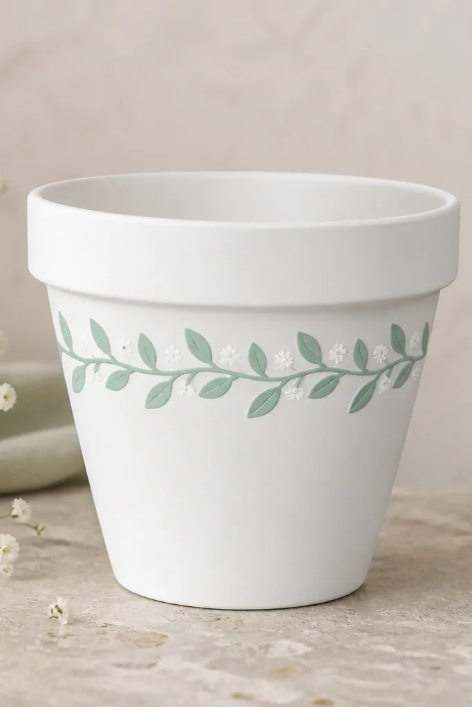
This look is for when you want a pot that feels fresh and calm, even in a busy yard. I use matte white as the base and mint green for the leaf border because mint pops without looking loud beside greenery. The daisy dots add movement, and they hide tiny brush marks better than solid stripes. It flatters plants with light-to-medium green leaves like pothos, sweet potato vine, or a mound of daisies. If your plants lean cool-toned (silver sage, dusty miller), the mint reads even cleaner and the whole pot looks “coordinated” instead of matchy.
Start by washing the pot with dish soap, then let it dry completely. Lightly sand the glazed areas if your pot is not raw terracotta, then prime with a thin coat of white primer. Base coat the entire pot with matte white acrylic paint, and let it dry to the touch. Tape a straight line where the border will go, then paint mint green leaves using a small angled brush — leaf stems go up and down around the curve. Finish by tapping tiny white dots with a round sponge for the daisy centers, then seal with 2-3 thin coats of exterior clear coat.
If your leaves look wobbly, practice on scrap cardboard first and keep your wrist loose — steady hand, not stiff arm.
Avoid painting thickly right after priming; it can peel when the primer flexes in the sun.
2. Terracotta-to-Teal Ombre with a Single Bold Rose at the Side
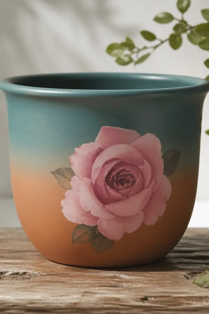
I love this one because it looks like a store-bought piece but it’s just paint control. The ombre from warm base to teal gives you depth, and the single rose keeps it from turning into “busy wallpaper.” I use muted rose pink and a tiny bit of dark berry for the rose center so it doesn’t compete with the plant. This pot looks best with plants that have either upright structure (like succulents or tall basil) or strong leaf texture (like snake plant leaves). If your plant has teal, purple, or deep green tones, the teal-to-rose combo makes everything look intentional.
Begin with a clean, dry pot and roughen any glossy glaze with 180-220 grit sandpaper. Prime the pot, then paint the bottom third with a warm base color close to terracotta — I use a light terracotta mixed with a touch of ochre. For the ombre, blend teal into the mid section using a damp clean sponge or a wide flat brush with minimal paint. Work in small sections and stop the blend where you want the color to “settle,” then let it dry. Paint the rose on the side after the ombre is dry, using a liner brush for petals and a small round brush for the center — keep the rose bigger than you think, around 4-5 inches wide on a 10-inch pot. Seal after everything dries, using thin exterior clear coat coats.
Pro tipFor a softer ombre, wipe your brush on a paper towel before blending so you don’t create hard streaks.
AvoidDon’t outline the rose in black; it will look like a sticker once sealed.
3. Chalky Navy Stripes with Tiny Gold Succulent Clusters
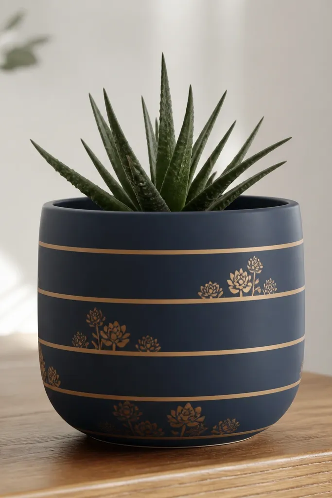
This design looks sharp in daylight and it photographs well because the stripes are crisp. Navy gives you a steady, grounded base, and gold succulent clusters add just enough shine without turning into glitter. I use a matte navy paint plus a gold metallic acrylic that I seal — the gold stays bright but doesn’t scratch off. It works especially well with small succulents and cacti or any plant with thick, geometric leaves. If you’ve got a kid’s windowsill cactus collection or a shelf of tiny plants, this pot makes the whole cluster look curated.
Clean the pot and prime it so the navy doesn’t soak in unevenly. Paint the base navy and let it dry fully — matte navy shows streaks if you rush. Measure stripe spacing with a ruler, then apply painter’s tape bands around the pot at equal intervals. Paint inside the tape with the navy again if you want the stripes to be raised-looking, or leave the tape off to create negative space stripes. For the succulent clusters, draw simple rosettes with a pencil first, then fill with gold paint using a small round brush. Seal once the gold is dry, and apply clear coat in thin layers so the metallic doesn’t turn cloudy.
Gold paint looks best if you mix it with a tiny dab of clear medium so it spreads smoothly on curved surfaces.
Avoid sealing too early — metallic gold can smear under clear coat if the paint is still soft.
4. Sage Green Base with Hand-Stamped Leafy Arcs (No Fancy Tools)
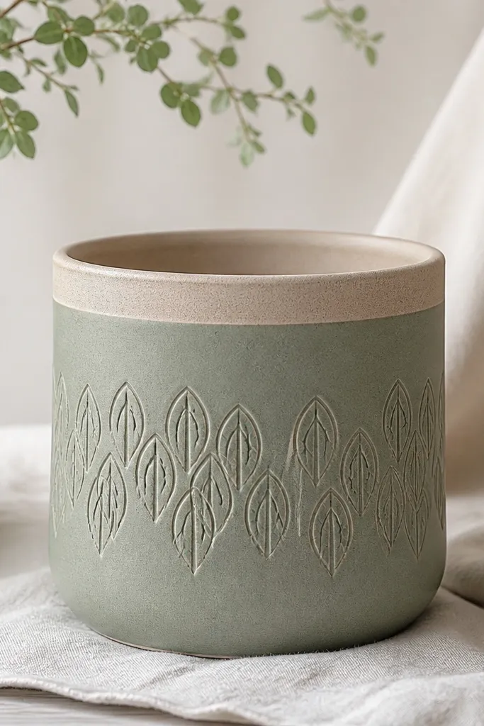
This is the one I reach for when I want texture without doing detailed flowers. Sage green is forgiving — it hides small paint gaps and pairs beautifully with almost any plant color. The stamped arcs look like a pattern you’d see on ceramics, but you can do it with a piece of craft sponge or a leaf-shape stamp. This works for trailing plants because the arcs wrap around the pot as the plant drapes, and it looks good with both bright greens and darker foliage. If your plants are mostly green, sage gives you color without stealing attention from the leaves.
Start by priming the pot, then roll or paint a smooth sage green base coat. Once dry, protect the rim with painter’s tape so the clear coat doesn’t pool on the lip. Make your stamp by dipping a craft sponge into darker green paint and pressing it lightly in curved arcs around the pot. Start with one band of arcs, then align the next band so the pattern “stacks” without repeating perfectly — slight variation looks more natural. Let it dry, then seal with exterior clear coat in 2-3 thin coats. If you want extra durability, sand the first clear coat lightly with 400 grit, wipe dust, and add a second clear coat layer.
Press stamp light and lift straight up; dragging makes the pattern look muddy on curved pots.
Don’t use watery paint for stamping — it spreads and blurs the leaf shape.
5. Pastel Rainbow Rim with a Single Plant-Name Style Initial
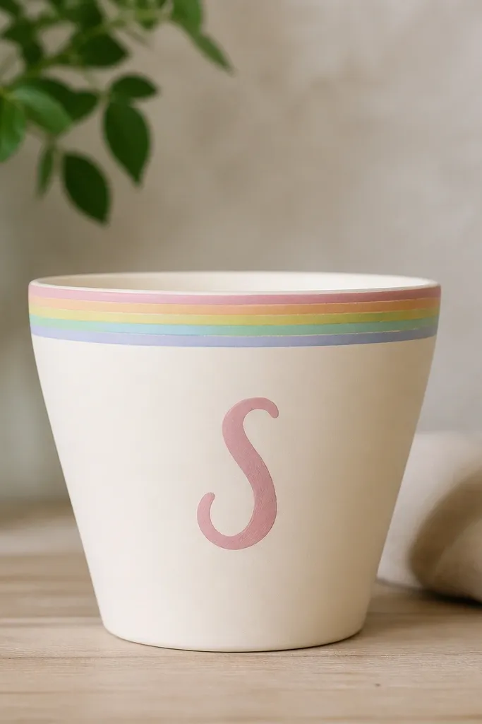
This look is for kids and for people who want cute without painting the whole pot. A pastel rainbow rim frames the plant like a haircut, and it draws the eye up to the leaves. I like using cream or off-white as the base because it makes the rim colors look brighter and hides brush strokes. The single initial keeps it personal without turning into a cluttered collage. This pairs well with upright plants like herbs, tiny palms, and seedlings because the plant sits right inside the “frame.” If your plants are colorful (red basil, purple flowers), keep the initial small so it doesn’t fight the blooms.
Clean the pot and prime it with a light-colored primer so pastel colors stay true. Paint the whole pot matte cream, then let it dry. Tape a band around the top to create the rainbow rim thickness, leaving the rim line crisp. Paint the rainbow with small flat brushes: pastel pink, peach, yellow, mint, and light blue, blending only at the edges so each color stays distinct. For the initial, sketch lightly with pencil first, then paint with a steady brush and let it dry before removing tape. Seal with exterior clear coat, and do an extra careful first coat around the rim so the tape line doesn’t lift.
Pro tipUse a hairdryer on low for 2-3 minutes between color layers so the next pastel doesn’t smear.
AvoidDon’t paint over damp tape; the clear coat later pulls the color right off the edge.
6. Blackboard-Green Pot with Chalk-Style Herb Icons
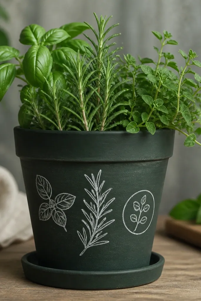
This one is a hit for budget & kids because it changes with the season. Blackboard-green makes the white icons pop, and it looks playful even with simple plants like mint, basil, or chives. I keep the icon set small — three herbs max — because the plant itself is the real star. It flatters casual, homey setups: kitchen windowsill pots, patio herb corners, and kids' craft gardens. If your plant has delicate leaves, the chalk-style lines make it feel themed instead of random.
Wash the pot, then prime lightly so the blackboard paint grips. Paint the pot blackboard green in thin coats and let it cure per the can — rushing cure is where the paint dents. Once cured, draw herb icon outlines in pencil: basil leaves, a rosemary sprig, and a small oregano circle. Paint the icons with white craft paint thinned slightly so the brush lines look chalky. Let dry, then seal with an exterior clear coat — for blackboard paint, use a clear coat labeled compatible with chalk paint or acrylic topcoats. After sealing, rub the surface with a dry cloth to remove any dusty residue before placing it near sunlight.
Pro tipIf you want it to feel extra chalky, sand the sealed surface lightly with 600 grit after the final clear coat cures.
AvoidAvoid putting this pot outdoors immediately after painting; blackboard finishes can stay soft for a bit.
7. White Linen Look with Spongy Texture and a Single Statement Flower
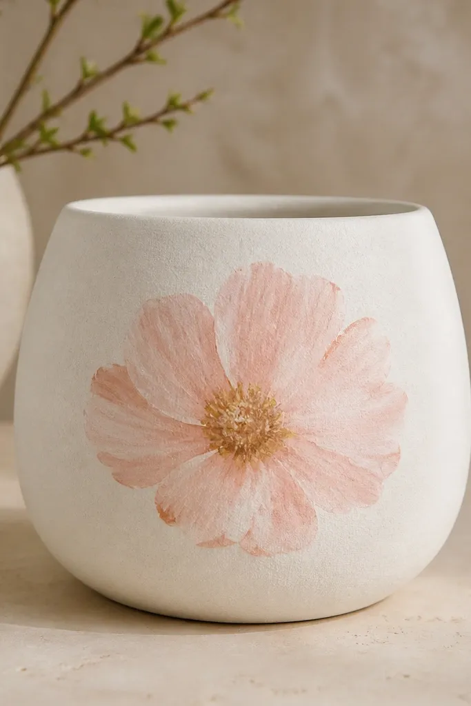
This design is for people who want the pot to look like fabric, even though it’s ceramic or terracotta. The spongy white base gives you texture that hides brush marks and makes the plant look more lush by contrast. The statement flower stays simple — one big bloom — so it reads clean from across a patio. It looks great with mounding plants like marigolds or zinnias because the flower icon matches the plant’s shape language. If your plants are bright and you don’t want the pot to compete, this white linen look keeps everything calm while still feeling handmade.
Clean and prime the pot, then mix your white paint with a little matte medium or use a matte acrylic so it dries without shine. Apply the white base using a sponge in small dabs instead of brushing — overlap lightly so you don’t get hard blotches. Let it dry fully, then sketch the flower in pencil at the front-center. Paint petals with a flat brush for the big shapes and a smaller brush for edges, using blush pink for outer petals and peach for the inner layers. Add a tiny dot cluster for the center. Seal with exterior clear coat in thin coats, and avoid heavy spraying because it can soften the spongy texture.
Do the texture first, then wait overnight — the flower paint sticks better when the base has fully set.
Don’t varnish with a glossy clear coat; it kills the linen effect and makes it look plasticky.
8. Bold Geometric Tiles in Terracotta Colors (Like a Mini Garden Wall)
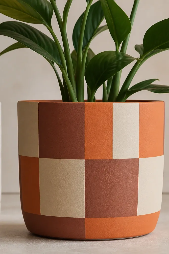
This is my go-to when I want a pot that looks modern and clean, even outdoors. The tile grid makes the pot look like it belongs in a patio set, and the terracotta palette ties it to real plants. I use a dusty cream, terracotta orange, and clay brown so it doesn’t turn into loud primary colors. This design flatters upright plants because the geometry stays visible as the plant grows, and it also looks great with ornamental grasses. If your plants have strong vertical lines, like fountain grass or tall basil, the tile pattern makes the whole arrangement feel balanced.
Start with priming, then paint a dusty cream base coat. Once dry, plan your grid width — for a 10-12 inch pot, I do 1 to 1.5 inch blocks so the pattern reads at a distance. Apply painter’s tape for the first row of blocks, paint the terracotta orange area, and let it dry to the touch. Peel tape carefully while paint is still slightly tacky to avoid tearing edges. Repeat with clay brown blocks, rotating the pattern so it wraps around smoothly. After all blocks are dry, seal with exterior clear coat in 2-3 thin layers, making sure edges are not flooded.
For perfectly sharp corners, press tape down with a plastic card, not your finger — your finger stretches tape on curves.
Avoid freehand geometry; crooked lines scream “first try” once the clear coat goes on.