1. Spring Daisy Stripe Pot
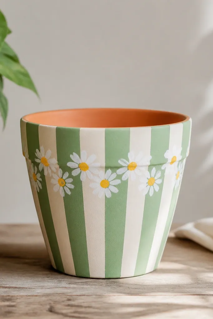
This one is bright without being messy. Paint the whole pot in crisp vertical stripes so the daisies sit on top like little stickers. I use mint green and white because they read clean in spring light and still look cheerful when the sun hits in summer. The daisy motif flatters kids' hands since petals are simple arcs, and it also looks good on any pot height because the stripe rhythm guides the eye upward. If you’re pairing it with flowers, daisies and small pansies match the style, and the pot won’t fight taller blooms.
Start by priming the pot, then paint two or three thin coats of mint green and white stripes using painter’s tape. Let it dry fully between coats so the tape edges stay sharp. Next, sketch a light guideline around the top band where daisies will sit, then paint daisy petals with a small round brush by curving five arcs around a yellow dot. Add a tiny green dot for the center leaf only if your kid wants extra detail. Finish by sealing with two thin coats of outdoor clear acrylic top coat, letting the first coat dry before the second.
Use a sponge-tip dauber for the yellow centers so kids can stamp without dragging paint.
Don’t paint thick stripes — thick paint stays tacky and smears when you add the daisies.
2. Summer Lemon Slice Galvanized Look
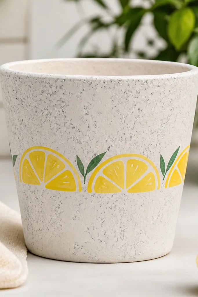
This pot looks like something you’d buy at a market booth, but it’s just paint. The faux galvanized speckle gives it that “metal bucket” vibe without needing real metal, and the lemon slices scream summer. I like beige plus gray speckle because it keeps the lemons looking juicy instead of neon. This style works great for kids because lemon halves are basically circles with a bite and a few white lines. It also plays well with herbs like basil and thyme since the colors match the real greens you’ll grow.
Prime the pot, then base coat it in warm beige. For the galvanized effect, dab a gray watered-down acrylic with a stippling brush or old makeup sponge, then lightly feather edges so it looks random, not striped. Paint lemon halves using a yellow base circle, then add a white curved pith line near the center and a few thin white segments. Add one small green leaf or leaf stem under two or three lemons so the pot doesn’t look like floating fruit. Seal with satin outdoor clear coat so the speckle still shows texture.
Mix a tiny bit of orange into the yellow for the bottom half of each lemon so it looks sunlit.
Skip glossy craft paint as your base — it fights the sealer and can peel at the edges.
3. Fall Pumpkin Patch Grid
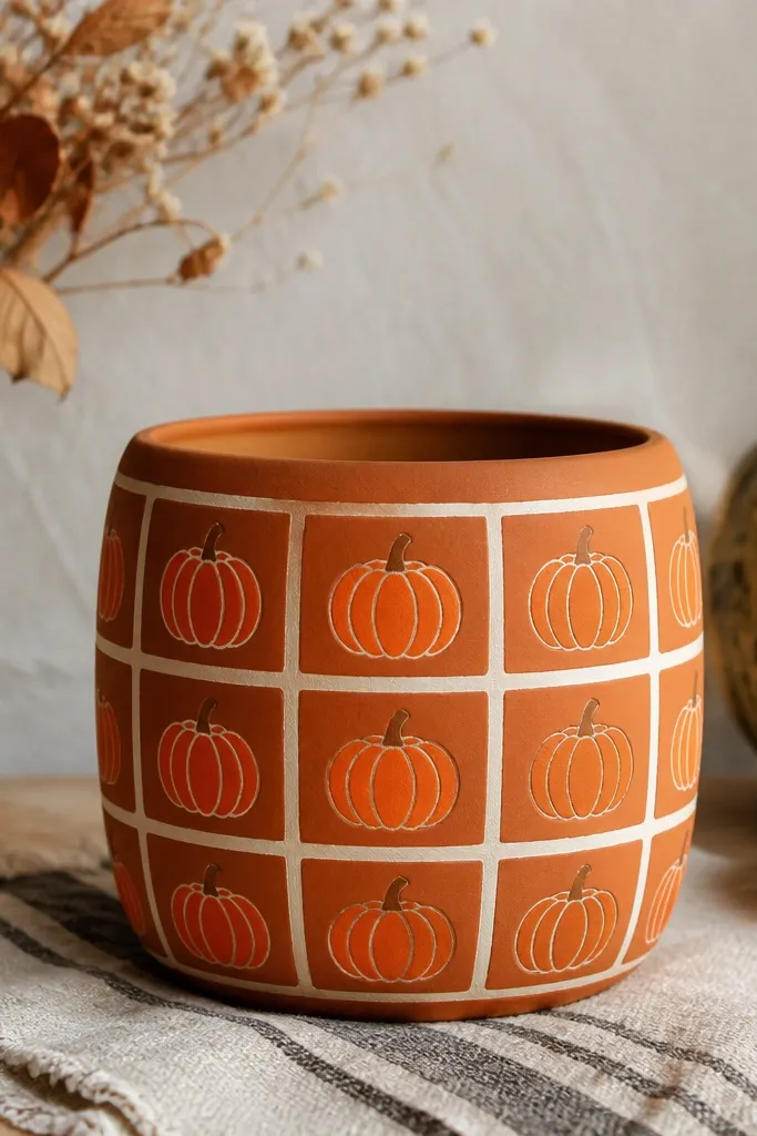
This one is my go-to when I want fall color that still looks tidy. The white grid keeps the pumpkins from turning into a random blob of orange, and the repeated rib lines make it feel “designed” even with kid-made brushwork. Deep orange is the sweet spot — it reads warm without looking like Halloween candy. This style looks best on wider pots because the grid squares can be big enough to paint clearly. It also looks great with mums, ornamental kale, or even a simple evergreen sprig if you want fall without full spooky vibes.
Prime first, then paint the base deep orange. Tape off a grid using painter’s tape, spacing squares about 2 inches apart on medium pots; remove tape while paint is still slightly tacky so edges don’t tear. Paint a simple pumpkin in each square: start with a curved outline, then add 5 to 7 ribs using a lighter orange or slightly darker shade. Finish each pumpkin with a small brown stem and a tiny shadow under it. Seal using matte outdoor clear coat to reduce glare and make the grid lines stay crisp.
Use a pencil to lightly map the grid before taping so you don’t end up with crooked rows.
Don’t overwork ribs — too many lines make pumpkins muddy once sealed.
4. Winter Snowflake Star Band
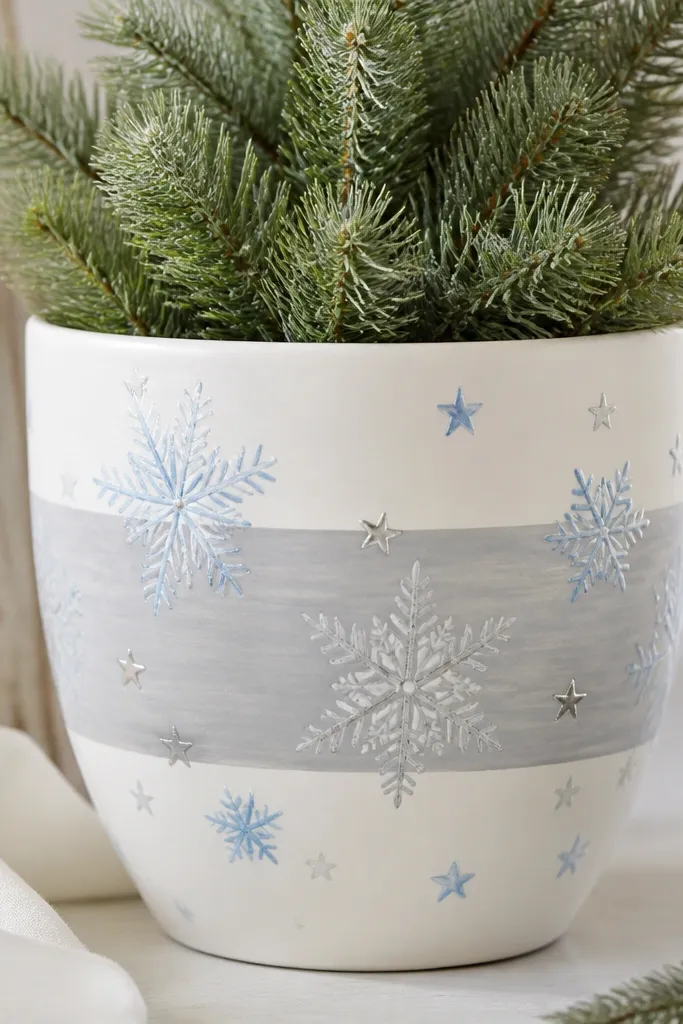
Winter pots should look clean even when it’s cold outside. A single horizontal band keeps it simple and reads like a scarf around the pot. I use white plus pale gray because it makes the blue and silver details pop without turning icy tones into something overly dramatic. This design flatters round pots because the band wraps naturally and keeps the pattern from looking stretched. It also pairs with winter greens like boxwood or holly since the pot doesn’t steal attention from the foliage.
Prime the pot, then base coat in bright white. Paint a pale gray band across the middle using painter’s tape, aiming for about one-third of the pot’s height. Add snowflakes with a stencil or freehand: six spokes with small arms, then tiny dots at the ends. Add five-point stars in light blue between snowflakes so the band feels balanced. Let everything dry, then seal with two coats of outdoor clear acrylic; if you want extra sparkle, add a light dusting of fine silver glitter only to star tips before the final sealer coat.
Use a stencil sheet and a foam dabber for snowflakes so they match even when kids paint.
Avoid thick glitter — it can snag fingers and wear off early.
5. Year-Round Bird Silhouette Perch
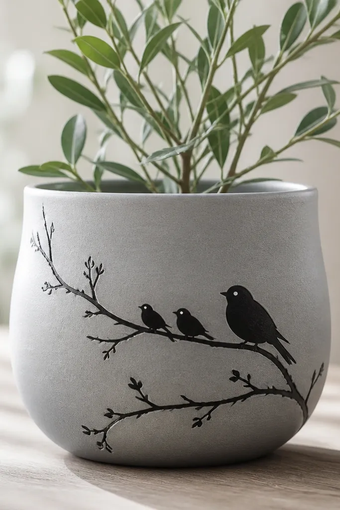
This is the design I use when I want something that doesn’t scream one season. Bird silhouettes look good against almost any flower color, and the branch adds structure even when plants are sparse. Light gray is a calm base that makes the black shapes feel sharp instead of heavy. The silhouette style is kid-friendly because it uses bold shapes rather than tiny details. It also flatters almost any pot shape since diagonal branches add movement and keep the view from feeling flat.
Prime and base coat the pot in light gray. Draw a diagonal line from upper left to lower right lightly with pencil, then paint a branch silhouette over it in black. Add three birds by painting simple oval bodies with a triangle beak and a short tail; vary size so one bird looks closer to the viewer. Add tiny white dot highlights on two birds so the scene looks lively. Seal with matte outdoor clear coat so the silhouettes stay readable in shade.
Put the biggest bird slightly off-center — it looks more natural than perfectly centered animals.
Don’t use dark brown for the birds — black holds up better and looks cleaner after sealing.
6. Polka Dot Rainbow Stacker
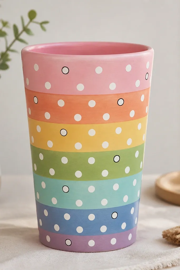
This is the pot that looks happy in every season. Horizontal rainbow bands give you color without needing themed drawings, and polka dots make it look playful for kids. Soft pink is the anchor since it keeps the rainbow from becoming too loud, especially in winter light. The style works on tall pots because bands stack upward and look intentional. It also flatters kids with different skin tones because the colors are bright but not harsh, and it looks great next to any plant green.
Pro tipUse a paint pen for dots — it stops the “random blob” look when kids dip too much paint.
Prime, then paint a base coat of soft pink. Tape off horizontal bands across the pot, starting with the widest band in the middle; paint rainbow bands in red, orange, yellow, green, and blue using thin coats. Use a white paint pen or a small round brush to dot each band evenly, keeping dots about the size of a pencil eraser head. Add tiny black dot outlines only on the top band if you want a bit more contrast. Seal with satin outdoor clear coat so the dots keep a smooth finish.
AvoidDon’t skip even spacing — uneven dots make the bands look messy after sealing.
7. Geometric Moroccan Corner Panels
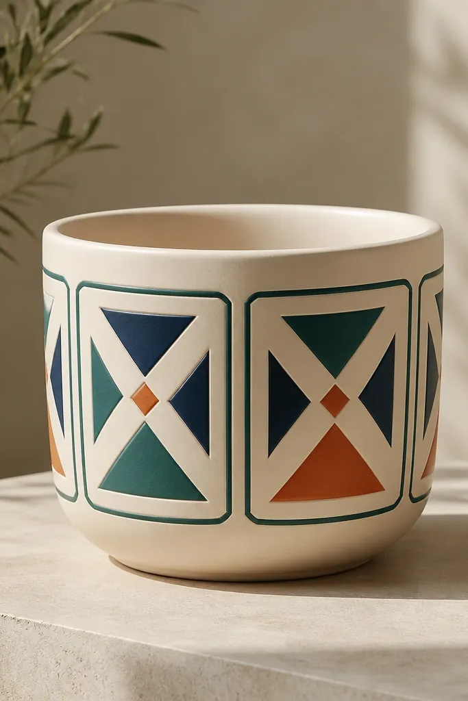
This style looks grown-up even though kids can help. Corner panels create symmetry, and geometry keeps the pot tidy when the plants are the “main event.” I like cream plus dark teal because it reads clean outdoors and doesn’t fade into muddy browns as fast as bright orange. The panels flatter round and slightly bulbous pots since corners naturally frame the shape. It also works with any flower color — white, purple, red, you name it — because the palette stays controlled.
Pro tipPress tape firmly along curved edges, then run a fingertip over it so paint doesn’t bleed under.
Prime, then base coat in cream. Tape off four corner squares leaving a small gap from the pot’s edges so the lines don’t get stretched. Paint the outlines in dark teal, then fill each panel with triangles and diamonds using two colors: navy and a terracotta orange accent. Keep triangle sizes consistent across all corners so it looks designed, not random. Seal with matte outdoor clear coat to reduce glare and keep the geometry crisp.
AvoidDon’t freehand the outlines — shaky lines look cheap once the sealer dries.
8. Mermaid Scale Texture with Seafoam Base
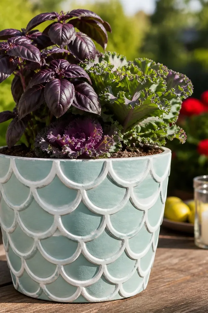
If you want a kid project that looks like a craft store find, scales do that. Seafoam is calm and pretty, and the white scales make it look like light hitting wet shells. This design reads well in spring and summer, but it also works in fall if you plant something dark like purple basil or ornamental kale. It flatters medium to tall pots because the scale rows can wrap smoothly upward. Bonus: kids enjoy the repetitive motion of painting each scale shape.
Pro tipPractice one scale row on scrap cardboard so your teardrop shape matches across the pot.
Prime, then base coat seafoam green. Paint the first row of scales starting about 1 inch below the rim, using a small brush to make teardrop or comma shapes that overlap. For the next rows, offset the scales so they sit between the gaps of the row below, working downward to the bottom. Use white for every other scale row and pale aqua for the alternating rows to add depth. Finish with a tiny cluster of turquoise dots near the top edge and seal with satin outdoor clear coat.
AvoidDon’t leave gaps between scales — you’ll see unpainted seams after sealing.
9. Halloween Friendly Ghost Faces
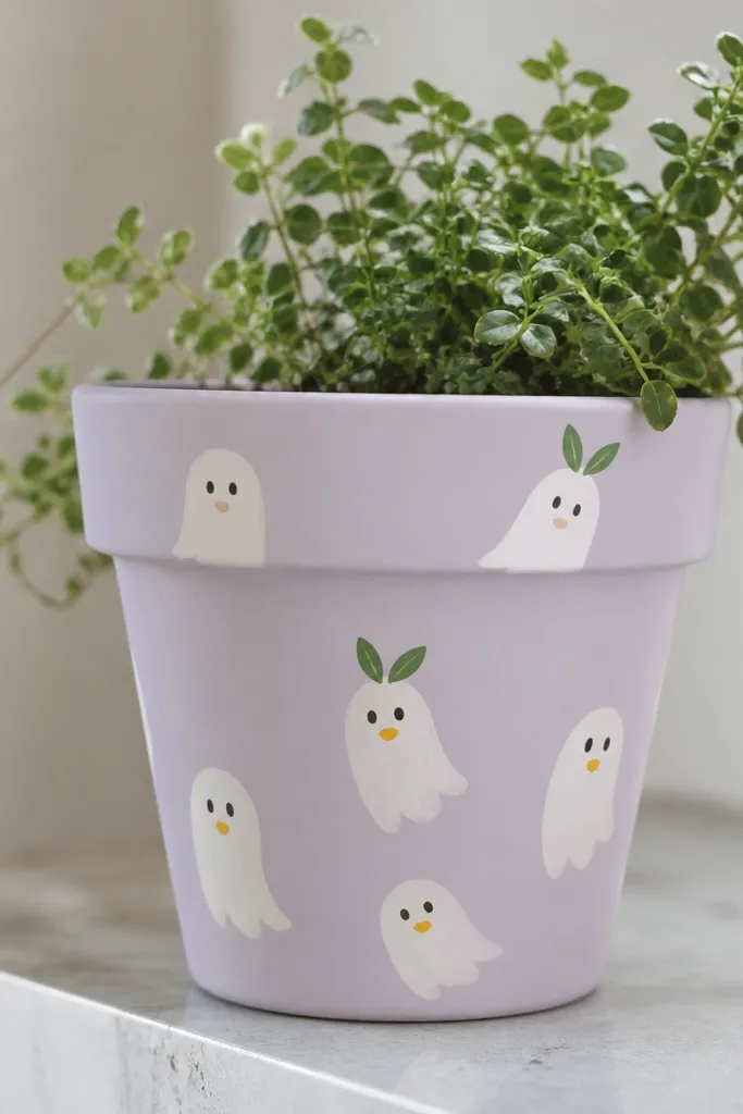
This is Halloween without the scary factor. Ghost faces look cute year round because they’re simple, and the lavender base makes them feel whimsical instead of spooky. I use white ghosts with black dot eyes because it hides small brush mistakes. This is perfect for younger kids because the shapes are big and forgiving. It also looks adorable with winter greens and even fake greenery in December since the pot still feels playful, not heavy.
Pro tipUse a cotton swab to clean up edges after painting — it makes ghosts look sharper fast.
Prime the pot, then paint a pale lavender base. Draw ghost outlines lightly with pencil: rounded top, narrower bottom. Paint ghosts in white, then add two black dot eyes and a small curved mouth in orange or yellow. If you want extra charm, paint a tiny green leaf above one ghost’s head like a hat. Seal with matte outdoor clear coat so the lavender stays soft and the ghosts don’t look glossy.
AvoidAvoid tiny facial details — small lines blur once sealed outdoors.
10. Monochrome Minimal Branch + Buds
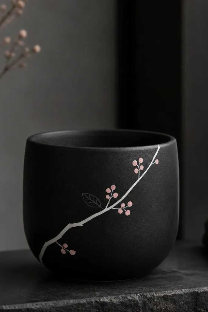
Minimal monochrome pots look expensive and still kid-friendly. The black base makes the white branch feel crisp, and the tiny bud dots add softness without turning into a busy cartoon. Pale pink buds keep it springy, but the design stays neutral enough for fall and winter. I like this on smaller pots because the details feel intentional when the pot isn’t huge. It also flatters any plant since the pot doesn’t compete with bright blooms.
Pro tipUse a liner brush you can control — if the brush frays, your branch line will look wobbly.
Prime, then paint the pot black and let it cure fully for a day if you can. Paint a thin branch line with white using a small liner brush, then add 6 to 10 bud dots in pale pink along the branch. Add two tiny leaf outlines in dark gray only near the top so it feels balanced. Let everything dry, then seal with satin outdoor clear coat to keep the black smooth and the white lines sharp.
AvoidDon’t skip primer on black pots — paint can look patchy and the sealer will highlight it.
11. Tropical Palm Fan Fronds
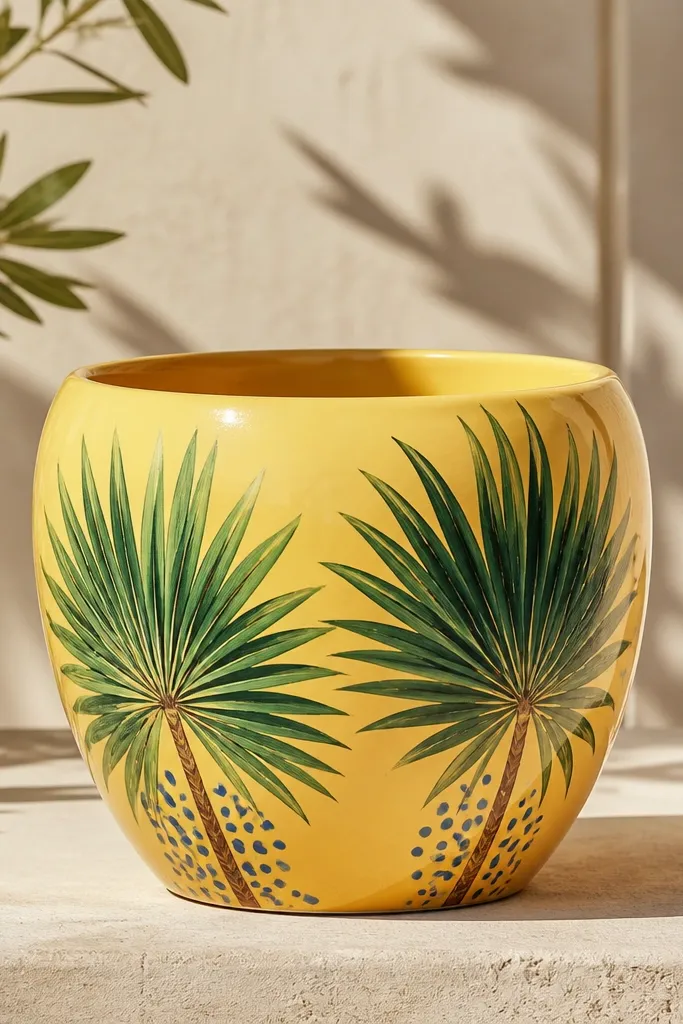
Palm fronds are a clean way to bring summer energy without using loud colors everywhere. Sunny yellow acts like a spotlight and makes green look fresh even in partial shade. I use two greens: a medium green for the main fronds and a lighter green for highlight lines so the fronds look dimensional. This design works best on oval or tall pots because the fan shape naturally follows the pot’s curve. It also looks good with summer flowers, but it still looks fine in fall with mums because the palette stays bright rather than seasonal.
Prime and base coat in sunny yellow. Paint a thin brown trunk line slightly off-center, then fan out frond leaves from one top point using a fan brush or a flat brush with controlled strokes. Layer lighter green highlight strokes down the middle of select fronds so they look layered. Add a few small blue dots near the bottom like distant sky or berries. Seal with satin outdoor clear coat in two coats so the yellow doesn’t chalk.
Use a fan brush for fronds — it gives you consistent spacing without extra sketching.
Don’t paint all fronds the same green — flat color makes the pot look like one big blob.
12. Stacked Heart Row for Spring to Valentine
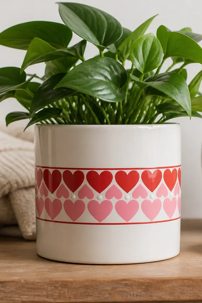
Hearts feel seasonal for Valentine’s Day, but the layout makes them year-round cute. A single band keeps it from looking like a holiday costume, and the white dots add a light, cheerful texture. Red and pink look good against white because kids' paint stays visible and readable after sealing. This design flatters medium pots because the band sits at eye level when you walk by. It also pairs well with soft flowers like begonias or even simple bedding plants.
Prime, then paint the pot white. Tape a band around the middle about 3 inches tall and paint it red. Paint hearts inside the band: make a heart outline, then fill with red and alternate some hearts with pink. Add small white dots between hearts so the spacing feels intentional. Seal with matte outdoor clear coat so the red band looks smooth and doesn’t glare.
Use a paper heart stencil cut from cardstock to speed up the shape for kids.
Avoid uneven band width — it makes the hearts look like they’re sliding.
13. Autumn Leaf Watercolor Wash
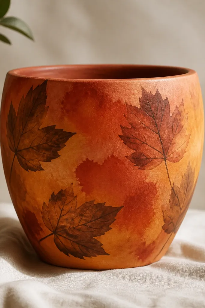
This is the one you use when you want fall color but don’t want crisp lines. The watercolor wash looks soft and organic, and it still looks good when plants fill in the gaps. I like mustard plus rust because it reads warm even when the weather is gray. Leaf silhouettes are enough detail to feel themed, but they don’t trap your kid in perfect symmetry. This style flatters tall pots because the wash can flow upward and the leaves can be scattered without looking crowded.
Prime, then base coat with a warm off-white to give the wash something to sit on. Mix watered-down acrylics: mustard, rust, and burnt orange. Sponge or brush on the wash in patches, blending edges with a dry brush so it looks like dye spreading, not stripes. Add leaf silhouettes in darker brown using a leaf stencil or simple teardrop shapes with a center vein line. Seal with matte outdoor clear coat so the wash stays soft instead of shiny.
Let the wash dry between colors so you don’t get muddy brown pools.
Don’t paint the wash too thick — thick paint cracks as temperatures swing.
14. Candy Stripe Planter Faces
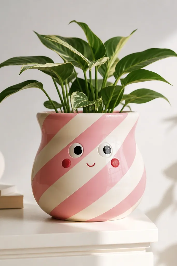
Diagonal candy stripes plus a face makes kids feel like the pot is alive. The diagonal angle hides small unevenness in stripe width, and the face gives it a clear focal point. I use candy pink and cream because it looks cute with green plants and doesn’t turn dull like darker reds can. This design flatters round pots and medium sizes because the face sits where you see it from the doorway. It also works for any season since the face is friendly, not themed.
Prime, then paint diagonal stripes with painter’s tape, aiming for stripes about 1 inch wide on a standard kids' pot. Paint alternating coats of candy pink and cream until the stripes cover evenly. Add a face near the top third: two large white eye ovals, black pupils, and a small curved smile. Finish with two cheek circles in strawberry red and a tiny eyebrow line if you want. Seal with satin outdoor clear coat so the stripes look smooth and the face stays readable.
Mark the face center with a pencil dot before painting eyes so both eyes end up the same height.
Don’t use black gel pen directly on bare pot — it smears and won’t seal cleanly.
15. Citrus Peel Ombre + Zest Dots
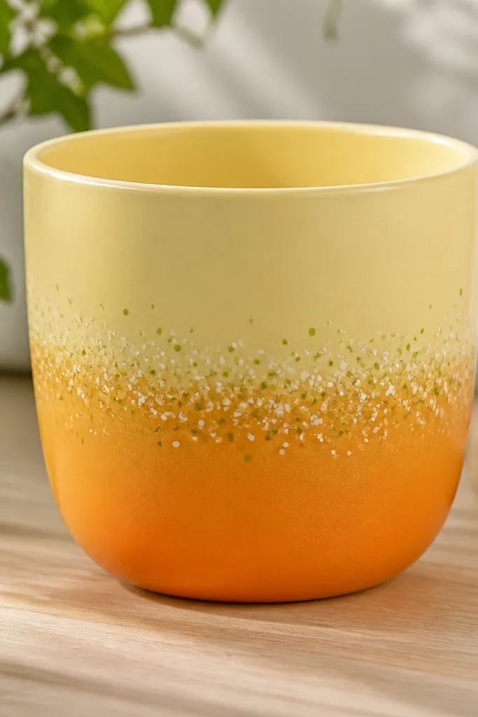
Ombre pots look like you spent more time than you did. This citrus peel version feels spring and summer, but the palette still looks warm in fall. I use pale yellow at the rim and blend down into orange so it feels sunlit, not sunset-orange. The zest dots add playful texture without turning into a full pattern that needs constant spacing. This style flatters taller pots because the gradient has room to breathe, and it looks good with herbs or flowers that have yellow/orange tones.
Pro tipAdd a tiny drop of yellow to your orange mix for the transition zone so it blends without streaks.
Prime, then base coat the top rim area pale yellow. Blend orange onto the lower half using a sponge or a wide brush, working in light circular motions so the transition is smooth. Keep the gradient soft — you want it like dye, not like a straight line. Add zest dots: small white dots and a few light green dots near the middle where the colors meet. Let dry, then seal with satin outdoor clear coat in two thin layers.
AvoidDon’t paint ombre in one heavy coat — it dries uneven and leaves hard edges.