1. Rim-Only Color Block on Terracotta
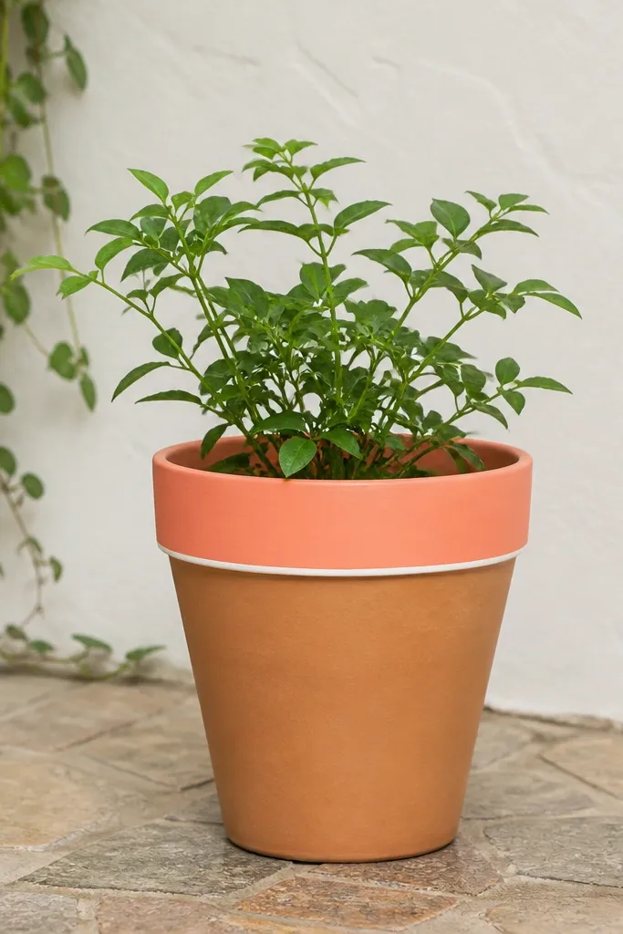
This is the fastest low maintenance pot painting idea I’ve used on terracotta because it limits the high-wear area. Leaving the body natural clay hides minor texture differences and makes the whole pot look intentional even if your brush gets a little streaky. The coral rim reads warm against green leaves, and the natural clay keeps it from looking too “craft store.” It flatters small spaces and smaller hands too - kids can water the plant without grinding paint off the sides.
Start by washing the terracotta and letting it dry fully, then sand only the rim lightly with 220 grit so paint grips. Prime the rim area with a bonding primer made for porous surfaces, using a foam brush so you don’t leave hard ridges. After primer dries, paint a coral band about 1 inch wide using two thin coats, letting each coat dry to touch before the next. Add a straight white line if you want definition: apply painter’s tape after the coral coat is cured enough not to smear, then peel the tape while the topcoat is still slightly tacky.
Seal after the final coat cures for 24-48 hours, and use a satin clear sealer so the rim wipes clean without turning chalky.
Avoid painting the whole pot if you want low maintenance — the rim will still get scuffed and that’s where it shows.
2. Speckled Basecoat with Chalky Teal and White
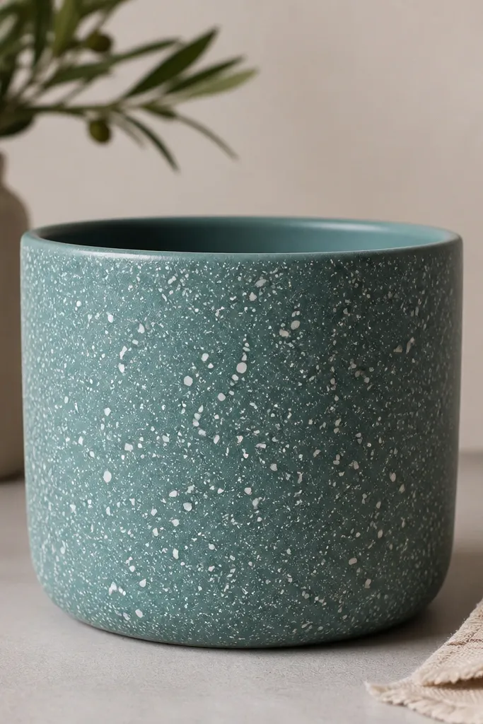
Speckling hides brush marks and tiny chips, which is why it’s my go-to when I’m painting a bunch of pots for a playroom or porch. Chalky teal looks soft in daylight, and the white specks pop without needing perfect lines. This works especially well on pots that already have small dents or uneven glaze since the texture blends into the pattern. If you’re working with kids, speckling is forgiving and still looks “designed” when you step back.
Start with a smooth base coat of chalky teal — I use a foam roller for the pot body so it lays down evenly. Let it dry fully, then load a stiff toothbrush with white paint thinned slightly with water or a paint extender until it drips slowly. Hold the toothbrush a few inches from the pot and flick away from the rim, rotating the pot as you go so the speckles don’t clump in one spot. Finish with a satin clear topcoat so the white specks don’t get scuffed when you move the pot.
Pro tipTest your flick distance on a scrap piece of cardboard first so you get specks the size of salt, not blobs.
AvoidSkip thick paint for the speckle — it lands too big and you end up with raised dots that chip.
3. Tape-Free Vertical Stripes Using a Chalk Marker Guide
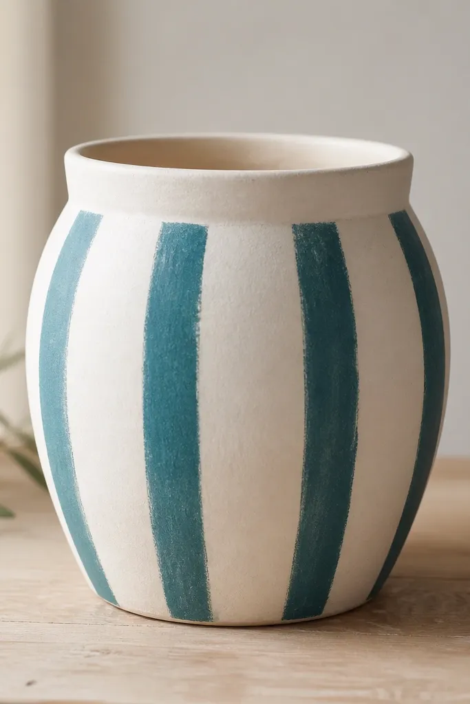
Vertical stripes look clean and modern even when you’re not a perfectionist, and this method keeps it low maintenance because it avoids tape failures. I use a chalk marker to map the stripe positions, which means no tape to peel and no edges tearing the base coat. Teal on white makes the pot look brighter in shade, which helps if your plants sit under a porch light or near a wall. This is flattering for tall planters because the stripes pull the eye upward instead of making the pot look chunky.
Start by painting the pot white with two thin coats and let it cure until it feels dry all the way through. Use a chalk marker to lightly mark 4 stripe centers down the pot, then place painter’s paper along the rim if you need a clean edge. Paint stripes freehand with a narrow synthetic brush, keeping your strokes vertical and consistent in thickness. Let it dry, then touch up any uneven spots with a second thin coat on the stripes only.
Pro tipIf your stripes get wobbly, don’t repaint the whole pot — clean the edges with a damp cotton swab right after the paint lands.
AvoidDon’t use tape for stripes unless the first coat is fully cured; tape is the fastest way to ruin clean edges on budget pots.
4. Ombre Wash from Bottom Edge to Mid-Height
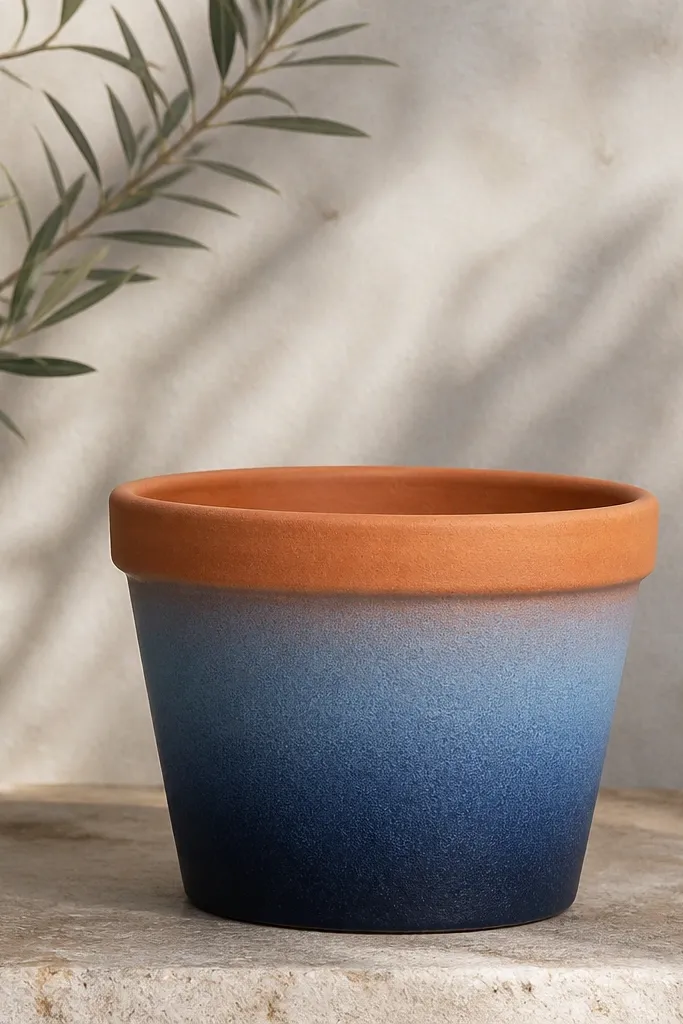
An ombre wash is low maintenance because minor fading or small chips blend into the gradient. The navy-to-denim transition looks smooth even with a slightly textured pot, and leaving the rim terracotta prevents that scuffed-paint look. This style also hides water marks because the darker lower area is less obvious when the pot gets splashed. It looks great with herbs and trailing plants since the color shift follows the plant’s natural “spill.”
Begin with a sealed base if your pot is terracotta: prime the bottom half and seal lightly so the paint doesn’t soak unevenly. Mix navy and denim blue acrylic paint with a glazing medium or just a little water so it spreads thin. Paint the bottom 2 inches navy, then blend upward with a damp sponge using gentle dabs, stopping around mid-height. Wipe the sponge edge occasionally so you don’t lift too much paint, then let it dry fully before adding a satin clear topcoat.
Do the blend while the paint is still wet-tacky — once it dries, blending creates streaks.
Avoid painting ombre in one thick layer; it dries fast and leaves a band where it starts to set.
5. Hand-Painted Leaf Outline on a Neutral Base
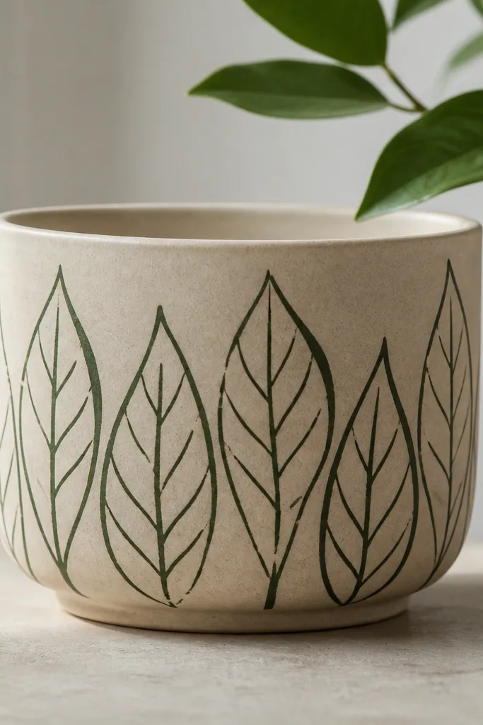
Line art looks high-end without needing heavy coverage, and it’s low maintenance because the design is thin and easy to touch up. A neutral base like warm beige or off-white keeps the leaves crisp, and dark green outlines look natural next to real plants. This is flattering for medium and large pots because the repeating pattern gives visual structure without crowding. If you’re painting for a kids' room or play space, it also hides small scuffs better than a full solid color.
Start by painting the entire pot with warm beige acrylic in two thin coats, then let it cure overnight. Use a pencil lightly to place 6-8 leaf locations around the pot, then trace over with a dark green paint using a fine liner brush. Keep your line thickness varied — press a bit harder at the leaf stem for a more natural look. Let the outlines dry, then seal the pot with a satin clear coat in two light passes so the lines don’t smear.
Use a liner brush that holds paint — if it runs dry fast, you’ll get patchy lines and you’ll end up repainting sections.
Don’t skip sealing; line art scuffs quickly on handled pots.
6. Geometric Corners with a Single Brush Edge
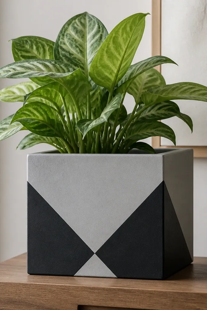
Geometric corners are a good low maintenance pot painting idea because they let you control the “wear zone” — the rim stays solid, while the design sits lower where it gets fewer finger rubs. Black corners on light gray look sharp and modern, even if your pot has slight warping from cheap molding. This style also photographs well for porch decor because it reads clean from a distance. It suits people who want structure without spending hours on tiny details.
Paint the pot light gray first with two thin coats, then wait until it’s fully dry. For the geometric shapes, mark corner points with a pencil and use a straightedge to guide the brush. Dip your brush lightly and paint the black shape in one confident pass, then fill in any gaps with the same brush angle. Let it dry, then do a final touch-up where the black meets gray so you don’t see a ragged edge through the clear coat.
Pro tipClean your brush edge with a damp rag between shapes — the crisp corners come from a clean edge, not from tape.
AvoidAvoid trying to paint geometry with tape on curved pots; the tape lifts and the lines get wavy.
7. Stenciled Numbers for Plant Labels That Look Intentional
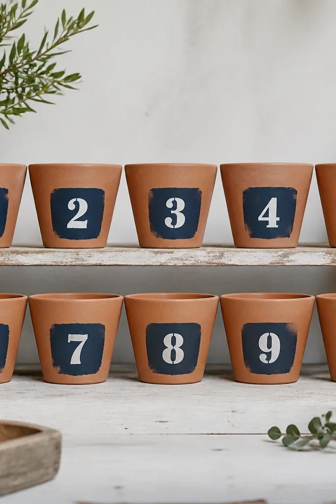
If you’re painting for a kid garden or a classroom shelf, stenciled numbers are low maintenance because you’re not relying on perfect full coverage. You only paint a small patch, so chips are less noticeable and touch-ups take minutes. The navy patch anchors the number and keeps it readable from across the room. This style also helps you keep track of plants without using flimsy plastic tags that fall off and get lost.
Start with clean, dry pots and paint a small rectangle patch on the front using navy acrylic, about 2 inches wide and 2.5 inches tall. Let the navy cure, then place a stencil over the patch and secure it with painter’s tape at the corners only. Dab white paint through the stencil with a foam stencil brush, not a loaded paintbrush, so you get crisp edges without bleeding. Remove the stencil carefully and seal the whole front with satin clear topcoat once everything is fully dry.
Pro tipUse the stencil on the same pot in one direction each time, so the numbers line up with the rim and look consistent across a set.
AvoidDon’t rush the stencil pull — if the paint is still wet, it smears and the number edges look fuzzy.
8. Matte White Base with a Thin Metallic Rim Line
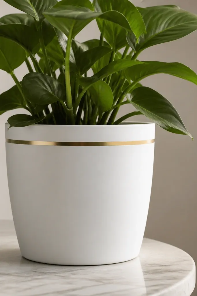
This one looks expensive but it’s low effort because the design is tiny and placed exactly where you can control it. Matte white hides scuffs on the pot body, and the thin metallic line gives you that “finished” look without painting big metallic areas that can peel. Gold reads warm with terracotta, dark soil, and green leaves, so it works in almost any doorway palette. It’s also friendly for people who don’t want to commit to patterns — just one clean line changes the whole pot.
Paint the pot matte white in two thin coats and let it cure until it feels hard, not tacky. For the metallic line, use a small craft brush and paint a 1/8-inch band just below the rim, following the pot’s curve. If your metallic paint is thick, mix a tiny amount of glazing medium so it flows without streaks. After it dries, seal with a satin clear coat that won’t dull your metallic line too much.
Do the metallic line last, after the white is cured for at least a full day, so you don’t drag white paint into the gold.
Skip glossy topcoats — they show every brush stroke on matte white.