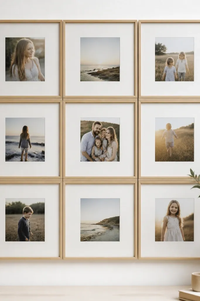
1. The Black Grid With White Mat Band
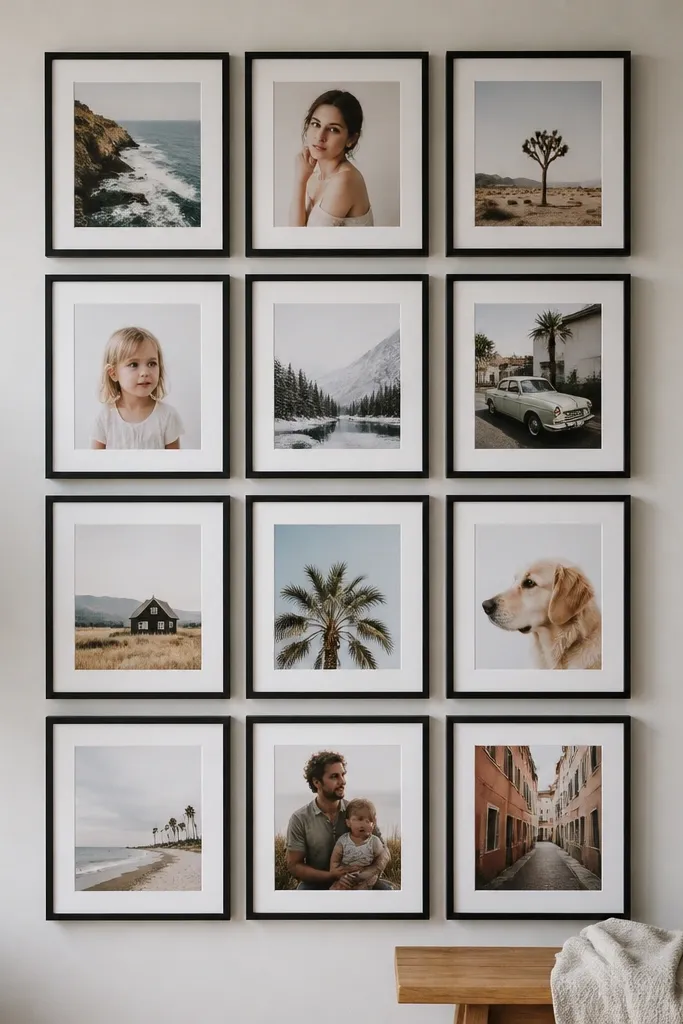
This one looks sharp because every frame repeats the same shape and color, and the white mats act like breathing room. I’ve used it in my hallway with school photos because the contrast helps faces stand out under warm ceiling lights. Choose a black frame width around 1 inch so the grid doesn’t look flimsy. It flatters most rooms because it anchors the wall without turning the photos into a background blur. If your photos include both bright and dark outfits, the white mat keeps the dark ones from sinking.
Start by dry-laying 12 frames on the floor in a 3x4 arrangement, leaving a 1/2 inch gap between outer frame edges. Cut a piece of foam board to fit the full grid, then tape the frames in place temporarily using painter’s tape. Pop out each frame’s backing, then place your photo on top with the same mat opening size for every frame. Finally, glue or tape the frames down to the foam board and hang the whole board using one centered sawtooth hanger strap.
Use portrait photos with faces centered, and crop them so eyes sit in the top third of each image.
Don’t mix black and bronze frames — it makes the grid look like mismatched thrift finds.
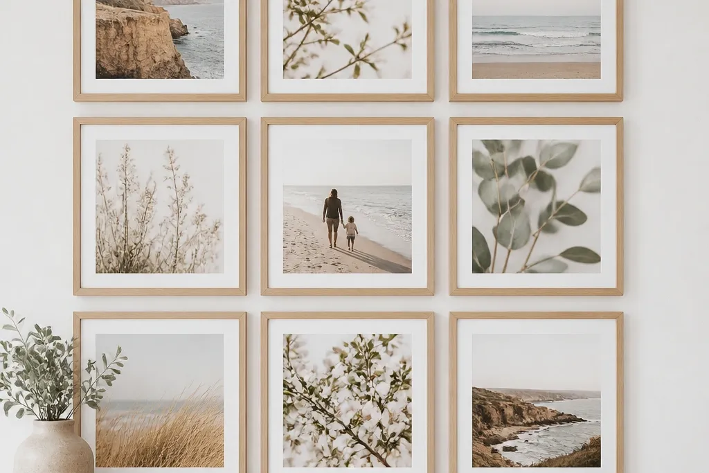
2. Warm Wood Frames With Cream Background Pop
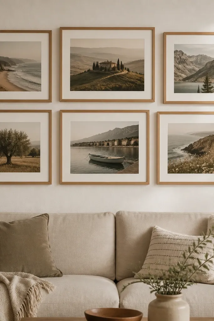
Begin with six frames in the same wood tone, then choose two mat colors: cream for all photos or cream for the top row and a slightly darker beige for the bottom row. Cut a backing board to the size of your 2x3 layout and mark the frame positions with a ruler and pencil. Place the frames on the board first, then trace inside edges so you know where each photo will sit. Mount the photos with the same mat opening and keep the photo bottom aligned across all frames so the collage feels orderly.
Warm wood frames soften the look and make family photos feel cozy instead of formal. I like this layout in living rooms because cream mats echo couch fabric and make skin tones look natural. It’s forgiving with kids' photos because the cream border hides small cropping differences between shots. If your home has lots of beige, tan, or soft green, this combo reads like it belongs. It also flatters warm undertones in photos where people wear browns, rust, or mustard.
AvoidAvoid glossy photo finishes in bright rooms — reflections make the wood look cheaper.
Pro tipIf your photos are bright, add a thin layer of matte photo paper or select images with less glare so the cream mats don’t look washed out.
3. White Frames With Pastel Mat Squares

Pick eight white frames with identical inner openings so your photos sit consistently. Cut pastel cardstock mats in the same outer size for each frame, then vary the inner mat color by frame. Dry-lay the arrangement on the floor so you can place darker pastels at the corners and lighter pastels toward the center. Mount photos by taping the photo to the mat backer so it doesn’t slide when you close the frame. Finally, glue the frames to a backing board and keep gaps at 1/2 inch for a clean grid look.
White frames keep the collage airy, and pastel mats let you bring color in without turning the wall into a rainbow. I used this in a kids playroom with birthday photos and it looks cheerful even when the room is messy. Pastels flatter most skin tones because they’re light and don’t cast strong color shifts onto faces. Pick one pastel family, like soft greens and pinks, so it feels intentional. This setup also works great when your photos include a lot of outdoor backgrounds.
AvoidDon’t use neon mats — they overpower the photos and make the collage look like classroom decor.
Pro tipUse cardstock mats at least 1/2 inch thick so the pastel color shows clearly from across the room.
4. Gallery Strip With Uneven Photo Sizes
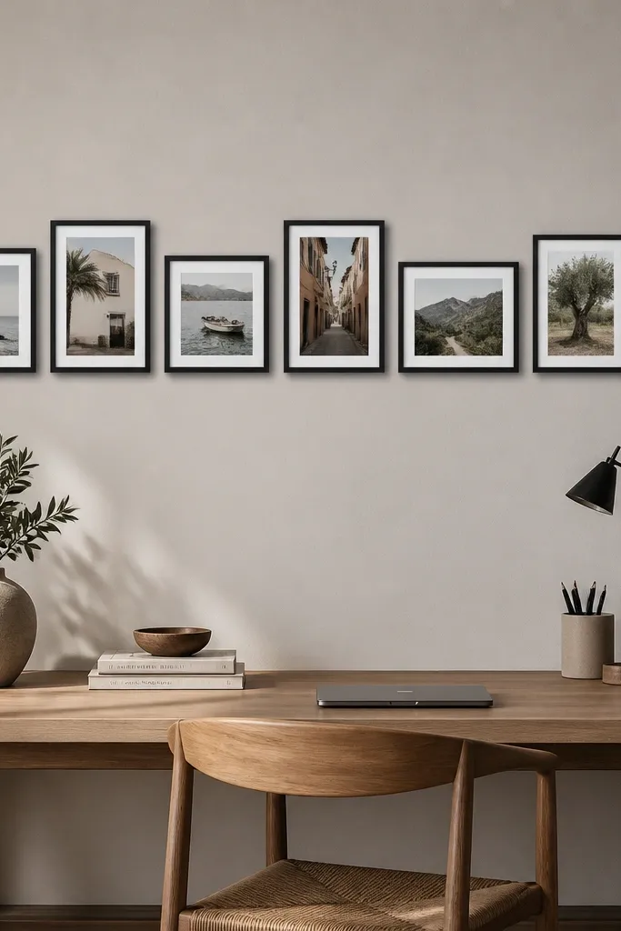
Start with seven identical frames, then remove the mat inserts so you can place photos at different sizes inside the same opening. Trim or crop photos so faces are readable at a glance, then tape each photo to the backing at the same height. Lay the frames on a foam board with 1/2 inch gaps and adjust until the strip looks balanced — I shift one frame slightly inward if the left side feels heavy. Mount and glue the frames down, then hang using two points so the board stays level over time.
This is the one I use when I have great shots but not matching crop sizes. Matching frames keep it tidy, and the mixed photo orientations add energy without looking messy. In my experience, the trick is keeping the frame finish consistent and the mat color the same, even if the photo sizes differ. It flatters rooms that have lots of horizontal lines because the strip visually follows the room’s shape. It also works well for couples and kids because the viewer’s eye moves across the story.
AvoidAvoid random alignment where faces sit at different heights — it reads sloppy fast.
Pro tipKeep all photo tops aligned even when the photo bottoms vary — it makes uneven sizes look designed.
5. Oval Window Frame Collage

Lay five oval frames on a backing board and decide on a cluster pattern — I do one larger oval in the center and four smaller ones around it. Use painter’s tape to test spacing, aiming for 3/4 inch between frame edges so the ovals don’t merge visually. Add a light wood or white foam board backing, then trace frame outlines to know where to mount. Insert photos with consistent mat spacing: same inner border thickness for every oval. Glue frames down, then add a single hanging wire across the back so the cluster sits flat.
Oval frames soften everything. When I used this in a bedroom corner, it made the wall feel calmer than a strict grid. Ovals also flatter older family photos because the softer shape looks less harsh than rectangles. If your photos include pets or kids mid-play, ovals keep the motion feeling playful instead of “ID card.” The key is to keep the frames the same color and thickness so the odd shape still feels cohesive.
AvoidDon’t mix oval and rectangle frames — it breaks the soft look.
Pro tipUse motion-friendly photos in ovals — candid shots look better because the shape feels less formal.
6. Floating Frame Layer With Clear Acrylic
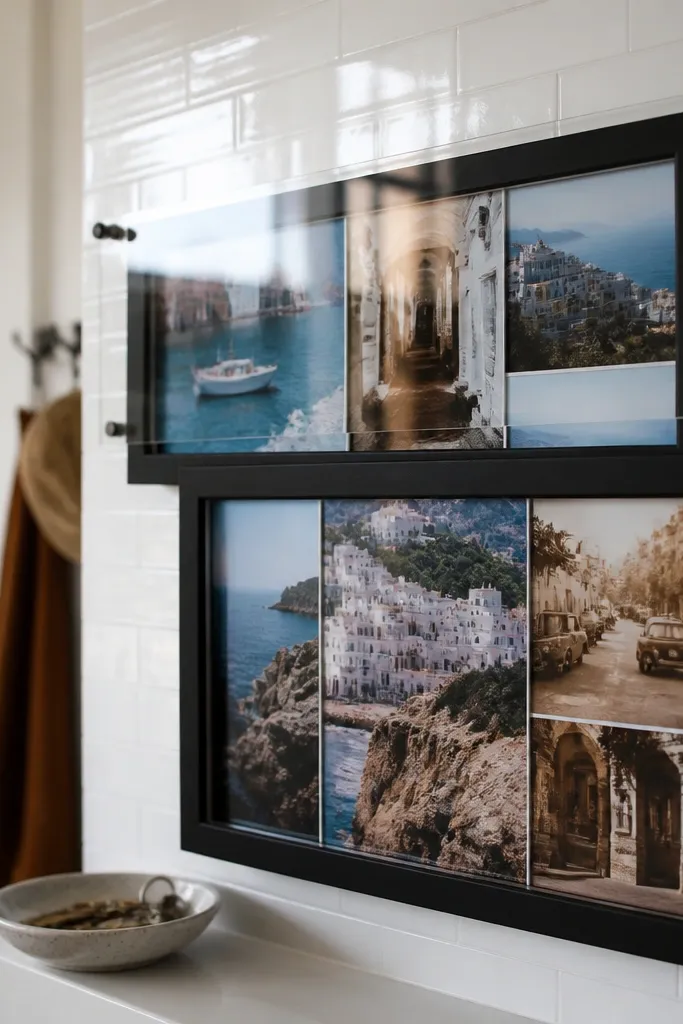
Buy frames that accept acrylic covers or use acrylic sheets cut to size. Print photos on matte photo paper so glare is controlled, then place them behind the acrylic. Mount the acrylic with the frame’s existing spacers so there’s a small air gap — it reduces contact smudges. Use a foam board backing and glue the frames down with 1/2 inch gaps. Wipe acrylic with a microfiber cloth before final assembly and again right before hanging.
This one gives a “shop window” vibe. Clear acrylic over photos makes colors look deeper and makes the collage feel more intentional, especially in a kitchen or entryway where light hits the wall. I did this with travel photos and the reflections looked cool instead of messy as long as you keep the acrylic clean. It flatters bright photos with skies or colorful walls because the acrylic adds a slight depth. The only downside is you need clean fingerprints — I learned that the hard way.
AvoidDon’t use glossy ink prints under acrylic — the shine fights the photos.
Pro tipIf you see glare, angle the collage a few degrees off level by adjusting how it sits on the hanger wire.
7. Kid Milestone Frames With Date Tags
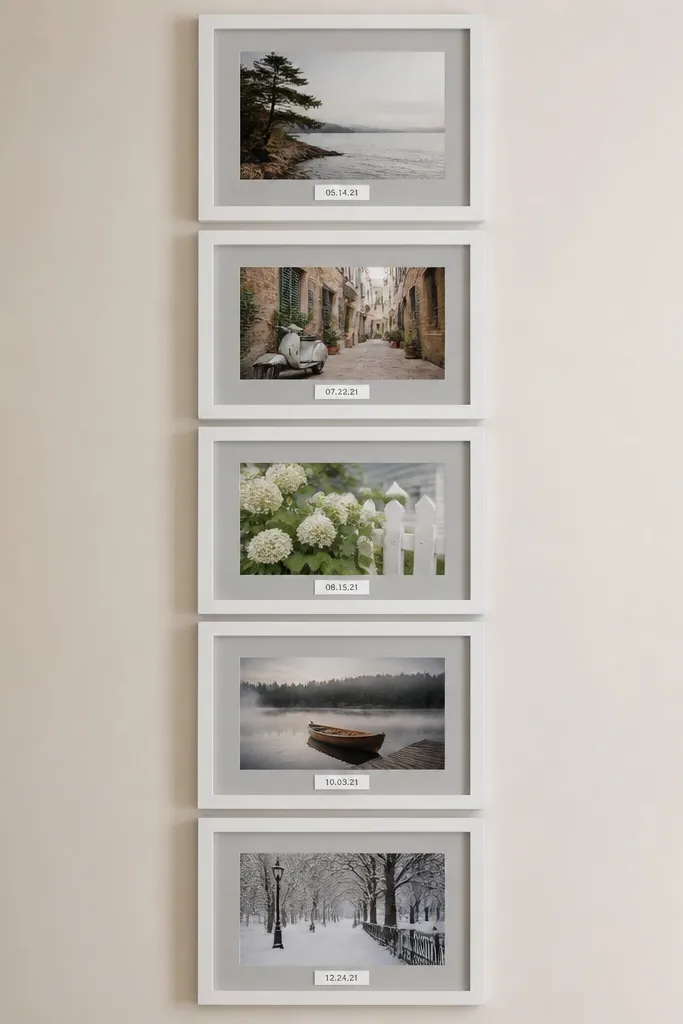
Pick five frames with the same mat opening size and consistent gray mat color. Print your photos, then add a thin strip at the bottom of each photo or mat for the date tag. I use a strip height around 1 inch and keep the text in black on a light gray background. Assemble each frame, then mount them on a foam board in a vertical line with 3/4 inch gaps so the tags stay readable. Hang with a single centered hanger strap and check level with a small phone bubble app.
Milestone photos look better when you give them a tiny anchor like a date. I’ve done this for birthdays and first-day-of-school photos, and the date tag keeps the wall from turning into a generic family collage. The gray mat keeps the text from overpowering faces. This setup flatters busy kids photos because the tag gives the viewer a clear reading path. It also makes the collage feel “organized” even when the photos themselves are candid.
AvoidAvoid tiny text — if you need to squint, it looks cheap.
Pro tipUse the same handwriting-style font for every tag so it looks like one set, not random labels.
8. Monochrome Frames With Color Pop Photos
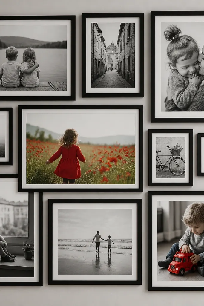
This layout makes the whole wall feel curated without forcing you to redo every photo. I start by turning most images to black-and-white, then I leave two or three color shots intact — usually a red outfit, a bright birthday cake, or a sunset. The contrast pulls your eye to the moments you care about most. It flatters rooms with neutral decor because the black-and-white frames don’t fight the furniture. If you have lots of photos that are technically similar, this method gives them a clear role.
Choose six identical black frames and decide which photos stay in color. Convert the rest to black-and-white using an editing app, then print all photos to the same size. Assemble frames with a white mat so grayscale doesn’t look muddy. Place the color photos in the center positions of the collage so they feel intentional, not random. Glue frames to a foam board backing and keep consistent 1/2 inch spacing to preserve the monochrome rhythm.
Pick color photos where one color dominates — red, teal, or yellow — so the pop is obvious from across the room.
Don’t leave too many color photos — if you go over three, the effect disappears.
9. Seasonal Frames With Fabric Backer
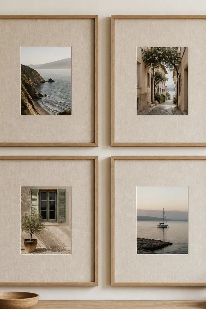
Start with four natural wood frames and remove the backing. Cut linen fabric slightly larger than the backing area, then stretch it tight and staple or glue it to the foam backing board. Place your photo in the center and tape it down so it stays flat. Assemble each frame, then mount all four to a larger backing board or hang individually in a square. Keep spacing at 1/2 inch between frames so the fabric texture still reads as one set.
Fabric behind photos adds texture you can feel from across the room. I used this for seasonal family photos and it makes the collage look like a craft project even with cheap frames. Linen or cotton fabric in warm beige tones flatters most skin tones because it doesn’t cast color like colored paper can. It also hides tiny imperfections in trimming photos. The texture works especially well if your photos include outdoor light and soft backgrounds.
AvoidAvoid shiny satin fabric — it reflects light and makes the photos look distorted.
Pro tipWash and dry the fabric first so it doesn’t shrink and ripple after you mount it.
10. Scrapbook Tape Frame Accents
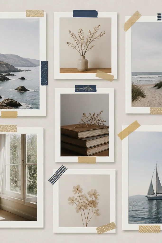
This is for when you want the collage to look playful but still clean. I’ve done it with kids' sports photos and it makes the wall feel themed without changing the whole layout. Washed-out navy and gold tape looks grown-up enough for a living room. It flatters casual photos because the tape adds a little structure around faces. The styling principle is restraint: tape only at corners or along the mat edge so it frames the photo, not fights it.
Use six white frames with gray mats and keep the photo sizes identical. Add washi tape at the corners of each mat in short strips — around 1 inch long — and press them flat with a credit card. Place the frames on a foam board backing with 1/2 inch gaps, then glue them down. If you want a stronger pattern, use the same tape colors across the entire collage, not random colors per frame. Assemble and hang, then stand back and check that tape isn’t covering any faces or important clothing details.
Trim tape edges with small scissors so the corners look crisp instead of frayed.
Don’t cover the whole mat with tape — it looks like school-project glue.
11. Polaroid-Style Overlap Frames

Overlapping photos make the wall feel like a moment, not a formal display. I used this in a reading nook with vacation shots and it made the corner feel cozy instantly. The trick is to use the same frame style and mat thickness so the overlap looks intentional. Polaroid-style borders flatter a mix of lighting because the border gives the photos a uniform “printed” look. It also hides small inconsistencies in photo brightness.
Pick six frames with thick white mats or buy frames that let you insert cardstock mats. Print your photos with a white border around them (I leave about 1/4 inch on each side), then trim to fit. Mount each photo slightly offset so it overlaps the next by about 1 inch, keeping all overlaps in the same direction for cohesion. Attach frames to a foam board backing in a staggered cluster, not a straight grid, and keep the total footprint centered. Hang using two hanger points so the cluster doesn’t tip forward.
Choose photos with similar color temperature — warm with warm — so the faux instant look stays consistent.
Don’t overlap randomly with different border thicknesses — it becomes visually noisy.
12. Matless Frame With Cropped Faces

Choose nine identical frames with the same inner dimensions and remove the mat insert. Crop each photo so the face is centered and fills most of the frame, leaving no important hair or shoulders cut off. Print photos at the exact size needed so you don’t stretch anything. Lay frames on a foam board with 1/2 inch gaps, then glue them down after you confirm spacing. Hang as one unit and check from the side — matless frames show crooked alignment more clearly.
Matless frames make photos feel modern and bold because the image goes right to the edge. I do this when the photos are already well composed and you have clear faces or strong scenes. It flatters people because close crops keep eyes sharp and reduce distractions from messy backgrounds. This look also works in small rooms because it uses the frame area efficiently. If your photos are low resolution, this style shows it — so pick your best shots.
AvoidAvoid using photos with busy backgrounds — edge-to-edge makes clutter obvious.
Pro tipUse close-up portraits with a plain or softly blurred background for the cleanest edge-to-edge look.
13. Framed Timeline With Sticky-Note Labels
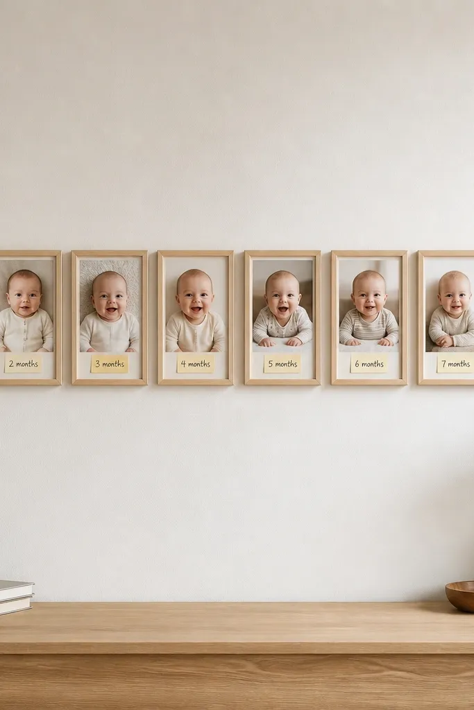
A timeline collage turns random photos into a story you can read quickly. I’ve used it for kids' growth across a year, and the sticky-note style keeps it casual instead of scrapbooky. Light wood frames keep it warm and friendly, and the labels help you remember when each photo happened. This layout works especially well for rooms with neutral decor because the labels add the color. The styling principle is a consistent label size and placement so the eye follows left to right.
Pick eight frames with the same width and inner photo size. Create labels by printing on light pastel paper, then cut rectangles about 1.25 inches tall and place them at the bottom of each photo or mat. Use the same label background color for all frames, and only change the date text. Arrange the frames left to right on a foam board with 1/2 inch gaps, then glue in place. When assembling, keep the label baseline aligned across all frames so it reads as one timeline.
Write dates in a simple format like 3/12/25 so it looks consistent and easy to scan.
Don’t use different label sizes — it breaks the timeline rhythm.
14. Spring Green Frame Set With White Edge Divider

Choose four frames with the same spring green finish and identical dimensions. Cut a foam board backing and add a white border strip between frames by using white cardstock or thin foam sheet — about 1/4 inch wide. Dry-lay the frames and divider strips, then glue the dividers down first so spacing stays even. Insert photos and make sure the photo centers align across all four frames. Glue frames onto the dividers and hang the board using a single centered hanger strap.
Colored frames can look intentional when you add a divider that ties everything together. Here, spring green frames give you a fresh hit, and the white divider between frames keeps the collage crisp. I used this in a laundry room with kid outdoor photos, and the green made the space feel brighter without changing the whole room. It flatters photos with greens and blues because the frame color echoes the scene. If your photos have lots of neutral backgrounds, the green frame still gives them a “theme.”
AvoidAvoid mixing two green shades — it makes the wall look accidental.
Pro tipPick one frame color and repeat it — matching hardware and screw color matters more than you think.
15. Kids Artwork to Photo Collage in One Wall
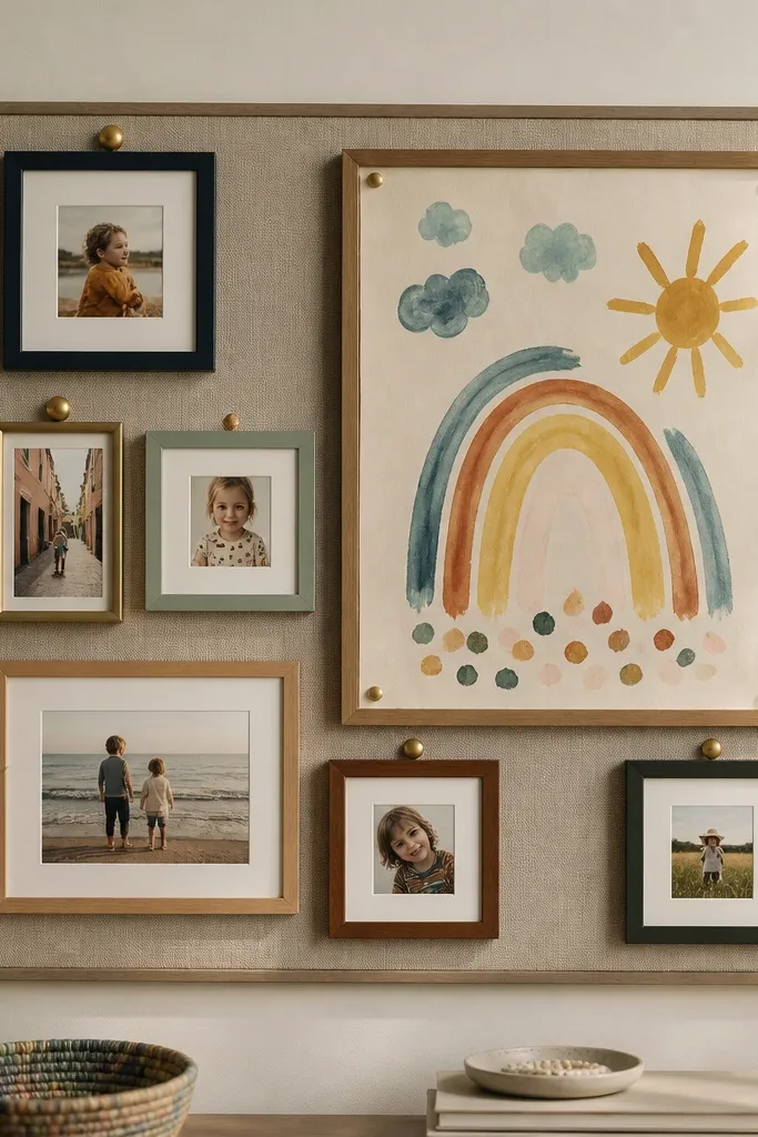
This is the wall solution when you want photos but you also want the kids' art to stay up without cluttering the fridge. I’ve done a layout like this in the dining room and it keeps everything in one place. The trick is to keep the frame finish the same and use simple mats so artwork and photos don’t compete. It flatters the whole family because the wall includes what the kids made, not just what the adults took. Choose artwork with bold colors that match your photo clothing palette so the wall feels coordinated.
Pick one larger frame for the kids' artwork and four smaller frames for photos, all with the same frame finish. Cut a backing board that fits the full layout and mark out your frame positions with 1/2 inch gaps. Place the artwork in the big frame with a mat or foam board spacer so it doesn’t touch the glass. For the photo frames, use a consistent mat color and insert printed photos sized to the same opening. Glue frames to the backing board and hang it as one piece, then adjust the bottom row so the artwork frame sits centered above the dining table.
Take a quick photo of the artwork before you frame it — you’ll have a digital copy when the kid makes the next one.
Don’t let art sit under dirty glass — smudges make the whole wall look neglected.