1. Cocoa Speckle + Cream Snowcaps
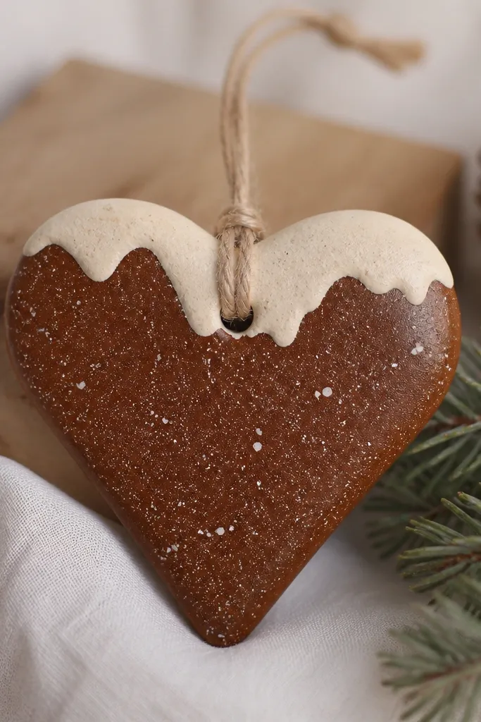
Step one: after sanding and sealing, prime with white gesso or a light craft primer so the cocoa doesn’t go patchy. Step two: paint the whole heart cocoa brown, let it dry 20-30 minutes, then dry brush cream on the top edge and a few bumps. Step three: flick a stiff toothbrush loaded with diluted cream paint to make tiny speckles — keep your wrist close to the surface. Finish by sealing again with a satin clear coat so the cream snowcaps don’t chalk.
I love this look because it reads cozy even when you use cheap craft paint. Start with a base coat of warm cocoa brown so the ornament looks like it’s been in a winter bakery window. Then I dry brush cream only on the top third and around the edges, leaving the middle darker for depth. The speckles are small and irregular, which makes the heart look more natural and less “stamped.” It flatters warm interiors and anyone who likes a softer, lived-in holiday vibe.
AvoidAvoid painting thick cream on top — it looks like paste and kills the speckle texture.
Pro tipDilute the speckle paint just enough that it flicks, not blobs. Test on paper first so the dots are the size you want.
2. Icy Blue Ombre Star

Step one: paint the star base coat with a mid-blue, then let it dry. Step two: load a flat sponge with navy and dab it into the tips and outer edges, then lightly blend toward the center with a barely damp sponge. Step three: add pale ice-blue to the center and feather outward so the transition is smooth. Step four: once dry, outline the star edges with a thin brush using a slightly darker blue for crisp definition, then seal with satin clear.
This is the ornament look that makes your tree look “put together” without adding complicated art. The ombre effect makes the star feel dimensional, especially on the points where light hits. I use a dark-to-light blue plan because it flatters cool color homes and looks great next to silver garland. The center stays lighter so it catches light like frosted glass. It also looks clean from a distance, which matters when you’re hanging a lot of ornaments quickly.
AvoidDon’t try to do the gradient in one heavy layer — you’ll get tide marks.
Pro tipUse a sponge for blending, not a brush. Brushes leave streaks that show up fast under warm lights.
3. Charcoal Concrete Look
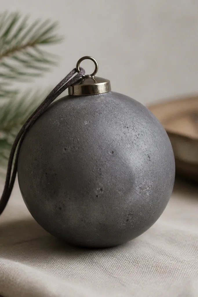
This one looks modern and grown-up, and it hides small dough imperfections better than bright colors. The charcoal base gives you that “cement” feel, while lighter gray smears and specks make it look like texture, not mistakes. I use it for family ornaments because it’s forgiving and still looks intentional. It flatters minimalist homes and works with both silver and black ribbon. The matte finish is key — gloss makes it look like plastic.
Step one: prime with gray-toned primer or seal, then paint the ornament charcoal gray in thin coats. Step two: mix a lighter gray (add a little white craft paint) and dab it on with a torn makeup sponge, then drag once or twice with a dry brush to mimic concrete movement. Step three: use a toothbrush flick with very diluted light gray to add tiny specks. Step four: keep it matte with a matte clear coat, not satin.
Tear your sponge instead of using a smooth one. The torn edge creates better irregular texture.
Avoid glossy clear coat on this style — it turns the texture into a shiny patch.
4. Marbled Red Ribbon Candy
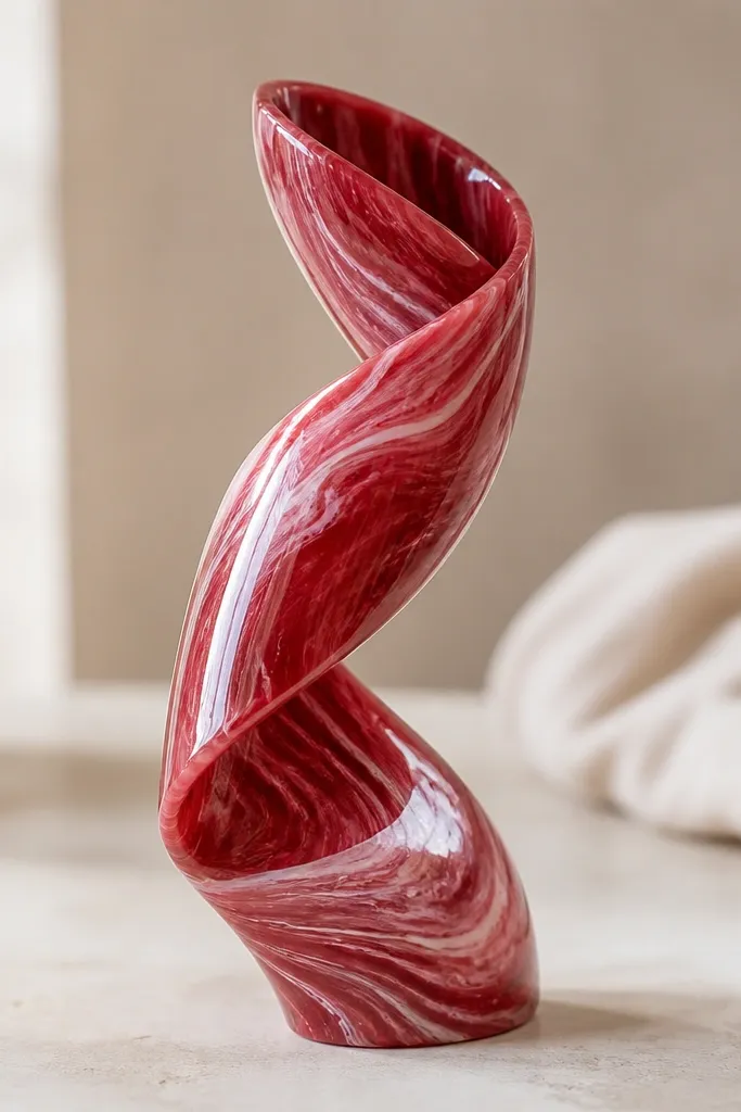
If you want a “store-bought candy” vibe, marbling does it fast. The twisted ribbon shape catches light and makes the swirls look like candy coating. I keep the palette tight: deep red, rose pink, and a tiny bit of white so it never turns pink mush. This looks great on trees with red accents or warm gold lights. It also flatters hands-on families because the technique is repeatable batch to batch.
Step one: prime and paint a base deep red, then let it dry fully. Step two: in a small cup, mix rose pink with a little clear medium or water so it flows, then dab it across the surface in streaks. Step three: drag a toothpick through the streaks in short motions to form swirls, then add a few thin white lines for “ribbon highlights.” Step four: seal with satin clear coat in two thin passes to keep the marbling crisp.
Use a toothpick for the swirls and wipe it often. Clean lines depend on a clean point.
Don’t over-blend. If you keep dragging, the swirls disappear into one flat color.
5. Gold Leaf Edges on Matte Cream
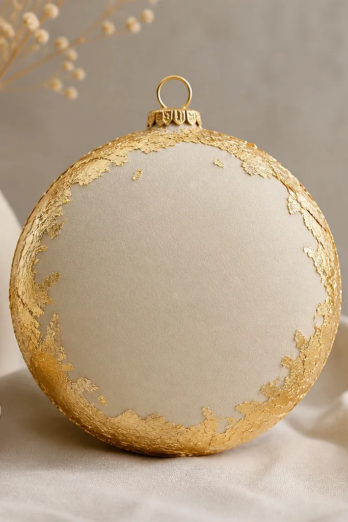
This look reads fancy without you having to paint tiny details. I do a matte cream base because it makes gold leaf pop without looking loud. The gold only on the edges creates a frame effect, and it hides any uneven thickness from rolling dough. It works beautifully for families who want something timeless and neutral. It also looks great on trees with white lights because the gold catches those warm points.
Step one: after sealing, paint the ornament matte cream using two thin coats. Step two: apply a thin gold-leaf adhesive only along the outer rim — don’t spread it across the center. Step three: press gold leaf onto the adhesive, then tap off excess with a soft brush. Step four: seal lightly with a matte or satin clear coat so the leaf doesn’t lift.
Gold leaf grabs fastest when the adhesive is tacky, not wet. Touch test on a scrap first.
Avoid sealing too soon after adhesive — trapped wetness can dull the gold.
6. Vintage Green + Distressed White Letters
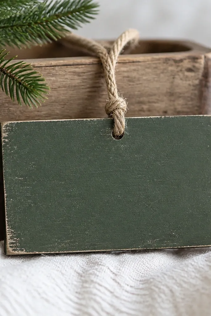
Step one: prime and paint pine green, then let it dry completely. Step two: stencil your word or initials with white paint — I use a stencil brush so the paint doesn’t bleed under the edges. Step three: after the stencil dries, dry brush a little off-white around the corners and lightly sand raised spots with 220 grit to create distress. Step four: seal with matte clear to keep the aged look.
This is my go-to when parents want personalized ornaments that still look “heritage,” not kid-made. The muted pine green base keeps it vintage, and distressed white letters make the text readable without glossy shine. I like rectangles and tags for this because the letter space is clear and forgiving. The worn edges make it look intentional, like it’s been on a mantel for years. It flatters warm wood tones and cozy farmhouse decor.
AvoidAvoid thick white paint for letters — it bridges stencil edges and looks heavy.
Pro tipUse a stencil with cut lines you can press flat. Loose stencils cause fuzzy letters.
7. Rose Clay Blush Faces

Step one: prime with a light base, then paint blush pink in two thin coats. Step two: use a fine liner brush for two small cheek dots in rose (slightly darker than the base). Step three: paint two tiny black eyes and add a short curved smile with watered-down black paint so it doesn’t look like a marker. Step four: seal with satin clear to keep the blush tone smooth.
This style is cute without being childish. The blush pink base looks flattering on most homes because it’s soft and warm, and it pairs with gold or white ribbon. I keep the face features minimal: two dots for cheeks, small eyes, and a simple smile. The simplicity reads clean from across the room, which is what you want for a parent gift. It’s also a great “family craft” because kids can help paint the cheeks and smile while you do the tiny eyes.
AvoidSkip the big eye dots. Oversized eyes make the ornament look like a sticker.
Pro tipPractice the eye size on a scrap ornament first. Dot eyes vary a lot depending on brush tip.
8. Monochrome Black Marble
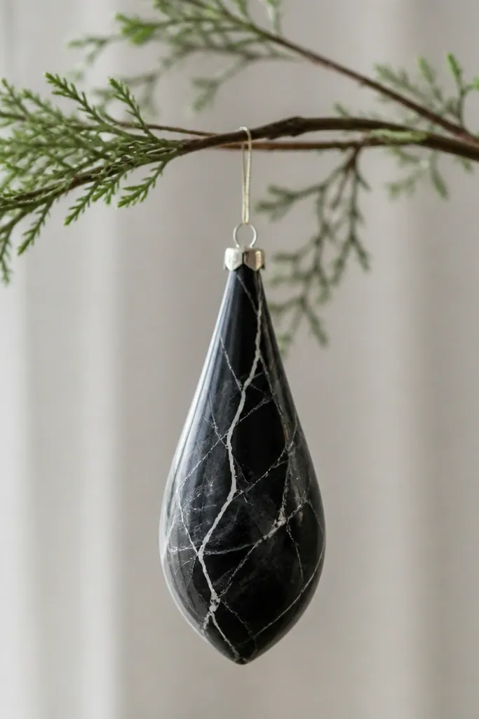
Monochrome marble looks expensive and hides small flaws in the dough. The black base makes the ornament feel modern, and gray veining adds movement without adding extra colors. I use this for minimalist trees and for gifts that don’t match the usual red/green palette. The satin clear coat gives a slight light bounce like stone, without turning glossy. It also looks sharp against matte ribbons and black-and-white garlands.
Step one: paint the ornament solid black and let it dry fully. Step two: mix gray paint (black + white) and load a small round brush — drag thin wavy lines across the surface, then add a second thinner line beside it for veining depth. Step three: add a couple of tiny white highlights where light would hit. Step four: seal with satin clear in two light coats so the marble lines stay visible.
Veins look best when they’re uneven. Do one thicker, one thinner, then stop.
Don’t flood the veining. Too much gray turns it into messy smudges.
9. Speckled Cinnamon Stain Look
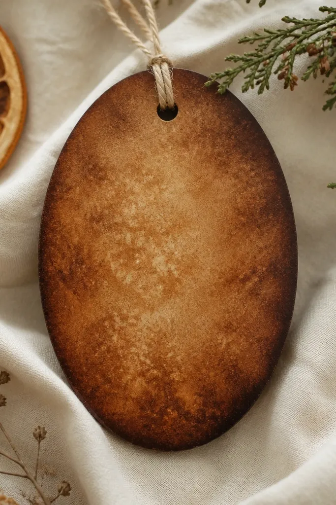
This look mimics stained wood and smells like holiday without needing real fragrance. The cinnamon wash gives warm tone, and speckles make it feel textured, like grain. I do this for ornaments that hang on front doors or near kitchens because the matte finish hides scuffs. It flatters rustic decor and looks good with twine or natural linen ribbon. The best part is that it forgives uneven dough thickness because the wash blends it all.
Step one: after sealing, paint a base cinnamon brown using a watered-down wash (about 1 part paint to 1 part water). Step two: while still slightly tacky, dab lighter beige with a sponge in small random patches. Step three: flick a diluted darker cinnamon mix for deeper speckles along the edges. Step four: after dry, lightly sand the high points and seal matte clear.
Use a sponge for the speckles, not a toothbrush, if you want smaller, more controlled dots.
Avoid painting thick wash — it dries glossy and looks like paint, not stain.
10. Pastel Rainbow Stripes Tag
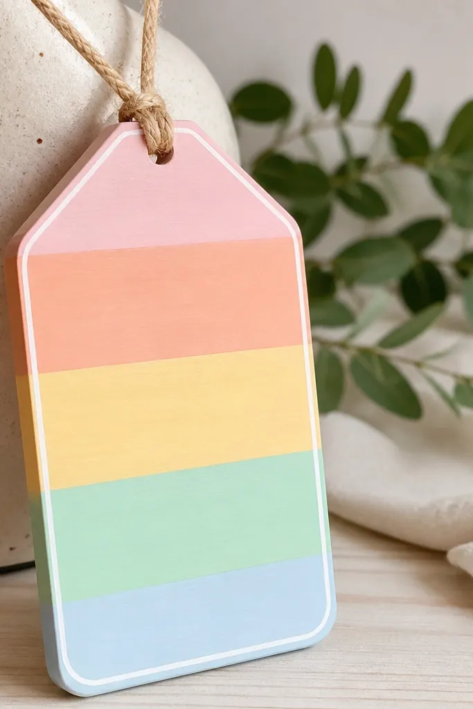
Step one: prime and paint the tag white, then let it dry. Step two: mask the stripes with painter’s tape, spacing them about 1/4 inch wide, and paint each stripe a different pastel. Step three: remove tape while paint is still slightly tacky so edges stay sharp. Step four: outline the border with a thin white line using a fine brush, then seal satin clear.
This is the ornament I make when the tree theme is “colorful but calm.” Pastels read gentle and work with white lights and simple ribbon. The tag shape gives you a neat surface for stripes, and the white border makes the colors look clean instead of messy. It’s flattering for kids' rooms and for parents who want something cheerful that still looks tidy. Keep the stripes even and the finish sealed — you’ll get that crisp “gift label” vibe.
AvoidAvoid freehand stripes. They drift and the whole ornament looks crooked.
Pro tipPress tape edges down with a fingernail so paint doesn’t seep underneath.
11. Matte Forest Green Pinecone Texture
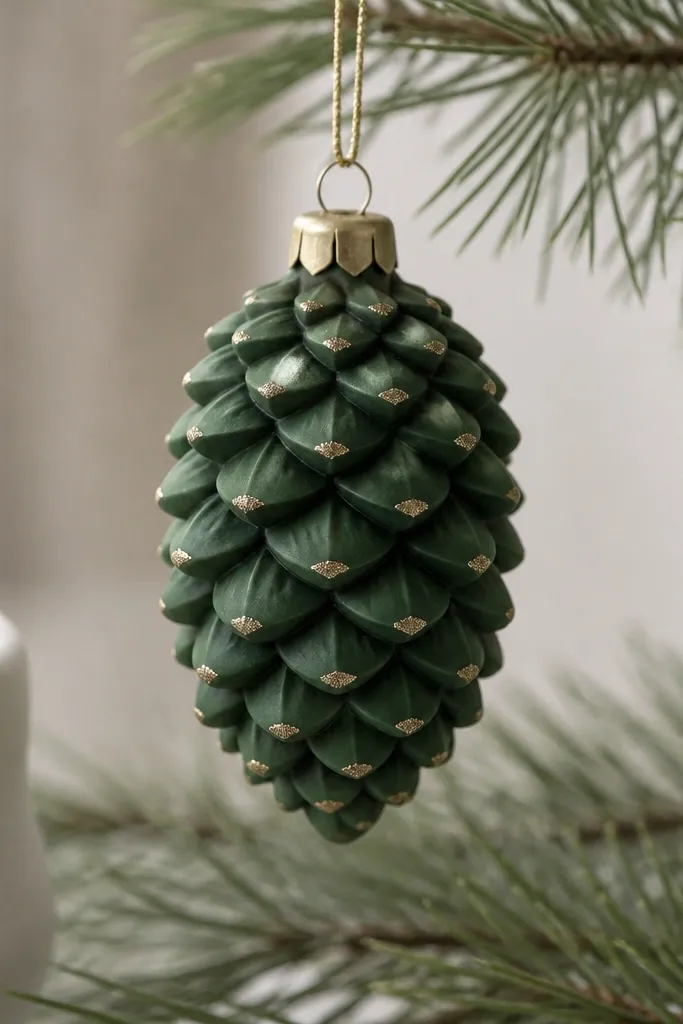
Texture makes salt dough ornaments look expensive, even when you’re not good at painting. Pinecone shapes are forgiving because the ridges hide small unevenness. I use matte forest green so it looks like dried pine, then I deepen the grooves with a darker shade for realism. Gold specks on the tips mimic tiny “frost” highlights. This one looks great on trees with earthy tones and pairs well with burlap or dark green ribbon.
Step one: prime and paint the whole pinecone forest green. Step two: mix a darker green and use a small brush to paint only the grooves, letting the base color show through. Step three: add gold specks with a toothbrush flick — keep it light so it doesn’t turn into glitter blobs. Step four: seal with matte clear to keep the pinecone from looking like candy.
Use a smaller brush than you think. Grooves need control, not coverage.
Avoid heavy glitter. It fills ridges and flattens the pinecone shape.
12. Silver Brushstroke Snow
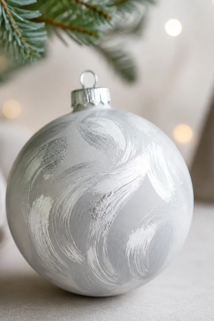
This look looks like the ornament is catching snowfall in motion. The round shape gives you room for sweeping brushstrokes that look good even from close up. I use a light gray base so silver doesn’t overpower, then I layer silver in strokes that follow the curve. It flatters cool palettes and looks sharp with navy ribbon or white string lights. The key is that the strokes stay visible — that’s what makes it feel hand-painted, not stamped.
Step one: prime and paint a light gray base. Step two: load a flat brush with silver craft paint and apply thick strokes in arcs across the surface. Step three: add a second silver layer only on the highest strokes for shine variation. Step four: once dry, seal with satin clear — matte would kill the sparkle effect.
If silver looks chalky, add a drop of clear medium to your paint so it levels.
Avoid thin silver washes. They dry uneven and look like dust.
13. Marigold Sunburst Center
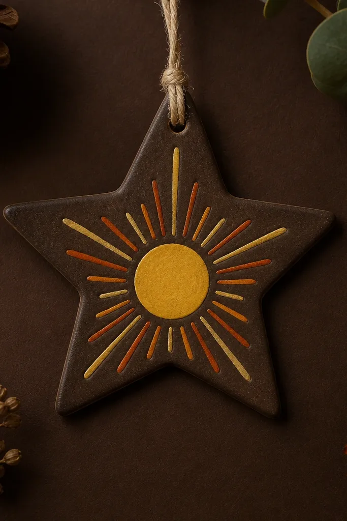
Step one: paint the star deep brown and let it dry. Step two: paint a marigold center circle using a small cup rim as a guide, then outline it with a slightly darker orange. Step three: add ray lines with a thin brush from the circle to the star points, spacing rays evenly and keeping line thickness consistent. Step four: seal satin clear to keep the yellow looking clean.
Sunburst designs make ornaments look bright even when the rest of your tree is busy. I like a deep brown background because the yellow center pops instantly. The ray lines give movement, and the center circle keeps it from looking like a random pattern. This style looks great on trees with warm bulbs, and it flatters people who like gold, amber, and earthy reds. It’s also easy to scale up for a parent gift set because you repeat the same ray spacing each time.
AvoidAvoid painting rays too thick. Thick rays turn into stripes and lose the sunburst effect.
Pro tipMark ray positions lightly with pencil first — erase after painting the lines.
14. Cream + Brown Rope Tie Bow
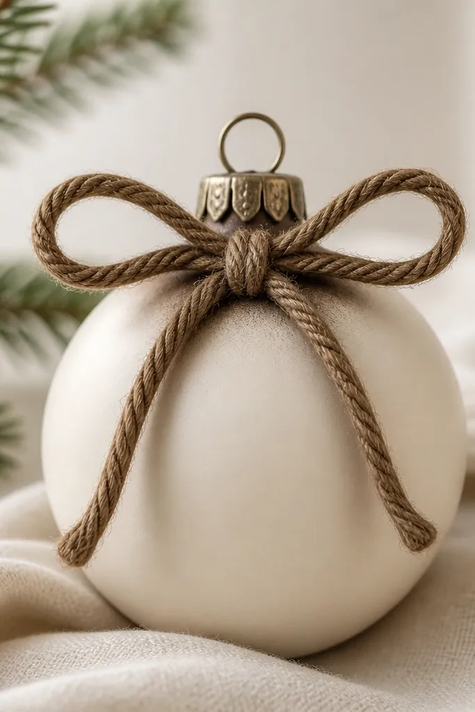
This one looks like a gift tag that got promoted to an ornament. The 3D rope bow adds real dimension, so it reads from across the room even if the paint is simple. I keep the base cream so the rope looks like twine, and I add brown shading around the bow so it looks attached, not glued on top. This style flatters rustic decor and it pairs with kraft paper wrapping and natural ribbon. It also works for kids because the rope bow is forgiving and fun to make.
Step one: paint and seal the ornament cream, then let it cure fully. Step two: cut a short length of brown jute or craft rope, coil into two loops for a bow, and tie a small knot in the middle with thread. Step three: glue the bow at the top with hot glue or strong craft glue, then add a tiny dot of brown paint around the base of the bow to blend edges. Step four: seal the whole ornament carefully, avoiding heavy spray directly over the rope fibers.
After gluing, press a piece of paper towel over the bow for 10 seconds. It helps the glue grab without stringy mess.
Avoid soaking the rope with clear coat. It can darken unevenly and feel stiff.
15. Navy Chalkboard Paint with White Writing

Step one: prime, then paint with chalkboard paint or matte acrylic in deep navy — two coats. Step two: after it dries, write with a white paint pen or white acrylic with a fine brush. Step three: add doodles around the text and let everything dry. Step four: seal lightly with matte clear coat, but test first on a scrap because some chalk paints get shiny under heavy spray.
Chalkboard-style ornaments are a parent-pleaser because they look neat and you can change the message later. Navy gives you a rich base that makes white writing pop, and the matte finish hides minor sanding marks. I keep the writing big and simple: one word or a short date, plus one doodle like a star or tiny heart. This works best for tag shapes or circles because the writing fits cleanly. It also flatters homes with black accents and modern garlands.
AvoidAvoid regular glossy clear coat — it kills the chalkboard look.
Pro tipUse painter’s tape to mask the writing area so the edges stay crisp.
16. Glitter Ombre Edge on Matte Base
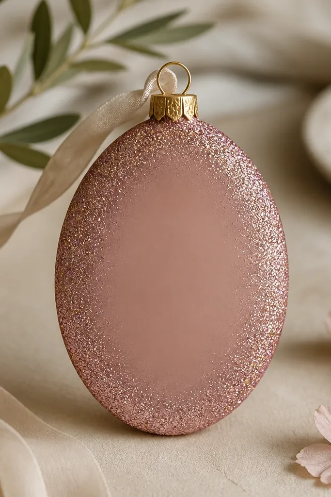
Glitter edges look fancy because they frame the ornament. The matte base keeps it from looking like a craft store ornament, and the ombre glitter fade makes it feel intentional. I use dusty rose because it’s flattering and not too loud, but you can swap in sage, light blue, or charcoal. This style works well for family sets because it’s quick: every ornament has the same edge treatment. It also photographs well under warm lights.
Step one: prime and paint the ornament matte dusty rose. Step two: mix a small amount of craft glue with a tiny dab of water so it spreads thinly. Step three: paint glue on the outer edge only, then dip or sprinkle glitter — heavier at the edge and lighter as you move inward by using less glue. Step four: after it dries, shake off loose glitter and seal with matte clear in one careful coat so glitter doesn’t shed.
Seal with matte clear over glitter, then let it dry upside down so excess doesn’t pool.
Avoid piling glitter into a thick band. It looks lumpy and rough.
17. Copper Wash + Antique Brass Highlights
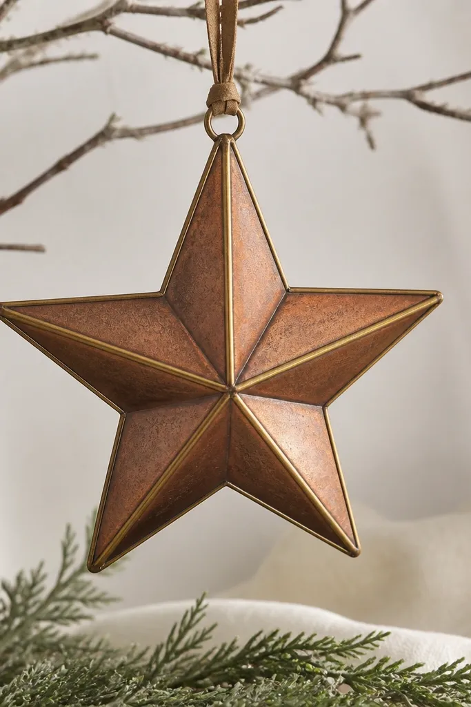
Step one: prime and paint a base warm brown, then add a copper wash by mixing brown paint with a little metallic copper acrylic and water. Step two: once dry, outline the star points and outer edges with antique brass paint using a fine brush. Step three: add a couple of tiny faux screw dots by tapping a toothpick dipped in brass paint. Step four: seal with satin clear so it looks metallic but not mirror-shiny.
Copper washes look warm and collectible, like old hardware. The copper tint gives you that aged metal feel, and antique brass highlights add definition where light hits. I use this when I want ornaments that match vintage decor without needing real metal leaf. It flatters both warm and neutral homes and looks especially good with cream ribbon and warm white bulbs. The trick is to keep the brass lines thin so they look like accents, not a second paint layer.
AvoidAvoid brushing metallic paint back and forth — it streaks.
Pro tipMetallic paint looks best in thin coats. Two thin layers beat one thick coat every time.
18. White Lace Stencil Effect
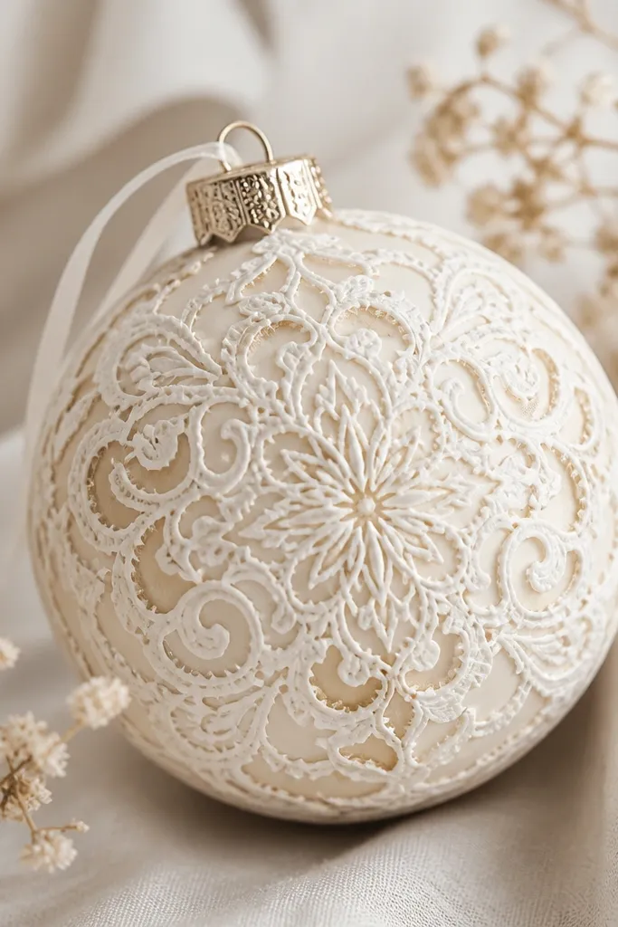
Step one: prime and paint the ornament cream, then seal with matte clear. Step two: tape a lace stencil flat and apply white stencil paint with a sponge — dab, don’t brush. Step three: remove the stencil carefully and let the paint dry. Step four: shade lightly around the stencil edges with a tiny amount of off-white or beige so the lace looks dimensional, then seal satin for a gentle glow.
Stencil lace makes salt dough ornaments look delicate, and it hides the roughness that raw dough can show. I use a cream base and white stencil pattern so it stays soft — you’re going for “doily” not “wedding cake.” The pattern reads best when it’s slightly raised, so you stencil after sealing and priming. This works for parents who want a gift ornament that looks classy with minimal painting skill. It also flatters vintage decor and rooms with beige, ivory, and gold accents.
AvoidAvoid thick paint on the stencil. It bleeds and the lace lines turn fuzzy.
Pro tipWarm the stencil with your hands for 10 seconds so it lies flatter and reduces paint seep.
19. Terracotta Handprint Keepsake
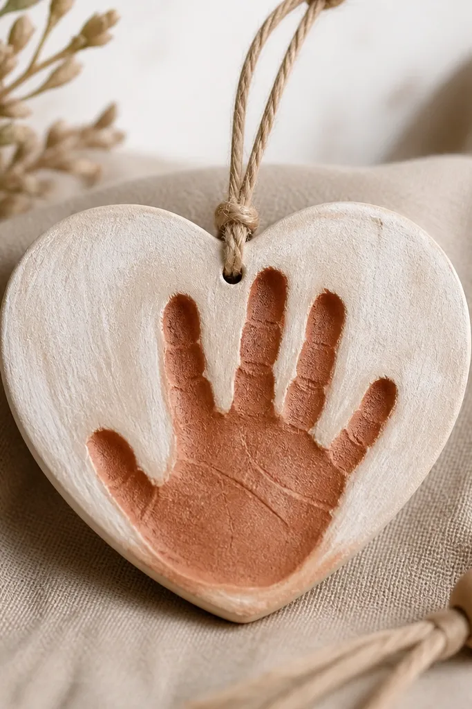
Step one: press the handprint into rolled dough gently, then cut and bake as usual. Step two: seal lightly and paint the whole ornament terracotta, pressing paint into the handprint grooves with a small brush. Step three: once dry, dry brush cream over the highest raised areas — keep the cream mostly off the deep lines. Step four: add a thin outline around the heart with darker terracotta for definition, then seal satin clear.
Handprint ornaments are sentimental in the best way, and you still want them to look clean. I like terracotta because it’s warm and forgiving, and the pressed handprint gives natural texture that paint can cling to. The contrast comes from painting the base terracotta, then dry brushing a lighter cream over raised areas so the handprint looks like it’s popping. This style flatters warm lighting and looks good on trees with neutral ornaments. It’s also the one keepsake where you’ll thank yourself later for sanding — the handprint catches every crumb.
AvoidAvoid painting over crumbs. Sand first or the paint will look gritty.
Pro tipIf the handprint edges look fuzzy after baking, sand only the rim, not the print. The texture is the point.
20. Monogrammed Black Velvet Finish
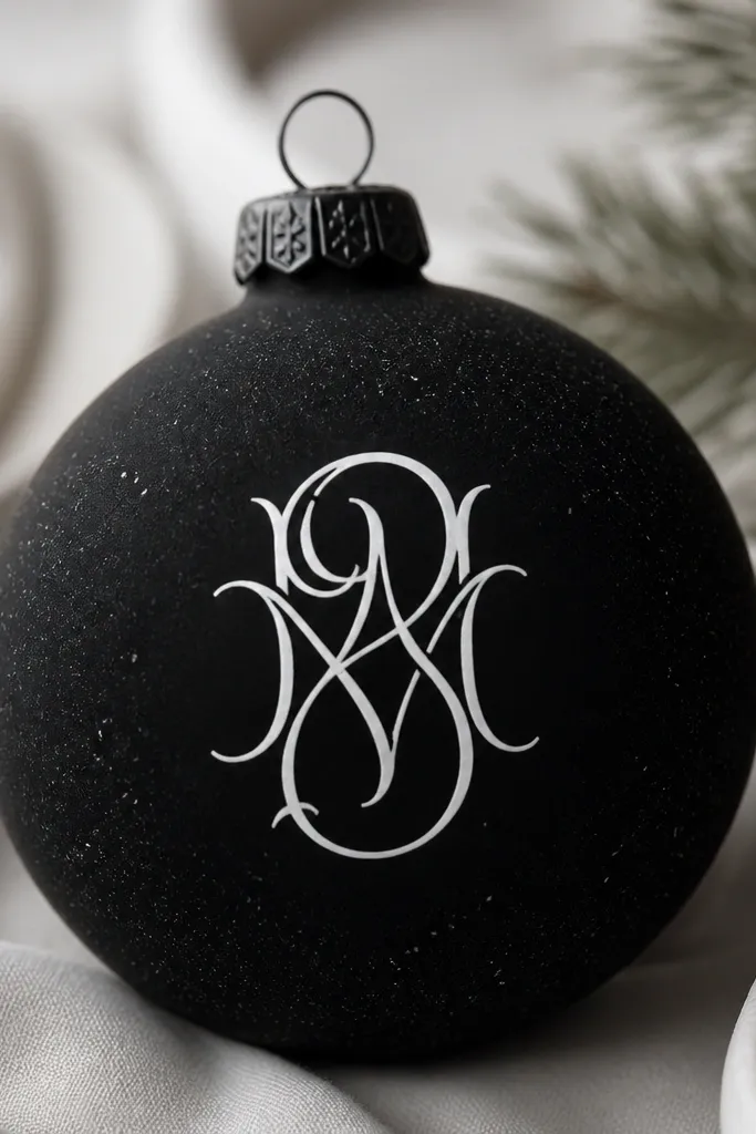
This is the “my kid made it but it looks like design” ornament. The black matte base makes the monogram crisp, and the subtle gray speckles add depth so it doesn’t look flat. I like it for names and dates because the contrast stays readable. It works in both modern and traditional settings, especially with white string lights or warm gold. It also photographs well, which matters if you’re taking parent gift photos.
Step one: sand, seal, then paint the ornament black matte in two thin coats. Step two: add tiny gray speckles by flicking diluted gray paint with a toothbrush — keep it sparse. Step three: stencil or freehand your monogram with white acrylic on a fine brush, then let it dry. Step four: seal with matte clear, but do it lightly so the speckles stay soft.
Stencil monograms with painter’s tape edges pressed flat. It keeps letters sharp.
Avoid glossy black. It shows every brush mark and looks cheap fast.