1. Cinnamon-stick star ornaments with browned edges

I love this look because it hides tiny drying imperfections. You paint the star center a soft off-white, then you add a thin brown wash only on the outer edge — it makes the shape look intentionally aged. The cinnamon-brown contrast looks best on warm skin tones in photos and looks cozy under amber lights. It also forgives uneven browning because the edge is supposed to look “hand-finished.” The styling principle is edge control: you make the visible variation belong to the design.
Roll your dough to 1/4 inch, cut stars, and punch the hanging hole before baking. After baking and cooling, lightly sand the surface with 220 grit so the wash doesn’t streak. Mix a brown acrylic wash with water (about 1 part paint to 3 parts water) and brush it only along the outer 1/8 inch of the star. When it dries, paint the center with an off-white acrylic and let it dry fully before sealing.
Use a damp makeup sponge to dab the brown wash — it gives a soft gradient instead of a harsh line.
Skipping sanding makes the wash cling to bumps and makes the ornament look patchy.
2. Snow-dusted pinecones with clear texture lines
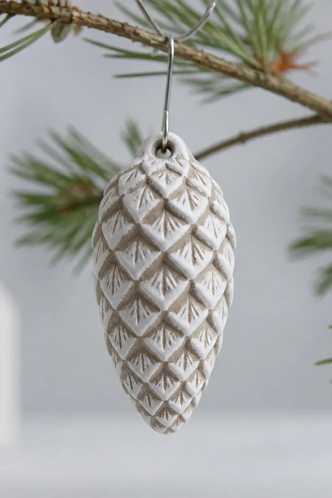
This one looks “expensive” because the texture stays sharp. I press a real pinecone into rolled dough to get ridges, then I paint the valleys gray-brown and the ridges a snowy white. Under daylight, the ridges catch light and the valleys recede, so it reads clearly even if your paint application isn’t perfect. It flatters any decor color because the palette sits between gray and warm tan. The styling principle is contrast mapped to texture — paint follows the ridges.
Pro tipDry-brush with a nearly dry brush — you should see white catching only on the peaks.
Roll to 1/4 inch, press the pinecone firmly, and lift straight up so the ridges don’t smear. Bake low at 200°F until fully dry, then cool in the oven with the door cracked. Mix a gray-brown acrylic base and brush it into the valleys, then dry-brush white paint across the ridges. Finish with a matte clear sealer so the texture stays readable instead of glossy.
AvoidPainting over the texture before it’s fully dry causes paint to sink and dull the ridges.
3. Monochrome black ornaments with gold crackle accents
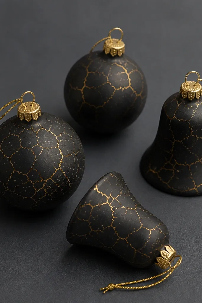
Matte black is unforgiving, so it’s a great test of crack-proof drying. When your dough dries evenly, black paint looks smooth instead of patchy. I add gold crackle accents only where you’d expect natural “age,” like around borders or along bow shapes. This looks sharp with silver trees and also works with warm bulbs because gold warms the black without turning it orange. The styling principle is controlled contrast: one strong base, one intentional highlight layer.
After baking and cooling, prime with a thin coat of white gesso if your dough looks uneven. Paint matte black acrylic in two light coats, letting the first dry completely. For the crackle look, brush a thin layer of metallic gold paint and drag a dry toothbrush lightly across it — keep it subtle. Seal with a matte clear coat to lock the gold in and keep black from scuffing.
If the black looks streaky, add a drop of acrylic flow improver to your paint — don’t add water.
Trying to fix cracks with heavy paint makes the surface thick and can peel later.
4. Pastel ornament set with ombré bands
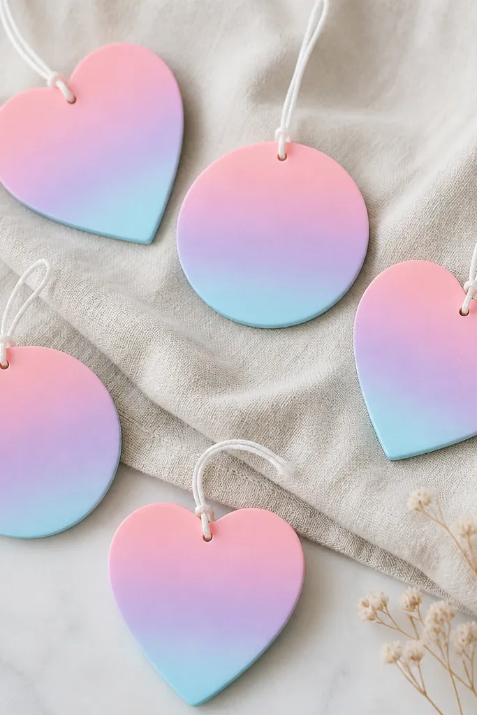
Ombré bands look clean when the ornament surface is smooth and dry — cracked dough makes paint break at the fissures. I pick three pastels that blend well: blush pink, lavender, and pale blue. The trick is to keep the bands narrow and let each layer dry before blending the next. This set looks best in bright rooms and on white trees because the colors stay airy, not muddy. The styling principle is gradual color transitions with dry layers.
Pro tipUse one sponge for blending and wipe excess paint off on scrap paper between colors.
Roll to 1/4 inch and cut consistent shapes, then punch holes right after cutting. Bake low, cool slowly, and sand lightly with 220 grit. Paint a blush-pink base across the top third, then blend into lavender at the middle using a slightly damp sponge. After it dries, repeat the blending from lavender into pale blue at the bottom third. Seal with a satin clear coat so pastels don’t look chalky.
AvoidRushing the blend before each color sets creates muddy transitions.
5. Red-and-cream holiday tags with tiny stamped dots
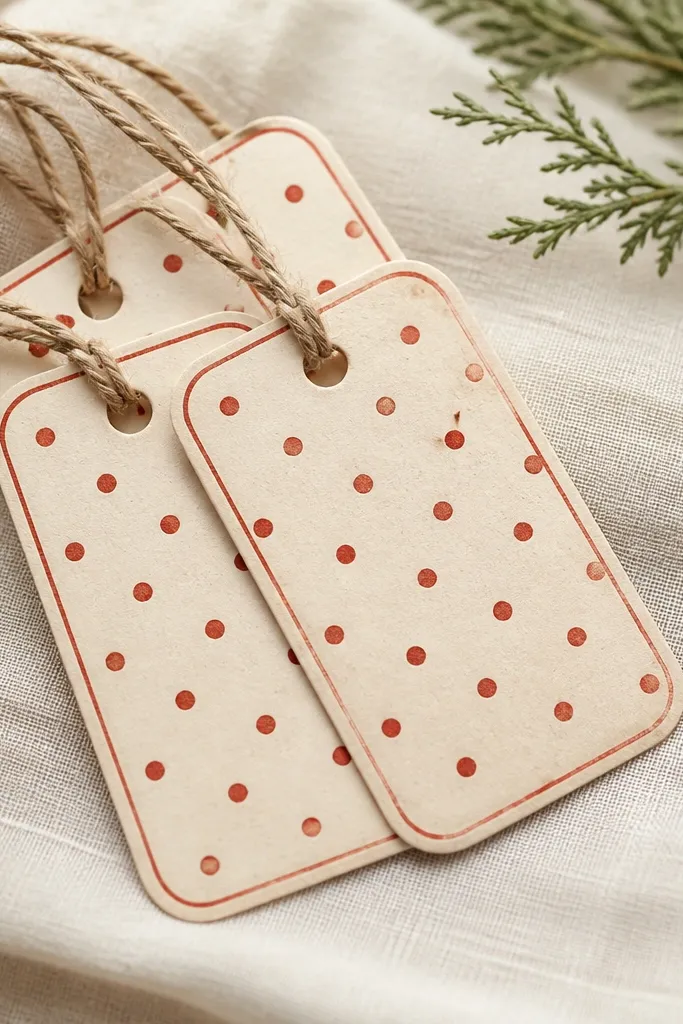
These look like old-school gift tags, and they hide hairline cracks better than flat solid colors. Cream paint shows texture, so I keep the dough smooth with sanding and careful drying. Red dots and a thin border make the design feel intentional, even if the surface has micro lines. This works especially well for readers who like farmhouse decor but still want crisp details. The styling principle is framing: you create lines and dots that pull attention away from tiny imperfections.
Roll to 1/4 inch, cut tags, and punch the hole with a skewer while the dough is fresh. Bake and cool slowly, then sand edges to keep the border crisp. Paint the whole tag cream, let it dry, then use a small round stamp or bottle cap dipped in red paint to dot along the border area. Add a thin red line around the edge with a fine brush and seal once dry.
Mix red paint with a tiny bit of flow improver so the dots look round, not ragged.
Using thick paint on the border makes it look like glue and can crack when it dries.
6. Green wreath ornaments with leaf-vein realism
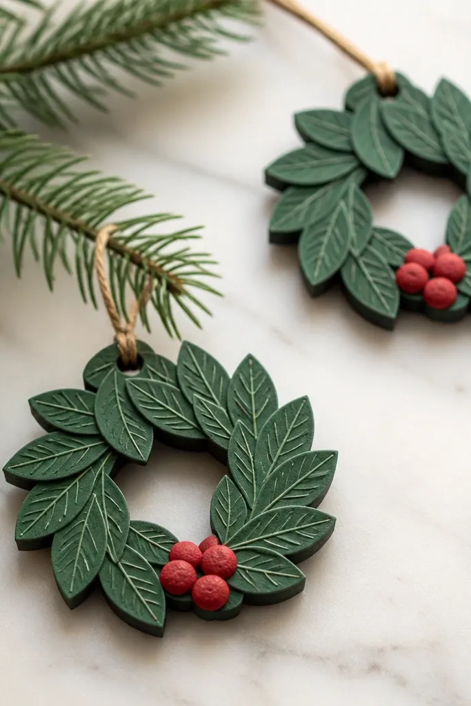
Leaf-vein realism is the fastest way to make salt dough look like real craft store decor. I use a two-green palette: deep evergreen and a lighter sage for veins. The veins pop because I paint them after baking, using a fine liner brush and a steady hand. It flatters warm neutrals and wood tones, and it looks great on both white and gold trees. The styling principle is layered color: base first, then veins, then berries.
Cut a wreath base from 1/4-inch dough, then layer small leaf shapes around the ring while the dough is still slightly cool from cutting. Bake until dry, then cool in the oven to avoid surface cracking. Paint the wreath deep green, then dry-brush lighter sage on the leaf edges so the leaves read as separate layers. Use a liner brush to paint thin vein lines down each leaf and add tiny red berries with a dotting tool. Seal with matte clear to keep greens from getting shiny.
If you want more realism, press leaf veins using a silicone leaf texture sheet before cutting.
Adding berries before baking makes them shrink unevenly and look lopsided.
7. Gold foil look frames with matte interior
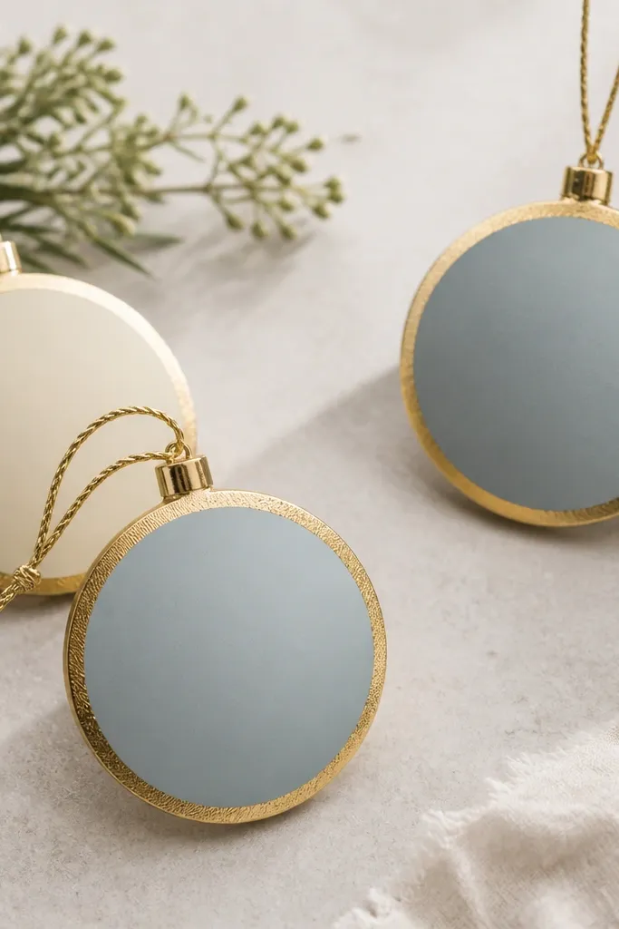
Gold foil frames make even simple shapes look finished. I keep the center matte so it doesn’t compete with the metallic ring, especially under tree lights. The gold effect hides slight surface texture because metallic finishes reflect light. This works well for people who want a clean, coordinated set without painting every tiny detail. The styling principle is material contrast: matte interior, reflective edge.
Pro tipUse glue ring width about 1/8 inch so the gold reads like a frame, not a blob.
Sand the ornament lightly after baking and cooling, then paint the center matte (dusty blue or cream). Let that fully dry. Brush a thin layer of craft glue only around the outer rim, then apply gold leaf flakes and press gently with a dry foam brush. Tap off excess flakes and seal the whole ornament with a matte clear coat, keeping the seal thin so the gold doesn’t dull too much. Thread ribbon through the hole last, after sealing.
AvoidSealing immediately after leaf application can trap moisture and cause dull spots.
8. Blackboard-style ornaments with chalky lettering
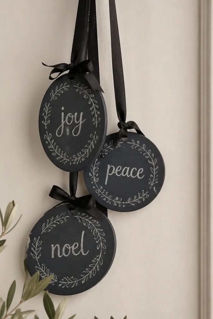
Chalky lettering is my go-to when I want the ornament to look “handmade” without needing perfect symmetry. The deep charcoal base also hides tiny cracks because chalk texture breaks up the light. I paint the letters with white acrylic, then lightly rub a damp sponge over the edges to mimic chalk smudging. This style looks great for names, dates, or short holiday phrases. The styling principle is texture imitation: you recreate chalk behavior on a matte base.
Pro tipWrite letters slightly thicker than you think — chalky smudging makes thin strokes disappear.
Bake, cool slowly, then paint a solid coat of charcoal acrylic. Let it dry fully, then lightly buff with 320 grit sandpaper if the surface feels too smooth. Use a pencil to lightly sketch your letters, then paint with a white acrylic and a small liner brush. While the paint is still slightly tacky, dab a barely damp sponge along the stroke edges to create a chalky fade. Seal with a matte sealer, not glossy, so the lettering stays “chalk-like.”
AvoidUsing a shiny sealer turns the chalk effect into a slick paint job.
9. Marbled ornaments with white swirls and soft gold flecks
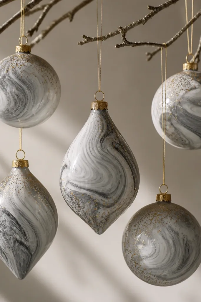
Marble looks hard, but it’s forgiving if you plan the flow. I use a gray base and then swirl white acrylic with a stiff brush, dragging just a few lines instead of trying to fill everything. Gold flecks land where light hits most, which makes the ornament look dimensional. This set looks especially good on silver trees because the gray reads cool and clean. The styling principle is controlled chaos: fewer swirls, more breathing room.
Roll to 1/4 inch, cut teardrops and rounds, bake low, and cool slowly. Paint a flat gray base in one coat, then let it dry. Mix white acrylic with a tiny amount of water so it moves, not drips. Swirl with a stiff brush in quick arcs, then tap the brush lightly to create small white breaks. Add gold flecks using a dry brush loaded with metallic paint, then seal with a satin clear coat.
Practice on a scrap cutout first — marbling is about speed and brush pressure.
Over-mixing the paint makes it uniform and kills the marble look.
10. Red velvet look ornaments with faux suede finish

This style turns a plain shape into something you want to touch. The trick is using a flocking powder or a suede-like paint effect after the base cures. I use deep wine red so it reads rich without needing shine. It looks stunning against cream ribbon and on trees lit with warm bulbs. The styling principle is tactile finish: you create depth through texture, not extra paint layers.
Bake and cool fully, then sand lightly so the surface is not dusty. Paint with deep wine acrylic in two thin coats, letting each coat dry completely. Sprinkle flocking powder over wet paint (or over tacky glue) and tap off excess. For a cleaner edge, use a small brush to remove stray powder around the hole. Seal lightly with a matte protective spray from a distance so you don’t crush the texture.
Keep the ornament flat while flocking so the powder doesn’t drift into the hole area.
Thick paint under flocking causes clumps and a bumpy edge.
11. Blue-and-white coastal ornaments with salt-wash effect
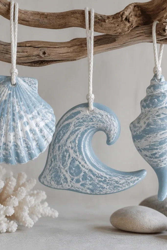
The coastal look is easy when you control water and salt — you get natural speckling that hides micro cracks. I paint a pale blue base, then use a salt-wash technique that creates “sea foam” clusters. The result looks airy and works with beachy decor without turning into beach-cartoon. It flatters cool-toned interiors and white trees because the blue stays light. The styling principle is letting the material do the patterning.
Roll shells and waves to 1/4 inch, bake low, cool slowly, then sand. Paint a pale blue base and let it dry until tacky, not wet. Sprinkle coarse salt lightly over the paint, then mist with water so the salt starts to dissolve and pull pigment. Wait for it to dry fully, then brush off the salt to reveal speckles. Add a thin white wash in recesses and seal with matte so the speckling stays visible.
Use coarse salt, not table salt — the larger grains create bigger foam dots.
Sealing before the salt-wash dries leaves a permanent gritty look.
12. Monogram initials with clean relief edges
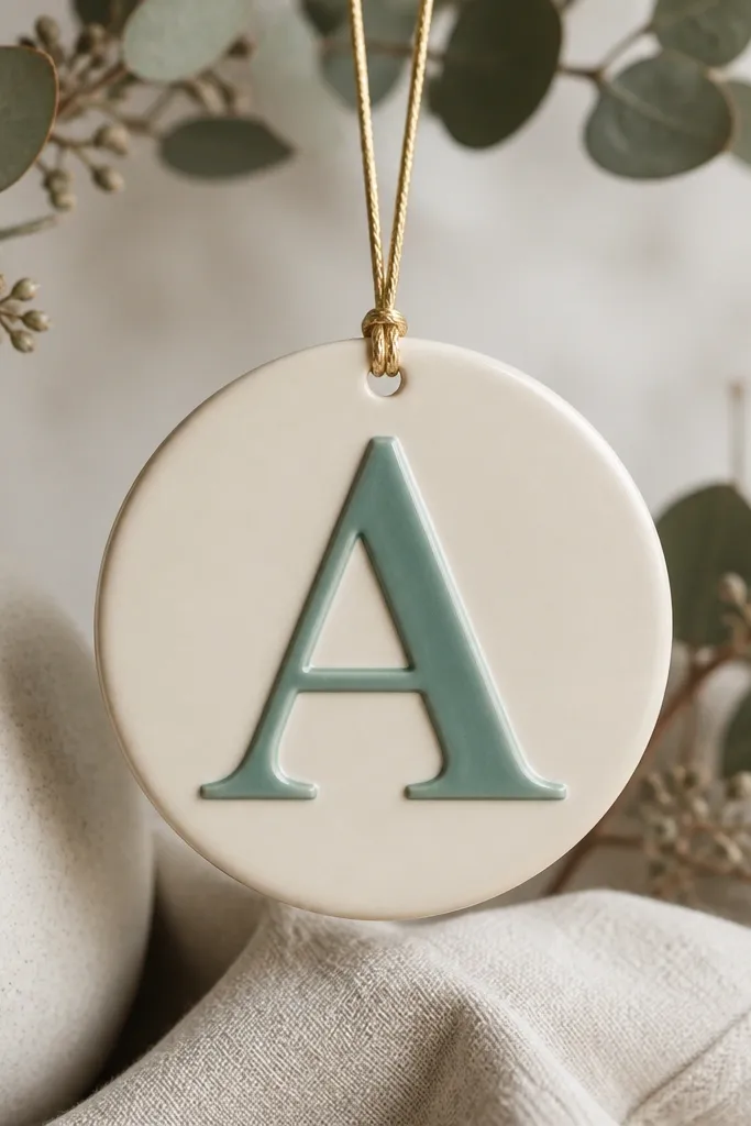
Relief monograms look sharp because the raised edge catches light. I prefer simple initials for this style because complex lettering creates tiny thin areas that crack if your dough is uneven. Cream base keeps it bright; muted teal on the relief makes it readable without yelling. This looks best on people’s calendars and keepsakes because it feels personal. The styling principle is using relief as the design — you paint the raised part, not the whole thing.
Roll to 1/4 inch and cut a circle or tag shape. Press a plastic alphabet stamp lightly into the dough to create relief, then trace over the stamp lines with a craft knife to define edges. Bake low, cool slowly, then sand just the flat surface, leaving the relief intact. Paint the base cream, then paint only the raised letters with muted teal using a small brush. Seal with satin clear so the relief edge stays crisp.
Press the stamp in one firm pass — repeated pressing smears the relief and makes it look blurry.
Skipping edge definition makes the monogram look flat and easy to mistake for a sticker.
13. Glitter-free iridescent shimmer with pearl paint

If you hate glitter mess, pearl paint gives you the shimmer without the fallout. I use a pearly white base and then add a whisper of pale pink on edges so the ornament looks dimensional. This style looks clean in photos because the surface stays smooth and the light shift is gentle. It also flatters cool and warm decor because pearl sits between both worlds. The styling principle is fine shimmer control: no chunky texture, just light reflection.
Bake and cool slowly, then sand to remove any rough spots. Paint a base coat of pearl white acrylic evenly, two thin coats. Once dry, mix a little pearly pink with white and lightly dry-brush it along edges and raised details. If you used a texture stamp, brush over ridges only so valleys stay pearl white. Seal with satin clear — matte can dull pearl too much.
Stir pearl paint gently — shaking introduces bubbles that show as tiny craters.
Applying thick pearl coats makes the surface uneven and more likely to craze.
14. Two-tone candy cane ornaments with crisp stripes

Candy cane stripes look “store bought” when they’re straight and evenly spaced. I keep the stripe width consistent by using painter’s tape as a guide after the base coat dries. White base makes the red pop, and it also hides any slight surface roughness from sanding. This style looks great on traditional red-and-green trees and also works with neutral modern decor because the shape is iconic. The styling principle is alignment: tape does the work so your hand doesn’t have to.
Pro tipCut tape strips slightly thinner than you want the final stripe so you don’t get fuzzy paint creep.
Cut candy cane shapes at 1/4 inch thickness and bake low, then cool slowly. Sand lightly and paint the entire ornament white, then let it cure at least an hour. Apply painter’s tape stripes along the cane, pressing edges down firmly. Paint red acrylic over the exposed area, then remove tape while paint is still slightly tacky for crisp edges. Let dry, then seal with satin clear so the white stays bright.
AvoidRemoving tape after paint fully dries often pulls the paint and leaves ragged edges.
15. Gold-washed mini houses with tiny window highlights
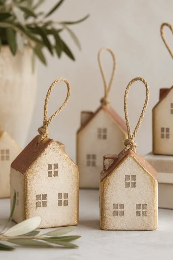
Mini houses look adorable, and gold wash in the corners makes them look dimensional fast. I paint the walls beige, then wash gold into seams and under roof edges so the structure reads even if the cuts aren’t perfect. Windows get small highlights so they look like little lanterns. This style flatters warm-toned decor, especially if your tree has wood beads or tan ornaments. The styling principle is depth mapping: wash in recesses, highlight on flat faces.
Pro tipUse a toothpick for window details — it keeps the paint from spreading into the dough pores.
Roll to 1/4 inch, cut house shapes, and punch the hanging hole before baking. Bake low, cool in the oven, then sand the flat surfaces only. Paint the walls beige acrylic and the roof muted terracotta. Mix a gold acrylic wash with water (about 1 part gold to 4 parts water) and brush it into corners and around door frames. Paint tiny window rectangles with a light cream, then add a dot of warm yellow in the center for a lantern effect. Seal with matte clear to keep it cozy instead of shiny.
AvoidGold wash over whole surfaces makes the house look muddy and hides the window work.