1. Honey Terracotta Sunburst Corners
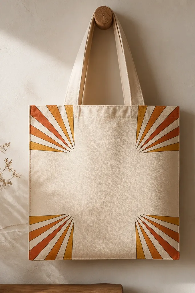
This one looks warm without turning into a busy pattern because it repeats in the corners, not across the whole bag. I paint the base rays honey yellow first, then glaze terracotta over the middle of each ray so you get depth instead of flat bands. The burnt umber outline makes the tote read crisp even on canvas texture. It flatters most tote sizes since corner placement leaves the main space open for your hands and any future charms. The color mix works especially well on totes that are natural cream or light beige, because the warm pigments pop.
Slide a piece of cardboard inside the tote and tape off a 1 inch border around each corner. Mix honey yellow with a tiny bit of white for a light wash, then paint 10 to 12 rays per corner using a flat brush. While it’s still a little tacky, glaze terracotta over the center half of each ray with a smaller brush. Let it dry completely, then trace the outer edge of each burst with burnt umber using a liner brush. Finally, add a tiny dot highlight in honey yellow at the center of each burst for a “sun” effect.
If your rays look wobbly, draw the ray lines lightly with a pencil first — then paint over them confidently.
Don’t fill the tote center with rays — it makes the bag feel crowded and hides the tote’s shape.
2. Peach Ombre Stripe Body
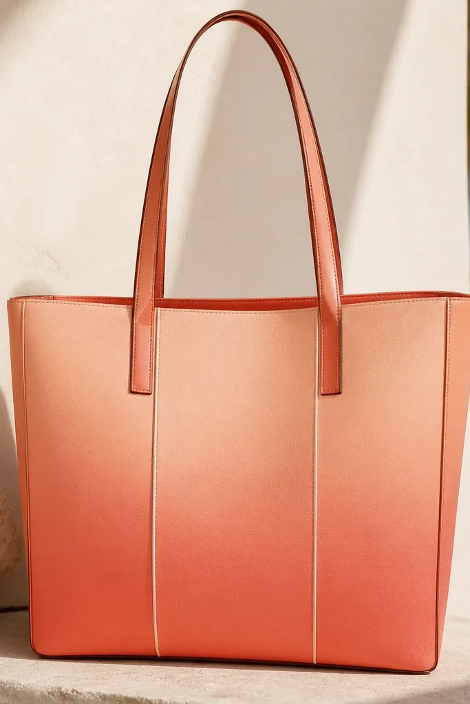
Vertical ombre stripes make the tote look taller and slimmer when you carry it on one shoulder. I use peach at the top because it reads soft and cozy, then deepen to coral for warmth that still looks modern. The reason it works on canvas is that the fabric texture adds a natural grain — ombre hides brush streaks better than solid blocks. It flatters anyone who likes warm tones but doesn’t want heavy illustration. It also looks great with gold jewelry because the coral catches light like a warm sheen.
Tape off three vertical stripes, each about 3.5 inches wide on a standard tote, leaving 1 inch gaps between. Paint the top 2 inches of each stripe in pale peach mixed with lots of white. For the next section, blend in more coral as you go down — I do it by painting the mid area first, then feathering the transition with a damp clean brush. Add a thin darker coral edge along each stripe border after the ombre dries. Finish by painting a hairline white highlight on the right side of each stripe so the stripes look polished.
Pro tipUse a sponge brush for the feathering stage — it smooths the fade faster than blending with a round brush.
AvoidAvoid painting the whole stripe in one go — you’ll get harsh lines where the brush stops.
3. Burnt Umber Dotty Terracotta Border
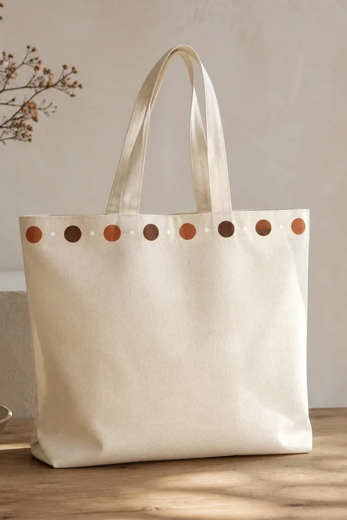
This is my go-to when I want “cozy” but I don’t want to draw anything complicated. The border framing makes the tote feel finished, like it came from a craft counter. Terracotta gives warmth, burnt umber adds grounding, and the tiny white dots make it look like sunlight flickering. It flatters smaller bags because a border draws the eye across the top where you see it most. It also works on darker totes too, but it’s easiest to get crisp dots on light canvas.
Mark a border line 1 inch below the top seam with pencil. Tape along that pencil line so your dots stay even. Mix terracotta and burnt umber on a palette and use a dotting tool or the end of a rounded paintbrush handle for consistent circles. Alternate dots every 1/4 inch across the border, then add tiny white dots between some of the larger dots for a “sparkle” effect. Let it dry, then touch up any uneven dots with a second thin coat for clean edges.
Test dot size on scrap canvas first — dotting tools vary, and you want the border to look intentional, not random.
Don’t use thick paint for dots — it turns circles into blobs on canvas texture.
4. Olive-Gold Leaf Spray Frame
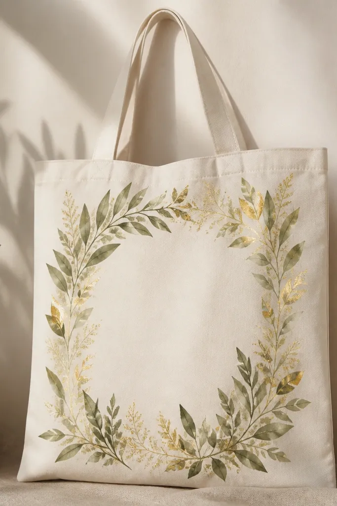
Leaf sprays give a cozy organic feel without needing perfect botanical drawing. I paint the frame as an airy rectangle so it looks like foliage wrapping the tote, not a full jungle print. Olive-gold reads warm because of the golden undertone, and it pairs well with cream, tan, and even light gray totes. This style flatters people who like understated decor — it looks artsy from a distance and detailed up close. It also works well for tote handles because the design stays centered and doesn’t fight the bag’s movement.
Cut a 1-inch wide paper mask strip to outline a rectangle in the center of the tote. Tape the mask down so paint doesn’t creep into the main tote area. Thin olive paint with a bit of water or fabric medium and lightly dab with a stiff brush using the “tap and lift” motion. Add gold highlights by mixing gold acrylic with a touch of white and dabbing only on the top edges of leaves. After it dries, remove the mask to reveal a clean frame line and add 3 to 5 small leaf clusters at the corners.
Pro tipKeep your leaf spray light. If you can see canvas through the paint, it looks more natural and less heavy.
AvoidDon’t paint hard outlines around every leaf — it turns the sprig into a sticker instead of a soft frame.
5. Spiced Latte Waves
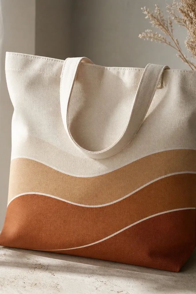
Wave lines make the tote feel like it has motion, and warm latte tones make it feel cozy without looking childish. I use three bands so your tote reads balanced even if the bag stretches when you carry it. The white highlights on wave crests are what sell the look — they give the illusion of light catching liquid. This design flatters most body types because it sits on the lower half and doesn’t visually widen the shoulders. It’s also an easy match for fall outfits and winter knits.
Draw three parallel wave paths with pencil, each about 1.5 inches apart, across the bottom half of the tote. Paint the first wave in warm cream, then the second in caramel brown, then the third in deep cinnamon. Use a flat brush for filling, then switch to a small round brush to add white highlights along the top crest of each wave. Blend the highlight edges with a damp brush so they look like reflections, not thick lines. Let it dry fully and do a second thin coat if the waves look patchy on canvas texture.
Pro tipUse a ruler to keep the wave paths level — a slightly slanted wave looks off when the tote hangs.
AvoidAvoid black or cool grays in the waves — they make the whole tote feel harsh instead of warm.
6. Warm Checkered Picnic Corners
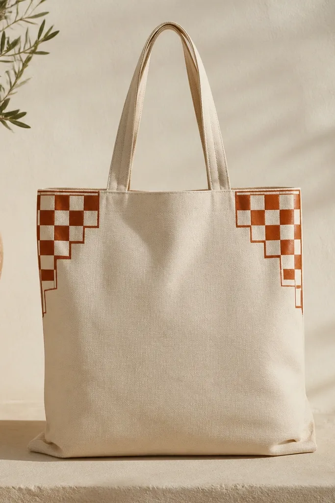
Checks look cozy fast because they read like picnic blankets and kitchen textiles. I limit the check pattern to the top corners so the tote stays wearable with any outfit and doesn’t feel like you’re carrying a full tablecloth. Terracotta and cream keep it warm, while burnt umber borders keep it sharp. This flatters people who want pattern but hate loud, full-coverage prints. It also hides minor paint imperfections because the grid breaks up the view.
Tape off a square area in each top corner about 6 inches by 6 inches. Mark a grid with light pencil lines for 1-inch squares. Paint the first pass with terracotta and fill alternating squares with cream, leaving pencil lines as guides. Let it dry, then trace the outer edge of each check area with burnt umber using a fine liner. Remove tape and touch up any tiny gaps where paint seeped under the tape.
Use painter’s tape on both the tote and your palette paper so your hand doesn’t smear wet paint while you work.
Don’t rush the grid. If the squares are uneven, the whole tote looks cheap even if the colors are pretty.
7. Coral Daisy Chain Mid-Band
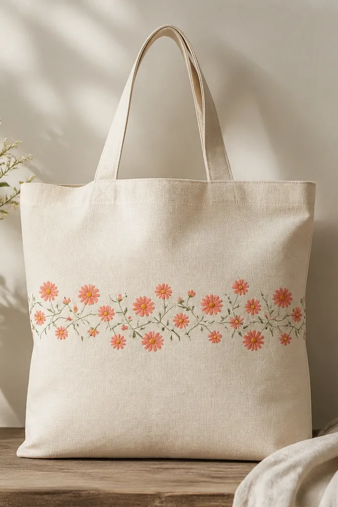
A mid-band daisy chain makes the tote look like a cheerful dress pattern without getting too cartoonish. I keep the daisies small and repeat them in a line so the design feels intentional. Coral petals with warm yellow centers read cozy, and the tiny white dot in each center gives a “glossy” look. This style flatters most tote sizes because the band sits at chest height when you carry it. It also pairs well with denim, linen, and anything neutral because the warm blooms show up clearly.
Mark a horizontal line across the tote about 5 inches from the bottom, then tape a soft straight guide. Paint the stems first in olive green — thin lines with slight curves every 1 to 2 inches. Add small five-petal daisies in coral along the stem line, keeping petals the same size for repeat consistency. Fill centers with warm yellow and then add a tiny white dot in the upper left of each center. After everything dries, outline the stems lightly with a darker green for separation from the canvas.
If you don’t trust your petal shape, use a bottle cap or stencil for the center circle, then paint petals around it.
Don’t use bright neon green — it kills the cozy warmth and makes the flowers look like they’re for a kid’s craft.
8. Terracotta Arch Cutout Style
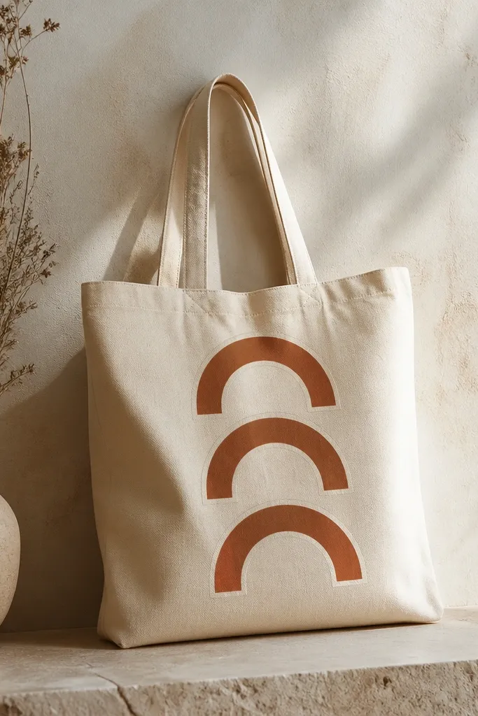
The arch cutout style looks clean and modern, but it still feels cozy because terracotta is warm and earthy. I like stacking three arches because it creates rhythm without clutter. The cutout effect — leaving canvas visible — keeps the tote from feeling stiff and thick. It flatters people who like minimal art but still want warmth. It also works well for tote painting on darker or medium-toned canvas since the cream outline creates contrast.
Tape three vertical rectangles on your tote where you want the arches, spacing them about 3 inches apart. Inside each rectangle, sketch a half-arch with pencil leaving a flat base. Paint the terracotta only on the arch outline area, then wipe any paint off the interior if you want the true cutout look. After the terracotta dries, paint a cream outline around each arch using a thin liner brush. Remove tape and check spacing — adjust any wobbly lines with a second thin coat.
Pro tipUse medium-thin paint so the edges stay crisp. Thick paint blurs the arch and ruins the cutout illusion.
AvoidAvoid painting the interior solid — it removes the airy cutout feel that makes this look expensive.
9. Warm Citrus Slice Confetti
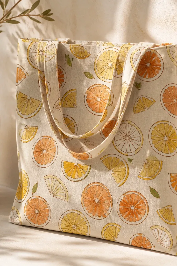
Citrus confetti makes a tote feel like summer in one glance. The trick is to keep slices small and spaced so the canvas still breathes. I use pale yellow for the base slice and orange for the segment lines, then add a burnt umber outline to stop the shapes from blending into canvas texture. Olive leaf tips tie the warm fruit colors together and keep it from looking flat. This style flatters anyone who wears simple outfits because the tote becomes the color anchor. It also looks great on totes that are cream or light tan.
Sketch 20 to 30 small citrus slices across the tote front, leaving at least 1 inch of space between clusters. Paint each slice with pale yellow, then add segment lines in orange using a fine brush. Add a thin burnt umber outline around each slice — it’s faster than trying to paint perfect segments inside. Drop in tiny olive green leaf tips near a few slices only, not everywhere. Finish by adding a small white highlight along the curved edge of each slice segment.
Pro tipCluster more slices near the center and fewer toward the edges. It looks intentional instead of random.
AvoidDon’t over-outline. Too much burnt umber makes it look like a craft coloring page.
10. Rust Sunflower One Big Bloom
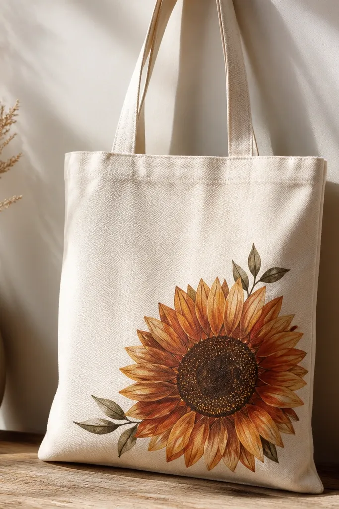
One big sunflower looks cozy because it reads like a centerpiece, even on a simple tote. I paint the petals in layered warm tones: golden yellow base with rust shading near the petal base. The center gets extra character with dotting — it stops the flower from looking flat. This flatters people who like statement art without going full mural. It also works well when you carry the tote by the handles because the flower sits in the natural sightline.
Draw a circle for the center where you want the bloom, then sketch about 16 to 18 petals around it. Paint petals with a golden yellow base, then add rust shading at the base of each petal with a smaller brush. For the center, use a stippling motion with burnt umber and a touch of black-free deep brown so it stays warm. Add three small leaves in olive green near one side of the bloom and connect them with a thin stem line. Let it dry, then add tiny white highlights on 6 petals for sparkle.
Stipple the center on a slightly damp paint layer for a more textured look.
Avoid painting all petals the same shade. Variation is what makes it look real and not stamped.
11. Cream + Cocoa Handwritten Script
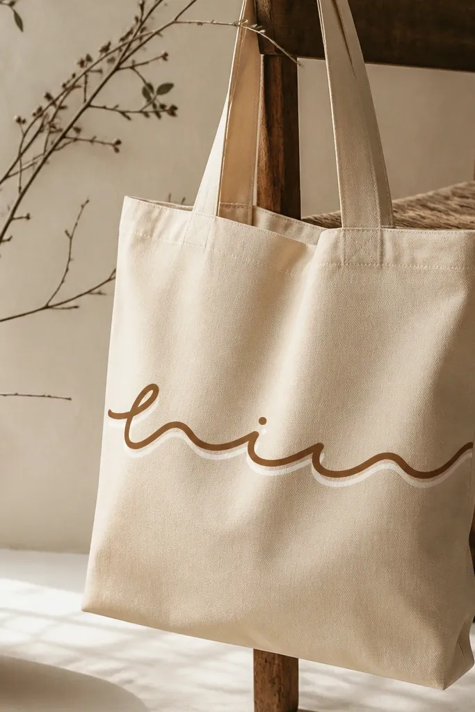
Handwritten script feels cozy because it looks personal, like you actually made it for your own bag. I keep it to one line so it doesn’t fight the tote’s shape. Cocoa brown reads warm and classy, and a cream shadow gives the letters soft depth without making it look like graffiti. This style flatters small to medium tote sizes and looks great on cream, tan, or even light gray canvas. It also pairs well with minimal jewelry and clean outfits because the typography becomes the focal point.
Use pencil to lightly place your one-line word or phrase across the front center, leaving about 2 inches from the top seam. Trace over your pencil with a fine liner brush in cocoa brown, letter by letter. Mix cream paint with a little water and add a thin shadow line under the downstrokes of your letters. Add 5 to 8 tiny dot accents in warm honey yellow around the script — keep them sparse. Let dry fully and seal with fabric medium or heat-set per your paint brand instructions.
Pro tipPractice the exact word on paper first. Your hand will remember the rhythm and your letters will look confident.
AvoidDon’t use a thick paint marker. It fills canvas texture and makes the script look cheap.
12. Warm Geometric Triangle Stack
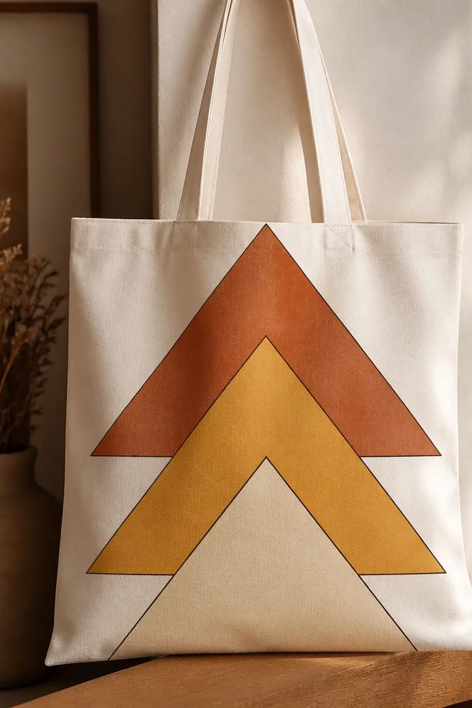
Geometric triangles feel modern, but warm colors keep them cozy. I stack triangles instead of scattering them because stacked shapes look intentional on a tote that naturally curves when carried. Thin burnt umber lines separate each layer and stop colors from blending into one block. This flatters people who like clean design and don’t want illustrated flowers. It also works on totes with any handle color because the geometry stays centered.
Tape a vertical guide down the center of the tote front. Mark three triangle outlines stacked like a pyramid, each about 6 inches tall for a medium tote. Paint the bottom triangle terracotta, the middle triangle honey yellow, and the top triangle soft cream. After each color dries, trace the triangle edges with burnt umber using a fine liner brush. Add a small white highlight line on one edge of each triangle to give it a “sunlit” look.
Use a ruler for the triangle edges. Straight lines make warm geometry look designer instead of DIY messy.
Don’t skip the separation lines. Without them, the colors blend and the shape loses its structure.
13. Saffron Wavy Border Frame
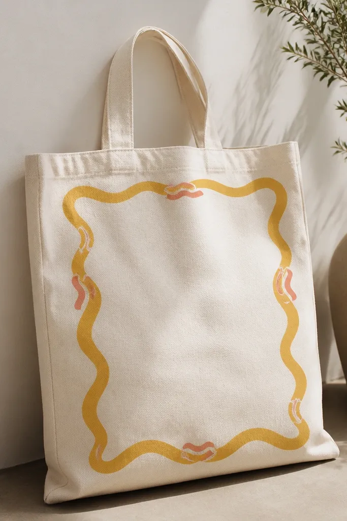
A wavy border gives a handmade feel while still looking tidy because it frames a clean center. I like saffron yellow because it reads warm and bright, and a few coral wave accents keep it cozy instead of too sunny. Leaving the center mostly blank makes the tote easier to pair with different outfits. It flatters anyone who wants art but doesn’t want to overwhelm the bag with full coverage. This design also hides small painting mistakes because the border has movement.
Tape a rectangle guide where your border will go, leaving about 1.5 inches margin on each side. Paint the wavy border by drawing small wave bumps along the taped edge, using saffron yellow. Add coral wave accents by swapping every few bumps to coral — keep the ratio about 2 saffron bumps to 1 coral bump. Let it dry and then remove tape carefully. If you want extra polish, outline the border with a thin burnt umber line.
Pro tipKeep the waves consistent width. If some waves are tiny and others huge, the border looks accidental.
AvoidDon’t fill the entire inside of the frame. The blank space is what makes it look intentional.
14. Apricot Watercolor Wash Clouds
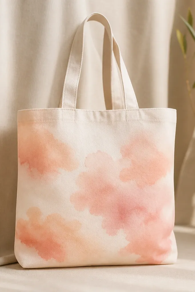
Watercolor wash clouds look cozy because they’re soft and airy, like warm evening light. I use apricot and peach with lots of water so the edges stay feathered. The reason this works on tote canvas is that the fabric texture makes the “watercolor” effect look natural instead of like a sticker. It flatters people who like subtle art and want the tote to match neutral outfits. Also, because there are no hard outlines, it hides uneven brush control.
Lightly sketch three to five cloud blobs in pencil across the center area. Mix apricot with water until it looks like thin yogurt, then paint the largest cloud first. Add peach wash over the top edges while the paint is still slightly damp for a natural fade. For depth, drop a few darker apricot spots at the bottom edges of clouds. Let it dry fully, then add a few tiny white “glow” dots around one cloud with a small brush.
Use a mop brush or soft round brush — stiff bristles make watercolor washes look streaky.
Don’t outline the clouds. Outlining makes it look like a coloring book instead of a light wash.
15. Cinnamon Coffee Cup Repeat
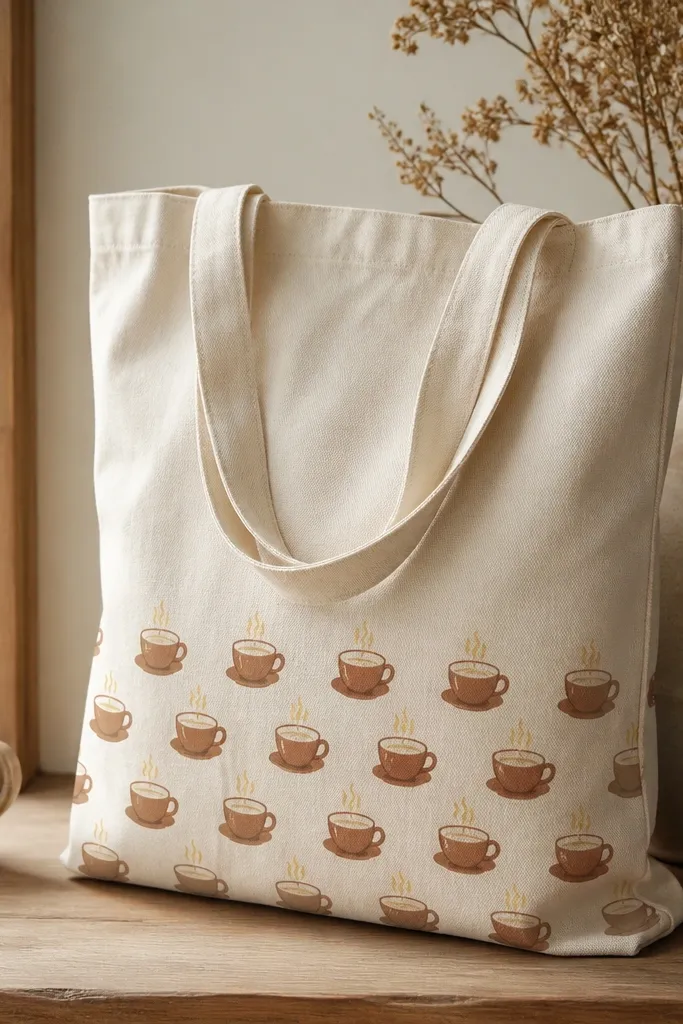
Coffee cup repeats feel cozy because they’re readable and practical. I keep the cups small and repeat them along the lower half so the tote front doesn’t get cluttered when it folds. Cinnamon brown looks warm and slightly vintage, and steam in pale honey yellow makes it feel like morning light. This style flatters most outfits because it’s a simple pattern that doesn’t fight your clothes. It also works well if you’re making a tote for a gift — it looks thoughtful without needing a big artwork.
Mark a band across the tote bottom about 6 inches tall. Sketch 10 cup icons spaced evenly inside that band. Paint cups in cinnamon brown, leaving the inner cup space warm cream for contrast. Add small steam lines above each cup in pale honey yellow with thin strokes. Let it dry, then add a tiny white highlight on the rim of each cup. Add a small dot at the base of each cup for extra definition.
Use a scrap of cardboard to practice the cup shape. Once your spacing feels right, repeat it confidently.
Don’t make the cups too thick. Heavy lines on canvas look bulky and stiff.
16. Terracotta Mandala Mini-Cluster
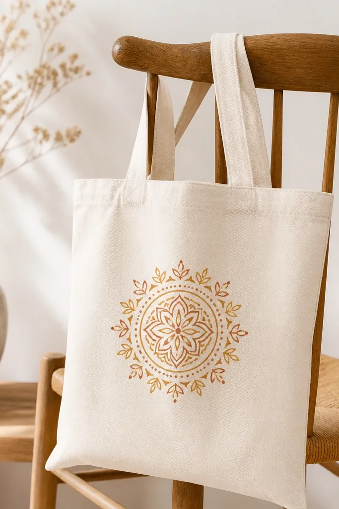
A mini mandala cluster is cozy because it adds detail without covering the whole bag. I keep it small, about the size of a grapefruit, so it looks like a focal ornament. Terracotta and honey yellow create warm contrast, and the dot accents make it look dimensional. This style flatters people who like texture and hand-done details, and it looks especially good on plain totes that are otherwise blank. It also handles tote creases better than full coverage art because the design sits in one area.
Draw a circle in the center and mark 8 spokes lightly with pencil. Paint a simple outer ring in terracotta, then add 8 petal shapes between spokes in honey yellow. Fill the spaces with tiny dots and short lines, alternating terracotta and honey. Add a second inner ring with thinner lines using a fine brush. Finish with tiny leaf shapes at the outer tips and a few white dot highlights for sparkle.
Pro tipDot work looks cleaner when you reload paint less often. Too much paint makes dots smear on canvas texture.
AvoidAvoid overcrowding the center — if everything is the same density, it looks messy instead of intentional.
17. Warm Stripe + Heart Split Panels
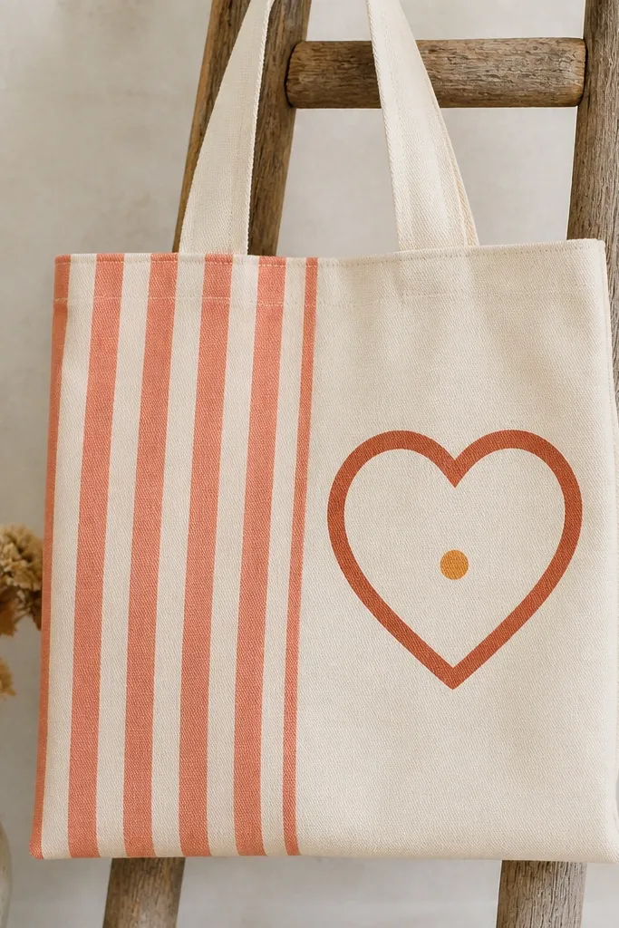
Split panels are cozy because they look like a patchwork textile. The striped side adds energy, and the heart makes it personal without feeling overly sentimental. I use coral stripes on one side and a cream heart on the other so the contrast stays bright and warm. The terracotta outline keeps the heart crisp on canvas texture. This flatters people who like cute but not childish designs. It also looks great for tote gifts because the heart reads instantly.
Tape a vertical line down the center of the tote front and separate the sides. On the left side, paint 5 to 6 vertical coral stripes, each about 1 inch wide, leaving thin gaps of canvas. Let it dry, then on the right side sketch a large heart shape centered in that half. Paint the heart interior cream, then outline it with terracotta using a fine liner brush. Add a tiny honey dot in the heart center and a short terracotta highlight line near the top curve. Remove tape after everything dries to avoid pulling paint edges.
Pro tipPaint the stripes first, then switch brushes and rinse well. Stripe colors can contaminate heart edges if you rush.
AvoidDon’t blur the center split line. A fuzzy tape edge makes the whole design look unfinished.
18. Sunkissed Border with Sun Dot Corners
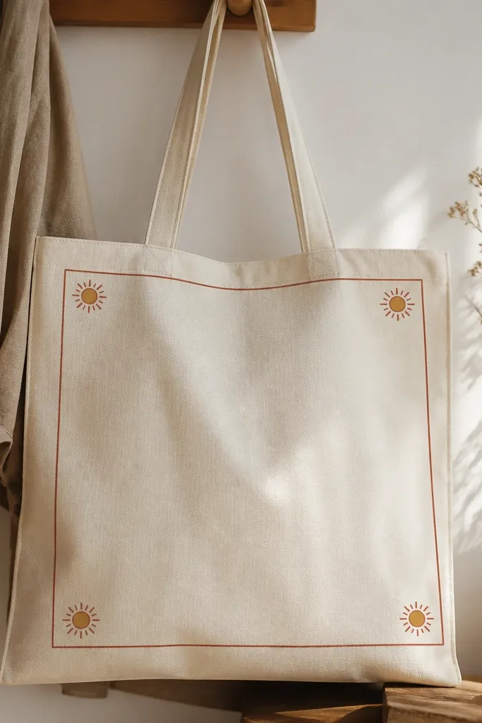
This border-and-corner sun combo is cozy because it frames the tote and adds a little “morning” feeling without drawing a full scene. The thin burnt umber border makes it look tidy, and the small sun dots are playful. I like honey centers because they read warm and friendly, while terracotta rays keep the suns from looking too bright. It flatters most tote sizes because the design stays compact and doesn’t fight the bag’s creases. It also looks good with casual outfits — it’s decorative but not loud.
Tape a rectangle border on the tote front, leaving about 2 inches from the edges. Paint the border in burnt umber using a fine brush for a thin line. In each corner inside the border, paint a small honey dot center about the size of a pencil eraser tip. Add 8 short terracotta rays around each center — tiny strokes radiating outward. Let it dry, then add one white dot highlight on each sun center for a glossy look.
Pro tipUse the same brush for all rays so the ray thickness stays consistent.
AvoidDon’t make the border too thick. Thick borders on canvas look like packaging labels.
19. Tomato Basil Fresco Panels with Chalky White Edges
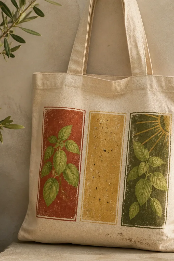
I did this one on a plain cotton tote and it instantly looks like it came from a tiny Italian market, not a craft table. The trick is the panel layout: three tall sections so the painting reads clean from across the room. Tomato red and basil green hit that cozy warm palette hard, and the chalky white edges make everything feel older and more lived-in. I paint the edges last with a dry brush so they look like plaster lines instead of crisp tape. It works especially well if your tote has a slightly stiff canvas — the paint sits on top and gives you that matte, fresco feel.
Start by lightly sketching three vertical panels with a pencil. Mix tomato red (or a red-orange) with a little water until it turns milky, then paint each panel in broad strokes — leave some canvas showing for texture. For the basil, use a small round brush and paint leaf shapes in two steps: first the darker green outline, then a lighter green center vein. Let the panel colors dry, then wipe off the brush and load it with white paint that is mostly dry (barely damp). Drag the dry brush along the panel borders and around leaf edges so the white looks chalky, then add a few tiny seed dots in the yellow panel with the tip of your brush.
Pro tipDry-brush the white borders with the brush angled almost flat — you want scratchy edges, not a solid line. If your tote is smooth, scuff it with 220-grit sandpaper first so the paint grabs.
AvoidSkip using painter’s tape for the white edges — it makes the lines too perfect and kills the fresco look.
20. Oat Milk Honeycomb Heat Map with Burnt Sienna Drips
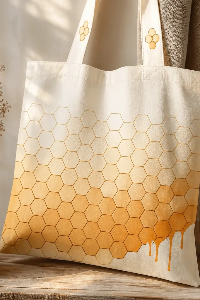
This is the tote painting idea that looks like a modern poster even when you keep it hand-drawn. The honeycomb pattern gives you structure, and the warm gradient makes it feel summery instead of graphic-only. I like using oat milk as the base because it keeps the whole thing cozy and soft, not neon. Burnt sienna drips add a little mess that still looks intentional when you place them only in one corner. The result reads warm and snack-like — like honey on toast — from arm’s length.
Prime a cotton tote with a thin coat of gesso or fabric medium mixed with white paint, then let it dry fully. Draw a honeycomb grid by marking a row of six staggered points and connecting them into hexagons with a light pencil — keep the lines faint. Paint the hexagons in a vertical gradient: top row in oat milk (off-white), mid rows in honey gold, bottom rows in deeper amber, leaving the outline area slightly lighter so it pops. Outline each hex with burnt sienna using a fine liner brush, then load a larger brush with burnt sienna and touch it to the lower right corner so gravity pulls a few drips down. While the drips are still wet, blot one or two with a paper towel to shorten them and keep the texture uneven.
Use a ruler for the first row only, then freehand the rest — that mix of straight and wobbly makes it look handmade. Keep a damp rag nearby so you can wipe accidental drips before they set.
Avoid painting every hexagon at the same intensity — flat color makes the honeycomb look like a coloring book.