1. Monstera Window Print With Crisp Tape Edges
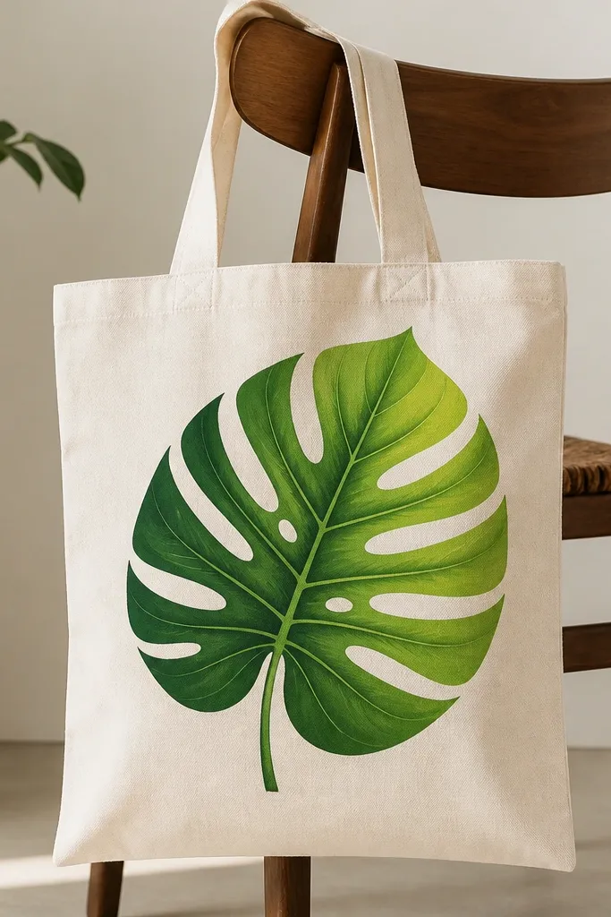
This look works because it’s one big shape that you can paint cleanly without overworking the fabric. The monstera leaf flatters most totes because it sits upright and draws the eye to the center, so even small bags look intentional. Use two greens: one deep (almost forest) for shadows in the folds and one lime or chartreuse for the raised parts. I like it for everyday use because the design has fewer tiny details to crack, and the negative space around the leaf hides minor scuffs.
Start by ironing the tote so the front panel is flat, then mark the leaf center lightly with a pencil. Tape the leaf outline with painter’s tape that has been pressed onto your jeans first (this reduces paint bleed). Paint the leaf in thin layers: base green first, then shadow areas with a darker mix, then add highlights with lime on the raised edges. Peel tape carefully while the paint is still slightly tacky, and let the leaf dry fully before sealing. Finish the veins with a small liner brush (size 0 or 1) so the lines stay sharp instead of fuzzy.
If your tape leaves a ragged edge, wipe the area with a damp cloth before the next paint layer — it saves you from scraping later.
Don’t flood the stencil or tape area with thick paint — it pools and then cracks along the tape line.
2. Watercolor-Style Pothos Drip Vines
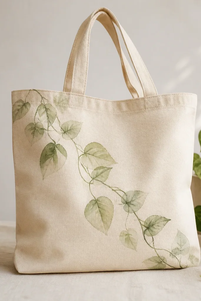
A pothos drip vine looks soft and artsy, and it’s forgiving when you’re learning because the edges can be imperfect. The diagonal trail is flattering on totes because it follows the natural way you swing a bag — your eye tracks it instead of stopping at the center. Use watery paint for the leaves so the fabric texture still shows through, which keeps it from feeling plasticky. This style looks best on light bags and works great for gifts because it feels personal and relaxed.
Mix your paint with fabric medium or a flow improver so it behaves like watercolor — you want it to spread, not sit in a thick layer. Start by drawing one vine line with a pencil, then paint it with a darker green thin brush (size 1). Add leaf washes one at a time: paint an oval with a lighter green, then drop in darker green near the base to create a natural shadow. Let each leaf dry 10-15 minutes before adding a second wash layer so it doesn’t muddy. Seal after the final dry pass using a fabric-safe topcoat applied with a foam brush in light strokes.
Pro tipPractice on a scrap cotton cloth the same color as your tote — the exact water-to-medium ratio changes how transparent the greens look.
AvoidDon’t overwork wet leaves with repeated strokes — that’s what turns watercolor-style plants into muddy blobs.
3. Botanical Border With Stencil Fern Stripes
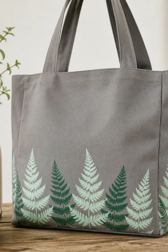
Borders look sharp because they give your plants theme structure without covering the whole bag. Ferns are perfect for this because their shapes repeat well and they hide small alignment errors — the fronds naturally overlap. The mint and deep green contrast makes the bag look fresh, and it works for both casual and slightly dressier outfits. I like this for totes that get used a lot because the border is mostly on the flat front panel, not right across the highest-stress fold.
Choose a fern stencil that matches your tote width, then tape it in place with painter’s tape. Start at the bottom edge with the first stencil row, keeping the stencil flat by pressing it with your palm as you paint. Use a sponge dauber for stencil work: load lightly, then dab off most paint on scrap paper before touching the tote. Paint the first layer in mint, then add deep green frond tips after it dries to avoid bleeding. Continue row by row until you reach the sides, then seal the border last with two thin topcoat layers.
Keep a scrap card under your dauber hand so you don’t accidentally drag paint when you move to the next stencil position.
Don’t use a full brush stroke across the stencil — it pushes paint under the edges and ruins the crisp border.
4. Terracotta Pot Still Life With Leaf Shadows
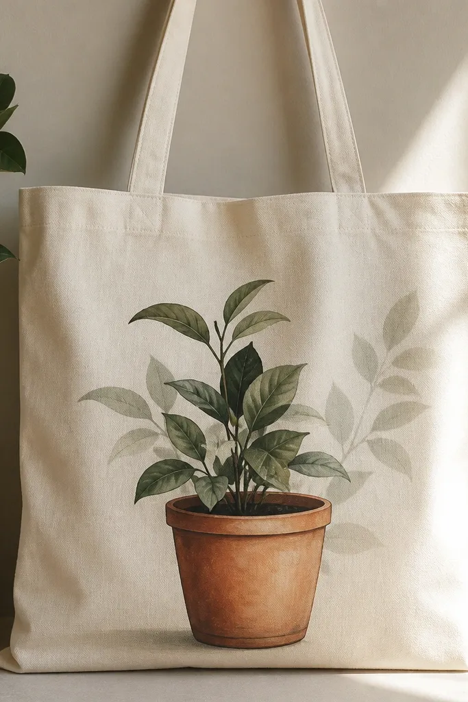
This setup looks grounded and grown-up, especially if you like warm tones. The terracotta pot gives you a natural anchor point, and the leaf shadows behind the plant add depth without needing tiny details everywhere. It flatters medium to larger tote fronts because the pot sits low and makes the tote look more structured. If your skin tone leans warm (olive, peachy, golden), the terracotta and green combo reads extra flattering in photos because it has both warm and cool contrast.
Start by sketching the pot shape with a pencil — draw a simple oval top and a slightly wider base. Paint the pot in terracotta first, then darken the rim and add a thin highlight line on the front curve. For the plant, paint 3-5 leaves only — larger leaves look better than a cluttered bunch on a tote. Add leaf shadows by painting a darker green shape on the tote background where the leaf would block light, then soften the edge with a damp brush. Seal with a fabric topcoat using a foam brush, and pay extra attention to the pot rim so it doesn’t rub off.
Pro tipLet the pot dry completely before you paint leaves — it prevents color mixing at the overlap and keeps the pot edges clean.
AvoidDon’t paint leaf shadows last with wet paint — it smears and makes the whole design look flat.
5. Pressed Leaf Silhouette Using Paper Stencils
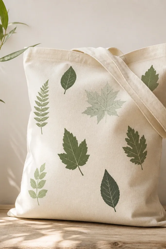
Pressed leaf silhouettes give a clean botanical look even if your painting skills are still forming. You get an organic shape without spending hours on perfect leaf anatomy, and the spacing makes the tote feel airy instead of crowded. This style works on almost any tote color because the leaf silhouettes look like real cut paper or pressed specimens. I like it for everyday because the leaves are big enough to hold up, and you’re not relying on tiny details that crack first.
Find real leaves for reference (or buy a leaf silhouette template), then trace the shape onto cardstock. Cut out the cardstock stencil and lightly spray the back with temporary adhesive so it doesn’t shift while you paint. Tape the stencil in place on the tote and paint with a flat brush using thinned acrylic or fabric paint so the edges stay crisp. Fill each leaf in one or two greens, then add a lighter vein line with a liner brush once the base dries. Arrange the leaves with at least a finger-width of empty space between them so they read clearly when the bag folds.
Pro tipIf you want extra realism, lightly stipple the leaf interior with a dry sponge to mimic the texture of pressed leaves.
AvoidDon’t place every leaf touching — crowded silhouettes hide the shape and look messy when the tote creases.
6. Greenhouse Collage Leaves With Mixed Brush Finishes
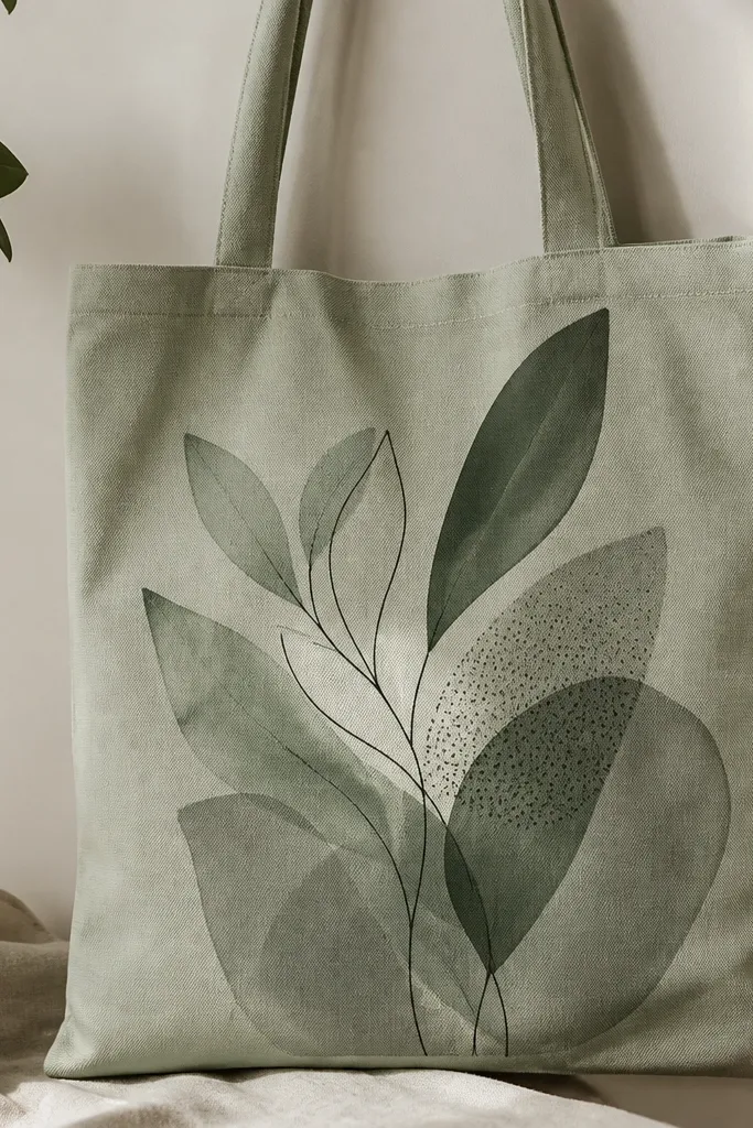
Collage-style plants look interesting because you mix finishes — smooth, washed, and speckled — so the design has movement. The overlapping layers also hide small paint mistakes, which is why I use this on tote fronts when I want it to look “designed” without stressing every stroke. This look works especially well on mid-tone bags like sage, clay, or oatmeal because the greens sit naturally on the fabric. The thin outline ties everything together so it doesn’t look like separate patches.
Plan your layout with simple blocks: two large leaves in front, one washed leaf behind, and a small cluster near the side seam. Paint the base leaves first with opaque green in thin layers, then add one washed leaf using a diluted mix so you see the tote texture. For the speckled section, load a toothbrush or stiff brush with darker paint, then flick lightly over the leaf area. After everything dries, add a thin dark outline around the main shapes with a liner brush so the collage reads clean. Seal with two thin topcoat layers, letting the first dry fully so the speckles don’t smear.
Pro tipDo your speckling last, then stop. Overdoing it makes the tote look dirty instead of plant-like.
AvoidDon’t skip the tying outline — without it, mixed finishes read as random patches after a few folds.