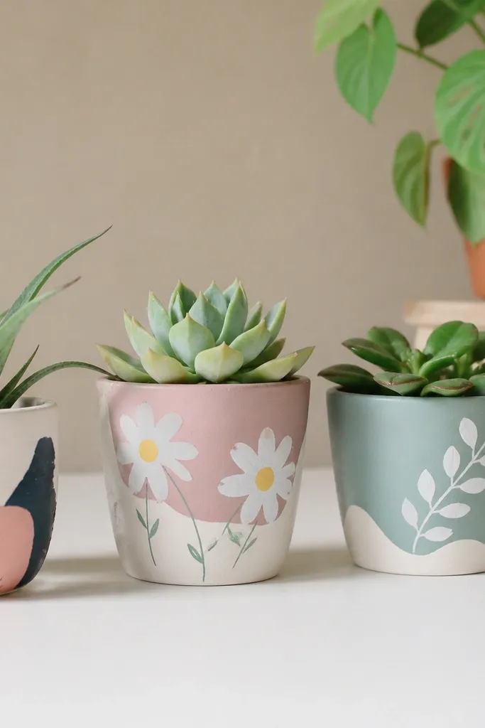
1. Candy Stripe Rim with Tiny Daisy Dots
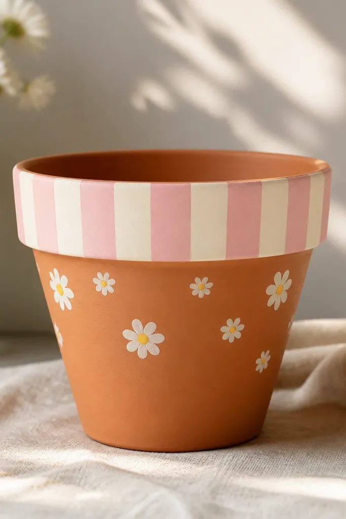
This design looks cute because the stripes frame the pot like a gift wrap band, and the daisies add a soft, friendly focal point. I like it on small pots (4-6 inches) because the rim band stays neat and the dots don’t crowd. Use pastel pink and cream for a sweet vibe that works for birthdays, baby showers, and teacher gifts. The terracotta shows through the middle, so it flatters the pot’s shape without turning it into a heavy block of paint. It also hides minor brush wobble since the flowers are tiny and forgiving.
Pro tipIf your tape pulls up paint, press it down with a fingernail for 10 seconds, then peel slowly at a 45-degree angle.
Start by cleaning and fully drying the pot, then apply bonding primer if it’s terracotta. Tape a straight band around the top — about 1 inch wide — and paint the first stripe color with a sponge brush, letting it dry before removing tape only after the paint sets. Paint alternating stripes (pink, cream, pink) with thin coats so the edges stay crisp. Next, use a dotting tool to place tiny white circles, then add yellow centers with the tip of a liner brush. Finally, seal with 2 light coats of clear matte acrylic spray.
AvoidAvoid painting thick stripes — they bleed under tape and turn fuzzy.
2. Sunflower Splash with Yellow Petal Fan
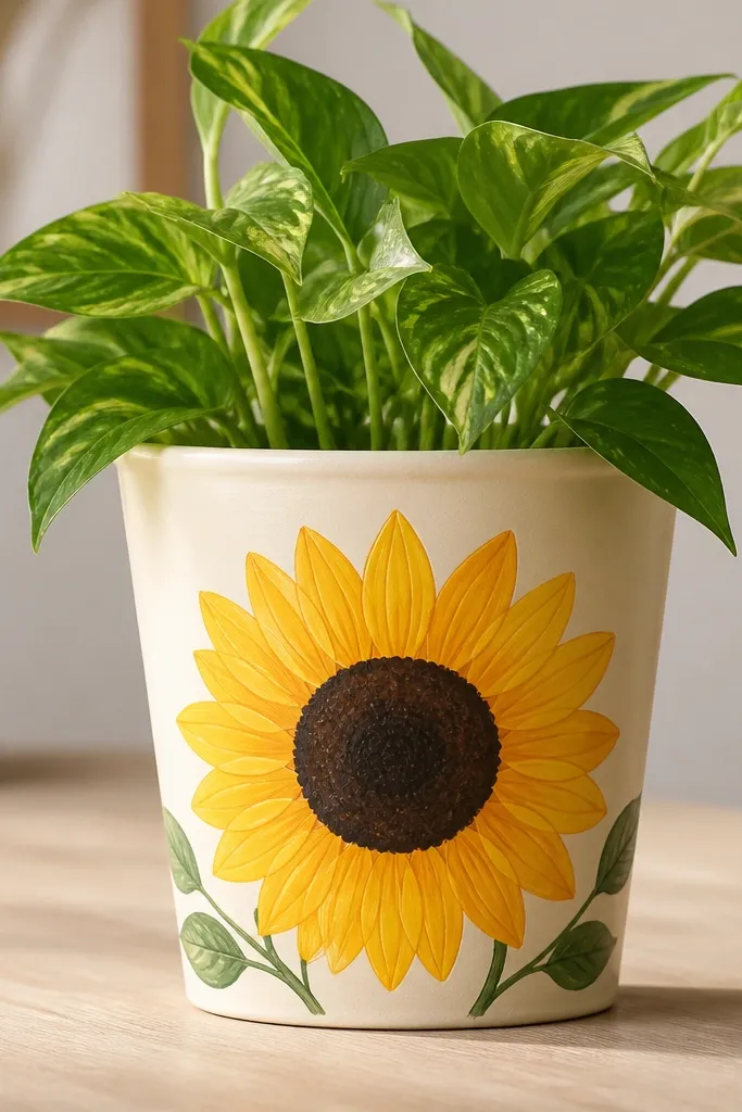
Sunflowers read cheerful from far away, and the petal fan gives you a big shape kids can help paint without needing perfect symmetry. This works best on a light base because the yellow pops and doesn’t look muddy. The dark brown center adds contrast and makes the flower look dimensional even with flat paint. I’ve used it for summer party favors and it always looks “intentional” because the composition is one clear subject. It also flatters most skin tones in photos because the bright yellows and greens give even, warm color in the background.
Prime and paint the whole pot cream first, then let it dry fully. Outline one sunflower circle in pencil, centered on the front, using a soft HB line. Load a fan brush with yellow and pull petals outward in short strokes around the circle; keep them slightly varied in length. Fill the center with dark brown, then add tiny lighter brown dots to mimic texture. Paint two small leaves in medium green near the bottom edge, then seal with clear matte.
Practice petal strokes on paper first so every stroke lands the same direction.
Don’t use watery yellow — it turns translucent and the petals look like stains.
3. Watercolor Hearts on a Blush Base
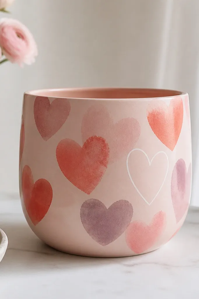
Watercolor hearts look soft and giftable, and the blush base keeps the whole pot from looking juvenile. I use this for Valentine’s Day and for kids' classmates because it feels sweet without being loud. The layered heart colors create depth even if you’re using simple acrylics. This one flatters people who like gentle, romantic palettes — it looks good with neutral planters and in photos with warm skin tones. The loose edges also forgive small hand slips.
Pro tipIf your hearts look too sharp, lightly blur edges with a damp sponge before the paint dries.
Start with a blush base coat, then let it dry until it feels dry to the touch (not tacky). Mix coral and pink acrylic with a tiny bit of water for a watercolor effect, then paint hearts in one uneven size cluster on the front. Add a second layer of hearts in dusty purple so you get a staggered look. For a finishing touch, paint one heart outline in white using a liner brush, and keep the outline slightly imperfect for a true watercolor feel. Seal after everything dries, using matte so it doesn’t glare.
AvoidAvoid painting hearts over a wet base coat — they’ll bleed together into blobs.
4. Pastel Rainbow Blocks with White Cloud Border
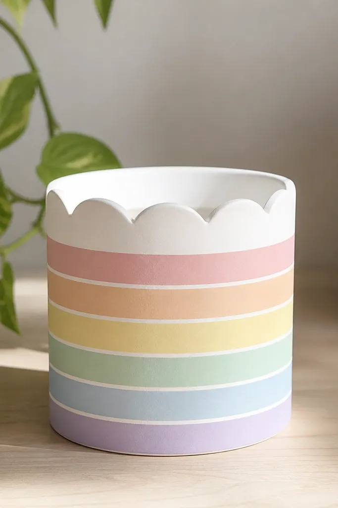
This is the pot I hand to kids when they’re excited but still need structure. The block layout is easy to follow, and the white cloud border makes it look like a storybook scene instead of craft paint. Pastels keep it classy enough to sit on a desk, and the white lines separate colors so it doesn’t look messy. It also looks great in group photos because the color bands are evenly spaced. The clean geometry flatters the pot’s round shape by giving your eye a clear path.
Pro tipUse a ruler as you tape so the bands stay level when the pot sits on a table.
Prime and paint the pot white, then tape off four horizontal bands starting about 1.5 inches below the rim. Paint each band with a different pastel: soft yellow, mint, light blue, and lavender. Remove tape while paint is still slightly cool to the touch for sharper edges. For the cloud border, use a stencil or freehand half-circles along the top band, then fill with white paint. Finish with a thin white outline around the whole rainbow block area to frame it.
AvoidAvoid using too many colors at once — four pastel bands look tidy, eight turns chaotic.
5. No-Drill Ladybug with Polka Dot Wings
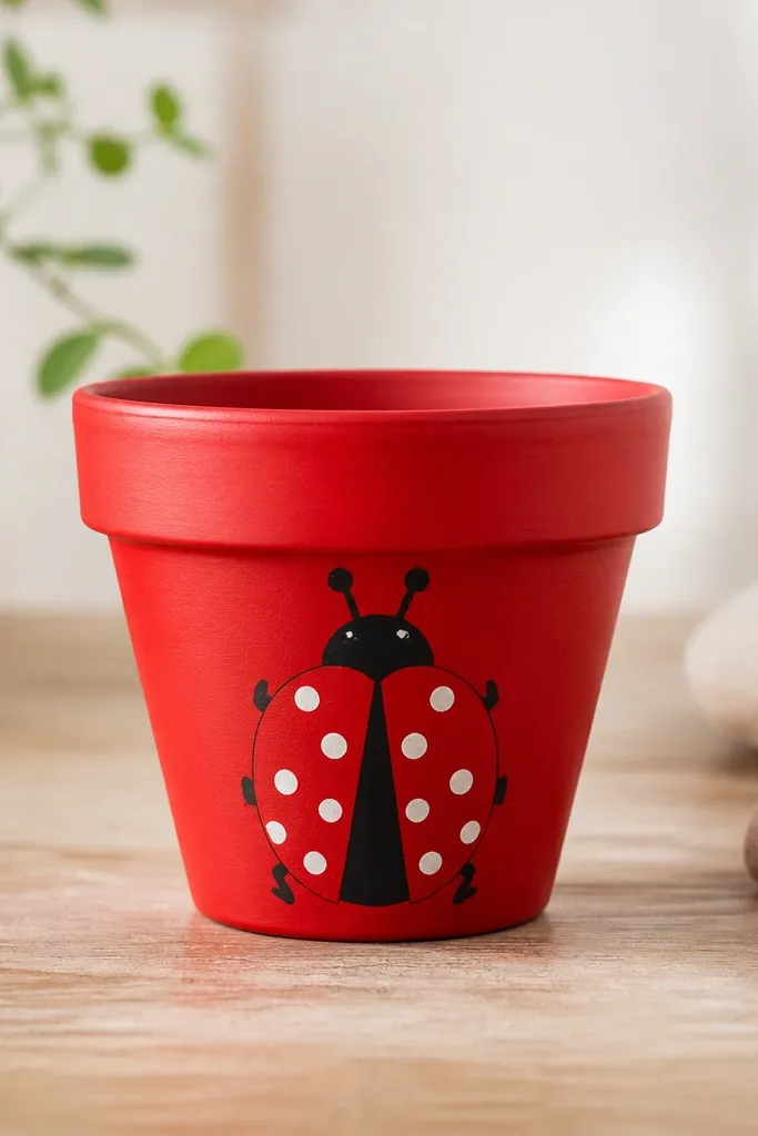
Ladybugs are a hit with kids and they photograph well because the design is bold and centered. The red base gives you instant “cute” energy, and the polka dots make it feel playful without needing fine detail. I like this for spring gifts because it looks cheerful on a windowsill. It flatters most rooms too — red and black anchor the palette, while white dots keep it light. The symmetry is forgiving because ladybugs are naturally graphic.
Pro tipIf the dots look uneven, count dots per wing (like 5 each) and place them in a loose arc.
Paint the pot red with 2 thin coats, letting each coat dry fully. Use painter’s tape to mask a center line down the front so you get two equal wing halves, then paint black wing sections on each side. Remove tape and add a small black head near the top center. Use a dotting tool for white polka dots on each wing, varying dot size slightly for realism. Add tiny curved legs with a liner brush, then seal with clear matte spray.
AvoidAvoid painting the black too thick — it can look like a smear over red.
6. Rainbow Sprinkles Over Cream with a Single Cherry
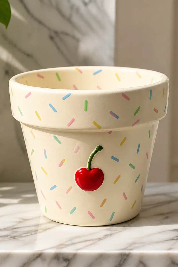
This one feels like dessert, and it works because the background is calm while the sprinkles do the talking. Cream makes the rainbow look clean instead of muddy. The single cherry gives you a clear hero element, so the pot doesn’t look like random marks. I’ve made this for birthday party favors and it’s always popular because kids can paint sprinkles fast and still feel like they helped create the main theme. It also looks good with natural wood desks and neutral shelves.
Prime and paint the pot cream, then let it dry. Use a liner brush to add short sprinkle strokes across the front — keep them mostly the same length and vary color. Add a cherry shape with red paint: a small circle plus a flatter base, then paint a tiny highlight dot in pale pink. Paint a green stem and two small leaf flicks. Seal with matte so the cherry stays soft, not glossy.
To keep sprinkles from blending, paint one color at a time and let it dry for 5 minutes between colors.
Avoid covering the whole pot edge-to-edge — leave a small clean margin so it reads as intentional.
7. Mint Polka Dot with Thick Navy Outline Hearts
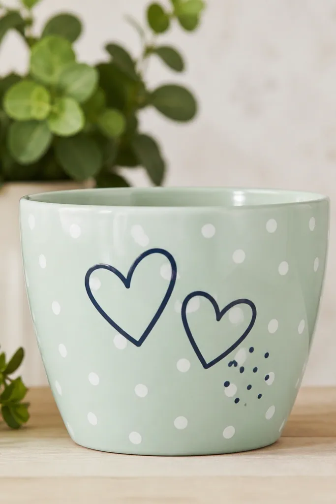
Mint and navy look modern, and the thick outline keeps the hearts visible even when the pot is small. The white polka dots add a playful texture without needing tiny details. I’ve used this for gifts for kids who like “cool” colors, and it looks good in photos because the navy gives strong contrast. The design flatters the pot by creating a clear horizontal balance: dots fill space, hearts anchor the center. It also pairs well with both bright and neutral plant pots.
Paint the pot mint with 2 coats, then let it dry. Mark dot positions lightly with pencil, or just use a ruler to keep spacing consistent. Tap white paint with a sponge to create polka dots; keep dot size around a pencil eraser width. For the hearts, use painter’s tape to mask heart shapes, then paint navy thick outlines, removing tape after paint sets. Add a small navy dot cluster near the bottom of one heart for extra charm.
Use a 1/4-inch painter’s tape strip to get heart outlines that look intentionally bold.
Avoid thin navy lines — they look like sketch marks and don’t read from a distance.
8. Galaxy Stars with Purple Nebula Swirls
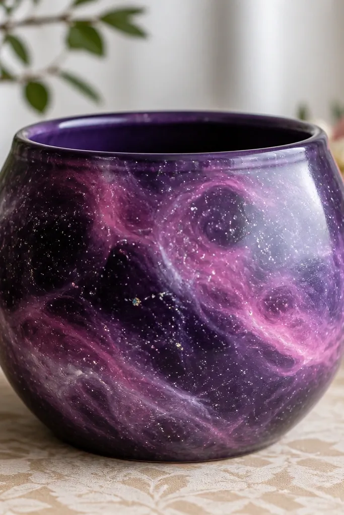
Galaxy pots look amazing as gifts because they feel magical, and the technique is forgiving. The dark base hides brush marks, while the swirls create movement without needing perfect blending tools. Kids love the star dots part, and adults love that it still looks cool on a shelf. This one flatters darker color palettes in a room by adding depth, and it reads well in low light. It also hides small paint imperfections, which makes it reliable even if your hands shake.
Pro tipPut cardboard under the pot and wear an old shirt — star flicking gets everywhere.
Prime and paint the pot a deep purple base, then let it dry. Add lighter purple and pink swirls using a sponge or a dry brush — dab and drag in curved paths. For stars, dip the end of a toothbrush in white paint, then flick over the pot for speckles, and add a few larger dots with a dotting tool. Optional: add tiny silver dots for a “sparkle” effect. Seal with matte or satin clear coat so the texture stays galaxy-like.
AvoidAvoid using black for the outline — it makes the galaxy look muddy instead of dreamy.
9. Classic French Daisy Band on White
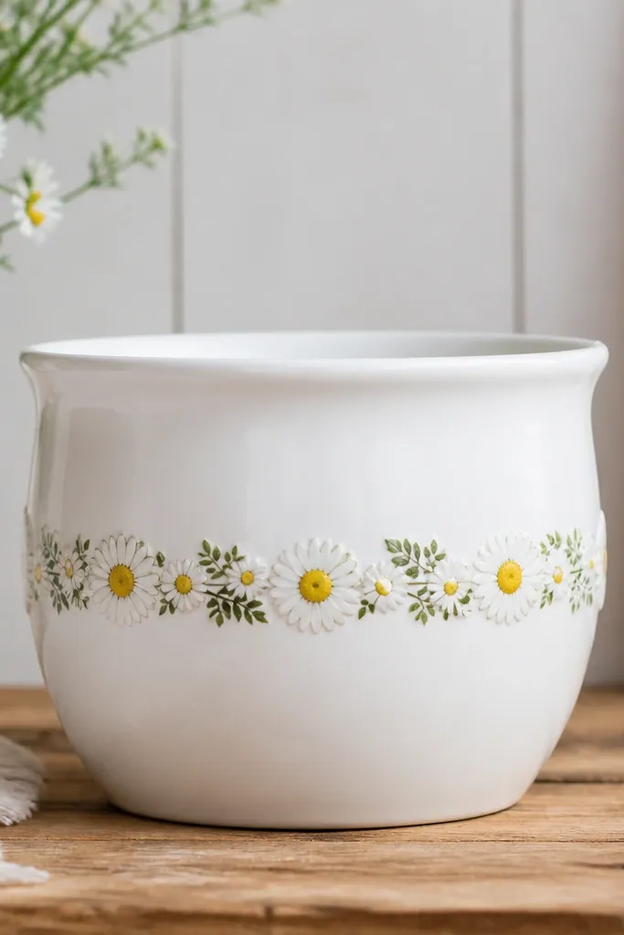
This looks like something you’d buy at a cute boutique because it’s clean, repeatable, and balanced. A middle band is flattering on round pots because it sits at eye level when the pot is on a table. White petals and yellow centers stay bright, and the tiny green leaves make the band feel finished. I’ve used it for teacher gifts and small thank-you presents because it doesn’t scream a holiday. It also works for kids who like painting the same shape over and over.
Pro tipMake a quick “petal template” on scrap paper so your petal size stays consistent.
Paint the pot white and let it cure enough that it doesn’t smear when you touch it. Use tape to mark a band across the middle — about 2 inches tall. Paint small daisy petals using a dot-to-petal method: place a yellow center dot, then pull 6-8 white petals around it with a fine brush. Add tiny green leaves between daisies to fill gaps. Remove tape once dry, then seal with clear matte spray.
AvoidAvoid crowding daisies too tight — spacing makes it look intentional instead of messy.
10. Monogram Letter + Confetti Dots
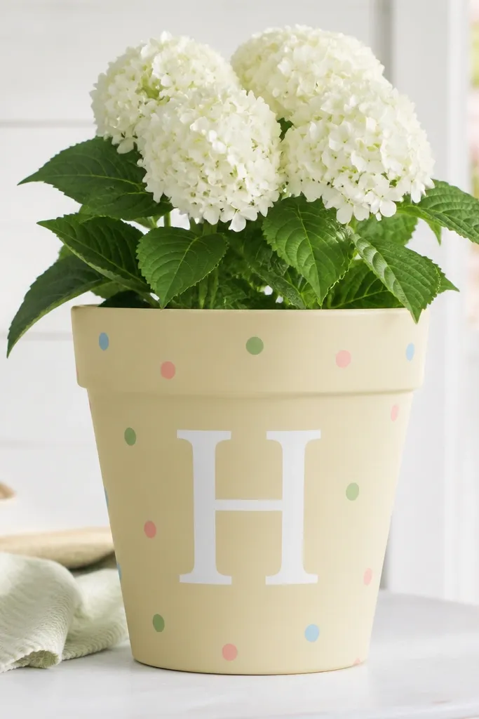
A monogram pot is the easiest way to make a simple paint job feel personal. The big letter is the focal point, while confetti dots add motion without cluttering the design. I’ve made these for birthdays where everyone wants the gift to look “adult enough” but still cute for kids. Choose a letter shape that fits the pot — block letters look clean on round surfaces. The pastel base keeps it light, and the white letter pops so it reads in photos.
Prime and paint the pot pastel yellow (or any soft base you like). Print a letter outline on paper, tape it to the pot, then trace with a pencil lightly. Paint the monogram in white using a flat brush for smooth edges, then let it dry. Add confetti dots around the letter with a dotting tool in 3 colors max. Seal with clear matte so the letter stays crisp and not shiny.
If tracing feels hard, use vinyl stencil sheets and press them down firmly for clean edges.
Avoid adding too many colors — the letter should stay the main thing.
11. Teacup Kawaii Cat with Blush Cheeks
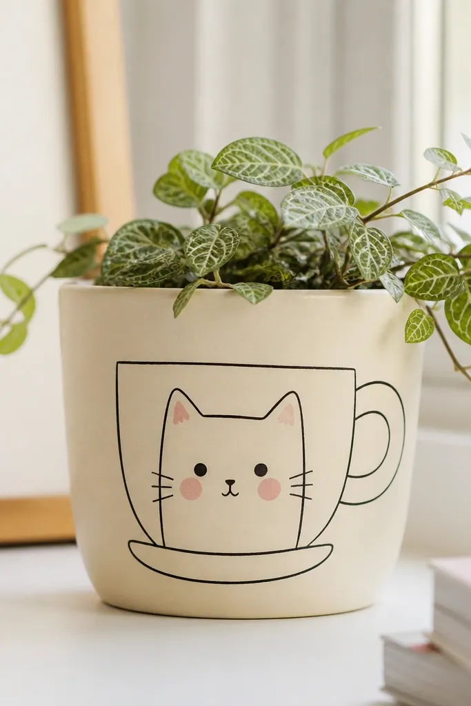
Kawaii cat faces are small-detail friendly, but you still get a big “aww” effect because the expression is clear. The teacup frame adds structure so the face doesn’t float on the pot. I use blush cheeks and a soft beige base for a warm look that matches kids' bedrooms and gift tables. This one flatters the pot shape by centering everything vertically. It also looks great on photos because the eyes are the brightest element.
Pro tipUse a pencil first, then paint over lines lightly so you can erase mistakes before paint sets.
Paint the pot beige, then let it dry. Draw a teacup outline in light brown across the front: a rounded cup body and a handle on one side. Inside the cup, paint a cat face with two small oval eyes, a tiny nose, and a mouth line. Add blush cheeks with a small dot or two of pink, then add three short whisker lines on each side using a liner brush. Seal with matte clear coat.
AvoidAvoid black eyes that are too big — they can make the face look startled.
12. Tropical Leaves with Lime Veins
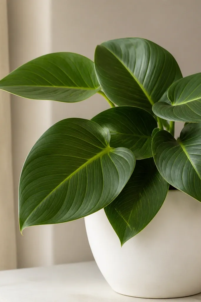
Tropical leaves look expensive because the shapes create depth, even when you’re using flat paint. The white background keeps it bright and makes the greens look fresh instead of dull. Lime veins add that “designer” detail that makes people ask where you bought it. I like this for summer gifts and for anyone who loves plants but wants the pot to look like decor. It flatters by drawing the eye upward with the leaf placement near the rim. The overlapping leaves also hide small imperfections at the pot’s seams.
Prime and paint the pot white. Sketch 3-5 leaf shapes across the front using a pencil guide, then paint the leaves in medium green. Use a thinner liner brush to add lime veins from the leaf stem toward the tip. Add a few overlapping leaf tips near the rim so the composition feels full. Seal with clear satin if you want a slight glow, or matte if you prefer a softer look.
For leaf stems, paint a single curved line first, then build both sides from that line.
Avoid using only one green shade — it flattens and makes the leaves look like stickers.
13. Butterfly Wing Outline with Metallic Accents
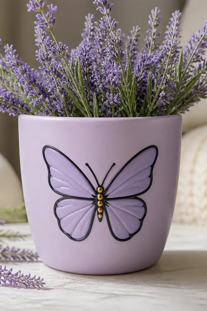
Butterflies look cute and a little grown-up, and the outline method keeps it clean on a curved pot. The metallic gold dots add a tiny highlight that catches light in a way flat paint can’t. This works well for gifts because it doesn’t tie to one holiday, and it still looks special. I’ve used it for spring birthdays and it looks great next to white flowers. The black outline flatters the shape by giving you a crisp boundary that stays readable from a distance.
Prime and paint the pot pale lavender. Sketch a butterfly outline in pencil centered on the front. Paint the outline in black acrylic, then fill wings in a slightly lighter lavender with a sponge brush for soft edges. Add a few gold dots near the body and a thin gold line on one wing edge. Finish with clear coat; if you want the gold to stay lively, use a satin top coat.
If metallic paint looks streaky, dab it with a small sponge instead of brushing it.
Avoid covering the whole butterfly in metallic — it turns into a flat glitter patch.
14. Lemon Slice Dots with Yellow Rim
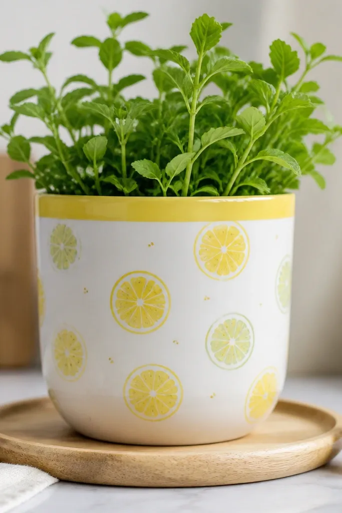
Lemons are my go-to when I want a pot that feels fresh and cheerful without looking like a theme party. The yellow rim makes the pot look polished, and the lemon slice circles give a repeating pattern kids can do quickly. This design works on small pots and medium pots because the slices repeat without crowding. It also flatters kitchens and dining rooms because the palette matches fruit decor. The pale green seeds add just enough detail to look “handmade” instead of generic polka dots.
Pro tipUse the same dot size for seeds so the lemons look like a set.
Paint the pot white first. Tape a 3/4-inch rim band and paint it bright yellow, then remove tape carefully after paint sets. Draw lemon slice circles lightly with pencil, then paint outer rind in yellow. Add inner segments in pale yellow and dot the center with tiny pale green dots for seeds. Seal with matte clear coat to keep the lemons looking like paint, not plastic.
AvoidAvoid painting lemon circles too big — they should fit comfortably in the pot’s front panel.
15. Rainbow Heart Garland Across the Front
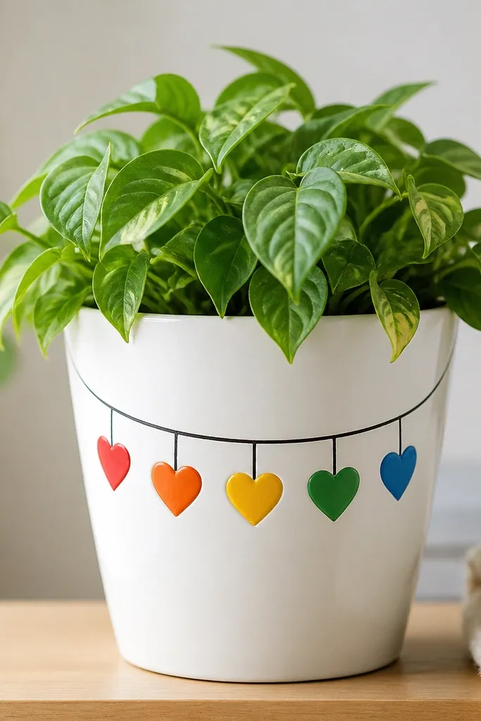
This one looks like a party banner on a mini scale, and it’s easy to adjust for different pot sizes. A curved “string” line gives movement, and the hearts hang in a rhythm kids can follow. I like it for birthdays and class gifts because it feels celebratory without being messy like drip paint. The white background keeps colors clean, and the heart shapes stay readable even if the pot has slight bumps. It also flatters the pot shape by guiding the eye in an arc.
Pro tipIf you’re short on time, pick 5 hearts instead of 7 — fewer shapes look neater on small pots.
Prime and paint the pot white. Sketch a gentle arc across the front, then paint a thin line in brown or gray to represent the string. Paint hearts in a rainbow sequence, starting with red on one side and ending with blue on the other. Keep heart sizes consistent by using a small cardboard cutout to trace once, then paint multiple hearts. Add small highlights in lighter paint on each heart if you want extra pop. Seal with clear matte spray.
AvoidAvoid cramming hearts into the rim — leave space so the garland looks like it’s hanging.
16. Sea Glass Ombre with Tiny Bubbles
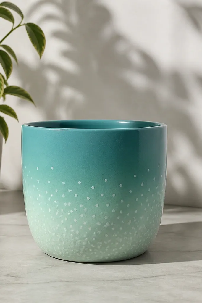
Sea glass ombre looks calm and expensive, and it’s great when you want a gift that doesn’t scream “kids craft.” The gradient hides brush marks because the color change smooths over small streaks. I like teal to mint for a soothing look that fits bathrooms, patios, and dorm rooms. Tiny bubble dots add charm without turning it busy. This design flatters the pot by emphasizing its vertical curve with the gradient direction. It also works well for people who like minimalist decor.
Prime and paint a base mix of teal in a horizontal band around the bottom. Blend upward into mint using a damp sponge brush — dab and lift rather than dragging. Keep edges soft so you get that sea glass feel. Add bubble dots with white paint using a dotting tool, concentrating them near the bottom where the “water” would be. Finish with a clear satin coat so the ombre looks smooth and light-catching.
For smoother blending, use slightly damp paint for the first blend pass and stop touching it once you like the gradient.
Avoid painting the gradient in one thick swipe — it creates hard lines.
17. No-Drill Garden Gnomes with Beard Texture
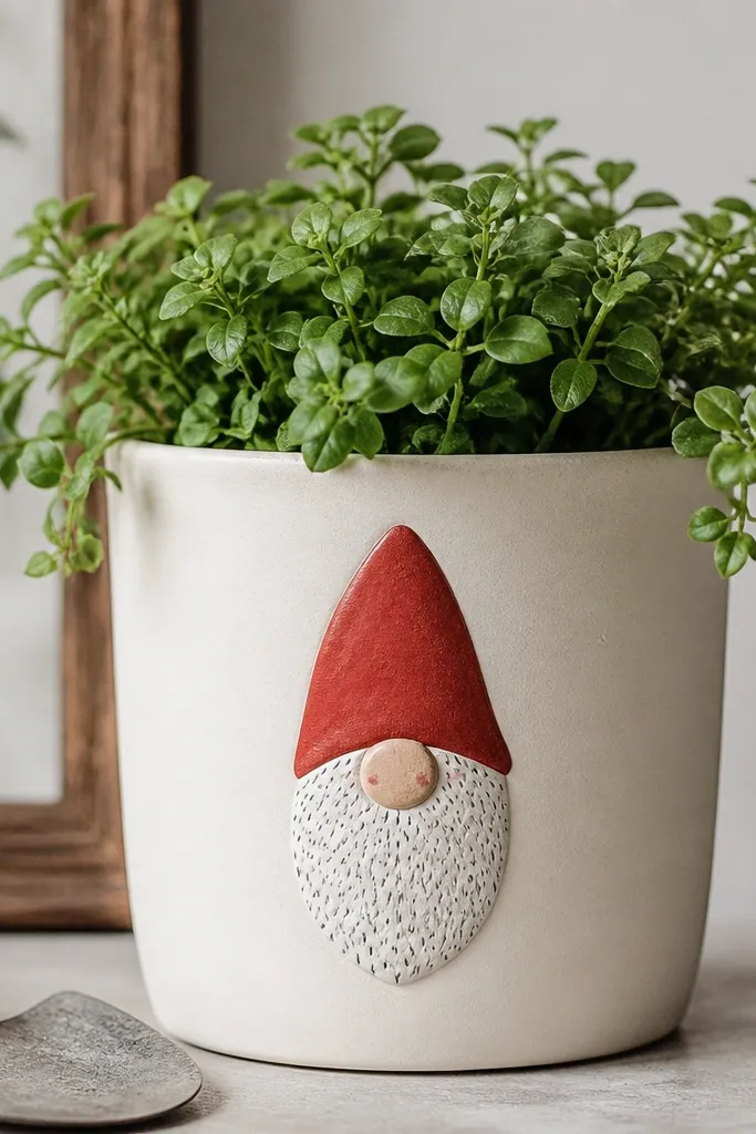
Gnomes are funny and sweet, and the beard texture makes them look handmade even with basic paint. The red hat gives you a strong focal point, and the cream base keeps it from looking heavy. I’ve used this for winter gifts and it still works in summer because gnomes are their own vibe. The simple face is easy for kids to help with — they can dot the beard and add a nose. It flatters the pot’s roundness because the gnome sits centered and balanced.
Pro tipStipple in clusters, not a straight pattern — the beard looks more natural that way.
Paint the pot cream and let it dry. Draw a simple hat shape in red on the top half of the front panel, then paint a darker red brim line. For the beard, stipple white paint using a sponge or stiff bristle brush to create texture. Add a small rosy nose dot in pink or peach, then paint two tiny eyes as dark dots. Optional: add a small green scarf band near the bottom with a thin stripe. Seal with matte clear coat.
AvoidAvoid smooth-brush beards — they look like blobs and lose the gnome charm.
18. Monochrome Doodle Flowers with Brown Stems
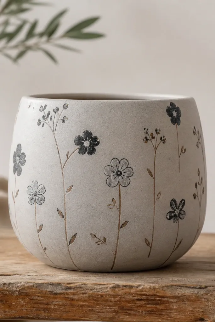
Monochrome doodles look cool because they look like you drew them, not like you filled a stencil. This is a great option for gifts when you want the pot to match lots of decor styles. Brown stems tie the black-and-gray flowers together and keep the palette warm. I like it for kids because it’s forgiving: a wobbly line still looks intentional. It also flatters photos because the design doesn’t compete with the plant — it frames the greenery. The scattered placement makes the whole pot feel alive.
Pro tipIf your lines tremble, slow down and use shorter strokes — the lines look more “drawn.”
Prime and paint the pot a light gray or pale taupe base. Use a fine liner brush to draw thin brown stems and a few leaf flicks. Add small doodle flowers by drawing 5 oval petals around a dot center, using black paint. Vary petal sizes slightly so it doesn’t look stamped. Leave lots of empty space so the doodles breathe. Seal with matte clear coat to keep it sketch-like.
AvoidAvoid filling the entire pot — doodles look best with breathing room.
19. Pink Flamingo with Black Wing Detail
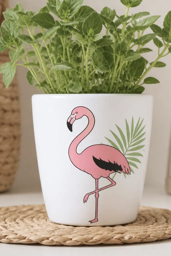
Flamingos are instantly cute and they look playful without needing glitter. A black outline makes the silhouette crisp on a curved pot, and the green leaf adds a tropical pop. I like this for party favors and kids' gifts because it feels like a character, not a pattern. The pink flatters warm skin tones in photos and gives a bright focal point. It also works well with real plants because the flamingo sits above the soil line visually.
Paint the pot white, then sketch the flamingo shape in pencil. Outline the flamingo in black first, including the beak and leg line. Fill the body with pink acrylic in 2 thin coats so it doesn’t streak. Paint the wing patch in a darker pink or coral, then add a small black pattern spot using a liner brush. Add a simple palm leaf behind the flamingo in green with a darker green vein line. Seal with matte clear coat.
Use painter’s tape to mask the wing edge so the black patch stays clean.
Avoid skipping the outline — without it, the flamingo looks washed out.
20. Berry Basket Pattern with Tiny Blue Dots
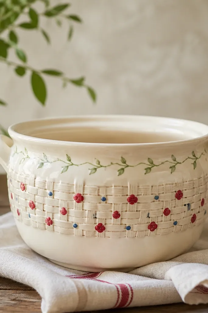
This design looks like a mini picnic theme because it combines a basket band with fruit dots. The basket weave gives structure, and the berries give the cute pop. I like cream as the base because the red and blue stay bright and don’t fight each other. This also flatters the pot by concentrating detail in one band, which makes the rest of the pot feel clean. Kids can help with the dot berries easily, and adults get a finished look because the basket band makes it feel crafted.
Pro tipFor weave lines, keep your brush load light so lines stay crisp instead of thick.
Prime and paint the pot cream. Tape a horizontal band around the middle, then paint a basket weave pattern with a light brown using a small flat brush: paint vertical lines, then cross with short horizontal strokes. Remove tape after it dries enough not to smear. Add red berry dots in a row across the band, then add tiny blue dots in the gaps. Paint small green stems above the berries with short curved lines. Seal with matte clear coat.
AvoidAvoid heavy paint on the weave — it turns raised and looks messy.