1. The 4-Frame Face Grid with White Borders
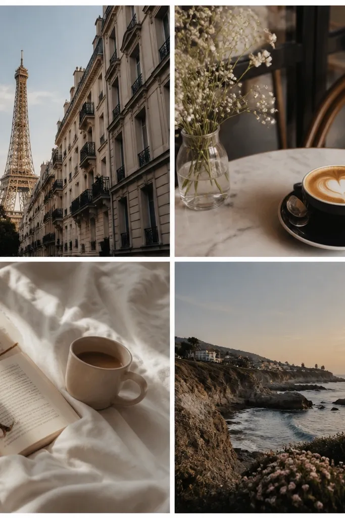
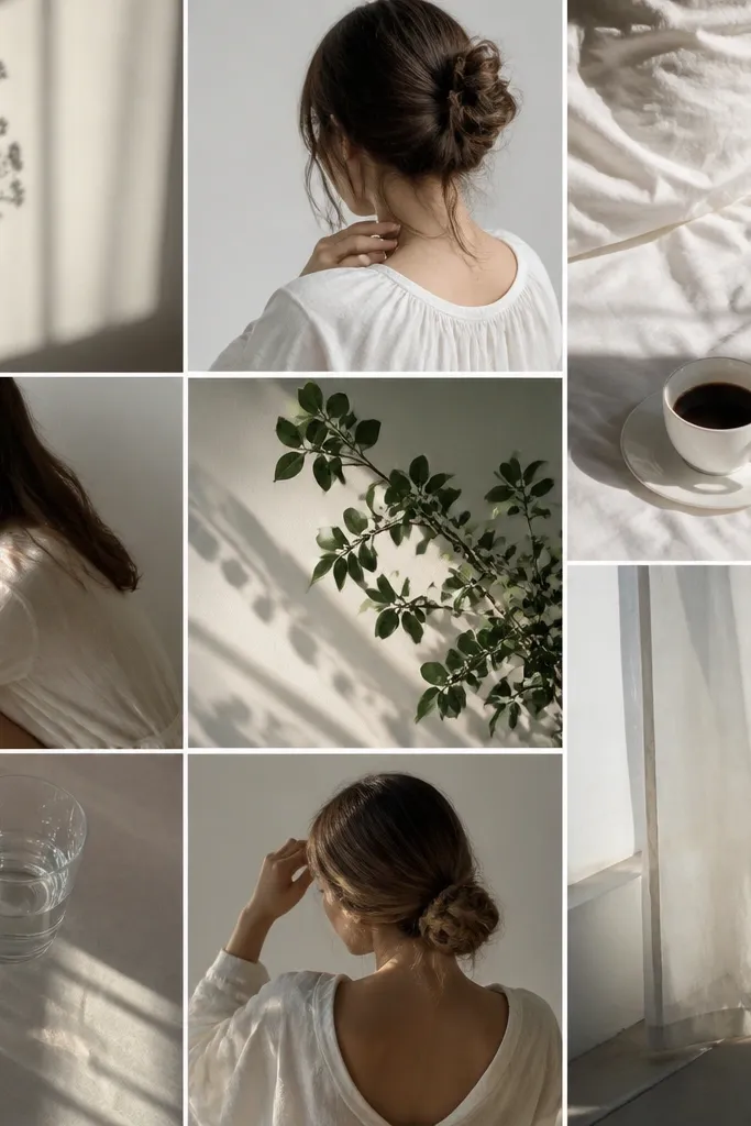
This one works because it treats your photos like a set, not a scrapbook dump. I use it when I have 4 strong shots — usually my kid’s best face angles — and the backgrounds are different. The white borders make the edges crisp against any photo color, so nothing blends into the next image. It looks clean on warm skin tones because the border gives the eye a break and keeps faces from getting washed out by bright backgrounds. The framing is neutral enough for birthdays, school photos, and random “we survived Tuesday” moments.
Start by choosing four photos where the faces take up at least half the frame. Crop each photo to 4:5, then place them in a 2x2 grid on a 1080 x 1920 canvas. Add a white border that’s the same width for all four frames, then keep the spacing between frames consistent — I use a gap around the same width as the border. Finally, add one small date stamp at the bottom-right in a simple sans font like Arial, sized so it’s readable but not loud.
If one photo is darker, brighten just that one by a small amount so all four faces land at similar exposure.
Avoid thin, uneven borders — if one frame has a different edge width, the whole collage looks like a rush job.
2. Polaroid Tape Line Collage (No Layout Math)
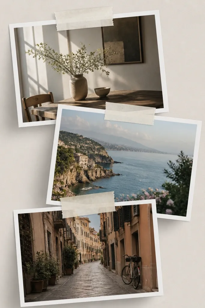
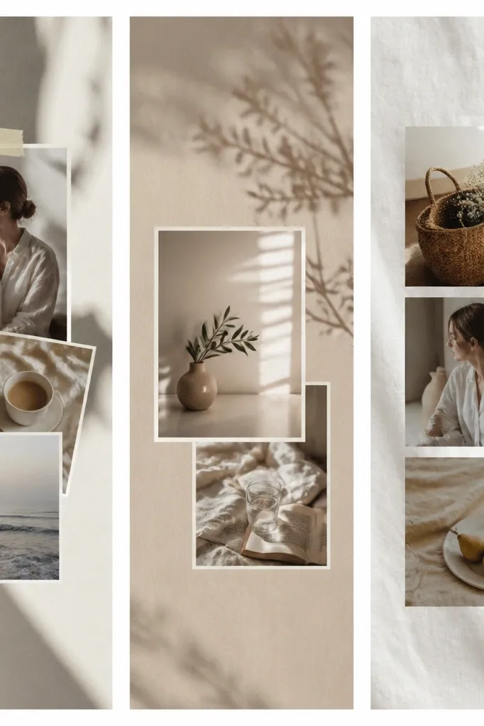
I use this when the photos are from one event and I want a playful vibe without a grid that feels too strict. Tape hides small alignment differences because your brain reads the tape as the “real” edge. The off-white tape looks good against both bright and dark outfits, and the slight shadow makes it feel physical even on a screen. It flatters kids' photos because the stacked format makes faces bigger and gives you room to include one silly shot without it looking out of place. It also works for couples and best-friend posts when you want warm, casual energy.
Start by selecting three photos and cropping them to 4:5. Place them in a diagonal stack centered on the screen, leaving about 10-15% of the canvas as margin on all sides. Add a tape strip at the top of each “Polaroid” frame, tilting each tape slightly in a different direction. Then give each photo a soft shadow so the stack looks raised instead of floating. Keep the background a solid light gray or cream so the tape reads clearly.
Use the same tape color for all frames — I stick to #F2E9DC — so the collage looks consistent.
Skip glossy highlights and heavy shadows — they make it look like a template instead of something you assembled.
3. Cream Paper Texture with Rounded Photo Corners
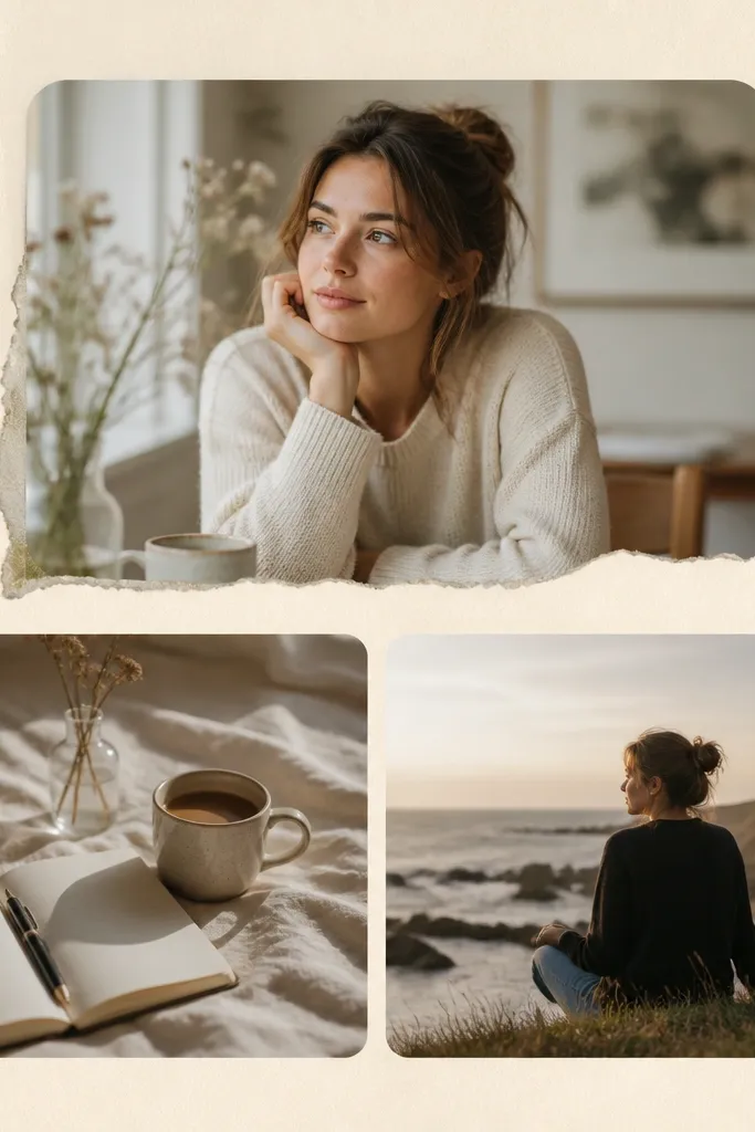
Paper texture makes a collage feel handmade, and rounded corners keep it from looking harsh. I use this when my photos are mostly warm tones — birthday cakes, indoor lighting, autumn sweaters — because the cream background makes reds and skin tones look cozy. Rounded corners also help with viewer comfort: your eyes don’t get stuck on sharp edges, especially when the photos are busy. For kids, it hides minor cropping mistakes because rounded corners forgive uneven borders. The overall look feels soft and calm without needing fancy fonts.
Pro tipPick one dark brown text color and stick to it, like #3B2F2A, so the collage feels cohesive.
Start with a cream background image or a solid color plus a subtle paper texture overlay. Crop two or three photos to 4:5 and add rounded corners with a radius around 40-60px. Layer the top photo slightly higher than the others and tuck the bottom photo a bit behind it so there’s depth. Add a faint torn-paper edge element behind the top frame if you have it, or use a simple mask shape. Keep text minimal — one short line in dark brown — and place it near the bottom so it doesn’t cover faces.
AvoidDon’t use high-contrast black text on cream paper — it looks harsh and cheap fast.
4. Magazine Cutout Style with Bold Title Bar
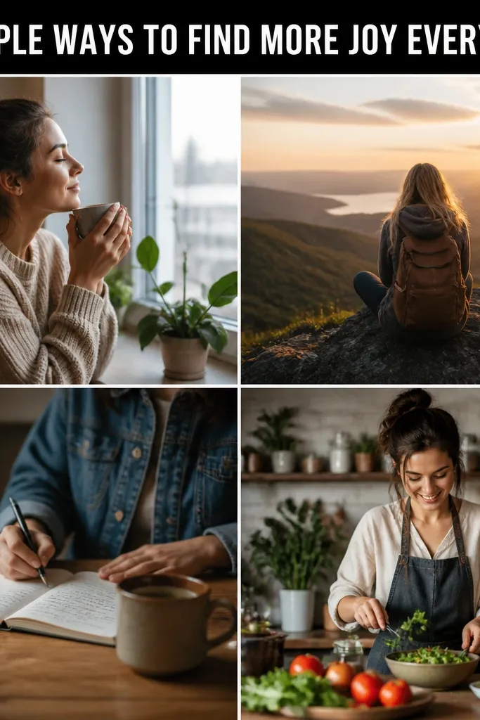
This is the layout I reach for when I want the story to look designed even with random photos. The bold title bar gives structure and makes the collage feel intentional, like you planned the order. Black text blocks work especially well with colorful kids' outfits because the frame around the photos keeps the colors from bleeding together. It also helps readability for people watching with low brightness on their phone. The cutout vibe flatters mixed lighting shots because the title bar anchors the eye at the top.
Pro tipMake your title bar text short: 3 to 5 words max so it stays crisp on Stories.
Start by placing four photos in a slightly uneven grid — two on top, two below — with consistent spacing. Add a thick title bar across the top of the canvas that covers about 12-15% of the height. Use white uppercase text centered in the bar, sized big enough to read without zooming. Add a small cutout edge effect to each photo frame by using a subtle shadow or a 2-3px light border that mimics paper. Keep the background plain — white or very light gray — so the black bar is the star.
AvoidAvoid long captions in the title bar — it turns into mush on small screens.
5. Diagonal Split Story with One Full-Height Hero Photo
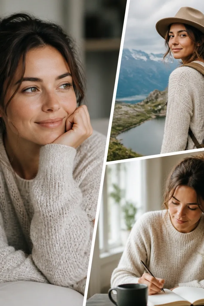
Hero-photo collages look polished because they give the viewer one clear moment to focus on. I use this when one photo is way better — like a clear face or a strong outfit shot — and the other shots are supportive. The diagonal divider feels modern and it hides differences in photo composition by creating a clear boundary. This flatters all skin tones because the hero photo controls the color mood, while the smaller photos don’t compete. It also works for kid milestones where you want the main moment to feel important.
Start by choosing one hero photo and crop it to 4:5, then scale it to fill the left side at full height. Add two smaller photos on the right, stacked, each cropped to match the same 4:5 ratio. Create a diagonal divider by adding a white or cream polygon shape that separates left and right, then keep its color consistent with your borders. Place the right-side photos slightly offset from the divider so they don’t look perfectly “stuck on.” Add a small date or location in the bottom-right corner of the right column.
If the hero photo is bright, add a tiny dark overlay (10-15%) behind the text only, not across the whole image.
Avoid placing the hero photo too centered — it should feel anchored to one side to keep the diagonal energy.
6. Polka Dot Overlay with Two Photos and Big Rounded Text
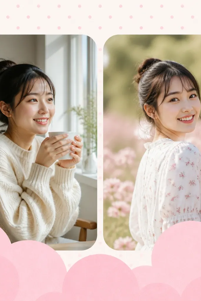
This one is fun for birthday parties, playdates, and school events when you want cuteness without chaos. The polka dot overlay adds texture so even simple photos look styled. I like it with two photos because the overlay stays readable and doesn’t fight busy grids. The rounded bubble text makes kids' faces and colorful outfits look sweeter, especially on lighter skin tones. If your photos are mostly neutral, the polka dots add personality without forcing you to recolor anything.
Pro tipMatch the polka dot color to one small detail in your photo (shirt stripe, accessory) so it feels intentional.
Start with a light background color, then add a polka dot overlay at low opacity so it doesn’t cover faces. Place two photos side by side, each cropped to 4:5 with rounded corners around 40px. Add a thin white border around the photos to separate them from the dots. Put big rounded text near the bottom, leaving enough space so it doesn’t cover faces. Use one text color that matches an outfit detail in your photos — like a dark navy if there are denim tones.
AvoidAvoid heavy opacity dots — if the dots are too strong, the collage looks like a sticker pack.
7. Gradient Wash Background with Three Frames
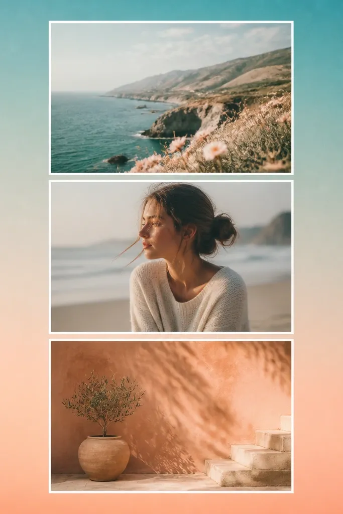
Gradient washes make a collage feel “designed” even when you only use three photos. I use it for travel days and beach weekends because the colors echo the sky and sand. The gradient also helps with mixed lighting: if one photo is warm and another is cool, the background color smooths the transition. This flatters all skin tones because you can control contrast — keep text white or black with a shadow. It also looks good for kids since it doesn’t demand exact color matching between photos.
Start by creating a gradient background with two colors pulled from your photos, like teal (#3AA6A8) and peach (#F6B7A8). Place three photos in a vertical stack centered on the canvas, each cropped to 4:5. Add a thin white border around each frame and keep the spacing consistent. Add a soft drop shadow so the photos pop off the gradient, but keep it subtle. Put your text near the top or bottom with a simple font and a shadow for readability.
Pick gradient colors that are mid-tone, not neon — neon gradients make faces look washed out.
Avoid gradients that are too dark — the text and faces lose clarity.
8. Instagram Poll-Ready Collage with Clear Text Zones

This one is for when you actually want engagement, not just aesthetics. I use it when I’m planning outfits, asking “which one?”, or letting family vote on a kid’s drawing. The trick is leaving clean text zones so the poll or question sticker doesn’t cover faces. Two big photos look better than four tiny ones because the viewer can react quickly. This works for any skin tone because you’re not stacking too many competing elements — the text area is separate. It also helps when your photos have busy backgrounds because the middle stays visually simple.
Pro tipTest it by opening the Story viewer at full brightness — if you can’t read it instantly, shrink the photos or move the text zone.
Start by placing two photos centered, each taking up about 45-50% of the width and cropped to 4:5. Leave the top 20% of the canvas empty or nearly empty with a plain background color so stickers have room. Keep the bottom 15% for a short caption and a small emoji if you want. If you’re adding a border, use the same border color for both frames. Finish by checking that faces are at least 80-100px away from where the poll sticker will sit.
AvoidAvoid placing faces under where the sticker lands — it looks accidental and messy.
9. Seasonal Grid with Color-Coded Borders
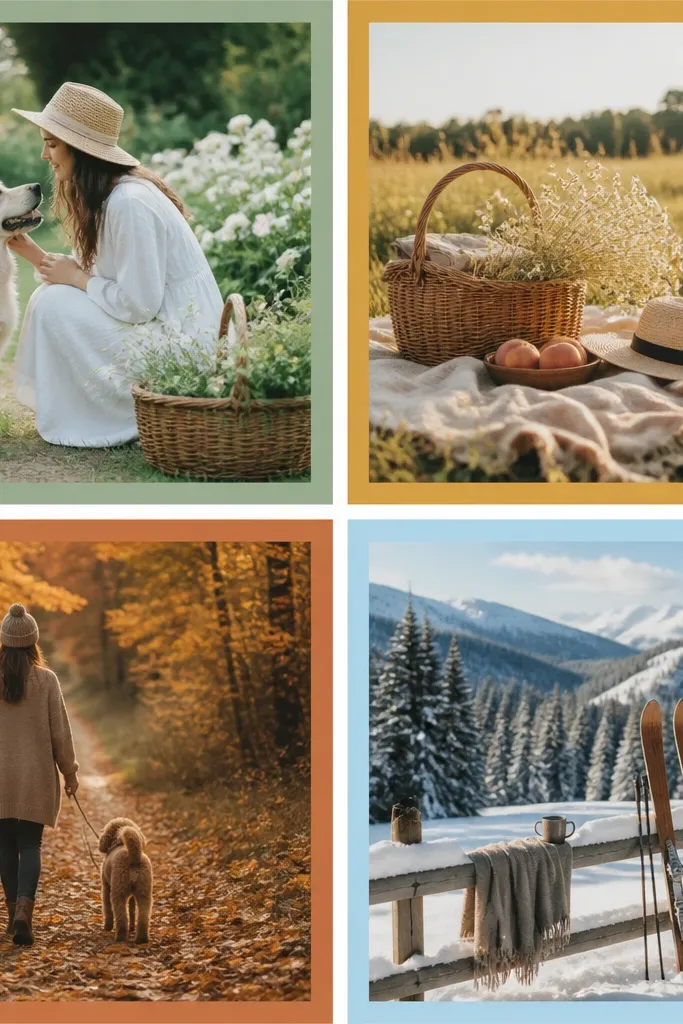
Color-coded borders make the collage feel cohesive even when the photos are from different days. I use this for seasonal posts because the borders carry the theme. It flatters skin tones because border colors guide the eye without changing the photo exposure. With kids' photos, the border colors also make it easier to spot the best moment since the frames are visually distinct. If you keep the border thickness consistent, it still looks clean instead of chaotic.
Pro tipPick border colors from actual pixels in your photos, not from random color trends.
Start with a 2x2 grid of four photos, all cropped to 4:5. Choose one seasonal palette and assign each border a single color from it, like sage (#9FB7A8), mustard (#D6A24A), terracotta (#C86A4A), and sky blue (#7FB6D9). Set the border thickness to the same value for all frames, and keep the spacing between frames consistent. Use a neutral background — white or very light gray — so the borders do the work. Add a tiny season label in the top-left, using a darker version of one border color.
AvoidAvoid using too many border colors in one collage — 4 is enough for a clean look.
10. Swipe-Stop Mini Collage for Kids' Activities

This layout is built for quick attention. The big top photo grabs the eye, then the two smaller shots show context. I’ve used this for playground days, dance class, and art projects because kids' activities often have one standout moment and a couple supporting shots. The “today” tag makes it feel timely without needing a long caption. It works on all skin tones because the top photo controls the color mood and the bottom photos stay smaller. It also looks good even if one action shot is blurry.
Start by picking one photo where the face is sharp and crop it so the face fills the center — still keep a 4:5 ratio. Place it at the top at about 55% of the collage height. Add two smaller photos below, each about 20-22% height, cropped to 4:5 and aligned to the same left edge. Use a light background and add thin white borders to separate frames. Put a small rounded rectangle tag with “TODAY” or the activity name in the top-right corner.
If an action shot is blurry, choose a crop where the motion is still visible — blur looks intentional when it’s framed tightly.
Avoid tiny captions in the bottom — they disappear fast on Stories.
11. One Color Pop Background with Full-bleed Photos

Full-bleed photos make your collage look modern and clean because there are no frame lines to misalign. I use this when the photos have strong subjects — a bright outfit, a clear toy, a crisp sky. The one color pop background gives you contrast so the photos don’t blend into each other. This is great for kids because you can include a close-up and a wider shot without the collage feeling like a template. It also keeps skin tones looking natural because you’re not adding heavy borders or textures that might change perceived color.
Pro tipUse one background color across multiple stories that week so your account looks consistent.
Start by picking one background color pulled from a strong detail in your photos, like coral (#F46A6A) or mint (#72C6B8). Place two photos full-bleed in a side-by-side layout and crop each to 4:5 before scaling so edges don’t stretch. Remove borders so the photos touch the background cleanly. Add your date sticker or a simple text label in the top-left with a white font and a thin dark shadow. Keep the rest of the canvas empty so the collage breathes.
AvoidAvoid using two different background colors in one story — it breaks the clean look.
12. Frame-in-Frame with Double Borders
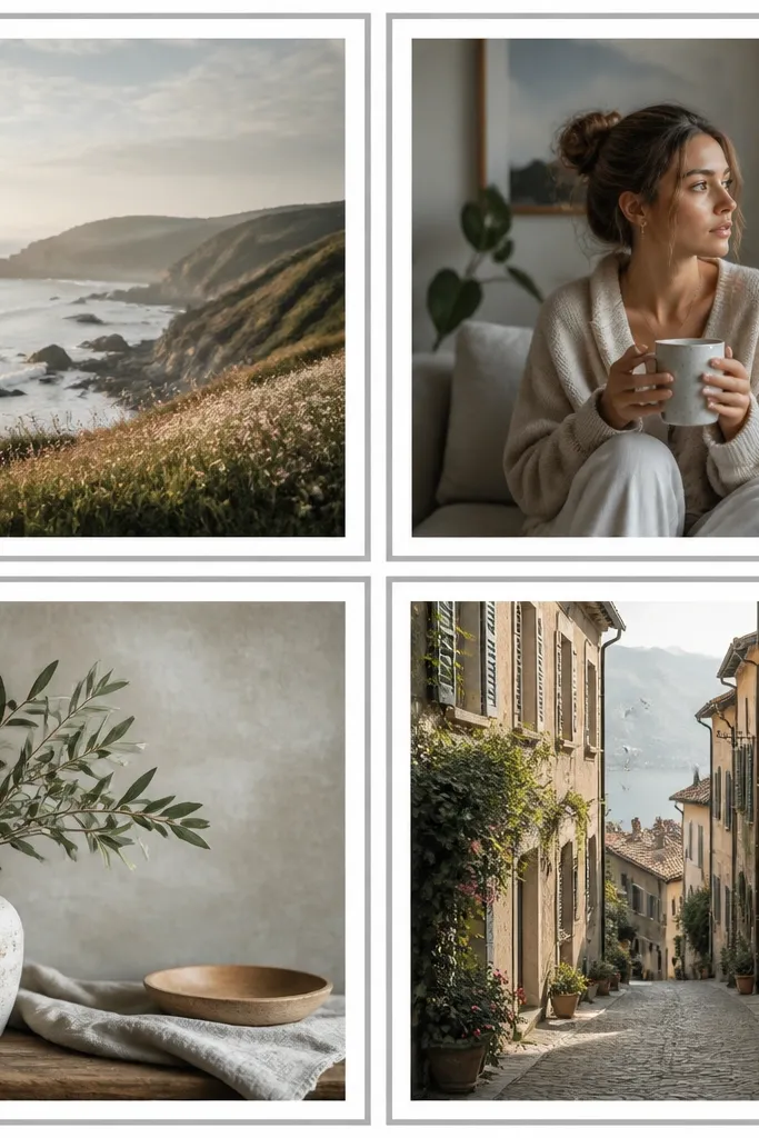
Double borders make photos feel “finished” without needing extra decoration. I use this when my photos are slightly noisy or have mixed contrast, like outdoor shots under trees. The inner border keeps faces crisp, and the outer border adds separation from the background. It flatters skin tones because the white inner edge prevents the photo edges from getting swallowed by dark areas. For kids' photos, it makes the collage look more polished even if the images aren’t all perfectly exposed. The effect is subtle but it makes a cheap template look like you spent time.
Start with a 2x2 grid of four photos, each cropped to 4:5. Apply an inner border that’s about 8px white, then add an outer border in a light gray around 4px. Keep the gap between frames the same as the outer border width so everything lines up. Use a neutral background like #F7F7F7 so the gray border reads cleanly. Add a small caption at the bottom center in a dark gray font.
If your photos have bright whites, use light gray inner borders instead of pure white so details don’t blow out.
Avoid random border thicknesses per frame — that’s the fastest way to make it look off.
13. Sticker Cutouts with Thick White Outline

Sticker cutouts are the easiest way to make a collage look playful and intentional at the same time. The thick white outline acts like a safety rail so your photos don’t blend into the background. I use this for kids' birthday weeks because it matches the sticker-and-cake vibe without needing fancy graphics. It flatters faces because the outline creates a consistent visual edge around each photo. If you have photos with different backgrounds, the outline still keeps the collage tidy. You get that “printed and stuck on” feel without doing real crafts.
Pro tipKeep icons small and limited — two or three icons max so the photos stay the main focus.
Start by choosing three photos and cropping to 4:5. Use rounded sticker shapes with a radius around 60px and apply a thick white outline around each photo, like 10-14px. Place one sticker slightly higher than the others and keep the spacing consistent so it doesn’t look scattered. Add a light gray background (#EFEFEF) and a couple tiny icons (hearts or stars) in the negative space. Put your text in the empty area, not on top of the sticker edges.
AvoidAvoid thin outlines — they disappear on brighter phone screens.
14. Minimal One-Photo Story with Photo Strips
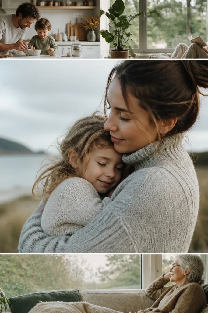
Sometimes the easiest collage looks the most expensive. This setup uses one main photo as the hero and adds two thin strips as visual support, like a magazine layout. I use it when I have one perfect portrait and a couple “in-between” shots that would look weak in a full grid. The strips keep the story from feeling empty, and the minimalist layout makes text readable. It flatters kids because the hero photo is large enough for faces to look sharp. With lighter skin tones, the large photo doesn’t get overpowered by extra frames.
Start with one main photo cropped to 4:5 and place it centered, taking up about 60-65% of the canvas height. Add two narrow strips — one above and one below — each using a different photo cropped to 4:5 but scaled horizontally into a strip. Keep the strips height around 15-18% of the canvas each, with consistent spacing between main photo and strips. Add a thin white border around the main photo only, or around all three if you want extra structure. Keep the background solid white or very light gray and place the caption in the top-left with a simple font.
Choose strips where the subject is still recognizable even at small size — toys, shoes, or faces work best.
Avoid strips that are too busy — tiny clutter becomes unreadable fast.
15. Split-Photo Timeline with Date Labels

A timeline layout makes your story feel like a sequence, not a random collage. I use this for weekends, school progress, and “day-by-day” activities because the date labels tell viewers what order to watch. The colored pill labels add personality and make the collage scannable even when photos have different colors and exposures. It flatters skin tones because the date pills pull attention to the left margin instead of covering faces. For kids, it’s great when you have a before/after or morning/afternoon set.
Start by selecting three photos and cropping each to 4:5. Stack them vertically with consistent spacing and a thin border around each photo so the edges don’t blur into each other. Place a colored pill label at the left of each photo, aligned vertically with the photo center. Use one color per photo label, pulled from the photo palette, but keep saturation similar so it stays cohesive. Keep the background white or light gray and add a short line of text at the top like “Weekend timeline” in small font.
Use the same font weight for all date labels so the sequence reads cleanly.
Avoid long date text — “Sat, March 2” is enough. Full paragraphs break the look.