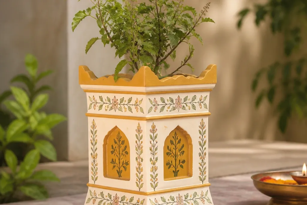
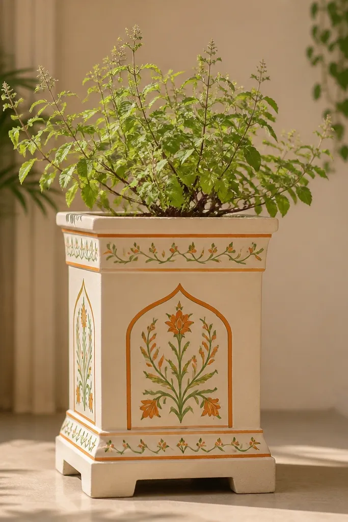
1. Marigold Border With White Dot Halo
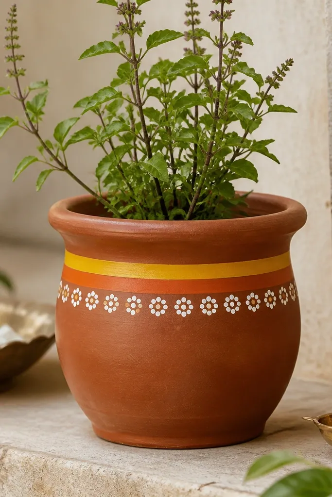
This design makes a tulsi pot look cheerful without turning it loud. I use marigold-yellow and burnt orange for the border, then add white dots as “light” so the whole pot reads bright even in dim corners. It flatters warm skin tones and golden lighting because the orange-yellow combo warms everything around it. If your home has off-white walls or light wood shelves, this pot looks balanced and clean instead of heavy. The styling principle here is contrast: a warm stripe + a high-visibility dot pattern so the shape of the cylinder stays clear.
Start by painting the top band just under the rim: mark a 1 cm line, then paint a solid marigold-yellow stripe using a flat brush. While it’s still a bit tacky, paint a thin burnt orange line right below it. Next, load a small round brush with white paint and tap dots around the pot, keeping them 1 to 1.5 cm apart so they look intentional. Finally, fill any faint gaps with a second dot pass after the first dries, then seal with a matte clear coat after 24 hours.
After sealing, lightly wipe the rim with a damp cloth to remove any overspray so the plant water doesn’t leave a ring.
Don’t paint right over dust — the white dots will turn patchy and chalky.
2. Green Leaf Vine Wrap
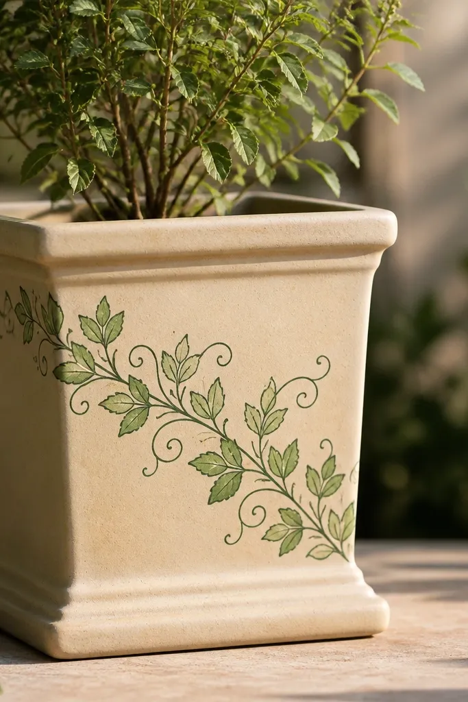
This one looks like a living plant accessory, even when the pot is empty for a day. I outline leaves in deep forest green, then fill with mint-green so each leaf pops without needing lots of colors. It suits homes with earthy decor — beige, tan, and light brown — because the greens match natural textures. For styling, I like it on medium-height shelves where the diagonal vine catches the eye as you walk by. The principle is movement: diagonal placement keeps the cylinder from looking flat.
Start by painting a thin base wash of very light green on the lower third, or skip the base if your pot is already clean terracotta. Sketch a gentle diagonal line using a pencil, then paint the vine stem in forest green. Add leaves on both sides of the stem: outline first, then fill with mint green while the outline is still slightly wet for smoother edges. Finish with tiny tendrils — short curved lines — to connect the leaves, then seal with satin so the greens look deeper.
Pro tipUse a leaf stencil for the first pot, then freehand after you get the spacing right.
AvoidAvoid tiny leaves packed too close — they blur when sealed and watered.
3. Peacock Feather Band
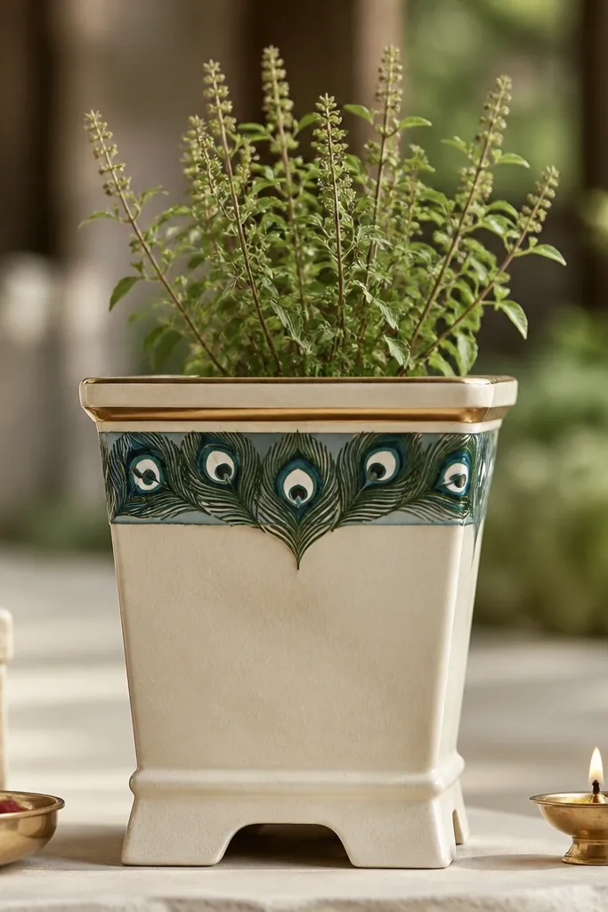
Peacock feathers make tulsi pots look ceremonial without needing gold foil. I paint the feather band with teal, dark green, and a hint of turquoise, then add tiny white dots at the feather eye points so it looks crisp. This works especially well if you have cool-toned decor like grey planters or blue tiles. It also flatters jewelry and gold accents because the gold frame line catches light. The styling principle is framing: a clean top border makes the feather design feel intentional.
Tape a straight line around the pot just below the rim, then paint a thin gold band. Inside that taped area, draw three feather shapes starting from left, centered, then right — each feather should be about 6 to 7 cm tall. Paint feather bars first in teal, then deepen the edges with dark green so the center looks lighter. Add the eye: a small oval with dark green center and white dot highlights, then finish with a clear satin sealer after full drying.
Pro tipIf you mess up one feather, scrape it off with a damp cotton bud while the paint is wet, not after it dries.
4. Earthy Terracotta Ombre Fade
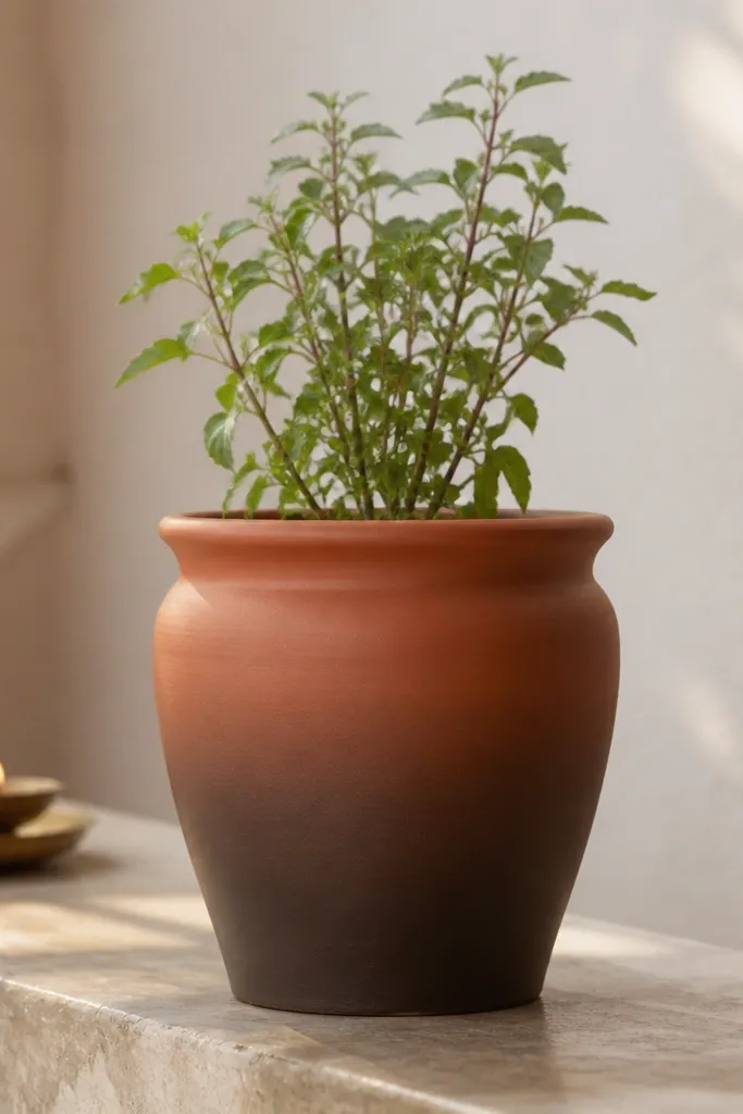
This is the easiest way to make a pot look expensive. I use three tones: terracotta base, burnt sienna, and chocolate brown, blending so the pot looks like it was dipped in color. It looks great in kitchens and bathrooms because it doesn’t scream; it just looks grounded. For people who don’t want patterns, this still looks “designed.” The styling principle is smooth transitions: ombre hides brush marks better than solid blocks.
Start with clean terracotta. Paint the bottom third with chocolate brown, then blend upward using a damp sponge so the middle becomes a gradient. Add burnt sienna to the middle band, then blend again with a clean sponge to soften any streaks. Keep the top near the rim mostly terracotta, then seal with a matte coat so the gradient stays soft and not glossy.
Pro tipBlend in small sections — 5 to 7 cm at a time — so you don’t get dry edges.
5. Kalamkari-Style Blocks in Navy and Coral
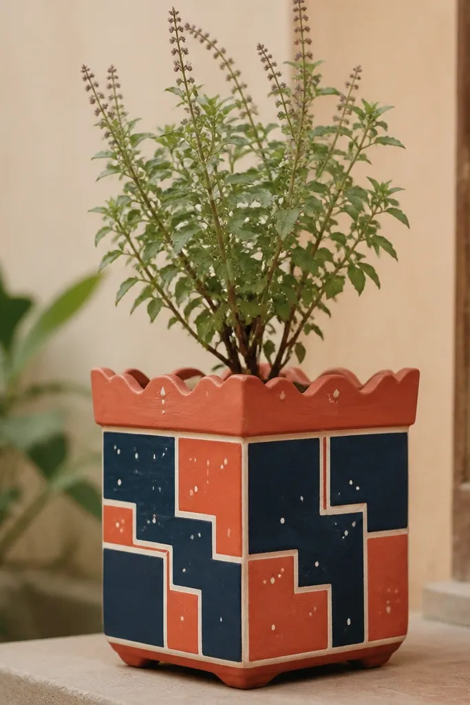
This design reads like a printed fabric, which is why it looks great on home altars. I use navy as the anchor and coral-red for warmth, then connect sections with thin white lines so it feels crisp. It flatters warm lighting and also looks good next to white marble or light stone. If you have kids, this is a fun one because the shapes are bold and forgiving. The principle is structure: blocky sections keep the cylinder from looking random.
Tape off a pattern grid lightly with painter’s tape, or just use a ruler and pencil marks. Paint the first set of navy blocks, then remove tape after the navy dries to avoid tearing edges. Add coral blocks inside the remaining sections, and paint thin white lines between blocks using a liner brush. Finish with small white dots at the corners to mimic fabric print texture, then seal satin for a slightly richer look.
Pro tipLet each color dry 45-60 minutes before adding the next so the white lines stay clean.
AvoidSkip metallic paints here — they smear the block edges when you seal.
6. Tiny Lotus Corner Motif
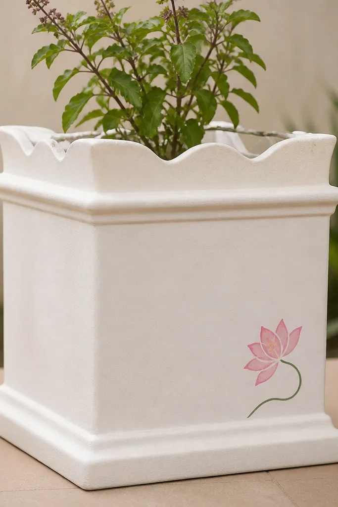
This is the kind of painting I do when I want the pot to look calm and not crowded. I paint one lotus near the lower third so the plant’s green leaves have space to be the main character. The soft pink petals and pale yellow dots look good with warm beige walls and also look pretty in daylight. It flatters smaller spaces because it doesn’t fight for attention with other decor. The principle is negative space: one motif, clean background, and a gentle curve.
Start by choosing one side of the pot and marking a placement point about 8 to 10 cm from the bottom. Paint a thin green stem curve, then add 5 to 7 lotus petals in soft pink, slightly overlapping. Add pale yellow dot centers and small petal veins with a lighter pink line. If you want extra polish, paint a tiny bud at the top of the stem, then seal with matte so it stays soft and serene.
Pro tipUse a dotting tool for the center — it makes the lotus look neat fast.
7. Gold Henna Dots Around the Rim
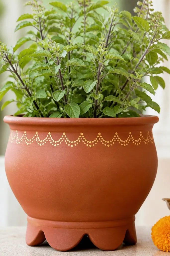
Henna-style dots make a tulsi pot look festive even when the rest of the room is simple. I use a warm gold paint for the dot arches and keep the rest of the pot plain terracotta or a light cream wash. This is flattering in homes with warm white lights because gold warms the whole scene. It also looks great for gifting because it reads “thoughtful” quickly. The principle is repetition: the repeating arch pattern gives structure without looking busy.
First, paint a light cream band around the pot just under the rim, about 2 cm tall. Let it dry, then use a stencil or freehand arches: place dots in a curved line and connect with tiny short strokes. Keep the pattern even by marking 6 to 8 anchor points around the circumference. After the gold dries, add a very thin line at the very bottom edge of the cream band using a liner brush. Seal with satin for a smooth, gold-friendly finish.
Pro tipIf your gold paint looks uneven, do two thin coats instead of one thick coat.
8. Blue Tile Pattern Like a Small Courtyard
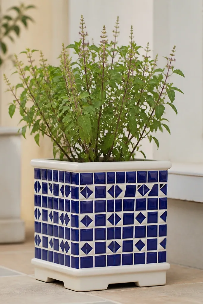
This pattern makes a tulsi pot look like it belongs in a tiled courtyard, even indoors. I use cobalt blue and deep sky blue, then separate shapes with white “grout” lines. It looks sharp next to white planters, grey shelves, or any place with bathroom-style tiles. For most body types? This is about decor matching — it works when your room has cool tones. The styling principle is grid clarity: the pot looks tidy because the lines are straight and consistent.
Start by painting a base wash of very light grey or keep terracotta as is if you like the warm contrast. Use painter’s tape to mask a grid of small rectangles, then paint cobalt blue shapes in the first row. Remove tape after each row dries to keep edges crisp, then paint sky-blue accents in alternating cells. Finally, paint grout lines in white between shapes using a fine liner brush, then seal with matte so the tile pattern doesn’t glare.
Use a ruler and mark 1 cm spacing — your eyes feel the difference immediately.
9. Monochrome Black Brushstroke With Soft White Specks
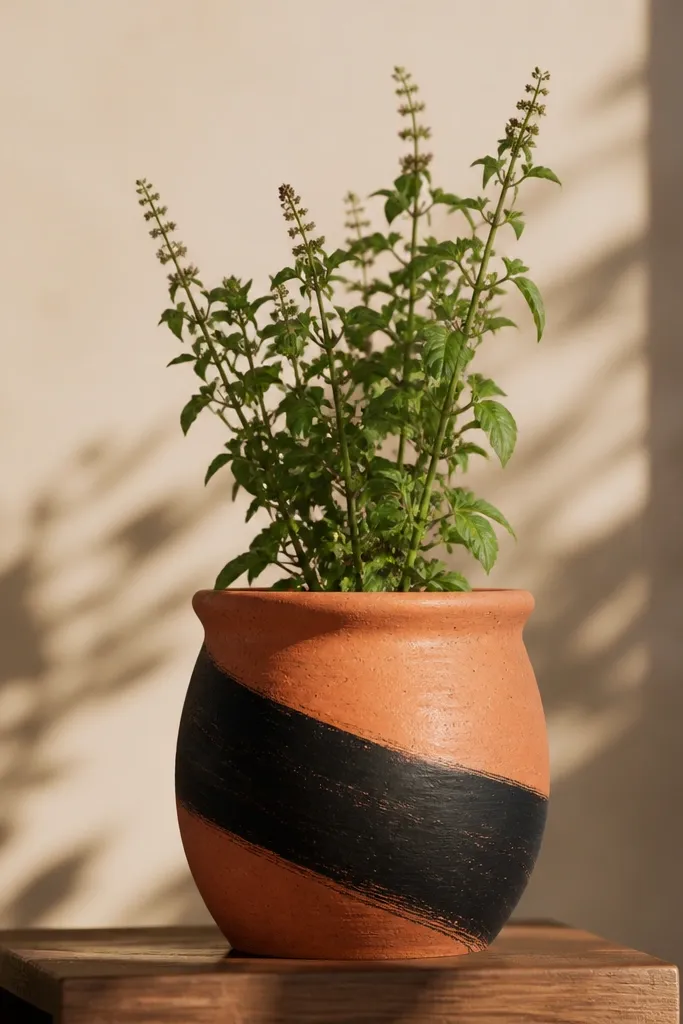
This is my go-to for modern homes because it doesn’t look like a craft project. The black brushstroke is bold, but I soften it with white specks so it feels airy instead of harsh. It looks best when your home has black frames, dark wood, or neutral beige. It also works well for gifts because it looks intentional even from across the room. The principle is single focal mark: one strong stroke plus small texture.
Choose a diagonal direction, then mask a band about 7 to 9 cm wide using painter’s tape. Paint the band with matte black acrylic in two thin coats so it doesn’t streak. After it dries, remove tape carefully to reveal a clean edge. Add white specks by tapping a toothbrush loaded with white paint over the surrounding area. Seal with matte clear coat, and avoid satin here because gloss makes specks look like chips.
Pro tipPractice the speck tapping on paper first so you get the right density.
10. Pastel Rainbow Stripes for Kids' Corners
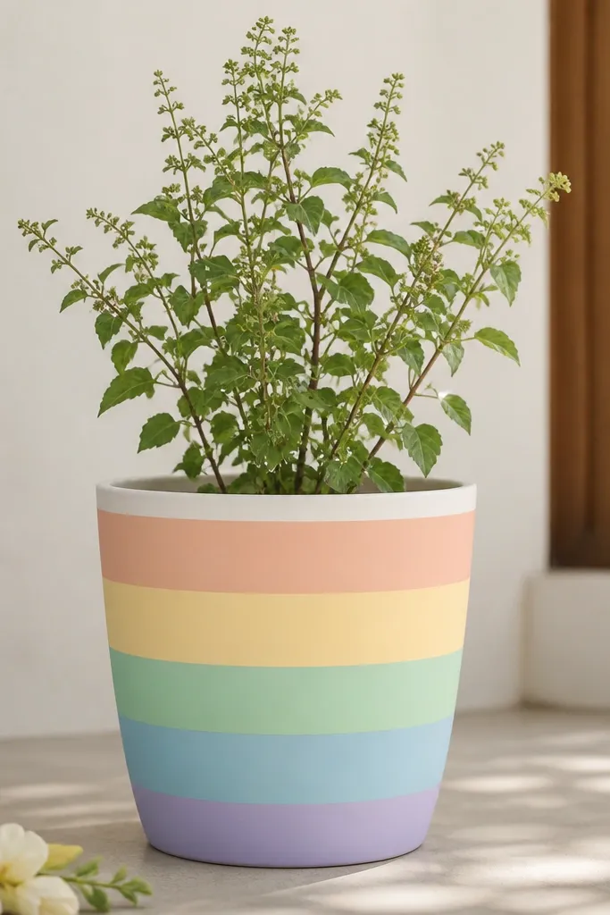
Kids' corners need color that’s cheerful but not chaotic. I use five pastels and keep the stripes wide so little hands and small rooms don’t feel overwhelmed. This works well for fair to medium skin tones in the sense that the colors look bright beside colorful toys and bright walls. For decor, it pairs perfectly with light wood and white shelving. The principle is breathing room: leave the rim clean and keep stripe spacing consistent.
Start by masking the rim area with tape so paint stays off the top edge. Paint the lowest stripe first: peach across the bottom third, then add pale yellow above it, then mint, then sky blue, then lavender near the top band. Each stripe should be about 3 to 3.5 cm tall depending on pot height. Let each stripe dry 20-30 minutes before painting the next to prevent color bleeding. Seal with satin to make pastels look smooth and not chalky.
Use a foam brush for pastels — it reduces streaks on terracotta.
11. Butterfly Wing Outline in Sage and Charcoal
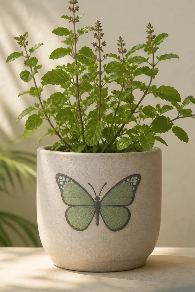
This design feels gentle but still decorative. I outline in charcoal so the butterfly is crisp, then fill with sage for a calm look that doesn’t fight the plant’s green. It’s flattering next to light curtains, linen, and neutral rugs because sage matches that soft palette. If you place the pot near a window, the charcoal lines hold up visually without fading. The principle is contrast without clutter: outline provides structure, fill stays light.
Lightly sketch the butterfly wings with a pencil — place it around the upper middle, centered on the pot. Paint the wing outline first in charcoal, then fill the wings with sage using a medium flat brush. Add tiny white highlights near the tips for a “shine” effect. If you want extra depth, add a second thin charcoal line inside the wing shape. Seal with matte so the lines don’t look shiny and toy-like.
Use a fine liner brush for the antenna — it makes the butterfly look real.
12. Temple Bell Motif With Maroon Frame
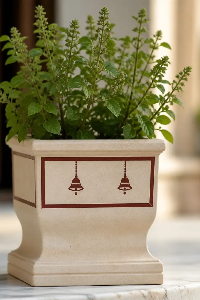
Temple bell motifs look grounded and devotional without covering the whole pot. I frame the design in maroon and paint the bells in off-white with a maroon accent so it feels classic. This looks especially good in homes with warm wood furniture because maroon pairs with brown tones. It also looks tidy for prayer corners because the frame keeps the artwork centered. The principle is containment: one framed area makes the rest of the pot stay calm.
Start by painting a maroon rectangle around the pot’s upper third, leaving 1 cm space from the rim. Use painter’s tape to get straight edges, then remove tape after the maroon dries. Inside the frame, draw a hanging line and two bells: bell shape outlines first in off-white, then fill lightly. Add small dots near the bell bottom and a tiny knob at the top. Seal with satin if you want the maroon to look deep, matte if you want it softer.
AvoidDon’t make the bells too large — they crowd the rim once the tulsi grows.
13. Monsoon Splatter With Deep Teal
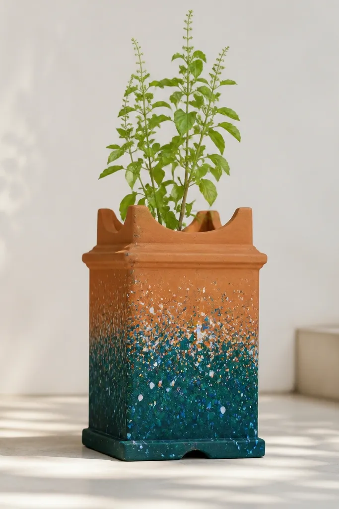
Splatter designs hide small imperfections and look playful in a way that still feels artsy. I use deep teal as the main color and add white and pale blue specks so it reads like rain. This looks great near entryways and laundry rooms where you want energy but not a busy pattern. It also works for people who don’t want to draw motifs — you’re just controlling density. The principle is selective coverage: keep the top half clean so the plant gets visual priority.
Mask off the top half with tape or cover the rim area with paper. Load a toothbrush with deep teal paint and flick over the lower half for splatter. Clean the toothbrush, then flick white and pale blue specks lightly so they don’t overpower the teal. Let everything dry fully, then remove masking. Seal with matte so the splatter texture looks like paint, not plastic.
Do two light splatter passes instead of one heavy pass — it looks more natural.
14. Cream Base With Marigold Micro-Flowers
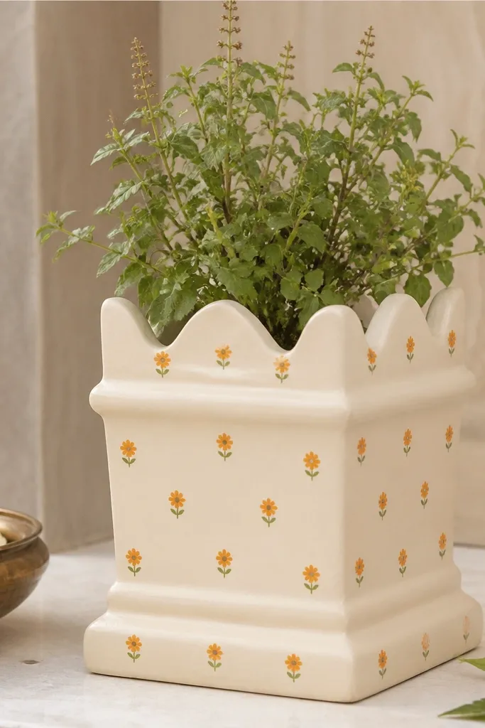
Micro-flower patterns look expensive because they create texture at a small scale. I keep the base cream so the marigolds pop, and I paint each flower with a yellow center and orange petal strokes. This works beautifully for bright rooms because cream keeps the design calm. It also flatters tulsi leaves because the flowers are small and don’t fight with the plant. The principle is scale control: tiny motifs read neat even when the pot is fully in view.
Paint a smooth cream base first using a sponge brush for even coverage. Let it dry, then use a dotting tool for yellow centers — place them about 3 cm apart. Add orange petal strokes around each center using a small angled brush, making 5 to 6 short strokes per flower. Keep the flowers slightly irregular so it doesn’t look stamped. Seal with satin to make the cream look smooth and the marigolds glow.
Skip thick paint for the petals — it cracks around watering and drying.
15. Saffron and Olive Chevron Wrap
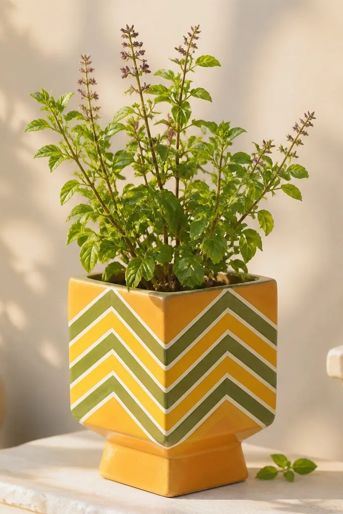
Chevron looks clean and modern, and it makes a round pot feel structured. I pair saffron and olive because it looks natural — like spices and leaves — rather than neon. It works well in homes with beige walls and green accents. If you want the pot to look intentional in photos, chevrons do that because the pattern is aligned. The principle is symmetry: crisp V shapes make the curve of the pot seem designed.
Tape a straight guideline horizontally around the pot at the height where chevrons start. Mark V shapes using a pencil lightly, or use a chevron stencil if you have one. Paint the first chevron set in saffron, then fill alternating Vs with olive. Paint thin white lines between chevrons after the colors dry so the pattern looks separated. Seal with matte to keep the chevrons looking like paint, not glossy wallpaper.
Use thin tape and press the edges down firmly so paint doesn’t bleed under it.
16. Rangoli-Inspired Center Medallion
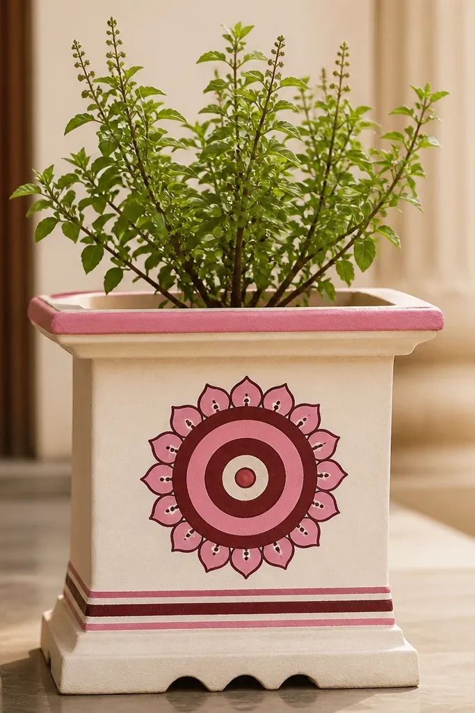
A center medallion makes the pot look like it belongs on a festive table. I paint concentric rings so the design wraps around the cylinder naturally, and I add small petal points so it feels like rangoli. This looks great against dark shelves or a black plant stand because the medallion pops. It’s also flattering in daylight because the rings create depth. The principle is concentric layering: circles guide the eye and handle the pot’s curve.
Start by painting a small circle at the pot’s center around the upper middle, using a bowl or lid as a guide. Add the next ring in maroon, then another ring in white, then pink — keep each ring about 1 cm wide. Add outer petal shapes by drawing teardrops around the last ring, evenly spaced. Let each ring dry before painting the next so colors don’t mix. Seal with satin for a slightly richer festive look.
Don’t make rings too thick — they look heavy once the pot has a plant and soil.
17. Botanical Stripes and Leaf Silhouettes
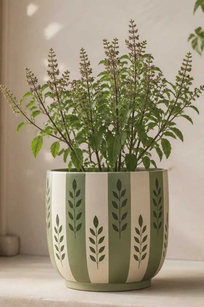
This looks like a printed wallpaper sample, but it’s handmade. I use vertical stripes to make the pot look taller, and leaf silhouettes so it feels botanical without painting lots of tiny details. It flatters neutral interiors because muted sage and cream don’t clash with everyday decor. It also looks good when the tulsi plant grows tall — the vertical lines match the plant’s upward habit. The principle is vertical rhythm: stripes guide the eye upward.
Paint a cream base first and let it dry completely. Mask vertical stripes with painter’s tape, spacing them about 2.5 to 3 cm apart, then paint alternating stripes sage green. Remove tape after each stripe set dries. For the leaf silhouettes, use a leaf stencil or print a simple leaf image and trace lightly, then paint deep green silhouettes between stripes. Seal with matte so the muted colors stay soft and not glossy.
If your stencil slips on terracotta, hold it with painter’s tape at the corners only.
18. Sunburst Rays in Terracotta Orange
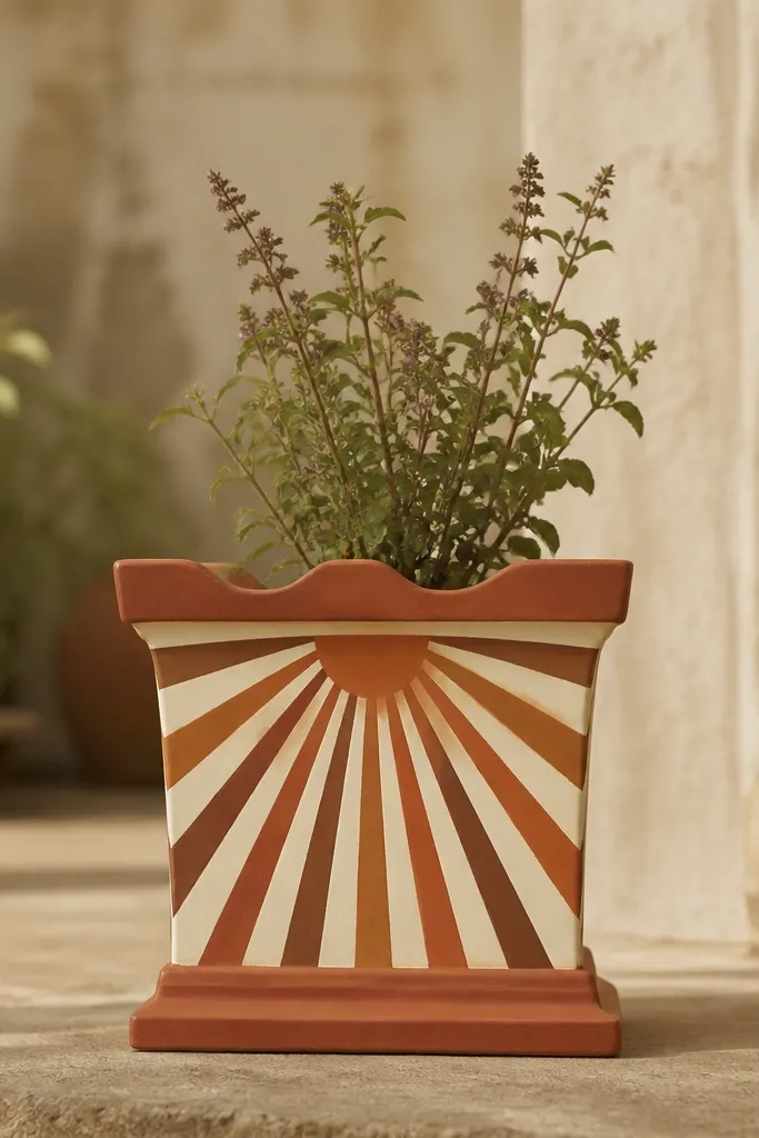
Sunbursts make tulsi pots feel bright even when your room lighting is average. I paint a cream top band, then draw rays in terracotta orange and burnt sienna so the center looks warm and glowing. This works well in entryways, because it gives the pot a focal point when you walk in. It also flatters brass decor like picture frames or lamp bases. The principle is light direction: rays from a top center point make the cylinder read like a sun.
Tape a cream band around the upper third and paint it smoothly. After it dries, mark a center point on the band and draw 12 to 16 rays using a pencil. Paint rays in terracotta orange first, then deepen every other ray with burnt sienna for contrast. Keep ray width around 6 to 8 mm so it doesn’t crowd. Seal with satin for warm glow, and avoid matte if you want the cream band to look crisp.
Don’t use super-thick paint for rays — it makes edges look rounded and messy.
19. Night Sky Stars With Deep Indigo Wash
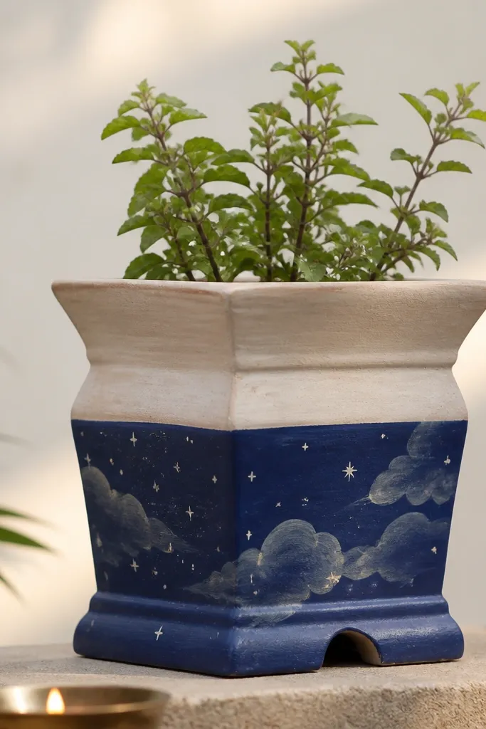
This design turns a simple tulsi pot into something that feels calm at night. I use deep indigo for the wash and add white stars with a toothbrush flick, then do tiny grey cloud swirls for softness. It looks stunning next to warm lamps because the indigo holds the light. It also works for kids because it’s visually fun but still clean. The principle is layering textures: smooth wash first, then star specks, then gentle cloud motion.
Mask the top area so the indigo stays only on the lower half. Paint deep indigo with a wide brush or sponge and blend edges upward so it fades slightly. Flick white stars across the indigo — keep star size small by using a dry toothbrush. Add 2 to 3 grey cloud swirls using a thin brush and watered-down grey paint. Let everything dry fully, then seal with matte so the star texture stays powdery, not shiny.
For smaller star dots, dip the brush lightly and flick with your wrist, not your arm.
20. Soft Pastel Geometric Confetti
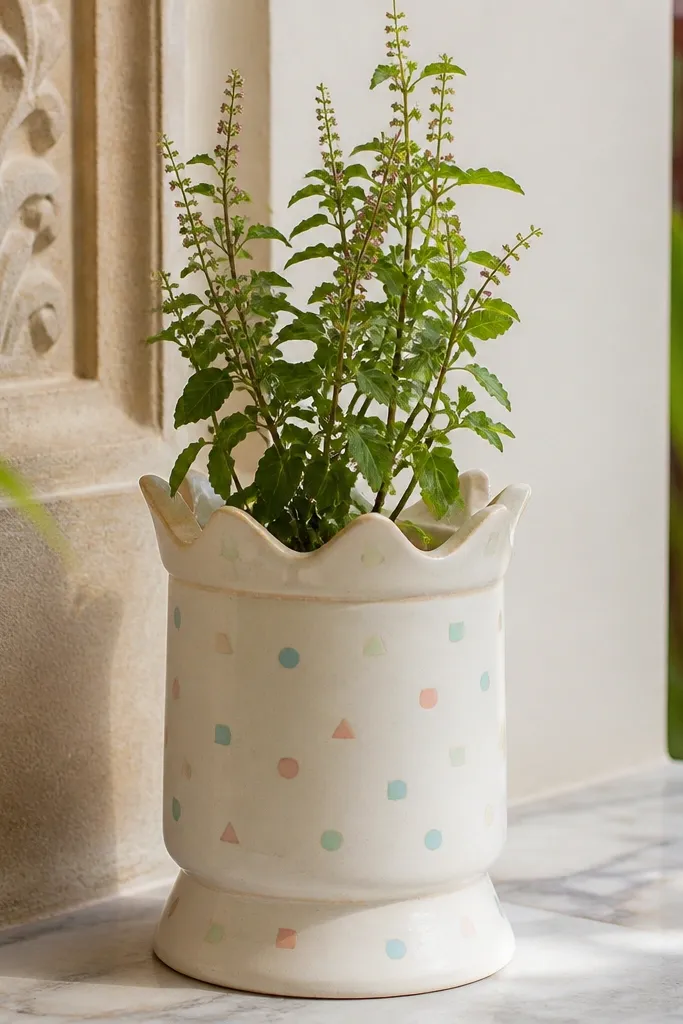
Confetti geometry feels playful but controlled, which is exactly what I want for a tulsi pot in a casual home. I use a cream base so pastels don’t dull, then place triangles and tiny squares at measured distances around the pot. It looks good on light-colored shelves and pairs with white planters or woven baskets. This design flatters bright spaces because the shapes don’t absorb light the way dark patterns do. The principle is spacing: evenly distributed small shapes look intentional.
Paint the pot with a cream base and let it dry. Use a template cut from cardboard to trace tiny triangles and squares lightly with pencil, then paint them with pastel colors. Keep the confetti spread mostly across the middle third, leaving the rim clean and the bottom less crowded. Add a few small circles in pale blue to break up the triangles. Seal with satin so pastels look smooth and the edges stay crisp.
AvoidDon’t mix too many pastels — stick to three colors so it reads cohesive.