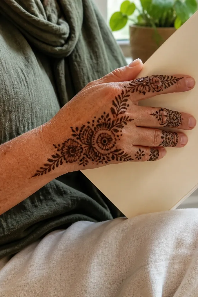
1. Central Paisley Drop with Side Lattice Runners
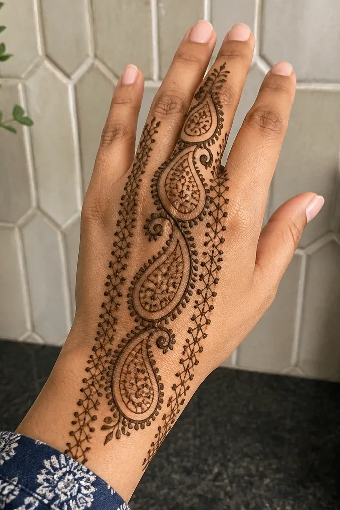
This design looks pricey because it creates a vertical “drop” shape that pulls the eye. The central paisley gives you a bold silhouette, while thin lattice runners add structure without filling the whole hand. Keep the paisley outline slightly thicker than the inner details so it reads as a framed centerpiece. The best part is the negative space between the paisley and the runners — it makes your mehndi look planned, not crowded. It suits everyday events, engagement functions, and even quick parties because you can finish it without covering every finger.
Start by drawing a vertical spine line from the center of the back hand down toward the wrist cuff. Add one large paisley centered on that spine, with its narrow end pointing toward the wrist. Then draw two thin lattice runners on the left and right — think of small crisscross boxes spaced evenly — and stop them before they reach the paisley edges. Finally, add a simple wrist band made of three parallel lines with small dots between them.
Pro tipIf your paste is too runny, do the outline first, let it rest 3-5 minutes, then fill the inner paisley.
AvoidDon’t fill the paisley densely — airy inner details look sharper than heavy full black.
2. Fan Medallion Above the Wrist with Finger Ring Bases
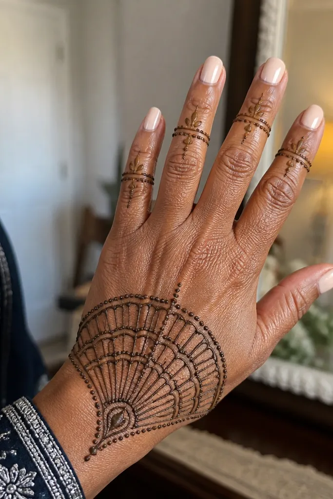
A fan medallion gives a high-end look because it creates a clear top anchor and a clean frame for the rest of the hand. The finger ring bases add polish without requiring full finger coverage. This works especially well when your back hand has limited time for detail — the medallion does the heavy visual lifting. Keep the fan ribs evenly spaced and slightly curved; that curve looks more expensive than straight spokes. It’s great for short sessions and looks good with both minimal and statement outfits.
Begin with tiny rings at the base of each finger — just two to three short arcs per finger. Next, draw a curved fan shape across the upper back of the hand right under the knuckles, with 8-12 ribs radiating from a single point near the center. Add a small circular dot cluster at the fan center, then outline the fan border with a thicker line. Finish by connecting the fan edges to a wrist cuff band using two thin parallel lines.
Use a toothpick or fine cone tip to place dot clusters — dots should look intentional, not smeared.
Skip full palm coverage — this design is meant to stay on the back and side lines.
3. Geometric Arch Panel with Micro Dots Border
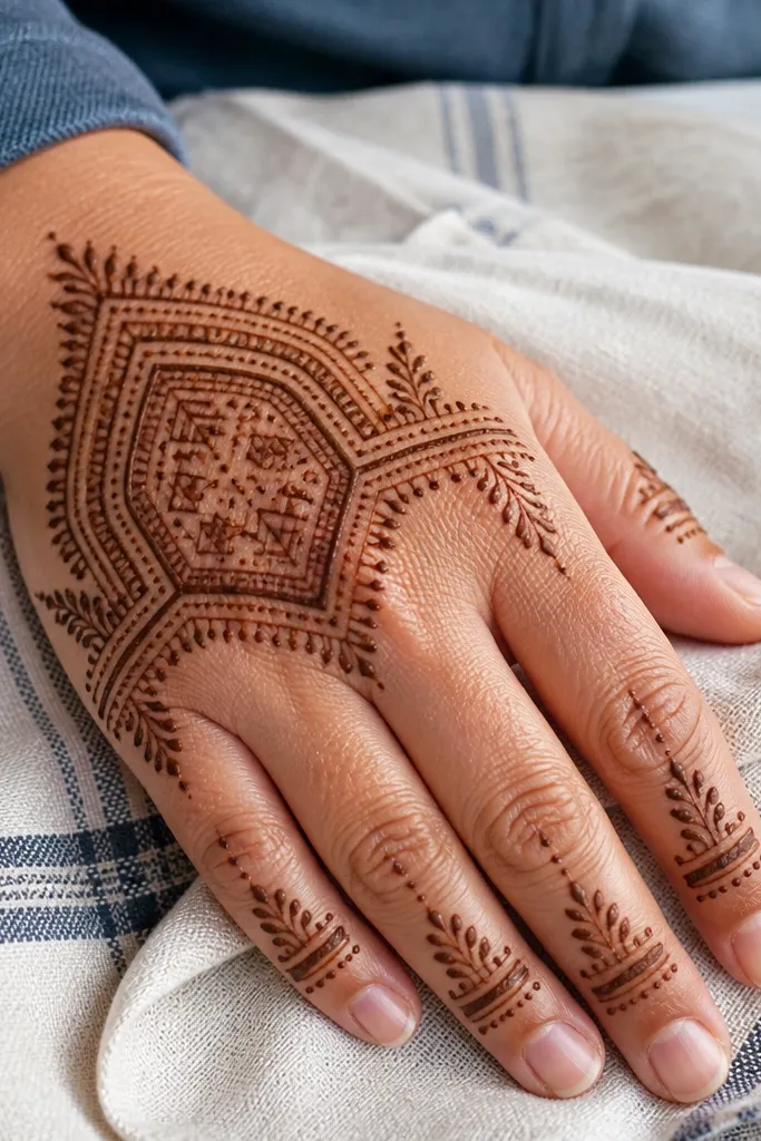
Geometric arches look expensive because they’re crisp and structured, and structure reads clean even when your lines aren’t perfect. The micro dot border makes the whole thing feel framed, like jewelry. You’ll get a premium look by keeping the inside pattern light — use small triangles, small squares, or short stepped lines — and leave breathing space around the panel. This is a strong choice for beginners because you repeat shapes instead of inventing curves. It also photographs well because the arch naturally matches the hand’s shape.
Draw an arch across the back of the hand, starting near the side near the thumb and ending near the pinky side. Outline the arch with a thicker line, then place a row of micro dots just outside the arch border. Fill the arch interior with alternating small triangles and short rectangles — keep each block the same size. Finally, add two thin side lines running from the arch ends down toward the wrist cuff, and close with a simple three-line band at the wrist.
Pro tipIf your triangles wobble, make the first row with a guide line, then repeat the same spacing downward.
AvoidDon’t overfill the arch — dense interiors look messy fast.
4. Vertical Vine with Teardrop Leaves and Tiny Seed Filling
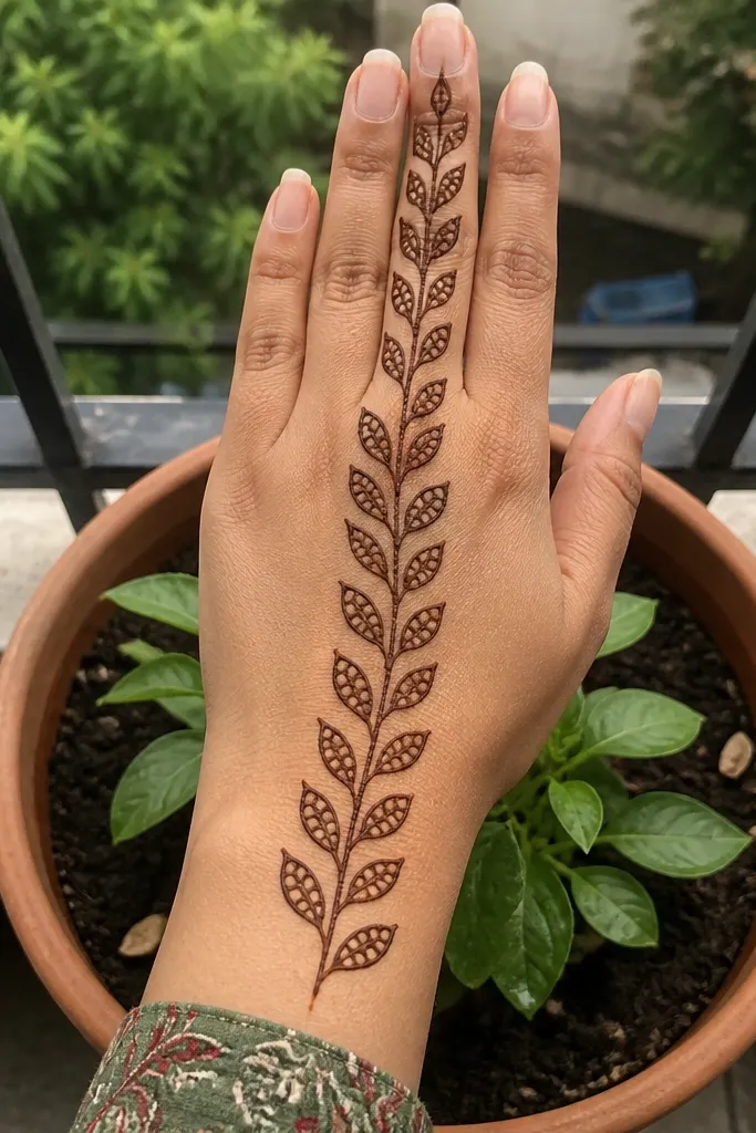
This one looks expensive because it uses movement. A vertical vine gives you a sleek, elongated look, and teardrop leaves read like delicate embroidery. The tiny seed filling inside leaves adds texture without making the design heavy. Keep the vine outline clean and use consistent leaf sizes on both sides of the spine. It’s ideal when you want something feminine and not too busy, especially for brunch, engagement dinners, or a quick festive look. You’ll also get a better stain because you’re not clogging every space with thick paste.
Start with a straight center spine line from knuckles down to the wrist edge. Add teardrop leaves on both sides in pairs, each leaf pointing slightly outward, then repeat the size for the next two pairs. Inside each leaf, add a tiny seed fill using small dots or short comma strokes. Connect the leaves with thin vine lines, and finish with a wrist cuff made of a single scalloped border line.
Pro tipLet the paste dry slightly before adding the seed dots so they don’t bleed into the leaf outline.
AvoidDon’t make leaves too big — large leaves force you into heavy filling.
5. Half-Moon Side Band with Linked Circles
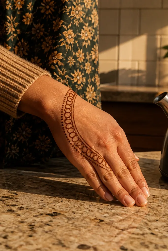
Side band designs look premium because they feel like bracelets for your hand. The half-moon band creates a smooth arc, and linked circles add a polished rhythm. This is a great option if you want minimal coverage but still want the back hand to look styled. Keep the band thickness consistent and let the linked circles be evenly spaced. It also hides small mistakes because the pattern repeats cleanly. Perfect for office-friendly mehndi or a light seasonal look.
Sketch a half-moon arc along the side of the back hand from near the knuckles toward the wrist. Outline it with a thicker line, then inside the band draw a chain of linked circles — each circle touches the next. Add one small dot at the top of every other circle to increase contrast. Finish the bottom with a tight wrist line using two parallel lines that curve to match the band.
Pro tipTo keep circles even, draw 5-6 guide points first, then connect them with curved arcs.
AvoidDon’t place the band too close to the thumb — it can look cramped.
6. Lace-Grid Back Hand with Central Knot
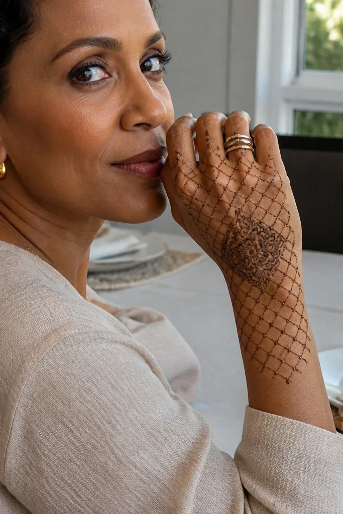
This design gives an expensive look because the lace-grid texture looks delicate but still structured. The central knot motif anchors the whole composition so it doesn’t look like random netting. The trick is to use a light grid and then add a slightly darker knot in the center for contrast. Leave open gaps between grid sections so the skin shows through. It’s a solid pick for festive events where you want something feminine and detailed without going full bridal coverage.
Draw a central knot shape in the middle — a small interlocking loop with a thicker outline. Then draw a rectangular grid across the back of the hand using horizontal and vertical lines spaced evenly. Connect the grid intersections with tiny dot points so it looks like lace. Finally, outline the outer border with a thin double line and add a wrist cuff using a simple zigzag strip.
Pro tipUse thinner lines for the grid and reserve thicker paste for the knot outline.
AvoidAvoid filling every grid cell — keep them airy so the lace effect stays clean.
7. Wrist Cuff Medallion with Two Matching Side Vines
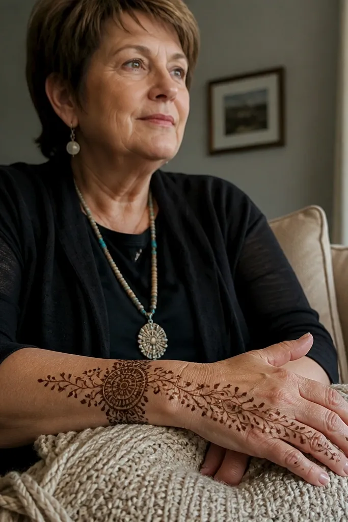
A wrist cuff medallion looks expensive because it frames the hand like jewelry and creates a strong base. Two matching vines make the design feel intentional and balanced without requiring full back coverage. Place the medallion right at the wrist line and let the vines climb toward the knuckles in a gentle curve. Use teardrops or small leaf shapes on the vine tips; those tips add detail that reads well in photos. This suits parties, festivals, and anyone who wants a clean look that still feels special.
Start by drawing a thick wrist cuff band across the wrist — a smooth border with a slight curve. In the center of the cuff, draw a small medallion: a circle with 6-8 petals around it. From both sides of the medallion, draw two vines moving upward with small teardrop leaves at regular intervals. Finish by adding a thin connecting line that brings the vines near the finger bases without going all the way around.
Pro tipKeep vine leaves small and spaced — large leaves make the design feel heavy.
AvoidDon’t make the vines uneven lengths; symmetry is what makes this look polished.
8. Knuckle Blossom Cluster with Minimal Finger Coverage
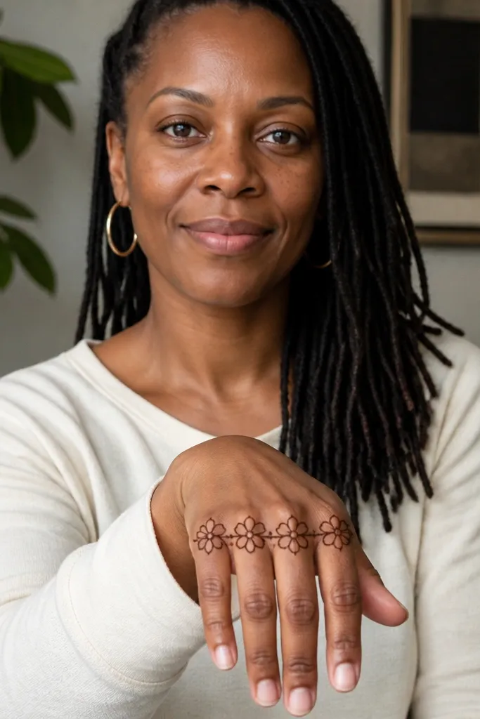
If you want an expensive look without full finger mehndi, build around the knuckles. A blossom cluster creates a focal area that looks high-end and balanced even when fingers are mostly bare. Use three to five small blossoms across the knuckle line and connect them with thin stems. Add tiny dots inside each blossom to increase darkness and contrast. This design is great when you’re working around rings or when you want a light, breathable look. It also looks great with both short and long nails because the pattern sits above the finger bases.
Draw a thin horizontal line across the knuckles — not thick, just a guide. Place 3-5 blossom shapes along that line, each blossom made of 5 rounded petals around a dot center. Connect blossoms with thin stems that taper as they reach the next blossom. Add small dot clusters at the sides of the cluster and finish with a narrow wrist band using one scalloped line.
Pro tipUse the same petal size for every blossom; consistency reads expensive faster than complexity.
AvoidSkip thick shading inside blossoms — outline + dot center is cleaner.
9. Paisley Frame with Open Center Panel
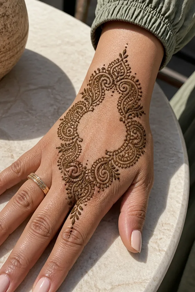
This design looks high-end because it uses framing and empty space. Instead of filling the whole back hand, you build a paisley frame and keep the center light. The center panel stays airy, so the frame feels like jewelry. Use a slightly thicker outline for the paisleys and keep their inner details minimal. This is the fastest way to get that expensive look when you’re short on time and still want something that photographs well. It’s also very forgiving if one paisley isn’t perfect.
Outline a rectangular or slightly curved center panel on the back of the hand, leaving skin visible inside. Then draw paisleys around the panel edges — two on the top, two on the sides, and one at the bottom center. Keep the paisley inner details to a few lines and dots, not full filling. Finish with a wrist cuff band and connect the frame to the cuff with thin lines at the corners of the panel.
If you’re unsure about symmetry, only mirror the outline positions — don’t mirror every internal petal.
Don’t fill the center panel; the empty space is the point.
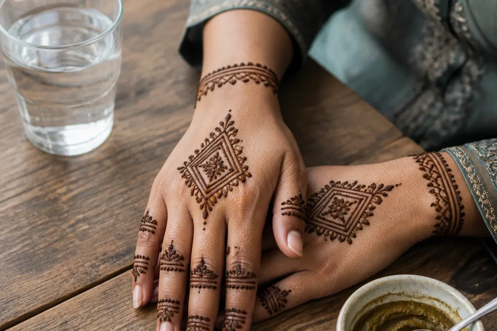
10. Diamond Ladder Pattern with Side Feather Tips
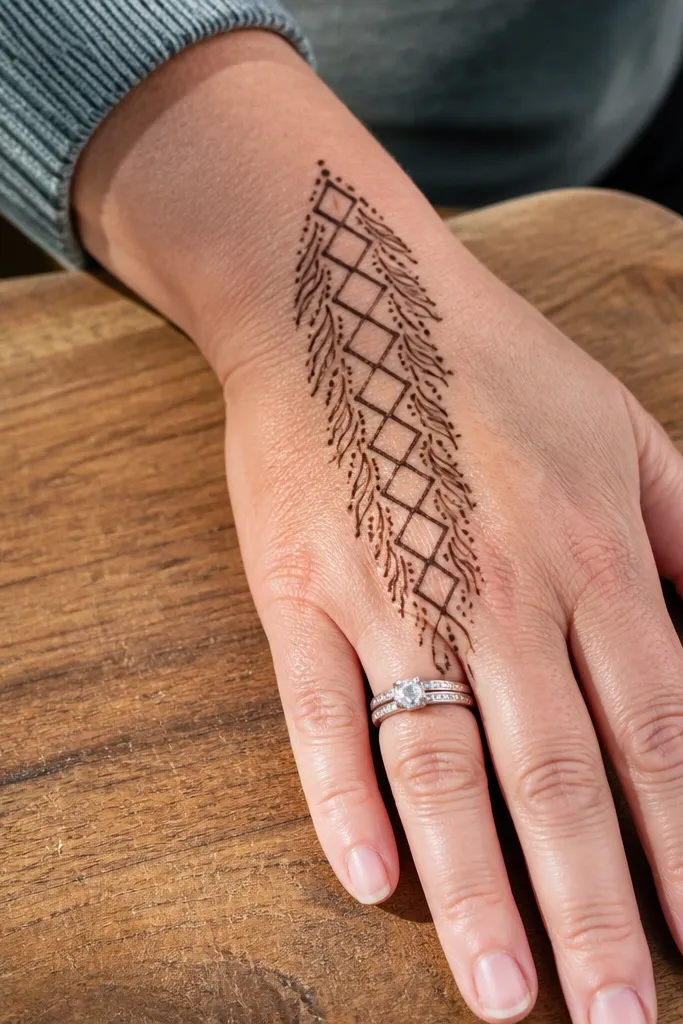
Diamond ladder patterns look expensive because they create a crisp rhythm and a structured surface. The side feather tips add a softer, decorative edge so the design doesn’t look too rigid. Keep the diamond lines thin and consistent, and use a slightly darker border around the whole section. This works well for beginners because diamonds are repeatable. It also looks great when you want coverage without fully filling every area with paste.
Draw a narrow border rectangle across the back hand, leaving a small gap from the wrist line. Inside it, create a ladder of diamonds by drawing diagonal lines that form repeating diamond shapes. Add two side feather tips — each feather is a small vertical stem with 4-5 short leaf lines branching out. Finish by adding a thin wrist cuff with two parallel lines and tiny dots between them.
Pro tipUse a light touch for diamonds — thick paste inside diamonds makes them look muddy after staining.
AvoidAvoid uneven spacing — diamonds that drift make the whole pattern look careless.
11. Ring-and-Runner Design with a Central Triangle Motif
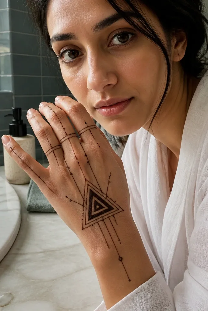
This design looks polished because it mixes small control elements (finger rings) with one bold geometry center (triangle). The central triangle motif gives you that “designed” look instantly, while runner lines create a smooth flow upward. It’s ideal if you want a clean, modern mehndi that still feels festive. Keep the triangle outline thicker and the runners thinner. The negative space around the triangle makes your hand look longer and more elegant in photos.
Draw small rings at the base of each finger using short arcs that wrap about one-third of the way around. Then draw a central triangle on the back of the hand — base near the knuckles, point toward the wrist. Add thin runner lines from each triangle corner down toward the wrist area, with small dots at the bends. Finish with a simple wrist band using three short lines across the wrist.
Make the triangle first, then place finger rings so they align with the triangle edges.
Don’t add extra motifs everywhere; this design relies on one strong center.
12. Peacock Tail Fan on the Back of the Hand
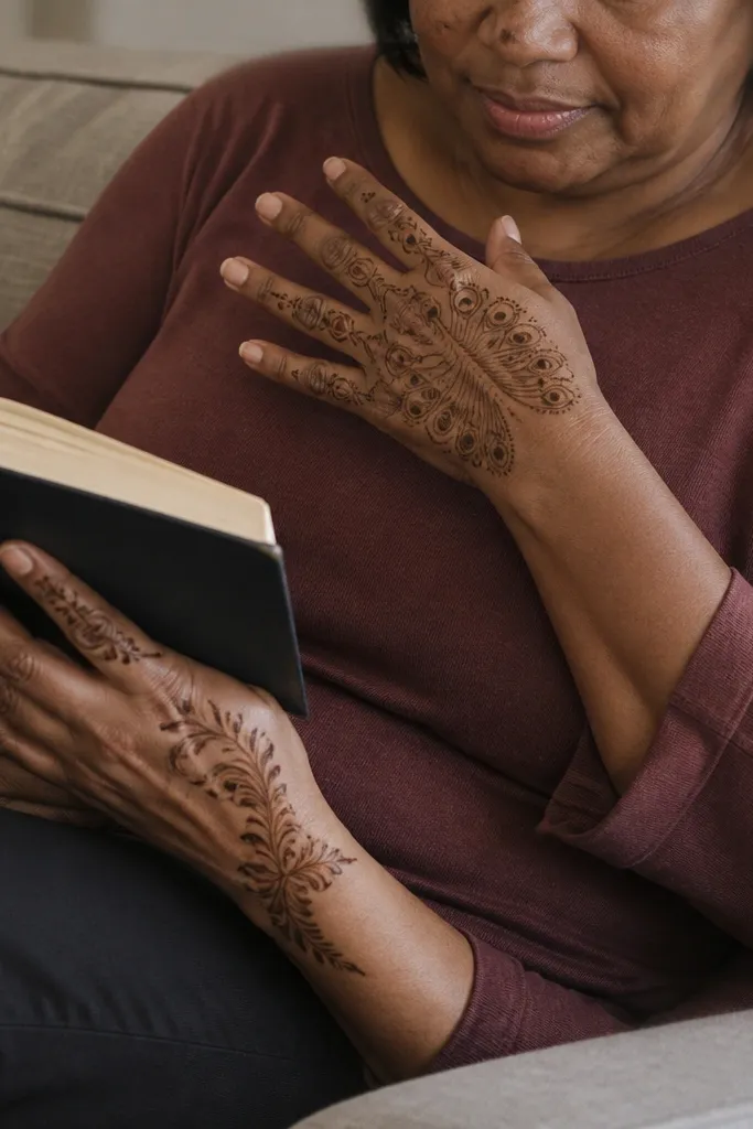
A peacock tail fan looks expensive because the eye motif gives drama and the feather ribs create fine detail. You don’t need to cover the entire back hand — place the fan in the upper half and let the lower half stay airy. Use layered feather shapes with small dot “eyes” so the pattern reads like feathers even from a distance. This suits festive evenings, weddings, and any event where you want a statement but still want control. It also works well if you want your mehndi to stand out without heavy finger coverage.
Start with a fan base line near the knuckles, then draw 6-10 feather ribs spreading outward. On the outer ribs, add feather shapes with a pointed tip and a small center dot cluster that acts like an eye. Thicken the outer border of the fan with a double line for a framed look. Finish by adding a thin runner line down the center and a narrow wrist cuff with a scalloped edge.
Keep feather “eyes” small and consistent; big eyes make the design look cartoonish.
Skip full shading inside feathers — outline and dot centers look cleaner.
13. Mandala Corner Cut with Side Micro Veins
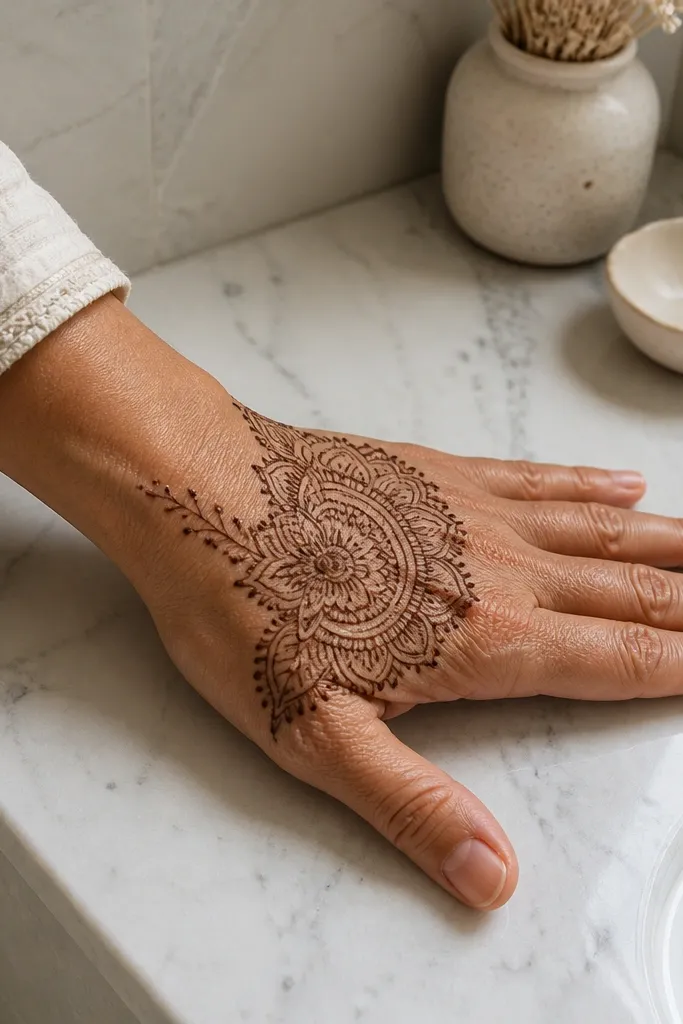
Corner mandalas look premium because they feel like a designed panel rather than a full-hand pattern. Put the mandala slightly off-center toward the thumb side, then balance it with micro vein lines on the opposite side. The micro veins create movement and fill the space without turning into thick blocks. This style is excellent for people who want a clean, modern look and don’t want to commit to covering the entire back of the hand. It also photographs well because the mandala corner acts like a focal badge.
Draw a small mandala in the corner of the back hand near the thumb side, using 6-8 rounded petals around a dot center. Add a thin outer border circle or hexagon around the mandala. On the opposite side, draw 3-5 micro vein lines — these are thin, slightly curved strokes with tiny dot bumps along them. Finish with a wrist cuff band that has one simple repeating motif, like dots between two lines.
Pro tipIf your mandala looks messy, simplify to fewer petals and thicker borders.
AvoidDon’t mirror the mandala exactly — asymmetry with balance looks more expensive.
14. Geometric Half-Flower with Negative Space Petals
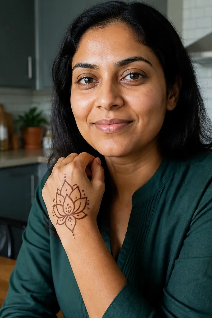
This is a clean, modern pattern that looks expensive because the petals are mostly empty. Negative space petals make your mehndi look like lace cutouts, not heavy paint. Use geometric petal shapes — small angled teardrops or trapezoids — and outline them in a thicker line. The inner area stays light with just a few dot anchors. It’s a smart choice when you want a “designer” look but you’re working with limited time or paste control. Great for daytime events and stylish casual outfits.
Draw a half-flower motif across the back hand by placing a central stem line and then adding 5-6 geometric petal outlines on one side of the stem. Leave the petal interiors mostly blank, with only 1-2 dot anchors per petal. Add two thin side runners from the flower ends down toward the wrist. Finish with a narrow wrist cuff band using a simple zigzag line and two parallel borders.
Use a thicker outline for petal edges, then keep everything inside minimal.
Don’t overfill negative space petals — the empty center is what gives the high-end look.
15. Side Scroll Bracelet with Three Bead Rows
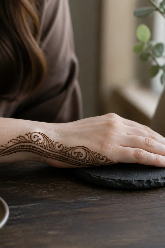
This looks expensive because it reads like jewelry: scrolls plus bead rows create a finished, intentional surface. Put the scroll bracelet along the side edge of the back hand, then use three bead rows inside the bracelet for a clean texture. The bead rows add darkness and pattern density without requiring heavy fill. This works well if you want something stylish and light, with minimal coverage that still looks festive. It’s also a good option if you’re short on time because the repeat elements are fast.
Sketch a smooth scroll line along the side edge of the back hand — use 2-3 large scroll curves. Inside the scroll outline, draw three parallel bead rows using small dot spacing that matches the scroll curve. Add tiny connecting dots between bead rows at regular intervals so the texture looks uniform. Finish with a wrist cuff band that mirrors the scroll outline thickness using one simple curved border line.
Pro tipUse consistent dot size — one dot bigger than the rest makes it look homemade.
AvoidDon’t make the scroll too thick; thick scrolls swallow the bead detail.
16. Wrist-to-Knuckle Lattice Ladder with Open Center
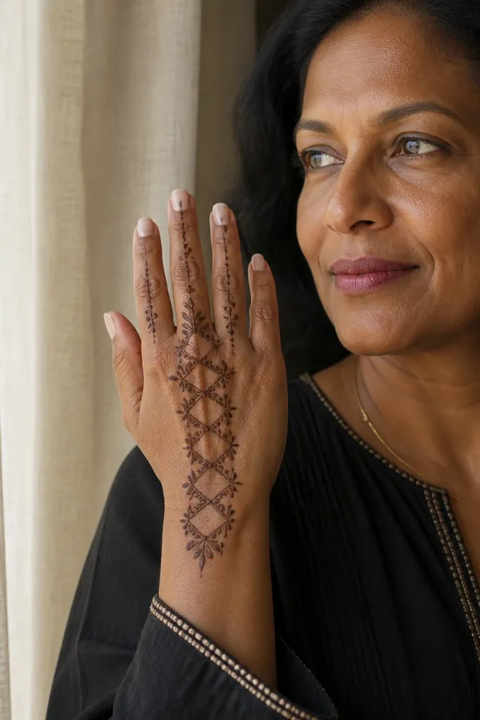
This design looks high-end because it combines a strong vertical ladder with airy center space. The lattice creates a delicate texture, while the open center prevents the back of the hand from looking overworked. Place the ladder from wrist area up toward the knuckles, then let side areas stay lighter. It’s a strong pick for seasonal events where you want something photogenic but not too bridal. It also fits beginners because you can repeat the lattice spacing in a controlled way.
Draw a vertical central line, then add two parallel vertical lines on each side to form a narrow panel. Fill the panel with a lattice ladder: cross lines connect the vertical rails in repeated intervals. Keep the center of the back hand mostly blank so the ladder stands out. Finish with a wrist cuff band using two parallel lines and a small dot chain between them.
If your lattice looks uneven, mark spacing points on the vertical rails first, then connect with short cross lines.
Avoid extending the lattice all the way to every finger; stop at the knuckle area.
17. Twin Vine Arcs with Teardrop Clusters Near Knuckles
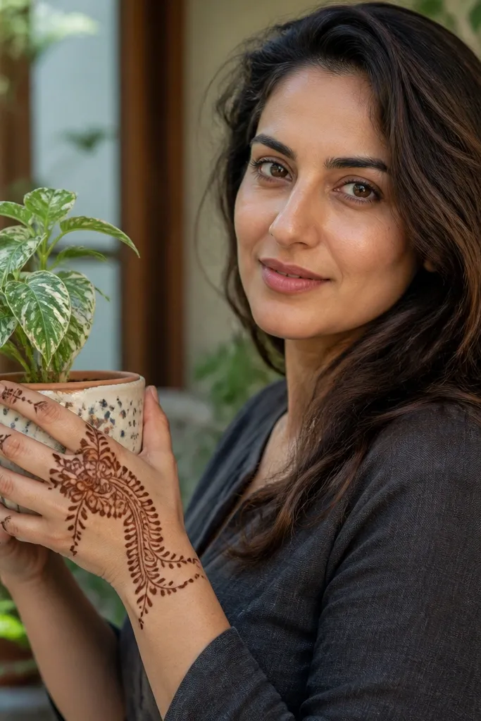
Twin vine arcs look expensive because they frame the knuckle area from both sides, creating a balanced, flowing composition. The teardrop clusters near the knuckles add a focal burst of detail, while the lower hand stays airy. This style reads elegant because it uses curves that match hand anatomy. It’s also practical: you can keep the vines thin and limit heavy filling to the clusters. Great for festive family dinners and evening gatherings where you want mehndi to look styled, not random.
Start with two curved vine arcs: one from the thumb-side knuckle area down toward the center, and one from the pinky-side knuckle area toward the center. Add small teardrop clusters at the highest point of each vine, about 5-7 teardrops per cluster. Connect the clusters using thin lines and add tiny dot accents between teardrops. Finish with a wrist band made of a scalloped border line plus a thin inner line.
Pro tipKeep cluster teardrops the same orientation — all tips pointing upward looks cleaner.
AvoidDon’t add full finger coverage; it breaks the framing effect.
18. Half-Panel Scrolls with Central Dot Rosette
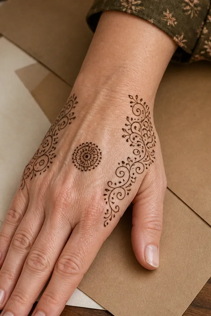
Half-panel scrolls look expensive because they feel like a design placed on the hand, not something spread everywhere. The central dot rosette gives you a dark anchor that makes the scrolls pop. Keep scroll lines thin and consistent, and use the rosette as the only dense area in the middle. This is a good choice when you want a modern, airy look with clear structure. It also works well for people who struggle with symmetry because the design is naturally anchored to one center dot.
Draw a central dot rosette in the middle of the back hand — a circle of 8-10 dots around one thicker center dot. Then draw scrolls on only one side of the rosette, using 3-4 big scroll curves that connect back toward the rosette. Add a thin border line around the scroll panel and let it stop halfway down the back hand. Finish with a wrist cuff band using two parallel lines and small dots along the top line.
Pro tipIf your scrolls get messy, slow down and keep each scroll curve one continuous line.
19. Butterfly Wing Outline with Micro Dot Body
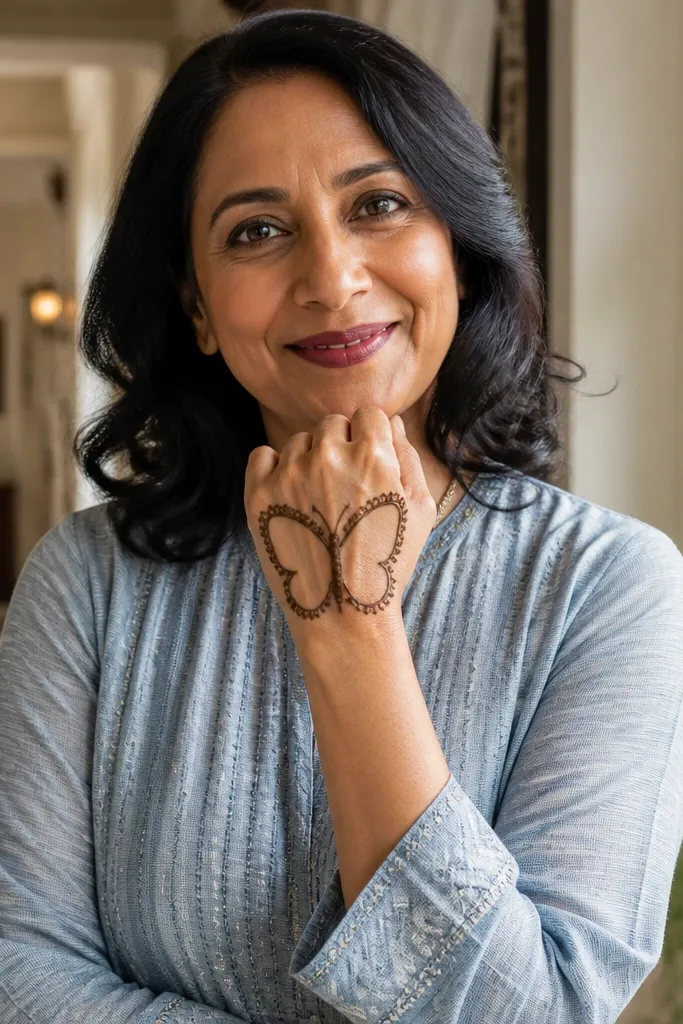
Butterfly wing outlines can look surprisingly expensive because the wing edges create a clean border, and the micro dot body adds a refined detail. Place the butterfly wings vertically across the center of the back hand so it looks like a pendant. Keep wing interiors mostly blank with just a few tiny dot rows — it reads light and high-end in photos. This design suits spring events, birthdays, and any seasonal look where you want something pretty without heavy coverage. It also gives you an easy symmetry target: left and right wings.
Draw a thin center line and place a small micro dot body at the midpoint. Sketch two wing outlines — each wing has a rounded outer edge and a slightly pointed inner edge near the center line. Add one row of small dots along each wing outline, then add 2-3 short internal lines per wing for structure. Finish with a narrow wrist cuff band and a small trailing vine line from the butterfly body toward the wrist.
Pro tipUse fewer internal dots than you think — too many makes wings look like they’re filled with paint.
AvoidDon’t outline the wings too thick — thick wings make the design look heavy.
20. Temple-Style Border with Open Center Triangle
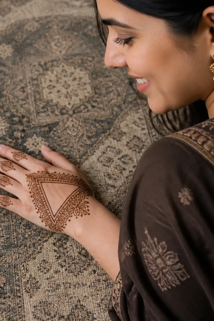
Temple-style borders look expensive because they create a regal frame, and frames always photograph well. Pair that border with an open center triangle so the design has breathing space and doesn’t become a full paste blob. Keep the border made of small repeating arches or scallops, then reserve your thicker line for the border only. The open triangle gives a modern twist and makes your mehndi look intentional. This works for festive nights, family functions, and anyone who wants a “statement but clean” look.
Draw a border around the back hand area — use small repeating arches along the outer edges, leaving a center space. In the center, draw a triangle outline with a slightly thicker line but keep it mostly empty inside. Connect the triangle base to the border using two thin lines that meet at the triangle corners. Finish with a wrist cuff band using one repeating motif, like dots between two lines.
Pro tipMake the border pattern uniform first, then add the triangle — it keeps your spacing consistent.
AvoidAvoid filling the triangle — the empty center makes the border look richer.