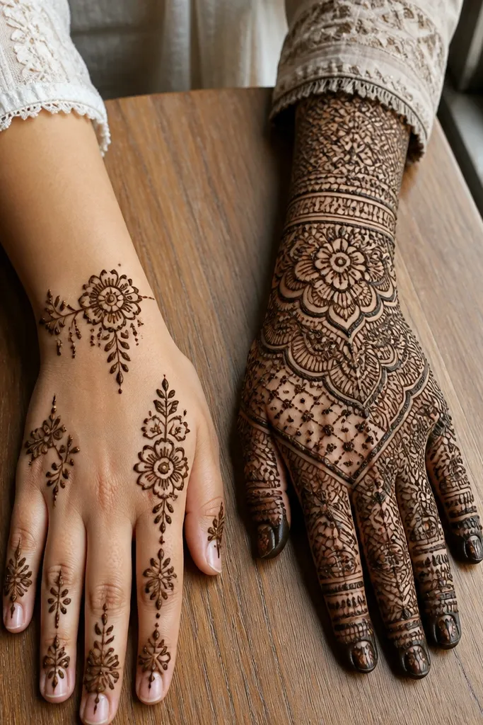
1. Wrist Cuff Spine Fan with Triple Vines
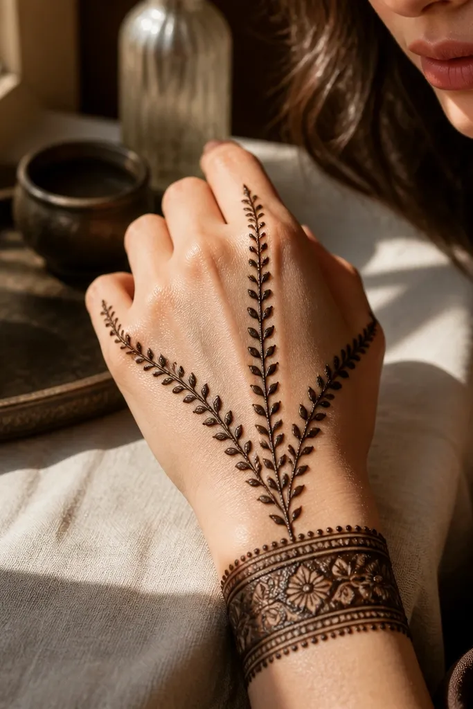
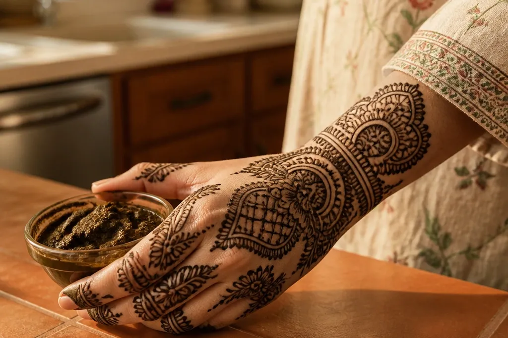
This design is bold because it locks the eye to a single central spine and then fans out in a controlled way. The wrist cuff gives you that heavy, photogenic base, while the three vine branches create symmetry without needing perfect mirror work across every finger. The spacing matters: keep a clean gap between the vine curves and the finger bridge so the paste color stays even and dark. It’s a great pick when you want full back hand coverage but you still want the pattern to look intentional, not crowded.
Start by drawing a thick cuff band around the lower wrist with a slightly scalloped outer edge. Then add a straight center spine up the back of the hand, and from the mid-point, split it into three vine curves that arc toward the index, middle, and ring finger bases. Finally, fill each vine with small leaf dots and add a light lace border only along the top edge of the finger bridge so the fingers frame the center.
Use a slightly thicker cone for the cuff and a thinner one for vine leaves so the contrast reads in photos.
Don’t add extra mini-fills between the vines — it kills the clean fan shape.
2. Knuckle Cluster Halo with Side Branches
A knuckle halo looks bold because it creates a clear ring of detail right where the hand naturally shows motion. You get full back hand impact without loading every square inch with tiny lines. The halo also helps your symmetry look cleaner, even if your left and right sides aren’t identical, because the ring gives the eye a reference. Choose this when you want a statement that still feels airy — the halo becomes the main event and the rest of the hand stays supportive.
Pro tipPress the cone a bit firmer for halo beads so the dots look raised and darker after drying.
Outline a thick semi-circle band around the knuckle area, leaving the center of the hand slightly open. Then draw two matching side branches from the halo down toward the outer wrist, each branch made of repeating teardrop beads. Fill the halo with small paisley pockets, but keep the back-hand center mostly negative space. Finish by adding a thin border line that connects the halo ends to the wrist cuff for a neat visual frame.
AvoidAvoid filling the center area heavily; the halo loses its bold contrast.
3. Back Hand Mandala Rectangle Frame
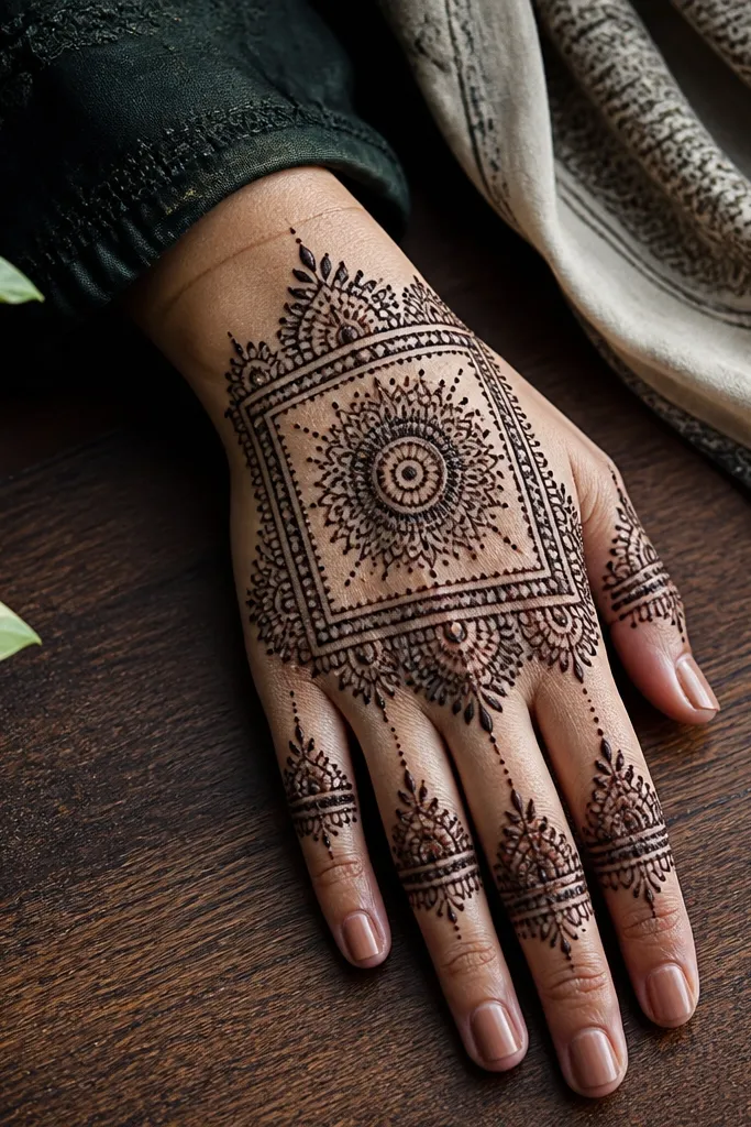
This one is bold because it uses geometry. A rectangle frame gives structure and makes the design look sharp even if the hand moves during drying. The center mandala acts like a focal medallion, so the pattern reads as one complete piece instead of scattered motifs. It’s also forgiving: you can keep finger-bridge work light while the frame does most of the visual heavy lifting. If you want full back hand coverage that looks designed, not random, this is the pick.
Draw two parallel vertical lines from near the wrist cuff up toward the finger bridge, then connect them with top and bottom curved lines to form a rectangle frame. Inside the rectangle, sketch a small mandala circle and expand it with four symmetrical petal loops. Fill the petals with dots and tiny scallops, leaving a gap between the mandala and the rectangle border. Add a thin vine line along the rectangle edges to make the border look alive, not flat.
Keep the rectangle corners slightly rounded; sharp corners crack faster as paste dries.
Don’t start filling the rectangle border with dense dots — it turns into a dark block.
4. Arabic Vine Ladder with Side Leaves
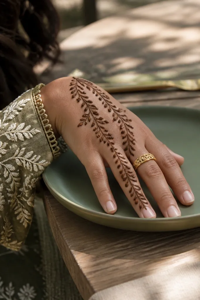
This design looks bold because the vine pattern creates rhythm. The ladder-like structure gives you consistent spacing, and the small side leaves add texture without overwhelming the hand. It’s best for people who want a full back hand look but don’t want heavy knuckle coverage. The negative space between rungs keeps the paste dark and clean. It also pairs well with rings because the design naturally frames the finger bases.
Pro tipMark your rung spacing with light dots before you pipe the lines; it keeps the ladder even.
Start with a wrist cuff band, then draw a central vine line up the back of the hand. From that spine, add alternating diagonal rungs like a ladder, each rung ending in a small teardrop tip. Place small side leaves on every second rung, keeping them smaller as you move upward. Finish by adding a thin lace border around the outer edge of the design area, stopping before the thumb side so it doesn’t crowd.
AvoidAvoid adding leaves on every rung — the hand turns busy and loses the ladder clarity.
5. Half-Moon Cuff with Full Back Hand Draped Paisleys
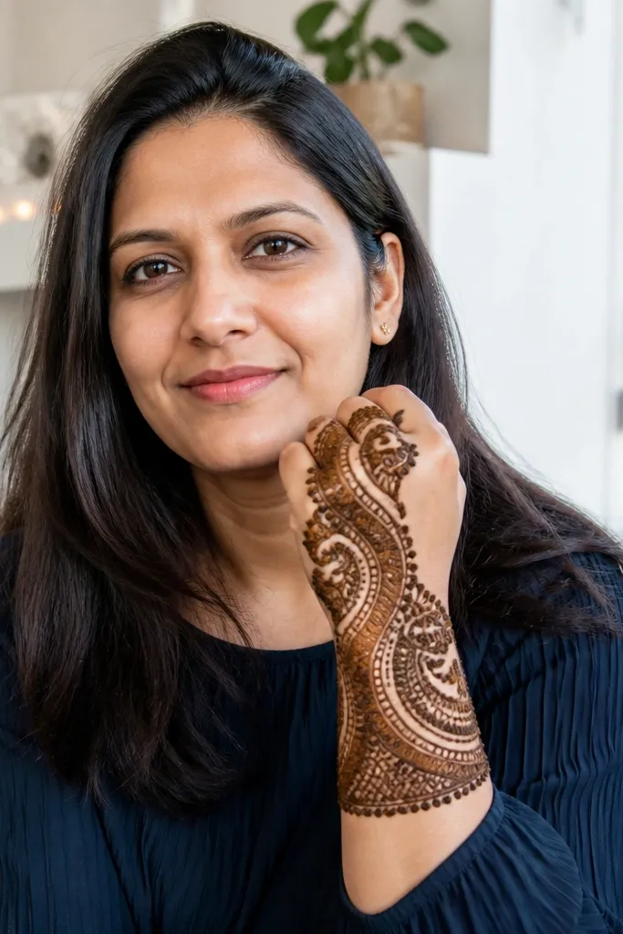
This is bold because it drapes. The half-moon cuff sets a clear shape at the wrist, and then paisleys flow diagonally across the back hand like fabric. Diagonal movement makes photos look dynamic, even with simple motifs. The paisley pockets also help you control fill density — you fill each paisley, not the entire background. Choose this if you want full coverage that still looks classy and not overly crowded.
Outline a thick half-moon cuff on the wrist, with the open side facing the thumb. Then draw a diagonal guideline from the cuff toward the outer finger bridge, and hang paisley shapes along it in two staggered rows. Fill each paisley with dots and short leaf strokes, keeping the gaps between paisleys visible. Add a thin connecting vine line at the top edge to unify everything.
Use the same paisley size for the first row, then shrink them slightly for the second row to create depth.
Don’t flip paisleys randomly; keep them all oriented the same direction for a clean drape.
6. Triple Border Top Band with Finger Bridge Lattice
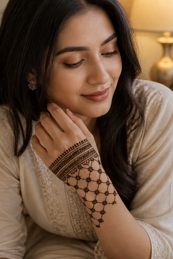
Top-band designs look bold because the eye reads them first. A triple border across the upper hand creates a crisp frame, and the lattice on the finger bridge adds structure without turning into heavy fill. This works well if you don’t want to cover the entire back hand with dense paste — the borders carry the look. The lattice also hides small cone mistakes because the cross-lines visually blend imperfections.
Start with a full back-hand base outline using a thin line from wrist to finger bridge, leaving the center mostly negative. Pipe three parallel curved borders across the top of the hand, close enough to look like one thick band. Then draw a lattice between the borders on the finger bridge: vertical lines first, then horizontal connectors. Fill only the lattice intersections with tiny dots or short half-moons for a clean finish.
Keep lattice squares slightly taller than wide so the pattern looks elegant on fingers.
Don’t fill the center background; it ruins the crisp border effect.
7. Sunburst Center Star with Radiating Petals
This design is bold because it uses radiating symmetry. A center star or small sunburst gives a clear focal point, and petal rays create movement across the back hand. It’s perfect for parties where you want the hand to look like it has a “center light.” Keep the rays consistent in thickness so the paste dries evenly. This works for both beginners and intermediate because you can map the rays before you fill.
Pro tipCount your rays (for example 8 or 10) before you start and stick to the count.
Draw a small center star or rosette in the middle of the back hand. From each point of the star, pipe petal rays outward toward the wrist and finger bridge, keeping the gaps between rays visible. Add a thin border around the outer edge of the design area, then fill each petal with dots and a single inner line. Finish by adding a small scalloped cuff band at the wrist to anchor the rays.
AvoidAvoid uneven ray spacing; it makes the design look accidental.
8. Peacock Tail Spine with Feather Tips
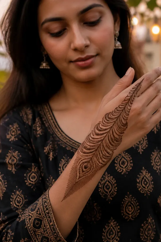
Peacock tail motifs look bold because they combine a center spine with layered arcs. The feather tips give you a natural gradient of detail from the center outward, and it reads clearly even with hand movement. You get full back hand coverage by letting the arcs travel toward the outer edges, then using lighter fill near the finger bridge. It’s a strong choice for seasonal and holiday looks because it feels festive without needing glitter.
Pro tipUse slightly thicker paste for the scallop beads on the outer arcs so they stay crisp after drying.
Start with a thick center spine from mid-back hand to the wrist cuff. Then draw layered arcs like a peacock tail — outer arcs should be longer and made of repeated scallop beads. At the top of each arc, add a feather tip shape and fill it with dots and a short leaf line. Add a thin connecting vine along the outer edge and keep the center between arcs mostly open for contrast.
AvoidDon’t overfill the feather tips; too much paste makes them look muddy.
9. Wrist Cuff to Finger Bridge Full Fan
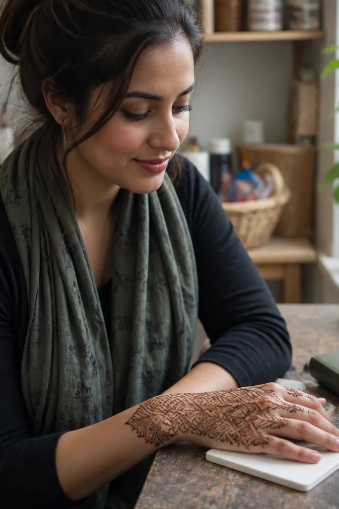
A full fan is bold because it covers a big visual area with one repeating structure. The fan shape naturally follows the hand’s curves, so it looks neat without needing dense background filling. You get a strong silhouette that photographs well, especially if you keep the fan edges crisp. This design is best when you want maximum coverage but still want it to look organized, not like a patchwork of motifs.
Pro tipKeep fan ribs evenly spaced by using the width of your cone tip as a measuring guide.
Pipe a thick wrist cuff band with a scalloped outer edge. Then draw a series of curved fan ribs from the cuff upward, each rib ending near the finger bridge. Connect the ribs with thin horizontal lace lines so the fan looks woven. Fill every second rib with small dots, leaving the alternate ribs lighter to keep the contrast.
AvoidAvoid connecting every rib with heavy fill; the fan turns flat and dark.
10. Center Chain Links with Side Paisley Swirls
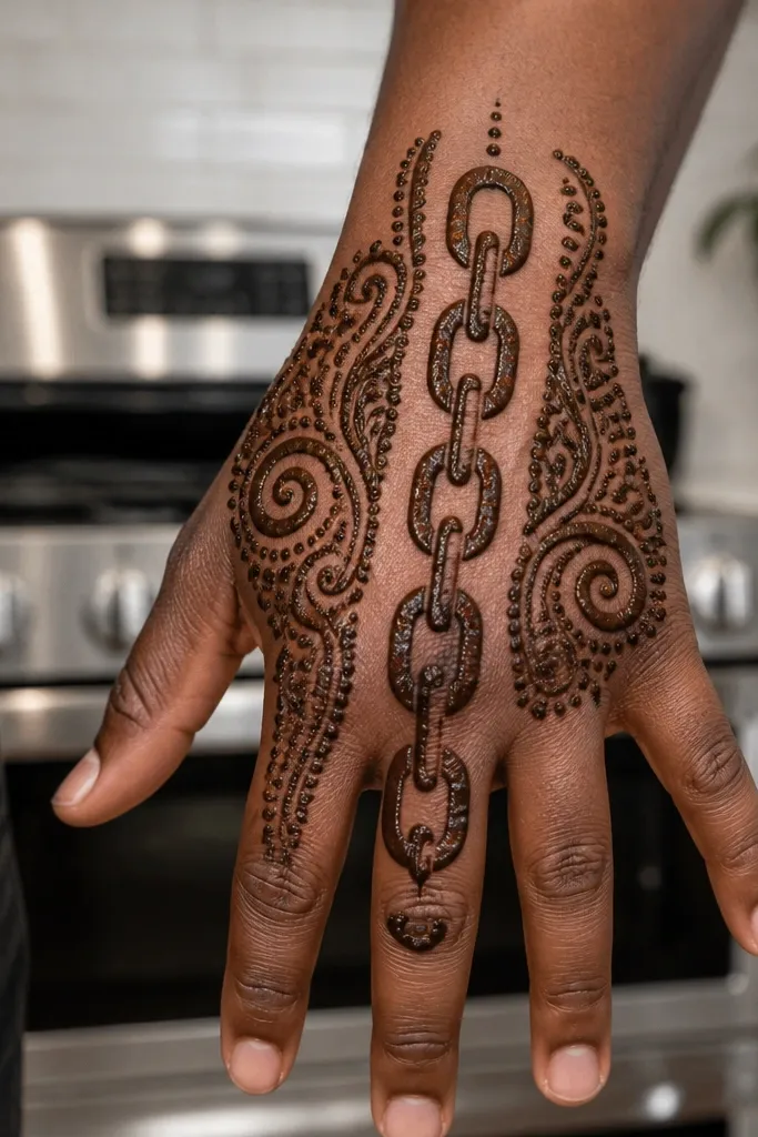
Chain link patterns look bold because they create a clean, modern rhythm. The center chain gives you instant readability, and the side paisley swirls add softness so it doesn’t look too rigid. This is a great comparison back hand mehndi design if you’re deciding between geometric and floral styles — it blends both without making it messy. Keep the chain links consistent in size and you’ll get that crisp, high-impact look.
Outline a center column on the back hand, from just above the wrist cuff to the finger bridge. Pipe chain links along the column, each link made with two rounded loops connected in the middle. Add paisley swirls on both sides of the chain column, anchored at the finger base and curving down toward the wrist. Fill the paisleys lightly with dots, and add a thin border line around the outer edge to finish the shape.
If your cone clogs, thin the paste and test a line on paper first — chain links show clogs immediately.
Don’t let chain links overlap; spacing is what makes them look bold.
11. All-Over Lace Net with Thick Outer Border
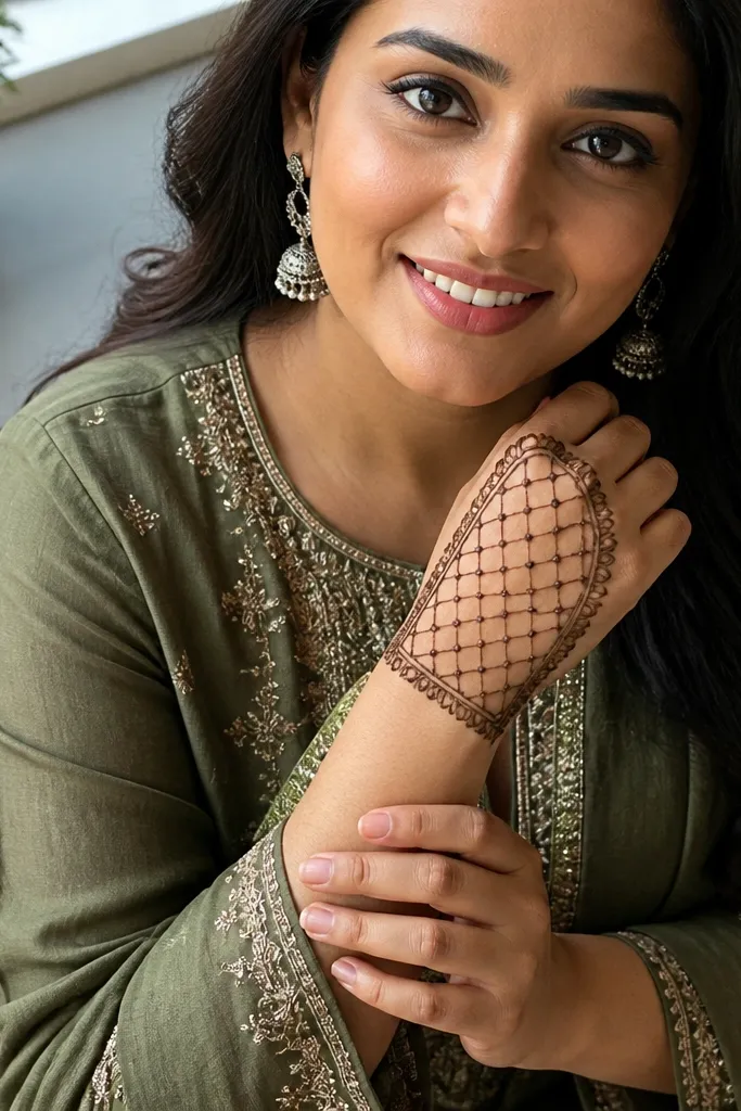
This one is bold because the thick outer border frames an all-over lace net. The net gives full coverage without heavy fill, so the design dries evenly and stays photo-friendly. It’s also practical if you want to use up time without over-darkening the center. The trick is keeping the net spacing consistent and making the border noticeably thicker than the inner work. This design is a strong choice for holiday events where you want the hand to look patterned from wrist to finger base.
Pro tipUse a ruler-like mental guide for net spacing — evenness matters more than tiny motif variety.
Start with a thick outer border around the back hand area, including the outer edge near the thumb side. Inside, pipe a grid-like lace net: vertical loops first, then connect them with diagonal or horizontal lines. Keep each net cell open so you see skin through the pattern. Add small dot clusters at the intersections and finish by reinforcing the wrist cuff with a single thick band.
AvoidDon’t fill the net cell centers with heavy paste; it turns the lace into a solid patch.
12. Arabic Square Grid with Diagonal Fill Bands
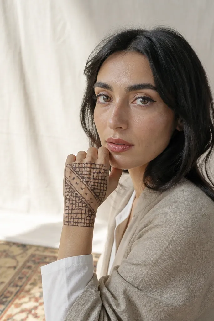
Grid designs look bold because they read like a pattern, not a sketch. A square grid across the back hand gives structure, while diagonal fill bands add drama without covering everything. This is a good pick when you want full back hand mehndi but you’re working with limited time and want a repeatable layout. The diagonal bands also help hide small asymmetry — your eye follows the diagonal direction instead of checking mirror symmetry.
Pro tipKeep diagonal bands about 1.5-2 cone tip widths wide so they look bold without turning heavy.
Draw a rectangular grid area from the wrist cuff to the finger bridge, keeping it slightly wider on the outer edge. Pipe vertical and horizontal lines to form the grid squares, leaving each square mostly open. Then add diagonal bands that cut across the grid, filling only the band path with dots and short leaf strokes. Finish by adding a thin top border and a thick wrist cuff band to anchor the pattern.
AvoidAvoid fully filling the grid squares; the bold look comes from the open cells.
13. Wrist Cuff with Butterflies and Finger Base Veins
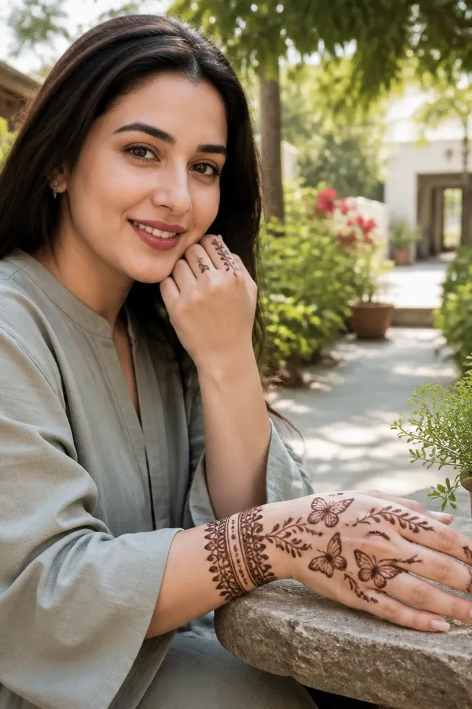
Butterfly motifs feel bold because they add recognizable shapes on a surface where most people use paisleys. The wrist cuff anchors the design, and the finger base vein lines give the butterflies a direction. This is a great holiday-friendly look because butterflies read festive but still clean. Keep your butterflies spaced so each one has a clear silhouette, and keep the background light so the wings show their detail. It’s full back hand coverage without stuffing every inch.
Start by building a thick wrist cuff with scalloped edges and a small vine line on top. Place two butterflies on the upper back hand area near the index and ring finger bases, each butterfly made with two wing loops and a small dot body. Connect the butterflies to the finger bridge using thin vein-like lines that branch into small leaf tips. Fill butterfly wings with dotted arcs and keep the center background mostly open.
Pipe butterfly wings in one continuous loop per wing — it gives cleaner symmetry.
Don’t cram three butterflies too close; overcrowding makes wings blend together.
14. Peony Blossom Cluster with Outer Petal Border
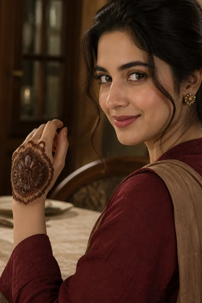
A peony-style blossom cluster is bold because it creates a layered flower mass that looks dimensional even in paste. You get full back hand impact by placing the peony in the center and letting an outer petal border wrap the edges. This design is visually rich without needing tiny filler everywhere. It also looks great for holiday looks because blossoms feel celebratory and frame the hand nicely for photos. Keep the outer border crisp so the center blossom doesn’t look like it’s floating.
Draw a medium-size center peony rosette with multiple petal loops around a small center dot. Build two more layers of petals slightly larger than the first, leaving thin gaps between layers. Add an outer border made of repeating half-petal arcs around the back hand area. Fill the petal layers with dots and short inner lines, then finish with a thick wrist cuff band that connects to the outer border.
Use fewer petal loops but make them thicker — bold petals read better than lots of thin lines.
Avoid heavy filling in the center rosette; it can turn into a dark blob.
15. Thumb-Side Crescent with Full Outer Edge Coverage
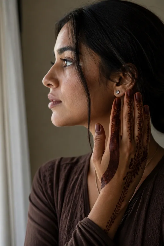
This design is bold because it uses one strong crescent on the thumb side plus heavy outer edge coverage. It creates a clear silhouette when the hand is photographed from the side, which is where most back-hand designs look weak. The center stays lighter, so the crescent and outer edge do the visual work. If you’re wearing rings or bangles, this look also frames them because the pattern naturally hugs the hand’s outline. It’s full and photogenic without feeling stuffed.
Start with a thick outer edge border that runs from the lower wrist up along the outer hand contour and toward the finger bridge. On the thumb side, pipe a crescent motif that curves from the wrist cuff upward, then add small teardrops along its inner edge. Keep the center area mostly open with only a thin connecting vine line. Finish by adding a light lace cluster at the top edge near the finger bases and reinforce the wrist cuff with a scalloped band.
Make the crescent inner edge slightly lighter than the outer edge so it shows as a distinct shape.
Don’t extend the crescent too far across the center; it should hug the thumb side.
16. Two-Layer Border with Center Medallion and Dots
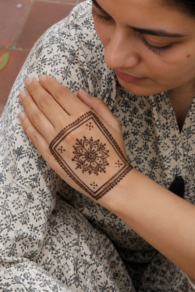
Two-layer borders make a back hand look bold because they create depth. The outer border gives you the frame, and the inner border gives you a controlled space where your medallion sits. The center medallion with dot clusters reads clean in photos because it’s high contrast against negative space. This design works for people who want full coverage but don’t want the stress of detailed lace across the entire back hand. It’s also easy to adjust size — just scale the medallion and keep the border spacing consistent.
Pipe an outer border around the back hand area with a slightly thick line and small scallops. Then add a second inner border parallel to it, leaving a narrow gap. Create a center medallion using a rosette with 6-8 petals, and fill the petals with dot patterns and one inner line. Add small dot clusters in the gap between the borders and keep the rest of the background minimal for clarity. Finish with a wrist cuff band that matches the outer border thickness.
If your dots look too small, increase dot size slightly instead of adding more dots.
Avoid filling the space between the borders completely; keep it airy for bold readability.
17. Chevron Ladder Bands with Finger Bridge Corners
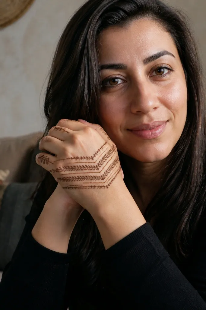
Chevron ladders look bold because they make strong diagonal structure. The design feels modern and graphic, and it photographs well because the lines stay crisp. By adding chevron bands across the upper back hand and ending with corner motifs at the finger bridge, you create a neat finish instead of messy finger clutter. This is a good choice for beginners who want a bold look without trying to do complex paisleys. The pattern is repeatable and forgiving if your lines aren’t perfect.
Start with a thick wrist cuff band, then draw two chevron ladder bands that run from the wrist up toward the finger bridge. Each band is a repeating V pattern, with the V tips pointing upward. At the top edge near the finger bridge, add small corner motifs — tiny inverted chevrons that sit at the outer and inner edges. Fill the chevrons with light dots only on the top half of each V, then add a thin outline around the design area to keep it framed.
Keep chevron size consistent across both bands so the design looks intentional, not random.
Don’t overfill the chevrons with dense lines; it turns the pattern into a dark stripe.
18. Gulab Rosebud Cluster with Vine Trails
Rosebud clusters look bold because they create layered texture without needing heavy fill across the entire hand. The vine trails connect each bud and keep the design flowing from wrist to finger bridge. This is a strong comparison back hand mehndi design if you want something floral but still structured enough to look clean in photos. Keep buds larger in the center and smaller as they approach the finger bridge, so the hand reads as one composition. It’s holiday-friendly and looks great with both minimal jewelry and stacked bangles.
Pro tipMake rosebud petals thicker than the vine so the flower shape stays readable after drying.
Outline a wrist cuff band and then draw a thin center vine line leading up the back hand. Place three rosebuds along the vine: one near mid-hand, one slightly above it, and one toward the finger bridge. Each rosebud is made with layered teardrop petals around a dot center, with dotted fill inside petals. Add side vine trails branching from the main vine and end them with small leaf tips. Keep the background mostly open and add a light border line around the outer edge.
AvoidDon’t add extra buds everywhere; three well-spaced buds beat a busy cluster.
19. Full Back Hand Geometric Hex with Corner Frames
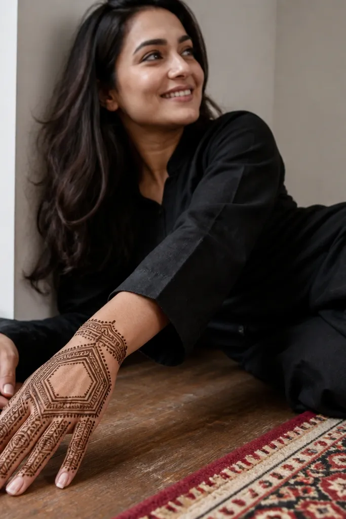
Geometric hex patterns look bold because they create a crisp, repeating structure that stays sharp in photos. Corner frames add polish and make the design feel finished even if the center has open space. This design suits people who want full back hand coverage but prefer clean lines over floral fills. The trick is keeping the hex grid evenly spaced and using corner frames to anchor the wrist and finger bridge. It’s a great pick for seasonal and holiday looks when you want something that looks intentional and graphic.
Draw a thick outer frame around the back hand area, then add two corner frames at the wrist and finger bridge using small stacked rectangles or arches. Inside, pipe a hex grid: start with one central hex, then repeat outward in rows. Connect hex edges with thin lines and keep the hex interiors mostly open. Add a few dot clusters at key vertices and finish by thickening the center column with one vertical vine line that visually ties the grid together.
Use consistent cone pressure for hex edges; uneven thickness makes the grid look patchy.
Avoid mixing hex shapes sizes; keep every hex the same scale for bold clarity.
20. Outer Edge Vine with Inner Dot Fill Curtain
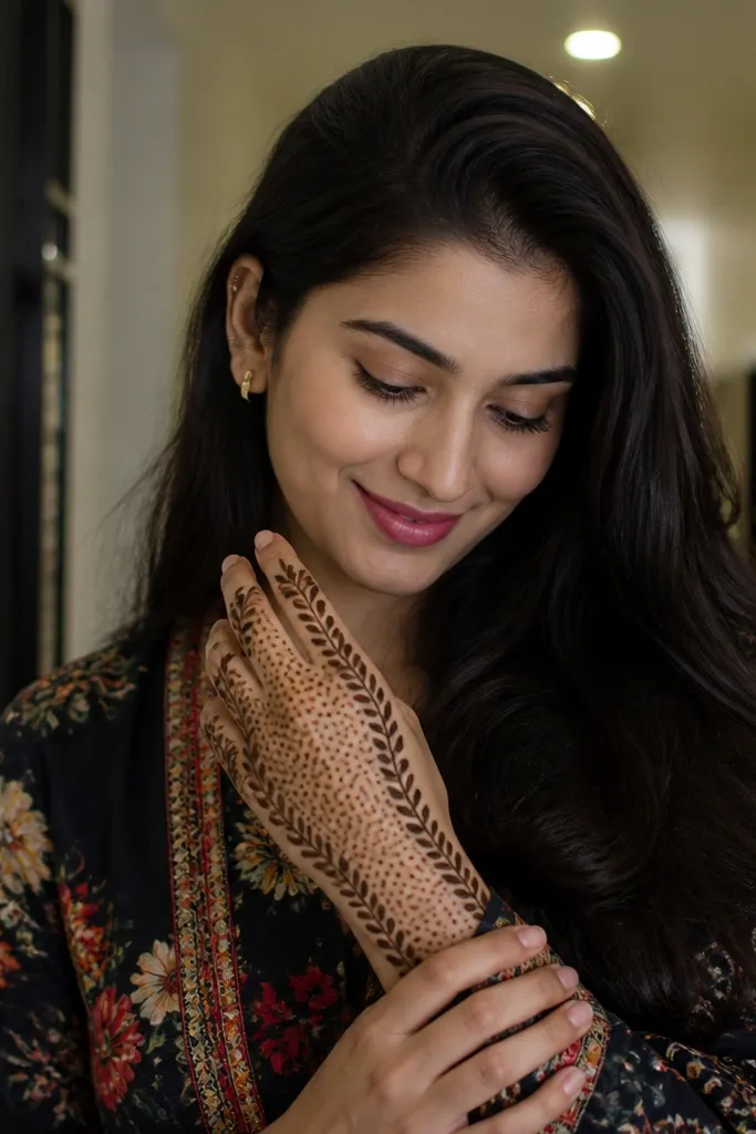
This design is bold because it creates a curtain effect. The outer edge vine gives crisp structure, and the inner dot fill curtain makes the hand look full without messy line density. It’s photogenic from both straight-on and slightly angled photos because the curtain texture reads as a soft gradient. This is a smart choice if you want coverage but you’re worried about lace work taking too long. The inner dots also dry darker when you keep them consistent in size.
Start by drawing a thick vine border along the outer edge of the back hand up to the finger bridge. Then create an inner curtain by drawing two parallel lines that form the curtain boundaries from wrist to finger bridge. Fill between those boundaries with repeated dots and short half-moon stamps, leaving small gaps so it doesn’t become solid. Add a few small vine loops connecting the outer border to the curtain edges for depth. Finish with a scalloped wrist cuff band that matches the outer vine thickness.
Keep dot size uniform by squeezing the cone at a steady speed — dot texture matters more than motif variety.
Don’t fully fill the curtain with continuous lines; dots and half-moons keep it bold and clean.