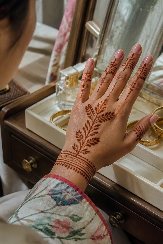
1. Single-Chain Center Vine
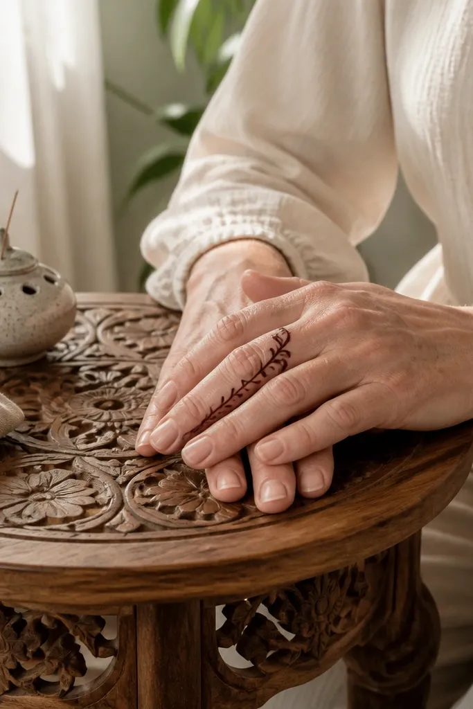
This design looks expensive because it reads like jewelry: one clean vertical stem, tiny linked segments, and a light top flourish. The center line gives structure, while the small “chain” dots keep it delicate instead of heavy. It’s perfect for short fingers because it adds height without spreading. The look is photo-friendly since the pattern stays crisp even when the stain fades a bit over time.
Start by drawing a thin vertical line from near the finger base to just before the tip. Then pipe small linked oval loops along the line, keeping each loop the same size. Finish with a tiny curl at the top and a single dot near the base to anchor the design.
Pro tipIf your cone globs, squeeze less and keep the tip slightly above the skin for a cleaner line.
AvoidDon’t fill the vine — leave it open so the design stays airy.
2. Knuckle Arch + Mini Dots

The knuckle arch makes fingers look styled because it frames the joint like a bracelet. The trick is keeping the arch narrow and letting the rest of the finger stay mostly blank. Small dots on either side add sparkle without turning into a shaded mess. This is a great pick if you want something quick that still looks intentional in close-up photos.
Pipe a thin curved arch across the knuckle area, leaving a small gap in the middle for a clean break. Add two or three dot clusters along the arch ends and one dot down the center line. Keep the dots tiny and evenly spaced so the finger doesn’t look crowded.
Pro tipLet the arch dry for 2-3 minutes before adding dots so they don’t smear.
AvoidSkip thick outlines — they make the arch look like a stamp.
3. Half-Moon Frame Finger
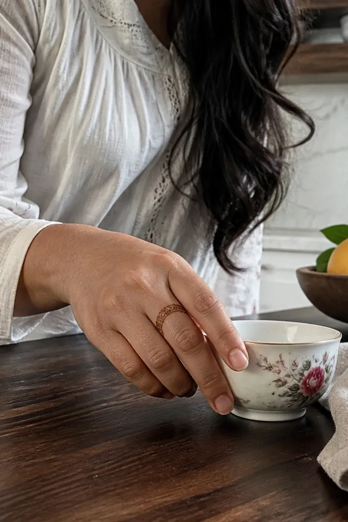
This one gives a luxury “border” look without requiring heavy filling. A half-moon frame suggests a cuff, while thin side lines keep it elegant. It’s especially flattering on medium-length fingers because the frame starts near the base and tapers toward the tip. The design stays readable in photos even if you remove some paste early.
Draw a half-moon arc starting from one side of the finger base and ending on the other side, leaving the center open. Then add two thin lines running up the left and right edges to about two-thirds of the finger. Finish with a small spiral at the top corner of the frame.
Pro tipUse a ruler edge or your nail line as a guide for consistent height on both sides.
AvoidDon’t close the frame all the way around — the open center is what keeps it high-end.
4. Top Lotus Tip
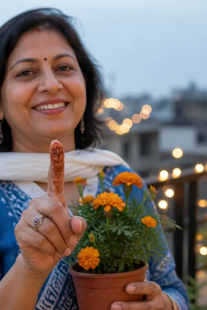
A lotus at the tip looks high-end because it concentrates detail where cameras naturally focus. The design stays simple because most of the finger has only a thin stem and a few petal lines. It’s a strong choice if you want mehndi that looks classy without covering your whole finger. Keep the petals small and separated so they look crisp rather than like a blob.
Start with a thin stem line from mid-finger to the fingertip. Pipe five narrow petal shapes at the top, each petal slightly tilted, leaving gaps between them. Add one dot in the center and a tiny leaf curl on the stem near the top.
Pro tipPress the cone tip lightly and lift at the end of each petal for a clean point.
AvoidDon’t overfill the petals — leave them mostly hollow for sharper lines.
5. Diagonal Bow Ribbon
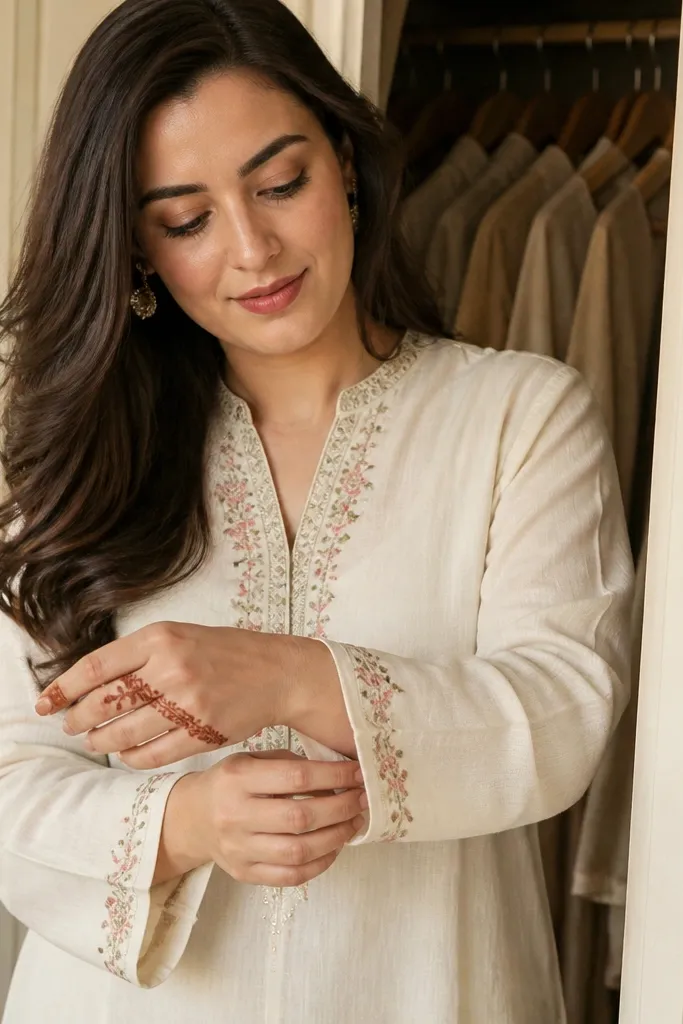
This looks like a hair ribbon on your finger. The diagonal line gives movement, and the bow adds a “designed” feel without needing a lot of paste. It’s great for adding style to fingers that you don’t want fully patterned. The diagonal placement also helps the design stay balanced on both sides of the finger.
Draw a diagonal thin line from near the base on one side to mid-finger on the other. At the middle, pipe a small bow using two loops and a center knot dot. Add two tiny dots on either side of the bow and stop — keep the rest clean.
Pro tipMake the diagonal line light and straight; thick diagonals look messy fast.
AvoidAvoid extra curls at the bottom — they make the ribbon feel crowded.
6. Two-Layer Chevron Band
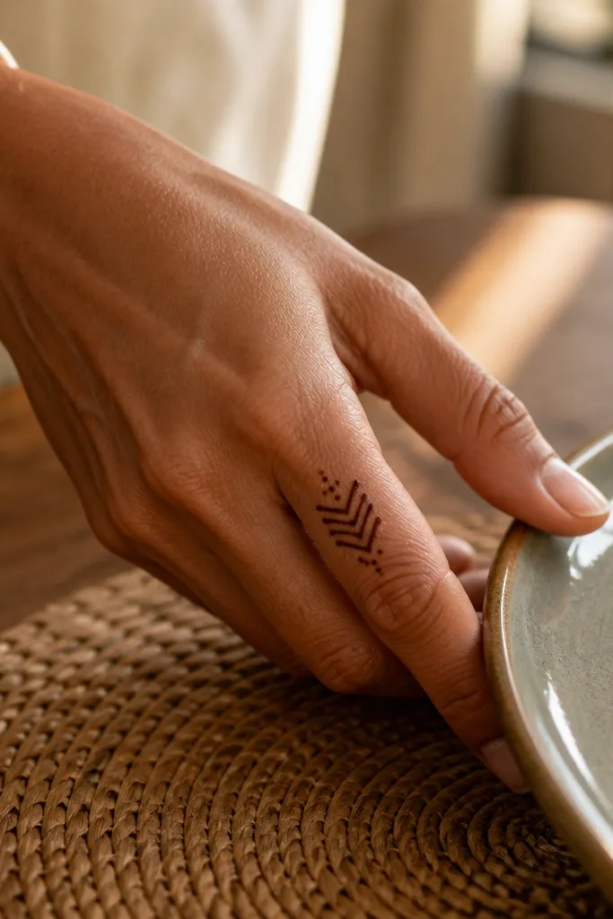
Chevron looks luxe because it has built-in geometry. This design uses a stacked band near the middle of the finger, with thin spacing between layers so it reads clean. It’s perfect for people who love bold patterns but still want “simple” — you’re concentrating effort in one band. The end dots keep it from looking unfinished.
Pipe a thin chevron zigzag band around the middle third of the finger, keeping the zig spacing even. Add a second chevron layer just above it, slightly shorter, and leave clear gaps between the two bands. Finish with a dot at each end of the top chevron and one dot down the center line.
Pro tipPractice the zig spacing on paper first — consistent angles matter more than size.
AvoidDon’t thicken the zig lines; thick chevrons blur together.
7. Side-Vine with Bead Dots
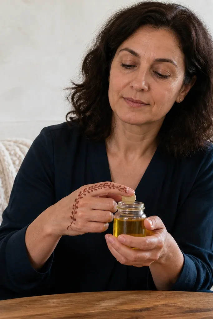
Running the vine along one side is an instant upgrade because it keeps the finger from looking filled-in. The beads add a jewelry effect without heavy shading. This design works on both short and long fingers — short fingers benefit from a smaller bead trail, while long fingers can handle a slightly longer vine. It’s clean, modern, and looks good even when the stain fades.
Start at the finger base with a thin curved line that hugs one side. Pipe tiny bead dots along the vine in a straight-ish rhythm, then add two small leaf curls near the top. Finish with one larger dot at the top corner so the design has a focal point.
Pro tipKeep bead dots uniform by using the same cone pressure each time.
AvoidDon’t mirror the vine on both sides — one-side placement is what keeps it luxury.
8. Micro-Grid Finger Window
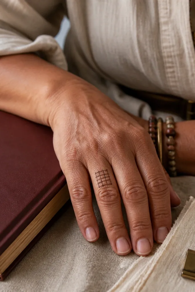
This is a “designer” look because it creates a window effect. The micro-grid stays simple when you keep it small and border it with thin lines. It’s ideal for fingers you want to decorate without covering the whole length. When stained, the grid gives a subtle texture that looks high-end in photos.
Draw a thin rectangular window starting near the base and ending around the upper middle of the finger. Inside, pipe a simple grid using short vertical and horizontal lines with consistent spacing. Add one dot at each corner of the rectangle and a tiny curl at the top edge.
Let the rectangle outline dry before you fill the grid so lines don’t bleed into each other.
Avoid making the window too wide — it should look like a panel, not a patch.
9. Center Line Star Dot

A small star dot is a clean, luxury focal point. You get the “bling” look from dots and short strokes, while the center line keeps the finger framed. This design is fast and works well when you’re doing matching fingers on both hands. It’s also forgiving if your paste isn’t perfect — the star pattern hides minor unevenness.
Pipe a thin vertical line down the center of the finger. Near the middle, create a small star shape using dots — one dot at each point and one dot at the center. Add two tiny dots above and below the star along the center line.
Use dot placement first, then connect with the smallest possible strokes if you want extra definition.
Don’t add a big star — small looks sharper and more upscale.
10. Bilateral Leaf Corner
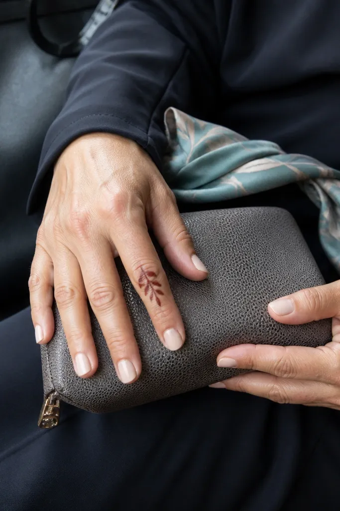
Leaf corners make a finger look styled without filling the whole space. The key is using symmetrical leaves at the top and letting the lower finger stay mostly blank. This design works for anyone who finds full mehndi too heavy. It also looks great for photos because the leaves catch the eye at the fingertip area.
Draw a thin outline line along the finger’s edge from base to about three-quarters height. At the top, pipe two mirrored leaf shapes facing inward, one on each side. Add a small dot cluster at the leaf base and a single tiny curl down the center line.
Pro tipIf your leaves look round, make the tip pointier by lifting the cone quickly at the end.
AvoidSkip thick shading under the leaves — keep it linework-only.
11. Triple Dot Ladder

This one is deceptively luxe. A ladder of grouped dots creates a refined, geometric rhythm, and it stays light enough for short fingers. The top curl adds the “finished” feel so it doesn’t look like random dots. It’s a good choice when you want something minimal but still obviously designed.
Draw a thin center line from the base to near the tip. Then pipe small groups of three dots on either side of the center line at even intervals, like rungs of a ladder. Finish with a tiny spiral at the tip and one dot at the base of the spiral.
Pro tipCount spacing: mark four equal intervals in your mind so the rungs line up.
AvoidDon’t make the dot groups too big or they’ll look like stains, not decoration.
12. Arch + Vine Side Frame

This design looks like a bracelet and a vine combined, but it stays simple because you only build two zones. The arch band gives structure at the knuckle, and the side vine adds movement down the finger. It’s perfect when you want mehndi that stands out but doesn’t take forever. The separation between the arch and the vine keeps it from becoming a dark smear.
Pipe a narrow arch across the knuckle area, then let it dry slightly. From the center of the arch, draw a thin vine line down one side of the finger, adding two leaf curls near the middle. Finish by adding a single dot at the vine’s end and one dot near the arch corners.
Pro tipUse one direction for the vine curls so both sides look intentional.
AvoidAvoid adding extra vines — one side is enough for a high-end look.
13. Fine Lace Net Strip
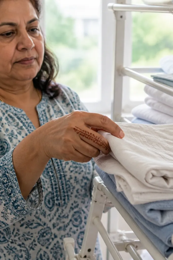
A lace net strip looks luxury because it mimics fabric texture using only linework. Keep the strip narrow so it reads as delicate lace, not a full mesh. This is a great design for fingers where you want a clean, vertical statement. It also ages well since the open net lines leave lighter gaps.
Draw a thin vertical strip line down the finger center. Then pipe small loops across the strip like a net, making tiny U-shapes that touch the strip line. Continue for about two-thirds of the finger, then stop and add a small curl at the top edge.
Keep loops consistent in size; one wrong loop sticks out more in net patterns.
Don’t overfill the strip — lace works because it stays open.
14. Temple-Style Side Border
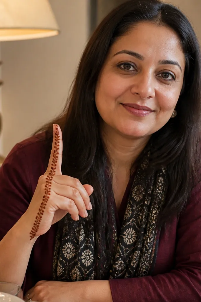
Temple-style borders look regal even when the finger design is small. Here, you use a single side border with tiny repeating motifs that create a patterned edge. The main benefit is that it frames the finger without heavy shading. It’s a strong choice for people who want a more traditional look but still keep it simple and fast.
Draw a thin border line along one side of the finger from base to tip, leaving a small gap at the very top. Add small repeating motifs along the border — a tiny leaf-petal shape or a short arch — spaced evenly. Finish with one larger motif near the base and one tiny dot near the top gap.
Pro tipIf motifs start to drift, pause after every two motifs and realign your hand.
AvoidDon’t mirror the whole border on both sides — it becomes heavy and less luxe.
15. Crescent Moon at Mid-Finger
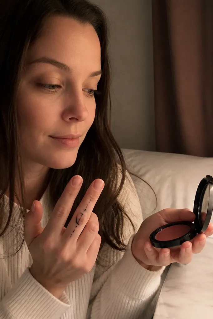
A crescent moon is a clean, modern motif that still feels special. The key is making it thin and keeping the negative space inside the crescent. Add a few tiny dots around it like stardust and the finger looks styled even with minimal paste. This works well on medium-length fingers and looks great when you do the same motif on multiple fingers.
Pipe a thin crescent shape at the middle of the finger, leaving the inside mostly empty. Add a small dot cluster of three to five dots around the crescent ends, not the center. Then draw a single fine line from the base to the crescent to anchor the design.
Pro tipUse a slightly smaller crescent than you think — big moons look cartoonish on fingers.
AvoidSkip thick filling inside the crescent; keep it linework-only.
16. Double Arch Ladder
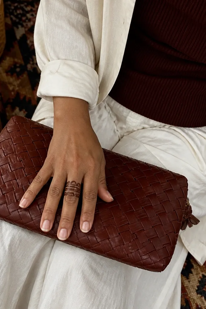
Stacked arches create a high-end, structured look because they read like layered bangles. This design stays simple because you focus on two bands instead of filling the whole finger. It’s a great option for fingers that need height and shape. The connecting lines keep it looking intentional and “finished,” not like separate doodles.
Draw the first thin arch band across the upper third of the finger, leaving gaps between the ends. Add a second arch band just below it, slightly wider or same width — choose one and keep it consistent. Connect the two bands with a couple of short center lines and finish with two tiny dots at the bottom arch ends.
Keep arches symmetrical by using the center line of the finger as your alignment tool.
Don’t add extra bands below the second arch — two is enough for luxury.
17. Petal Column + Micro Dots
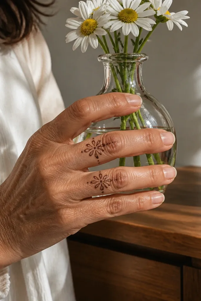
A petal column looks luxe because it turns a finger into a vertical centerpiece. The trick is keeping petals small, spaced, and line-based. Micro dots between petals add a sparkle effect without filling the column too dark. This is a great choice when you want something more detailed but still simple enough to finish quickly.
Pipe a thin center line down the finger. Add small petal shapes along the center line, one after another, about 6-10 petals total depending on finger length. Place one tiny dot between each petal for rhythm, then finish with a small curl at the tip.
Pro tipKeep petal tips pointed — rounded petals look less high-end on fingers.
AvoidAvoid heavy shading inside petals; linework gives the luxury look.
18. Half-Finger Mandala Dot Cluster

This design uses a mini mandala cluster on only the upper half, which makes it feel expensive without taking over the whole finger. The dot mandala creates texture, while a thin ring outlines it so it stays crisp. It’s ideal for long fingers where you want a focal area near the tip and knuckle. The ring helps the cluster read cleanly in photos.
Draw a thin curved ring around the upper half of the finger, like a partial halo. Inside the ring, pipe a small dot mandala pattern — a center dot, then dots forming a rough circle, then a few dots at the corners. Add two short curved lines from the ring to the center to connect the pattern.
Pro tipKeep dot clusters tight and stop early; the fastest way to make it look luxury is restraint.
AvoidDon’t extend the mandala to the base — it starts to look busy.
19. Minimal Geometric Corner Triangle

Geometric corners look modern and high-end because they’re clean and controlled. This triangle sits at the top corner, giving a sharp focal point while the rest of the finger stays light. It’s a great pick for people who want minimal mehndi that still looks like a design, not random doodles. The dot line along the side adds a delicate finish.
Draw a thin line along one side of the finger from mid to near the tip. At the top, pipe a small triangle pointing inward, with one side touching the line. Add a short row of tiny dots along the outside edge of the triangle and stop there.
Pro tipUse smaller triangle than you plan — corners look best when they’re subtle.
AvoidSkip thick outlines and shading; geometry needs thin lines to look luxury.
20. Finger Tip Crown

A crown at the fingertip looks instantly dressed up, and it’s simple because it only takes three points. The crown shape reads clearly even with lighter staining, and it looks great on multiple fingers in a matching set. It also works for both short and long fingers since it sits at the top. Keep the crown thin and add a tiny dot base to make it feel complete.
Pipe a thin curved line at the fingertip base, then add three pointed peaks on top, evenly spaced. Draw a small dot line or single dot at the crown base so the crown looks anchored. Add one tiny curl under the center peak and leave the rest of the finger blank.
Pro tipIf your peaks merge, reduce pressure and lift the cone between each point.
AvoidDon’t add side chains — keep it clean so the crown stays the hero.