1. Wrist-to-Center Arch Frame
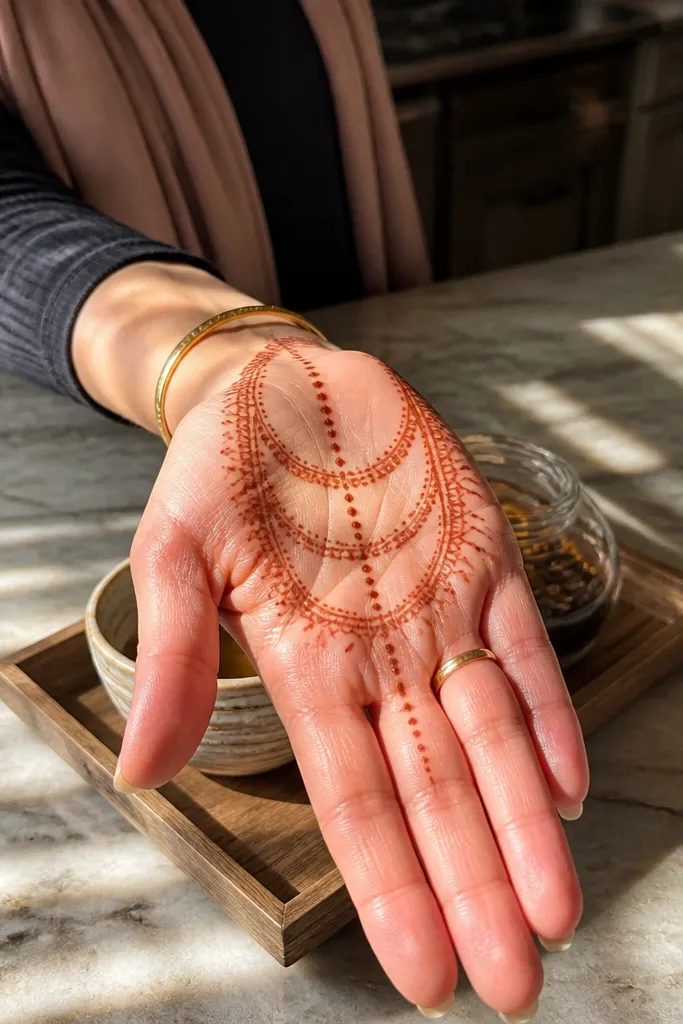
This one is clean, photogenic, and fast because it gives your palm a strong border without crowding. Start with two curved side lines running from the wrist line toward the thumb side, then connect them with three stacked arches across the palm. The center gets a straight vertical line made of evenly spaced dots, which keeps symmetry even if your hands aren’t perfectly steady. It’s beginner-friendly and works with almost any henna paste shade because the pattern relies on spacing, not tiny details.
Step 1: Draw a thin curved border along both sides of the front palm, stopping just before the finger base. Step 2: Add three stacked arches across the palm, each arch touching the side border at both ends. Step 3: Place a vertical dot line down the center from the top of the arches to the wrist line. Finally, add 2-3 small dots at the top corners where the arches meet the border.
Pro tipIf your cone starts to wobble, use your non-drawing hand to steady the wrist on a folded towel.
AvoidDon’t overfill the arches — thick lines make the center dots disappear in photos.
2. Three-Band Palm Stripe
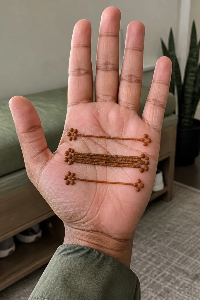
This design looks modern because it reads like clean bands rather than lace. You’ll draw three horizontal stripes across the palm, with one stripe across the middle being slightly thicker. Then you place dot clusters at the ends of each band so the design doesn’t look flat. It’s ideal if your paste dries unevenly because the bold bands hide minor variation in line thickness.
Step 1: Outline a thin horizontal line near the wrist crease, then repeat at the middle of the palm and near the upper palm. Step 2: Thicken only the middle band by going over it once more. Step 3: Add 4-6 dots at both ends of each band, keeping the clusters mirrored left and right. Finish by connecting the dot clusters to the band ends with a short curve, like a bracket.
Pro tipLet each band set for a minute before adding dot clusters so the ends don’t smear.
AvoidAvoid drawing bands too close together — the gaps are what make it look airy.
3. Thumb-Corner Chevron Ladder
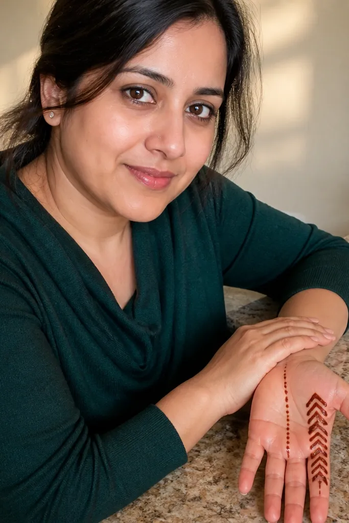
This one is a smart renter-friendly choice because it focuses on a small area near the thumb and the outer edge, so you get impact without covering the whole palm. Make a chevron ladder (V shapes stacked) starting near the thumb side corner, then balance it with a vertical line of dots down the center. The contrast between geometric chevrons and soft dots makes it look intentional, not random. It’s great for short sessions because it doesn’t require filling the entire palm.
Step 1: Start with a set of three chevrons stacked near the thumb side corner of the front palm, each V touching the next. Step 2: Extend the chevron base into a short curved line that points toward the center. Step 3: Add a vertical dot ladder down the center — 8-10 dots from top to wrist line. Finally, place one tiny dot at each side of the chevrons to frame them.
Press the cone lightly and keep the same speed on each chevron so they look even in photos.
Don’t make chevrons too wide — oversized Vs can look messy on a small front palm.
4. Dot-Star Center Burst
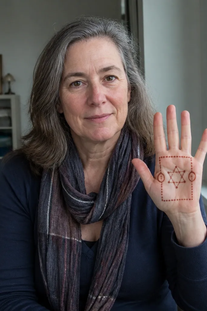
A dot-star center burst looks delicate but stays simple because you’re building the shape with dots, not leaf lines. Draw a thin border around the palm frame, then place a small star at the center made from dots connected by short lines. Add two curved comma shapes on either side of the star using dots and tiny strokes. This design photographs well because the center is the focal point and the border keeps the edges neat.
Step 1: Draw a thin curved outline framing the front palm — keep it lighter on the wrist side. Step 2: In the center, make a star using 5 points formed by dots, then connect each point with a short, straight mehndi line. Step 3: Add two comma-like loops on left and right of the star, each loop starting with a dot and ending with a tiny taper line. Finish with 6-8 small dots around the star points for sparkle.
Pro tipUse a toothpick to lightly clear any paste blobs before they dry if you see thick lumps near the star.
AvoidAvoid drawing a full floral fill — it steals attention from the star and makes it harder to clean.
5. Outline Bloom Corner
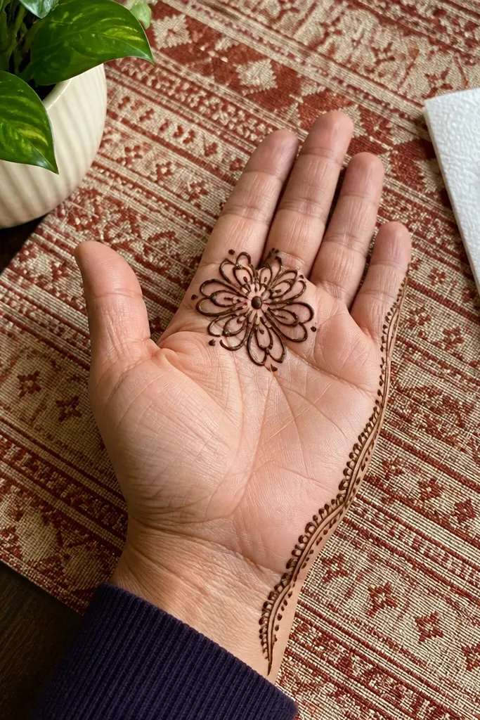
This is minimal but still pretty because it uses one clear bloom instead of lots of micro-detail. Put the flower near the top of the front palm, close to the finger base, and keep petals as outline loops rather than filled leaves. The petal outlines give you a lacy look without taking forever. Add a thin side border line so the flower doesn’t float. It’s a strong choice when you want front-palm aesthetics but your paste isn’t great for tiny work.
Step 1: Draw a light border line along the two side edges of the front palm, stopping before the wrist crease. Step 2: At the top center, sketch 5-6 petal outlines as rounded teardrops pointing outward. Step 3: Add a small dot cluster in the flower center. Finish by connecting the bottom of the flower to the side border with two short curved lines.
Pro tipIf your outlines thicken, go slower on the curve and lift the cone at the end of each petal to keep clean tips.
AvoidDon’t shade the petals — filled petals take longer and smear more during drying.
6. Palm Center Ladder with Side Dots
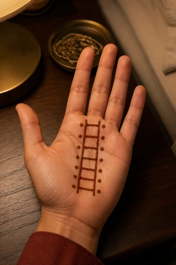
This design looks structured and modern because it mixes one strong vertical “ladder” with paired dots for balance. The ladder is made of small horizontal steps connected by a vertical line, so you always know where your next stroke goes. Add dots on both sides at each ladder rung to make it look symmetrical. It’s great for beginners and works even if your paste dries slightly lighter, because the structure stays readable.
Step 1: Draw a straight vertical line from the wrist crease to the upper palm. Step 2: On that line, add 6-7 small horizontal steps that stick out left and right like a ladder rung. Step 3: Place 2 dots near each rung end, mirrored on both sides. Finally, add one tiny dot at the top of the vertical line to finish the composition.
Use the side of your cone tip for the rung lines so they look flat and consistent.
Don’t make the ladder rungs uneven in spacing — it reads as accidental in photos.
7. Half-Moon Wrist Band
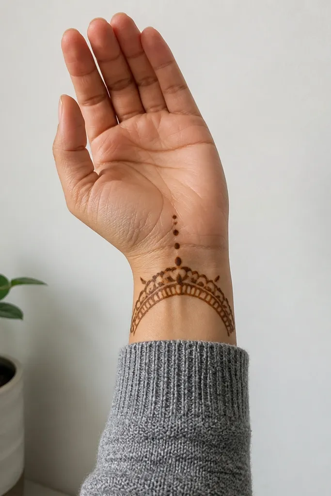
If you want a renter-friendly design that doesn’t spread into your sleeve, this is the one. The main focus is a half-moon band across the wrist area, with small vertical dots rising into the palm. It gives a “bracelet” look without requiring full coverage. The negative space inside the half-moon keeps it clean and photo-ready, even if your henna fades a bit as it dries.
Step 1: Draw a thick curved band across the wrist line, shaped like a wide U or half-moon. Step 2: Add 5-7 vertical dot lines rising from the center of the half-moon, each dot spaced evenly. Step 3: Place a small dot cluster at both ends of the half-moon band. Finally, add 1-2 tiny curved marks between the dot lines to connect the look.
Keep the band slightly thicker than the dots so the design looks intentional while drying.
Avoid drawing the half-moon too high — it can look like it’s covering the wrong area.
8. Asymmetry-Right Side Vine
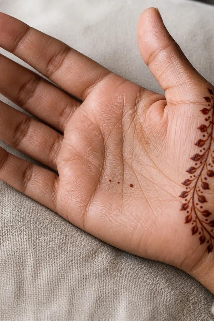
This one looks artsy without being messy because the “vine” stays on one side. Draw a gentle curved line along the right edge of the front palm, then add small dot leaves branching off it. Keep the left side mostly empty so the design has contrast. A few tiny dots near the center act like anchors, so the overall look still feels balanced. It’s a good choice if you want a modern look that still reads simple.
Step 1: Draw a curved vine line from the wrist crease up toward the finger base on the right side. Step 2: Add dot leaves — each leaf is a short line with a rounded dot at the end, spaced every 1-2 cm. Step 3: Add three dots near the center in a slight diagonal. Finish by adding two small curved strokes that touch the vine and stop before the center.
Pro tipStop each leaf stroke with a quick lift so the tip stays sharp on camera.
AvoidDon’t fill the empty left side with random dots — it kills the clean asymmetry.
9. Central Teardrop Chain
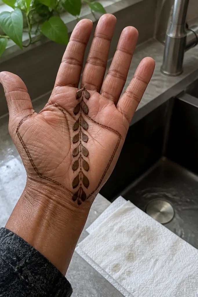
A teardrop chain is one of the easiest ways to make a front palm look “designed” fast. The chain gives you a vertical rhythm, and each teardrop shape creates natural negative space between them. Place a thin outline frame around the palm edges so the chain doesn’t look floating. This design works best when your cone makes smooth, even lines because teardrops show wobble more than dots do.
Step 1: Draw a thin side border along both edges of the front palm. Step 2: In the center, draw 7-9 teardrops stacked vertically, each teardrop touching the next at the narrow end. Step 3: Add a single dot in the center of each teardrop using the cone tip. Finally, connect the bottom of the chain to the wrist line with a short curve.
If teardrops keep turning into blobs, lighten pressure and draw slower on the curved top, faster on the taper.
Don’t over-outline each teardrop twice — thick outlines make the chain look heavy.
10. Double Dot Halo
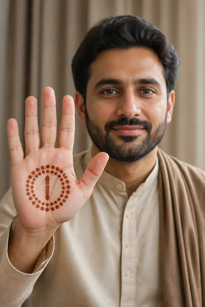
This looks like a minimalist halo crown. You draw two arcs of dots around the center of the front palm, then add a simple vertical line motif inside. It’s photogenic because the dot arcs catch light and look crisp even when the henna tone isn’t very dark. The design is also forgiving for renters because it stays mostly in the middle — fewer long lines means fewer smudges.
Step 1: Place two curved dot arcs across the palm, one slightly above the center and one slightly below. Step 2: Connect the ends of the arcs with short straight lines so the arcs look like a frame. Step 3: In the center, draw a vertical line of 6 dots. Finally, add one small dot cluster at the top center between the arcs.
Use consistent dot size by squeezing the cone the same amount each time — your arcs will match in photos.
Avoid uneven arc spacing — if one halo sits too high, it looks off-balance.
11. Finger Base Fringe Border
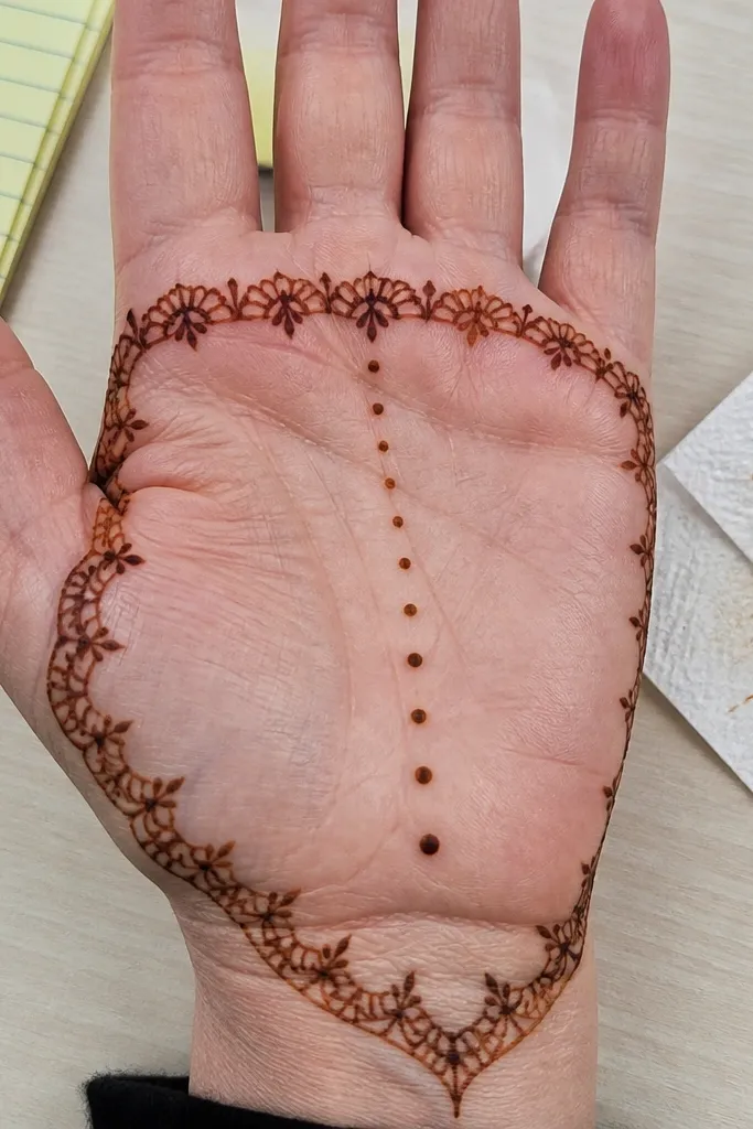
This design looks like a delicate fringe curtain across the upper palm. Put a thin border around the palm edges, then add a row of tiny scallops or short teardrops along the top edge near the finger bases. The center stays simple with a dot column so the fringe is the hero. It’s a clean way to get a “mehndi look” without filling the whole palm with patterns.
Step 1: Draw a light outline frame around the front palm, focusing on the top edge and side edges. Step 2: Along the top edge, add 9-12 tiny scallops — each scallop is a small curved U or short teardrop. Step 3: In the center, draw a vertical column of 7-8 dots. Finish by placing 2 dots on each side of the column at the mid-point.
Pro tipIf scallops blur, make them shorter and lift the cone quickly at the end of each curve.
AvoidDon’t make the fringe too thick — it will look like a heavy line instead of airy scallops.
12. Minimal Geometric Hex Panel
Geometric panels make front palms look neat and modern. Draw a small hexagon in the center of the palm, then add dot corners and a simple internal line cross. Because it’s geometric, it hides small hand wobble and still reads crisp. This design works well for lighter henna tones because the lines are bold enough to show up in photos.
Step 1: Draw a small hexagon in the center of the front palm, keeping line thickness even. Step 2: Put one dot at each of the six vertices. Step 3: Inside the hexagon, draw a simple cross — one vertical line through the center and one horizontal line through the center. Finally, add four small dots just outside the hexagon at the top, bottom, left, and right points.
Pro tipUse a slow, steady wrist angle so each hex side meets cleanly at corners.
AvoidAvoid drawing the hex too large — big geometry can crowd the palm and look cramped.
13. Triangle Kite Center with Side Arcs
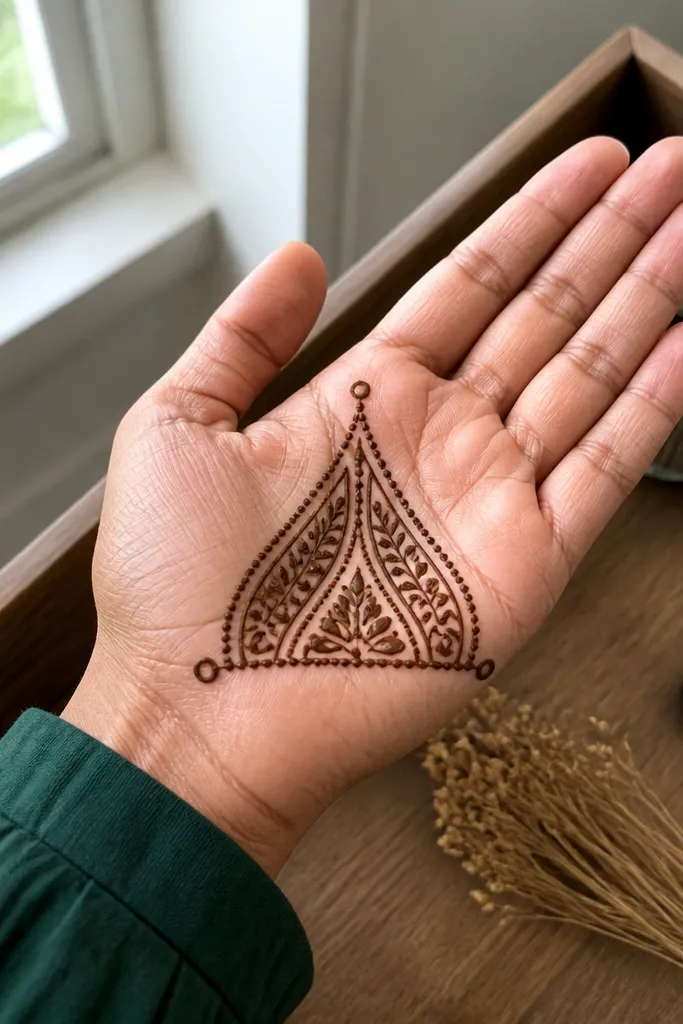
This looks like a kite because the center has a triangle that tapers at the top. The sides get two curved arcs that mirror each other, which makes the design feel balanced even though it’s simple. Add a dot at the triangle tip and two dots at the lower corners to finish it. It’s a good choice when you want something structured but not heavy like full bands.
Step 1: Draw a centered triangle/kite shape — wide at the bottom near the palm midline, tapering upward. Step 2: Add one dot at the top point and two dots at the bottom corners. Step 3: Draw two side arcs, each arc starting near the bottom corners and curving outward toward the side borders. Finish by adding tiny connecting lines between the arcs and the triangle base.
Pro tipKeep the triangle outline single-pass. Double outlining makes the kite look thick and less airy.
AvoidDon’t overcrowd with extra leaves — the kite and arcs should stay clean.
14. Front Palm Lace Bar at Midline
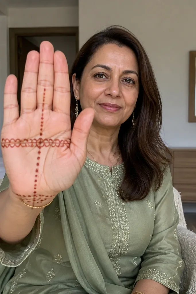
This is the best “looks complicated but isn’t” option. You draw a horizontal lace bar across the middle of the palm using repeating small loops, then keep the rest simple with a dot ladder down the center and a few dots near the wrist. The lace bar is what catches attention in photos, while the dot ladder keeps it easy and renter-friendly. This one is great if you want a stronger aesthetic impact without filling the entire palm.
Step 1: Draw a straight horizontal line at mid-palm. Step 2: On that line, add repeating loop motifs like tiny “O” shapes stacked in a row, stopping at both sides of the palm frame. Step 3: Draw a vertical dot ladder from the lace bar down to the wrist line using 6-7 evenly spaced dots. Finally, add two short curved marks near the lower corners to connect everything.
Pro tipMake the loops uniform by keeping each loop the same height; uneven loops look accidental.
AvoidAvoid making the lace bar too tall — one loop row is enough for a clean front palm.
15. Wrist Rings with Center Blossom Dot
Wrist rings look good because they frame the palm without taking over. Draw two thin curved rings near the wrist crease, then place a tiny blossom in the center made of 5 dots arranged like a flower. Add one small dot chain rising toward the rings so the composition feels connected. This design is ideal if you want something that looks neat even when your henna darkens unevenly.
Step 1: Draw two thin curved rings around the wrist crease area on the front palm, spaced about 1 cm apart. Step 2: In the center of the palm, place 5 dots in a flower arrangement, with one dot at the center. Step 3: From the blossom center, draw a short vertical line of 3 dots leading toward the upper ring. Finish by adding 1-2 small dots on each side of the rings.
Pro tipKeep ring lines lighter than the blossom so the center stays the focal point in photos.
AvoidDon’t shade the rings — solid fills smear and blur during drying.
16. Side Border + Center Leaf Outline
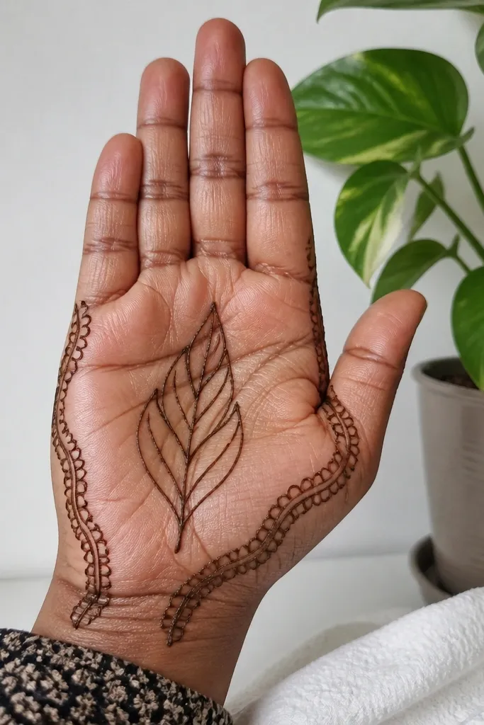
This design gives you a classic mehndi look with minimal effort. You outline both side edges of the front palm, then add a single central leaf shape that points upward. The leaf is only an outline, with a few internal short lines to suggest veins. It’s photogenic because the leaf outline creates a clear silhouette, and the side borders keep it tidy. Great for beginners and for anyone who wants a clean look without filling the whole palm.
Step 1: Draw a thin border along both side edges of the front palm from wrist crease to finger base. Step 2: In the center, draw one large leaf outline — wide at the bottom, tapering at the top. Step 3: Add 3 short internal vein lines inside the leaf, from the center to the sides. Finally, add two tiny dot clusters at the leaf bottom near the side borders.
Use a single, confident outline pass for the leaf outer edge — it looks sharper than repeated lines.
Avoid adding multiple leaves — one bold leaf reads cleaner on front palms.
17. Thumb Arch with Dot Clusters
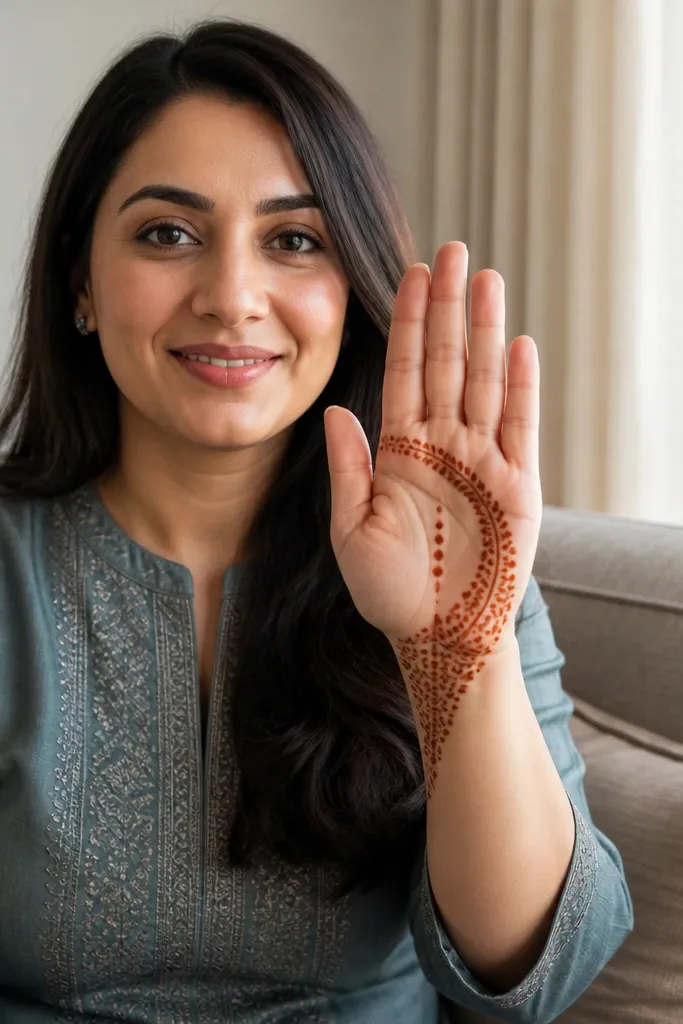
This one flatters the thumb area, which is where front palms often look empty. Draw a curved arch starting near the wrist and sweeping toward the thumb side, then fill the arch with dot clusters instead of heavy lines. The center gets a simple vertical dot column to tie it together. It’s a great renter-friendly design because it uses dots for most of the texture, which are easier to control and less likely to smear.
Step 1: Draw a curved arch along the thumb side of the front palm, starting at the wrist crease and ending near the finger base. Step 2: Inside the arch, place 3-4 dot clusters, each cluster made of 5-7 dots. Step 3: Draw a vertical dot column in the center with 6-8 dots. Finally, add two small connector lines from the arch ends to the nearby palm border.
Pro tipIf dot clusters merge, space them wider and keep each dot distinct with a quick lift.
AvoidDon’t push the arch too far into the center — keep it thumb-side for the clean look.
18. S-Curve Center Ribbon
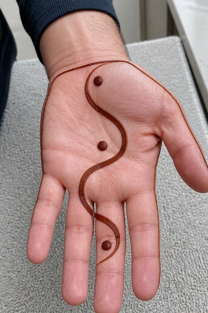
S-curves look stylish and they’re simple to execute on a front palm. Draw an S-shaped ribbon through the center using one continuous line, then place dots at both bends and at the midpoint. Add a thin border frame so the ribbon has a defined stage. This design reads elegant in photos even if your henna shade is light because the S-curve is high-contrast and the dots anchor it.
Step 1: Draw a thin outline frame around the front palm edges. Step 2: Create an S-shaped line through the center — it should dip once and rise once. Step 3: Put a dot at each bend and one dot at the midpoint of the S. Finally, add two tiny curved strokes near the top and bottom of the ribbon to balance the negative space.
Pro tipPractice the S motion on scrap paper first so your curve has one smooth rhythm.
AvoidAvoid kinking the line — a jagged S looks messy even with dots.
19. Midline Star + Corner Mini Arches
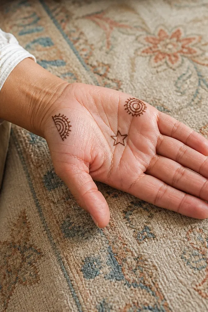
This is a balanced composition that looks festive without being crowded. Put a small star in the center of the palm and keep it outlined, not filled. Then add two mini arches at the upper left and upper right corners to frame the star. A few dots near the lower corners finish the look without adding extra work. It’s a good choice for holiday vibes because stars read instantly on camera.
Step 1: Draw a small outlined star in the center — use 5 points and keep the lines thin. Step 2: Add one mini arch at the upper left corner and one matching mini arch at the upper right corner, each arch touching the side border. Step 3: Place two dots at the lower left and two dots at the lower right corners. Finally, connect each arch to the star with a short curved line.
Keep the star smaller than you think. A big star makes the palm look cramped.
Don’t fill the star — filled stars can look like a blob on front palms.
20. Braided Border + Center Dot Column
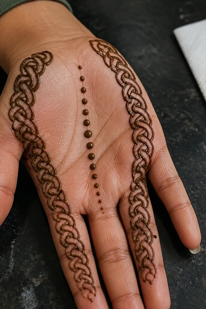
Braided borders look fancy, but you can fake the braid with simple repeated curves. Draw a border along both side edges that looks like two strands interlocking, then leave the palm center mostly open. Add a vertical dot column down the center to keep the composition grounded. This design is photogenic because the border catches attention along the edges, while the open center keeps it clean and renter-friendly.
Step 1: Draw a thin straight-ish line along each side edge of the front palm as the braid guide. Step 2: For each side, add interlocking curves across the guide line, alternating left and right like a simple braid pattern. Step 3: In the center, draw a vertical dot column with 8-10 dots. Finally, add one small dot cluster at the top of the column where it meets the upper palm border.
Keep your braid curves short. Short curves look like braids; long curves turn into waves.
Avoid thick braid lines — they overpower the dot column.