1. Weekly Theme Page with a 3-Icon Header
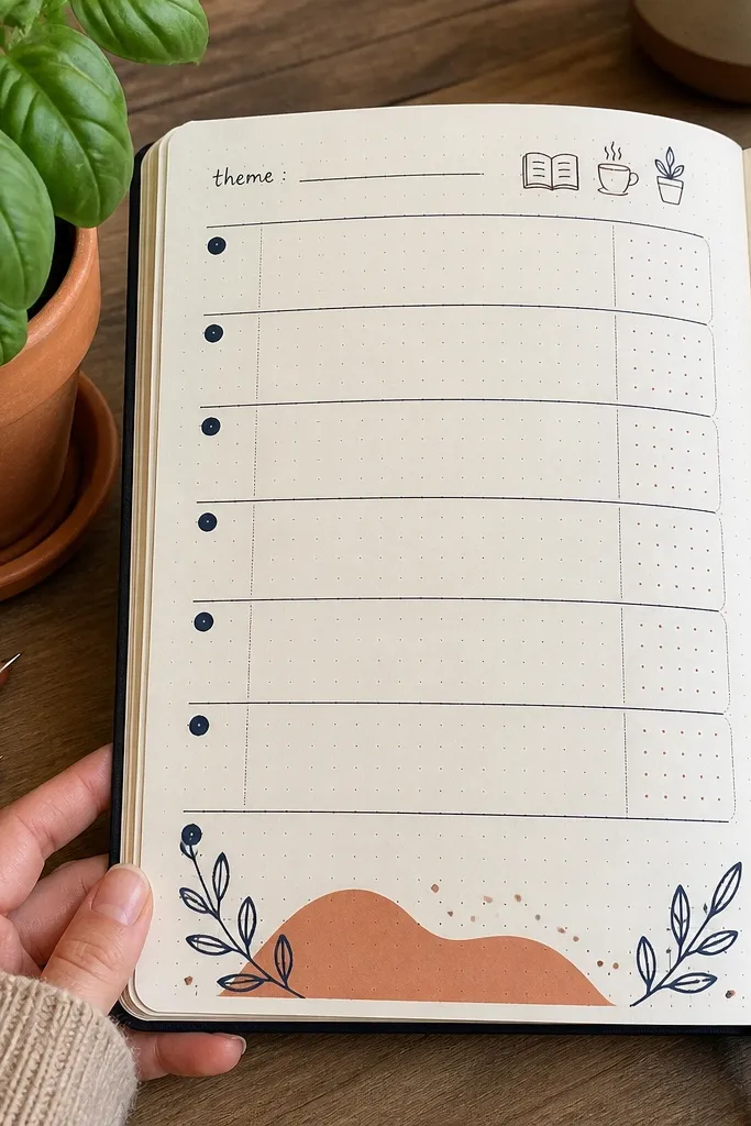
Start by drawing three equal-width color blocks across the top margin. Inside each block, sketch one icon (keep them the same size) and write a one-word label under the icon in small caps. Next, leave a clean area below for your weekly tasks, and use one consistent bullet style for dates or priorities. Finish by adding a thin border around the page using your ruler so the whole spread looks framed.
This page gives your week an obvious visual anchor. Put a small “theme” line at the top and pair it with three simple icons that match what you actually want to focus on — like a book, a coffee cup, and a plant. It’s beginner-friendly because icons are easy to draw as outlines, and the layout stays the same every week. The payoff is a spread that looks designed in photos even when the rest of your handwriting varies.
AvoidDon’t use more than one accent color on this page or it stops looking like a theme.
Pro tipChoose icons you can repeat without thinking, like a star, a droplet, and a book.
2. Mood Ring Tracker with 7 Tiny Color Swatches
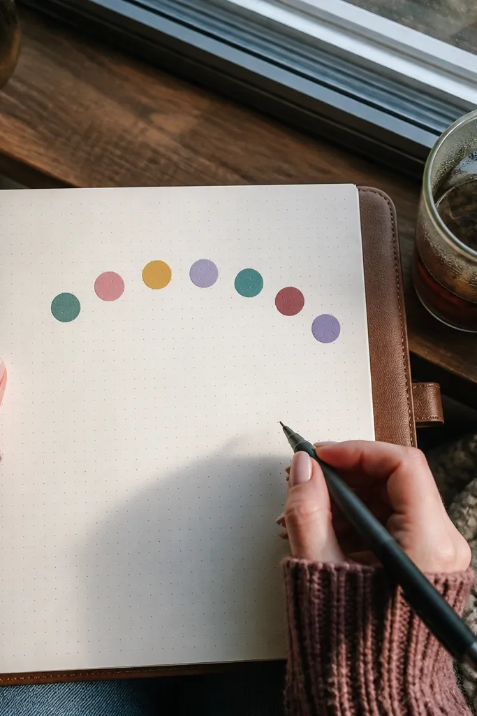
This is mood tracking that looks cute instead of clinical. You’re not writing paragraphs — you’re picking a color each day and filling a tiny swatch. The ring layout makes it easy to scan and it looks great in overhead photos because the colors create a soft gradient. You also get faster journaling because the “decision” is visual and quick.
Draw a small circle near the top of the page and split it into seven segments like a pizza. Assign each day a color from a fixed mini palette (for example: teal, sky blue, lilac, warm orange, yellow, rose, and gray). Then write the day abbreviation outside each segment and fill the segment with the matching color. Leave a blank space in the center for a short note like “why” or “what helped.”
Use gel pens for the swatches so the color stays smooth and doesn’t streak.
Don’t change the color meanings mid-month or your tracker stops making sense.
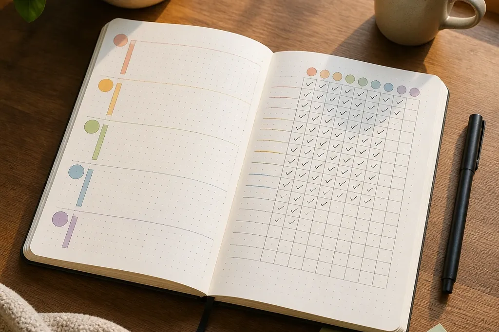
3. Habit Tracker in a Rounded Grid with Checkmarks
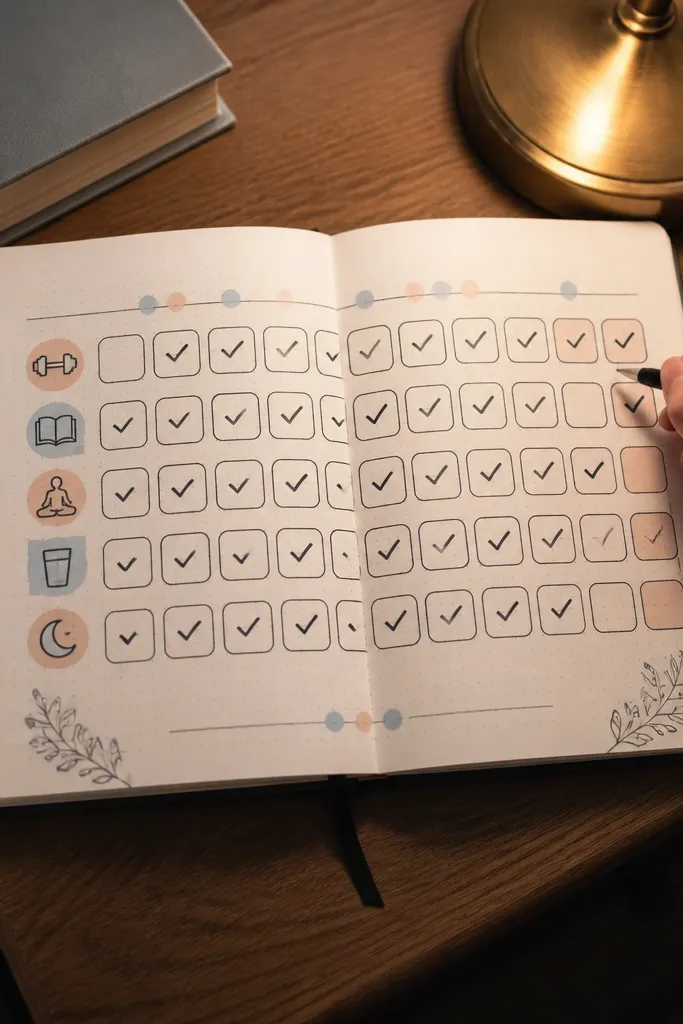
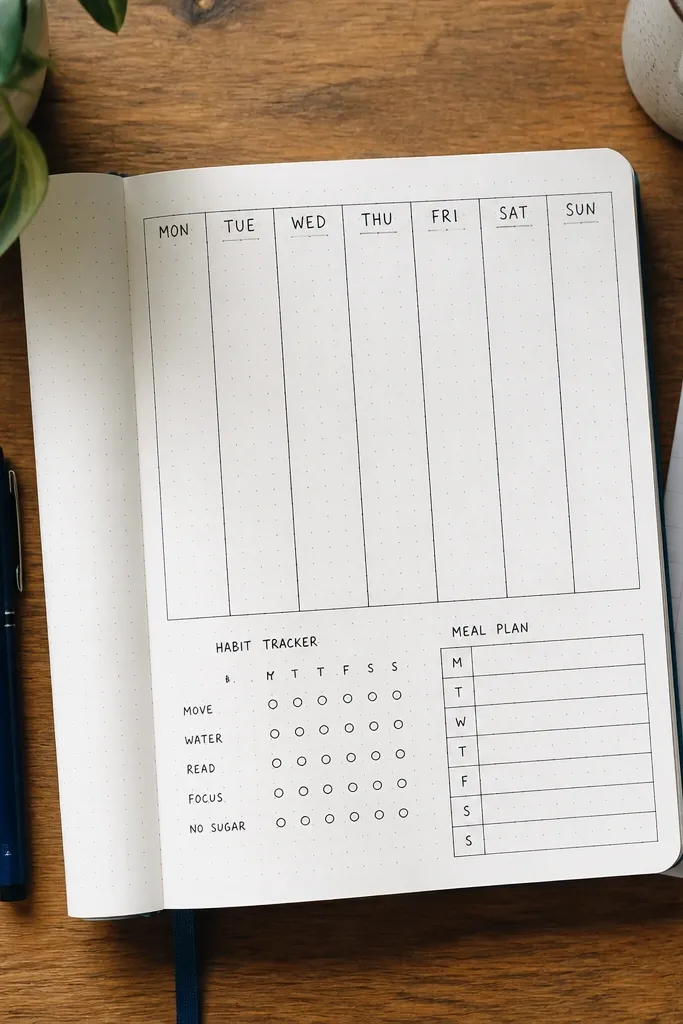
Draw a rectangle for your tracker area, then round the corners by lightly sketching curves before you commit to lines. Create 5-7 rows for habits and 7 columns for days, leaving a small label column on the left. Write habit names in the left column, then add day numbers or initials across the top. Finally, use a simple checkmark style (same size every time) and leave one small empty circle at the start of each row if you want an “on/off” toggle.
A rounded grid looks softer and more aesthetic than harsh straight boxes. It also helps your brain — you can tell at a glance which habits you’re actually doing because each row is consistent and the checkmarks line up. This is one of the easiest “every week” spreads because you can reuse the same structure and only change the habit names. It’s also very photo-friendly since the grid is orderly and the checkmarks create texture.
AvoidAvoid mixing checkmarks and X marks in the same row; pick one system for clarity.
Pro tipMake the habit names short — two words max — so the grid stays clean.
4. Meal Plan Page with a 5-Frame Bento Layout
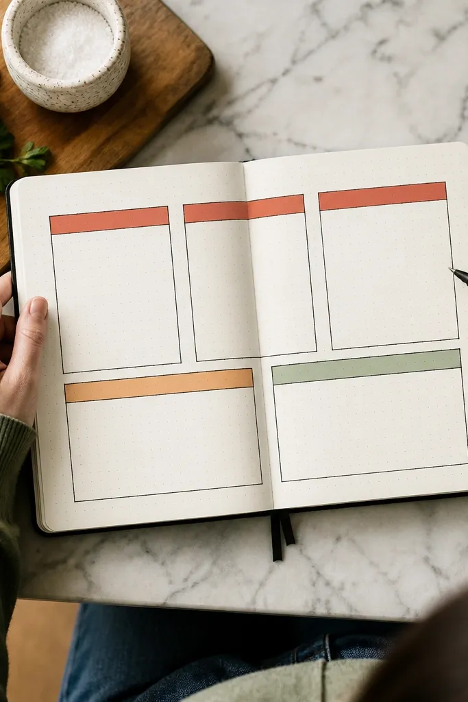
This layout turns meal planning into a tidy visual plan. Five frames keep you from overstuffing the page, and the bento style makes it look designed instead of list-heavy. It works especially well for beginners because you only need to write one line per meal, and you can color-code categories like breakfast, lunch, dinner, and snacks. Your photos will look cohesive because each frame has the same shape and spacing.
Draw a grid of five rounded rectangles: four for days or meals and one larger frame for a grocery list. Label each small frame with a day or meal type and leave one line for the chosen dish. Add a thin divider line between frames so they look like separate compartments. Then use one accent color for the frame outlines and write in your normal pen.
Use two-letter abbreviations for days (Mo, Tu, We) so the page stays airy.
Don’t write long recipe names; shorten or you’ll lose the bento look fast.
5. To-Do List with Priority Color Bands
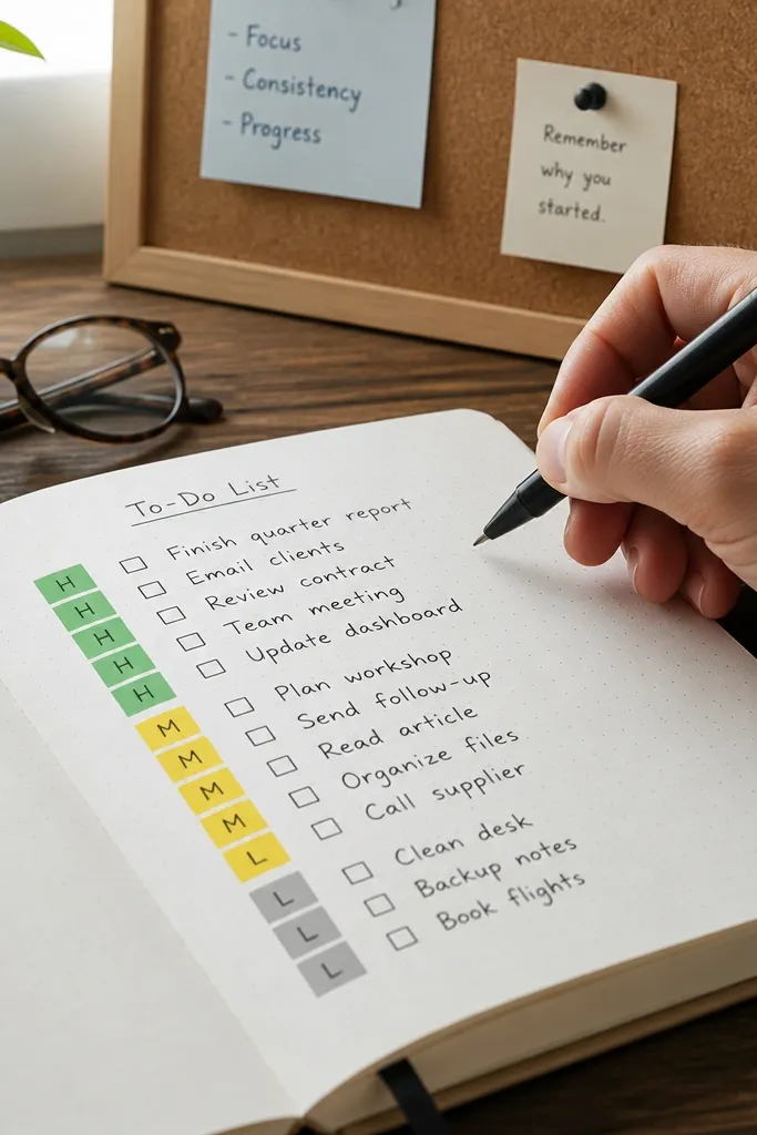
Create a vertical list with space for 12-20 tasks. For each line, draw a narrow rectangle strip along the left margin (about 0.5-0.7 cm wide). Pick three priority colors and keep them consistent all month. Write the task text starting after the strip, then fill the strip with the appropriate color.
This makes your to-do list readable at a glance. Instead of rewriting tasks in different sections, you attach a small colored band to the left of each line to show priority. It looks clean in photos because you get repeating blocks of color, and it helps you choose what to do without scanning a wall of text. Beginners like it because the system is simple and the layout stays consistent.
AvoidDon’t add five priority colors; three is enough for quick decisions.
Pro tipUse a ruler even for the strips — crooked strips make the whole page feel messy.
6. Daily Page with a 3-Row Flow Chart
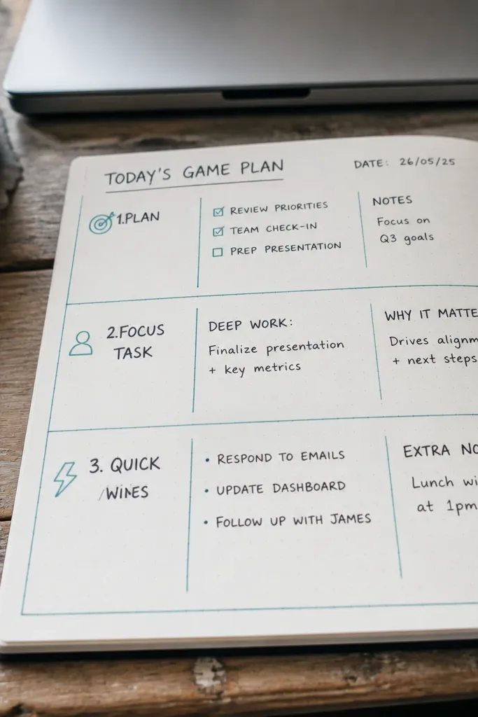
Draw three horizontal bands across the page with a ruler, leaving space between them for writing. Add small arrows or connector lines between the bands using a straight edge. Label them on the left side with short titles like Plan, Focus, Notes. Then write one or two lines per band, keeping everything aligned to the same starting point.
A three-row flow chart keeps your day from turning into random notes. Row one is the plan, row two is the focus task, and row three is quick wins or notes. It’s photogenic because the structure is bold and clear, and it’s beginner-friendly because you only need to write short phrases. The main benefit for weekly use is that you can redraw the same flow chart every day without redesigning.
AvoidDon’t let the text spill past the same right edge — alignment is what makes it look intentional.
Pro tipUse a thick pen for the arrows and a lighter pen for the text so the flow pops in photos.
7. Index Page with Color-Coded Sections
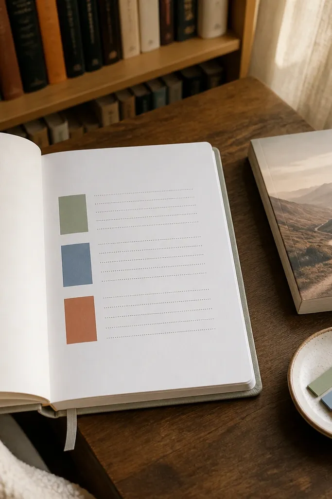
Split your index page into 4-6 sections with a ruler and light pencil first. Choose one color per section and write the heading inside a small rectangle. For each entry, write the topic on the left and the page number on the right with dot separators. Keep your handwriting consistent and avoid squeezing entries — leave a tiny gap between lines.
A good index makes your journal feel organized, which shows up visually too. By color-coding sections, you prevent the index from becoming a bland list. It’s also practical for beginners because you can find pages quickly without rereading everything. The look is clean because headings repeat the same color blocks and the page numbers become easy to scan.
AvoidDon’t create too many sections; if you have 10 colors, your index becomes harder to read.
Pro tipUse dot separators like • • • between topic and page number for a neat look.
8. Simple Dotted Border with Corner Stars
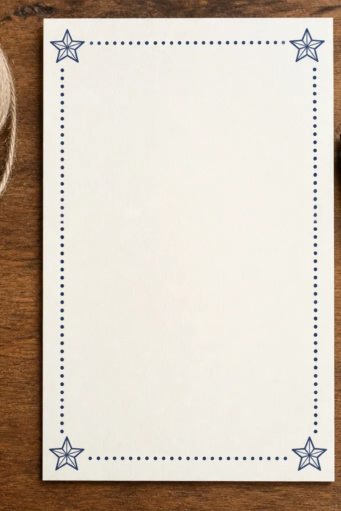
Lightly mark four corner points for your border area with a ruler and pencil. Draw a dotted line around the perimeter using a pen and consistent dot spacing. Then add one small five-point star in each corner inside the border. Finally, write your main content in the center and keep it aligned to the border edges.
Borders instantly make pages look styled. A dotted border is easier than a full solid frame, and corner stars add a playful detail that reads well in photos. This works for any spread type — weekly plan, trackers, or notes — because it doesn’t fight your layout. Beginners can do it without fancy art skills since stars can be traced using a simple template or drawn as five-point outlines.
AvoidSkip the border if your spread is already box-heavy; too many frames can feel cluttered.
Pro tipUse the same dot size throughout — it makes the border look deliberate, not accidental.
9. Weekly Checklist with a Left Margin Date Column
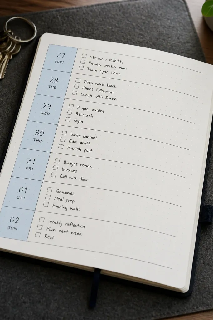
Draw a vertical column on the left for dates (about 2 cm wide). In that column, write the day numbers or abbreviations. Across the rest of the page, create one row per day with a checkbox at the start of each row. Write tasks next to the checkbox, keeping each day’s tasks on the same line or next line under it.
This is a weekly page that stays readable even when you add tasks on the fly. The left margin date column is a strong visual guide, so your tasks don’t drift across the page. It’s also beginner-friendly because you only need to keep rows aligned. Photos look crisp because the date column creates a clean vertical rhythm and the checkboxes add structure.
AvoidDon’t use freehand spacing between days — the alignment is what makes it look clean.
Pro tipUse one checkbox style, like a square with a sharp check, so the page looks consistent.
10. Project Tracker with a 3-Stage Progress Bar
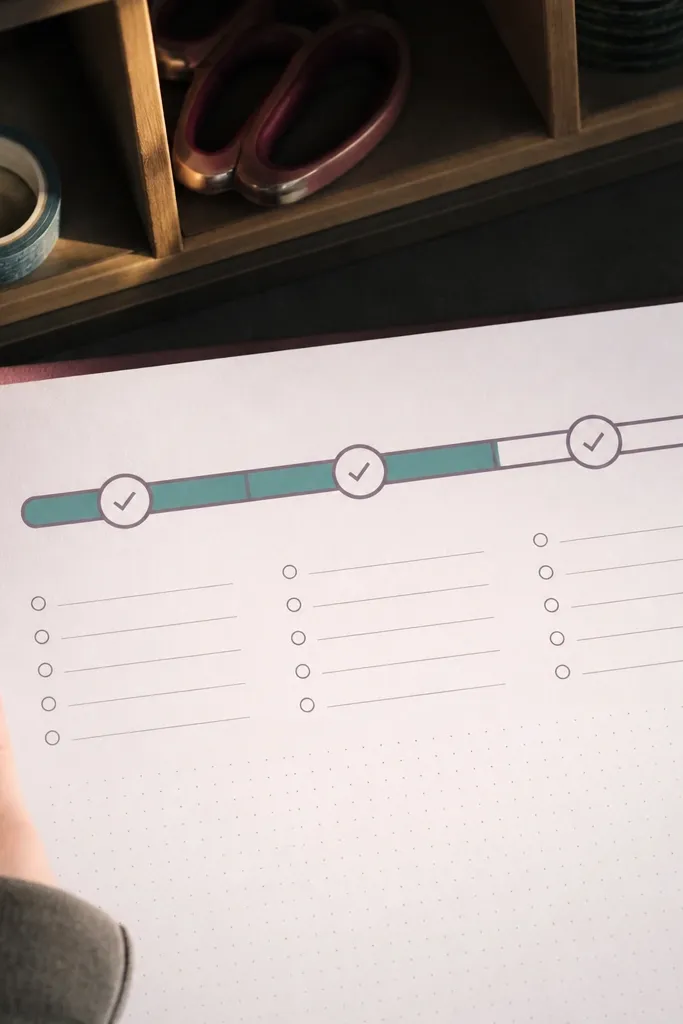
If you have anything you’re working on weekly, this layout makes it visible. Three stages keep it simple: Plan, Do, Wrap. The progress bar looks great in photos because it’s a clean graphic element, and it turns your journal into a quick dashboard. Beginners benefit because you don’t need to invent complicated metrics — you just fill the bar as you move forward.
Pick one project and draw a long horizontal bar near the top of the page. Split it into three equal segments with a ruler. Label the segments Plan, Do, Wrap and leave a bit of space above for the project name. Fill one segment with your accent color each week based on progress, and write one short line under the bar for what changed.
Keep the segment labels small and consistent so the bar remains the focus.
Don’t use percentage numbers if you’re not tracking time — the bar should reflect stages, not math.
11. Budget Mini Spread with Two Columns and Totals
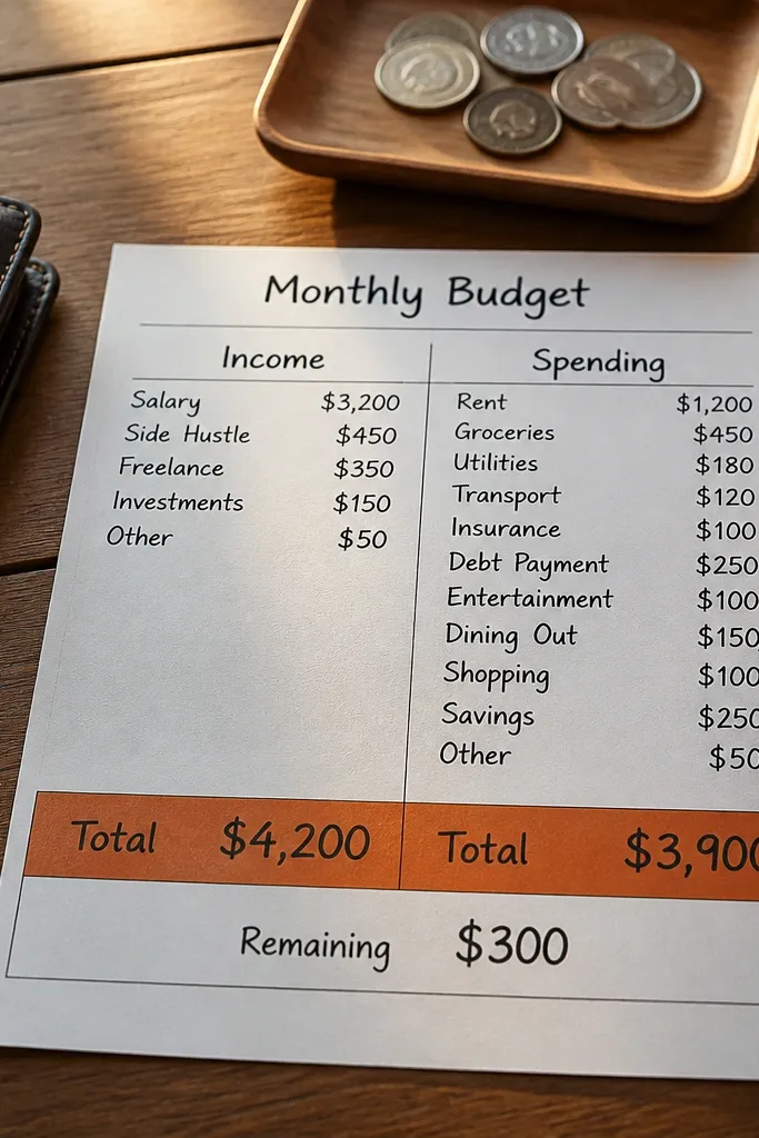
A mini budget spread looks sharp and it stops money notes from getting scattered. Two columns keep it clean: Income and Spending (or Needs and Wants). Beginners like it because it uses simple arithmetic and a single totals row that makes the spread feel finished. In photos, the bold totals line and clear columns read instantly.
Draw two equal-width columns and label them at the top. Add 6-10 rows under each column for categories, leaving extra space for totals at the bottom. Write your category names lightly, then fill amounts in a darker pen. Use a ruler to draw a thick line above the totals row, and write the totals centered across both columns.
Use one pen color for numbers and another for labels so the totals pop.
Don’t cram 20 categories into one page; the grid needs breathing room to look good.
12. Reading Log with a Stacked Bookmark Card
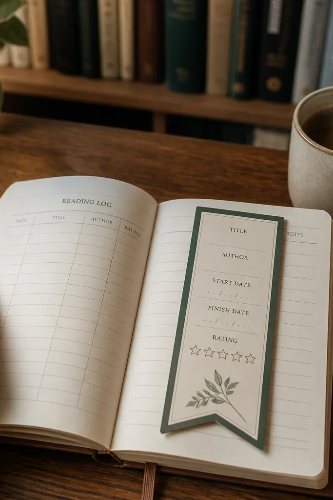
Draw a bookmark outline in the center: a rectangle with a pointed bottom tip. Inside, create 4-5 lines or small boxes for title, author, start, finish, and rating. Add a small border around the bookmark card using your ruler for clean edges. Then write the book info and leave the outer page space for notes or quotes in short lines.
This turns a reading log into an object on the page. The bookmark-shaped card looks cute in overhead photos and gives you a consistent place to record book details. It’s beginner-friendly because you only track a few fields: title, author, start date, finish date, and a quick rating. The card shape also makes the spread feel intentional instead of like a random list.
AvoidSkip tiny text; if the fields are too small, the bookmark looks messy.
Pro tipUse a one-word rating system like “Cozy,” “Page-turner,” “Meh” to keep it fast.
13. Cleaning Schedule with a 4-Box Rotation Map
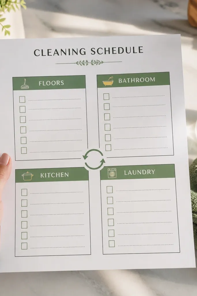
Draw a 2x2 grid with thick lines and label each box with a room or task area. Add a small icon in the corner of each box (broom, sponge, toilet, laundry) to make it scannable. Under each label, write 3 short tasks that you can finish in 10-20 minutes. At the bottom, add checkboxes for the week’s rotation so you can see what’s done at a glance.
A rotation map keeps cleaning from becoming a weekend disaster. The 4-box layout is easy to follow and looks graphic, not chaotic. It works well for weekly routines like floors, bathroom, kitchen, and laundry. Beginners can stick to a repeatable checklist, and photos look satisfying because each box holds the same type of tasks with a consistent icon or label.
AvoidDon’t list tasks longer than one line; the box should stay readable.
Pro tipUse one icon style across all boxes — outlines or filled icons — so it looks cohesive.
14. Cloud Quotes Mood Page with One Color Accent
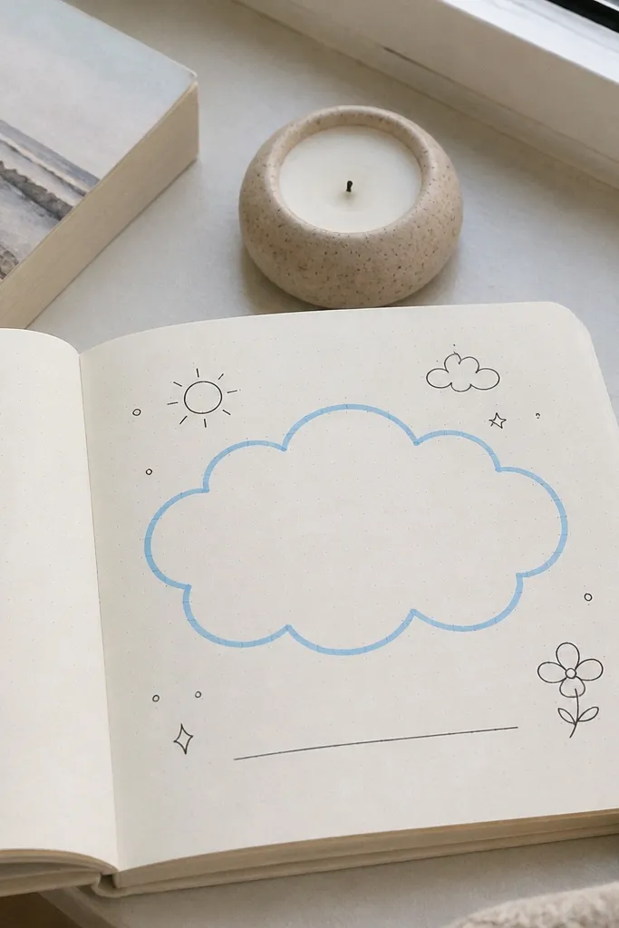
This spread is for journaling that looks soft and calm. A cloud-shaped quote area gives you a dedicated space for one sentence — a reminder, a lesson, or a goal. It’s beginner-friendly because cloud outlines are forgiving, and the rest of the page can stay minimal. The visual payoff is big: the cloud shape frames your words and looks great in photos with natural light.
Draw a cloud outline in the upper half of the page using a light pencil first. Choose one accent color for the cloud border and a neutral pen for the quote text. Add the quote in 2-4 lines, keeping the text centered. Then leave the lower half for three bullet points labeled with short headings like Win, Worry, Next.
If your cloud lines wobble, trace over them with a steadier hand and keep the pencil marks erased.
Don’t add stickers everywhere; one shape + one quote looks cleaner than a collage.
15. Two-Column Note Page with Margins for Symbols
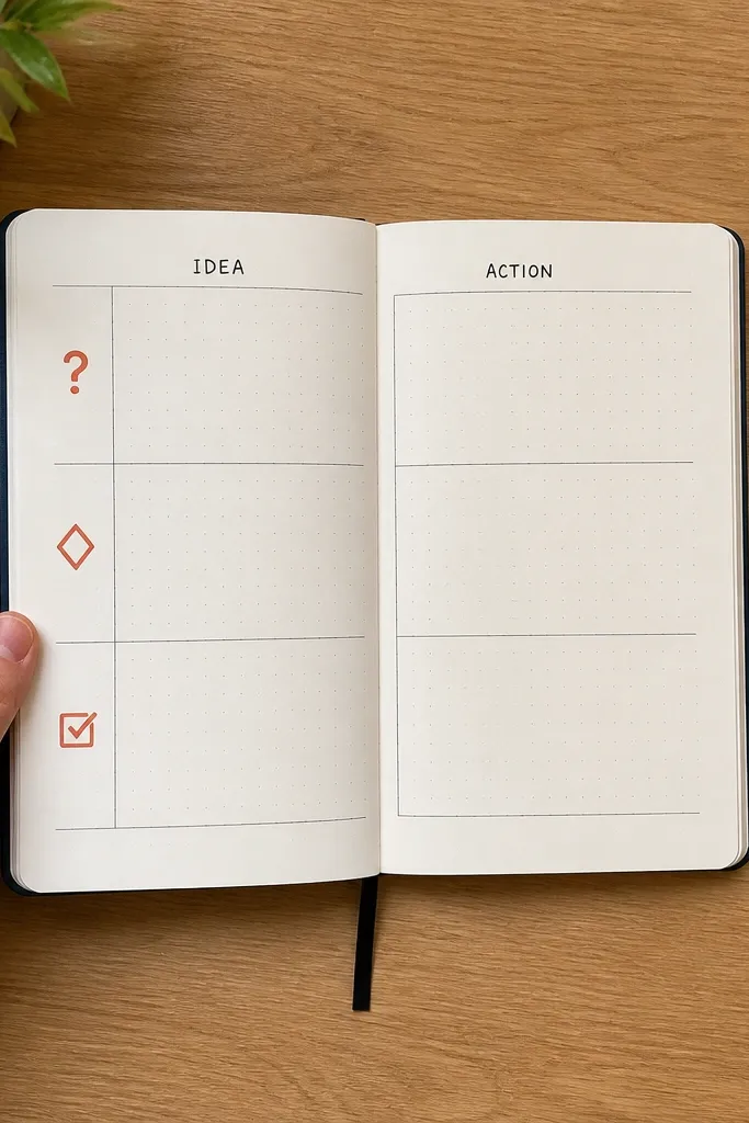
This is how you keep notes organized without turning them into a spreadsheet. Two columns separate “idea” from “action,” and the left margin symbols make it easy to skim later. Beginners can pick just three symbols to represent types of notes: question, decision, and task. It’s photogenic because the columns create a clean structure and the repeating symbols add visual rhythm.
Draw a vertical dividing line to create two columns with equal width. On the far left margin, reserve a small strip for symbols (about 1 cm wide). Pick three symbols and place one symbol at the start of each note line. Write the note content in the left column and the next action in the right column, keeping each entry to one or two lines.
Use the same symbol size every time; consistent icons make the page look designed.
Don’t invent new symbols weekly; stick to three or the system falls apart.
16. Weekly Weather Snapshot with Tiny Icons
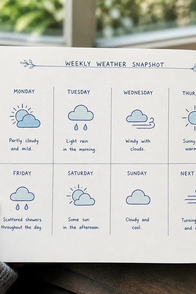
Draw a grid with seven rows or seven columns depending on your page space. In each cell, sketch a tiny weather icon (sun, cloud, raindrop, wind lines) and write the day abbreviation under it. Add a single notes line at the bottom for anything you want to remember, like “laundry dried outside.” Keep the icon style uniform — outline icons or filled icons.
Weather pages are surprisingly good for weekly memory and planning. Tiny icons make it easy to record conditions without writing a paragraph, and the grid layout looks adorable in photos. It also helps you remember things like when you wore a jacket or planned an errand around rain. Beginners can keep the notes line short and focus on icon consistency.
AvoidDon’t mix big icons with tiny text; keep icon size consistent.
Pro tipUse one icon set for the whole month so your photos look cohesive.
17. Calendar Grid with Color-Blocked Weekends
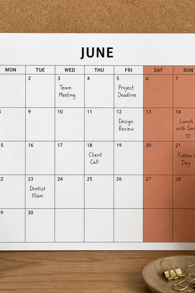
Draw a standard monthly grid with 7 columns for days of the week. Label the header row with small day names. Identify the weekend columns (like Saturday and Sunday) and lightly fill those cells with your accent color using a light hand so the paper doesn’t get too dark. Then write dates and add tiny event dots in the center of any day that has a plan.
A monthly calendar can look clean and aesthetic instead of cramped. Color-blocking weekends gives your eye a clear pattern and makes the month easier to scan in photos. Beginners benefit because the structure is fixed, and you only add a few events per week. The look is crisp because the weekend blocks create a repeating visual rhythm that frames your handwriting.
AvoidAvoid filling every weekday with color — the weekend contrast is what makes this look good.
Pro tipUse a light marker or diluted color for weekend blocks so it doesn’t overwhelm your pen text.
18. Goal Ladder with 5 Steps and Check Circles
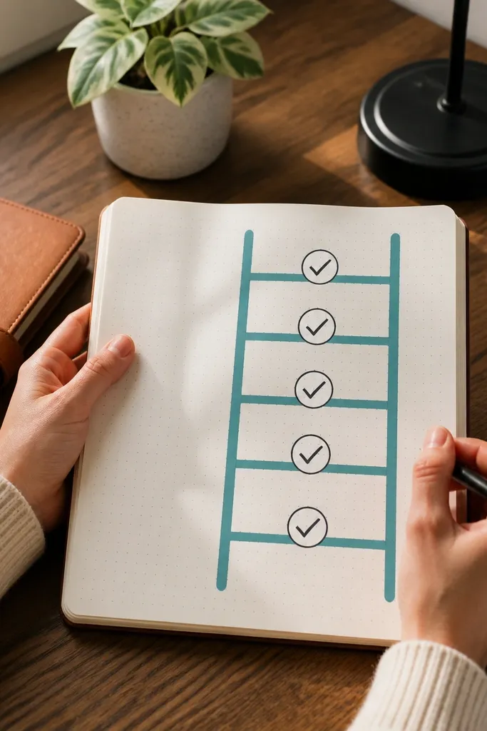
Draw two diagonal ladder rails and connect them with five evenly spaced horizontal rungs. At the end of each rung, draw a small circle where you’ll check off completion. Write one action step per rung in short phrases. Use one accent color for the rails and keep the text in your normal pen.
A goal ladder turns a vague goal into visible progress. Five steps keep the page from looking crowded, and check circles give you a satisfying way to mark progress as you complete each step. It’s photogenic because the ladder lines create direction and the circles add clean geometry. Beginners can write short action steps and update it weekly without redesigning the whole page.
AvoidDon’t put vague steps like “try harder” — the ladder looks pretty but it won’t guide you.
Pro tipKeep steps measurable in plain language like “book appointment” or “draft plan,” not “work on goal.”
19. Monthly Reset Page with a 6-Question Box
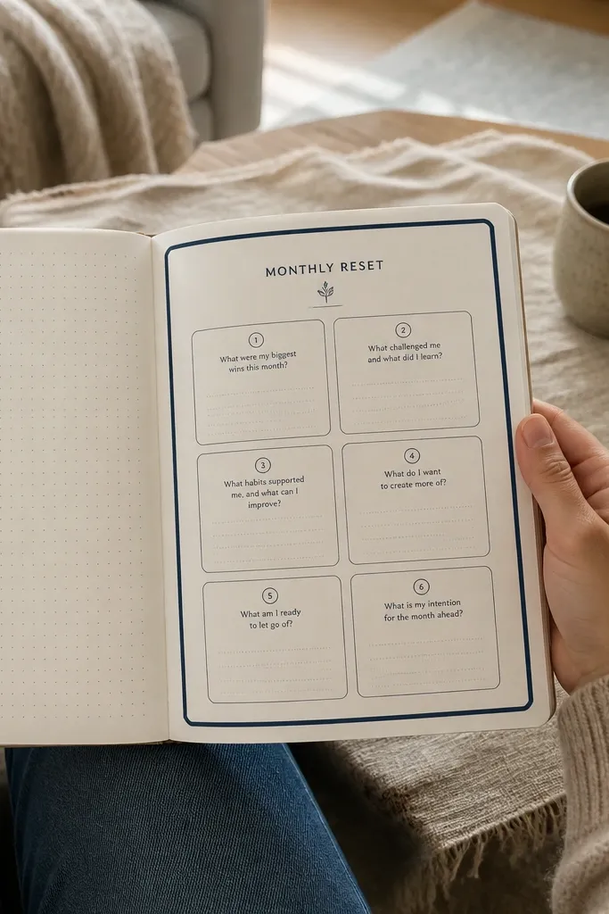
This page is a reset that looks intentional and forces clarity. A single big box makes it easy to keep your answers together, and the six questions create a balanced view of work, home, health, and priorities. It’s beginner-friendly because you’re writing short answers, not building complicated trackers. In photos, the big box and neat question list make the spread look clean and complete.
Draw one large rectangle in the center of the page with a ruler. Inside, split it into a 3x2 grid for six questions. Write the questions in short phrases like “What worked?” “What drained me?” “One improvement?” “One joy?” “Health check?” “Next month focus?” Leave a small blank area beneath each question for a 1-2 line answer. Finish by drawing a thin border around the rectangle.
Use a lighter pen for questions and a darker pen for answers so your answers pop.
Avoid long paragraphs; the box needs short answers to look neat.
20. Travel Packing Checklist with Icon Sidebars
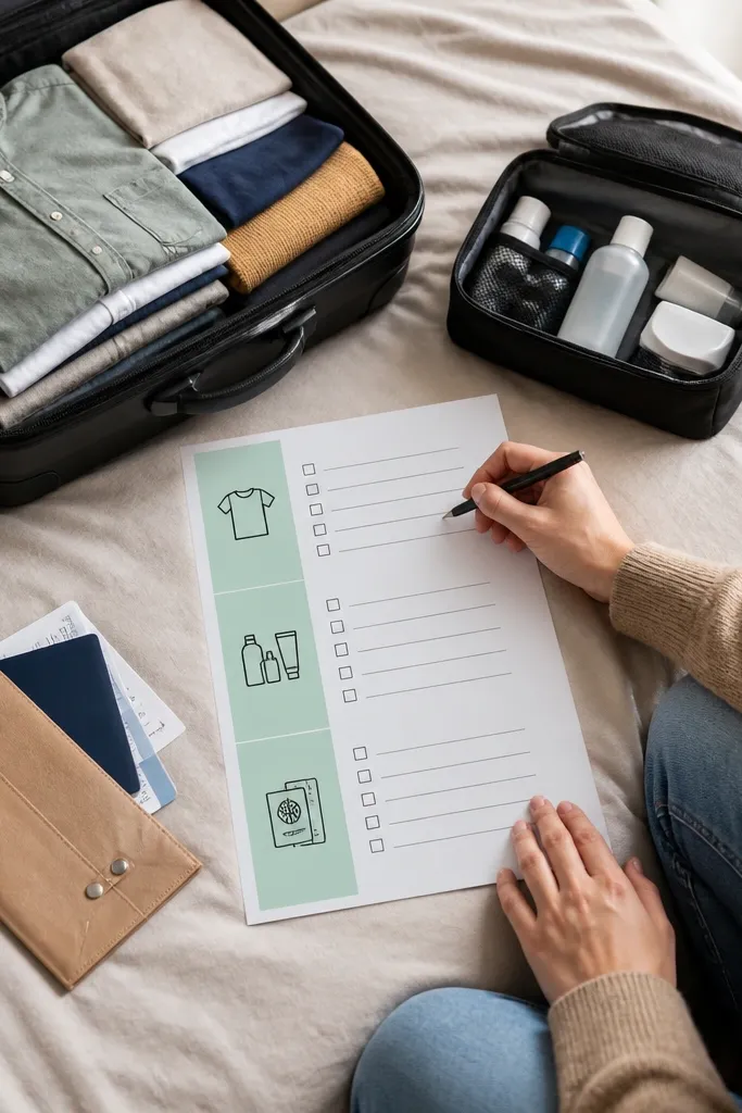
Packing checklists look good because they’re structured, and the icons make them fun. A checklist with icon sidebars separates categories like clothes, toiletries, and documents, so the page doesn’t turn into one long list. Beginners can keep it simple with 3-6 items per category. The aesthetic comes from repeated icon placement and aligned checkboxes.
Draw three category headers across the top or along the left margin. For each category, add 5-8 checkbox lines with the item names aligned. Place a small icon next to each category header (passport, toothbrush, shirt). Use one accent color for the category headers and keep the rest in one pen color. Leave extra empty lines at the bottom for last-minute items.
Write items short and specific like “charger” not “electronics” so checking is satisfying.
Don’t mix handwriting sizes across categories; adjust once and keep it consistent.
21. Shopping List with a Price Target Line
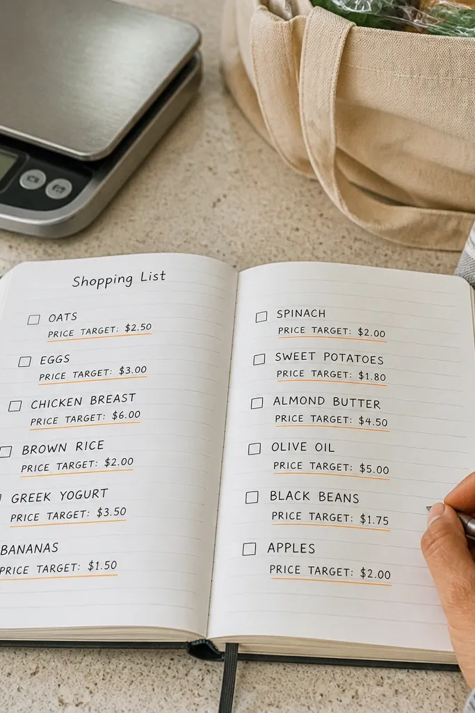
This turns shopping from guesswork into a clean visual plan. Each item line has space for the price target, and that tiny line makes the spread feel “grown-up.” It’s photo-friendly because the rows are aligned and the repeated structure looks tidy. Beginners like it because it’s still just a list — you’re only adding one extra field for money control.
Draw 10-15 aligned item rows with a ruler. On the right side of each row, add a small blank box or underline for the price target. Label the column at the top with “Target” and write items on the left. When you shop, fill the price in the target box and circle it if you got under budget.
Use a single digit style for prices so they line up visually even with different amounts.
Don’t add a calculator-style column with too many numbers; one target line is enough.
22. Monthly Habit Review with a Simple Dot Map
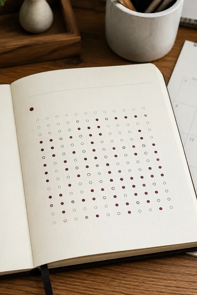
Create one row per habit and 30 small dot positions per row in a grid. Label each habit on the left and mark weeks with faint lines or tiny separators. Use a colored pen for the dots and keep the same color for the whole month. After each day, place one dot in the correct position. Add a final column on the far right with a quick count you tally once at the end.
A dot map turns habit review into a graphic you can read instantly. Instead of rewriting totals, you place dots for each day you did the habit, and the page becomes a visual pattern. It’s beginner-friendly because you only draw dots — no fancy bar charts required. The look is photogenic because dot grids create a clean, speckled texture that photographs well.
AvoidDon’t change dot spacing; keep the grid uniform or it looks uneven in photos.
Pro tipUse a dotting tool or the pen tip consistently so dots are the same size across the page.
23. Sketched Border Vines for a Soft Accent
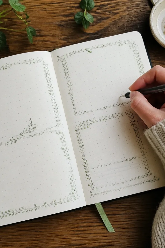
If you want “aesthetic” without going full art project, vine borders are the answer. They frame your content and add gentle movement, while still keeping the page readable. This works for weekly plans, meal pages, or notes because the vines stay in the margins. Beginners can draw vines as simple looping lines with tiny leaf ovals, and the border makes the spread look intentional even with minimal writing.
Draw a thin margin line around the page content area using a ruler. Along the top and sides, sketch vine loops that follow the margin line, then add 2-4 small leaf ovals attached to the loops. Keep the vine height low so it doesn’t cover your writing area. Choose one accent color for the vines and keep your main text in a neutral pen.
Lightly sketch the vine first, then trace with steady pressure to avoid thick, messy lines.
Don’t pack leaves everywhere; a few clusters look better than a full border jungle.
24. Receipt-to-Refund Mini Ledger
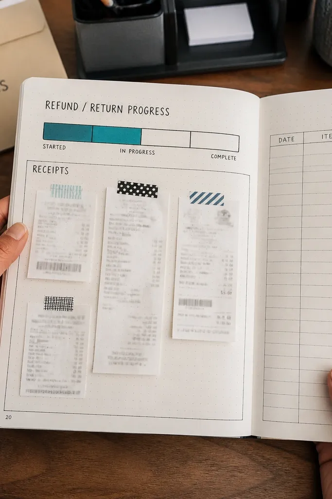
Use a page protector-friendly layout: draw a 3-column grid that is 5 rows tall, leaving a 1.2 cm margin on the left for dates. Label the columns Date, Item, and Status, then add a small horizontal bar under Status with three segments labeled Filed, In transit, Closed. Add a 2 cm-tall box at the bottom for Totals so you can sum refunds you expect. When you paste receipts, trim them to fit the Item column width (about 7 cm) and leave 3 mm around the edges so paper doesn’t buckle. Finish by writing a short note line under each receipt, like Reason or Refund method, so the page stays useful later.
This page turns messy receipts into something you can actually use every week. You paste or tape receipts in one place, then track refund or return status with a clean progress bar so nothing slips through. It fixes the common problem where you forget what you bought, when you bought it, and whether you already filed the return. The look is sharp and photogenic because receipts create natural texture, while the printed-style boxes and thick bars keep it readable. This is beginner-friendly if you can draw straight lines, and it takes about 20-30 minutes to set up once, then 5 minutes every time you add a receipt.
AvoidAvoid using heavy marker directly on receipt paper — it bleeds and makes the page look messy.
Pro tipStick receipts with a thin glue stick or double-sided tape runner, not liquid glue, so edges don’t ripple.
25. Weekly Mail + Keys Dispatch Station Page
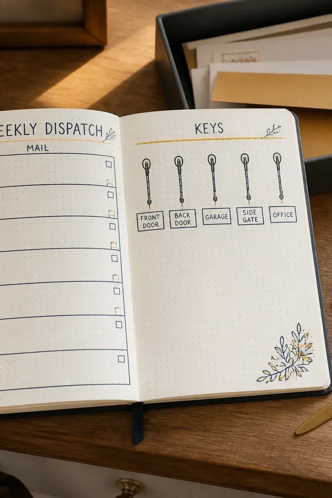
Draw a layout with two vertical panels split down the center: left for Mail, right for Keys. In the Mail panel, create 5 stacked rows for Mon-Fri, each row with a small square for check and a tiny icon box labeled Letter, Package, or Coupon. In the Keys panel, draw 4 rounded boxes for Front door, Car keys, Wallet, and Small pouch, then add a narrow strip at the top labeled Drop time with seven tick marks for the week. Use a thick pen for panel borders and a lighter pen for the inner lines so the page reads fast. Add one small “Today” highlight dot per day in a consistent color, then use that dot to guide your weekly reset.
This spread is for the week-to-week chaos of mail, packages, and keys that end up in random piles. You get one page that tells you what to grab when you walk in the door, and it keeps your routine visible without turning your journal into a chore. It delivers a clean, high-contrast look because the mail section uses bold stamps and the keys section uses simple icons, both tied to the same weekly rhythm. The result is photogenic because each day has a small visual marker, and the repeated layout makes it satisfying to flip through. It takes 25-35 minutes to set up and then about 2 minutes daily to check off.
AvoidAvoid mixing too many icon styles or fonts — the page stops looking organized and starts looking cluttered.
Pro tipUse a single stamp or sticker style for all mail icons so your page has a cohesive look even when the paper texture changes.