
1. 3-Color Mood Weather Strip
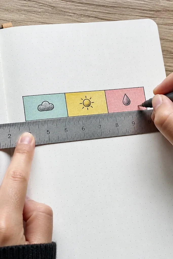
This page turns “how I feel” into something you can see at a glance. You pick three colors that match your mood spectrum, then map your day into a clean strip like a mini weather chart. It looks tidy because the layout is strict — one row, one direction, and small icon marks. The writing is short, so it stays beginner-friendly while the page stays photogenic.
Start by drawing three long horizontal rectangles across the page with a ruler. Choose three colors and label each strip with a mood word like calm, wired, or heavy. Add tiny icons in each strip — sun, cloud, raindrop — and write one sentence fragment per icon. Finish by circling the strip that matches the strongest mood and underline the mood word once.
Use a black fine liner for the icons so the colors don’t blur into the page.
Avoid using more than three colors or the strip loses its clean, chart-like look.
2. Washi Tape Frame + One Sentence Story
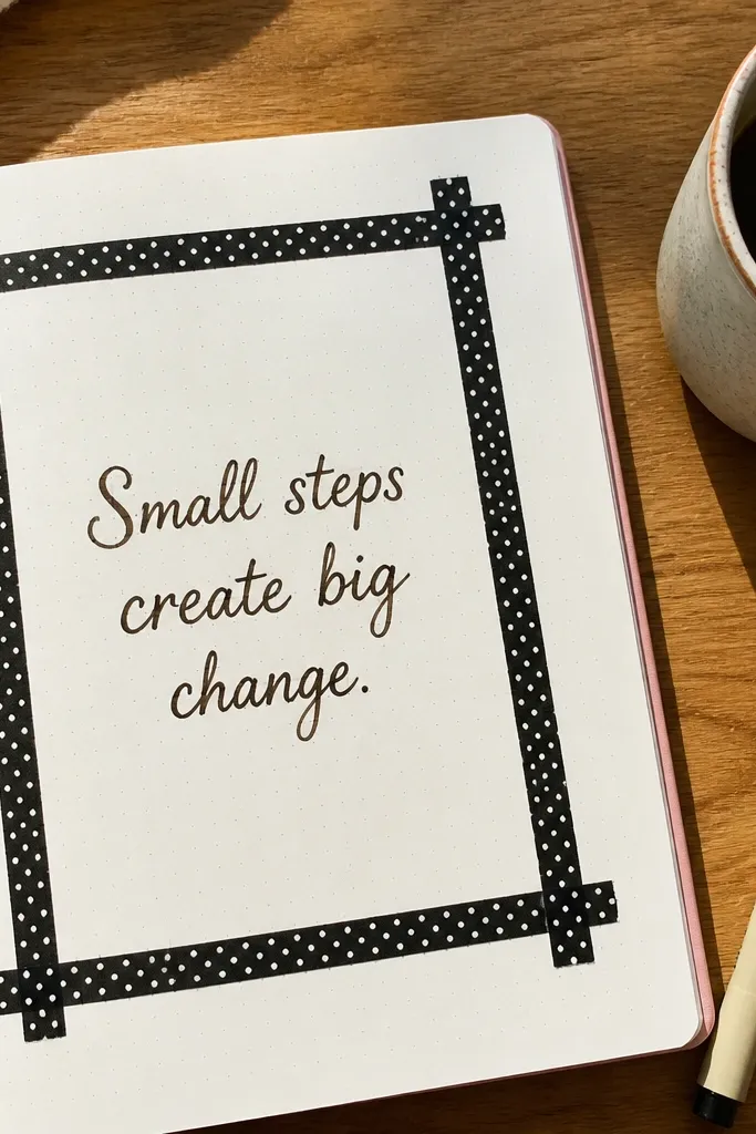
A taped frame makes your journal page look finished even with minimal writing. Put a bold border on the page, then write a single sentence that tells a complete micro-story. The frame gives structure, so the sentence placement looks intentional instead of floating. This one is great for busy days because you’re only writing one line, but the page still photographs well.
Cut four strips of washi tape and arrange them as a rectangle border with even gaps between tape and paper. Leave a clear center area for text. Write one sentence story in the middle — start with a time marker like “After lunch” or “Tonight” — and keep it under 18 words. Add two tiny doodles near the corners that match the sentence (a cup for coffee, a moon for night).
Press the tape down with a flat edge like a ruler so it sticks cleanly without lifting.
Don’t rotate the frame at random angles; straight borders read sharper in photos.
3. Letterboxing Quote Gallery
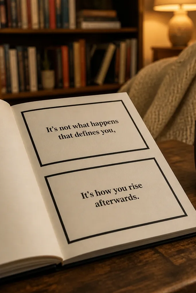
This layout borrows from movie “letterboxing” and turns quotes into a gallery. You create two stacked panels with bold margins, then write a short quote or line you want to remember. The look is striking because the page has strong negative space and clear borders. It’s beginner-friendly because you only need to pick text and place it neatly.
Draw two vertical rectangles on the page with wide margins on both sides. Use a pen or pencil first, then trace the final lines with a fine liner. Write one quote per rectangle, keeping the text centered and broken into 2-3 lines. Add one small decorative mark at the top of each panel like a star, swirl, or triangle cluster.
Use handwriting with consistent size — blocky letters look better than fancy mixed sizes here.
Avoid long quotes; the panels look best with short text that fits cleanly.
4. Doodle-Map of Your Route Today
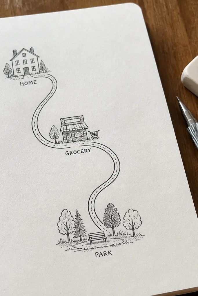
This is a writing idea that looks like art because your words attach to a map. You sketch a route — even if it’s just home to store and back — and label each stop with a short phrase. The visual line path makes the page lively, and the labels keep it personal. It also works when you don’t have big feelings to write about — it’s just “what happened where.”
Start by drawing a simple path line across the page with a big starting dot and an ending dot. Add 3-5 stop markers along the line, like small circles or squares. Write one short label next to each stop — 2 to 5 words — and add a tiny symbol for each place (key for errands, leaf for park, cup for café). Finish by drawing a small compass arrow in one corner and underline the start dot once.
Pro tipUse different line styles for different stops: solid for main route, dashed for detours.
AvoidDon’t over-detail streets; the charm is in the simplified route.
5. Five-Word Headlines for the Day
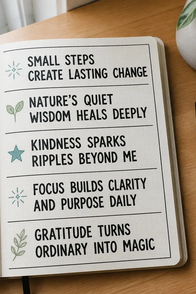
Turn your day into a newspaper page without the pressure of paragraphs. You write multiple “headlines,” each made of exactly five words, and you decorate each one with a small icon. The strict word count keeps it beginner-friendly, and the bold text blocks make it instantly photogenic. This is also one of the easiest ways to see patterns over time because the entries are consistent.
Pick a layout with 4-6 headline blocks across the page. Write each block as exactly five words, all in the same font size. Add a tiny icon next to each headline — lightning bolt, heart, book, cloud — using a single color or black ink. Underline each headline once, then draw a thin divider line between blocks.
Write the five words first in pencil, then commit in ink so spacing stays clean.
Avoid using five words that are too abstract; make them concrete like “waiting room, overheard joke”.
6. Color-Coded Gratitude Confetti
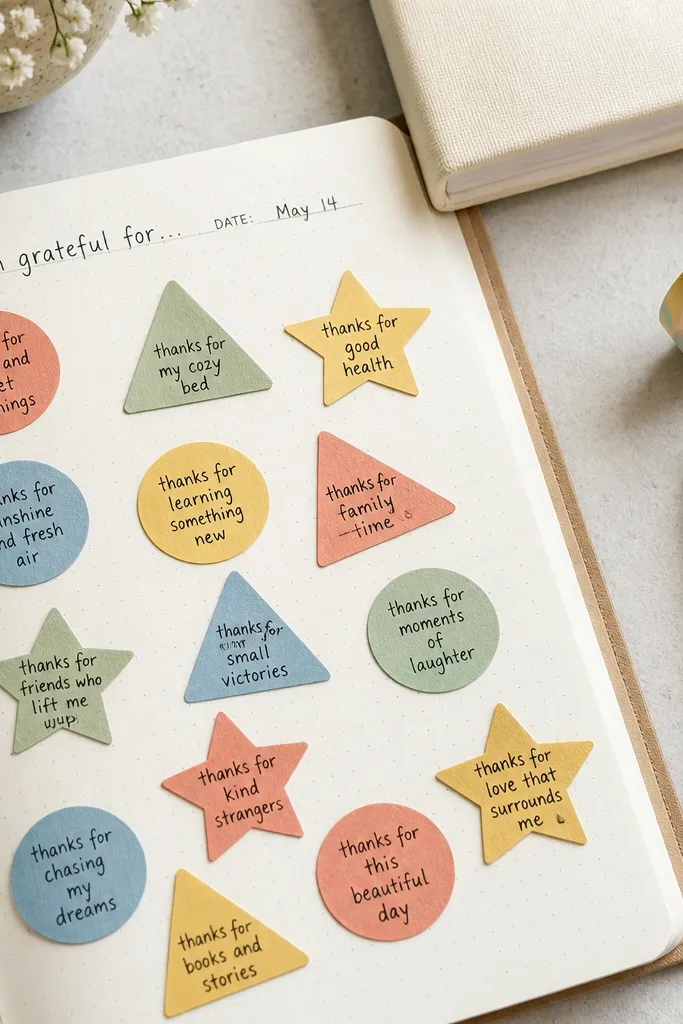
Gratitude pages look best when they’re playful, not solemn. This idea puts your gratitude into confetti shapes so your page feels light and celebratory. Each note is short, placed on a colored shape, and the scattered layout makes it fun to look at later. It’s beginner-friendly because you’re not trying to write beautifully, you’re placing small text pieces.
Choose 4 colors and draw 12-20 confetti shapes around the page using a mix of circles, triangles, and squiggles. Keep the shapes small enough that each one holds 2-4 words. Write one gratitude phrase per shape, like “warm socks” or “kind text,” using a dark pen. Leave a few shapes empty as breathing room, then add a tiny dot accent in the corners.
Use the same pen color for all tiny text so your page reads as one cohesive piece.
Don’t crowd every inch with confetti — leave white space so it still looks airy.
7. Timeline With Highlights Only
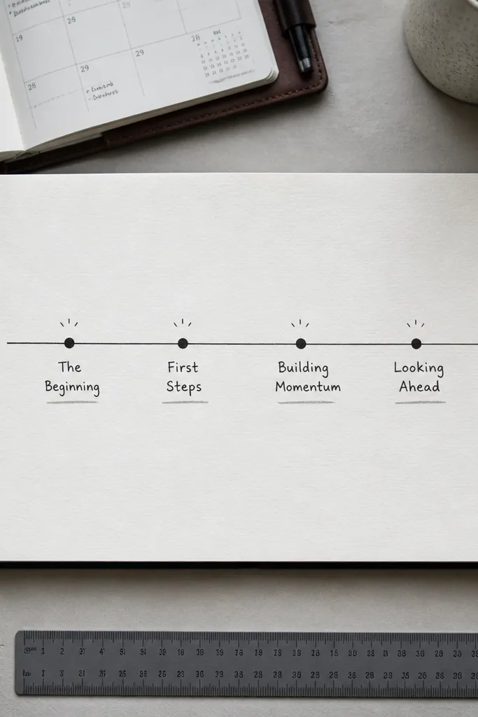
A timeline page gives you a clear structure, but this version keeps it aesthetic by only tracking highlights, not every detail. You draw a single line, mark four points, and write short labels for the best moments. The page looks clean and graphic because it’s minimal and organized. It’s great for beginners because the “writing task” is tiny and the layout does the heavy lifting.
Draw a horizontal line across the page and add four evenly spaced tick marks. Label each tick with a time range like “morning,” “midday,” “evening,” and “night.” At each tick, write one short phrase — 3 to 7 words — and underline it with a matching color. Add a small star above the tick that felt the most meaningful.
Pro tipUse a ruler for the timeline line; straight lines make the whole page look intentional.
AvoidAvoid adding more than four moments; the page loses its clean graphic vibe.
8. Bubble-Map of One Problem and One Wish
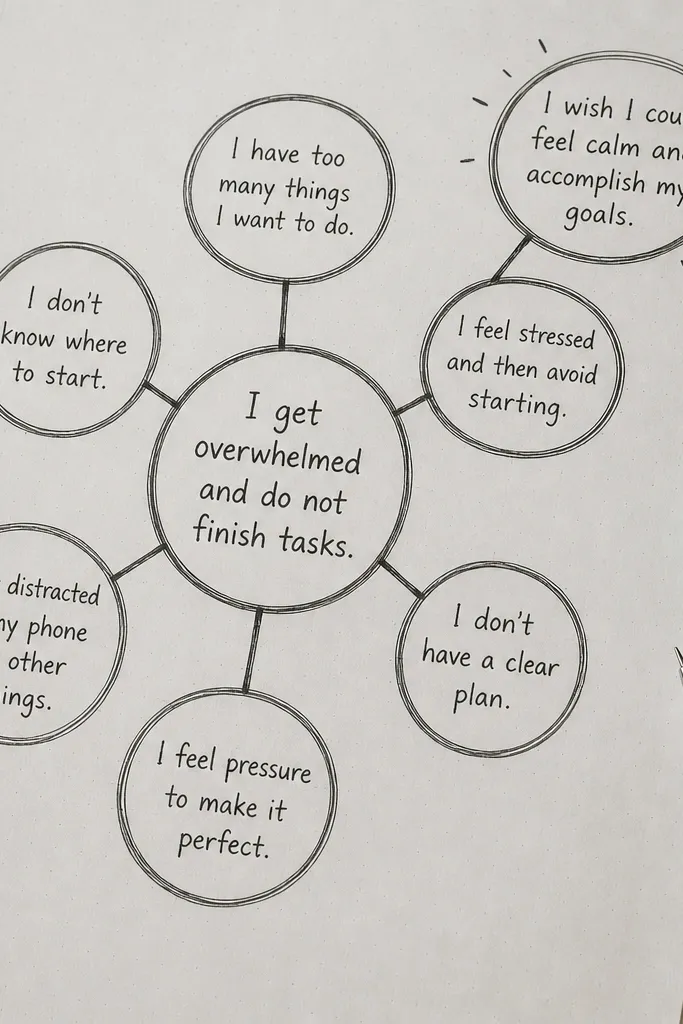
This layout turns a vague mental fog into a readable page. You write one problem in the center, then surround it with a simple bubble map that ends with one wish. It looks good because bubbles create shape repetition and the page has a clear visual hierarchy. It’s beginner-friendly because you’re not writing a whole essay — you’re filling bubbles with short phrases.
Draw a large circle in the center and write the problem in 3-6 words. Around it, draw six smaller bubbles in a ring and split them into two groups of three. In the first three bubbles, write what’s making the problem worse. In the last three bubbles, write what you want instead, ending with one “wish” bubble that gets a star inside.
Keep bubble lettering consistent by using all caps for the first word only.
Don’t make the center too long; if it doesn’t fit, shorten it until it does.
9. Stencil Quote Blocks With One Accent Color
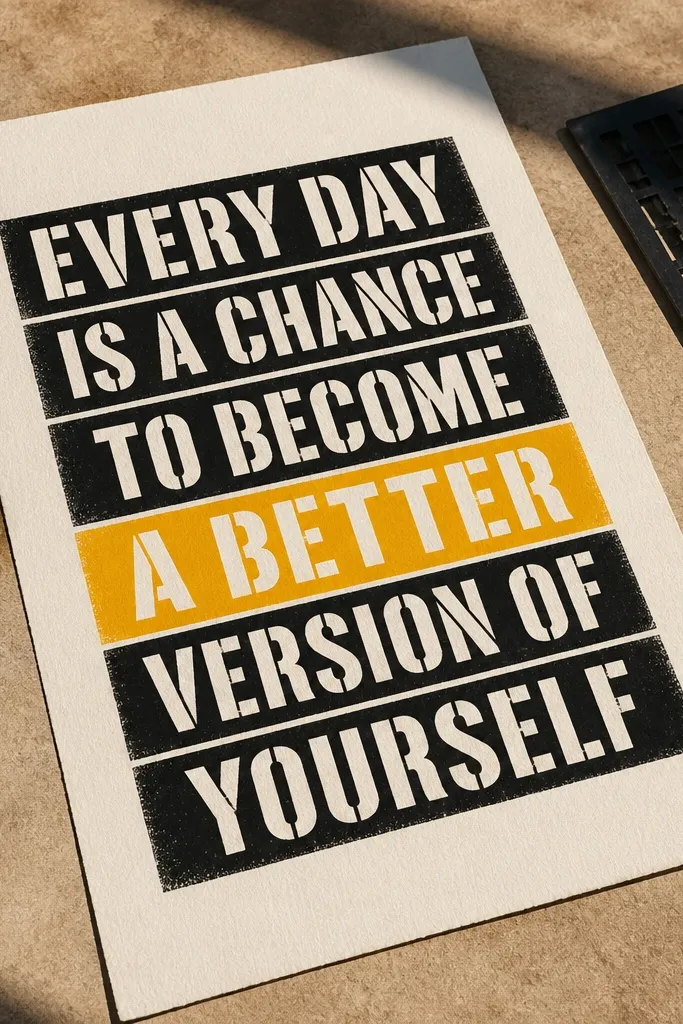
This is how you get a crisp, graphic page without worrying about fancy handwriting. You write a quote in blocky, stencil-style text, then highlight just one phrase with an accent color. The result looks designed because the typography has uniform edges and the accent color pulls the eye. Beginners like it because it’s less about expression and more about placement.
Choose a quote line you want to remember and write it in pencil inside a rectangle area. Use a stencil or stencil-like lettering approach: draw each letter with consistent stroke thickness, then ink over pencil. Pick one accent color and underline only one phrase, not the whole sentence. Add a thin border line around the quote block and a small decorative dot pattern in one corner.
Do the pencil pass lightly; heavy pencil lines show through on ink-heavy pens.
Avoid using multiple accent colors; one underline reads cleaner.
10. "Before / After" Page Split
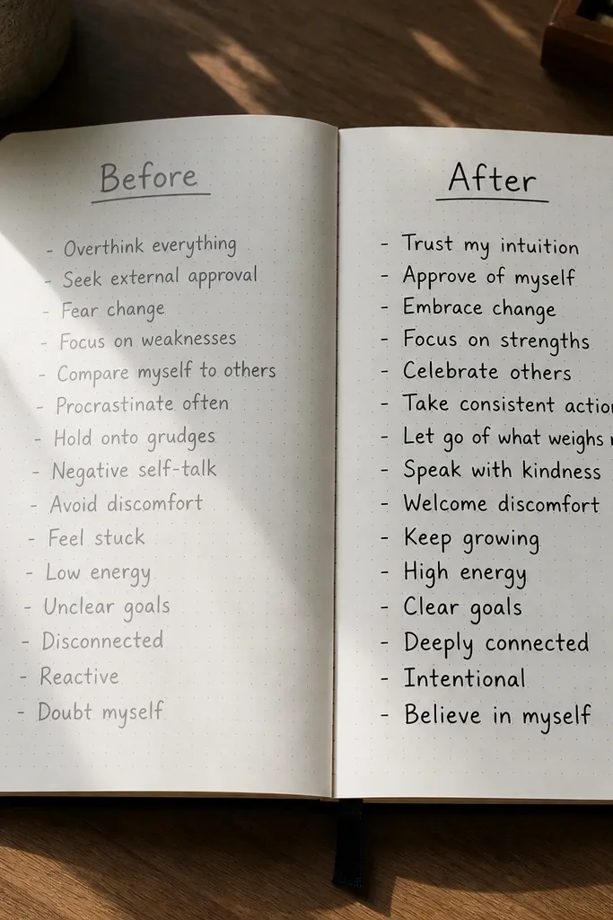
This idea is simple, but it looks powerful because the page is a direct comparison. Split the page down the middle, write “before” on the left, “after” on the right, and fill each side with a short phrase list. It’s beginner-friendly because you’re not writing a full story — you’re documenting change. The visual split makes it easy to read in photos and easy to revisit later.
Draw a vertical line down the center of the page and label the top of the left side “before” and the right side “after.” Write 3 bullet phrases on each side, keeping them to 3-7 words each. Use two different pen colors for left and right, but keep the text style the same. Add a small arrow doodle pointing from the left side to the right side across the center line.
Pro tipUse a consistent bullet shape like tiny squares so the page looks cohesive.
AvoidDon’t leave the “after” side blank; even one phrase makes the split feel complete.
11. Photo-Receipt Memory Collage (No Photos Needed)
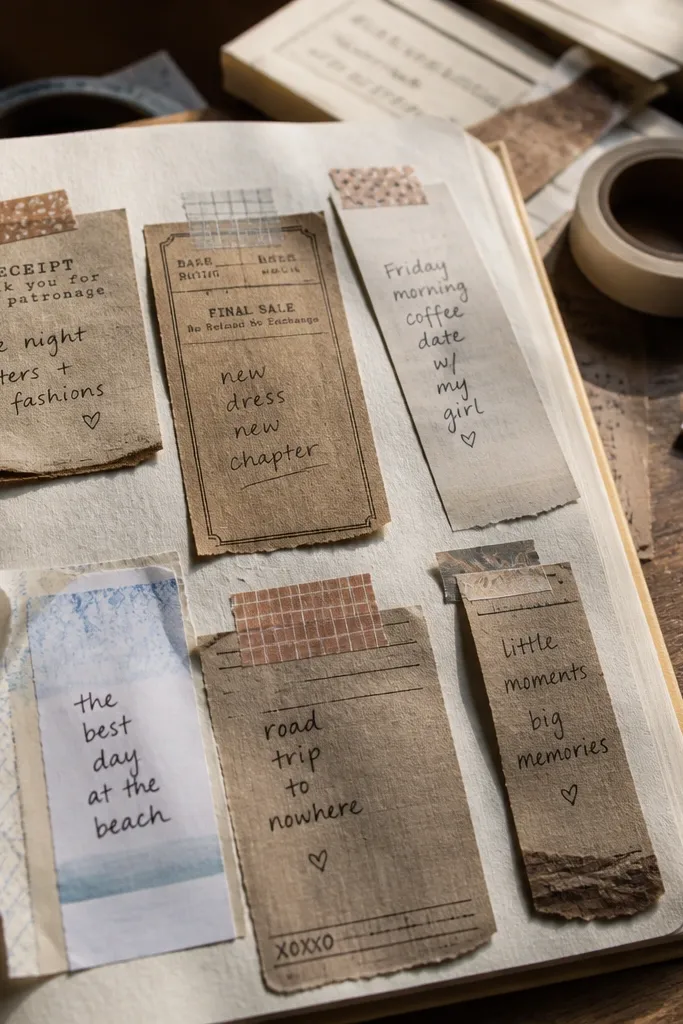
Collage journaling looks amazing because it brings texture and layering. You make “receipt” strips from paper scraps, washi tape, or old packaging, then write a tiny memory note on each strip. Even without actual photos, the receipt shapes create that lived-in, documentary vibe. It’s beginner-friendly because each strip is a small task, and you can stop after 5-7 pieces.
Cut 5-8 narrow strips of paper about 2-3 inches wide and 4-6 inches long. Tape them onto the page at slight angles using washi tape, leaving some overlap. Write a date on each strip and a 1-2 sentence memory note, keeping the tone simple and specific. Finish by adding a thin underline under each date and a small doodle icon near one edge of the strip.
Pro tipUse slightly different paper colors for each strip so the collage has contrast even in low lighting.
AvoidAvoid gluing everything flat; a tiny angle difference makes the collage look intentional.
12. Grid Page With One Big Word
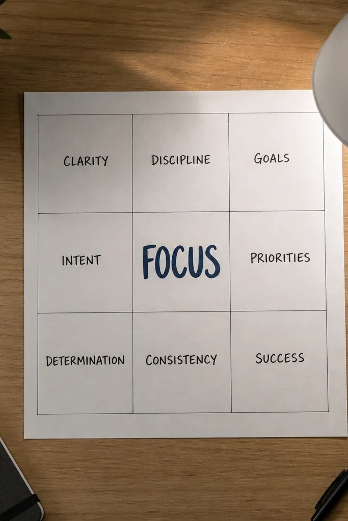
This is the fastest way to make a page look like graphic design. You draw a grid, place one big word in the center, then fill the surrounding cells with short related words. The big word anchors the page, while the smaller words add texture. Beginners can do it because the writing is bite-sized and the grid controls spacing.
Draw a 3x3 or 4x4 grid on the page using a ruler. Write one big word in the center cell, using thicker ink for emphasis. In the other cells, write 1-3 related words per cell that match your theme, like “focus” leading to “quiet,” “timers,” “notes.” Add a border around the whole grid and lightly shade two opposite corners with colored pencil.
Choose one theme word that can generate 6-10 related words without forcing it.
Avoid using the same word twice; the page looks better with variety.
13. Hand-Lettered Checklist With Icons
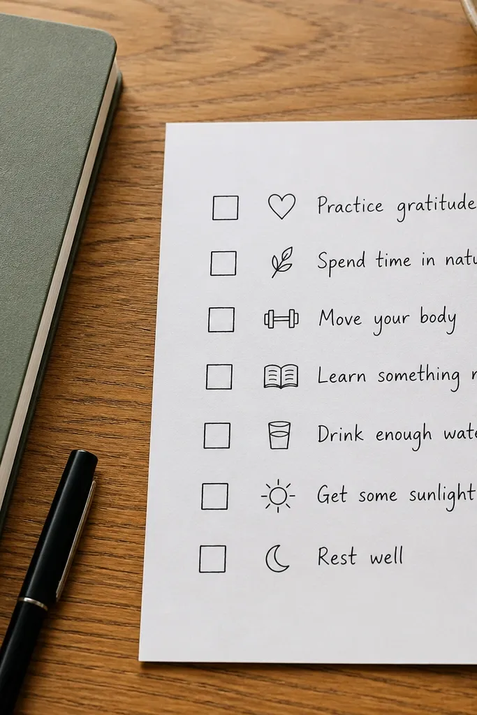
A checklist journal page is clean, satisfying, and very photogenic. You hand-letter the items, add matching icons, and leave space for checkmarks. It’s beginner-friendly because you’re writing short lines, not paragraphs, and the layout does the organization. This one works well for routines, planning, and even “things I learned” entries.
Draw a single vertical column on the left side of the page with a ruler and leave a big blank area to the right for notes or doodles. Write 6-10 checklist items in consistent font size, each ending with a small blank check box. Add one icon per item — book for learning, sun for health, clock for time — and keep the icon style consistent. When you finish, draw a simple title at the top like “Today’s Focus” and underline it once.
Use a box checkmark template by tracing three boxes first, then repeat the same size across the column.
Don’t cram more than 10 items; the column should breathe.
14. Ink Wash Circle Planet Mood
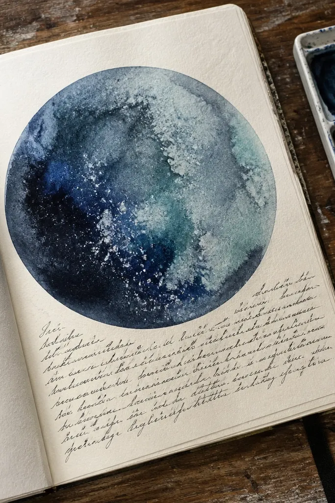
If you want drama on a page, paint a single circle like a planet. Your mood becomes the color, and your writing becomes the caption. This looks gorgeous in photos because the circle shape is bold and the ink wash creates texture without you needing perfect drawing skills. Beginners can handle it because it’s one shape, one caption, and controlled mess.
Use a cup or stencil to trace a circle about 3-4 inches wide in the center of the page. Mix a light ink wash or watercolor in one mood color and paint inside the circle, leaving a small highlight unpainted. While it’s still a little wet, add 3-5 tiny ink splatters with a pen tip. Write a short caption under the circle like “Today feels like...” and finish with a few star dots around the planet.
Pro tipLet the circle dry fully before adding stars so you don’t smear the edges.
AvoidAvoid painting the whole page; one planet keeps it clean and photogenic.
15. Pressed-Flower Bookmark Poetry Page
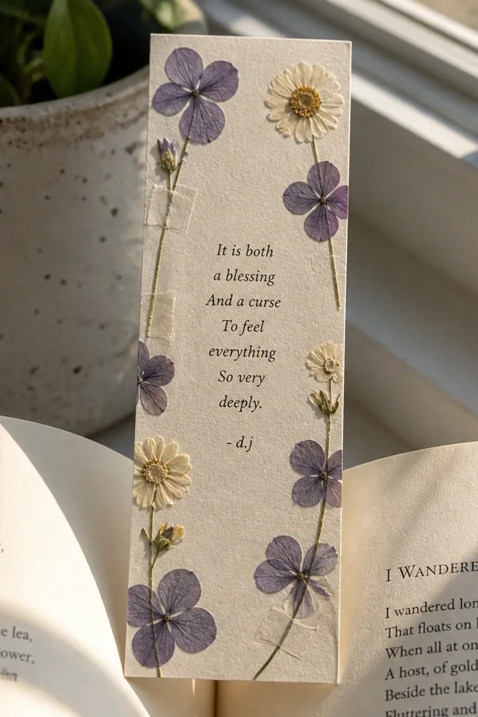
This idea turns journaling into something you can actually hold. You write tiny poetry lines on a bookmark-shaped card, then anchor pressed flowers along the edges so the page looks like a real keepsake. It fixes the problem of blank-page fear because the layout is already decided: short lines, clear borders, and a “frame” made from paper and botanicals. The result is photogenic because the flowers give you real texture and color contrast — flat petals against smooth paper. It takes about 45-60 minutes the first time and 20-30 minutes after you have a small stash of dried flowers. It suits beginners who want a creative page that looks intentional even with messy handwriting.
Cut a journal insert that is bookmark-shaped: 3.5 in wide and 7.5 in tall, with a rounded bottom and a small hole near the top (about 0.25 in from the top edge). Use watercolor paper or thick cardstock (at least 200 gsm) so the paper doesn’t buckle when you add glue. Write 4 short lines of poetry or “micro-thoughts” using a black gel pen, keeping each line under 12 words. Arrange 5-10 pressed flowers in a loose border along one long edge, then lightly dab craft glue on the paper first and place the flowers one by one. Seal the whole bookmark with a thin layer of matte Mod Podge or a clear acrylic medium, and let it dry flat under a book for 30-45 minutes. Punch the hole and thread it onto a ribbon or tuck it into a pocket page so it looks like a bookmark you made, not a random craft.
Press flowers between parchment and a book for at least 5-7 days, then trim any overly thick stems so they sit flat under the sealant.
Don’t use glossy sealant — it turns pressed petals shiny and can warp the paper edges.



