
1. Tape Border + One Big Title Block
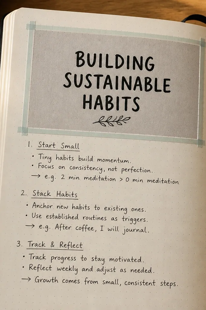
This layout looks crisp because the border does the heavy lifting. Put tape on the page first, then write inside one bold title block so your handwriting only needs to be readable, not fancy. It works with any theme because tape color and title background color change the whole vibe. Use it for weekly planning pages, daily check-ins, or any prompt that needs a clear “top anchor.”
Cut 4 strips of masking tape (or washi tape) and place them evenly 1 cm inside the page edges to form a rectangle. Add a second strip across the top to create a title band about 3 to 4 cm tall. Write your title in the band using a black fine-liner, then fill the rest with short lines or a simple list. Remove the tape only after the ink is fully dry so you don’t smear.
Pro tipPress the tape down with a fingernail or a plastic ruler so edges stay sharp in photos.
AvoidDon’t use too many tape colors on one page — two is enough.
2. Sticker Grid Scorecard
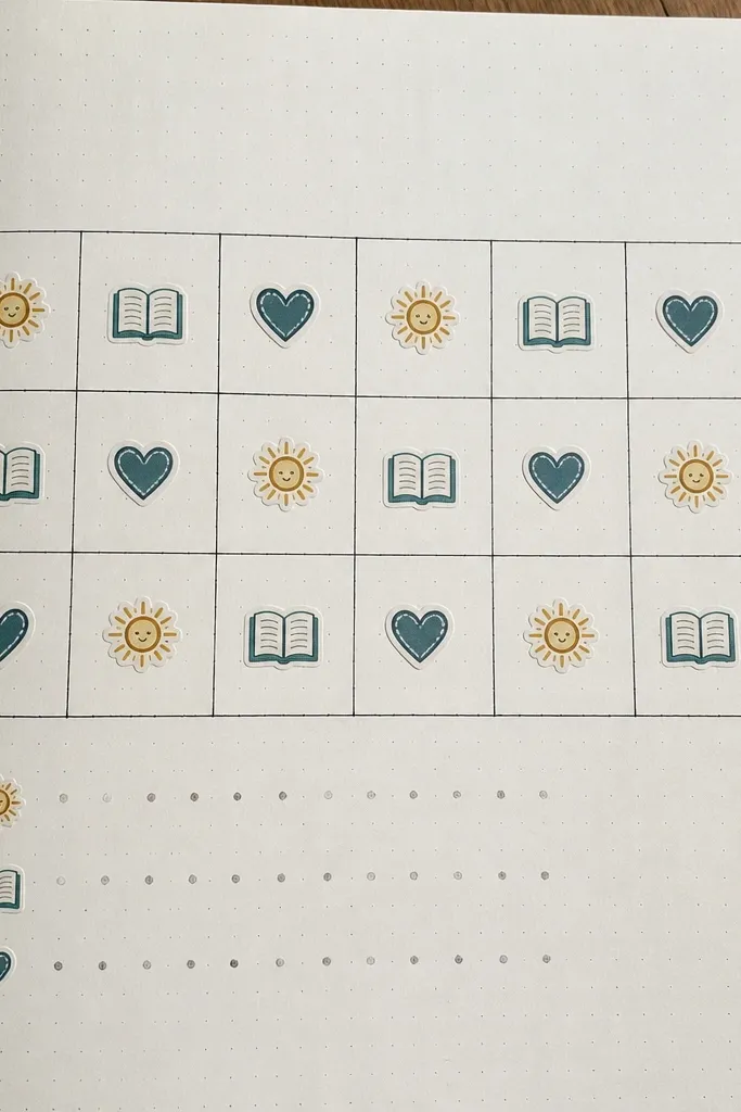
A grid makes the page look organized even if your notes are short. You’re basically turning your journal into a visual scoreboard, and that reads well in photos. This is great for tracking habits, moods, or reading progress because each square becomes a tiny moment. The best part is you don’t need artistic skills — stickers do the design work.
Draw a 5x5 grid using a ruler, leaving a 2 cm margin at the top for a header. Label the header with the thing you’re tracking and the date range. Fill squares with small stickers or sticker-like shapes (circles, stars, icons) until the grid looks balanced. Finish by adding one sentence at the bottom: “Best part” or “What I learned.”
Pro tipUse one sticker shape repeated (like hearts or dots) for a cleaner look than mixed icons.
AvoidSkip freehand grids — use a ruler so lines don’t wobble.
3. Watercolor Wash + Dry-Brush Quote
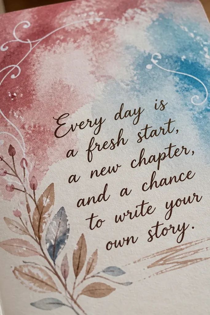
Watercolor makes the page look like a mini artwork, and the dry-brush quote keeps it readable. This combo looks good because the background stays loose and the text stays crisp. Use this for a weekly theme, a reflection prompt, or a “one thing I’m grateful for” page. It’s beginner-friendly because you don’t need perfect watercolor control; you just need a single wash and one centered line of text.
Wet the page lightly with clean water using a wide brush, then apply one watercolor color in a loose rectangle about the size of your hand. Let it dry until it’s matte, not shiny. Use a dry brush or a thicker paint/marker to add one centered quote line in dark ink or paint. Add small paint splatters around the quote for energy, then let everything dry fully before closing the book.
Use thicker paper (at least 160gsm) or the page won’t lie flat after the wash.
Don’t outline the watercolor with heavy black — it kills the soft look.
4. Vertical Sidebar Mood Map
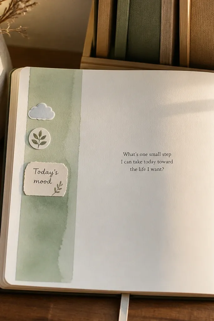
A vertical sidebar instantly gives structure and makes the page look designed. Mood maps are photogenic because colors and icons create a clear visual story down the page. You get a clean place for your daily mood plus a small note that explains it. This works in any journal because you’re repeating the same template, so it looks consistent over time.
Draw a vertical line 3.5 cm from the left edge to create a sidebar. In the sidebar, draw 7 small boxes (one for each day) and color each box with a single color that matches your mood. Write the mood label in each box in tiny lettering. On the right side, leave one section for a short sentence per day: “Why it felt like that.”
Pick a fixed color-mood system (for example: green calm, yellow alert, blue heavy) so pages look cohesive.
Don’t cram long paragraphs into the main area — keep it to one sentence.
5. Circle Timeline of the Day
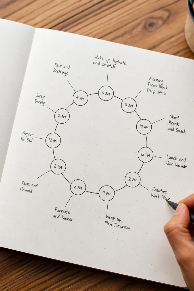
Circles look playful and clean, and they’re perfect for tracking a day without writing an essay. This layout gives you a visual timeline that’s easy to photograph because your eye follows the ring. It’s great for “what happened when” entries, planning, or journaling after a trip day. The design hides shaky handwriting because the labels are short and the structure is already doing the work.
Draw a circle in the center using a compass or a round object, then divide it into 6 to 8 slices with a ruler. Label the slices with times like 8am, 11am, 2pm, 5pm. In each slice, write one tiny phrase (not a full sentence). Add a small key at the bottom using three icons that represent what kind of moment it was (work, rest, people).
Pro tipUse pencil for the circle and divisions first, then go over with a fine-liner once you like the spacing.
AvoidDon’t use tiny handwriting in every slice — keep each entry to 2 to 4 words.
6. Dot-Grid + Color-Blocked Prompt
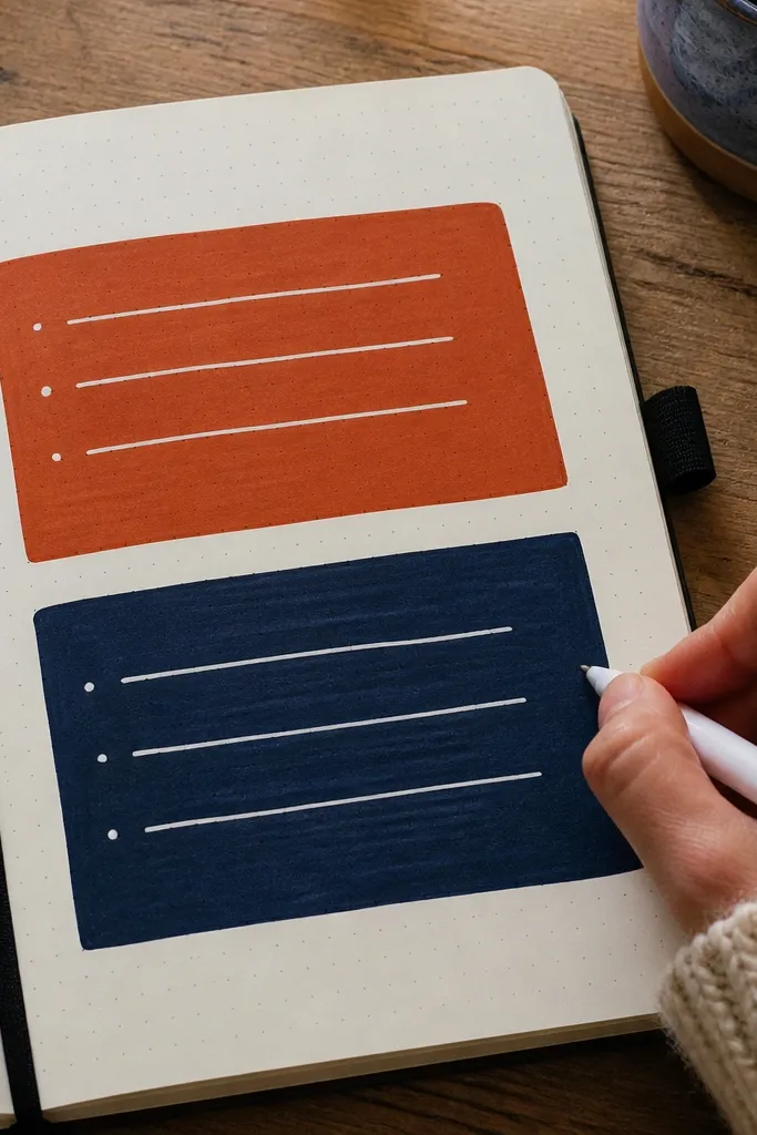
Dot-grid paper style pages look instantly organized, even if your notes are messy. The color blocks create a modern look and help the page read like a design, not a diary dump. Use it for prompts like “What I want next week” or “Things I’m carrying.” It’s beginner-friendly because you’re not drawing complicated shapes — just rectangles or bars.
Lightly mark a dot-grid pattern by placing a ruler at an angle and tapping a pencil to place small dots, or use a dot-grid journal page as your base. Draw 3 to 5 rectangles across the top half and color them with marker or paint. Write your prompt in one rectangle and your answers in the dot-grid area below. Keep your writing aligned with the dots so it looks straight in photos.
Pro tipChoose one marker per page and use it for both blocks and labels so the palette stays tight.
AvoidSkip full-page coloring — it makes the writing harder to read.
7. Photo Corner Frame (No Printing Needed)
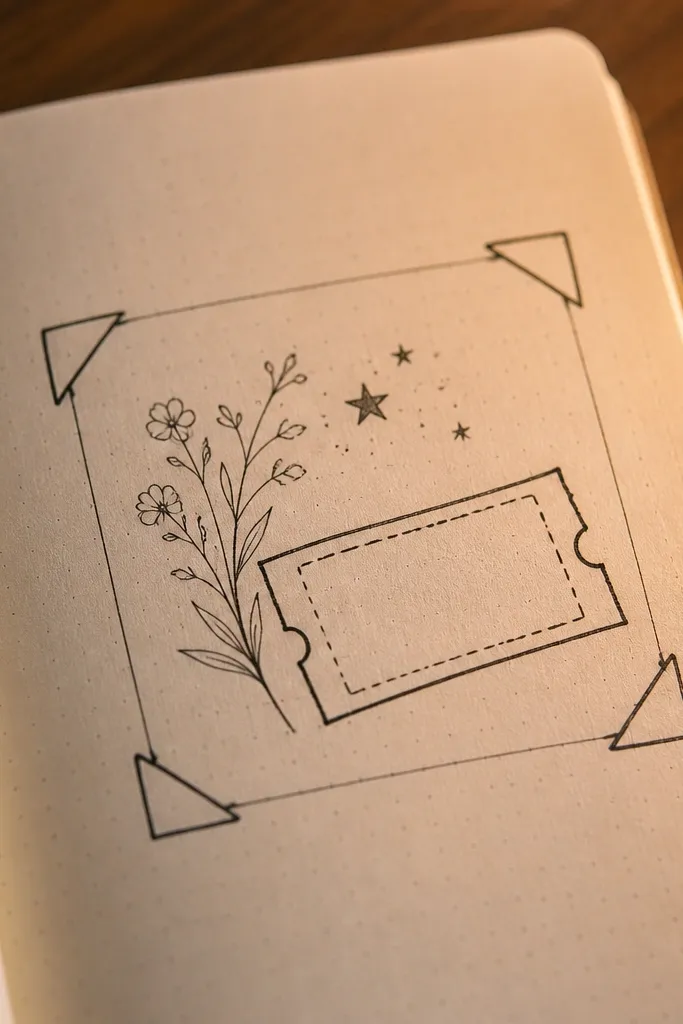
This gives you the “photo moment” look without needing to print pictures. A corner frame makes your page feel curated and intentional, and it’s great for travel days, meal logs, or memory notes. You can fill the frame with a small sketch, a ticket stub, or even just a cluster of handwritten highlights. It looks good because the frame creates a clear boundary and the rest of the page stays clean.
Draw a rectangle frame near the top-left corner and leave a 1 cm margin between the frame and the page edges. Add two short diagonal lines in the corners of the rectangle to mimic a photo corner style. Inside the frame, write 3 short lines or paste one small ticket/stub. Add a caption line under the frame like “Where I was / what I noticed.”
Use thicker pen for the frame lines and a lighter pen for the caption to create contrast.
Don’t center the frame on the page — corner placement looks more dynamic.
8. Big Hand Lettered Word + Small List
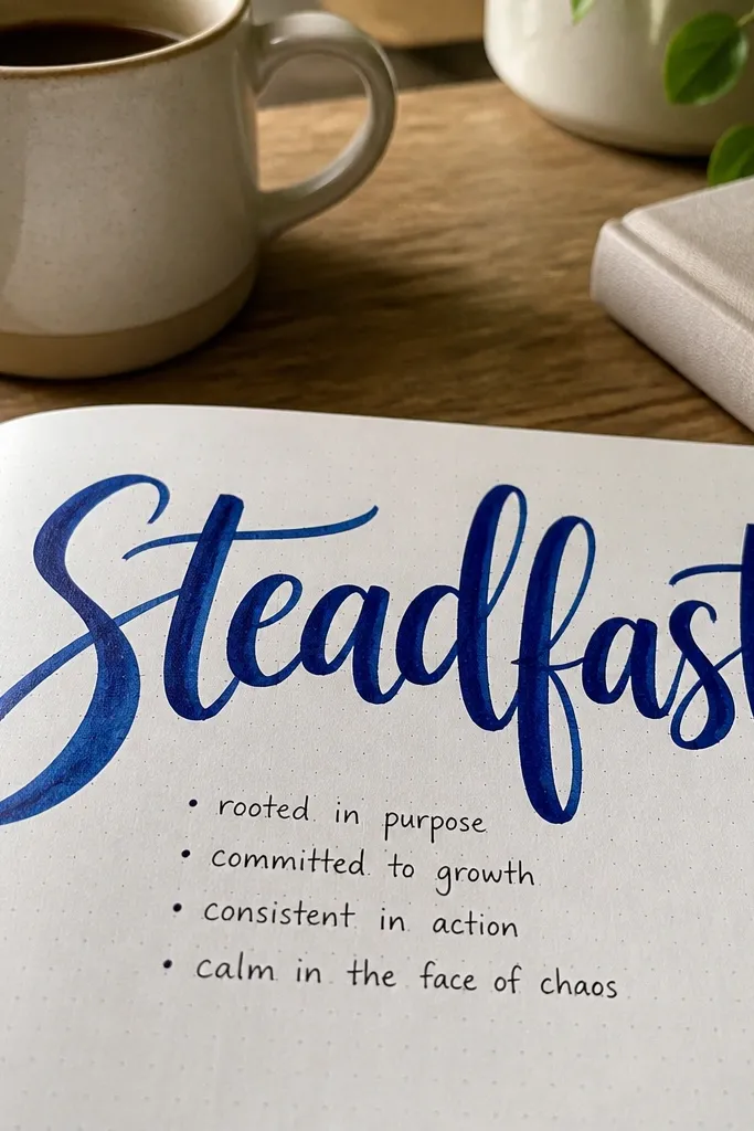
One big word makes the page look designed, even when the rest is minimal. It’s a great way to journal without writing a lot — you just pick a theme word and support it with small bullet lines. This is photogenic because the word becomes the focal point. It works for mood, weekly theme, or a “focus for today” entry.
Pick one theme word like “Calm,” “Momentum,” or “Curious.” Write it large across the top using a thick black marker, then underline it with a single line. Add a short list of 3 bullets under it, each one 4 to 8 words. Finish with a tiny doodle icon near the last bullet that matches the theme (a sun, cloud, arrow, or leaf).
Use a thicker marker for the word and a fine-liner for bullets so everything stays readable.
Don’t add more than 3 bullets — the page should breathe.
9. Cut-Paper Collage Strips
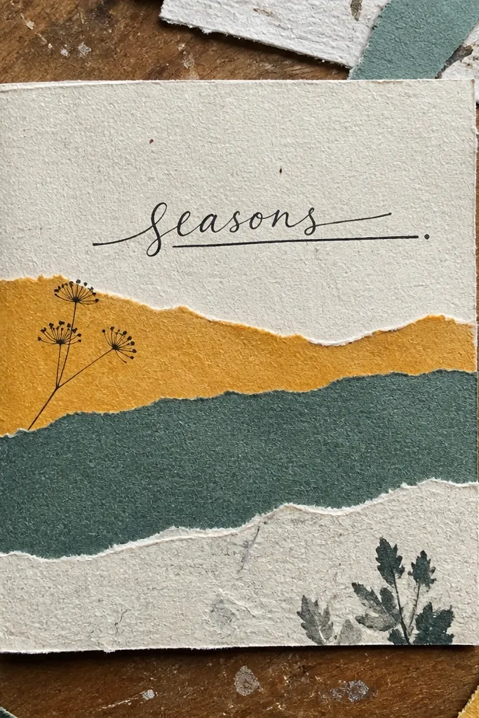
Collage strips look artsy and textured, and they hide beginner-level drawing. You’re building a visual rhythm with layers, and that makes the page look high effort without complex skills. Great for monthly reflections, “what I’m learning” pages, and journal covers for a new season. The photogenic part is the layered edges and the contrast between paper colors.
Choose 3 paper scraps in a tight palette (cream, muted green, light terracotta). Cut them into strips about 1 cm wide and 6 to 12 cm long. Arrange them diagonally across the page and tape them down at the ends only, so the center sits flat. Write your text on the clean areas between strips, then seal the tape edges with a thin layer of glue stick if needed.
Pro tipCut strips with a craft knife and ruler for straight edges that look cleaner in photos.
AvoidDon’t use wet glue — it warps paper and makes shadows.
10. Stencil Doodles with One Accent Color
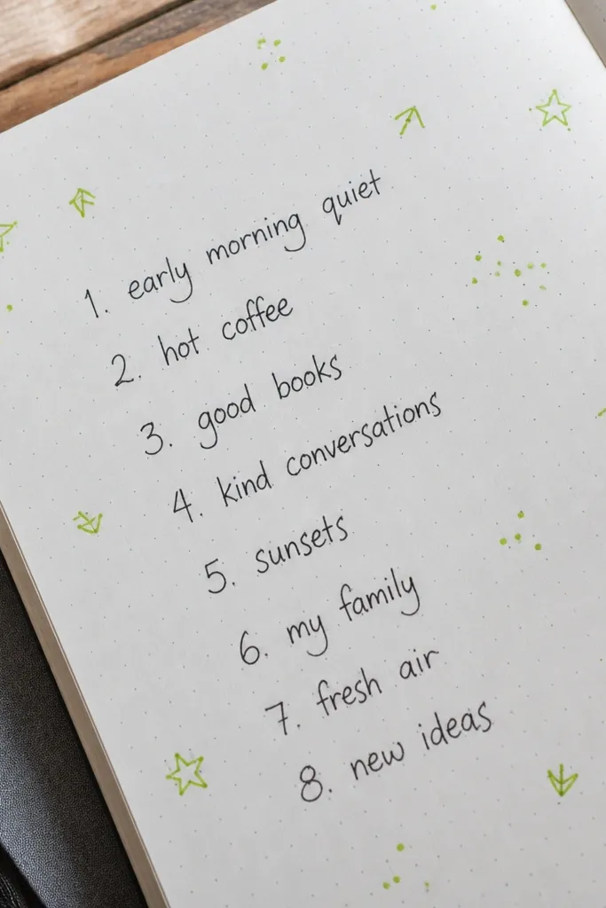
Stencils make doodles look consistent, which is the difference between “cute” and “messy.” This layout is built around one accent color, so your page looks cohesive. Use it for gratitude lists, reading logs, or any prompt that needs decoration without clutter. The stencil pattern frames your writing and makes it look intentional.
Pick a simple stencil shape set (stars, hearts, tiny flowers) and choose one accent color marker. Lightly plan where you want the doodles: corners, around a box, or along the left margin. Tap the stencil with marker for each shape so the edges stay crisp. Add your text in the negative space, then connect one doodle to the writing with a thin arrow or underline.
Pro tipPractice on scrap paper first so you know how hard to press for crisp edges.
AvoidDon’t flood the stencil — over-inking makes shapes look blurry.
11. Corner Icons + Centered Question
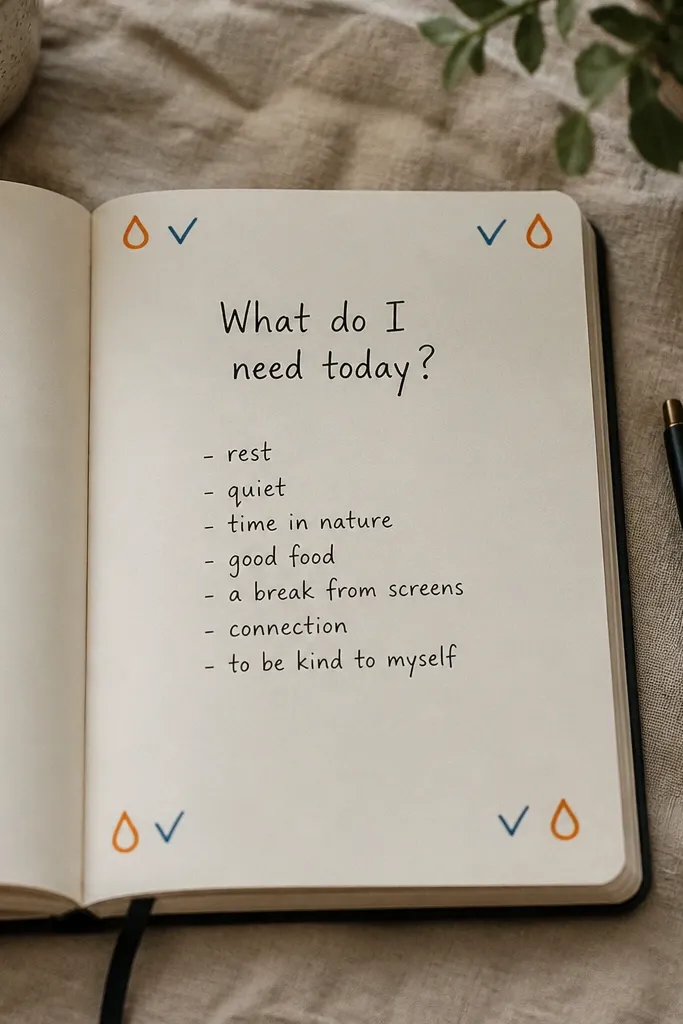
This design looks clean because the question stays centered and the corners do the decorating. It’s perfect for reflection prompts where you want short answers that fit neatly. Your handwriting can be imperfect; the layout still holds it together. Use it for “What do I need today?” or “What’s one thing I’ll do differently?”
Write your question in the center using a fine-liner, leaving space above and below. In the top-left, top-right, bottom-left, and bottom-right corners, draw one small icon each using the same line weight. Add a single underline under the question. Write your answer in 3 short lines directly below the question, staying aligned with the center.
Pro tipKeep icons tiny and simple so the question remains the hero element.
AvoidAvoid busy corner doodles; corners should frame, not compete.
12. Color Wash Background with White Gel Pen Highlights
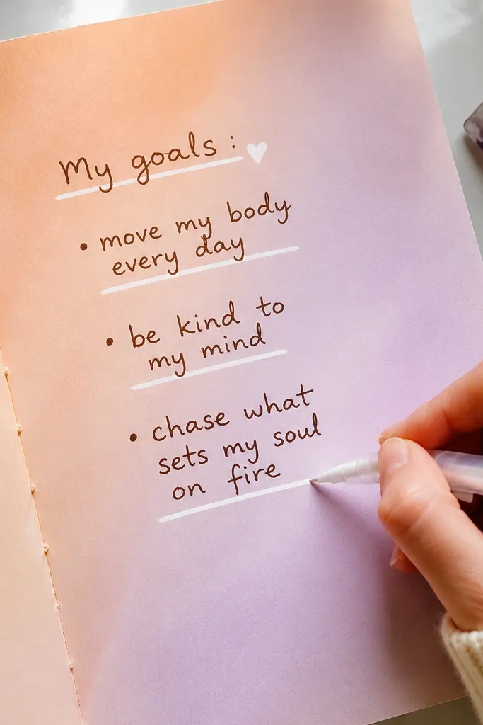
If you want the “glowy” look without digital effects, this is the move. The wash gives you color mood, and white gel pen lines make crisp details that pop in photos. This works well for weekly goals, habit trackers, and any page where you want light and contrast. It’s beginner-friendly because your design can be simple lines — the materials do the visual work.
Paint a light watercolor wash across the top half or in a loose rectangle, then let it dry completely. Use a white gel pen to draw simple shapes on top: circles, thin lines, or a small border. Add your text on the wash only if it stays readable; otherwise, write on the unpainted bottom half. Finish with 5 to 10 tiny dots around the main text for sparkle.
Pro tipUse a thicker gel pen tip (1.0mm) for opaque white so it doesn’t look gray.
AvoidDon’t write with dark ink on a wet wash — it bleeds.
13. Monthly Seeds Page (Tiny Boxes for Growth)
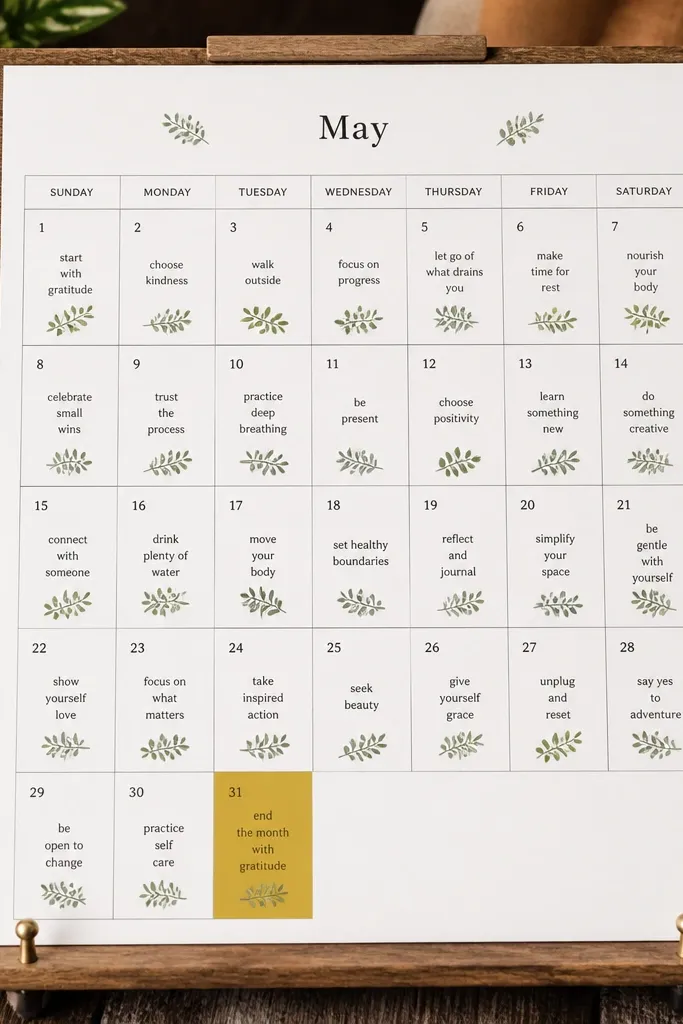
This layout makes planning feel gentle and visual. You get a page that looks like a grid of small “seeds,” which is photogenic and easy to maintain month after month. Each box holds one short note about progress, learning, or a goal. It’s perfect for beginners because the instructions are the same every month, so the journal stops feeling like a new project each time.
Draw a grid of 6 columns by 5 rows (30 boxes) with a ruler, leaving a header area at the top. In each box, write a short growth note: one sentence fragment like “stayed consistent,” “asked for help,” or “walked more.” Use one color for the box outlines and a second color for small icons inside select boxes. Add the month name in a bold band at the top, then decorate the header with 3 small doodles.
Pro tipUse a ruler even for small boxes — the neatness is what makes it look designed.
AvoidDon’t cram long sentences into boxes; keep them under 6 words.
14. Torn Paper Tear Strip Accent
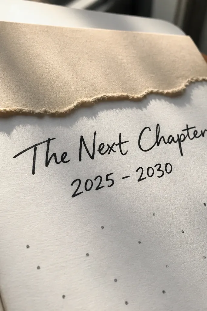
Torn paper edges look handmade and intentional, and they add texture without needing drawing skills. This is a great “cover page” style for a new journal week or theme. The strip also gives you a natural place to write a title and a date range. It looks good in photos because the tear edge creates a soft, uneven line that feels organic.
Pick a sheet of colored paper and tear a strip about 2.5 cm tall and long enough to span the page width. Place it across the top and tape only the back corners so the center stays flat. Write your title and date range on the torn strip using a dark marker. Add a small subtitle under the strip on the main page for 1-2 words like “focus” or “intentions.”
Tear the paper first, then trim the ends with a craft knife for cleaner corners.
Don’t glue the whole strip — it warps and looks bumpy.
15. Checklist with Arrowed Sections
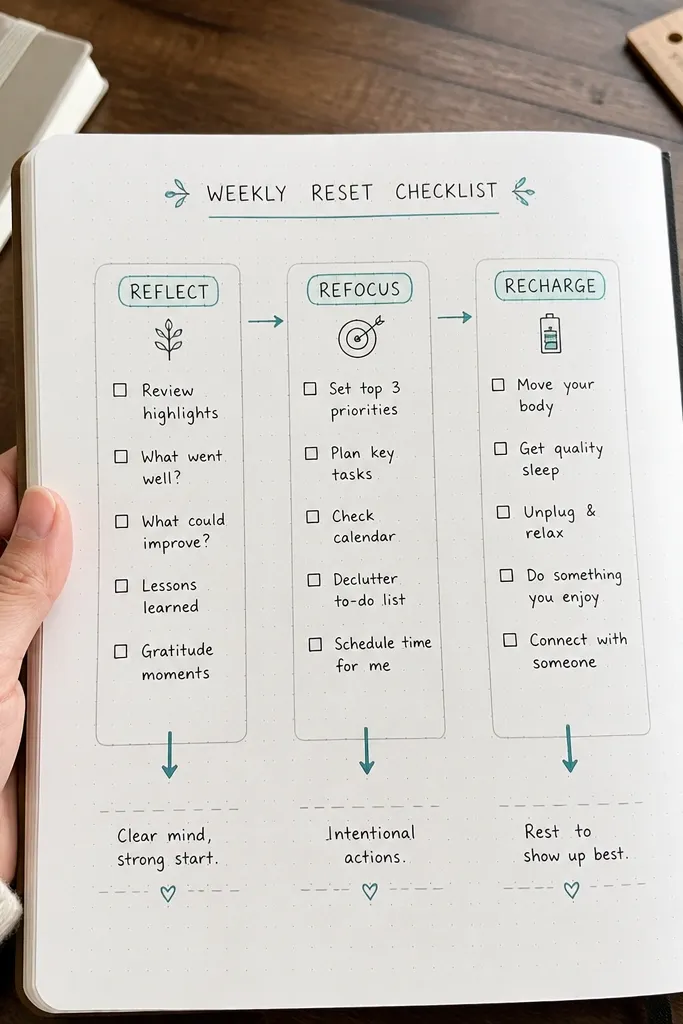
Checklists are easy, but arrowed sections make them look graphic and modern. You’re creating a flow from top to bottom, which makes the page feel structured instead of random. This works for weekly tasks, study plans, or self-care routines. It’s beginner-friendly because you just need straight boxes and simple arrows.
Draw a vertical column of 5 to 7 sections using a ruler, each section about 2 cm tall. In each section, draw a checkbox at the left and an arrow pointing right to the text area. Write one short task per section using 3 to 6 words. Color one arrow in an accent color for each completed task by marking it with a check later.
Pro tipUse a single arrow style across the page so it looks like a designed template.
AvoidDon’t make the text too long; if it wraps, the page loses the clean look.
16. Seeded Doodle Border Around a Square
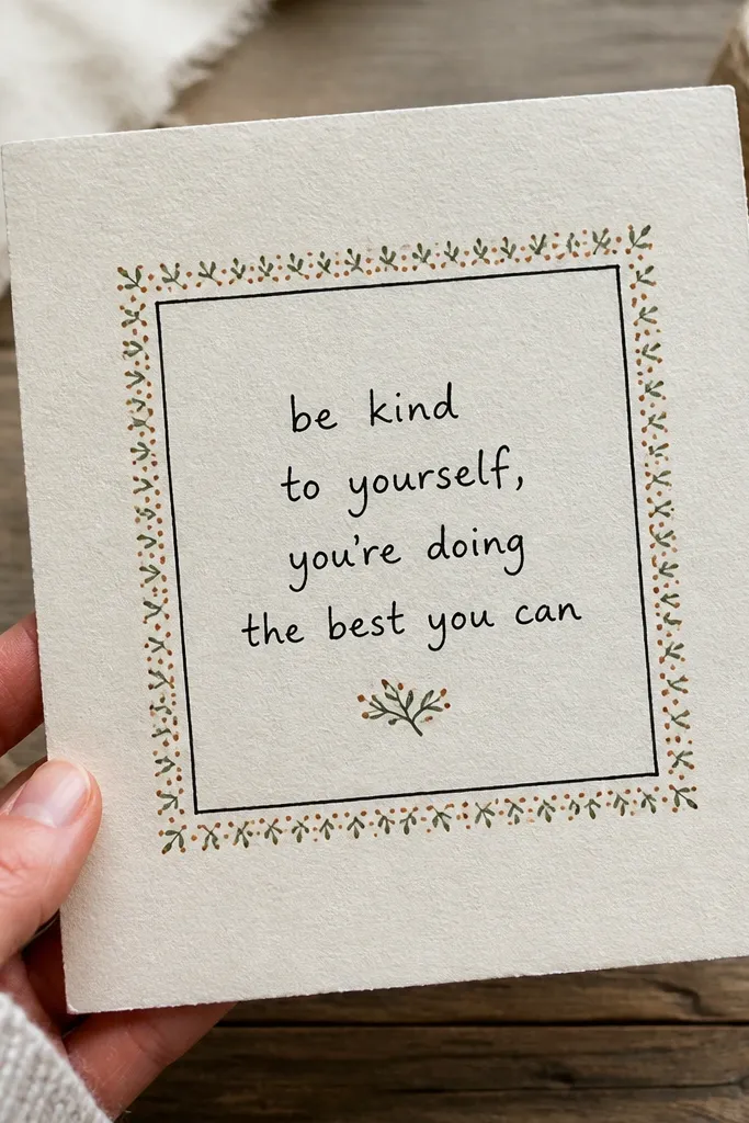
A doodle border turns a plain page into a framed artwork. The central square is your writing area, and the border is your decoration. This looks great for quotes, book reviews, or any prompt where you want a “window” in the middle. Beginners like it because the border is made of tiny repeatable shapes, not complicated drawings.
Draw a central square or rectangle about 10 x 14 cm in pencil, then trace with a fine-liner. In the margin around it, add a border of tiny repeated shapes like dots, small leaves, or stars. Keep the border consistent: same spacing, same size. Write your main content inside the square using short lines, then add one small underline or header above it.
Pro tipUse a single repeating shape for the border so it looks intentional, not chaotic.
AvoidDon’t vary doodle sizes wildly; consistency is the whole aesthetic.
17. Two-Column Map with Key Legend
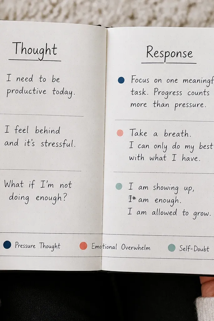
This layout makes journaling feel like organizing information, and that reads well visually. Two columns give you a clean place for “before vs after,” “thought vs response,” or “plan vs results.” The legend box is the design detail that makes it look like a real system, not a one-off page. It’s great for beginners who want structure without fancy art.
Draw a vertical line down the center of the page to create two columns, leaving space at the top for a title. Write a short label at the top of each column like “Plan” and “Result.” Add a small legend box in the lower corner with two colored dots and what they mean. Fill each column with 3 to 5 short bullet lines, using the legend colors for quick categorization.
Pro tipLimit each column to 5 bullets so the page stays airy and photogenic.
AvoidSkip overcomplicated legends — two categories look clean.
18. Hand-Drawn Waves Divider with Section Notes
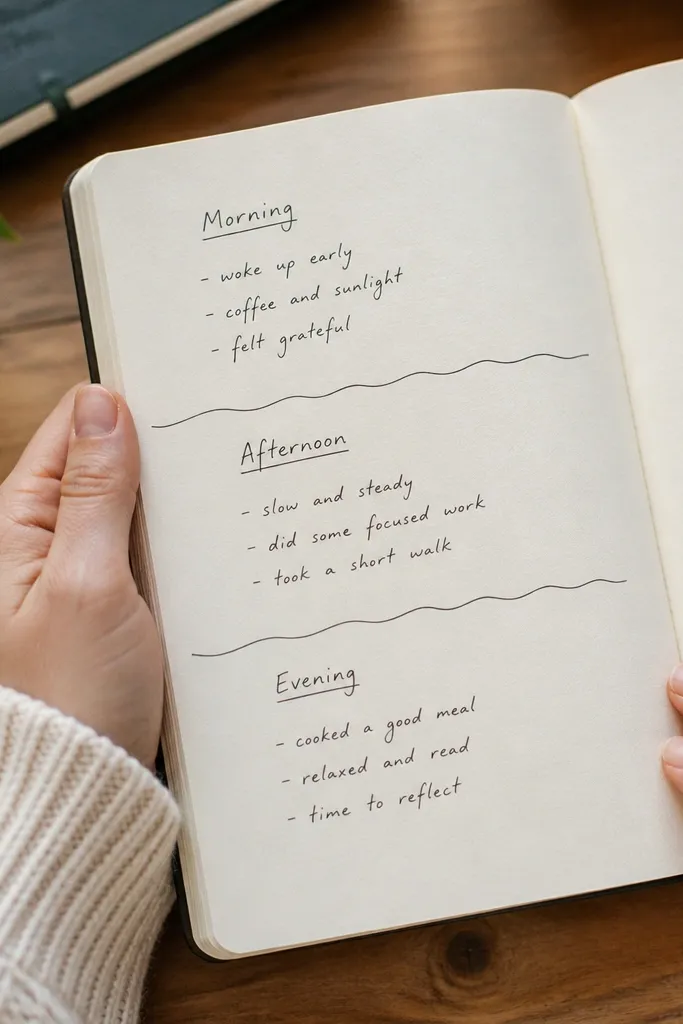
Wavy dividers add motion and softness, and they make a page look like it has sections even when your writing is simple. This is perfect for daily journaling where you want three parts: morning, afternoon, evening. The divider line is the main design element, so your handwriting can stay casual. It’s also quick to do once you’ve drawn one good wave pattern.
Draw a wavy line horizontally across the page using a ruler for the straight baseline and freehand waves between. Create three sections by adding two wavy lines — one for top and one for middle — or just one wavy line and one straight line. Label each section with a small heading like “Morning,” “Now,” and “Tonight.” Fill each section with 3 short lines of notes, keeping spacing even.
Pro tipUse a light pencil wave first, then trace with a pen so the final line looks smooth.
AvoidDon’t make the waves too tall; small waves look cleaner in photos.
19. Stitched Look Journal Page Using Tape + Thread Lines
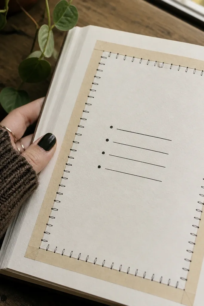
The stitched look turns a flat page into something that feels craft-made. You get a border effect that frames your writing and makes the page look special without sewing. This is great for gift journals, weekly spreads, and any page you want to look “finished” even if it only has a few lines. It’s beginner-friendly because you’re drawing stitch lines — not actually stitching through paper.
Place a strip of washi tape along the page edge to create a border about 5 mm wide. Draw small stitch marks along the tape in a repeating pattern using a fine-liner: one short line, then a diagonal cross. Add a second stitch layer offset slightly to mimic depth. Write your title inside the border, then add one or two short lines below.
Pro tipKeep stitch marks the same length so the border looks uniform.
AvoidDon’t use thick marker for stitches — it hides the pattern.
20. Gradient Highlighter Bars Behind Notes
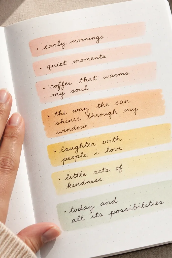
This is one of the fastest ways to make handwriting look intentional. The gradient bars create a soft color glow behind your words, so the page looks styled even when the text is simple. Use it for gratitude lists, reading notes, or daily reflections. It photographs well because the color sits behind the ink and creates contrast without heavy decoration.
Pick two highlighter colors that blend nicely, like yellow to peach or mint to teal. Mark 3 to 5 horizontal bars behind where your text will go, each bar about 1 cm tall. Overlap the colors on each bar so the middle is darker and the edges fade. Write your notes on top of the dry bars using a fine-liner.
Let the highlighter dry fully before writing so it doesn’t smear.
Skip the temptation to color every line — a few bars look cleaner.



