
1. Tape-Frame Daily Grid Pages
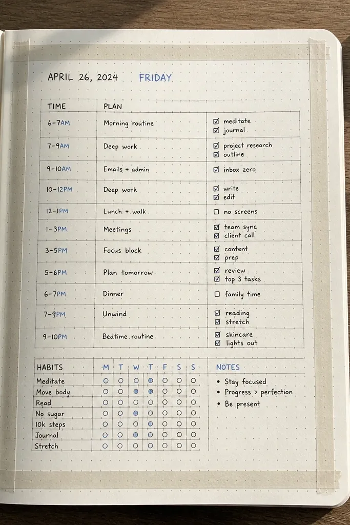
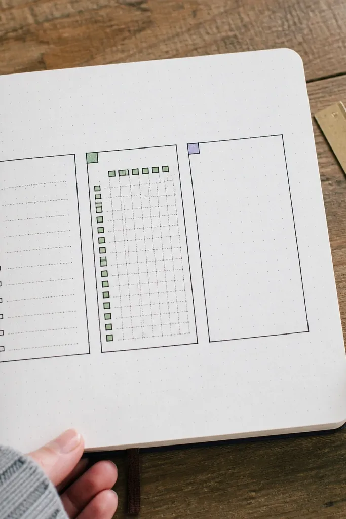
Start with an 8.5 x 11 sheet or an A5 notebook page laid flat. Mark a light pencil rectangle for the inner writing area, leaving about 0.5 inch margins on all sides. Cut 4 tape strips for the top, bottom, left, and right, and press them down with a burnishing tool or a credit card edge. Then draw your grid inside the tape using a 0.5 or 0.7 pen and add three small icon boxes at the corners for quick mood or focus notes.
This one is for when you want “designed” pages without spending an hour. Tape frames give you instant borders, make your handwriting look intentional, and create strong photo contrast. Use a simple grid inside each frame so the page always looks organized even when your day is not. It works best for daily logs, habits, and meal tracking because you can reuse the same layout over and over. Skill level is beginner and the first page takes about 15 to 25 minutes.
AvoidDon’t stack tape overlaps at the corners — it looks bulky and lifts over time.
Pro tipUse washi tape that has a matte finish so it doesn’t glare in photos.
2. Watercolor Wash + Line Checklist Spread
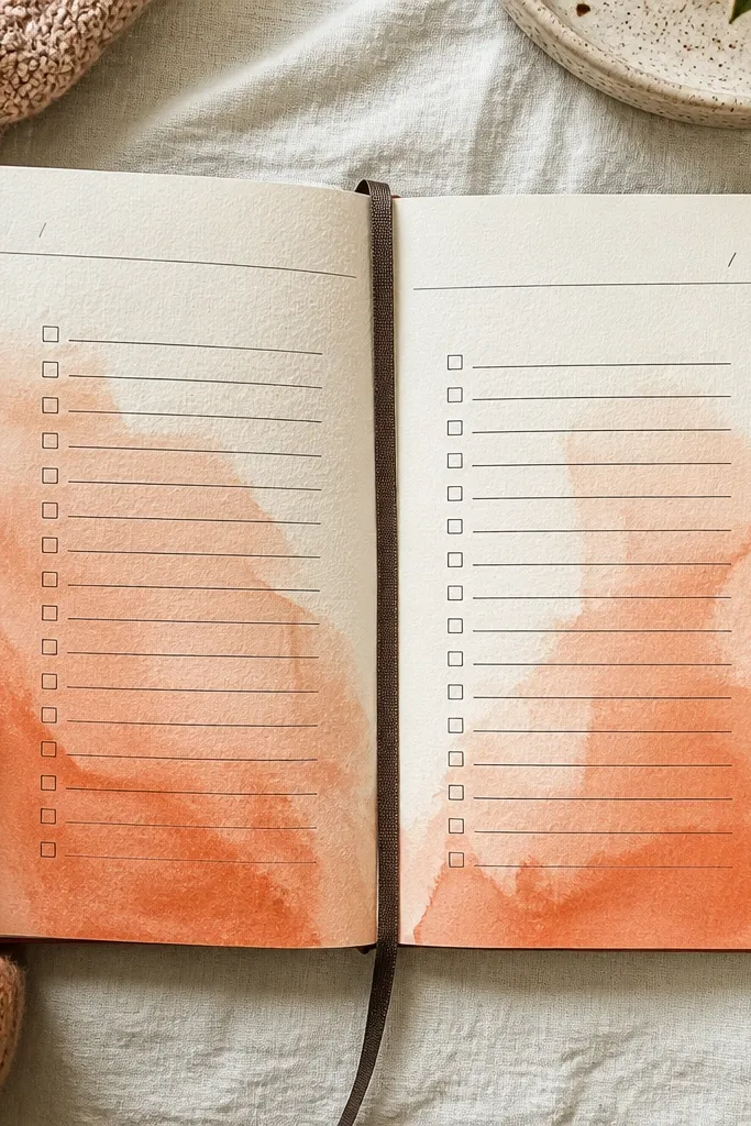
This is the fastest way to make a page look artsy while still being practical. A watercolor wash creates that soft, cloudy background that makes your black lines pop. Then the checklist keeps the page useful so you actually fill it. Choose one color family per page — like terracotta with a warm gray pen — so your journal stays cohesive. It suits weekly planning, reading logs, and “things to do before Friday” pages. Expect about 25 to 40 minutes including drying time.
Wet the page lightly with clean water using a flat brush, then paint a loose watercolor wash across the top half or full page. Keep the wash thin at first so the paper doesn’t buckle — let it dry completely. Once dry, use a black fineliner to draw 6 to 10 checklist lines with consistent spacing. Add a date header and a small color key box in the corner using the same watercolor color but in a darker tint.
Test your paint on scrap paper first to see how much it bleeds on your paper type.
Skip heavy water — warping makes the lines look uneven when you write on top.
3. Stenciled Quote Header with Color Block Underline
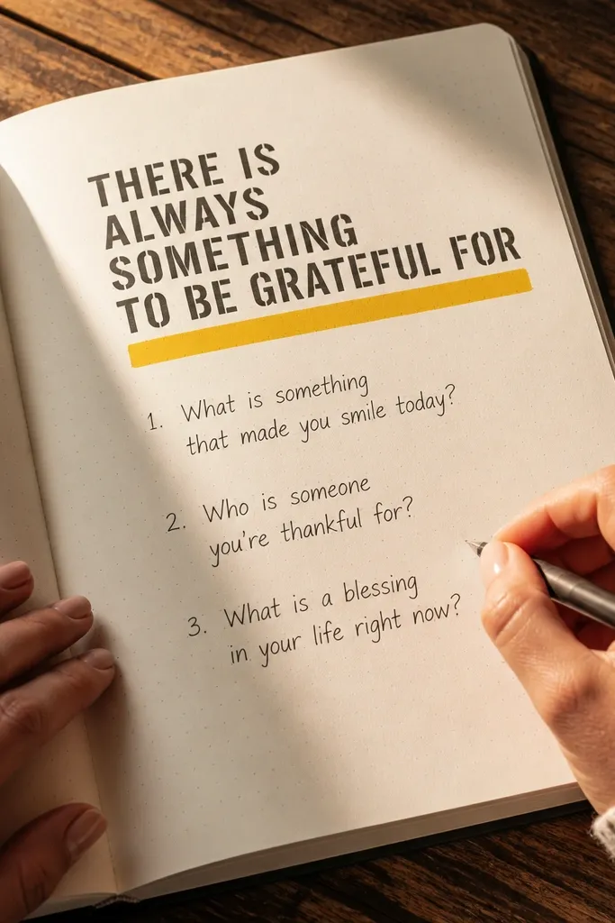
Pick a stencil font you like and place it at the top margin of your page. Use stencil brush strokes or a foam dauber with acrylic ink or pigment ink so the edges stay sharp. Let the stencil ink dry, then write or print your journal prompt under it in normal handwriting. Finish by painting or marker-filling a thick underline strip — about 1 inch tall — directly under the header, staying within the page width.
If your journal pages look good only at the top and messy everywhere else, this fixes that. A stenciled header gives you crisp letter shapes, and a thick color block underline anchors the page visually. It’s great for “one thought a day,” gratitude entries, or journaling prompts because the header becomes a repeatable brand for your journal. You get a polished look even with messy handwriting. This is a 20 to 35 minute project for one spread.
AvoidDon’t use gel pen for stencil ink — it smears and ruins the clean border.
Pro tipUse painter’s tape to mask the underline edges so the color block stays straight.
4. Collage Pocket Page with Ticket and Fabric Tabs
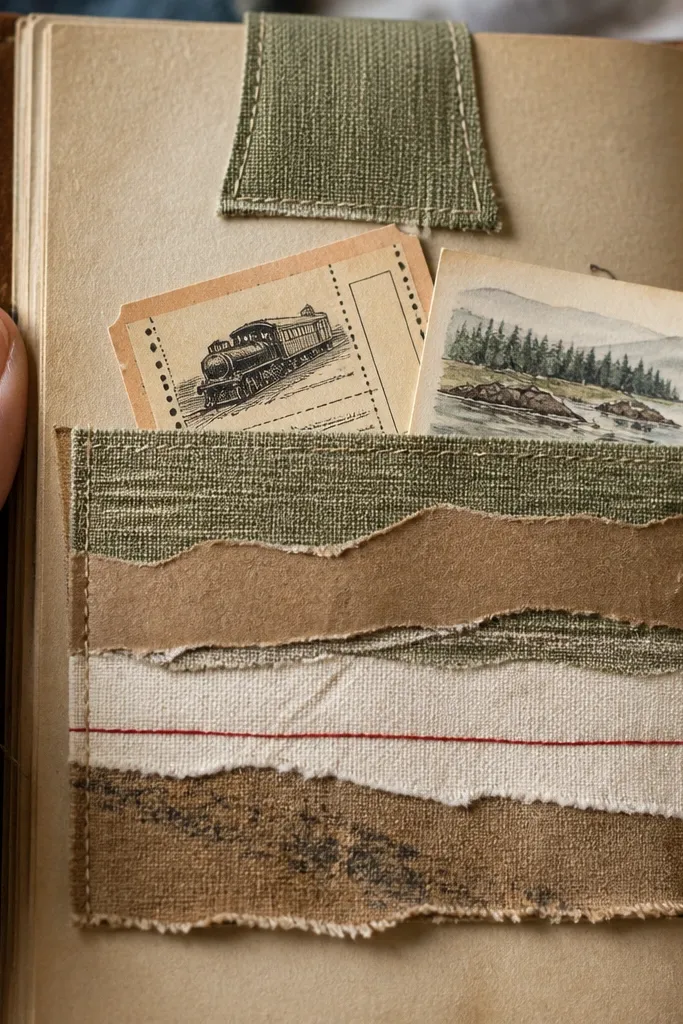
Cut a pocket from cardstock — a common size is about 4 x 6 inches, leaving a 0.25 inch margin on the sides. Score a fold along the top edge and glue the sides and bottom with archival glue. Reinforce the pocket opening with a strip of washi tape on the inside so it doesn’t peel. Then add fabric tabs by gluing small fabric rectangles onto the pocket front so they stick out about 0.5 to 0.75 inch.
This is the photogenic journal page that looks like a scrapbook without turning into clutter. A pocket holds small keepsakes, and fabric tabs add texture that shows up in photos. The pockets also solve a common problem: where do you put receipts, notes, and tiny cards? Use this for travel memories, event notes, or “wins of the week” receipts. It looks best when you keep the pocket size consistent and the materials in a tight palette. Plan about 45 to 60 minutes for a first pocket page.
AvoidDon’t overload the pocket with mixed sizes — the page stops looking intentional.
Pro tipUse a bone folder on the pocket fold so it stays crisp and flat.
5. Pressed Leaf Corner with Inked Veins
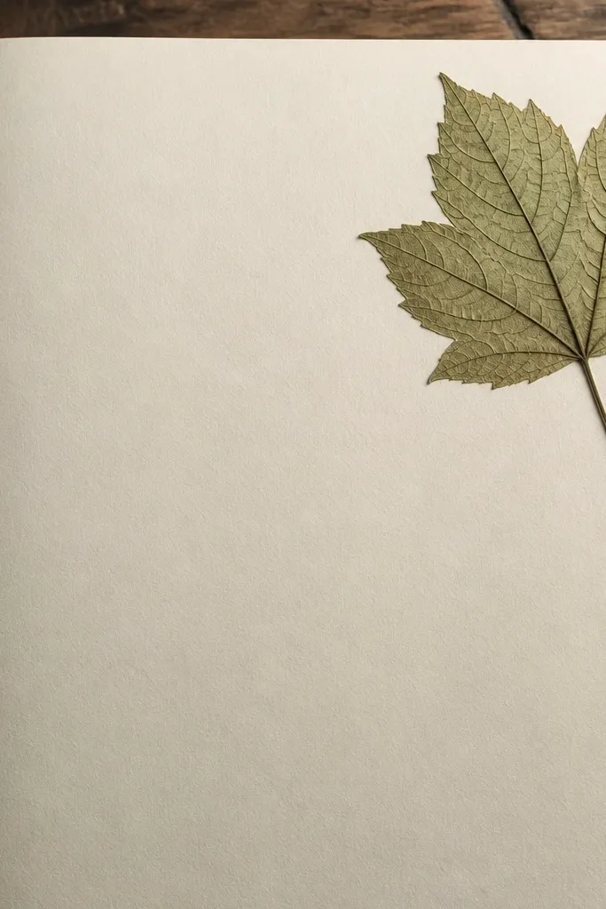
Press a leaf between clean sheets with a heavy book for at least 24 hours. Once dry, place it in a corner of your page and trace around it lightly with pencil. Ink the leaf veins using a fine brush and diluted ink, then glue the leaf down with a tiny amount of archival glue under the edges. Let everything dry fully before closing the notebook so the page doesn’t stick.
If you like nature aesthetics but hate messy glue, this gives you controlled detail. The pressed leaf sits in a corner, and inked veins make it look deliberate instead of random. You get a strong composition rule: one subject, one placement, and lots of negative space. This is perfect for journaling reflections, seasonal notes, and “what I noticed today” prompts. Skill level is easy to moderate, mostly about drying time. Give it about 1 to 2 days if you need to press the leaf, or use already-pressed leaves.
AvoidDon’t glue the center — it can wrinkle and make the leaf lift.
Pro tipChoose flat leaves like small fern or clover shapes for the cleanest pressed look.
6. Photo Booth Strip Mood Tracker
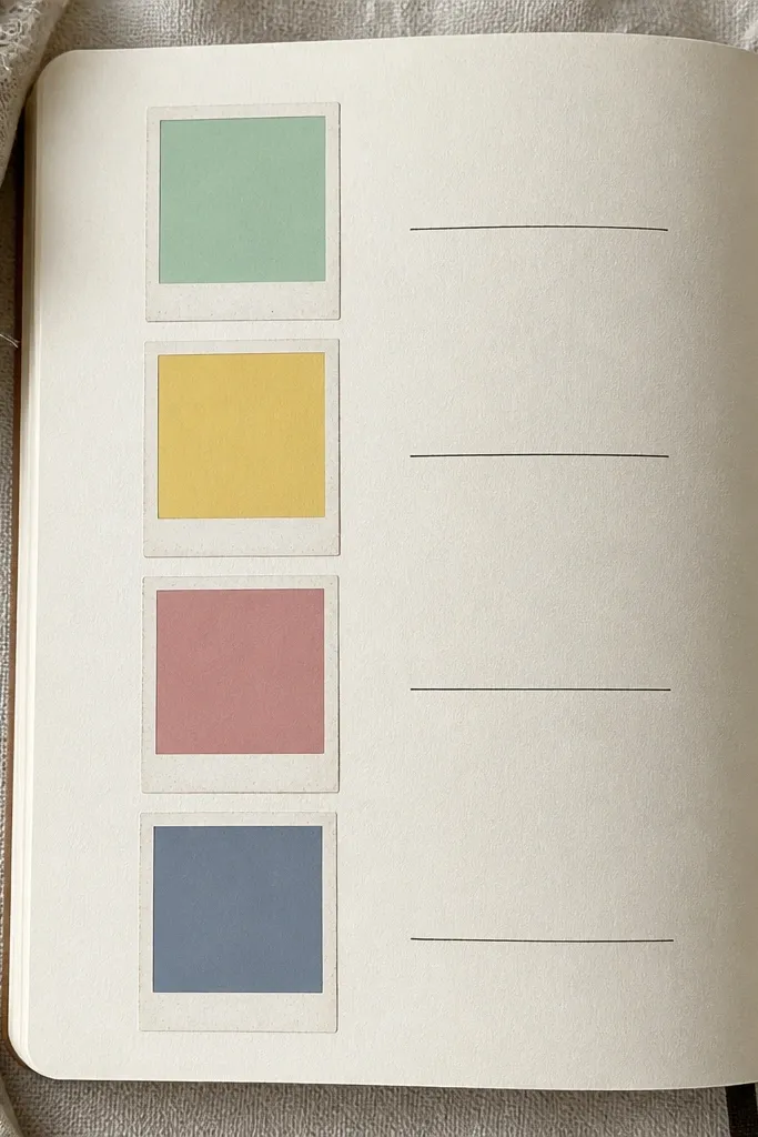
Choose 5 to 7 mood colors and create a key on the side using a small colored swatch. Draw a strip of small rectangles across the page, about 0.75 inch wide each, and label them with dates in tiny writing. Fill each rectangle with colored pencil or brush marker, keeping the edges crisp. Add a small caption line under the strip for one sentence about what drove the mood.
This one makes mood tracking actually fun because it looks like a mini gallery. Instead of writing long sentences, you fill small color squares that represent how your day felt. It’s photogenic because the strip is aligned and the colors create a clear pattern over time. Use it for daily moods, energy levels, or focus rating. It works in any notebook size, but A5 looks especially cute. Time is 15 to 25 minutes per week spread.
AvoidDon’t mix too many colors in one week — it turns into a rainbow mess.
Pro tipUse a ruler for rectangle spacing — the whole look depends on alignment.
7. Monochrome Ink Blot Background with White Pen Notes
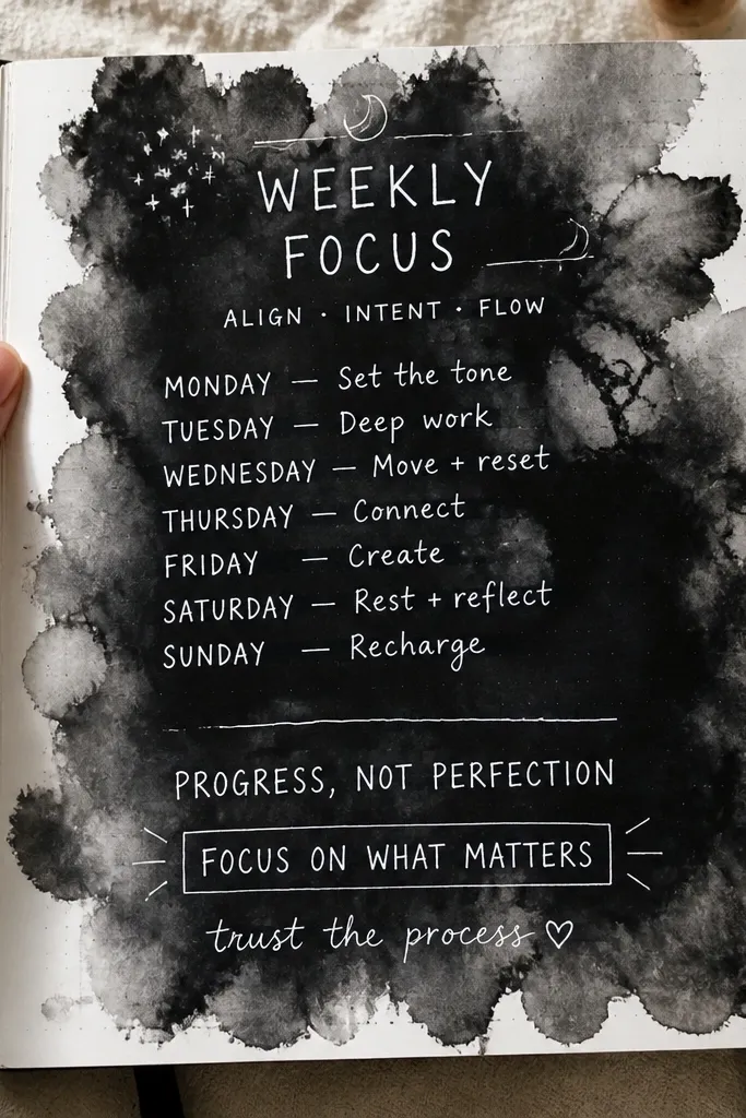
Drop black ink onto the page and tilt gently to spread it, then stop before it covers the whole page. Use paper towels to pull ink edges into a clean shape. Let the ink dry fully, then write your prompt and notes using a white gel pen or white acrylic marker. Add one small underline or box around a key line so it reads clearly.
Monochrome looks expensive fast. Ink blots create texture and depth, and white gel pen gives you that crisp, high-contrast handwriting that pops in photos. This idea is great for journaling prompts, weekly themes, and “things I’m thinking about” pages. The look is bold without being cluttered, because the blot is one big shape and the text is limited. It takes about 20 to 30 minutes including drying.
AvoidDon’t write on wet ink — the white pen will drag and look dull.
Pro tipLayer ink in thin passes instead of flooding — thick ink takes longer to dry and smears.
8. Fabric Texture Border with Stitch-Look Dots
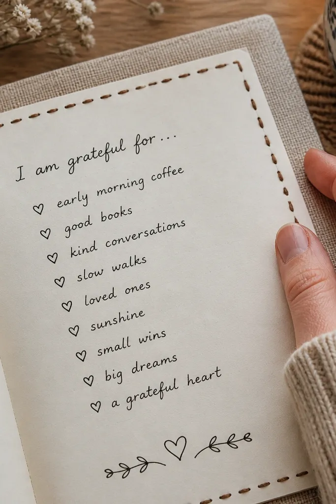
Pick a cotton fabric strip about 0.75 inch wide, and cut it to match the page width. Glue it along the left and right edges using a thin archival glue layer, pressing flat with a ruler. Add stitch-look dots by tapping a small dot tool or cotton swab with black acrylic paint along the fabric edge at regular intervals. Finally, draw your inner layout with a dark pen so the border stays the star.
This is for a cozy, tactile aesthetic that still photographs cleanly. A fabric border gives you real texture, and stitch-look dots make it look hand-sewn. You get a consistent frame around whichever layout you use inside — gratitude list, reading notes, or a weekly review. It’s also a practical way to hide imperfect notebook edges. Skill level is beginner and you can finish a page in about 30 to 45 minutes.
AvoidSkip stretchy knits — they warp and make the border look wavy.
Pro tipTrim fabric corners at a slight angle so the border doesn’t bunch at the bottom.
9. Shaker Card Style "Thought Box" Page
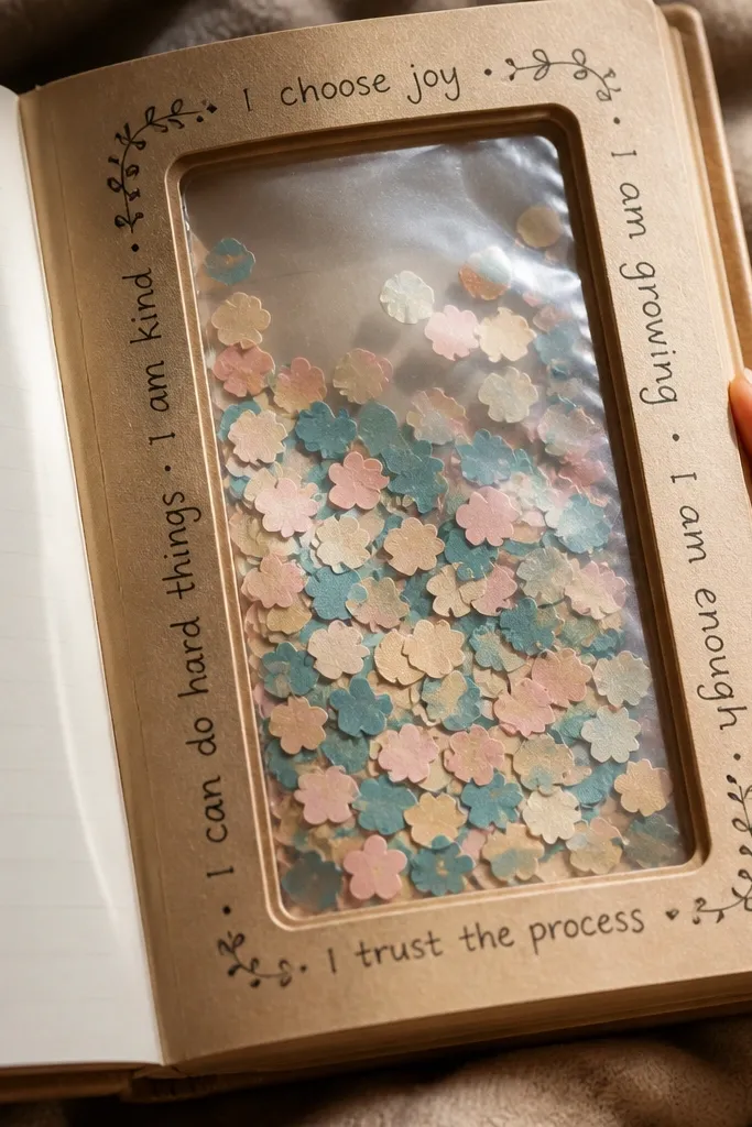
Cut a window frame from cardstock and glue it to the page where you want the box. Cut a clear plastic sheet slightly larger than the opening, then glue it to the back of the frame so it forms a sealed pocket. Add small paper pieces inside the pocket before sealing the last edge. Use a pen to label the box with a short title like “Today’s thought” and keep the surrounding text minimal.
A shaker-style box makes journaling feel interactive and it’s extremely photogenic. You place a clear window on the page, fill it with tiny cutouts or paper confetti, and write around it. It fixes the problem of “my journal is static” because the box adds movement and texture. Use it for intentions, mood themes, or a “current obsession” page. Time is moderate: 60 to 90 minutes for a clean first attempt.
AvoidDon’t overfill the box — it looks messy and the window fingerprints show.
Pro tipUse thin plastic from a report cover so it stays flat and doesn’t crinkle.
10. Hand-Drawn Topographic Lines for Weekly Themes
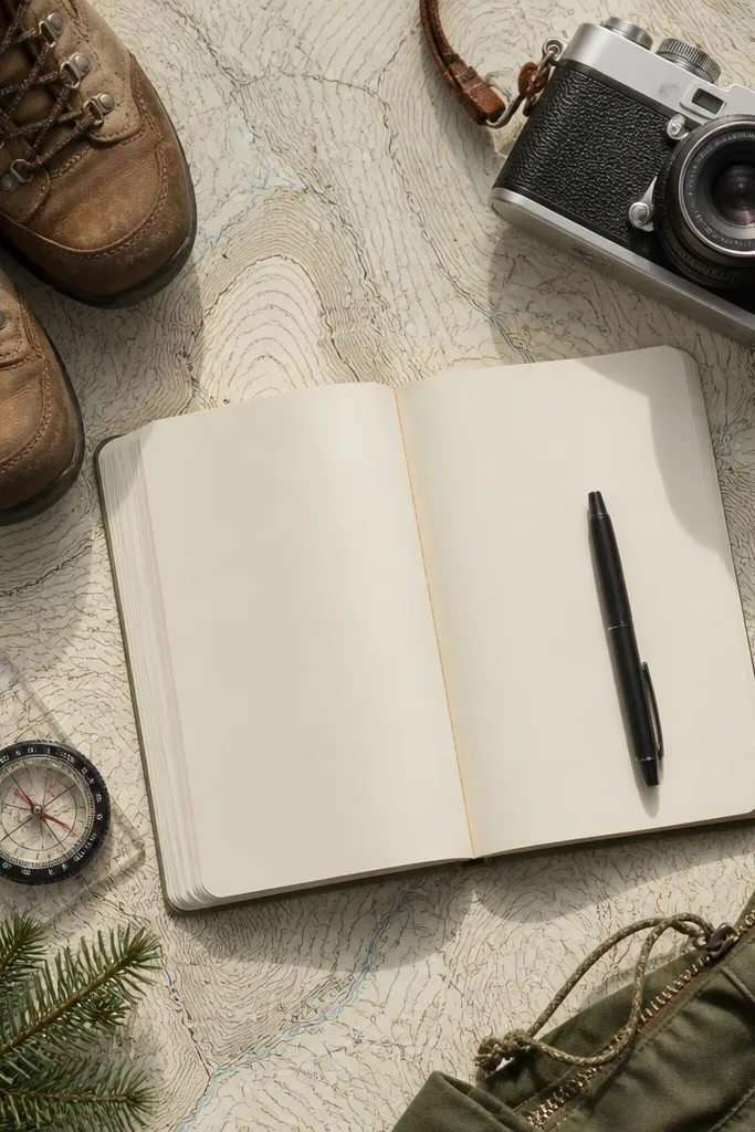
Topographic lines make your pages look like art prints. The best part is you don’t need to be good at drawing — you just repeat curved lines that follow a few anchor shapes. Use this for weekly themes, goals, or a “what changed this week” page because the lines create a sense of movement. It looks amazing in monochrome ink or one accent color. Plan about 30 to 50 minutes per page.
Draw a simple blob or hill shape in the middle of the page with a light pencil. Starting from the edges, draw contour lines around it, spacing them evenly at about 0.1 to 0.2 inch. Use one pen size for the lines and a thicker pen for the outer border. Color one or two contour bands lightly with watercolor pencil for a clean accent.
Keep the line spacing consistent — that’s what makes it look like a real topo map.
Don’t add too many different shapes — one main form keeps it photogenic.
11. Gouache Color Blocks with Tiny Calendar Grid
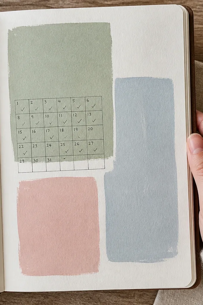
Gouache has a matte, velvety look that makes pages feel designed right away. Color blocks give you structure, and a tiny calendar grid keeps it useful without crowding the page. This idea works for planning, habit tracking, and “what I want to remember” lists. Choose 3 to 5 pastel blocks and one dark pen so the page stays readable and photo-friendly. Time is 25 to 40 minutes for the first layout plus drying.
Paint 3 to 5 rectangular gouache blocks across the page, leaving white space between them. Keep each block about 1.5 to 2 inches tall and let it dry fully. Draw a small calendar grid under each block or in one corner, using consistent row heights. Write dates and 1-line notes inside the grid cells using a dark fineliner.
Thin gouache with water in a separate cup so your first block doesn’t go patchy.
Don’t use glossy paints — glare ruins the clean matte look.
12. Dot Grid Art Page with Rainbow Margins
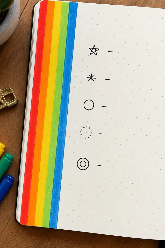
Dot grid paper is already aesthetic, and a rainbow margin turns it into a statement page. You use the dots to place shapes — circles, stars, or tiny squares — so everything looks neat even when you’re quick. The rainbow strip gives you a clear focal point, and the dot grid keeps your writing straight. This suits creative prompts, reading trackers, and “brain dump with structure” pages. Time is 20 to 35 minutes.
Use dot grid paper or add dots with a template and light pencil spacing. Draw a margin strip along one side and mark 6 to 8 equal color sections. Fill each section with marker or colored pencil stripes, keeping the edges tight to the dots. Then create your main content in the open area using dotted placements — like a row of repeated icons or a mini constellation made of circles.
Use pencil first for placement, then go over with pen so you don’t scratch the paper.
Don’t let the rainbow section get too thick — keep it narrow so the content still reads.
13. Sticker Layering Map with Clear Tape Overlays
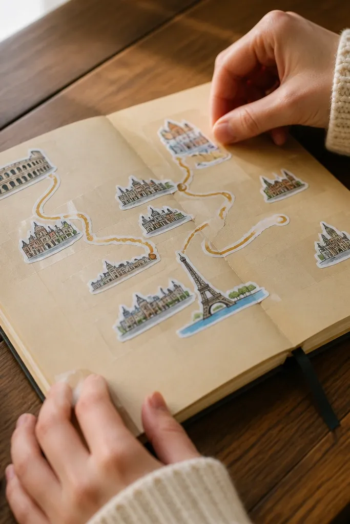
Sticker layering looks good when it’s planned like a map. Put stickers in a few zones, then seal the edges with clear tape so everything looks crisp instead of peeling. This idea is great for travel journals, learning logs, and “monthly theme” pages because stickers naturally represent places and categories. It also solves a common issue: sticker edges curl and ruin the clean look. Time is 35 to 60 minutes.
Sketch a simple map layout on the page using pencil — like a top, middle, and bottom area. Place stickers within those zones, leaving breathing room between them. Cut clear tape strips and press them over sticker edges, trimming flush with scissors. Add one dark pen line connecting the zones, like a route path, then write a short legend key for labels.
Use matte clear tape if you have it — it reduces glare compared to glossy tape.
Don’t cover the whole page with tape — it turns shiny and busy.
14. Photo Corner Journal Layout with Caption Lines
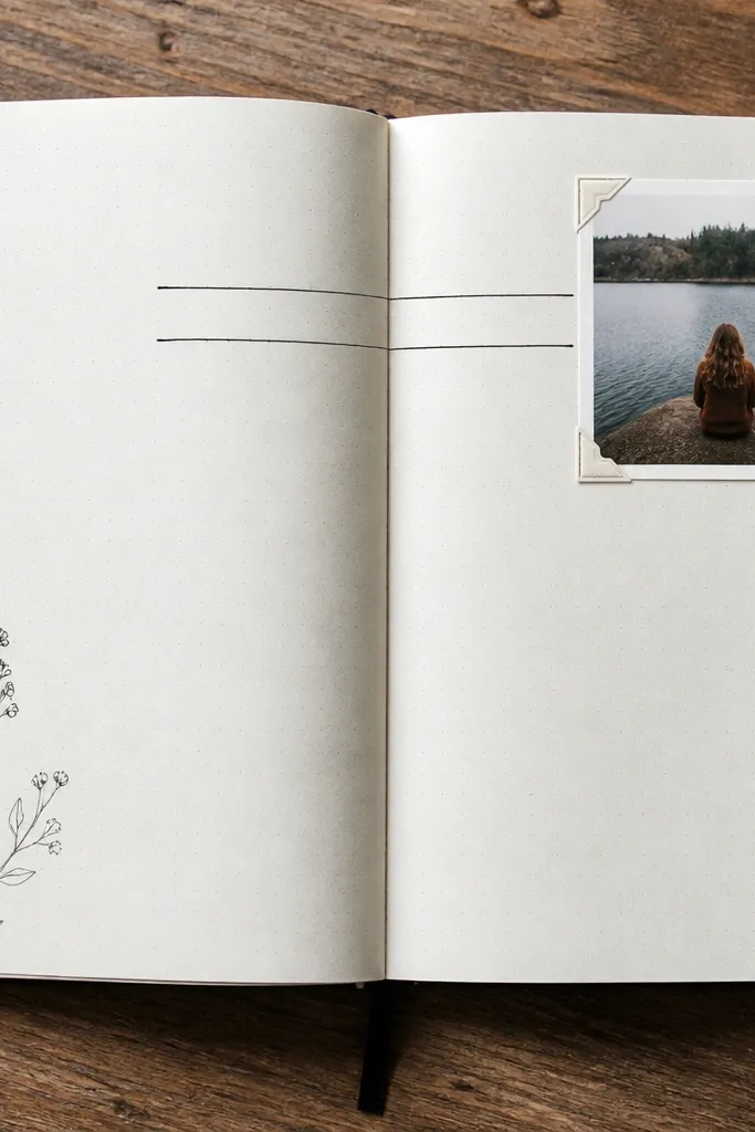
Print or cut a small photo to about 2 x 3 inches. Place it in the top corner and glue it down with a thin layer of glue stick or archival tape around the edges. Draw 3 to 5 caption lines below the photo using a ruler so they’re perfectly straight. Add a short title above the lines and keep the rest of the page open for handwriting.
Photo corners make pages look like a magazine spread with almost no work. You place a small photo or printed image into a corner, then build the rest of the page around clean caption lines. It’s perfect for journaling events, sketches, and “things I saw” collections. The look stays consistent across entries, so your journal looks cohesive when you flip back. Time is 25 to 40 minutes per page.
AvoidDon’t choose photos with busy backgrounds — the caption lines get lost.
Pro tipUse a white gel pen to add tiny doodles on the photo edges so it blends more cleanly.
15. Neon Highlight Border with Black Pen Checklist
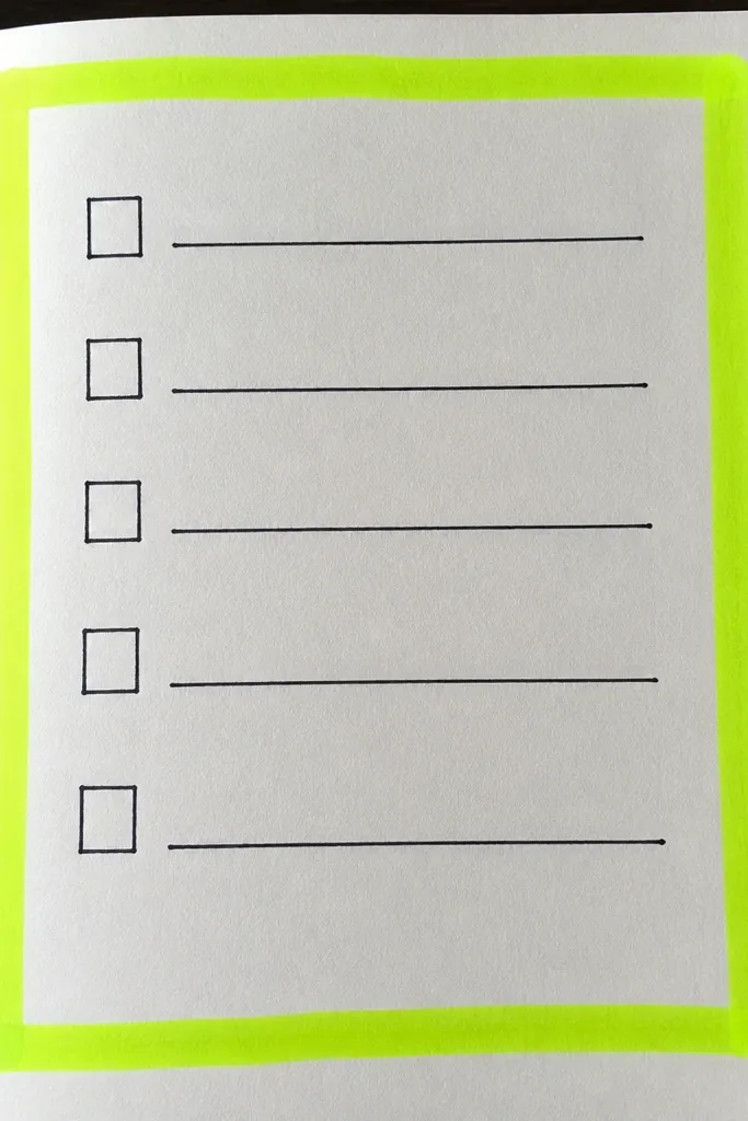
Draw a rectangle border in pencil about 0.5 inch from the page edges. Go over it with neon highlighter or neon marker, staying inside the pencil lines. Use black fineliner to add 7 to 12 checklist items in the center, with consistent spacing. Finish by writing the date in small caps at the top inside the border for a clean layout.
Neon borders are loud in the best way, and they make pages look instantly current and high-contrast. The trick is to keep the inside layout simple — a black checklist or a short list of prompts. This gives you a strong focal frame without making the page unreadable. It works for daily tasks, study sessions, and “tomorrow plan” pages. Skill level is beginner, and you can finish a page in about 15 to 25 minutes.
AvoidSkip thick borders on small pages — it eats space and makes text cramped.
Pro tipLet neon ink dry fully before you write — it smears if you stack ink layers too fast.



