

1. Washi Tape Frame + One-Question Box
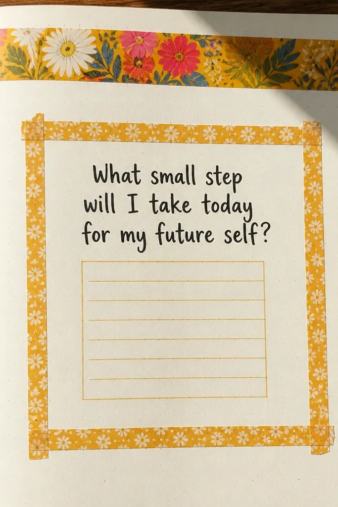
This layout is for days when you want the page to look finished even if you write only a few lines. The tape frame gives you instant structure, and the one-question box keeps your brain from spiraling into blank-page editing. Use a bright header tape for the top edge, then build a simple rectangle in the middle. The contrast between the taped border and the clean writing area makes the page look tidy and photo-ready.
Start by drawing a light pencil rectangle about 1 inch from the tape edges, sized to fit your usual writing lines. Apply washi tape along the top, left, right, then bottom edges of that rectangle, pressing down firmly so the corners sit flat. Write a single prompt in the center box, like “What mattered today?” Then answer in 3-6 short lines using one pen color for the prompt and another for your answer.
Cut washi tape with a craft knife on a cutting mat so the edges stay crisp.
Don’t cover the whole page in tape — the writing area needs breathing room.
2. Torn Paper Corner + Date Stamp Strip
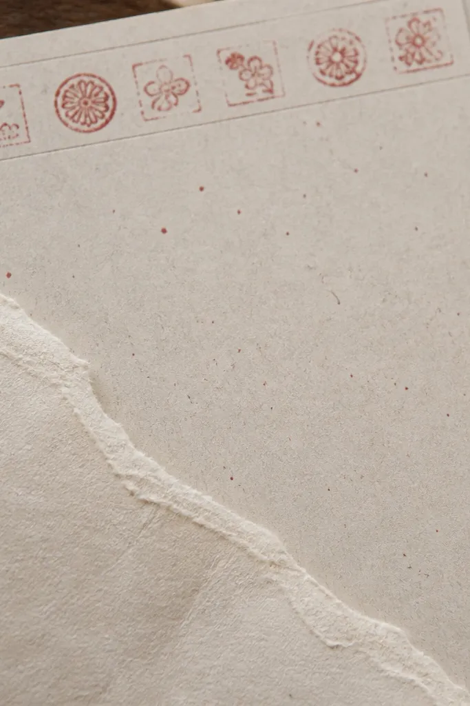
This one makes your journal look artsy without needing drawing skills. The torn paper corner creates texture and depth, while the date strip anchors the page so it looks consistent across entries. Choose paper in one theme color — like cream with red specks — so the pages match your aesthetic. It’s also forgiving: if your handwriting isn’t straight, the torn edge draws the eye to the design instead.
Cut a small triangle or quarter-circle corner piece from patterned paper, then tear the edges by hand for a natural look. Place it in one top corner of the page and trace around it lightly with pencil so you can glue neatly. Glue the torn piece and let it dry under a book for 5-10 minutes. Then make a date strip across the top using a thin washi strip, writing the date in the center of the strip with a fine-tip marker.
Use matte glue stick for paper pieces so it doesn’t warp the page.
Don’t use glossy sticker paper for the corner — it reflects light and looks messy in photos.
3. 3-Color Habit Tracker Bars
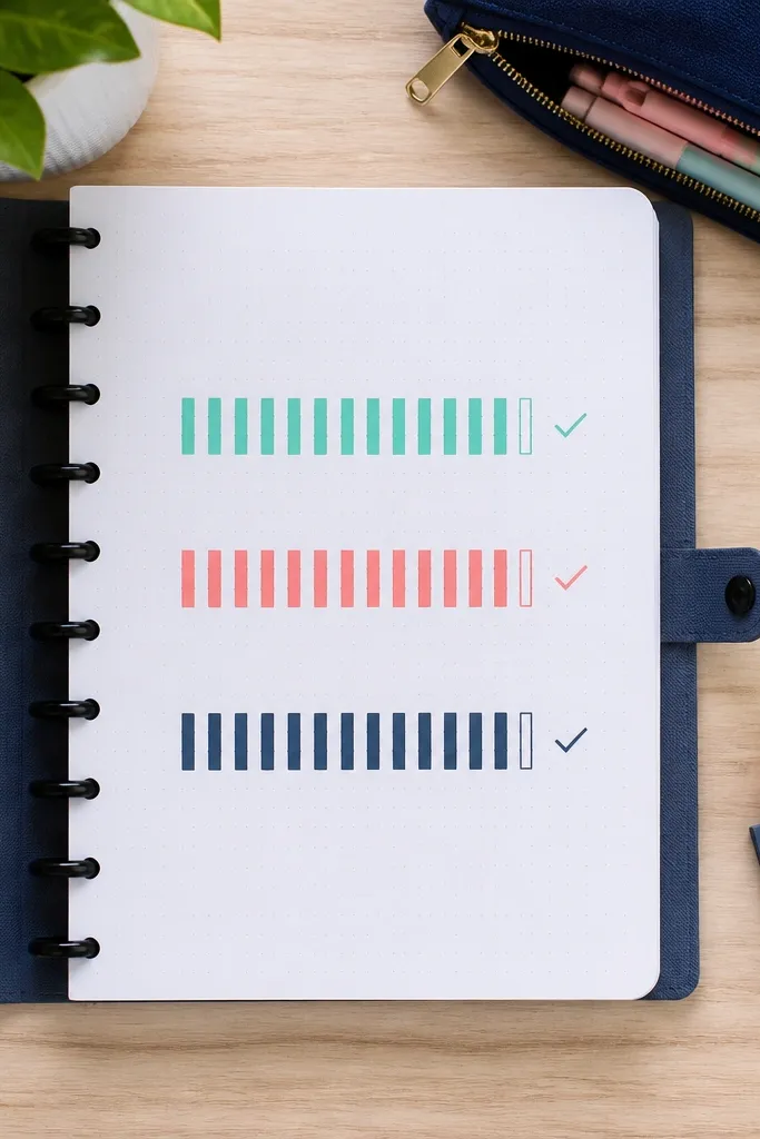
Habit trackers are the fastest path to consistency because they turn journaling into something you can complete quickly. This version looks clean and cute because it uses only three colors and simple bars instead of detailed grids. Each bar is a visual anchor, so you can flip back and instantly see patterns. It’s also great for small spaces since the whole tracker fits on a single page.
Pick three colors of pens or markers and decide which habit gets which color. Draw three horizontal bars across the page, leaving a small label area on the left for the habit names. Under each bar, add 7 or 14 tiny boxes (one per day) in a single row. Fill the boxes with a dot, check, or quick fill using the matching color, then write a one-sentence note at the bottom: “Best habit today was ___.”
Pro tipMake the boxes with a ruler using 1/4-inch spacing so your rows stay aligned.
AvoidDon’t use more than three colors — the page stops looking cute and starts looking busy.
4. Sticker-Only Title Header
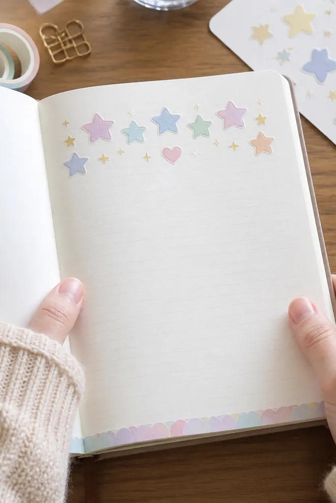
This is a cheat code for consistency: your title is done before you write a single word. Sticker headers look adorable, hide uneven lettering, and instantly make the page feel “designed.” Use one sticker set with a consistent style — like pastel icons or simple script — so the journal looks cohesive. Then you get a clean writing block underneath for your actual entry.
Choose 4-8 small stickers that form a word or short phrase, like “Daily Notes” or “Brain Dump.” Arrange them across the top margin, then lightly pencil the final line so you can place them straight. Press them down firmly, then add a thin line under the stickers with a fineliner to separate header from entry. Write your date and 5 bullet points in the writing area using one pen color.
Pro tipAdd a single underline with a black gel pen to make sticker colors pop.
AvoidDon’t stack stickers over too much texture — you’ll get lift-off edges later.
5. Polaroid Frame Photo Journal Block
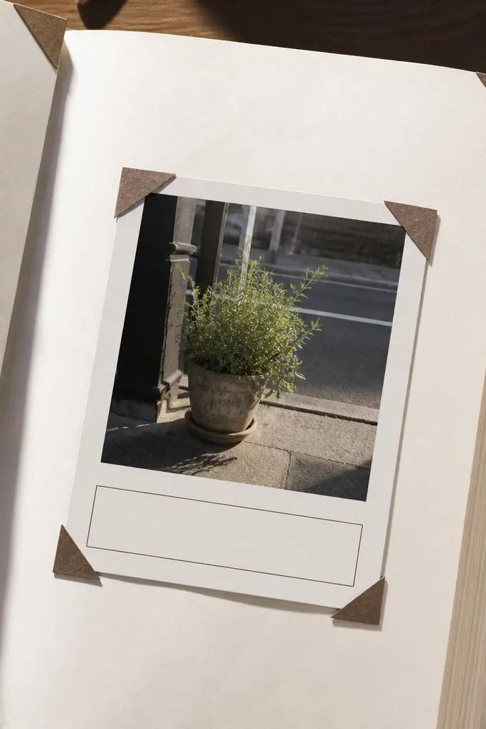
If you want your journal to look good even when you’re not in the mood, use a photo block. A simple faux polaroid frame gives you a clear visual focal point, and the caption box tells your brain what to write. It’s also one of the easiest ways to make the journal feel personal without doing big art. The frame style is photogenic because it creates a clean rectangle with a border.
Cut a 3x4 inch rectangle from cardstock or thick printer paper and trim it to a polaroid shape by adding a 1 inch caption area at the bottom. Draw a thin border around it with a pencil, then ink it with a black marker. Glue the frame onto the page and tape a small photo or printed image inside using two pieces of washi at the top corners. Write a caption in the bottom caption area: 1 sentence about what you noticed.
Pro tipUse double-sided tape for photos so the edges stay flat in photos.
AvoidDon’t glue the photo directly if you want flexibility — tape lets you swap later.
6. Corner Doodle Border With One Theme Icon
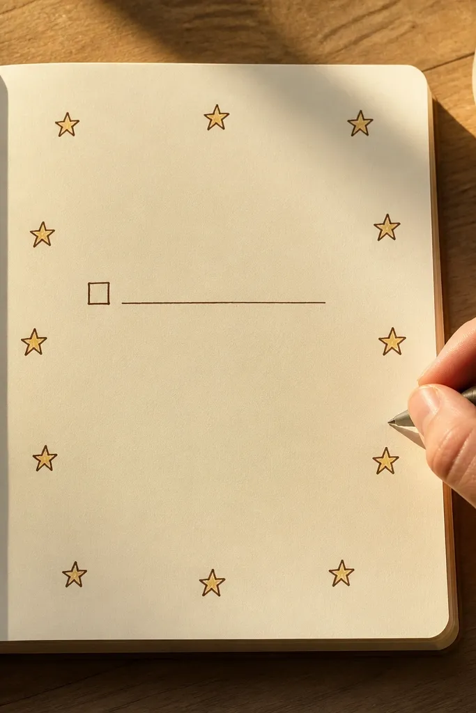
This idea looks cute because it frames the page without covering your writing space. Repeating one tiny icon — like hearts, stars, or flowers — makes the page feel intentional even if your doodles are simple. Choose one theme icon and repeat it 8-12 times around the margins. The result is a “designed” page that still leaves room for real journaling.
Pick one icon and draw it small in each corner of the page margin area using a fineliner. Then add 2-4 icons on each side, spaced evenly with pencil first. Trace over pencil lightly so the final line stays consistent. Finally, write your entry title in the top center and keep the rest of the page open for free writing.
Pro tipIf your hand shakes, sketch the icon lightly in pencil, then ink only the final line.
AvoidDon’t vary the icon style — mixing doodle types makes the page look random.
7. Notebook Paper Cutout Collage Strip
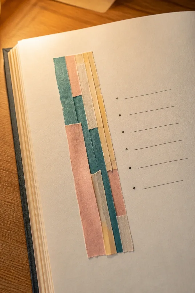
Cut paper strips create instant texture and color blocking with almost zero skill. The trick is to keep the collage to one narrow strip so the rest of the page stays calm. This makes the layout photogenic because the eye lands on the color strip first, then reads your entry. It also works well for “what I did / how I felt” because you can write in a clean block next to it.
Cut 5-7 rectangles from scrap paper or old wrapping paper in 2-3 colors, keeping them roughly the same width (about 1 inch). Tear or hand-cut one long edge for a lived-in look, then glue them into a vertical column on the left side of the page. Use a ruler to keep the column straight. On the right side, write two headers: “Did:” and “Felt:” with short bullet points under each.
Pro tipUse a glue stick and press for 20 seconds per piece so edges don’t lift.
AvoidDon’t make the strip too wide — it steals space from your writing.
8. Gradient Highlighter Mood Bar
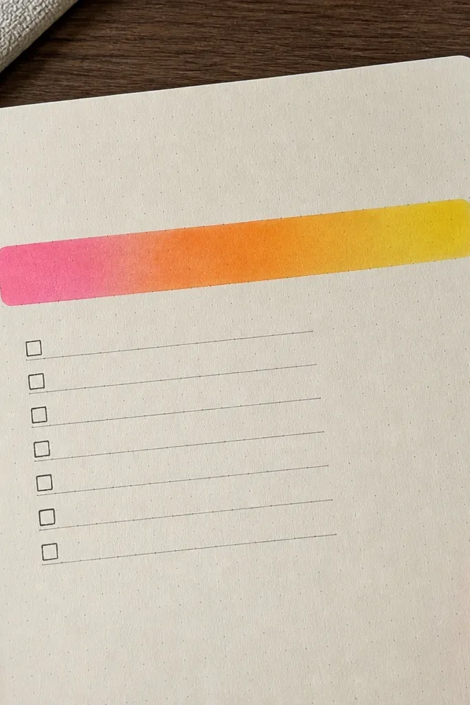
Mood tracking looks cute when it’s visual instead of list-based. A gradient bar turns “how I feel” into a color choice, so the page stays fast and pretty. Pick one highlighter color family, like pink to orange, and make a clean bar across the top third. It’s photogenic because the gradient reads clearly in photos and makes each day’s page look designed.
Draw a long rectangle across the top, about 1.5 inches tall and with 0.5 inch margins. Shade it with highlighter in segments using a ruler — for example, 6 segments from light to dark. Write the day’s mood label on the left of the bar: “Mood:” and add a one-word answer in the bar area. Finish with two short lines below: “Reason:” and “Next step:.”
Let the highlighter dry fully before you write over it to avoid smearing.
Don’t blend with your fingers — it turns patchy and dull in photos.
9. Lettering-Free Date Grid With Checkmarks
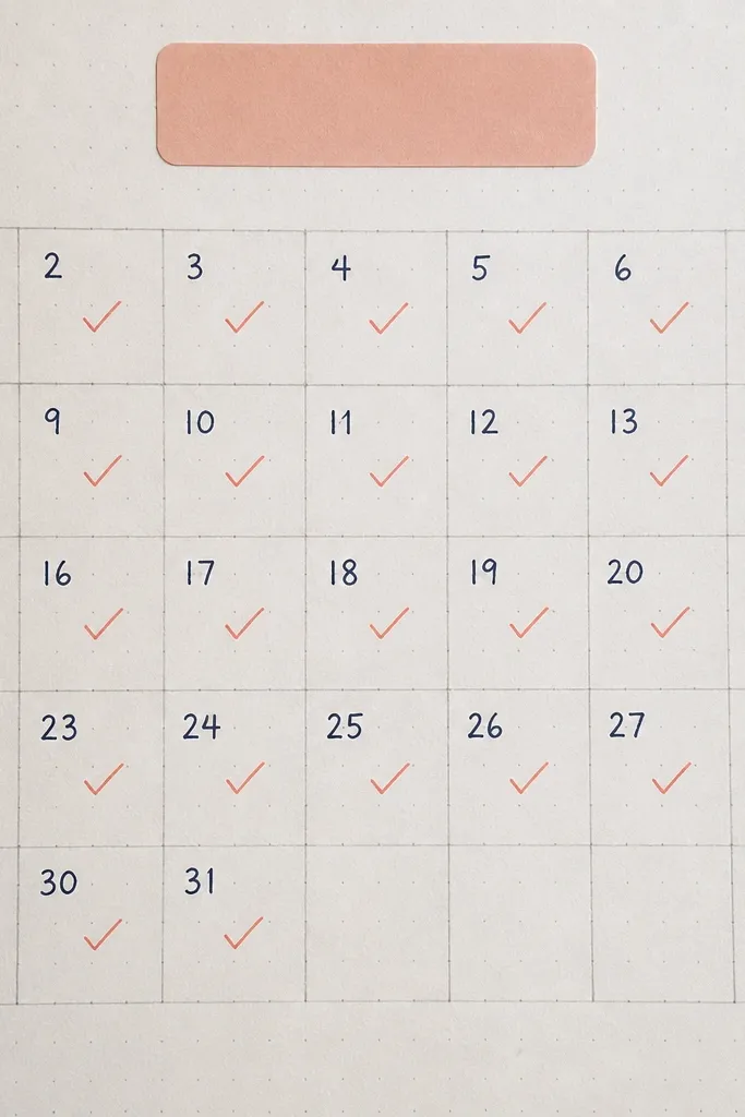
If you dislike fancy lettering, this keeps the page cute without relying on handwriting. A small date grid creates rhythm, and checkmarks make entries feel satisfying fast. Use a single pen color for the grid and a second color for checks. The page looks consistent across weeks, which helps you keep going because you’ll see progress immediately.
Draw a small grid in the top half, 4 columns by 5 rows, leaving space for labels above. Write the dates in tiny numbers using a ruler-guided light pencil first, then ink. Add a bold rectangle around the grid with a marker so it stands out. Under the grid, write one line: “Today’s win was ___.”
Use a mechanical pencil for the light date marks so erasing is clean.
Don’t overcrowd the grid — leave margins so it stays airy.
10. Coffee Stain Edge Paper Border
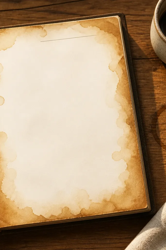
This idea adds an antique, cozy look with materials you already have. The coffee-stain edge gives warm tones and makes plain paper look intentional, which is perfect for aesthetic journaling. Keep the center clean so your writing stays readable. It’s also great for “night journal” entries because the warm edge makes the page feel calm on camera.
Lightly dampen the edges of plain printer paper or a page protector sheet with coffee using a cotton swab, then blot with a paper towel. Let it dry completely, then glue it or place it on top of a journal page. Add a thin black border line around the stained edge with a fineliner. Write your entry in the center, then add a small title with one icon sticker.
Pro tipUse cold brew coffee for a smoother, less blotchy look.
AvoidDon’t soak the whole page — heavy staining makes ink bleed.
11. Rainbow Washi Side Strip and Bullet Notes
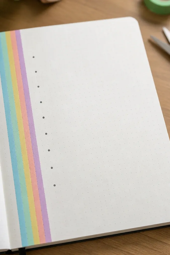
This is a clean, modern look that still feels playful. The side strip sets a strong visual line, so your bullets stay organized even when you write quickly. It’s one of the best formats for daily check-ins because you can keep the same structure every time. The page looks cute because the colors are concentrated in one place.
Choose 5 washi tapes in a rainbow-ish order and cut them into equal lengths for a vertical strip. Place the strip along the left margin, leaving about 0.75 inch for writing. Add a thin line next to the tape strip with a black pen to separate the design from the text. Write 4-7 bullet points using only one pen color, then add a tiny star next to your favorite line.
Pro tipPress the tape down with a ruler edge so it doesn’t curl at the edges.
AvoidDon’t mix tape patterns too much — keep it to similar thickness tapes.
12. Mini Timeline With Washi Milestones
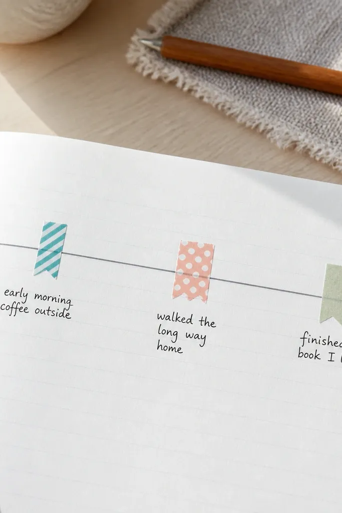
A mini timeline makes journaling feel organized without needing paragraphs. You get a clear, photogenic line across the page, then you mark moments with washi tape pieces. This format is great for busy days because you can jot down 3-5 moments and stop. It also looks good because the timeline line is a strong graphic element.
Draw a horizontal line across the middle of the page with a ruler. Add 4-5 small vertical tick marks and label them with times like “AM,” “Midday,” “Evening,” or specific hours. Cut small washi tape squares and place them over each tick mark like flags. Write one sentence under each flag describing what happened, keeping each line short.
Pro tipUse a single pen size for labels so the timeline stays crisp in photos.
AvoidDon’t write long paragraphs under each tick — it kills the clean look.
13. Half-Page Envelope for Receipts and Notes
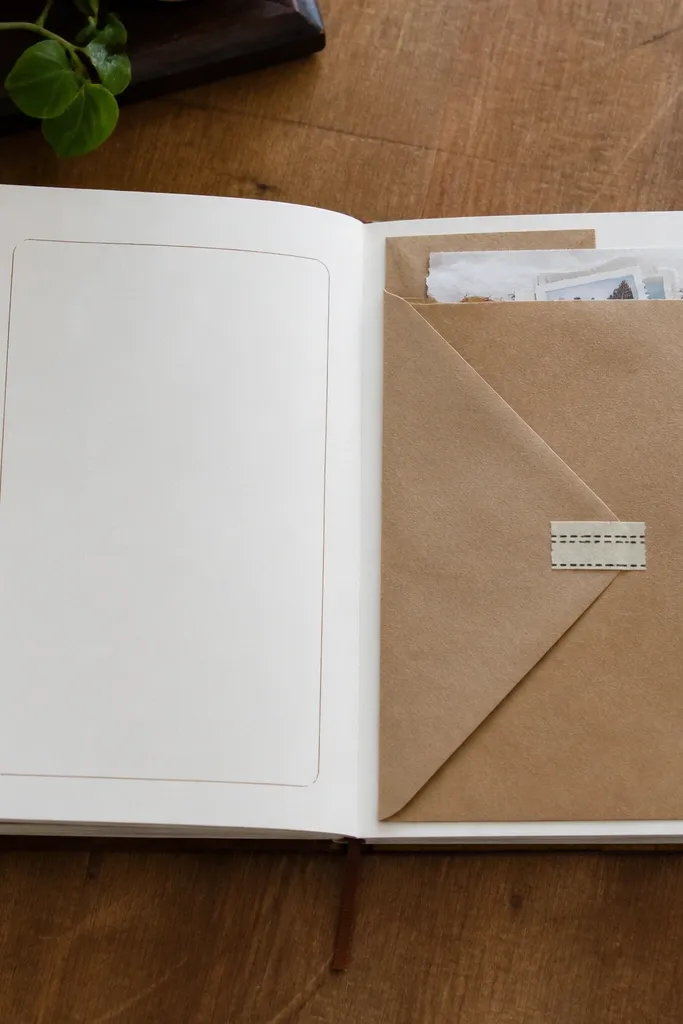
This one is practical and cute, which is why it keeps people consistent. The envelope flap gives you a place to store tiny receipts, ticket stubs, or scraps, so your journaling materials don’t pile up. It also makes your pages look layered and intentional. Pair it with a small writing box so you still get a complete entry, not just storage.
Fold a rectangle of cardstock or thick paper into an envelope shape on the right side of your journal page, with a 1 inch flap. Glue only the sides and bottom, leaving the top flap free. Add a closure tab with a small piece of washi or a paper clip. On the left side, write a title and 3 bullet points, then tuck the scraps into the envelope.
Use a bone folder or the back of a spoon to make sharp folds.
Don’t glue the flap — you need access to the contents.
14. Stamped Seed Paper Nameplate
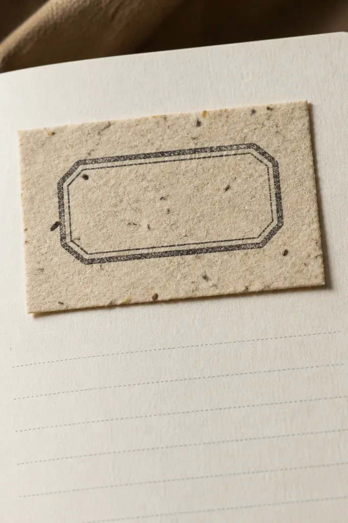
A nameplate makes each entry feel like part of a series. You stamp or label a small paper rectangle and glue it near the top, then write under it. It looks cute because it adds a distinct layer and a consistent spot for the date. If you struggle with consistency, this reduces the “what do I write first?” problem.
Cut a small rectangle from scrap cardstock about 2.5 x 1 inch. Stamp it with a simple word or icon using ink, or write with a thick marker if you don’t have stamps. Glue the rectangle near the top left, then draw a straight line across the page under it. Write your date and a short entry heading, then fill 6-10 lines in the space below.
Let stamp ink dry 2 minutes before you glue the piece to prevent smudges.
Don’t place it dead center — slightly off-center looks more intentional.
15. Scribble Corner + Clean Center Grid
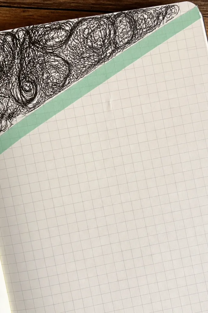
This layout uses a simple contrast trick: one messy-looking corner and a clean, grid-based writing center. The scribble corner adds energy and personality, while the center grid keeps your writing organized. It’s a great format for brain dumps because you can toss messy notes in the grid and keep them contained. The page photographs well because the grid is crisp against the scribble texture.
Draw a light pencil grid in the center area, like 3 columns by 6 rows with small boxes. Choose one corner and fill it with scribbles or squiggles using a darker pen. Add a small title above the grid in one sentence length. Write short phrases inside the grid boxes and leave the scribble corner as “free space” for doodles or tiny notes.
Pro tipUse a ruler for the grid, but freehand the scribble corner — that’s the contrast.
AvoidDon’t make the entire page grid-heavy — the scribble corner needs to stay the star.
16. Pastel Washi Checklists With Boxed Lines
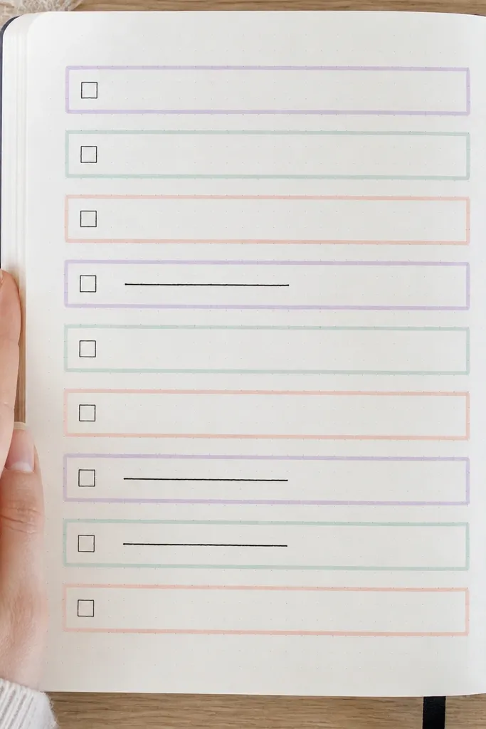
Checklists keep entries moving, and boxed lines keep them looking neat. This design uses washi to outline each checklist item, so you don’t need to draw perfect rectangles. The pastel vibe makes it cute without being childish. It also helps you stay consistent because you can complete a checklist in seconds.
Pick one pastel washi roll and cut 4-6 short strips to form mini borders around checklist areas. Place them in a column down the left side of the page, leaving a writing space on the right. For each item, write a checklist title next to the washi border and leave a small checkbox square at the end. Fill the checklist with short tasks, then add one sentence reflection at the bottom.
Use a fineliner for checkboxes so they stay sharp in photos.
Don’t use dark washi with light ink — the boxes won’t read.
17. Cutout Quote Tag + Bullet Reflection
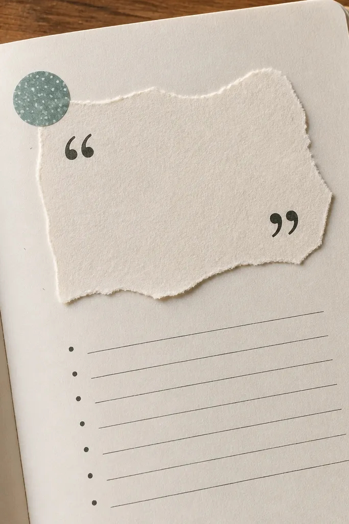
This layout makes journaling feel like a mini prompt card on your page. The cutout quote tag gives you a visual hook, and bullets keep your reflection quick. Choose a quote from a book you own or print a short line and cut it into a tag shape. The result looks styled because the tag adds a separate layer and a clear focal point.
Print or write a short quote line on scrap paper and cut it into a tag shape with rounded corners. Glue it near the top center and underline it with a thin marker line. Draw two short bullet sections below: “What I learned:” and “What I’ll do next:.” Keep each bullet to one sentence. Finish by adding a small doodle under the last bullet that matches the quote vibe.
Pro tipCut the tag slightly smaller than you think — it looks cleaner on camera.
AvoidDon’t write the quote in tiny font — it should read in a photo.
18. Bottom Border Washi + Top Title Only
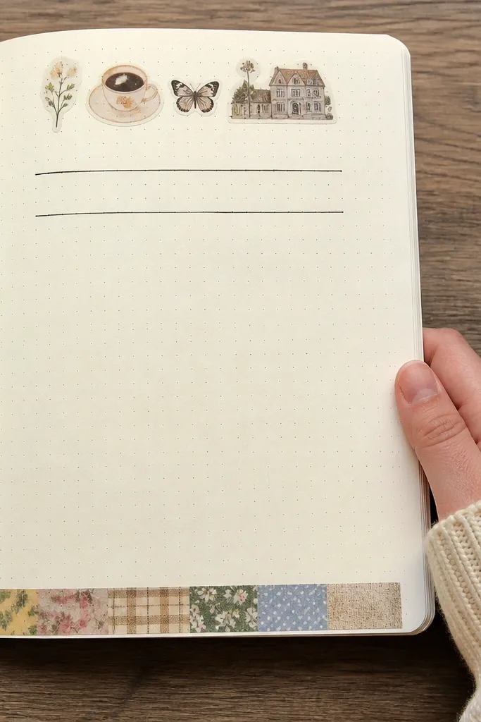
This is minimal but still cute, and that matters when you want consistency. The bottom washi border frames the page without stealing attention from your writing. A single top title keeps the layout consistent across days. If your handwriting is shaky, this layout hides it because the design is simple and the eye rests on clean lines.
Write a title at the top using one pen color, keeping it short like “Today’s Focus” or “Notes.” Add washi tape along the bottom edge of the page, using 2-3 pieces for a continuous border. Draw a thin line between the title and your writing area. Write your entry in paragraphs or bullets, but keep the writing within the middle area between the top title and bottom border.
Pro tipUse matte washi if you want less glare on photos.
AvoidDon’t add extra decorations — the simplicity is the look.
19. Stamp-Style Date Circle With Marker Outline
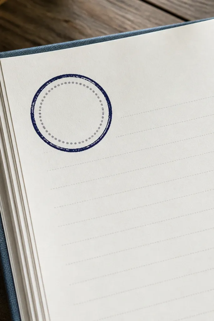
A date circle makes your page feel like a stamped artifact. It’s playful, and it turns the boring part — the date — into a design element. This layout works for daily entries because you repeat the same circle every time, which trains you to start writing quickly. The circle also helps you keep the rest of the page visually organized.
Write the date near the top center. Draw a circle around it using a compass if you have one, or trace a round object like a mug lid for a consistent size. Outline the circle with a bold marker, then add two small accent marks like stars at left and right. Under the circle, write your entry heading and fill the page with 5-12 lines.
Lightly pencil the circle first so you can adjust before inking.
Don’t make the circle too big — keep it compact so your entry has space.
20. One-Sheet Color Block Page With Labels
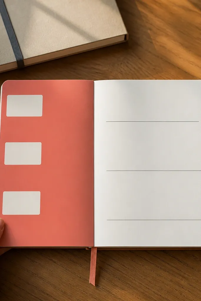
Color blocks make pages look designed even when the writing is simple. This setup uses one bold block for structure, then labels for the content so you don’t overthink. It’s perfect for tracking three things: a win, a worry, and a next step. The block creates strong contrast, which makes your journal look good in bright light and on camera.
Choose one solid color paper or cardstock. Cut it into a rectangle that covers about the top third of the page, leaving margins. Glue it down, then write labels directly on the color block in white gel pen or a contrasting ink. Below the block, draw three small lines or bullet points under labels like “Win,” “Worry,” and “Next.”
If your color block is dark, use a white gel pen for legibility.
Don’t pick a color that clashes with your pen color — contrast is the whole point.
21. Corner Photo Tape + Caption Lines
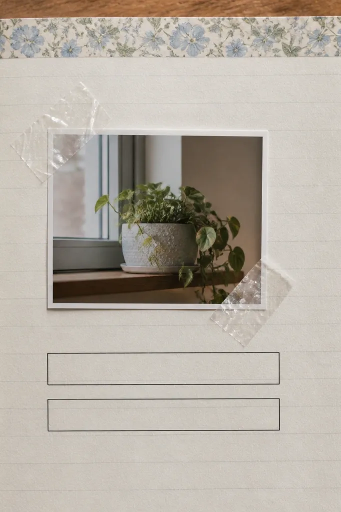
This is the easiest way to get that styled, scrapbook look without doing a full collage. Taping a small photo in the corner creates depth and makes the page feel personal. Two caption lines keep it fast, so you don’t spend 30 minutes arranging tiny pieces. The page stays clean because the photo is small and the writing area is clear.
Print or cut a small photo to about 2 x 2.5 inches. Place it in the top right corner of the journal page and tape only the top edge with two pieces of washi. Draw a short line under the photo and then add two caption lines with a ruler. Write a one-sentence caption and a second line for a detail you noticed.
Pro tipTape the photo edges only — it keeps the photo flat and less wrinkled.
AvoidDon’t tape the bottom edge — it lifts and looks messy in photos.
22. Folded Paper Pocket With Daily Prompt Card
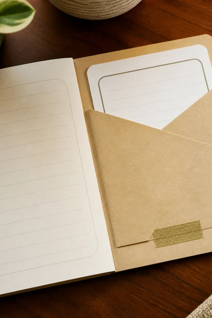
This idea is consistency engineering. The pocket holds a prompt card, so you never stare at a blank page wondering what to write. It also makes the journal look interactive and layered, which photographs really well. You can keep the cards short and repeat prompts if you want a simpler routine. The pocket makes the page feel like a system, not a one-off entry.
Cut a pocket from cardstock about 3.5 inches wide and 2.5 inches tall. Fold it so the top edge is open, then glue only the two sides and bottom to the journal page. Add a small tab closure using washi or a tiny paper flap. Write a prompt on a small card and slide it into the pocket, then write the answer on the open space below the pocket.
Pro tipUse a card stock weight that bends but doesn’t crease — thin paper pockets look flimsy.
AvoidDon’t make the pocket too big — oversized pockets swallow the page and look crowded.
23. Graph Paper Style Lines Using Pencil + Marker
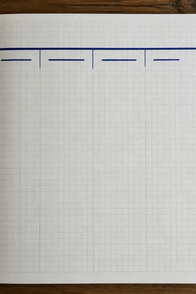
Graph-style pages look clean, modern, and organized. You get a structured feel without needing fancy planners. The aesthetic comes from the contrast between faint pencil grid lines and a bold header. This layout is perfect for tracking thoughts in categories, like “Ideas,” “To-do,” and “Feelings,” without making a messy table.
Use a ruler to lightly draw vertical and horizontal lines across a section of the page, making a grid about 1 inch squares. Keep the grid light with pencil so it doesn’t fight your ink. Add a bold header at the top with a marker, and write short section labels down the left side. Fill each grid cell with a few words or a tiny number, then add a final one-sentence reflection under the grid.
Pro tipErase pencil lightly after you finish inking so the grid stays crisp.
AvoidDon’t ink the whole grid — it becomes heavy and less cute.
24. Single Word Title With Highlight Underline
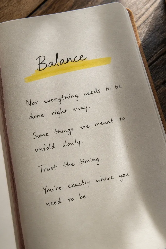
This is the simplest layout that still looks intentional. A single word title anchors your entry, and the highlighted underline adds color without extra tools. It’s ideal for consistency when you don’t have time for a full design. The page stays photogenic because the title area is clean and the highlight creates an obvious visual focal point.
Write one word at the top, like “Calm,” “Focus,” or “Grateful.” Underline it with a highlighter strip, keeping the line straight with a ruler. Add the date in small text at the top right. Write your entry in 6-10 lines below, using bullet points if you want speed. Finish with one short line that starts with “Today I...”
Pro tipUse the same highlighter color for the same journal theme so pages match across weeks.
AvoidDon’t use neon highlighters if your ink smears — choose a smoother pen.
25. Layered Border: Doodle Line + Washi Trim
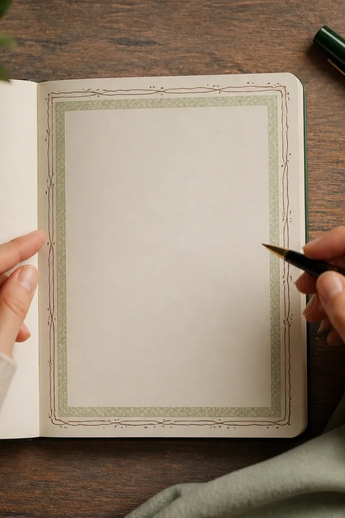
Layered borders look premium because they create depth, even with cheap materials. The doodle line adds charm, and the washi trim keeps it neat and intentional. This layout is perfect for entries you want to feel special, like monthly reflections or weekend reviews, without buying expensive stationery. It also hides uneven margins since the border defines the edge.
Draw a simple rectangular doodle border around the page content area using a fineliner, keeping it about 1 inch inside the edges. Then apply a thin washi strip along one or two sides of the border, leaving the other sides as doodle-only. Write your title at the top inside the border, then fill the page with 3 sections labeled with small icons. Keep each section short so the border stays visible.
Pro tipChoose one washi pattern with clear shapes so it reads well at a glance.
AvoidDon’t add washi on all four sides — it turns into a sticker wall.



