
1. Sunburst Coffee Ring
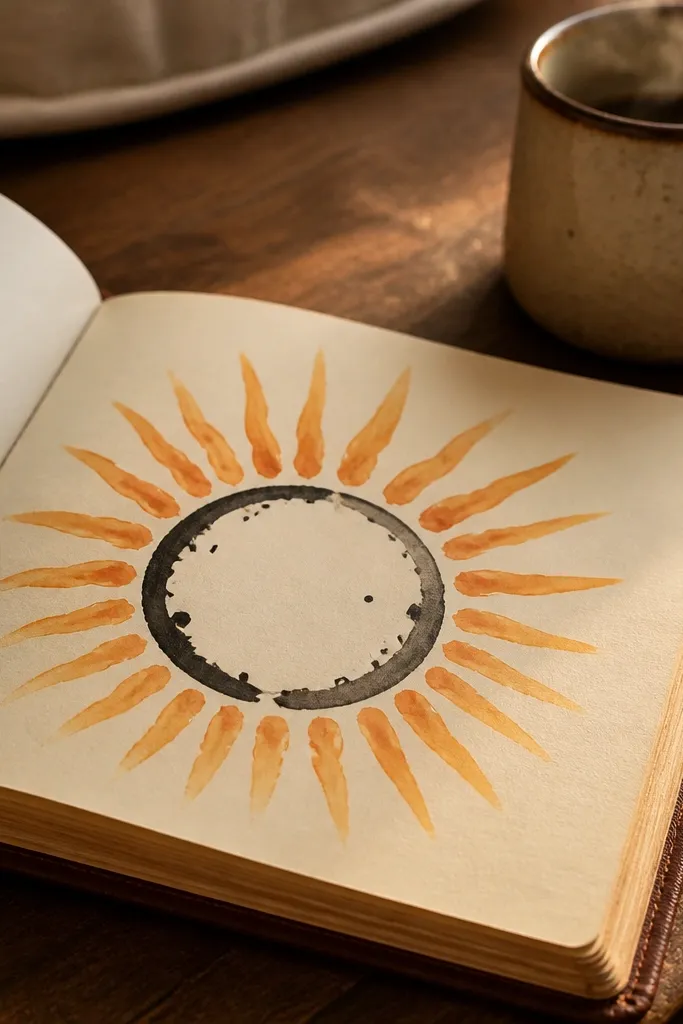
Draw a coffee ring as the main shape: an oval with uneven inner gaps like the liquid soaked into paper. Then surround it with sunburst lines that start thin and get thicker as they reach the edge. Use warm orange for the rays and keep the ring in black so it pops. This looks cozy and graphic in a journal photo, and it works great for mornings, reset pages, or “what I’m drinking” trackers. Skill level is easy because the ring shape forgives mistakes — just keep the rays consistent.
Start by drawing a horizontal oval coffee ring in black, then add small irregular arcs inside the oval to suggest spilled edges. Next, draw 12-18 rays from behind the oval — make the first 1-2 rays light, then press a bit harder for the rest. Finally, color only the rays in orange or burnt sienna, leaving the ring uncolored for contrast.
Keep ray spacing even by counting out loud while you draw.
Don’t color the oval too — it flattens the contrast and makes the rays less readable.
2. Mint Leaf Frame
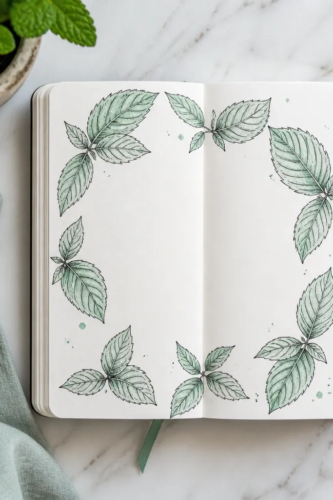
This is a clean, aesthetic page layout: a leaf border with a calm center. Draw 8-12 mint leaves pointing inward so the frame feels symmetrical without being perfect. The center stays mostly blank, which makes the page look airy and “designed,” even with simple tools. It’s great for gratitude lists, mood ratings, or a single big quote in tiny handwriting later. If you like minimal doodles but still want visual interest, this one nails it.
Start with a rectangle border lightly sketched in pencil, leaving a 1-inch margin from the page edges. Then draw leaves along each side: one leaf every 1.5-2 inches, alternating left-right angles. Finally, outline the leaf veins lightly with a fine pen and color only the leaf tips in mint green.
Use a darker green for the leaf veins so they read even on cheap paper.
Skip full leaf coloring — partial color at the tips looks sharper and faster.
3. Bubble Tea Time Capsule
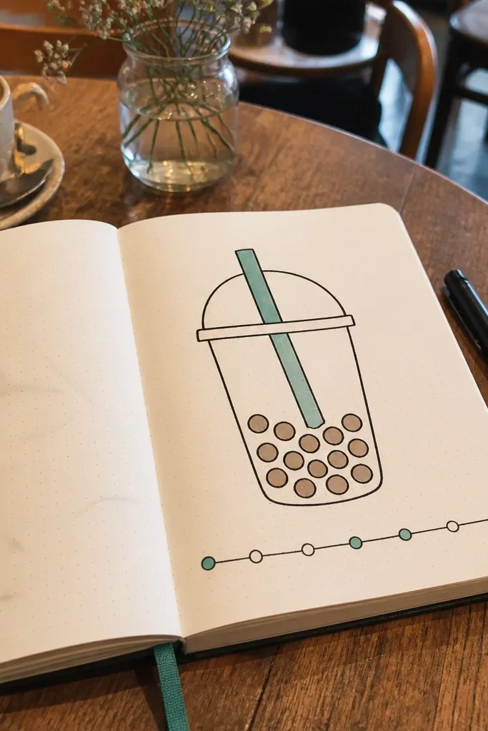
A cup silhouette is one of the easiest “big look” doodles, and the pearls add instant charm. Draw a rounded cup, then fill it with 10-14 tapioca circles stacked in a slightly messy cluster. Add a thin timeline strip at the bottom with 3 labels like “now,” “later,” and “after” using tiny text. The overall page reads playful but organized, and the timeline makes it feel like a real journal tool. It’s perfect for habit check-ins, weekly plans, or “how it tasted” notes.
Draw a cup with a wider top and a slightly narrower base in black, adding a lid line across the top. Then place pearls: small circles inside the cup, varying sizes and spacing, and connect one pearl to a straw line. Add a bottom strip (about 1 inch tall) and divide it into 3 sections with two short vertical lines, then write the three labels in tiny letters.
Make one pearl look “highlighted” by leaving a tiny white spot uncolored.
Don’t outline every pearl heavily — some should be filled with marker for a smoother look.
4. Washi Tape Corners
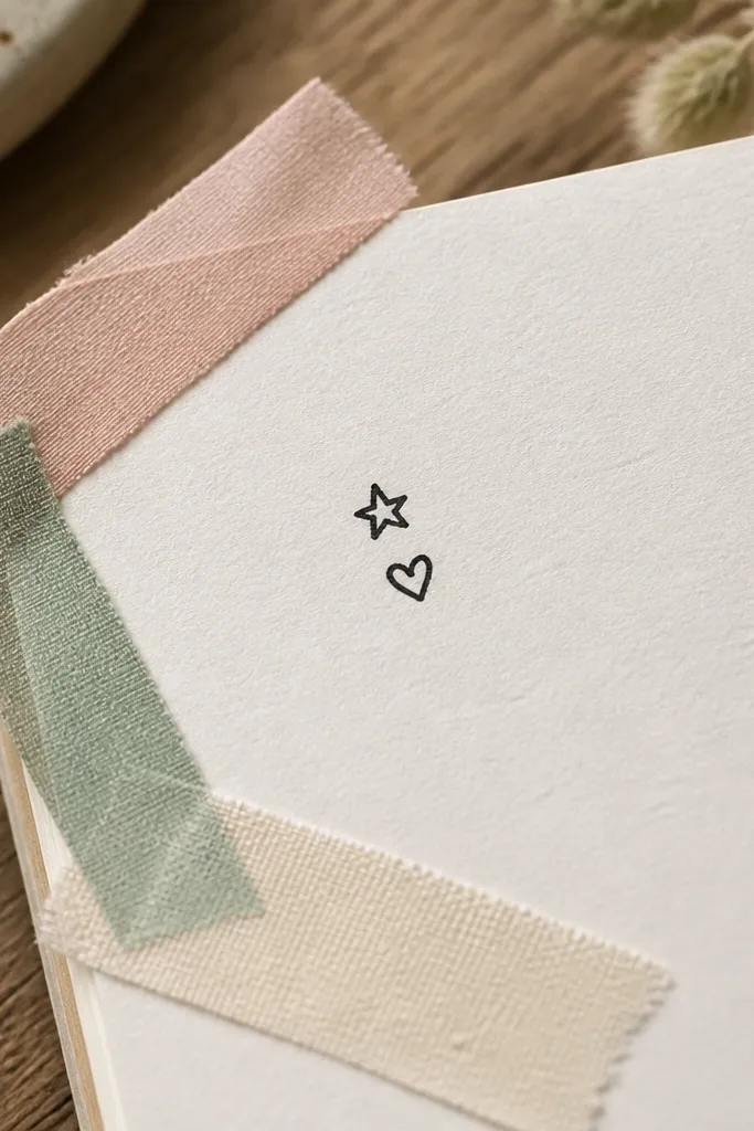
This is decoration-first, but it’s also functional. You’re framing your page like you used real tape, which instantly makes the journal page look intentional. Draw two or three tape strips in different colors at the corners, each with a slightly curled edge. In the center, add a single small doodle like a star, a heart, or a tiny plant. This works for any theme, and it’s fast enough to do every day without repeating the same picture. It’s also the easiest way to keep your page photogenic.
Start by picking 2 tape colors and sketching corner rectangles lightly in pencil. Then draw tape folds: one short curve on each strip edge so it looks lifted, and add a subtle dashed line along the top edge. Finally, color the tape with marker, leaving thin white gaps for fold highlights, then add a small center doodle in black.
Pro tipIf your marker bleeds, use colored pencil for the tape fill and keep the fold line in pen.
AvoidDon’t cover the whole page with tape — corner framing looks cleaner and more premium.
5. Hatched Rainbow Ladder
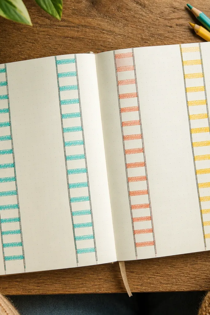
This one is all about texture. Instead of a flat rainbow, you build it like a ladder: parallel vertical rails with rungs that cross them. Each rung gets hatched shading in the same color family, so the rainbow feels dimensional. It’s bright without being chaotic because the structure stays consistent. Great for “weekly energy” pages, school notes, or any page where you want a cheerful graphic element that won’t overpower your writing.
Draw two vertical rails (about 6 inches tall) in black, spaced 1.5-2 inches apart. Then add 6-8 rungs across the rails, and color each section with a rainbow marker color, keeping the rails black. For texture, hatch each rung with short diagonal lines in the same color, then darken the outer rails with a second pass.
Pro tipUse diagonal hatching at a consistent angle so it looks designed, not scratched.
AvoidDon’t overfill the rails with color — keep them mostly black for crisp edges.
6. Constellation Sticker Map
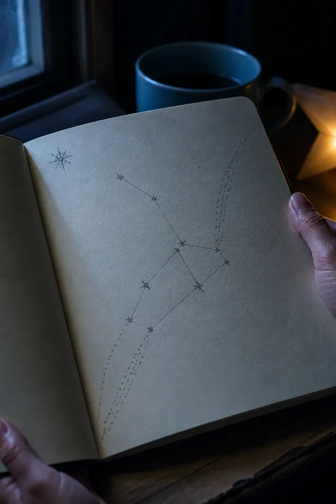
Constellations look amazing with minimal effort because the eye reads them as intentional. Draw a cluster of 7-12 dots, then connect 2-4 lines to form a simple shape like a cat silhouette, a key, or a comet. Add dotted trails that fade out into the corners. Finish with a tiny “label” like “north” or “today” in all lowercase. It’s photogenic, calm, and works perfectly for tracking nights you stayed up late or days you felt grounded.
Start by scattering 10 small dots across the center area, leaving space around them. Connect only 3-4 dot pairs with straight line segments, then add dashed trails from two outer stars toward page corners. Finally, write a tiny label near the cluster and add 3 small accent dots in a contrasting color (silver-gray or light blue).
Pro tipUse a sharp pen tip for dots; thick dots make the constellation look sloppy.
AvoidAvoid drawing too many connecting lines — the constellation loses clarity.
7. Circles in Circles Portal
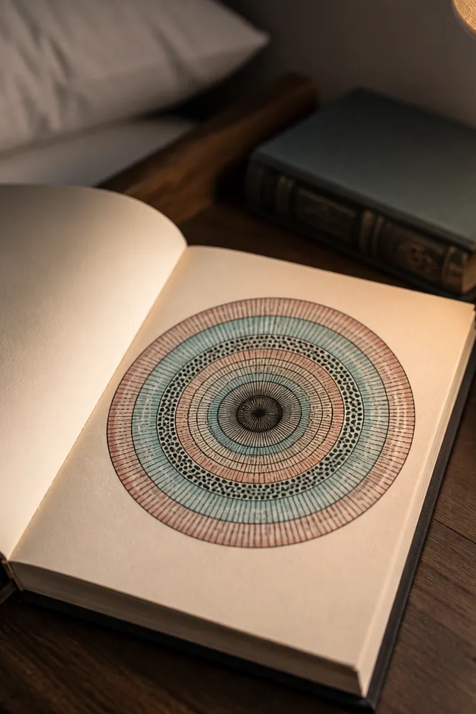
This is a guaranteed aesthetic pattern: concentric circles that alternate between line fill and dot fill. The center gets darker, and the rings get lighter, so the page has depth even with basic supplies. Use black for the outline, then color every other ring in a single muted tone like teal or dusty rose. It’s great for “reset” pages, covers, or any entry you want to look like a finished design. The skill level is beginner-friendly because circle symmetry is forgiving when you keep ring spacing consistent.
Draw one medium circle in black, then add 6-9 concentric rings around it with a compass or by tracing a jar lid. Alternate fill styles: for ring 2, draw short curved lines; for ring 3, place tiny dots; repeat. Color only the filled rings in your accent color, and finish with a thicker black outline on the outermost ring.
If circles wobble, trace the outer ring last — it hides imperfections.
Don’t add a bunch of extra doodles inside — the rings are the whole point.
8. Gingerbread Cookie Notes
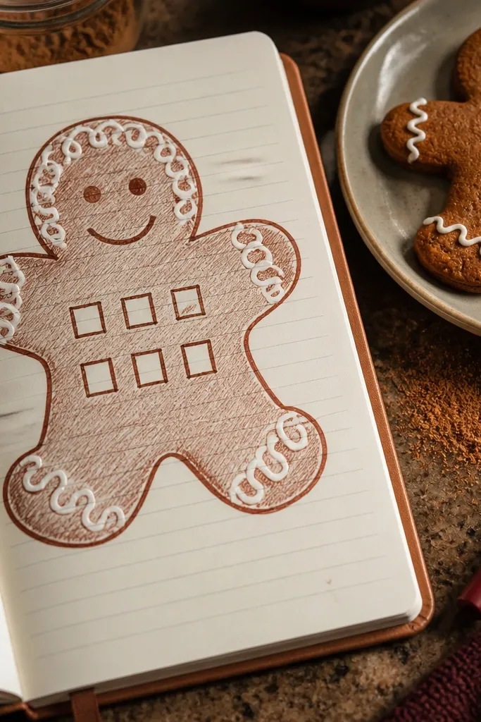
Cookie doodles make journal pages feel like decor. Draw a gingerbread cookie shape with a slightly uneven outline, then add frosting lines using white gel pen or a light marker. Include a small grid of 6 checkboxes inside the cookie so it doubles as a tracker. The frosting lines should be simple loops, not elaborate. This idea is photogenic because the cookie silhouette gives a strong shape, and frosting lines add a highlight effect. It works for to-do lists, self-care routines, or holiday-themed pages year-round.
Sketch the cookie outline: a rounded rectangle with a small notch for a bite mark. Add frosting with gel pen in 3-4 loop paths, then draw a 2x3 checkbox grid inside the cookie. Color the cookie lightly with a warm tan pencil, keeping frosting lines white and untouched.
Press lightly when coloring tan so the frosting stays crisp and bright.
Skip dark brown marker fills — it can look like a stain instead of a cookie.
9. Polaroid Frame with Scribble Title
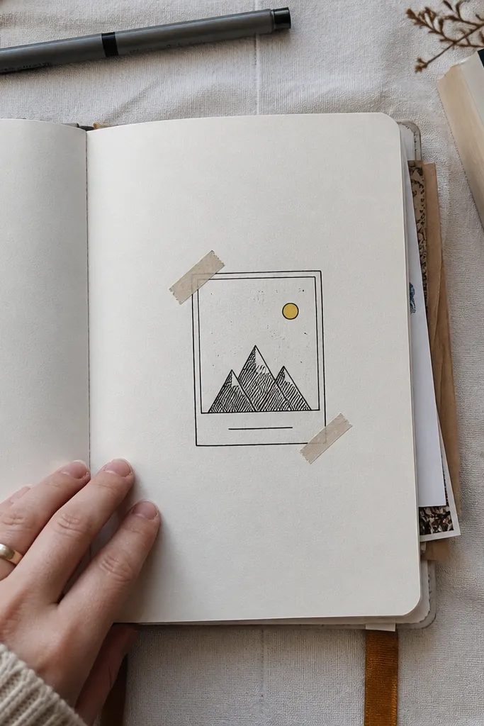
A polaroid-style frame is a quick way to make a page look like a photo memory without printing anything. Draw a rectangle with rounded corners, then add tape strips on two sides and a tiny “caption” line beneath. Inside the frame, put a single scribble scene: a mountain triangle, a sun circle, and a few dots. It looks clean and aesthetic because the frame edges and tape corners create structure. This is perfect for journaling prompts, travel notes, or any entry you want to feel like a keepsake.
Draw a rounded rectangle (about 4x5 inches) centered on the page. Add two tape strips at the top left and top right, then draw a simple interior scene using only three elements. Finally, write a short caption line under the polaroid frame and underline it with a thin wavy line.
Pro tipMake the tape strips slightly angled so the page feels playful, not mechanical.
AvoidDon’t clutter the interior scene — one sun, one mountain, one detail reads best.
10. Macaron Stack with Pattern Fill
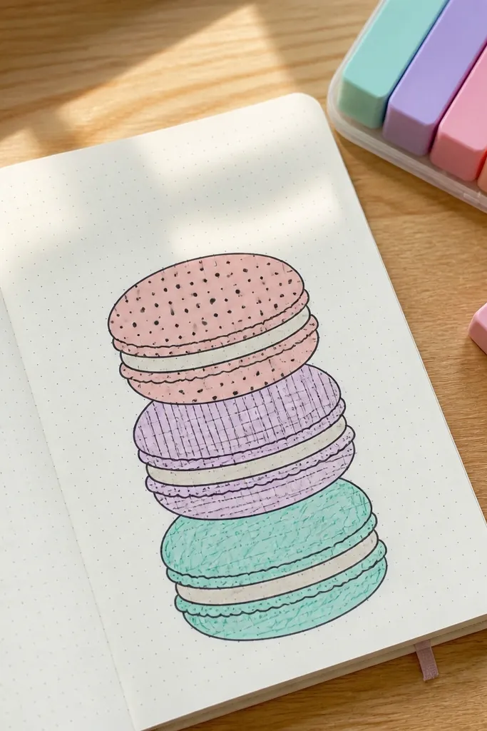
Macarons look adorable because they’re basically circles with layers. Draw three stacked macarons with small “filling” bands between them, then fill each macaron with a different simple pattern. Use polka dots on one, thin stripes on another, and a scribble texture on the third. Keep outlines black and use pastel markers or colored pencils. This is ideal for mood pages because each macaron can represent a feeling, a snack rating, or a theme. It’s beginner-friendly and very photogenic.
Sketch three circles stacked vertically, decreasing slightly in size for the top macaron. Draw a small band between each circle to represent filling, then fill each macaron with a pattern: dots, stripes, or tiny crosshatches. Color the bands lightly in a complementary color and add a thin highlight line on one side.
Pro tipUse a ruler for stripes so they look like candy, not random lines.
AvoidDon’t use too many patterns at once — three max looks intentional.
11. Geometric Tile Corner Pop
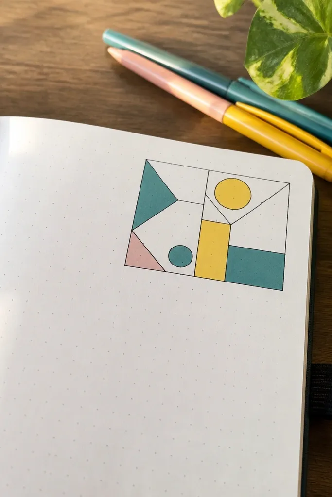
Corner tiles make a page look styled without covering it. Draw a square in the top-right corner, then divide it into 6-10 shapes: triangles, small rectangles, and a couple circles. Color only 3-4 shapes so the pattern breathes. Add a thin border line that wraps around the corner square like a design element. This fits bullet journal pages, habit trackers, and any page where you need a decorative accent but still want lots of writing space. The look is sharp because geometry reads clean on camera.
Place a small square about 3x3 inches in the top-right corner. Divide it with straight lines into mixed shapes, then outline each segment in black. Color 3-4 segments using one bright accent and two neutrals, then finish by drawing a thin border line that runs along the top and right edges of the square.
Pro tipUse one consistent line thickness for the tile outlines — it makes the pattern look printed.
AvoidDon’t color every segment — full color makes it look messy fast.
12. Cloud Checklist Strip
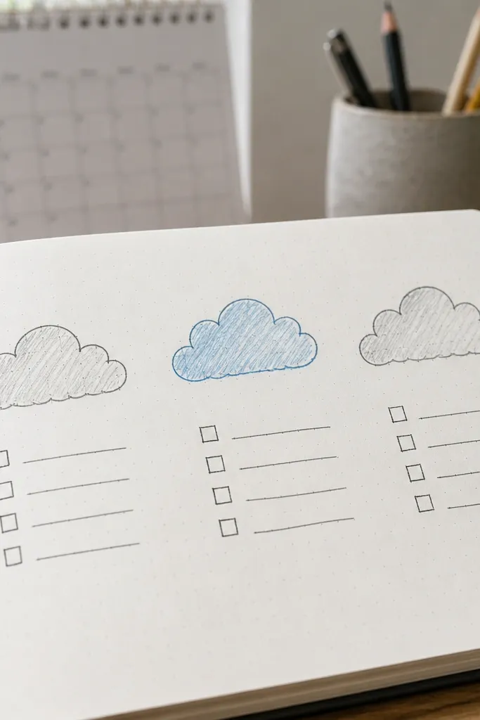
Clouds are instantly readable, and checkboxes make them useful. Draw three simple clouds in a row, then put a mini checklist under each cloud. Use a single sky-blue accent for one cloud and keep the rest in light gray pencil, so the page has a focal point. This idea is great for planning, tracking chores, or labeling days by weather vibe. It’s photogenic because clouds create soft shapes that balance sharp pen lines.
Draw three cloud outlines across the page, leaving equal spacing between them. Under each cloud, draw 4 small checkboxes in a neat row, then label them with tiny letters like A, B, C, D. Color one cloud in sky blue and lightly shade the others with gray pencil, keeping the outlines black.
Make the checkbox squares tiny (about 1/4 inch) so they don’t overpower the clouds.
Avoid thick coloring on clouds — pencil shading looks cleaner on journal paper.
13. Feather with Single-Line Veins
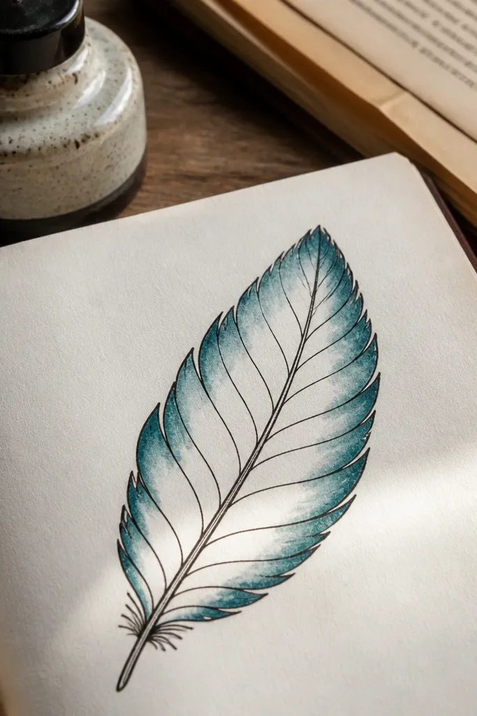
A feather doodle looks high-effort, but it’s really controlled repetition. Draw the center shaft, then place evenly spaced side veins on both sides. Leave the inside mostly blank, then add a gradient feel by coloring only the outer edges. This gives a classy aesthetic without needing watercolor. It’s perfect for pages about writing, journaling prompts, or “what I want to say.” It also works as a header on a left or right page.
Draw a long teardrop shape for the feather outline and add a straight center line from tip to base. Then draw 10-14 side veins on each side, each a slightly curved line branching from the center. Color the outer edges with a light brown or muted green pencil, leaving the center blank for contrast.
Keep the side veins short near the tip and longer near the base for natural shape.
Don’t add heavy fill — the blank center is what makes it look airy.
14. Bookmark Border with Tiny Stars
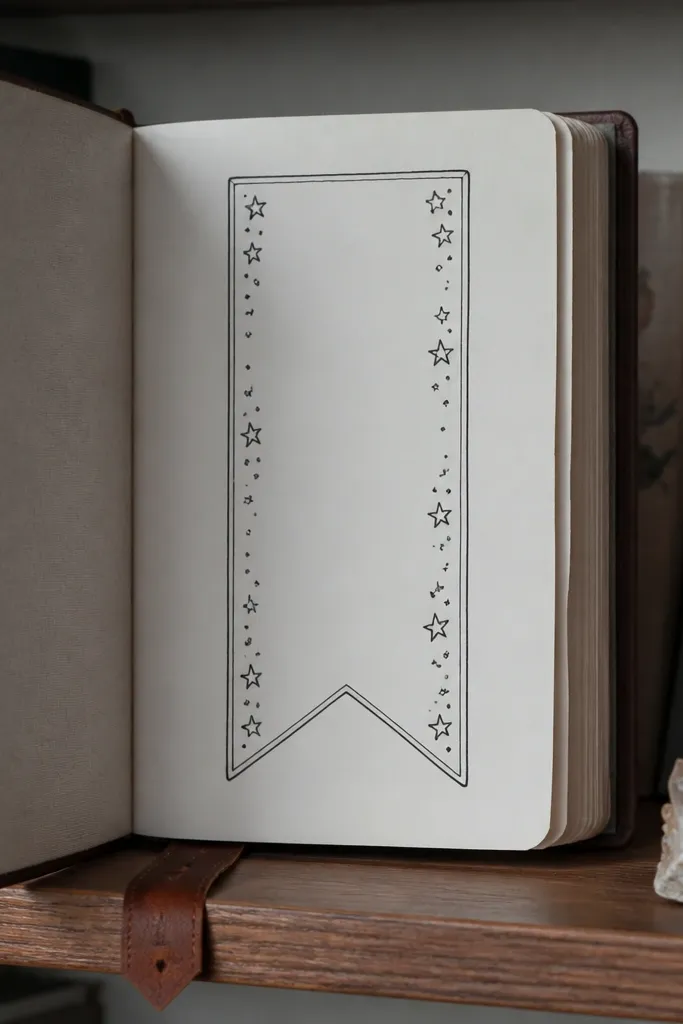
Turn your journal page into a “bookmark page” by drawing a border shaped like a bookmark. Add tiny star clusters along the sides and a blank center for writing. This makes the page feel like a labeled insert, not just a page of text. It’s also great for tracking books read or writing goals. The look is photogenic because the bookmark silhouette and repeated stars frame the page neatly.
Sketch a bookmark outline: a rectangle with a tapered bottom, sized to leave a margin around it. Draw the outer border in black, then add two star clusters on each side using 3-5 stars each. Finally, write a short header at the top inside the border and keep the center open.
Pro tipUse a fine pen for stars, and let the border lines be slightly thicker for hierarchy.
AvoidAvoid overcrowding stars — keep them grouped in clusters of 3-5.
15. Wavy Coffee Waves Pattern
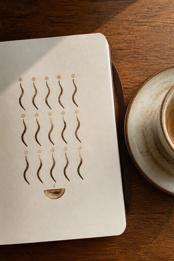
This is a pattern doodle that instantly makes the page feel alive. Draw two or three horizontal rows of wavy lines, like steam rising, then add tiny dots at alternating peaks. Use a dark brown for the steam lines and a lighter tan for the dots. Add a small “cup base” semicircle at the bottom to anchor it. It’s perfect for daily pages where you want a calming, rhythmic background without full-page coloring. The pattern stays readable on camera because the waves are consistent.
Draw a horizontal baseline near the lower third of the page. Above it, draw three rows of wavy lines, each wave about 1/2 inch wide, with alternating tall and short peaks. Add dots at every other peak, then draw a simple semicircle cup base under the lowest wave row.
Pro tipIf waves get uneven, use a ruler lightly for the baseline only — the waves can float.
AvoidDon’t vary wave height too much — keep it uniform or it looks accidental.
16. Terracotta Pot with Sprout
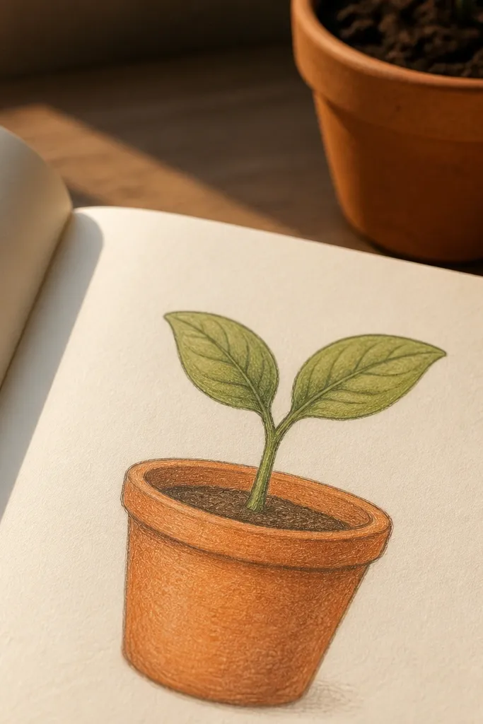
A terracotta pot is a small doodle with big aesthetic payoff. Draw the pot with a slightly rounded top rim and a simple base, then place one sprout in the center. Add two leaves with a clear vein line down the middle. Color the pot in terracotta orange and lightly shade with darker orange along the rim. It’s photogenic because terracotta reads warm and modern, and the single sprout keeps it minimal. Great for “today’s intention” pages and quick mood starters.
Sketch the pot first: a rounded trapezoid with a thick rim line. Draw a soil line across the pot and then add one stem rising from the center. Finish with two leaves and one simple vein line per leaf, then color pot terracotta and shade the rim with darker orange pencil.
Pro tipAdd tiny dots on the pot rim for texture instead of heavy shading.
AvoidSkip multiple plants — one sprout keeps it clean and readable.
17. Candy Stripe Border
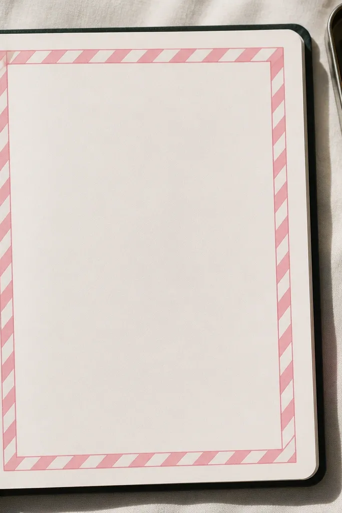
Borders make pages look finished, and candy stripes look fun without being childish. Draw a thin rectangle inset from the page edges, then add diagonal stripes inside the border. Keep the background white and color only the stripes in alternating colors like pink and cream, or teal and white. Put your writing in the center uncolored area. This style is great for weekly spreads, lists, or journaling prompts because it frames the content without stealing attention.
Draw an inner rectangle border leaving a 1/2 to 3/4 inch margin around the page. Inside it, draw diagonal stripe lines from top-left to bottom-right, spacing about 1/4 inch. Color alternating stripes with two colors, then outline the border rectangle again with a thicker pen.
Pro tipUse light pressure for the stripe lines, then color over them for crisp edges.
AvoidDon’t make the stripes too thick — thin stripes look more decorative.
18. Mini Mountain Skyline
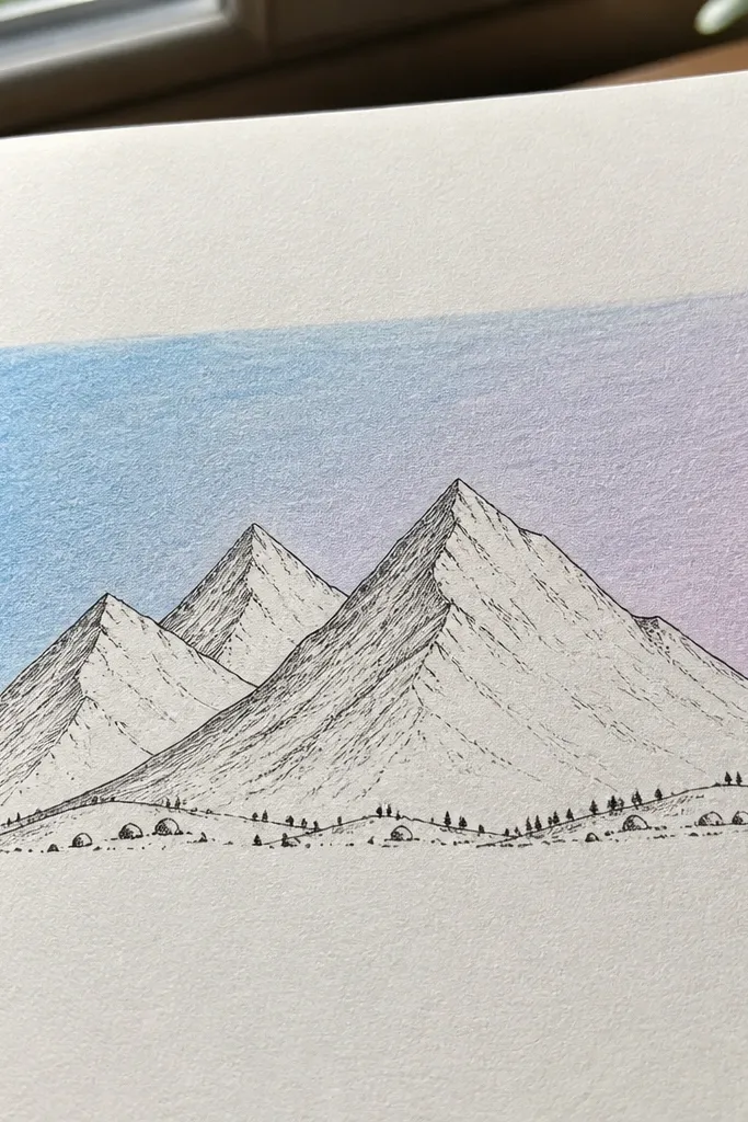
A layered mountain skyline is one of the cleanest ways to create depth with basic tools. Draw three mountain triangles of different sizes, then color the sky band behind them with a single gradient-like band using two colors blended by pencil. Add a few tiny dot trees or rocks at the base for realism. It’s photogenic because the triangles give strong shapes and the sky color gives mood. Use it for “where my mind went,” travel pages, or any entry that needs calm scenery.
Draw a base line, then add three mountain triangles overlapping from largest in back to smallest in front. Color the sky band behind the mountains with two pencils or marker tones, blending softly with light strokes. Add small texture marks at the front mountain base, like 10 tiny dots or short dashes.
Let the sky band be wider than you think — it makes the page feel bigger.
Avoid adding clouds everywhere — keep the background simple.
19. Sushi Roll Cutaway
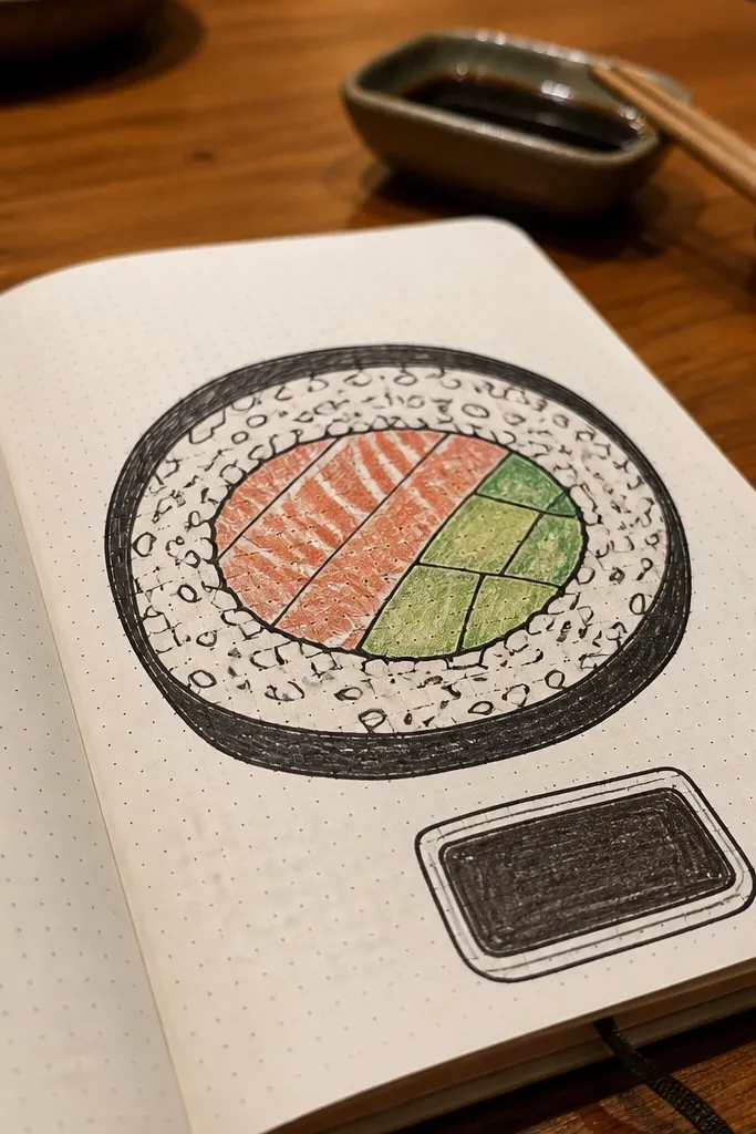
Cutaway sushi looks weirdly satisfying and very photogenic. Draw a big horizontal roll, then add a cross-section slice line to show the inside layers. Use black outline for the nori, then color the rice area with tiny dots and the filling with a couple stripe colors like salmon pink and avocado green. Add a small soy sauce cup doodle in one corner for balance. This is great for food journaling and for pages where you want a bold, graphic subject without clutter.
Sketch a long rounded rectangle for the roll and outline the nori edge. Draw a diagonal cut line across the roll and then add inside layers: rice dots in a lighter color and filling stripes in two darker tones. In one corner, draw a small sauce cup circle and add 3-4 tiny sauce dots inside.
For rice texture, dot with the pen tip first, then color lightly over the dots.
Don’t shade the nori too much — keep it mostly dark for crisp separation.
20. Tiny Carousel Horses
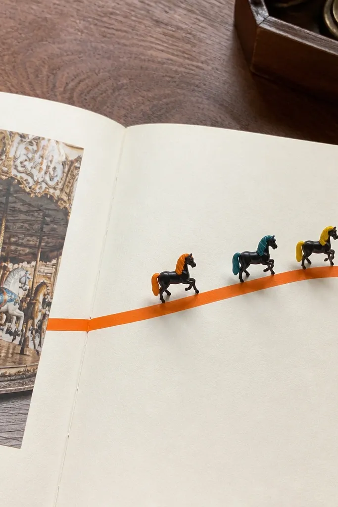
Carousel horses add motion to a still page. Draw a curved banner line across the middle, then place 3 small horses standing on it. Add simple manes with short strokes and color the banner in one bright shade while keeping horses mostly black with one accent color. This idea looks like a mini illustration and reads playful, not childish. Use it for celebration pages, “wins of the week,” or any entry that needs a little lift.
Draw a curved banner line across the center and thicken it slightly with a second line. Then sketch three horses: each has a head circle, a neck line, and a simple body oval with legs as short strokes. Color the banner and add one mane color accent to each horse, then outline everything again for clean edges.
Make the middle horse slightly larger so the composition feels intentional.
Avoid adding detailed faces — simple eyes and nostrils are enough.
21. Lemon Wedge with Seed Dots
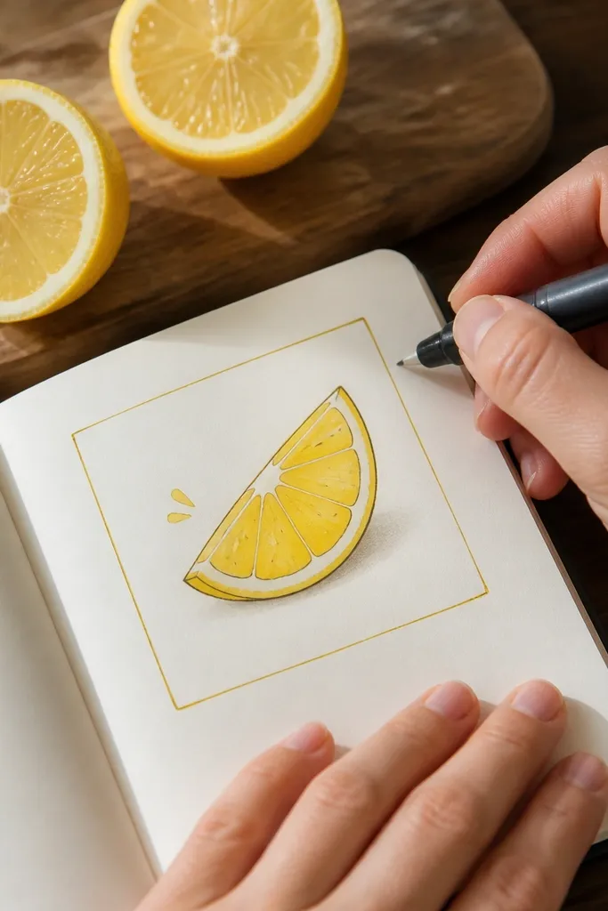
Lemon wedges are bright, graphic, and easy to repeat across pages. Draw one wedge and shade it in two tones of yellow, with a white highlight line running down the center. Add seed dots at the inner edge so the wedge looks real. For the journal aesthetic, frame the lemon with a thin border line and add a tiny “slice” label underneath. This works for morning routines, hydration trackers, and pages that need a fresh pop of color.
Draw a wedge shape: a triangle with slightly curved sides, then outline it in black. Color the outer half with a deeper yellow and the inner half with a lighter yellow pencil or marker. Add 8-12 tiny seed dots along the inner edge, then draw a thin rectangle border around the lemon and a small label under it.
Pro tipUse a white gel pen for the highlight line if you have it.
AvoidDon’t overdo the seeds — too many makes it look like clutter.
22. Notebook Stitch Heart
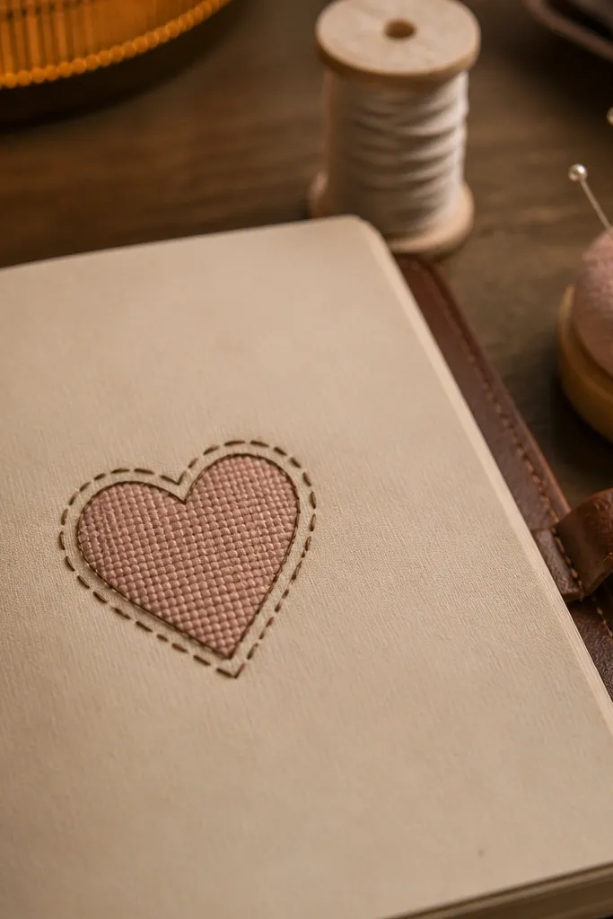
This is a cute “craft” doodle that looks like fabric. Draw a heart outline, then wrap it with dashed stitch marks around the edge like you’re sewing it onto paper. Add a simple fill pattern in the heart — tiny crosshatches or dots — and color it with a single muted pink. It looks cozy and intentional, especially if you keep the stitches consistent. Great for self-care pages, apology notes, or any entry where you want soft energy without using heavy decoration.
Sketch a heart outline in black and keep the curves smooth. Then draw a second outline slightly outside the heart and add dashed stitches between them, about 1/8 inch apart. Fill the heart interior with crosshatching or dots, color lightly, and finish with two tiny “thread knots” near the bottom points.
Pro tipIf your pen skips, press lightly and move slower for even dashes.
AvoidAvoid thick marker fill inside the heart — stitch outlines get lost.
23. Spiral Notebook Corner Page
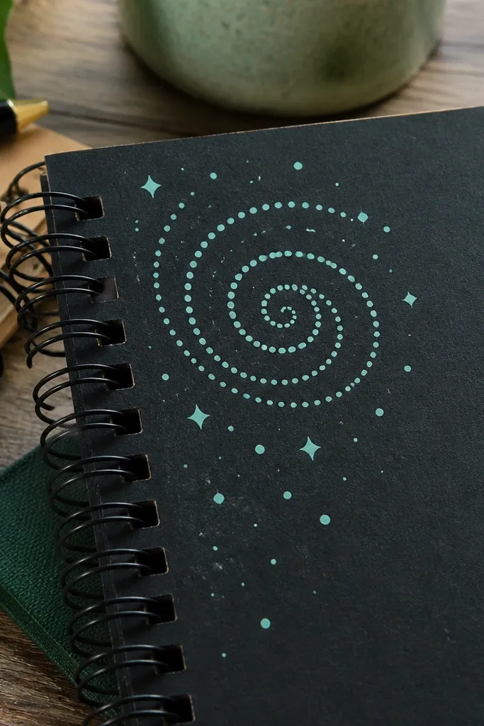
A spiral in the corner gives a page that “designed” look without blocking your writing. Draw a tight spring spiral that starts near the corner margin and coils inward. Add tiny dot sparkles around the spiral like it’s floating. Use one neutral (black) plus one accent color for the dots or the spiral highlight. This looks great on journal photos because it’s clear and graphic. It’s perfect for quick daily pages where you want one element and lots of space.
Start by drawing a small curved anchor circle near the corner. From that circle, draw a tight spiral line inward using consistent spacing, and outline the spiral with a thicker line. Add 8-12 tiny dots around it, then color only the dots with an accent color. Finish with a thin border line along the top and right page margins to frame the corner.
Keep the spiral spacing uniform by counting coils as you draw.
Don’t place the spiral too close to the edge — leave margin for clean photos.
24. Ocean Waves with Foam Dots
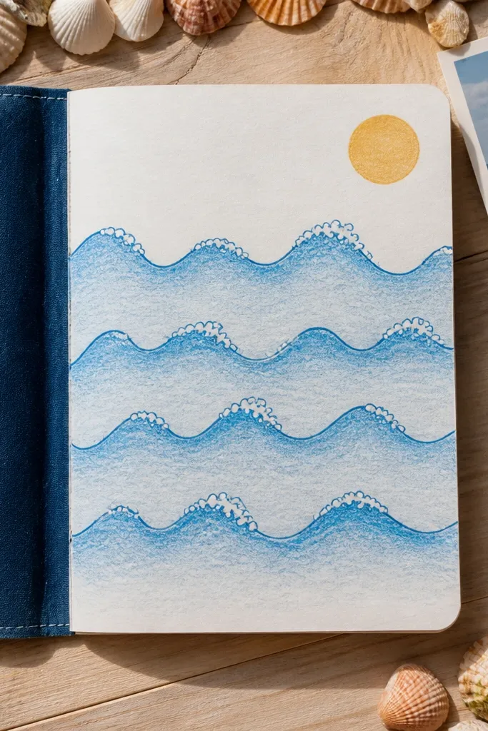
Waves are forgiving and look great when you keep the structure simple. Draw 4 layered wave bands, each with a darker blue outline and lighter fill. Then add foam dots at the top edge of each wave, like tiny bubbles. Include a small sun circle in one corner for extra pop. This style is photogenic because it has clear layers and a repeating texture (foam dots). Use it for mood pages, beach-themed journaling, or any page that needs calm visuals.
Draw a wavy baseline across the page, then add three more wave baselines above it with increasing height. Outline each wave band in blue-black pen and fill with a light blue pencil or marker. Add foam dots along the crest line of each band, then draw a small sun circle with a few rays in the top corner.
Use a white gel pen for foam if your paper allows it; it looks crisp.
Don’t add clouds and extra icons — the waves and foam are enough.
25. Geode Cut Rock Slice
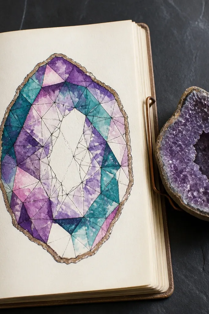
Geode slices look like expensive art, but you can draw them with basic pen and a few colors. Make a jagged oval outline, then divide the inside into 6-10 facets using thin lines. Color facets in two or three gemstone colors like amethyst purple, teal, and pale pink. Leave a few facets uncolored for contrast, then outline the facets again lightly. This idea is perfect for cover pages, “big feelings” entries, or any journal page you want to feel like decor. It’s beginner-friendly if you keep facets simple and bold.
Draw a jagged oval outline in black, with uneven edges like a cut rock. Inside, draw 6-10 facets using straight-ish lines that meet at random points. Color 4-6 facets with your gemstone colors, leave 2-3 facets mostly blank, then add a thin inner highlight line along the facet edges.
Color facets with light pressure first, then deepen only the darkest 2-3 facets.
Avoid coloring every facet the same strength — it kills the geode depth.
26. Leafy Initial in a Bubble
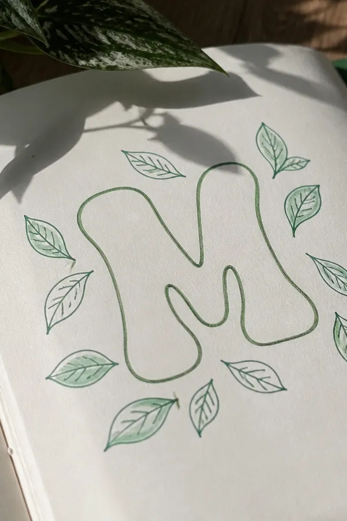
Pick one letter for your page theme, like the first letter of your name or today’s word. Write it in a thick bubble style, then surround it with small leaf doodles that alternate direction. Use one accent green for leaves and keep the letter mostly black with a single color outline. The look is clean, personal, and very photogenic because the letter gives instant readability. Great for monthly themes, intention pages, and cover entries.
Write a single bubble letter in the center using thick black pen and add a second outline behind it. Then draw 10-14 small leaves around the letter — half pointing up, half pointing down. Color the leaves green and add a tiny vein line to each leaf, then lightly shade one side of the bubble letter with a pale green pencil.
Pro tipKeep leaf sizes consistent (about the height of your pen tip) so the page looks balanced.
AvoidDon’t add extra letters — one bold letter reads best.
27. Peppermint Stripe Candies

Peppermint candies look festive and graphic, and they’re easy to draw in clusters. Draw 3 candies with rounded ends, then add diagonal stripe lines that spiral slightly from top to bottom. Finish with a tiny “knot” at the top for each candy to make them look wrapped. Use red stripes on white paper and keep the candy outline black. This idea is great for holiday pages, but it also works for any “treat yourself” entry. It’s photogenic because the stripes give crisp contrast.
Draw three vertical rounded candy shapes in black, spaced evenly across the page. Add diagonal stripe lines on each candy, curving the stripes slightly to mimic a twist. Color the stripes red, leaving the base white, then add a small knot shape at the top of each candy in black.
Pro tipUse a ruler for the first stripe line, then freehand the rest with the same angle.
AvoidAvoid thick red fill — crisp stripes look cleaner than painted blocks.
28. Starburst Confetti Polka
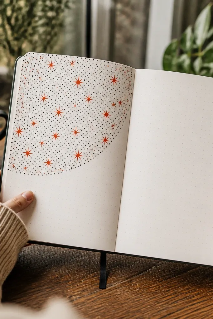
This is a fun “fill the page corner” idea that still looks intentional. Draw a large circle in the center, then fill it with a mix of tiny dots and small starbursts. Keep the starbursts consistent: 4-6 points with a short center line. Use one bright color for starbursts and black for dots so it doesn’t get busy. This works for prompts, celebration pages, and “best moment today” notes. The circle keeps the chaos contained and photogenic.
Draw a large circle in black at the center of your page. Divide your fill by drawing a few faint arcs so you don’t miss areas. Add confetti dots across the circle, then add starbursts in only one accent color, keeping their size small and consistent.
Do dots first, then add starbursts last so you control where the color lands.
Don’t add more than one accent color — it turns into clutter quickly.
29. Triangle Pattern Banner
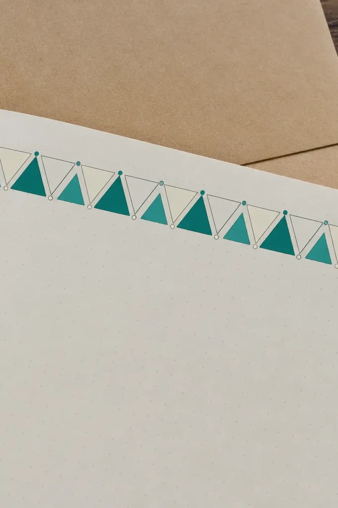
A triangle banner is a graphic pattern that looks like it belongs on a poster. Draw a long horizontal banner, then fill it with alternating triangles pointing up and down. Use two colors: one for filled triangles and one for outline-only triangles. Add tiny dots at the corners of each triangle for texture. It’s great for dividing sections in your journal and making headers look styled. This is especially good for trackers because the pattern stays neat and consistent.
Draw a long rectangle banner line across the page, about 1.5-2 inches tall. Divide it into equal sections, then draw triangles in each section, alternating up and down. Fill only the up-pointing triangles with your accent color, keep the down-pointing ones outline-only, and add a tiny dot at each triangle vertex.
Pro tipUse a pencil to lightly mark triangle boundaries first if your spacing tends to drift.
AvoidAvoid uneven triangle sizes — the banner looks messy when the pattern breaks.
30. Paper Cutout Snowflake Frame
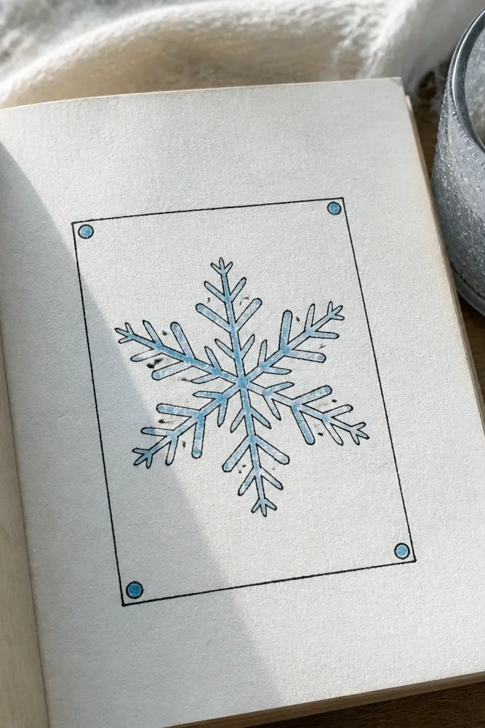
Snowflakes look intricate, but you can fake the “cut paper” look with simple symmetry. Draw a snowflake in the center with 6 main arms, then add short branch lines at each arm. Frame it in a rectangle and add small dot accents around the frame corners. Use light blue pencil for the snowflake, but keep the outlines darker in pen. This idea is perfect for winter themes, but the frame makes it look like a decorative label year-round. It’s photogenic because the symmetry and border are clear.
Sketch a rectangle frame first, leaving a 1-inch margin inside. Draw a snowflake with 6 main arms in black, then add 2-3 short branches per arm. Color the snowflake lightly in light blue pencil, then add tiny dot clusters in two corners of the frame.
Keep branch lines short — long branches make the snowflake feel tangled.
Don’t overfill with extra branches — 6-arm symmetry beats complexity.



