
1. Coffee-Stained Paper Frame + Gel-Pen Title
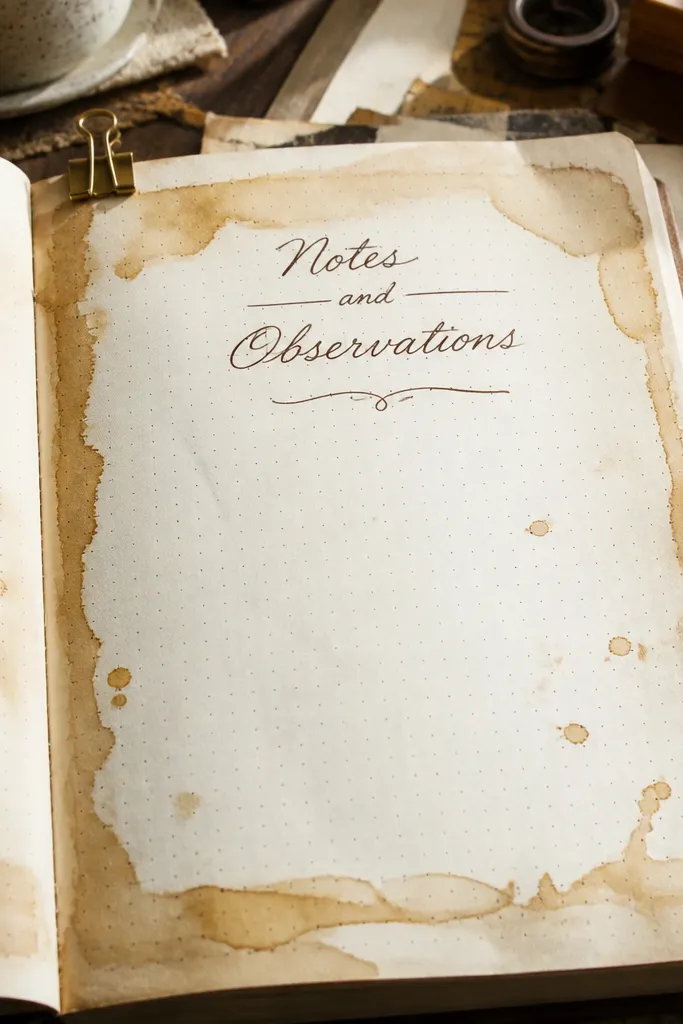
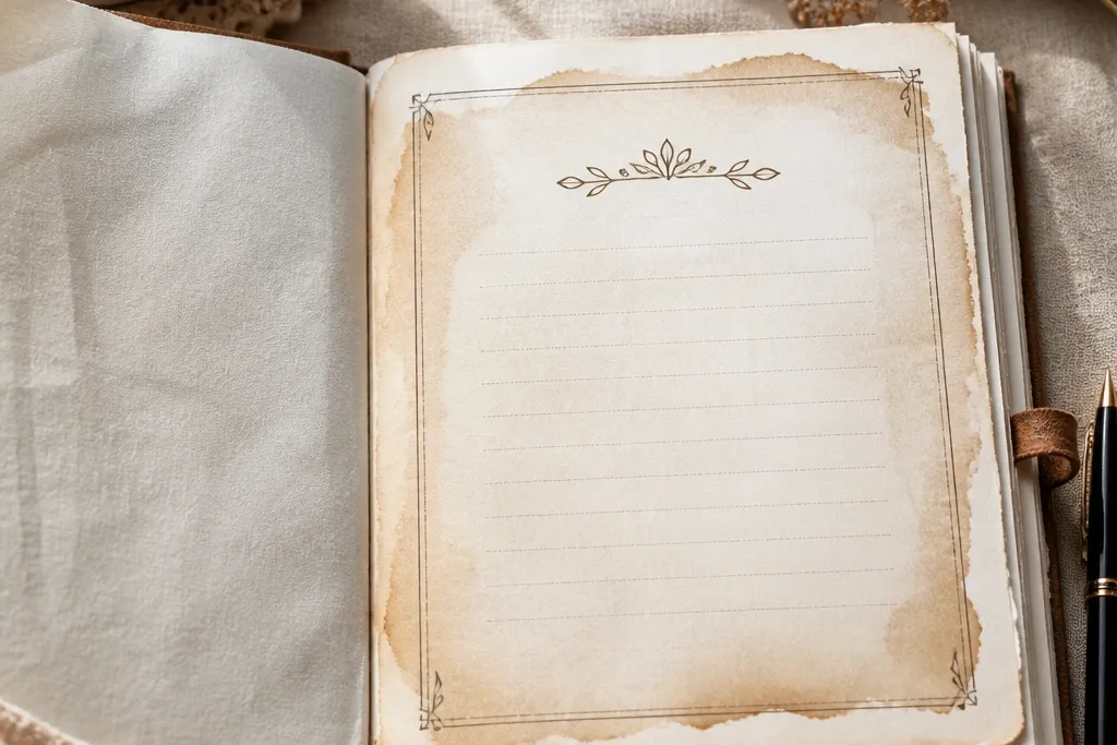
This look turns a plain journal page into something that feels like it already has stories inside. The coffee-stain border gives you a warm, uneven edge that reads cozy without needing fancy drawing. Put the title in brown gel pen so it stays legible even with the textured background. Keep the center area mostly clean so your writing space still feels inviting, not cluttered. This is a great choice for a new journal because it hides the “blank page panic” with one strong frame.
Cut a strip of scrap paper to fit your journal page dimensions, then stain it with cold coffee using a foam brush. Let it dry flat, then lightly trim the edges so you get a clean inner rectangle. Glue it down centered, leaving an even margin all around. Write your journal title in brown gel pen inside the framed area, and add one small doodle in the bottom corner (a tiny leaf or star). Seal the stained paper with a thin layer of matte medium or watered-down clear glue so it won’t smear when you write.
Use a ruler for the inner rectangle, even if the stain edges are messy. The contrast is what makes it look intentional.
Don’t soak the paper so much that it tears or warps the page.
2. Washi Tape Diagonal Ribbon + Minimal Date Box
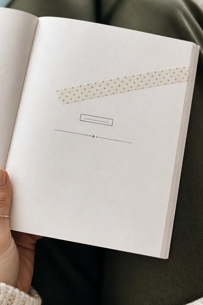
Diagonal tape instantly makes a first page feel styled because it creates motion. You get a cozy vibe from the pattern and color without needing to draw a full border. The date box makes it practical, and it also adds structure for future entries. Keep the title simple and centered under the ribbon so the page doesn’t feel top-heavy. This is ideal when you want something pretty but you’re not trying to paint or cut lots of paper.
Choose two washi tapes in the same warmth level: one solid or subtle, one patterned like small dots or tiny florals. Stick them diagonally from the top-left area to the bottom-right area, overlapping slightly for a neat seam. Mask off where you want a date box using washi tape strips to create a rectangle guide. Write the date in a gel pen, then remove the masking tape slowly while the ink is fresh. Add your journal name in a small font along the lower edge of the diagonal ribbon.
Press the tape down with a bone folder so it stays crisp in photos and doesn’t lift at the edges.
Avoid using three different tape styles on one page; it turns cozy into chaotic.
3. Circle Medallion Title with Tiny Sticker Constellation
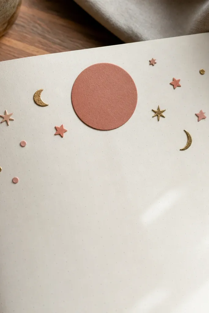
A circle medallion makes the first page feel like a “cover moment” even though it’s just page one. It’s flattering for cozy themes because circles read soft and friendly. The tiny sticker constellation adds personality without crowding the center where your first entry will go. Use matte stickers or die-cuts in warm colors so they look like part of the paper, not random attachments. This layout is especially good for journals used for reflections, gratitude, or weekly check-ins.
Cut a paper circle (about 3.5-4 inches wide) from cream cardstock and lightly distress the edge with a brown ink pad. Glue it centered near the top third of the page. Write your journal title across the circle or just below it, then add a short subtitle line in smaller gel pen (like “morning notes” or “week thoughts”). Place 6-10 tiny stickers around the circle in a loose arc, keeping them mostly in the top half. Finish by drawing 3-5 connecting dots with a fine liner for that constellation look.
Keep sticker sizes under 1 inch each. Small anchors read cozy and don’t block writing.
Don’t place stickers in the middle of where you plan to write your first real paragraph.
4. Bookplate-Style Corner Label + Feathered Ink Border
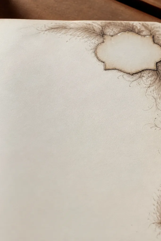
This one makes your journal feel curated without needing perfect handwriting. A bookplate-style label in the top corner gives you a tidy identity, like a library item. The feathered ink border adds a soft, handmade edge that reads cozy and artsy. It also frames the page so your writing area looks intentional. If your goal is “beautiful on day one,” this delivers because the corner label is a visual anchor and the ink border gives texture.
Stamp or brush a light wash of brown ink along the outer edge of the page using a sponge brush, then dab the edges to create a feathered fade. Make a corner label by cutting a small rectangle (about 1.5 x 3 inches) and rounding the corners. Write the journal name in a darker brown or black gel pen on the label. Add a tiny underline line and one small icon like a feather, leaf, or simple flame. Glue the label to the top-right corner, then let the ink dry fully before you write over it.
Use a scrap paper blot under your hand while stamping so you don’t smudge the border.
Avoid heavy ink coverage. Thick ink dries glossy and looks less cozy.
5. Photo-Frame Layout with One Pocket for Cards
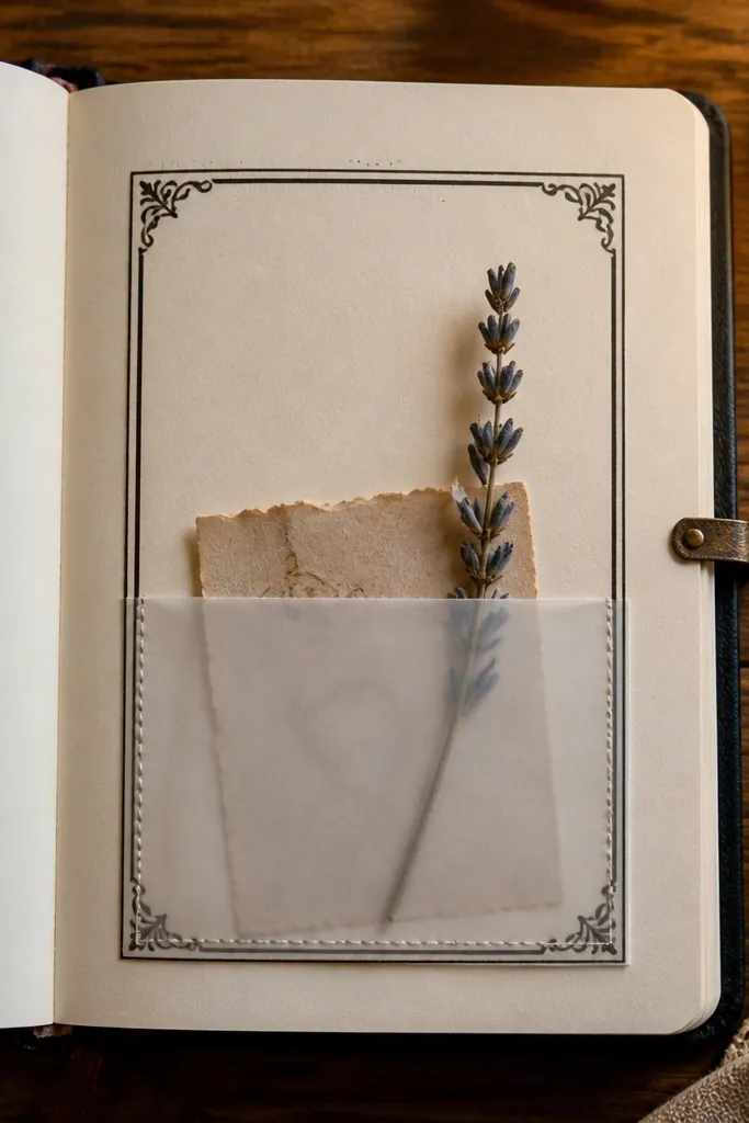
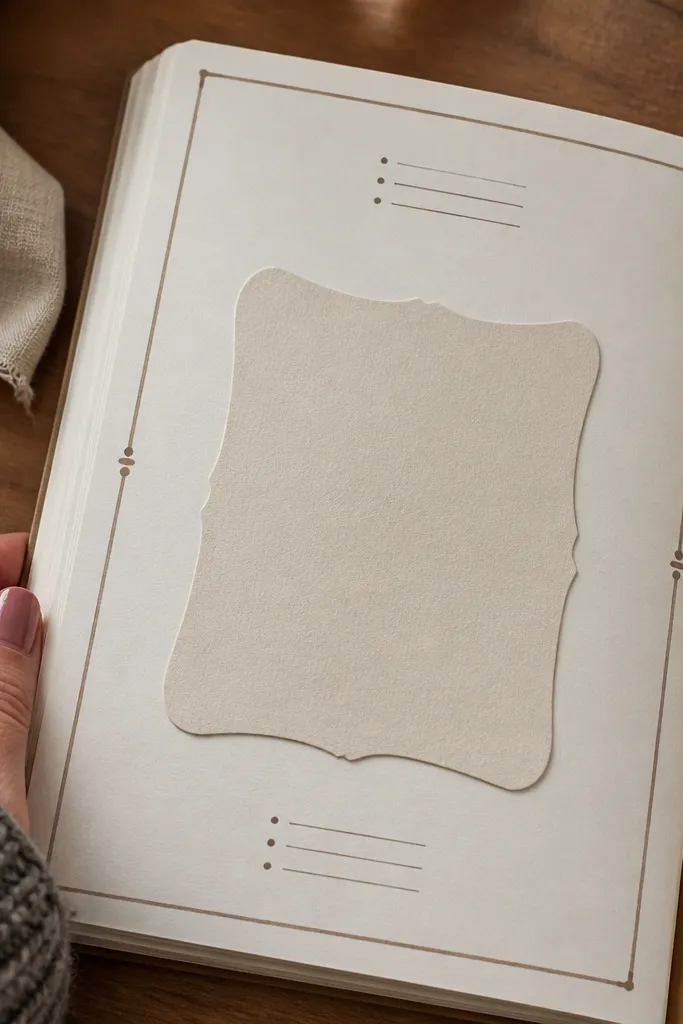
A frame layout is instantly readable in photos because it has clear boundaries. Add a pocket and you get a practical first page that holds receipts, tiny quotes, or a dried tea note. The pocket gives you a reason to keep the journal nearby, not tucked away. This is a strong choice if your journal is for collecting little bits of life. Use warm paper and a simple frame so the page looks cohesive even when the pocket insert changes.
Cut a frame mat from slightly darker scrapbook paper, leaving an inner opening about 2 inches from the page edges. Glue it down so it looks like a photo frame. Create a side pocket by cutting a rectangle of cardstock, folding it so one side is open, then gluing only the bottom and sides. Place the pocket on the right side of the framed area so the opening faces inward. Write your journal title at the top of the inner opening and add one short line like “first page notes” in gel pen.
Make the pocket opening 1/8 inch wider than the cards you plan to slip in. This prevents fighting the paper later.
Don’t glue the pocket across the frame seam. It creates a lumpy edge that looks messy.
6. Pressed-Leaf Look with Watercolor Wash Background
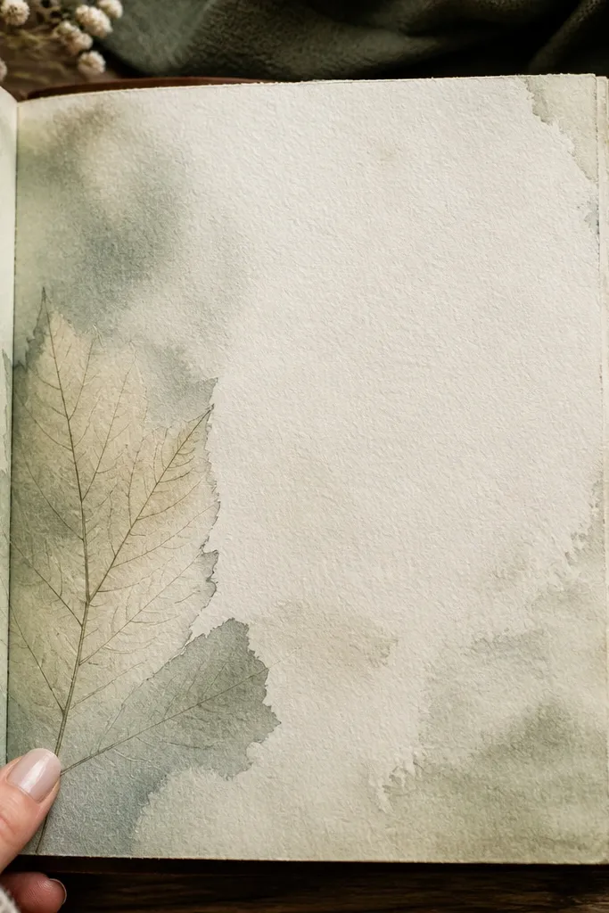
This is cozy in a very specific way: it looks botanical and calm, but it doesn’t require real pressed plants. A watercolor wash background gives you that gentle gradient under the title. Then you add a leaf silhouette or tracing using a fine liner, so the page feels organic. The best part is the contrast — watercolor stays soft, and the ink title stays crisp. It works perfectly for a journal used for nature walks, mood tracking, or slow mornings.
Use watercolor paper or a page protector-safe paper and paint a light wash across the top half in sage or dusty green. Let it dry completely. Draw a leaf outline with a fineliner in the lower-left corner, then shade the leaf veins lightly with a second watery green. Write the journal title in gel pen above the leaf, staying within the cleanest part of the wash. Add two tiny dots or a small sprig near the opposite corner to balance the composition.
Let the first wash dry 100% before drawing. Wet watercolor makes fineliner bleed and ruins the crisp look.
Avoid dark watercolor blobs. They read harsh and turn “cozy” into “muddy.”
7. Felt Tab Title Strip with Stitch-Look Dashes
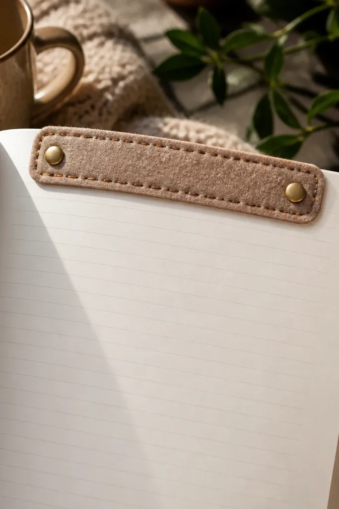
Felt adds instant warmth. It also photographs well because it has texture, so even a simple layout looks crafted. A felt tab title strip in the top area acts like a heading label and keeps the page from feeling flat. Add stitch-look dashes around the tab and suddenly it looks like a handmade journal cover page. This is a good pick for winter journals, cozy habit trackers, or any journal you want to feel tactile even before you write.
Cut a felt strip about 2.5 inches wide and 0.5 inch tall, then round the corners with scissors. Glue it near the top-left or top-center. Write the journal title on the felt using a fabric-safe pen or a gel pen that works on felt (test on scrap first). Add a stitch effect by drawing small dashed lines with a fine black pen along the felt edges. Finish with one small decorative icon in the opposite corner so the page feels balanced.
Use a thin layer of glue and press with a cloth for 20-30 seconds to avoid felt edges lifting.
Don’t use thick glue blobs. They show through the felt and look shiny.
8. Accordion Mini-Panel for First Entry Prompts
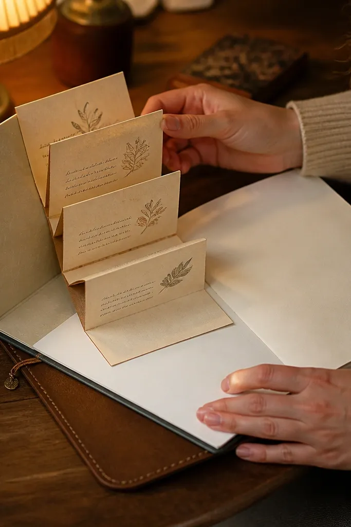
If your problem is that the first page feels intimidating, an accordion mini-panel solves it. It gives you a small, contained spot for prompts so you’re not staring at a blank expanse. The accordion folds create a pleasing rhythm and look super photo-friendly because you can see the layers. Write your prompts inside the folds, then open it to reveal them when you need them. This is great for journals that start with guided writing — gratitude, intentions, or a weekly theme.
Cut a strip of paper about 10 inches long and 2 inches wide. Score and fold it into 3 sections to create a mini accordion (about 3.3 inches each). Glue only the ends of the accordion strip to the journal page so the middle folds freely. Write one prompt per fold (like “today I feel,” “one small win,” “what I need”). Add a title at the top of the page with a gel pen and a small underline line to frame the accordion.
Pro tipUse heavier paper for the accordion so it stays crisp and doesn’t sag when you open it.
AvoidDon’t glue the accordion at the center fold. It will stop opening and kill the effect.
9. Ink Bleed Background with Clear Tape Borders
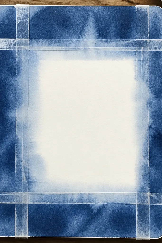
This look makes your first page look artsy without requiring drawing skill. You create a controlled ink-bleed background by letting a single ink color spread and fade, then you frame it with clear tape borders for clean geometry. The tape gives you sharp lines that contrast the soft bleed, which reads beautiful on camera. It’s especially good for journals that need a moody-cozy feel — think deep brown, warm plum, or muted teal. Your writing still has a clean zone because the tape frames the ink area.
Tear or cut two strips of clear tape and place them to form a rectangle in the upper half of the page. Drop diluted ink or watered-down fountain pen ink inside the taped box using a pipette or brush, then let it spread for 30-60 seconds. Blot lightly with a paper towel so it doesn’t overrun. Let it dry fully, then remove the tape to reveal a crisp border. Write your journal title in gel pen under the taped rectangle, leaving the framed area as a visual backdrop.
Use only one ink color. Multiple colors make the bleed muddy fast.
Avoid removing tape before the ink is dry. It will smear and tear the paper.
10. Vintage Map Strip + Handwritten Coordinates
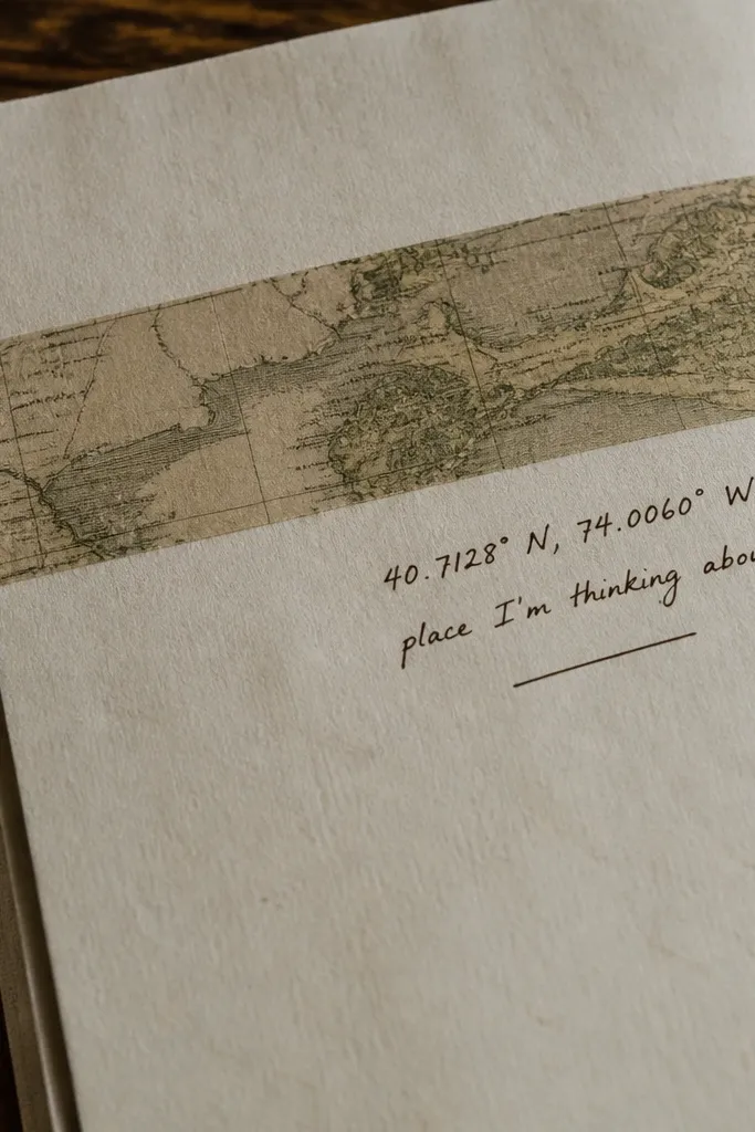
A map strip gives you instant story energy and a cozy, traveled look. The trick is to keep it to one strip, not full-page collage. That keeps the page clean enough for your writing while still looking styled. Add handwritten coordinates or a simple “place I’m thinking about” line to make it personal without needing elaborate art. This works well for journals about moving, travel planning, or homebody routines with a sense of place.
Cut a narrow map strip (about 1 inch wide) and glue it along the left edge or across the bottom of the page. If you don’t have a map, use printed atlas-style paper or scrapbook paper with map lines. Add a small title near the top in brown gel pen, then write coordinates below it using a simple format like “40.7, -74.0” or your own chosen numbers. Draw a tiny compass rose next to the coordinates using a fineliner. Finish by adding one thin border line around the title area with a ruler.
Use cream or warm gray map paper. Bright whites make the page look modern and less cozy.
Don’t cover the whole page with map text. It turns the journal into a poster.
11. Stamped Polaroid Frame with One Mini Quote
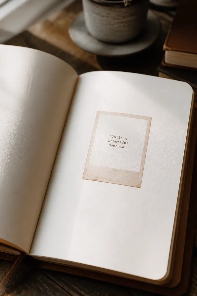
A polaroid-style frame is photogenic and friendly. It makes your journal first page feel like it has a memory attached, even if you haven’t written anything yet. Stamping the frame instead of drawing it keeps the lines imperfect in a good way. Then you add one mini quote in the “photo” area, which sets a mood for the rest of the journal. Keep the quote short so it doesn’t swallow your writing space.
Create a polaroid rectangle by stamping or drawing a border in warm brown ink. If you’re stamping, use a stamp set with a simple rectangle or photo frame design; stamp lightly so it doesn’t bleed. Add a small “date” line under the border and write it in gel pen. Place one short quote inside the polaroid area, using a different pen color like dark brown or burgundy gel. Add one tiny doodle in the corner — a heart, a sun, or a small swirl — to balance the composition.
Pro tipStamp twice lightly instead of pressing hard once. Light stamping looks cleaner and less blotchy.
AvoidAvoid long quotes. They make the page feel like a quote book instead of a journal.
12. Grid Paper Overlay with Cozy Corner Doodles
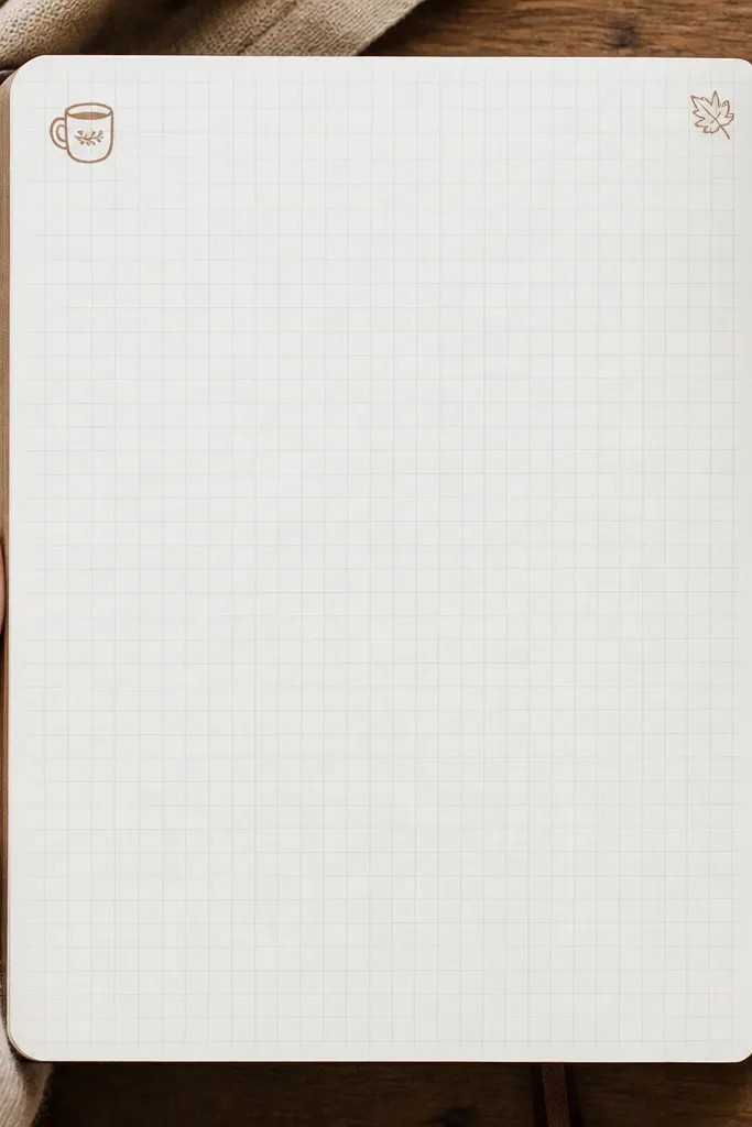
Grid overlays make your first page look tidy and intentional, even if you write messy. The cozy part comes from corner doodles that are small and warm — like a mug, a leaf, or a tiny house. Use a light grid so it doesn’t dominate your writing. This layout is perfect for habit journals, planners, and anyone who likes structure but wants it to feel soft. It also photographs well because the lines guide the eye to your title.
Cut a piece of graph paper or printable grid paper to fit the page, leaving a 1/4 inch border. Lightly glue it down or use removable tape if you want flexibility. Write your journal title at the top center in gel pen and underline it with a single thin line. Add one doodle in each corner, keeping them small and simple. Finish by drawing three short guide lines under the title where you’ll write your first entry.
Use a ruler for the guide lines, then freehand the doodles. The mix reads handmade but controlled.
Don’t darken the grid lines. Heavy grids make everything feel harsh.
13. Watercolor Wash + Thread Wrapped Title Loop
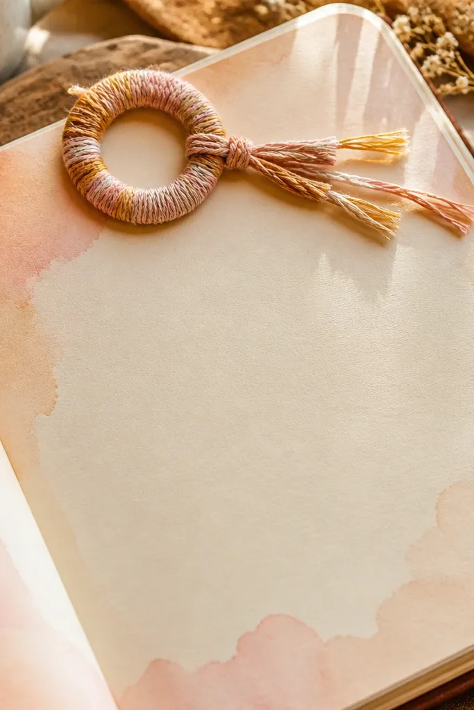
This one looks special because it adds a 3D element without being complicated. A soft watercolor wash gives the cozy background, and the thread-wrapped loop makes the title feel like a little craft keepsake. It’s great if you want a first page that looks handmade and tactile, not like a planner page. The loop also gives you a place to hang a small tag later, if you want to expand the journal. Use warm colors and keep the loop simple for a clean, photo-friendly result.
Paint a light watercolor wash across the top half in warm gray-blue or dusty rose, then let it dry. Punch two tiny holes along the top area where you want the title loop to sit, about 1 inch apart. Thread embroidery floss or thick sewing thread through the holes and tie a knot on the back page. Wrap the thread around itself to form a tight loop, then secure with a knot. Write your journal title beneath the loop in gel pen so it stays readable and clean.
Choose thread that matches the wash tone but is one shade darker. It pops without looking neon.
Avoid soaking the paper under the holes. Wet paper tears when you pull the thread.
14. Fabric Tape Border with Tiny Button Accent
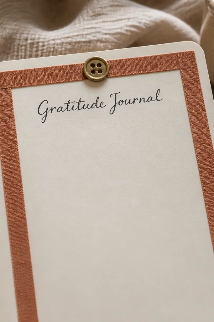
Fabric tape borders look cozy because they mimic ribbon, and they photograph with a soft texture that paper tape can’t match. A single fabric border line frames your writing area and keeps the page from feeling empty. Add one tiny button near the title for a playful focal point. This layout is best for journals meant for sewing, craft notes, or anyone who likes tactile details. It’s also forgiving — even if your handwriting isn’t perfect, the border does the visual work.
Cut fabric tape to make a simple rectangle border with 1/2 inch margins from the page edges. Press it down firmly, then reinforce corners with a tiny dab of fabric glue or clear glue. Place a small button (about 1/2 inch) near the top-left or top-right, then glue it in place. Write the journal title in gel pen near the button, keeping letters large enough to read in photos. Add one small line of text under the title so the page looks finished even before you write long entries.
Pro tipLet glue cure fully before closing the journal. Buttons can shift if you press the cover too early.
AvoidSkip glossy buttons. They reflect light and can look less cozy than matte ones.
15. Monogrammed Corner Tag + Layered Paper Scrap Stack
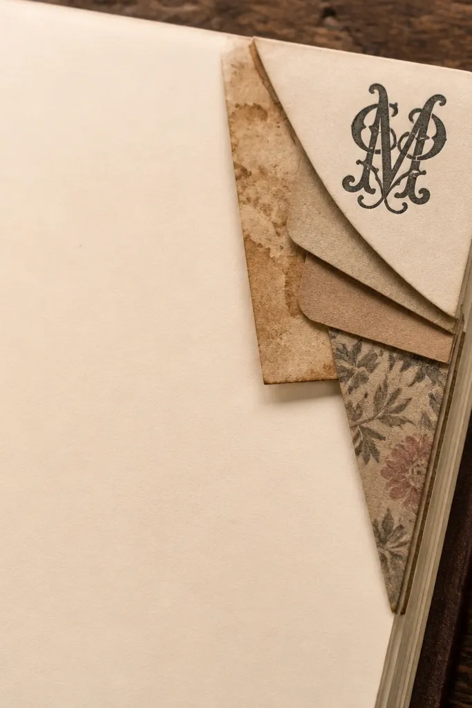
This is a cozy first page that looks “collected,” not manufactured. A monogram corner tag gives you a clear identity, and a small layered scrap stack adds depth without needing a full collage. The scrap stack can be made from three paper types: coffee-stained paper, plain cardstock, and a patterned scrap. It reads like you started saving things before you even wrote the first line. This works well for journals that hold personal notes, planning, or creative prompts.
Cut a corner tag from cardstock (about 1.5 x 2.5 inches) and round the bottom edge. Write a monogram in dark brown gel pen and add a tiny underline line. Create a scrap stack by cutting three small rectangles and layering them behind the tag, with the top scrap about 1/4 inch visible. Glue the stack in place first, then glue the tag on top so it looks lifted. Add one short heading line on the main page area, aligned with the tag so the layout feels cohesive.
Keep the monogram to one letter. More letters make the tag feel busy fast.
Don’t use very different font styles on the same page. One clean handwriting style looks best.



