
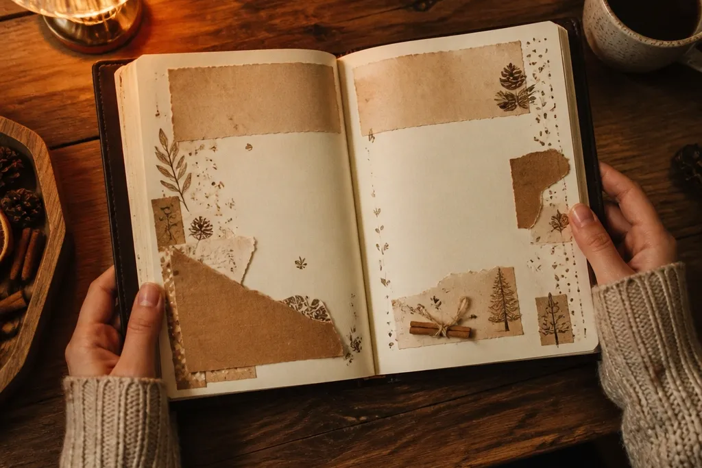
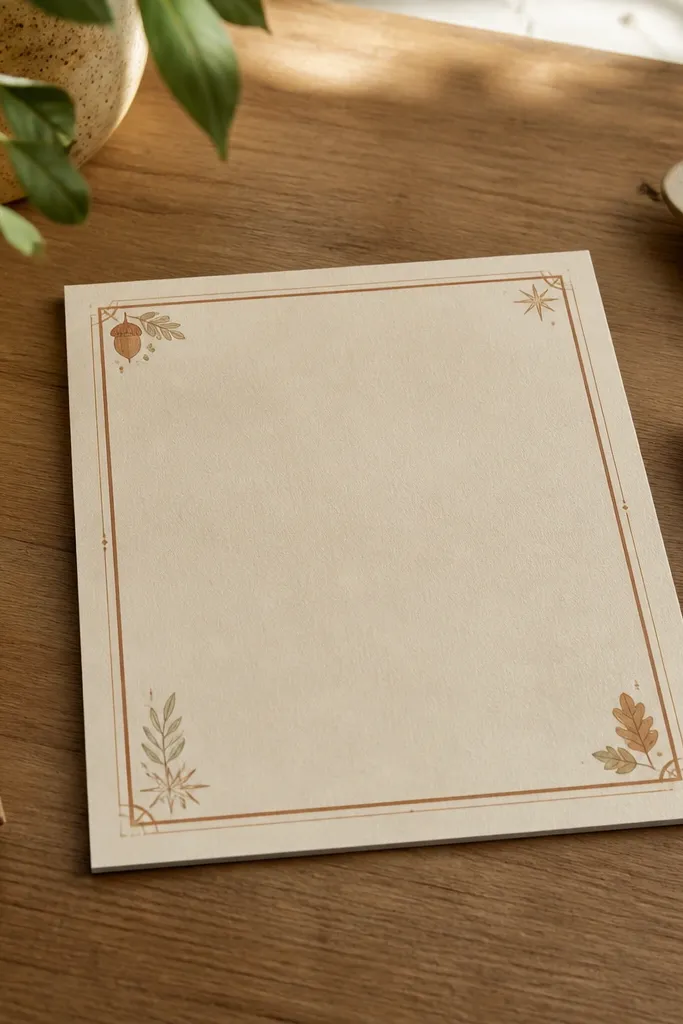
1. Kraft Paper Tear + Cinnamon Wash Header
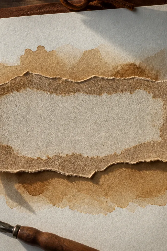
This page looks cozy because the torn kraft edge creates natural, imperfect texture, and the cinnamon wash gives a warm glow behind your title. It’s also practical: the torn strip naturally defines a writing area, so your words feel organized without a heavy layout. Use it for weekly reflections, habit check-ins, or a single-page journal entry where you want the header to feel like a label. The warm brown stays gentle on paper, so it photographs well even in indoor light.
Start by cutting a kraft-paper strip about 1.5 inches wide and tearing the edges so the fibers show. Lightly brush a cinnamon-brown watercolor wash or diluted acrylic ink behind where the header will sit, then let it dry fully. Glue the kraft strip along the top third, leaving a little uneven edge visible. Write your header in a dark brown or black fine liner, then add two small gel pen dots or tiny leaf marks on the corners for balance.
Pro tipSpritz a tiny bit of water on the kraft before tearing for longer, softer fibers that look more “cozy.”
AvoidDon’t use a fully solid block of brown paint — it makes the header look heavy and kills readability.
2. Washi Tape Corner Frames in Oat and Clay
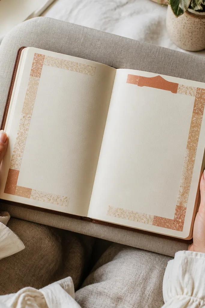
Corner frames look cozy because they add warmth without crowding the center where you write. Oat and clay colors read like natural neutrals, which makes your handwriting the main event. This layout is great when you want a clean page photo: the tapes create a border effect but leave a calm writing field. It also works for both blank pages and pre-printed prompts because the frame gives you a consistent “stage” every time.
Pick two tapes: one in an oat beige and one in dusty clay terracotta. Place the oat tape in the top-left corner as a short L-shape, then mirror it on the bottom-right. Add the clay tape as a second, slightly offset strip — about 2-3 mm away — so you get layered depth. Finally, draw a thin pencil guideline rectangle inside the tape frame and write your date and heading inside it.
Pro tipUse a kneaded eraser to lighten any pencil lines after you finish writing so the frame stays crisp in photos.
AvoidSkip bold patterned tapes — they can steal attention from your writing and make the page feel less cozy.
3. Tea-Stain Gradient Background with Gel Pen Stars
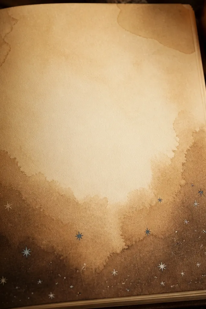
Tea-stain gradients look cozy because they mimic natural aging and create soft depth. The trick is keeping it uneven and translucent, so the page feels lived-in instead of painted. Add tiny gel pen stars or dots to give a warm “night sky” mood, which photographs beautifully against the stain. This is ideal for journaling at night, gratitude lists, or dream logs where you want a gentle atmosphere.
Dilute brown tea or watered-down sepia ink until it looks like weak caramel. Brush or dab it from the bottom edge upward, keeping the top lighter, then let dry completely. Lightly sketch a few star placements with pencil so you don’t overdo it. Trace the stars with a white gel pen, then add 2-3 small dot clusters near the header for a cozy constellation effect.
Pro tipKeep a paper towel under your page while staining so moisture doesn’t warp the sheet.
AvoidDon’t saturate the whole page — tea-stain backgrounds should be soft gradients, not blotchy stains.
4. Chunky Knit-Texture Border with Sponge Dabbing
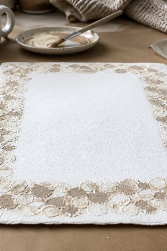
This layout reads cozy because it mimics knit texture — the repeated dabbing creates that “chunky sweater” look. Use it as a border around a clean center writing block so you get warmth plus readability. It’s a strong choice for monthly goals, letter-style entries, or pages where you want your headings to pop. The texture also adds visual interest in close-up photos without adding clutter.
Mix a light beige or warm gray acrylic paint with water until it’s the consistency of milk. Dip a small makeup sponge and dab on scrap paper first to control the speckle. Create a border rectangle about 0.5 inch from the page edges, then dab along the lines in a repeating pattern. Let it dry, then write your header in the top center and add a thin gel pen line inside the border to sharpen the cozy frame.
Rotate the sponge slightly every few dabs to avoid a repetitive dot pattern that looks machine-made.
Don’t outline the border with thick marker first; it shows through and makes the knit effect look messy.
5. Pressed Leaf Corner + Soft Watercolor Wash
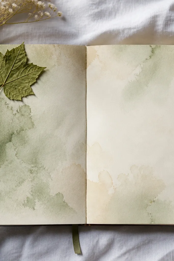
Pressed leaf accents feel cozy because they bring in natural, organic detail. The key is to place the leaf in one corner and keep the rest of the page airy with a pale watercolor wash. This layout is perfect for nature journaling, gratitude lists, or any entry where you want the page to feel like an evening stroll. It also looks great in photos because the leaf shape gives a clear focal point.
Lightly watercolor a small patch in one corner using a warm tone like sage-green mixed with a little ochre. Place a pressed leaf on top only after the wash is dry so it doesn’t smear. Glue the leaf with a thin layer of glue stick or clear gel medium, then press it under a book for 10 minutes. Add a simple header above the leaf and draw 3 tiny vein lines with a fine brown pen to echo the leaf’s texture.
Pro tipChoose leaves with clear veins; they read better even when the leaf is small.
AvoidSkip glossy glue — it can reflect light and make the leaf look wet.
6. Hot Chocolate Ribbon Header with Faux Foil
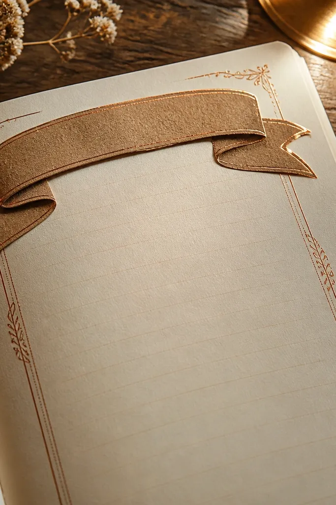
A ribbon header looks cozy because it frames the page like a gift tag. Use a warm brown paper strip or cardstock to create the ribbon shape, then add faux foil highlights with a metallic gel pen so it catches light in photos. This layout is great for entries where you want the title to feel celebratory — weekly themes, monthly intentions, or a “notes from today” page. The metallic accents are subtle, so it stays warm, not flashy.
Cut a paper strip about 2 inches wide, fold it into a soft ribbon shape, and tape or glue the back. Place it across the top third, leaving both ends slightly angled. Use a metallic gold or antique bronze gel pen to add a thin highlight line down the center of the ribbon. Write your title in white gel pen on top of the ribbon, then add a small heart or cocoa bean doodle at each end.
Pro tipTest the white gel pen on scrap paper first — some papers need a second pass for solid coverage.
AvoidDon’t use black ribbon — it turns the page cold fast.
7. Peachy Blush Background with Doodle Sprinkles
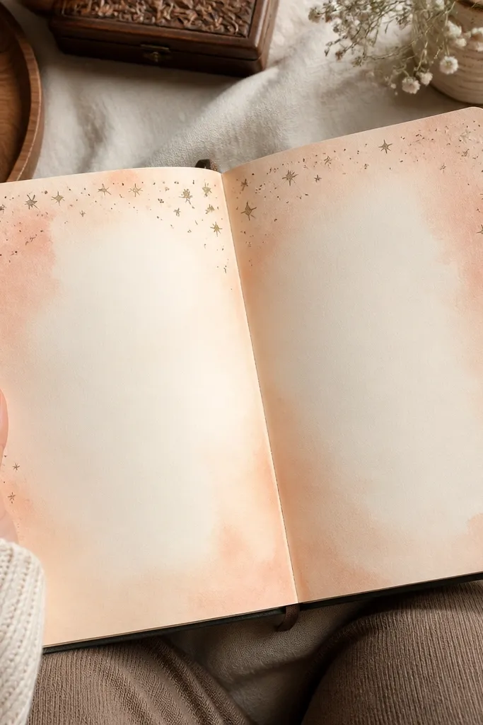
Peach blush backgrounds feel cozy because they’re warm and gentle, like afternoon light. Keep the decoration minimal: tiny sprinkle dots, small swooshes, or micro stars around the header so the page stays readable. This layout works for mood tracking, gratitude entries, or any prompt where you want soft color without heavy drawing. In photos, peach backgrounds make skin-tone warm and make dark ink look crisp.
Use a light peach watercolor or diluted pink marker to wash the background behind the header area only, leaving the lower half mostly clean. When dry, write your header in a darker brown pen. Add a cluster of tiny sprinkles above the writing block using 3-4 dot colors like brown, cream, and a little gold. Finish by drawing a simple underline that matches the sprinkle colors.
Pro tipKeep the wash thin — if it looks streaky, add a second light layer instead of pressing harder.
AvoidDon’t fill the whole page with peach; it flattens the contrast.
8. Candle Light Halo with Circular Gel Pen Rings
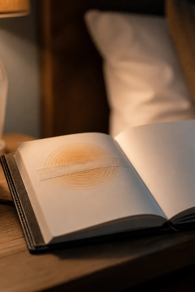
A candle-light halo looks cozy because circles mimic light bloom. Place the halo behind your main header so your title feels like it’s glowing. The rings also structure the page naturally, giving you a gentle “frame” without a hard border. This one is great for reflective entries, bedtime journaling, or pages themed around calm. It photographs strikingly because the gel pen rings catch light and create a soft focal center.
Draw a faint circle guide in the center using a coin or small stencil, then lightly mark 3-4 ring positions from that center. Add warm watercolor very lightly behind the rings — pale amber or butter yellow — then let dry. Trace each ring with a white gel pen, varying thickness slightly. Write your header on top of the halo, then add 2-3 small flame doodles in the margins.
Pro tipUse a white gel pen with a smooth tip; scratchy pens make rings look uneven.
AvoidDon’t make the halo too dark; it should feel like glow, not spotlight.
9. Felt-Cut Banner with Stitch Dots
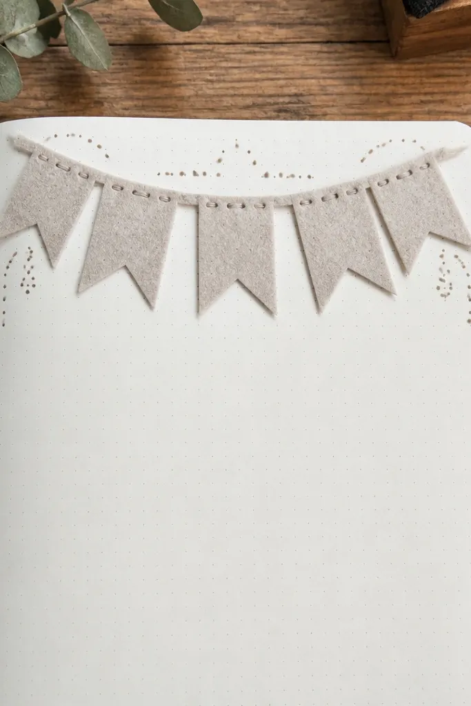
Felt-cut banners are cozy because they look soft and “crafty,” even when you’re using paper. The stitch dots give it that handmade finish, and the raised banner creates a clear top focal point. This layout is perfect for cover pages, project journals, or a page where you want a strong header without heavy decoration across the writing area. It also adds depth for photos because the banner sits above the page surface.
Cut a banner shape from craft felt or felt-look paper about 3 inches wide and 1 inch tall. Layer it slightly offset with a darker felt piece underneath for contrast. Glue the banner along the top third. Use a fine brown pen to add small stitch dots around the edges, then write your title in the center. Add a thin decorative line under the banner using a gel pen.
If you use felt paper, rub the edge with a pencil eraser to roughen the fibers for a more natural cut.
Don’t outline everything in dark marker — it makes felt look like plastic.
10. Snowy Window Border with Frosty Lines
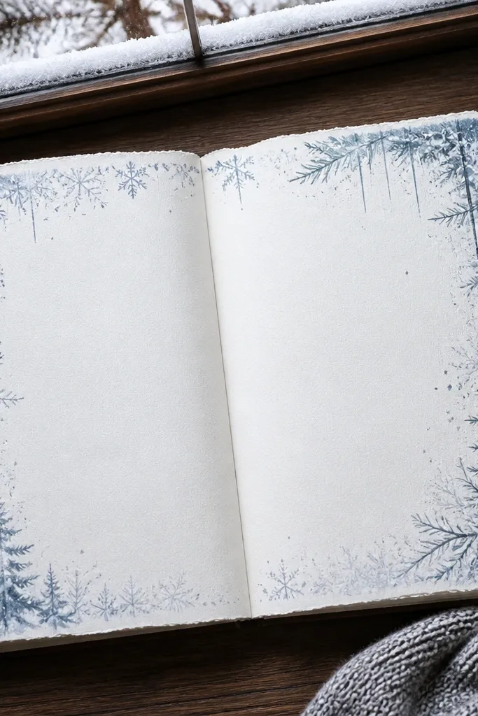
A frosty window border feels cozy because it hints at cold weather while keeping your page warm and readable. The border gives you a themed frame, but the center stays open for journaling. Use it for winter entries, self-care check-ins, or “what I’m grateful for today” pages in chilly months. It photographs well because the white gel pen frost lines show on darker ink and warm paper.
Choose a light gray or warm cream paper. Draw a thin border rectangle about 0.5 inch from the edges. Use a white gel pen to create frost lines: short diagonal streaks, tiny dots, and a few curved arcs that touch the corners. Add your header at the top center with a dark blue or brown pen to make the frost pop.
Pro tipPlan frost lines with light pencil first so you don’t overfill the corners.
AvoidSkip thick glitter — it sheds and looks messy in photos.
11. Autumn Map Doodles with Light Compass Rose
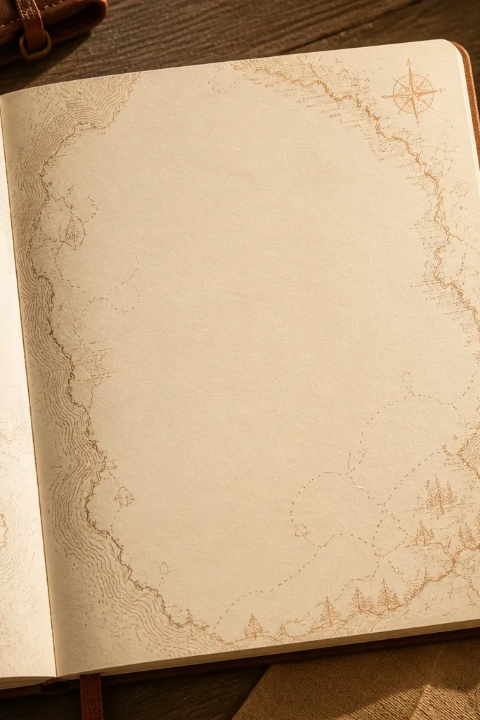
Map doodles look cozy because they’re playful and structured, like a small journey. Keep it soft: warm browns, muted oranges, and thin lines. Add a faint compass rose so the page reads like a “home base” for your thoughts. This is great for travel lists, seasonal reflections, or tracking where your creativity goes each week. The thin lines keep it photogenic and not cluttered.
Draw a simple compass rose in the top corner using pencil: four main points and small ticks between them. Lightly watercolor a small wash of muted orange around the compass, then let dry. Add “route” lines across the page using a fine brown pen, with 3-5 small destination dots. Write your heading under the compass and add a short legend key in tiny handwriting.
Pro tipUse one pen thickness for the whole page; mixed thicknesses make map lines look chaotic.
AvoidDon’t color every route segment — let the paper stay visible.
12. Hot Tea Labels with Mini Tag Stickers
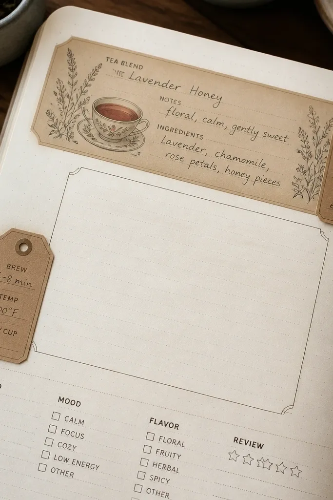
Tea label pages feel cozy because they mimic a warm ritual: picking a blend, writing notes, and saving the moment. Mini tags create visual hierarchy — your eye reads the tags first, then the entry text. This layout is great for journaling prompts, book notes, or “today’s mood” pages where you want a neat structure. It also looks adorable in close-ups because the tags create layers and movement.
Cut 3 small rectangles or tag shapes from cardstock, about 1.5 x 2 inches each. Write small labels on them like “Comfort,” “Curiosity,” and “Calm” using a dark marker. Place one tag in the top left, one in the top right, and one along the left margin, then glue them down. Add a small doodle under each tag (a tea cup, leaf, or steam line) and write the main entry in the center open space.
Lightly distress the tag edges with sandpaper or a nail file so they look handmade.
Don’t overcrowd the center — the tags should frame, not replace your writing.
13. Cocoa Beans Pattern Header with Repeat Dots
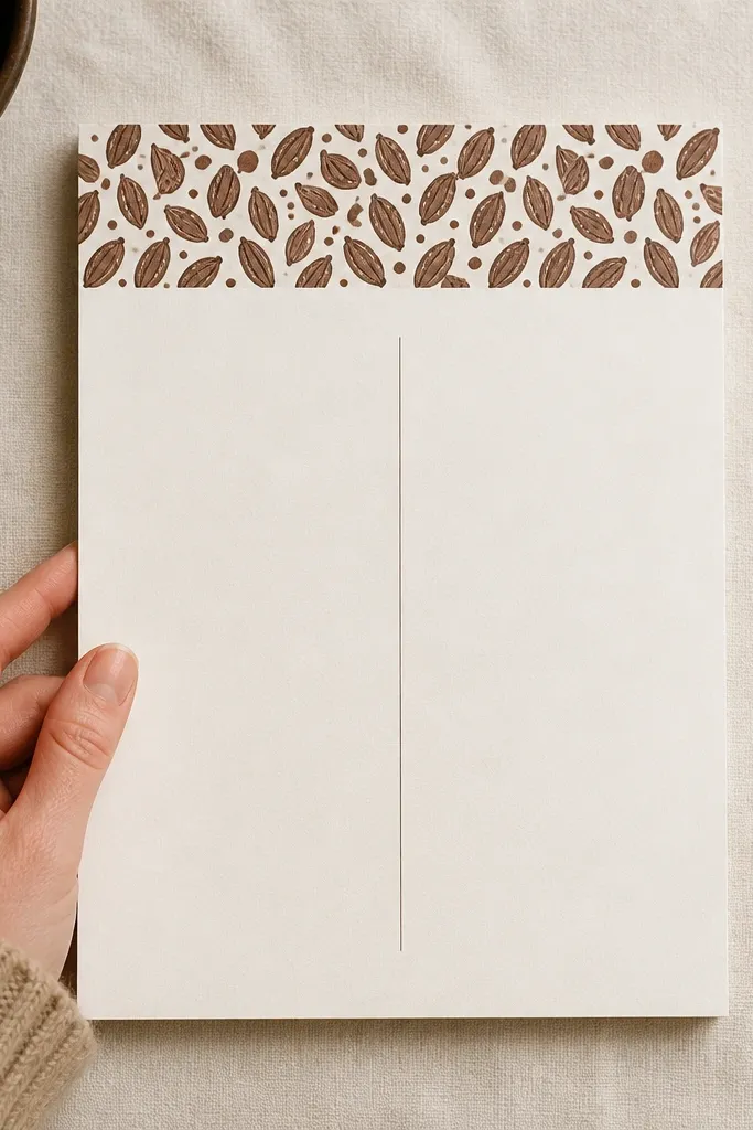
A cocoa bean repeat pattern looks cozy because it’s warm, rhythmic, and not too literal. Use small oval doodles and tiny center dots to suggest cocoa beans without drawing a full picture. Put the pattern only in the header strip so the page stays readable. This is ideal for habit pages, daily logs, or any entry where you want a cozy top band and a clean writing field below. The pattern also reads well in photos because it’s concentrated near the top.
Draw a thin line across the top third as the header strip. Create a repeating pattern of small bean shapes above the line using a fine brown pen — about 0.25 inch each — with tiny dots in the centers. Write your title right on the strip or just below it. Add one tiny “steam” curl next to the title to connect the doodle theme.
Pro tipKeep the pattern spacing consistent by counting spaces between beans for the first row.
AvoidDon’t extend the pattern into the writing area; it turns cozy into busy.
14. Soft Ombre Wash + Stamped Leafy Corners
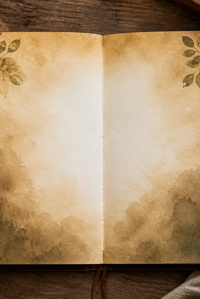
Ombre washes feel cozy because they create a smooth, comforting backdrop. Leafy corner stamps add a natural accent without taking over the page. This layout works for long-form journaling, where you want the background to support the writing instead of compete with it. Use warm greens and browns so it reads like fall, even if it’s just a few stamps. In photos, the ombre gives that soft gradient glow around your handwriting.
Brush or sponge a warm ombre wash from top to mid or bottom to mid, using diluted watercolor in two layers: light at one edge, stronger at the other. Let it dry. Stamp or sponge leaf shapes into the top-left and bottom-right corners, keeping them small. Add your header in the top center with a dark pen, then draw a thin line under it to separate the writing block.
Pro tipStamp on a scrap first to get the ink density right, then commit on the page.
AvoidDon’t make the ombre too saturated; it will mute your ink.
15. Brown Paper Bag Collage Mini Pockets
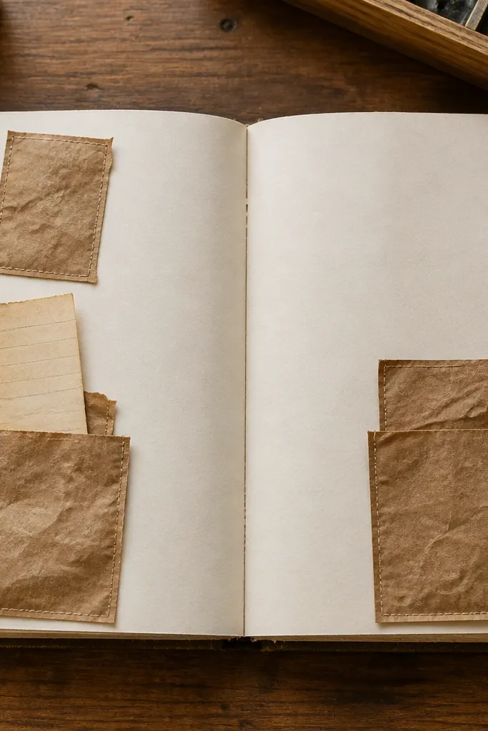
Mini pockets are cozy because they add function and texture. The brown paper bag material looks warm and slightly weathered, which instantly makes the page feel handmade. Use pockets to hold ticket stubs, tiny notes, or a strip of journaling you can swap out. The pocket placement also organizes your page: one pocket anchors the top, another balances the side. This is great for memory-style journaling where you want the page to do more than look pretty.
Cut two pocket shapes from brown paper bag material: one top pocket (about 3 inches wide) and one side pocket (about 2 inches wide). Fold the top edge to create a flap and glue only the sides and bottom, leaving the opening free. Place the pockets in the top third and left margin, pressing them flat. Write your header above the top pocket, then add a small stitched line using a fine marker or faux stitch pen around the pocket edges.
Pro tipUse a glue stick for the initial hold, then reinforce with a thin line of glue along the flap edges after it dries.
AvoidDon’t glue the flap shut — you lose the functional pocket look.
16. Book Spine Title Strip with Page Edge Dots
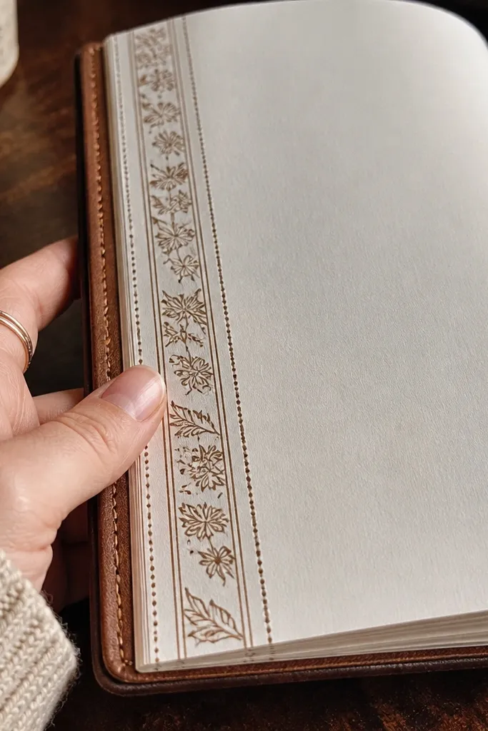
A book spine strip looks cozy because it turns your journal page into a little book page — familiar and comforting. The vertical title gives you an aesthetic structure, and the dotted page-edge details add a tactile feel. This layout is perfect for journaling about a book, a chapter, or a theme you want to label clearly. It’s also great if you like writing in a wide center block because the spine strip keeps the edges interesting without crowding.
Draw a vertical rectangle on the left side about 1 inch wide and 3.5 inches tall, aligned to the top third. Fill it with a warm neutral wash (light brown or beige) and let it dry. Write the title vertically using a fine pen, or write normally then rotate the card look by adding small arrows. Add small dot accents along the right edge of the rectangle to mimic page-edge dots, then write your main entry in the open center.
Pro tipFor vertical handwriting, use a ruler to keep the letters evenly spaced.
AvoidDon’t use bright colors for the spine — they make the page feel more party than cozy.
17. Thermal Printer Look Dots with Warm Margin Line
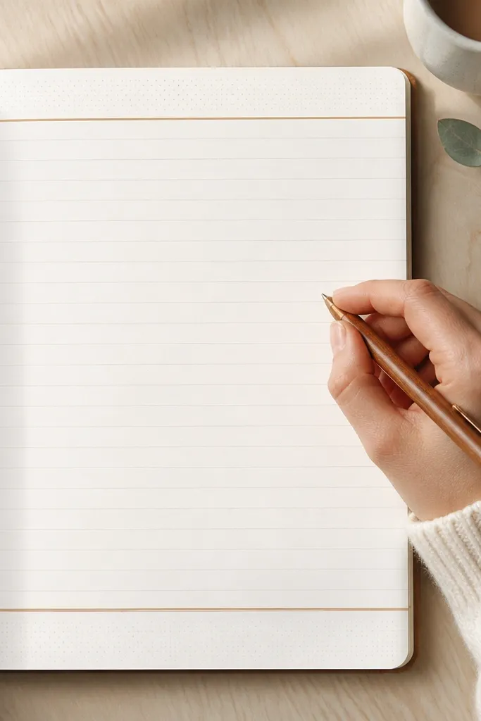
The thermal printer dot vibe is cozy because it feels nostalgic and imperfect. Instead of heavy illustration, you get a dotted texture that reads warm and handmade. Pair it with a simple warm margin line so your page still looks clean. This is great for minimalist cozy spreads where you want texture without taking over the page. Photos look good because the dots create a soft pattern that contrasts with solid handwriting.
Draw a warm margin line around the page using a light brown pen, about 0.4 inch from the edge. Create a dotted strip near the top by placing dots in a line — 0.1 inch apart — then connect the dots with a very light pencil guideline. Write your header inside the top area, then add a few scattered dot clusters in the corners. Finish with one thin divider line above the writing block.
Use a gel pen for dots so they look uniform, not scratchy like some brush pens.
Skip big doodles — the dots are the texture; extra art makes it noisy.
18. Candle Jar Label with Tiny Checklist Lines
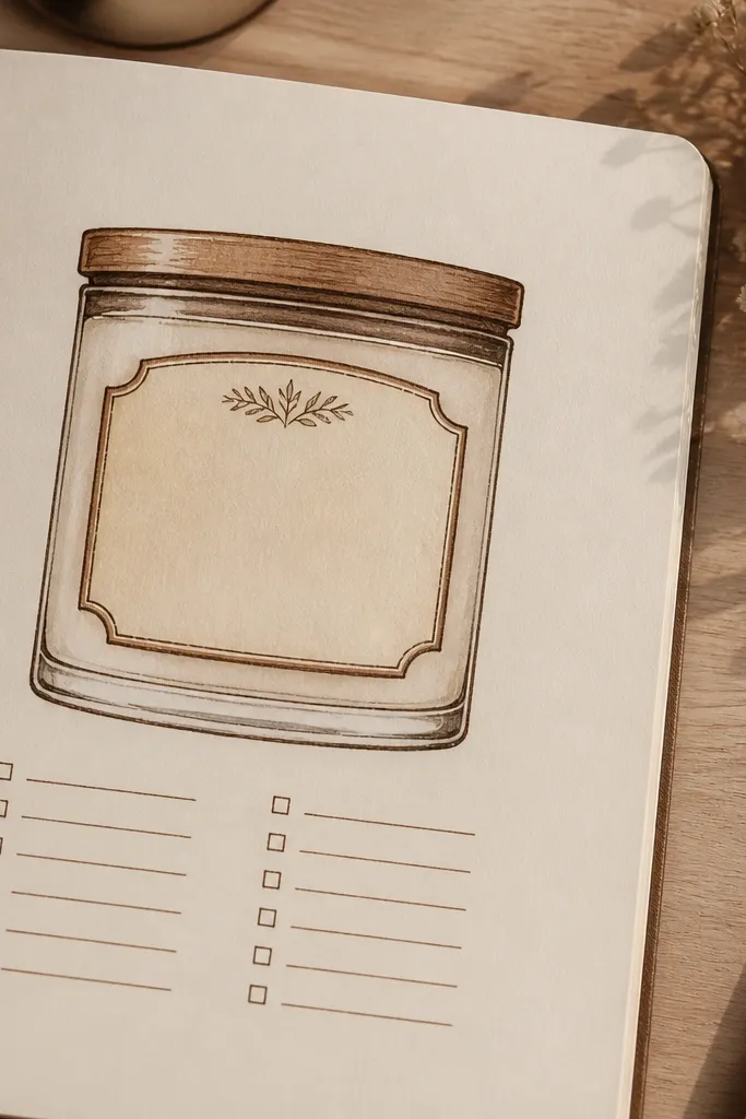
This layout looks cozy because it combines a cute label with a structured checklist. The jar-label style gives you a clear focal point, while the checklist lines keep your entry usable. Use warm creams and browns so it reads like a candle scent label. It’s perfect for self-care pages, morning routines, or any entry where you want to track a few items without turning the page into a spreadsheet. In photos, the label is crisp and the checklist adds gentle order.
Draw a rounded rectangle label at the top center, about 3 inches wide. Lightly shade it with warm beige marker, leaving the edges slightly lighter. Inside, write a short title and add 3-5 checklist lines using a fine pen. Add a tiny candle doodle above the checklist and a thin line under the label. Write your main notes in the open area below, leaving space between lines.
Pro tipUse a ruler only for the checklist lines; freehand the label so it stays handmade.
AvoidDon’t cram the checklist — leave a full line of breathing room.
19. Mismatched Washi Stacking Over Soft Grid
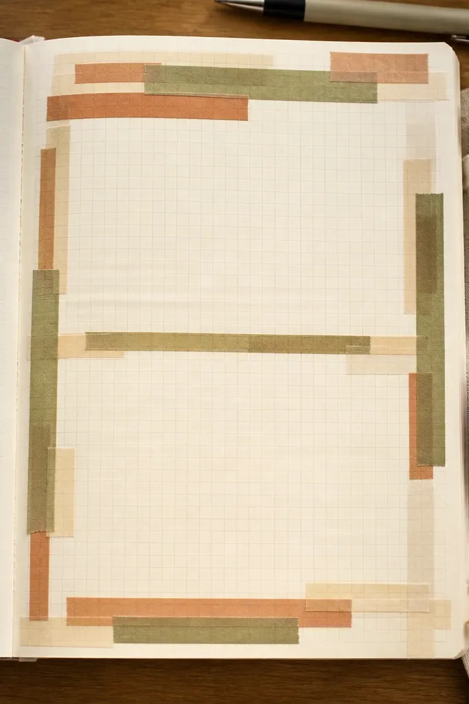
Stacked washi looks cozy because it adds depth and a slightly messy, real-craft feel. A soft grid keeps the page organized, so the stacking doesn’t turn into chaos. This layout is great for prompt pages, weekly planning, or any spread that needs sections. Use a warm palette like cream, terracotta, and muted olive so it stays cozy instead of bright. It photographs well because the tape layers catch light and create shadows.
Lightly pencil a grid with columns and rows, using very faint lines so you can erase later. Add washi tape strips horizontally across one section at the top, then vertically through a neighboring section. Keep the tape width around 0.25-0.5 inch so it stacks without covering everything. Erase the pencil grid lightly after you place the tape, then write your headings inside the remaining open sections.
Pro tipPress tape down with a bone folder or the back of a spoon for crisp edges and cleaner shadows.
AvoidDon’t apply too many tape layers — 2-3 stacks per page is enough.
20. Cozy Corner Doodles with Thick-Thin Pen Pair
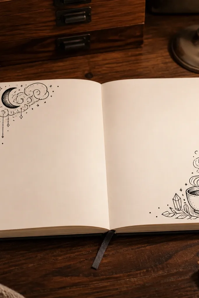
Thick-thin linework looks cozy because it adds warmth through contrast. Use a thicker pen for outlines and a thinner pen for details like steam curls, leaves, or small sparkles. Place doodles only in two corners — top-left and bottom-right — so the center stays calm. This is a strong choice for daily journaling pages where you want the decoration to frame your words, not compete with them. Photos look good because your eye gets a visual anchor in corners and a readable center.
Choose one thick pen (like a 0.8-1.0 mm) and one thin pen (like 0.3-0.5 mm). Draw a simple border rectangle in pencil and keep it light. In the top-left corner, sketch a hot drink cup with steam and one tiny heart; in the bottom-right, sketch a small branch or leaf cluster. Trace the outlines with the thick pen, then add details with the thin pen. Write your heading in the top center and your entry below the border.
Let the thick outline dry before adding thin details so the ink doesn’t smear.
Don’t put corner doodles in both corners and the margins — pick two corners only.
21. Warm Marble Lines with Oil Pastel + White Gel Highlights
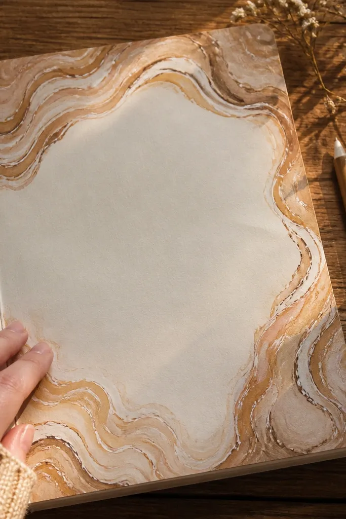
Marble lines feel cozy because they look soft and swirled, like warm stone or caramel swirls. You don’t need to cover the whole page. Keep the marble effect in the header band and around the outer edges, then write in the center clean area. This layout is great for creative prompts, mood pages, and art journaling where you want texture without a full illustration. It’s very photogenic because white gel highlights make the swirls catch light.
Use oil pastel or soft chalk pastel in warm colors like caramel brown and muted terracotta. Rub and blend lightly to create a header band swirl about 2 inches tall, leaving the center mostly blank. Add a second color to create marbling streaks, then blend with a tissue. Once it’s set, trace a few swirl edges with white gel pen for highlights. Write your header on the cleanest part of the band and add one small divider line below it.
Fix pastel lightly with a matte fixative spray tested on scrap first to avoid streaks.
Don’t use glossy sealant — it can glare in photos.
22. Soft Floral Frame with One Color Only
A single-color floral frame looks cozy because it stays calm and cohesive. Use one ink color — warm sepia brown or deep olive — and keep petals small. The frame makes the page feel styled without turning it into a coloring sheet. This layout is great for monthly spreads, gratitude pages, and any time you want a decorative edge but readable center. It photographs cleanly because everything shares one color family.
Draw a thin pencil rectangle frame about 0.5 inch from the page edges. In one corner, sketch a small flower cluster: 5 petals, one center dot, and 2 tiny leaves. Mirror the cluster in the opposite corner, then add single sprigs in the remaining corners. Trace the pencil lines with a warm sepia pen, then write your header in the top center. Keep the center writing block wide so your handwriting stays the focus.
Pro tipUse a fine brush pen for petals; it gives cleaner curves than a marker nib.
AvoidDon’t add multiple flower colors — the page loses the cozy, unified look.
23. Tea Cup Silhouette with Oversized Steam
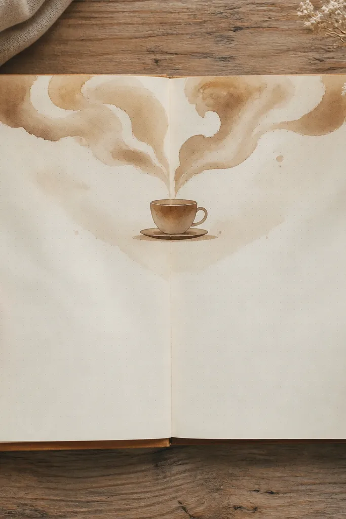
This page is cozy because the steam curls create motion and softness, and the silhouette keeps it minimal. Oversized steam is the trick: it frames your header like a warm cloud without needing a full illustration. This layout works for bedtime journaling, evening gratitude, and any prompt where you want the page to feel like a slow exhale. It’s photogenic because the steam lines look graceful and the silhouette gives strong contrast.
Draw a small tea cup silhouette at the top center using a dark brown pen. Then draw 6-8 steam curls that rise above it, filling the top half like a wreath. Color the cup lightly with a thin wash or leave it solid for contrast. Add your header inside the steam area, keeping letters large. Write the entry below with line spacing wide enough that the header doesn’t compete.
Pro tipUse a ruler to keep your writing baseline straight even if your steam curls are freehand.
AvoidDon’t make the steam too dense — leave gaps so the page stays airy.
24. Cross-Stitch Corner Border with Colored Threads
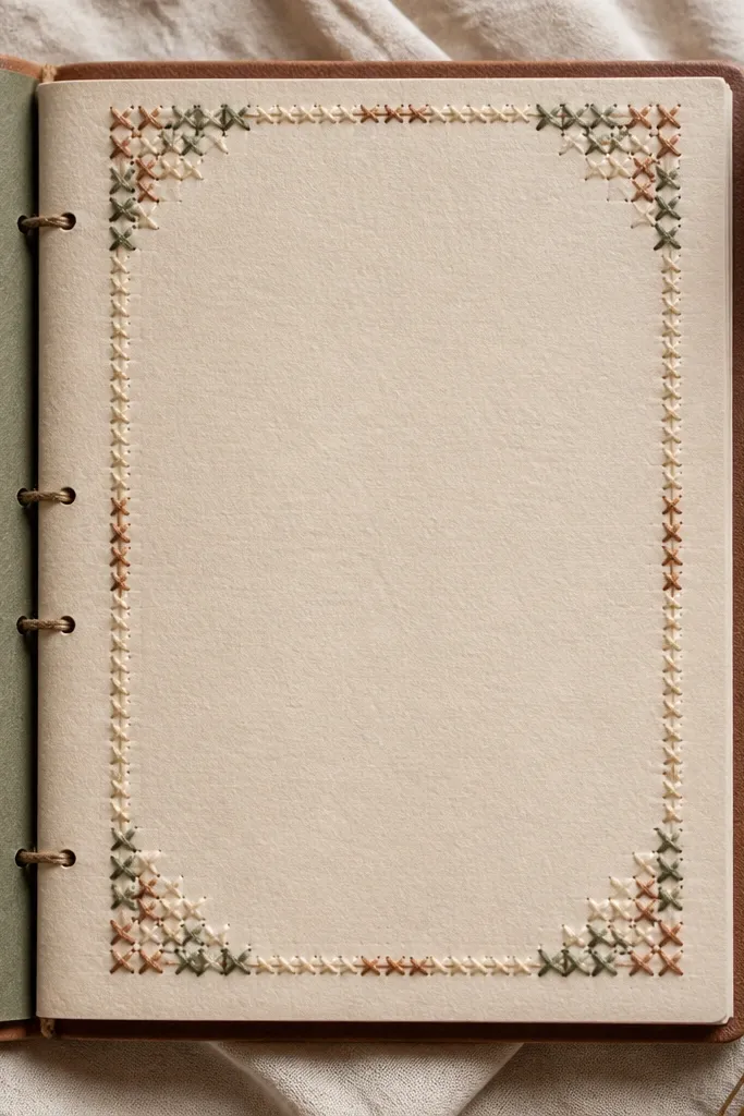
Cross-stitch borders look cozy because they mimic hand sewing, and that craft texture reads warm instantly. Keep it in the corners or along one edge so you don’t overwhelm the writing area. Use 2-3 thread-like colors that match your journal palette: cream, warm brown, and muted green. This is a great layout for covers, “letters to myself,” and any page where you want a cozy handmade feel. In photos, the stitch pattern creates a tactile look even with flat ink.
Draw a small corner square grid in pencil, about 1.5 inches by 1.5 inches. Choose 2 colors of gel pen or fine marker and cross-stitch by drawing X shapes in alternating directions. Fill only part of the corner so it looks like a patch, not a full sampler. Trace the grid lightly with a brown pen to define it, then write your header near the stitched corner. Erase any pencil grid marks after the ink is dry.
Pro tipUse a white gel pen for the “thread highlight” between X shapes so it looks more dimensional.
AvoidDon’t draw X shapes freehand without a grid; the pattern will look sloppy.
25. Scone Crumb Dots Along the Margin
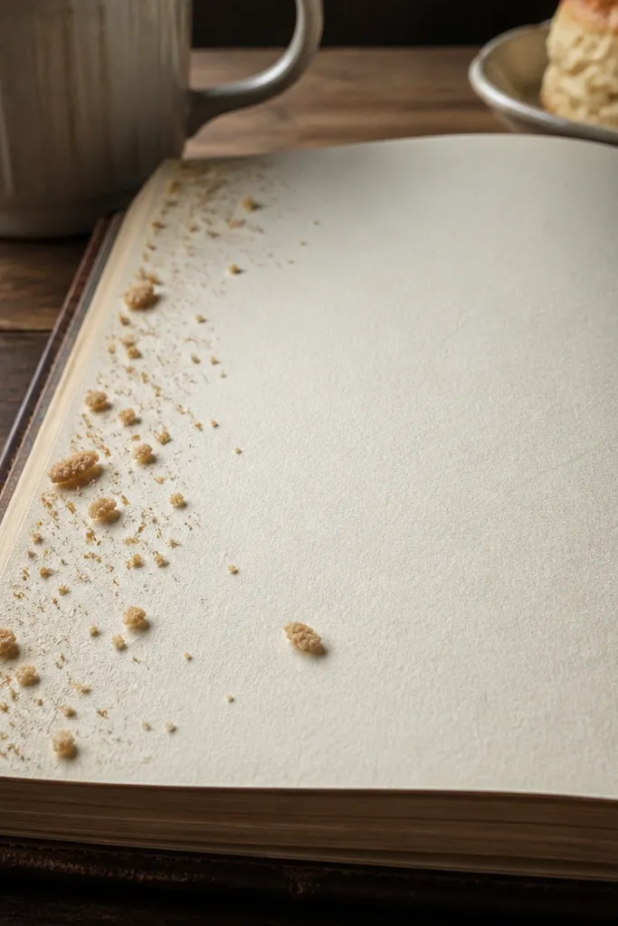
Crumb dots are cozy because they feel like baked texture without needing a full food illustration. Scatter small “crumbs” along one margin and keep the center clean for writing. This layout is great for quick daily entries, where you want the page to look cute but not take forever. It photographs well because the crumb dots create a warm speckled edge that frames your handwriting. Use warm ink colors so it feels like scone or cinnamon.
Pick a warm base paper or lightly tint the page with a pale beige wash at the very edges. Along the left margin, draw a faint line about 0.4 inch from the edge. Add tiny crumb dots and small short dashes using a brown pen, building a cluster near the top and thinning toward the middle. Write your header at the top center and start your entry below, using the margin crumbs as a visual anchor.
Pro tipMake some crumbs slightly larger than others to avoid looking like printer noise.
AvoidDon’t cover the margin with dense dots — keep it airy so the handwriting stays readable.
26. Candle Jar Stack with Three Labels
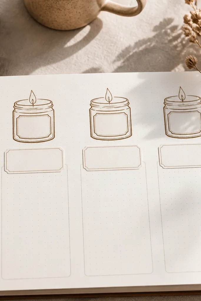
Stacked jar labels look cozy because they create a clear hierarchy and a cute homey theme. The three jars also give you natural sections for writing: one for today, one for gratitude, one for a plan. This is great for structured cozy pages where you still want the page to look styled. Keep jar drawings simple and warm — use cream, brown, and soft gold accents. It’s very photogenic because the stacked shapes create depth and a strong top focal point.
Draw three rounded rectangles stacked with slight gaps, each about 2.2 inches wide. Add a simple lid line at the top of each jar and a small shadow under the jar rim. Fill jar bodies with light beige watercolor or marker wash, leaving highlights uncolored. Write a short label in each jar using a dark pen, then add tiny gold gel pen dots on the lids. Leave the bottom area open for longer notes.
Pro tipUse consistent jar widths so the stack looks intentional, not accidental.
AvoidDon’t add too many tiny details like flames everywhere — keep the jars clean.
27. Campfire Ring Border with Flicker Lines
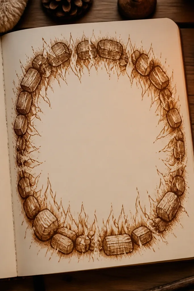
A campfire ring border feels cozy because it’s warm, centered, and instantly themed. Use a circular or oval ring near the edges to frame the writing area, then add flicker lines for movement. This layout is great for weekend logs, reflection pages, or any entry that needs a strong mood. It photographs well because the ring provides a clear boundary and the flicker lines catch light as fine strokes. Keep the center open so your writing stays readable.
Draw an oval or circle ring about 0.6 inch in from the page edges, leaving a clear center. Outline the ring with a warm brown pen. Add short flicker lines inside the ring — 10-15 lines — varying length so it feels like flame without drawing fire. Write your header in the top center and add a small “smoke” curl at one side of the ring.
Use a white gel pen to add a tiny highlight on 3 flicker lines so the border looks lit.
Avoid filling the ring with solid color; outlines and flickers read cozy without making the page heavy.
28. Cozy Mandala Seeds in One Corner
Mandala seed corners look cozy because they feel meditative and soft, especially when you keep them small and contained. The trick is to place the mandala in one corner only and leave the rest of the page open for writing. Use warm brown lines and a single accent color like muted gold or olive for tiny dots. This layout is ideal for journaling prompts, intention pages, or when you want a page that looks calm in photos. It’s photogenic because the corner cluster creates a strong focal detail without covering the text.
Choose a corner and draw a tiny circle guide about 1.2 inches wide. Around it, add petal-like shapes, then nest smaller dots inside each petal. Build outward in one direction only so it looks like a growing seed cluster. Trace the lines with a fine pen, then add 5-8 tiny accent dots in one color. Write your header near the opposite corner and keep the center blank for text.
Pro tipUse a dotting tool or the end of a gel pen for consistent dot sizes.
AvoidDon’t expand the mandala across the page; one corner is what keeps it cozy and readable.
29. Puffy Cloud Bubble Header with Soft Outline
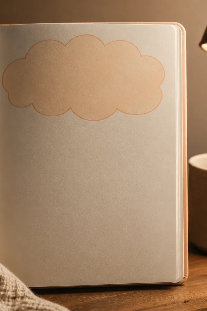
Cloud bubble headers look cozy because they’re playful and soft, like a warm blanket shape. Keep the outline thin and use warm pastel ink so the header doesn’t feel childish. This layout works for daily notes, “what I felt today,” and journaling prompts where you want a gentle mood. Photos are great because the cloud shape creates a clear top focal point and the center stays clean for writing.
Draw a cloud outline across the top third using a light brown or muted navy pen. Thicken the cloud outline slightly, then trace inside the outline with a lighter color wash (cream or pale beige). Write your title centered inside the cloud. Add two tiny stars or raindrop dots on the corners of the page to balance the composition. Write your entry below with a simple line divider under the cloud.
Use pencil first for the cloud shape — it’s the part you want to get perfect for photos.
Don’t use a thick black outline; it makes the cloud look harsh.
30. Warm Checkered Corner with Pencil Grid + Marker Blocks
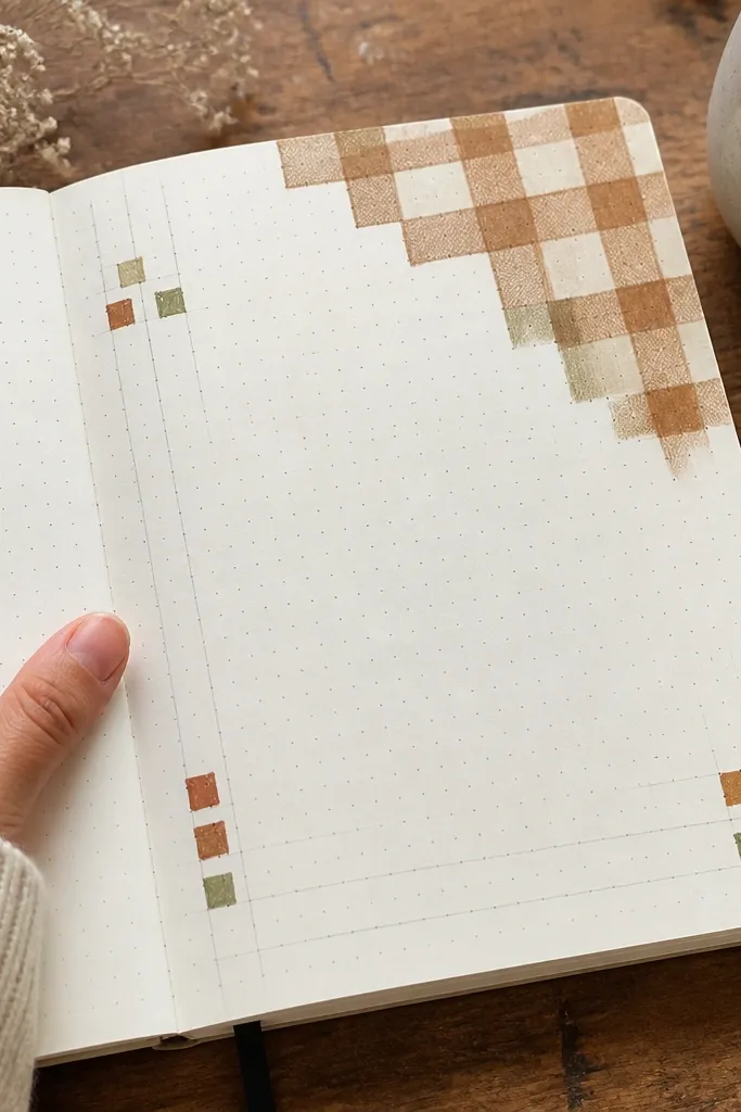
Checkered corners feel cozy because they look like fabric — the page instantly reads like a blanket pattern. Keep it in one corner and use a warm palette like cream and caramel brown. The rest of the page stays clean for writing, so the cozy effect doesn’t fight your handwriting. This layout is ideal for journaling pages that need structure but not heavy decoration. It’s photogenic because the corner pattern gives a crisp detail that stands out.
Lightly pencil a small square grid in the top-left corner, about 1.5 inches by 1.5 inches. Color alternating squares with a warm brown marker, leaving the other squares cream. Add a second thin border line around the checkered area using a fine pen. Write your header near the top center and start your entry below, keeping your lines straight. Erase grid lines after marker dries so the pattern looks clean.
Pro tipUse a ruler for the grid only; freehand coloring inside squares looks messy in photos.
AvoidDon’t color every square with marker — alternating blocks create the cozy fabric look.



