
1. Washi Tape Border with Center Quote Box
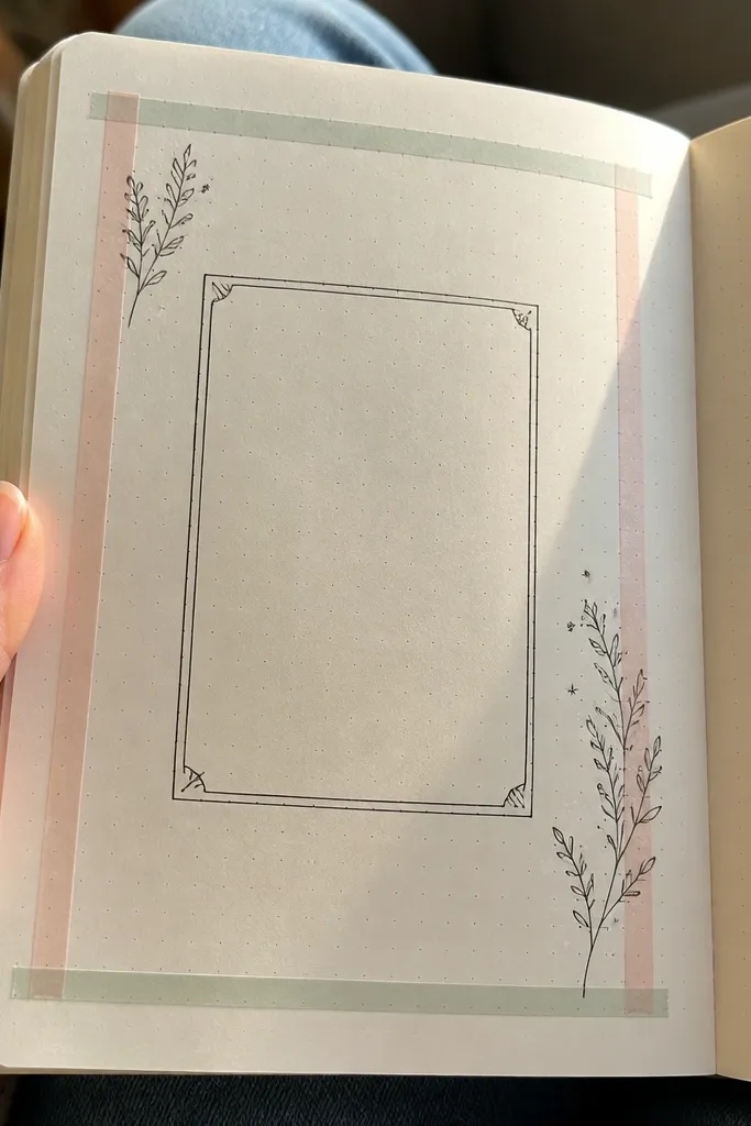
This is the quickest way to make a page look intentional. You build a clean border using washi tape strips, then anchor the whole spread with one centered quote box. Use black fineliner for the quote so it stays readable and sharp in photos. The tape creates texture without needing drawing skills, and the quote box gives your page a focal point.
Start by measuring your journal page width and placing four tape strips as a thin frame, leaving a margin of about 8-12 mm on each side. Then draw a rectangle in the center with a ruler and write your quote or prompt inside using a 0.7 fineliner. Finally, add one small color accent — like a single underlined word or a tiny doodle in the bottom-right corner — so the page doesn’t look flat.
Pro tipCut tape edges with a craft knife and metal ruler for crisp lines, not torn edges.
AvoidDon’t cover the whole page with tape — keep it to a border so the center stays readable.
2. Gel Pen Gradation Title Strip
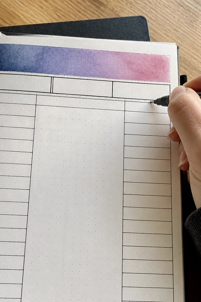
This idea makes a journal page look “graphic design” without complex art. A gradation strip at the top sets mood and color direction, while a bold title underneath keeps the page structured. It photographs well because the top strip creates a clear horizontal band that the eye can follow. Choose one color family and make the gradient from light to dark for a smooth, polished look.
Start by drawing a 15-25 mm tall rectangle at the top of the page with light pencil guides. Fill it using gel pens in 3-5 passes, blending from light to dark by overlapping strokes. Then write your title in dark ink directly below the strip and add one short section label like “Today” or “Notes” aligned to the left edge of the title.
Pro tipUse a paper test scrap first — gel pen layering behaves differently on thicker vs. Thin paper.
AvoidSkip the random multi-color rainbow gradient; stick to one color family or it looks cluttered.
3. Stamp Background with Transparent Label Headers
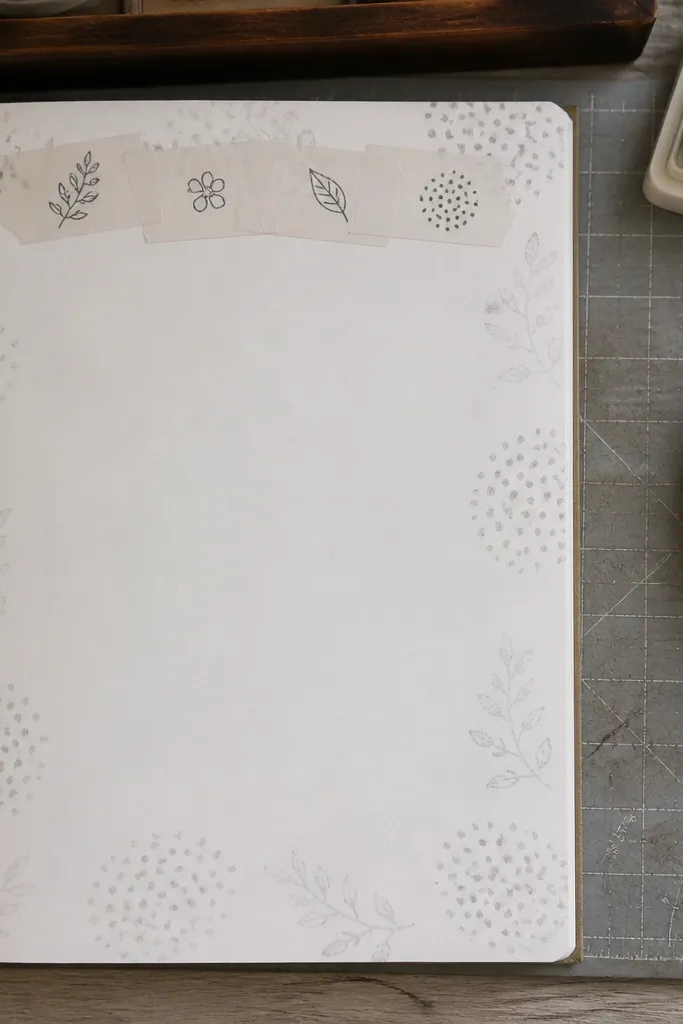
Stamped backgrounds add texture that looks expensive in photos. You keep the page airy by using a light stamp color and leaving plenty of white space. Then you place label-style headers across the top using translucent tape labels or clear sticker labels. The result is a clean, organized page with a soft, patterned foundation.
Start by choosing a small stamp (dots, stars, or tiny florals) and stamping lightly across the page using a light ink pad. Then place clear label strips at the top — 3 labels works well — and write short header text on each. Finally, fill the body with bullet points under each label, keeping line starts aligned to the left edge of the labels.
Let the ink dry between passes so you don’t smear and muddy the background.
Don’t stamp dark ink across the whole page; light and sparse looks cleaner.
4. Grid Pages with One Thick Divider Line
If your pages feel too open, this gives structure fast. A simple grid makes everything look planned, and one thick divider line adds drama. It’s especially good for weekly planning, because you can keep tasks and notes in separate visual zones. The thick line also photographs clearly, even when your handwriting is small.
Start by drawing a grid using a ruler: for example, 3 columns and 6 rows, with each cell about 18-25 mm wide. Then pick one horizontal divider line and thicken it with a darker pen so it separates two major sections. Finally, write section headings in the top row cells and keep each cell to one or two lines so the grid stays tidy.
Pro tipUse mechanical pencil for the grid and only ink the thick divider and headings.
AvoidDon’t overcrowd every cell — leave some blank squares for breathing room.
5. Circle Date Stamp Map
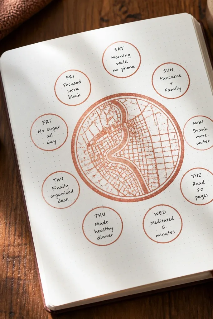
This layout turns dates into a visual theme instead of plain text. You stamp or draw one large circle for the date, then surround it with smaller circles for highlights. It looks cute, structured, and readable in photos because circles create strong boundaries. Use it for “daily wins,” “mood,” or “top three moments.”
Start by drawing one medium circle centered on the page and write the date inside. Then add 6-10 smaller circles around it, spacing them evenly like a mini constellation. Write one short phrase in each small circle, using consistent font size. Finish by adding a thin ring around the whole cluster if you want a stronger frame.
Pro tipUse a compass or a bottle cap template for consistent circle sizes.
AvoidDon’t mix circle sizes randomly; keep small circles within a narrow size range.
6. Corner Photo-Mat Style Page
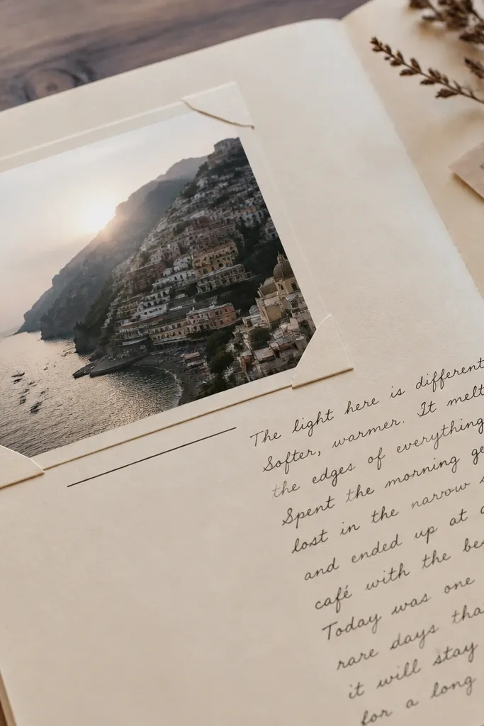
This one looks like a scrapbook page, even if you never paste photos. The trick is a photo-mat frame in one corner with a caption line, plus a clean text block elsewhere. It gives your page a designer “asymmetry” look without needing illustrations. Great for travel journals, meal logs, or any page where you want one moment to stand out.
Start by drawing a rectangle in the top corner with margins of about 25-35 mm from the edges. Add an inner rectangle inset by 6-10 mm to create a mat effect, then write a short caption line under the inner rectangle. Use the rest of the page for a tidy list aligned to the left margin, and keep your bullets short so they don’t fight the corner frame.
Pro tipUse a slightly thicker pen for the outer frame and a thinner pen for the inner mat line.
AvoidDon’t place the mat in the center; corner placement is what makes it feel styled.
7. Two-Column Mood Tracker with Color Blocks
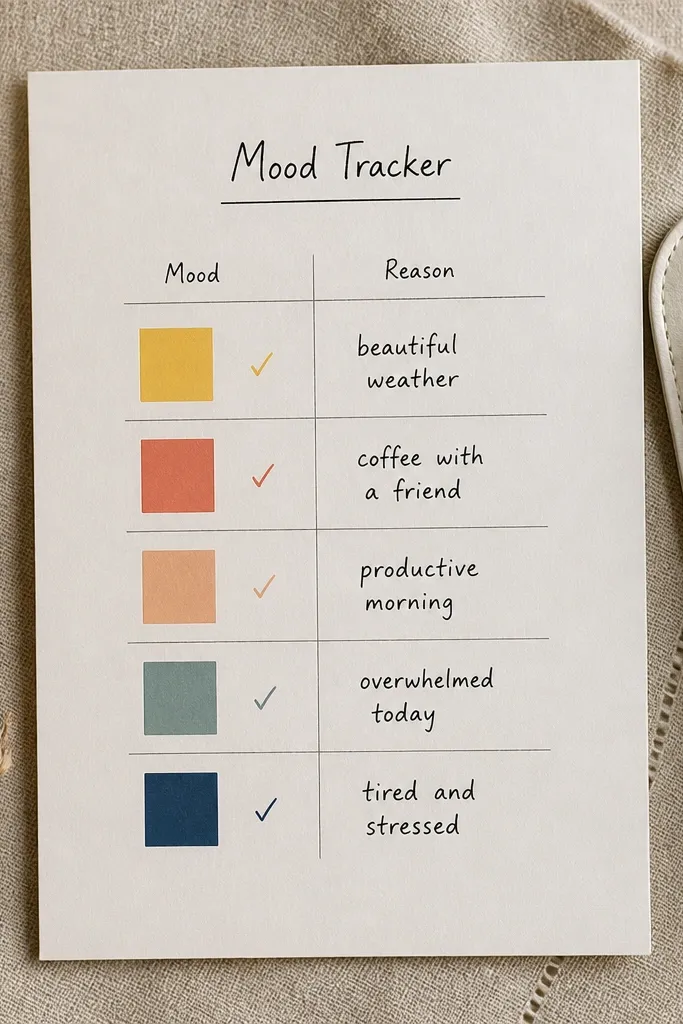
Mood tracking looks way better when it’s graphic, not paragraph-based. Two columns let you separate “mood” and “reason,” and color blocks make it visually satisfying. Choose 5 mood levels and assign each a consistent color. The page stays clean and easy to scan when you revisit your journal later.
Start by drawing two vertical columns separated by a 10-15 mm gap. In the left column, create 7-10 equal squares per day and fill each with a chosen mood color. In the right column, label each row with the same order and write one short reason phrase. Keep your handwriting aligned to the top of each row so it doesn’t drift.
Make a tiny legend at the top using small colored swatches and mood words.
Don’t use too many colors; 5 mood colors max keeps the page cohesive.
8. Hand-Lettered Title on Rounded Rectangle
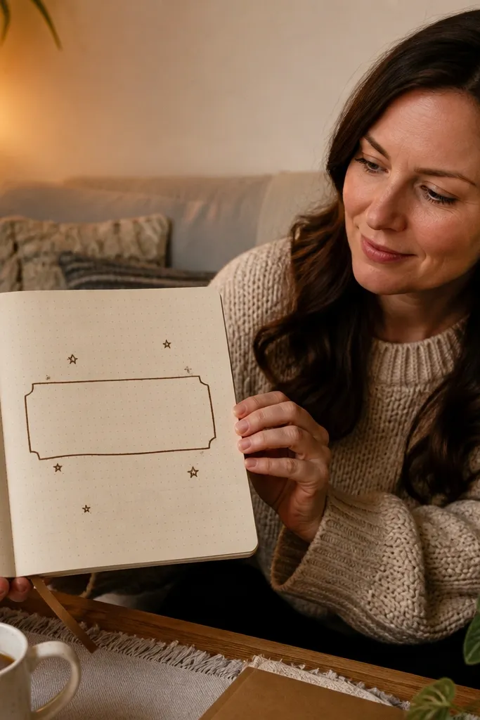
This is a strong “cover page” style layout for any entry. The rounded rectangle gives a soft, modern look, and hand-lettered titles add personality without clutter. It works with minimal text because the title becomes the centerpiece. If you want pages that feel cohesive week after week, this is one of the easiest repeat formats.
Start by drawing a rounded rectangle across the top third of the page using a stencil or by tracing a bowl shape. Write your title inside with a brush pen or a thicker gel pen, keeping letter height consistent. Then underline only the last word with a thin line and place the rest of your entry below in short bullets. Use one black pen only for the body so the title stays dominant.
Pro tipLightly pencil the rectangle first; eraser marks show through some journal paper.
AvoidDon’t outline the rounded rectangle with multiple colors; one outline is enough.
9. Checklist with Oval Bullets and Micro Icons
A checklist can look cute when the bullets are part of the design. Oval bullets and tiny micro icons add a handmade feel while keeping the structure functional. This layout is great for daily tasks, studying, or self-care routines. Photos look clean because each line has an identical start point and consistent icon size.
Start by drawing 5-10 lines down the left side of the page with a ruler. Next to each line, draw an oval bullet using a small template or freehand, then add one tiny icon inside or beside the oval (heart for self-care, star for priority). Finally, write the task text aligned after the icon and leave enough space at the right for check marks later.
Use a 0.3 or 0.4 fineliner for micro icons so they don’t look blob-like.
Avoid big, detailed icons; tiny and simple read better in photos.
10. Watercolor Wash Underlined Headings
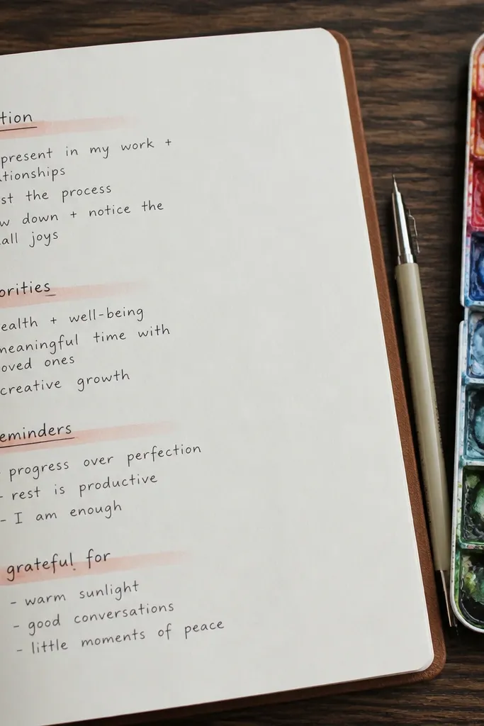
Watercolor washes bring softness and color without turning your page into a mess. The best version here is minimal: a light wash under each heading, not a full background. It creates a gentle gradient that looks good even with messy weathered paper textures. Keep your text dark and your wash light for a clear contrast.
Start by writing 3-5 headings in black fineliner and spacing them evenly down the page. Then wet the area just below each heading lightly with clean water and paint a thin watercolor underline that fades out at the ends. Let it dry fully before adding any extra notes so you don’t smear ink. Finish by writing your bullet points under each washed underline.
Use a small round brush and keep the wash thin — 3-6 mm height is enough.
Don’t paint over wet ink; headings should be ink-dry before watercolor.
11. Paper Cutout Label Column
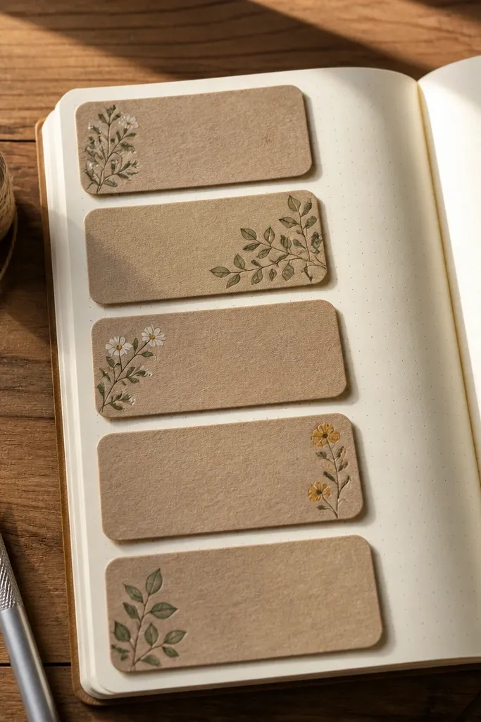
This makes your journal look tactile and styled. Cutout labels add a dimensional layer that reads well in close-up photos and makes the page feel like a DIY collage. You don’t need fancy craft skills; simple rectangles with rounded corners are enough. Use it for planning pages where you want each category to feel separated.
Start by cutting 4-6 label strips from cardstock or thick paper, about 35-45 mm wide and 12-18 mm tall. Round the corners with scissors or a corner punch if you have one. Arrange them down the left or top area and glue only the back edges so the label front stays crisp. Write category names on the labels, then fill the page with aligned notes in columns that match each label’s position.
Pro tipUse a glue stick for paper labels so you don’t warp the page like liquid glue can.
AvoidDon’t use flimsy printer paper for the labels; thin paper curls and ruins the look.
12. Dot Grid Background with Highlighted Paths
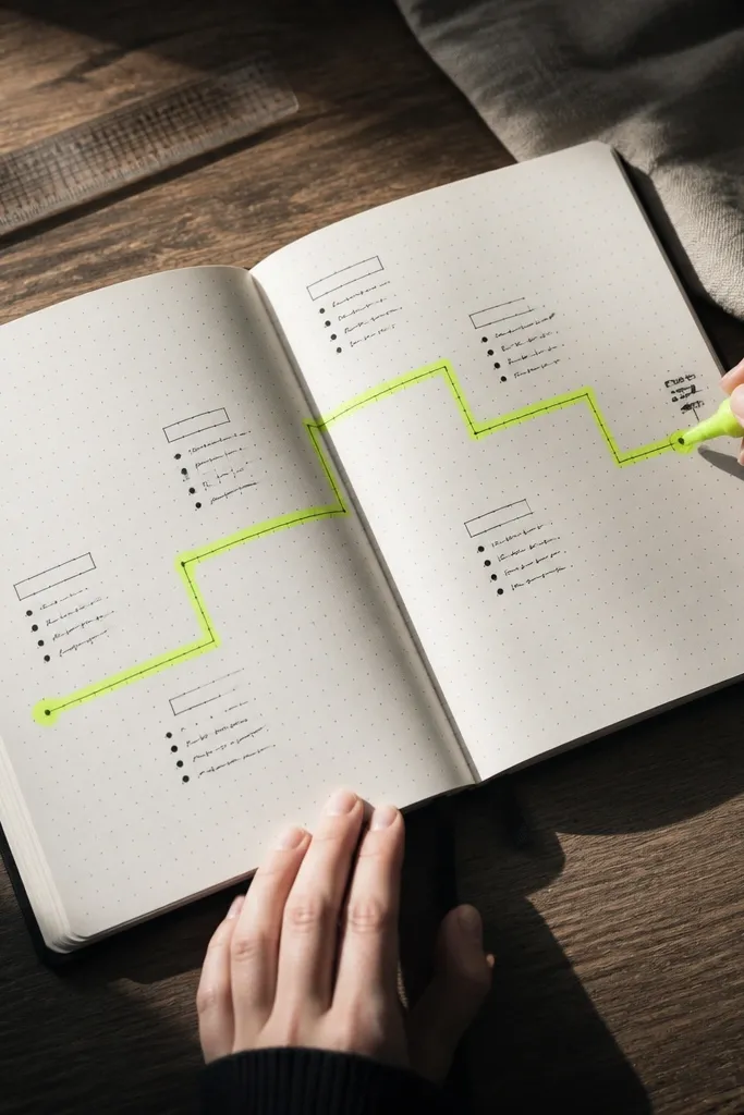
A dot grid page instantly looks organized, but the magic is adding one highlighted path. Think of it like a visual route: a zigzag or curve that links your notes. It looks playful and intentional, and it helps you track relationships between ideas. Use bright highlighter for the path and keep everything else in dark ink.
Start by drawing a dot grid lightly across the page using a dot marker or a ruler with a hole punch grid guide. Then choose one theme and draw a continuous line through several areas of the page, like a zigzag or S-curve. Outline the line with a highlighter, then write short note fragments next to the points where the line changes direction. Keep your handwriting small so the highlighted path stays the hero.
Use a ruler to place the turning points; the path looks cleaner when the geometry is deliberate.
Don’t highlight every line — one path only keeps the photo uncluttered.
13. Photo-Card Style Sidebar with Rounded Corners
This design gives you a modern sidebar block, like a magazine layout. You create a rounded-corner card on one side, add a short title and 2-4 bullet points, then let the rest of the page be your main notes. It’s great for “things I learned,” “ingredients,” or “book notes.” The card shape makes the whole page look finished even when the content is short.
Start by drawing a vertical rounded rectangle on the left side of the page, leaving margins of about 15-20 mm. Add a thin border line inside the card, then write a short sidebar title at the top. Fill 2-4 bullets with consistent line length so the sidebar looks balanced. On the right side, write your main entry in a normal block, but keep the first line aligned with the sidebar bullets.
Pro tipA corner radius template makes this look crisp fast.
AvoidDon’t make the sidebar card too wide; if it takes half the page, it stops feeling like a design element.
14. Doodle Frame Around a Plain Text Block
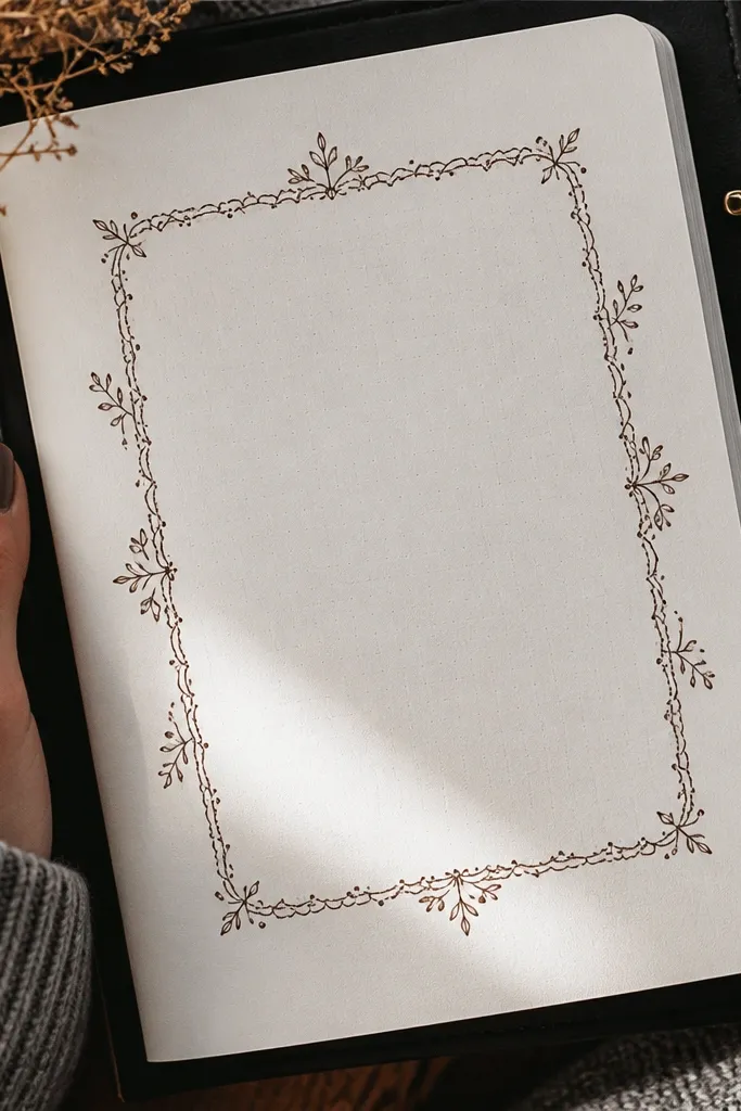
This is for when you want the page to look artsy but still readable. You keep the center text block plain and consistent, then add a doodle frame around the edges. The frame hides imperfections at the margins and gives the whole page a finished border. Use one doodle type, like tiny stars, scallops, or leaf sprigs, repeated lightly.
Start by drawing your main text block in the center with a ruler, leaving a 20-25 mm margin from the edges. Then add a doodle border around the text block — for example scalloped curves at the top and bottom, and small dots on the sides. Keep doodles small and evenly spaced so they don’t compete with your handwriting. Finish by writing one bold heading above the text block in the same pen color as the doodles.
Pro tipUse a single pen thickness for the doodles; mixed thicknesses can look accidental.
AvoidDon’t fill every edge with dense doodles; leave gaps so the center text stays clean.
15. Layered Washi Tape Arrows for Sections
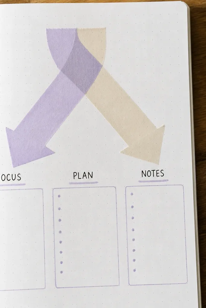
Arrows are the fastest way to make your page feel like a system. Layered washi tape arrows add color and guide the eye from section to section. This is perfect for study notes, project planning, or any entry where you want “this goes here” clarity. The look is graphic, and the tape layers create a satisfying texture without heavy drawing.
Start by deciding how many sections you have — 3 works best for one page. Place a label for each section in a line, then draw an arrow path from the first label to the second and third. Create the arrow using two or three washi strips layered slightly offset so it looks dimensional. Write short content under each label, keeping the first word aligned to the label start.
Pro tipUse one washi pattern for arrows and a plain tape for label underlines so it stays readable.
AvoidDon’t use arrows for every single sentence; use them for section-level navigation.
16. Marbled Edge Wash Border
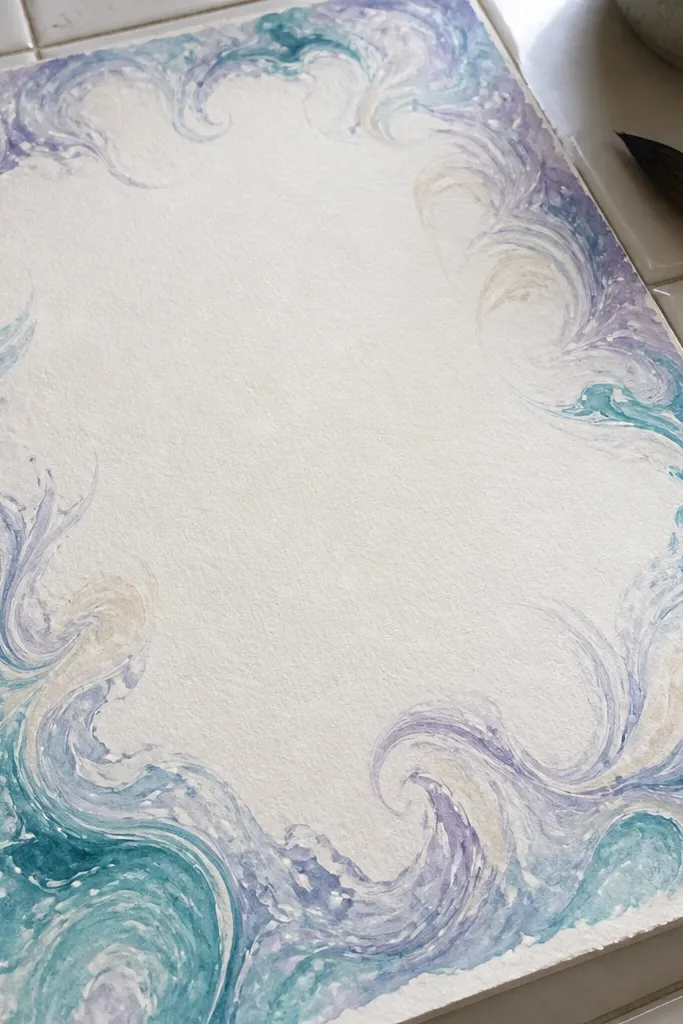
A marbled edge border makes a plain page look styled in seconds. You paint color only around the perimeter, leaving the center untouched for clean handwriting. The marbling looks complex, but the execution is simple: swirling watered paint and lifting it with a brush. This is a strong choice when you want your journal to look artful without covering the whole page.
Start by mixing 2-3 watered watercolor colors on a palette so they spread easily. Wet the outer 15-20 mm edge of the page lightly with clean water, then dab and swirl the colored paint with a small brush to create a marbled effect. Let it dry fully, then write your title and body in dark ink in the center. If you want extra polish, add a thin black line along the inner edge of the marbled border after it dries.
Practice the swirl on scrap paper first; edge borders behave differently with different paper thickness.
Don’t paint too close to the center; if the wash creeps under your text, it looks muddy.
17. Monogram Top Banner with Mini Icons
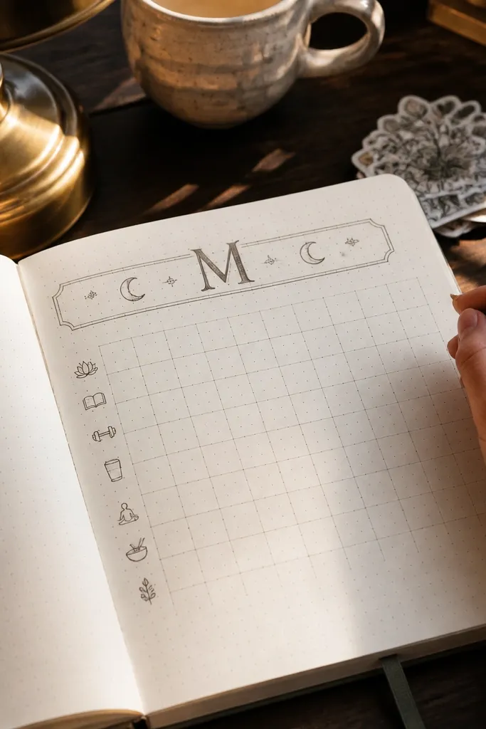
A monogram banner instantly makes a journal page feel personal and cohesive. You pick one letter (your initial, a brand letter, or a themed symbol) and place it at the top in a bold style. Mini icons around it keep the page playful without adding clutter. This works well for monthly reviews, habit trackers, and theme pages where you want a strong header.
Start by drawing a top banner rectangle about 25-35 mm tall across the page. Write your monogram large inside it using a brush pen or thick gel pen, keeping strokes smooth. Add 3-5 mini icons around the banner corners — like stars, dots, or tiny hearts — in a lighter pen color. Then write the entry title below the banner and keep the body in consistent bullet points.
Use a photocopy of your monogram as a guide to keep letter proportions even.
Don’t use a thin pen for the monogram; it disappears in photos.
18. Calendar Strip with Daily Color Squares
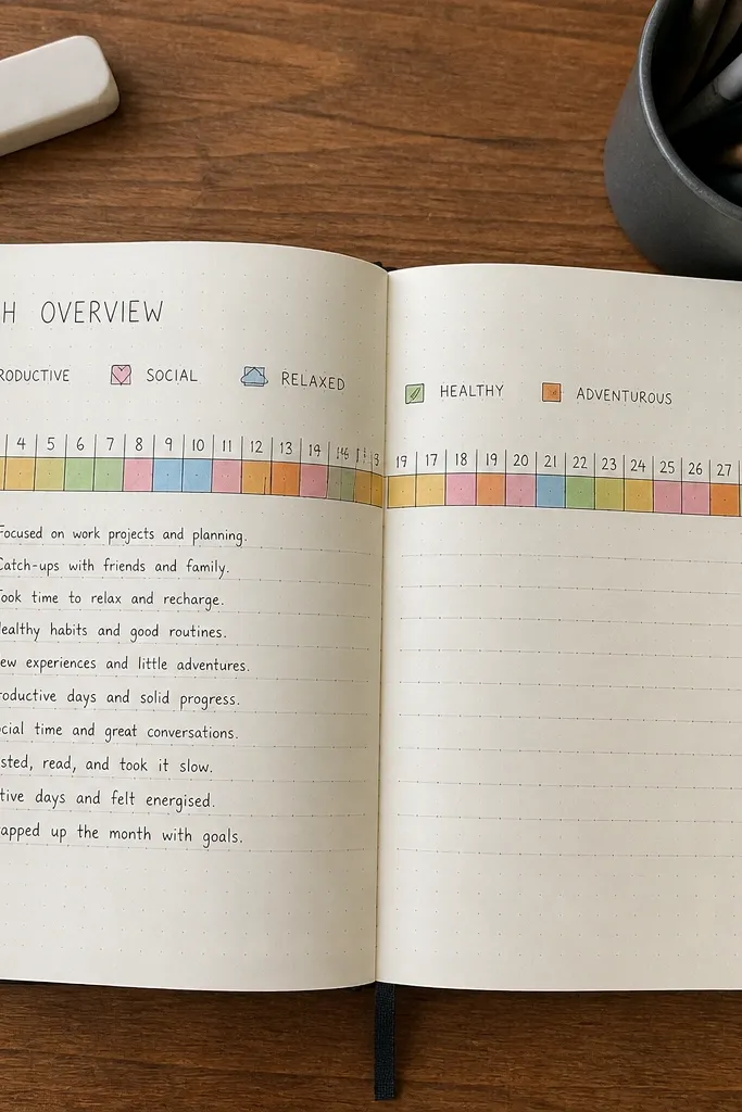
This turns a month overview into something you can skim instantly. A calendar strip made of small color squares gives you a visual record of your week at a glance. Add one label line for what each color means, then keep your daily notes short. It looks clean because the squares create consistent structure across the page.
Start by drawing a horizontal strip across the page with 7-14 equal small squares, each about 12-16 mm wide. Fill each square with one assigned color for that day’s status. Add a short legend above or below the strip using tiny swatches and one-word labels. Finish by writing 3-5 short highlights in a neat list under the strip, aligned to the left edge.
Use one ruler pass to draw the strip outline, then fill squares freehand so you don’t overthink spacing.
Don’t write full sentences inside the squares; keep them as color only.
19. Torn Paper Corner with Inked Title
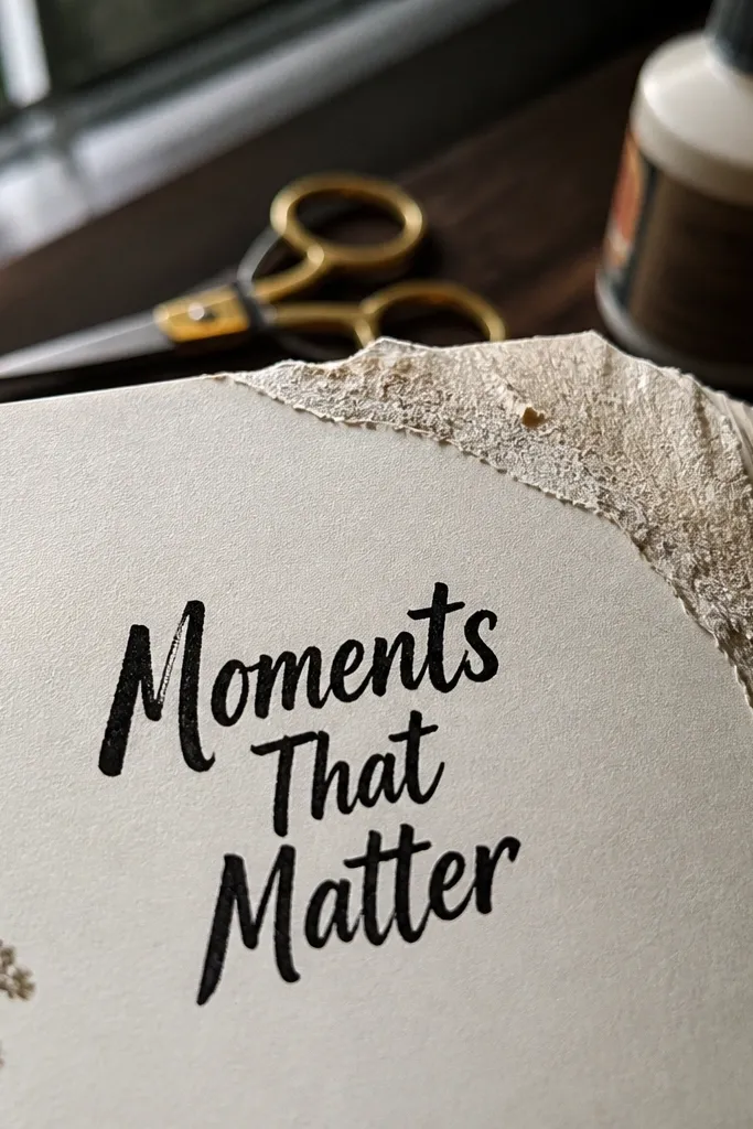
Torn paper edges add texture that looks great in close-ups and still keeps the page tidy. Place the torn piece in one corner, then write a bold title on the clean paper area. The contrast between rough edge and smooth handwriting looks intentional. Use this for weekly themes, goals, or cover-style pages that need a “finished” look.
Start by tearing a small paper piece from cardstock or textured craft paper, about 60-90 mm on each side. Glue it into one corner so the torn edge faces inward. Then write your title in bold ink on the main page area, keeping the title baseline parallel to the page edges. Add a short list under the title, and keep spacing consistent so the torn corner doesn’t steal attention from the text.
Tear on a slight angle and trim only the straight edges; raw torn texture looks better than perfect cuts.
Avoid using very glossy paper; it can reflect light and wash out in photos.
20. Perspective Lines with Side Notes
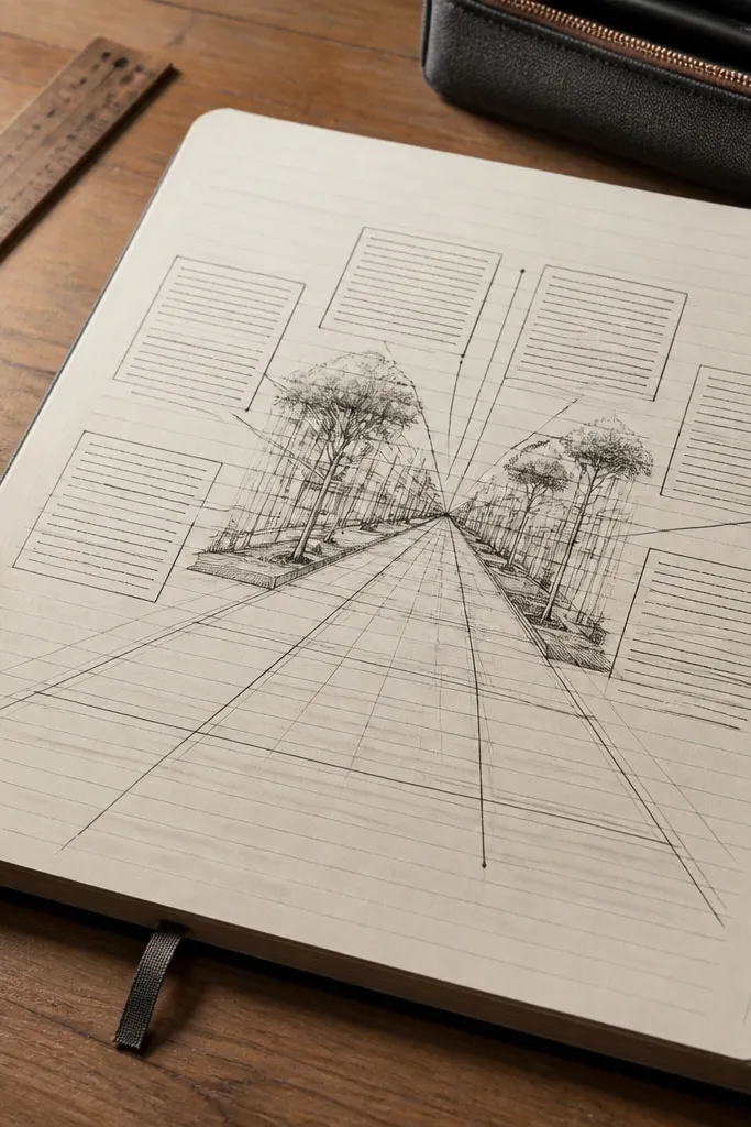
Perspective lines make a journal page feel like an illustrated scene, even when your content is simple. You draw converging lines from the bottom toward a vanishing point, then place side note blocks along the lines. This layout looks dynamic and photograph-friendly because the eye follows the lines. It’s best for brainstorming, “ideas map” pages, and any entry where you want to visually connect points.
Start by drawing a vanishing point near the center-bottom of the page. Then draw two sets of straight lines from the bottom corners toward the vanishing point, spacing them evenly. Place small rectangular note boxes along one side of the perspective lines and label each box with short phrases. Finally, connect related boxes with thin lines so the page reads like a visual map.
Use a ruler for the perspective lines and only freehand the note box outlines for a handmade feel.
Don’t draw too many lines; 6-10 total lines is enough to create the perspective look.
21. Envelope Pocket for Receipts and Notes
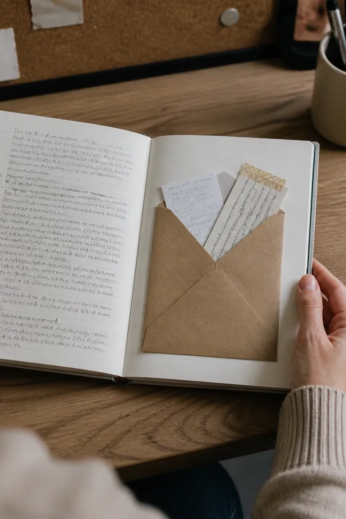
A pocket page is one of the best aesthetic upgrades because it adds a physical element. You can tuck receipts, stickers, or printed snippets inside, and the pocket makes the page look styled even when it’s empty. The envelope shape also creates a clean visual silhouette that stands out in photos. This is ideal for journaling with ephemera, like meal logs, event notes, or monthly summaries.
Start by cutting a pocket from cardstock: roughly 120-150 mm wide and 170-220 mm tall depending on your journal size. Fold it into an envelope shape with crisp creases and glue only the side and bottom flaps to the journal page. Add a small label tab on the top flap and write a short category like “May receipts.” Finally, seal the pocket edges with a thin glue line and let it dry flat under a book for 30-60 minutes.
Pro tipUse a bone folder on the creases so the pocket stays sharp and doesn’t look wrinkled.
AvoidDon’t glue the top flap — you need it to open, and glue squeeze marks ruin the look.
22. Pressed Flower Timeline on Black Gesso Pages
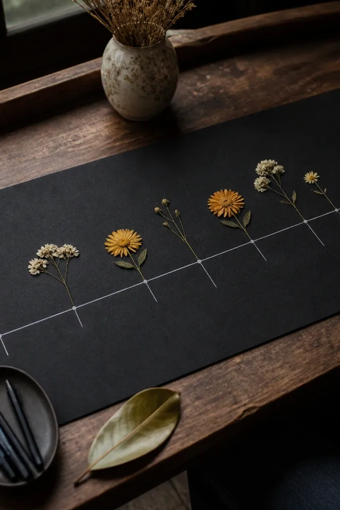
This one looks dramatic because black gesso makes every pale flower and ink line pop. You get a timeline that feels collectible, not messy — the flowers act like visual milestones. It also fixes a common journal problem: dates and events blend together when the page has no structure. Materials are simple, but the finish looks high-end because the flowers sit flat and the ink line stays crisp. It takes about 45-70 minutes per page, and it suits people who like calm aesthetics with a little contrast, like study journals, mood logs, or monthly reflections.
Prime your pages with black gesso using a wide foam brush, then let it dry until it feels fully matte (usually 30-40 minutes). Lightly pencil a timeline across the page at a 1.5 cm margin from the left and right edges, spacing markers for 6-10 dates. Place pressed flowers on the penciled markers with matte gel medium, then press gently with a clean scrap paper for 10-20 seconds each spot. Once everything is dry, draw the timeline line and date labels in white gel pen or acrylic paint pen, then seal the whole page with a thin coat of matte clear acrylic spray from 20-25 cm away. Let it cure for at least an hour before flipping pages to avoid smudges.
Use tweezers and a toothpick to place stems — it keeps the glue off your fingers and prevents shiny spots. Press flowers under a heavy book for 2-3 weeks for the flattest results.
Don’t use glossy glue or watery ink on gesso — it can bleed and smear the timeline line.
23. Foil-Edge Polaroid Frame for Weekly Notes
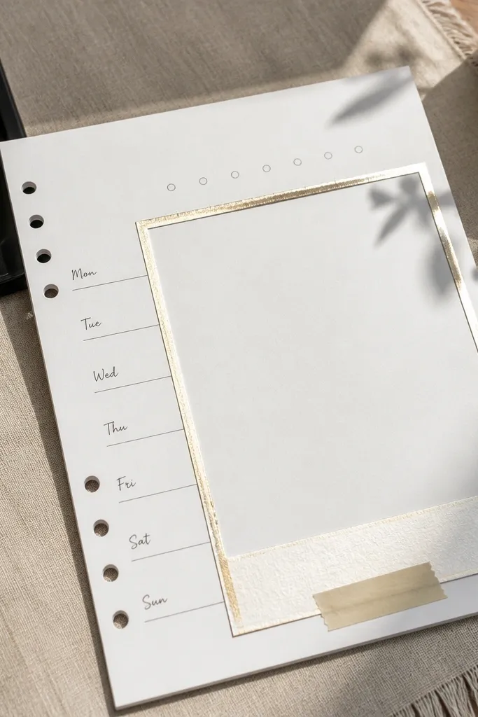
This layout is photogenic because the foil edge catches light while the center stays clean and readable. It gives your weekly notes a gallery look without turning the page into a cluttered collage. You fix the issue of “pretty pages” that are hard to write in — this one has a clear writing area with a strong frame. The contrast is intentional: matte paper inside, metallic edge outside. It takes around 30-50 minutes per page, and it fits planners, school week trackers, or anyone who wants their journal to look like a mini display.
Cut a rectangle for the photo-card area to 10.5 cm by 14.5 cm, then add a 1.2 cm white border around it on a 13 cm by 18 cm page. Use a craft knife and metal ruler for crisp cuts, then round the photo-card corners with a corner punch or sandpaper block. Apply double-sided tape or a thin line of glue stick along the outer edge of the border, keeping it inside the cut line so it doesn’t squeeze out. Press gold or silver foil transfer sheet onto the taped edge, then rub lightly with a dry cloth to lift the excess. Write your week title and 4-6 bullet notes inside the card, then seal only the center with matte spray so the foil stays sharp.
Pro tipCut your foil tape strip slightly longer than the frame edge, then trim after pressing so the corners look clean instead of ragged.
AvoidDon’t seal the foil with heavy wet varnish — it dulls the shine and can create a cloudy look.
24. Ink Drip Side Column with Numbered Prompts
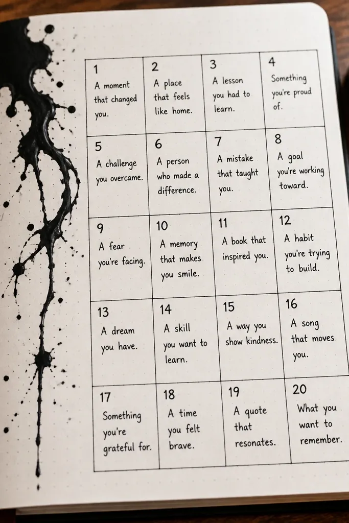
This idea looks artsy because the ink drips create motion on one side while the rest of the page stays organized. It turns journal prompts into something you want to photograph: numbered boxes aligned to a single drippy column. It solves the “my prompts look random” problem by giving you a fixed grid for text. The page feels intentional even when the ink pattern is organic. Build time is 25-40 minutes, and it suits reflective journaling, gratitude logs, or creative writing prompts where you want structure with texture.
Use a ruler to draw a vertical guideline 3 cm from the left edge, then sketch 5-7 prompt boxes to the right at 1.8-2.2 cm tall each with 0.7 cm gaps. Tape a strip of printer paper along the left guideline as a drip guard, so the ink stays where you want it. Mix black or dark gray ink with a little water until it flows smoothly, then load it onto a brush and touch the brush to the top of the taped strip to start a controlled drip. Let the drips run naturally down the taped edge, then remove the guard once the top is set (about 3-5 minutes). After the ink dries fully, write each prompt number in a small circle and add one-sentence answers in the boxes using a fine liner.
For cleaner drips, use watercolor paper or thick mixed-media paper so the ink spreads less and the drip edges stay crisp.
Don’t flood the page — too much ink turns the boxes gray and makes the numbers hard to read.
25. Water-Soluble Crayon Marble Header with Label Tabs
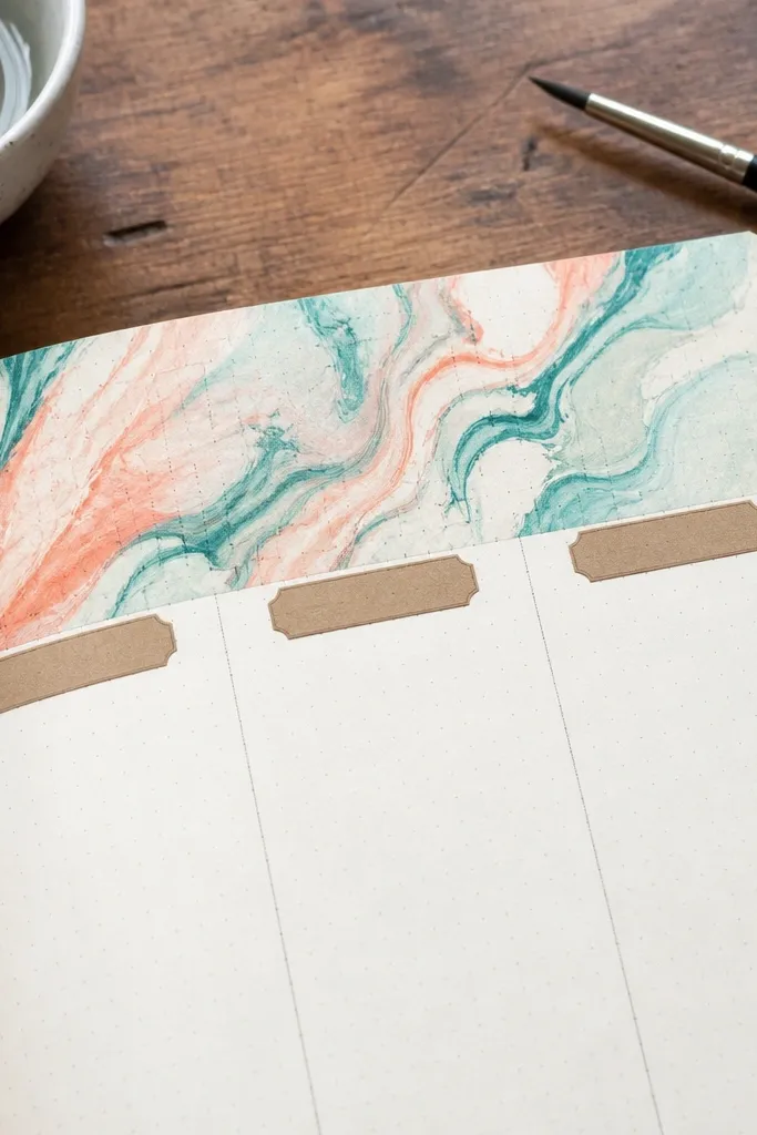
This layout is good-looking because the header has marble swirls that look layered without needing fancy tools. The label tabs keep it functional, so you still get clear sections for notes, plans, or reflections. It fixes the common problem where marbling looks pretty but leaves the page too chaotic — the tabs and straight lines bring order back. The color palette stays soft and cohesive because watercolor from crayons spreads in a controlled way. It takes about 35-60 minutes, and it suits a dashboard-style journal page, class notes, or a monthly overview.
Draw a header band across the top about 5 cm tall, then color it with water-soluble crayons using 4-6 colors in short strokes that overlap. Lightly mist the header with clean water using a spray bottle or damp brush, then tilt the paper to guide the pigment into marble swirls. Let it dry until it’s no longer tacky (15-25 minutes), then outline the header bottom edge with a fine black pen for crisp separation. Create three label tabs by cutting 1.5 cm wide strips from patterned paper and gluing them on top of the header area, spacing them 1.5-2 cm apart. Write the section names on the tabs in a neat hand, then add short lines below for content.
Pro tipUse a thicker paper (200 gsm+) so the crayon pigment doesn’t feather and the tab edges stay sharp when you glue them.
AvoidDon’t use regular wax crayons — they won’t activate with water and you’ll get streaky color instead of marble.



