

1. Sunburst Weekly Spread with Bold Center Header
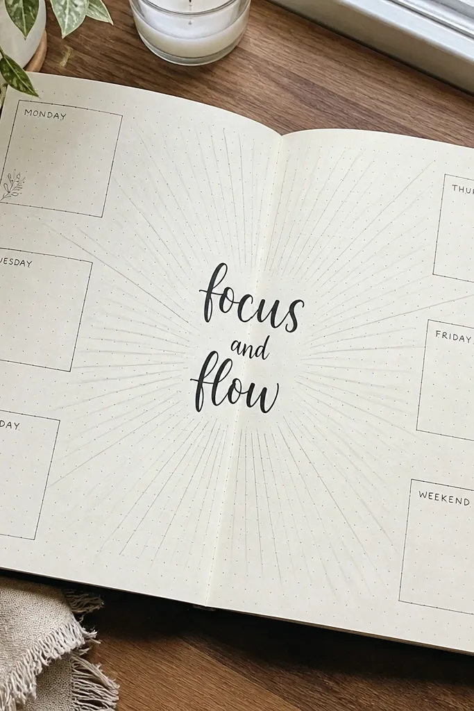
This is a weekly layout that looks dramatic without being complicated. The sunburst rays pull attention straight to your date range, and the rest of the page stays clean because the content sits in quiet boxes around the edges. Use dark ink for the title and pencil guides for the rays so the spacing stays even. It’s a great choice when you want your week to feel like a “main character” page in your journal photos.
Pro tipTrace the ruler lines lightly first, then ink only after you confirm the rays hit the same distance from the center.
Start by drawing a centered rectangle for the header, then lightly mark 12 evenly spaced points radiating outward from the rectangle. Draw rays with a ruler for straight lines, then ink over the pencil. After that, add seven small boxes for the days in a ring layout around the rays, using the same box width all the way around. Finish by adding one short task line under each day box in thin lines.
AvoidDon’t freehand ray spacing — uneven rays make the whole page look rushed.
2. Pastel Gradient Mood Tracker with Rounded Columns
Mood trackers are usually busy, but this one stays photogenic because the columns are rounded and the background does the work. A gentle gradient behind the tracker creates a calm look, while your mood icons stay readable because each day has a consistent cell size. This page is perfect for people who want something pretty even when their month is chaotic. It also looks great when you snap a photo in daylight since the gradient softens the contrast.
Lightly outline a grid with 30 equal-width columns for days and 2-3 rows for mood levels. Add a thin gradient wash behind the grid using two or three diluted pastel tones, keeping the wash lighter than your ink. Once the wash dries, ink the grid lines in black or dark brown. Put a small heart or circle icon in each day cell and label the mood levels in the top row.
Use watercolor pencils or diluted gouache for the gradient so it blends without soaking through thin paper.
Don’t let the wash touch the grid lines while wet — it turns your borders muddy.
3. Monochrome Botanical Border Around a Weekly Log
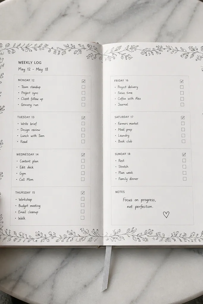
A botanical border makes a weekly log look styled instantly, even if your handwriting is still inconsistent. The trick is keeping the border monochrome so it supports the layout rather than competing with it. Leaves and sprigs around the outer edge give you that “magazine” frame effect, while the inside stays practical with date boxes and checklist lines. This works especially well for weeks where you need reminders, appointments, and a few long notes.
Draw a light border margin 5-8 mm from the page edge, leaving space for your photo crop. Sketch a repeating leaf pattern at the corners and along the sides, keeping leaves the same height. Ink the leaves last, after you draw your weekly boxes in the center. Add seven day boxes with thin lines, then label each box with a small date stamp style.
Use one leaf shape repeated with slight rotation — it looks intentional and saves time.
Don’t add tiny leaf details inside the content area — it steals attention from your tasks.
4. Grid-Only Monthly Calendar with Oversized Numbers
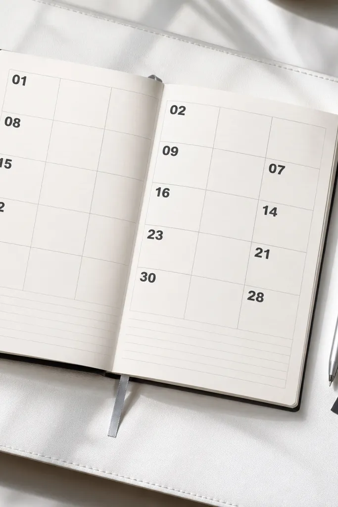
If your monthly pages usually look cluttered, this one fixes it by going “grid-only” and letting numbers do the design. Oversized numbers at the top of each week create a strong visual rhythm, while the rest of the page stays simple lines for notes. It’s very photogenic because there’s lots of white space and the grid reads clean on camera. This layout is best when you want to track events and see the month at a glance.
Start by drawing a monthly grid with 6 rows of weeks and 7 columns for days, using a ruler for straight lines. In each week’s first column cell, write an oversized week number or date number in dark ink. Keep day cells mostly blank except for tiny date dots or small date numerals. Add a small legend at the bottom for color coding or icons, then underline it with one straight line.
Use a thick black pen only for the oversized numbers; keep the grid lines thinner for contrast.
Avoid overcrowding day cells with full notes — keep notes in a separate notes row.
5. Washi Tape Frame with Checklist Cards
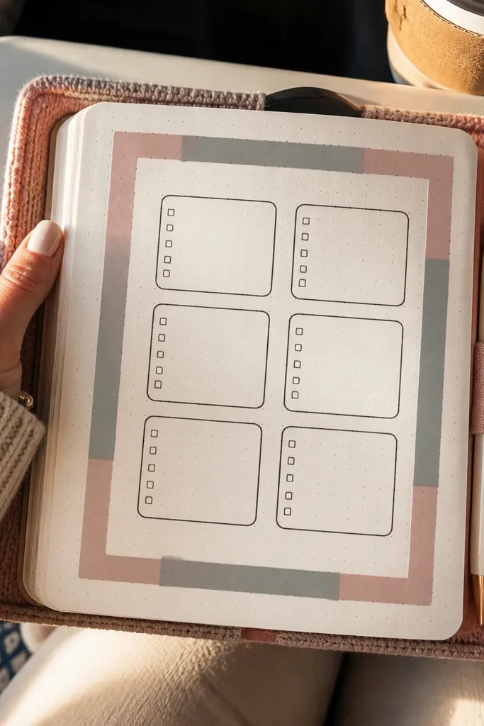
This idea is stunning because it looks like styling, not just drawing. A washi tape frame creates perfect straight edges and adds texture without you having to paint anything. Inside the frame, checklist cards keep tasks organized and easy to scan. It’s especially good for journaling on the go because the tape does the “decor” part while you focus on content.
Cut two strips of washi tape to the width of your journal page and place them as top and bottom borders, leaving side margins. Add side strips next, then press firmly so the tape edges are crisp. Draw three to five rounded rectangles inside the frame for your checklist cards. Write headings on each card and add checkbox lines; finish by outlining the cards lightly in pencil and in ink.
Use a matte tape instead of glossy so the tape doesn’t glare in photos.
Don’t cover the whole page with tape — it flattens the layout and makes the checklist harder to read.
6. Hand-Lettered Title Banner with Dotted Baseline
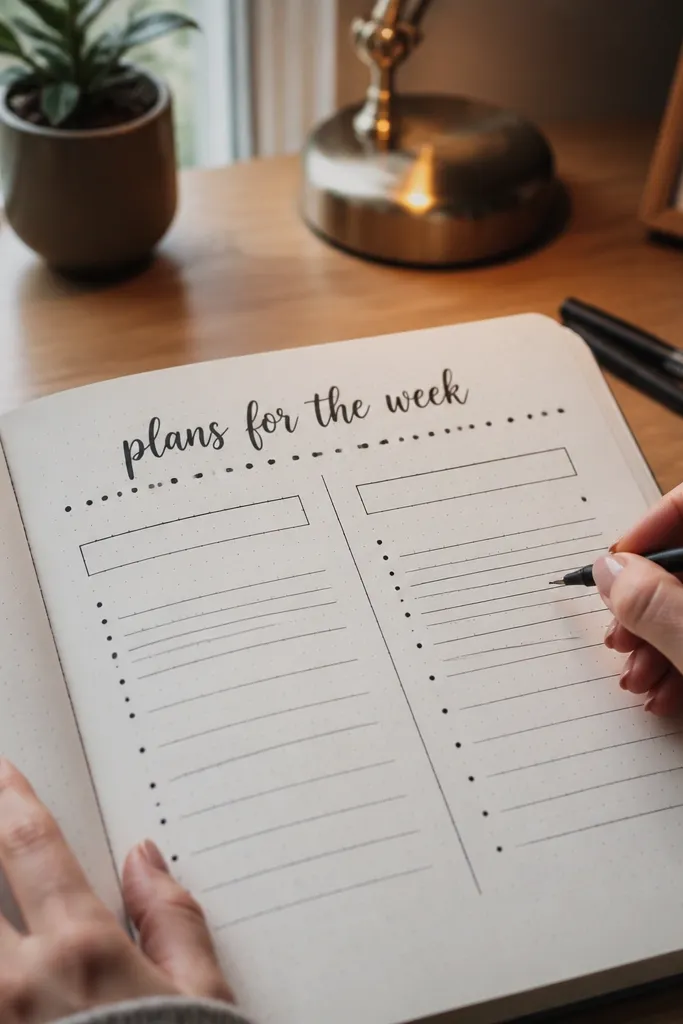
A title banner is the fastest path to “stunning” because it creates a clear focal point. This design uses a dotted baseline under your lettering, which makes the banner look intentional and gives you a clean place to align your words. Pair it with a simple section layout below and the whole page stays photo-friendly. It’s a smart pick for collection pages, reading logs, or tracking pages where the header needs to feel special.
Pro tipDo the dots with a ruler edge or a dotting tool so spacing looks even.
Write your title in thick letters across the top using a brush pen or a bold felt tip. Draw a dotted line directly underneath the title with a fine liner, spacing dots evenly. Create two columns below the banner with thin lines, then add section headers in small caps style. Finish by adding three to six content rows under each column and a small icon in the corner of each section.
AvoidDon’t write the title too high — leave room for your camera crop and keep it balanced.
7. Black Ink Star Map with Tiny Label Boxes
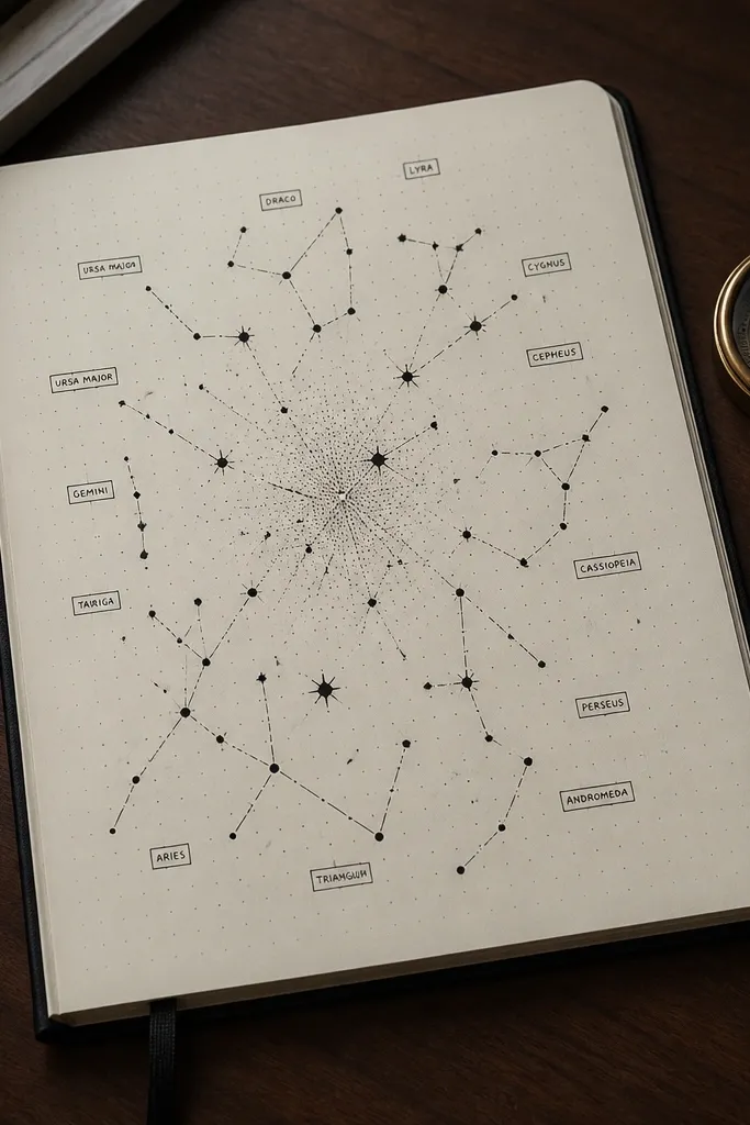
This is a clean, aesthetic layout that feels artsy without becoming messy. The star map style uses dots, lines, and a few labeled points, which makes it interesting while staying readable. Use it for a “highlights” page, a goal map, or even an anniversary page. The black ink and minimal labels look sharp in photos, especially against light paper.
Pro tipVary dot size by using a gel pen with different pressure — it creates depth without extra drawing.
Lightly sketch a loose diagonal arc across the page, then mark 20-30 small dots of varying sizes along it. Connect a handful of dots with thin lines to create a constellation effect. Add small rectangular label boxes near 5-7 key points, keeping the text short. Fill the rest of the page with a simple legend on the side and a few checklist lines at the bottom.
AvoidDon’t draw too many constellations — one or two clusters look better than a full web.
8. Ocean Wave Habit Tracker with Blue Ink Sections
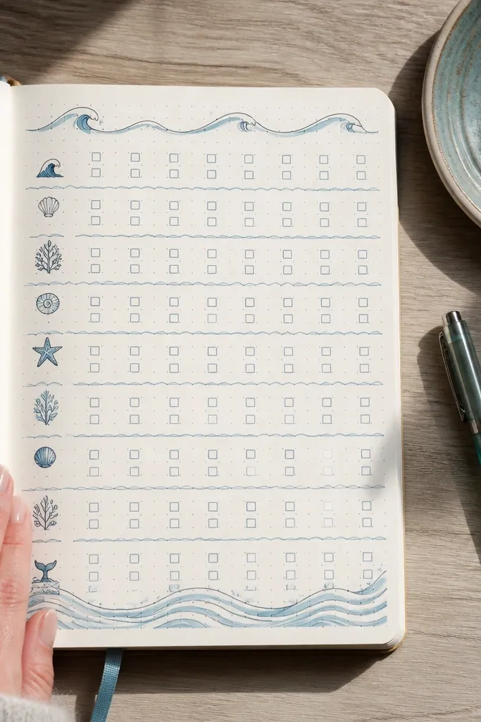
Habit trackers can look stiff. Wave dividers fix that by adding motion and soft curves while keeping your data grid. The blue sections make the page feel cohesive, and the wave lines help separate habits so your eyes don’t blur across rows. This works well when you track 6-10 habits and want a page that looks calm even if you’re behind on routines.
Choose 8 habits and draw 8 horizontal rows with a consistent row height. Divide each row with a wave line: draw a repeating sine-like curve using a ruler edge or freehand with steady rhythm. Add a blue wash or light blue marker color block behind every other row for contrast. Put checkboxes or small circles at the start of each row, then label each habit in a neat column.
Use one consistent wave width across the page so it looks like a set, not random curves.
Don’t color every row — alternating color keeps it readable.
9. Coffee Shop Notes Layout with Receipt-Style Boxes
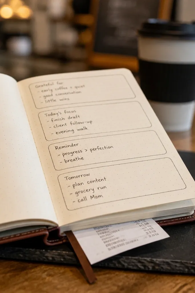
Receipt-style boxes make notes look fun and structured. The design uses stacked rectangles with small rounded corners and tiny divider marks, which makes the page feel like paper ephemera. It’s a strong choice for journaling days, meeting notes, or a “random thoughts” page that still needs to look tidy. This layout photographs well because the lines and corners catch light cleanly.
Draw a top header line, then create 5-7 stacked rounded rectangles using a template or by measuring width with a ruler. Add a tiny dashed divider line inside each rectangle near the top, like a receipt line. Write a short title label at the top of each box and keep the body lines short. Finish by adding a small timestamp block at the bottom right with two short lines for time and mood.
Use a fine liner for the dashed lines — wide markers make the receipt effect look chunky.
Avoid tall boxes with tiny text — keep each box’s text proportionate to the rectangle size.
10. Diagonal Checklist Page with Color-Blocked Corners
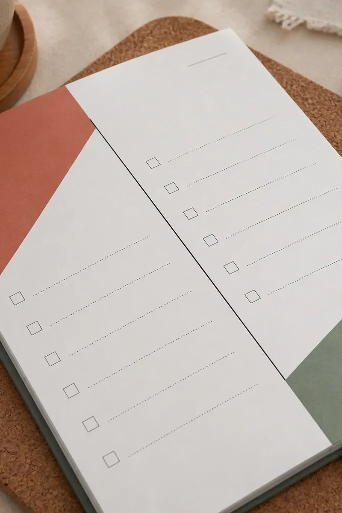
This layout looks modern because it breaks the grid with a diagonal structure. Color-blocked corners add a graphic punch while keeping the rest of the page minimal. You get a clear checklist area that doesn’t feel boring, and the diagonal line gives the page movement in photos. Use it for to-dos, packing lists, or a “things I’m working on” collection.
Pro tipKeep your color blocks within 15-25 mm of the page edges so the design looks balanced.
Draw a diagonal line from the top-left margin to the bottom-right margin, then use it to split the page into two main sections. Add a thick color block in the top-left corner and a smaller one in the bottom-right corner, keeping them simple geometric shapes. On the large checklist side, draw 12-18 checkbox rows with thin lines. On the small side, add a short notes box with 3-4 lines and a small icon header.
AvoidDon’t let the diagonal line drift — straighten it with a ruler so it reads crisp.
11. Terracotta Monthly Tracker with Side Timeline
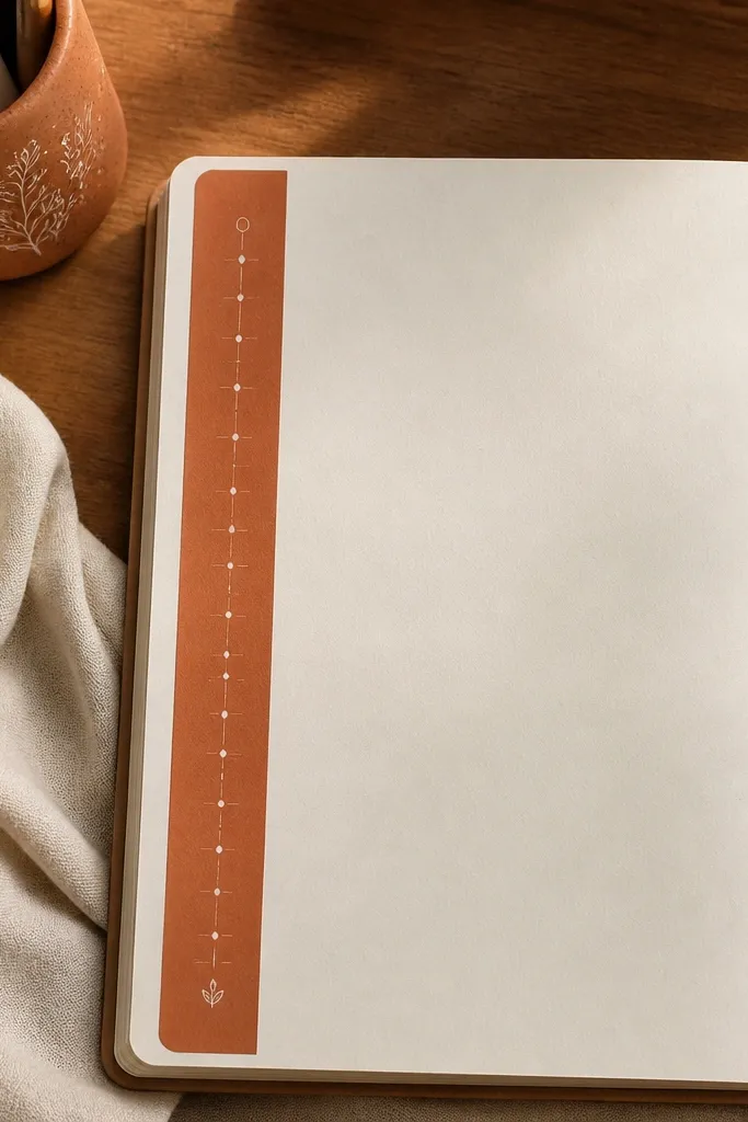
This is a monthly tracker that looks styled because the timeline lives along the side, not across the middle. The terracotta color gives warmth, and the small daily marks keep it from getting cluttered. It’s a great option if you track one thing across the month, like workouts, water intake, or reading streaks. The side timeline also looks great when you flip back through your journal because it’s easy to spot.
Draw a vertical timeline along the left margin, leaving about 25-30 mm for your content. Mark 30 small tick points at equal spacing, then label only every 5th day to keep it clean. Color the timeline line with a terracotta marker or diluted gouache. Put a simple checklist or icon row on the right side for your notes and add a small legend at the bottom.
Use a ruler to keep tick spacing even; uneven ticks are what makes timelines look amateur.
Don’t label every day — it kills the clean look.
12. Monochrome Marble Background with Checklist Overlay
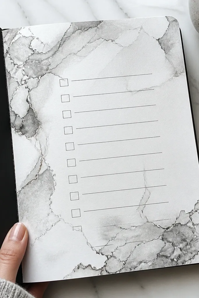
Marble backgrounds look expensive, but you can get the effect with simple ink techniques. The key is keeping the marble subtle so your checklist stays readable. This layout is perfect when you want one “wow” page — like a weekly reset, a budget page, or a goal page — without adding a ton of extra drawings. It photographs well because the marbling creates texture and depth behind clean black lines.
Pro tipDo the marble first, then wait until fully dry before you ink any sharp lines.
Cover the page area with a light gray wash using diluted ink or watercolor, then swirl darker gray and black ink with a wet brush. Use a toothpick or the tip of a fine brush to drag thin ink veins across the surface. Let it dry completely. Then draw a centered checklist box in pencil, ink the box and checkboxes, and write short items with dark pen.
AvoidDon’t flood the page — heavy marbling bleeds and makes checkboxes look cloudy.
13. Frame-Within-Frame Collection Page with Doodle Corners
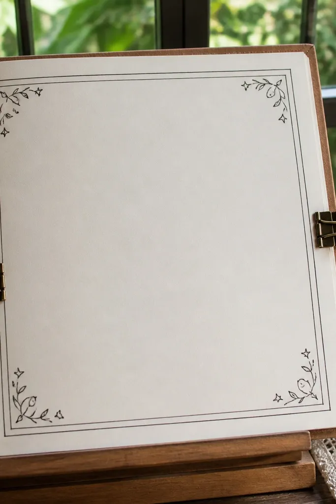
This is a collection page that looks finished even when the content is simple. The double frame gives structure, and the doodle corners add charm without covering your text. I like this for trackers like “favorite recipes,” “movie nights,” or “bucket list ideas” because you can keep entries consistent. The frame also gives you a clear boundary for neat handwriting, which makes your page look better even if your pen control isn’t perfect yet.
Draw an outer rectangle border about 10-12 mm from the page edge. Add a second inner border with the same spacing, then leave the corners for doodles. Sketch small corner icons like tiny stars, leaves, or dots — keep them all the same style. Inside the inner frame, divide the page into 3 columns or a grid of 12 entry boxes, then label the page at the top.
Pick one doodle icon set and repeat it in the corners; mixing styles makes it look random.
Don’t add doodles along the sides — corners only look cleaner.
14. Dot-Grid Overlay with Geometric Rings
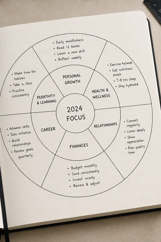
Dot-grid overlays make your journal page look intentional even with minimal writing. Geometric rings add a graphic look that’s easy to repeat, and the rings help you separate sections without drawing big boxes. This page is great for weekly review, a menu plan, or any page where you want multiple small categories. It’s photogenic because the dots and rings create a pattern that looks crisp on camera.
Pro tipUse one ring size for two sections and a slightly larger size for the main section to create hierarchy.
Start by lightly drawing a dot-grid across the page using a dotting stencil or by marking dots with a ruler guide. Draw 3-5 geometric rings (circles or rounded rectangles) that overlap the dot-grid, each one centered on a section. Ink the rings with a steady line, then write section headers inside each ring. Finish by adding short bullet lines below each header for your content.
AvoidDon’t ink over the entire dot-grid — keep dots light so your text stays readable.
15. Rainbow Underline Header with Two-Color Icons
This layout makes your page look bright without turning it into a highlighter mess. The rainbow underline gives a playful top element, while two-color icons keep the rest of the page organized. You’re basically giving your journal a “designed” header and letting the icon system guide your categories. It’s perfect for reading logs, study plans, or any page where you want several categories that should still look cohesive.
Pro tipKeep the rainbow underline short — if it stretches across the whole page, it starts to look messy.
Write your page title at the top in black or dark brown. Underline it with 5-7 short rainbow segments, keeping each segment the same width. Create two or three sections below with thin divider lines. Add a small icon in each section header using two colors (for example black plus one accent color), then add 4-6 lines for entries.
AvoidAvoid using more than one accent color for icons — too many colors makes the page chaotic.
16. Vintage Label Page with Faux Letterpress Text Boxes
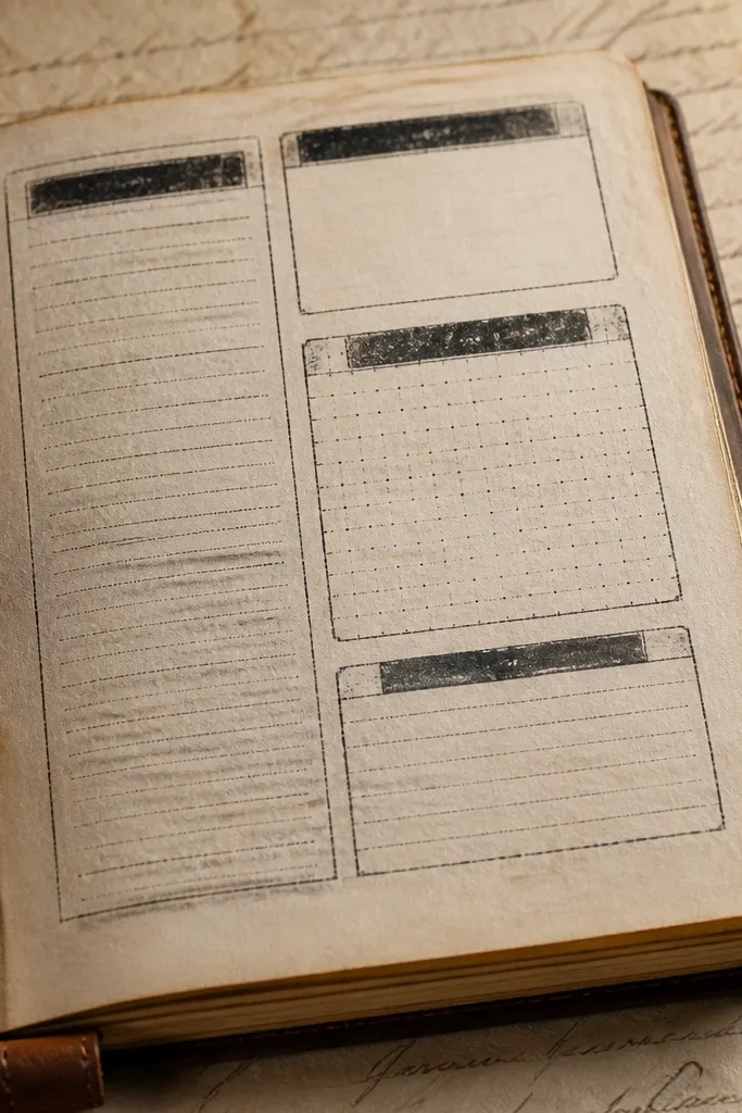
This idea looks like a printed document because the boxes have label styling and slight distressed edges. It works well for long-form trackers where you want a “stationery” feel, like expense logs, reading notes, or project summaries. The faux letterpress look comes from layering light and dark ink tones, which gives depth without expensive supplies. If you want the page to look like it belongs in a scrapbook, this is the one.
Draw 4-6 label boxes in a grid, with rounded corners and a small notch at the top or bottom. For the faux letterpress effect, trace each box twice: first with a light gray tone, then offset slightly with a darker tone. Write short headings inside each box and keep the body text aligned in straight lines. Add a small “stamp” circle in the corner with a date or theme word.
Use a pencil guide for the box alignment; the offset effect looks better when everything is straight.
Don’t over-distress the edges — a little texture looks vintage, heavy distress looks sloppy.
17. Confetti Dot Background with Clean Monthly Goals
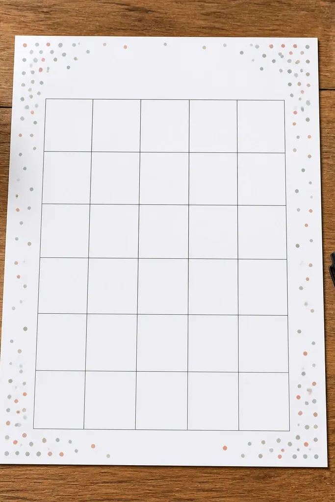
Confetti dots give you instant energy while keeping the main content area clean and readable. Your goals grid stays crisp because the dots live in the margins and corners, not behind the text. This page is a great choice for goal setting, monthly intentions, or a “3 things I’m focusing on” page. It’s photogenic because the dots add texture without heavy coloring.
Pro tipVary dot sizes by using two pens: a fine liner for small dots and a gel pen for bigger ones.
Draw a simple goals grid: three boxes across and two rows down, leaving a margin around the edges. Add confetti dots in the margins only — use different dot sizes and a single accent color plus black. Keep dots away from the boxes so the ink doesn’t compete with your writing. Ink the grid and write your goals with short phrases.
AvoidDon’t put dots inside the boxes — the text will lose contrast.
18. Minimal Checklist with Thick Outline Boxes
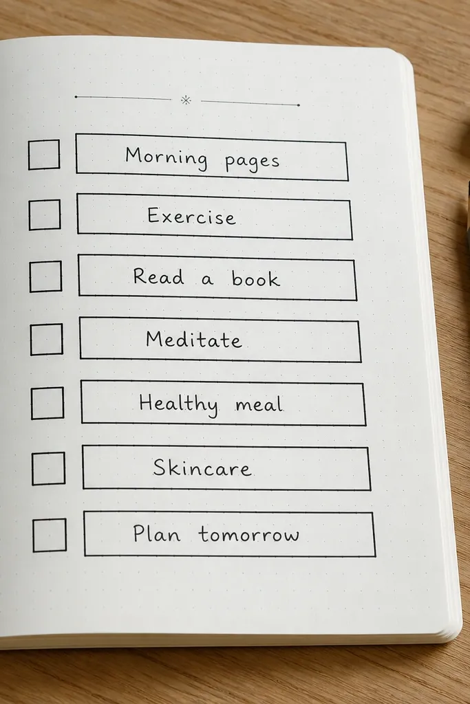
This is the cleanest “stunning” option on the list. Thick outlines do the design work, and the page stays readable because everything else is thin and quiet. I recommend this for people who like aesthetics but get frustrated with complicated art — it looks sharp even with basic lettering. It’s also easy to keep consistent across months, so your journal looks cohesive as a set.
Lightly sketch 10-14 checklist rows in pencil with consistent spacing. Draw each checkbox line inside a thick outline rectangle, keeping the rectangle width the same for every row. Ink the thick outlines first, then add the checkbox marks and small text lines inside. Finish by adding one thin header line and a small title in the top margin.
Choose one pen for thick outlines and one for thin lines so you don’t blur your contrast.
Don’t make the outlines too close to the text — leave breathing room for readability.
19. Archery Targets Page with Concentric Rings for Priorities
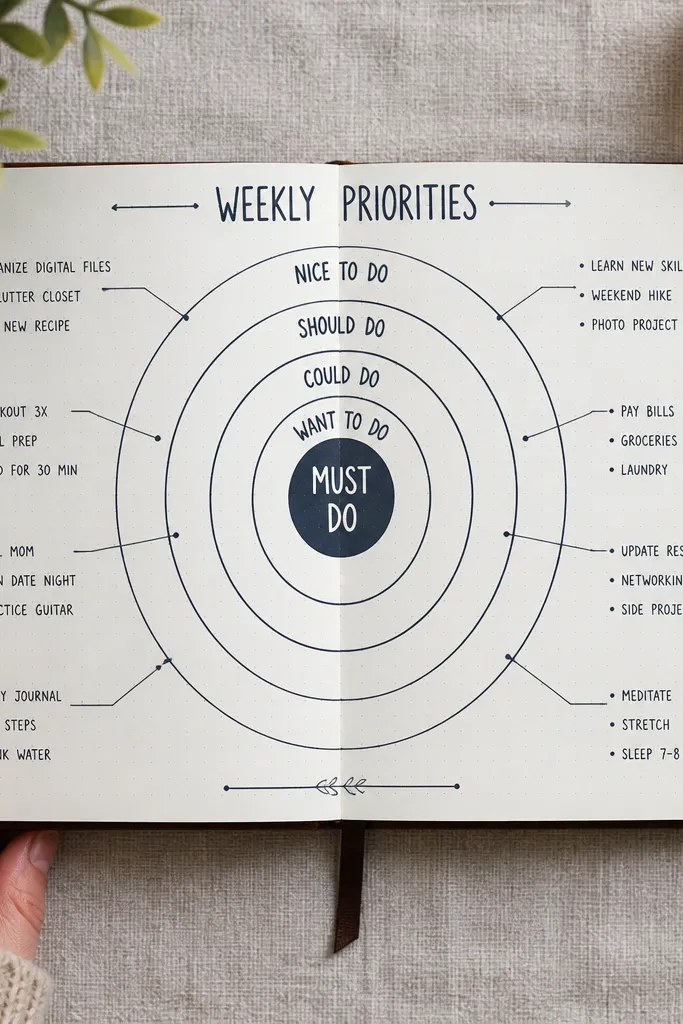
Target rings look cool and they’re genuinely useful for priorities. The center is your “must do,” and the outer rings are your “nice to do,” so the page tells you what matters without extra explanation. It’s photogenic because rings create a strong symmetry and the labels give it structure. Use it for weekly priorities, project planning, or a “decision day” page where you want clarity.
Pro tipUse a compass only for the outer circle; for inner rings, measure the radius difference to keep spacing equal.
Draw a large circle near the center of the page, then add 3-4 concentric rings with a compass or a string-and-pencil method. Label the rings with short priority terms, placing text along the rings using a consistent angle. Add four small wedge sections or side boxes for notes and next steps. Finish by adding 6-10 short task lines and place them inside the ring that matches their priority level.
AvoidDon’t crowd tasks into every ring — leave blank space so the rings still read as rings.
20. Terrazzo Background with Simple Weekly Task Blocks
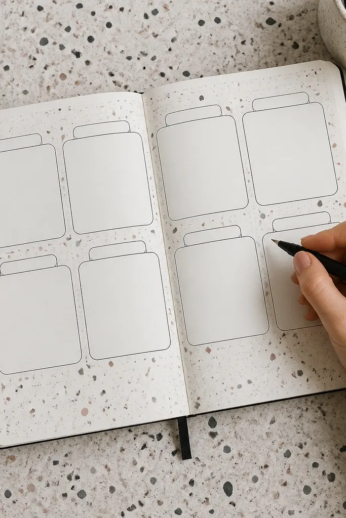
Terrazzo speckles look modern and playful, and they hide small imperfections in your page. The design works because the speckles live behind the task blocks, not across them, so your writing stays crisp. This is a great choice when you want a weekly page that looks fun and not overly “planner-ish.” It also photographs well because the speckles add texture without needing gradients.
Pro tipFlick from farther away for smaller speckles; close flicks create bigger blobs that look messy.
Lightly wash a base color across the page in a rectangle area where your tasks will sit. While the wash is still slightly damp, flick diluted ink or gouache with a toothbrush to create speckles. Let it dry completely, then draw 7 day blocks inside the speckled area using thin pencil lines. Ink the blocks and write day labels and tasks in each block.
AvoidDon’t let the base wash bleed into the margins if you want clean photo framing.
21. Folded Corner Page with Hidden Sub-List
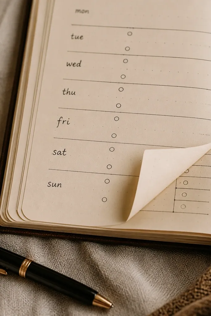
Folded-corner effects make your journal page feel like a real artifact. It’s also useful: the corner flap can hold a tiny sub-list, like reminders, a grocery mini list, or a quick “tomorrow” note. The page looks stunning in photos because the corner creates a 3D-like shape and frames the main content. This is a good pick when you want function plus a design trick.
Draw a diagonal line from the corner toward the middle of the page to create the flap shape. Shade the fold area lightly with pencil, then ink the outline with a fine liner. Add a small box inside the folded corner area for the sub-list, then keep the rest of the page as a simple main checklist. Finish by adding a header and 8-12 task lines, leaving the corner flap area clear.
Use a lighter pencil for the fold shading so it doesn’t look like a smudge once ink goes on top.
Don’t make the flap too big — if it takes half the page, it stops looking like a corner detail.
22. Ribbon Banner Divider with Two-Section Spread
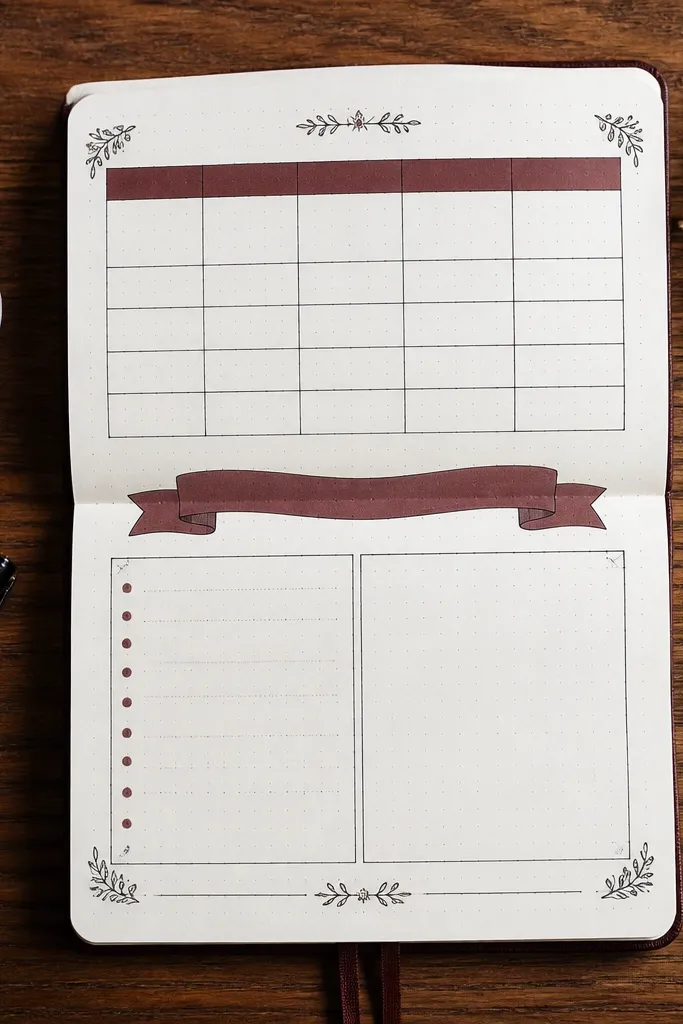
A ribbon divider makes a page feel designed and gives you an easy way to split content. The banner sits between two sections and adds a visual break, so the page doesn’t look like one long block of writing. This is great for pages like weekly planning plus notes, reading tracker plus reviews, or budget categories. It’s also photogenic because the ribbon shape catches light and creates a strong horizontal line.
Draw a horizontal divider across the page at about one-third from the top. Sketch a ribbon banner centered on that divider with folded ends, then ink the ribbon outline. Create two content sections: one above and one below, each with its own header and a small grid of rows. Write your content inside the boxes and keep the text aligned to the ribbon edges.
Keep the ribbon ends symmetric; asymmetry makes it look accidental.
Avoid adding extra doodles around the ribbon — the divider already does the styling.
23. Paper Cutout Style Layered Labels
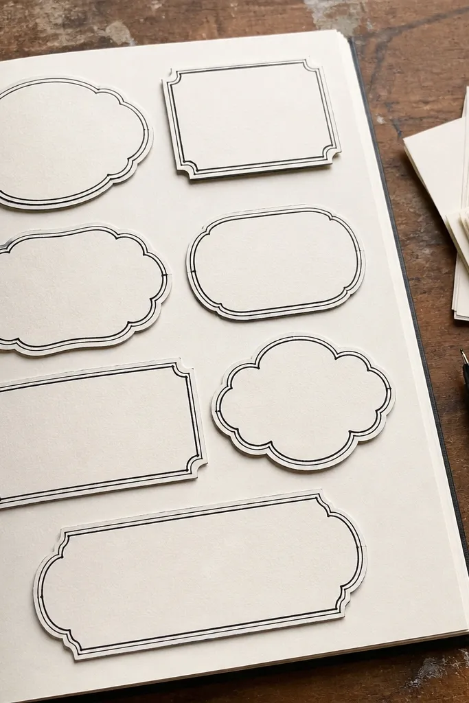
Layered labels look like paper cutouts, and that 3D illusion makes your page stand out. You draw one label behind another with a slight offset, which creates depth even with plain ink. This idea is perfect for collection pages where you want categories that feel separated and easy to scan. It’s also a good option when you want to use one accent color without coloring the whole page.
Pro tipUse the same label shape for all categories so the layered look stays cohesive.
Pick three categories and draw a label shape for each in pencil with rounded corners. Duplicate each label outline one time, offset it 2-3 mm down or to the side, then ink the top label in your main color and the back label in light gray. Put category headers in the top label, then add 6-10 entry lines under each category. Finish by adding a small icon next to each label header to keep entries consistent.
AvoidDon’t offset too much — if the layers separate too far, it looks like misalignment.
24. Ink Wash Background with White Gel Highlights
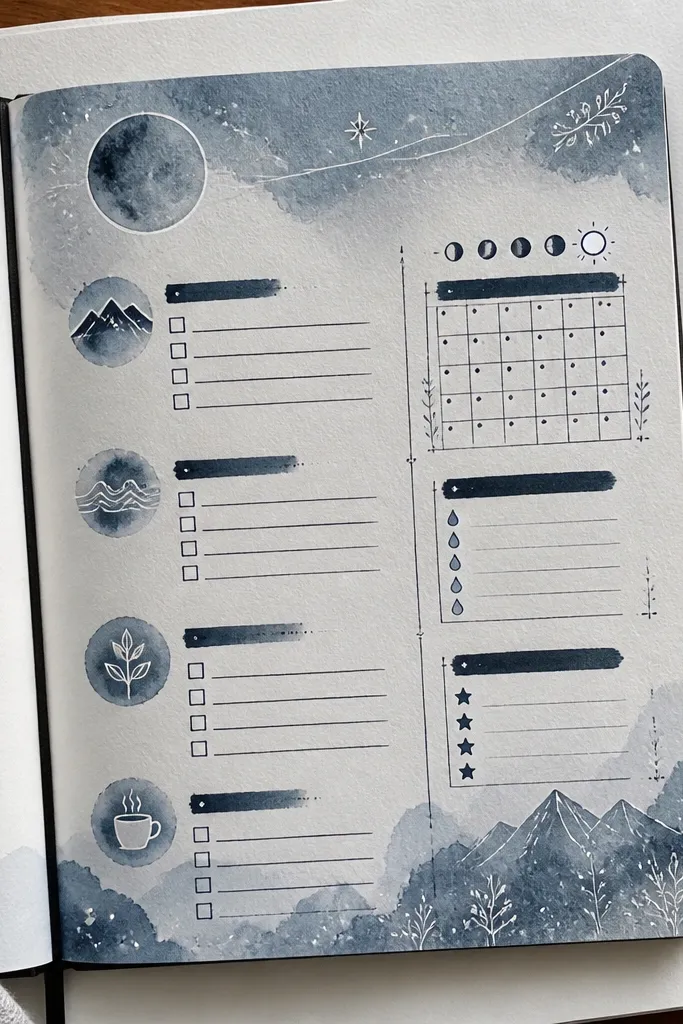
This page looks stunning because the ink wash gives a soft background and the white gel highlights make details pop. It’s a strong aesthetic choice for trackers, especially if you want your handwriting to read clearly over a colored surface. The contrast is built-in: you write with dark ink, then add white accents like dots, stars, or small dividers. It’s also great for creating a “night sky” or “paper glow” vibe.
Pro tipTest the white gel on a scrap page — some papers need two passes to look opaque.
Lightly draw your layout in pencil — a header area and a grid or checklist section. Paint a diluted ink wash behind the layout, keeping it lighter than your ink so your lines stay legible. After drying, ink your text and boxes, then use a white gel pen to add highlight dots and thin divider accents. Finish by tracing the header underline with white gel for a bright focal point.
AvoidDon’t add white highlights before the wash dries — it smears and dulls the contrast.
25. Stacked Ticket Stubs for a Weekly Budget Tracker
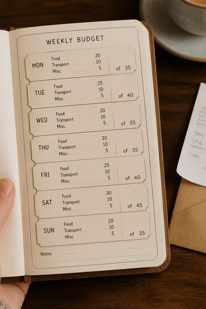
Ticket stub layouts are visually satisfying because they look like small records. This one works for weekly budgets, spending checklists, or a “money out” tracker where you want everything grouped. The stub shape naturally creates sections, and the tiny counters keep numbers neat. It’s photogenic because the stacked rectangles create a clear pattern and the stub notches add charm.
Pro tipUse a ruler for the rectangle edges; ticket shapes look best when they’re straight.
Draw 5-7 ticket stub rectangles stacked in a column, each with a notch cut on the left edge (draw a small triangle or semicircle notch). Add a header above with the week range. Inside each stub, write a category label and two lines for amount and notes. Add a small progress bar rectangle at the bottom of each stub and ink a few segments to show status.
AvoidDon’t make the notches too detailed — simple notches look cleaner.



