
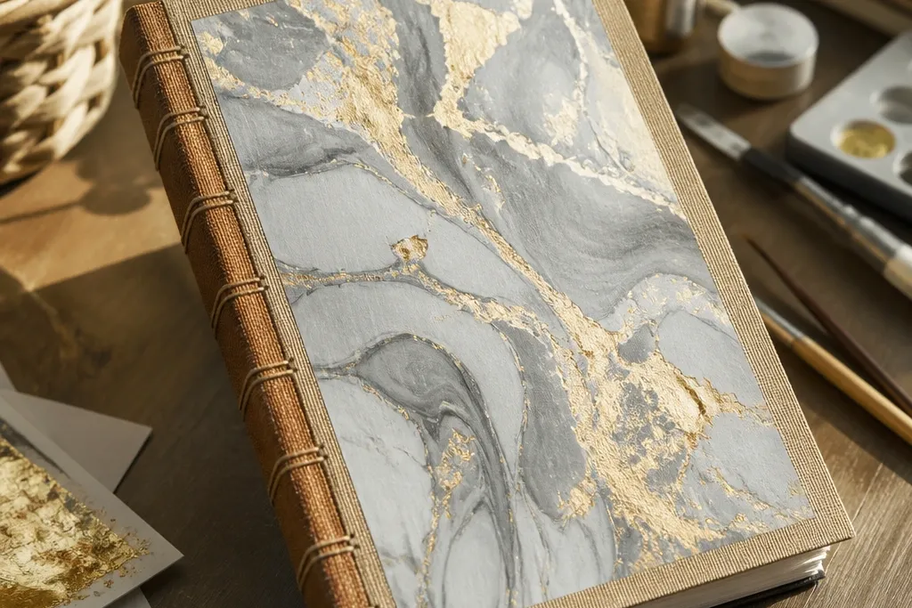
1. Marble-look Gel Pen Cover with Gold Leaf Title
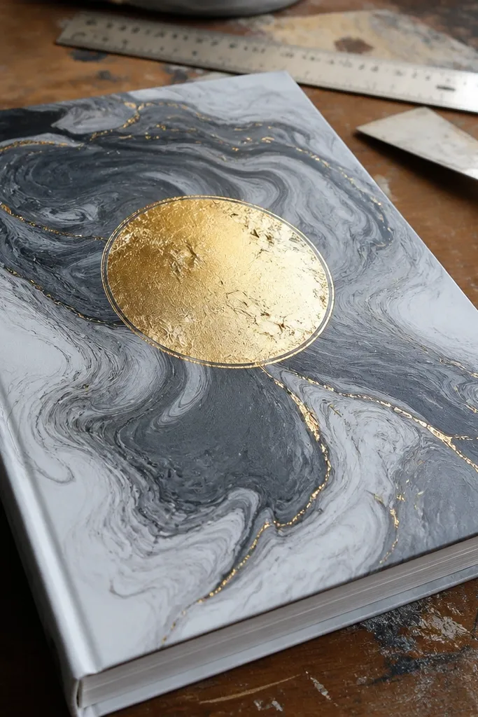
This cover is gorgeous because the marble swirl creates depth without needing messy painting skills, and the gold leaf title gives you that high-contrast “luxury” moment. The marble effect reads soft and organic, while the gold makes the front look intentional and expensive. You get a clean, modern vibe that fits both minimal journals and art diaries. It also stays photogenic under warm desk lamps because the gold catches light while the marble stays matte. Plan on a medium skill level and about an hour of prep and drying.
Start by covering the journal front with a smooth white cardstock or bookcloth backing. Use a gray gel pen (and a black gel pen sparingly) to draw loose swirls, then blend with a dry cotton pad for a cloudy marble look. Once the swirls are dry, press gold leaf adhesive or gold leaf flakes onto a stencil spelling your title. Seal with a matte clear spray made for paper so the gold doesn’t smear and the marble lines don’t rub.
Pro tipUse a stencil for the gold title — freehand leaf edges look ragged fast.
AvoidDon’t overwork the marble with too many dark passes or it turns muddy.
2. Pressed Flower Border with Watercolor Center Panel
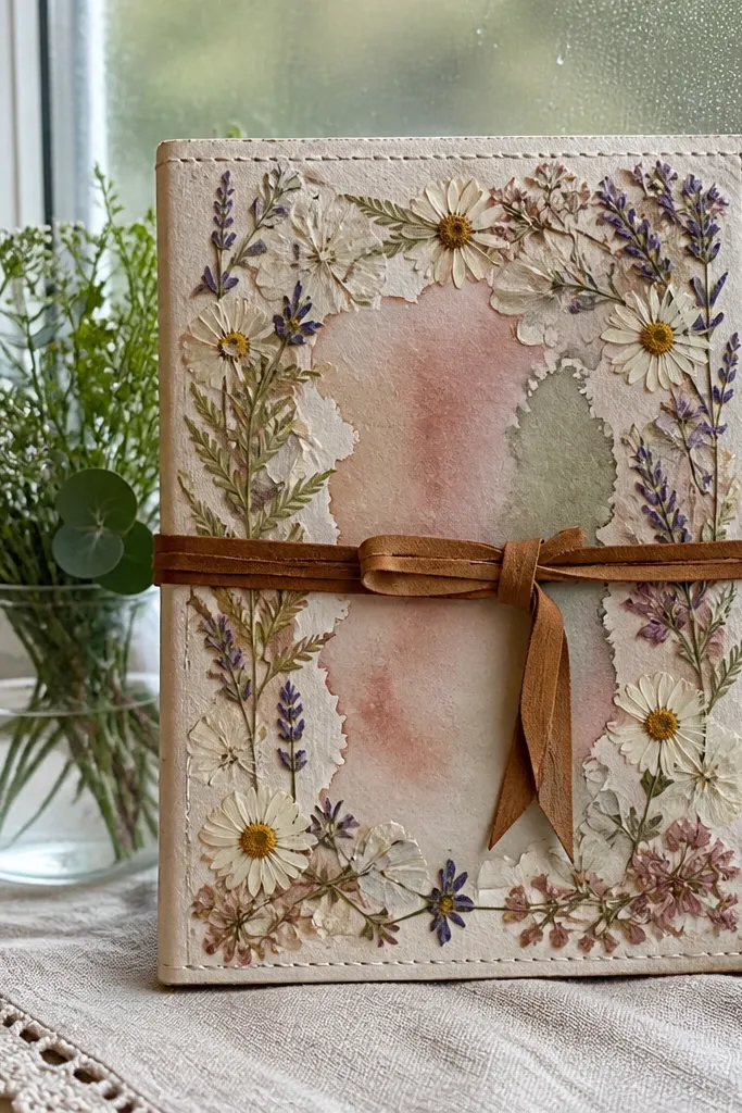
This one looks delicate and expensive because the pressed flowers act like a botanical frame while the watercolor panel gives a soft color wash. The border makes the composition feel finished even if your center text is simple. It’s perfect for wellness journals, recipe journals, or anything that needs a gentle mood. The key is contrast: keep the center light and let the flowers do the visual work. You’re aiming for airy, not crowded.
Cut a watercolor paper rectangle to fit the cover front, leaving a 1-2 cm margin for the border. Arrange pressed flowers around the rectangle edges first, then glue them with gel glue or archival glue in small dots. Paint a light watercolor wash inside the rectangle — think pale sage, blush, or dusty blue — and let it dry fully. Finish by sealing the entire front with a thin matte medium so the flowers stay flat and protected.
Pro tipPress flowers under weight for at least 3-5 days so they don’t lift at the edges.
AvoidSkip thick layers of glue under flowers or you’ll get bumps that catch light weirdly.
3. Monochrome Block Type with Cut-Paper Shadow
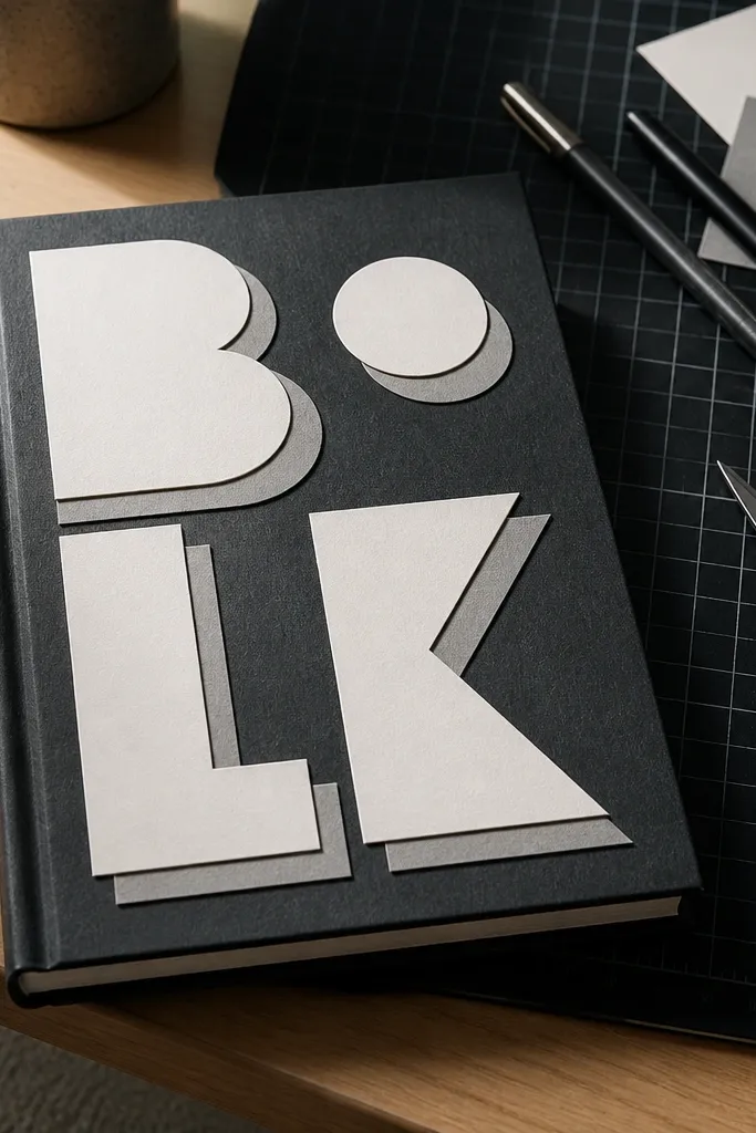
If you want graphic and modern, this is the move. The design looks clean because you’re using bold block letters and a cut-paper “shadow” offset behind them. That shadow creates depth without any painting, and it photographs sharply. Choose one color family — black, cream, and gray — and the cover will look designed even with minimal decoration. It suits planners, study journals, and travel logs.
Print or draw your title in thick block letters, then trace onto craft paper and cut it out with a craft knife. Cut a second version of the letters from a slightly different tone (like gray) and shift it 2-4 mm down and to the side. Glue the shadow layer first, then glue the main letters on top. Seal with a matte sheet laminator film or a matte sealer so the cut edges don’t lift.
Pro tipUse a metal ruler when cutting letters to keep edges crisp and photo-ready.
AvoidDon’t use thin serif fonts — they look messy when cut.
4. Scrapbook Map Coordinates with Navy Stitched Lines
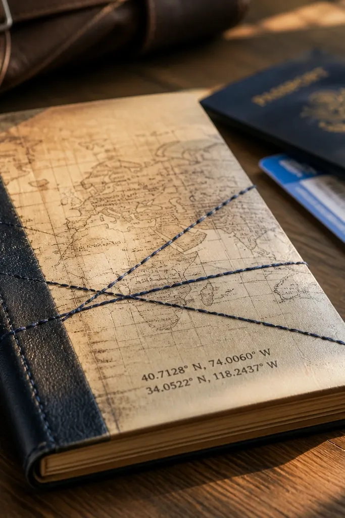
This cover has a lived-in look that still feels organized. A map panel gives instant texture, while navy stitched lines add a handmade, graphic rhythm across the page. Coordinates make it feel personal without needing a big illustration. It’s a great fit for travel journals, language practice journals, or anyone who likes history vibes. The stitches also hide small imperfections and frame your text.
Trim a piece of vintage map paper to cover the front, then distress edges with sandpaper for a clean worn look. Add coordinates using a fine liner pen and a small sans-serif font, centered or placed in the bottom third. Mark two or three stitch paths across the cover with a pencil grid, then use a needle and navy embroidery thread to stitch through the paper and backing. Glue a thin backing sheet behind if your cover base is too thick for stitching, then press flat under a book for 10 minutes.
Pro tipUse waxed thread — it slides through paper holes and looks smoother.
AvoidDon’t stitch directly on glossy paper or the needle slips and the line looks wavy.
5. Peel-and-Stick Vinyl Shapes on Textured Kraft
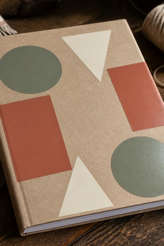
Kraft paper gives you a warm, tactile base, and vinyl shapes add sharp color blocks that look graphic and modern. This is one of the easiest ways to get a clean, gorgeous front without paint mess. The vinyl is also durable, so it holds up to rubbing better than most paper-only designs. Choose 2-3 muted vinyl colors like olive, terracotta, and cream for a cohesive look. This works great for beginners who want a high-end finish fast.
Cover the front with textured kraft cardstock or bookcloth. Plan your layout on paper first, then cut vinyl shapes using a vinyl cutter or pre-made die cuts. Apply shapes starting with the largest element, pressing firmly with a plastic scraper to avoid bubbles. Seal only the edges with a matte clear spray — avoid spraying directly on vinyl if the label says it’s not compatible.
Pro tipDo a dry layout with painter’s tape before you peel anything — it prevents crooked placement.
AvoidDon’t layer too many tiny shapes; it turns into clutter on the cover.
6. Fabric Patchwork Front with Contrast Binding Strip
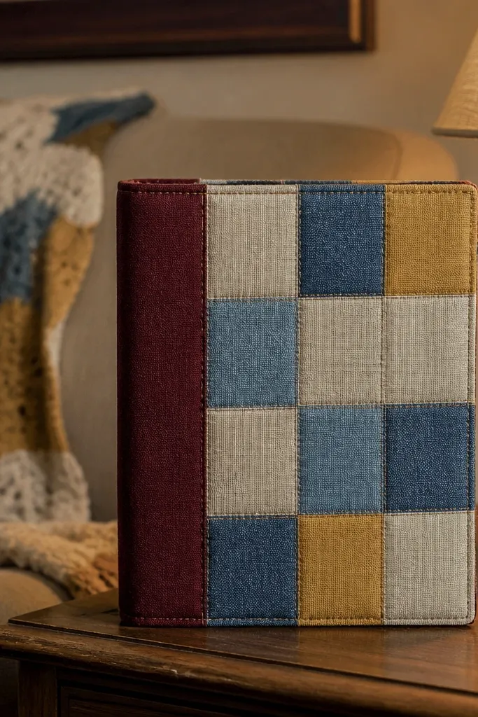
Patchwork looks gorgeous because it creates depth and multiple textures in one frame. A contrast binding strip makes the whole front feel finished, like a mini quilt. This is ideal if you like cozy aesthetics or want your journal to feel soft and warm in hand. It also hides uneven edges and small fabric flaws. Expect a slightly longer build because you’re cutting and aligning fabric, but the result is worth it.
Cut fabric squares or rectangles in a grid, keeping sizes within 5 mm tolerance so the seams look even. Lay them on a backing board (thin cardboard or a stiff book cover sheet) and glue with fabric glue or double-sided fusible web. Add a binding strip around the perimeter — cut a strip 2.5-3 cm wide, fold it over the edge, and glue the fold to the back. Trim any overhang, then press under a heavy book while the glue cures.
Pro tipUse a fabric with a tight weave (cotton poplin, quilting cotton) for cleaner edges.
AvoidSkip stretchy knit fabrics; they warp under glue and look sloppy.
7. Black Gesso + White Acrylic Stencil Burst
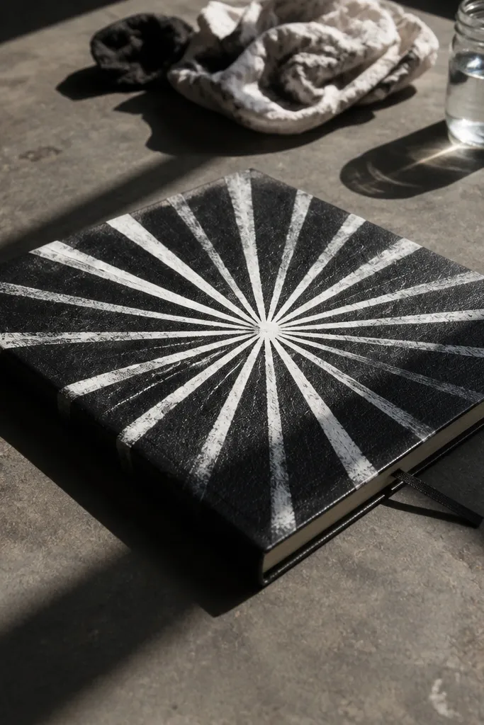
Dark gesso makes everything look sharper. When you stencil white acrylic on top, you get crisp lines and high contrast that pops in photos. This design is dramatic without being loud, and it works for both art journals and goal trackers. The matte black base also hides minor mistakes from assembly. It’s a good choice if you want a cover that looks modern and a little edgy.
Cover the front with thick cardstock or bookboard, then paint a coat of black gesso. Choose a stencil with a bold motif like rays, stars, or a geometric burst and tape it down flat. Apply white acrylic using a sponge or stencil brush in light dabs, then lift the stencil straight up. Let it dry, then add tiny controlled splatters with a toothbrush and diluted paint. Seal with matte varnish so the finish doesn’t scuff.
Use a stencil brush or sponge — bristle brushes push paint under the stencil edges.
Don’t use glossy paint on gesso or the surface reflects weirdly under light.
8. Gold Foil Washi Tape Frame with Minimal Date Block
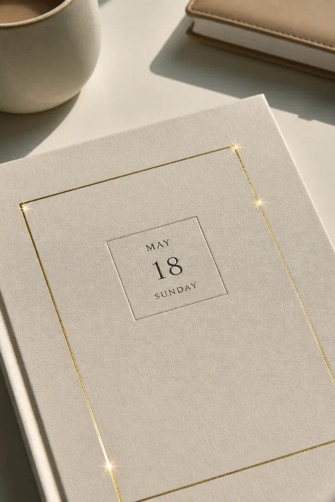
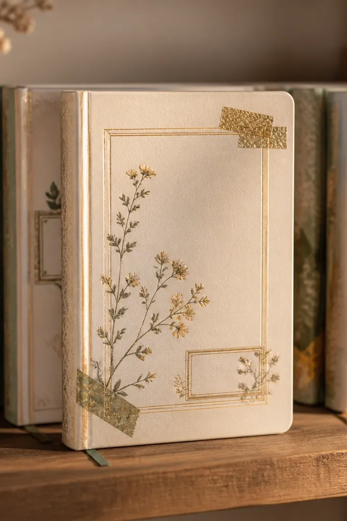
This is gorgeous because it’s restrained. A gold foil washi tape frame creates instant structure, while a minimal date block keeps the front looking like a designed stationery piece. It takes minutes but still looks intentional, which matters if you make multiple journals. Choose a neutral center like cream or light gray so the gold reads warm, not harsh. This works best for daily journals, gratitude logs, and planners.
Start with a clean cream or light gray paper base. Tear or cut washi tape strips and lay them in a rectangular frame, leaving a 1-2 cm inner margin. Use a fine black pen or paint marker to write your title inside the center, aligned to the top third. Add a small date block at the bottom — keep it short, like “2026” or “JAN — MAR”. Press the washi down firmly and seal with a thin matte spray if your ink is not waterproof.
Pro tipUse painter’s tape to mask the frame edges before spraying or sealing for straighter lines.
AvoidDon’t cover textured paper with washi and expect it to stay flat — use smooth stock.
9. Torn Paper Collage with Script Title and Ink Wash Background
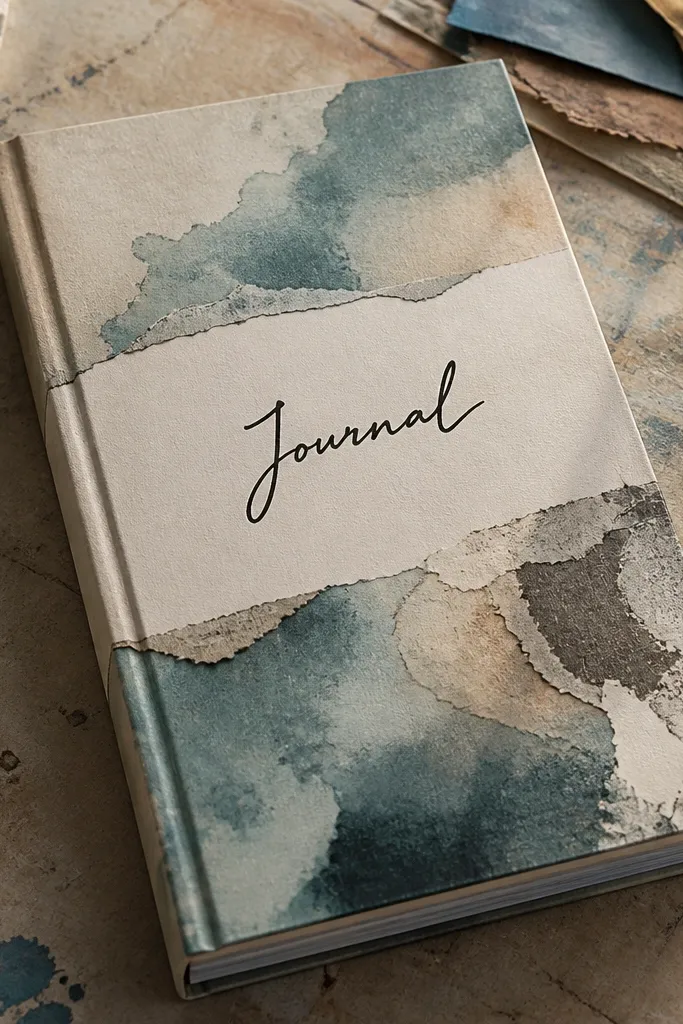
Torn paper looks good because it creates natural irregular edges that feel artistic, not craft-store random. The ink wash background keeps everything unified, and the script title adds a human touch. This cover is great for journals that are meant to be written in daily since the texture looks great even when it’s slightly handled. Keep your palette tight — think warm neutrals and one accent color. It’s an easy way to make a plain cover look like a page from a zine.
Brush a light ink wash over a cream base, then let it dry until it’s matte. Tear paper scraps in a gradient direction (light to dark) and layer them with gel glue, smoothing edges as you go. Write your title on top with a waterproof ink pen, then add a thin highlight wash around it using diluted ink. Seal with matte medium once everything is dry to prevent smearing and lift.
Pro tipTear edges by pulling, not cutting — pulling makes the fibers catch light nicer.
AvoidDon’t stack too many layers at once; thick collage makes the front feel bulky.
10. Pressed Herb Labels with Typewriter-Style Text
This design looks like a mini apothecary page. Pressed herb leaves give you delicate shapes, and typewriter-style text makes it feel vintage without needing real old printing. It’s perfect for cooking journals, tea journals, and herbal study notebooks. The cover stays airy if you keep the leaves small and space them like specimens. You’ll get a charming, readable front that still feels modern when paired with clean black text.
Cut small rectangles of paper and glue them onto the cover as label panels. Place pressed herb leaves on each label and glue the stems lightly so the leaf stays flat. Use a typewriter-style font template for placement, then trace with a fine black pen. Add a tiny “date” line under each label. Finish with a matte seal so the paper doesn’t absorb moisture from your hands and smudge the ink.
Pro tipCut label panels slightly uneven — perfect rectangles look too sterile for this style.
AvoidSkip large leaves; they overpower the cover and look messy at a distance.
11. Washi Tape Constellation Dots with Starburst Title
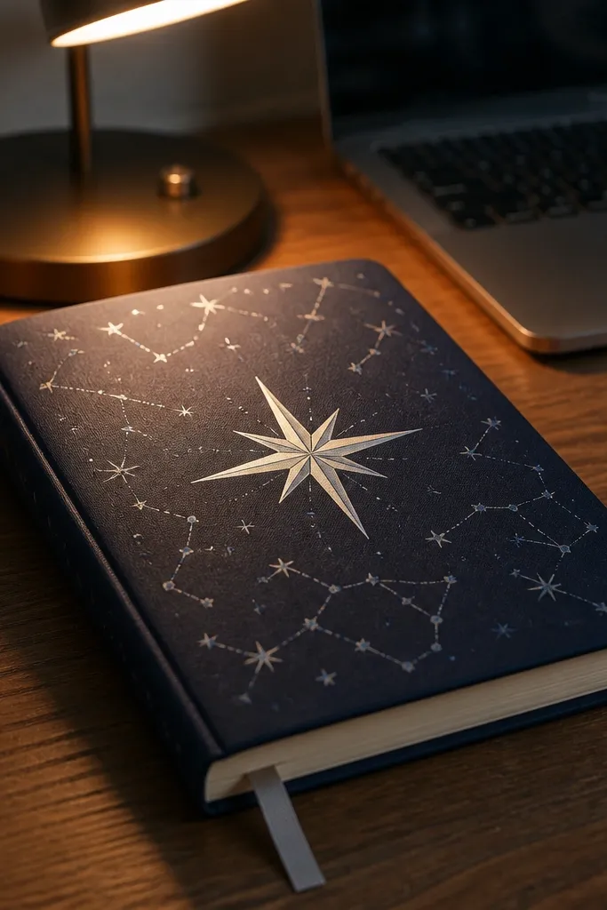
Constellations look gorgeous because they’re small, intentional, and easy to scan from across a desk. Using washi tape dots gives you consistent circles without needing paint. A starburst title makes the center feel energetic while staying clean. Choose a limited palette like midnight blue tape plus silver and cream for a night-sky look. This is a great journal front for astronomy notes, night routines, or anything that feels calm but fun.
Cover the front with dark navy cardstock or paint a base and let it dry fully. Cut tiny washi tape circles by rolling tape onto itself, then place them where you want the “stars.” Draw connecting lines with a fine white gel pen or thin paint pen. Create a starburst title by placing small strips of tape radiating from behind the title text, then write the title on top with a white marker.
Pro tipUse a white gel pen for the lines — it stays opaque and doesn’t fade fast.
AvoidDon’t use too many colors; five-plus tapes makes the constellation look like craft clutter.
12. Photo Transfer Silhouette with Matte Varnish
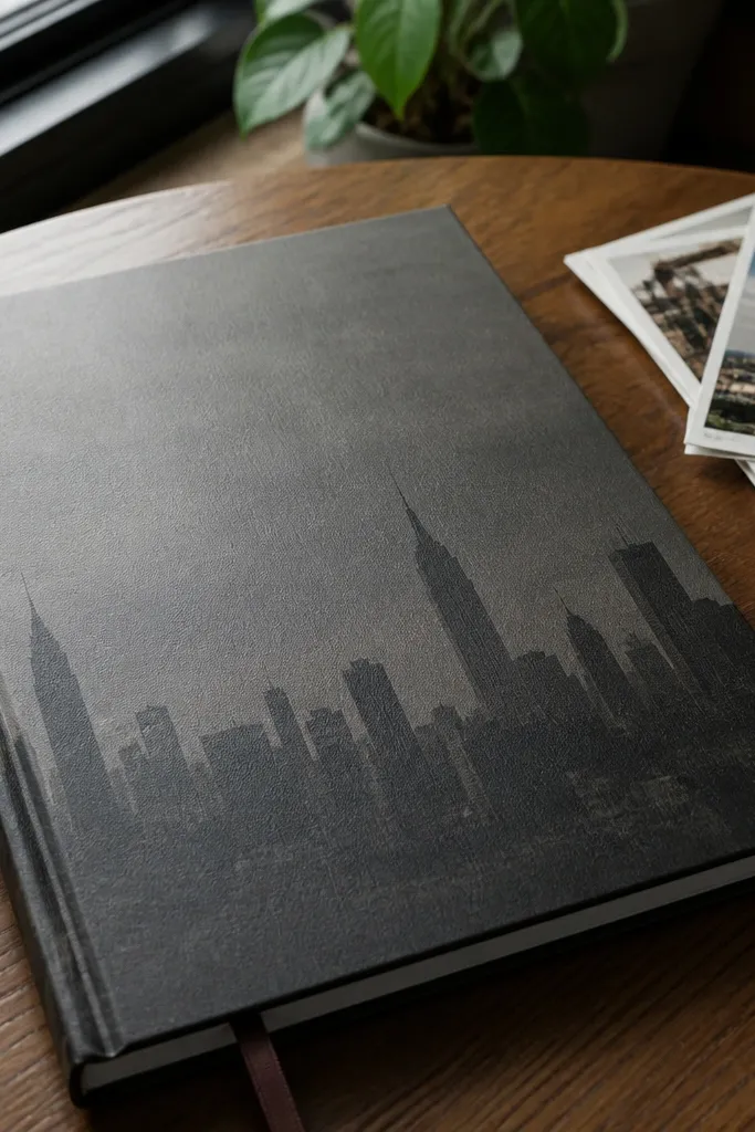
A photo transfer silhouette looks gorgeous because it makes a real image feel like art print, not a pasted photo. The matte finish is the secret — it removes the “sticker” vibe and makes the transfer look integrated. This is perfect if you want your journal to feel personal without adding bulky decorations. Use a high-contrast photo so the silhouette reads clean. Skill level is medium because you need careful timing and correct paper compatibility.
Print your photo on the correct transfer paper type for the medium you’re using (laser vs inkjet matters). Clean the journal cover surface and apply transfer medium evenly. Place the print image-down and rub gently, then let it sit for the manufacturer’s recommended time before soaking and removing the paper. Seal with a matte varnish after the transfer is fully dry so it doesn’t smear when you touch it.
Pro tipUse a test scrap first — photo transfers are sensitive to paper type.
AvoidDon’t use a low-contrast photo; the silhouette will look gray and washed out.
13. Watercolor Wash Bands with Letterpress-Style Text
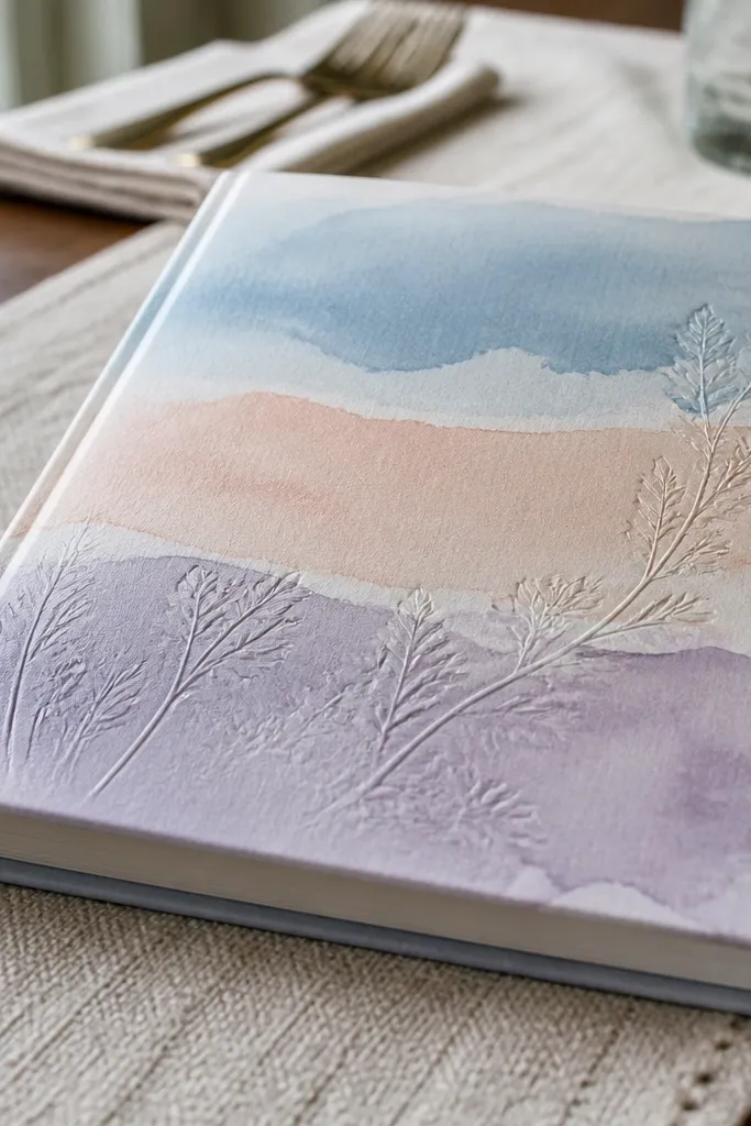
Horizontal wash bands look gorgeous because they create a calm rhythm across the entire front. Pastels keep it friendly, and letterpress-style text adds that slightly embossed feel even if you’re not doing real letterpress. This cover is a strong choice for planners, habit journals, and anything meant to be soothing. It also works well with simple titles because the bands provide the color interest. Build time is moderate — the only wait is drying.
Paint three to five horizontal watercolor bands across a smooth paper base, keeping each band about 1.5-2.5 cm tall. Let the colors blend naturally in the wet edges, then dry completely. Use a craft foam letterpress stamp or a DIY emboss look by tracing text into a thin layer of embossing paste and letting it set. Paint over the raised text lightly with a cream or white wash, then wipe the top so only the recesses hold color. Seal with matte spray.
Pro tipUse a small angle brush so the band edges stay crisp, not feathered.
AvoidDon’t over-saturate the paper; too much water makes cockling and warped edges.
14. Cork Texture Panel with Inked Line Art Title
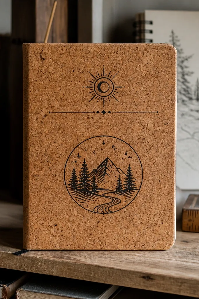
Cork looks good because it has a natural texture that reads instantly, even from a distance. A black line art title keeps it graphic and clean, and it contrasts with the warm cork color. This cover feels earthy and modern, great for notebooks used at home, in a studio, or for creative prompts. You get a tactile front that doesn’t need extra embellishment. The craft is straightforward: cut, glue, ink, seal.
Cut a cork sheet panel to fit the journal front, leaving 1-2 mm margin around the edges. Glue it down with contact cement or strong craft adhesive, then press flat. Sketch a simple line art title or icon in pencil and ink over it with a waterproof fineliner. Lightly sand any rough cork edges so they don’t snag. Seal the ink with matte clear spray made for craft surfaces.
Pro tipUse a craft knife with a fresh blade for clean cork cuts.
AvoidDon’t skip edge sanding; rough cork edges look messy in close-up photos.
15. Butterfly Wing Foil on Deep Teal Paper
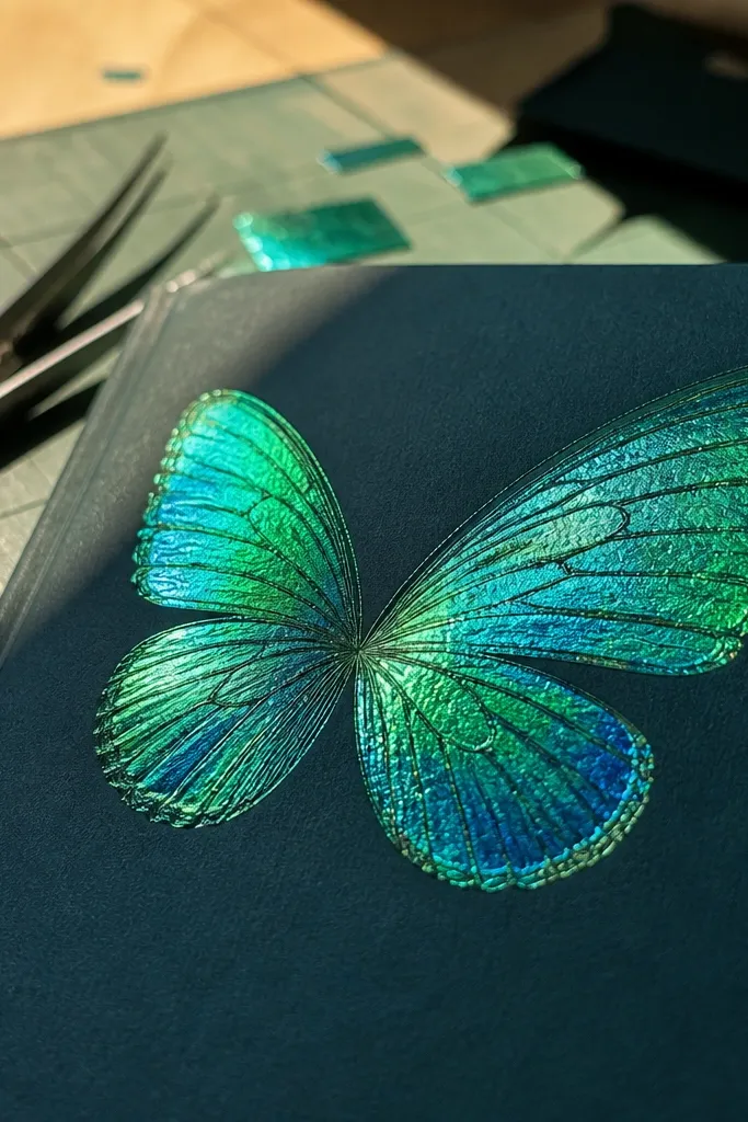
This cover is gorgeous because it uses one dramatic foil element on a deep color field. The teal makes the metallic stand out, and a butterfly-wing motif reads instantly without needing a lot of writing. It’s perfect for creative journals, mood trackers, and anyone who wants a little magic in their everyday notes. Keep the rest minimal so the foil doesn’t look like random craft scraps. This is a medium skill build because foil needs patience.
Cover the front with deep teal cardstock or paint a rigid base with acrylic paint. Add a butterfly wing shape using a stencil or pre-cut foil adhesive template. Press metallic foil onto the adhesive, then remove excess carefully. Add a small title in the bottom third with metallic gel pen or white paint marker. Seal gently with a matte sealer that won’t dull the foil too much.
Pro tipWarm the foil adhesive with your palm for 10-15 seconds before pressing foil.
AvoidDon’t use cheap foil on rough paper; it tears and looks patchy.
16. Typography Tape Banner with Color-Blocked Sides
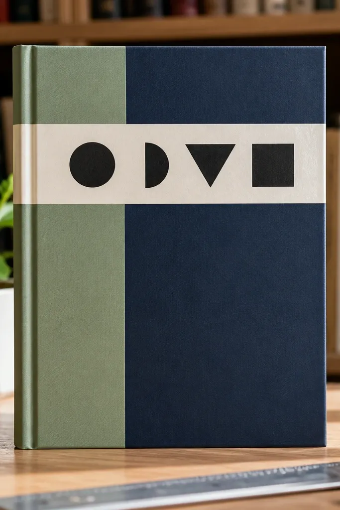
Tape banner typography looks good because it reads like graphic design, not decoration. By color-blocking the sides, you create depth and a frame around your title. This is a great cover if you like bold text and want it to look crisp even if you don’t draw well. Use two tape colors max and keep the background neutral. The result is clean, photo-friendly, and fast.
Start with a neutral base like off-white cardstock. Cut two vertical color-block panels and glue them to the left and right edges, each about 2-3 cm wide. Create a banner across the top with washi tape strips layered slightly overlapping. Add title letters using black paint marker or vinyl letters placed on top of the banner. Seal with a matte clear coat over the paper areas, not the vinyl if it’s not compatible.
Pro tipUse a straightedge to align the banner so the letters sit perfectly centered.
AvoidDon’t make the side panels too wide; it squishes the title area and looks crowded.
17. Embossed Leatherette Look with Heat-Set Texture Paste
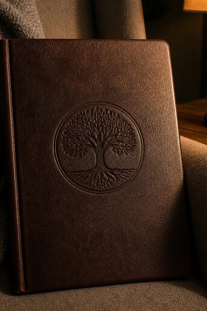
This cover looks gorgeous because the surface has real texture, not just printed decoration. A subtle embossed pattern catches light softly, and dark lettering gives you a strong focal point. It works well for journals meant to feel sturdy and “kept,” like a planner you’ll carry or a reading journal. You can keep the pattern simple — dots, waves, or a repeating border — so it stays elegant and readable. Skill level is medium because embossing paste needs drying time.
Cover the front with warm beige cardstock or bookboard. Tape a stencil in place and spread texture paste evenly, then remove the stencil carefully. Let it dry until fully matte and hard (you can speed with a hair dryer on low). Paint over the texture lightly with a darker ink wash, then wipe the raised areas so only the grooves hold color. Add your title with a dark paint marker and seal with a matte varnish.
Pro tipDry longer than you think — tacky paste ruins the finish and smears ink.
AvoidDon’t use thick paste in large areas; it cracks when it dries.
18. Shimmery Acrylic Drips with Chunky Sticker Title
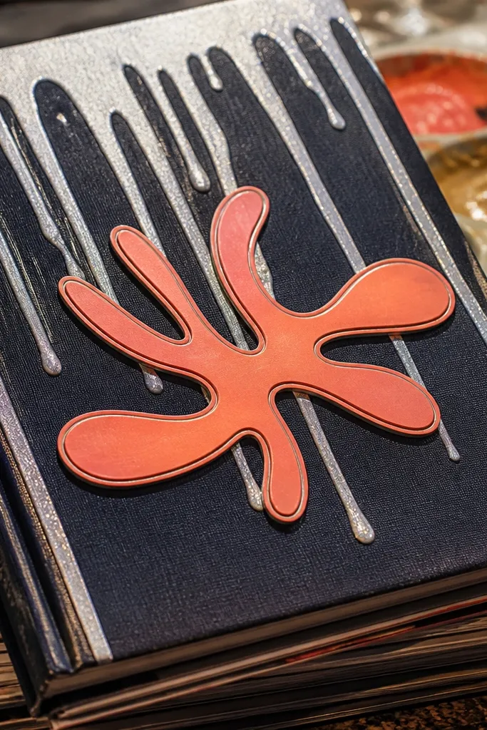
Drips look gorgeous when they’re controlled. A shimmery acrylic drip pattern gives you movement, while a chunky sticker title makes the front feel playful and bold. This cover is best for art journals, teen journals, and anything that wants energy. The shine makes it photo-friendly under angled light, and the sticker gives instant typography. Keep the background solid so the drips don’t look chaotic.
Paint the base with a solid matte color — black, charcoal, or deep plum. Mix glitter acrylic with a little clear medium so it drips smoothly, then load a small brush and apply three to five vertical drip lines starting near the top. Let the drips dry fully so they don’t run during handling. Add a sticker title or cut vinyl letters and press them down firmly. Seal with a matte spray over the background only, and avoid sealing glitter directly if it dulls.
Pro tipUse painter’s tape to mask the bottom area so drips stop where you want them.
AvoidDon’t do thin glitter drips over bare paper; it soaks in and looks uneven.
19. Linen Look with Screen-Printed Crest and Threaded Corner
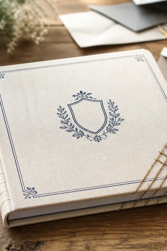
This cover looks like handmade stationery because it combines a linen-like base with a small crest graphic and a threaded corner detail. The crest keeps it classy, while the corner wrap adds craft texture without covering the whole front. It’s a strong option for wedding guest books, studio journals, or anything you want to feel “special” without bright colors. The key is scale — the crest should be small and crisp, not huge.
Cover the front with linen-texture paper or bookcloth. Create a simple crest with a stencil and screen-print style method using a foam brush and fabric-safe ink (or acrylic thinned for paper). Tape the stencil in place and dab ink evenly, then lift carefully. Wrap the top corner with thin embroidery thread in tight coils and glue the tail on the back. Seal the printed area with matte medium to protect the ink.
Pro tipTest your ink thickness on scrap — too thick smears through paper fibers.
AvoidDon’t wrap the thread too loosely; gaps show and look unfinished.
20. Resin-Style Look Using Clear Packing Tape Over Paper Collage
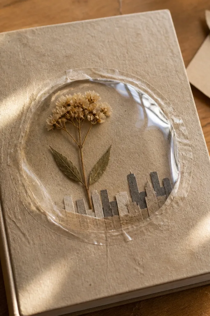
You get a “resin window” look without buying resin. The glossy tape dome makes colors underneath look deeper, and it turns a simple collage into a dimensional cover. This is great for small motifs like a single flower, a mini skyline, or a geometric window. It photographs really well because the highlights create depth. Skill level is easy, but you need patience to apply tape smoothly.
Build your collage on a paper base using layered cardstock — keep the collage under 1-2 cm tall for a smoother dome. Cut a clear tape sheet slightly larger than the collage and press it down from one edge, smoothing with a plastic card. Trim the tape edges cleanly with a sharp blade. Add a second thin tape layer if you want more gloss depth. Let it sit flat so bubbles settle, then add your title with a marker that won’t bleed under tape edges.
Pro tipPress tape with a hard plastic ruler for crisp edges and fewer wrinkles.
AvoidDon’t trap big paper fibers under tape; they show as bumps.
21. Gridded Dots Pattern with Neon Accent Title

This cover looks gorgeous because it mixes order with a pop of color. A gridded dot pattern gives you a clean, modern background, and a neon accent title becomes the focal point. It’s perfect for study journals, productivity planners, and anyone who likes graphic design aesthetics. Keep the neon color to one spot — the title — so the rest stays calm. The result is bright, readable, and very photo-friendly.
Use a ruler to draw a light grid on a white or light gray base, then dot along the intersections using a fine paint pen or marker. Keep spacing consistent, like 1 cm or 1.25 cm. Choose one neon color for the title and write it in thick letters at the center. Add a small underline or border using the same neon to unify it. Seal with matte sealer once the paint is dry to protect the dots from smudging.
Make the grid lines faint pencil so you can erase them before sealing.
Don’t use multiple neon colors; the background gets loud fast.
22. Hand-Painted Ombre Corner with Stamped Title
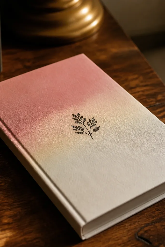
Ombre corners are gorgeous because they frame the cover without taking over the whole space. When you fade one color into the base, you get a soft gradient that looks expensive, especially with a stamped title in black. This is a great choice if you want a cover that looks artsy but still lets you write notes clearly inside. The stamped title adds texture and a slight imperfect charm. It’s medium skill since blending needs control.
Tape a diagonal or corner area on the cover so you can control the fade. Sponge-paint the corner with acrylic, starting with strong color at the edge and blending into white as you move inward. Use a dry sponge to soften the transition — dab, don’t swipe. Let it dry, then stamp your title using archival ink or paint and a stamp pad. Seal with a matte varnish to lock in the ombre and prevent rubbing.
Pro tipUse two sponges: one for color load, one dry for blending so you don’t muddy the fade.
AvoidDon’t paint the entire cover ombre — the corner is what makes it feel intentional.
23. Layered Acrylic Paint Scratches with Tiny Gold Dots
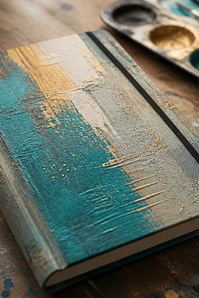
This cover looks gorgeous because it has movement you can feel visually. Layered paint gives depth, and controlled scratches reveal previous layers like a hidden color story. Tiny gold dots add sparkle without turning into glitter chaos. It’s a strong pick for creative journals where you want the cover to feel like a piece of art. The build is medium skill, and the look depends on clean, intentional scratching.
Paint a base layer and let it dry fully, then paint a second layer on top in a contrasting color. Once the top layer is tack-free but not fully cured, use a craft knife tip or fine sandpaper to scratch lines and patterns lightly. Clean dust off with a dry brush. Add gold dots using a gold paint marker, keeping them clustered near the title area. Seal with matte medium so the scratch edges don’t smear.
Pro tipScratch in one direction for a cleaner look — random scratching looks messy on small covers.
AvoidDon’t scratch while paint is wet; it smears and turns the whole area gray.
24. Quilted Look Using Fabric Strips and Book-End Corners
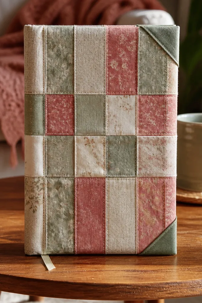
A quilted look is gorgeous because it brings real softness and dimension to a journal front. Fabric strips arranged in a grid create that quilting rhythm, and neat corners make it look like a finished textile item. This style works for cozy journals, kids' journals, and holiday notebooks. Keep your strip colors coordinated, and add a centered title in a contrasting fabric label. The result is tactile and photogenic from both front and side angles.
Cut fabric strips into equal widths, like 2 cm, and arrange them in a grid on a backing board. Glue strip seams to the backing so the layout doesn’t shift, then trim the edges flush. Create “book-end” corners by folding small corner flaps of fabric over the back and gluing them down for crisp edges. Add a fabric label title by cutting a rectangle, writing on it with fabric marker, and stitching or gluing it centered. Press flat under a heavy book until the glue cures.
Pro tipChoose cotton with a matte finish so the quilt texture reads clearly in photos.
AvoidDon’t use slippery satin — it shifts while gluing and the grid looks crooked.
25. Colored Pencil Border Frame with Watercolor Title Wash
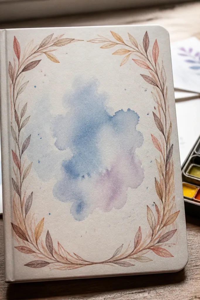
This cover looks gorgeous because it blends two “quiet” mediums: colored pencil for crisp structure and watercolor for soft color. The border gives a finished frame, while the watercolor title creates a gentle focal point. It’s ideal for journals that need a calm aesthetic, like reading journals, study notes, or gratitude pages. You also get a handmade feel without bulky materials. Build time is short, and the result is clean and readable.
Draw a rectangular border about 1 cm inside the cover edges using colored pencil, then shade slightly thicker on the corners. Add a watercolor title wash inside the border — paint only the letters or paint a soft rectangle behind them. Let it dry, then reinforce the title outline with a darker pencil or fineliner. Add small accent dots at the border corners if you want extra polish. Seal with a matte spray after the watercolor fully dries.
Use a fine fineliner to sharpen the title edges after watercolor dries.
Don’t seal too early — watercolor can lift and smear under spray.



