
1. Sunrise-to-Sunset Color Energy Strip
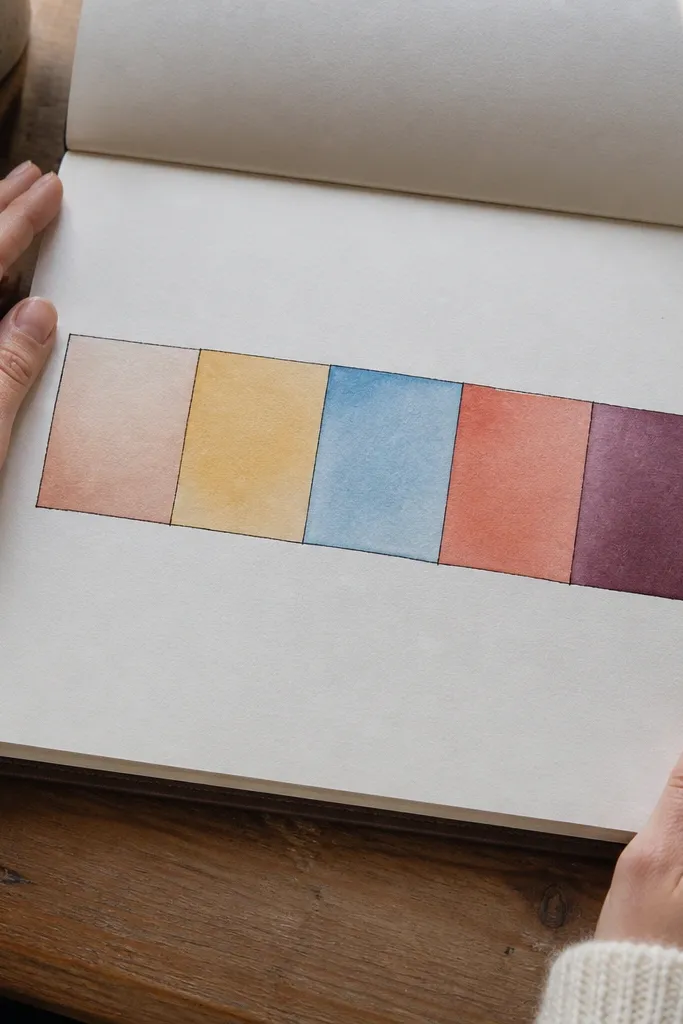
This format keeps you writing because it’s fast and it shows progress instantly. You draw one long strip across the page, then split it into five segments labeled sunrise, morning, midday, afternoon, sunset. In each segment, you fill a color that matches your energy level that time of day. The high-end look comes from consistent spacing and a limited palette: pick 5 tones that always mean the same thing. It’s great for mornings when you don’t know what to write — you just pick color and move on.
Start by drawing a clean rectangle strip about 1.5 inches tall and spanning nearly the full page width, leaving a 0.5-inch margin on both sides. Divide it into five equal segments using a ruler or a straightedge. Choose a fixed color key beforehand (like pale yellow for low, amber for medium, deep orange for high) and use the same colors every day. Write the date in the top margin, then shade each segment lightly with watercolor or solid gel pen and finish with tiny labels in the corners.
Use watercolor pencil or very light watercolor for the fill so the colors stay airy instead of heavy.
Don’t freestyle the colors each day — random palettes kill the polished look.
2. Three-Photo Memory Frame (Printed + Taped)
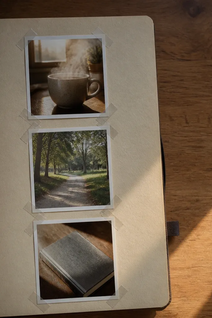
If writing stalls, this format gives you a visual hook. You dedicate one page to a single day’s three small memories, each inside a simple frame shape. The page stays photogenic because the layout is consistent: same photo size, same spacing, same border. Use matte photo prints so they blend with paper texture instead of looking glossy. This works especially well for days when your brain is full but words won’t cooperate.
Print three small photos (about 1.5 by 2 inches each) and trim them slightly so they fit a uniform grid. Draw three rectangles on the page as placeholders, then tape each photo into its rectangle with narrow washi tape on the corners only. Add a thin border line around the whole layout in a pen color that matches one photo. Under each photo, write one sentence with a single verb-first prompt like “I noticed...”, “I learned...”, “I felt...”. Finish by adding the date in the top right.
Use corner tape strips instead of full-sheet tape so the page doesn’t warp and curl.
Avoid oversized photos — they crowd the page and make the border look unfinished.
3. Minimalist Weather + Mood Map
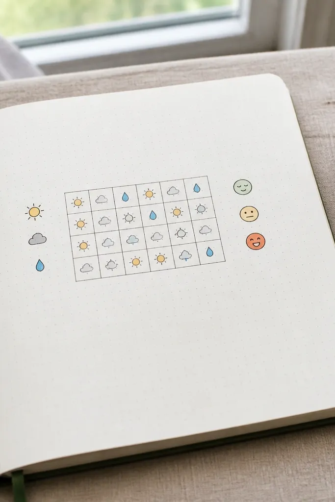
This is one of the cleanest ways to keep daily momentum while still capturing real life. You log weather and mood in a tiny grid so your page looks like a designer made it. The high-end look comes from icon consistency and tight alignment: same icon size, same spacing, and a simple legend. It also helps you spot patterns without turning the journal into a spreadsheet. If your entries are usually scattered notes, this brings them into focus fast.
Draw a 3 by 4 grid near the center of the page, leaving space above for a title like “Today’s Weather.” In each row, write a weather icon (sun, cloud, rain, wind) in one fixed style and add a mood label (calm, focused, low, restless) in a small block beside it. Create a tiny legend in the margin that maps each mood to a color dot. Use a ruler to keep the grid straight, then add one short line at the bottom: “Weather that affected me: ___.”
Pick one pen for icons and one for labels; mixing styles makes the page look messy.
Don’t draw icons freehand at different sizes — that’s the quickest way to lose the high-end feel.
4. Receipt-to-Resolution Layout
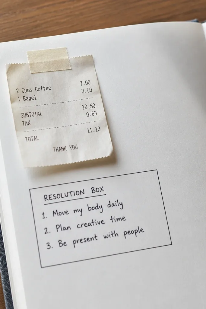
Cut a receipt or ticket into a neat rectangle about 3 inches wide and 2-3 inches tall. Tape it near the top using washi tape only on the corners. Draw a bordered box below it and label it “Resolution for tomorrow” with a single line for a goal. Add three mini lines inside the box: “One step,” “Time window,” “If it fails, I will...”. Write the date at the top margin and keep the rest of the page blank for breathing room.
This one turns clutter into a page you actually want to look at. You tape a small receipt or ticket stub and attach a resolution box under it. The aesthetic is crisp: one “found object” at the top, one clean action plan below, and lots of white space. It keeps you writing because you’re not starting from zero — the receipt is your anchor. This suits busy days when you want a journal that feels grounded and real.
AvoidDon’t cram the receipt with extra stickers — one found object is the look.
Pro tipUse a black gel pen for the box and labels so the page reads cleanly even when the receipt has print noise.
5. Hand-Lettered Quote in a Rounded Rectangle
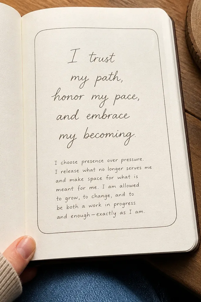
Draw a rounded rectangle border centered on the page, about 4 inches wide and 2.5 inches tall. Use a pencil first, then ink the border with a fine pen. Letter your quote inside with consistent baseline height, and keep each line roughly equal length. Below the frame, write 2-3 short lines starting with “Today I...”, “Tomorrow I...”, “I’m grateful for...”. Date the page in the corner.
This format gives you a “finished page” feeling even if you only write a few lines. You hand-letter one short quote or personal mantra, then add a tiny reflection paragraph below in smaller handwriting. The high-end look comes from the rounded rectangle frame and careful spacing, not the quote itself. Choose a quote length that fits two or three lines max. This is best for evenings when your brain wants aesthetics more than journaling prompts.
AvoidDon’t use thick marker for lettering inside a small frame — it bleeds and makes the quote look heavy.
Pro tipPractice the letter size by writing one word on scrap paper until it matches your frame height.
6. Ink Swatch Mood Palette + One Sentence
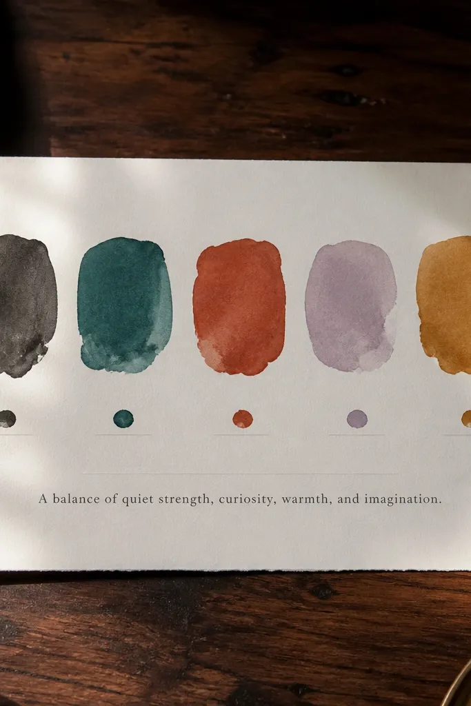
On the right side of the page, draw five small squares in a vertical column with equal spacing. Paint or ink each square with a different tone (use the same set of colors for consistency). Label each square with a mood word using a tiny font style. On the left side, write the date and then one sentence: “My strongest feeling was ___ because ___.” Keep the sentence short enough to fit without wrapping.
If your journaling turns into rambling, this forces clarity. You create a mood palette with 5 swatches that match your day, then write one sentence that explains the strongest mood. The page looks high-end because the swatches are structured and labeled neatly, like a paint board. You’re not asking yourself to write a lot — you’re matching color and truth. This is ideal for people who want their journal to look collectible, not chaotic.
AvoidDon’t add more than five swatches — the layout starts looking like a test sheet.
Pro tipUse watercolor swatches with a wet-on-wet edge so they look soft, not harsh.
7. Daily Checklist with Elegant Micro-Icons
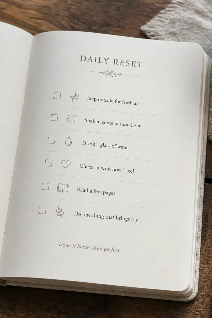
Draw a header line at the top and write the date, then create a vertical list of 6 check boxes about 0.4 inches wide. Add one tiny icon to the left of each checkbox (a sun, drop, star, book, heart) in the same size. Keep text short, like “Move 20 minutes” or “Clean one surface.” At the bottom, leave one blank line and label it “Repeat tomorrow:” then write one sentence.
This keeps you writing when your mind wants structure. You make a short checklist of 5-7 items, but you format it like a design page: micro-icons, aligned check boxes, and one clean header. The high-end look comes from consistent icon style and spacing — not from fancy handwriting. After you tick boxes, you add a single line at the bottom: the one thing you want to repeat tomorrow. It’s perfect for days when you need momentum more than storytelling.
AvoidDon’t use long checklist items — wrap lines make the page look cramped.
Pro tipUse the same pen for check boxes and icons so line weight stays consistent across the page.
8. Watercolor Corner Wash + Focus Word
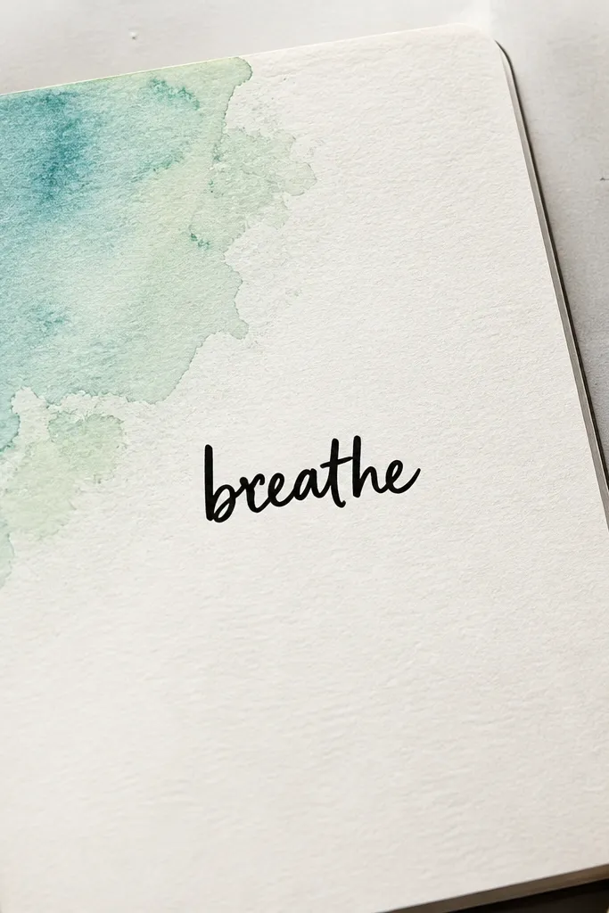
Tape off the page edges lightly with painter’s tape to keep the wash crisp. Paint a small corner wash about 2.5 inches square using diluted watercolor and let it feather outward. Once it dries, write one big word in the center using a bold pen (like “CALM,” “BUILD,” or “MOVE”). Under the word, write three bullet prompts in short lines: “Today I will...”, “I can ignore...”, “I’ll do it at...”. Remove tape carefully after the paint is dry.
This is the cleanest way to make a plain journal page look expensive. You paint a soft watercolor wash in one corner, then write one big focus word centered or slightly off-center. The contrast between airy color and sharp pen text looks intentional. It works even when you only have one minute to write because the layout already carries the aesthetic. It’s great for weeks where you need calm structure.
AvoidAvoid painting the entire page — one corner only gives the high-end balance.
Pro tipLet the wash dry fully before writing — wet paper makes pen look fuzzy.
9. Museum-Style Ticket Column + Notes
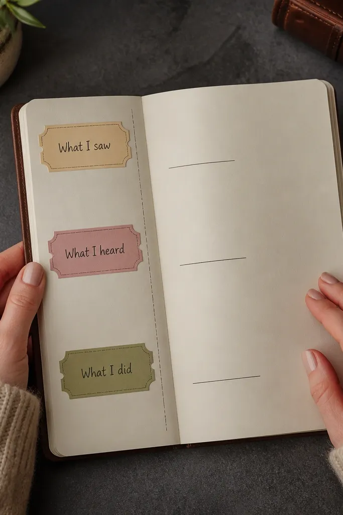
Draw three or four ticket shapes stacked vertically on the left side, each about 1.2 inches wide. Add small notch cutouts on the sides with a ruler guide so the shape repeats. In each ticket, write a category label in all caps. On the right side, write 2-3 short lines for each category in the same order. Date the page in the margin and keep the handwriting tight to the lines.
If you want your pages to look like curated paper objects, this layout does it. You create a vertical column of ticket-shaped labels, each one holding a short note category: “What I saw,” “What I heard,” “What I did.” The rest of the page is clean space for your handwriting. The high-end look comes from repeating shapes and consistent label sizes. It also helps you write something every day because each ticket gives you a narrow prompt.
AvoidDon’t change ticket sizes — inconsistent shapes make it look handmade in a messy way.
Pro tipUse a thin black pen for ticket outlines and a softer gray pen for the notes lines.
10. Three-Block Timeline with Time Labels
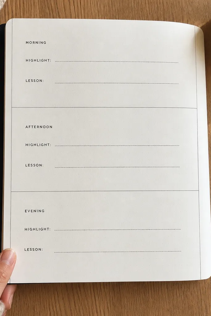
Draw three equal rectangles across the page with a ruler, leaving a small gap between blocks. Label them “AM,” “PM,” and “EV” or write “Morning,” “Afternoon,” “Evening.” Inside each block, write two mini headings: “Highlight” and “Lesson.” Fill each with one sentence each, keeping the font size consistent. Add the date at the top and use a single accent color underline for each block label.
This format turns your day into a clean story without long writing. You split the page into three blocks labeled morning, afternoon, evening, then add one highlight and one lesson in each. The page looks high-end because the blocks are equal, the labels are aligned, and the text is short. It works when you feel like your day disappeared — you can reconstruct it quickly. Great for anyone who wants structure but hates strict planning.
AvoidAvoid long paragraphs inside blocks — keep it to one or two lines max.
Pro tipUse a ruler for block edges — straight geometry is what makes this look polished.
11. Gold-Edge Sticker Border with Minimal Text
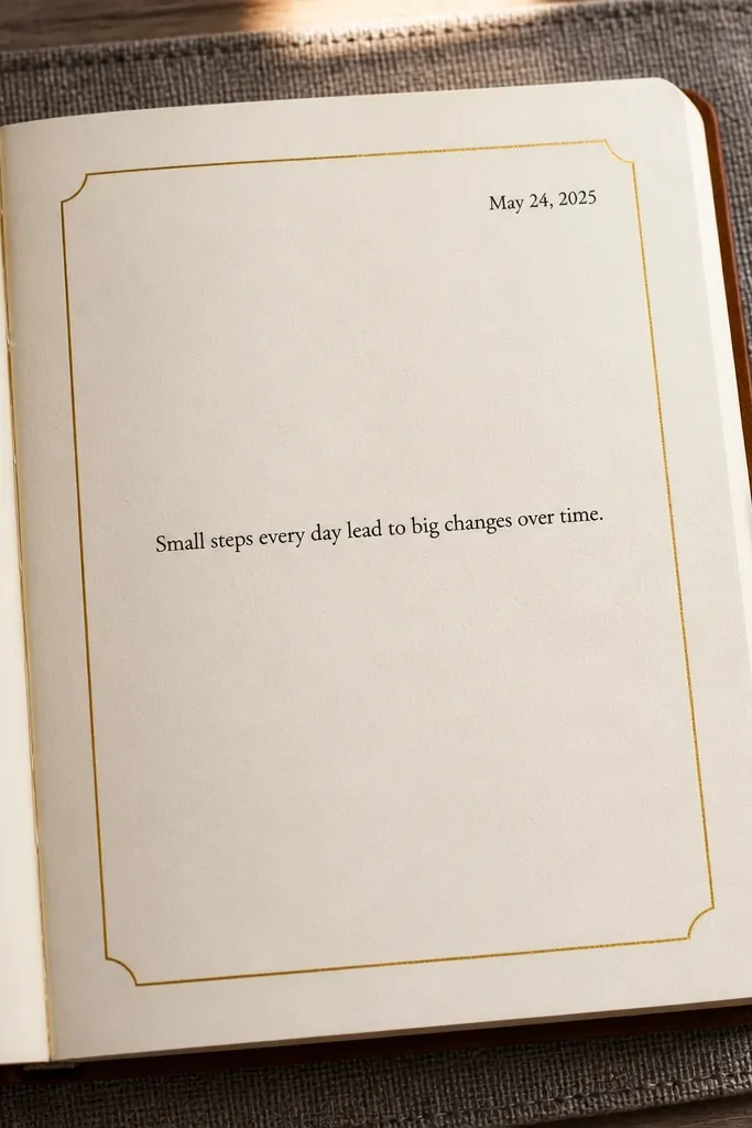
Apply a thin metallic border along the top and sides only, leaving the bottom open for writing. If using stickers, overlap them slightly so the border looks continuous; keep the total thickness consistent. Write the date in the top corner and then a centered sentence under it that starts with “Today I...”. Add one small bullet line at the bottom like “Next: ___.” Use a matte pen so the text doesn’t compete with the metallic border.
Borders make pages look finished, even when you only write a few lines. You create a thin frame using gold-edge sticker strips or a metallic gel pen along the margin, then keep your text centered and short. The high-end look comes from restraint: one border, one main sentence, and a date in the corner. This works on busy days when you want the journal to look elegant without spending time on heavy layouts.
AvoidDon’t add multiple colored borders — metallic + color chaos ruins the clean look.
Pro tipChoose matte paper for this — glossy pages make metallic edges look cheap and streaky.
12. Grid Lettering Habit Tracker with One Accent Row
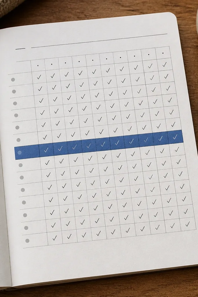
Habit trackers can look ugly fast. This one looks high-end because it uses a neat grid and only one accent row color. You pick one habit per week page and track it with small checkmarks in a tidy layout. The page stays photogenic because the grid lines are straight and the text is minimal. It also keeps you going because the action is tiny: check the box, write one line about what helped.
Draw a grid with 7 columns (days) and 4 rows (week weeks or categories) using a ruler. Label the top with Mon-Sun and keep the font small. Add checkmarks in pencil first, then ink over them. Highlight only one row with a colored underline or a light wash behind the row label. At the bottom, write one sentence: “What made this easier: ___.”
Use a 6B pencil for light grid lines so you can erase them cleanly before inking.
Don’t cram multiple fonts into the grid — pick one handwriting style for labels.
13. Pressed Leaf + Date Stamp Page
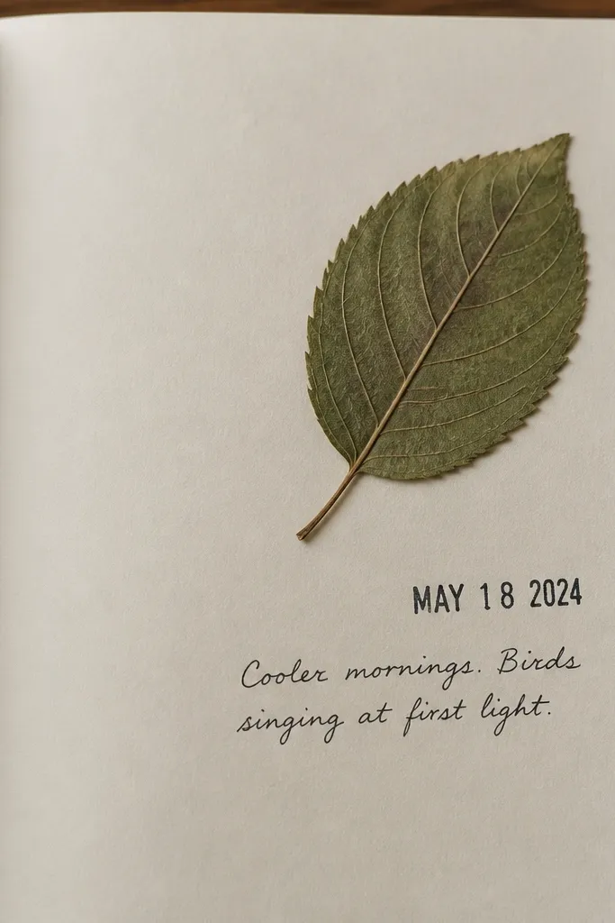
Press a leaf between book pages until flat, then trim the stem if needed. Paste it using a tiny dot of archival glue or a small strip of double-sided tape on the back. Stamp the date in the opposite corner with a clear ink pad, or write it with a neat date format. Under the leaf, write a short line: “Today smelled like ___.” Keep everything else blank so the pressed item stays the hero.
This format turns the journal into a small keepsake without turning it into a scrapbook mess. You place one pressed leaf or petal near a corner, then add a clean stamped date and a short note. The high-end look comes from the negative space and the one natural element — it looks intentional, not cluttered. It’s also easy to keep up because you only need one tiny piece of nature per day or per few days. Perfect for calm journaling periods.
AvoidAvoid multiple dried elements on one page — it looks messy quickly.
Pro tipUse archival tape or glue so the leaf doesn’t lift and curl over time.
14. One-Page Budget Mood Diary (Numbers as Aesthetic)
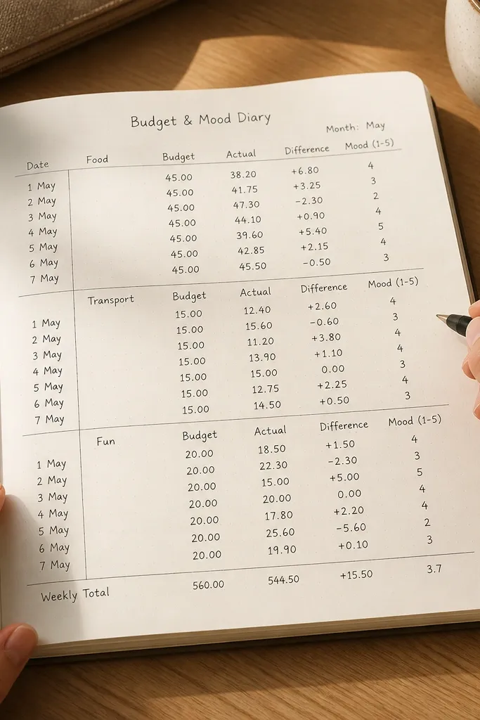
Draw three horizontal rows across the page and label the left side with categories. Add two columns: one for a spend figure (in dollars or a simple symbol like “$”, “$$”) and one for a mood score (1-5). Write the mood score as a colored dot next to the number, using the same color scale each time. At the bottom, write one reflection line starting with “When I spent on ___, I felt ___.” Keep numbers aligned with a ruler.
This idea keeps you writing because it’s concrete and it ties money to feelings without long explanations. You create three categories like food, transport, fun and assign each a spend number plus a mood score from 1-5. The page looks high-end because it uses clean alignment and consistent number formatting. You get a visual pattern of how spending affects your mood, which makes the journal feel useful. It’s best for people who like data but hate worksheets.
AvoidDon’t add ten categories — three rows make it look designed.
Pro tipUse a single currency format and one decimal rule so the page stays visually consistent.
15. Checklist of Wins with Framed Checkmarks
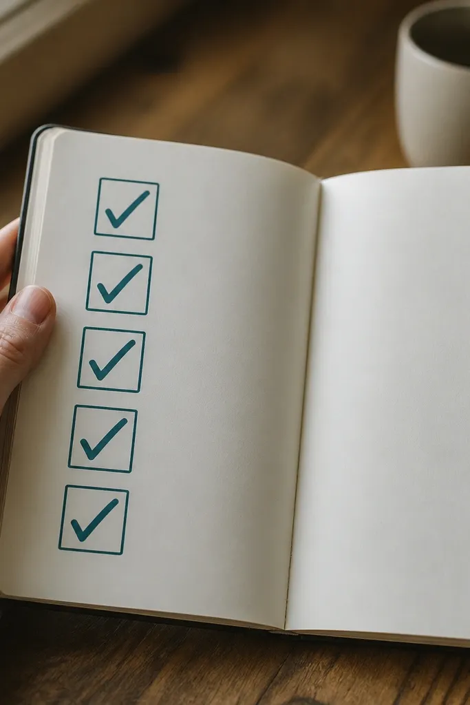
If you feel like your days are mostly noise, this flips the page into proof. You write 5 wins from the day, each inside its own small frame box with a checkmark style you repeat. The high-end look comes from tiny boxes, consistent margins, and one accent color for the checkmarks. It’s also emotionally easier than prompts that ask for deep feelings every day. You’ll keep going because the format is forgiving and fast.
Draw five small square frames in a row or two rows of three with equal spacing. Label the top with “Wins” and add today’s date. Write one short win per box, keeping each line under 6-8 words. Mark each box with a checkmark in your accent color once you’re done writing. Add one final line under the frames: “Next win I want: ___.”
Make the checkmark style consistent by tracing it once on scrap paper, then repeating it in each box.
Don’t use long sentences in boxes — they break the clean look.
16. Map-Route Style Day Notes (Little Lines + Icons)
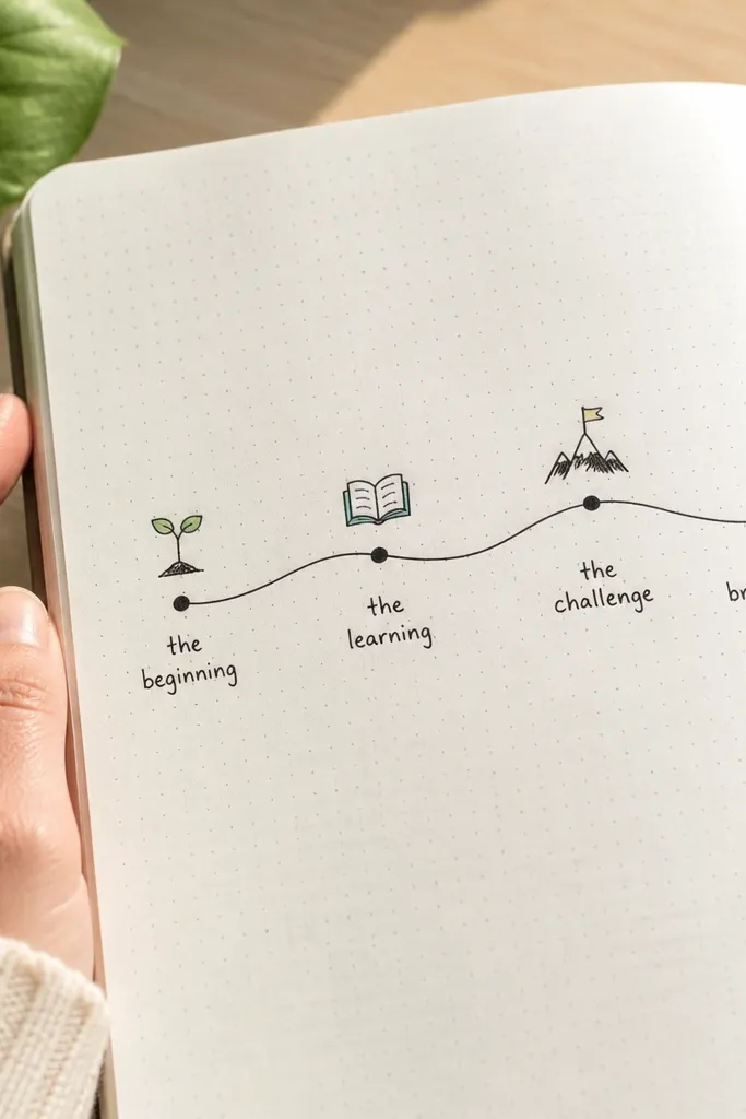
Use a fine pen to draw one curving route line across the page, leaving margins. Place 3-5 equal-size dots along the line, then label each dot with a tiny icon and 2-4 words. Under the route, write a one-sentence summary starting with “The route taught me...”. Keep labels aligned so they’re readable and not scattered. Date the page in a corner and keep the rest of the page clean.
This one turns a normal day into a visual route, which makes your journal feel like art. You draw a curving line across the page like a map route, then place 3-5 dots for key moments. Each dot has a tiny icon and a short label. The high-end look comes from line weight and spacing: smooth line, consistent dot size, and tidy labels. It’s perfect for travel days, errands days, or any day with movement where writing feels boring.
AvoidAvoid messy label spacing — dots with floating text look chaotic fast.
Pro tipOutline your route line once lightly in pencil, then ink it in one smooth motion to avoid wobbles.
17. Stamped Circle Themes with One Caption
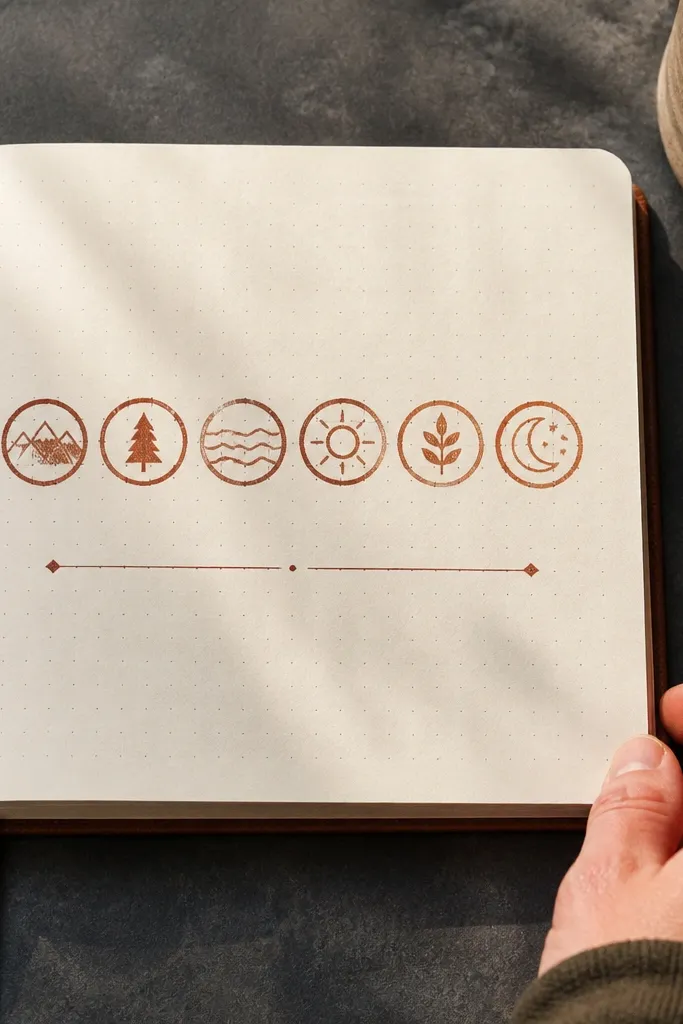
Pick a small circular stamp and a single ink color. Stamp 5-7 circles across the page with consistent spacing, then let the ink dry fully. Write a theme caption above or below the circles, like “Noise day,” “Soft day,” or “Momentum day.” Under the caption, write one sentence reflection. Keep handwriting size small so it balances the stamp row. Add the date in the margin.
Stamping gives pages structure without heavy drawing skills. You stamp a row of circles with one theme color, then write one caption that ties the circles together. The high-end look comes from repeating the same stamp size and keeping the caption typography clean. This format works on days you want to write but don’t want to think about layout. It also makes your journal look consistent over time.
AvoidDon’t stamp too many circles — five to seven keeps the page elegant.
Pro tipUse matte pigment ink if you want stamps to stay crisp without smudging.
18. Notebook-Style Accordion Notes Foldout
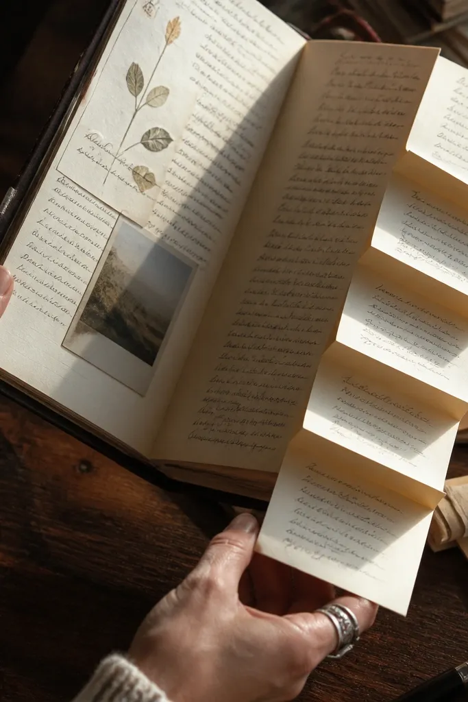
This is a seriously good way to add dimension without messy glue. You attach an accordion-fold strip and write short notes on each fold, so your page looks like a tiny book inside a journal. The high-end look comes from sharp fold lines and neat handwriting blocks. It also helps you stay consistent because each fold has a dedicated prompt. This suits reflection days when you have a little extra time and want something tactile.
Cut a strip of paper or cardstock about 10 inches long and 2 inches tall. Score it every 0.8 inches so it folds into an accordion of 5 sections. Glue or tape the folded strip onto the journal page along the top edge so it opens outward. Label each fold with a prompt like “Good,” “Hard,” “Lesson,” “Next,” “Grateful.” Write one sentence per fold, then press flat with a book for an hour so it sets.
Use a bone folder for crisp scoring so the folds look sharp in photos.
Avoid thick cardstock — it makes the fold bulkier and harder to close.
19. Big Date Header with Thin Underline Grid
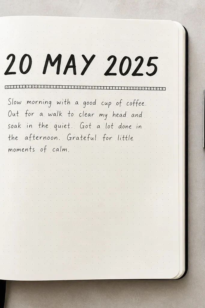
Write the date across the top in a large size, then draw a thin underline just below it. Below that, draw a simple micro-grid of short horizontal lines or a 3-column grid using a ruler. Place 3-4 prompts on the grid lines such as “Top thought,” “One action,” “Mood,” “Gratitude.” Keep each entry short so it fits inside the grid. Add one accent line in a single color under one prompt label.
This is the clean, designer look that makes daily pages feel consistent even when content varies. You write the date big, then add a thin underline grid pattern beneath it. The rest of the page holds 3-4 short lines, each aligned to the grid. It’s high-end because it looks intentional and structured, not because it has fancy art. Great for people who want the journal to look like a system, not a diary dump.
AvoidDon’t make the grid too heavy — thick lines turn it into a worksheet.
Pro tipUse a light gray pen for the grid and a darker pen for text so the structure stays subtle.
20. Matte Sticker Cluster with Hand-Drawn Halo
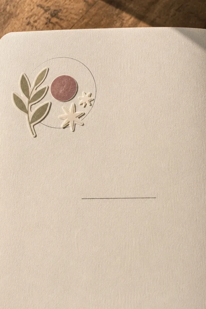
Choose three matte stickers that share one color family or theme (icons, nature, stationery). Place them near one corner with small overlaps, keeping the cluster within a 3-3.5 inch square. Draw a halo circle around the cluster with a thin pen, leaving a small gap between the ring and stickers. Add the date and one caption line like “The best part was ___.” Keep the rest of the page blank so the cluster stays the focal point.
This is for days you want the journal to look styled without turning into a sticker scrapbook. You place 3 matte stickers in one small cluster, then draw a halo ring around them with a thin pen. The halo ties everything together and makes the stickers look like they were designed into the page. Write a single caption sentence next to the cluster so the page has both “fun” and meaning. It’s ideal for birthdays, weekends, or any day you want a mood boost.
AvoidAvoid glossy stickers — reflections make pages look cheap and uneven.
Pro tipPress stickers down with a clean fingernail to prevent edges lifting in photos.



