
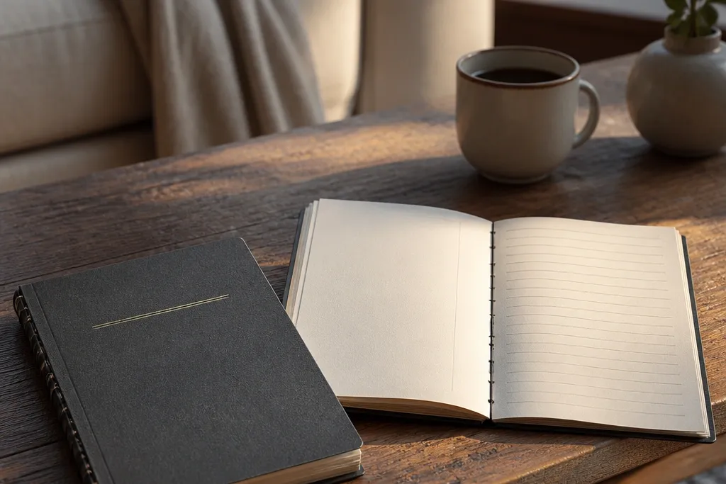
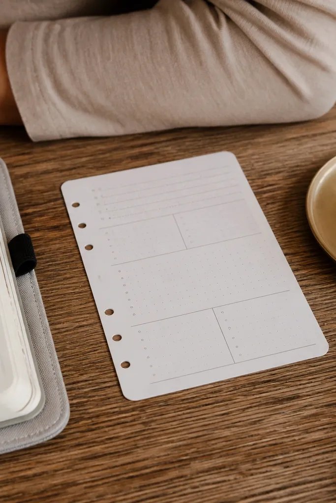
1. Matte Black Cover with Gold Foil Spine Label
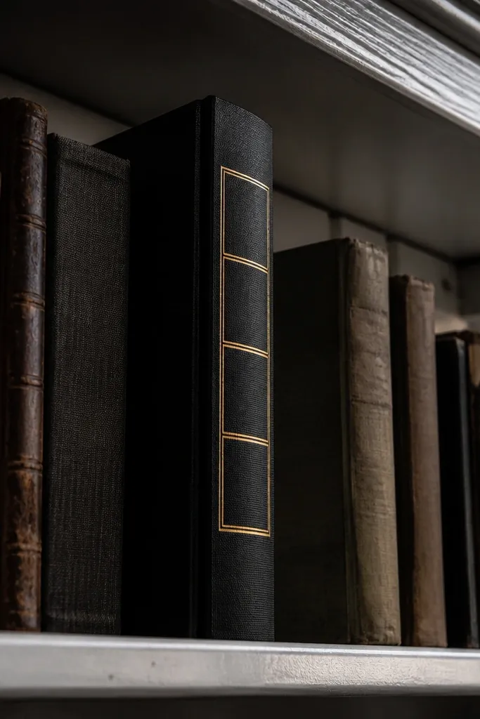
A matte black cover instantly reads high-end because it kills glare and makes the gold details look sharper. The spine label is where the journal gets its “real product” vibe — it gives the whole piece a clear identity when it’s stacked on a shelf. Use thin gold lines or foil tape so the design stays minimal instead of loud. This idea works for both planners and art journals because the cover stays clean even as the inside fills up.
Start with a cover base that’s firm, like 200-300 gsm cardstock or a pre-bound blank journal you can wrap. Cut a spine label strip to about 1.25 inches (3.2 cm) wide and the length of your spine, then apply gold foil tape or gold vinyl lettering centered on the strip. Seal the surface with a matte craft sealer so the label doesn’t scuff. Finish by adding two tiny gold corner marks on the front cover — keep them small, like 0.25 inch squares, so it stays refined.
Press foil tape down with a plastic ruler edge for cleaner adhesion and fewer bubbles.
Don’t use glossy black — it reflects light and makes the gold look dull instead of crisp.
2. French Grid Pages with Thick Header Band
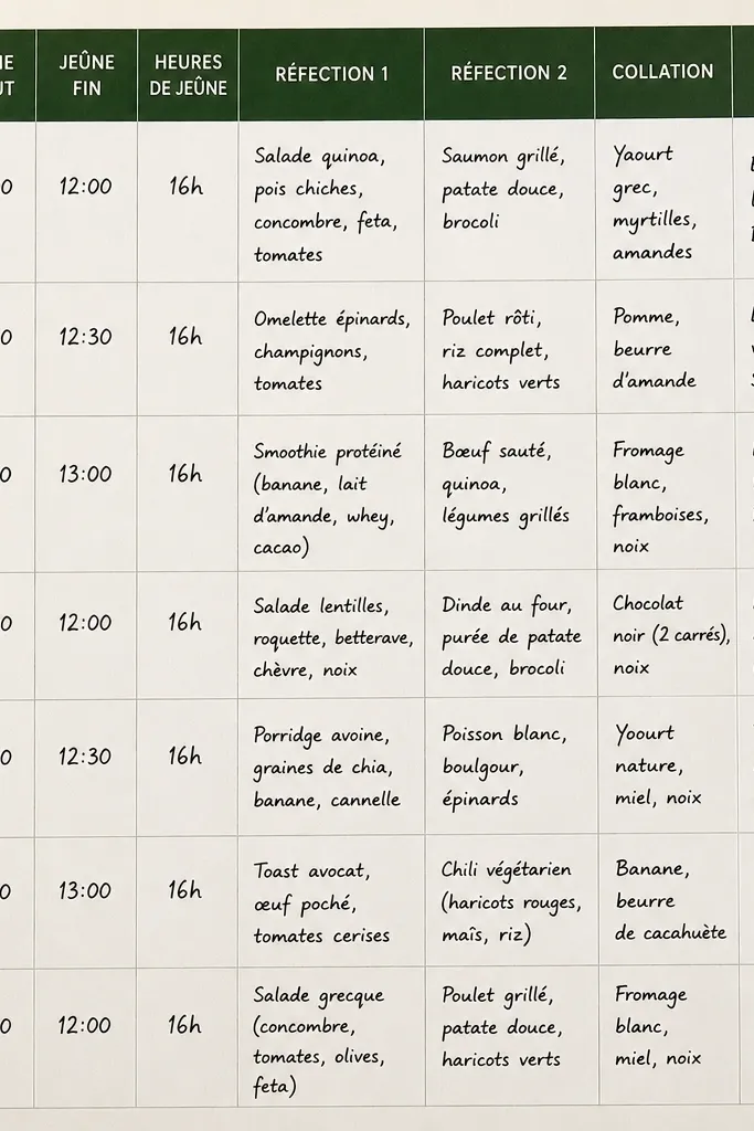
French grid layouts look expensive because they’re structured but not sterile. The thick header band creates a focal point without needing heavy decoration, and it gives every entry a consistent “top bar” like a printed planner. Use muted navy or deep forest for the header so it reads classy next to off-white paper. This design is perfect for tracking weeks, menus, or goals because the grid keeps everything aligned and easy to scan.
Begin by drawing a margin frame: leave a 0.75 inch (2 cm) border on all sides using a ruler. Then map a light grid inside — aim for 0.5 inch (1.3 cm) squares — using a grey pencil or very light grey pen. Add the thick header band across the top inside the margin, about 0.6 inch (1.5 cm) tall, and write the date or category in the center. Finally, keep notes in one cell per line so the grid stays readable.
Use a light pencil for the grid and go over only the header with pen so the page stays crisp.
Don’t make the grid too dark; heavy grid lines turn the page into a worksheet.
3. Perforated Washi Frame with Center Photo Card
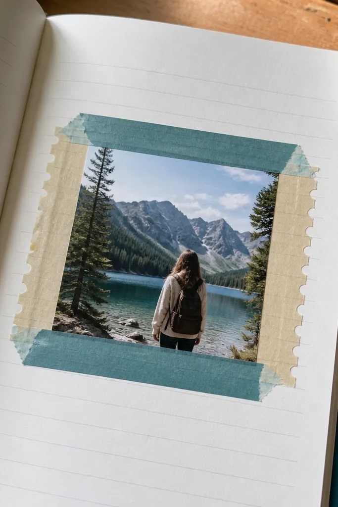
This layout looks high-end because it combines a clean frame with one strong focal piece. The perforated edge effect from layered washi tape gives a subtle “packaging” feel, like a premium insert. Put a small photo card or printed card in the center to add depth and texture, even if you don’t draw much. It’s especially good for travel journals, memory logs, and monthly highlights where one centerpiece makes the page feel complete.
Cut a rectangle card to about 3.5 x 5 inches (9 x 12.5 cm) and round the corners using scissors or a corner punch. Build the frame using two layers of washi tape: one layer for the border and a second layer offset slightly to create a faux perforated edge. Place the card in the center and adhere it with double-sided tape corners so it lies flat. Finish by adding a short caption line under the card, centered, and write it in one consistent pen color.
Pro tipChoose washi that has a matte finish so the frame doesn’t glare under phone flash.
AvoidDon’t cover the whole page with tape — keep it to the frame so the card stays the star.
4. Deckle-Edge Paper Layer with One-Line Title
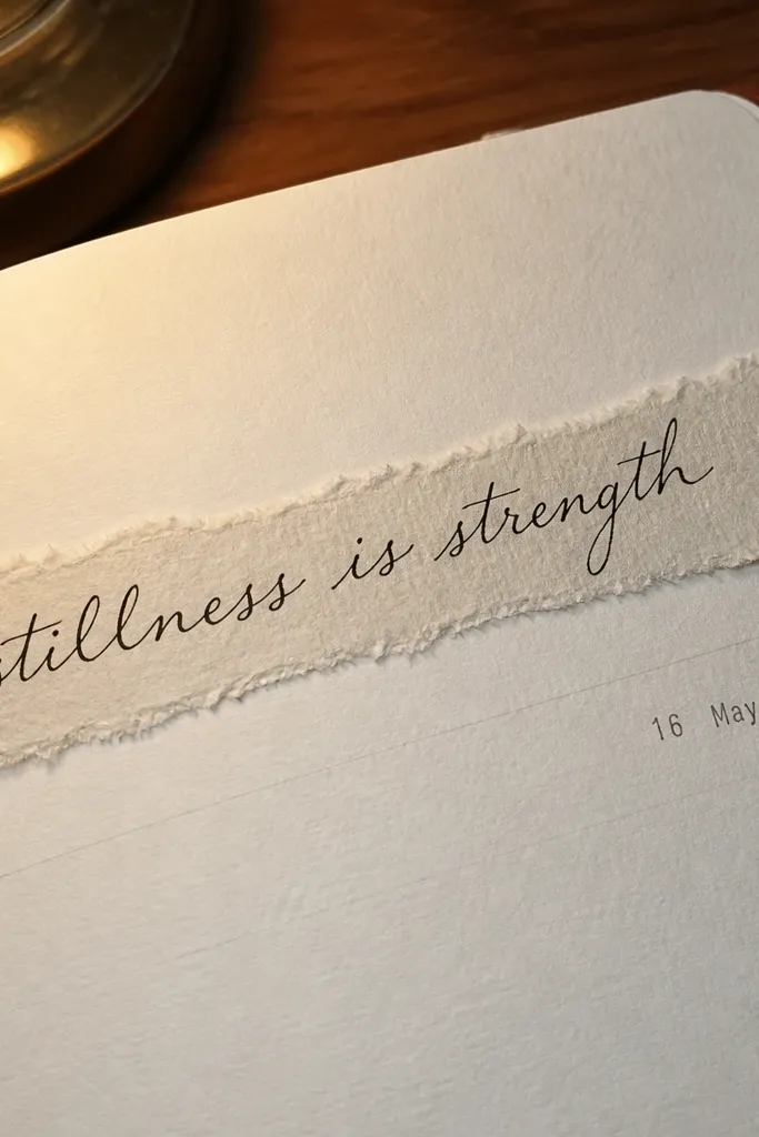
Deckle-edge paper gives instant texture and a handmade-luxury look. The trick is to keep the rest of the page quiet: one title line and maybe a small date. When you layer a deckle-edge strip behind your writing, your journal gains depth without clutter. This works beautifully for gratitude logs, reading journals, and any entry where you want the writing to feel like a keepsake card.
Tear or cut a deckle-edge strip roughly 1.5-2 inches tall and long enough to span most of the page width. Adhere it slightly above the middle line so it peeks behind your text. Write a single title line across the strip using a brush pen or fountain pen, then add a tiny date in the bottom margin. Seal the edges lightly with a thin layer of matte glue so the paper doesn’t fray further.
Pro tipUse a ruler for placement, not for tearing — tearing should be free, alignment should be strict.
AvoidDon’t add multiple layers; one deckle edge is enough to look intentional.
5. Foil Stamped Corner Tags for Sections
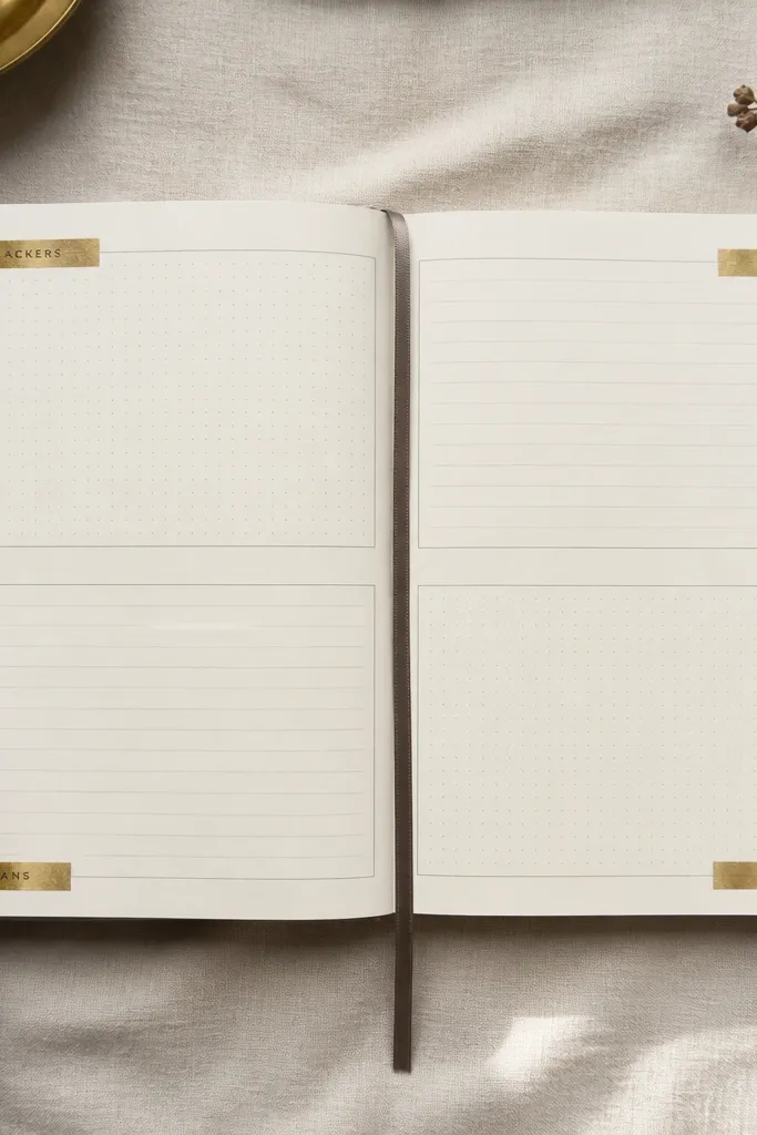
Corner tags look premium because they act like built-in page markers. Foil stamping or foil tape in the corners gives that “designed product” feel, while the headings keep the page functional. This layout is great when you want your journal to look organized even on busy days. Use it for trackers, checklists, and reading notes where each section has its own vibe but the page stays cohesive.
Cut small tag rectangles from cardstock, about 0.75 x 1.5 inches, and stamp or apply foil tape to one side. Place tags in the top corners of a page — left for one section and right for the other — and glue them with tape or a thin glue dot. Write section titles beneath each tag in all caps using a fine pen. Finish by leaving space for entries inside each section block so the tags don’t feel like decoration only.
Use the same tag size on every page so your journal looks like a system, not random embellishment.
Don’t place tags too far from the corner; leaving a gap makes them look accidental.
6. Watercolor Bleed Header with Crisp Black Body
This design looks high-end because it pairs soft color with sharp type-like writing. The watercolor bleed header gives motion and depth at the top, while the black body stays clean and readable. You don’t need a full painting — just a controlled wash. This layout suits daily pages, meal logs, and reflective prompts where you want the page to feel calm and artsy without losing legibility.
Mask off the top header area with painter’s tape about 1 inch tall, then wet the paper lightly with clean water using a brush. Drop in diluted watercolor pigment and let it bleed toward the tape edge. Remove the tape while the paper is still slightly damp to keep the edge crisp, then write your date or prompt in black once dry. Add 3-6 lines of writing in a consistent spacing rhythm using a fine liner so the page stays tidy.
Use thicker paper (at least 160 gsm) for watercolor headers so the ink doesn’t feather.
Don’t use multiple watercolor colors in the header; two shades are enough for a polished look.
7. Monogrammed Elastic Closure with Leather-Style Wrap
A closure detail makes a journal feel expensive because it signals thought about how it’s used. A leather-style wrap band plus an elastic loop keeps the journal closed and gives a clean silhouette when it sits on a desk. Add a monogram in one color to keep it classy. This is perfect for a daily journal you carry around, since the closure helps protect pages and keeps your styling consistent between entries.
Wrap a strip of faux leather or thick cardstock around the journal cover and mark where the ends meet, leaving the strip centered on the front. Cut a small elastic loop and stitch or glue it under one end so it sits snugly across the front. Add a monogram using vinyl letters or a heat-transfer monogram decal, centered on the wrap. Seal the edges with fabric glue or clear craft sealer so the wrap doesn’t lift with handling.
Pro tipStretch the elastic slightly before gluing so it holds tension without warping the cover.
AvoidDon’t glue elastic directly to thin paper — reinforce with a cardstock backing strip.
8. Gold Tape Margin Lines with Dot Checkboxes
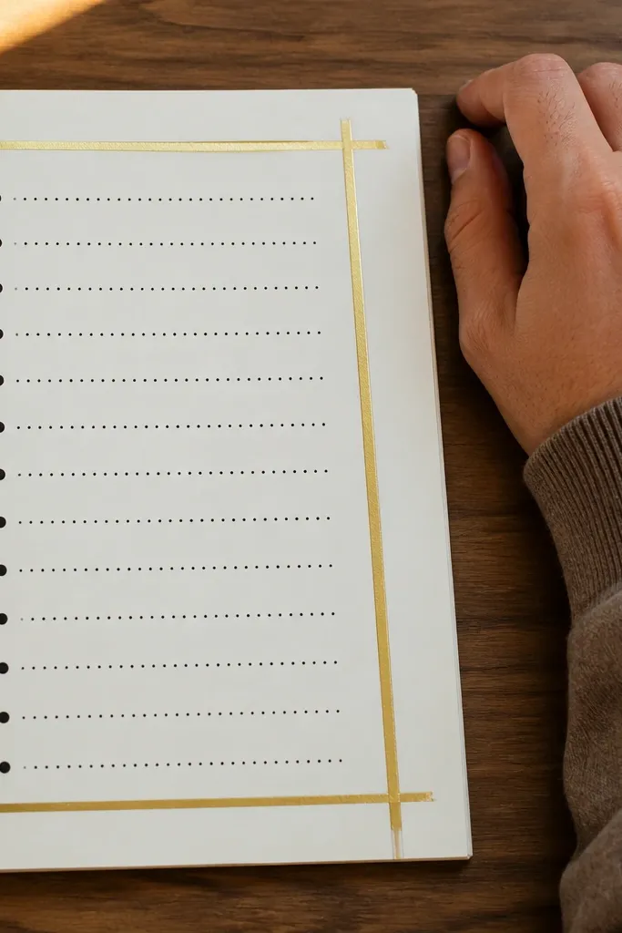
Margin lines made from gold tape instantly elevate a page because they frame your writing like a printed document. Dot checkboxes look modern and stay readable even when you cram notes in. This layout is great for monthly planning, habit tracking, and work checklists where you want structure but not a full grid. The gold stays subtle when you limit it to the margins and one small accent area.
Measure a left and right margin and place thin gold tape strips along each margin line, leaving your writing area centered. Use a grey or black pen to draw a row of checkbox dots — each dot about 0.1-0.15 inch — then add a label to the right. For dates, write in a compact font style with consistent letter height. Finish by adding one small gold tape underline beneath the page title, about 2-2.5 inches long.
Pro tipPress tape edges down with a dry craft spatula so they don’t peel when you write over the area.
AvoidDon’t put gold tape under heavy ink strokes — it can smudge and look messy.
9. Torn Paper Skyline with Black Ink Captions
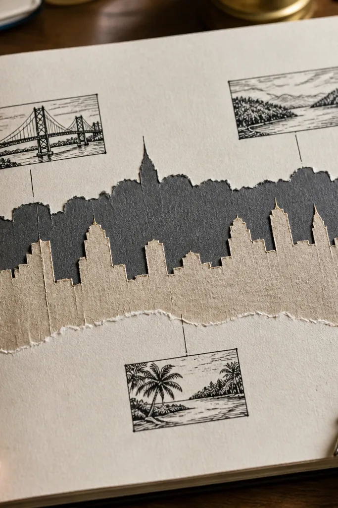
A torn paper skyline looks stunning because it adds texture and a layered horizon without needing detailed drawing. Pair it with black ink captions and your page reads like a mini poster. Use one dark paper tone and one light tone so it stays stylish instead of busy. This layout works for travel pages, monthly themes, and any entry where you want a visual metaphor for a place or mood.
Tear two strips of paper — one dark, one light — into uneven skyline silhouettes and lay them across the lower third of the page. Adhere with glue stick only where the tears overlap so edges stay crisp. Write short captions in black ink above and below the skyline, keeping each caption to one sentence fragment. Add tiny dots or short lines in the sky area to suggest texture, but keep them sparse.
Use a matte paper for the skyline so the torn edges look soft rather than shiny.
Don’t add gradients or multiple colors — one dark + one light gives the clean “gallery” look.
10. Stamped Circle System for Dates and Notes
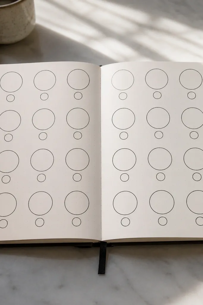
A stamped circle system looks high-end because it creates a repeating motif that’s instantly recognizable. Circles organize information without the rigidity of full grids, and stamping adds crisp edges that feel printed. Use one stamp size for dates and a second smaller size for notes. This design suits bullet-style journaling, meeting logs, and any page where you want tidy sections without heavy drawing.
Pick a circle stamp size around 0.6-0.8 inch for dates and a smaller one around 0.3-0.4 inch for notes. Sketch a light guide line across the top of the page, then stamp date circles in a row with consistent spacing. Inside each date circle, write the day number neatly. Add note circles beneath each date block, then fill each note circle with short keywords — keep it to 3-6 words each.
Test ink coverage on scrap paper first so your circles stamp evenly before you commit to the journal page.
Don’t overfill circles — if text touches edges, the page looks cluttered fast.
11. Layered Label Tabs with Matte Sticker Paper
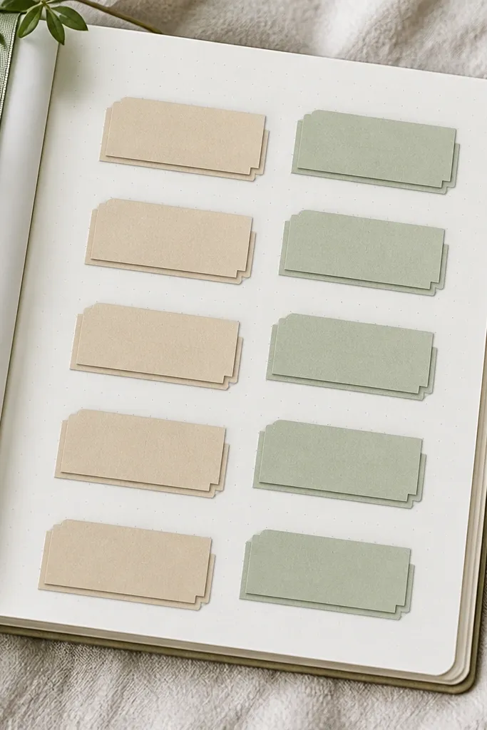
Layered label tabs make your journal look like it has built-in organization. Matte sticker paper gives a clean, product-like surface, and the layering creates depth that reads well in photos. Keep the tab set small and repeat it across multiple pages so your journal becomes a consistent system. This works for meal planning, project logs, and study notes where you need clear sections without drawing frames.
Cut label tabs from matte sticker paper, each about 1.25 inches wide and 0.6 inches tall. Layer them by placing a slightly offset tab behind the first one to create a shadow effect, then press firmly. Apply tabs to the top margin in a consistent order — for example, left to right: Date, Tasks, Notes. Write heading text on each tab with a fine pen, then use the space below for content aligned to the tab edges.
Use a single font style for headings (all caps with the same height) so the tabs look intentional.
Don’t mix glossy and matte sticker finishes on the same journal — the page will look uneven.
12. Ribbon Bookmark Seam with Threaded Cover Detail
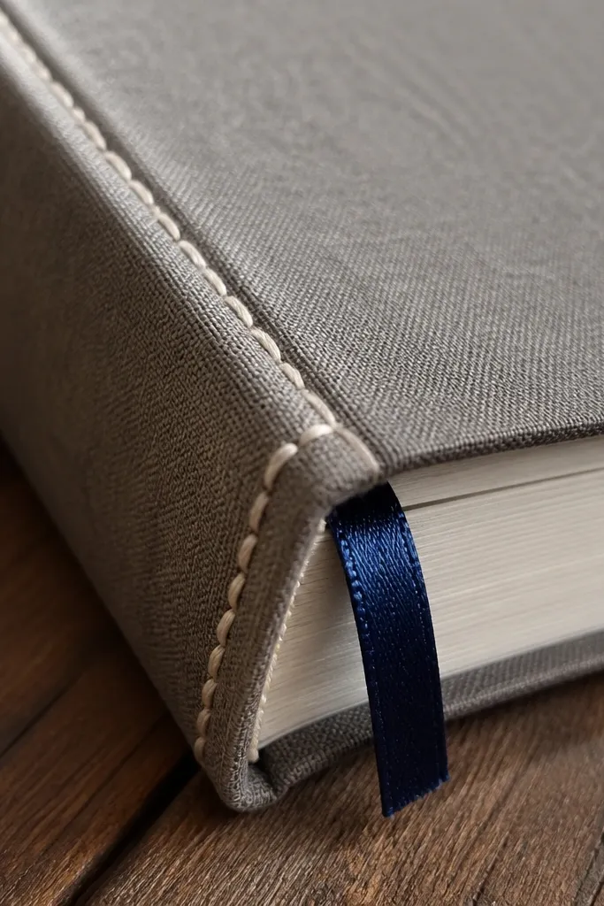
A ribbon bookmark seam makes your journal feel designed because it adds a practical detail that also looks decorative. The threaded edge detail gives texture and depth, especially if you use a contrasting thread color. This idea is ideal if you’re binding your own journal or upgrading a simple notebook. It looks great on camera because the ribbon catches light softly and the seam lines guide the eye.
If you’re using a cover you can open, attach a ribbon bookmark by gluing or stitching it at the inside spine about 0.75 inch from the top. For the threaded edge, sew through the cover edges with waxed thread in evenly spaced stitches, about 0.25-0.35 inch apart. Tie off the thread on the inside and trim cleanly. Finish by tapping the knot area with a tiny dab of clear glue so it doesn’t snag.
Waxed thread grips better and looks cleaner than regular thread for cover seams.
Don’t use a ribbon that’s too thin — it twists and looks cheap instead of crisp.
13. Pastel Wash Label Boxes with One Accent Pen Color
Pastel wash label boxes look expensive when they’re restrained. A light wash behind labels adds softness, but one accent pen color keeps the page from turning into a rainbow. This layout suits journaling prompts, mood tracking, and weekly summaries where you want clear sections. It also photographs well because pastels reduce harsh contrast and make handwriting pop.
Choose one pastel tone for the wash, like pale blush or powder blue. Paint small rectangle boxes behind your labels, keeping each box about 2.5 inches wide and 0.6 inch tall. Let the wash dry fully, then write the label text in your accent pen color — pick deep navy, charcoal, or dark brown. Fill content below each label and keep it in short lines that match the box width.
Use a fine brush and a steady hand: crisp label edges look more premium than messy paint blobs.
Don’t outline pastel boxes with thick black lines — it kills the soft, high-end feel.
14. Tidy Checklist with Faux Letterpress Header

A faux letterpress header looks like a printed stationery piece, and it instantly upgrades a simple checklist. The trick is to use two-step lettering: one lighter color impression behind the main text. Then keep the rest of the page plain — small checkboxes and clean line spacing. This is perfect for packing lists, daily tasks, and project to-dos where the page needs to stay functional and photo-ready.
Write your header text twice using two inks or pens: first in a lighter grey or muted color, then in a darker ink slightly shifted down or to the side by about 1-2 mm. Add checkboxes in neat rows with consistent spacing — each box about 0.2 inch square. Label each line with short phrases, not full paragraphs, so the page stays airy. Finish by underlining the header with a thin line that matches the darker ink color.
Pro tipPractice the shift on scrap paper until the impression looks intentional, not crooked.
AvoidDon’t use bright neon header colors — letterpress looks best with muted tones.
15. Black Wash Background with White Ink Micro-Text
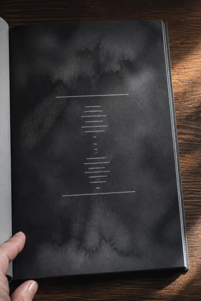
This design is dramatic and looks high-end because it flips the usual contrast. A soft black wash background makes white micro-text feel like a custom print, and it also hides small mistakes in handwriting. Keep the text minimal and structured so it doesn’t become a wall of noise. This is great for cover pages, title pages, and monthly reflections where you want the journal to look bold and styled.
Paint a very light-to-medium black wash over the page using diluted ink or acrylic ink, leaving the edges slightly lighter for a soft fade. Let it dry completely so white ink doesn’t smear. Write a title and a few short lines in white ink with a fine tip, keeping line spacing tight but readable. Add one thin border line in white around the writing area, about 0.5 inch from the edges.
Use opaque white ink (not chalk) so it stays readable on dark wash.
Don’t flood the black — thick paint makes the page look uneven and can bleed through.
16. Marbled Paper Pocket with Insert Cards
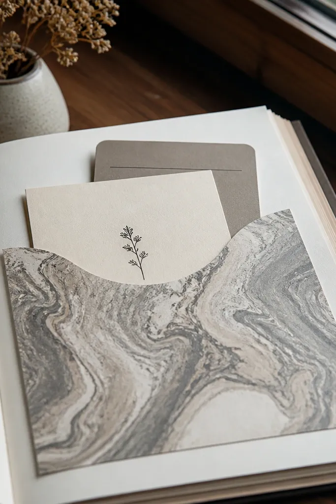
Marbled paper instantly reads luxurious because it has movement and depth even with minimal design. A pocket turns that marbling into an interactive element: you can slide in tickets, notes, or printed quotes. Keep the pocket simple and centered so the page still looks clean. This works for memory journals, wedding planning binders, or any journal where you want physical inserts without stapling chaos.
Cut a marbled paper rectangle to form a pocket, about 4.5 inches tall and wide enough to cover half the page width with a 0.5 inch margin. Fold the top edge down by 0.5 inch to create an opening, then glue the sides and bottom with double-sided tape or glue stick. Add a small insert card, about 3.5 x 5 inches, and label it with a date or category. Reinforce the pocket edges with a thin strip of matching cardstock so it doesn’t peel with repeated use.
Use matte double-sided tape for pocket seams so they don’t show shiny edges.
Don’t make the pocket too deep — inserts bulge and ruin the flat, premium look.
17. Press-Fold Accordion Side Panel
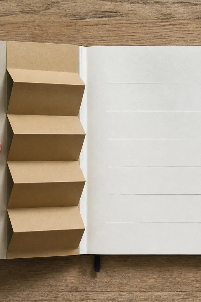
An accordion side panel looks high-end because it adds dimension while staying organized. The side placement keeps the main page clean, and the folded rhythm gives a premium “booklet” feel. Use kraft or off-white for the panel so it looks warm and paper-like, not plastic. This layout is ideal for meal plans, mini timelines, or any entry where you want extra space without turning the page into a scrapbook mess.
Cut a panel strip from kraft paper about 3.5 inches wide and 10-12 inches long. Score it with a bone folder every 0.75 inch to create folds, then fold into an accordion. Glue or tape the accordion to the left or right margin of your journal page, keeping the opening facing outward. Label the accordion sections with short headings on each fold, then write your main content in the remaining space.
Burnish each score line with a bone folder — sharp folds look cleaner than creased paper.
Don’t glue the whole panel flat; leave slight lift so it opens smoothly.
18. Gold Leaf Sticker Border with Minimal Quotes
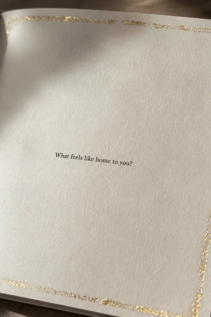
A gold leaf sticker border looks premium because it frames the page like stationery packaging. Keep the content minimal — one short quote or prompt — so the border reads intentional instead of decorative clutter. Gold leaf also photographs beautifully when it’s thin and concentrated at the edges. This is a strong option for title pages, monthly covers, or any page you want to look like a designed print.
Choose a thin gold leaf sticker border or create one using gold foil tape strips. Apply the border about 0.5 inch from the page edges, leaving corners neat and aligned. Write one centered quote in a simple script or neat block letters, keeping it to 4-10 words. Add a small date line below in a smaller size and avoid extra doodles so the border stays the focal point.
Use a ruler and mask guide paper so your border stays perfectly parallel across the page.
Don’t overcrowd the page with multiple quotes — one line makes the border feel expensive.
19. Single-Color Typographic Layout with Cut-Out Letters
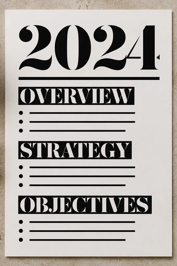
This is a clean, high-end look because it treats your journal like printed design. Cut-out letters in one color give a typographic hierarchy without fancy illustration. You get a polished result even if your drawing is basic, because the layout does the work. This suits reading journals, project notes, and any page where you want the writing to feel graphic and intentional.
Pick one letter style using sticker letters or cut letters from colored cardstock, in a single color like deep teal or warm black. Plan a hierarchy: one big title line near the top, then 2-3 smaller lines below. Place letters using a light pencil guide so spacing stays even. Write supporting text in the same ink color as the letters, then add a thin underline beneath each heading for structure.
Keep letter sizes consistent across the page set so it looks like a system, not one-off crafting.
Don’t mix letter colors — it breaks the typographic clean look.
20. Smoked Vellum Overlay with Letterpress-Style Title Window
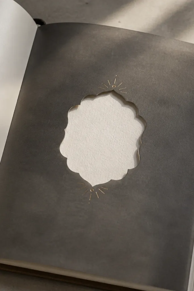
This design looks high-end because it creates depth without adding bulk. The smoked vellum acts like a soft, dark filter over your page, so photos and ink look more “gallery” than “notebook.” You also get a clean focal point by cutting a precise window for the title, then framing it with a few tiny gold accents. It fixes the common problem of busy front covers by making one controlled, photogenic element the star. This is a medium-skill project that takes about 2-3 hours because you’re doing accurate cutting and alignment, not complicated binding work. It suits desks, coffee tables, and anyone who likes moody, editorial-style journals.
Cut a front-cover overlay from smoked vellum to match your journal cover size. Measure the finished cover height and width, then subtract 2-3 mm from each side so the vellum sits inside the edge cleanly. Mark a centered title window on the vellum using a ruler and a fine pencil: for a typical A5 cover, a window around 140 x 45 mm looks balanced. Use an X-Acto knife on a cutting mat to cut only the window area, then test-fit the overlay on the cover before you commit to adhesive. Add a thin strip of double-sided tape along the vellum edges only, then place three small gold dot accents in the top corners of the window frame using a gold paint pen or metallic foil dots. Finish by burnishing the tape edges with a bone folder so nothing lifts when you close the journal.
Pro tipDo a dry run with painter’s tape on the cover first. Once the window is perfectly centered, transfer that alignment to the vellum and only then add permanent tape.
AvoidAvoid gluing vellum across the window opening — it smears and makes the cut line look messy under light.



