
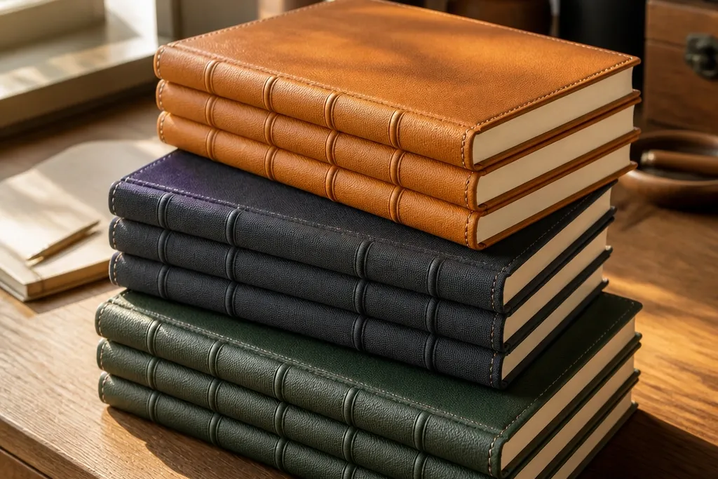
1. Saffron faux-leather wrap with black saddle stitching lines
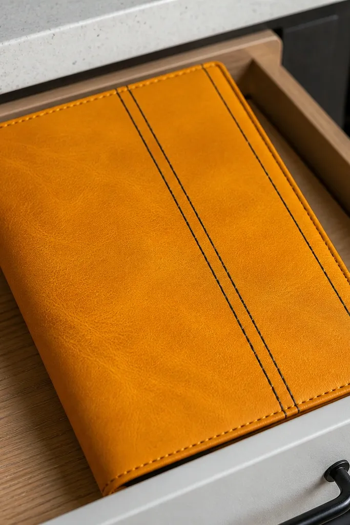
This is the fastest way to get the “expensive leather book” vibe without buying leather. The warm saffron base reads high-end because it’s bold but not loud, and the black stitched lines add structure you can see from across the room. The trick is using faux leather that folds cleanly and then scoring the stitch lines so they sit flat. It looks best on journals with a slightly rounded cover shape and a narrow spine, where the stitching lines frame the opening neatly.
1) Cut a faux-leather sheet so it wraps the journal with a 1.5 cm overlap on both sides and 2 cm on the top and bottom; test a dry-fit before gluing. 2) Lightly score two or three “stitch lanes” along a ruler on the outer face, then punch shallow holes along each lane using an awl or needle. 3) Glue the inside edges with contact cement or strong craft glue, wrap the cover, and stitch through the holes with waxed thread. 4) Trim the corners to small triangles, then fold them in tight and glue down.
Use a bone folder on the scored lines so the cover looks crisp instead of wrinkled.
Don’t glue the outer face until the overlap is perfectly centered — once it’s down, the whole cover skews.
2. Charcoal book cloth cover with a brass label spine tab
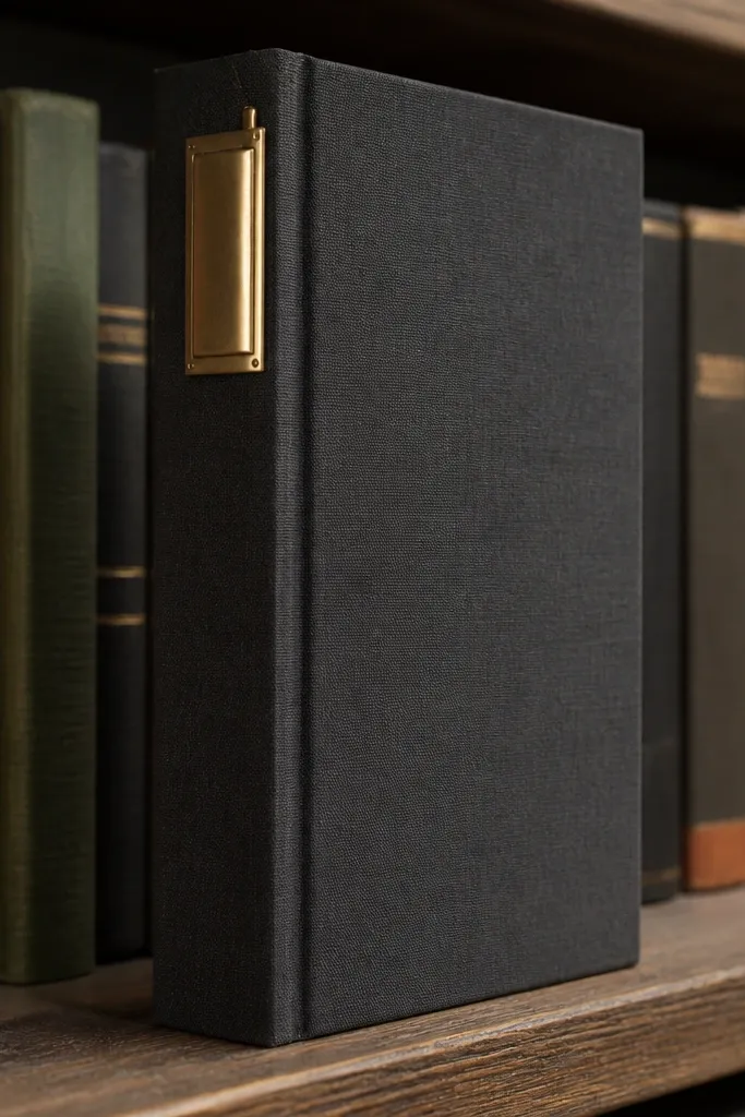
Book cloth looks expensive because it has a tight weave and a soft matte finish. Charcoal keeps it modern, while a brass label tab on the spine gives you that designer detail people notice first. This design works especially well if your journal sits on a shelf where the spine shows. The brass tab also hides small alignment flaws because it draws the eye to the centerline.
1) Wrap book cloth around the journal using a thin layer of PVA or spray adhesive on the board backing (not the fabric face). Press with a straightedge so the surface stays smooth. 2) Cut a 3 cm wide strip of faux brass sheet or metallic label stock, then fold the ends under so the edges look finished. 3) Apply the tab centered on the spine, and seal the label with a thin coat of matte clear acrylic so it doesn’t look like sticker paper.
If your cloth frays, run the cut edge along a low-heat heat gun from a distance to tighten it.
Don’t use glossy clear coat over metallic paper — it can create streaks on the label.
3. Forest green padded cover with cream piping edge
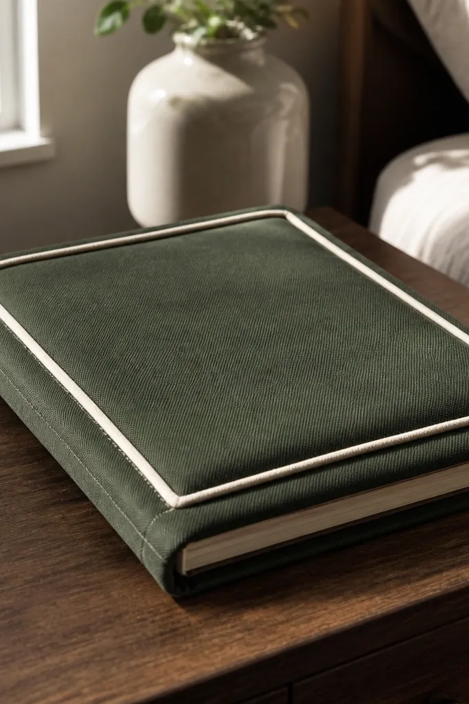
Padding changes the whole feel. When you add cream piping, you get that tailored look you’d expect from a boutique planner. The forest green fabric reads rich without needing heavy decoration, and the piping creates a visual frame around the cover. This one is best if you like tactile projects and want your journal to feel protected when you toss it in a bag.
1) Cut a base from 5 mm craft foam to the journal cover size, then cover it with fabric using spray adhesive. 2) Measure the front and back perimeter and cut piping cord strips to match, leaving 1 cm extra at each corner. 3) Glue piping into the edge seam with hot glue in small sections, then wrap fabric over the corners and trim excess. 4) Add a thin inner lining layer so the inside edges don’t look raw.
Pro tipUse 1/4-inch piping so the line stays crisp and doesn’t bulk up at corners.
AvoidSkip thick foam — too much padding makes the journal opening stiff and ugly.
4. Marbled watercolor paper cover with clear matte laminate
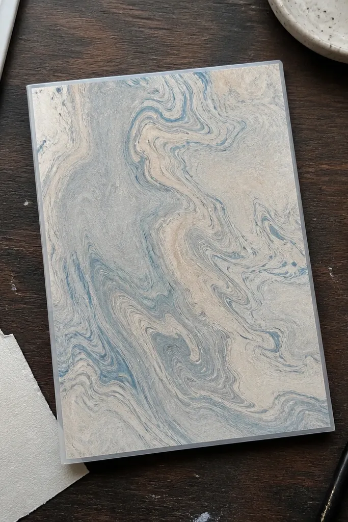
Marbling looks high-end because it has natural variation that reads intentional, not random. The key is using a controlled palette and then sealing it with matte laminate so the surface looks like designer paper. This cover works for notebooks you carry often because the laminate protects edges and makes the colors look deeper. It also photographs beautifully under soft light because matte surfaces reduce glare.
1) Create a marbled sheet using watercolor on a non-absorbent tray, then transfer to watercolor paper and let it dry flat for 2-3 hours. 2) Cut the marbled piece to wrap the journal with a 1 cm margin and apply a thin layer of PVA to the back only. 3) Laminate with a matte film using a laminating pouch or heat laminator, trimming edges carefully with a craft knife. 4) Finish corners by folding the laminate-backed paper inward and gluing down.
Pro tipChoose one dark anchor color and one accent color so the marbling stays classy, not messy.
AvoidDon’t use glossy laminate — it turns watercolor into glare and kills the premium look.
5. Black linen cover with white heat-transfer constellation map
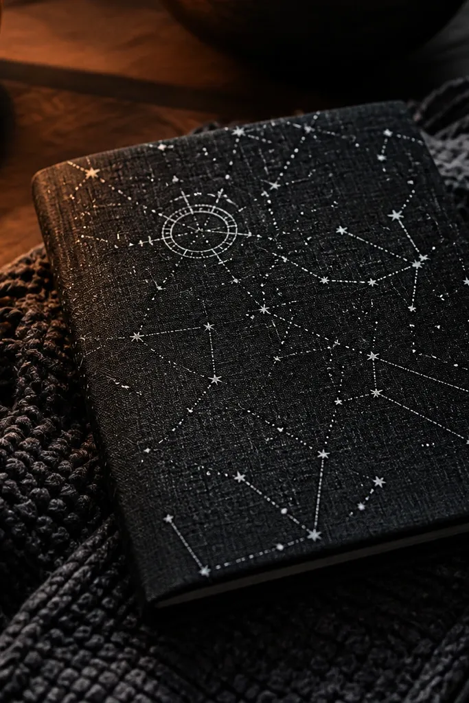
Linen plus a single-color graphic is a clean, high-end combination. The black linen gives texture, and the white constellation map looks like a printed design from a studio stationery brand. It’s photogenic because the stars pop against the fabric weave without needing heavy embellishments. This works best if your journal spine is narrow and you want a design that reads from the shelf.
1) Stretch and smooth linen onto a thin backing board so it doesn’t ripple when you heat-transfer. 2) Print or cut your constellation map as a heat-transfer vinyl or transfer paper design, sized to the front panel with 2 cm margins. 3) Use a heat press or iron with parchment paper on top; press firmly for the time listed for your transfer product. 4) Seal the transfer with a fabric-safe matte sealer so it doesn’t snag.
Pro tipPress in multiple short bursts instead of one long heat to avoid scorched fabric.
AvoidDon’t skip backing board — heat transfers warp when linen is too floppy.
6. Terracotta paper wrap with gold foil corner triangles
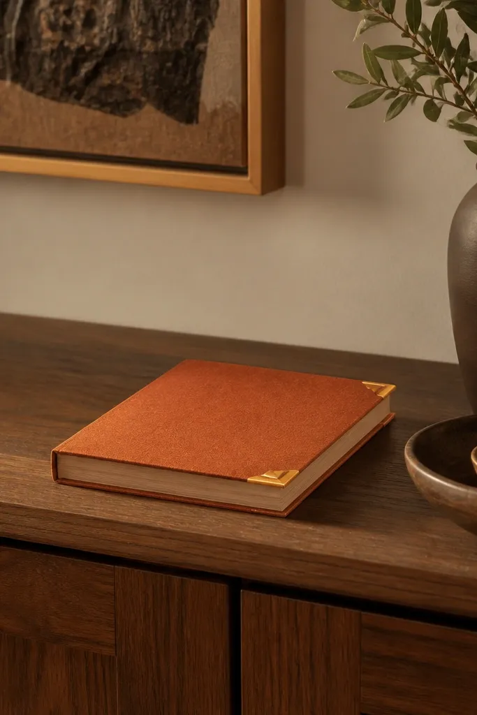
This is a minimalist high-end trick: color blocks plus tiny metallic geometry. Terracotta looks warm and expensive, and gold foil corner triangles mimic the finish of luxury packaging. Because the metallic is limited to corners, it looks intentional instead of flashy. This cover is great for journals that have a simple shape and you want the design to feel architectural.
1) Wrap terracotta cardstock or thick paper around a rigid backing board, then burnish the edges with a bone folder. 2) Cut four small right triangles of gold foil adhesive sheet or transfer foil; size them so each triangle sits 1 cm from the corner seams. 3) Press foil triangles firmly with a brayer or spoon, then seal the surface with a thin matte acrylic to protect foil edges. 4) Add a narrow spine strip in matching paper so the fold line looks clean.
Use a metal ruler and a fresh blade for triangle cuts — foil shows every wobble.
Don’t over-foil the whole cover — gold everywhere flattens the look.
7. Ivory fabric cover with subtle tonal monogram emboss
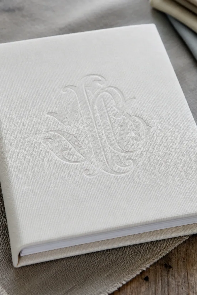
Tonal emboss is one of the cleanest ways to look expensive because it adds depth without adding color. Ivory fabric stays classy, and the monogram reads like high-end stationery. This one is best when you want personalization that doesn’t scream. It also hides minor glue lines because embossing draws attention to the design area.
1) Apply your fabric to a firm backing board with spray adhesive, then let it dry flat under a book for 30 minutes. 2) Create a stencil for a monogram and use a heat embossing tool with tonal emboss powder (cream on ivory) or a deboss tool if your method supports it. 3) Dust off excess powder and heat again lightly to set. 4) Seal with matte clear spray designed for fabric so the emboss doesn’t smear.
Pro tipDo a test emboss on scrap fabric first — fabric weave changes how powder sits.
AvoidDon’t use high-contrast emboss powder — it stops being subtle and looks craftier.
8. Navy patterned paper cover with a clear acrylic window label
A clear window label gives your journal a “product” feel, and that look reads high-end fast. The navy patterned paper provides depth while the acrylic keeps the label crisp and readable. It also photographs well because the window creates a glassy highlight. This one works especially well for journals meant for planning or work notes where you want a visible title area.
1) Choose a patterned paper in navy and wrap it around a rigid backing board with a smooth glue layer. 2) Cut a label shape from thin clear acrylic or a clear plastic sheet, then sand the edges lightly so they’re not sharp. 3) Add a printed title backing behind the acrylic window, and glue the acrylic on top using double-sided tape designed for clear plastic. 4) Seal the paper edges with a thin matte medium so the paper doesn’t peel.
Pro tipLightly sand acrylic edges before attaching — it looks cleaner and safer.
AvoidDon’t glue acrylic directly with thick glue blobs — you’ll see bumps under light.
9. Olive waxed canvas cover with stitched strap closure
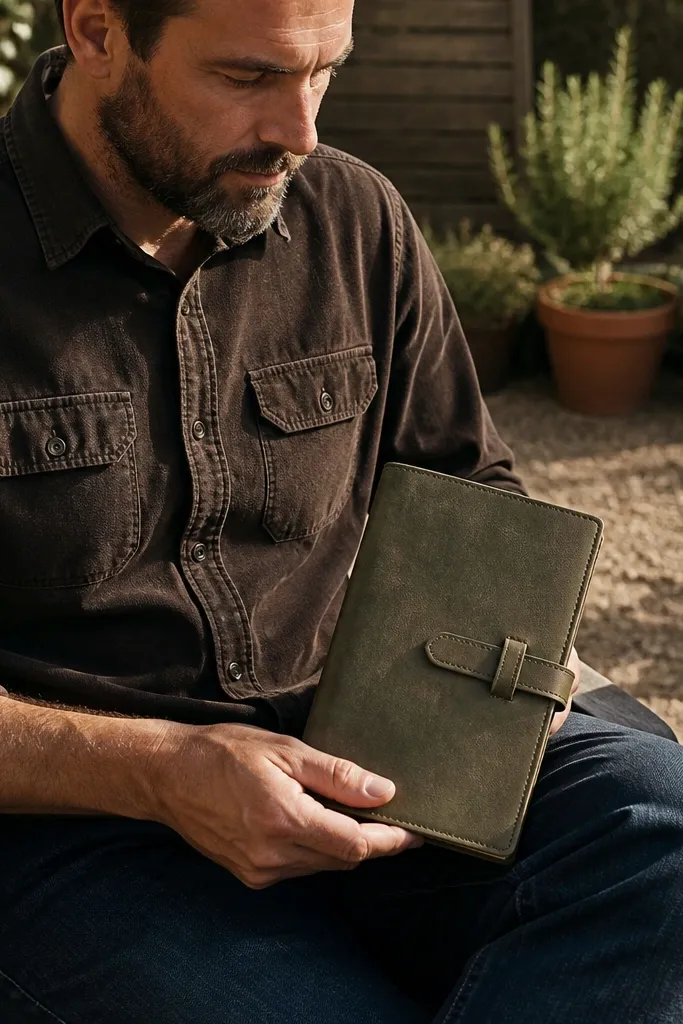
Waxed canvas looks rugged-luxe because it has a slightly stiff hand and a matte sheen. The stitched strap closure adds function and structure, so the journal stays closed and looks designed. Olive is a strong neutral that works in kitchens, offices, and studio spaces. This cover is best for journals you actually carry because canvas holds up better than paper wraps.
1) Cut canvas to wrap the journal with seam allowance; reinforce the spine area with a strip of thin binder board. 2) Sew or glue a strap from canvas webbing or folded canvas, attaching it with bartack stitches if you have a machine. 3) Add a magnetic snap or hook-and-loop closure at the front panel, centered so the strap lands flat. 4) Stitch around the perimeter with waxed thread for a finished edge, then seal frayed ends with fray check or a tiny dab of glue.
Use a leather needle or heavy-duty needle if you stitch through canvas — it prevents skipped stitches.
Don’t skip reinforcement on the spine — strap closures pull fabric out of alignment.
10. Blush velvet cover with thin black ribbon spine band
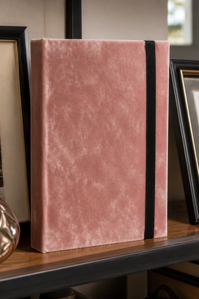
Velvet makes anything look more expensive because it changes how light hits the surface. Blush keeps it soft and modern, and the thin black ribbon spine band adds graphic contrast without adding bulk. This design is a great shelf piece because it reads luxurious even from a distance. It also pairs well with minimal interiors where you want one statement object.
1) Stretch velvet onto a backing board using spray adhesive, then trim edges cleanly with a sharp knife. 2) Cut a ribbon strip sized to the spine length and glue it centered, leaving a tiny gap at the fold so it doesn’t bunch. 3) Add two small corner tabs on the inside to hold the back cover tight. 4) Use a fabric-safe matte seal so the ribbon and velvet don’t shift over time.
Pro tipPress velvet with your palm, not a hot iron — heat flattens nap and ruins the look.
AvoidDon’t use wide ribbon — it makes the spine bulky and kills the sleek silhouette.
11. White marble-look vinyl wrap with black spine stripe
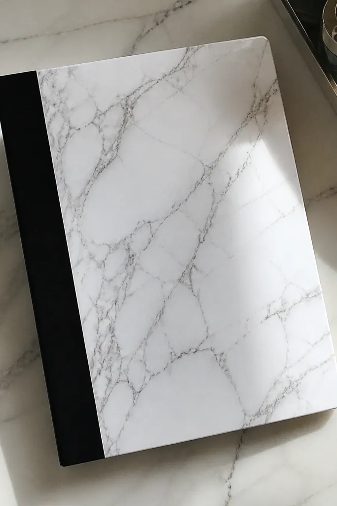
Marble-look vinyl gives you that high-end stone look without the mess of real marbling. The surface is smooth and wipeable, and the black spine stripe gives it a tailored, designer finish. This is a smart choice if you want something that stays clean and still looks premium. It also works well for mass-use journals because vinyl resists scuffs.
1) Clean and dry your journal surface area, then wrap vinyl with a 1.5 cm overlap on each side. 2) Use a straightedge to crease the fold lines so vinyl doesn’t wrinkle; trim excess with a new blade. 3) Add the black spine stripe using vinyl strip or painted tape, aligning it with the spine centerline. 4) Seal the edges with a thin layer of clear craft sealer so the vinyl doesn’t lift at corners.
Heat vinyl lightly with a hair dryer while smoothing — it conforms better around edges.
Don’t stretch vinyl hard — it puckers when it cools.
12. Brown kraft paper wrap with wax-seal style medallion
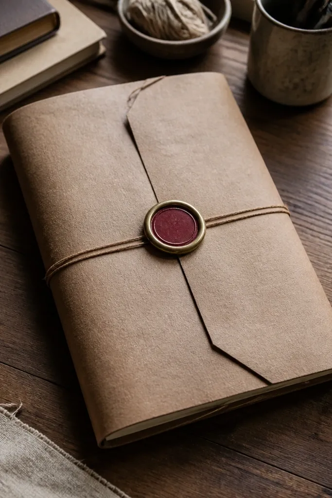
Kraft paper looks intentional when you keep everything simple and add one strong focal point. A wax-seal style medallion in brass or deep red makes the cover feel like a collectible. It’s also forgiving — kraft hides minor imperfections, and the medallion covers small alignment issues. This concept is great if you like old-world stationery vibes but want it to look clean, not messy.
1) Wrap kraft paper around a rigid backing, burnish edges, and seal the paper with matte mod podge or matte acrylic. 2) Create a medallion using foil-backed sticker paper, a metal-look sticker, or a printed circle cutout layered with foam for dimension. 3) Add a faux wax ring around it using red inked paper or a thin red foam ring. 4) Finish by sealing the whole front with matte spray to protect from handling.
Pro tipLayer the medallion with 1-2 mm foam so it casts a visible shadow.
AvoidDon’t add multiple stickers — one medallion looks designed; five looks like a scrap pile.
13. Red and cream striped fabric cover with hidden elastic pen band
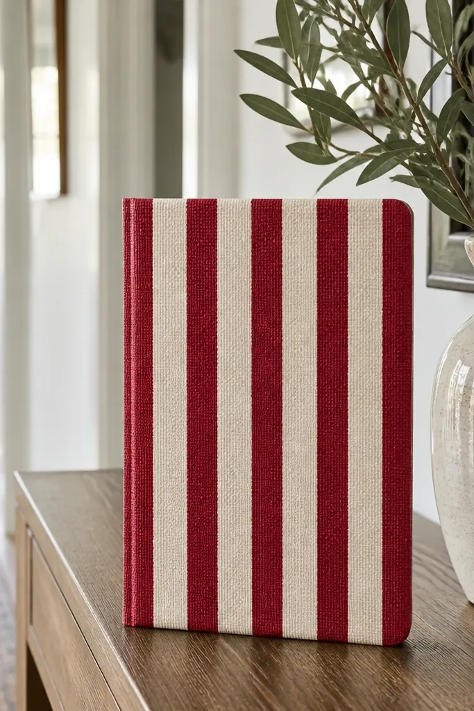
Stripes add instant polish when the spacing is even and the fabric is cut straight. The hidden elastic pen band makes the cover functional without ruining the front look. Red and cream reads classic, and the elastic keeps your pen secure while the cover stays sleek. This is a great choice for people who carry one journal everywhere and want a clean front.
1) Choose a medium-weight cotton or canvas stripe fabric and back it with thin interfacing or foam for stiffness. Cut panels so stripes match across the front and back, then wrap and glue. 2) Sew or glue elastic inside the front cover opening, placing it 3-4 cm below the top edge. 3) Finish the perimeter with a narrow binding tape to hide raw edges. 4) Add a simple closure strap or ribbon if you want it sturdier for bags.
Pro tipUse a clear ruler and mark stitch lines with tailor chalk so your elastic sits straight.
AvoidSkip low-stretch elastic — it won’t hold a pen and will sag over time.
14. Gold leaf effect paper cover with black stitched border
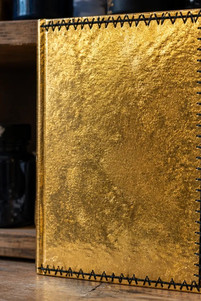
Gold leaf effect paper looks expensive because the surface has micro-shimmer, but it can get messy if you don’t frame it. A black stitched border gives structure and makes the gold feel like part of a design system. This cover is great for smaller journals where the border can be the main visual. It also photographs beautifully because the black lines separate the shimmer from the background.
1) Wrap gold leaf effect paper around a rigid board and seal the back so it doesn’t curl at edges. 2) Cut a black border strip from faux leather or heavy cardstock and glue it around the perimeter with 5-7 mm spacing from the edge. 3) Punch holes every 8-10 mm along the border and stitch with black waxed thread. 4) Seal the stitched border lightly with a matte acrylic so thread doesn’t snag.
Punch holes before gluing border strips — it prevents slipping and keeps spacing even.
Don’t stitch over too-thick material — your needle will fight you at corners.
15. Seafoam paper cover with layered scallop edge trim
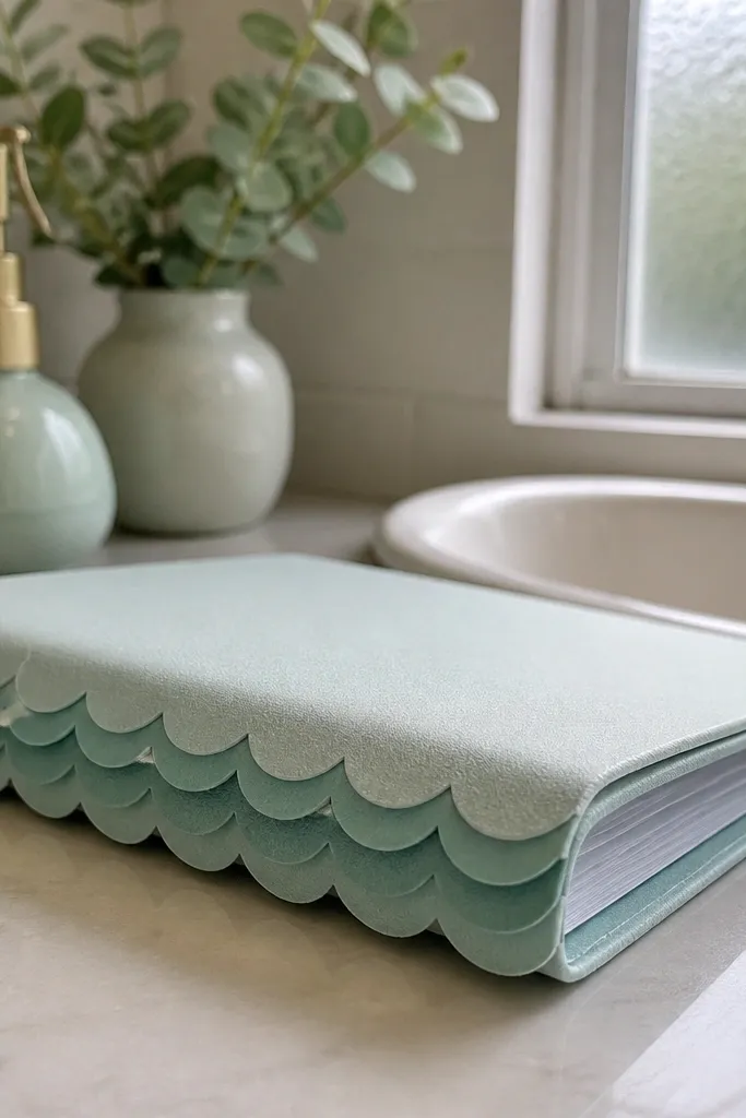
Scallop trim feels playful, but it can look genuinely high-end when the colors are controlled and the trim is layered neatly. Seafoam is soft and modern, and the layered scallops create a shadowed edge that looks expensive in photos. This cover suits journals that sit in bathrooms, kitchens, or bright desks where color matters. It’s also a good pick if you want decoration that’s mostly on the edges instead of the center.
1) Wrap seafoam cardstock around a rigid backing board and seal with matte medium. 2) Cut scallop strips from two shades of cardstock: one matching seafoam and one slightly darker mint. 3) Glue the darker scallop strip first along the perimeter, then align the lighter scallops on top so the layers create a crisp border. 4) Trim corners carefully so the scallops meet cleanly at the fold lines.
Pro tipUse a paper trimmer for scallop cuts — hand cutting makes the pattern uneven fast.
AvoidDon’t make the scallops too big — oversized trim looks costume-y.
16. Black-and-cream faux leather wrap with centered zipper pocket
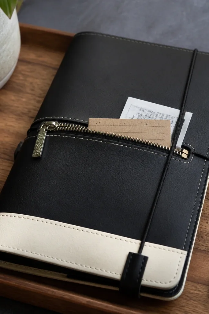
A centered zipper pocket makes a journal cover look like a designed accessory, not a craft project. Black-and-cream keeps it high contrast and clean, while the zipper adds that functional, luxe hardware vibe. You also gain storage for receipts, stickers, or a small notebook sleeve. This is one of the most “high-end” looks because the pocket creates dimension and a clear purpose.
1) Build a rigid backing from binder board and cover it with faux leather panels: cream for the main face and black for the side frames. 2) Cut a pocket opening on the front panel and attach a zipper strip between two inner pocket linings using fabric glue or sewing. 3) Seal the zipper ends and hem the lining so no raw edges show. 4) Wrap and glue the side panels, then stitch or glue a border strip around the zipper pocket for a finished look.
Use a separating zipper with a smooth pull — it lays flatter and looks cleaner on covers.
Don’t skip lining — unlined pockets look thin and cheap at the zipper seam.
17. Ivory paper cover with pressed botanical silhouette and gold dot border
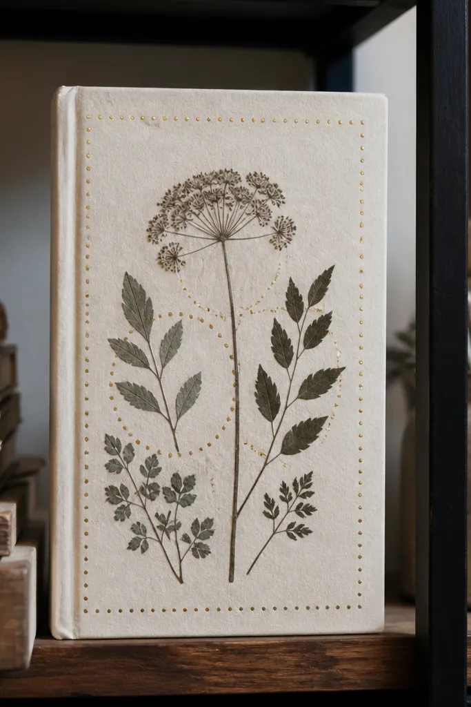
Pressed botanical silhouettes look premium when they’re framed with a simple metallic detail. The ivory background makes the plant shape crisp, and the gold dot border gives it that printmaking feel. It’s a beautiful choice if you want a soft, artsy look that still reads polished. This cover works best with journals that have a smooth cover surface so the pressed area lies flat.
1) Dry press leaves or flowers between parchment paper under heavy books for 5-10 days, then trim to a clean silhouette. 2) Arrange the botanical on ivory paper and adhere with a thin layer of archival glue or gel medium; let it dry flat. 3) Add a gold dot border using a fine paint pen or a gold acrylic dot stamp, keeping dots evenly spaced. 4) Seal the whole front with matte clear medium to protect the pressed plant and prevent lifting.
Pro tipChoose one plant shape and one border — mixing multiple botanicals makes it look busy.
AvoidDon’t use thick glue under the leaf — it creates ridges you’ll see in photos.
18. Charcoal cover with white faux-ceramic tile inserts
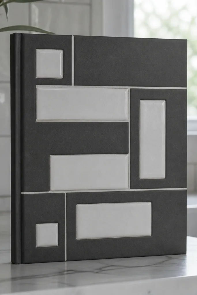
Tile inserts make a journal cover look like a mini design object. The contrast is the whole point: charcoal background, white tile inserts, and thin “grout” lines that make it feel architectural. This is more work than a wrap, but the result looks custom and high-end because the surface has real structure. It’s also great for people who like graphic design more than florals.
1) Cut a rigid base and cover it with charcoal fabric or paper, then seal so it’s smooth. 2) Make tile inserts from foam sheet or thick paper, then draw thin grout lines with a pencil guide and black paint pen. 3) Glue the tile inserts onto the front in a grid, pressing flat and letting the adhesive cure fully. 4) Add a thin top coat of matte sealer over tiles so they don’t look like raw craft materials.
Pro tipUse a ruler to draw grout lines — even 1 mm wobbles show up immediately.
AvoidSkip curing time on glue — moving the inserts while wet leaves misalignment.
19. Terracotta linen wrap with hand-painted gold line border
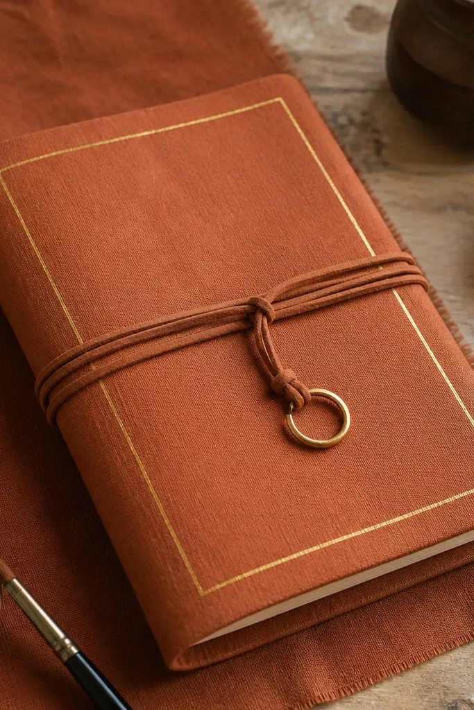
If you want “high-end stationery” without complicated tools, thin hand-painted lines are the move. Terracotta linen gives texture, and a single gold line border makes the cover look like it came from an art supply store with good taste. Keep the gold line narrow so it reads like fine ink, not craft paint. This works well for journals that will sit on a desk and get picked up daily.
1) Wrap terracotta linen around a stiff backing board and seal lightly so it doesn’t absorb paint unevenly. 2) Tape a border guide using painter’s tape, leaving a consistent gap from the edge, then paint one thin gold line with a fine brush. 3) Remove tape after the paint sets to avoid tearing linen fibers. 4) Seal the painted line with matte acrylic spray once fully dry.
Pro tipUse painter’s tape and paint in one pass — multiple passes thicken the line and look clunky.
AvoidDon’t paint on dry, unsealed linen — you’ll get patchy gold spots.
20. Midnight navy fabric cover with faux mother-of-pearl button center
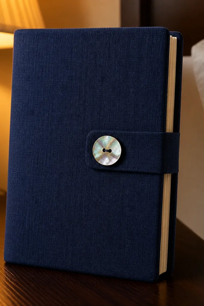
A single button centerpiece can look surprisingly luxe when the fabric is dark and the button has iridescence. Midnight navy makes the pearl tones pop, and the center placement feels intentional. This cover is best for minimalist builds where you want one focal point and clean edges. It also hides small imperfections because the button covers the center area.
1) Stretch and glue midnight navy fabric onto a rigid board for smoothness. 2) Mark the center and attach a faux mother-of-pearl button using a strong glue plus a few stitches through the button holes for security. 3) Add a thin stitched ring around the button with matching thread to make it feel designed, not glued-on. 4) Seal fabric edges with a thin matte medium and let cure under weight.
Pro tipStitch the button after gluing — glue alone can loosen with repeated handling.
AvoidDon’t choose a button that’s too large — oversized buttons look costume-y on journal covers.



