

1. Two-Color Weekly Prayer Grid with Date Tabs
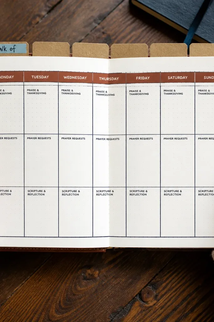
This layout removes the hardest part of journaling — deciding what goes where. You get a simple grid that holds Monday through Sunday, with each day split into three tiny sections: prayer request, answered prayer, and one-sentence reflection. The date tabs make the page look styled even before you write, and they guide your eyes so you don’t wander. Keep the grid lines in gray and the section labels in black, then add one accent color for the tabs. It’s low-maintenance because you only fill boxes; nothing gets redesigned weekly.
Start by drawing a 7-column grid across one journal spread using a ruler, with each day getting a consistent width. Add three small labeled boxes per day, then place date tabs along the top using narrow washi tape strips cut to the same height. Use black or gray fine-liner for the grid lines and labels, then color the tabs with one accent color. Finally, write the week’s dates on the tabs and leave the boxes blank until you’re ready to fill them. If your notebook paper bleeds, test your pen on a spare page first.
Use a 0.3 or 0.5 black fineliner and a gray marker with the same tip width so the page looks uniform.
Don’t add extra decorative elements inside the grid — they make the page harder to fill fast.
2. Prayer Request Receipt Pockets for Quick Updates
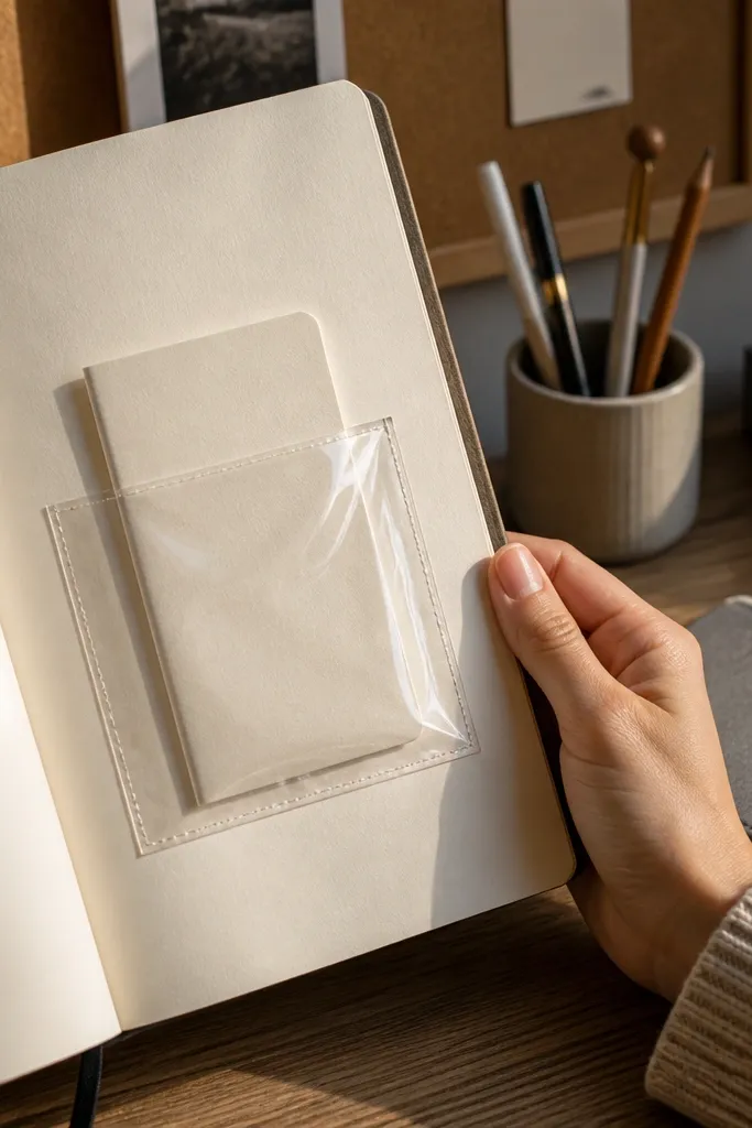
If your problem is that prayer notes live on scraps, this fixes it. You attach a pocket to the journal page, then fold short prayer requests on small cards that slide in and out. The pocket makes the journal look organized and intentional, and it also keeps your writing tidy because you’re not trying to fit everything onto one page. The cards look cute because they’re uniform, and they’re easy to photograph because they sit in a clean pocket opening. This setup is low-maintenance since you only make cards once and then keep adding them.
Cut two pocket pieces from cardstock: one outer pocket panel (about 4.5 inches wide) and one inner pocket backing to match. Score a line 0.5 inch from one edge so the pocket folds cleanly, then tape or glue the pocket to the journal page near the spine. Create 10-20 small folded cards (about 2 x 3.5 inches) and label them with a simple icon like a heart for requests. Slide cards into the pocket and update them weekly by writing a new request on a fresh card. Seal the pocket edges with a thin strip of matte tape if your paper is thin.
Use cardstock at least 110 lb so the pocket doesn’t sag and the cards slide smoothly.
Don’t glue the pocket too close to the page binding — it will peel when the journal opens.
3. Stamped Amen Banner Across the Top
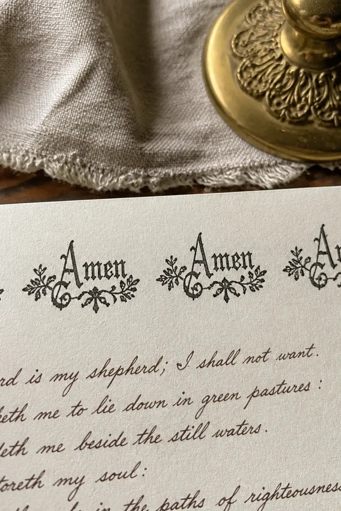
This is a tiny change that makes the whole page feel finished. A repeating “Amen” banner across the top creates a consistent visual identity, so your journal doesn’t look blank even when you only wrote a few lines. It also gives you a place to start — you write under the banner, and your brain stops stalling. Keep the banner minimal with one ink color and one stamp size so it looks crisp in photos. It’s low-maintenance because you stamp once per page and fill the rest naturally.
Pro tipTap the stamp onto scrap paper first to even out ink coverage, then stamp your banner with light pressure.
Pick a small rubber stamp or ink stamp that fits in a narrow strip (about 1 inch tall max). Use painter’s tape to mask a straight line at the top of your page, then stamp the word repeatedly with even spacing. Let the ink dry completely, then write your prayer content in a single paragraph or two short lines under the banner. If you want structure, add a thin horizontal rule under the banner using a ruler. Store the stamp in a small zip bag so it stays clean between uses.
AvoidDon’t stamp on glossy paper or wet ink — it smears and ruins the clean look.
4. Bullet Journal Style Prayer Checklist with Icons
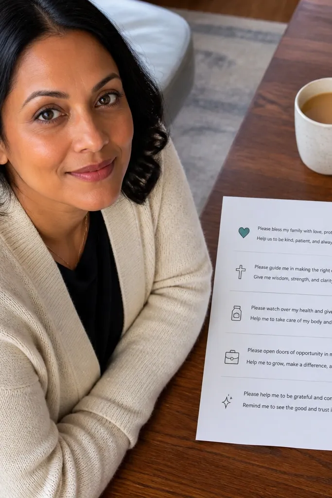
Checklists make prayer writing feel doable because you can see progress. This idea uses a clean bullet layout with icons for categories like family, health, work, guidance, and gratitude. Each icon sits next to a short line where you write one request and one follow-up sentence. The look is photogenic because icons create visual rhythm and the page stays organized even with short entries. It’s low-maintenance since you only check items and add one line per category.
Pro tipUse a 6B pencil lightly to sketch box positions, then go over with pen once your alignment looks right.
Draw a simple vertical list on the left side of the page with five categories, leaving space on the right for writing. Add checkboxes or small empty squares aligned under each icon. Use one icon set printed or hand-drawn in the same style so the page looks consistent. Write one short prayer request under each category, then add a one-sentence update beside the checkbox for later. Repeat the same structure weekly by copying the list outline onto a new page.
AvoidDon’t mix icon styles — different shapes make the page look messy fast.
5. Color-Blocked Gratitude Page with 3 Boxes
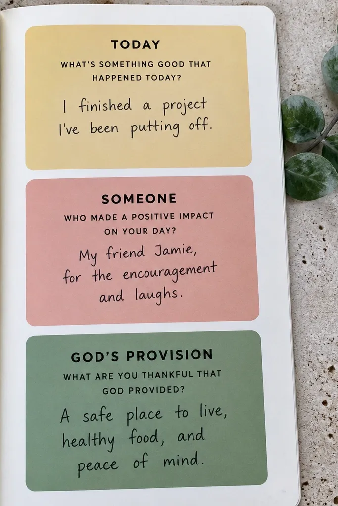
Gratitude pages are where most journals start looking messy because people write everywhere. This version keeps it tidy with three big boxes, each with a color block background and a short prompt. Put one box for “Today,” one for “Someone,” and one for “God’s provision.” The bold blocks make the page look styled even if you only write one sentence per box. It’s low-maintenance because the layout stays identical every week; you just swap the content.
Choose three coordinating colors and cut thin strips of washi tape or use marker blocks with a ruler. Divide the page into three equal rectangles, then tape or color the backgrounds inside each rectangle. Add small labels in black fineliner at the top of each box. Write one gratitude line per box, then add a tiny underline doodle in the same accent color beneath each line. Keep your handwriting size consistent so the page looks calm.
Use washi tape for the color blocks if you want crisp edges without marker bleeding.
Don’t use too many colors on one page — it fights your handwriting.
6. Corner Bookmark Divider with Verse Tab

A divider solves the “where was I?” problem, and it keeps your journal looking intentional. Add a corner bookmark divider that sticks out and shows a small verse phrase on a tab. When you open to the right page, the tab is visible in photos and looks neat. This is low-maintenance because you don’t reformat pages; the divider just stays in place. It also helps you keep prayer notes organized by theme — one divider per theme section.
Pro tipWrite the verse with a fine pen and let it dry fully before closing the journal to prevent smudging.
Cut a divider strip from cardstock about 2 inches wide and 6 inches long. Round the bottom edge slightly so it doesn’t catch on the pages, then score a small bend at about 1 inch from the top. Create a tab by attaching a smaller paper strip (about 2 x 1 inch) at the top and writing a short verse phrase on it. Slide the divider into your journal so it grips the corner pages, then adjust the height so the tab shows above the page edge. If your journal has thick paper, use two layers of cardstock for grip.
AvoidDon’t use flimsy paper for the divider — it bends and looks sloppy.
7. Washitape Framed Prayer Box with One Prompt
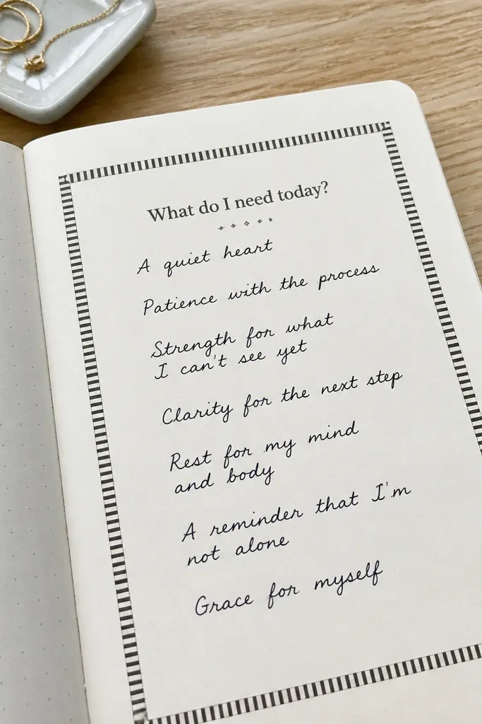
This is the easiest way to make a page look “done” in under a minute. You frame one writing area with washi tape and put a single prompt at the top like “What do I need today?” or “Who should I pray for?” The frame creates a clear visual boundary, so your writing stays neat and your photo looks clean. It works for people who freeze because they don’t know what to write; the prompt tells them. It’s low-maintenance because you reuse the same taped frame style on new pages.
Pick a washi tape width (around 1 inch) and tape a rectangular frame on your page using a ruler to keep edges straight. Leave a small top gap for the prompt label, then write the prompt in black fineliner. Add a second thin line of tape just outside the frame corners if you want a layered look. Fill the center with 3-5 short lines of prayer. Replace the tape on a new page when you start the next prayer entry.
Burnish tape edges with a credit card so they lift less when you write nearby.
Don’t make the frame too tight — cramped boxes make handwriting look cluttered.
8. Sticker-Only Prayer Theme Page (No Hand Drawing)
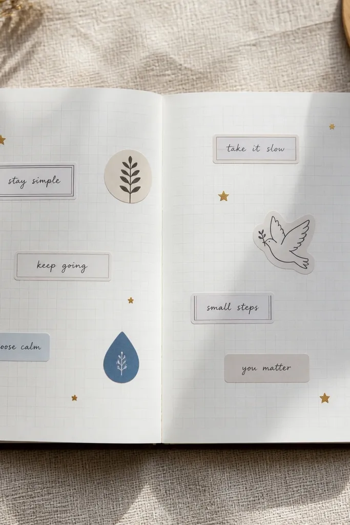
If you want photogenic pages but you hate drawing, this is the cheat code. Use a few themed stickers — small icons, tiny florals, or minimalist symbols — and combine them with printed labels for the structure. Your handwriting stays inside the label lines, so the page looks organized and consistent. It’s low-maintenance because stickers do the decoration and you only write short phrases. This format also photographs well because it keeps a lot of white space.
Pro tipUse matte stickers, not glossy ones — glossy reflections show up in photos and look messy.
Choose one theme sticker set and one accent color palette, then decide where the labels go before sticking anything down. Place three printed label strips across the page (about 3 inches long each) for request, scripture, and reflection. Add small stickers in the corners or between labels, keeping them under 1 inch tall so the page stays clean. Write one short line under each label, then finish with a tiny dot pattern in one corner using a black marker. Store sticker sheets flat so they don’t curl.
AvoidDon’t overload the page — too many stickers make it hard to read your own writing.
9. Printable Scripture Strip with Handwritten Notes
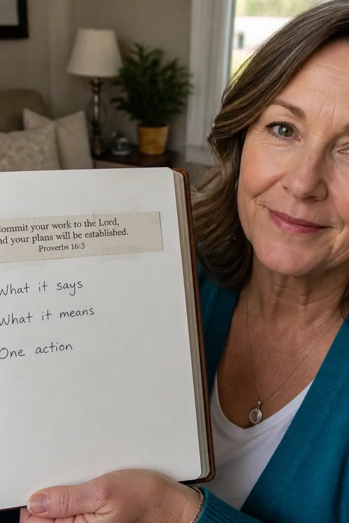
This turns scripture into a page that looks intentional without needing fancy calligraphy. You print a scripture excerpt on a narrow strip of paper, then tape it across the top of your journal page. Under it, you write three bullets: what it says, what it means for today, and one action you can take. The printed strip looks crisp and gives you a strong visual anchor for photos. It’s low-maintenance because you print a batch once and just swap strips week to week.
Pro tipUse a laser printer if you can; inkjet can smudge when you tape and write nearby.
Print scripture strips on plain printer paper, then cut them into 8 x 1.5 inch rectangles. Tape one strip across the top of a fresh journal page using two small pieces of tape at the ends. Write the three bullets beneath with consistent spacing, using a ruler if you want straight alignment. If your journal paper is thin, place a second sheet behind the page before writing so the ink doesn’t bleed. Repeat with a new strip each week.
AvoidDon’t print huge text — narrow strips keep the page airy and readable.
10. One-Line Prayer Starters Stamp Set (Pick 1 Prompt)
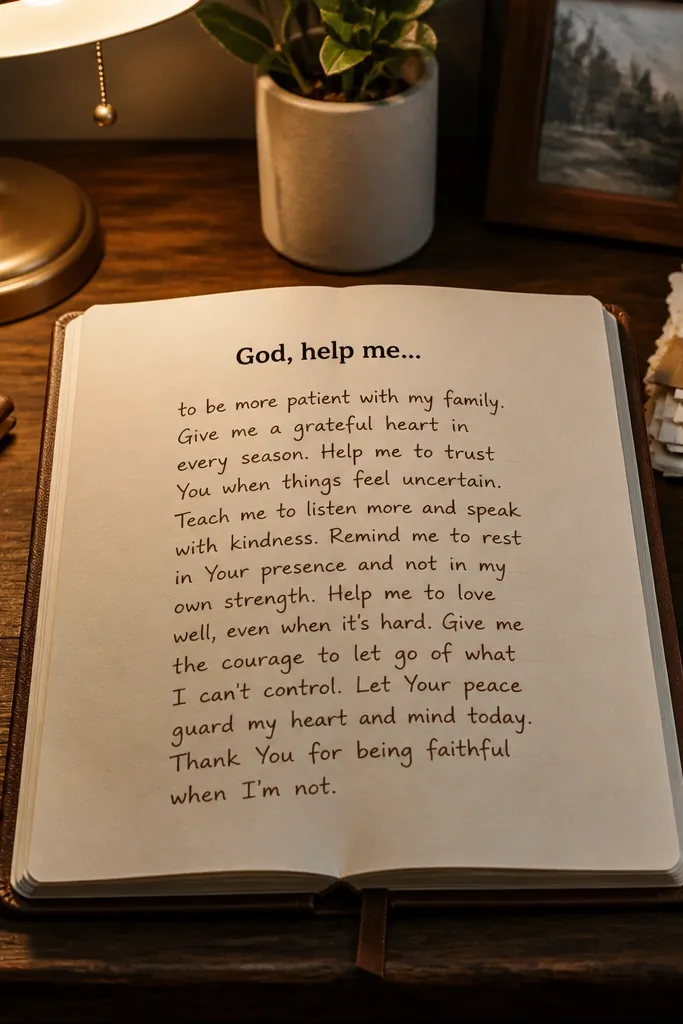
This solves the blank-page problem with zero planning. A one-line prompt stamp gives you a starting sentence like “God, help me...” or “Teach me to...” and you write beneath it. The prompt stamp is also visually consistent, so your journal photos look like a series instead of random pages. You only pick one prompt per entry, which keeps the writing quick and keeps the page clean. It’s low-maintenance because you stamp and write — no drawing frames or cutting paper every time.
Get a small stamp set or a single stamp with multiple prompt phrases you can rotate. Stamp the prompt at the top left of your page using a stamp pad in black or dark gray. Add a thin underline beneath the prompt with a ruler. Write your prayer in 3-6 lines, keeping the line length short so it fits neatly under the prompt. Clean the stamp with a baby wipe between uses so ink stays even.
Use a foam mat under the journal when stamping so you get a crisp impression without smudges.
Don’t stamp too large — big stamped prompts dominate the page and crowd your writing.
11. Tape-Backed Index Cards for Prayer Topics
When your prayer topics multiply, your journal stops looking neat. Index cards fix that by separating topics into small units you can organize and revisit. Tape-backed cards are especially low-maintenance because you can slide them in and out without glue mess. The look is photogenic because the cards are uniform and create a clean grid-like pattern on the page. You write on the cards as needed, then tuck them away until the next update.
Pro tipUse double-sided tape strips on the card edge, then cover with a thin strip of washi for a cleaner look.
Cut index cards to a consistent size like 3 x 4 inches. Label each card on the front with a topic title using a fine pen and one accent marker. Tape one long edge of the card to the journal page with removable tape, leaving the rest of the card free to lift. Write your prayer request and update on the card, then fold it back down. Add 5-10 cards in a section so you can flip by topic without hunting.
AvoidDon’t use thick glue — it warps cards and makes the page look uneven.
12. Grid Paper Overlay for Straight Writing Without Ruining the Look
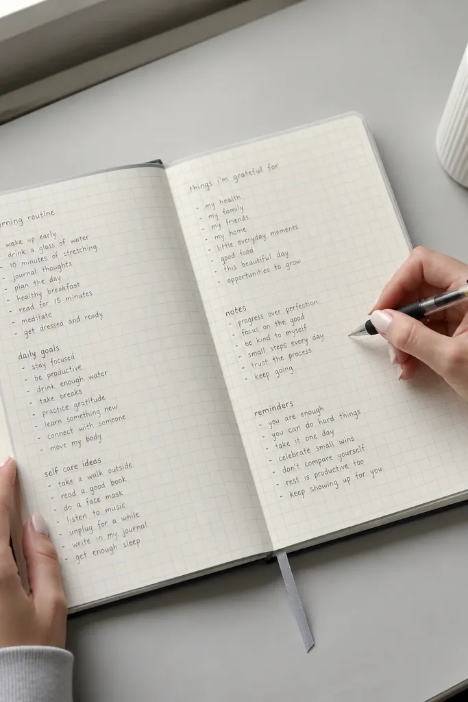
This is for people whose handwriting turns slanted when they’re tired. Instead of drawing lines, you use a light grid overlay to guide your writing while keeping the journal visually clean. The overlay can be a thin plastic sheet or a sheet of clear contact paper with printed grid lines. The result looks crisp because your lines stay even, and it photographs well because the page stays mostly white. It’s low-maintenance because you reuse the same overlay every week.
Pro tipUse a pencil baseline only — pencil marks disappear under ink and keep the page looking clean.
Cut a grid overlay to fit your journal page size, about 8.5 x 5.5 inches for standard notebooks. Place it on a page and trace only the writing baseline with a pencil, then remove the overlay. Write your prayer in pen following the baseline marks. Add one accent line with a marker under the last line of your entry to make it look styled. Store the overlay flat in a folder so it stays straight.
AvoidDon’t draw full grid lines on the page — it makes the journal busy and reduces readability.
13. Monthly Answered Prayer Highlight Strip
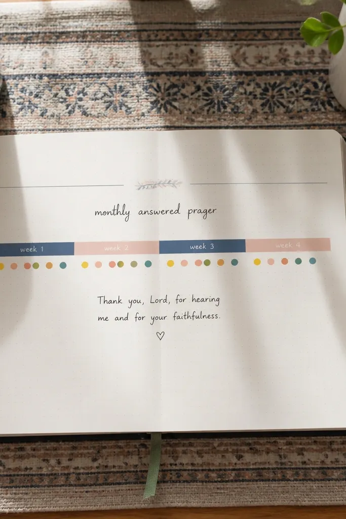
This turns answered prayers into something you can see at a glance. Each month gets one horizontal strip divided into weeks, and you add a colored dot when you see an answer. Under the strip, you write one short note about what happened. It’s photogenic because the strip creates a clean band of color, and it’s low-maintenance because you only add dots and one note. This setup also keeps you from rewriting the same story repeatedly.
Pro tipUse dot stickers for consistency; hand-drawn dots vary in size and look messy in photos.
On a fresh page, draw a long rectangle strip across the middle and divide it into 4 or 5 segments for weeks. Label the segments with small week numbers using a fine pen. Add colored dots (using a marker tip or sticker dots) as you notice answers. Below the strip, write a short “Answer note” paragraph for the most meaningful one. Keep dot colors consistent for the month so it looks intentional.
AvoidDon’t add too many segments — 4 to 5 keeps the strip calm and readable.
14. Neutral Cover Upgrade with Fabric Label and Elastic Band
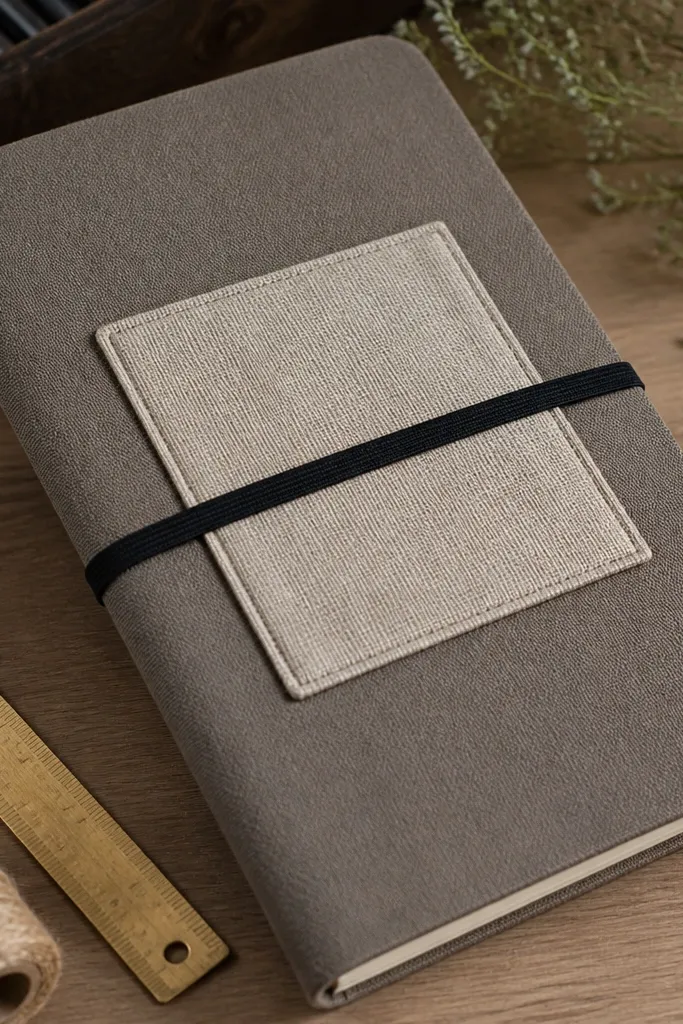
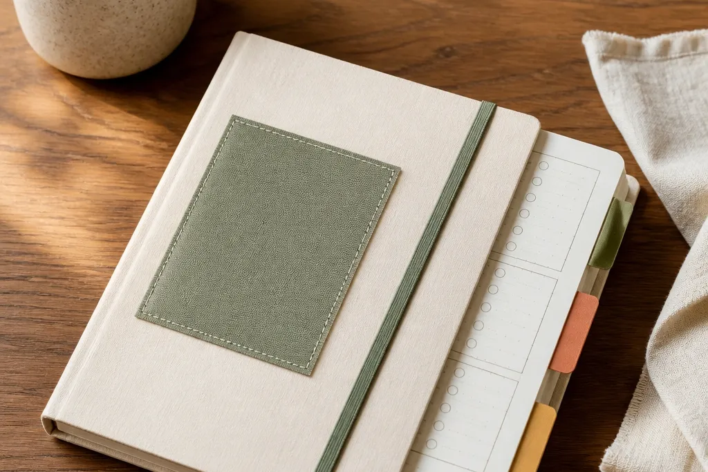
Your routine starts before you open the journal. A neutral cover with a fabric label and elastic band makes the journal look tidy on your desk and easier to grab when you’re rushing. This upgrade is also photogenic because it gives a consistent, styled “journal flat lay” look without adding clutter. You don’t need to decorate every page; you make the journal itself look put-together. It’s low-maintenance because once the cover is set, you only write.
Pro tipPick a fabric label that doesn’t fray — use pinking shears or tape the edges before gluing.
Choose a neutral fabric scrap or linen ribbon for the label, about 3 inches wide and 5 inches long. Attach it to the cover with fabric glue or double-sided tape designed for fabric, then add a short phrase using a fabric-safe pen. Install an elastic band closure by sewing or gluing two elastic anchor points on the inside cover, spaced about 2.5 inches from the edge. Stretch the elastic across the front to hold the journal shut. Finish by pressing the glued areas flat until fully dry.
AvoidDon’t use shiny ribbon — it catches light and makes cover photos look washed out.
15. Minimal Side Margin Micro-Notes with Sticky Tabs
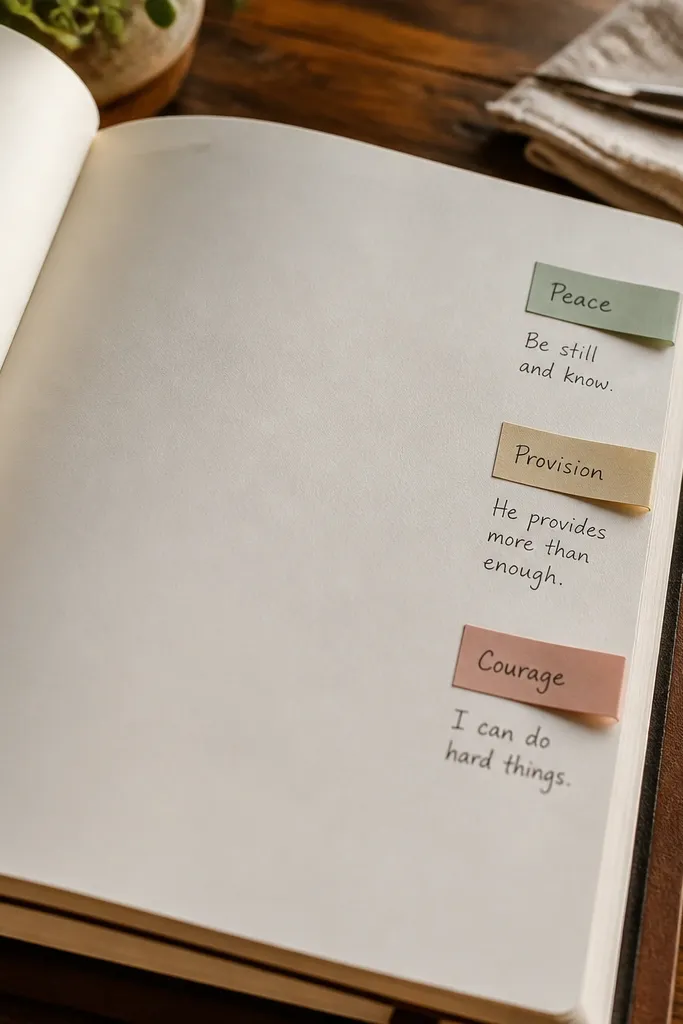
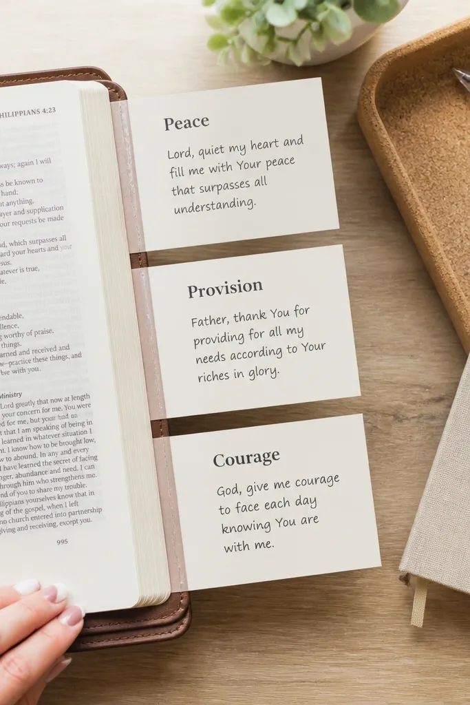
If you write prayers in bursts, side micro-notes keep your thoughts from spilling into the main text. You add small sticky tabs on the side margin, each with a keyword like “Peace,” “Provision,” or “Courage.” Then you write one micro-note next to the tab area on the page, keeping the main body clean. The look is aesthetic because tabs create a structured vertical line, and micro-words keep the page airy. This is low-maintenance because tabs are quick to place and you only write short phrases.
Place 3-5 sticky tabs along the right margin of a page, leaving equal spacing between them. Label each tab with one keyword using a fine pen, keeping letters small and consistent. Draw a faint vertical guideline at the edge of the main writing area so your micro-notes align. Write one or two sentences next to each tab area, then leave the center of the page for a longer prayer if you want. Replace tabs when you start a new entry.
Use thin sticky tabs so they don’t bulk up the journal when it closes.
Don’t cover the whole margin — 3-5 tabs keeps the page breathable.



