
1. Washi Tape Window Frame with One Bold Word
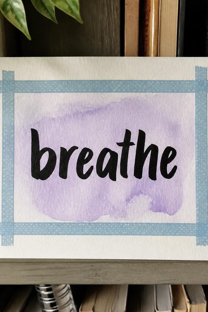
This page looks styled because the tape gives you instant geometry. You get clean lines without drawing, and the single word keeps the composition from getting crowded. Use a paint marker or brush pen for the word so it has weight and reads clearly in photos. The background can be simple — a light wash, a dot pattern, or even left mostly blank — because the tape frame does the heavy lifting. It’s fast, beginner-friendly, and it works with almost any journal paper.
Start by placing two horizontal strips and two vertical strips of washi tape to form a rectangle, leaving a gap in the middle for your focal area. Color the center with a light wash or quick dot pattern using a sponge or marker, then let it dry for 2-3 minutes (or hit it with a low hair dryer). Write one bold word in the middle using a brush pen, then add small timestamp-style marks around the edges with a gel pen.
Press the tape down firmly with a credit card so the edges stay sharp when you write over near them.
Don’t use too many words — one bold word makes the page look intentional.
2. Stamp Row Skyline with Teal and Black
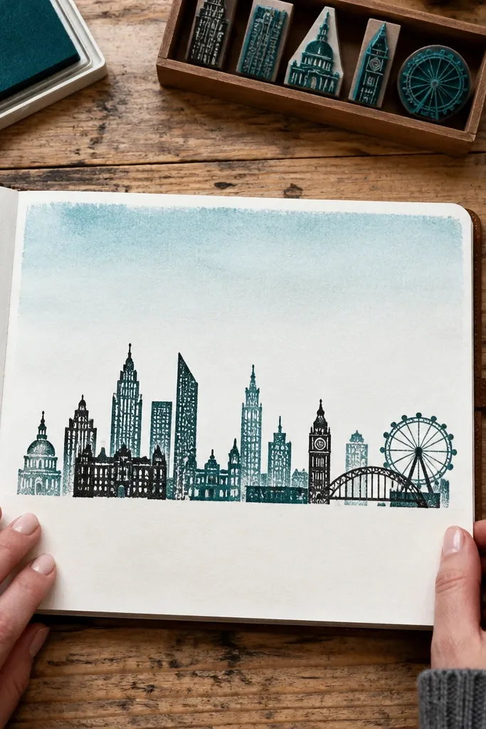
A skyline made from stamps looks graphic and modern because the repetition creates rhythm. Teal and black give strong contrast, so the page reads clearly even from a distance. This idea is great when you don’t want to draw buildings but still want a composed scene. The background sky can be minimal — just a gradient or two-tone wash — so you finish fast. It’s also easy to customize: swap stamps for leaves, waves, or simple icons.
Pro tipUse a stamping platform or a scrap paper under your journal to keep stamp pressure consistent.
Sponge a light teal wash across the top third of the page and let it dry until it’s not glossy. Stamp building shapes across the bottom in black, spacing them evenly so the row looks planned. Add one or two teal highlights on the buildings with a small brush or paint marker, then finish with tiny dots in the sky using a gel pen.
AvoidSkip layered stamping while the ink is still wet — it smudges and blurs your skyline edges.
3. Monochrome Circle Orbit with Gold Gel Pen Dots
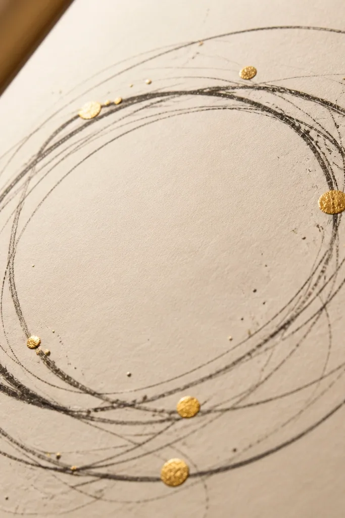
Circles feel instantly polished when you keep them monochrome. The center orbit idea gives structure, and the gold gel pen adds that “finished” sparkle without needing lots of color. This is a great page for days when you want calm visuals but still want something that photographs well. You’ll only draw smooth arcs and place dots, which is easy to do in one sitting. The result looks like a design page, not a random doodle page.
Pro tipIf your gold gel pen skips, warm the tip by scribbling on scrap paper for 10 seconds.
Draw one medium circle in the center using a compass or tracing a lid, then draw 3-5 smaller circles around it, slightly offset like planets. Fill the circles with light gray or leave them outlined — choose one style and stick with it. Add gold gel pen dots along the orbit path, counting roughly 20-30 dots so it looks intentional. Finish by drawing one thick black ring behind the orbit to frame the whole page.
AvoidDon’t mix three ink colors — gold pops best when everything else stays black/gray.
4. Textured Collage Label with Scrap Paper Edges
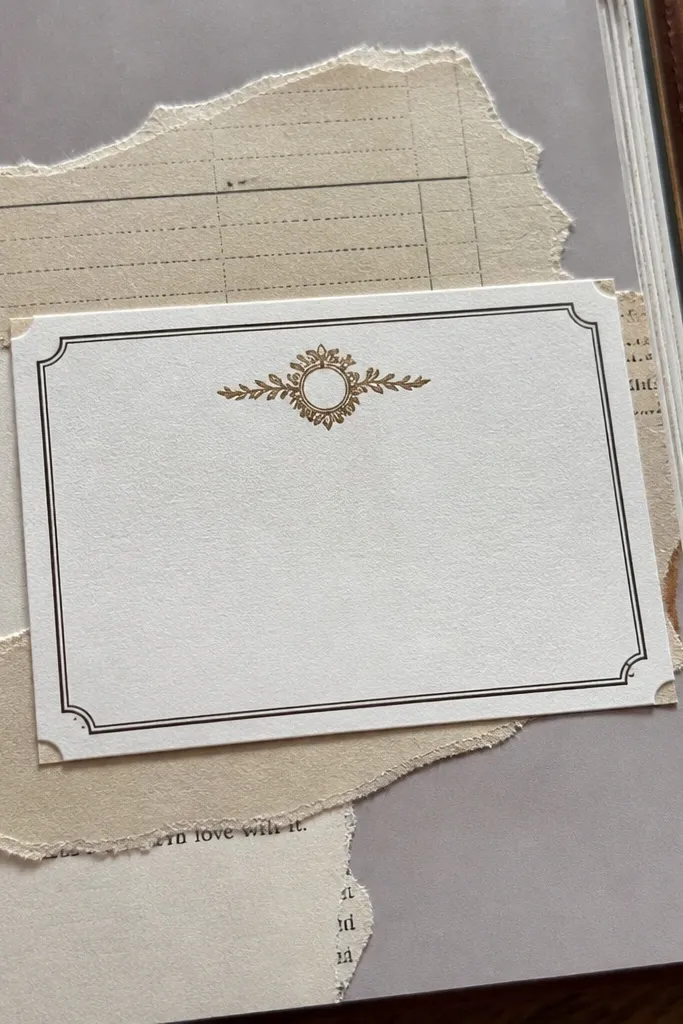
Torn scrap edges look tactile in photos, and a label shape makes the page read like a collectible card. This idea uses contrast: matte paper against your journal background, plus one bold header for clarity. It’s perfect when you want to use what you already have: old receipts, packaging, or book pages. Keep the label to one main block so it stays quick and visually clean. The texture hides small glue mistakes because paper fibers absorb light.
Pro tipUse a glue stick for most pieces; wet glue can warp thin paper and ruin the clean label shape.
Tear two or three paper strips into a label shape and overlap them on the page, keeping edges visible. Glue down the largest piece first with a glue stick, then layer the smaller strips so the overlap looks deliberate. Write a header on top of the label with a thick marker, then add 2-3 small lines of “notes” in tiny handwriting. Seal the label with a thin coat of matte gel medium if your journal paper can handle it.
AvoidDon’t glue directly over glossy packaging — it resists glue and lifts.
5. Grid Checklist with Color Blocks and Tiny Icons
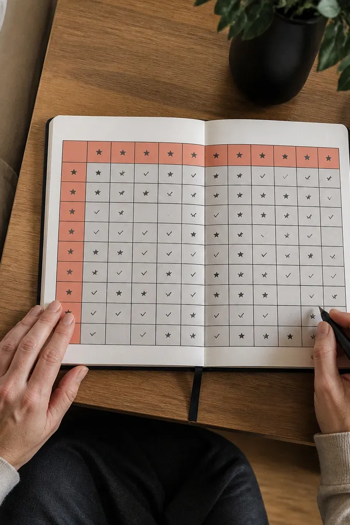
This page looks crisp because the grid forces order. Color blocks add personality without taking time, and tiny icons make the page feel designed instead of functional. It’s a great choice for journaling when you need a quick “what I’m doing” page that still looks pretty. You can use one accent color and one neutral, keeping it clean. Photos will show the straight lines and the bold squares clearly.
Pro tipTrace your ruler with a gel pen after pencil lines — it makes the grid pop in photos.
Draw a simple grid: 4 columns by 5 rows using a ruler and light pencil marks, then erase lightly later. Fill select boxes with solid color blocks using a paint marker or acrylic, leaving some boxes white for breathing room. In the empty boxes, draw tiny icons like a star, a droplet, or a leaf using a fine liner. Add a bold header at the top and write checkmarks beside 3 boxes.
AvoidDon’t fill every box — white space makes the page look intentional.
6. One-Minute Gradient Background with Overlaid Quote
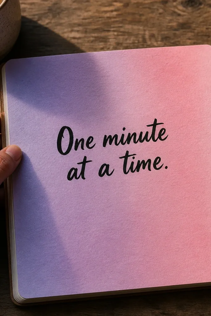
A smooth gradient background looks fancy fast because it creates depth without needing detail. Overlaid text gives you a focal point and stops the page from looking like a paint test. This works best with one short quote or a single phrase, kept bold and centered. Use a limited palette — like lavender to soft pink — so it stays cohesive. The gradient also photographs well because the color shift reads as texture from a distance.
Wet the page lightly with clean water using a brush, then drag two diluted paint colors into each other (start at one side and blend toward the other). Use a hair dryer on low for 20 seconds to set the gradient. Write one short phrase across the center using a waterproof brush pen, then add a thin underline in the accent color. Let the ink dry fully before touching the page.
Blend on a slightly tilted surface so the paint moves evenly and you don’t get hard tide lines.
Don’t use too much water — it turns the gradient streaky and washes out your text.
7. Layered Stencil Border with Mixed Ink Wash
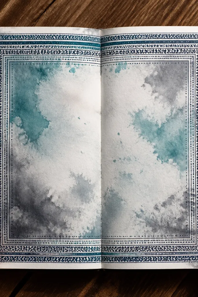
Borders make pages look finished instantly. A layered stencil border gives you repeatable pattern work without hand-drawing every line. Inside the border, a simple ink wash adds softness so the border looks crisp by comparison. This is a strong option if you want your journal to look consistent across entries. It also hides small mistakes because the border frames everything.
Tape a stencil along the page edges so it stays aligned, then apply ink or paint with a foam dabber. Do two layers: first one color, then remove the stencil and add a second color slightly offset for a layered look. Inside the border, swipe a diluted ink wash from left to right and stop before the stencil edges. Finish with tiny dots in the corners using a gel pen.
Wipe the stencil between colors to prevent muddy overlap.
Don’t flood ink under the stencil — thick pools create blurry edges.
8. Paper Tear Map with Route Line and Compass Marks
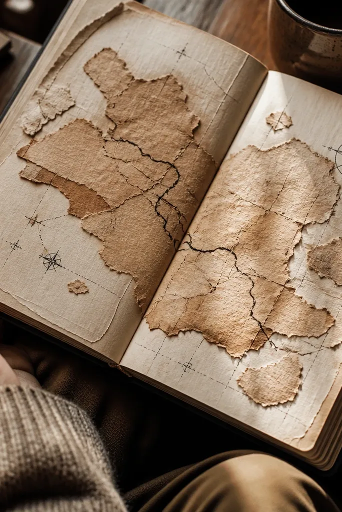
A tear-paper “map” looks artsy and photogenic because the fibers catch light. The route line adds narrative — you’re not just gluing scraps, you’re drawing a path. Compass marks and tiny coordinate-like numbers turn it into a mini poster. It’s fast because you’re not drawing landscapes, just arranging shapes and one line. This works well in journals because the texture makes the page feel dimensional.
Tear irregular shapes from scrap paper and glue them in a rough oval or rectangle map area. Draw one main route line across the shapes using a black fineliner, then add 3-4 “stops” with small circles. Place compass marks in one corner: a tiny N arrow and a short circle compass. Add coordinate-like numbers beside the route stops using a fine pen.
Use matte glue medium or a glue stick, then press with a ruler edge to flatten paper fibers.
Don’t over-detail the map — one route line and a few marks are enough.
9. Bubble Thought Diagram with Color-Weighted Outlines
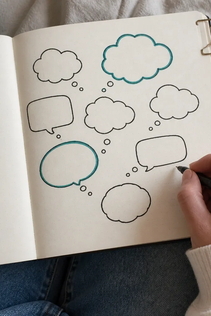
Bubble diagrams feel playful and clean when you keep the outlines bold and consistent. Color-weighted outlines mean you highlight only one or two bubbles, which keeps the page from looking messy. This is a great “brain dump” page that still looks pretty because the structure controls the chaos. Use one accent color and one neutral outline so the page reads clearly in photos. It’s also quick because you’re repeating a shape, not drawing a scene.
Draw a chain of 6-8 bubbles across the page, connected lightly so the layout feels like a thought path. Outline every bubble in a neutral color using a thick fineliner. Pick 2-3 bubbles and outline them again with a brighter color, then fill them lightly with a wash or marker scribble. Write one short phrase inside each bubble and add tiny dots around the highlighted bubbles.
Use the same bubble size for the first 4 bubbles, then taper sizes slightly toward the end for a smooth flow.
Don’t write long sentences — short phrases look better in bubble space.
10. Paint Marker Confetti Background with Center Photo-Card
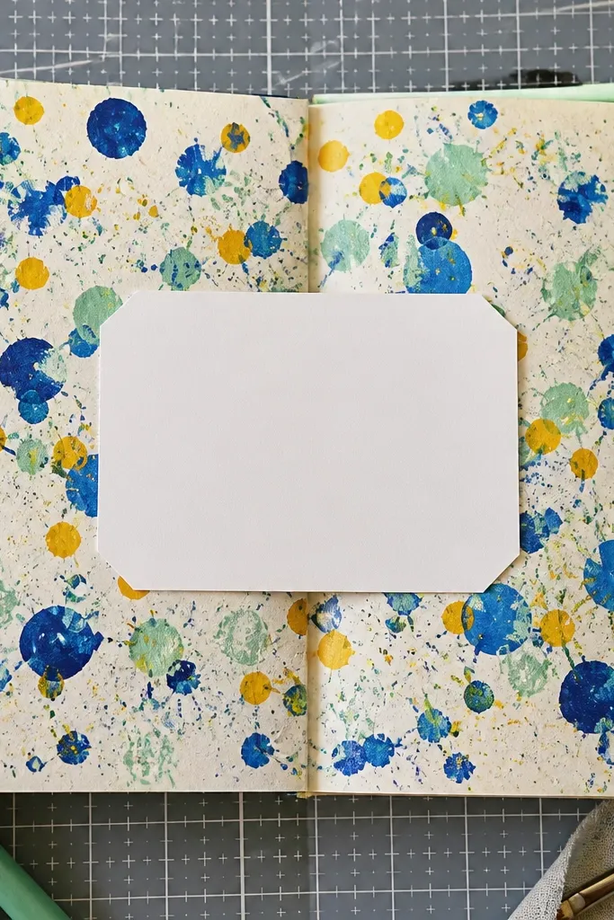
Confetti backgrounds look energetic and celebratory, and they hide the “I ran out of time” feeling because the pattern does the decorating. A centered card shape keeps the page structured and gives you a place for a title or theme word. This is one of the easiest ways to make a page look like a finished design. Use paint marker dots in only two colors plus white gel pen highlights. The center stays clean so it photographs sharply.
Draw a rectangle or rounded rectangle in the center with a thick fineliner. Around it, flick or dot paint marker color to create confetti — aim for 150-250 dots total, not random chaos. Color only a few dots larger so the pattern has depth. Add a short title inside the card and underline it with a contrasting gel pen.
Test dot size on scrap first; paint marker nib pressure changes dot thickness fast.
Don’t add confetti over the title area — keep the center clear for readability.
11. Botanical Leaf Rubbing with Black Ink and Cream Paper
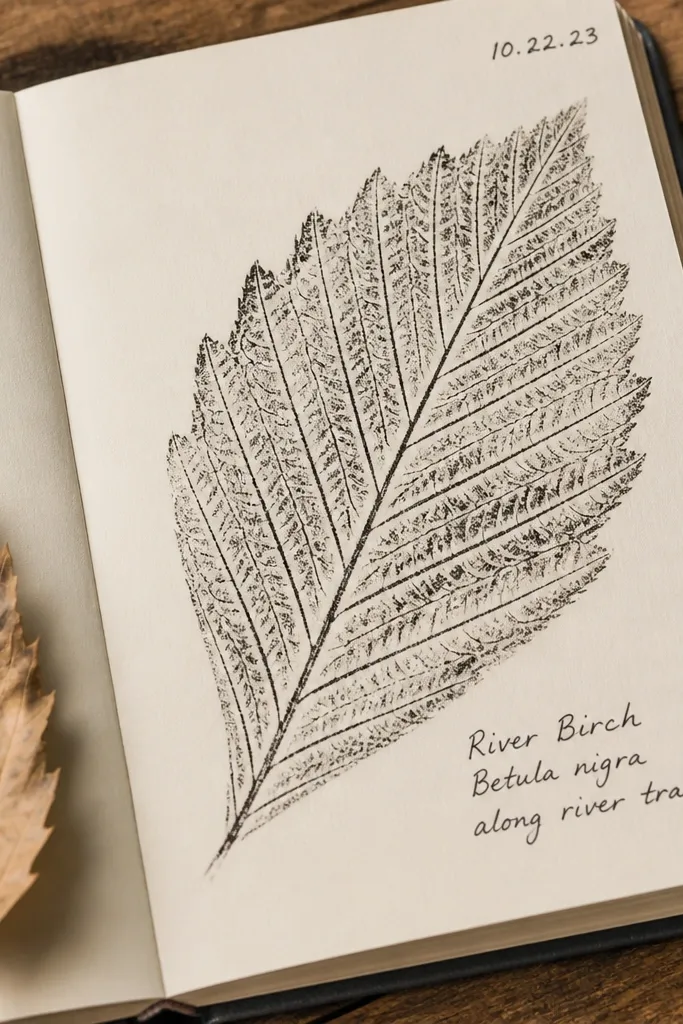
Leaf rubbing looks gorgeous because it captures veins and texture you can’t fake quickly with hand drawing. Black ink over a cream-toned background gives a classy print look. Add small labels and dates, and the page becomes a mini museum specimen. This works especially well if you have actual leaves for rubbing. It’s still fast because you’re repeating rubbings instead of painting a full botanical scene.
Pro tipUse a sheet of wax paper between leaf and journal to protect your page from smudges.
Place a leaf under a thin scrap or wax paper and rub over it with a black pencil or charcoal, then trace the vein pattern with black fineliner. Arrange 3-5 leaf rubbings in a cluster on the page. Add small label lines with a gel pen — keep them short like “mint” or “vine” — and write a tiny date in the corner. Finish by lightly shading around the cluster with a diluted black wash for depth.
AvoidDon’t press too hard — heavy rubbing tears paper and makes vein edges fuzzy.
12. Oversized Corner Frame with Negative Space
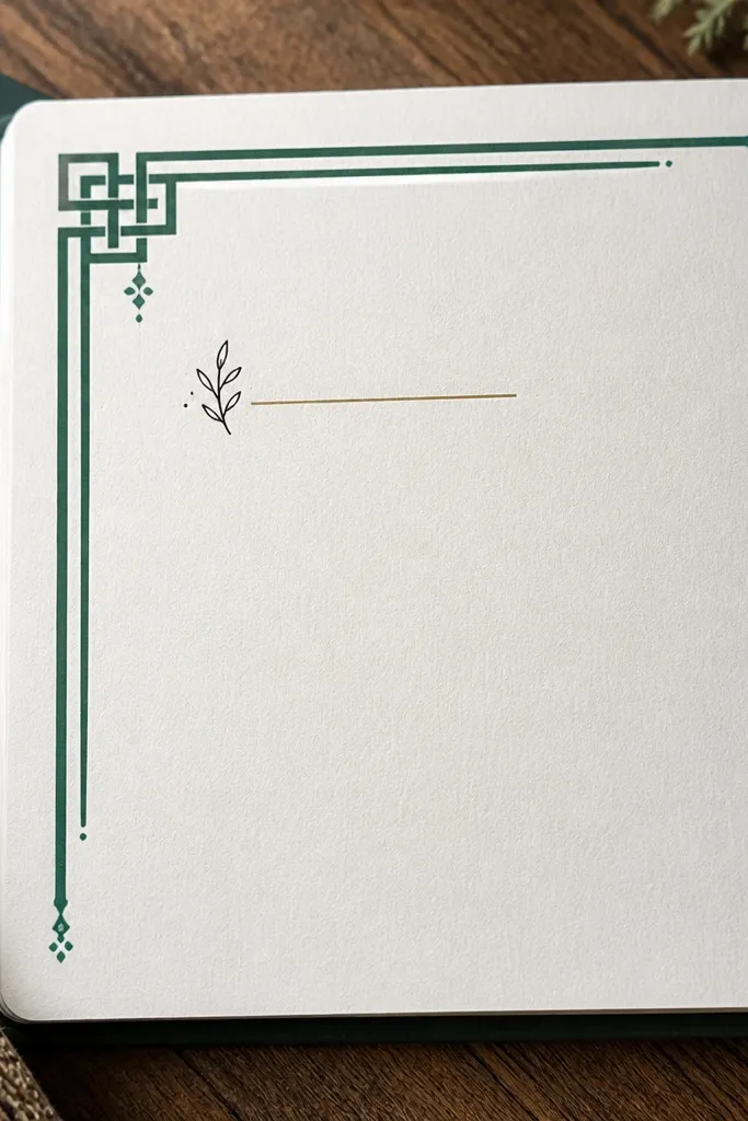
Negative space is what makes this look expensive. By putting a big frame in one corner and leaving most of the page blank, you create a clean poster layout instantly. The small note inside the frame gives you a focal message without clutter. Use one color for the frame and one thin accent line so the page stays sharp in photos. This is a strong choice when you’re tired and want a page that still looks designed.
Choose the top-left or bottom-right corner and draw a large rectangular frame that takes up about 1/3 of the page. Leave a wide gap between the frame lines and the edge so it looks intentional. Add one short word inside the frame using a brush pen, then draw a tiny underline or arrow pointing inward. Finish with 3 small dots or ticks outside the frame for balance.
Use a ruler and keep line weight consistent — uneven frame lines show quickly in photos.
Don’t fill the blank space just because it feels empty — the emptiness is the style.
13. Two-Tone Ribbon Banner with Handwritten Title
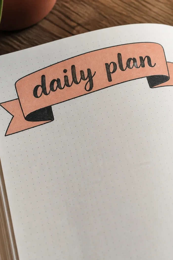
A ribbon banner makes your journal page look like a graphic poster. The two-tone effect adds depth without complicated blending. Handwriting the title directly on the banner keeps it personal and readable. You only need a straight banner shape, two color blocks, and a clean outline. This one is great for journaling prompts, weekly themes, or a single intention word.
Pro tipLet paint dry before writing — marker inks can bleed into wet paint.
Draw a long ribbon banner across the top or middle of the page with slightly angled ends. Fill the banner with two colors split vertically, then outline the edges with a thick fineliner. Write a short title in the center using a brush pen, then add a thin highlight line along one side of the banner. Finish with small decorative ticks at the banner ends.
AvoidDon’t use low-contrast colors for both halves — one needs to pop against the other.
14. Ink Doodle Waves with White Gel Highlights
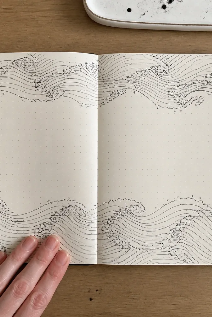
Wave doodles look soothing and stylish when you add white highlights. The black ink gives structure, and the white gel pen makes it feel glossy and dimensional. This is ideal if you want a calming page that still photographs well. Keep the waves in one direction so the composition looks intentional rather than sketchy. You can also swap waves for feathers or flowing ribbon shapes.
Pro tipLet ink dry fully before adding white gel pen, or the gel will drag the ink.
Draw 6-10 parallel wave lines across the page using waterproof ink. Vary line thickness by pressing harder for every third line. Add small “foam” highlights with a white gel pen along the crests, then add 3-5 tiny bubbles or dots in one corner. Finish with a small caption word in the negative space.
AvoidDon’t make every line the same thickness — variation gives depth fast.
15. Geometric Triangles Stack with One Metallic Edge
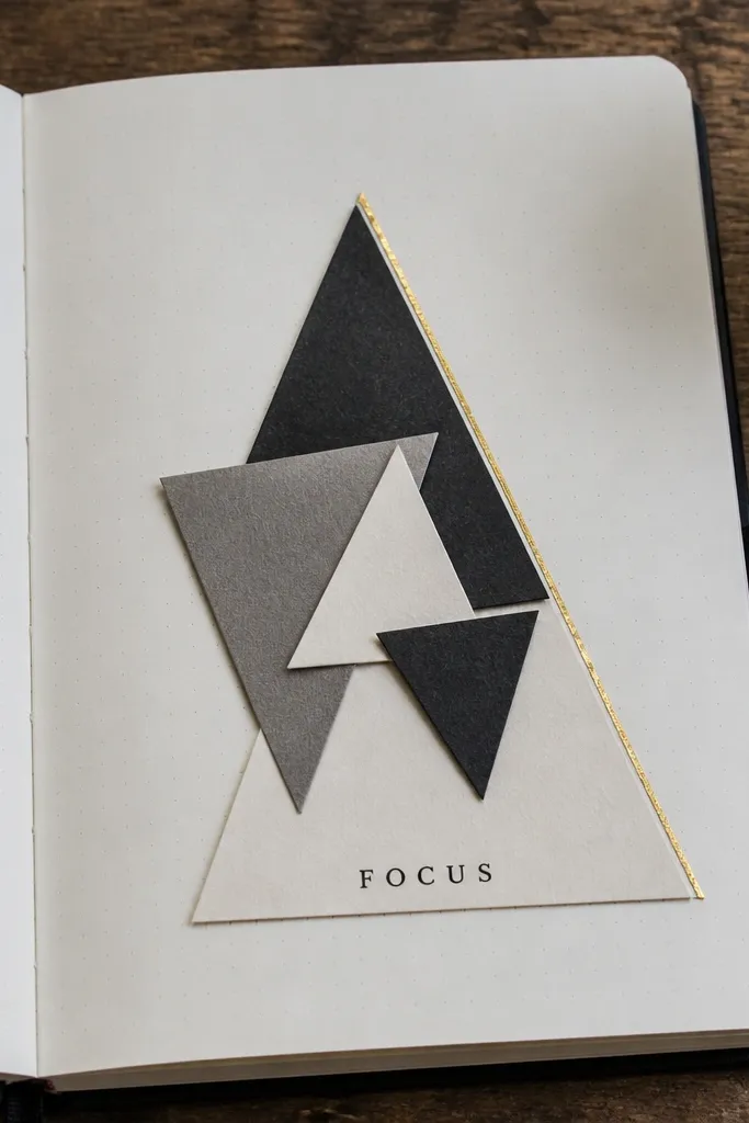
Triangles stack well because they create motion and a clean graphic look. Keeping most shapes matte and adding one metallic edge makes the page feel finished without extra work. This idea is great for using leftover scrap paper because triangles hide irregular edges. It also makes a strong background for a short word or date. Photos love hard angles and the metallic line catches light.
Cut or trace 5-8 triangle pieces from scrap paper or draw them directly with a ruler. Arrange them in a stacked formation, making sure the biggest triangle sits at the bottom. Glue the triangles down or draw them with marker, then outline one triangle edge with metallic gel pen or metallic acrylic. Add one short word centered above the stack and a small date in the corner.
If you’re drawing triangles, use a ruler and keep all triangle heights consistent so the stack looks deliberate.
Don’t stack too many triangles — 5-8 keeps the page readable.
16. Circle Sticker Mosaic with Black Connector Lines
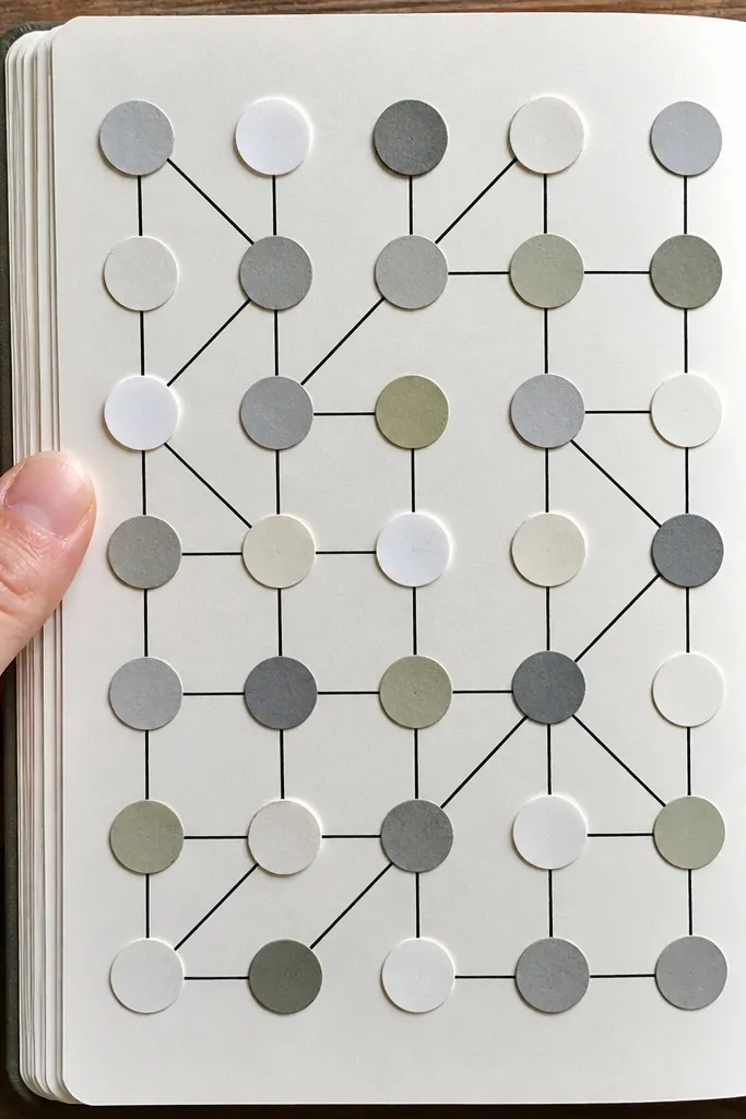
Circle mosaics look clean because circles naturally align visually. Connectors in black ink make the page feel like a design diagram instead of random sticker placement. This is one of the fastest ways to get a high-impact page with minimal drawing. Choose stickers or punch circles from paper, then commit to a grid-like arrangement. The black lines unify everything in photos.
Place 12-20 circles across the page, leaving small gaps between them so the background shows. Use a black fineliner to draw connector lines between a few circles, making one simple pattern path. Add a bold title above the mosaic and underline it with a thicker black line. If you want extra depth, color two circles with a different shade and keep the rest neutral.
Use the same circle size for at least 10 of them; size variety looks better after you lock the base pattern.
Don’t over-connect — 6-10 connector lines is enough for a clean diagram look.
17. Corner Date Stamp with Oversized Drop Shadow
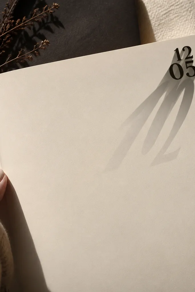
Date stamps make pages feel organized, and the oversized drop shadow adds instant drama. This looks good even if your journal paper is plain because the shadow creates depth. Keep the stamp content short: date + one tiny symbol. The rest of the page can be minimal, which makes the idea perfect for quick sessions. It also gives you a consistent “signature” element across multiple pages.
Pro tipUse a stencil for the date layout so the letters stay crisp when you shadow them.
Stamp or write a date in one corner using waterproof ink. Then draw a second version of the same stamp text offset down and to the right to create a drop shadow. Fill the shadow lightly with a gray marker or diluted gray paint. Add a thin border line along one edge of the page and a tiny dot cluster near the opposite corner.
AvoidDon’t use wet ink for the shadow — the offset lines blur.
18. Monochrome Photo-Copy Style Frame with Scribble Caption
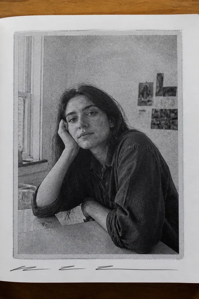
This idea looks like a vintage print without needing actual photo paper. A framed panel with scribble caption text gives you a strong hierarchy: frame first, message second. Keep the panel mostly monochrome so it reads like a copy. The scribble caption adds personality and texture. It’s fast because you’re making one panel and decorating around it, not building a full scene.
Pro tipStipple with a pen tip kept upright; angled scribbling creates messy blobs.
Draw a rectangular frame in the center using a gray fineliner. Fill the panel with light gray dashes or a quick stipple pattern using a fine pen. Add one small “caption” line below the frame using a thicker marker and slightly uneven handwriting. Finish with 3-4 tiny stamp marks around the panel corners.
AvoidDon’t add lots of colors — monochrome is what makes the copy style work.
19. Ink Blot Background with Sharp Cutout Label
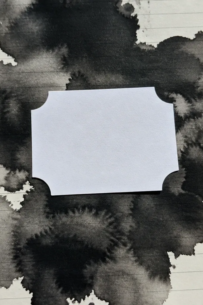
Ink blot backgrounds look dramatic because they create organic texture quickly. A sharp cutout label on top turns the chaos into a clean composition. Use black or deep charcoal blotting and keep the label bright — white paper or cream cardstock. This is a great page when you want something bold that still takes less than 30 minutes. The contrast between messy texture and crisp label is what makes it photogenic.
Pro tipDry blotting fast — wet ink can keep spreading and ruin the label placement.
Drop ink or diluted acrylic onto the page and tilt gently to spread into a blot, then dry it with a hair dryer. Cut a small label from white paper and write one short phrase on it. Glue the label over the blot, then outline the label with a thin black marker for extra crispness. Add one small dot or line near the label to balance the composition.
AvoidDon’t place the label right at the edge of the blot — keep a calm margin so it looks intentional.
20. Wavy Tape Horizon with Two Color Skies
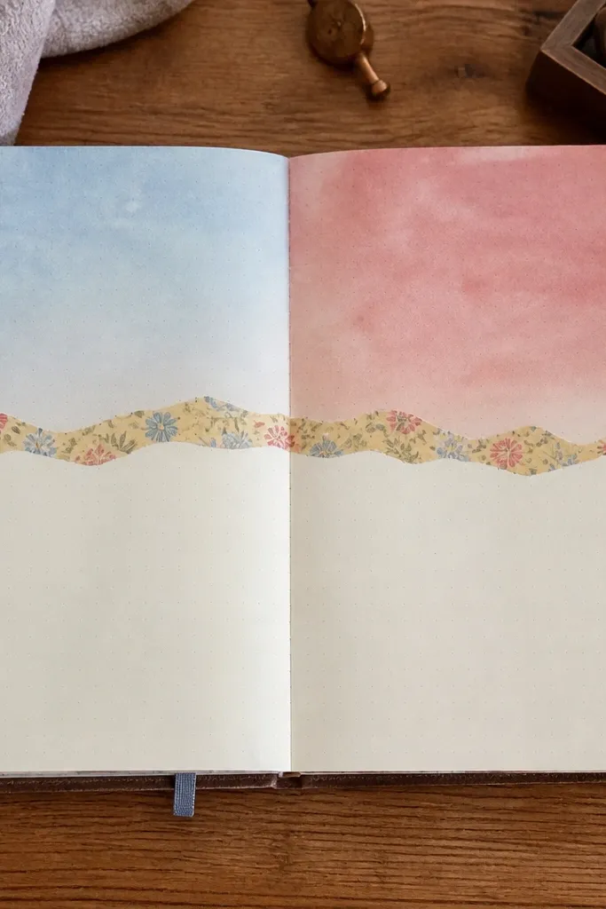
A wavy tape horizon instantly creates a scene without drawing. Split the page into two skies with two colors, and the wavy tape acts like a horizon line. This looks great in photos because the tape texture is visible and the color split reads clearly. It’s fast because you’re using tape as a guide instead of trying to draw a wave line freehand. You can keep it abstract or add tiny dots like stars.
Tear or cut a strip of washi tape, then place it across the page in a wavy line near the middle. Paint or marker-fill the top area with one color and the bottom area with a second color, leaving the tape line visible. Remove the tape carefully after the paint dries so the edges stay clean. Add a few tiny star dots with white gel pen in the darker sky.
Remove tape at a slight angle, not straight up, to avoid tearing paper fibers.
Don’t paint over the tape while it’s still wet — it can seep and bleed under the edges.
21. Handwritten Numbers with Dotted Path
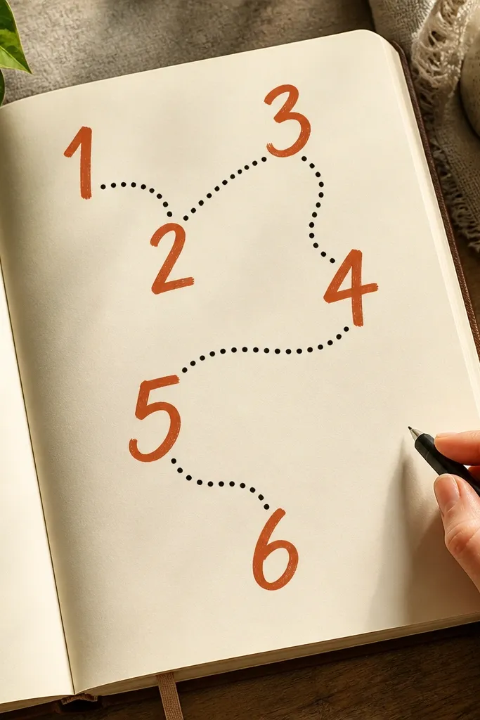
Big handwritten numbers look graphic and satisfying, especially when you connect them with a dotted path. This is a great way to turn a list into a visual story in one page. The page stays clean because the number is the main subject and the dots are controlled details. Use one accent color for the number and black for dots. It’s also easy to repeat across the journal for a consistent series.
Write one large number in the center using a brush pen, keeping the shape bold and readable. Draw a dotted path starting near the number and curving toward a corner using a black gel pen. Add 3-5 small label words near the path like “start,” “pause,” or “finish.” Finish with a thin border line around the page edge using a ruler and light gray pen.
If your brush pen bleeds, outline the number first with a fineliner, then fill carefully.
Don’t make the dotted path too dense — leave space so it looks airy in photos.
22. Stencil Stars with One Streak of Color
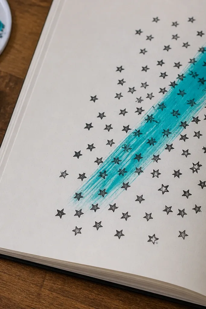
Stencil stars create a clean, celebratory pattern, and one diagonal streak of color makes the page feel dynamic. It’s a simple contrast trick: repeating small shapes plus one strong movement line. This works well for journaling themes like goals, birthdays, or “good news” pages. You finish quickly because stenciling is faster than drawing stars one by one. Photos will show the star pattern clearly and the streak gives energy.
Stencil a cluster of stars across one side of the page in a neutral ink or gray paint. Let it dry for a minute so you don’t smear. Draw one diagonal streak from corner to corner using a bright paint marker, then add 2-3 small dots along the streak. Write one short word near the stars in a contrasting color.
Use a foam brush instead of a regular brush for stencil work; it prevents paint from creeping under the edges.
Don’t use too many bright streaks — one streak keeps the layout crisp.
23. Envelope Flap Pocket with Tiny Message Card
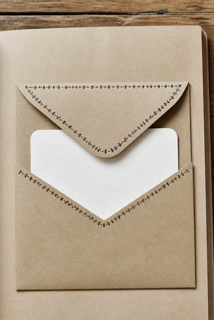
A pocket page looks interactive and photo-friendly because you can show the card peeking out. It also solves the “what do I write?” problem by giving you a dedicated space for one message. Use a simple envelope flap shape and decorate it with a border or stamp. This is great for journals that need occasional focus points. The pocket also hides a mess, because you can tuck in scraps or a quick note.
Pro tipUse cardstock for the pocket even in a soft journal; it holds shape and looks clean in photos.
Fold a rectangle of cardstock into an envelope pocket shape and glue the sides, leaving the top flap free. Decorate the pocket with a thin border line and one small stamped icon on the front. Insert a small message card with a short handwritten line and a date. Seal the flap with a small piece of washi tape on the inside so it stays closed but still looks like a pocket.
AvoidDon’t make the pocket too deep — if it sticks out too far, it looks bulky.
24. Ink Splatter Sunburst with Center Dot
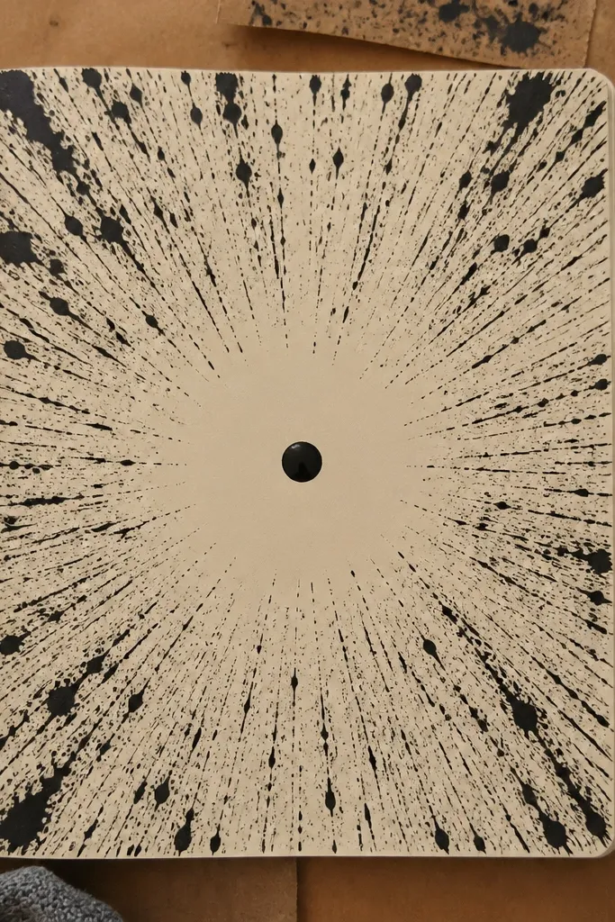
Sunbursts look bold because they pull the eye toward the center, and splatter adds texture without drawing details. Keep it to one color family for a clean look — like black splatter with a warm cream background. The center dot makes the page feel finished, like a poster. This is fast because you’re creating a burst with controlled splatter rather than painting a whole scene. It’s a strong choice when you want high impact in a short time.
Pro tipPractice splatter on scrap paper first to match droplet size to your page scale.
Draw a small circle dot in the center using a gel pen. Flick diluted ink or paint from a stiff brush to create rays around the center, keeping the rays mostly even in length. Add a thin ring around the center dot to frame the burst. Write one short word under the sunburst with a thick marker.
AvoidDon’t splatter too close to the center — large blobs can swallow the focal dot.
25. Color Block Margin with Handwritten Bullet List
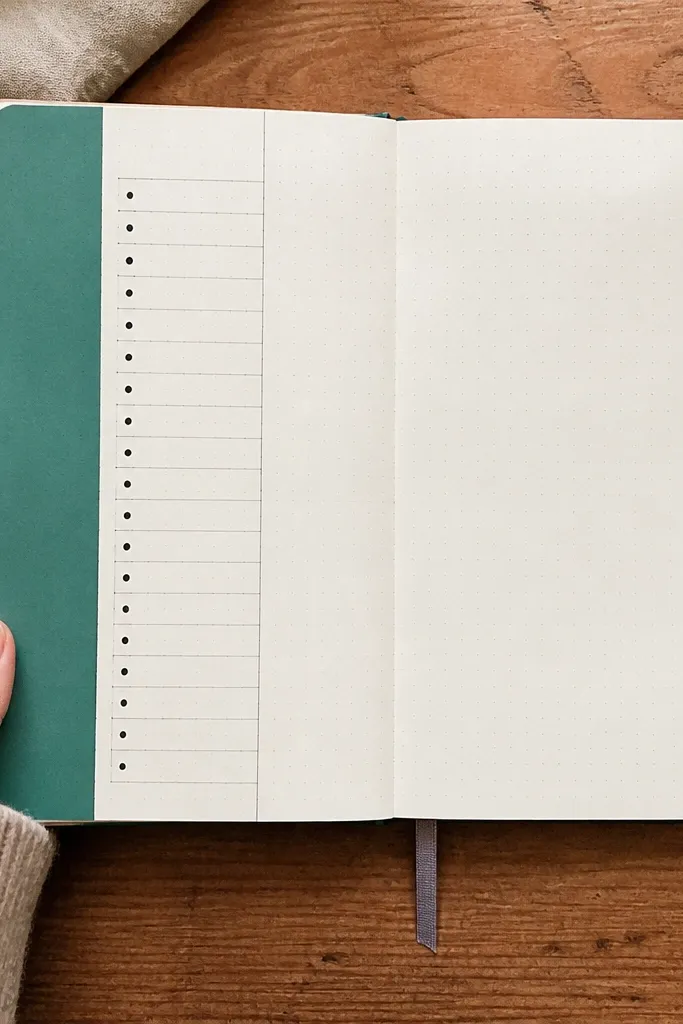
A color block margin makes the page look structured, and the handwritten bullets give it a diary feel. This is a great fix for pages that look empty because the margin block gives a strong design element. Choose one accent color and keep the rest neutral so it photographs cleanly. The bullet list stays readable because it sits on a consistent background. It takes less than 30 minutes because you’re building a simple layout.
Draw a vertical rectangle block along one side of the page, about 1 inch wide. Fill it with solid color using a paint marker or acrylic, then let it dry. Write a short bullet list (4-6 bullets) next to the block using a fineliner, and keep each line under 6 words. Add tiny checkmarks or dots beside each bullet for rhythm.
Use a ruler for the margin block — straight edges make the whole page look more “designed.”
Don’t pick font-like handwriting that’s too small — readability matters in photos.
26. Raised Texture Scribbles with Glue and Salt
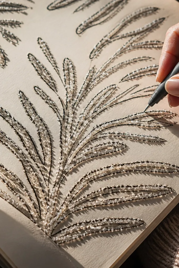
Texture always looks good in close-up photos, and this one is easy to control. Glue lines sprinkled with salt create a crunchy, sparkly surface that dries fast and holds shape. Then you trace over the texture with marker for crisp lines. This is best when you want a tactile page without complicated painting. It also gives you a way to turn random scribbles into a deliberate design.
Pro tipUse fine salt, not coarse — coarse grains look uneven and can shed.
Draw 8-12 looping scribble lines with a glue pen or white craft glue in the center area. Sprinkle fine salt over the glue and tap off the excess once it stops moving. Let it dry for 10-15 minutes, then gently brush away loose salt. Trace over the scribble paths with a dark fineliner and add one small label word near the bottom.
AvoidDon’t move the page while glue is wet — the salt shifts and the pattern blurs.
27. Triangle Confetti Border around a Central Word
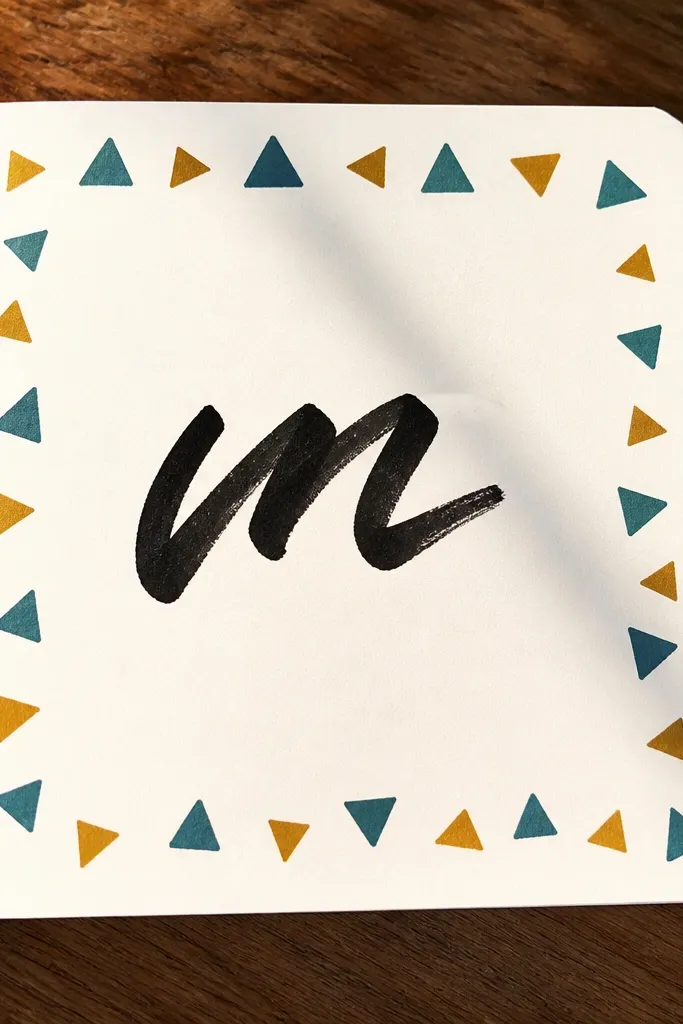
A triangle border frames the page and makes it look like a poster even with minimal content. Central word keeps it readable and gives you a clear focal point. This idea is photogenic because the border creates a “designed edge” that stands out. Use two colors: one for triangles and one for the word. The rest stays simple so you finish fast.
Pro tipIf you’re drawing triangles, mark 12-16 anchor points first — it keeps spacing even.
Draw a central word in the middle using a thick brush pen. Then along the edges, draw small triangles with a ruler as spacing guides, or cut tiny triangles from colored paper and glue them in a row. Keep triangles consistent in size and direction, wrapping around at least two sides. Add a thin line connecting the triangle border corners to make it feel cohesive.
AvoidDon’t overcrowd the border — triangles need breathing room to look clean.
28. Ink Pen Mandala Corners with Minimal Center
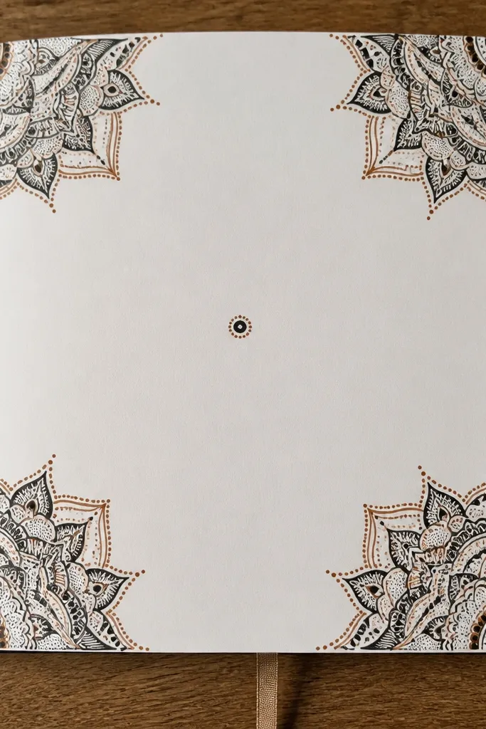
Mandala details look intricate, but this version is fast because you place them only in the corners. Keeping the center mostly blank makes the page feel modern and airy instead of busy. Use one ink color and one accent line color for contrast. This is a great option when you want a calm, symmetrical look without spending an hour on full-page mandalas. Photos will show the corner detail and the clean central space.
Pro tipUse a stencil for the first petal shape, then repeat by eye for the rest.
Draw a small circle in each corner, about 1.5 inches wide, then add 4-6 repeating petals or teardrops around each circle using a fineliner. Keep the corner designs similar but not identical — slight variation looks handmade. Leave the center blank or add one small dot cluster in the middle. Write a short title word under the dot cluster.
AvoidDon’t fill the entire page with mandala lines — corners only is what keeps it quick.
29. Receipt Barcode Texture with Bold Number Title
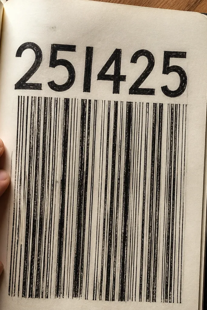
Barcode texture looks crisp and graphic, and it’s an easy way to make a page look “designed” using scraps. A bold number title gives it a clear theme. This idea is especially good when you want to journal about bills, purchases, or a “counting wins” theme without writing long paragraphs. The stripes are quick to create with a marker and ruler. Photos love the high-contrast lines.
Draw a barcode block on the left or top portion of the page using a ruler and a black fineliner. Make 25-35 vertical stripes with varying widths, then add two thicker bars for realism. Write one bold number title on the opposite side in a thick marker. Add three small lines of “notes” beneath the number using a smaller fineliner.
Make your stripe widths by alternating between two sizes — it looks more realistic than random widths.
Don’t make the barcode too large — keep it as a block, not a full background.
30. Monochrome Scribble Waves with One Red Accent
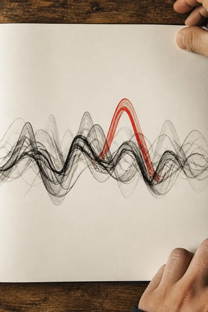
This is a simple contrast trick that always looks good. Monochrome scribble waves create movement and texture, while one red accent keeps the page from feeling flat. It’s fast because you’re repeating a wave shape and focusing on one highlight. This works well for mood pages because the red mark can represent one feeling or one moment. Photos show the texture even with minimal color.
Draw 10-14 wavy scribble lines across the page in black, keeping them mostly parallel. Leave a clear path in the middle area where you’ll place your accent. Add one red accent mark in the center — a small filled circle, a short underline, or a tiny burst. Finish with a short word in black near the bottom.
Use a fineliner for scribbles, not a thick marker, so the waves look airy instead of heavy.
Don’t add multiple red accents — one is what makes it feel intentional.



