
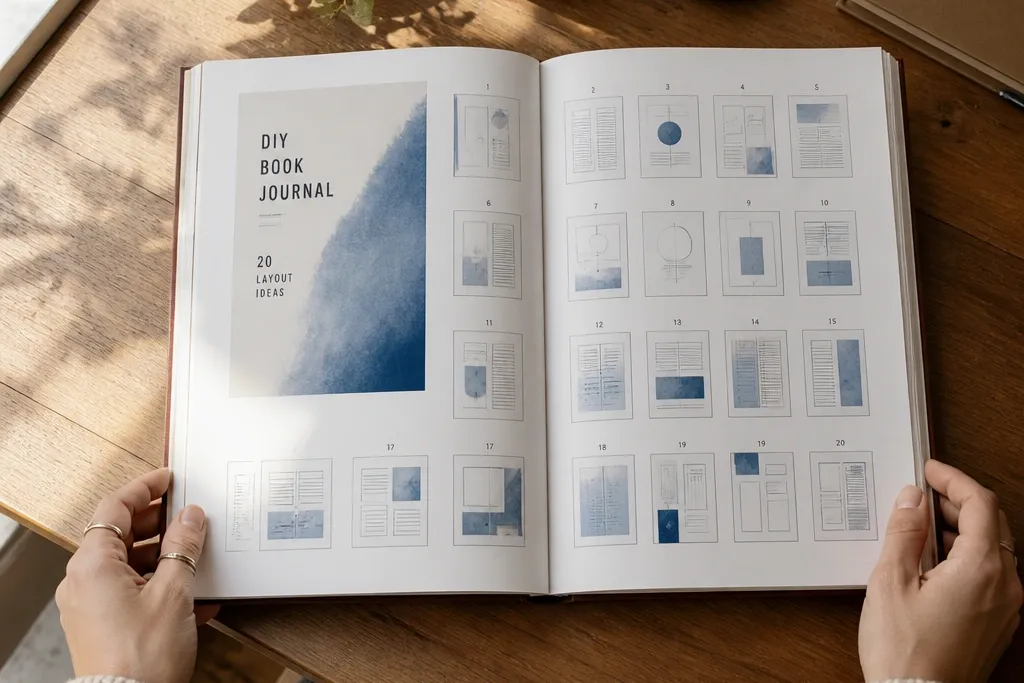
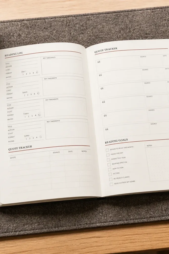
1. Terracotta Tape Frame Quote Page
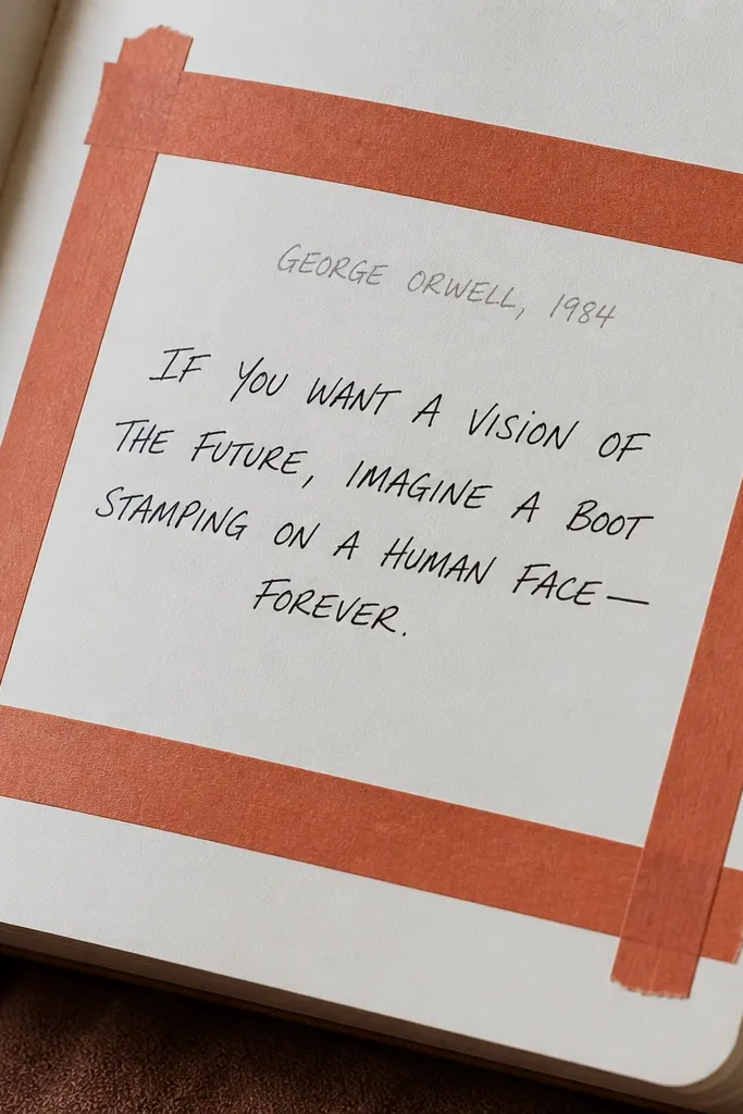
This layout looks modern because the tape frame gives you a crisp boundary, like a gallery label on a wall. Put your main quote in the center using a black pen, then add a small author/title line at the top inside the frame. The terracotta accent reads warm in photos and balances black ink without turning the page into a scrapbook. It’s also practical: you can swap quotes week to week while keeping the same structure, so your pages stay consistent.
Start with off-white paper or a journal page protector sheet. Cut two strips of painter’s tape and lay them as left and right borders, then add a top strip; keep a 1 cm gap from the edge so handwriting doesn’t crowd the tape. Write your quote in the center, then add a small line for book title and page number under the quote. Finish by pressing the tape edges firmly with your fingertip and removing painter’s tape only after the ink fully dries.
Use painter’s tape for clean removal, and let gel pen ink sit 10-15 minutes before you peel.
Avoid thick marker fills inside the tape — they smear and look messy under tape shadows.
2. Two-Column Margin Notes + Page Number Grid
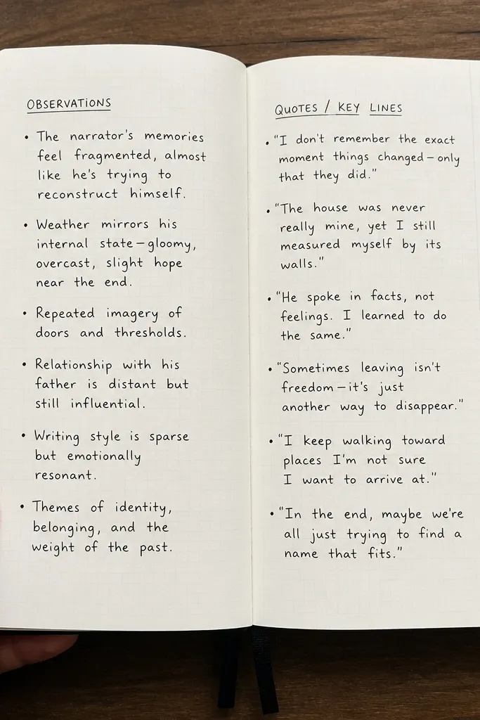
This one is clean and modern because it turns “notes” into a system. The left column is for short observations, the right column is for quotes or key lines, and a small grid in the margin holds the page numbers you reference. It photographs well because the whitespace stays even, and your handwriting doesn’t sprawl across the whole page. It also fixes the common problem where notes pile up but you can’t find anything later.
Draw a vertical line down the page to split it into two columns with equal width, leaving a 2 cm margin on the outside. In the margin, draw a 3x3 grid and label the squares with page numbers you’re tracking. In the left column, write 3-5 bullet notes; in the right column, write one quote per line with a short attribution. Keep line spacing tight and consistent, then underline only the page-number grid labels with a thin pen.
Use a ruler for the vertical split — your eyes read symmetry even when the content is messy.
Don’t use too many font styles; one pen for all text keeps the layout modern.
3. Monochrome Stamped Corners Reading Log
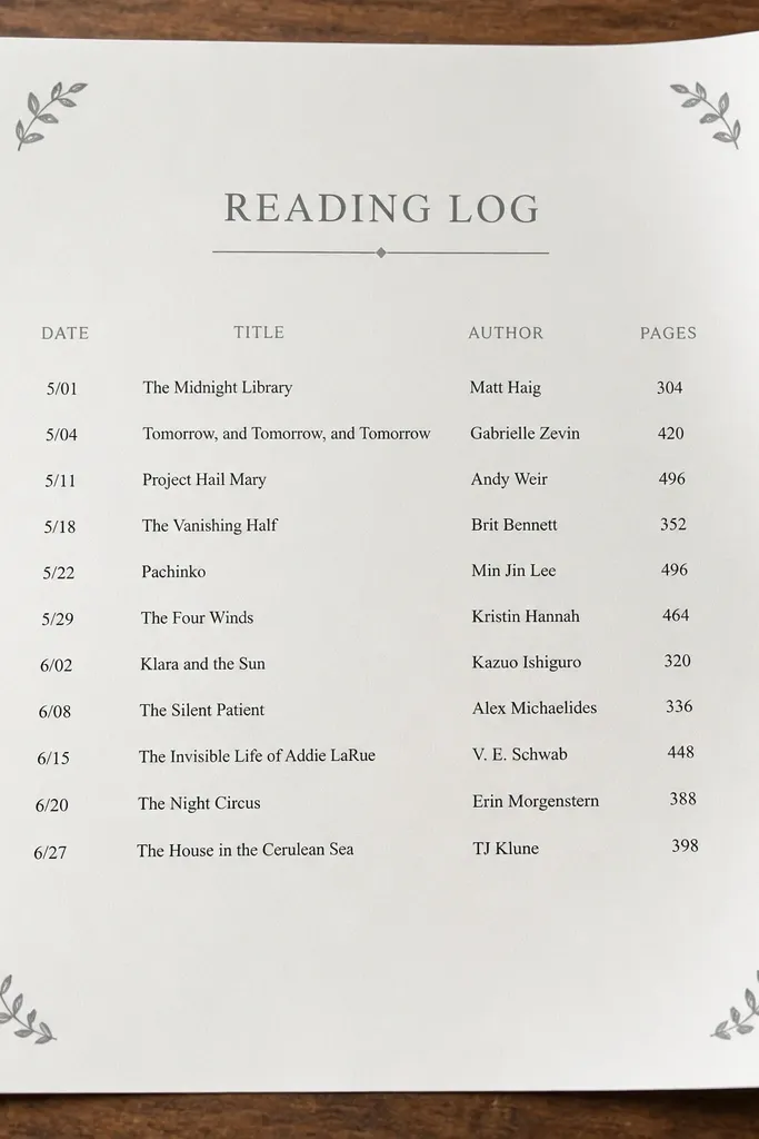
Stamped corners make a page feel designed even with simple text. Use a single stamp (like a tiny star, dot cluster, or leaf) in each corner so the layout has a repeating motif. Keep the rest monochrome: black list text, gray headings, and one accent line. This style works when you want a fast log format for each book section without drawing boxes every time.
Pick one stamp and one ink pad in black or dark gray. Stamp each corner lightly, leaving about 1.5 cm from the page edge so the corners don’t crowd. Write a heading across the top (book section + dates), then list 5-7 items in short lines under it. Add a single thin underline at the bottom using a gray fineliner, and keep all text left-aligned.
Pro tipPress the stamp firmly for 2 seconds, then lift straight up to avoid smudged edges.
AvoidAvoid multiple stamp types on one page — it kills the modern, minimal look.
4. Watercolor Wash Behind a Single Title Box
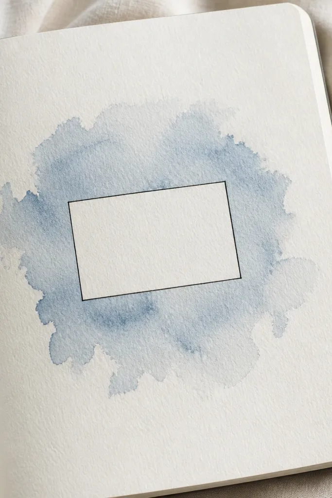
This idea looks modern because it treats color like a background layer, not decoration everywhere. You paint a soft watercolor wash behind a single title box, then let the text sit cleanly on top. The wash adds depth in photos without fighting the handwriting, especially if you use one color family like dusty blue or muted sage. It’s perfect for starting a new book or section because it makes the page feel like an entry marker.
Tape off a title area with painter’s tape so you get a sharp rectangle. Wet the paper lightly with clean water using a flat brush, then paint a thin watercolor wash around the taped rectangle; keep the edges soft. Let it dry 20-30 minutes, remove tape, then write your title in a bold black block-letter style inside the title box. Finish with a short one-line subtitle below in smaller text.
Use thicker paper (160-200 gsm) for watercolor so it doesn’t buckle.
Don’t paint the wash too dark — dark washes make black ink muddy.
5. Cut-Paper Window Quote Layout
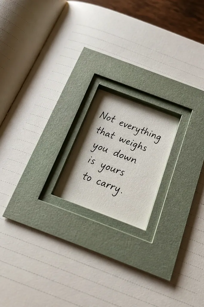
A cut-paper window turns your page into a frame for language. You create a “window” layer using a rectangle of colored paper, then place your quote where the window opens. The layered edges cast tiny shadows, which look great in photos and make the page feel dimensional. This is the most satisfying option if you want your book journal to look like art, but you still want it to be readable.
Cut a rectangle from colored paper (like light gray, mustard, or deep green) with clean straight edges. Glue the rectangle onto the journal page, then cut a slightly smaller rectangle out of the top layer if you want a true window effect. Write your quote in black in the center of the window area, then add a tiny author/title line at the bottom. Seal the edges with a thin layer of matte glue so the paper doesn’t lift.
Use a craft knife and a cutting mat for crisp lines — torn edges look messy in this style.
Avoid bulky glue blobs — they show as bumps in overhead photos.
6. Ink-Only Timeline of Chapters
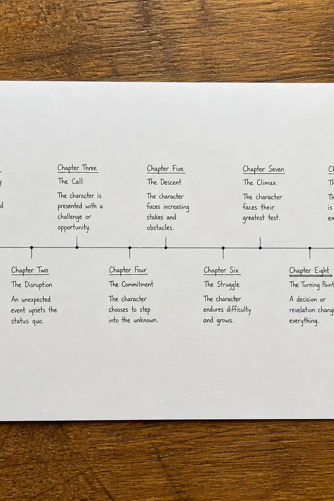
A timeline layout is modern because it turns reading into a clean sequence. Draw a single horizontal line across the page, then place chapter names or key moments as small blocks along it. Keep everything ink-only: black for text, gray for the timeline line, and optional one accent highlight under a block. This is great for nonfiction books, series reading, or when you want to track how ideas build over time.
Draw a straight horizontal line with a ruler, leaving 1.5 cm margins at both ends. Mark 5-7 evenly spaced ticks, then write a chapter name under each tick in small text. Add a small date or page range in lighter gray next to each block. Finish by circling one “key moment” with a thin accent line in your chosen color.
Use a 0.3 pen for tiny labels so the timeline stays airy.
Don’t crowd 10 labels on one page — spacing is what makes it modern.
7. Dot Grid with Highlighted Takeaways
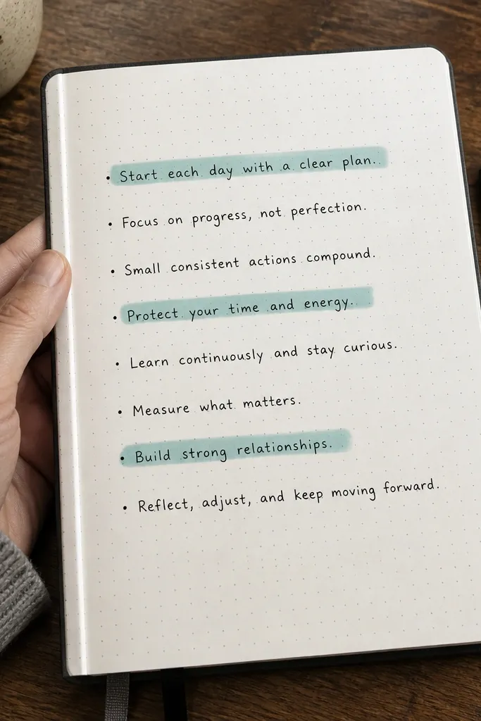
Dot grids instantly make a page look structured, even if your notes are messy. The trick is to keep the grid faint and use color only for takeaways, not for everything. Write 6-10 short lines aligned to the dot grid, then highlight three lines with a brush pen in one accent color. The result looks crisp, modern, and intentional in photos because the color hits are controlled.
Use a dot grid page or lightly draw dots with a stencil and pencil. Create a consistent left alignment by drawing a faint vertical guide line. Write short notes in neat lines across the grid. Highlight exactly three takeaways with a brush pen, then add small checkmarks next to them in black.
If you don’t have dot grid paper, use a ruler and a 5 mm dot marker spaced evenly.
Avoid using multiple highlight colors — it turns into a cluttered page.
8. Photo-Style Sticker Labels for Book Sections
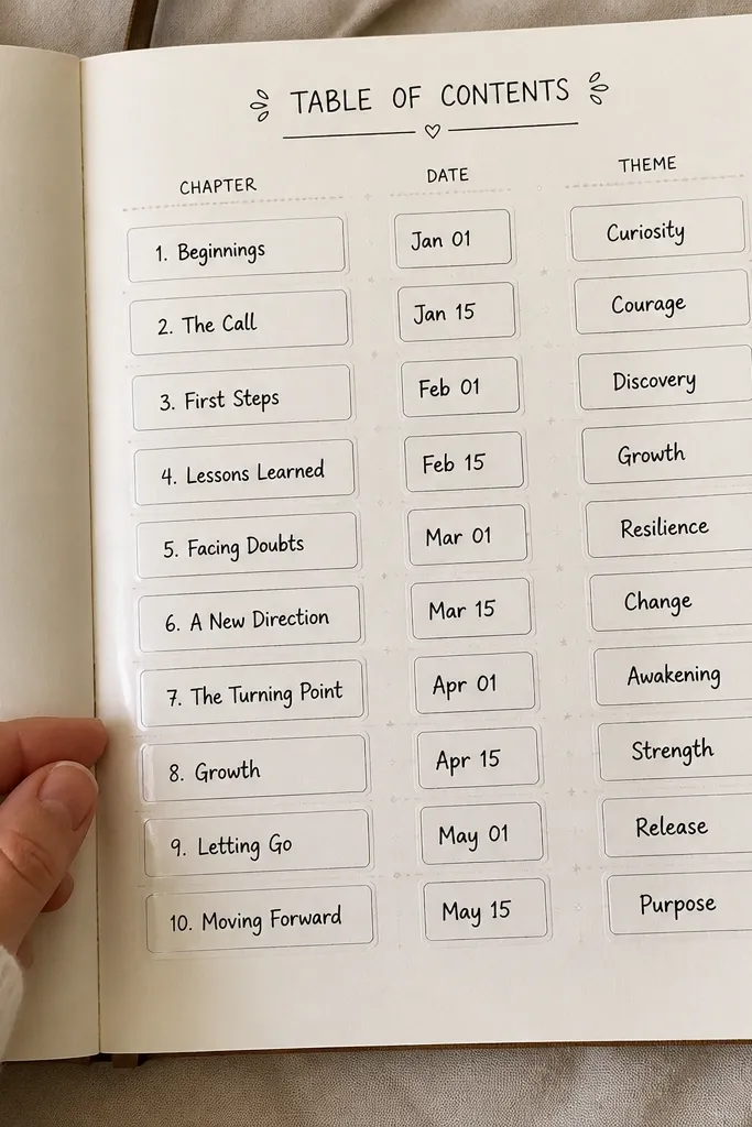
This layout looks like a photo caption system. You create sticker-like labels (rectangular boxes) that hold chapter titles, dates, and one-word themes. Keep the labels uniform in size and use one border style, like a thin black rectangle. The page stays modern because it reads like a design sheet, not a diary dump. It’s also fast: you can fill labels as you read without rewriting whole paragraphs.
Choose label sizes, like 3.5 cm by 1.5 cm, and draw 5-7 rectangles with a ruler. Add a thin black border and leave a small padding inside for text. Write the chapter title in bold black, then add a smaller date line under it. Place the labels in a tidy column or stagger them in two rows, then add a short theme word in accent color.
Pro tipUse a white gel pen to add tiny highlights on the label borders if you want extra pop in photos.
AvoidDon’t vary label sizes — the uniformity is what makes it look modern.
9. Scribble Border + Clean Center Reflection
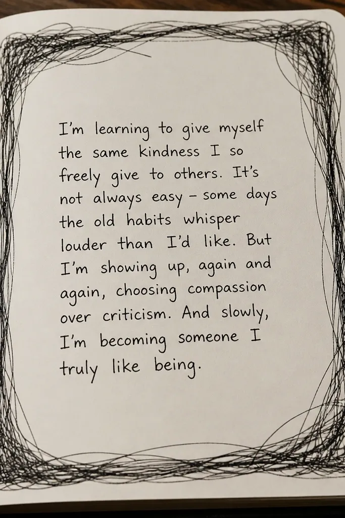
This one balances chaos and control. The outside has a loose scribble border that looks handmade, while the center stays calm with a single paragraph of reflection. It’s photogenic because the border creates a frame and the center text stays readable. Use it for reflective prompts, like “What changed in my thinking?” or “What line will I remember?”
Lightly mark a rectangle frame area with pencil at least 1.5 cm from the edges. Go over that with a black pen to create a scribble border, leaving gaps so it stays airy. Write one centered paragraph inside the frame with line breaks that keep the text block compact. Add one small date stamp or page number in the bottom corner.
Pro tipKeep the scribble border irregular, but make the inner text alignment strict.
AvoidAvoid scribbling over the text block — it makes the page look crowded.
10. Accordion Fold Insert for Mini Quotes
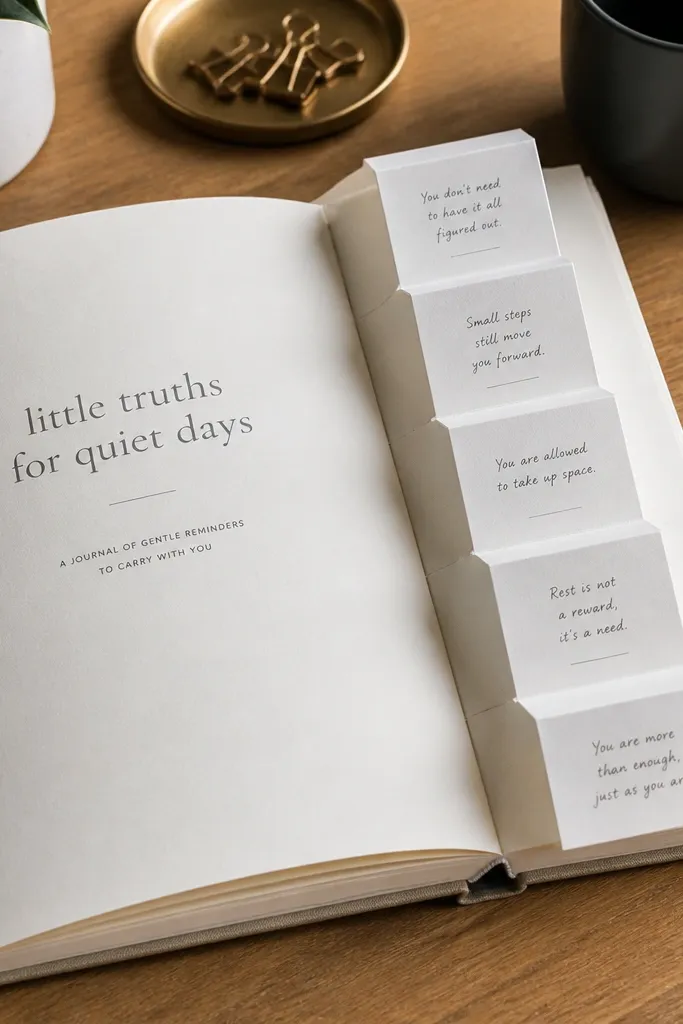
An accordion fold insert makes the journal interactive and visually interesting. You get a clean front page, then a hidden layer of mini quotes that you can pull out and read. In photos, the fold catches light at the edges, which makes the page look more dimensional than flat layouts. This is a strong choice if you collect short lines you can’t fit into your regular page system.
Cut a strip of paper about 18 cm long and 6 cm wide, then score folds every 3 cm to create 6 sections. Fold it into an accordion, then glue the folded strip to the inside of a journal page along one edge. Write one mini quote per section using a small handwriting size. Close the journal to flatten, then reinforce the fold with a thin piece of tape on the glued edge only.
Pro tipUse lighter paper for the strip so it folds without bulk.
AvoidDon’t glue the accordion across the fold lines — it will stop opening.
11. Book Spine Color Blocks with Matching Notes
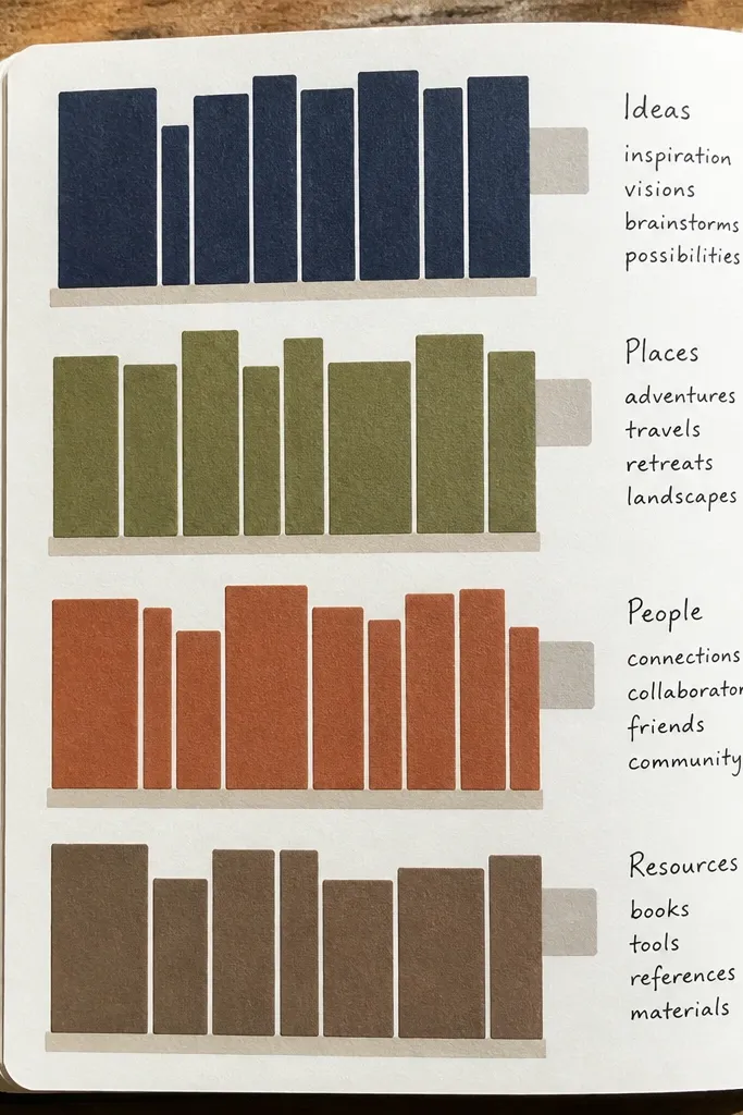
This layout works because it mimics how books look on a shelf. You draw color blocks stacked like spines, then write a short note beside each block that matches the color category (plot, theme, quote, question). It’s modern because the structure is graphic and the colors are intentional. It’s also useful: your notes are sorted by category instead of mixed in paragraph form.
Pick 4-6 muted colors (use watercolor or markers), and draw vertical rectangles on the left side like book spines. Make them equal width, about 2.5 cm each, with 0.5 cm gaps. Next to each spine, write a short header word in black, like “Theme,” “Quote,” or “Question,” then fill 2-3 lines of notes. Leave the top area clean so the layout doesn’t look heavy.
Pro tipUse one consistent black pen for all headings so the colors do the work.
AvoidAvoid bright neon colors — they overpower the handwriting and look harsh in photos.
12. Thin Line Art Cover Page
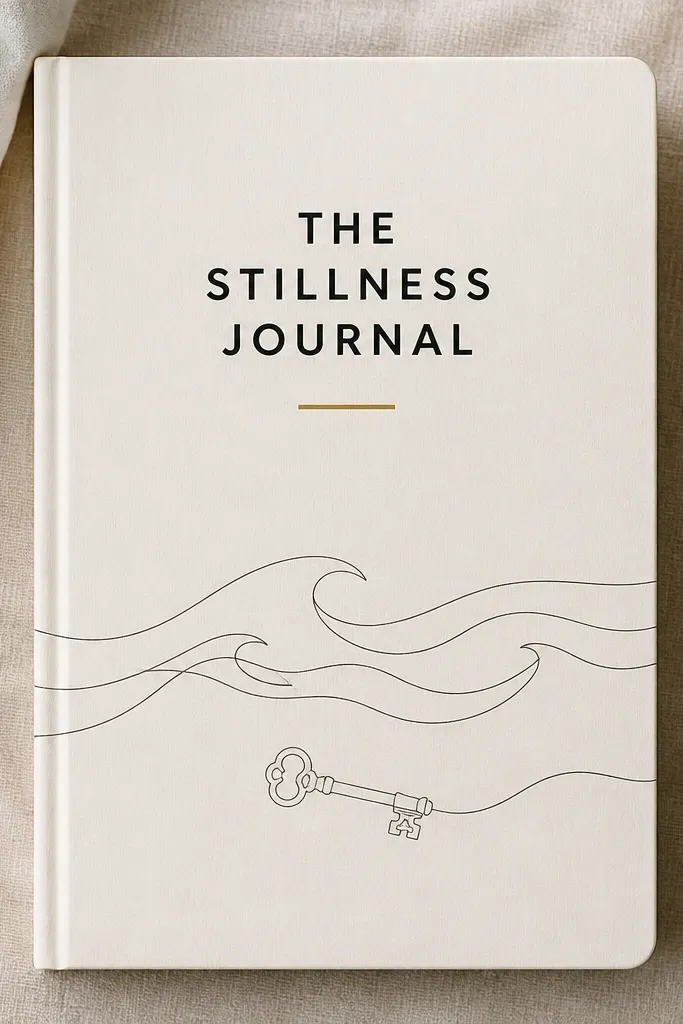
Line art is modern when it’s minimal and placed with restraint. Sketch a few thin lines that suggest the book’s theme — like waves, a key, a city skyline, or a plant — then keep the rest of the page clean. Put your title in a simple block font, and add only one accent mark in color. This gives you a strong cover look without turning every page into a drawing project.
Choose one theme sketch and keep it to 3-5 elements. Draw lightly in pencil first, then trace with a 0.3 black pen. Place the title at the top, centered, then position the line art under it so there’s a clear hierarchy. Add one colored underline under the title or one small dot cluster in the corner.
Pro tipUse a ruler for title alignment even if the line art is freehand.
AvoidAvoid thick outlines — they look cartoonish and reduce the modern feel.
13. Stamped Date Wheel Reading Habit Page
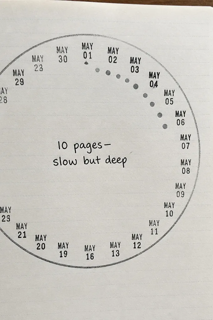
A date wheel gives your journal a repeatable habit tracker look. You stamp dates around a circle, then write a short summary in the center like “10 pages — slow but deep” or “Finished chapter 3.” It’s photogenic because circles frame text and stamps create a patterned texture. This format is great for monthly reading goals, book clubs, or anyone who wants pages that look consistent across time.
Draw a circle with a compass or trace a small bowl, about 6-7 cm wide. Divide it into 10-12 segments with light pencil lines. Stamp one date per segment using black or dark gray ink. In the center, write a short reading summary in one or two lines, then add a small accent dot outside the circle.
Pro tipKeep the center text larger than the rim text so it reads instantly in photos.
AvoidAvoid writing tiny paragraphs around the circle — it becomes unreadable.
14. Layered Paper Tabs for Key Quotes
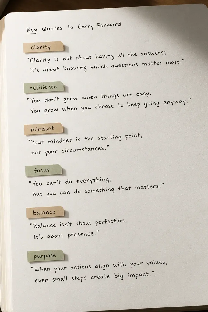
Paper tabs make key quotes look like they’re labeled for a display. You glue small tab strips above or beside quote lines, then write the quote category on the tab. The page becomes scannable, and the tabs create a strong vertical rhythm that looks good under overhead light. It’s perfect when you want a “find it fast” page for themes like gratitude, conflict, or transformation.
Cut 6-10 small tabs from colored paper, about 1.5 cm wide and 4-5 cm tall. Glue each tab lightly along the top edge so it lifts slightly. Write short quote lines on the page, then stick the tabs pointing toward the matching quote. Add a small category word on each tab in black, and finish with one thin border line around the whole quote section.
Use matte glue so the tabs don’t look shiny in photos.
Don’t stack tabs directly on top of text — the shadows make letters harder to read.
15. Blackout Quote with White Gel Pen Lettering
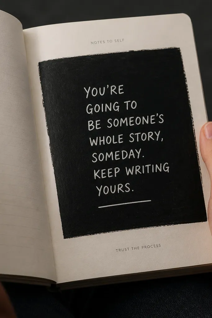
This is dramatic and modern because it treats text like design, not handwriting alone. You cover a quote area with matte black ink or solid black marker, then write the quote back in white gel pen. The contrast is extreme, so it looks crisp in photos and stands out even with messy handwriting. Use it for one killer line per page — the whole page stays clean and the quote becomes the hero.
Choose a quote line and lightly pencil where it will sit. Use a brush pen or matte black marker to fill a rectangle area behind the quote; keep edges straight with painter’s tape. Let the black dry fully, then write the quote in white gel pen, staying inside the rectangle. Add a small book title line above in black or gray so the page isn’t only darkness.
Pro tipUse matte black ink, not glossy — glossy reflects light and washes out the white text.
AvoidAvoid writing too small — white gel pen needs enough space to stay legible.
16. Gradient Highlight Bands Across a Paragraph
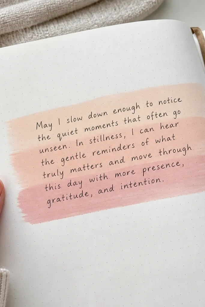
Gradient highlight bands look modern because they add color in a controlled, linear way. You pick one paragraph of reflection, then paint or marker-blend two or three horizontal bands behind it. The text stays readable because the gradient is light and sits under the ink. This style is great for “reaction” pages where you want your thoughts to flow but still look designed.
Write your paragraph first in black so you know where the text sits. Then tape two thin horizontal guide lines above and below the lines you want highlighted. Use a watercolor wash or alcohol marker blend to create a soft gradient band across the taped area, keeping it semi-transparent. Let it dry, then remove tape and add a single accent under one sentence with a fine brush pen.
Keep gradients light by testing on scrap paper — heavy color kills readability.
Don’t highlight every line — two or three bands is what keeps it modern.
17. Perspective Rectangle Frame with Vanishing Point Doodle
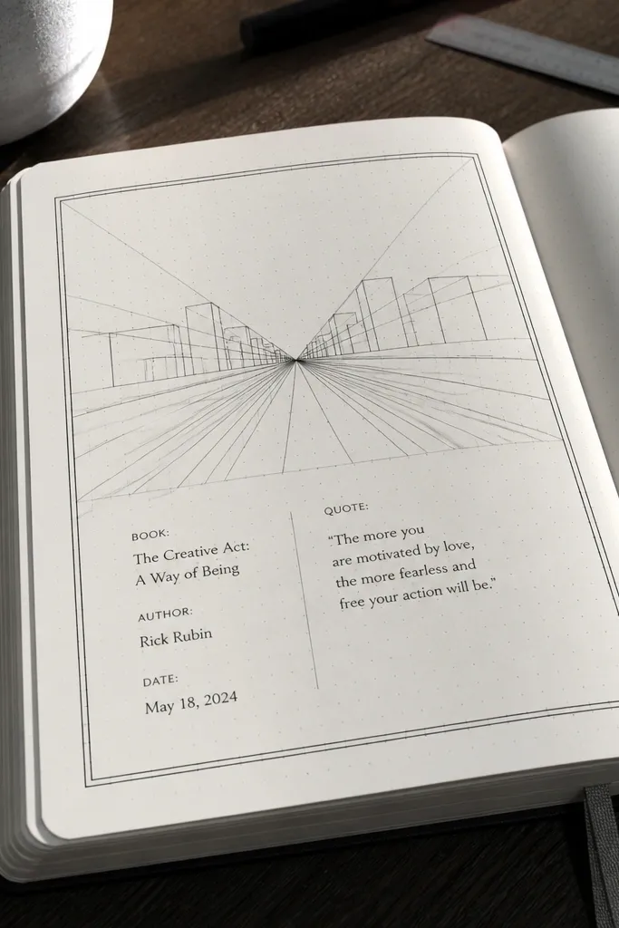
Perspective frames look architectural and modern without needing fancy art skills. You draw a rectangle frame that “recedes” toward a vanishing point, then place your book info and quote inside. It’s photogenic because the lines guide the eye and create depth on a flat page. Use this when you want a more graphic look for a cover page, book summary, or favorite chapter spread.
Pick a vanishing point on the lower third of the page. Draw two diagonal lines from the vanishing point to corners of an inner rectangle. Connect them with a top and side line to complete the perspective frame. Write your title and a short quote inside, and keep the text left-aligned so the geometry stays the focus.
Pro tipUse a ruler for the diagonal lines — perspective looks right when they’re straight.
AvoidAvoid freehand perspective — crooked angles make it look accidental.
18. Monogram Initial Page with Subheading Blocks
A monogram initial page is modern because it reads like stationery, not a scrapbook. Use the first letter of the book title as a large initial in black, then add small subheading blocks for theme, setting, and one quote. The page stays photogenic because your eye lands on the big shape first, then moves to tidy text blocks. It’s a strong starting page for each book, especially if you track multiple titles.
Choose the book’s first letter and write it big, about 8-10 cm tall, using a black fineliner. Draw three or four small rectangles under it for subheadings, each about 4 cm wide. Write the subheading words in the rectangles, then add 1-2 lines of content under each one. Finish with a thin underline under the monogram and one small accent dot in your chosen color.
If lettering scares you, print the letter outline on tracing paper and trace it.
Avoid busy doodles around the monogram — the letter should be the main graphic.
19. Grid Map of Characters with Color Key
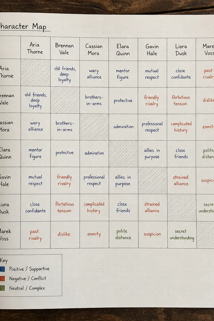
Character maps look modern because they turn relationships into a tidy visual grid. You draw a grid with character names as headers and short notes in the cells, then add a small color key for relationship types. This is perfect for novels, fanfiction reading, or any book where connections matter. The grid makes pages easy to scan later, and the color key keeps it from turning into a wall of text.
Draw a grid with 4-6 columns and 4-6 rows, leaving room for a top header row. Write character names in the header cells, then fill each cell with a short relationship note like “allies,” “rivals,” or “family.” Add a small legend on the side: colored dots with labels that match your relationship types. Use one accent color for one relationship category and keep all other notes black.
Keep cell text to 3-6 words so the grid stays readable in photos.
Avoid adding too many relationship categories — two or three colors keeps it modern.
20. Glossy Sticker Overlay with Matte Text
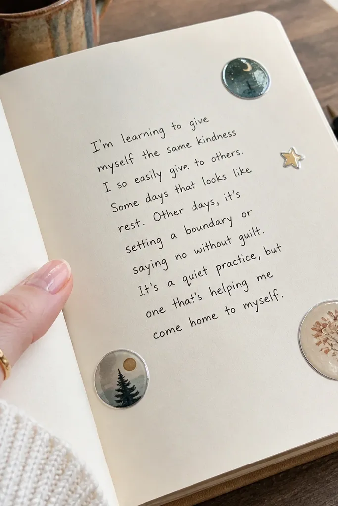
This style is photogenic because it mixes finishes: matte text and glossy sticker highlights. Use a few sticker shapes that match your palette, like small circles, stars, or book icons, and place them around a clean text block. The gloss catches light and makes the page feel styled without covering everything. It’s a good option when you want a modern look but you don’t want to draw frames or geometry.
Write a clean paragraph or bullet list first in black fineliner. Place 3-5 glossy stickers around the text block, keeping them near the corners or edges so the center stays readable. Add one accent underline or date line in your chosen accent pen. Press stickers down firmly and rub the edges gently so they don’t lift.
Pro tipChoose stickers with flat edges and avoid puffy foam stickers — they look messy in overhead shots.
AvoidAvoid stacking stickers directly on handwriting — the shine makes letters hard to read.



