
1. Two-Column Quote Frame with Side Index
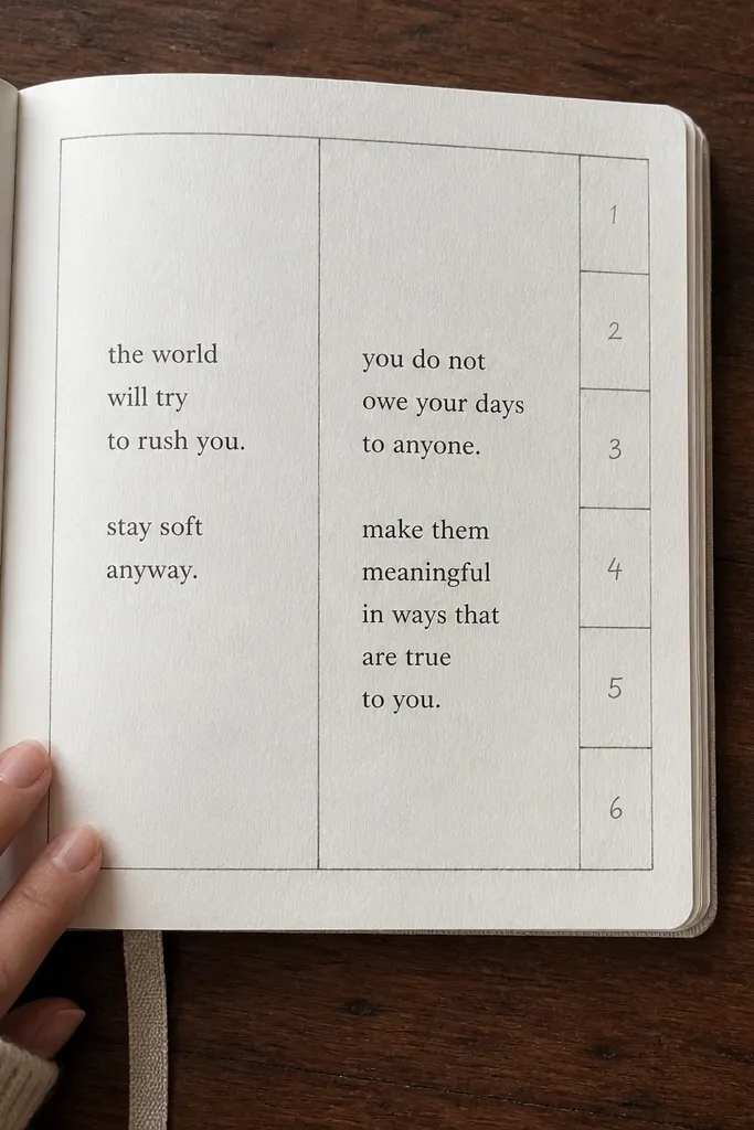
Start by drawing a vertical center line with a ruler, then create two equal-ish columns (for example, 2.5 cm left, 2.5 cm right on a standard A5 page). Add a narrow margin strip on the far left for the index, about 1 cm wide, and write numbers from 1 to 6 down that strip. In the main area, block out a large rectangle for the quote on the right column and keep notes in the left column. Finish by underlining the header and writing the final lines with a fineliner, keeping the quote font slightly larger.
This layout is built for quote-heavy reading. You get a big, calm quote area that looks like it belongs in a book, not scribbled on loose paper. The side index makes the page scannable, so your future self can find quotes by number without hunting. It stays modern because the columns keep your text aligned and the index is visually small, not distracting. Skill level is beginner, and it takes about 10-15 minutes once you’ve drawn the grid.
AvoidDon’t mix three font sizes inside the quote block; pick one size and stick to it.
Pro tipWrite quotes with one consistent line length by using the ruler edge as a text guide.
2. Theme Radar Rings with 5 Labels
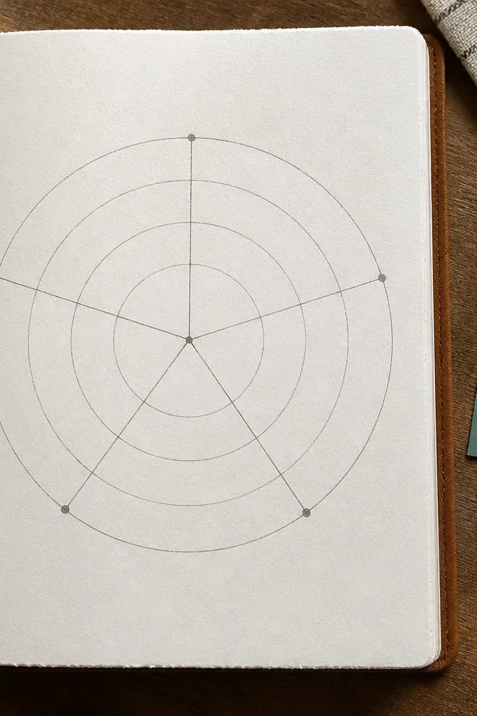
Trace a circle centered on the page, about 6-7 cm in diameter, then draw a smaller inner circle for contrast. Divide the circle into five sections using a ruler and light pencil lines. Label each section around the outside with short theme words, one per segment. Fill each segment with a short note and one highlight mark (a dot or tiny dash) where the theme shows up most.
If you track themes, this layout turns notes into something visual without getting complicated. The rings give your page structure, and the five labels keep it from becoming a long list. It looks good because the circle shape creates a focal point, and the labels sit neatly around it like a design element. This works best for books where you want to capture repeated ideas (fear, choice, grief, ambition, etc.). It’s simple enough for a beginner, and you can finish it in 15 minutes with a compass or a traced circle.
AvoidDon’t write full sentences around the circle; keep labels short and put details inside the segments.
Pro tipUse a single accent color for the five labels so the rest of the writing stays calm in photos.
3. Minimal Top Banner Log with Date + Mood
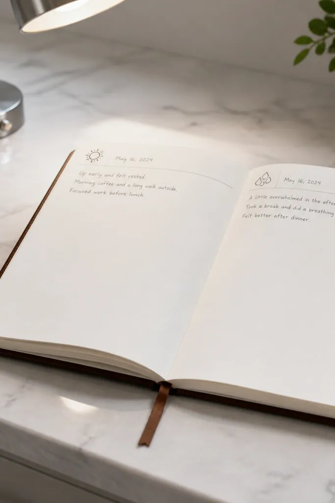
This is the layout I recommend when your writing is messy because you rush. The top banner forces a clean start, and the page stays organized even when the body notes vary. It’s modern because it uses space — lots of white paper, a clear header, and small icon details. Use it for quick daily reading logs, especially when you only have a few minutes. The build is fast, and it looks sharp in overhead photos.
Draw a horizontal rectangle banner across the top, about 3 cm tall, and leave 1 cm margins on each side. Inside, write the date on the left and a mood word or number on the right (like 1-5). Under the banner, create three lines or a small ruled box for “What I read,” then add another box for “One idea I liked.” Finish with a single thin underline under the header text.
Use a ruler to keep the banner edges perfectly straight; that one detail makes the whole page look designed.
Don’t add more than two icon elements; extra doodles turn it into clutter.
4. Accordion Sections for Chapters (4 Blocks)
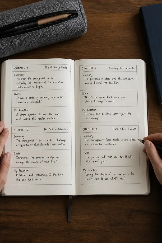
On a blank page, draw a vertical margin line about 1 cm from the left edge. Create four horizontal panels stacked from top to near bottom, each about 5-6 cm tall, with thin pencil lines first. Label each panel on the left with one word (Summary, Quote, Theme, Reaction). Write short entries inside each panel and keep the text aligned to the same starting point.
This layout makes chapter notes look organized without making you write long paragraphs. The accordion blocks create four clear zones, so you can capture summary, quotes, and reactions in separate spaces. It looks modern because the lines are crisp and the blocks are consistent in height. It’s especially good for books where you read in chunks and want to reflect on each section. Time is about 15-20 minutes depending on your pen habits.
AvoidDon’t cram long summaries into one panel; keep each entry to 2-4 lines.
Pro tipIf you use fineliner, press lightly for the pencil guide lines and erase them once ink is dry.
5. Diagonal Quote Slab with Corner Date
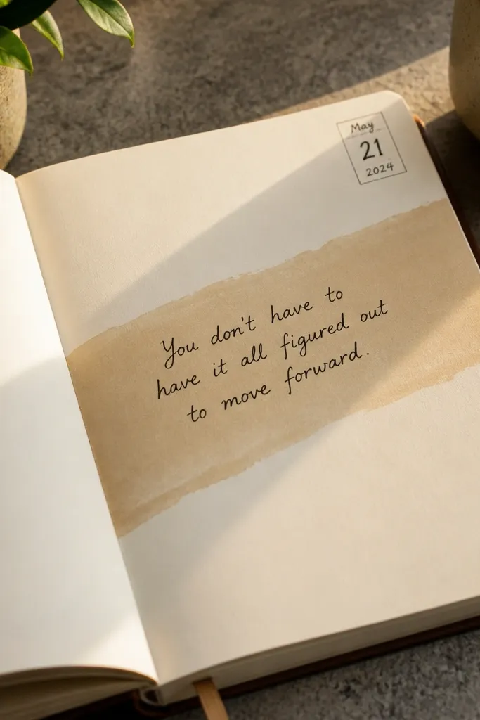
This one is for the “I want it to look styled” mood. A diagonal slab breaks the grid in a controlled way, so the page feels modern instead of scrapbooky. The corner date keeps the composition clean and prevents the header from taking over. It works best for one big quote plus a few short notes, not for long reading logs. Skill is beginner, and the only trick is getting the diagonal line straight.
Write your date in a corner box, about 2.5 cm wide, then choose where the diagonal slab will start. Use a ruler to draw a diagonal rectangle (for example, start near the top left margin and end near the bottom right margin). Shade only the slab border with light color wash or colored pencil, keeping the center mostly white. Put the quote inside the slab and add two short note lines below it.
Use a light gray pencil for the diagonal guide so you can erase it cleanly after inking the border.
Don’t outline the entire page; keep the diagonal slab as the only bold shape.
6. Three-Bar Section Header with Color Coding
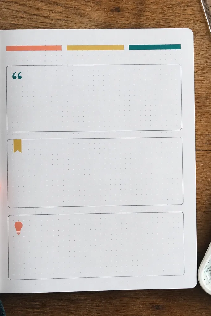
Draw three horizontal bars across the top, each about 4 cm long and 0.6-1 cm tall, with a 0.5 cm gap between them. Label each bar with short text: Quotes, Themes, Notes. Under each bar, draw a matching box that’s the same width as the bar and fill it with short entries. Use one color for the bars and keep the writing in black for contrast.
If your journal tends to mix content, this fixes it. Three color bars act like tabs without adding bulk, and each bar tells you what to write in that section. It’s modern because the bars are thin, aligned, and consistent in spacing. You can use it for any book, but it’s especially good when you want quotes, themes, and your personal notes separated. It takes about 20 minutes the first time, then faster after you reuse the template.
AvoidDon’t use five colors; three bars are plenty for a clean look.
Pro tipLet the colored bar dry fully before writing over it to avoid smudging.
7. Numbered Reading Timeline with Milestone Dots
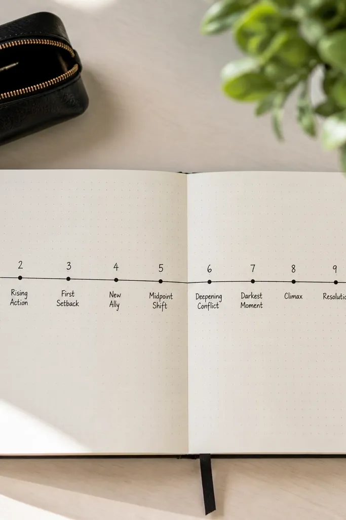
This layout keeps pacing notes from turning into vague reflections. The timeline gives you a sense of progression, and the milestone dots make it easy to spot the moments that mattered. It looks modern because the line is straight and the dots are evenly spaced. Use it for longer books where you want to track chapters, page counts, or “what changed” over time. It’s beginner-friendly and takes 15-25 minutes.
Draw a horizontal line across the middle of the page, leaving margins of about 1 cm on both sides. Mark 5-7 evenly spaced tick points along the line, and write a short number under each (like 1-6). Place a small dot above each tick, then draw a small box next to each dot for your milestone note. Keep each milestone to one short sentence or two lines max.
Use the same dot size for every milestone; consistency is what makes it look designed.
Don’t place milestone boxes randomly; keep them aligned to the same side of the line.
8. Minimalist "Book Snapshot" Grid (6 Cells)
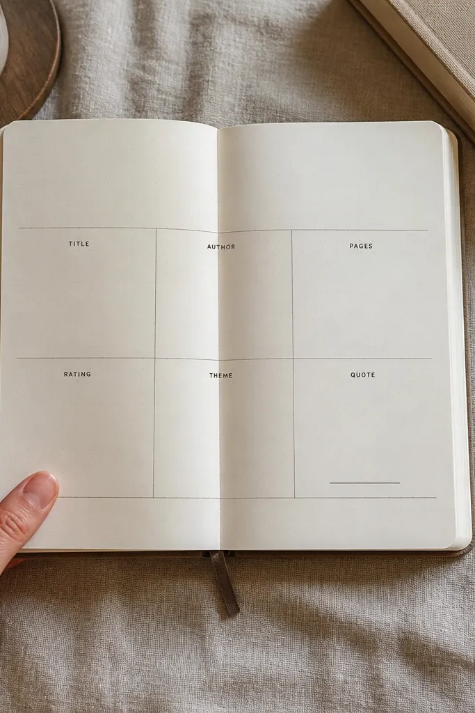
This is a clean, modern layout for people who want a fast overview. Six cells force you to limit each note, so the page doesn’t become a wall of text. It looks photogenic because the grid is tidy and the labels keep everything readable. Use it at the end of a book or after a big reading session. Time is about 10-15 minutes because the structure does the heavy lifting.
Draw a 2x3 grid using a ruler, leaving consistent margins (about 1 cm). Label the cells with short prompts like Title, Author, Genre, Favorite Quote, Theme, Rating. Fill each cell with 1-3 lines of writing, then add one small star or dot rating in the Rating cell. Finish by drawing a thin line around the whole grid or just the header row.
Write labels in uppercase and keep them smaller than the content text for instant hierarchy.
Don’t squeeze long quotes into multiple cells; keep quotes in one dedicated cell.
9. Corner Icon Set with Quote Block Center
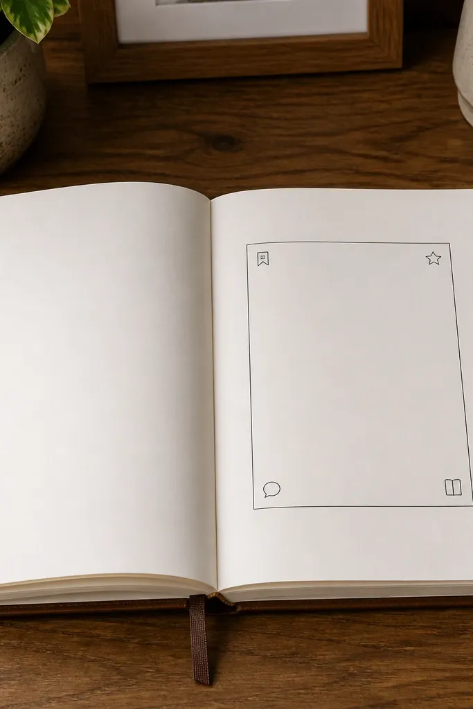
This layout uses negative space and tiny icons to make a simple page look intentional. The quote block sits center stage, while the corner icons act like decoration that doesn’t steal attention from your writing. It’s modern because icons are small, aligned, and repeat the same stroke weight. Great for a single quote spread with minimal notes. Build time is about 12-18 minutes depending on how neat your icons are.
Draw a rectangle quote block in the center of the page, about 12-14 cm wide and 8-10 cm tall, leaving margins. Add a small icon in each corner of the page area (three corners is enough), using the same line thickness each time. Write a short header above the quote block and add one note line beneath it. Keep the icons monochrome and don’t shade them.
Pick one icon style and stick to it — simple dots and lines look best with fineliners.
Avoid filling corners with full scenes; tiny symbols only.
10. Hand-Drawn Grid with One Thick Border Page Frame
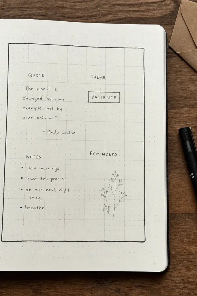
Draw a thick rectangular frame around the page content area, keeping the frame about 6-8 mm from the edges. Inside, divide the space into 4-6 smaller boxes using a light pencil guide first. Label one box as Quote, one as Notes, and one as Themes; leave the rest for chapter summary or questions. Ink the frame and the box lines with a fineliner, then erase pencil guides once dry.
A grid alone can look plain. A thick border frame makes it look styled while still giving you structure inside. This layout is ideal for mixed notes: quotes, thoughts, and quick theme tags all on one page. It works because the eye reads the frame first, then moves to the grid. It’s beginner-friendly — you’re basically drawing straight lines with one bold edge. Time is about 20 minutes for a first build, less after that.
AvoidDon’t make the internal boxes too dense; leave at least one larger box for comfortable writing.
Pro tipUse one pen weight for the frame and a lighter line for internal boxes to keep it modern.
11. Staggered Bullet Quotes with Wider First Line
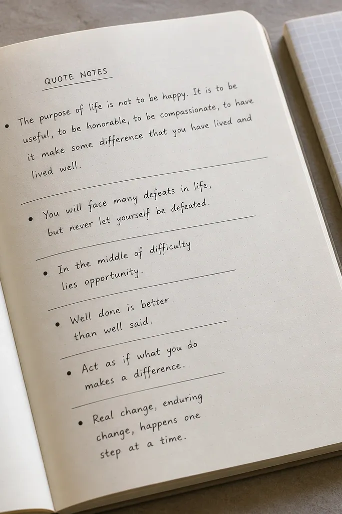
Draw a small header at the top, then create a wide text line area for the first quote, about 8-9 cm long. Below it, set up 4-6 bullet lines that alternate between 6 cm and 7 cm widths using ruler guides. Write each quote in 1-2 lines max, and add a tiny dash or dot at the start of each bullet line. Keep all bullets aligned to the same left start point for a clean look.
This layout makes quote notes look like a designed list instead of a clump. The wider first line creates a strong entry point, then the staggered bullets guide your eye down. It’s modern because the spacing is intentional and the line lengths change on purpose. Use it for books where you pull multiple short passages and want them to feel curated. It’s quick — around 10-15 minutes.
AvoidDon’t let quotes wrap to three lines; it breaks the staggered rhythm.
Pro tipUse one consistent bullet shape (a filled dot or a thin dash) so the page looks cohesive.
12. Page Split with Left Margin Notes and Right Summary
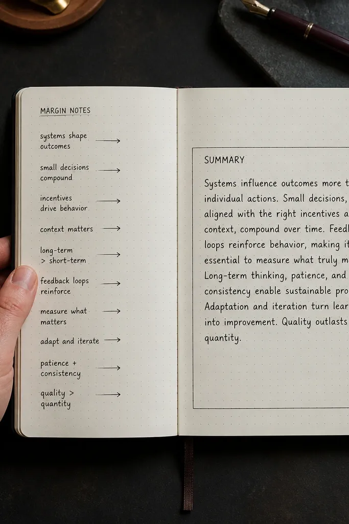
This layout mimics the look of a well-marked book page. The left margin is for quick notes, while the right side holds a clean summary. It’s modern because the margins are clean and the writing areas have clear boundaries. Use it when you want to track connections, questions, or reactions without crowding your main summary. Skill is beginner, and it takes about 15 minutes.
Draw a vertical line about 3 cm from the left edge and treat everything left of it as the margin notes column. On the right, create a larger box for “Summary” that runs from top to near bottom. Add a header at the top of the right box and write the summary in short paragraphs or bullet points. On the left margin, write 3-5 short notes, each starting with a small symbol (question mark, star, or arrow).
Write margin notes slightly smaller than the summary text so the hierarchy feels natural.
Don’t use the same font size in both columns; it makes the split look accidental.
13. Zigzag Divider with Quote + Reflection Panels
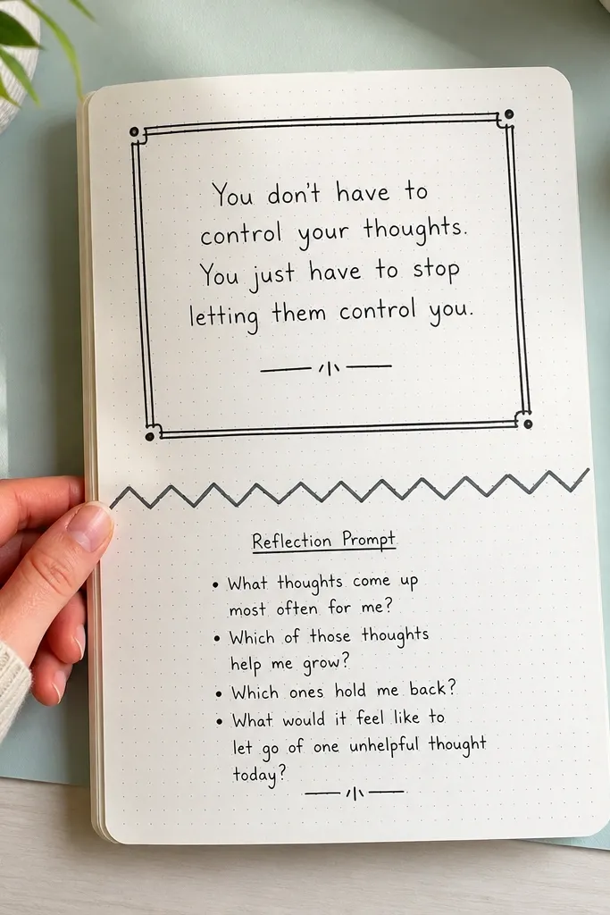
Draw a horizontal divider line across the page, then replace it with a zigzag pattern by making small peaks and valleys every 1-1.5 cm. Above the zigzag, draw a quote panel rectangle and write your quote in 3-6 lines max. Below it, draw a reflection panel and label it with one short word like Reflection or What I noticed. Finish by inking the zigzag divider darker than the panel borders.
A zigzag divider adds energy without turning the page into doodles. You get two panels: one for a quote, one for reflection, separated by a clean, repeating shape. This is modern because the zigzag is controlled and sits between structured sections. It works well for journaling after finishing a chapter or a short book where you want one quote highlight plus your reaction. Time is about 15-20 minutes with careful line work.
AvoidDon’t make the zigzag too tall; big peaks make the page look childish.
Pro tipLightly pencil the zigzag first, then ink only after the spacing looks even.
14. Minimal Checklist Spread for Reading Goals
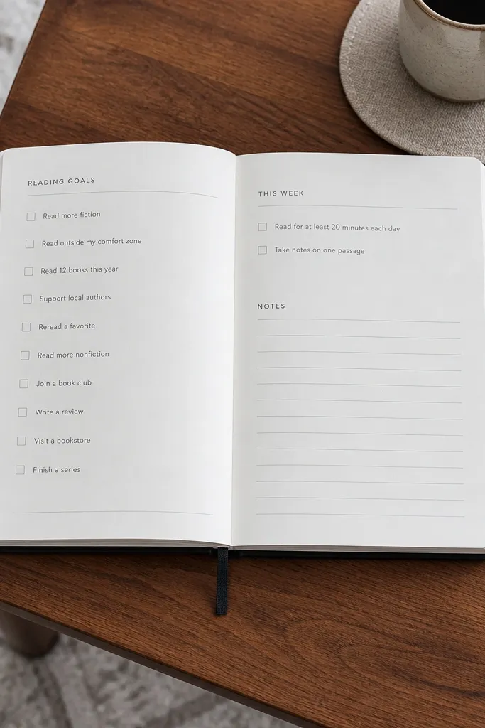
Draw a simple grid with one wide top header area and two columns below it. Put 6-10 checklist items in the left column, each with a checkbox box about 0.7 cm wide. In the right column, add a small note area for page counts or time spent. Add a thin underline under the header and keep the rest of the writing aligned to the same start point.
This layout is for practical journaling — goals, habits, and quick progress notes. It looks modern because checkboxes and short labels create a tidy structure, and the page stays mostly white. Use it when you want your journal to track reading behavior, not just content. It also works for tracking weekly reading goals: pages, chapters, or audiobook minutes. Beginner-friendly and fast at 10-15 minutes.
AvoidAvoid mixing circles and squares; stick to one checkbox shape.
Pro tipUse one checkbox style for every item so the spread looks consistent in photos.
15. Pocket-Map Margins with a Single Big Compass Quote
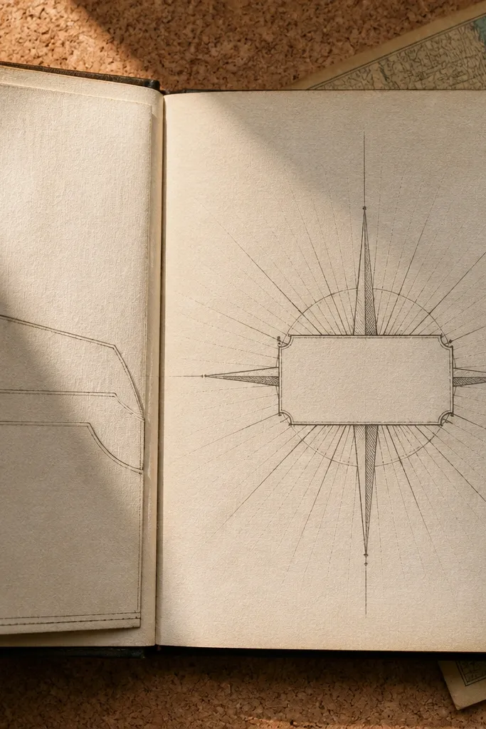
Cut a left margin pocket from 110 lb cardstock or thick paper at 3.25 in wide and 8.5 in tall (letter-size layout). Score a fold 0.75 in from the pocket’s right edge, then crease hard with a bone folder so the pocket stands up cleanly. Glue the pocket only on the outer vertical edge and the bottom edge — leave the top open — then reinforce the inside fold with a thin strip of double-sided tape. Draw a compass frame in pencil: a circle about 4.25 in wide centered on the page, with four short cardinal ticks and a small dot in the center. Letter one bold quote inside the compass, then add tiny “N / E / S / W” labels around the circle in the same ink color so it looks intentional.
This layout is simple because it uses two repeatable shapes: a pocket panel along the left margin and a compass-style quote block in the center. It looks striking because the pocket edges create real visual depth, and the compass lines give you a clean, graphic structure even with messy handwriting. You get a page that feels interactive without turning it into a scrapbook project. It works great for reading logs, poetry, or any book where you want one “direction” quote to anchor the page. Skill level is beginner-friendly — you’re basically cutting, scoring, and gluing straight lines — and it takes about 45 to 60 minutes once your measurements are set.
AvoidAvoid gluing the pocket on the top edge — it kills the pocket function and makes the page look unfinished.
Pro tipUse a ruler + craft knife for the pocket edges, and press the glue seams for 30 seconds with a scrap sheet so the pocket doesn’t lift later.



