
1. Rainbow Header Band With Clean Block Caps
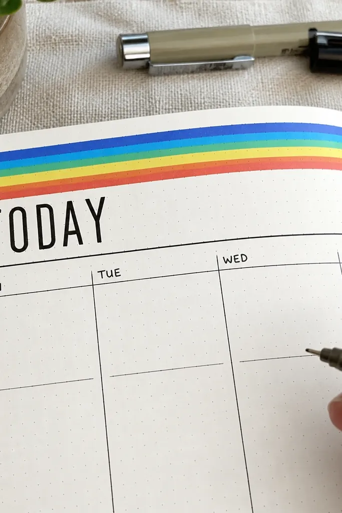
This design makes your page look styled even if you only fill a few lines. The rainbow header creates instant focus at the top, and black block caps keep the text readable. It works best for weekly spreads, daily task pages, and “today” pages where the header gives structure. Use thin fineliner for the text and one thick marker for the header lines so the contrast stays sharp in photos. The result is bright but controlled — no clutter creeping into the rest of the page.
Start by drawing a rectangle header area across the top third of the page with a light pencil guide. Then color it in with 5-7 horizontal stripes using one color per stripe, keeping each band the same height. Finally, write your title in black block caps inside the header and add your tasks below in simple rows or a single column. If you want extra polish, underline the header with one thin black line after the color dries.
Let the marker sit for 30-60 seconds before you write over it; it prevents smudges on smoother paper.
Don’t vary the stripe height — uneven bands make the whole page look rushed.
2. Monochrome Checklist With One Accent Icon Column
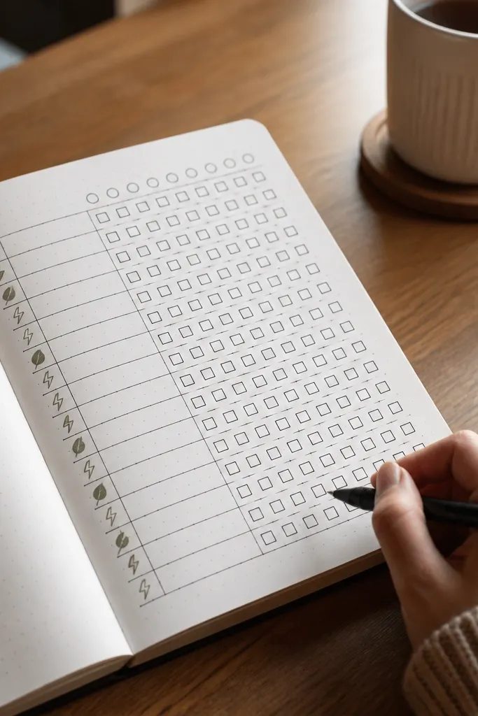
If your pages look flat, this fixes it without adding extra work. The checklist is pure black ink, which keeps everything crisp, and a single accent icon column adds a graphic rhythm. It’s perfect for routines, study trackers, and “habit by day” lists because each row already has a job. The one-color icons also photograph well because the rest stays calm. You get a clean look that still feels designed.
Draw a left margin column about 1.2 cm wide, then outline a checklist grid with equal spacing for rows. Use black fineliner for every box and line so the page stays consistent. Pick one accent color and add a tiny icon in the left column for each row (star, droplet, book, dumbbell, etc.). Keep icons the same size and line weight so they look like a set.
Use a ruler for the checklist row spacing; it makes the icons look intentional instead of random.
Don’t use multiple accent colors — you’ll lose the clean, monochrome effect.
3. Dot-Grid Ombre Sidebar
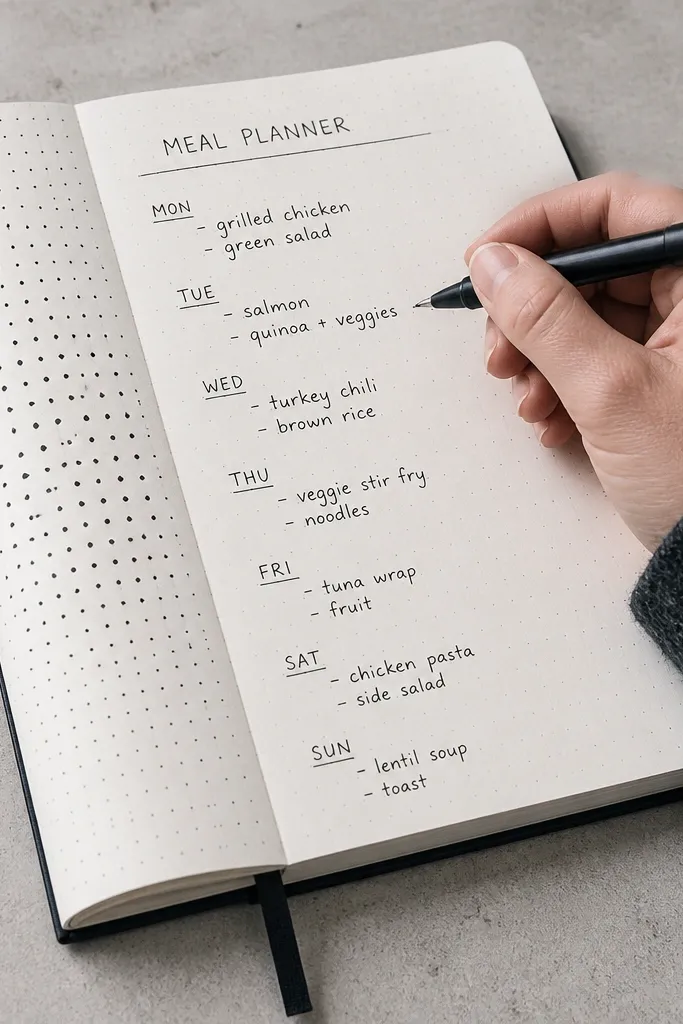
This turns a plain sidebar into a texture that looks expensive but takes minutes. Dot-grid ombre gives you depth without heavy shading, and the fading effect frames the page content. It’s great for trackers, meal planners, and project logs where you want an easy visual anchor. Because the dots follow a pattern, the page stays neat even if you’re not confident drawing. The ombre also makes the page feel dimensional in photos.
Lightly mark a vertical strip on one side of the page, about 1 cm to 1.5 cm wide. Starting at the top, place dots in a tight grid using your fineliner or a fine marker, then gradually reduce dot density as you move down to create the ombre. Keep the dots aligned to the same imaginary rows so it looks intentional. Finish by adding your headings and entries in black ink to the right of the dot strip.
Make your darkest section about the top 20-25% of the sidebar; that’s where ombre looks strongest.
Don’t stretch the ombre too long — if the fade is too subtle, it reads like smudging.
4. Diagonal Stripe Section Dividers
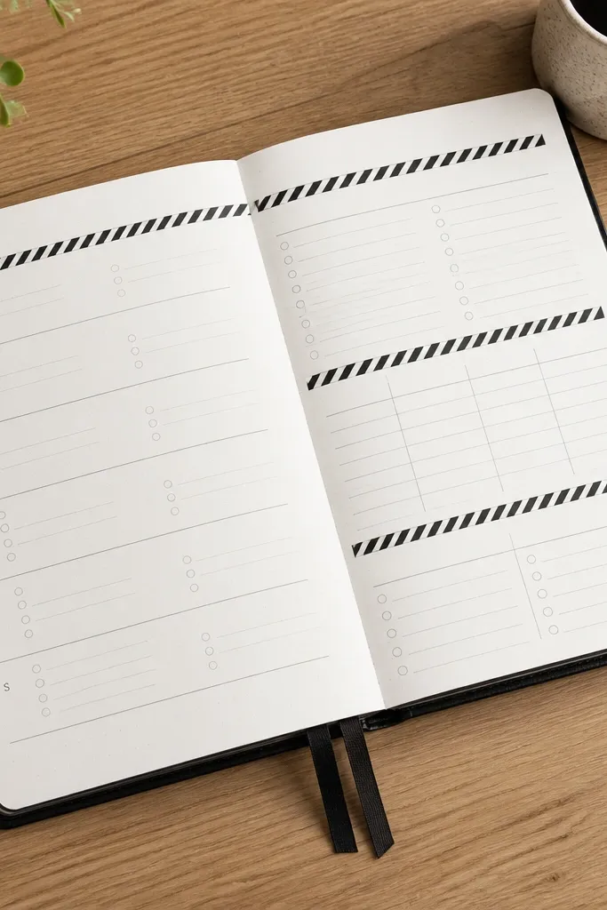
Diagonal stripes give instant structure and make your page easier to scan. Instead of drawing fancy boxes around everything, you separate sections with clean stripe bands. This works perfectly for weekly pages that need a notes block, a budget block, or a “wins” section. The diagonal lines also create movement, so the page looks dynamic instead of static. It’s one of the fastest ways to make a spread look designed.
Plan your sections first with light pencil lines so you know where the stripe dividers go. Draw diagonal stripe bands across the divider area using a ruler as a guide for straight lines. Keep stripe spacing consistent, and color only the stripes — leave the rest black-and-white. After the stripes dry, write section titles directly on the white space between bands or on the line.
Use a pencil to map the stripe angle, then commit with marker once it’s aligned.
Don’t let stripes cross your text — keep them as dividers only.
5. Washi Tape Corner Frames
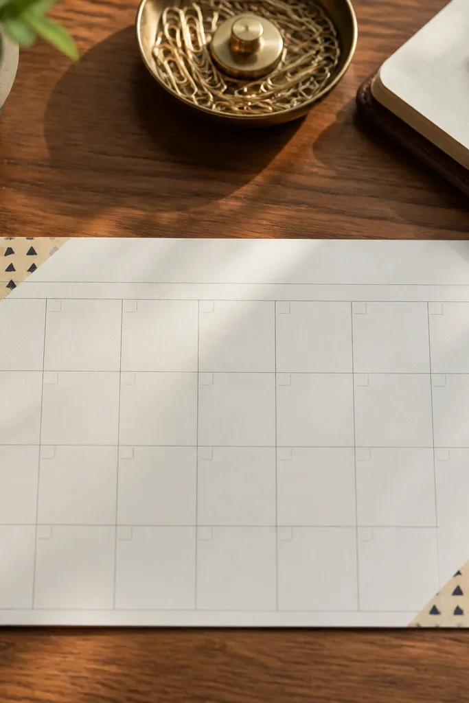
Corner frames make a page look styled without covering your handwriting. You get a clean border effect while still leaving the center open for tasks and charts. This is ideal for monthly calendars, reading logs, and anything you want to keep readable. Choose one washi pattern and repeat it in the same spot style across multiple pages so your journal looks cohesive. It also hides small layout mistakes because the frame tells the eye where to look.
Cut four small washi tape pieces and place them as corners around your title area, leaving the middle open. Keep the corners aligned by measuring the same distance from the page edge each time. Then draw your tracker grid or bullet list in the center using black fineliner. Press down gently and avoid stretching the tape — stretched tape can lift and catch on paper edges.
Seal the tape edges with one thin pass of clear glue stick if your pages smear easily.
Don’t cover more than 15-20% of the page with tape; too much makes it busy.
6. Doodle Stars Around a Center Title
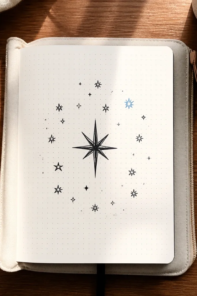
This is the easiest way to add personality while keeping the layout clean. The center title gives your page a clear focal point, and the star doodles add charm without clutter. It’s perfect for goal pages, reading goals, or a “monthly theme” page where you want it to look fun. Keep the doodles small and evenly spaced so the page reads organized. The black outline stars also work with any color scheme you use elsewhere.
Pro tipUse a tiny star size you can repeat ten times without getting bigger — it keeps the page balanced.
Write your title in the center using block letters or thin script — pick one style and stick to it. Add 10-16 small star doodles around the title, leaving consistent gaps between them. Use a single accent color for 3-5 stars, and keep the rest black outline only. Finally, place your list items below in a simple column with boxes or dots so the page stays readable.
AvoidDon’t add stars on top of your text lines; keep them in the header zone.
7. Thin-Line Box Grid With One Color Counter
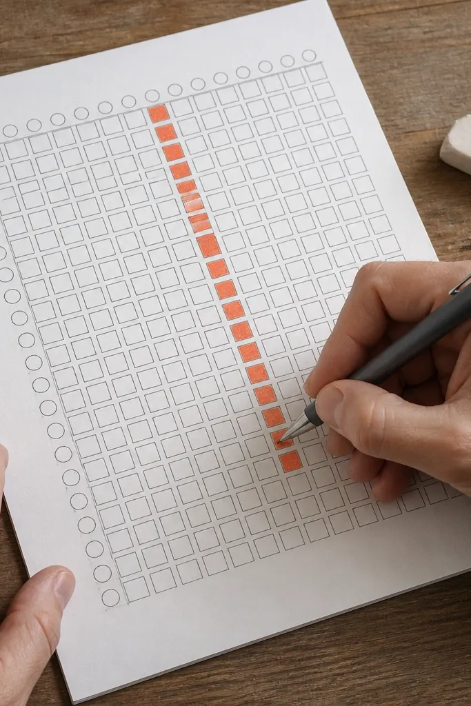
A thin-line grid looks crisp and modern, and one colored counter adds the “designed” feeling. This works for progress trackers, study sessions, and weekly goals where you want a visual fill without complicated art. The thin lines keep it from looking heavy, and the single colored box gives instant visual feedback. It’s also easy to replicate across multiple pages so your journal looks consistent. You can do this in under 30 minutes once you get the spacing right.
Draw a grid of small boxes using a light pencil first, then trace with fineliner. Pick a size that fits your page — for most notebooks, 6 columns by 5 rows is a good start. Label the grid at the top with a short title in black. Choose one accent color and fill a single box each time you complete a step, leaving the rest white.
If your fineliner bleeds, switch to a 0.3 pen and keep your lines lighter on the first pass.
Don’t make boxes too tiny — cramped grids look messy instead of clean.
8. Hand-Lettered Title Underlined by Brush Pen Waves
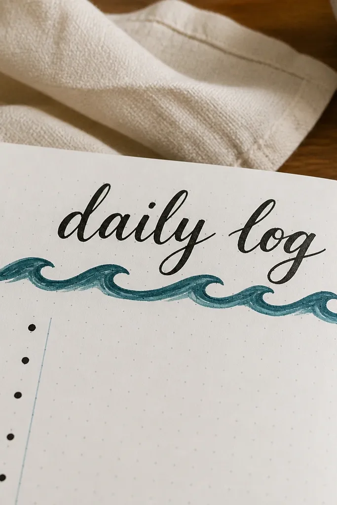
This idea adds movement with almost no drawing skill. The brush pen wave underline looks artsy, and the title stays the focus. It works for daily logs, reading pages, and any spread where you want a “header moment” without a full border. The wave line also creates a clear separation between the header and the content. If your handwriting isn’t consistent yet, this helps because the wave line draws attention away from minor letter differences.
Pro tipPractice the wave line on a scrap page first so you keep the rhythm consistent across the title width.
Write your title at the top using black fineliner or a brush pen, then leave a small gap below it. Draw a single continuous wave line underneath — keep the waves the same height across the width of the title. Color the wave line with one accent color or keep it two-tone by using a darker shade for the peaks. Write your list below in simple bullets or checkboxes aligned in rows.
AvoidDon’t stack multiple wave lines — one underline looks clean; three turns into decoration noise.
9. Corner Arrows To Guide Reading Flow
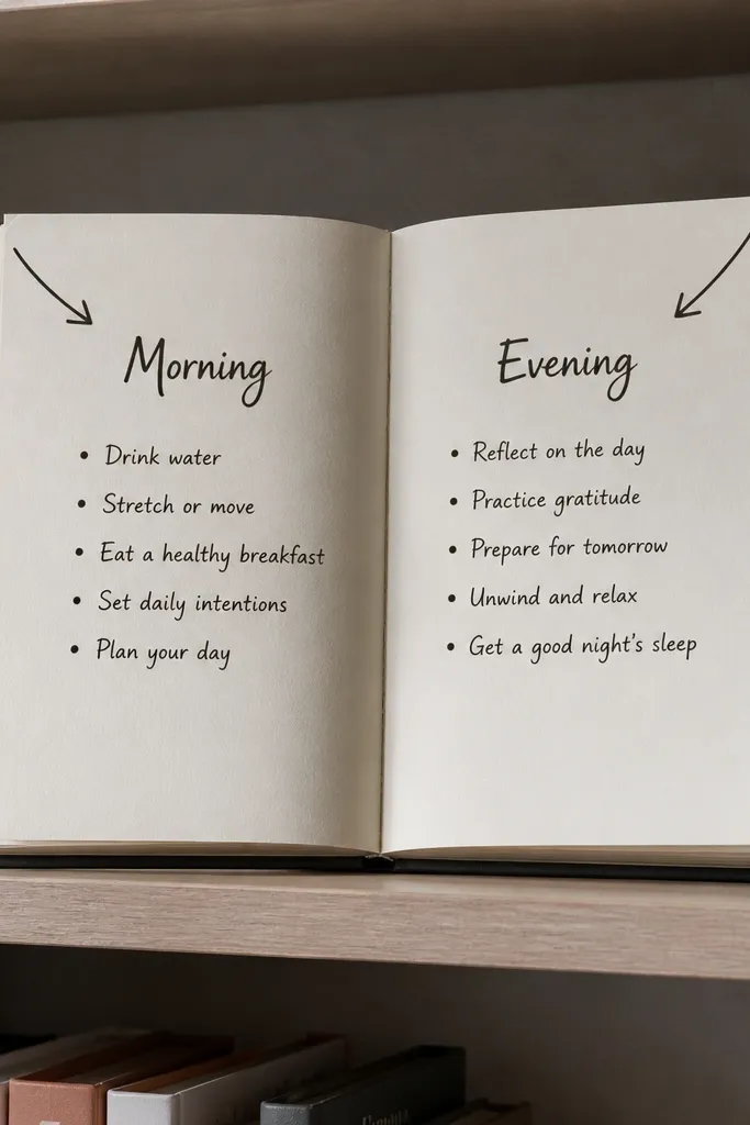
Arrows are underrated because they make your page feel organized even when you’re using a simple list. Place arrow doodles in the corners pointing inward to guide the eye toward headings. It’s especially good for pages with two sections, like “morning” and “evening,” because the arrows help separate attention. Use black outlines for the arrows and one accent arrow color to highlight the section you care about most. The look is minimal, but it reads clear in photos.
Add two headings on your page with a light pencil guide for spacing. Draw a small arrow in each corner that points toward the appropriate heading area. Keep arrow size consistent and use fineliner for crisp edges. Then fill in your bullets or checkboxes under each heading in neat rows.
If you’re using two sections, make the arrow color match the section accent you use for titles.
Don’t add arrows to every list item; keep them as page-level guides.
10. Confetti Dot Title With One Big Outline Letter
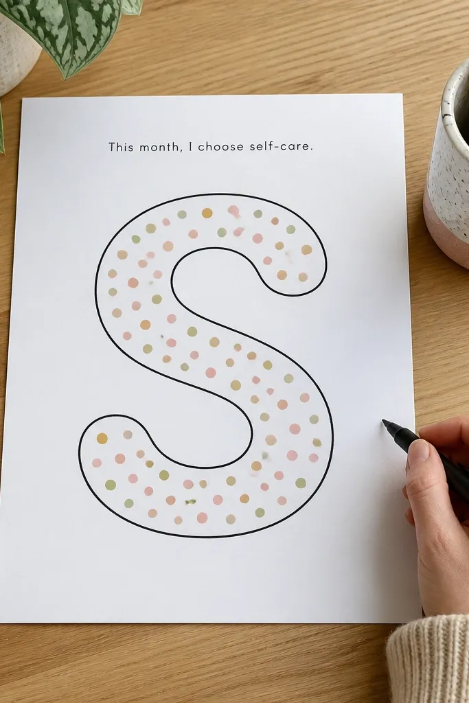
This design is punchy and still quick because it uses one big element. A single oversized outlined letter anchors the page, and confetti dots add texture without drawing detailed art. It’s great for month themes, weekly focus pages, and “self-care” spreads where you want it to feel playful. Use a limited palette: black plus one accent color. The outline letter also keeps the page from feeling too filled — lots of white space stays visible.
Pro tipTrace the big letter lightly first; outline letters look cleaner when the edges are planned.
Pick one letter for your title (like M for Month) and draw it large at the top using an outline style. Then add small dots around it in a scattered pattern, mixing black and one accent color. Keep the dots random but sized consistently, so it doesn’t look like smudging. Add your tracker or bullets below in a simple left-aligned column.
AvoidDon’t use too many dot colors — two colors max keeps it photogenic.
11. Mini Stairs Checklist Rows
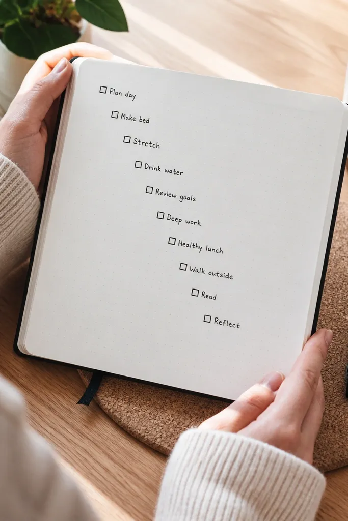
Stairs layout turns a plain checklist into a graphic, which is why it looks good in photos. Each item sits slightly higher or lower, so the eye follows the list naturally. This works for “top 5,” “priority tasks,” or any page where you want to show order. The design also helps if your handwriting varies because the boxes create a consistent structure. Keep it to 7-10 items so it stays light and readable.
Draw a header at the top, then plan 7-10 checklist rows. For each row, shift the checkbox and text slightly right while also moving it up or down by a small amount, creating a step effect. Use a ruler to keep the steps even. Finish by connecting the rows with a thin line or leave them separate for a cleaner look.
Use the same checkbox size for every step; inconsistent box sizes ruin the stair rhythm.
Don’t make the steps too steep — tiny shifts look stylish, big shifts look cramped.
12. Sideways Calendar Grid With Month Title
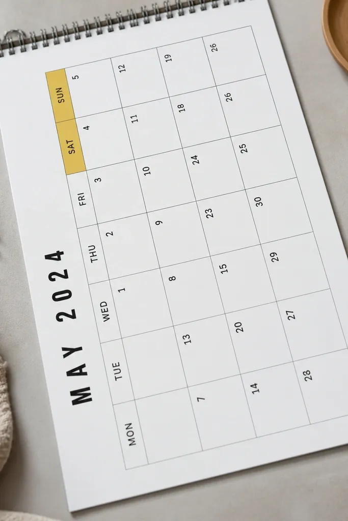
A sideways grid looks different from the usual straight calendar layout, so it stands out without extra drawing. It’s still a calendar, so it’s functional, but the rotation gives you that aesthetic punch. This works for month-at-a-glance pages and simple event trackers. Use thin lines and one accent color for weekends or important dates. Because the grid is consistent, it stays neat even if you don’t have fancy lettering.
Pro tipKeep accent marks to dots or tiny symbols; coloring entire squares makes it heavy fast.
Draw a grid with 7 columns and 4-6 rows depending on your month, using light pencil first. Rotate the grid placement by 90 degrees or tilt it slightly if your notebook allows, then redraw with fineliner. Add a month title above the grid in black and choose one accent color for date numbers or weekend columns. Fill in event dots or small marks only in the relevant squares.
AvoidDon’t overcrowd the weekend column with symbols; pick one symbol rule.
13. Geometric Triangle Frame Around a Text Block
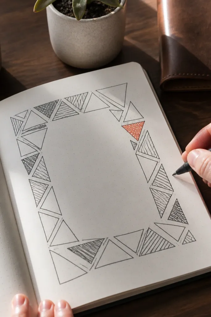
Triangle frames look modern and clean, and they create a strong border without thick lines. Put the triangles around a central text box for notes, gratitude, or a “project brief” page. The geometry gives structure and makes the page look designed even when the content is short. Use black outlines and one accent triangle filled in color so the frame has depth. This is a good pick if you like crisp lines and don’t want lots of doodles.
Pro tipUse a triangle template or a small right-angle ruler to avoid lopsided shapes.
Draw a rectangular text area in the center with a light pencil. Then add four triangle shapes at the corners pointing inward, keeping their bases aligned to the rectangle edges. Outline the triangles with fineliner and fill only one triangle with your accent color. Finally, write your text or bullets inside the rectangle, keeping line spacing consistent.
AvoidDon’t fill multiple triangles — one filled triangle is enough for a clean look.
14. Budget Page With Two-Tone Bar Totals

You get a visually satisfying budget page without complex charts. Two-tone bars make totals easy to scan and look great in photos because they create clear horizontal color bands. This is ideal for simple monthly spending, sinking funds, or “planned vs spent” trackers. Keep categories short and readable, and use one accent color for the “spent” part. The layout stays tidy because bars align to the same baseline.
Pro tipUse a light tone for planned so your darker spent bars stand out immediately.
Draw a list of categories down the left with small labels in black. For each category, draw a horizontal bar area to the right using a ruler for consistent length. Split each bar into two colors: one color for planned (light) and one for spent (darker) based on your numbers. Add a small legend at the top with two colored squares and labels.
AvoidDon’t freehand bar lengths — align them to a fixed scale like 1 cm equals $50.
15. Calendar Habit Tracker With Mini Check Icons
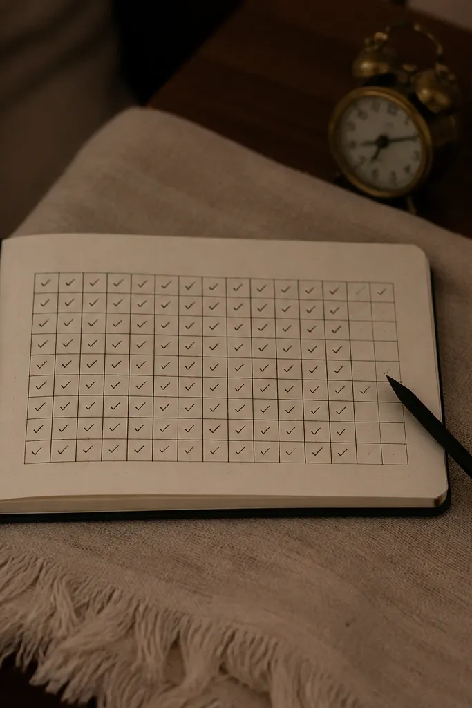
Habit trackers look best when the marks are consistent. This one uses mini check icons instead of messy scribbles, so it stays neat as the month fills in. The grid is simple, but the check icons make it feel satisfying and designed. Use it for habits like water, steps, reading, or skincare. The page stays easy to photograph because the checks create a repeating pattern. It also works for school schedules and workout logs.
Pro tipMark streaks with a small dot in the corner of the cell instead of changing the whole icon style.
Create a grid with habits on the left and days across the top. Use a pencil guide for row and column spacing, then trace with fineliner once it’s aligned. For each cell, leave it blank until you complete the habit, then add a tiny check icon in that cell. Keep the check size small and identical, and use one accent color only for “streak” cells you want to highlight.
AvoidDon’t overcrowd each cell with extra symbols; one check icon per completed day keeps it clean.
16. Plant Leaf Margin Doodles
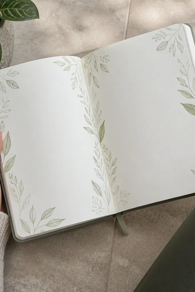
Leaf margin doodles add softness without taking over the page. You keep your content readable because the leaves live in the margin, not on top of your writing. This works well for self-care spreads, meal planning, and any page where you want a calm aesthetic. Use a limited set of leaf shapes so it looks intentional and repeatable. The result is a gentle frame effect that still feels modern.
Pro tipMake leaves face the same direction; mirrored leaves look chaotic fast.
Pick one margin side and draw a faint vertical guideline where the leaves will sit. Create 10-14 small leaf doodles of two sizes, alternating them along the margin. Outline leaves with fineliner and lightly shade only the veins or one edge with an accent green or brown. Write your headings and bullets in the main page area with consistent spacing.
AvoidDon’t add leaves across the whole page — margin-only keeps it polished.
17. Photo-Ready Quote Box With Border Stars
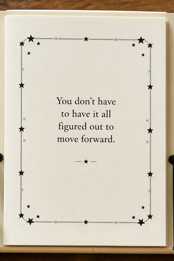
This turns a notes page into something you actually want to reference. A quote box gives you a clean block of emphasis, and border stars add a light decorative edge. It’s perfect for monthly intentions, study reminders, or “things I’m learning” pages. Keep the quote short so it fits and stays readable, then use stars only at the corners. Because the stars are placed on the frame, the page looks balanced and not random.
Pro tipUse one line break; quotes that wrap too much start to look cramped.
Draw a rectangle around where the quote will go, leaving a little margin from the page edges. Outline it with thin black lines and add tiny star doodles at each corner touching the border. Write your quote in a readable font size — block caps for one line or small cursive for two lines if you prefer. Finish by adding a small bullet list below the quote box for action steps.
AvoidDon’t use thick borders and thick stars together — it gets heavy and messy.
18. Calendar Timeline With Numbered Checkpoints
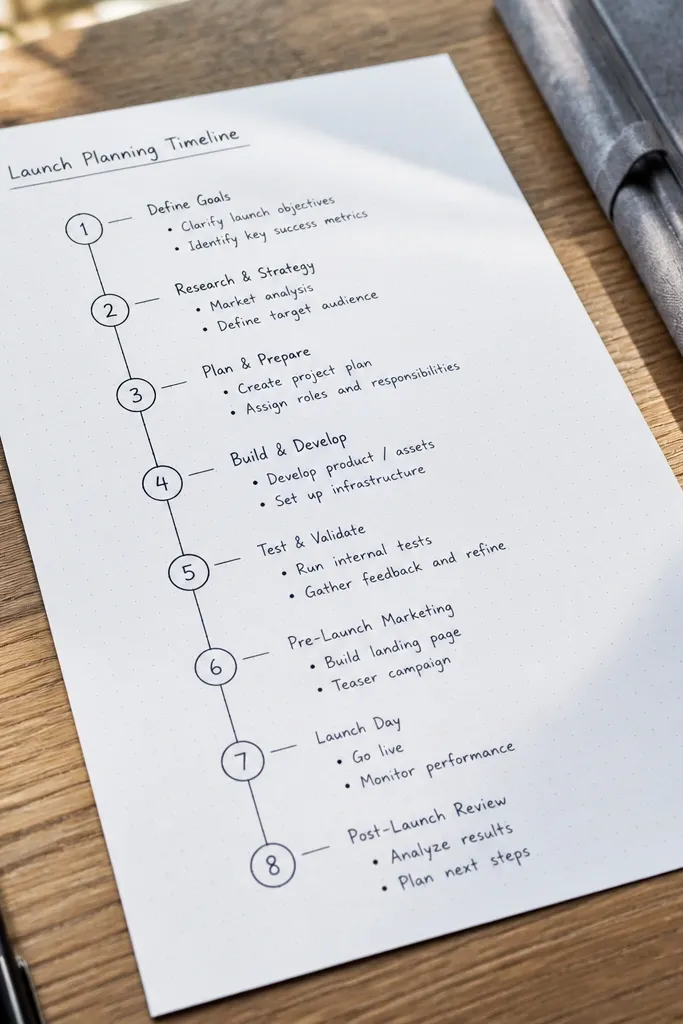
A timeline layout makes planning feel structured and looks great because it’s linear and graphic. Numbered checkpoints give you a clear story from start to finish, and the short notes keep it functional. This works for project plans, travel planning, or exam prep schedules. Keep the timeline simple with 5-8 checkpoints so it stays clean. The numbering also helps if your handwriting is messy — readers can still follow the order.
Pro tipUse circles about the width of your pen tip — too big makes the page feel crowded.
Draw a horizontal line across the middle of the page with a ruler. Mark 5-8 evenly spaced circles on the line and write numbers inside each circle. Under each circle, add a short label in black fineliner, no more than 3-5 words. Add one accent color to the first and last checkpoint circles to frame the sequence.
AvoidDon’t cram long sentences under checkpoints; keep labels short.
19. Washi Stripe Checklist With Alternating Box Fills
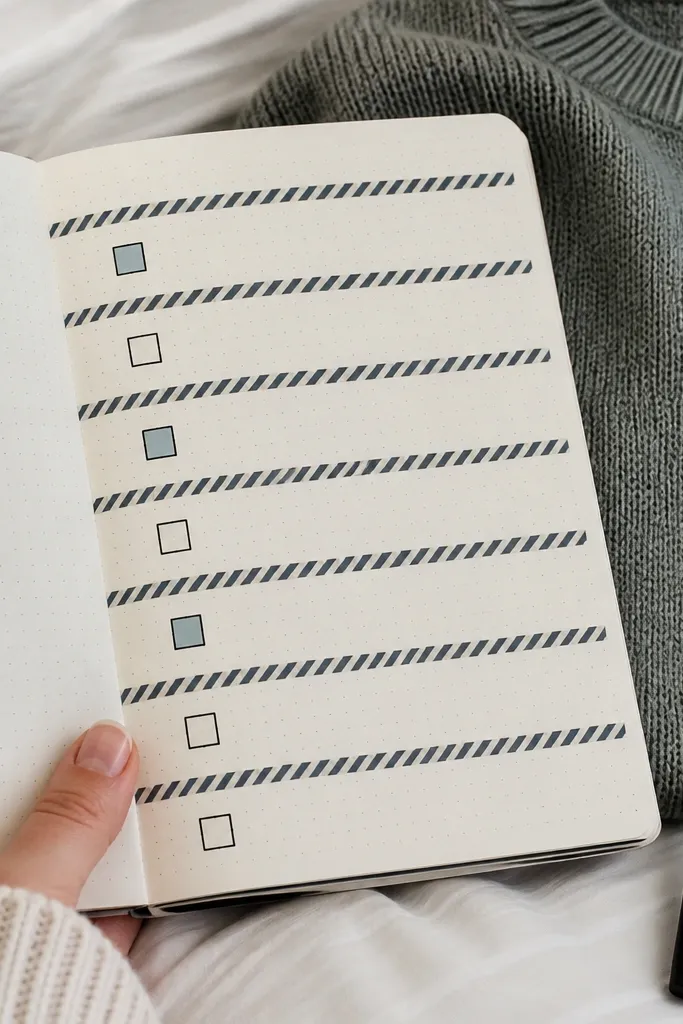
This is the fastest way to make a checklist look “decorated” without drawing. Washe stripes act like separators so you don’t need boxes everywhere, and alternating filled boxes give a rhythmic look. It’s ideal for packing lists, cleaning routines, and weekly chores. Use one washi pattern so the page stays cohesive, then pick one marker color for the alternating fills. The result is neat, photo-friendly, and quick.
Pro tipPress the washi down firmly with a fingernail so edges don’t lift and catch ink.
Cut washi tape strips and place them horizontally as separators across the page, spacing them so each section has its own row group. Draw light guideline lines under each stripe for your checkbox rows. Then add checkboxes in black and fill every other checkbox with your accent color for a clean pattern. Finish by writing a short title above and a small legend note if needed.
AvoidDon’t add too many stripes — 3-5 separators look designed; 10 separators look chaotic.
20. Zigzag Footer With Month Goals
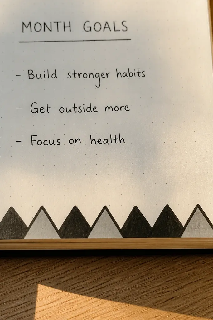
A zigzag footer adds a fun finish while keeping your main content clean. Put your goals or key tasks in the main area, then use the zigzag as a decorative baseline at the bottom. This design is great for monthly goal pages, study plan pages, and “top priorities” spreads. It also makes the page look complete instead of unfinished, which is the real aesthetic problem. Keep the zigzag thin and consistent so it feels intentional.
Pro tipMake the zigzag repeat count even so the ends don’t look lopsided.
Write your month goals in the upper two-thirds of the page in a left-aligned column with checkboxes or bullets. Draw a straight horizontal line near the bottom as the zigzag baseline. Then create a repeating zigzag pattern above the baseline using a ruler for consistent angles. Color the zigzag with one accent color and keep the rest black ink.
AvoidDon’t draw the zigzag too close to the text; leave a clean gap for readability.



