
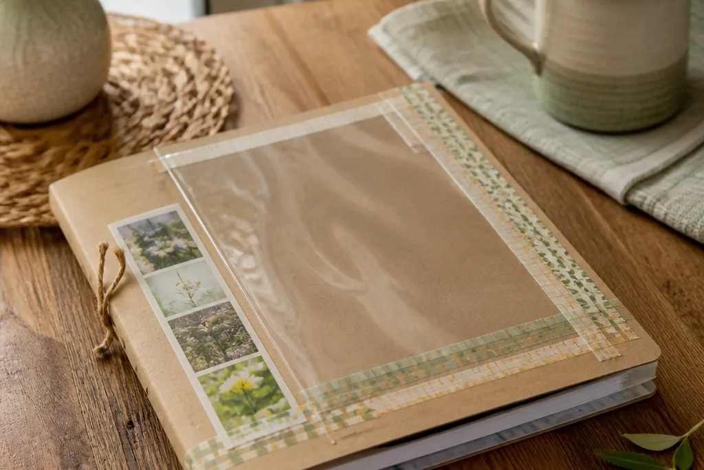

1. Fabric-Edge Frame with Removable Tape Tabs
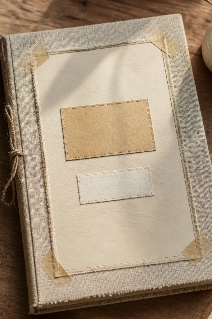
This front page looks styled because it has a fabric border like a mini gallery mat. You’re getting texture without messy glue — the fabric edge reads warm and intentional in photos. The layout is simple: a centered card panel with a fabric frame around it, plus a title label in the middle. It works great for cloth-loving aesthetics like farmhouse, soft neutral, and cozy journals. Skill level is beginner and the time is about 30-45 minutes depending on your fabric width.
Cut a piece of cotton fabric or linen about 1.5 inches wider than your journal’s front page on each side. Lay it flat, then place painter’s tape tabs on the back corners of the fabric (not the front) so you can lift and re-stick later. Center a thick cardstock mat on the journal cover, then press the fabric frame onto the mat using the tape tabs. Finish by adding a bold title label on top of the mat with a glue stick or double-sided tape strip.
Use a fabric with a slightly rough weave — it hides tiny alignment mistakes better in photos.
Avoid super-thin satin; it wrinkles fast and makes the frame look sloppy.
2. Photo Corner Collage with Color-Block Mats

If you like a clean, modern look, this one nails it. Photo corners keep your images crisp and removable, and the color-block mats make the front page pop without clutter. You’ll end up with a poster-like grid even if you only have a few photos. It’s perfect for travel-style journals, habit logs with “mood” photos, or anyone who wants the cover to feel personal. This takes about 45-60 minutes because you’re trimming mats and lining up the corners.
Pro tipChoose mats with matte finishes; glossy cardstock reflects light and makes the collage look less sharp.
Cut three cardstock mats in solid colors that match your journal theme, each slightly larger than the photo you’ll use. Add photo corners (the adhesive-free kind or removable adhesive corners) to the back of each photo so you can slide the photo into place. Arrange the photos on the journal cover with 0.5-1 inch spacing, then tape the mats down using washi tape along the edges. Add a small header label in the top-left corner and keep it to one short word.
AvoidDon’t overlap photos with glue — it ruins the clean, removable look.
3. Stamped Date Grid with Inked Border
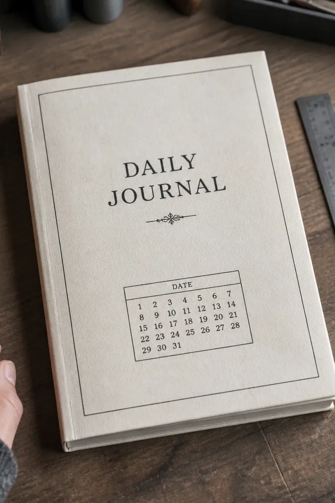
This gives you a “designed stationery” vibe without needing fancy tools. Stamps and a simple grid make the cover look organized and intentional, even if your journal is for creative chaos. The inked border adds structure and frames your title so it reads clearly. It’s especially good for planners, work journals, and minimalist setups. Skill level is easy if you can stamp steadily, and it takes around 35-50 minutes.
Tape a sheet of printer paper onto your journal cover area using painter’s tape as a guide. Use a fine-line stamp or small number stamp to create a neat grid in one corner, leaving a clear space for the title. Then stamp or draw a thin border around the page using archival ink or a waterproof fineliner. Finish by writing your title in a larger font style and letting the ink fully dry before you close the journal.
Use archival ink or waterproof fineliner so the edges don’t smear when the journal bumps in a bag.
Avoid cheap pigment ink; it can bleed on textured or coated covers.
4. Washitape Topographic Lines with a Tiny Legend
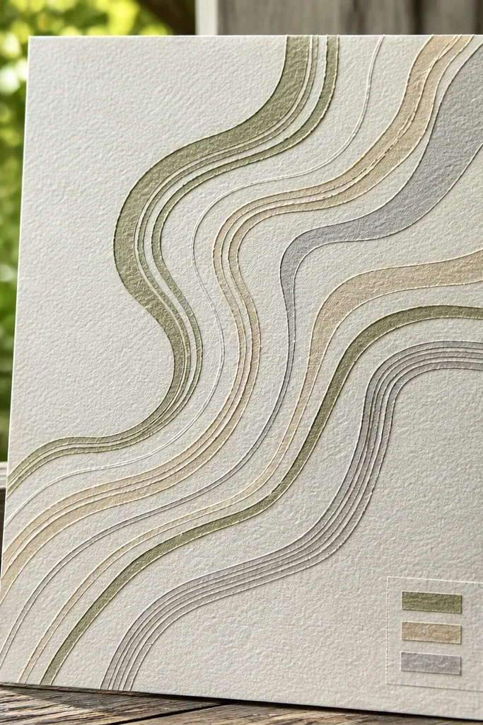
Topographic lines look artsy but still controlled, which is why this works on a front page. Washi tape lets you get crisp curves and layered depth without permanent adhesives. The tiny legend makes it feel like a real design element rather than random tape. This is great for nature journals, study logs, and anyone who likes calm, graphic aesthetics. Plan for 40-70 minutes because your curves need patience.
Pro tipPress the tape down with a ruler edge so the curves look clean in close-up photos.
Choose 2-3 washitapes: one neutral matte (cream/gray) and one accent (sage/terracotta). Lightly sketch a contour path with a pencil so the lines flow toward a center focal point. Layer tape lines along the pencil curves, slightly varying thickness by overlapping edges. Add a small legend box in the bottom corner with three labels using a fineliner, then seal nothing — just press tape edges firmly.
AvoidDon’t use glossy tape — it catches light and makes the lines look messy.
5. Clear Page Protector Window with Layered Paper Inside
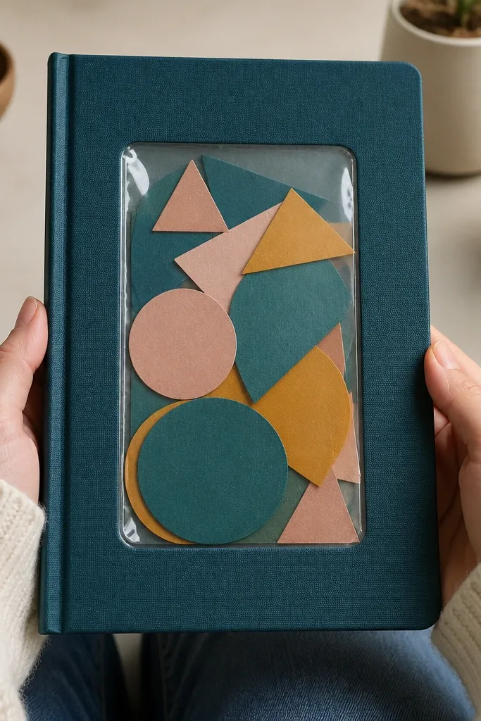
This is one of the most renter-friendly options because you’re not gluing anything directly to the cover. The clear window creates a polished look, like a mini display card, and it protects your art from smudges. Layered paper shapes inside give depth and color without bulk on the cover itself. It’s ideal for journals that live in tote bags or get handled a lot. Skill level is beginner and the time is about 20-30 minutes.
Pro tipUse matte cardstock behind the clear window so colors look even and not streaky.
Cut a piece of cardstock to fit slightly inside a clear page protector sleeve or a clear vinyl pocket made for scrapbooking. Arrange layered paper shapes behind it — for example, a circle on top of a rectangle — using only tape on the cardstock base. Slide the cardstock into the clear sleeve, then tape the sleeve to the front cover using small strips of painter’s tape at the corners. Add a title sticker or lettered label on the outside of the sleeve.
AvoidAvoid thick chipboard layers; the sleeve can bow and look uneven.
6. Magnetic Bookmark Pocket Front Page
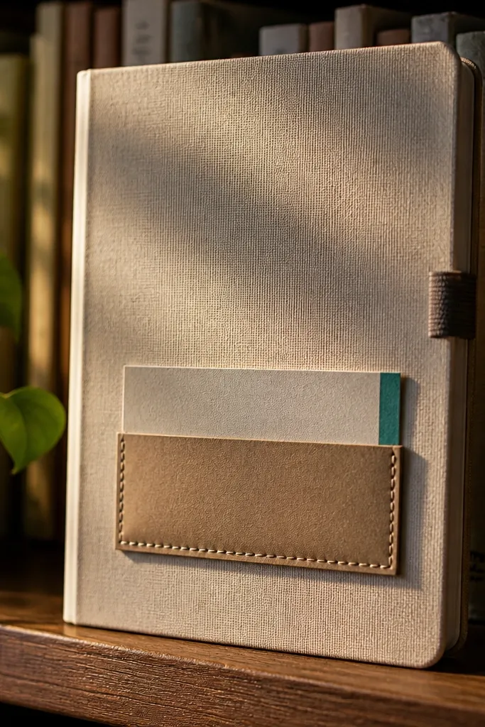
This idea makes your front page functional and pretty at the same time. A small pocket on the front holds a slim bookmark or a folded note, giving the cover a “designed product” feel. The magnetic closure keeps the pocket tidy without sewing or permanent hardware. It suits reading journals, book trackers, and anyone who wants the front cover to do more than look cute. Expect 1-2 hours for the first build because you’re measuring and aligning the magnet.
Pro tipUse a rare-earth magnet but keep it small (around 10-15mm); big magnets can warp thin covers.
Cut two rectangles of cardstock: one for the pocket base and one slightly larger for the pocket front flap. Glue fabric or faux leather to the front flap for a clean texture, then reinforce the pocket edges with a thin strip of cardstock. Attach a small rare-earth magnet to the back of the flap and a matching metal sheet or magnet to the journal cover area inside the pocket alignment. Test the closure with the bookmark inserted, then tape the pocket down with removable tape where needed.
AvoidDon’t put magnets directly on thin paper covers without a reinforcement layer.
7. Hand-Lettered Title with Chalk-Style Wash Background
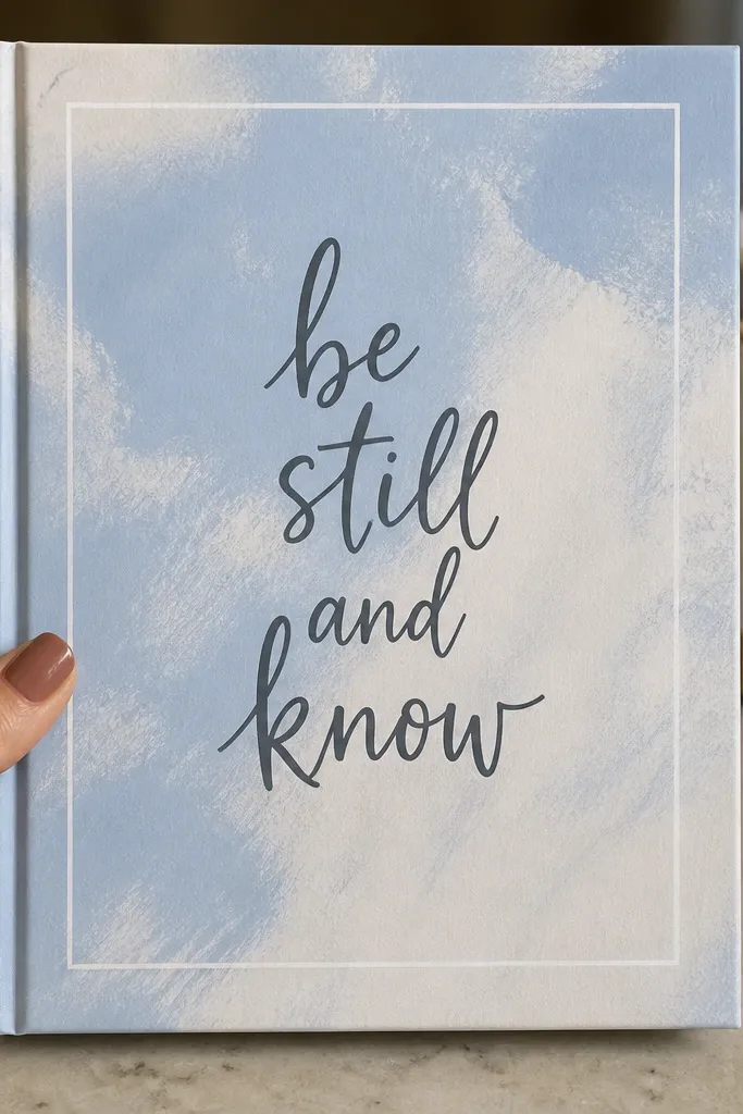
This one is all about typography. A chalk-style wash background makes the title look crisp and intentional, even if your letters aren’t perfect. The trick is to keep the background light and let the lettering do the heavy lifting. Pair it with a thin white border for that clean, photogenic frame. It works for almost any journal theme because the colors are easy to swap. Time is about 30-45 minutes if you let the wash dry between steps.
Pro tipPaint the wash first, then letter; lettering over wet paint smears and ruins the sharp look.
Mix a very light wash using acrylic paint watered down heavily or use watercolor. Paint a soft rectangle background in the center, leaving generous margins, and let it dry. Add a thin border with a white gel pen or paint marker around the rectangle. Letter your title in a bold, simple script and finish with a tiny underline or dot cluster in one corner.
AvoidDon’t use a dark wash if your letters are thin — it kills readability on photos.
8. Layered Paper Cutout Mountain Range
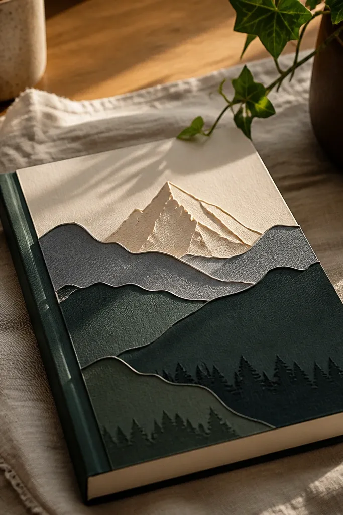
Paper cutouts look high-effort because they cast tiny shadows, even when the layers are just cardstock. A mountain range gives instant visual direction — your eye travels from bottom to top and the cover looks cinematic. Keep it renter-friendly by using foam dots only under the top layer, not by gluing directly everywhere. This suits nature journals, weekend planners, and anyone who wants calm scenery on the cover. Plan for 50-75 minutes for cutting and clean edges.
Pro tipUse a sharp craft knife and a metal ruler for crisp mountain edges.
Choose three cardstock colors that fade toward the top (for example, charcoal, slate green, and pale sand). Cut mountain peaks from each color and keep the widest layer at the bottom. Tape the bottom layer flat to the cover using washi tape at corners. Add the middle layer with thin foam dots and the top layer flat or lightly raised, then place a sky strip above with a paper cloud cutout.
AvoidAvoid messy glue squeeze-outs — they create glossy bumps that show up in photos.
9. Accordion Pocket for 5 Mini Cards
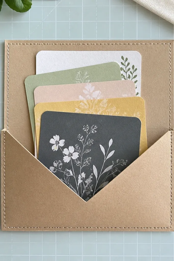
This is a front page that looks like stationery packaging. An accordion pocket holds multiple mini cards, so the cover has texture and a clear focal point. It also gives you ready-to-write prompts without needing extra supplies. The look is especially photogenic with matching card colors and a clean pocket frame. It works for gratitude lists, study prompts, or monthly goals. Time is about 1-1.5 hours because you’re building the pocket and cutting uniform cards.
Cut a strip of cardstock for the accordion pocket and score it into 5 folds so each section matches the mini card size. Glue or tape the accordion strip to a pocket frame piece that matches your cover width, leaving the top open. Insert five mini cards and test for smooth pull. Finally, tape the pocket frame to the front cover with painter’s tape along the back edges and add a label title on the front of the pocket frame.
Make the mini cards 1-2mm shorter than the pocket opening so they slide without catching.
Don’t overstuff the pocket — thick cards make the front bulge when the journal closes.
10. Foam Dot Photo Frame with One Bold Sticker
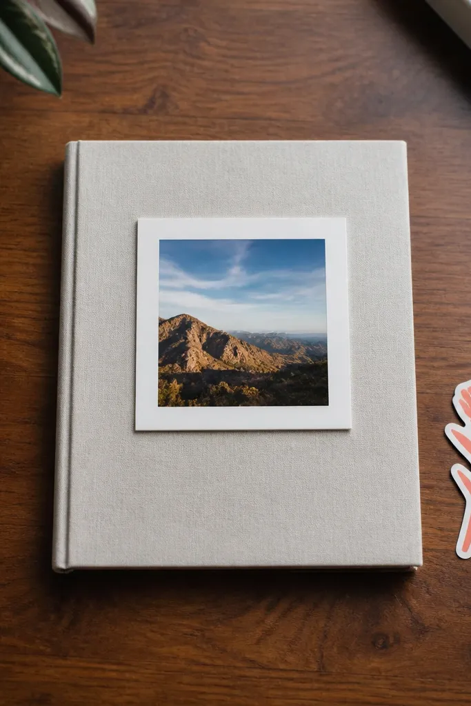
This is the fastest way to make a cover look styled with minimal supplies. A simple photo frame plus foam dots creates that “floating” look that reads premium. Then you add one bold sticker or die-cut title so the front page doesn’t feel empty. It’s perfect for renters because everything is removable and flat. Skill level is easy; time is about 15-25 minutes.
Pro tipUse matte photo paper or a matte print; glossy photos glare under daylight in photos.
Cut a square or rectangle frame from cardstock and leave an inner opening slightly smaller than your photo. Place the photo behind the frame and secure with removable photo corners or tiny tape strips at the back. Layer foam dots under the frame so it lifts above the cover by about 2-3mm. Add one title sticker or hand-lettered label on top of the frame and press it down firmly.
AvoidAvoid stacking foam dots too close to edges; they can warp the frame.
11. Button and Thread Title on a Paper Banner
Buttons and thread add a handmade feel that looks great even when the design is small. This front page uses a paper banner across the top with a stitched title and two buttons as anchor points. It’s visually strong because the thread line creates a clear path for the eye. This suits craft journals, sewing logs, and any cozy aesthetic. Time is 45-75 minutes depending on stitching detail.
Pro tipUse embroidery floss in two strands for a thicker, cleaner stitch line.
Cut a long banner strip of cardstock, then round the ends for a softer look. Use a pencil to sketch the title placement, then punch small holes along the letters using a needle or craft hole punch. Thread embroidery floss through the holes to create a stitched outline for each letter, then knot and trim neatly at the back. Glue or tape two small buttons at the ends of the banner and attach the banner to the front cover using painter’s tape on the back corners.
AvoidDon’t use hot glue on the front; it can show shiny blobs in photos.
12. Monogram in Vinyl-Style Layered Paper (No Vinyl Needed)
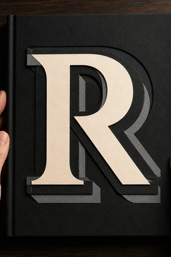
You get the bold vinyl-letter look without committing to vinyl that’s hard to remove. Layered paper monograms look crisp, graphic, and very “designed cover” in photos. The shadow effect comes from offset layers, which makes the letter pop even on plain paper. Pick your initials or a single word and keep the background clean. This is beginner-friendly with a cutting template and takes about 45-60 minutes.
Trace your monogram onto two or three cardstock colors and cut them out cleanly. Offset the top layer by about 2-4mm to create a shadow edge, then tape the layers together on the back. Place the monogram on the front cover and secure it with foam tape or small foam dots under the main letter. Finish with a tiny subtitle label under it using a fineliner or letter stickers.
Use a cutting mat and go slow on curves; clean cuts make the monogram look expensive.
Don’t pick three similar shades; the letter edges disappear in low light.
13. Café Menu Style Bullet Points with a Header Block
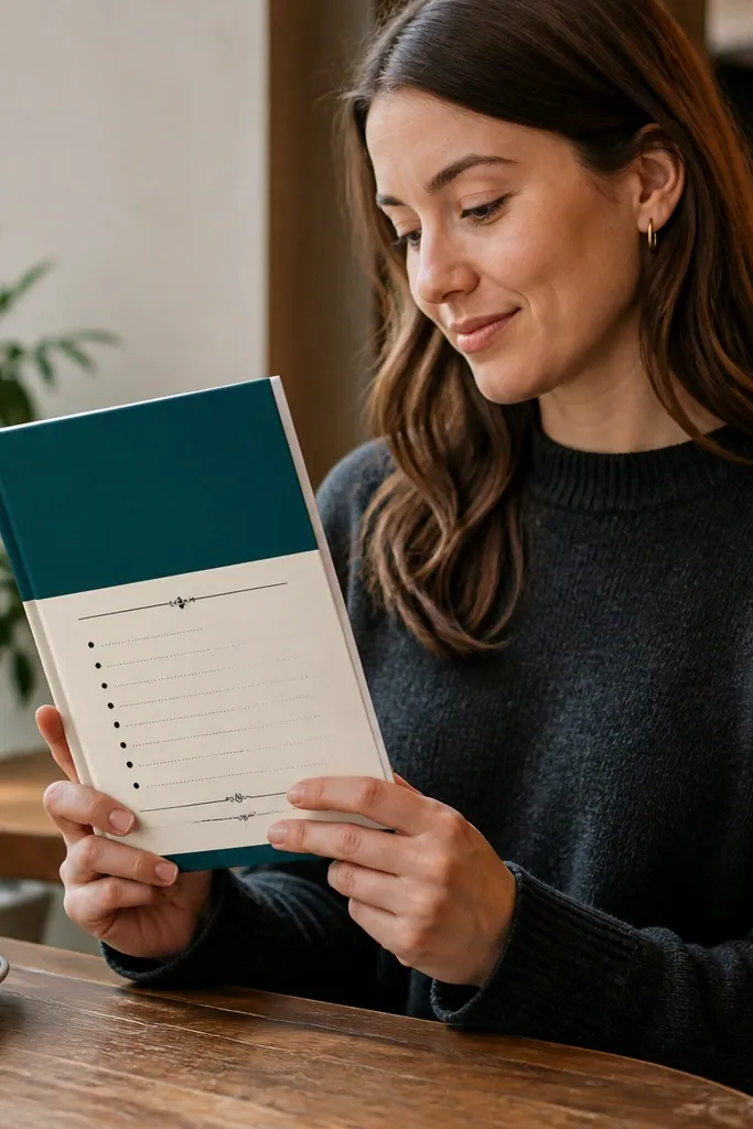
Menu typography makes the front page feel playful and organized at the same time. You’ll get a strong header block at the top and small bullet lines underneath, so the cover looks like a real printed piece. It’s great for journaling themes like “weekly specials” (goals) or “today’s focus.” The look is photogenic because it has a clear grid and high contrast. Time is about 30-45 minutes if you use letter stickers or a stencil.
Pro tipStick to one font style — either all stencil caps or all handwritten caps — so it reads clean.
Cut a rectangle header block from black or dark navy cardstock and place it centered at the top using painter’s tape corners. Add a title on the header using white gel pen or letter stickers. Under the header, draw a simple grid of 5-7 bullet lines using a ruler and fineliner. Write short items like “Focus,” “One win,” “Gratitude,” leaving consistent spacing, then add a small decorative line at the bottom.
AvoidDon’t cram long phrases; menus look good because lines stay short.
14. Ripped Paper Edge Collage with Clean Tape Seams
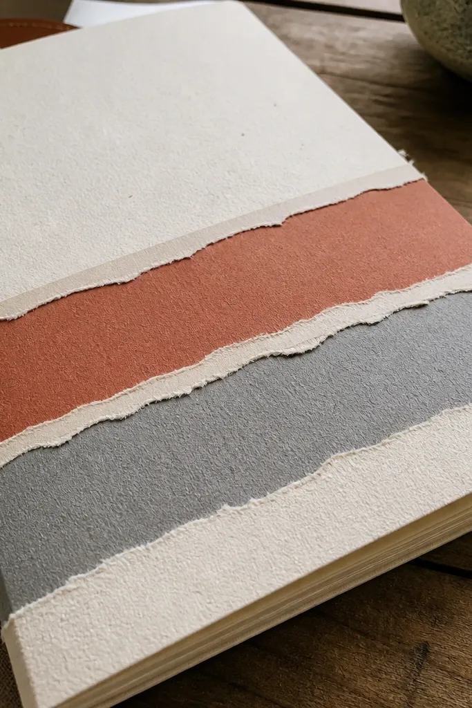
Ripped paper edges look artsy and textured, but you need clean seams to keep it from looking messy. This design uses ripped strips layered in bands, with painter’s tape or washi tape holding the seams flat. It’s visually striking because the torn edges create movement while the tape lines keep structure. Great for creative journals, mood logs, and art diaries. Time is 40-60 minutes.
Choose 3-4 paper colors with different textures (kraft, off-white, patterned scrapbook paper, and one accent). Rip strips by hand for natural edges, then layer them across the lower half of the cover. Secure each strip at the back with washi tape on the edges, leaving the torn edges free for texture. Add a centered title label on the top clean area using a contrasting cardstock rectangle.
Rip slightly uneven strips; perfectly straight edges kill the handmade look.
Avoid covering the entire cover; leave a clean top zone for the title.
15. Neon Gel Pen Star Map with Masking Tape Lines
A star map front page looks bold and modern, especially when you use neon accents on a dark background. Masking tape lines help you draw constellation paths without accidental smudges. The cover becomes instantly photogenic because the neon pops under light. This suits night-themed journals, astronomy pages, or anyone who wants a dramatic aesthetic. Time is about 35-55 minutes.
Cover the front area with dark cardstock or a dark paper layer secured by painter’s tape on the edges. Lightly sketch constellation dots with a pencil, then place masking tape along the lines where you’ll draw. Draw the constellation paths using neon gel pens and small dot markers, then remove tape while the ink is still fresh. Add a tiny compass rose or coordinate-like label in the corner with a white fineliner.
Press tape down firmly so neon ink doesn’t bleed under the edge.
Don’t use water-based markers on dark cardstock; they can feather.
16. Pressed Leaf Silhouette with Cardstock Backing
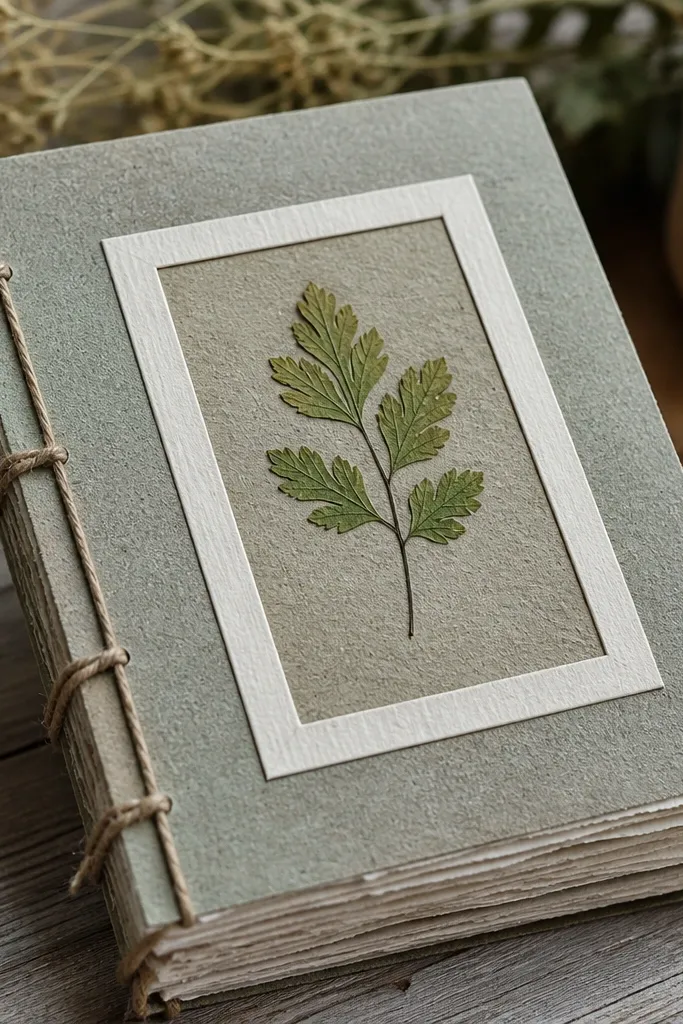
Pressed leaves give a soft, organic silhouette that looks gorgeous in close-ups. The key is using cardstock backing so the leaf stays protected and the cover stays flat. You’re creating a nature-themed front page that feels delicate but still structured thanks to the frame. It’s perfect for garden journals and seasonal trackers. Time is 20-30 minutes for assembly, plus leaf prep time if you’re drying them.
Place a thin pressed leaf on a piece of cardstock and trace around it lightly. Cut a window opening in the cardstock frame so the leaf sits behind the opening, then tape the leaf to the back of the frame using small strips of washi tape. Add a background paper behind the leaf so it shows clearly. Attach the framed leaf panel to the journal cover with removable tape at the corners.
Use leaves that are fully dry; damp leaves curl and lift the frame.
Avoid gluing leaves directly onto journal paper; glue warps and yellows over time.
17. Gold Foil Tape Borders with Centered Quote Card
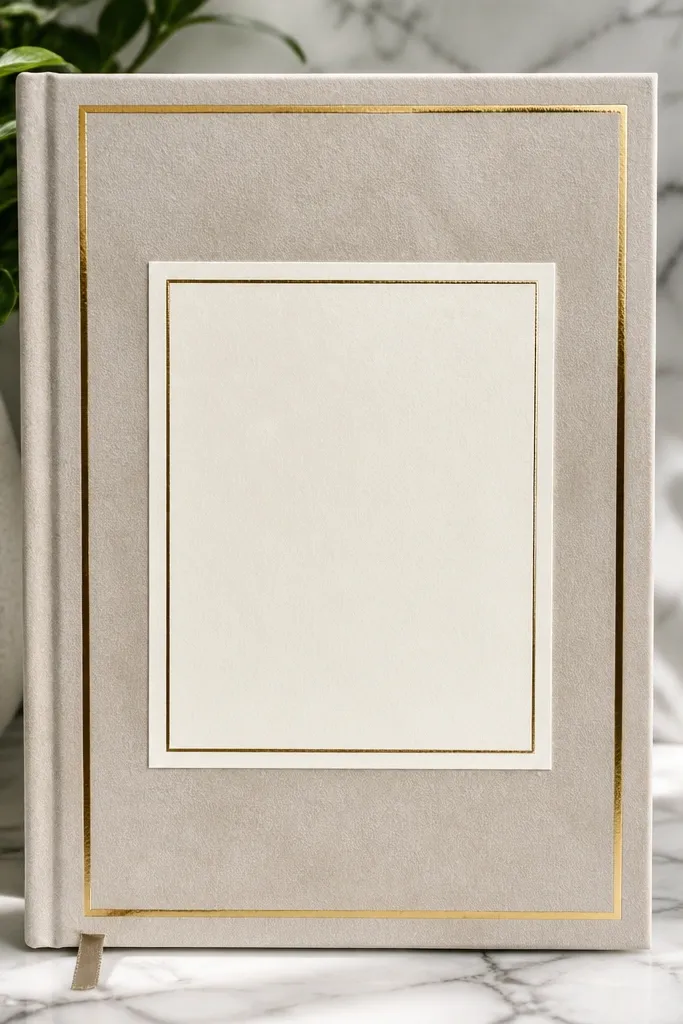
This is the cleanest way to get that expensive, stationery look without printing. Gold foil tape borders frame the page, and a centered quote card gives you a clear focal point. It’s renter-friendly because the tape sticks lightly and you can remove it later with care. This works for productivity journals, intention planners, and anyone who wants a polished cover. Time is about 25-40 minutes.
Pro tipUse a burnishing tool or the back of a spoon to seal foil tape edges so they don’t lift.
Measure a border area on the front cover and apply gold foil tape strips along the edges using a ruler for straight lines. Cut a small cardstock quote card that fits inside the border with about 1-2cm margin. Write your quote with a fine gel pen or paint marker, then attach the quote card using removable adhesive dots. Press everything flat and avoid adding extra layers that make the cover bulge.
AvoidDon’t wrap foil tape around corners with thick overlaps; it looks uneven.
18. Stencil Spray Background with Masked Corners
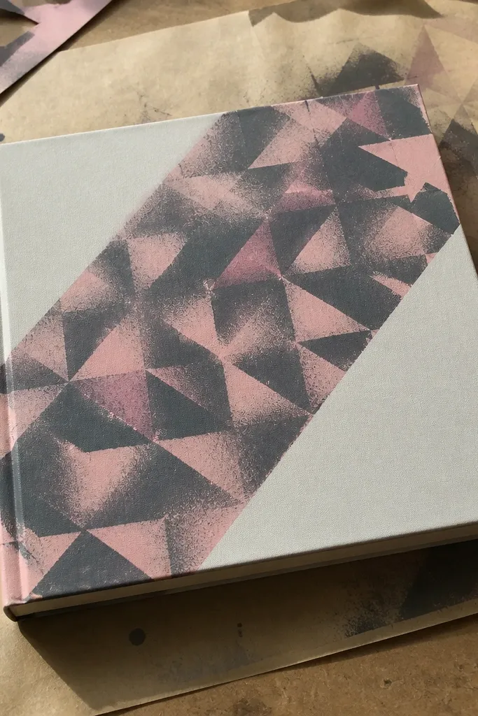
Stenciled backgrounds look pro because the pattern is consistent and the edges are sharp. Masked corners keep the design graphic instead of chaotic. This is a strong choice for anyone who wants color on the front page but hates messy splatter. It’s renter-friendly if you use removable masking tape and work on scrap paper. Time is about 45-70 minutes including drying.
Pro tipDo 2-3 light coats instead of one heavy coat so the stencil stays crisp.
Tape off the front area with painter’s tape, leaving a rectangle where the background will go. Place a stencil over the taped area and mask the corners with tape so only the center gets pattern. Apply light coats of spray paint or spray ink through the stencil, then let it dry fully. Remove all tape, then place a bold title label in the center using tape or adhesive dots.
AvoidDon’t use thick paint; it seeps under stencils and blurs the pattern.
19. Ribbon Bookmark Spine Band with a Front Nameplate
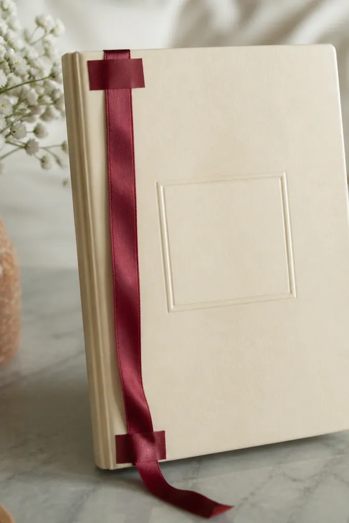
This gives you a tidy, fashion-brand look because it uses a vertical band and a clean nameplate. The ribbon is functional too, since it becomes a bookmark ribbon that sits between pages. It’s renter-friendly because you can attach the ribbon with removable tape or a fabric strip tied around the cover thickness. The front nameplate adds the “front page” feel even when the journal is closed. Time is about 20-35 minutes.
Cut a ribbon strip long enough to reach about 2 inches into the journal from the front cover edge. Tape or adhere one end of the ribbon to the inside front cover near the spine using removable tape. Cut a small nameplate from cardstock and cover it with a patterned paper layer or label paper. Attach the nameplate to the front cover with adhesive dots, keeping it aligned above the ribbon.
Use grosgrain ribbon; it holds shape and looks neat in photos.
Avoid stretchy satin; it twists and makes the ribbon look messy.
20. Stamped Floral Corner with Off-White Mat and Tiny Ring
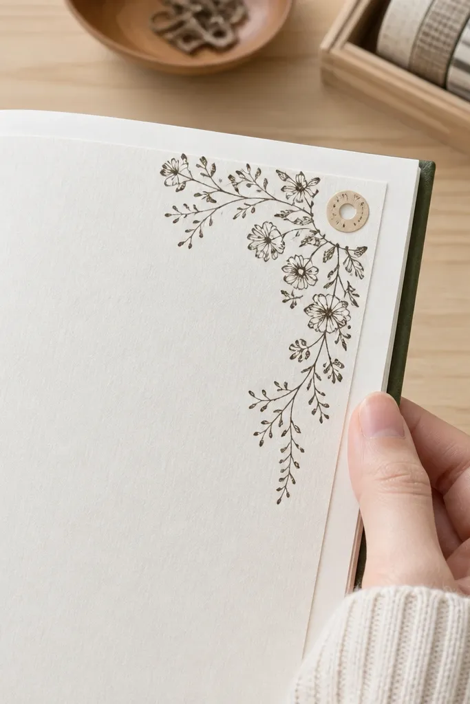
Corner stamps make the front page feel delicate without covering the whole surface. An off-white mat gives a soft contrast, and a tiny ring label adds a “product label” vibe. This is great for journals that need calm visuals — gratitude, wellness, or daily reflections. It’s also easy to adjust for any theme by swapping stamp style and label text. Time is 25-40 minutes.
Pro tipUse a stamp cleaner or baby wipe to keep ink edges crisp between stamping.
Cut an off-white cardstock mat to fit the front cover and place it centered using painter’s tape corners. Stamp a floral cluster in one top corner with archival ink, then add a small circular label (cut from cardstock) near the middle. Write one short word on the circle like “Notes” or “Daily” using a fineliner. Secure the mat with removable tape and press stamp areas flat until dry.
AvoidAvoid stamping too close to the journal edge; it smears from rubbing.



