
1. Tape Frame + Three Bullet Mood Lines
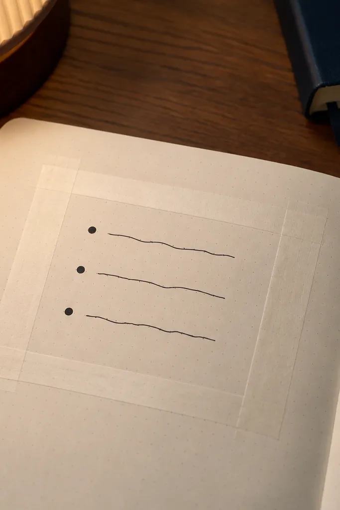
This layout looks tidy because the tape frame creates a boundary you can’t accidentally break. Put your journaling inside the frame with only three lines, so the page stays calm and readable. Use a fine marker for the text and a thicker felt tip for the bullet dots — that contrast makes it photogenic. It works great when you want to write a little but still have your page look “styled.” You can do it on plain paper, notebook paper, or even a single loose sheet you later tape in.
Start by measuring a margin of about 1 cm on each side and place washi tape to form a rectangle. Then write one short header at the top inside the frame, followed by exactly three bullet lines with dots in front. Finally, add small finishing touches like a tiny star next to the second line and a curved underline under the header. Let the ink dry before you close the notebook so the edges don’t smudge.
Pro tipPress the tape down with a ruler edge so it stays crisp in photos.
AvoidAvoid adding more than three lines — the layout looks best when it stays sparse.
2. One-Color Grid Window
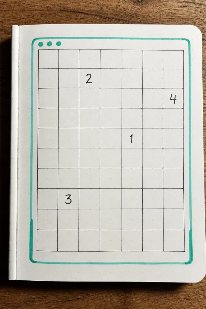
A grid window gives you structure without making your page feel like school homework. Pick one color (like teal or black) and draw a rectangular grid inside it. Then place your writing in only a few grid squares so the page has rhythm. The rest stays blank, which makes the page look clean and intentional in small spaces. This is a strong choice if your handwriting is a little uneven — the grid hides it by guiding the eye.
Use a ruler to sketch a rectangle about 6 x 8 cm in the center of the page. Draw a grid inside it with evenly spaced lines — for example, 1 cm squares. Write short phrases in 4-6 squares, leaving empty squares around them. Finish by tracing the rectangle border again with a thicker pen so the window pops.
Pro tipChoose square sizes that match your writing length; 1 cm squares are forgiving.
AvoidDon’t fill every square — empty space is what makes it cute.
3. Circle Checklist with Dots
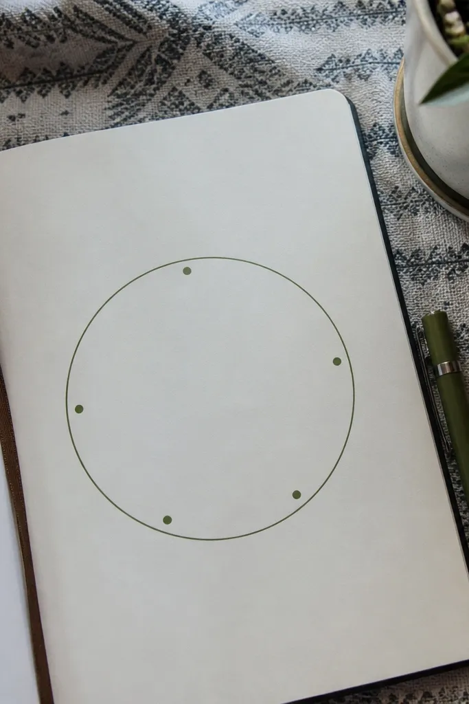
Circles look soft and friendly, and they’re great for small-space organization. This page uses one big circle as the container and five checklist items as dot markers. The visual payoff is the consistent spacing of the dots — it looks neat even if you write quickly. Keep the items short and use one pen size for text plus a slightly thicker pen for the check marks. It’s perfect for weekly intentions, quick wins, or a mini brain dump you want to sort.
Draw a circle about 5-6 cm wide in the center of your page. Add five small dots evenly spaced along the inside edge, then write a short word or phrase next to each dot. Mark the completed ones with a check that matches the thickness of your dots. Finally, add a simple shadow line under the circle border using a second pass with lighter pressure.
Pro tipIf your circle isn’t smooth, trace a cup or jar and then erase the guide lines.
AvoidAvoid random dot spacing — uneven dots are what makes it look messy.
4. Diagonal Washi Strip + Word Blocks
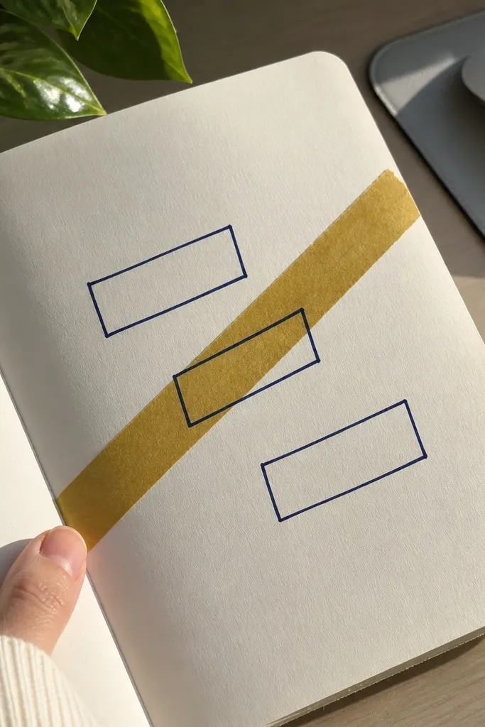
Diagonal elements add movement, and this layout uses one diagonal washi strip to “steer” the eye. Put three short word blocks above, on, and below the tape strip so the page looks styled rather than scattered. Choose one block color for the outlines, like black or navy, and keep the handwriting consistent. This works especially well for journaling prompts, like “today,” “tomorrow,” and “note.” It also photographs nicely because the diagonal tape creates a strong line.
Cut or tear one strip of washi tape long enough to cross the page diagonally from bottom-left to top-right. Place it first, then write a short word at the top-left area, one directly overlapping the tape, and one in the bottom-right area. Use a pen to draw a rectangle outline around each word block. Finish by adding tiny dots in the corners of each rectangle for a finished look.
Pro tipUse painter’s tape under the washi strip edges if your paper is thin and curls.
AvoidDon’t place the diagonal strip too close to the edge — leave at least 1 cm clearance.
5. Mini Polaroid Corner Photo-Label Mock
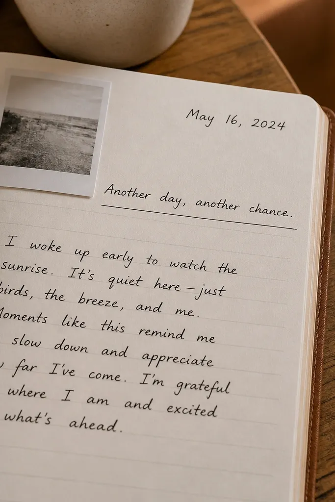
You can fake a photo moment even without printing anything. This idea uses a mini polaroid-style rectangle in the corner, with a handwritten date and a caption line. The rest of the page can be simple writing, which keeps it small-space friendly. It looks cute because the polaroid shape has a built-in hierarchy: image area, then caption. Use soft colors for the border and keep the text short.
Draw a rectangle about 6 x 4 cm in one corner with rounded corners if you can. Add a slightly larger “mat” border behind it by tracing the rectangle outline with a 2-3 mm offset. Write the date under the mat and a one-line caption beneath the date. Shade the polaroid border with a colored pencil lightly, then go over the outline with a dark pen.
Pro tipUse a ruler for straight edges, then round corners with the tip of a spoon or a coin template.
AvoidAvoid long captions — the mock polaroid looks best with one sentence fragment.
6. Side Margin Ruler Lines + Tiny Icons
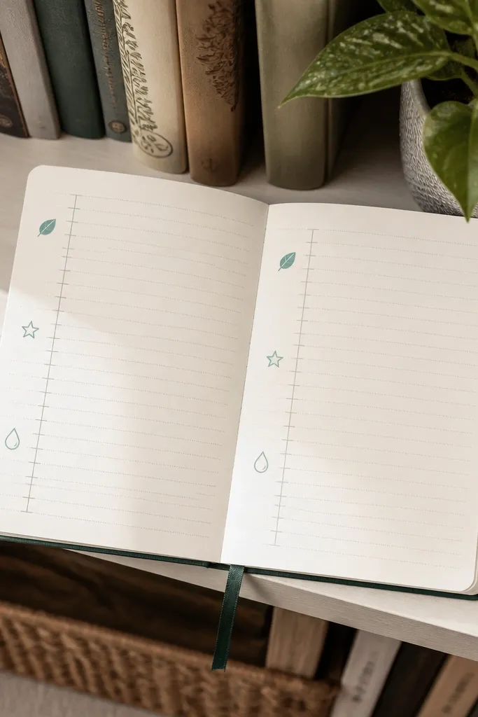
This layout makes your writing look organized fast. Add vertical ruler lines along the left margin, then write short lines of text in the column. Place tiny icons between lines — think a leaf, a star, a droplet — so each line has a visual cue. It’s cute because the page has a consistent left alignment and repeated icon shapes. It’s also great for habit tracking notes, gratitude lists, or “what I’m thinking” entries.
Draw a vertical line 1 cm from the left edge of the page, then add two more lines at 1 cm and 2 cm to create a narrow column. Write your text inside the column with one line per thought. Between lines, add a small icon in the gap area — keep them the same size, like 6-8 mm. Finish by drawing a bold line at the top and bottom of the column to frame the section.
Stick to one icon set — either all stars or all leaves — for a cleaner look.
Avoid mixing icon sizes; one size makes it look intentional.
7. Watercolor Wash Background Block with Pen Over
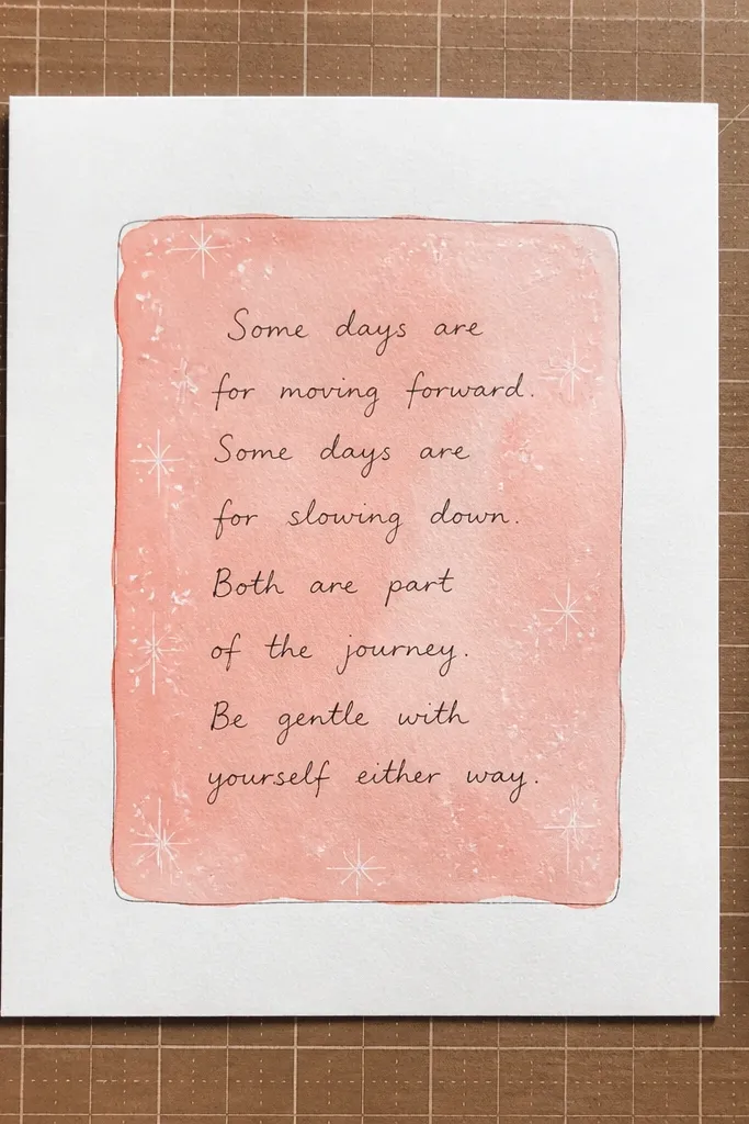
A watercolor wash block adds color without filling the whole page with details. Use a single rectangle behind your writing, then outline it lightly so the text stays readable. The look is soft and pretty, and it still works in a tiny space because you only paint one area. Choose one or two diluted colors and keep the edges controlled. This is a good option when you want the page to feel more “decorated” but you still need it simple.
Tape off a rectangle area about 7 x 9 cm so the wash doesn’t bleed everywhere. Wet the rectangle with clean water using a small brush, then drop in one diluted color and let it spread. Let it dry fully, then write your text on top with a dark pen. Finally, outline the rectangle with a thin marker and add one small accent line like a wavy underline.
Pro tipUse a scrap piece under your page so watercolor doesn’t stain the desk.
AvoidDon’t write on wet paint — it blurs and kills the crisp cute look.
8. Shimmery Gel Pen Dot Border
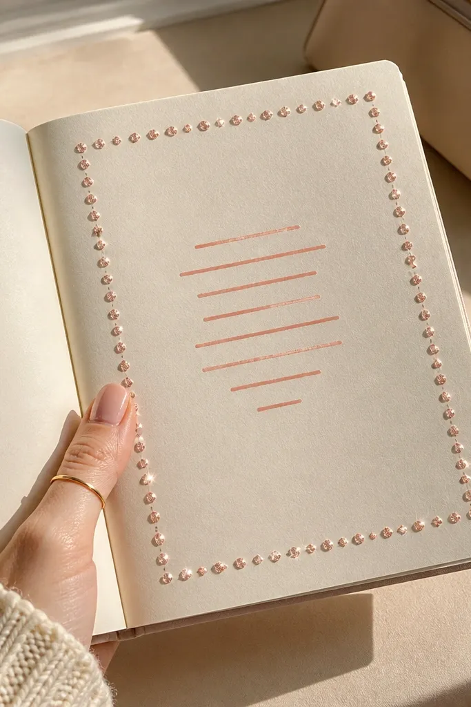
A dot border is one of the easiest ways to make a plain page look finished. It frames your writing without covering it, and gel pens catch light in photos. Use a single color for the dots, like silver or rose gold, and keep your writing simple. This idea is great for small-space journaling because it adds decoration while leaving plenty of room. It also works for prompts, daily notes, and “tiny lists” because the border does the styling.
Pick a gel pen and decide your border distance — start about 5-7 mm from the page edge. Make evenly spaced dots along the top and bottom first, then connect the sides by continuing the same spacing. Leave the center area for writing. Add one header line with a regular pen and underline it with a second pass of the gel pen.
Pro tipPractice dot spacing on scrap paper so your border looks even.
AvoidAvoid heavy dot clusters — sparse dots look cleaner and more cute.
9. Folded Corner Banner with Tape Hinges

This page is cute because it adds a little dimensional banner without bulky supplies. You create a corner fold that acts like a flag, then write the heading on it. The tape hinges hold the fold so it stays crisp when you close the notebook. It’s perfect for labeling sections like “ideas,” “today,” or “week overview.” The look reads as intentional because the fold creates a clear visual hierarchy.
Cut a small rectangle of paper or cardstock about 4 x 8 cm and fold it in half lengthwise. Place it in the top corner of your page and secure the folded edge with two small pieces of tape as hinges. Write a short heading across the banner. Finish by adding a small underline on the page next to the banner so the alignment looks clean.
Pro tipUse thinner paper for the banner so it doesn’t bulk up your notebook.
AvoidAvoid folding the banner too wide — keep it narrow so it stays neat in small spaces.
10. Three-Block Layout with Shadow Outlines
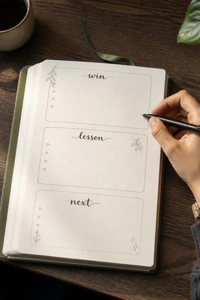
This layout makes your page look designed by creating clear zones. Three blocks is a sweet spot — enough structure to look good, not so many that it feels busy. Shadow outlines add depth, and you only need one dark pen plus a lighter color pencil. Put one theme in each block, like “win,” “lesson,” “next.” It’s great for journaling when you want your writing to feel organized without a grid covering the whole page.
Draw three rectangles across the page with equal spacing, leaving about 1 cm margins. Write one short heading inside each rectangle, then add 2-3 lines of text. Create a shadow by drawing a second outline offset by 1-2 mm down and right, using a lighter pencil. Go over the main outlines with a darker pen so the blocks pop.
Keep your offset shadow small; big shadows look messy on small pages.
Don’t cram text into the blocks — leave blank space around the words.
11. Leaf Silhouette Corner Cluster
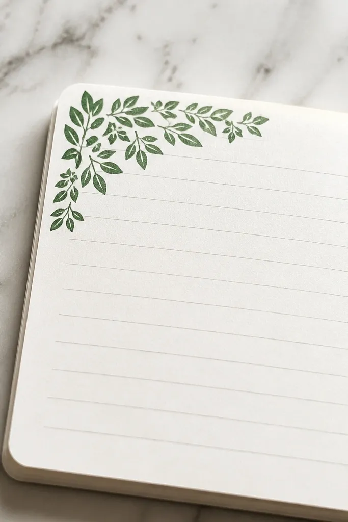
Simple leaf silhouettes make a page look hand-made and cozy without taking over. You place them in one corner, then write the rest of your journaling normally. Use one color for the leaves and keep the shapes consistent — that’s what makes it aesthetic. This is a good choice for gratitude, “things I noticed,” or any entry where you want a soft nature vibe. The corner placement keeps the page from feeling crowded in small spaces.
Draw or trace 5-7 leaf shapes in one corner, varying size slightly but keeping the same stem style. Shade them with a colored pencil or marker, then outline with a thin pen for crisp edges. Add a small cluster stem line connecting the leaves. Write a short sentence beneath the cluster and underline one word with a contrasting colored pencil.
Use a reference leaf shape from a book or package label to keep the silhouette natural.
Avoid random leaf angles — choose one direction and repeat it.
12. Doodle Border with Alternating Shapes
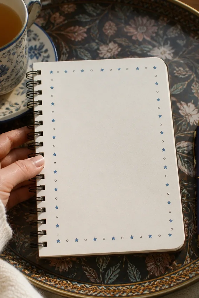
Alternating doodles look cute because they repeat, and repetition reads as intentional. Keep the border thin so your writing still has room. Use two small shapes — stars and circles, or hearts and dots — and alternate them consistently. This idea is perfect for a quick decorated page that doesn’t require painting. It also photographs well because the border frames the text.
Choose the border distance from the edge, about 7-10 mm. Draw alternating shapes along the top edge first, then continue down the sides and across the bottom. Keep each doodle about the same size, like 4-6 mm. Add one heading line in the center and underline it with a solid line matching the border color.
Pro tipUse a fine liner pen so the doodles stay sharp instead of chunky.
AvoidDon’t change the shape style halfway around the border.
13. Sticker-Look Labels with Washi Tabs
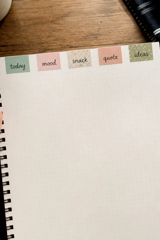
This layout mimics sticker labels using washi tape tabs, which looks adorable and stays easy. You create 4-6 tabs across the page, each with a short phrase. The aesthetic comes from consistent tab width and clean handwriting. It’s ideal for tracking, like “today,” “mood,” “snack,” “quote,” or any mini categories. In small spaces, labels keep the page organized and visually light.
Tear small strips of washi tape about 2.5-3 cm wide and place them in a row with even gaps. Fold the tape ends slightly inward to make a tab shape, then press down firmly. Write one short word or two on each tab using a dark pen. Add a tiny dot or line accent under each label for consistency.
Pro tipKeep tab text to under 6 characters if you want it to look clean in photos.
AvoidAvoid overlapping tabs — separate them so each label reads clearly.
14. Hand-Drawn Ticket Stub Section
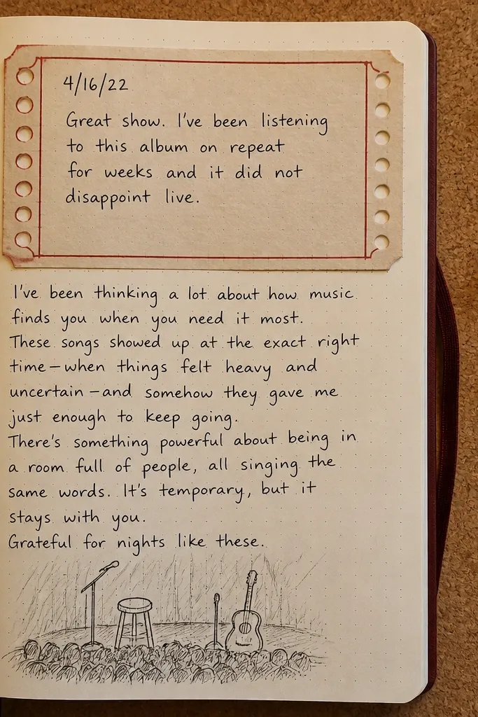
Ticket stubs feel nostalgic and cute, and you can make one using simple lines and dot perforations. Place the ticket across the top third of your page and write a date and a short note. The perforation dots add charm without clutter. This is a strong option for journaling days, events, or “what I’m carrying forward.” It also keeps your writing in a defined zone, which helps small-space pages look tidy.
Draw a rounded rectangle about 8 cm wide and 4-5 cm tall in the top area of the page. Add a second outline inside it to create a border, then draw a dashed or dotted line across the middle to look like a perforation. Write the date on the left side and a short caption on the right. Finish by adding two small “scallop” cuts at the ticket ends using small curved arcs.
Use a ruler for the outer rectangle, then freehand the inner border for a handmade look.
Avoid making the ticket too tall; it crowds the rest of the page.
15. Color Wash Background with White Pen Highlights
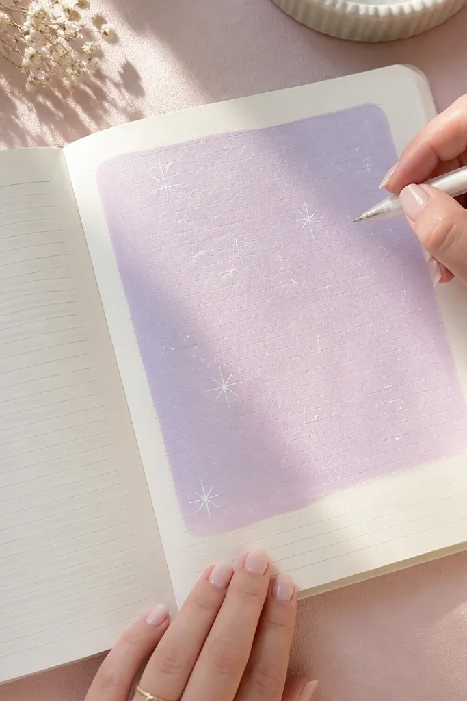
A light colored wash plus white pen highlights looks artsy but still simple. You paint one rectangle behind your text, then add white dots, dashes, or tiny stars on top for contrast. The white details make the page pop in photos because they catch the light. This works great when you want a “decorated but not busy” look for a single entry. Keep the wash light so your writing stays readable.
Tape a rectangle area on the page and apply a very diluted wash with watercolor or watered-down ink. Let it dry completely before adding white pen details. Write your main sentence in a dark pen, then add white dots or short lines around the sentence. Remove the tape carefully to reveal a clean edge.
Use a gel white pen for highlights; it shows up better than paint markers on paper.
Avoid saturating the wash — heavy paint makes it hard to read and looks muddy.
16. Dot-to-Dot Constellation Page
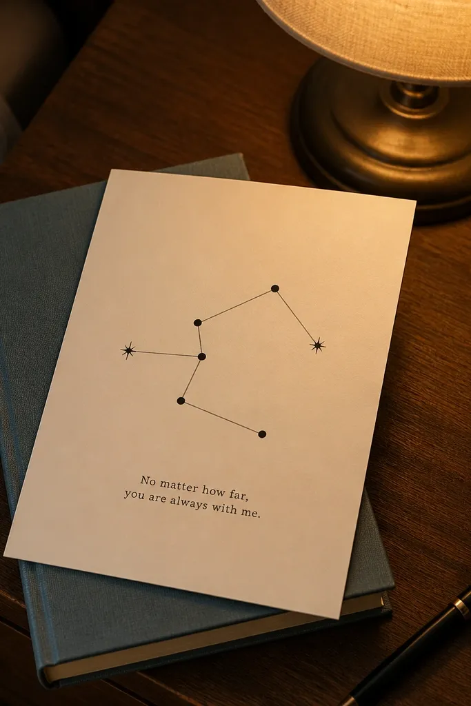
Constellations create a cute, calming look and they’re perfect for small pages because the drawing is minimal. Make a cluster of 8-12 dots, connect them with thin lines, and write one short message near the cluster. Use one dark pen for the dots and a second lighter color for the star highlights. This layout works for reflection prompts, “things that guided me,” or night-themed journaling. It also looks good even if your handwriting is small.
Place 9-12 dots in a cluster area, leaving space between dots so connections are clear. Connect a few dots with straight lines to make the constellation shape. Add 3-4 tiny star accents using a lighter color pen or colored pencil. Write your caption in a small line under the constellation and underline one word.
Pro tipKeep lines thin and straight; thick lines make it look like doodle clutter.
AvoidAvoid too many connections — 4-6 lines is enough for a readable constellation.
17. Borderless Center Heading with Side Notes
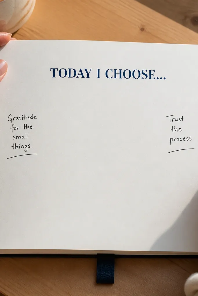
This layout looks clean because it relies on white space instead of a full border. Put a bold heading in the center, then add two short notes on the left and right edges. The page stays readable, and the contrast between bold heading and small side notes makes it feel styled. Use one pen color for the heading and a second color for tiny underlines on the side notes. It’s great for “one idea per page” entries.
Write a centered heading near the top half of the page using a thicker marker. Add a short left note line starting about 1 cm from the left margin and a short right note line starting about 1 cm from the right margin. Underline each side note with a colored pencil or gel pen. Finish by adding a small dot or dash near each note to balance the composition.
Pro tipUse consistent note lengths — keep them to one line each.
AvoidDon’t add extra paragraphs around the heading; keep it minimal.
18. Washi Tape Waves + Single Line Journaling
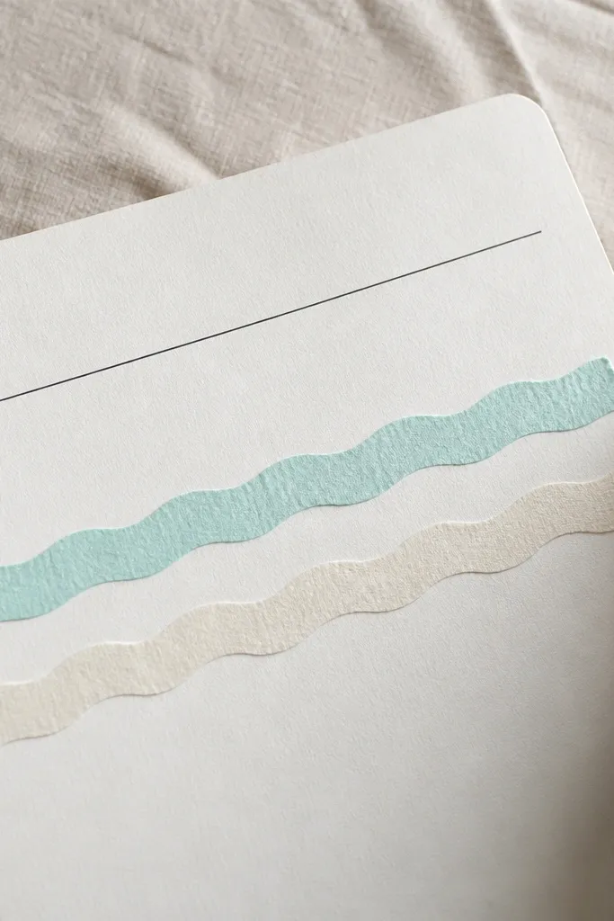
Wavy tape looks playful and cute, and it doesn’t require drawing skills. This layout uses two or three horizontal wavy washi strips under your sentence, then you write one clean line of journaling above them. It’s a great solution when your handwriting wants to look neat but you don’t want a complicated page. Keep the sentence short so the page stays airy. The wave pattern gives movement that photographs well.
Tear two or three washi tape strips long enough to span the page width. Place them horizontally with a gentle wave — press down and trim the ends if needed. Write one short sentence above the waves, leaving at least 1 cm clearance. Add a small underline under one word and you’re done.
Use one washi pattern plus one solid tape to keep the look from getting busy.
Avoid stacking too many wavy strips; three is plenty.
19. Mini Scrap Paper Collage Frame
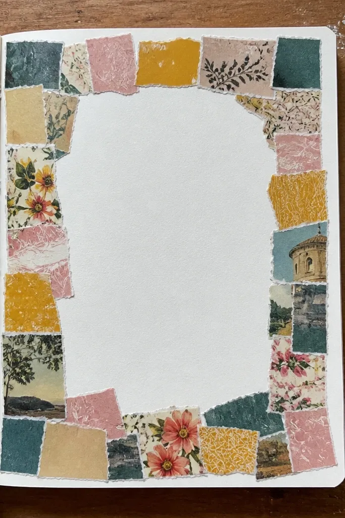
Collage frames look expensive even when they’re made from scraps. You place small rectangles in a border pattern, leaving the center for your writing. The cut edges create texture, and the mixed colors make the page feel alive. This idea is perfect if you have leftover wrapping paper, old magazine scraps, or torn colored paper. It takes a little cutting time but stays small-space friendly because you only build a thin frame.
Cut 10-14 small rectangles about 1.5-3 cm wide and 2-4 cm tall. Arrange them on the page edges to form a frame, then tape them down one by one. Leave a clean center area for writing and add your main sentence. Finish by trimming any pieces that overhang the frame line and pressing everything flat.
Pro tipUse a glue stick for paper scraps so edges don’t curl like tape can.
AvoidAvoid too many busy patterns — mix solids with just a couple prints.
20. Hand-Lettered Bullet Title with Underline Stars
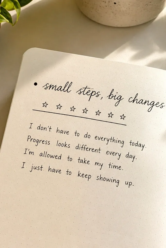
This is a typography-style page that looks cute without being artsy-crafty. You write a bullet title in a slightly larger font and then underline it with a row of tiny stars. The rest of the page can be 3-5 short lines of journaling. It’s visually strong because the title anchors everything. This layout works for quotes, daily focus, or “top three thoughts.”
Draw a small bullet dot at the start of a line, then hand-letter your title next to it using a thicker marker. Underline the title with a straight line. Add 5-8 tiny star shapes along the underline, keeping them evenly spaced. Write your 3-5 lines beneath, aligned to the left of the title.
Pro tipKeep the star size consistent by drawing them all with the same motion speed.
AvoidAvoid fancy letter flourishes — clean block lettering looks sharper.
21. Corner Doodles Around a Single Word
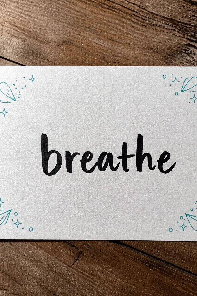
If you want maximum cuteness with minimum effort, put one word in the center and decorate each corner lightly. Think of it like a mini poster layout. The corners get tiny doodles — circles, sparkles, droplets — so the page feels complete. Use one word that matches your entry theme, like “breathe,” “plan,” or “grateful.” This is excellent for small-space pages because it doesn’t rely on filling space.
Write one large word in the center of the page using a thick pen. In each corner, draw one small doodle cluster about the size of a quarter. Add a thin underline or border line around the center word. Finally, write 1-2 tiny lines of journaling beneath the word to connect it to your day.
Pro tipPick one doodle type and repeat it in all corners for a cohesive look.
AvoidDon’t add doodles in the middle — corners only keeps it clean.
22. Accordion Fold Tabs for Mini Sections
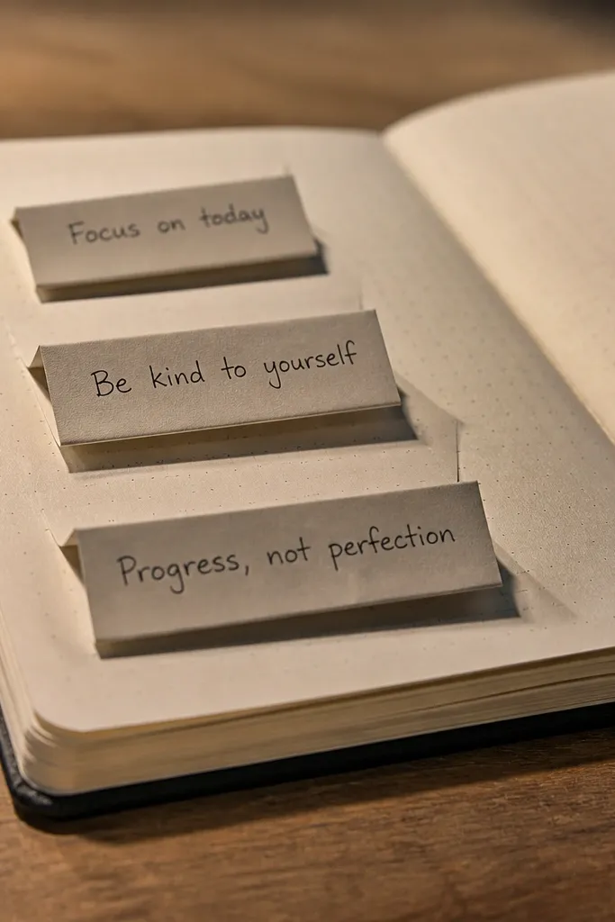
Accordion fold tabs make a page look interactive, even when you’re working on a flat notebook. You create three mini sections by folding small strips of paper and sticking them down, then write one short note in each section. The fold creates dimension and makes photos look more interesting than plain lines. It’s good for “today / later / done” or quick reflections. Skill level is low: you’re mainly folding and taping.
Cut a strip of paper about 2.5 cm wide and long enough to span the page width. Fold it like an accordion into three equal sections, around 5-6 cm each. Tape the folded strip to the page so the tabs open upward, then write one short line in each section. Add a small header above the tabs and press the taped edges firmly.
Pro tipUse a bone folder or the back of a spoon to sharpen the folds.
AvoidAvoid thick cardstock — it makes the notebook bulky when closed.
23. Washi Tape Corner Arches + Date Stamp Style
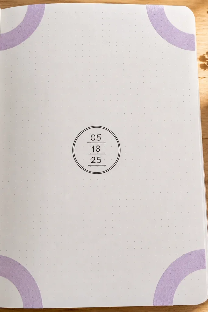
Corner arches are a cute alternative to full borders. This layout uses small curved washi tape arcs in the corners, then writes a date in the center like a stamp. It looks intentional because the corners are symmetrical and the center date gives a clear focal point. Use one color tape and one pen color for the stamp text. Great for setting up a page for daily journaling where you want the structure but not a full grid.
Place small washi tape strips in each corner, curving them inward to form an arch shape. Keep each arch about 1.5-2 cm long and roughly the same height. Write the date in the center with a thicker pen and add a small circle or rectangle outline around it. Finish by drawing two tiny dot clusters under the date, one on each side.
Use a pencil lightly to map where the arches will land before taping.
Avoid uneven arch heights — match them visually across corners.
24. Dotted Timeline with Two Checkpoints
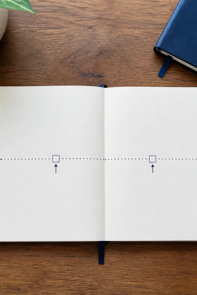
A dotted timeline makes journaling feel organized without drawing a full calendar. You draw one long dotted line across the page, then mark two checkpoints with labels and tiny arrows. It’s perfect for “morning vs night,” “before vs after,” or “plan vs result.” The look is cute because the dots create a consistent visual texture. You only write at two points, so the page stays clean.
Draw a horizontal line across the page and replace it with dots, spacing them evenly. Add two larger circle markers at specific spots along the line, leaving space in between. Label the circles with short words like “morning” and “night,” and add a short note near each label. Finish by drawing small arrows pointing from the line to each label.
Use one pen thickness for dots and a slightly thicker pen for the two checkpoints.
Don’t add more than two checkpoints; the timeline loses its neat look.
25. Tiny Sticker-Style Burst Background
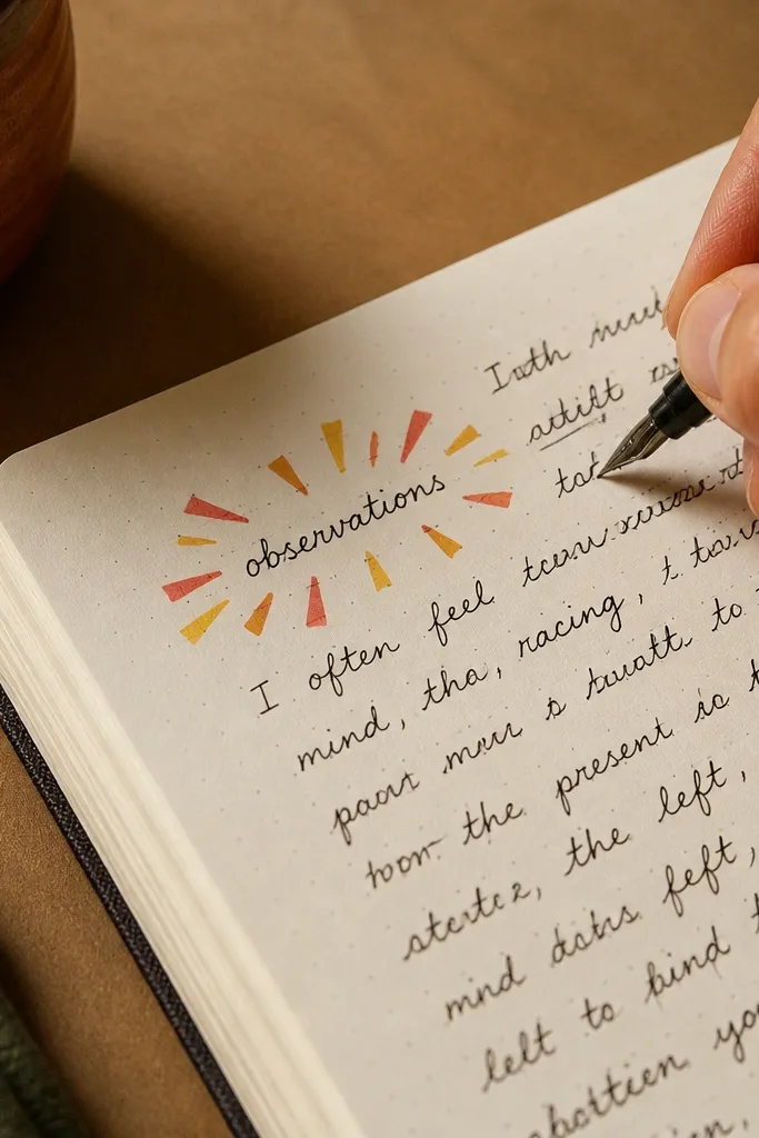
Sunburst bursts are a classic cute shape, and you can make one with simple triangles or lines. Put the burst behind a short word or mini header, then write your journaling around it. The burst adds visual energy without needing lots of supplies. Keep it small so it fits a small-space page and doesn’t overwhelm your writing. This is great for a page that needs one main message.
Draw a small circle or oval in the top half of your page and place your short word inside it. Around the oval, draw 10-14 short lines or triangle points like a burst. Choose one color for the burst and a darker pen for the word outline. Add two lines of journaling beneath the burst and underline one sentence with a thin line.
Keep burst points short and consistent so it looks like a sticker, not messy spikes.
Avoid using too many colors in the burst; one color reads cleaner.
26. Confetti Dot Cluster Header

A confetti dot cluster header turns a plain page into something fun in seconds. You draw a small cluster of colored dots above your header, then keep the body text simple. The dots act like decoration but also visually separates the header from the writing. Use 3-5 colors max, and keep dot sizes consistent. This idea works for prompts, gratitude lists, and “things I want to remember” pages.
Choose a spot near the top center and write your header line with a dark pen. Above it, draw a cluster of 20-30 dots in 3-5 colors using colored markers or gel pens. Keep dots about 2-4 mm wide for a neat look. Finish by adding a straight underline under the header and one dot on each end of the underline.
If dots bleed, use gel pens and let them dry fully before closing the notebook.
Avoid giant dots — they make the header look cluttered.
27. Hand-Drawn Label Strip with Cut-Out Notches
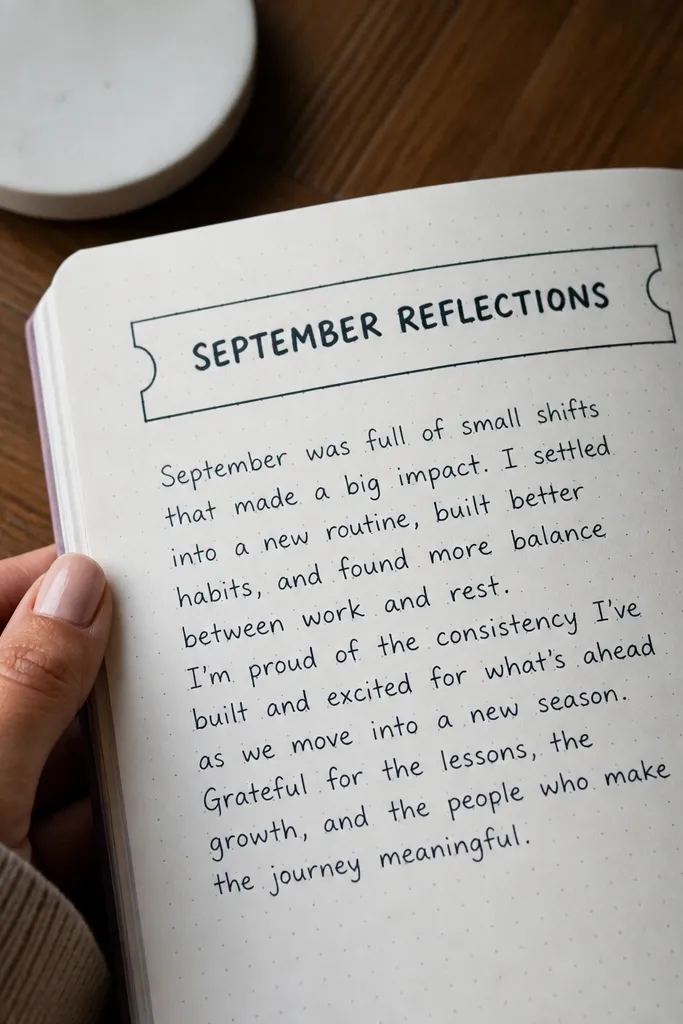
Label strips with notches look like packaging stickers and they make small-space pages feel intentional. You draw a strip across the top or middle and add small cut-out notches at the ends. Then you write a short title inside the strip. It’s a clean, photogenic way to organize your page without a full border. This layout works for daily themes, weekly goals, or a single paragraph entry.
Draw a rectangle strip across the page about 12-15 cm wide and 2.5-3 cm tall, centered. Add two small notch cuts on the left and right edges by drawing semicircles inward. Shade the strip outline with a colored pencil, then write your title inside in dark ink. Add one small icon under the strip, like a tiny heart or star, and write your notes beneath.
Use a ruler for the strip, then freehand the notches for a handmade feel.
Don’t make the strip too tall — it crowds the writing area.
28. Two-Color Arrow Map Layout
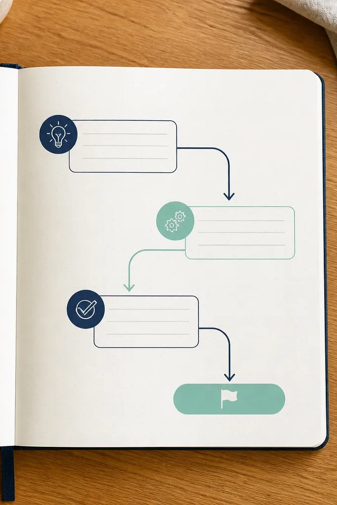
Arrow maps look cute because they show movement even with minimal text. This layout uses two colors for arrows and three short note areas connected in a path. It’s perfect for journaling a sequence: plan, action, result, or start, middle, finish. The visual hierarchy is clear and the page stays tidy because you limit text to three spots. Use one handwriting color for everything and reserve colors for arrows only.
Draw three small rectangles or circles in a diagonal line across the page, spaced evenly. Write one short phrase inside each shape. Draw arrows connecting shape one to shape two and shape two to shape three, alternating arrow colors. Finish by adding a tiny dot at each arrow start and end to make the connections look crisp.
Keep arrowheads the same size; that consistency is what makes it look clean.
Avoid adding arrows that loop — one path looks best.
29. Mini Mason Jar Outline + Label Text
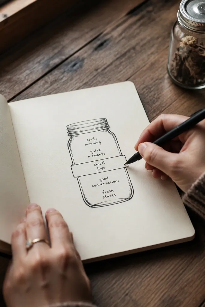
A mason jar outline is an easy cute icon that turns journaling into a “collected thoughts” page. You draw a simple jar shape, add a label strip, and then write short words inside the jar. It feels fun and organized because the jar is a container. Keep the jar small so the page still has breathing room. This is a great fit for gratitude items, affirmations, or “things I’m saving for later.”
Draw a simple jar outline about 6-7 cm tall, with two curved sides and a small lid line on top. Add a label strip across the jar middle and write a short label there. Inside the jar, write 5-7 short words stacked lightly. Outline the jar with a dark pen and shade the jar interior lightly with a colored pencil.
Pro tipUse a gel pen for the jar outline if your paper shows pencil smudges.
AvoidAvoid writing full sentences inside the jar — short words look cuter.
30. Notebook Spine Style Margin Header
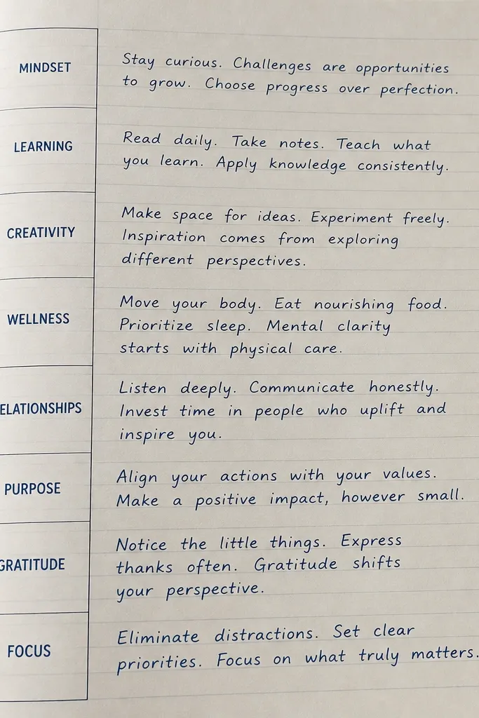
This layout borrows the look of a binder or notebook spine, which instantly makes a page feel curated. You create a vertical margin header on the left side with a few stacked words, then write horizontal notes to the right. It’s cute because it uses layout design, not doodle overload. Choose a theme word for the spine header and keep the rest simple. It works well for organizing by category when you’re doing multiple journal sections.
Draw a vertical rectangle margin on the left about 2.5-3 cm wide. Write your theme word vertically inside using small letters, one per line. On the right side, write 3-6 lines of notes aligned to the left margin line. Add a thin border line around the vertical margin header and a small dot under the last note to balance the page.
Pro tipUse a single-letter spacing style so the vertical text looks deliberate.
AvoidAvoid cramming too many spine words; three to five lines is enough.



