
1. Washi Tape Corner Frame + One-Line Promise
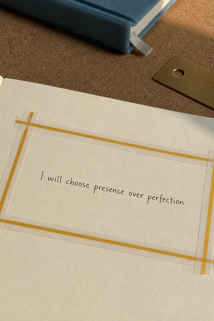
This layout looks sharp because the frame is made from crisp tape edges instead of drawn borders. You get a clean focal point for one sentence that guides your journal — something like “Write the honest thing first.” The rest of the page stays uncluttered, so your handwriting stands out. It’s best for daily journals where you want a fast start and a page that looks tidy even when you add notes later.
Cut 4 strips of washi tape and place them as a corner frame: two corners on the top (left and right) and two on the bottom (left and right). Keep the inner “window” about 2.5 inches from each tape edge so your text has air. Write one promise line in the center using a fine-tip black pen, then underline it with a thin ruler line or a second tape strip. Finish by adding 3 small doodle dots around the promise line with a gel pen for a balanced look.
Burnish tape edges with a fingernail so they don’t lift when you write over them.
Don’t cover the whole page with tape — the frame should be minimal or your text loses contrast.
2. Watercolor Wash Background + White Gel Pen Title Block
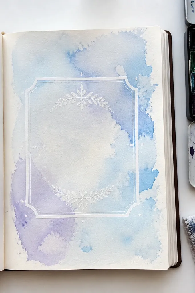
A watercolor wash gives you that “designed” look with almost no effort. The key is keeping the wash light enough that your title text still reads. A white gel pen title block makes the words pop on top of the color, and it stays photogenic even with imperfect brush strokes. This is perfect for mood journals or gratitude journals where you want the page to feel airy, not heavy.
Wet a watercolor brush lightly and paint a loose wash across the page, leaving margins untouched (about 0.5 inch). Let it dry until it’s no longer cool to the touch. Draw a rectangle title block in pencil in the center and fill it with white gel pen lettering. Add 2 short lines under the title for your prompt, then outline the rectangle with a thin black pen for crisp edges.
Use paper that can handle water — if your pages buckle, tape the page to a board before painting.
Avoid using thick watercolor in the area where you’ll write — muddy color makes white gel pen look dull.
3. Thrift Collage Centerpiece + "Start Prompt" Tag
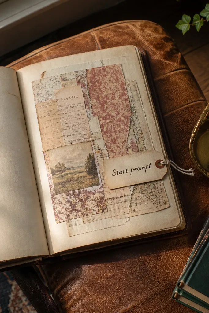
Collage is the quickest way to make a first page look like art because it already has texture and color variation. The centerpiece draws attention, while a small “Start prompt” tag gives you a practical place to write. Keep the collage area to the center so the page still feels organized. This works especially well for journals about creative ideas, reading logs, or anything where you want inspiration to feel physical.
Pick 3-5 scraps with different textures (old book pages, receipt paper, fabric-like scraps, or magazine bits). Tear them into irregular shapes and arrange them in a 4x5 inch cluster in the middle of the page. Glue them down with a thin layer of matte glue, smoothing from the center outward. Add a small tag shape under the collage (about 2x1 inch) and write your prompt inside it, then seal the surface with a light coat of matte medium.
Tear edges instead of cutting for a softer blend — it looks cleaner on camera.
Don’t glue everything at full thickness — thick layers create uneven shadows that can look messy.
4. Dotted Grid Layout + "3 Things" Checklist
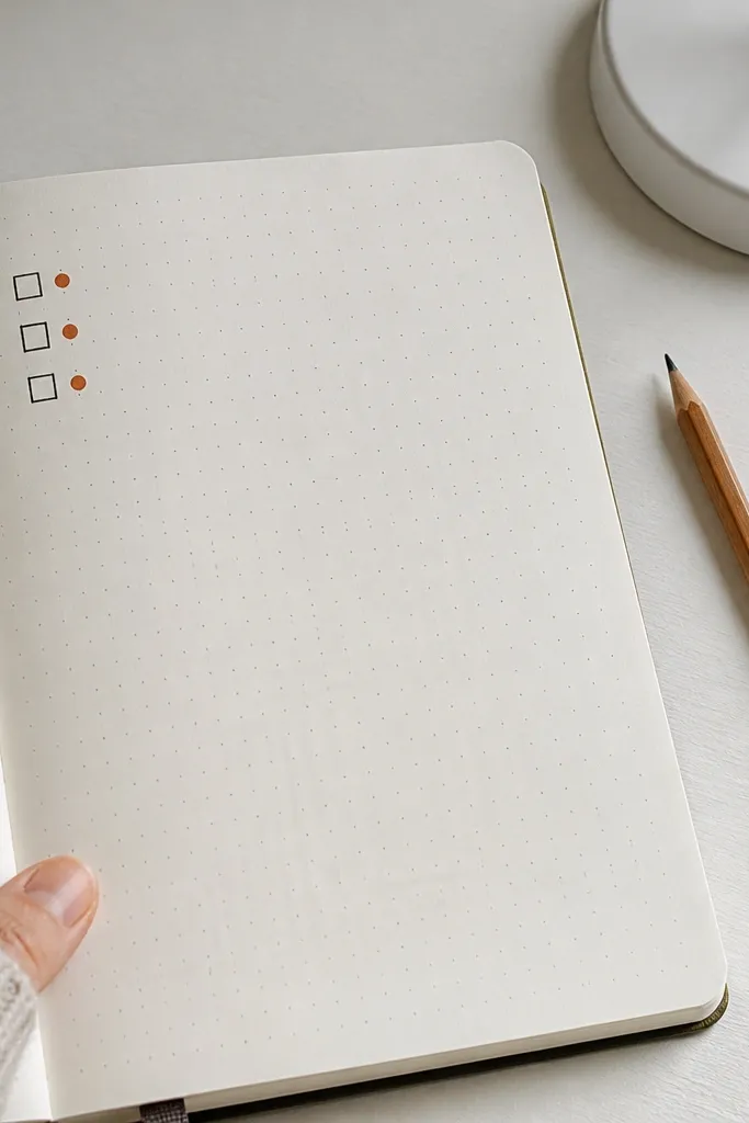
A dotted grid gives you automatic structure, and it reads instantly as intentional. This layout is great for people who want a first page that helps them start writing today. The “3 things” section is quick and repeatable, which keeps the page from becoming a one-time art project. It also photographs well because the dot pattern creates a subtle rhythm behind your text.
Pro tipMake the dots faint — press lightly so your handwriting stays the main event.
Use a fine dot marker or a stencil to create a light dotted grid in the background, leaving a blank margin of about 0.75 inch around the page. Draw a title at the top center, then create three checkbox rows spaced evenly across the middle. Use a ruler to keep checkbox squares aligned to the grid. Write your “3 things” prompt next to the checkboxes, then add a short date line at the bottom.
AvoidDon’t make the grid too dark — it steals attention from the checklist.
5. Stamp Border + Handwritten Monthly Focus
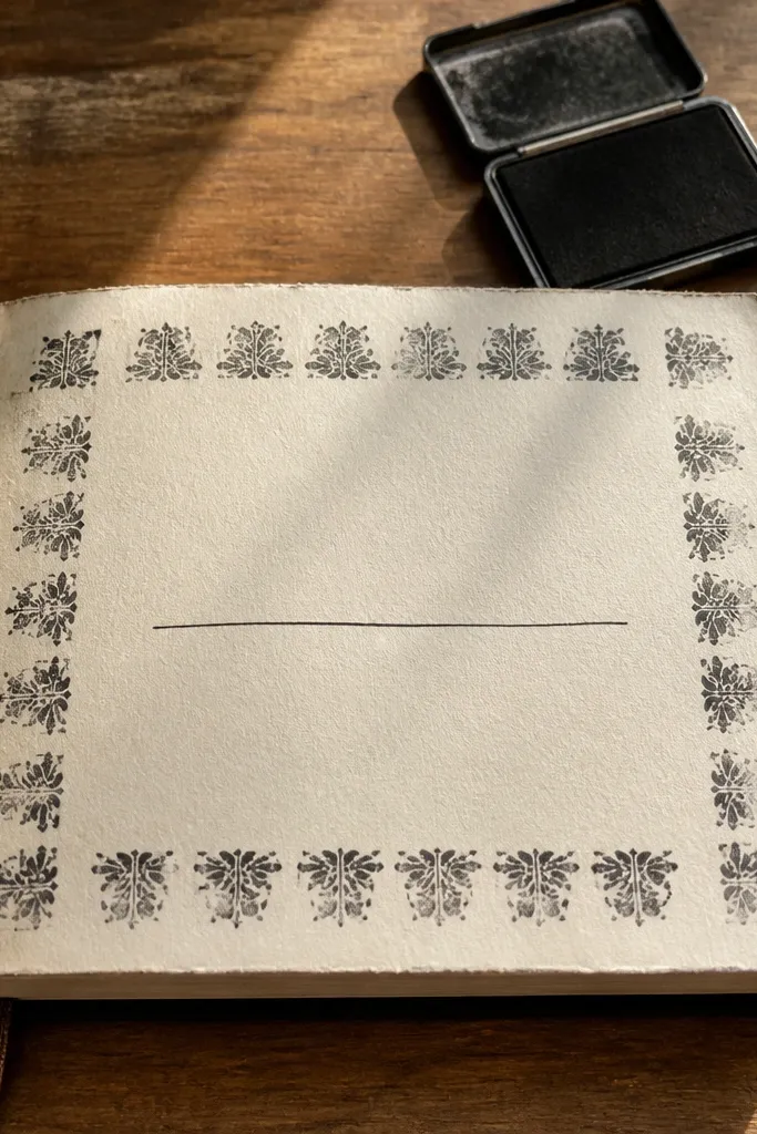
Stamps create a repeating pattern without you drawing anything perfectly. A border frames the page and makes the center feel like a “panel” for your writing. This layout is ideal for monthly journals because your focus line can stay consistent while you add dates and notes. It also looks great in photos because stamp ink gives crisp texture at the edges.
Choose a single stamp and ink color like black, deep navy, or muted terracotta. Stamp a border rectangle leaving a 0.5 inch margin, keeping the corners aligned. Write a bold centered title in the middle, then add a single sentence beneath it labeled “Monthly focus:” followed by a blank line. Finish with 4 small stamp marks near the corners of the center panel to balance the composition.
Let stamp ink dry fully before you write over it to avoid smudges.
Don’t use too many different stamp designs on the same page — it makes the border feel noisy.
6. Ink Splatter Side Column + Vertical Quote Rail
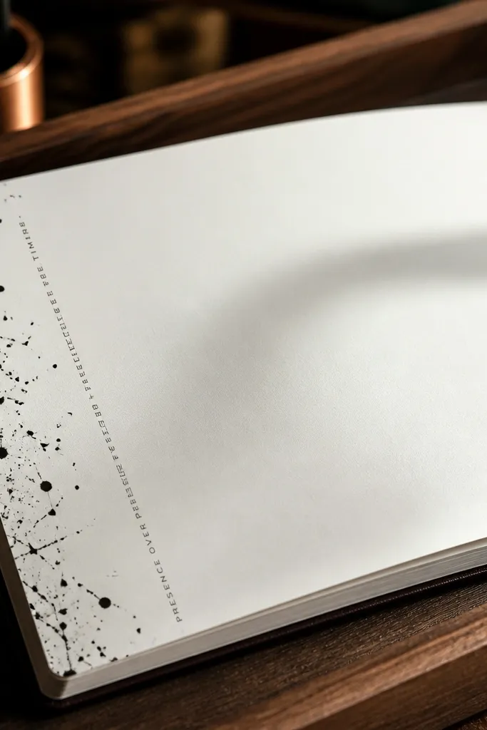
This is a high-contrast look that still stays organized. The splatter adds energy, but the vertical quote rail keeps the page readable. It’s perfect for journals where you want your first page to hold an anchor thought you can revisit. The side placement also makes it camera-friendly because the main text stays centered and sharp.
Pro tipPractice the flick on scrap paper — ink density changes fast.
Mark a vertical strip on the left side about 1.25 inches wide, with a clean margin around it. Dip a toothbrush in diluted ink or watered acrylic, then flick to create controlled splatters inside the strip. Draw a thin vertical line where the strip ends, then place a quote rail beside it: a rectangle about 3 inches tall with your handwritten quote. Add a short “Start writing:” line at the bottom of the rail.
AvoidAvoid splattering across the writing area — even small dots make text look messy.
7. Hand-Drawn Botanical Frame + Mood Word Corner
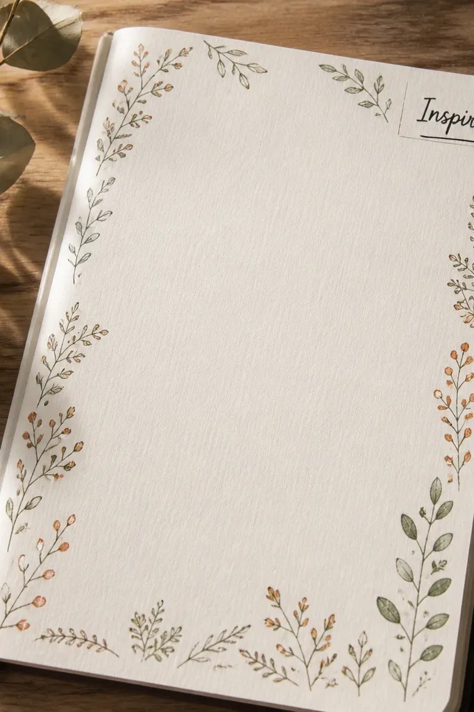
Botanical doodles look soft and intentional, especially when you keep them small and repeatable. A frame around the page makes the center feel like a clean workspace. The mood word corner gives you a quick emotional check-in that’s easy to write and easy to photograph. This works well for wellbeing journals and creative diaries where you want gentle structure.
Lightly sketch a border using pencil: small leaves or sprigs along the top and sides, leaving the bottom area for writing. Ink over the pencil with a brown or dark green fineliner, then erase pencil marks after the ink dries. Add a small corner box in the top-right (about 1.25x1.25 inches) and write one mood word inside. Put your main prompt in the center with 2-3 lines, like “What do I need today?”
Use one plant shape repeated — consistency is what makes it look designed, not random.
Don’t add too many different leaf styles — variety kills the calm look.
8. Monochrome Paper Cut Shapes + Center Title Panel
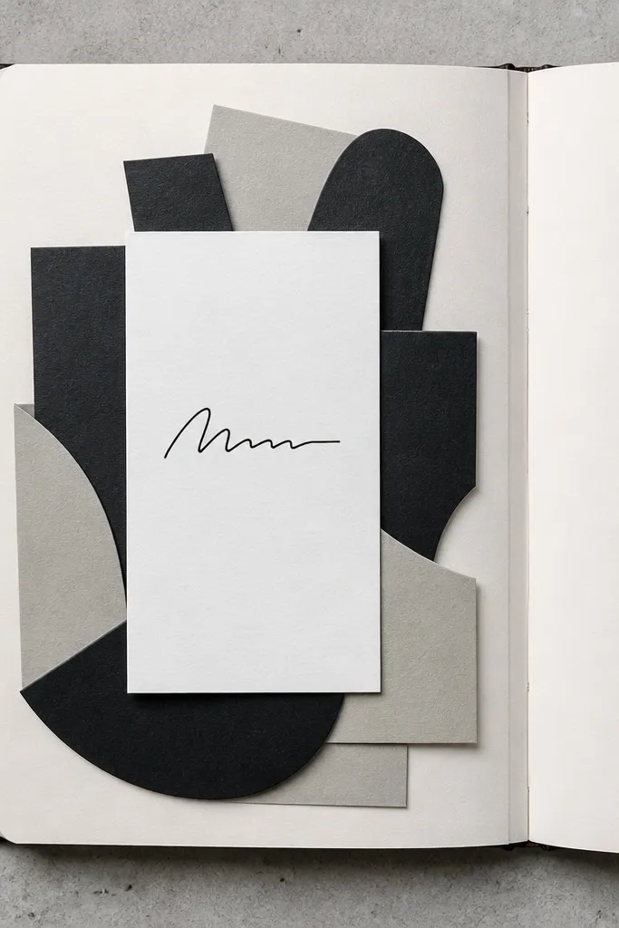
Paper cut shapes look clean and graphic, and monochrome keeps it stylish instead of cluttered. Layered shapes behind a title panel create depth without needing paint. This layout is great for journals that are mostly text, because the background stays subtle. It also fits any theme — you’re not locked into flowers or stars, just geometry.
Pro tipSand or lightly roughen paper edges with fine sandpaper for a softer cut-edge look.
Pick 2-3 shades of one color family (cream, taupe, charcoal) from craft paper or cardstock. Cut simple shapes like triangles and rounded rectangles, then arrange them behind where your title will go in the center. Glue layers down with a thin adhesive so edges don’t curl. Add a centered title rectangle (about 3.5 inches wide) and write your journal prompt inside with a bold black pen, then add a tiny date line under the rectangle.
AvoidDon’t use glossy paper — glare looks bad in photos and can make the ink look washed out.
9. Grid Label System + Color-Blocked Prompt Squares
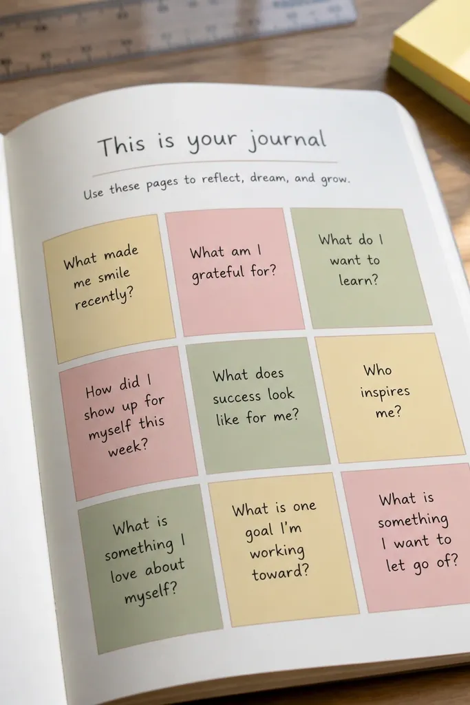
This idea makes your first page look like a planner spread. The color-block squares give you clear sections for writing, and the grid keeps everything aligned. It’s especially useful if you want to track multiple things right away, like mood, intention, and one task. Photographically, the straight lines and solid blocks are crisp and satisfying.
Draw a grid on the page with a ruler: create a 3x3 layout in the center, leaving a margin of about 0.75 inch. Label each of three squares with short prompts like “Mood,” “Intention,” and “One task.” Color-fill the squares with light marker or watercolor, keeping each square one shade. Leave the top row for a title label and the bottom row for a date stamp line. Write in black pen on top of colored squares only after the color is dry.
Use a light hand with marker so the paper doesn’t buckle — watercolor marker works better than heavy permanent ink.
Avoid tiny text in colored squares — it blurs unless you use a fine pen.
10. Doodle Border + Centered "Weekly Reset" Box
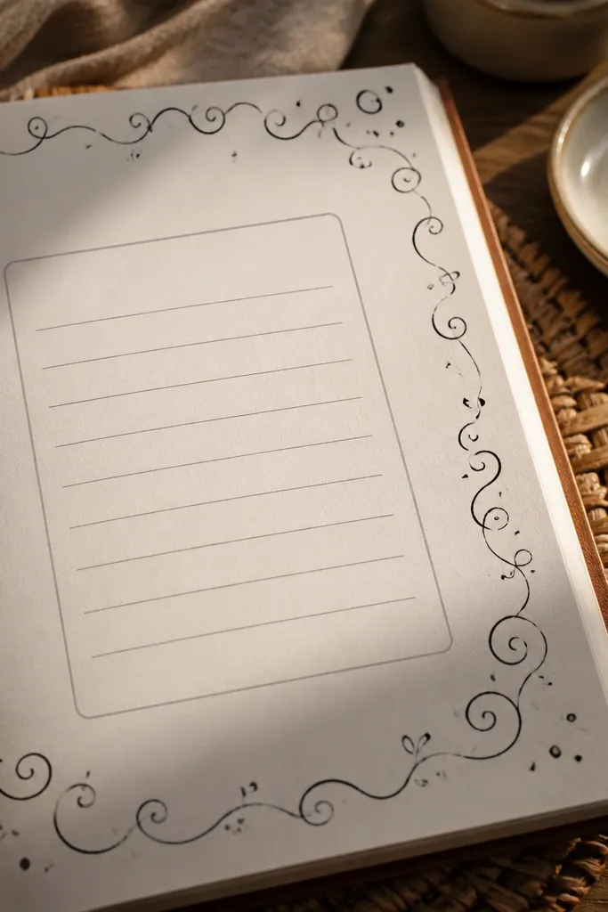
A doodle border gives personality while still keeping the page structured. The center reset box is where you write your actual journal content, and it stays clean because the border doesn’t cross it. This layout is good for weekly journals, especially if you want to review what worked and what didn’t without hunting for space. It’s also a great way to practice consistent doodles because you repeat the same motifs around the edges.
Choose 4 doodle motifs like stars, dots, tiny hearts, and simple lines. Draw a light border rectangle in pencil, then ink the motifs along the border edges in the same style and size. Create a center box about 4x5 inches and write “Weekly reset” at the top. Add three prompt lines inside the box: “What I’m carrying,” “What I’m releasing,” and “What I’m doing next.” Finish by stamping or signing lightly in the bottom-right corner.
Keep doodles small — a consistent size looks intentional and doesn’t crowd the writing box.
Don’t add doodles inside the center box — it turns the writing area into decoration.
11. Gel Pen Galaxy Dot Burst + Date Orbit Circle
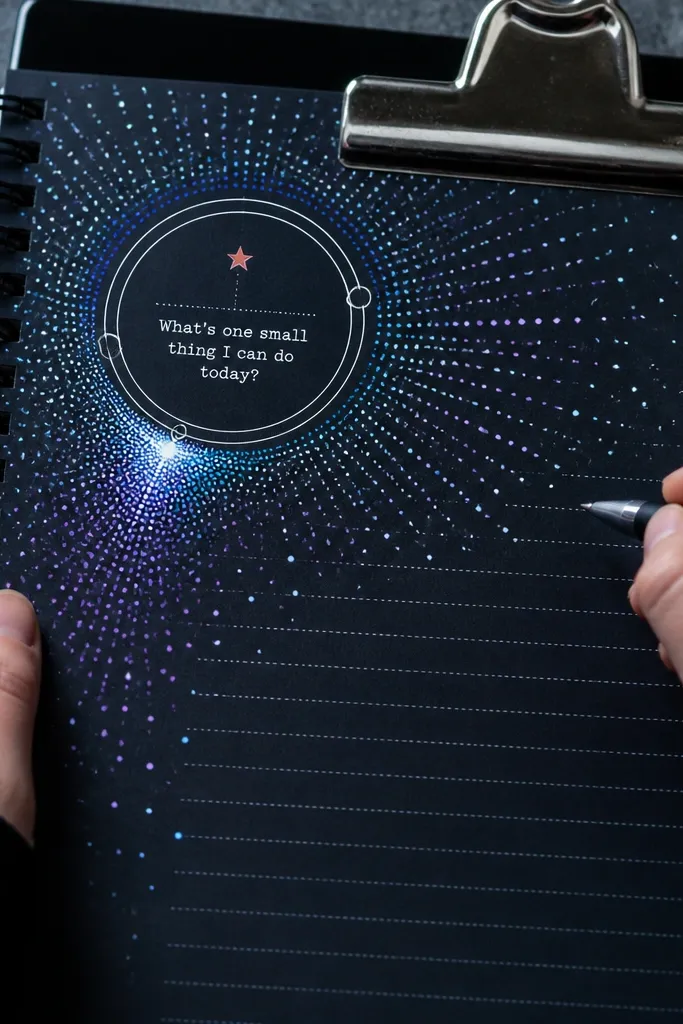
This looks like a mini celestial poster, but it still works as a writing page. The dot burst creates movement, while the orbit circle gives you a clear place for the date and a small prompt. It’s photogenic because bright dots catch light and create texture. Use it for creative journals, study logs, or any notebook you want to feel playful without losing legibility.
Pro tipLayer colors lightly — thick gel pen can smear when you write nearby.
With a black fineliner, draw a small circle in the center about 1.75 inches wide for the date area. Around it, add a dot burst using gel pens: start with pale dots near the circle and build outward with brighter colors. Write your date around the circle path, then add a short title above the burst like “Today’s focus.” Finish with 2-3 prompt lines underneath the burst, leaving them free of dots so your handwriting stays crisp.
AvoidAvoid using too many colors — five colors max keeps it looking intentional.
12. Black Ink Topographic Lines + "My North" Heading
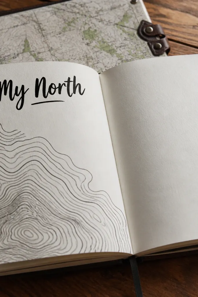
Contour lines look dramatic and modern, and they create a built-in texture that doesn’t distract from text. The heading “My North” makes the page feel like a compass, which is perfect for goal journals and intention pages. Keep the lines thin and layered so the center stays readable. This is a strong choice when you want aesthetic without color mess.
Draw your “My North” heading at the top center. Below it, create a center writing area about 3.5x4 inches. Use a black fineliner to draw contour-like lines around that writing area, starting with wider spacing and tightening toward the center. Add a small label line like “Guiding question:” followed by a blank line. Let the ink dry, then lightly shade the background with a gray pencil if the page feels too stark.
Use one pen size for all lines — mixed line widths make contour art look accidental.
Don’t fill the whole page with lines — the writing area needs breathing room.
13. Sticker Mosaic Frame + Clean Date Strip
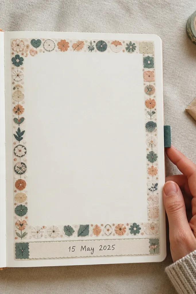
A sticker mosaic looks fun and collectible, and it instantly makes your page feel styled. The secret is to keep the mosaic in a frame so your writing stays readable. A clean date strip at the bottom gives you a practical spot to track entries without fighting busy visuals. This works best for journals that you actually use daily, because stickers age well and hide small mistakes.
Choose 10-20 stickers that share a vibe (same color family or same line style). Place them around the page edges in a border band about 1 inch wide, leaving a clear center for writing. Add a bottom date strip by drawing a thin rectangle across the page width minus 0.5 inch margins. Write the month and date label on the strip with a fine black pen. Fill the center with your “Start here” prompt in 2-4 short lines.
Press stickers down firmly and avoid thick overlapping — raised edges catch glare in photos.
Avoid placing stickers directly on top of your main prompt — the ink won’t look clean.
14. Fabric Swatch Patchwork + Thread-Look Border
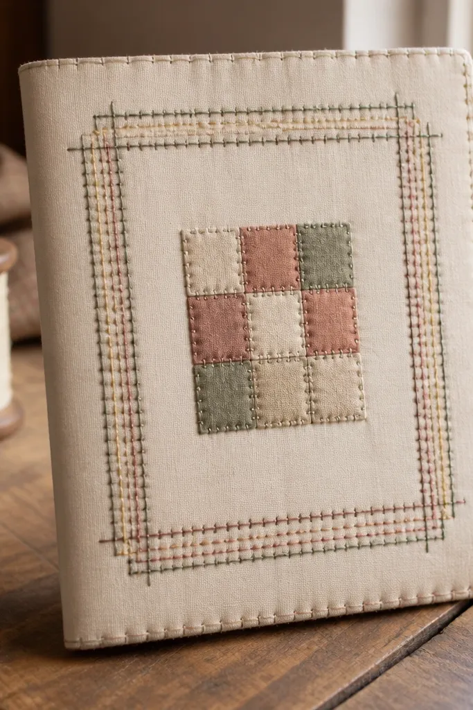
Fabric swatches add a tactile look that paper-only pages can’t match. Patchwork in a small center area makes the page feel warm, cozy, and intentional, even with simple writing. The thread-look border can be drawn with a fine marker or gel pen to mimic stitching lines. This is a great pick for memory journals, gratitude journals, or any notebook you keep on a coffee table.
Pro tipIf fabric frays, dab a tiny bit of glue on the cut edges before patching — it looks cleaner.
Cut small fabric rectangles or scraps about 1.2x1.2 inches each. Arrange 4-6 pieces in a center patchwork cluster and glue them down with matte glue, smoothing wrinkles. Draw a stitched border around the patchwork using a fine pen: make short dashes along the edges. Add your prompt text in the open area around the patchwork, keeping it at least 0.75 inch away from fabric. Seal the fabric lightly with matte medium so it doesn’t fray.
AvoidDon’t soak the fabric with glue — it can bleed through and warp the page.
15. Monoline Frame + Minimal Icons Header
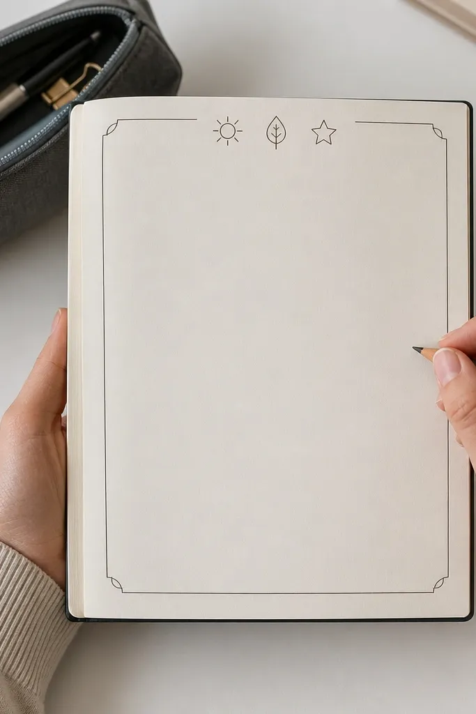
This is the clean, modern look that still feels handmade. A monoline frame is thin enough that your handwriting is the focus, and minimal icons add personality without clutter. It’s perfect if you want your first page to look good even after you write over it with different pens. This style also matches any journal theme because it’s mostly line work.
Pro tipUse a ruler for the frame but freehand the icons — perfect icons look printed; slightly imperfect looks human.
Draw a thin rectangle border around the page with a ruler, leaving 0.5 inch margins. Add a header line at the top center and small icons on either side, like a sun, a leaf, or a droplet, all in the same line weight. Create a central prompt box about 3.5 inches wide with 4 writing lines. Write your prompt, then add one small underline flourish below it using the same pen. Let ink dry before erasing any pencil guides.
AvoidDon’t thicken the frame lines with multiple pen passes — it makes the page feel heavy.



