
1. Celestial Phone-Case Stars
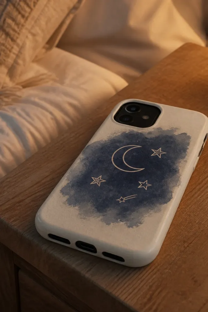
This one looks good because it mimics a modern phone-case graphic: a tight cluster of icons with clear negative space. Draw a crescent moon, three sizes of stars, and one tiny shooting star. Keep every icon the same line thickness so it reads as a single design. Add a navy wash behind the cluster and let the paper show through around the shapes — that contrast is what makes the page pop in photos.
Start by penciling a rough rectangle or rounded rectangle frame where the icons will sit. Ink the crescent and stars with a black fineliner, then add a simple shooting star line with two short strokes. Color the background with a light navy wash using a small brush or watercolor pencil and leave the icons unpainted. Finish by adding one white gel pen highlight dot on the crescent and one star.
Pro tipUse a gel pen for highlights even if you’re using markers elsewhere — it gives crisp sparkle without smudging.
AvoidDon’t outline stars with multiple line weights or they’ll look messy instead of graphic.
2. French Market Mini Baskets
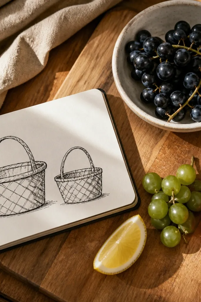
Woven textures look aesthetic fast because your eye reads the pattern even when the fruit details are minimal. Draw two small baskets with a simple crisscross weave, then add three fruit shapes like grapes, a lemon wedge, and a strawberry. Keep the fruit color palette tight: one warm yellow, one red, one deep green. Add a light tan or cream wash behind everything to make the line art feel like a postcard.
Sketch two baskets side by side, leaving a gap between them so the page breathes. For the basket weave, draw vertical lines, then cross them with diagonal lines and keep it consistent across both baskets. Color the fruit with soft fills (colored pencil or marker), then lightly shade under each fruit shape to anchor it in the basket. Wash the background with diluted warm beige, then let it dry before adding any final ink touch-ups.
To sell the weave, darken the outer basket rim and keep the inner weave lighter.
Don’t overcrowd with too many fruits — three items per basket looks cleaner and more styled.
3. Apothecary Label Bottles
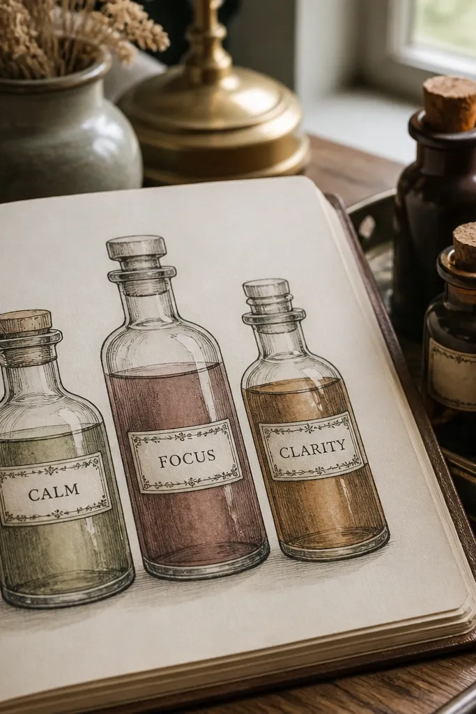
Apothecary drawings look expensive because labels create structure. Draw three bottles of different heights, each with a label that has one short word and a small decorative border. Use muted colors like sage green, dusty rose, and amber-brown for the liquid tint. The key is to add one consistent “glass shine” highlight on every bottle — that makes them look like they belong together.
Draw bottle silhouettes first: one tall, one squat, one medium, with simple neck shapes. Add label rectangles on the front and write tiny text like “calm,” “mint,” or “sun” using your normal handwriting style. Color the liquid as a light tint inside each bottle and leave a white highlight strip near the right edge. Outline bottle edges again with a fine black pen after the color dries so the lines stay sharp.
Pro tipKeep label text to one to two words. Tiny handwriting that’s too long turns into scribbles fast.
AvoidDon’t fill the entire bottle body with color — leave the glass outline mostly transparent.
4. Vintage Window Curtain Panels
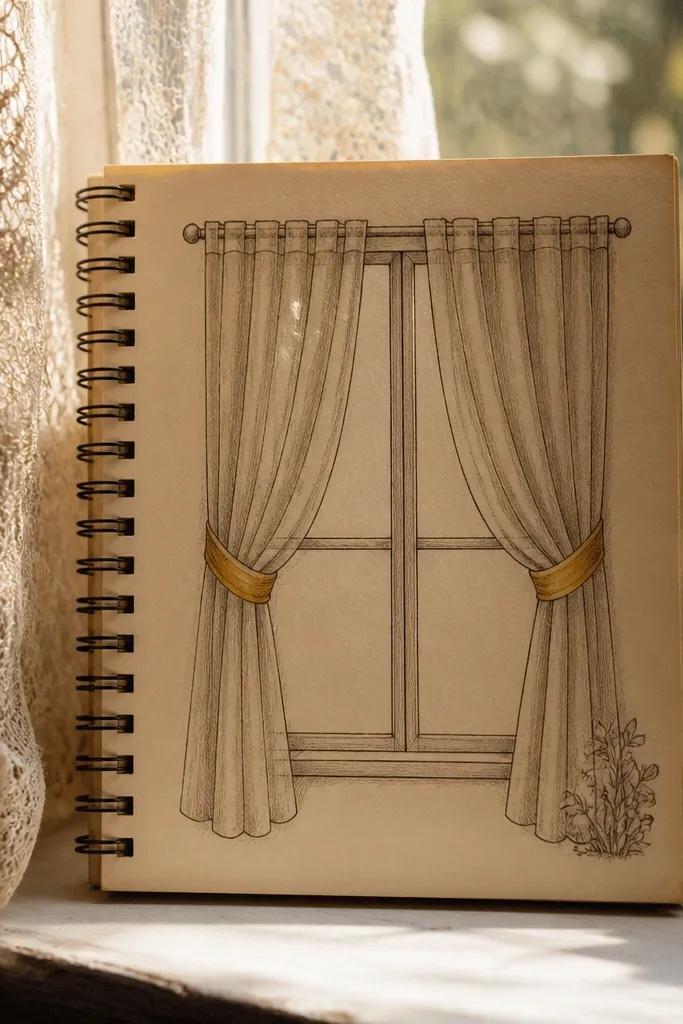
Curtains are one of the easiest ways to get “aesthetic” because folds create natural shading. Draw a simple window frame, then two curtain panels with repeating U-shaped folds. Use sepia or warm gray for the shading and one accent color for tiebacks. Add a tiny plant silhouette at the bottom corner for balance and a soft background wash so the whole page feels like a quiet room scene.
Sketch a rectangular window frame with a thin border and add a small sill line at the bottom. Draw curtain folds as repeated curved lines that get slightly tighter near the tieback. Shade one side of each fold darker to create depth, then lightly color the tiebacks. Wash a pale background (very light beige or watercolor gray), let it dry, then ink the window frame edges for crisp contrast.
Pick one light source direction and shade every fold the same side — that consistency makes it look designed.
Don’t make folds random sizes everywhere or the curtains won’t read as fabric.
5. Marble-Corner Border with Mini Icons
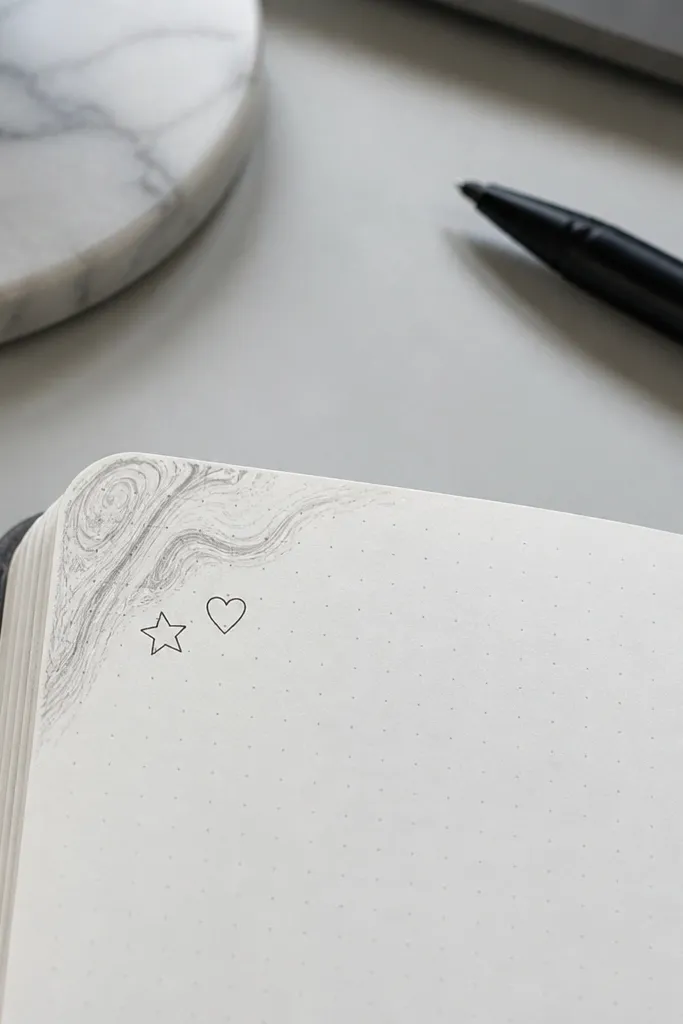
This is a layout trick disguised as an art idea. A marble-corner border frames your page and lets small icons feel intentional. Draw marble swirls only in the top-left corner (or any one corner) so it doesn’t overpower the page. Then place two tiny icons inside the corner — a star and a heart, for example. It photographs well because the corner becomes a clear focal point with high contrast.
Use watercolor or colored pencil to create a marble swirl in the corner: lay a light base color, then add thin curved lines in a slightly darker shade. Blend lightly with water if you’re using watercolor, or smudge gently with a tissue if you’re using pencil. After it dries, draw two tiny icons just inside the corner border with a fine liner. Finish by adding one thin shadow line under each icon so they feel placed, not floating.
Pro tipKeep the marble lines thin and sparse; dense marble looks muddy in small corners.
AvoidDon’t color the whole page with marble — the corner framing is what keeps it aesthetic.
6. Monochrome Fashion Silhouette Trio
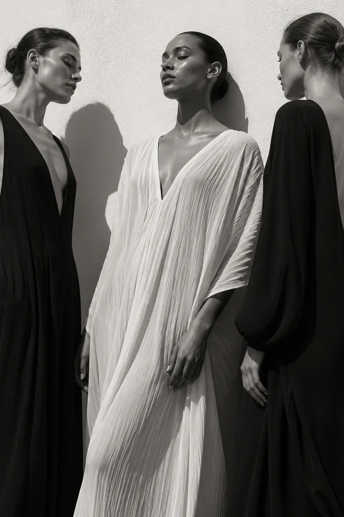
Fashion silhouettes look striking because they rely on shape, not detail. Draw three figures in profile or one-quarter view, but simplify them to clean outlines. Use only one ink color (black or deep charcoal) so the page stays graphic. Add one patterned element like a polka-dot scarf on just one figure to create a focal pop without breaking the monochrome look.
Draw three silhouettes stacked vertically, leaving space between each one for breath. Outline hair, shoulders, and clothing hem with a single smooth line, then fill clothing with solid black. Add one accessory pattern using a simple repeat — five dots, three stripes, or a tiny checker. If you want extra depth, add a light gray wash behind each figure with a soft edge.
Pro tipUse a thicker pen for the outer outline and a thinner pen for the accessory details.
AvoidDon’t add facial features — the charm comes from the shape and gesture.
7. Cozy Coffee Steam Lettering

Steam is a cheat code for aesthetic because it creates swirls that look intentional even if your cup is simple. Draw one coffee cup with a minimal outline and add steam lines that curl into cursive-like loops spelling one word such as “soft” or “stay.” Keep the steam lines consistent thickness and leave the inside of the steam white so it looks airy. Color the cup with a warm brown and add a faint shadow under the cup to ground it.
Sketch the cup first: an oval top, straight sides, and a small handle shape. Add a base shadow under the cup with light pencil or a gray marker. Draw 6-8 steam lines that curve upward and loop back down slightly, then connect them to form a single readable word. Color the cup lightly, then ink the outlines after the color settles to prevent bleeding.
Write the steam word in pencil lightly first, then trace over with a fineliner.
Don’t make the steam too thick — heavy steam lines turn the page from airy to cluttered.
8. Japanese Wave Pattern with Tiny Koi
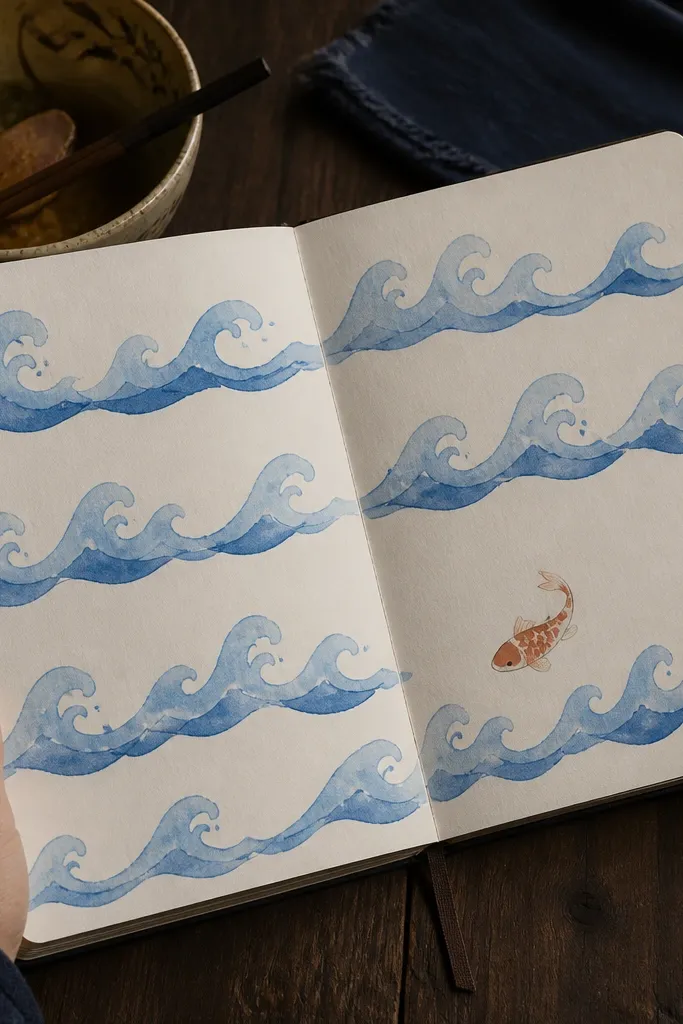
Wave patterns create that calm, aesthetic rhythm instantly, and the koi adds a focal point. Draw 3-4 rows of simple waves across the page, then place one small koi fish in the negative space. Use a limited palette: two blues and one accent red or orange for the koi. Add a subtle gradient by layering a lighter blue on top and a darker blue on the bottom edge of the waves.
Start by drawing a horizontal guideline across the page where the waves will sit. Make wave rows using repeated C-shapes, keeping each row evenly spaced. Color the waves with two blue tones: lighter on top, darker on the bottom. Draw the koi as a simple curve with tail fins, then add one red patch near the head and one small dot eye.
Pro tipIf your waves wobble, trace the first row carefully and then copy the spacing row-by-row.
AvoidDon’t add extra fish — one koi reads cleaner and looks more intentional.
9. Soft Pastel Floral Corners
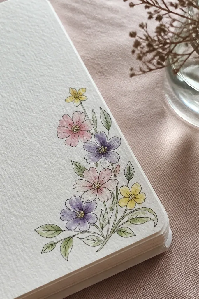
Floral corners are popular for a reason: they frame the page without covering your writing. Build a small cluster of 5-7 tiny flowers in the corner, with thin stems that taper toward the center. Use pastel shades like blush pink, pale lavender, and soft yellow. Add light green leaves with minimal vein marks. The aesthetic comes from airy spacing — you want the paper to show between petals.
Choose one corner and lightly mark where the bouquet will fit. Draw 2-3 larger flower shapes first, then add smaller buds around them. Add leaves as narrow ovals with one central line, and connect them with thin stems. Color petals in light layers, then add a tiny dot center with a darker pastel or colored pencil.
Use colored pencil for petals if you want the soft, grainy pastel look without streaks.
Don’t outline every petal with black — it makes pastels look harsh.
10. Candy Wrapper Border with Cutout Stripes
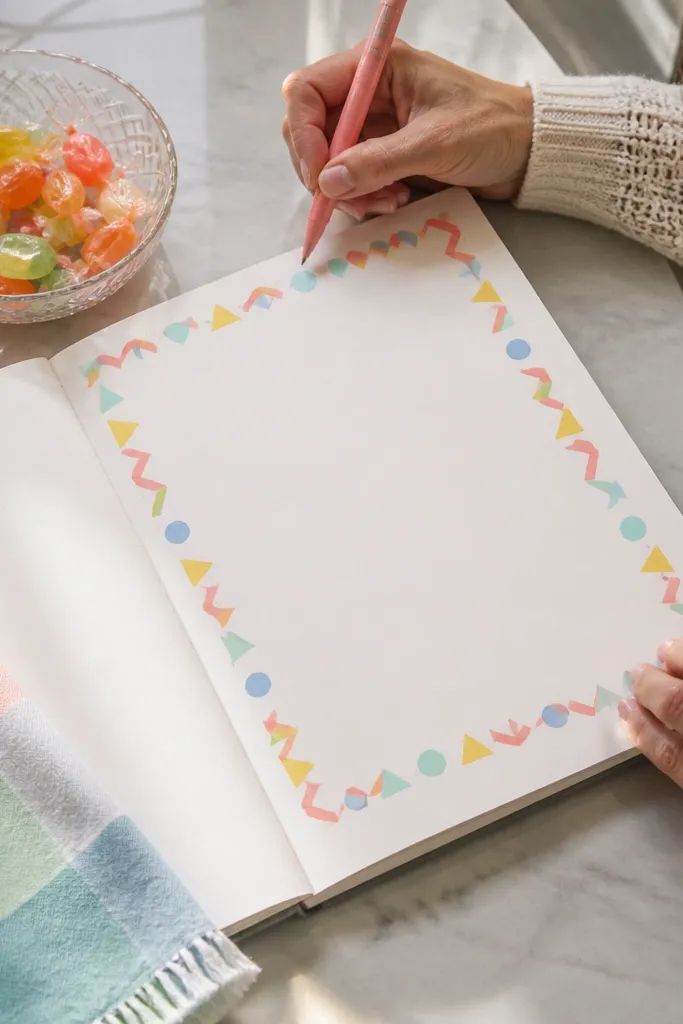
This idea looks playful and clean because it uses a border system. Make a zigzag candy stripe frame around one edge, then add cutout shapes inside like small triangles or circles. Keep the colors in two families: warm (coral, yellow) and cool (mint, sky blue). The border does the heavy lifting, so the center can stay minimal for writing.
Draw a rectangle border near the page edge, leaving a margin for writing. Inside that border, create zigzag stripes by alternating diagonal lines and filling each strip with a color. Add “cutouts” by leaving small gaps in the zigzags shaped like triangles or circles. Finally, outline the border lightly with fineliner so the stripes look crisp in photos.
Use a ruler for the border, but freehand the zigzags — perfect zigzags look too mechanical.
Don’t use more than four colors in the border or it turns into visual noise.
11. Terrarium Glass Dome and Labels
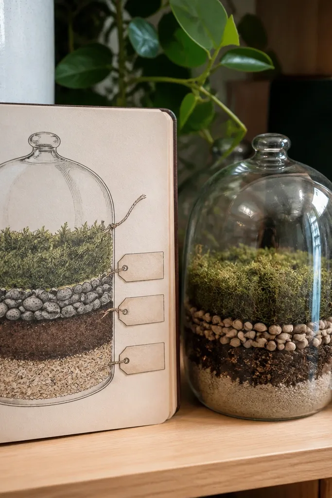
Terrariums look aesthetic because they combine shapes: dome outline, stacked layers, and small labels. Draw a rounded dome, then inside it add three layers like sand, pebbles, and moss. Use a muted green palette and one warm brown layer for soil. Add 2-3 tiny label tags hanging from the dome edge with short strings. It’s photogenic because the dome outline frames the layers like a miniature diorama.
Sketch the dome outline first: a semicircle with a thick rim line. Inside, draw three horizontal layer lines, then fill each with a different texture using dots for pebbles and light scribbles for moss. Add two tiny plant shapes as simple leaf clusters near the top layer. Finish by drawing two small label tags with short handwritten words and color the string lightly.
Pro tipFor the glass rim, leave a thin white highlight on one side of the dome.
AvoidDon’t over-detail every leaf — three plant clusters look better than ten.
12. Sunset Gradient Sky with Silhouette Skyline
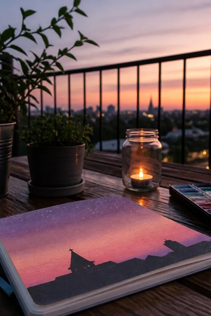
Gradient skies make journal pages look instantly styled because they add smooth color transitions. Draw a simple skyline silhouette at the bottom with one or two recognizable shapes — a peaked roof, a tower, or a bridge. Then add stars sparingly above the skyline. Keep the gradient clean: three bands of color blended smoothly, not many random colors. The silhouette stays dark so it reads clearly against the sky.
Draw the skyline first in pencil: a low horizon line and simple blocky shapes. Ink the skyline with a black pen or marker and let it dry. Create the gradient sky with watercolor or watercolor pencil in three bands: peach near the horizon, orange in the middle, and purple at the top. Blend gently with water, then add a few tiny star dots with a gel pen once the paint is dry.
Pro tipUse wet-on-wet blending for the gradient, but keep the skyline completely dry before you add stars.
AvoidDon’t outline the skyline with a gray wash — solid black looks cleaner.
13. Minimal Marble Lettering Banner
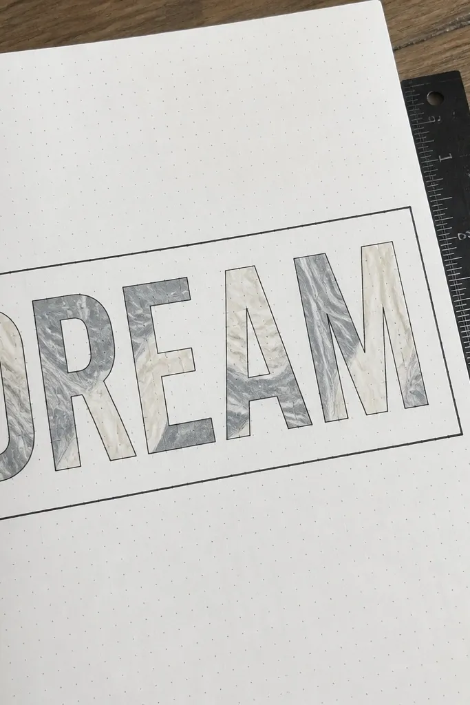
A lettering banner looks aesthetic because it combines typography-like shapes with a decorative fill. Pick one short word like “dream,” “journaling,” or “notes” and draw it in a simple block letter style. Fill the letters with a marble pattern using two colors, then outline the letters in black. Add a thin border line above and below the banner so the page feels organized.
Sketch a straight banner line across the page with a ruler and lightly pencil your word in block letters. Ink the letter outlines with a fineliner. Fill each letter with a marble effect: paint a light base color, then add thin darker swirls and drag them slightly with a damp brush. After dry, add tiny highlight streaks inside the letters with a white gel pen.
Keep your letters tall and narrow. Wide letters make marbling harder to control on a journal page.
Don’t skip the black outline — marble fills alone look unfinished in photos.
14. Botanical Press Leaf Stamps
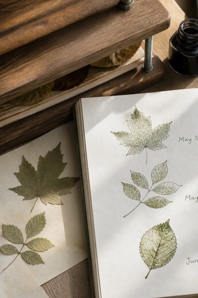
Pressed-leaf aesthetics look good because they’re graphic and slightly imperfect. Draw two or three leaf outlines and treat them like stamps: clean outline, subtle vein lines, and a light wash inside. Add small handwritten “date” notes near each leaf like “May 3” or “June 1.” Use one ink color for outlines and one pale green for fill. The look is calm, airy, and reads like a curated nature page.
Draw leaf shapes with a teardrop outline and a pointed tip, then add a central vein line and 3-5 side veins. Ink the leaf outlines, then color inside with pale green colored pencil or watered marker. Add tiny date text near each leaf using the same pen. Finally, outline the leaf with a slightly darker green along the edges for definition.
Use a light touch on vein lines — thick veins steal attention from the stamped look.
Don’t add lots of background texture — the leaves should be the only pattern.
15. Sewing Thread Spool Border with Tiny Scissor Frames
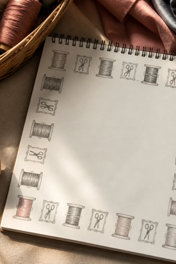
This drawing idea gives you a clean, repeatable border that looks styled even when you’re sketching fast. The spools read like real objects because you draw them in simple rings with shaded thread bands, and the tiny scissor frames add a “craft room” vibe without clutter. It’s photogenic because the repeating shapes create a strong rhythm across the page. You get a practical layout too — the border naturally leaves a neat writing area in the center, so your journal stays usable. This is beginner-friendly, and it takes about 25 to 35 minutes for one page border with a few frames. It fits desks, sewing-themed journals, and anyone who wants their page to look organized in photos.
Grab a ruler, a black fineliner, and two thread colors you like (like mustard + cream, or teal + coral). Lightly pencil a rectangle border that sits 1.2 cm from the page edges, then draw 7 to 9 thread spools along the top and bottom edges — each spool should be about 1.1 cm wide and 0.9 cm tall. Add a filled band for the thread wrap: paint or marker the top band first, then shade the underside with a slightly darker tone so the spool looks round. Between spools, draw thin connecting lines like thread trails, then place tiny scissor frames in the corners and at two mid-sides — each frame is just a simple scissor outline inside a rounded rectangle about 2.2 cm by 1.4 cm. Finish by tracing over the final border lines with fineliner and lightly erase pencil smudges so the lines stay crisp.
Use a scrap paper strip under your hand when coloring the thread bands so you don’t smear ink into the border lines.
Don’t make the spools all the same flat color — add at least one darker underside band or they’ll look like stickers instead of thread.



