
1. Red Thread Travel Ticket Pocket Page
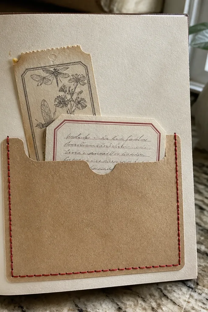
Cut a cardstock rectangle 6 in x 8 in and round the corners slightly. Create a pocket by gluing a 6 in x 4 in kraft paper panel on three sides, leaving the top open, then stitch a straight path across the pocket front with embroidery thread using a needle and awl holes spaced about 1/4 in apart. Add one ticket strip centered, then glue a small label cut from scrap paper under the ticket. Finish by inking the edges with a brown ink pad and tying a short red thread bow at the bottom corner of the pocket.
This page looks polished because it’s built around one strong focal point: a ticket-style pocket framed by a stitched red thread line. The red thread adds movement and a “made on purpose” feel, even if your ephemera is mismatched. Use kraft paper for warmth, then add one printed ticket strip and one handwritten label so the page reads like a mini travel memory. It’s great for photos because the pocket creates depth and the thread catches light without looking glossy. Skill level is beginner-friendly, and you can finish a page in about an hour.
AvoidDon’t glue the ephemera directly over the stitch line — it makes the thread look flat.
Pro tipMark your stitch line with a pencil first, then punch tiny holes so the thread stays straight.
2. Botanical Washi Frame With Pressed Leaf Look
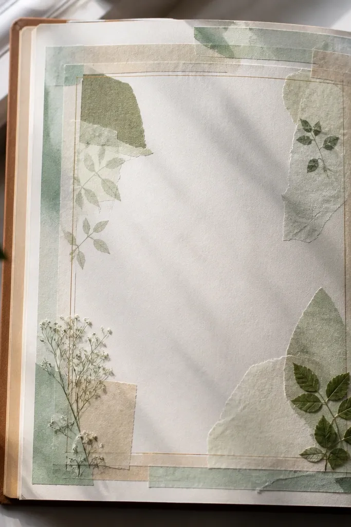
Start with a 7 in x 9 in page base on smooth paper. Tape a rectangular frame using two widths of green washi tape: one solid strip and one dotted/line tape, leaving the middle open. Layer thin green tissue in the bottom third, then stencil leaf shapes on top using a pale green ink pad. Add one small stamped sentiment in the upper left, then seal the page lightly with matte medium only over the tissue area.
A washi tape frame makes this theme instantly photogenic because it creates a clean border that holds the chaos together. Even if you don’t have real pressed leaves, you can mimic the look with green tissue scraps, a leaf stencil, and light color layering. The page feels airy because the center stays mostly light, letting the green accents pop. It works especially well in journals with lots of writing space since it gives you a visual break. It’s a fast build that looks delicate without being fragile.
AvoidSkip thick glue under tissue — it creates bubbles that show up in photos.
Pro tipUse a light touch with the stencil — multiple faint passes look more “pressed” than one heavy coat.
3. Midnight Sky Pocket With Star Map Tag
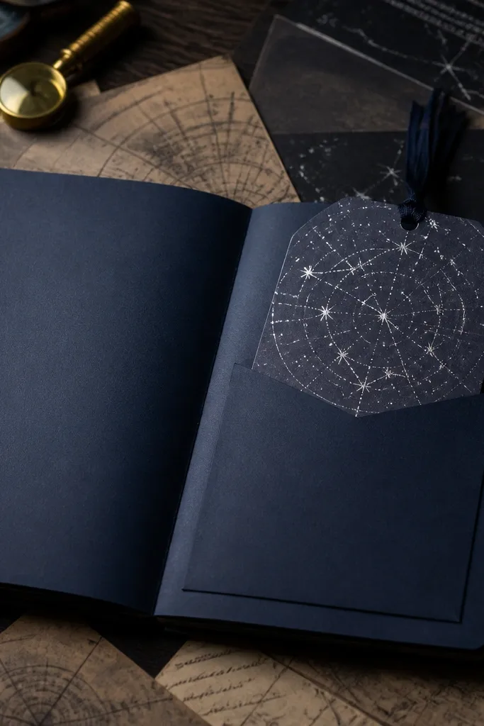
Cut a 6.5 in x 9 in page base from cardstock and paint or sponge it with dark navy acrylic, keeping it uneven for a real sky texture. Glue a side pocket using a 5 in x 4 in rectangle, leaving a 1/2 in border around it. Make a tag from 3 in x 6 in cardstock covered with a star map scrap, then punch a hole and thread through with thin silver cord. Add tiny star marks with a white gel pen and ink the tag edges with black ink.
Dark backgrounds make themes look dramatic and intentional. This spread uses a deep navy pocket plus a removable star map tag, so the viewer sees layering and function in one glance. The silver star accents add sparkle without needing actual glitter. It’s a clean way to use scraps like old maps, book pages, or printed astronomy pages, and the tag gives you a place for journaling prompts. The contrast is what makes it photograph well — the navy absorbs light, while the silver and white ink pull it back.
AvoidDon’t use chunky glitter — it reflects too much and can look messy in close-ups.
Pro tipLet the navy paint dry fully before you ink edges; otherwise you get muddy smears.
4. Citrus Zest Splash Page With Orange Ink Splatter
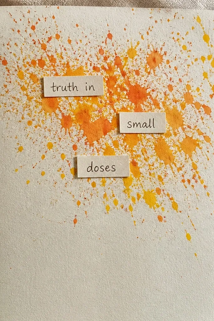
Use an off-white cardstock base 8 in x 10 in. Paint a thin band of pale yellow near the bottom, then load a toothbrush or splatter brush with orange ink and flick small droplets across the upper area. Cut two mini labels (about 1.5 in wide each) and glue them at the top corners, one reading “zest” and one reading “juice” using your own handwriting. Add a small strip of patterned paper at the center as a “menu” divider, then outline the strip with a black fine-tip marker.
This idea is loud in a good way. Orange and yellow splatter instantly reads “citrus” and gives you a page that looks energetic in photos. You’ll anchor that energy with small, neatly cut labels so the chaos feels controlled. The page looks fresh because most of the background stays white or off-white, letting the citrus colors pop. It’s ideal for mood journaling, recipes, or quick notes. Build it fast and it still looks styled.
AvoidAvoid covering the whole page with splatter — you need breathing room for readability.
Pro tipPractice splatter on scrap first so your page doesn’t get giant blobs.
5. Vintage Recipe Fold-Out With Index Tabs
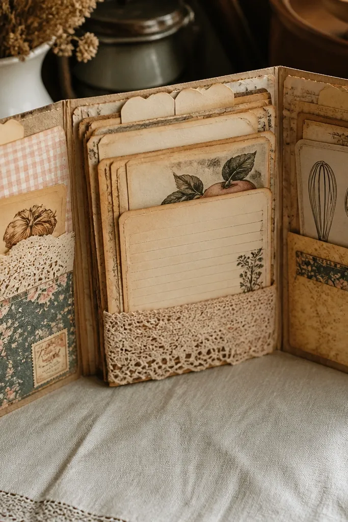
Start with a 9 in x 12 in cardstock sheet, score at 3 in and 6 in to create a tri-fold. Glue a patterned paper strip on the outer panels and ink the edges with sepia ink. Create three tabs by cutting 1.5 in x 2 in cardstock rectangles, gluing them to the top edges of each panel, then writing short headings. Add a fold-out “recipe card” flap by gluing a 8 in x 3 in paper strip to the center panel bottom edge. Seal the fold lines lightly with matte medium so they don’t stick.
Fold-outs make junk journals feel interactive, and recipe themes photograph beautifully because the paper textures look nostalgic. This spread uses a tri-fold layout with index tabs so every section has a job. The aged look comes from ink aging and paper layering, not from random antiques. It’s a great choice when you want your journal to store actual content like family recipes, meal plans, or ingredient lists. The tabs make it look organized even when the rest of your ephemera is varied.
AvoidDon’t stack heavy paper at the fold — it will crack or bulk up.
Pro tipScore with a bone folder so the folds stay crisp in photos.
6. Monochrome Film Strip With Frame Captions
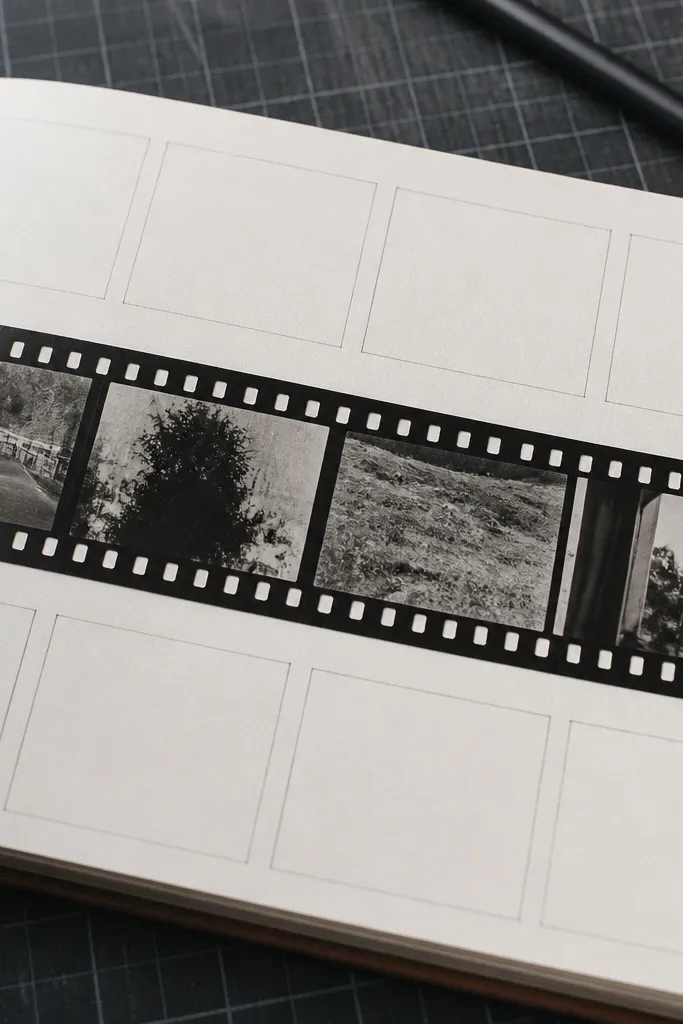
Monochrome is a cheat code for gorgeous consistency. This page uses a film strip strip as the main visual, then adds small caption frames so it looks like a curated photo set. You can use old negatives, printed film strip images, or even hand-drawn frames — the layout does the heavy lifting. The page reads clean because the elements repeat at regular intervals. It’s a great theme for journaling days, memories, or “things I noticed.”
Cut a 7 in x 9 in page base from cream cardstock. Create a film strip band by gluing a long strip of printed film frames (or draw 4-5 frames) across the center, leaving equal margins. Add a caption frame under each frame using small rectangles 1.5 in x 0.75 in, then write one word per caption. Punch a small circle on the left margin and attach a mini photo tag with a jump ring. Ink the edges with gray or black ink to unify everything.
Use a fine black pen for captions; thick markers look fuzzy next to film prints.
Skip glitter or bright colors here — they break the film vibe fast.
7. Lavender Field Pocket With Faux Dried Buds
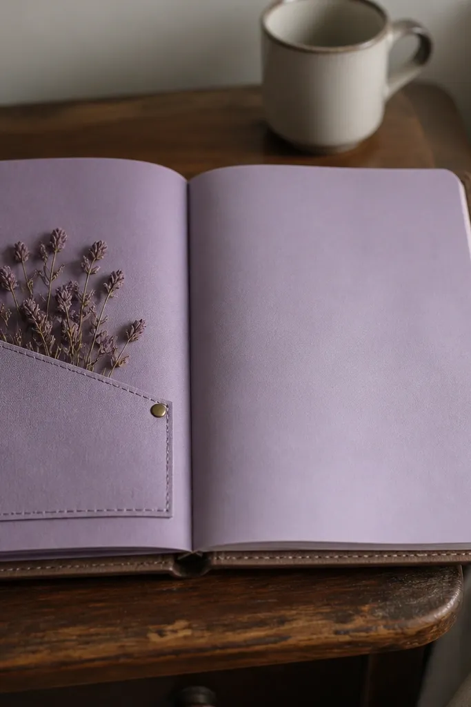
Make a 6.5 in x 9.5 in page base from light gray cardstock. Glue a pocket on the right side using a 5 in x 4.5 in lavender-toned paper panel, leaving the top open. Create bud shapes by cutting small teardrops from purple tissue or thin paper and layering them in a cluster on the pocket front, then secure with a tiny dot of white glue at the base. Add a thin border line with a purple marker along the left edge. Finish with edge ink in gray-purple so everything matches.
Lavender themes look soft and pretty in close-ups, and pockets add structure so the page doesn’t flatten out. This design uses a muted purple palette with small “dried bud” shapes for texture. It’s a good choice if you want your journal to feel calm and airy rather than busy. The pocket lets you tuck in a short note or a tiny bookmark, which makes the page interactive. It’s not hard, but it looks like you spent more time than you did.
AvoidDon’t soak tissue — it warps and makes the buds look sloppy.
Pro tipLayer buds from darkest to lightest so the cluster looks dimensional.
8. Sea Glass Shaker Window With Beach Card
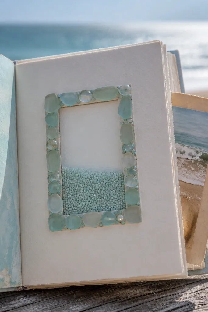
A shaker window is one of the quickest ways to get a “wow” page that photographs well from any angle. The sea glass look works because you use pale blues and greens in small pieces, then keep the window frame neat. Add a tucked beach card for a second focal point, so it feels layered and not just a gimmick. This theme is perfect for summer journals or anytime you want a page that feels like a collectible. It’s beginner-friendly if you use clear acetate and double-sided tape carefully.
Cut a 2.5 in x 3.5 in window rectangle on a 7 in x 9 in cardstock base, then glue clear acetate behind the opening. Build a frame using cardstock strips 1/8 in wide and reinforce corners with extra tape. Fill inside with small pale acrylic pieces or cut-up clear confetti in aqua/seafoam/green, then seal the top with another acetate layer or tape strip. Make a beach card tag (2 in x 4 in) and tuck it under a small side pocket. Shake gently to test before you press down permanently.
Use a craft knife on a cutting mat so your window edges stay clean for the tape seal.
Don’t overfill the shaker — it clumps and looks messy in photos.
9. Black Coffee Stain Map With Compass Corner
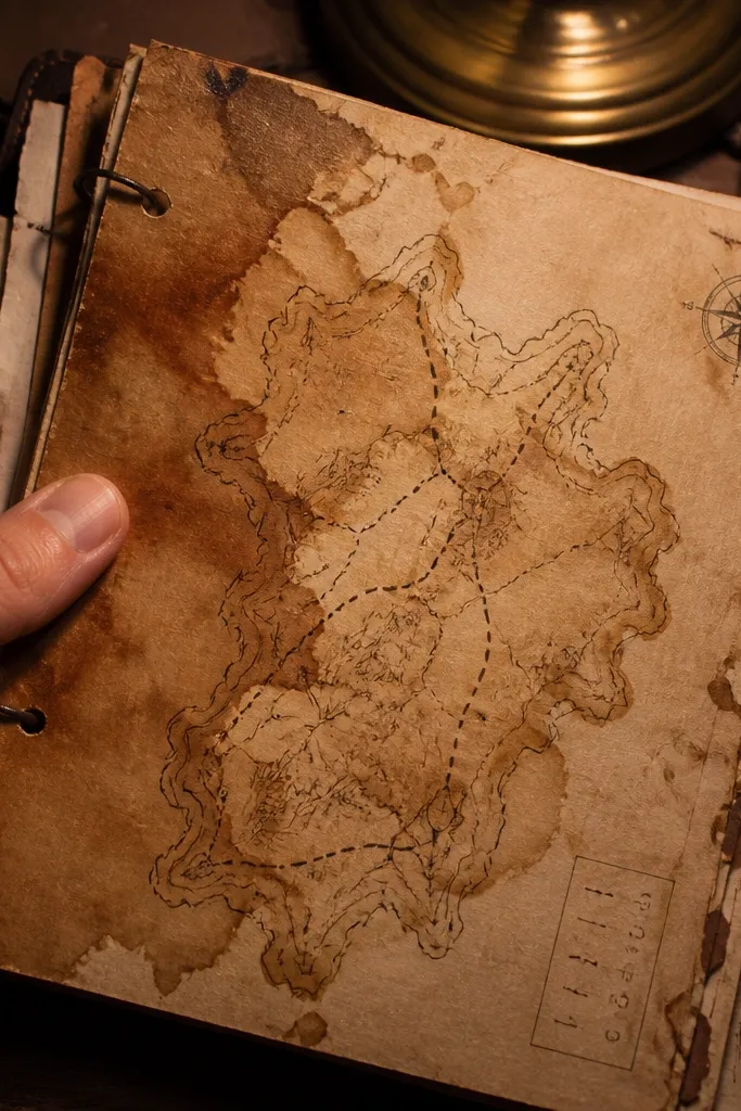
This page looks like a real travel artifact. Coffee staining gives you natural gradients, and a compass corner icon makes the theme readable instantly. The trick is to treat the stained paper like a map background, then add only a few crisp elements on top. You’ll get a gorgeous sepia base without printing anything fancy. It’s great for journaling routes, reading lists, or “places I want to go,” and it photographs beautifully because stain edges create natural texture.
Brew strong coffee (or use black tea) and let it cool slightly. Brush or sponge the liquid onto a piece of book page or plain paper, then blot with a towel and let it dry flat under a book. Tear the paper into a slightly irregular rectangle, then ink the edges with black or dark brown. Add a small compass drawing in the top right corner and glue a tiny “coordinates” strip using scrap paper. Finish by sealing the stain with a thin matte medium coat to prevent smudging.
Dry the page flat — warped coffee paper makes edges look uneven in photos.
Avoid heavy water — it tears thin pages and ruins the map texture.
10. Candy Wrapper Collage With Foil Border
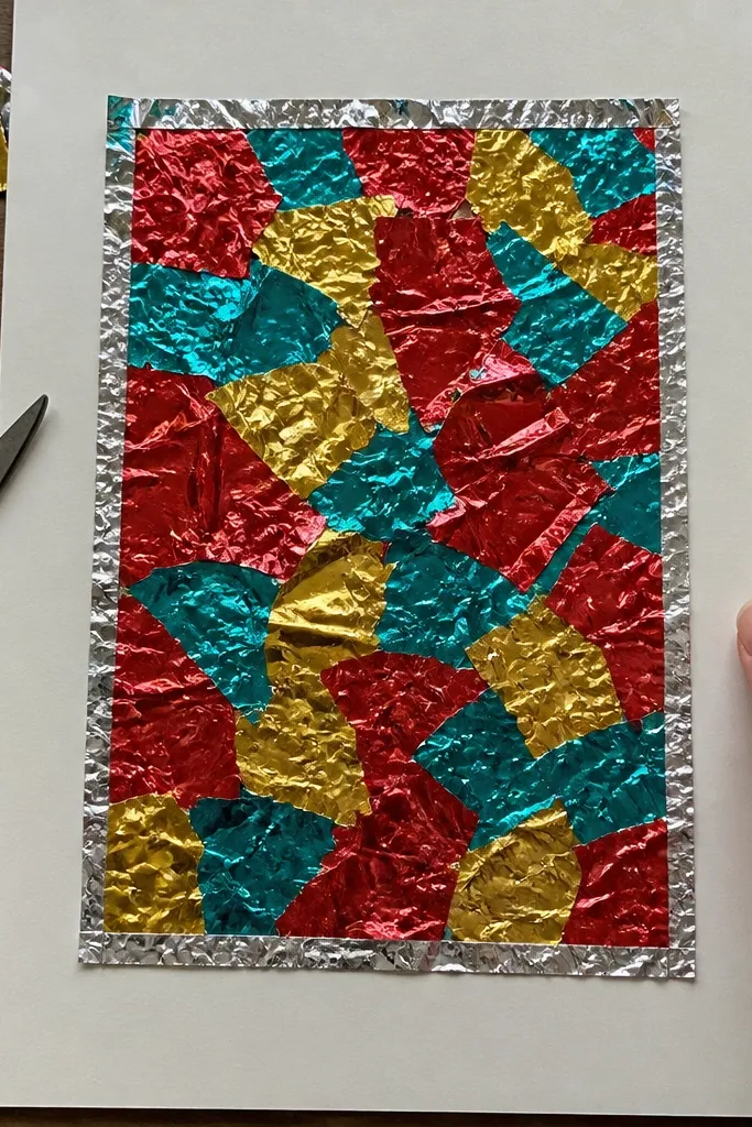
Cut a 8 in x 10 in cardstock base. Apply a foil tape or thin metallic washi around a centered rectangle opening, leaving a 1/2 in margin. Layer candy wrappers inside the rectangle by cutting pieces into consistent sizes and overlapping them like shingles. Add one small handwritten title strip at the top and a date strip at the bottom. Seal the whole collage with matte medium on top lightly, keeping it thin so the foil doesn’t go dull.
Candy wrapper collage is pure visual fun, and it works because foil and bright colors create instant contrast. The key is to frame the chaos with a clean border so the page doesn’t look random. Use one foil strip as the border, then keep the collage area contained in a rectangle. This theme is perfect for “treat tracker” pages, party memories, or any journal moment that needs color. It’s also a great way to recycle wrappers without it looking like craft-store trash.
AvoidDon’t use glossy tape everywhere — too many shiny layers look chaotic on camera.
Pro tipPress wrappers flat under parchment while you glue so you don’t get bumps.
11. Autumn Leaves Corner With Die-Cut Look Using Paper Punch
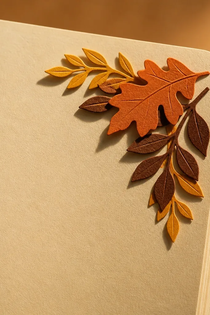
Use a 7 in x 9 in base in light kraft or cream. Punch 12-20 leaf shapes from orange, burnt sienna, and muted olive paper, then sort by size. Glue a staggered leaf cluster in the bottom right corner, layering larger leaves first. Add a small torn paper strip behind the leaves for contrast, then ink the leaf edges with a brown marker. Write a short heading on the opposite side using a thin pen.
Leaf corners look good because they frame the page instead of covering it. This idea uses paper punch leaf shapes (or hand-cut leaf silhouettes) to create a die-cut look without needing a cutting machine. Keep the rest of the page clean and warm, so your writing or photos stand out. The corner cluster creates depth, and the warm oranges photograph well with natural light. It’s a great theme for fall journals, gratitude notes, and seasonal checklists.
AvoidSkip a full-page leaf scatter — corners look intentional, full spreads look cluttered.
Pro tipInk edges after gluing so the overlaps also get unified.
12. Tea Bag Envelope With Strung Tag and Steep Notes
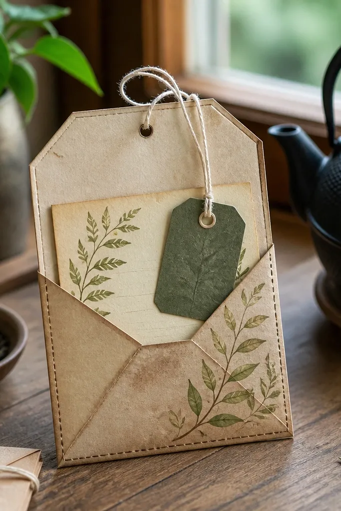
This theme is photogenic because it combines a small, readable structure with a tactile detail: string. The tea bag envelope shape instantly signals “tea,” and the tag gives you a place for steep notes or a flavor rating. Keep colors warm and earthy so the page feels cozy. It’s also a practical build for storing tiny recipe cards or scent notes. If you want pages that look like collectible paper goods, this one hits that vibe without being complicated.
Cut a 4 in x 6 in cardstock piece and fold it into an envelope by scoring at 1.5 in from the sides and 3 in at the bottom. Add a thin strip of patterned paper to the front flap as your accent. Create a tag from 2 in x 4.5 in cardstock, glue a tea-stained paper scrap on it, then punch a hole near the top and thread with twine. Add a small label on the envelope front and write “steep notes” or your own heading. Seal only the tag edges with matte medium so it stays flexible.
Use a ruler to score envelope folds — crooked lines show up fast in photos.
Don’t use thick glue on the envelope flap — it makes the fold bulky.
13. Art Museum Ticket Bookmarks With Color Wash Background
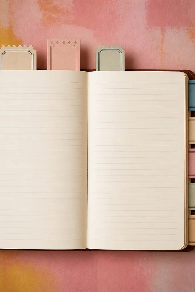
Paint a watercolor wash on a 8 in x 10 in page base using one color (sage green or dusty blue) diluted heavily. Let it dry completely. Cut two ticket shapes from cardstock, about 2.5 in x 4.5 in, and glue printed art scraps on them. Add a thin black border around each ticket with a fine marker. Glue the tickets onto the page as bookmarks so they extend from the top edge, then ink the ticket edges to unify the layers.
Museum-themed pages look great when you treat them like gallery signage. This layout uses a soft color wash background plus ticket-style bookmarks that stick out, so there’s an obvious focal stack. The bookmarks also give you a built-in place for journaling about what you “saw” or what you learned. Keep the background subtle and let the tickets carry the theme. It’s medium-skill but straightforward, and the result looks intentional even if your ephemera is simple.
AvoidDon’t add too many elements to the wash — the tickets need contrast.
Pro tipUse diluted paint and keep brush strokes visible — it looks more “gallery print” than flat color blocks.
14. Snowflake Window With Layered Washi Snow Roads
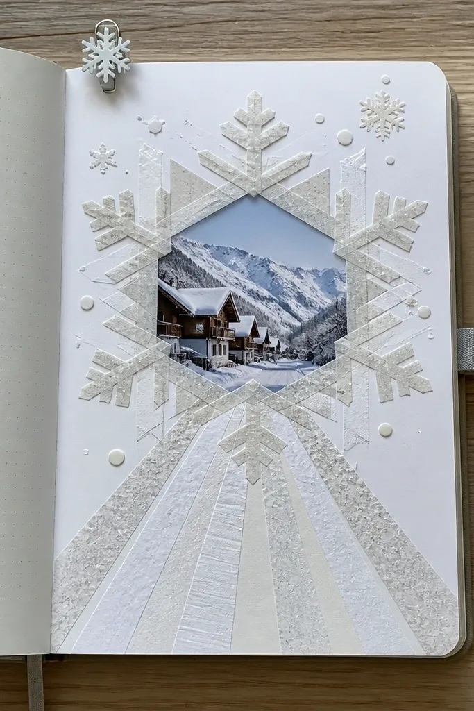
Cut a 3 in x 3 in square window in a 7 in x 9 in cardstock base. Back it with acetate, then frame it with a thin strip of white cardstock. Build snow roads using white washi tape strips arranged like intersecting paths from the bottom toward the window. Add a snowflake shape behind the tape by tracing a stencil onto white paper and gluing it centered. Punch a small notch at the bottom edge so you can slide in a mini tag.
A snowflake window looks crisp and bright, and washi tape lets you build “snow roads” that photograph cleanly. This theme works because it has both geometry (snowflake shape) and texture (tape layers). You get a page that feels wintery without needing bulky decorations. The window concept also makes it easy to swap inserts for different notes. Build this when you want a page that reads clearly in winter photos or holiday spreads.
AvoidAvoid metallic tape for the snow roads — it turns the page into a disco effect.
Pro tipUse matte white cardstock for the frame so the acetate doesn’t glare as much.
15. Roaring 20s Lace Border With Ticket Tabs
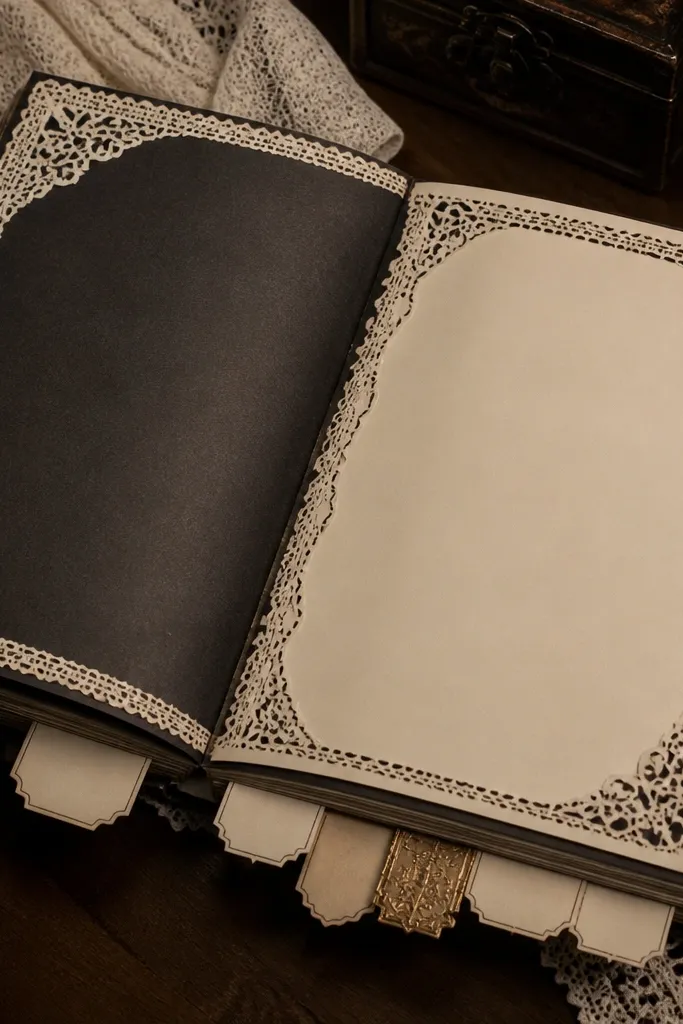
Use cream cardstock 8 in x 10 in. Add lace trim along one edge by gluing it with fabric glue or a thin line of matte medium. Create three ticket tabs by cutting 1.75 in x 3.5 in rectangles, rounding corners, then stamping or writing short headings in black ink. Glue tabs along the opposite edge so they peek out. Finish by outlining the lace edge with a thin gold gel pen line and inking all edges lightly with brown.
This theme is photogenic because lace borders look instantly “period,” and ticket tabs add a sense of vintage organization. Keep the page mostly cream and black with one gold accent so it feels like old print, not costume craft. The ticket tabs create depth and give you a place for short notes. It’s a great option when you want a bold aesthetic with minimal effort. The build takes about 1-2 hours depending on how many tabs you add.
AvoidDon’t use bright neon paper — it kills the vintage look immediately.
Pro tipIf lace frays, seal the cut edge with a tiny dab of matte medium before gluing.
16. Rainbow Gradient Side Pocket With Color Swatches
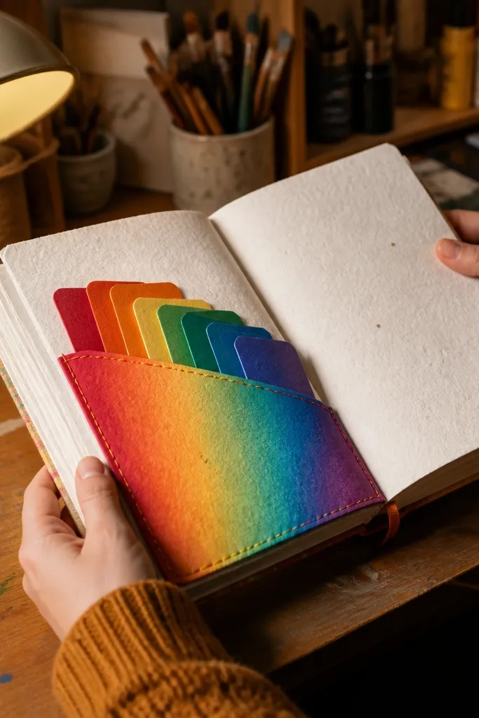
Cut a 7 in x 9.5 in base from cardstock. Glue a side pocket on the left using a 4 in x 7.5 in panel, leaving a 1/2 in border. Create a gradient strip by blending ink pads or watercolor from red to violet on a 6.5 in x 2 in paper strip, then glue it across the pocket front. Add 4-5 swatch strips (about 1.5 in x 0.75 in) tucked into the pocket top. Ink the edges and add one small handwritten label on the right side.
A rainbow gradient pocket is one of the most camera-friendly designs because gradients read cleanly and color swatches make it interactive. This page works best when you keep the structure simple: one side pocket, one gradient strip, and a few swatches that slide or tuck. You get a strong theme signal without needing lots of tiny decorations. It’s great for art journaling, mood trackers, or “painted ideas.” The time cost is low, but the look is bright and intentional.
AvoidAvoid random rainbow scraps — a true gradient reads more “designed” than scattered colors.
Pro tipBlend gradients on smooth paper, not textured — it gives you a cleaner photo look.
17. Campfire Night Scene With Black Paper Silhouette Flap
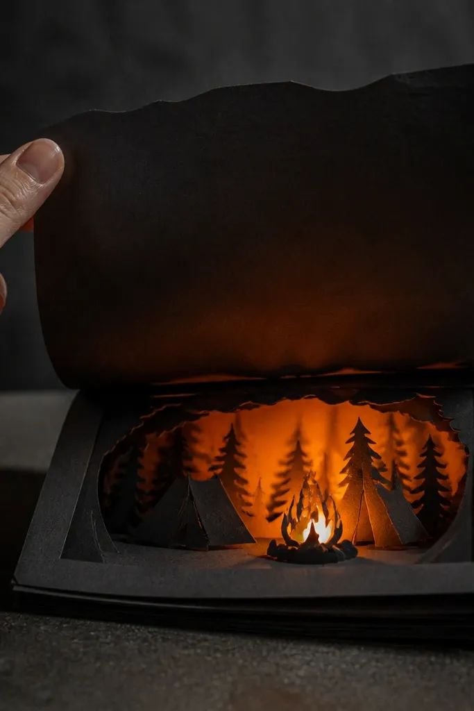
Make a 8 in x 10 in base from dark navy or black cardstock. Cut a tree-line silhouette from black paper and glue it across the bottom third. Create a flip-up flap by cutting a 7 in x 2.5 in cardstock tab on the top edge of the tree-line area, then glue only the back so it flips. On the flap front, glue a small orange tissue or painted paper circle as the campfire glow. Add a small journaling card tucked under the flap edge and secure with a tiny strip of tape.
Campfire pages look gorgeous because you get strong contrast: black silhouette shapes and a warm orange glow. This design uses a flip-up flap so the “fire” reveals only when you open the page. That motion makes it feel interactive and photo-worthy. Use layered black paper for the trees or tent silhouette, then tuck in a small journaling card behind the flap. It’s perfect for camping journals, winter evenings, or any theme that needs cozy drama.
AvoidDon’t make the flap too wide — it blocks the rest of the scene in photos.
Pro tipUse thin foam tape under the fire circle if you want a slight 3D glow effect.
18. Book Spine Collage With Spine Number Labels
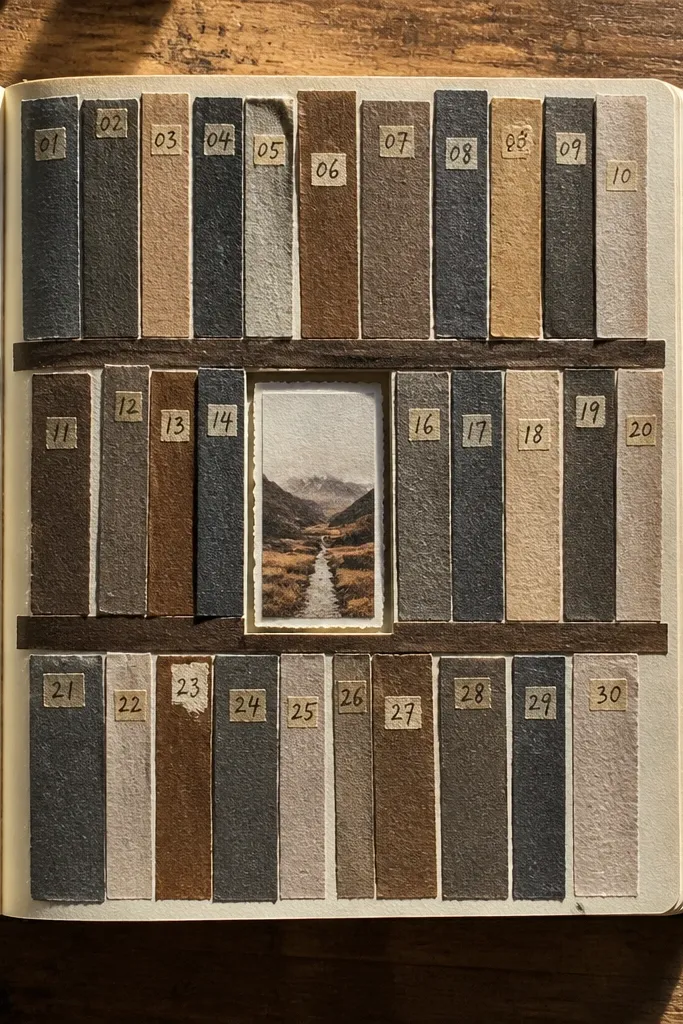
Start with a 8 in x 10 in cream cardstock base. Cut 8-12 narrow spine strips about 1 in wide and 6-7 in tall from old book pages or printed scraps. Glue them in a staggered vertical pattern leaving gaps. Make small spine number labels (1 in x 0.5 in) and write numbers 1-8 with a black pen, then glue one label per strip. Add one horizontal divider strip at the bottom and ink all edges with dark brown or black.
This is one of those themes that looks “collected” instead of “made.” Book spine strips create a graphic pattern, and numbered labels make it feel like a real shelf. The visual repetition is what makes it look gorgeous in pictures, even if your scraps are random. Use consistent fonts for labels (handwritten is fine) and keep your palette to cream, black, and one accent color like teal. It’s also great for memory lists, reading lists, and indexing your journal sections.
AvoidAvoid mixing too many font styles on labels — keep it consistent.
Pro tipTrim the strips so their tops align roughly — it looks intentional instead of accidental.
19. Garden Seed Packet Pocket With Date Stamps
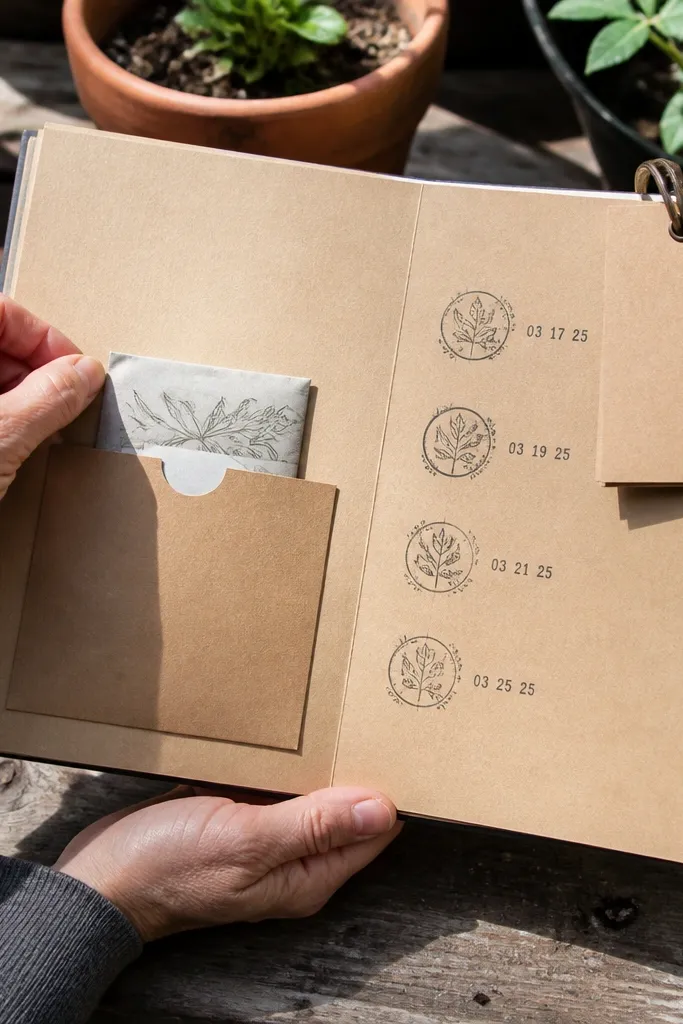
Use kraft cardstock 8 in x 10 in as your base. Create a center pocket using a 6 in x 5 in rectangle, leaving a 1/2 in border on all sides. Cut a seed packet front panel from patterned paper and glue it onto the pocket front. Stamp or handwrite 3 date blocks on the pocket panel using a simple square stamp or a drawn box. Add a flip tag by gluing a 3 in x 6 in cardstock rectangle to the pocket top inside edge so it swings open. Seal the pocket edges with matte medium to lock everything down.
Seed packet themes look instantly charming because the shapes are already designed. This spread turns that into a pocket page with date stamps so it looks functional, not just decorative. You’ll get a clean, repeating layout: pocket, stamped dates, and a small flip tag for notes. It’s perfect for gardeners, plant journalers, or anyone saving “ideas to try.” The page photographs well because seed packet graphics and kraft textures are naturally warm and detailed.
AvoidDon’t cover every surface with glue — seed packet paper warps when it gets soaked.
Pro tipKeep stamps black or dark brown so the page stays readable and consistent.
20. Gilded Frame With Gold Foil Tape Corners
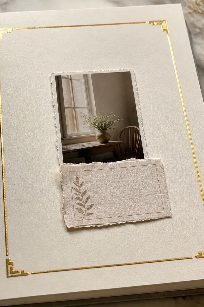
If you want instant “fancy,” this is the easiest path: a simple page frame with gold foil tape corners. It looks expensive because the composition is clean and the gold sits only at the corners and along one edge. Add one small label or photo scrap in the center and write a short caption. This theme works with almost any ephemera because the frame controls the look. It also makes pages feel curated even if the inside materials are simple.
Start with an 8 in x 10 in cream cardstock base. Add gold foil tape in a thin border along two sides, then place corner pieces made from small 1 in squares cut diagonally. Create a center mat by gluing a slightly smaller rectangle of patterned paper (about 6.5 in x 8.5 in). Add a small focal label in the center (2.5 in x 3.5 in) using a scrap that has contrast. Outline the label edges with a black fine pen to make everything crisp.
Press foil tape down firmly with a scrap of folded paper so it sticks without bubbles.
Skip gold foil all over the page — it turns into glare and looks messy.
21. Space Station Control Panel With Label Grid
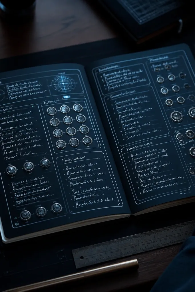
Use dark gray cardstock 8 in x 10 in. Draw a light grid with a ruler: 3 columns and 4 rows, leaving a 1/2 in margin. Fill each cell with a label strip (about 1.5 in x 0.5 in) cut from different scraps, then write one short word per strip. Add circular accents by punching circles from colored paper and gluing them in two or three cells. Outline the grid with white gel pen so it reads clearly in photos.
Control panel layouts look great because they’re graphic and structured. This space theme gives you a grid of labels plus “button” circles, so your page reads like a designed dashboard. It’s an aesthetic win for journaling because it creates a place for lists, checkboxes, and short notes. The dark base makes your label colors pop and keeps the page from looking flat. It’s also surprisingly easy to build without specialty tools.
AvoidDon’t go full rainbow — too many colors kills the control-panel look.
Pro tipUse one accent color for the circular buttons to keep the layout clean.
22. Vintage Luggage Tag With Leather-Style Corner Tabs
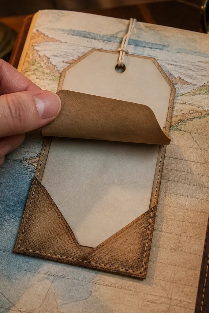
Luggage tag themes are photogenic because they’re small, readable, and have strong typography. This page uses corner tabs that mimic leather and a tag you can lift or tuck. The look is vintage without needing actual leather — just brown paper, ink aging, and careful edge distressing. It’s ideal for travel journals, secret notes, or gift journaling. The brown palette also photographs nicely under warm light.
Cut a 7 in x 9 in page base from tan cardstock. Create a tag pocket by gluing a pocket on the right side using 5 in x 4 in brown paper, leaving the top open. Make a luggage tag from cardstock 3.5 in x 5.5 in, age it with brown ink and add faux stamp circles with a pen. Create leather-style corner tabs by cutting four small trapezoids from darker brown cardstock and gluing them at the tag corners. Add a small string hole in the top of the tag and secure with twine.
Distress edges with a craft knife lightly, not scissors — it gives a more rugged look.
Avoid bright adhesives on the tag — tape edges show in close photos.
23. Ocean Waves Washi Border With Tucked Shell Card
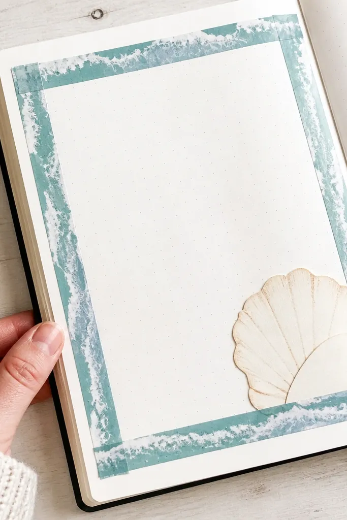
Start with a 8 in x 10 in white or very light blue cardstock base. Apply a wave washi border along the top and bottom edges, aligning the pattern so it looks deliberate. Make a small shell card by cutting a 3 in x 4.5 in piece of cardstock in a shell shape, then glue a patterned paper scrap on it. Tuck the shell card into a small side pocket made from 3 in x 4 in paper. Ink the card edges with blue-gray ink to unify everything.
This page looks clean and beachy because the waves are contained in a border. The tucked shell card gives you a second element that adds depth without crowding the page. Choose one wave washi and one shell-shaped accent so the theme stays focused. It’s a good choice when you want your journal to look airy and not over-decorated. The white space helps writing and photos stay readable.
AvoidDon’t cover the entire page with ocean paper — borders keep it photogenic.
Pro tipTrim washi edges with a straightedge so the pattern lines don’t look crooked.
24. Spice Rack Labels With Tiny Drawer Pockets
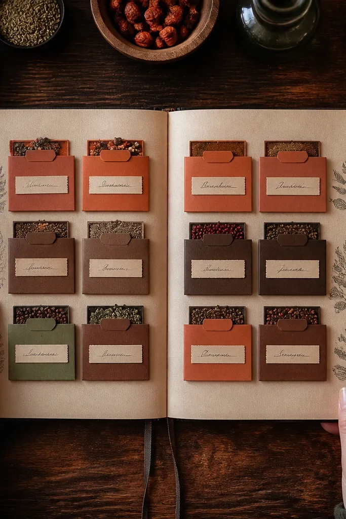
Spice rack pages look amazing because the labels give you instant structure and the drawer pockets add dimension. This is a themed build that turns scrap paper into something that looks like a functional organizer. It’s especially photogenic because you can use small label strips, consistent handwriting, and one warm background. The pockets let you tuck in recipe notes, ingredient lists, or little tags. It’s a satisfying project that teaches you how to make tiny pocket drawers without bulky construction.
Use a 9 in x 12 in base in kraft or parchment-toned paper. Draw a simple layout for three mini drawers across the top half, each about 2.5 in wide. Make each drawer pocket from cardstock: glue two sides and the bottom, leaving the top open. Label each pocket with spice names on white label strips (about 2 in x 0.6 in) using a dark pen. Add a small “measuring spoon” doodle in the corner and ink all edges with brown.
Use a consistent label size across all drawers so the whole page looks designed.
Skip uneven pocket heights — it makes the layout look sloppy in photos.
25. Fairy Tale Map With Path Line and Waypoint Tags
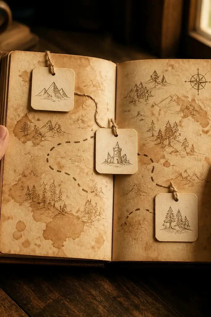
Fantasy map pages are gorgeous because they combine drawing, texture, and tiny interactive pieces. This layout uses a simple path line across a coffee-stained map background, then adds three waypoint tags that you can lift. The page looks “storybook” without needing elaborate illustration — the path and tags do the work. It’s great for journaling prompts, character notes, or reading trackers. If you like pages that feel like you’re collecting clues, this one fits.
Coffee-stain a page and let it dry flat, then lightly sketch a rough map grid with pencil. Draw a winding path across the page with a dark brown marker. Place three small tag pockets along the path by gluing tiny side pockets (about 1.5 in wide) so tags can slide in. Make three waypoint tags (1.5 in x 3 in) and decorate each with a different scrap and a simple icon. Seal the background with matte medium so the marker doesn’t smear.
Write waypoint names in pencil first, then trace with marker for clean lettering.
Don’t draw a complicated map — big shapes read better than tiny details.
26. Cinema Night Ticket Fold With Popcorn Paper Texture
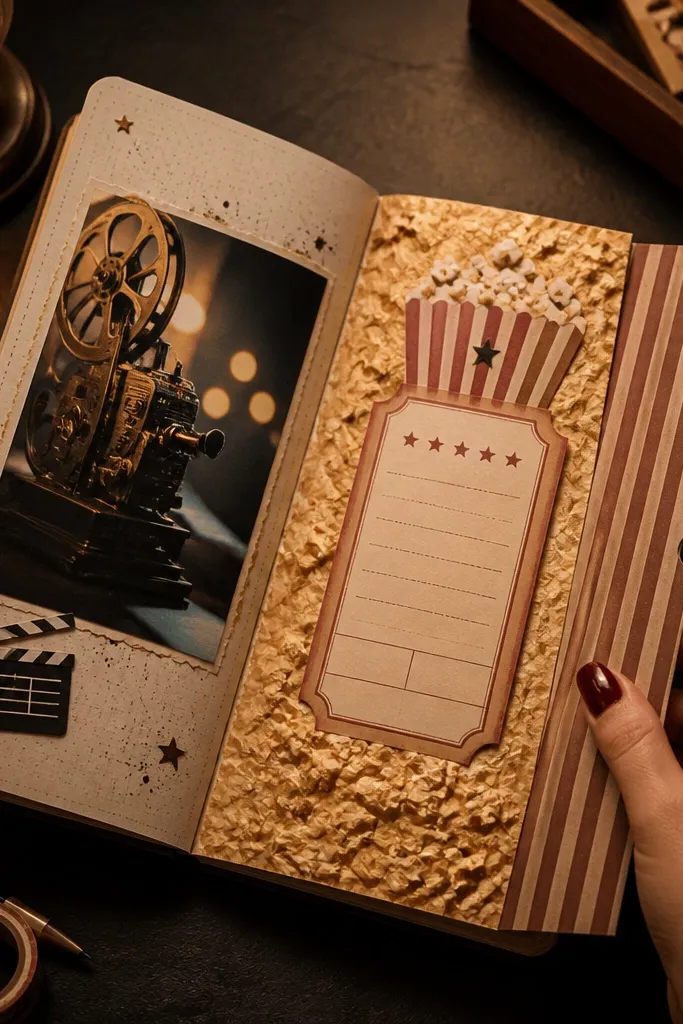
Cinema-themed pages look fun and photo-ready because ticket folds create clear structure and the icons add personality. This spread uses a fold that opens like a movie ticket, plus “popcorn texture” made from crumpled paper pieces. It feels playful without looking childish because the layout stays neat. You can journal about movies, quotes, or a date night plan. The fold makes the page interactive, which always photographs better than a flat collage.
Start with a 8 in x 10 in base. Create a ticket fold by scoring a 7 in x 8 in cardstock panel so it folds in half, then glue it to the page along one side only. Cover the outer fold with a printed ticket strip or drawn border. Make popcorn texture by crumpling tiny pieces of off-white paper, then gluing them lightly inside one corner area. Add small film reel icons using a stamp or simple doodles, then ink edges with black or dark brown.
Use small glue dots for the crumpled paper texture so it doesn’t soak through.
Avoid big crumpled blobs — small pieces look like popcorn in photos.
27. Monogram Letter Pocket With Stamped Initial Card
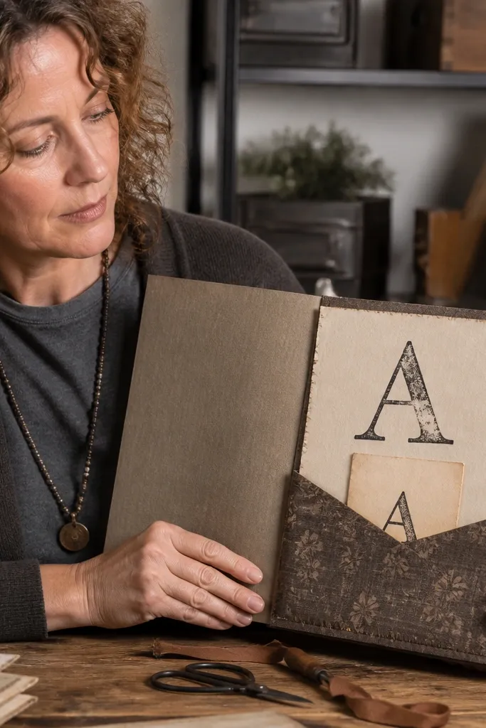
Use 8 in x 10 in cardstock base. Glue a vertical pocket on the left side using 3.5 in x 7 in cardstock, leaving the top open. Cut a monogram card 3.5 in x 5 in and stamp or draw one large initial in dark ink. Add a thin border around the card with a fine pen and glue a small patterned strip at the bottom. Seal the pocket edges with matte medium so the card slides smoothly.
Monogram pages look instantly classy and cohesive because the letter creates one clear focal point. You’ll build a pocket to hold a stamped initial card, then decorate around it with minimal accents. This theme is perfect when you want a “gorgeous but calm” aesthetic that doesn’t fight with other pages in your journal. It also makes your journal feel personal without needing lots of photos. The simple design reads well in close-up photos.
AvoidDon’t add multiple competing decorations around the letter — one focal point wins.
Pro tipUse one font style for the initial and keep the rest of the page handwritten in the same pen.
28. Garden Journal Index With Numbered Side Tabs
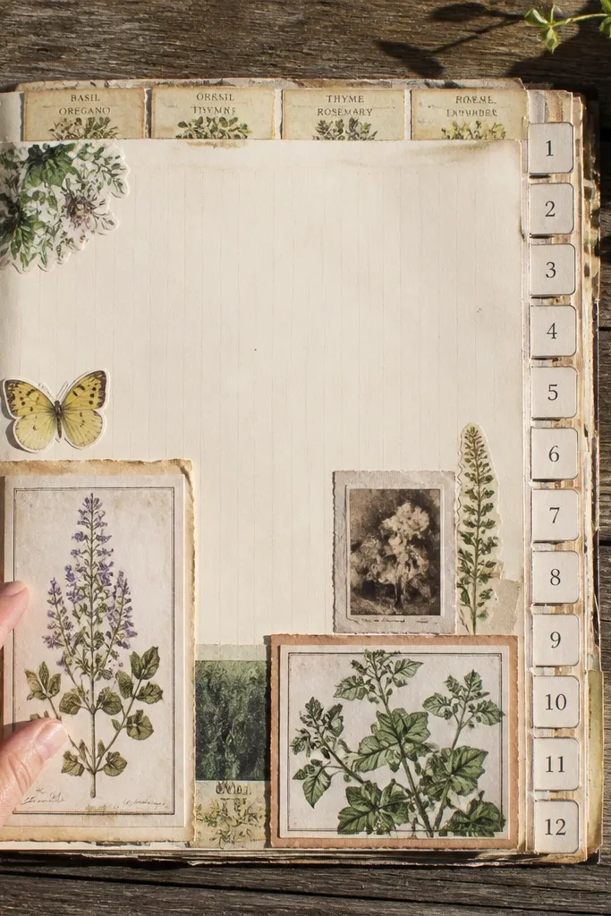
Start with a 9 in x 12 in base in light green or kraft. Cut 5 side tabs from cardstock, each about 1 in x 3 in, and glue them along the top edge spaced evenly. Label each tab with a number and a short heading like “seeds,” “notes,” “watering,” “photos,” “sketch.” Create a central grid area by drawing light divider lines and gluing label strips in each section. Finish by inking edges and adding a small leaf doodle in the bottom corner.
Index pages are boring in theory, but they look great when you make them interactive and graphic. This garden index theme uses numbered side tabs that stick out, plus plant label strips that repeat like a filing system. The result is a page that photographs like stationery, not like a random collage. It’s also practical because it organizes your journal content — seeds, notes, watering logs, and sketches. Build it once and reuse the layout across seasons.
AvoidSkip uneven spacing — it shows up instantly in pictures.
Pro tipKeep tab sizes identical so the page looks like a real index card set.
29. Holiday Ornament Frame With Clear Candy Insert
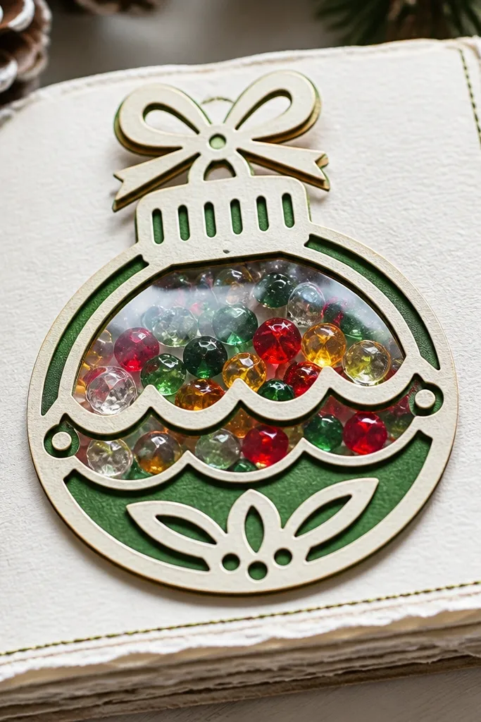
Cut an ornament-shaped window from cardstock on a 8 in x 10 in base, leaving a thick frame around it. Back the window with clear acetate and seal the edges with double-sided tape. Add tiny confetti pieces in red, green, and gold inside the window, then close the top with another acetate layer or tape seal. Glue a small label strip below the ornament frame for the year or theme. Seal lightly with matte medium around the frame, not over the acetate.
Ornament frames look gorgeous because they’re symmetrical and instantly read as holiday decor. This design uses an ornament-shaped window and a clear insert with tiny colored pieces inside so it catches light. The frame creates the aesthetic, and the insert creates the dimension. You can swap inserts later, which keeps the journal flexible. It’s photogenic even without fancy supplies, as long as the frame edges are crisp.
AvoidDon’t put glue on acetate — it clouds the clear insert.
Pro tipUse a craft knife for the ornament shape so the edges stay sharp.
30. Coffee Shop Menu Page With Receipt Tucks
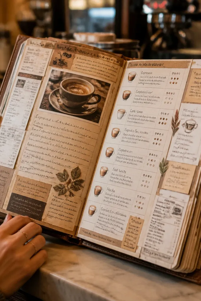
Make a 8 in x 10 in cardstock base. Create a menu grid by drawing 4-5 horizontal lines and 3 vertical sections, keeping margins wide. Glue a receipt strip down the left column and add two small receipt tucks on the right using cardstock pockets. Write drink names on label strips (like “latte,” “chai,” “cold brew”) and glue them into the grid. Finish by inking edges with brown and adding a small handwritten footer line at the bottom.
This page looks like a real coffee shop menu because it’s structured like one — rows, sections, and a clear center. Receipt tucks add depth and make the page feel collectible. It’s photogenic because receipts have built-in typography, and menu layout keeps everything readable. You can use it for drink ideas, book quotes, or “things I want to try.” The build is simple and the result looks like a designed insert, not a collage.
AvoidSkip random pocket sizes — the menu look collapses if pockets vary too much.
Pro tipUse consistent label strip width for every menu item so the grid looks clean.



