
1. Matte Vellum Cover with Color-Block Spine
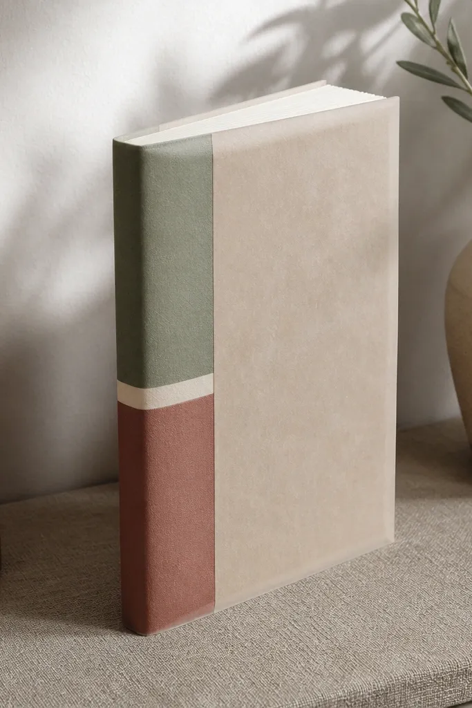
This cover idea makes your journal look expensive without needing a leather budget. Vellum adds a soft haze that hides messy edges and makes the cover feel airy in photos. The color-block spine gives you a clean focal point, so your camera always knows where to land. Use it for year-round use because the spine strip can change — swap the strip for spring pastels or winter jewel tones while keeping the same vellum base. It takes basic crafting skills and a couple hours, not a full weekend of painting.
Start with a simple notebook or a stack of papers you can bind with a cover. Cut vellum to cover the front and back, leaving a 1/4 inch margin so it lays flat without snagging. Make a spine strip from cardstock in two colors, then glue it to the center spine and wrap the vellum over it. Finish with a narrow strip of matte tape on the inside corners to keep the vellum from lifting when you open the journal.
Pro tipPress the vellum under a heavy book for 30 minutes before gluing so it lies smoothly.
AvoidDon’t use glossy tape on vellum — it creates shiny glare and makes the cover look cheaper.
2. Disc-Bound Journal with Seasonal Insert Tabs

Disc-bound is the fastest way to keep a journal looking intentional all year. You can rearrange pages without tearing anything, and seasonal inserts stay neat instead of getting stuffed randomly. The insert tabs are what make it dreamy — they create a gentle rainbow line you can see in photos even when the pages aren’t open. This is best for people who write frequently and want their journal to stay organized without “catch-up” stress. Skill level is beginner-friendly, and the setup time is about an afternoon.
Choose a disc-bound system or buy a disc punch setup and matching covers. Cut tab inserts from cardstock, each 1.5 inches wide, and punch matching holes at the top. Create a base set of dividers with consistent margins, then add tabs for seasons and themes. Insert the tabs into the discs and keep the tabs' top edges aligned so the photo line looks clean.
Pro tipUse the same cardstock thickness for every tab so the disc spacing stays even.
AvoidDon’t vary the tab widths — uneven tabs make the whole layout look sloppy in pictures.
3. One-Color Wash Background Pages
Dreamy pages often look calm because the background is controlled. A one-color wash creates that soft, dreamy mood without adding busy patterns. It also saves time because you don’t have to decorate every page — the wash is the decoration. Do this year-round by using different wash colors by season, but keep the same technique and the same dilution ratio. This suits journals used for lists, reflections, and quick sketches because writing stays readable. You’ll spend about 2-3 hours preparing a stack of pages.
Mix watercolor paint with lots of water until it looks like tinted milk, then test on scrap paper. Use a wide flat brush and apply a light wash across each page, leaving some lighter areas for texture. Let pages dry fully under a stack of paper to avoid warping. Once dry, write with a darker pen so the contrast holds up in photos.
Spray a light mist of water on the brush between pages to keep the wash intensity consistent.
Don’t over-saturate — heavy washes swallow ink and turn the page muddy in close-ups.
4. Washi Tape Frame + Minimal Sticker Corner
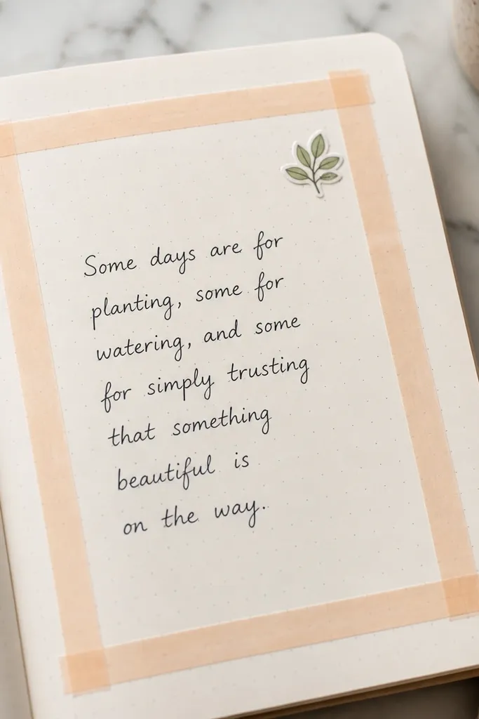
This layout looks dreamy because it gives you structure without feeling rigid. A thin washi tape frame creates a clean rectangle, and a single corner sticker adds personality without clutter. The frame also helps your handwriting look tidier since you’re working inside a boundary. It’s great for year-round use because you can rotate sticker themes while keeping the same frame. It’s quick too — 15 minutes per spread if you keep the sticker choice simple. Photos love it because the tape edges read crisp.
Pick one washi tape pattern and cut two strips for the top and bottom, plus two for the sides. Place tape with consistent spacing from the page edge, aiming for about 3/8 inch margins. Add a small sticker in only one corner, then write your title and a short paragraph inside the frame. Seal the edges with a tiny amount of matte glue stick if the tape lifts.
Use a ruler and light pencil marks for tape placement so the frame stays straight.
Don’t add two different sticker corners — that’s where the layout starts looking busy.
5. Pressed Leaf + Vellum Layered Quote Pages
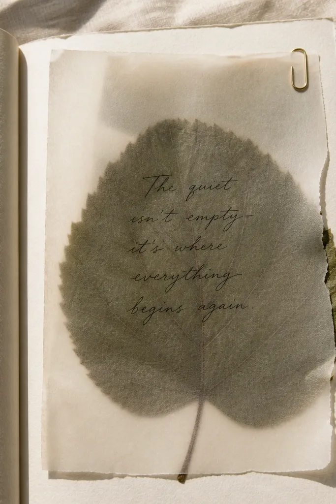
Pressed leaves look dreamy because they add real texture that reads well in photos. Layering the leaf under vellum makes it look soft and protected, not flattened and harsh. Add a short handwritten quote and you get a page that feels seasonal without turning into a scrapbook pile. This works year-round by using whatever plant material you can find, then keeping the layout identical each time. Skill level is medium only because drying takes time, but the actual build is simple. Plan for about a week of pressing and a half hour to assemble each page.
Press leaves between parchment and paper under a heavy book for 5-10 days. Cut vellum to the exact page size and place the leaf on the lower third. Write your quote in pencil first, then go over it with a fine black pen. Tape the vellum down along the sides only so the leaf stays visible.
Pro tipChoose leaves with clear veins — they show best through vellum.
AvoidDon’t glue the leaf directly to the paper — it can warp and tear when you open the journal.
6. Fabric Bookmark Spine Wrap with Hidden Pocket
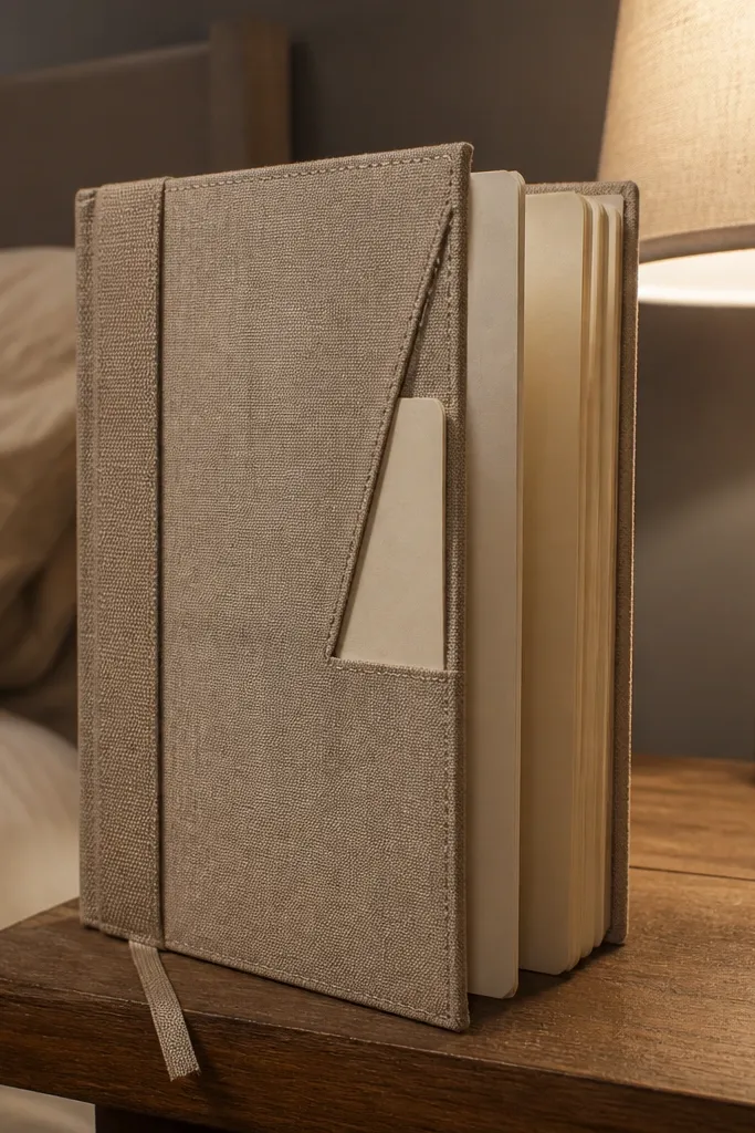
A fabric spine wrap makes the journal look tactile and cozy in any season. The hidden pocket is where the aesthetic becomes functional: store a small card, a ticket stub, or a mini note without stuffing the pages. The bookmark spine wrap also makes photos look styled because fabric texture catches light differently than paper. This is a great build for people who like keeping extras, but hate bulky inserts. It’s beginner-friendly and takes about 2-4 hours depending on how neat you are with edges.
Cut fabric strips about 2 inches wide, long enough to wrap the spine plus 1 inch for overlap. Glue fabric to a thin cardstock strip, then wrap around the journal spine and secure the overlap on the inside cover. Make a small pocket by folding cardstock into a U shape and lining it with scrap fabric. Attach the pocket inside the back cover so it sits flat when the journal closes.
Pro tipUse fabric glue and apply pressure with binder clips for 10 minutes at a time.
AvoidDon’t use thick fabric — bulky seams make the journal close unevenly and show in photos.
7. Stitched Pamphlet Pages with Cotton Thread Binding
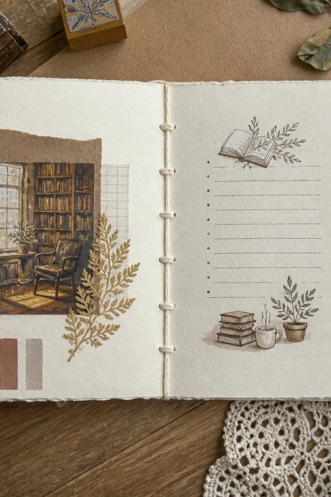
Visible stitching is one of the fastest ways to make a journal look handmade and intentional. It also creates a strong vertical element that frames the pages in photos. Use a stitched pamphlet for themed mini journals that you can swap throughout the year, like “spring gratitude” or “winter reading.” The pages themselves can be simple; the binding carries the look. This project is medium difficulty but very doable if you measure carefully. Plan for an evening of assembly plus drying time for glue if you use it.
Fold your paper into signatures, usually 4-8 sheets per signature, and create 3-5 stitch holes along the fold. Punch holes with a needle or awl so the thread passes cleanly. Thread cotton through the holes using a simple saddle stitch pattern, then tie off and trim. Add a cover from thicker cardstock and glue it to the first and last signature for stability.
Keep hole spacing equal by marking with a ruler before punching.
Don’t pull the thread too tight — it puckers the paper and makes the spine look uneven.
8. Photo-Ready Grid Layout with 5mm Dot Guide
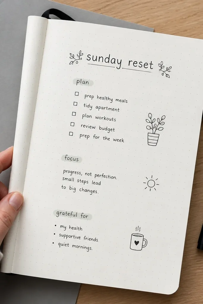
A dot-grid guide is the easiest way to make handwriting look crisp and “designed” in photos. It gives you spacing for headings, lists, and tiny doodles without turning the page into graph paper chaos. This is year-round because you can keep the grid and change only the color ink or theme stickers. For a dreamy look, pair the grid with one slim font style: short headings and lots of white space. This suits people who want structure but don’t want to buy pre-printed grid journals. Build time is about 30-45 minutes per set of pages.
Print or buy a 5mm dot grid template, then use it as a guide under your paper. Lightly pencil in a margin box and draw the dot guide using a fine mechanical pencil or dot marker. Add headings on the top margin and keep body text in the center column. Write with a single pen color and add one accent line using a fineliner.
Use a kneaded eraser to lift pencil lightly so the guide disappears under ink.
Don’t add multiple pen colors — it breaks the clean grid look in photos.
9. Matte Black + Warm Paper Collage Strips
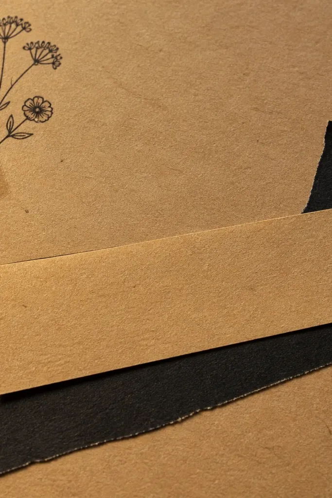
This style looks dreamy because it has contrast and texture without being loud. Warm paper (kraft or cream) gives a soft, vintage glow, while matte black tape or cutouts add crisp edges. Make collage strips that run diagonally or vertically, leaving plenty of blank space for writing. It’s perfect for year-round journaling because you can keep the same materials and change only the paper cutouts by season. Skill level is beginner, and each spread takes about 20-30 minutes.
Cut long strips from kraft paper or book pages, then tear one edge for texture. Add matte black washi tape or black cardstock strips to form a strong line. Glue strips lightly so they don’t warp the page — use small dots of glue stick. Write your title in the top third and keep the rest of the page for text.
Tear, don’t cut, for at least one strip so the collage feels natural in photos.
Don’t cover the whole page — the blank space is what keeps it dreamy.
10. Clear Sticker Envelope Pockets for Notes
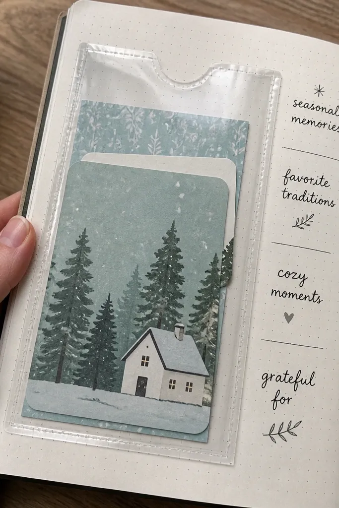
Transparent pockets look clean and collectible in photos because they show the contents without cluttering the layout. You can slide in notes, mini art, or seasonal cards, then remove them later without ripping pages. This is year-round because the pocket stays the same, while the insert changes with holidays and weather. It also solves a common aesthetic problem: loose paper piles. Skill level is easy, and you can set up 5-10 pockets in one sitting. Expect about 1-2 hours total.
Buy clear sticker envelopes or make your own from clear acetate sheets. Cut the pocket to about 3.5 x 5 inches and add a 1-inch flap area. Glue or tape the pocket along the top and sides only so the flap opens. Label the pocket with a small printed label or handwritten date in the corner.
Pro tipUse matte label paper for labels so they don’t glare under light.
AvoidDon’t use glossy clear film with shiny labels — glare ruins the dreamy look.
11. Soft Pastel Accordion Mini-Insert
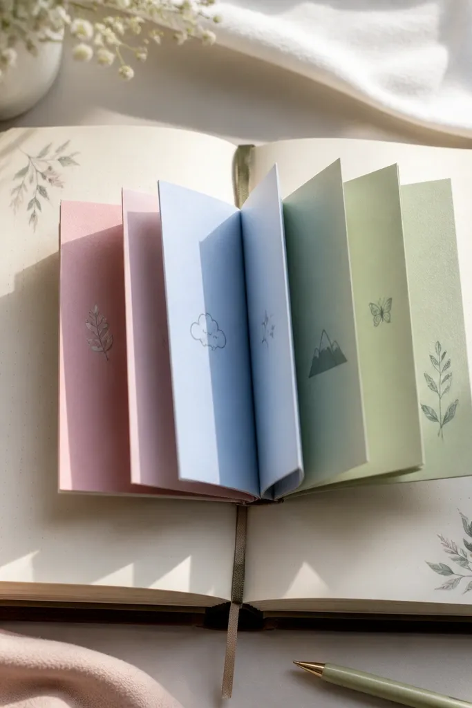
An accordion insert makes the journal interactive and photogenic without needing fancy art skills. It creates a “reveal” moment when you flip pages, which looks great in staged flat-lays. Choose pastel paper and keep the folds tight for a clean, dreamy stack. This is ideal for year-round use because you can dedicate one accordion to each season’s theme: scents, reads, outfits, or weather. Build time is about 2 hours for the first one, then faster next time.
Cut cardstock to a strip about 3 inches wide and 10-12 inches long. Score fold lines every 1 inch using a ruler and bone folder. Accordion-fold the strip, then decorate each panel with simple blocks of color or tiny stickers. Attach the accordion to a pocket page using two small glue dots at the sides so it still expands.
Use a bone folder for sharp folds — it’s the difference between crisp and messy accordion lines.
Don’t glue the accordion flat across the center — it kills the reveal.
12. Gold Foil Accent with Black Ink Rules
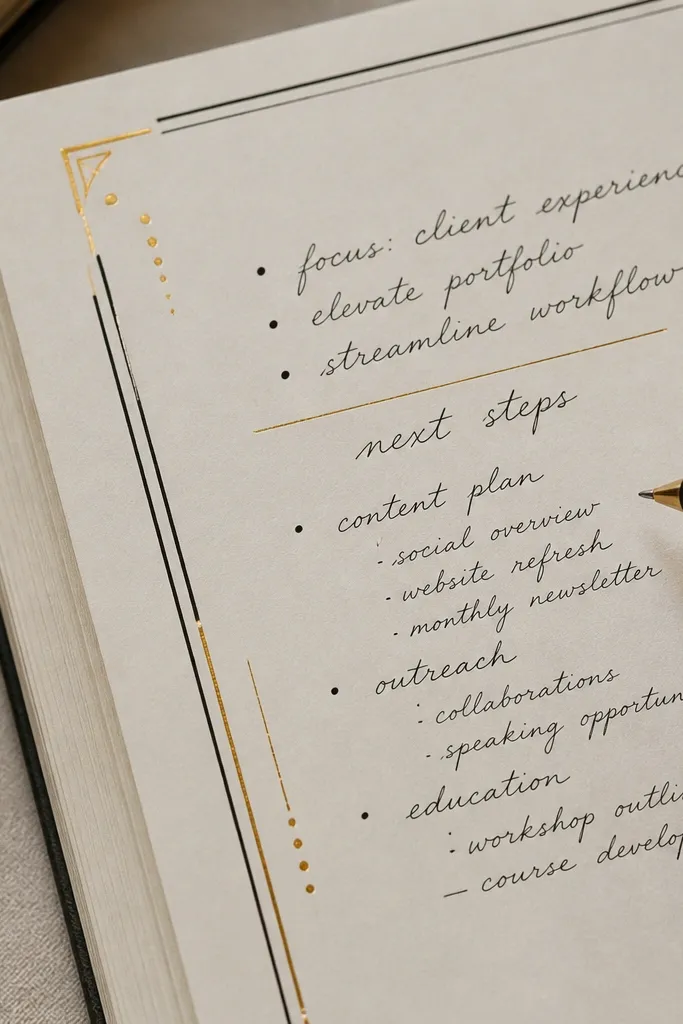
Gold foil accents look dreamy because they catch light in tiny, controlled streaks. The trick is to keep gold minimal: thin rules, small dots, and one corner accent. Pair it with black ink and matte paper so the foil doesn’t look tacky. This style works year-round because black + gold holds up in every season, while the content changes. It’s best for monthly pages, reading logs, or goal spreads. Skill level is medium only because foil placement needs care, but the steps are simple.
Use matte black fineliner for headings and write your content first. Add gold foil using a foil pen, adhesive foil squares, or a small gold leaf sheet with transfer adhesive. Press the foil gently along a straight edge to create thin lines that match your layout. Seal with a light matte fixative only if your materials require it.
Use painter’s tape as a straight guide, then remove immediately so the line stays sharp.
Don’t cover large areas with foil — big gold blocks look harsh in daylight.
13. Ribbon Bookmark with Color-Matched Page Tabs
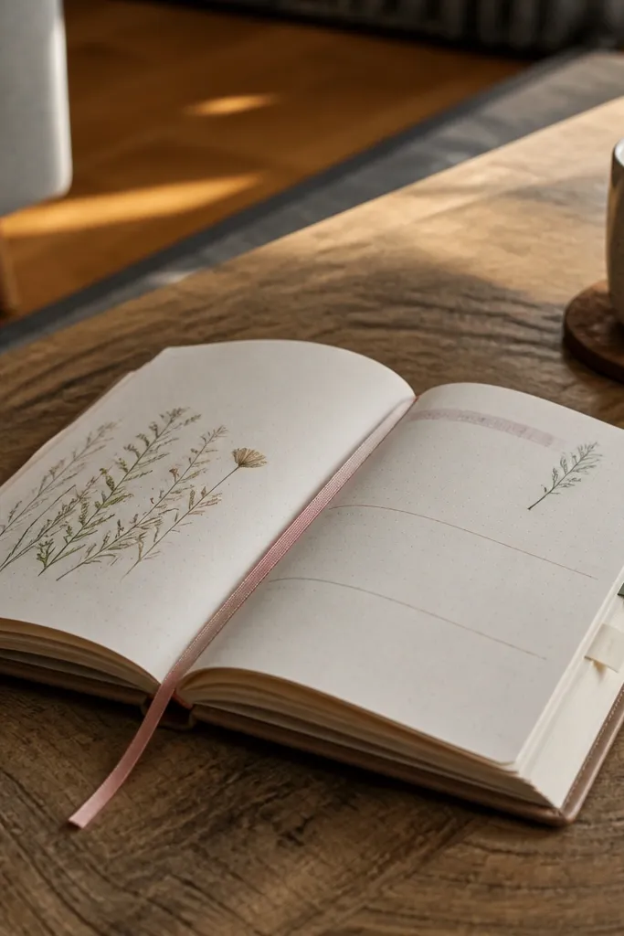
This is a simple build that looks polished in every photo. A ribbon bookmark adds soft movement and a luxe touch, and matching page tabs keep the journal looking styled even when it’s open to a random page. For year-round use, keep the ribbon style and switch the ribbon color with each season. The tabs can also match the ribbon, so the whole journal looks coordinated. It’s beginner-friendly and takes less than an hour. The aesthetic comes from color harmony and neat placement.
Pick a satin ribbon about 1/4 inch wide and cut it to the journal’s height plus overlap. Glue the ribbon to the inside top spine so it hangs evenly. Cut small tabs from cardstock in the same color as the ribbon, then glue tabs to the top edges of divider pages. Write month names or themes on the tabs in a consistent font with a fine pen.
Pro tipBurn the ribbon end lightly with a candle to prevent fraying, then let it cool before gluing.
AvoidDon’t attach the ribbon too low — it should clear the page edges when you flip.
14. Torn Paper Skyline + Minimal Weather Tracker
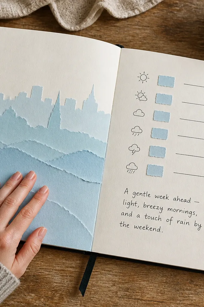
Torn paper skylines look dreamy because they create soft edges and layered depth without painting. Add a minimal weather tracker next to it, and the page turns into something useful, not just decorative. Keep the palette limited: one sky color and one ground color. This layout stays year-round because weather themes never run out, and torn paper is easy to reuse each week. Skill level is easy, and each spread takes about 25-35 minutes.
Tear a strip of colored paper to form a skyline shape, then glue it along the lower third. Make a small weather tracker box using pencil lines and then ink it with a fineliner. Add tiny icons only for temperature or rain, using one style. Leave lots of breathing space above so the skyline reads clearly.
Pro tipUse paper with slight texture so the torn edges look softer in photos.
AvoidDon’t add extra patterns behind the skyline — it competes with the torn edge look.
15. Monochrome Sticker Sheet Layouts with One Accent Color
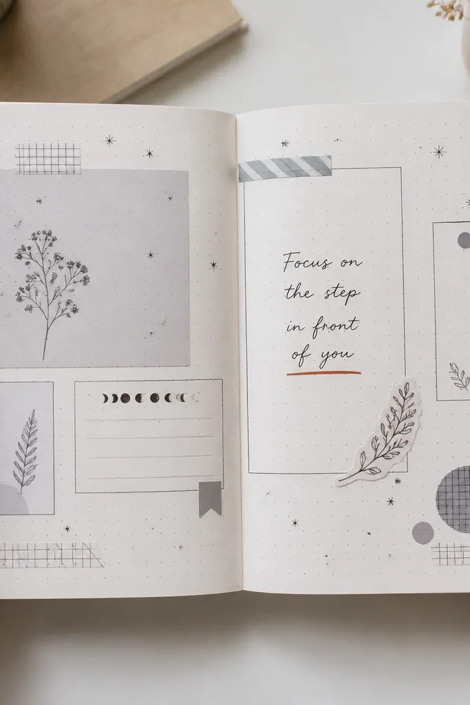
This is how you get that “designer” sticker look without drowning the page. Use a monochrome sticker set for the bulk, then pick one accent color for a single underline, dot, or border. The result is photogenic because the eye has a clear hierarchy — black/gray first, accent second. It’s year-round because you can keep the monochrome set and rotate accent color by season. Skill level is beginner, and it’s repeatable for dozens of pages. Time is about 15-20 minutes per spread.
Choose one monochrome sticker sheet and one accent color pen or tape. Place stickers in a deliberate cluster in the top half, leaving the bottom half for text. Add one accent element like a ribbon line, dot row, or thin border around the text area. Write with black ink so the accent color stays the only pop.
Pro tipPhotograph test pages under daylight before committing to a whole stack.
AvoidDon’t mix multiple accent colors — it makes the page look busy and less dreamy.
16. Fabric-Covered Pocket Journal for Tiny Keepsakes
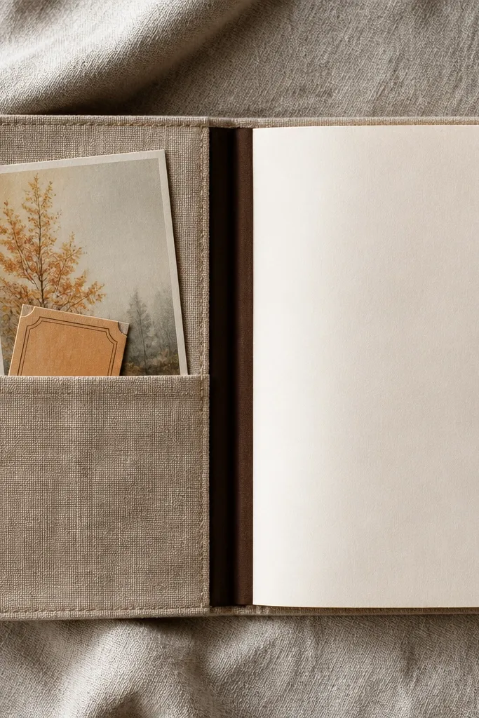
A fabric pocket turns your journal into a keepsake organizer that still looks clean. The fabric hides rough edges and gives a soft, cozy look that photos love. Keep the pocket shallow so inserts sit flat and don’t create lumps. This works year-round because the pocket is neutral; you can slide in seasonal cards, notes, and mini prints. Skill level is medium because you’ll sew or stitch, but you can do simple hand stitching. Build time is about 3-4 hours for one journal cover.
Cut fabric large enough to cover the front and back of a cardstock cover, with extra for folding. Sew or glue a pocket pouch from fabric-lined cardstock, leaving a 1/2 inch top opening. Attach the pocket to the inside front cover and reinforce corners with stitching. Add a closure band or elastic so the pocket doesn’t gape when you flip pages.
Use cotton fabric for the best drape and easiest gluing.
Don’t make the pocket too deep — thick inserts ruin the flat, dreamy look.
17. Hand-Drawn Frame Letters with Light Pencil Grid
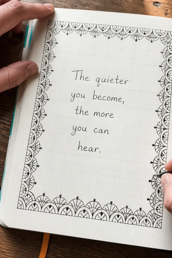
Lettered frames make a journal instantly aesthetic because they give a decorative boundary that looks custom. The pencil grid keeps everything aligned so the letters don’t drift and the page doesn’t look wonky in photos. You keep the frame style consistent and reuse it, changing only the title and theme. This is a great year-round project for weekly spreads. Skill level is medium because letter spacing matters, but you can simplify by using block letters and one consistent thickness. Expect 45-60 minutes for a first template and 20 minutes after that.
Lightly draw a grid using a 1-inch margin and a simple rectangle guide. Plan your frame letters: choose 8-12 letters and map them evenly along the top and sides. Trace your letter shapes with pencil first, then ink with a fineliner. Add a title in the center and keep your body text smaller than the frame so the layout stays dreamy.
Pro tipUse a ruler for the outer frame line, then freehand only the letterforms.
AvoidDon’t ink over heavy pencil — dark pencil lines show through and ruin the clean look.
18. Seasonal Color Inks with One Pen System
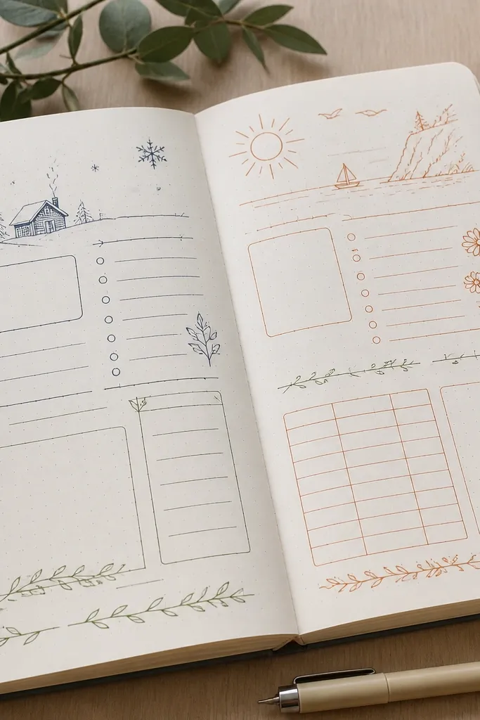
This idea is less about decoration and more about visual consistency, which is what makes a journal look dreamy year-round. Pick one pen system (same nib or fineliner thickness) and switch only ink color by season. For example: winter is deep navy headings, spring is sage green, summer is terracotta accents, fall is muted plum. The pages still look cohesive because the line weight stays the same. It’s perfect for people who journal daily and need a system that doesn’t take time. You can set this up in under 30 minutes if you already have the pens.
Choose one fineliner or nib size and stick to it for every spread. Buy or mix 4 ink colors and label them by season so you don’t guess. Write headings in the season color and keep body text in black or dark gray. Add one small accent mark in the same color each time so the palette stays tied together.
Do a quick smear test on your paper before committing to a whole month of pages.
Don’t change nib thickness between seasons — the line weight shift kills the aesthetic.
19. Acrylic Paint Edge Wash on Page Edges
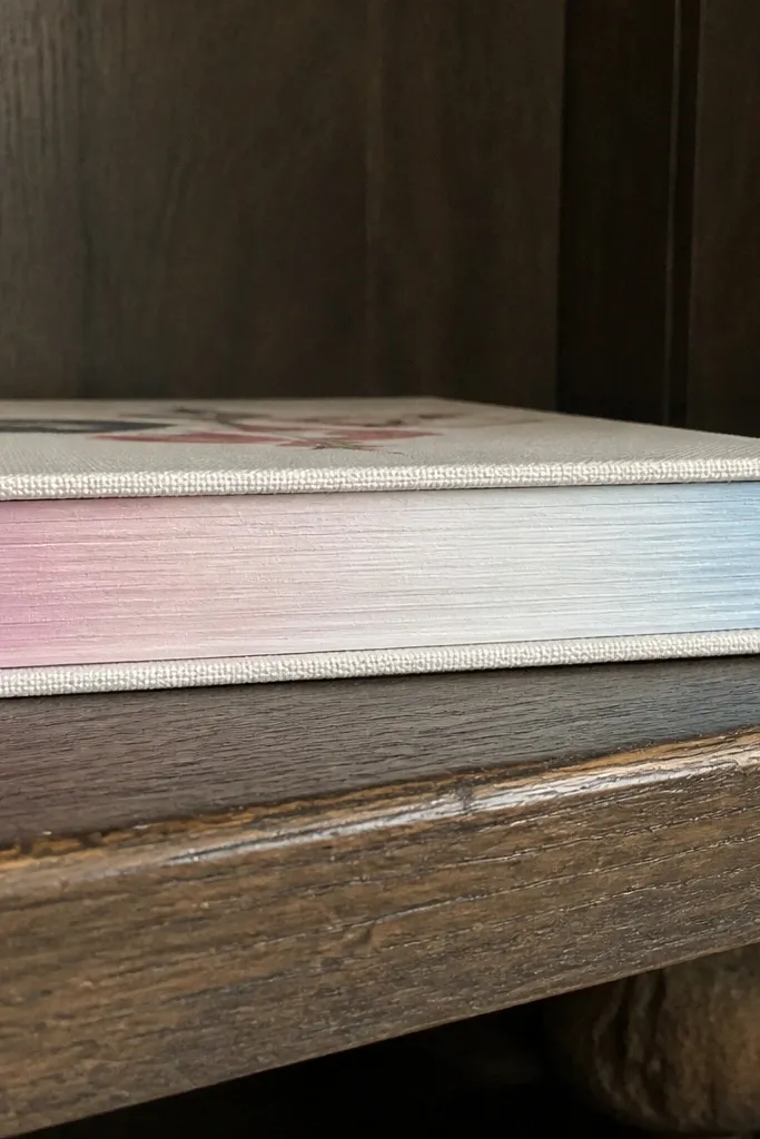
Painting the outer page edges gives you that dreamy “finished book” look even when the pages are closed. It also makes your journal feel intentional because it’s visible constantly. Use a soft blush, sky blue, or sage wash so it doesn’t look harsh. This is year-round because you can refresh the edge color per season, or keep one neutral edge and swap only the cover. Skill level is medium because you need clean masking, but the build is straightforward. Plan 1-2 hours plus drying time.
Clamp the journal closed or use a rubber band so pages don’t fan out. Mask the spine with painter’s tape to protect it from paint. Pour a tiny amount of acrylic paint mixed with water, then use a wide brush to paint the page edges lightly. Remove tape carefully and let the journal dry flat with a weight on top.
Use a sponge brush for the edges — it reduces streaks and keeps the wash soft.
Don’t paint too thick — heavy paint chips and looks rough in close photos.
20. Stamp-Only Doodles with One Repeat Motif
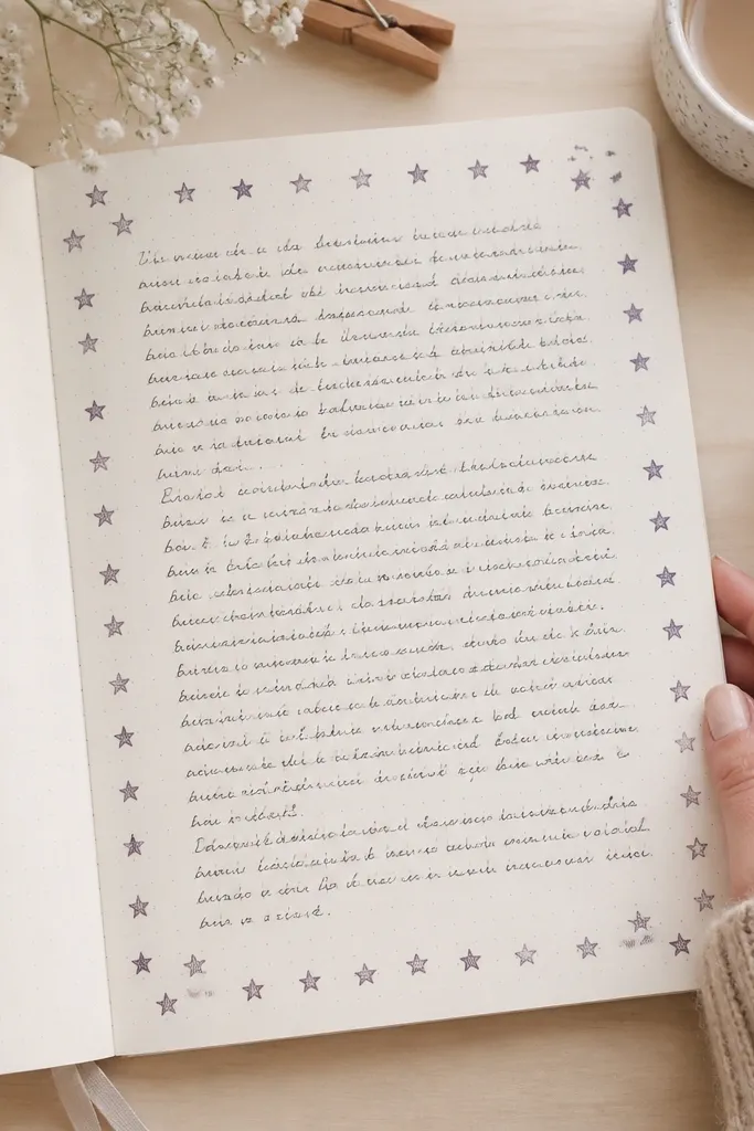
Stamp-only doodles look dreamy because they’re consistent and graphic. Pick one repeat motif like tiny stars, small flowers, or simple leaves, then use it like a pattern — not random decoration. Pair it with handwritten text in one pen color for a clean, photo-ready spread. This works year-round because the motif stays the same and the content changes. Skill level is easy if you have stamps or stamp stickers. Build time is about 20-30 minutes per spread.
Choose one stamp motif and one ink color, preferably a pigment ink for crisp edges. Stamp lightly in the margin or along a border line, keeping the spacing consistent. Write your title and body text after stamping so you don’t smear ink. Add one thicker line or box around your main text area for structure.
Test your stamp on scrap paper — the first press is often too light and the second is perfect.
Don’t use multiple stamp sizes — it makes the page feel inconsistent.
21. Clear Tape Art Lines for a Glassy Look
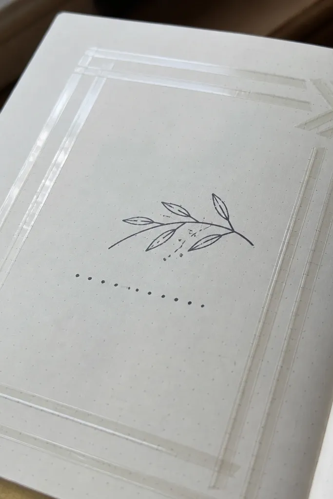
Clear tape art gives a glassy, modern look that photographs cleanly. It’s also a clever way to add shape without covering the page. Use it for geometric frames, arrows, and corners, then keep handwriting minimal so the tape lines do the heavy lifting. This style works year-round because it’s neutral and doesn’t depend on seasonal paper. Skill level is beginner, and it’s fast once you’re steady with straight edges. Expect 15-25 minutes per spread.
Draw a light pencil guide for where the tape will go, like a rectangle frame or an L-shaped corner. Cut clear tape strips and place them carefully along the guide. Press the tape down with a clean bone folder or fingernail to avoid bubbles. Write your text inside the taped area and keep your ink dark for contrast.
Pro tipUse a craft knife and ruler for tape cuts so the edges look crisp.
AvoidDon’t add tape over thick ink lines — raised texture shows in photos.
22. Notebook Spine Label with Handwritten Season Dates
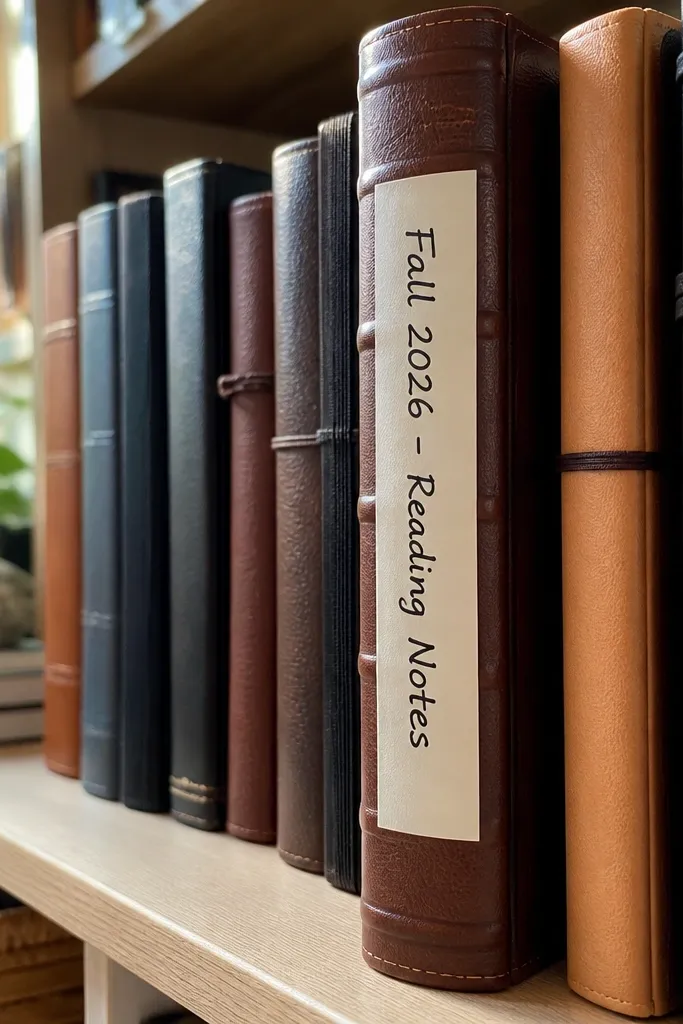
A spine label is the easiest “aesthetic” upgrade because it makes the journal look organized from the outside. Add season dates and a short theme, like “Spring — Lists & Walks” or “Fall — Reading Notes,” and your journal shelf looks styled. Year-round benefit is real: you can keep multiple journals and still know which one is for what. It’s fast, cheap, and very photo-friendly because spines show up in flat-lays. Skill level is beginner and it takes about 10-20 minutes.
Cut a label strip from matte cardstock about 1 inch wide and long enough to wrap the spine. Write the season name and date range in a neat hand using black pen. Add a thin accent line in the season color using a fineliner. Glue the label centered on the spine and press flat for 1-2 minutes.
Use a monoline font style (simple block letters) so the label stays readable in photos.
Don’t use glossy sticker paper — it reflects light and makes the spine look messy.
23. Matte Photo Corners for Mini Print Inserts
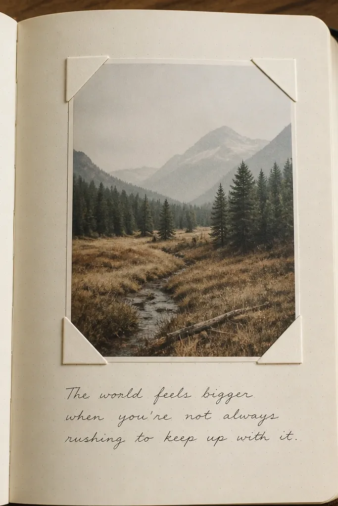
Mini print inserts look dreamy because they add a framed moment inside your handwriting. Photo corners keep prints from curling and let you swap them without residue. Choose matte prints with soft colors so the journal doesn’t look like a random collage. This works year-round because you can rotate prints by season — beach photos in summer, museum photos in winter. Skill level is easy, and you’ll spend most time trimming and aligning. Each insert takes about 10-15 minutes.
Cut your mini print to a consistent size, like 3 x 4 inches. Mark where it goes on the page, then place matte photo corners at the four corners. Stick the corners to the print first, then press them onto the page. Write a short caption below in the same pen color as the print’s main tone.
Pro tipRound the print corners with a corner punch for a softer, more dreamy look.
AvoidDon’t place prints flush to the page edges — leave at least 1/2 inch of breathing space.
24. Hand-Torn Paper Border with Watercolor Dots
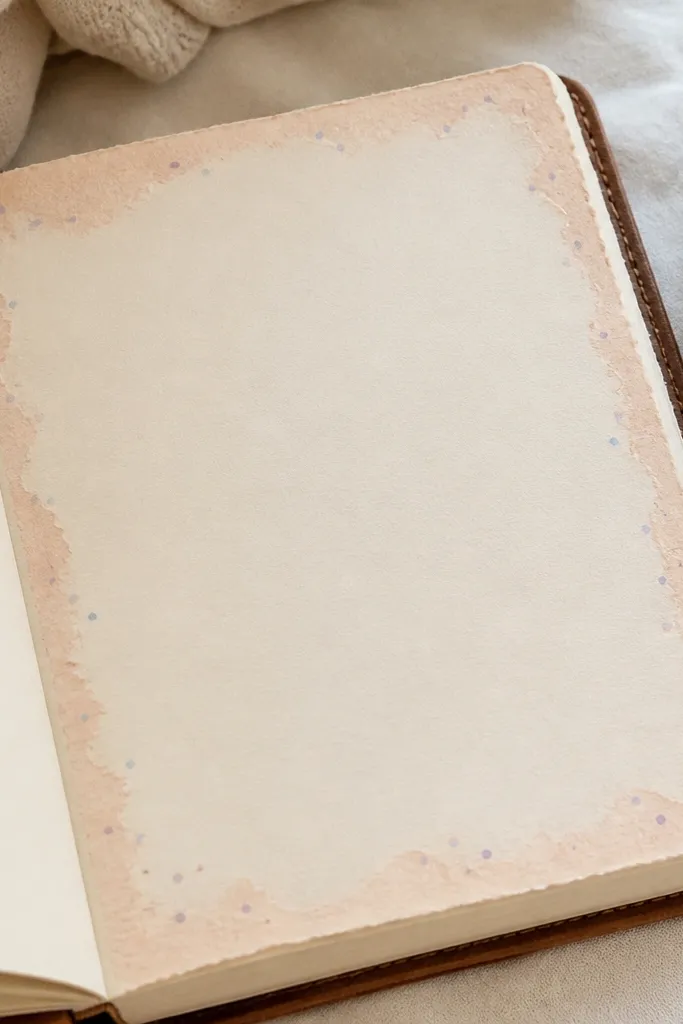
Hand-torn borders look dreamy because they add texture without needing illustration. Combine that with tiny watercolor dots, and you get a soft, whimsical frame that still feels clean. This is year-round because you can change the border paper color or dot color each season while keeping the same layout. It’s best for reflection pages, habit trackers, and weekly notes. Skill level is easy to medium, and build time is about 30 minutes per spread.
Tear thin strips of paper for a border and glue them lightly along the top and sides, leaving the bottom open for writing. Mix watercolor paint into a dot-friendly consistency and flick a few dots near the border edges. Let dots dry fully before writing over them. Add a title line in a darker pen so the border stays the background visual.
Use tissue paper for the border if you want extra softness and a floaty look.
Don’t flood watercolor dots — they should look like tiny specks, not puddles.
25. Kraft Paper Belly Band with One Big Tag
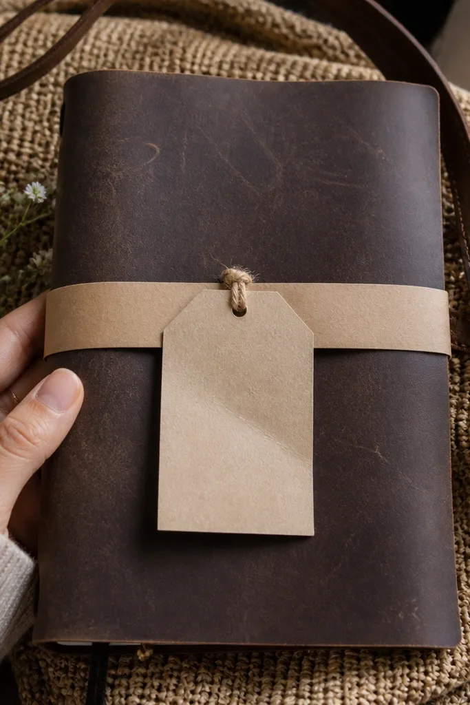
A belly band with a big tag looks instantly styled because it creates a vertical element with movement. Kraft paper grounds the look and keeps it warm in every season, while the tag gives you space for a theme label. The band also makes the journal feel like a product, not a notebook. This setup is ideal for travel journaling or monthly spreads where you want a clear “cover page” moment. Skill level is beginner and it takes about 1-2 hours.
Cut a kraft belly band strip that wraps around the journal with a 1-inch overlap. Glue or tape the ends to form a loop, then punch a hole near the overlap edge. Make a tag from cardstock, then thread it with twine or a ribbon through the hole. Write the month or theme on the tag and keep the font centered.
Use thicker cardstock for the tag so it doesn’t droop in photos.
Don’t use a narrow band — thin bands roll and look messy when the journal is open.
26. Clear Label Stickers for Consistent Section Headers
Label stickers bring order to your journal visuals, which is what makes pages look dreamy instead of improvised. Clear labels look clean and modern, and they keep your section headers consistent across the year. Use them for sections like “Gratitude,” “Ideas,” “Plans,” and “Reads,” then keep the label placement identical every time. The result is a journal that looks designed even when your writing changes. Skill level is easy and it’s a great way to upgrade an existing journal. Time is about 20 minutes to set up labels for multiple spreads.
Pick a label size like 1.25 x 2.5 inches and print or write consistent text. Place labels in the same positions on each spread using light pencil guides. Use black or dark gray pen for label text so it stays readable through the clear sticker. Add one matching accent underline in the season color beneath the label.
Pro tipKeep label font simple — block letters look best on clear stickers.
AvoidDon’t rotate label positions — the repeated layout is the whole aesthetic.
27. Double-Margin Layout with Wide White Space
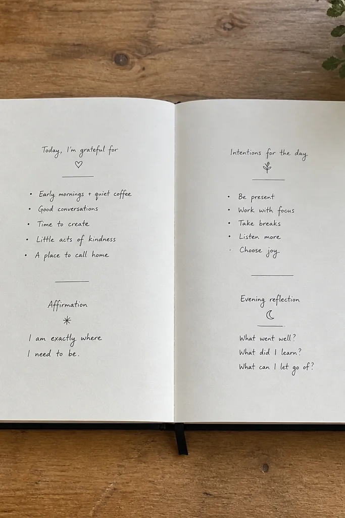
Wide white space is the fastest route to dreamy. A double-margin layout creates a calm frame around your text so the page looks breathable even with lots of writing. It’s also a workaround for messy handwriting because you keep text in a controlled middle zone. This works year-round since the layout stays identical and you can change only your content style. Skill level is beginner — it’s basically measuring and sticking to it. Expect about 15 minutes to set up a template for a whole month of spreads.
Draw two margin lines on each page: one 1 inch from the left edge and one 1 inch from the right edge. Create a narrower center writing box between them, leaving extra space above for titles. Use a ruler to keep text lines inside the box. Write your heading in the top area, then keep body text aligned with the center box.
Pro tipUse a light pencil guide and only ink after you confirm the spacing visually.
AvoidDon’t cram text into the margins — the airy look comes from leaving space untouched.
28. Seasonal Fabric Swatch Corner with Hand Stitch
Fabric swatches in a corner look dreamy because they add softness and tactile color without overwhelming the page. Hand stitching makes it feel intentional and keeps the swatch from peeling over time. Use a tiny swatch — like 1.5 x 2 inches — so it stays subtle and photogenic. This is year-round because you can swap swatches by season while keeping the stitch placement the same. Skill level is medium because stitching needs patience, but the build is simple. Plan about 30-45 minutes for a swatch page.
Cut a fabric swatch and fray the edge lightly or press it flat so it looks natural. Mark a corner location on the page and stitch through the swatch and paper using a needle and thread. Keep stitches small and evenly spaced around the swatch perimeter. Finish by writing a short heading next to the swatch and adding one accent line under it.
Pre-wash fabric so it doesn’t shrink later and pull the stitching.
Don’t use slippery satin unless you stabilize it — it shifts while you stitch.
29. Watercolor Border with One Clean Center Column
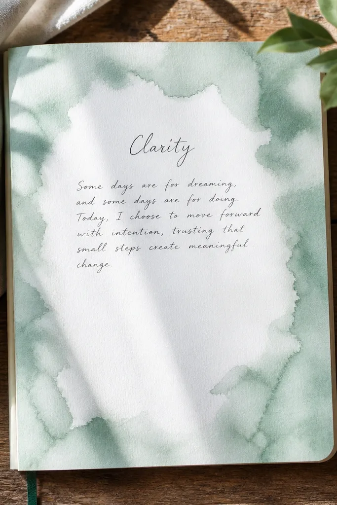
A watercolor border looks dreamy because it frames the page with soft color while keeping the center readable. The key is to paint only the outer edges and keep a clean center column for text, so the page feels organized in photos. This is year-round because you can change border colors by season while using the same layout. It’s great for journaling prompts because the border becomes a consistent visual cue. Skill level is medium because you need control around edges, but the technique is forgiving. Each border takes about 25-35 minutes plus drying.
Tape off a center column area with painter’s tape, leaving about 2.5-3 inches for text. Paint a thin watercolor border around the taped edges, keeping the wash light. Remove tape carefully after the paint is dry enough to not smear, then let it finish drying. Write your content in the center column with a dark pen.
Pro tipUse a smaller brush for corners so the border doesn’t bleed into the center.
AvoidDon’t paint the border too dark — it will compete with your handwriting.
30. Vintage Book Page Backing with Modern Pen Overlay
Layering vintage book pages behind your modern writing gives instant depth. The antique text becomes a subtle texture, while your newer pen lines stay crisp and readable. This style looks dreamy because it mixes time periods without turning into clutter. You can keep the same backing paper and change only the overlay content by season. Skill level is easy because it’s mostly cutting and gluing. Plan 20-30 minutes per spread.
Cut a piece of vintage book page to fit the writing area, leaving a 1/4 inch margin. Glue it down with a thin layer of glue stick to avoid wrinkles. Add your overlay text on top using a black fineliner, then draw one clean underline or box for structure. Seal the edges with a tiny bit of matte medium if the paper is fragile.
Use a thicker fineliner so the ink holds on textured paper.
Don’t choose a backing page with huge, dark paragraphs — it will fight your overlay text.



