
1. Monthly Reading Weather Strip
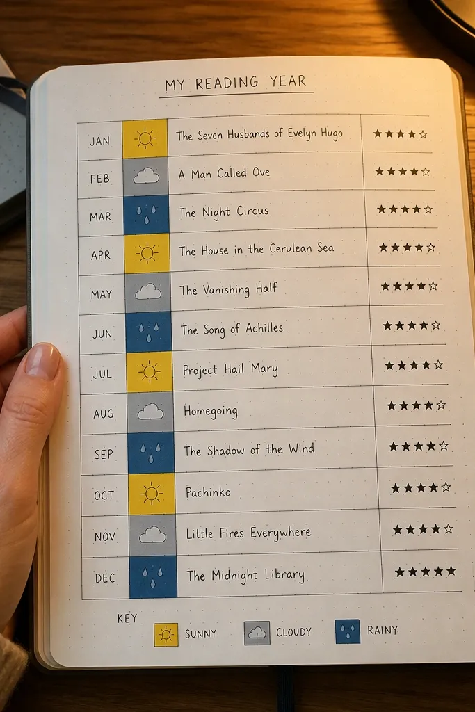
This layout turns your reading year into something you can scan in seconds. Each month gets one narrow “strip” with a simple visual cue — sunny for fun, cloudy for slow, rain for heavy themes — plus a one-line book title and a rating. It looks great because the grid is clean and the icons create a consistent rhythm across the page. It’s also practical: you only write a few words per month, so you don’t fall behind when life gets busy.
Start by drawing a rectangle that spans the width of the page and split it into 12 equal boxes. In each box, write the month abbreviation, add a tiny weather icon, and include one short rating like 4/5 or “5” (keep it uniform). Finish by adding a single legend in the corner that tells you what each weather icon means, using the same color for each icon category.
Pro tipUse a 0.3 or 0.35 fine liner for the grid lines so your strip stays sharp in photos.
AvoidDon’t switch icon styles month to month — it makes the page look messy fast.
2. Quote + Margin Notes Ribbon
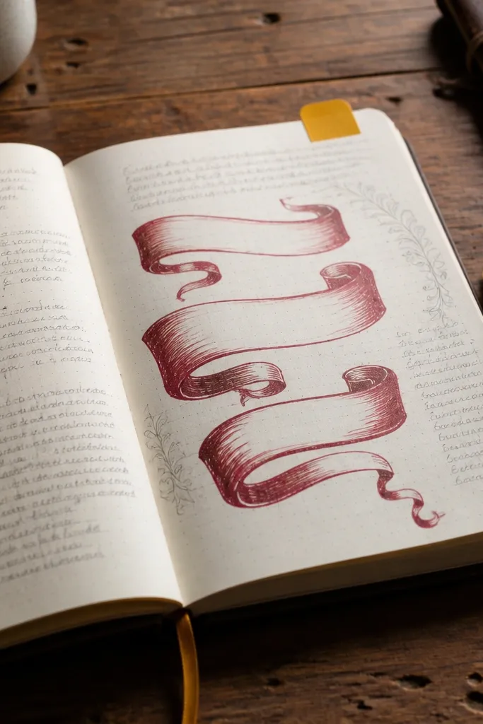
This is the easiest way to make your journal look “designed” while staying quick to fill. You put one standout quote in a bold ribbon across the page, then write short margin notes beside it like a conversation with the author. The visual contrast — one big quote area plus delicate side notes — creates a clean, layered look. It’s perfect for rereads or books where you want to track moments that hit you without writing paragraphs.
Draw a horizontal ribbon band about 2 inches tall across the top third of the page. Write the quote inside, then leave the right or left margin as a narrow column for margin notes. In that margin, use 3-5 tiny bullet fragments like “theme,” “image,” or “question,” keeping each fragment under one line so the page doesn’t get crowded.
Pro tipUse a contrasting ink color only for the ribbon outline, not the entire quote.
AvoidDon’t use full sentences in the margin notes — short fragments look better and take less time.
3. Two-Book Character Card Layout
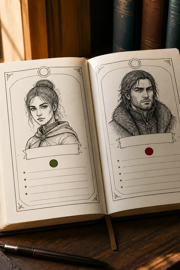
Character cards are a photogenic way to track fiction without turning it into a spreadsheet. You make one card per character and you can do two cards per page, so it stays manageable year-round. The look is strong because cards have borders, consistent spacing, and a repeated header style. It also helps you remember what you read: you’re forced to pick traits and one “why it matters” line, not just summarize the plot.
Create two vertical cards by drawing two rectangles that leave a slim gap in the middle. In each card, add a header line with the character name, then a trait row with three short words, and a small “turning point” box near the bottom. Add a tiny icon in the corner of each card (a key for secrets, a star for ambition) using the same icon style for every entry.
Pro tipPrint or stamp the same mini icons to keep the cards looking cohesive.
AvoidDon’t cram backstory — keep the card to traits and one specific moment.
4. Nonfiction Clippings Timeline
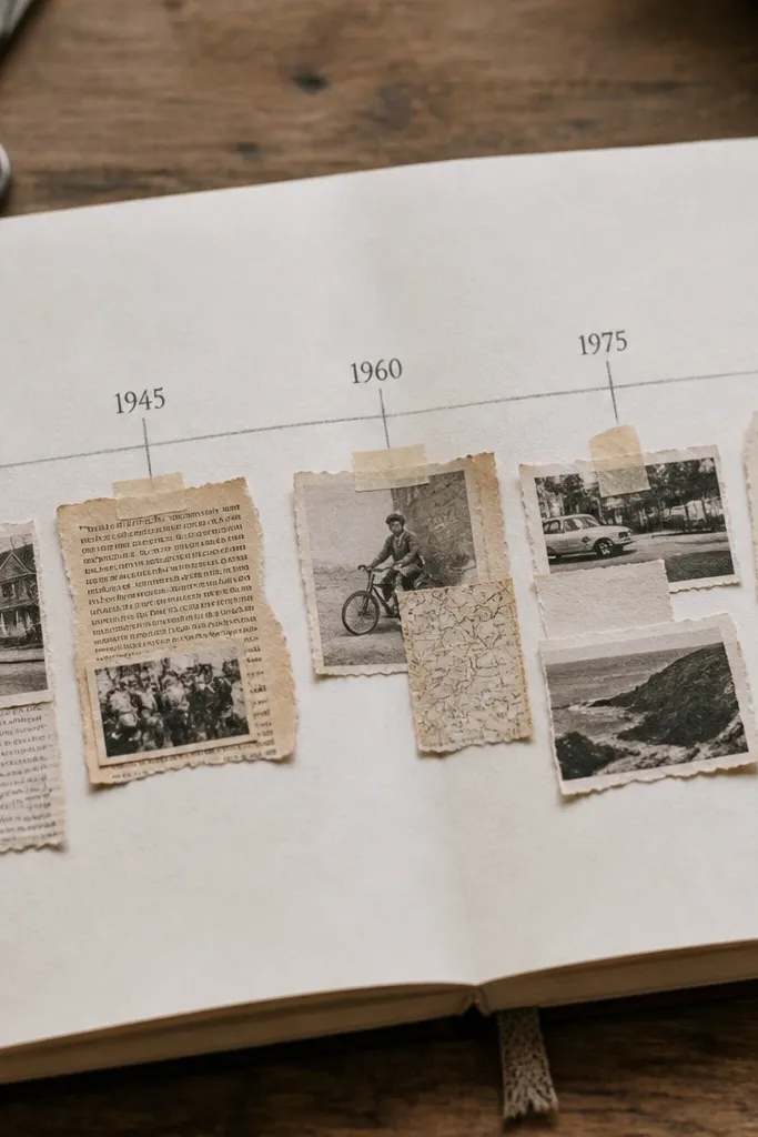
This layout turns nonfiction notes into a visual timeline, which makes your ideas easier to revisit later. You tape or paste small clippings (printed snippets, magazine cutouts, or even handwritten text strips) along a horizontal line. The aesthetic comes from the texture: paper edges and slight overlaps look intentional on camera. It’s a great choice for books about history, science, culture, or any topic that has a sequence or evolution.
Draw a straight horizontal line across the page and split it into 5 segments with small tick marks. For each segment, write a date or “chapter number” and then paste a small paper strip above or below the tick mark. Finish each segment with one sentence under the strip that starts with a verb like “Explains,” “Challenges,” or “Proves.”
Use a glue stick for paper strips, not liquid glue, so you avoid ripples.
Don’t paste full paragraphs — clippings should be short enough to read at a glance.
5. Book Spine Color Band
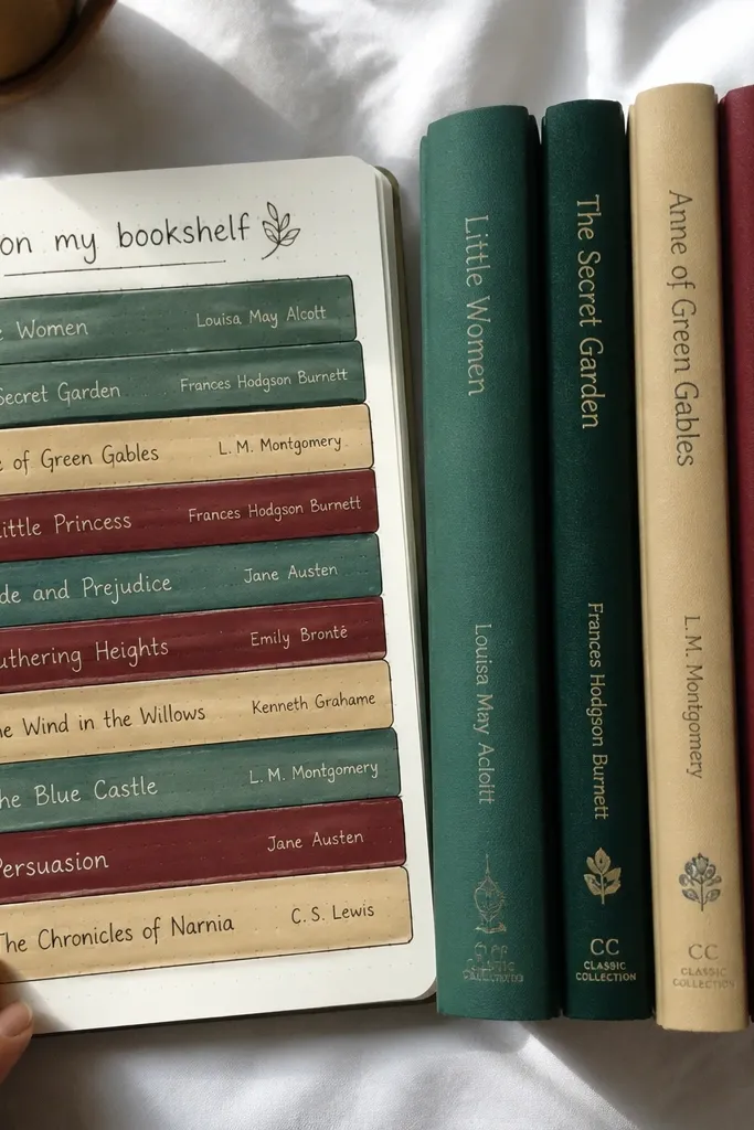
If you love the look of neatly organized shelves, this gives you that vibe on paper. You create color bands for each book, labeled with title and author, so your page looks like a mini bookshelf. The payoff is speed: you can fill it with one band per book and add tiny notes later. It works year-round because it doesn’t require long writing sessions, just consistent labeling.
Choose 3-6 solid colors you want to use for the year and keep them consistent. Draw vertical bands about 1 inch wide each, stack them down the page, and label each band with the title and author in small text. Add one tiny rating mark on each band (a dot or star) so you can scan later.
Use felt-tip markers or colored pens with the same saturation for all bands.
Don’t use random colors — the page looks chaotic and stops feeling cohesive.
6. Reading Speed and Mood Bar Graph
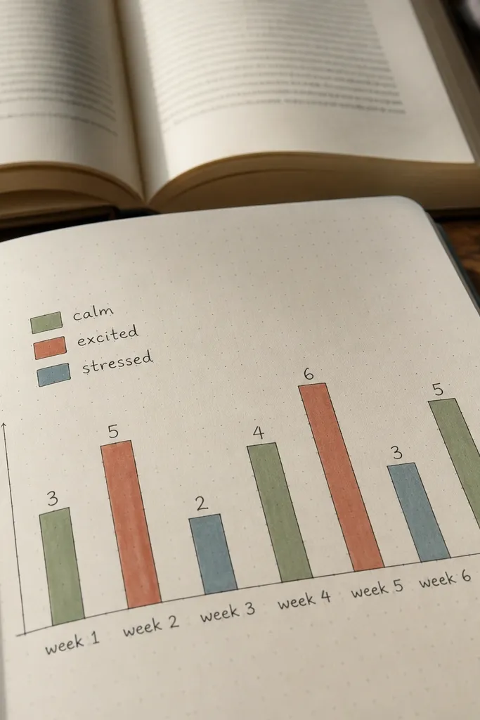
This is a clever way to track reading habits without writing a diary. You make a simple bar graph for pages read per week and pair it with a mood scale so the graph tells a story. It looks clean because graphs have structure, and the mood color key adds personality. It’s great when you want year-round consistency but don’t want to write the same summary every time.
On one page, draw a horizontal axis for weeks (W1 to W8, or however many you track) and a vertical axis for pages read. Color each bar by mood using a 3-color key you define in the corner. Write the book title in a small label under the graph and add one sentence that explains the biggest change in your reading pace.
Pro tipPick one unit and stick to it — pages per week looks more consistent than mixing pages and chapters.
AvoidDon’t make the mood scale too many steps; three colors is enough.
7. Genre Map Routes

This layout makes your reading feel like travel, even if you’re reading at home. You draw a map-like route line, then place “pins” for genres you read, each pin labeled with the book title. The look is photogenic because maps have lots of small visual details — routes, tiny symbols, and direction arrows. It also gives you a way to spot your reading patterns across seasons.
Draw a rough route line across the page and add 4-6 small landmarks along the way. For each landmark, write a genre label and place a circular pin bubble next to it. Inside or near the pin, write the book title in a small font and add one tiny symbol (leaf for nature, globe for travel, heart for romance).
Use a stamp for pins if you want consistent circles every time.
Don’t overcrowd the map — fewer pins looks more intentional.
8. Staggered Date Tiles
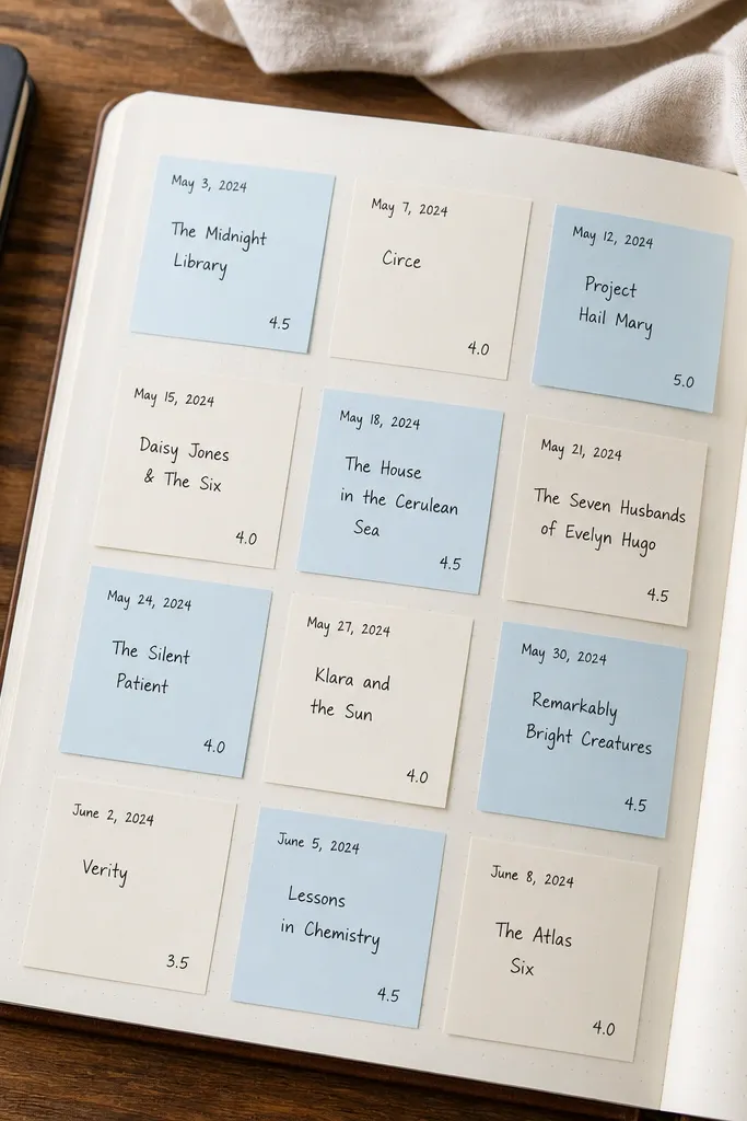
Tiles give you that clean, modern look while keeping the writing minimal. Each entry is a small square with the date, one book title, and a rating. You stagger the tiles so the page looks dynamic instead of like a spreadsheet. This is a great year-round format because you can keep adding tiles as you read without redesigning the page every time.
Choose a grid size like 3 columns and 5 rows, then draw squares with a consistent margin. Stagger by shifting every other row half a square to the right or left. In each tile, write the date at the top, then the title in the center, and a rating at the bottom using a single symbol like a star.
Use one paper color for the tiles and one accent for ratings to keep photos clean.
Don’t use different fonts in each tile — pick one and repeat it.
9. Reading Manifesto Box
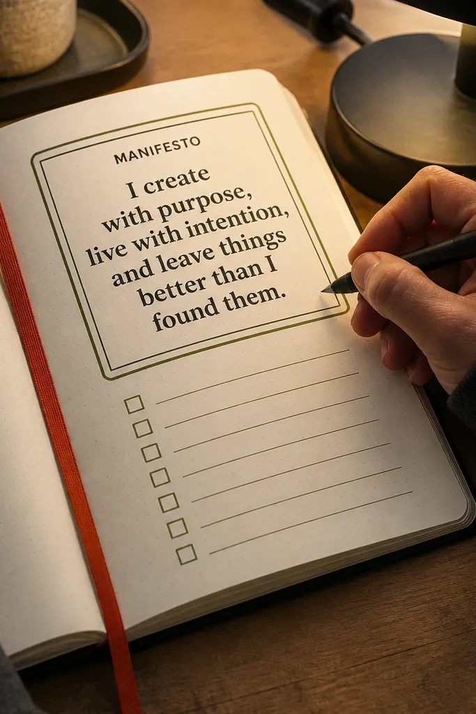
This one is for when you want your journal to look inspiring but still be practical. You write a short manifesto sentence at the top and then add a checklist that you can complete fast. The layout is photogenic because the big box and bold text create strong contrast against the page. It also keeps you consistent year-round because the goals are visible every time you open the journal.
Draw a thick rectangle box around the top half of the page and leave margins for a clean frame. Inside, write your manifesto sentence, then below it add 4 checkboxes with short actions like “one chapter,” “highlight one quote,” “write one takeaway.” Keep the checkboxes in a single column so the box stays visually balanced.
Pro tipUse a gel pen for the manifesto sentence so it pops in photos.
AvoidDon’t make the manifesto long — one line looks best and reads fastest.
10. Aesthetic Rating Sticker Sheet
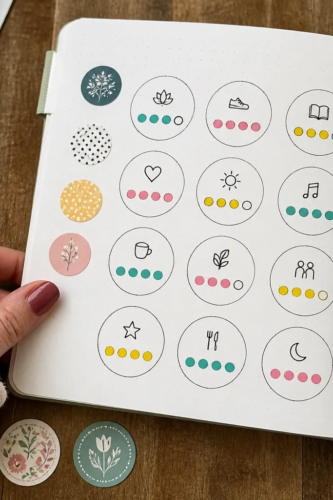
Sticker sheets make your journal feel fun without requiring fancy art skills. You create a grid of “sticker circles” where each circle has a title snippet and a dot rating. The look is consistent because every entry uses the same shape and spacing. It’s also realistic for busy seasons: one circle per book means you can keep up without writing paragraphs.
Draw a grid of circles across the page, for example 4 columns by 5 rows. In each circle, write the first 3-5 words of the title and then place a row of colored dots underneath to show rating (like 1-5 dots). Add a small legend in the corner showing what dot color means if you want mood or genre categories.
Pro tipTrace circles with a coin template so all sticker shapes match.
AvoidDon’t write full titles in tiny circles — use short title fragments.
11. Seasonal Theme Fold-Out
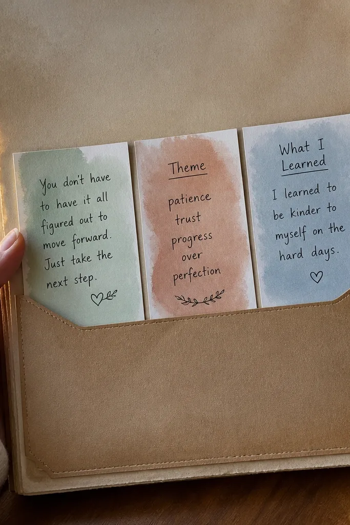
Fold-outs make your journal feel like a keepsake, and they photograph well because they create depth. Each season gets a pocket fold containing 2-3 short cards: one quote card, one theme card, and one “what I learned” card. The look is tactile, with layered paper edges and a clean pocket border. It’s ideal for year-round use because you only redo it four times, then swap the content inside.
Create a pocket by folding a piece of cardstock into a vertical sleeve and gluing or taping it to the inside of the journal page. Cut three small cards sized so they slide in comfortably, then write one theme prompt per card. Label the pocket with the season and year on the outside so you can find it later.
Use matte cardstock for the cards so glare doesn’t ruin photos.
Don’t make the pocket too tight — if cards scrape, they’ll get damaged.
12. Book-to-Playlist Soundtrack Lines
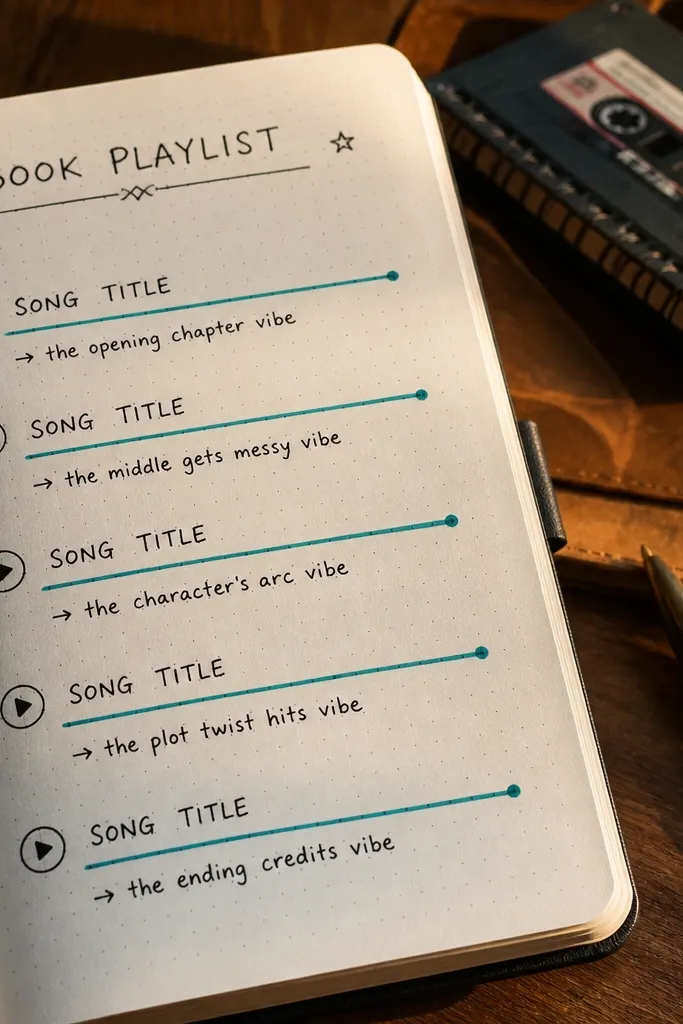
This layout pairs reading with sound, and it looks cool because you’re writing in a structured, music-like format. You pick one book and write five “soundtrack lines” — each line has a song title placeholder plus one short note about why it matches a theme. The aesthetic comes from the repeated line structure and the clean typography. It also keeps your reading journal alive year-round because your entries turn into a mini playlist you can revisit.
Pick a book and write its title at the top with the date. Draw five long horizontal lines across the page, leaving space at the end for a short “reason” note. On each line, write a song title and then add a 3-6 word reason, like “gloomy but hopeful” or “fast pace and tension.”
Use one accent color for the song titles and keep the reason notes in black.
Don’t write essay-length reasons — 3-6 words keeps the layout photogenic.
13. One-Page Book Report With Big Title Header
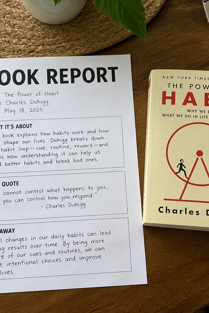
If you want something you can repeat all year without thinking, this is it. The big title header anchors the page visually, then three boxes keep your writing focused: what it’s about, best quote, and takeaway. The look stays consistent across months, so your journal photographs like a coherent set instead of random entries. It’s also the fastest “real report” format — it forces decisions, not free-form rambling.
Create a header box at the top and make it take up about one quarter of the page height. Under it, draw three equal text boxes, then add a star rating row between the header and the boxes. Fill the boxes in order: summary sentence, quote sentence, and takeaway sentence.
Pro tipUse a ruler for box edges, and keep font size changes only in the header.
AvoidDon’t add more than three boxes — the page stops looking clean.
14. Character Relationship Web
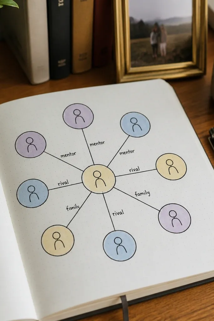
Relationship webs are visual, and they make fiction notes look like something you’d frame. You draw a web with circles for characters and connect them with lines labeled with relationship words like “mentor,” “rival,” or “family.” The look is striking because lines and nodes create a graphic pattern, and it’s easy to keep consistent across entries. It’s great for novels with multiple POVs where a normal summary feels useless.
Draw a center circle and label it with the main character. Add 4-7 surrounding circles and connect each to the center or to other circles with lines. Write relationship labels on the lines in short phrases, then add one “turn” note in the corner about what changed by the end.
Pro tipUse different line thicknesses for different relationship strengths — thin for minor, thick for major.
AvoidDon’t label every tiny interaction — keep it to relationships that matter to the plot.
15. Reading Goal Ladder
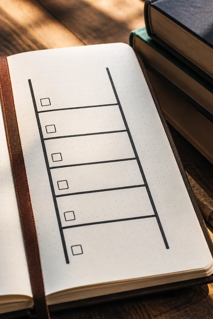
A ladder layout makes goals feel achievable because each rung is a step you can check off. You set an annual goal at the top rung, then break it down into monthly or weekly rungs. The visual is strong because ladders have clear lines and space for check marks, so the page looks organized even when you miss a week. It’s perfect for year-round tracking because it turns progress into something you can see.
Draw a ladder with two vertical rails and 6-10 rungs across the page. Label the top rung as the yearly target, then label each rung below with a smaller target like “8 chapters this month” or “2 books this season.” Add check marks next to rungs you hit, and keep the handwriting consistent in size.
Pro tipWrite rungs in sentence fragments, not full paragraphs, for a cleaner look.
AvoidDon’t set rungs that require perfect weeks — the page will stay blank and discouraging.
16. Book Cover Color Study
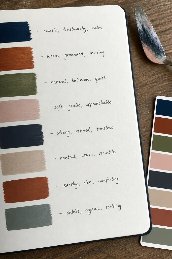
This is for people who love the look of book covers but want something you can do even if you don’t want to take full notes. You pick 6-8 colors that show up on the cover and translate them into paint swatches or marker blocks on the page. Then you write one line about what the colors make you expect from the book. The aesthetic is bold and graphic, and it gives your journal a design element that isn’t dependent on writing speed.
Find the book cover image (in your book app or a photo) and choose 6-8 dominant colors. Make swatch blocks on the page, each block about 1 inch wide, and label each block with a short color name or symbol like “sea,” “rust,” “ink.” Finish with a small caption beneath the swatches: one sentence that predicts the book’s mood based on the colors.
Use a limited palette for the swatches so the page looks intentional, not random.
Don’t copy the cover exactly — color swatches should be simplified.
17. Marginalia Index Page
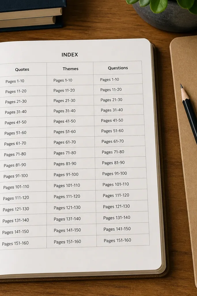
This layout makes your journal easy to navigate, which matters if you want to use it year-round instead of abandoning it after a few entries. You create an index page that logs where your best quotes, themes, and questions live. The look is clean because it’s a table with consistent headers and spacing. It also keeps future entries faster: when you write a new quote, you can update the index in seconds.
Draw a table with four rows of categories and enough columns for page numbers or entry dates. Add headers like Quote, Theme, Question, and Action so each category has a clear purpose. As you fill the journal, write the page number in the correct category and add a 3-6 word snippet for what you’ll find there.
Use one pen color for headers and one for page numbers so the table reads instantly.
Don’t create an index page that’s too detailed — fewer categories keep it usable.
18. Reading Ritual Corner Frame
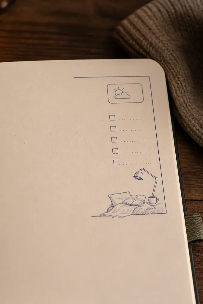
Corner frames are small, but they look great because they add a designed edge without taking over the entire page. You draw a thin frame in one corner and keep a recurring “ritual” section there: checklist, mood, and a tiny sketch of your reading setup like tea cup, lamp, or blanket. This stays photogenic across months because the corner motif repeats. It’s also a real consistency tool — you’re reinforcing a behavior, not just recording books.
Pick one corner and draw a small rectangular frame about 3 inches wide. Inside, create three mini lines for a checklist and one line for a mood mark using a symbol like a half-moon for calm or a lightning bolt for intense. Add a tiny sketch in the bottom of the frame, then write the book title on the main page area.
Pro tipKeep sketches under 1 inch tall so they don’t clutter the spread.
AvoidDon’t change the corner position — repeating the same corner makes the journal look intentional.
19. Timeline of Chapters With Highlights
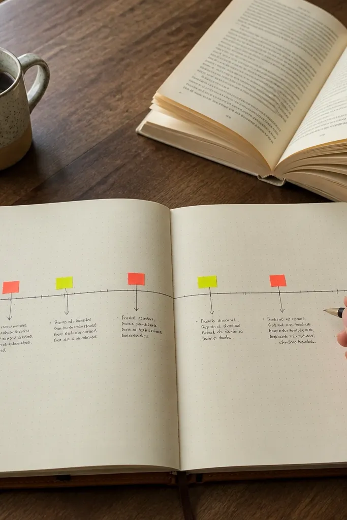
This layout is made for long reads and helps you find your best moments again. You draw a chapter timeline and place highlight markers where something mattered — a reveal, a concept, a quote-worthy scene. The look is graphic and clean, with markers that pop against the page. It’s also practical year-round because you don’t need to write chapter summaries; you just mark the moments that earned your attention.
Draw a horizontal line across the page and mark 6-10 points along it, labeled with chapter numbers or ranges like 1-3, 4-6. At each marker, write a short note under it starting with a keyword like “reveal,” “idea,” or “theme.” Add one star next to the best marker and write a short quote snippet next to the star.
Use a consistent marker shape for highlights, like a teardrop or star, and repeat it every entry.
Don’t mark every chapter — if everything is highlighted, nothing stands out.
20. Book Mood Color Wheel
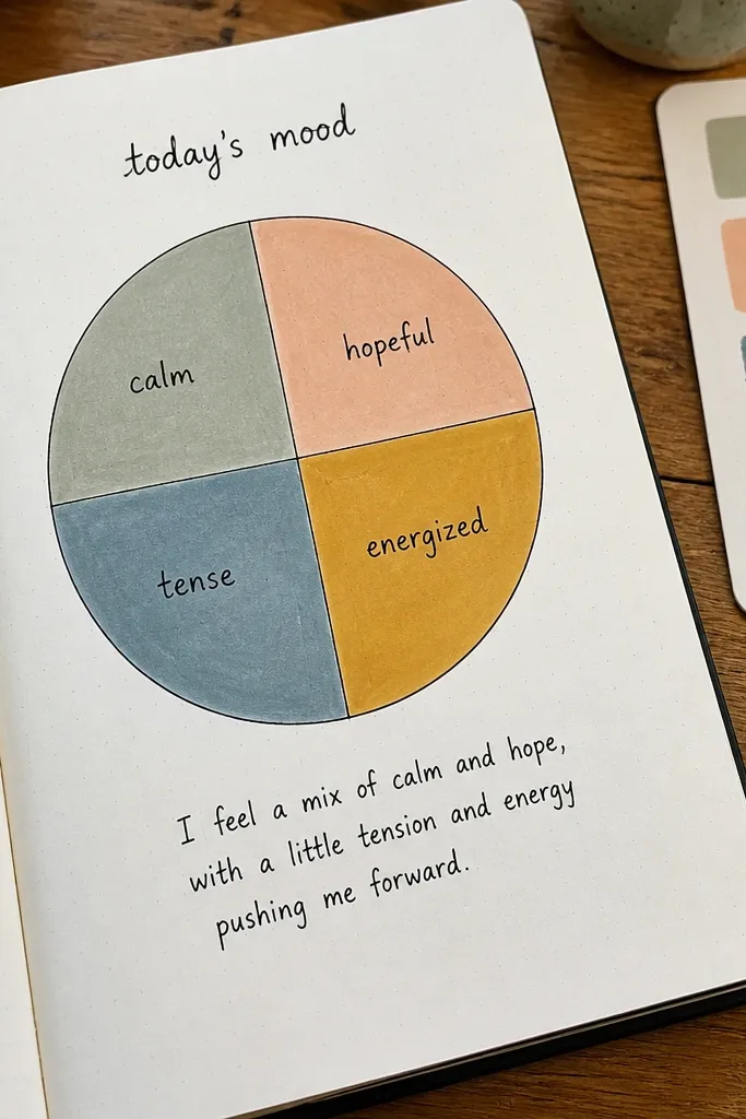
A color wheel turns your reading mood into something you can see at a glance. You pick 3-4 colors that match the book’s emotional range and assign them to slices of a simple wheel. Then you write one short sentence explaining the overall mood in plain language. The look is striking because the wheel gives you a graphic focal point, and the color slices make the page feel alive without extra writing. It’s a great year-round format when you want quick entries that still look designed.
Draw a circle and divide it into 3-4 equal slices with pencil first. Color each slice with a marker or colored pencil and label each slice with a mood word like “calm,” “tense,” “hope,” or “sad.” Add the book title and date beside the wheel, then write one sentence below the wheel that explains the overall emotional arc.
Pro tipUse colored pencils for the wheel so the edges stay soft and photo-friendly.
AvoidDon’t pick too many colors — 3-4 slices keeps the wheel readable.



