
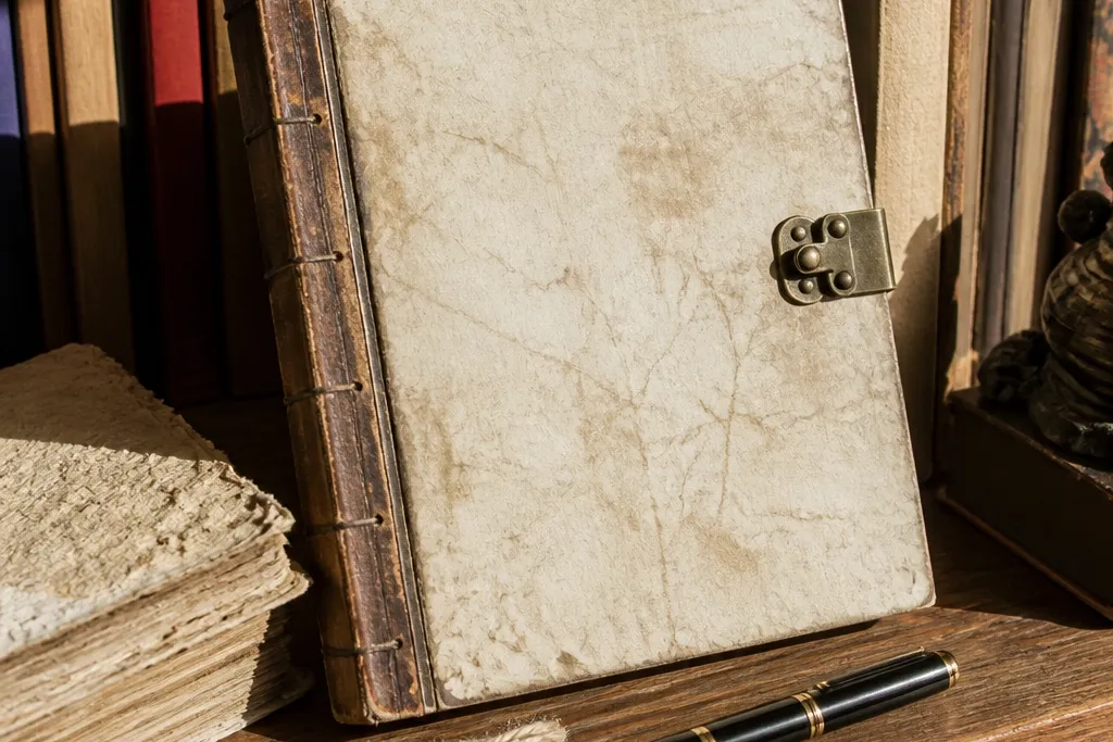
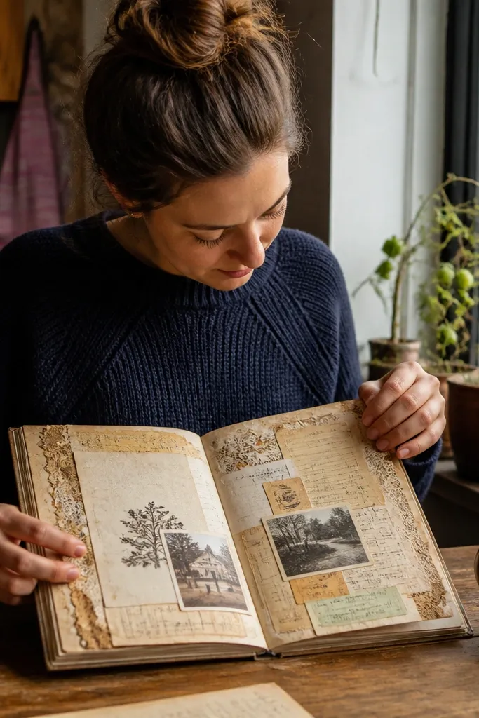
1. Tea-Stained Ephemera Pocket Page
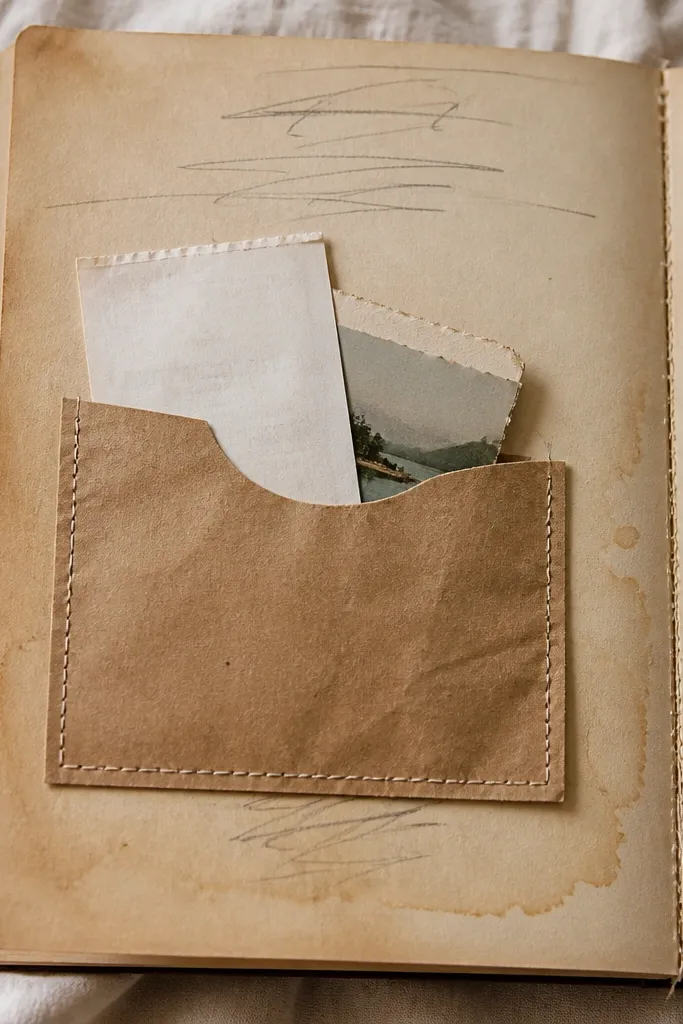
This is the easiest “vintage journal” page that still looks styled. The warm tea tone sets the background, and the pocket gives you a reason to collect real ephemera instead of taping everything flat. Add a stitched edge to the pocket and the page looks handmade on purpose. It’s perfect for scrap lovers because you can store bus tickets, handwritten notes, and old photo strips without turning your journal into a sticky mess.
Pro tipBrew tea stronger than you think — a darker base makes the pocket pop against your writing.
Cut a rectangle pocket from tea-stained cardstock (about 3.5 x 5 inches). Lightly sand the pocket edges, then stitch around the three open sides using waxed thread and a hand needle. Glue the pocket to a tea-stained page with a thin line of archival glue, leaving the top open. Finish by adding two small corner tabs from kraft paper so you can grab the contents without tearing the pocket.
AvoidSkip heavy glue blobs; they cause ripples that ruin the vintage, flat look.
2. Ledger Grid Writing Card with Numbered Margins
Ledger paper instantly reads vintage because the grid feels archival. This idea turns it into a journal page by giving your writing a “record” format: numbered margins, clean blocks, and a consistent title strip. The result looks like something you’d find in an old shop — structured, readable, and photogenic. It’s great for weekly notes, habit tracking, and memory logs where you want tidy organization.
Start with ledger-style paper or print a grid template on cream cardstock. Add a 0.5-inch title strip at the top with a dark ink pen. Along both sides, draw six small boxes spaced evenly and number them 1-6. Write your content in the center grid area, then seal the page with a light coat of matte clear spray to keep ink from smudging.
Use a black fineliner for the grid lines and a slightly softer brown for the numbers so it looks aged, not harsh.
Don’t draw every line by hand; use a ruler for the grid so it stays crisp.
3. Wax Seal Bookmark Page Border
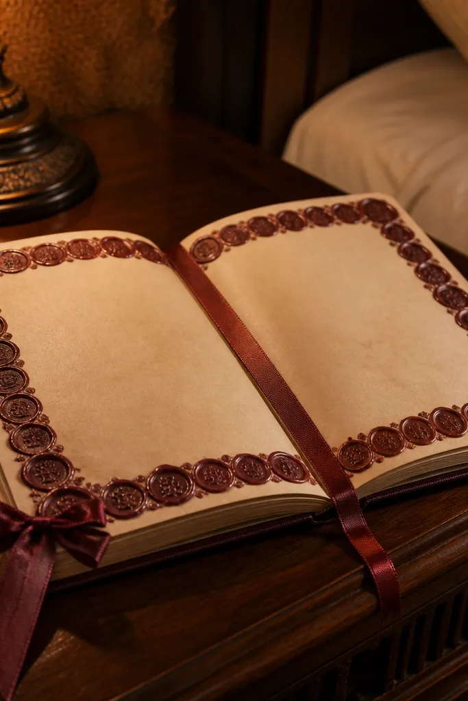
If you want one detail that screams “vintage,” wax does it. This project is a border page with a faux wax-seal cluster and a ribbon bookmark tied into the corner. The ribbon adds a soft, romantic texture, and the seal gives you that antique closure vibe without actually sealing anything. It photographs beautifully because the raised texture catches light.
Cut a strip of kraft paper the width of your page and about 1.25 inches tall. Color the strip with a light brown ink wash, then dry it fully with a hair dryer on low. Press a wax-seal stamp into melted wax or use a wax-seal sticker and secure it at the strip center. Tie a 6-inch satin ribbon through a small hole at the top corner and glue the strip down around the bookmark area.
Let the ink dry completely before sealing; otherwise the wax texture can smear.
Don’t use glossy ribbon; shine makes it look modern next to aged paper.
4. Bookcloth Fabric Cover Page with Stitched Spine Spine Tab
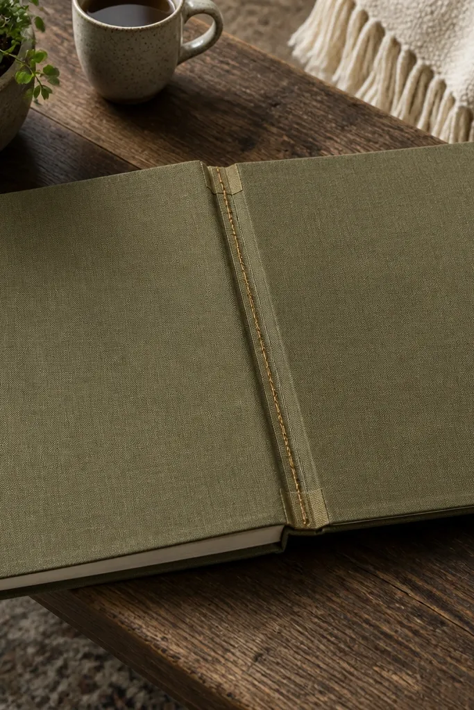
Fabric makes a journal look expensive and older than it is. This idea uses bookcloth or canvas as a cover-style page inside your journal, plus a stitched spine tab so it reads like part of a real bound book. The texture is the whole point — you’ll see it in photos, and it feels good when you flip. It’s ideal for writing sections you want to frame, like introductions, seasonal notes, or “rules of this journal.”
Cut bookcloth to the size of your page front (measure the journal page first). Back the fabric with thin interfacing using fabric glue so it doesn’t stretch. Stitch a simple border 0.25 inches from the edge with thick thread, then add a 1-inch-wide spine tab along the fold line. Glue the finished fabric panel onto a blank page using archival bookbinding glue and let it dry under a flat weight for 30 minutes.
Use a chalk pencil to mark stitch lines — it wipes off cleanly.
Skip stretchy fabric; it warps the page and makes the stitched lines look crooked.
5. Gilded Edge Corner Frame with Gold Leaf Pens
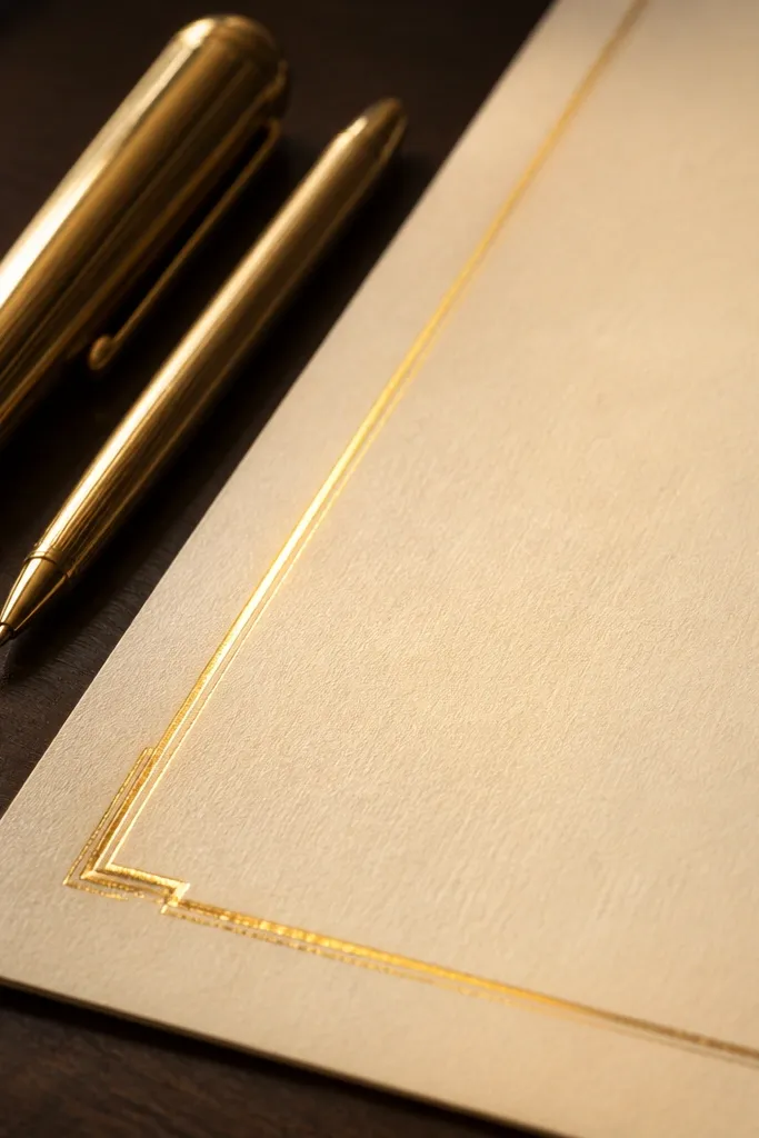
Gold accents make vintage journals look intentional, not random. This project adds a corner frame and a thin gilded line that guides the eye back to your writing. Use gold leaf pen or metallic acrylic for a raised, sparkly edge that looks great under desk lamps. It suits title pages, monthly covers, or any page where you want the layout to feel like a bound volume.
Start with tea-stained or cream cardstock. Draw a 0.5-inch border around the page using a light brown pencil, then trace the border with a gold leaf pen. Add a corner frame by drawing an L-shape in each corner, sized about 0.75 inches, and fill it with gold ink. Let it dry, then lightly rub the gold with a soft cloth to soften any thick streaks.
Use a ruler and short strokes; gold pens get uneven if you drag them slowly.
Don’t cover the whole page in gold; small placement looks more vintage than heavy shine.
6. Vintage Map Fold-Out with Thread Hinge
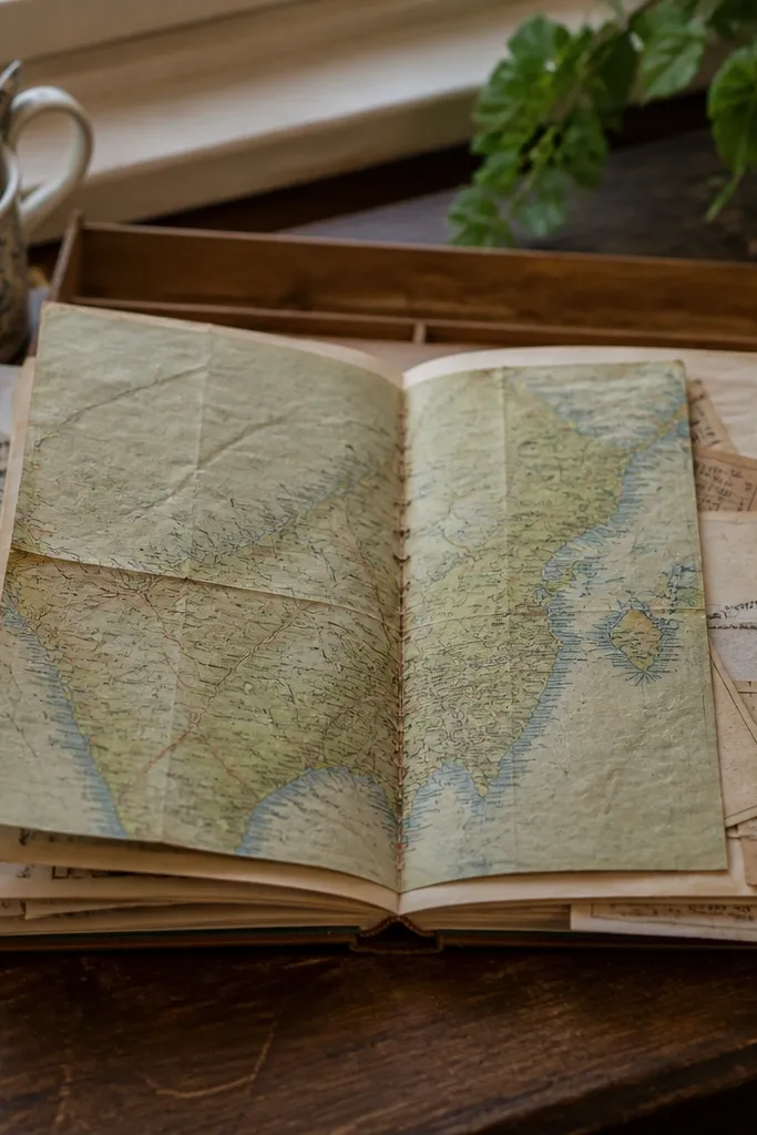
Fold-outs add drama and make your journal feel like a mini exhibit. A vintage map insert gives instant age, and the thread hinge makes it look handbound. This is a perfect year-round idea because you can reuse the format for travel memories, monthly “places I want to revisit,” or even seasonal rituals. It’s also photogenic because the open flap creates depth.
Pro tipUse a fabric tape hinge (not paper tape) — it holds up to repeated opening.
Cut a map sheet to the fold-out size (about 4 x 8 inches). Score the fold line and fold it cleanly. Attach a thread hinge by gluing one strip of fabric tape to the fold, then stitching through the tape at 0.25-inch intervals. Glue the other side of the hinge to your journal page, leaving the flap free to open. Finish by labeling the flap with a small date stamp or handwritten town name.
AvoidSkip thick glue at the fold; it makes the flap stiff and ugly in close-ups.
7. Pressed Flower Envelope Page with Wax-Cover Label
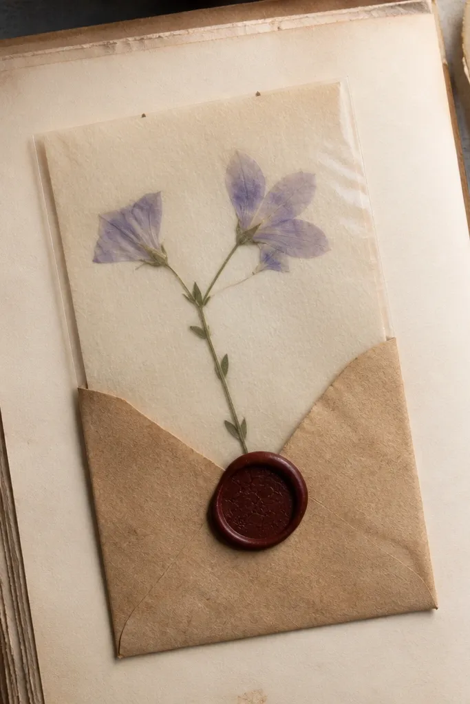
Pressed flowers are a classic, but most people make them look flat and random. This envelope format fixes that by protecting the petals and giving the page a clean vintage composition. The wax-style label adds a seal vibe, and the envelope gives you a place for notes about the plant. It’s great for spring and summer, but the envelope still looks good year-round because the label and paper tones stay consistent.
Make an envelope from kraft paper sized about 5 x 7 inches. Add a small inner pocket from thin cardstock so you can tuck the pressed flowers without crushing them. Glue the pressed petals to a backing card with tiny dots of archival glue, then place that card inside the envelope. Create a label by stamping into wax paper or using a wax-seal sticker, then glue the label to the envelope front and write a plant name beneath it.
Press flowers between blotting paper for 2-3 days so they stay flat enough for close-up photos.
Don’t use regular school glue; it can yellow and warp thin petals.
8. Sepia Photo Strip Index Page with Corner Washi Tabs
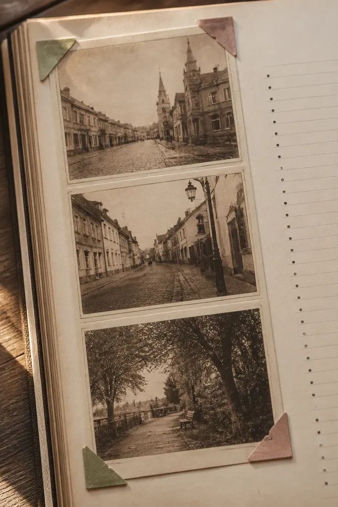
This idea turns your journal into a scrapbook without messy tape. A sepia photo strip gives you instant vintage color, and the index list makes the page useful — not just pretty. Corner tabs keep the photos from looking like they’re floating, and they add a neat, repeated design language. It works year-round for monthly highlights, family notes, or “seasonal things I noticed.”
Pro tipUse the same washi pattern on every page for that consistent vintage system look.
Print or photocopy 3-5 sepia photos into narrow strips (about 1 x 3 inches each). Back them with thin cardstock so they don’t curl. Create an index column on the right side with 3-5 lines and small numbers. Add corner tabs using patterned washi tape at the top corners of each photo strip. Glue the strips down with a thin tape runner and lightly outline each photo with a brown pen.
AvoidDon’t use too many different tape patterns; it reads scrapbooky in a messy way.
9. Dried Ink Marbling Header with Sharpie-Resist Lines
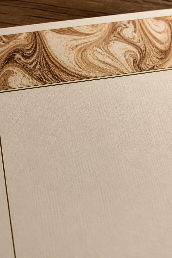
Marbling makes a journal page look like handmade paper from an old mill. This version is controlled: you get swirly sepia color in a header strip, then you add sharp, resist lines so the layout stays graphic. The contrast between soft marbling and crisp lines makes it photogenic. Use this for title pages, “season opening” pages, or any entry where you want the header to carry the whole look.
Pro tipMix ink with a little dish soap for better flow — the swirls look smoother.
Create a marbled header strip on a plastic sheet using diluted brown ink and a marbling tool or toothpick. Transfer the marbled film to cream cardstock by laying the paper down gently, then lift. Let it dry flat. Use a Sharpie or dark fineliner to draw thin lines over the marbled area that act like borders. Finish by writing your page title in the center with a typewriter-style font pen or a consistent handwriting style.
AvoidSkip thick ink puddles; they dry glossy and look modern.
10. Antique-Style Label Maker Page with Twine Tie
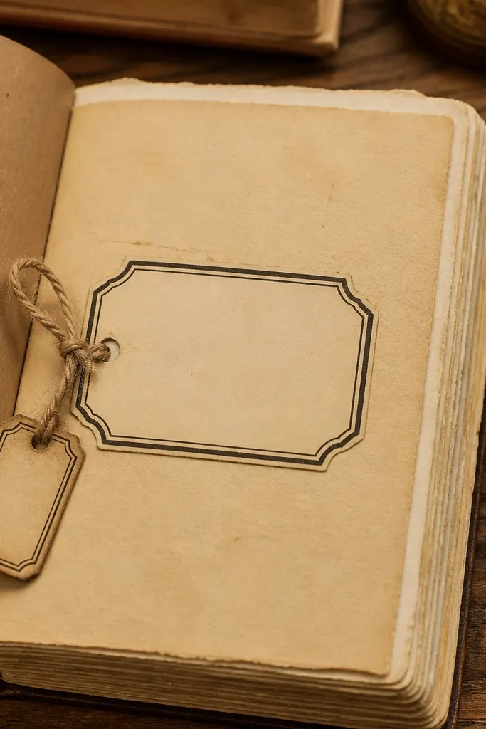
This is the “decor” version of a journal page: labels and ties make it feel like an old cabinet drawer. The label gives you a clear title area, and the twine tie adds texture and a little ritual when you open it. It’s great for organizing notes by topic — like recipes, letters, or seasonal lists — without needing a full binder. The look is clean, warm, and very photo-friendly.
Cut a kraft tab about 1.5 x 3.5 inches and round the corners. Punch a small hole at the top for twine and one hole for a label strip. Create the label strip by printing or handwriting a title on cream paper, then glue it to the tab. Thread twine through the holes and tie a tight bow. Glue the tab to your journal page and write a short entry beneath it.
Use brown twine with a matte finish; shiny cord looks too new.
Don’t make the tab too wide; the tie looks bulky if it covers the writing area.
11. Chalk Ink Stamped Border with Small Repeat Motifs
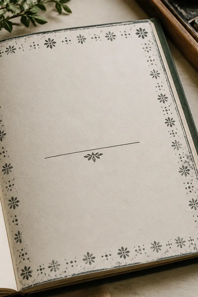
Chalky ink and stamped motifs give you that worn-paper feel without smudging your handwriting. This layout uses a repeat border — small flowers, dots, or tiny numbers — that frames your content like a vintage book. The best part is consistency: once you stamp the motif and spacing once, you can repeat it across pages. It works for year-round journaling because the border style never changes; only the content does.
Pro tipStamp on the same day you write; fresh chalk ink bonds better to the paper surface.
Use a stamp pad mixed with a chalk medium or a chalk ink pad for a matte look. Practice on scrap paper to find even pressure. Stamp a 1-inch border around the page using the same motif and spacing. Add a line of text in the center with a fine brush pen or fineliner. Let the border set for 10-15 minutes, then lightly rub any chalky excess with a clean cotton cloth.
AvoidSkip watery stamp pads; they bleed into tea-stained paper and blur the motif.
12. Vintage Recipe Card Double-Page Spread
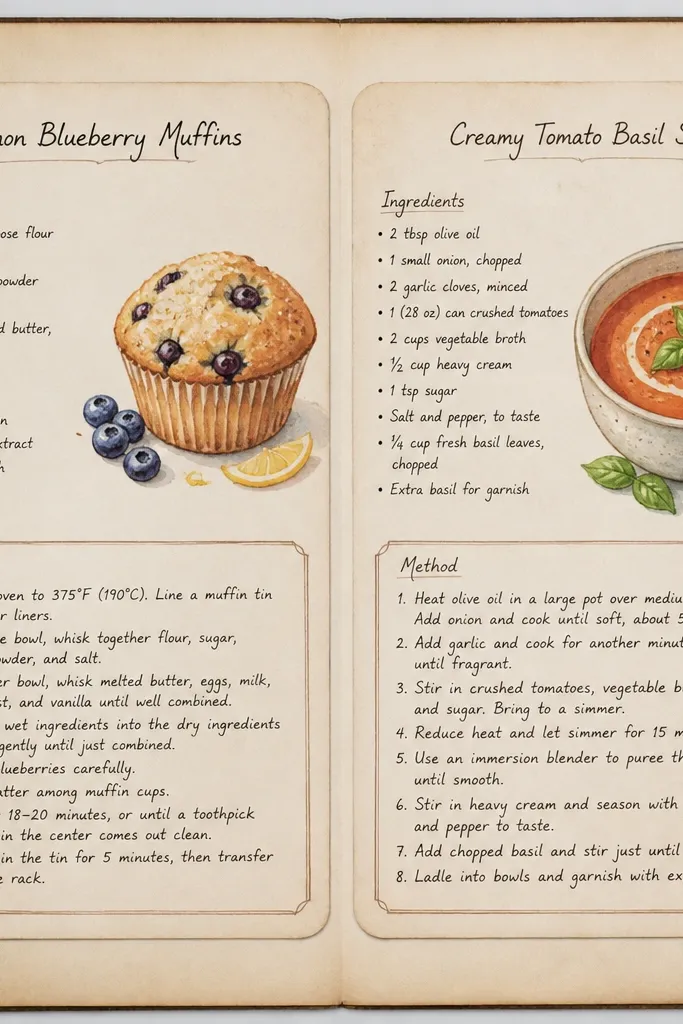
Recipe cards look vintage by default, and they make your journal feel useful. This idea uses a double-page layout where two recipe cards sit side by side with a small “method” box below. It’s perfect for year-round entries because recipes, routines, and seasonal notes all fit the same format. The look is clean and styled, especially if you keep the card typography consistent and the paper tones warm.
Pro tipUse the same pen for headings every time so the spread looks like a set.
Cut two recipe card panels from cream cardstock, each about 4 x 6.5 inches, and round the corners. Print or handwrite a title at the top, then draw an ingredients box and a method box with a brown pen. Glue the cards to a two-page spread so the vertical edges align. Add a small strip of washi tape at the top of each card to mimic old filing labels. Finish by writing a short paragraph in the bottom box and date it.
AvoidDon’t overcrowd — recipe layouts read best with generous margins.
13. Rope-Cord Bookmark Spine Wrap Page
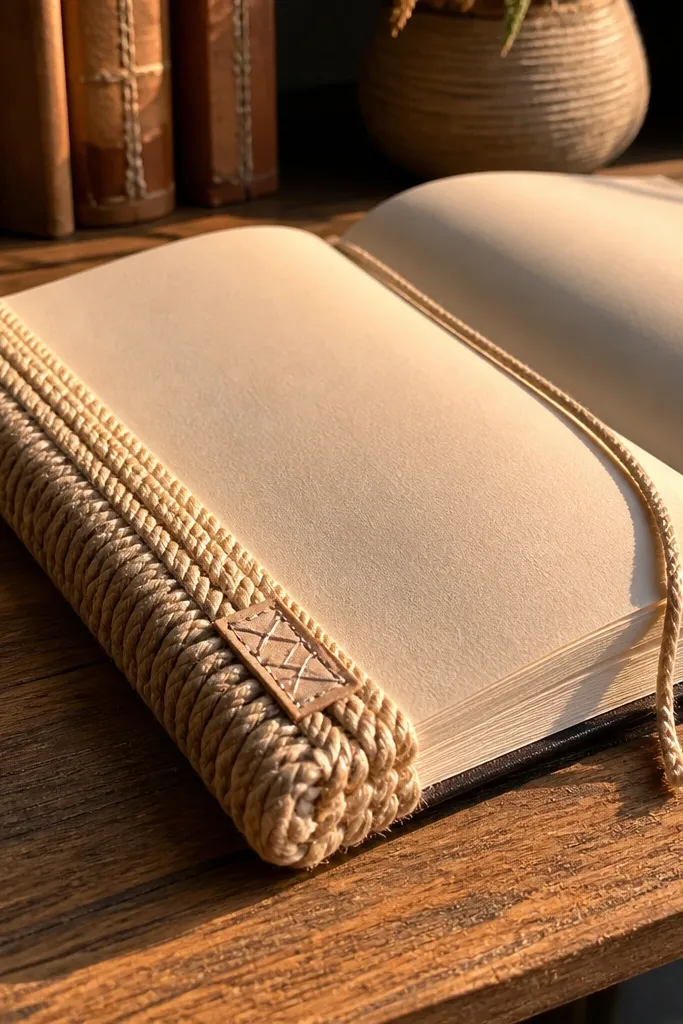
This is a decor-forward idea that makes the journal itself look older and more crafted. A rope cord wrapped along the spine or edge adds thick texture and a rustic vintage feel. If you add a stitched label on the cord, the whole thing looks like a handcrafted book, not a scrapbook. It’s especially good for year-round journals because you can keep the same spine wrap and swap the writing pages inside.
Pro tipUse a thin fabric glue brush so the glue line stays invisible under the rope fibers.
Measure your journal page height and cut a length of natural rope or jute cord (about 1.5 inches longer than the spine). Glue the cord along the edge using a strong fabric glue, then press it flat with a weighted book. Create a small label from kraft paper, stamp or write a title, and stitch it onto a thin fabric backing. Glue the label over the cord seam so the join disappears. Let the glue cure fully before you start flipping.
AvoidSkip synthetic rope; it looks plasticky and cheap in photos.
14. Gouache Wash Background with Dry-Brush Script Lines
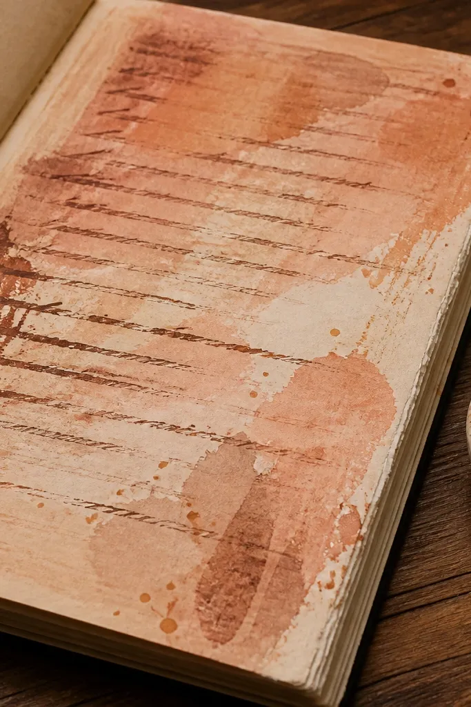
Gouache gives you that soft, vintage paint look that ink can’t. This idea uses a warm wash background — like sepia, clay, or dusty olive — then dry-brush script lines so the writing area feels airy. It’s photogenic because the paint has tooth and the dry brush leaves uneven texture. This works year-round because you can pick a color palette that matches your seasons without changing the layout format.
Paint a thin gouache wash across the page using a large flat brush (leave margins). Let it dry until it feels slightly matte, not glossy. Load a smaller brush with a darker gouache color, then wipe most paint off and drag lightly for dry-brush script lines. Write your main entry in a darker ink pen on top of the paint once it’s fully dry. Finish by sealing with matte spray if your pens smear.
Dry-brush on a scrap first; the exact pressure changes everything.
Don’t use wet ink on fresh gouache; it bleeds and looks messy.
15. Black Tea Dye Gradient Margins with Corner Date Stamp
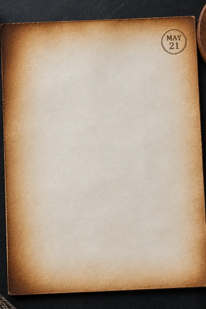
This is a cleaner, more controlled tea-stain look than soaking the whole page. You dye only the margins with a gradient, then add a corner date stamp for that old-book rhythm. The dyed edges make the page feel framed, and the corner stamp keeps the composition consistent. It’s perfect for daily or weekly journal pages because you can repeat the same layout and just swap the entry text.
Pro tipUse a cotton pad for the gradient; it blends smoother than paper towels.
Brew black tea extra strong and let it cool. Using a sponge brush, dab tea into the outer 0.75 inches of the page, then blend inward with lighter dabs. Let the gradient dry fully. Stamp or handwrite a date in the top-right corner in brown ink. Add a thin border line along the inner edge of the dyed margin using a ruler.
AvoidSkip soaking the center; blotchy centers look uneven in close-up photos.
16. Vintage Ticket Stub Strip with Double-Stitch Edges
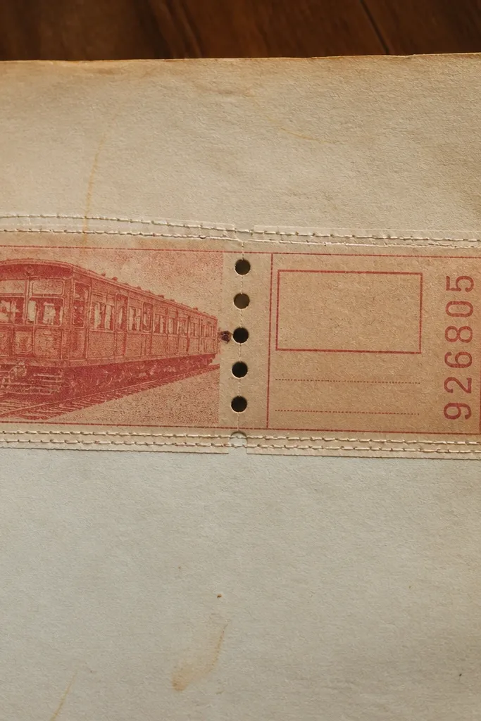
Ticket stubs are the fastest way to get an authentic vintage vibe. This project makes them look intentional by turning the strip into a stitched insert with double lines of thread. The double stitch adds a “bound archive” feel, and the strip format keeps the page from looking chaotic. It’s great for travel memories, concerts, or even year-round “outings” you want to track.
Pro tipBack the tickets with cardstock so the ink doesn’t bleed when you punch holes.
Cut a strip of ticket stubs or printed ticket shapes (about 1.5 x 6 inches). Arrange them in order and glue them to a thin backing card so they stay flat. Punch holes along both long edges at 0.25-inch intervals. Stitch using waxed thread in two passes: first one edge, then the other, keeping the tension even. Glue the stitched strip to your journal page and write a short caption under it.
AvoidDon’t stitch through paper-only tickets; they tear around the holes.
17. Sepia Washi + Frame Title Plate Page
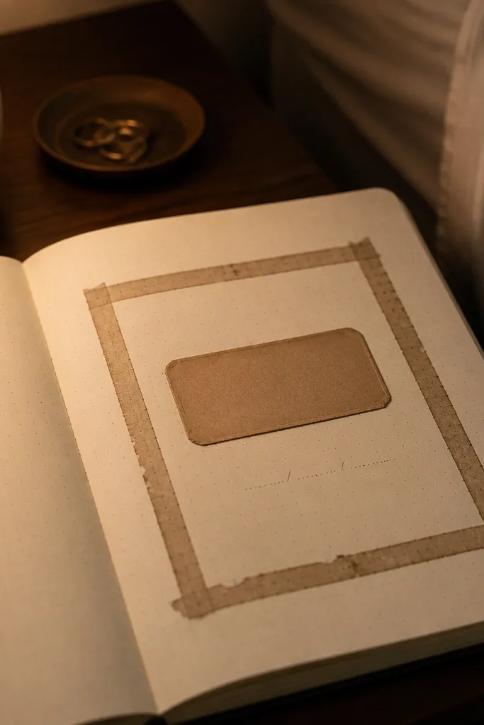
A title plate makes your journal look like a real book section. This idea uses sepia-toned washi tape to build a frame, then a small label plate in the center for the page title. It’s designed for year-round consistency — you can reuse the same frame and just change the title and dates. The frame reads vintage because the tape has muted colors, and it photographs well because it creates clean lines.
Pro tipUse a ruler when placing washi; straight tape lines look more vintage than crooked ones.
Cut a cream cardstock page to size. Place washi tape strips to form a rectangle frame, leaving a 0.5-inch gap inside the frame. Make a title plate from a smaller rectangle of kraft or cream paper and glue it centered inside the frame. Write the title with a dark pen and add the date beneath in smaller handwriting. Seal the page with matte spray to protect ink and reduce washi lifting.
AvoidSkip glossy washi; shine makes the frame look modern.
18. Old-Book Page Folding Map of Your Month
This is a “journal map” layout that looks like a miniature document. You fold an old-book page into sections and label each area with days or themes, so your month becomes a visual object. It’s aesthetic because the creases create natural vintage texture, and the layout is structured enough to photograph cleanly. Use it for monthly planning, seasonal goals, or theme tracking.
Pro tipCrease with a bone folder so the folds look crisp, not wrinkled.
Print or photocopy a book-page texture onto thin paper, then cut it to about 8 x 10 inches. Fold into a 3x3 grid layout, creasing firmly and flattening. Draw small labels in each section with brown ink: either dates or theme words like “walks,” “letters,” and “chores.” Glue the folded map into your journal with a strip of hinge tape on the back fold so it opens flat. Add a small ribbon pull tab so you can unfold it easily.
AvoidDon’t use thick paper for this; it won’t fold neatly and looks bulky.
19. Sew-on Metal Charm with Fabric Tab Closure Page
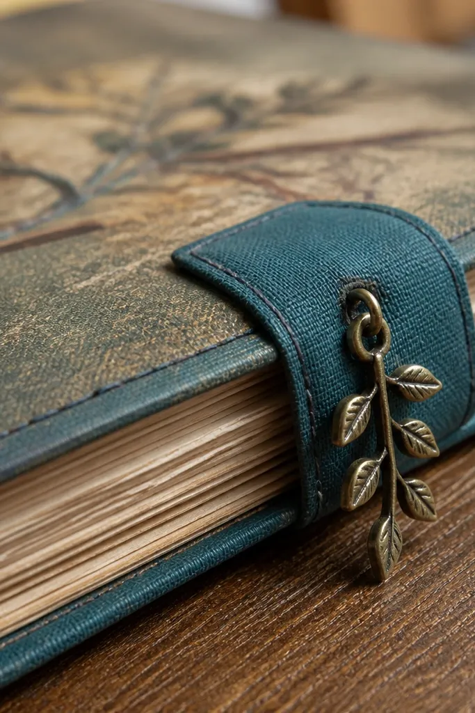
Metal charms turn a journal into decor because they add shine and weight. This page uses a fabric tab closure with a sew-on charm that sits at the corner — a little vintage detail you can see even when the journal is closed. It also gives you a functional closure so pages don’t flop around. Great for year-round use because the closure stays the same, while the writing pages inside can change weekly.
Cut a fabric tab about 1.25 x 3.5 inches and back it with fusible interfacing. Stitch or glue the tab to the inside cover edge so it folds over. Sew a small metal charm (like a key or tag) onto the tab using a strong thread and a tight knot on the backside. Add a small snap or loop closure point with a brad or binder clip hardware. Finish by stitching around the tab edges to lock everything down.
Use a thicker needle and don’t rush; fabric tab seams need tight stitches to stay flat.
Skip cheap charms with sharp edges; they can snag pages and look rough.
20. Vintage Border Tape + Handwritten Drop Cap Page
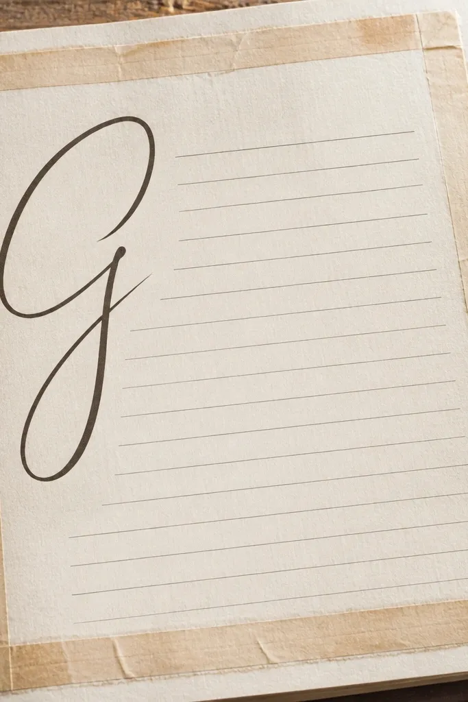
Drop caps look old-school because they mimic printed books. Pair that with muted border tape and you get a page that feels like it belongs in a vintage volume. The border keeps your writing aligned, and the drop cap gives you a focal point that photographs well. This idea is perfect for year-round journal entries because you can use it daily and the layout stays consistent — only the first letter changes.
Pro tipOutline the drop cap twice: first lightly in brown, then trace in black for depth.
Place a thin strip of muted washi or patterned border tape along the left and bottom edges, leaving margins. Choose a starting letter for the entry and draw it larger than the rest of the text. Use a brush pen or calligraphy marker to write the drop cap, then outline it with a fineliner. Write the rest of your paragraph in neat lines, using the border as your guide. Let the ink dry fully before closing the journal.
AvoidDon’t make the drop cap too tall; it should fit without hitting the border tape.
21. Stitched Grid Notebook Page with Corner Labels
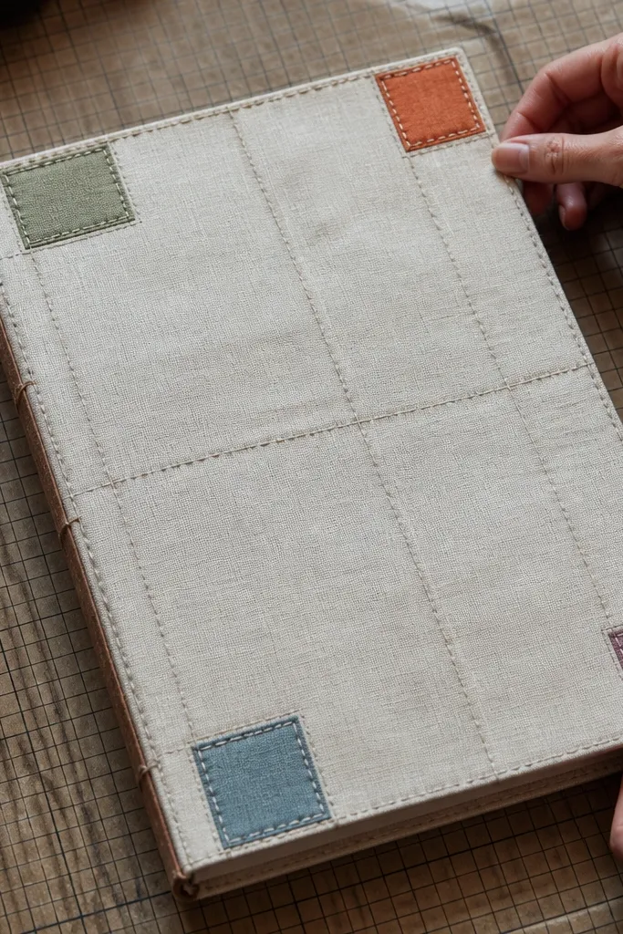
This is a DIY structure page that looks like a bound journal even if you’re using loose sheets. A stitched grid creates a “page system,” and corner labels make the spread readable at a glance. It’s photogenic because the stitching lines show texture and depth. Use it for monthly trackers, meal plans, and year-round “things I’m working on” lists.
Draw a grid on cream cardstock using a ruler: 0.75-inch squares work well. Stitch along the grid lines at the top and left edges only, not every square, so it stays realistic and not too bulky. Add corner labels by cutting four tiny rectangles from kraft paper and gluing them at each corner. Write a word in each corner label, like “ideas,” “notes,” “plans,” and “done.” Finish by writing inside the grid cells with a consistent pen.
Stitch only two directions; it keeps the page thin and the look still handbound.
Skip over-stitching; too much thread makes pages thick and awkward to photograph.
22. Aged Paper Layered Frame with Cut-Out Window
Layered frames with a cut-out window look like vintage stationery. You build depth with two or three paper layers, then cut a window so the writing sits behind like it’s displayed in a small gallery. The aged paper tones keep it warm, and the window makes it instantly interesting in photos. This works for special entries — seasonal reflections, letters, or any page you want to highlight without making it messy.
Pro tipUse a craft knife and a metal ruler; clean window edges make the whole look feel vintage and intentional.
Cut a base page from tea-stained cardstock. Create a second frame layer from darker kraft paper and cut a rectangle window in the center (about 3 x 4 inches). Glue the darker frame to the base, then add a third thin cream layer inside the window so the text looks framed. Write or paste your text behind the window and glue only the edges of the window frame. Add small corner tabs to hide any rough cut edges.
AvoidDon’t glue the center window area; it flattens the depth and kills the layered effect.
23. Seasonal Color Wash with Dried Leaf Pressed Corner
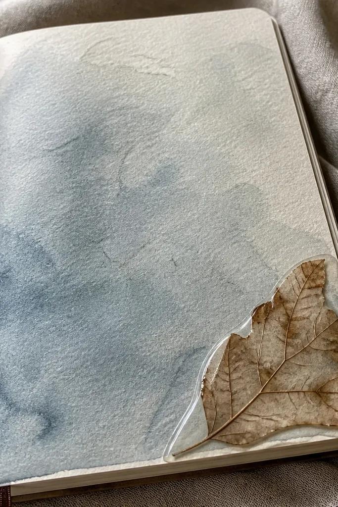
This idea makes your journal feel year-round because each season gets its own color wash, but the layout stays the same. A pressed leaf in the corner anchors the page and adds a natural texture that photographs nicely. Use muted seasonal colors — moss green, clay orange, dusty blue, or pale plum — so it stays vintage instead of modern bright. It’s a great option when you want quick pages that still look styled.
Pro tipChoose flat, thin leaves; thick leaves look bulky and won’t press cleanly.
Pick a muted color gouache or diluted acrylic and paint a light wash across the page, leaving a big white margin. Press a small leaf flat ahead of time for at least 48 hours, then glue it into the top corner using archival glue. Add a small handwritten title near the leaf and write your entry below. Outline the leaf corner with a thin brown fineliner so it blends into the page. Seal with matte spray once everything is dry.
AvoidSkip shiny glue mediums; they create a glossy patch that looks modern.
24. Faux Antique Letterhead with Cut Paper Address Block
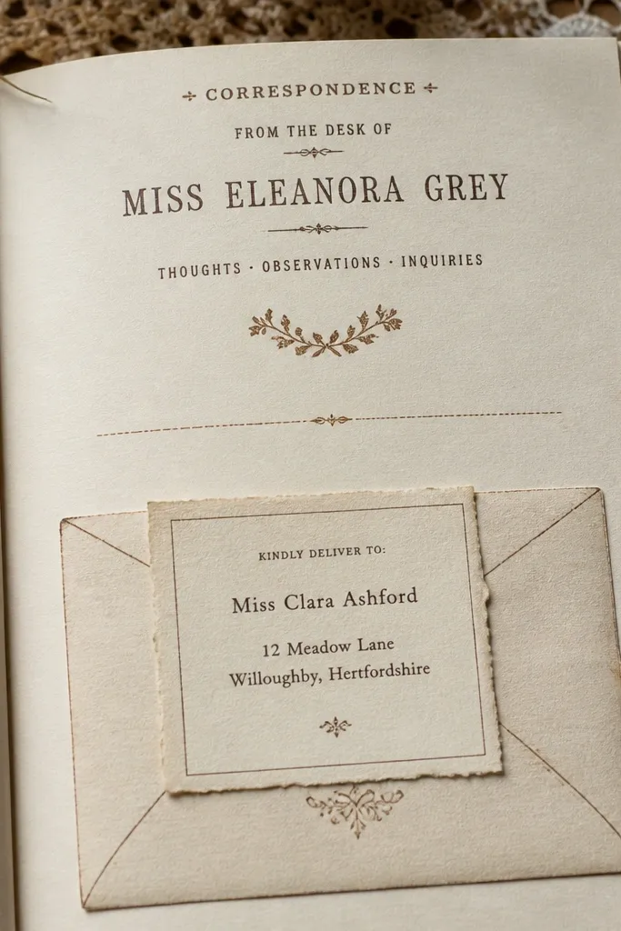
A letterhead layout instantly makes your journal entries feel like correspondence. This project uses a faux antique header plus a cut paper “address block” so it looks layered and official. It’s photogenic because the header has a clear hierarchy: title line, block, then body text. Use it for year-round journaling prompts like “write a letter to future me” or “compose a note to your home.”
Pro tipUse a ruler for the header lines; letterhead layouts look best when the lines are crisp.
Create a header strip at the top using cream cardstock, about 1.25 inches tall. Draw a thin line under it and write a letter title centered using a typewriter-style pen. Cut an address block from darker kraft paper, roughly 2.5 x 1.5 inches, and glue it slightly offset to look layered. Write sender and recipient lines inside the kraft block using brown ink. Fill the body area with your letter text in neat paragraphs.
AvoidDon’t use bright colors for the address block; it breaks the antique feel immediately.
25. Monochrome Woodblock Stamp Border with Date Title
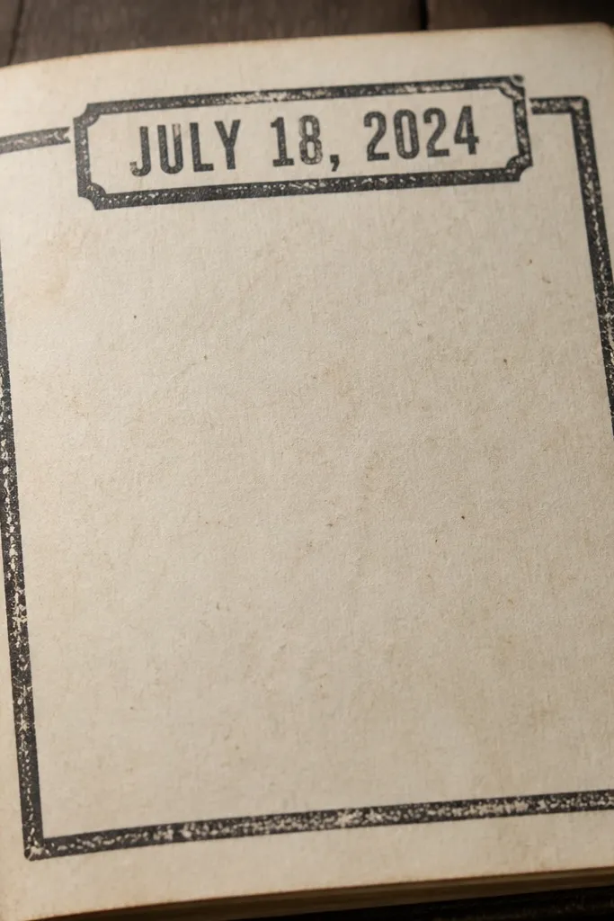
Woodblock-style stamps look old because they have imperfect edges and real texture. This page uses a monochrome border and a bold date title, so your entries look like they’re from a dated journal book. It’s especially good for year-round logging because you can keep the same stamp border and just change the date. The result reads antique without needing complicated supplies.
Pro tipChoose matte ink if you want the stamp edges to look worn instead of shiny.
Use a woodblock-style stamp or a stamp set with imperfect texture. Stamp a border around the page using a brown or black ink that dries matte. Add a date title at the top with a thicker pen or brush pen, keeping it centered. Write your entry below in smaller handwriting. Let the ink dry fully, then lightly press a clean scrap paper over the border to remove any excess ink sheen.
AvoidAvoid glossy stamp pads; they look modern on tea-stained paper.



