1 Minimalist Line Strawberry
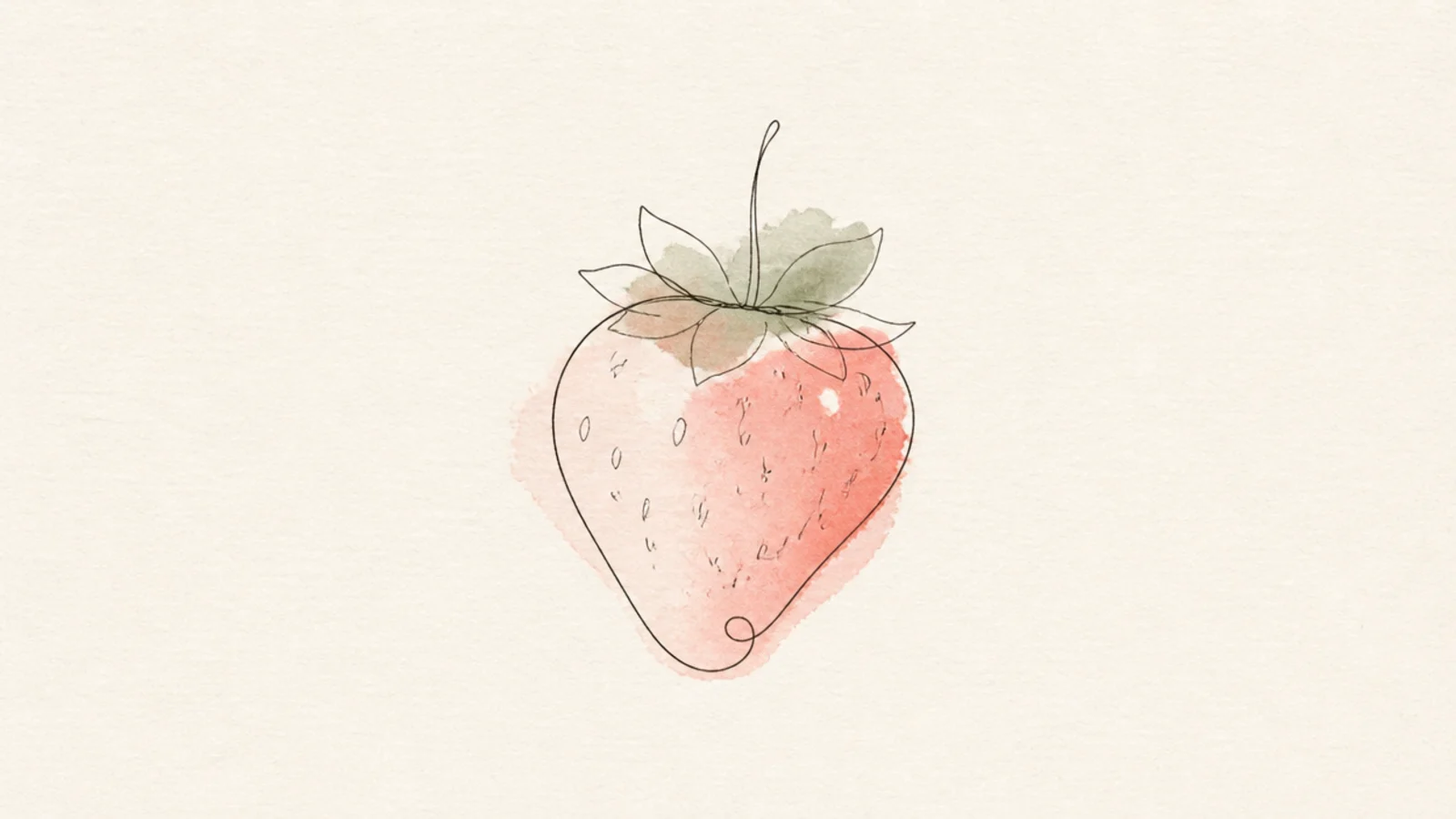
A delicate single-line strawberry is the most minimal aesthetic accent and the base for the mood. The thin unbroken line feels calm and modern. It is the perfect first page doodle.
Step 1 draw the body and leaf cap in one continuous thin line. Step 2 add three or four tiny seed dashes. Step 3 leave it completely uncolored for an airy look.
Use your finest liner and draw slowly for a confident, delicate line.
Don’t add fill or heavy detail; the empty space is the aesthetic.
2 Blush Wash Strawberry
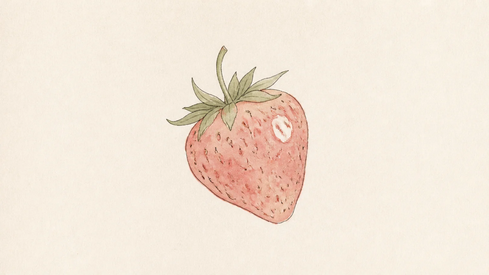
A strawberry in a light blush wash feels soft and dreamy. The muted color is what makes it aesthetic rather than bold. It is gentle and pretty.
Pro tipDilute the color heavily so the paper glows through the wash.
Step 1 draw a light strawberry outline. Step 2 wash the body with diluted blush, leaving a white highlight. Step 3 add a soft sage cap and let the edges stay uneven.
AvoidDon’t use full-strength red; the softness is the whole point.
3 Negative-Space Strawberry
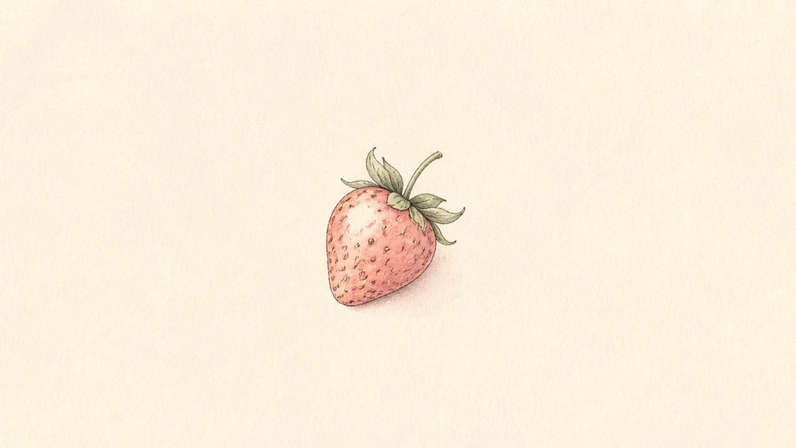
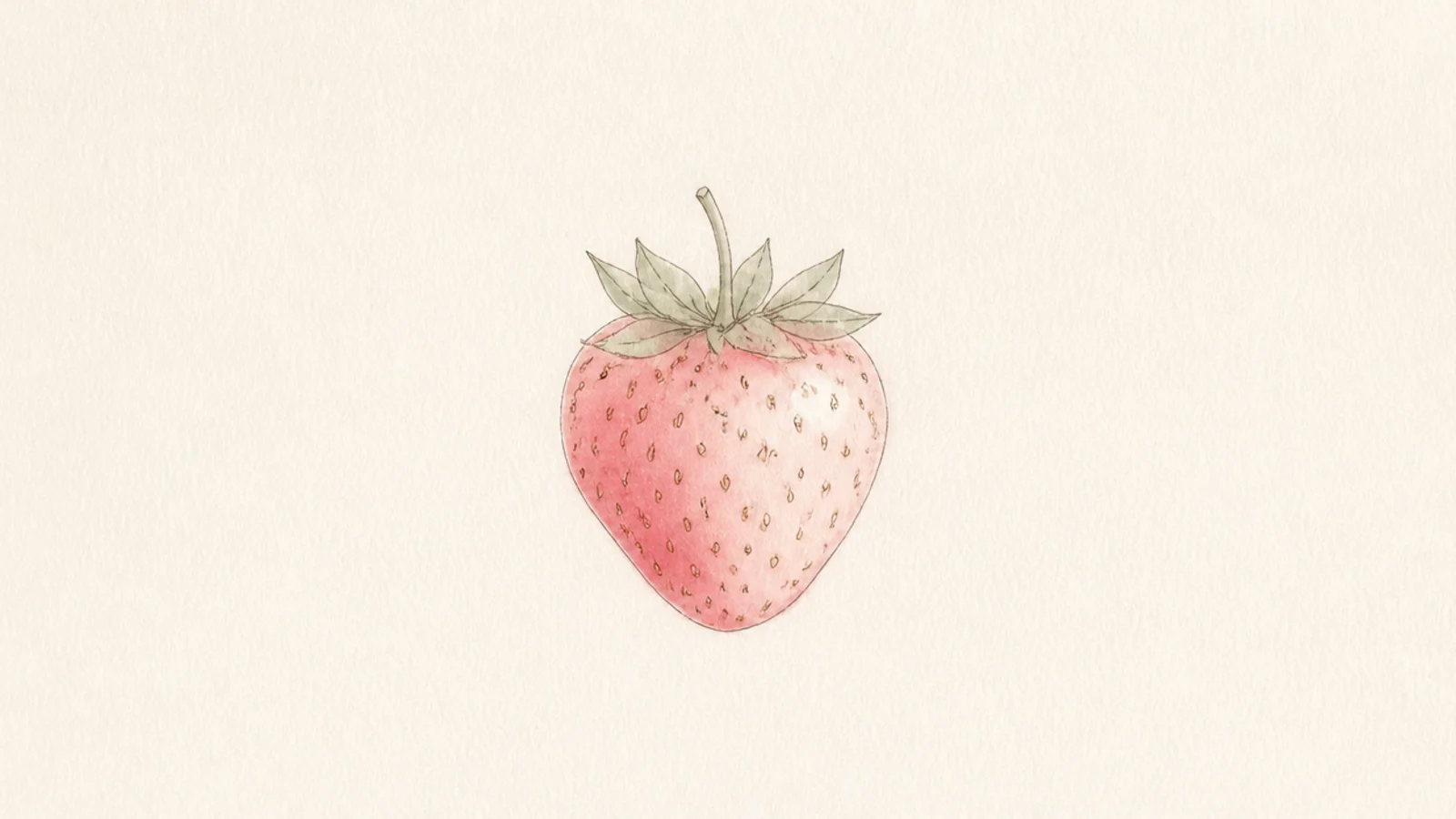
A tiny berry surrounded by open page is a calming, gallery-like accent. The empty space is the design. It feels intentional and serene.
Pro tipPlace the berry off-center so the white space feels deliberate.
Step 1 draw one small strawberry off-center. Step 2 keep it delicate and lightly colored. Step 3 leave the rest of the space completely empty.
AvoidDon’t fill the empty area; the openness is the aesthetic choice.
4 Pressed-Flower Strawberry
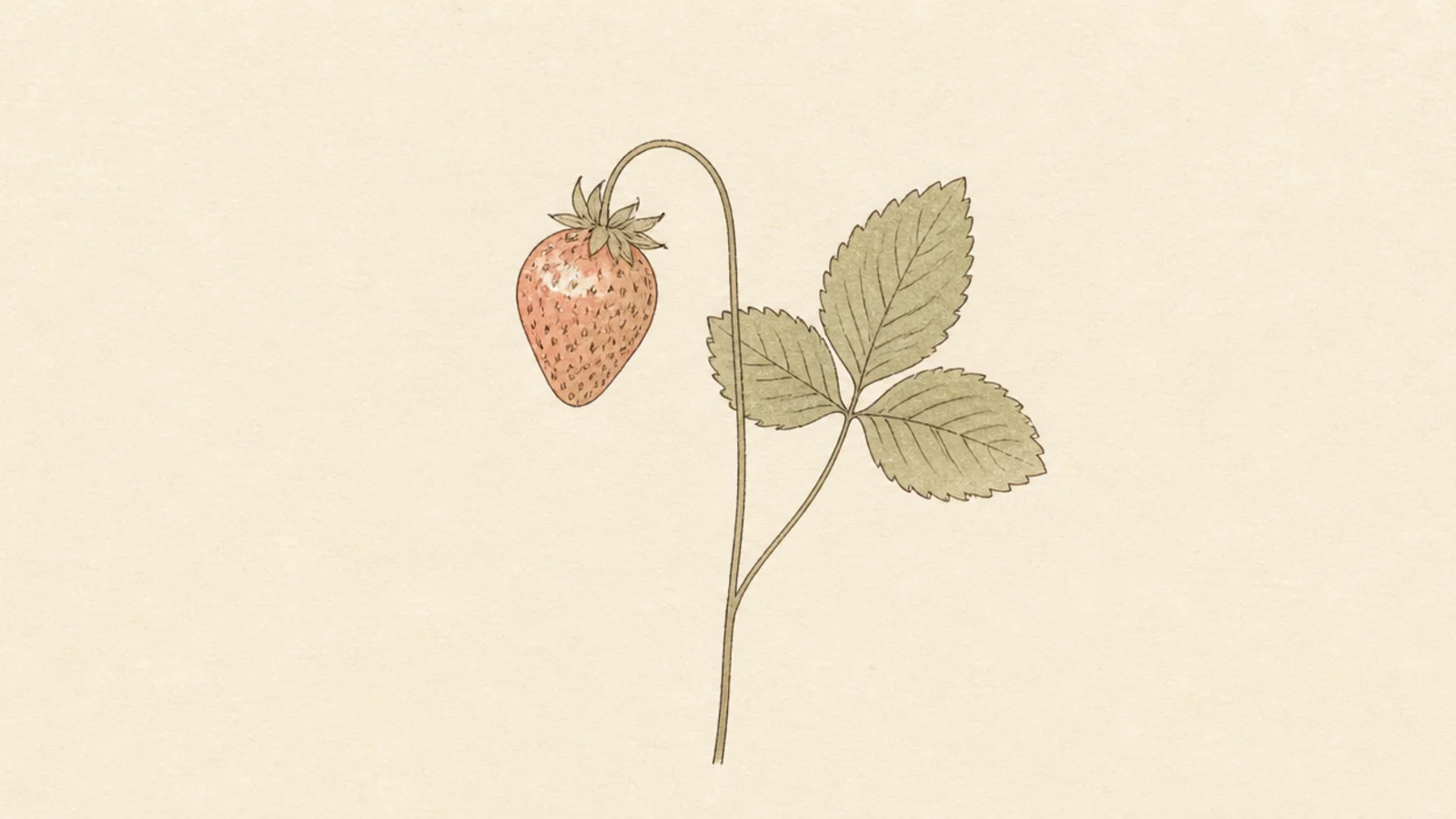
A flat, pressed-botanical strawberry looks like a keepsake from a scrapbook. The delicate stem and leaves feel vintage. It is soft and nostalgic.
Pro tipFade the colors slightly, like a real pressed flower that has aged.
Step 1 draw a strawberry with a long thin stem and a few leaves. Step 2 keep everything flat with no shading. Step 3 use muted, faded color as if pressed and dried.
AvoidDon’t add glossy highlights; pressed botanicals look flat and matte.
5 Strawberry Moon Motif
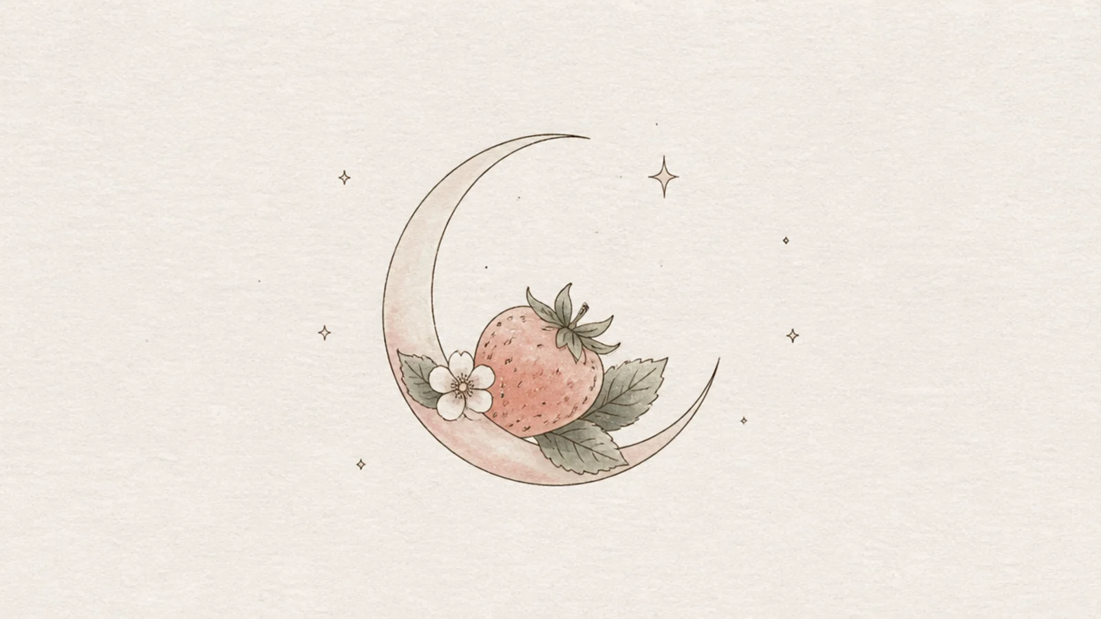
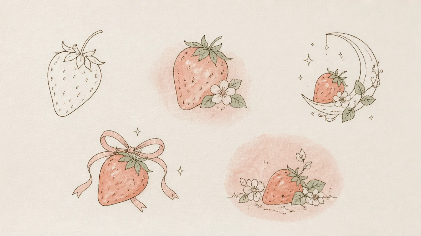
Pairing a strawberry with a crescent moon makes a dreamy celestial motif. The soft night theme is very aesthetic. It is lovely for a title page.
Pro tipKeep the moon thin and the stars sparse for a calm night feel.
Step 1 draw a thin crescent moon. Step 2 tuck a small strawberry into the curve. Step 3 scatter a few tiny dot stars around them.
AvoidDon’t crowd the sky; a few stars read as dreamy, many read as busy.
6 Strawberry in a Glass Jar
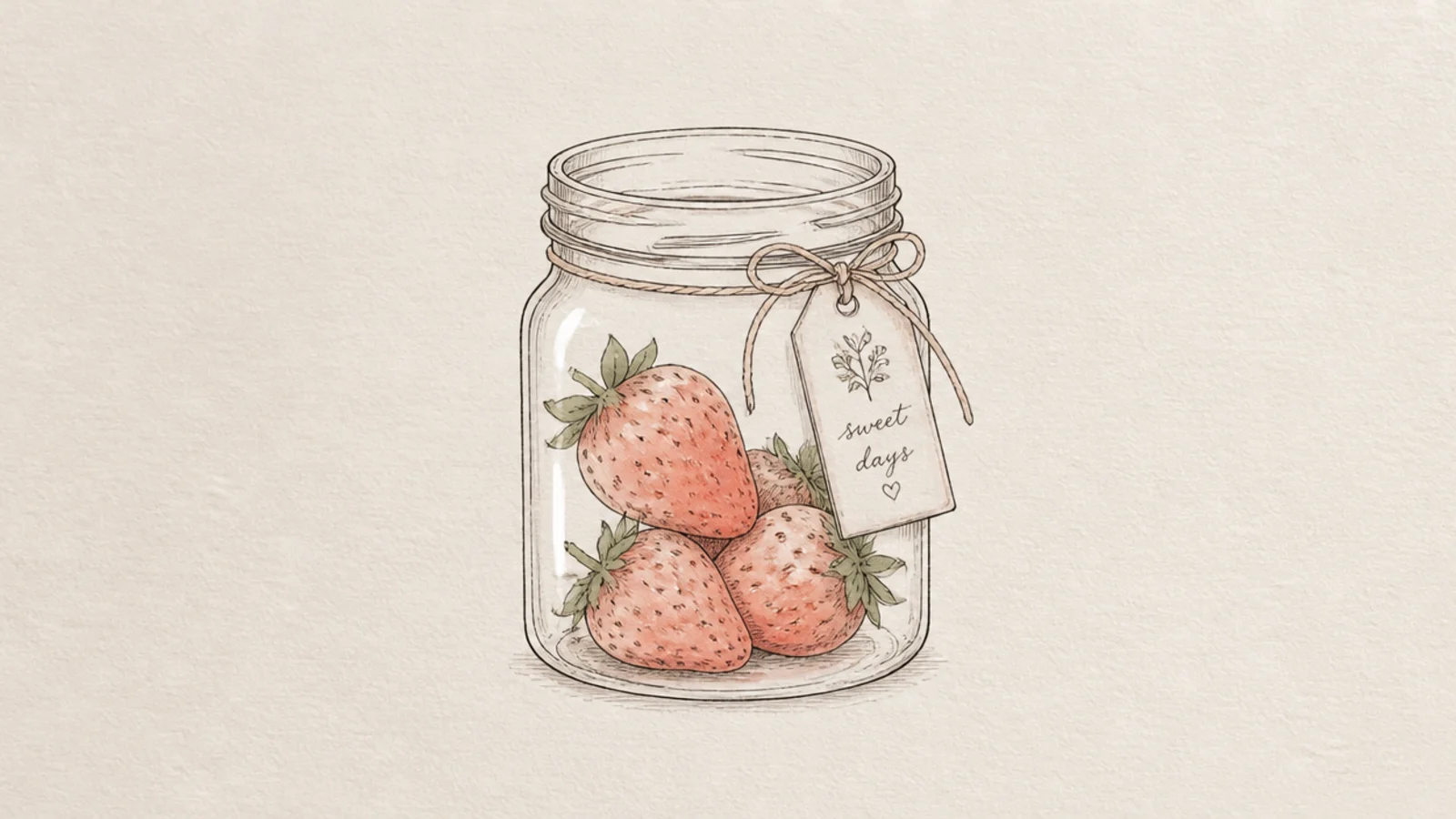
Strawberries in a simple glass jar feel cozy and cottagecore. The clear jar and soft berries are calming. It is a sweet shelf-style accent.
Pro tipLeave the glass mostly uncolored so it reads as clear and light.
Step 1 draw a simple rounded jar outline lightly. Step 2 add a few soft strawberries inside. Step 3 add a small label tag and keep the color muted.
AvoidDon’t outline the jar boldly; a thin line keeps it soft and glassy.
7 Soft Watercolor Bleed

Letting watercolor bleed softly past the lines gives a loose, artistic feel. The gentle blooms look dreamy. It embraces happy accidents.
Pro tipWork on slightly damp paper so the color blooms gently.
Step 1 draw a light strawberry outline. Step 2 drop diluted color inside and let it bleed slightly past the edges. Step 3 leave a white highlight and soft uneven edges.
AvoidDon’t fight the bleeds; the soft spread is the aesthetic.
8 Strawberry With a Ribbon
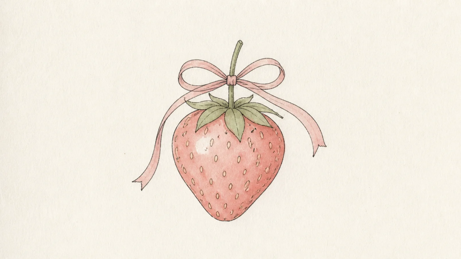
A strawberry tied with a thin ribbon bow feels sweet and coquette. The delicate bow adds a soft, girly touch. It is charming and pretty.
Pro tipDraw the bow loops slightly uneven so the ribbon looks soft, not stiff.
Step 1 draw a soft strawberry. Step 2 add a thin ribbon around the stem tied in a small bow. Step 3 keep the bow loose and the color muted pink.
AvoidDon’t make the bow big and bold; a small delicate bow suits the mood.
9 Delicate Strawberry Branch
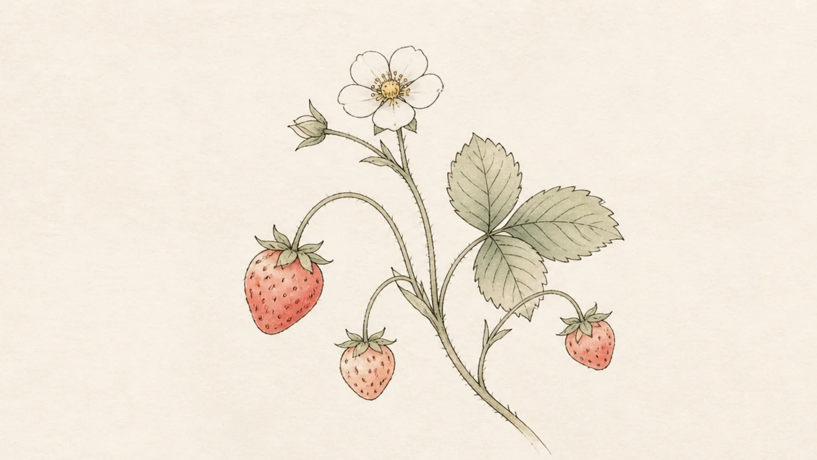
A slender branch with a few berries and a blossom feels like a botanical study. The trailing shape is graceful. It is elegant and calm.
Step 1 draw a thin curving branch. Step 2 hang two or three small berries and add a white blossom. Step 3 add a few pointed leaves along the branch.
Let the branch curve gently across the page for a graceful line.
Don’t overload the branch; a few elements keep it delicate.
10 Pastel Gradient Strawberry
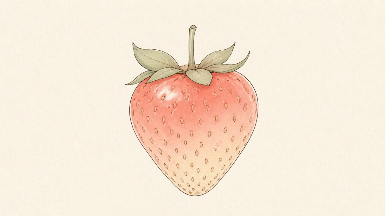
A berry that fades from soft coral to pale cream is quietly beautiful. The gentle gradient feels modern and aesthetic. It is soothing to look at.
Pro tipBlend the two tones while the color is still soft for a smooth fade.
Step 1 draw a light strawberry. Step 2 blend soft coral at the top into pale cream at the bottom. Step 3 keep the leaf cap a muted sage.
AvoidDon’t let a hard line form between the colors; keep the fade gentle.
11 Strawberry Cloud Doodle
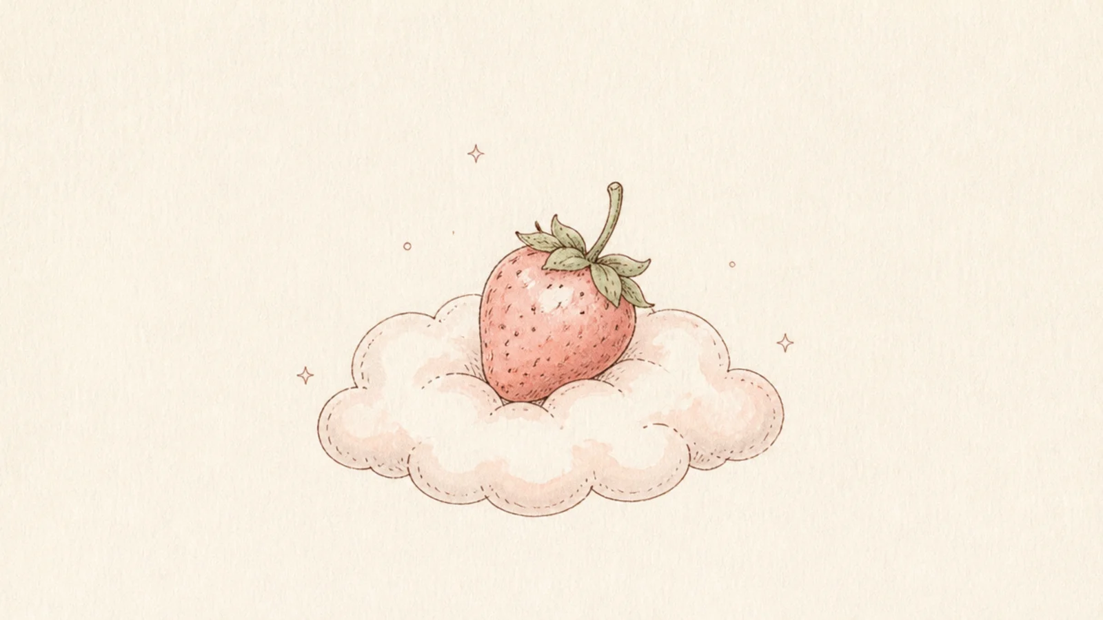
A strawberry floating on a fluffy cloud is whimsical and dreamy. The soft cloud adds a gentle, airy mood. It is playful and calming.
Pro tipDraw the cloud with soft round bumps and no hard bottom line.
Step 1 draw a small strawberry. Step 2 add a soft scalloped cloud beneath it. Step 3 add a few tiny sparkle dots and keep everything pale.
AvoidDon’t outline the cloud sharply; a soft edge keeps it dreamy.
12 Strawberry Teacup
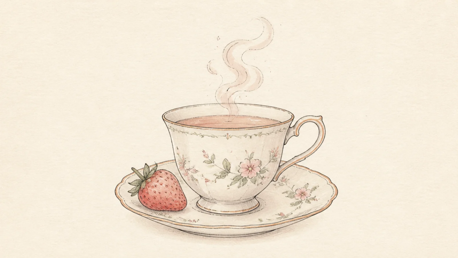
A dainty teacup with a strawberry resting on the saucer feels cozy and slow. The little scene is very journal-aesthetic. It is warm and inviting.
Pro tipDraw the steam as two thin wavy lines for a calm, cozy touch.
Step 1 draw a small teacup on a saucer. Step 2 rest a strawberry on the saucer edge. Step 3 add soft curling steam and a muted floral pattern on the cup.
AvoidDon’t over-pattern the cup; a hint of florals is enough.
13 Strawberry Heart Frame
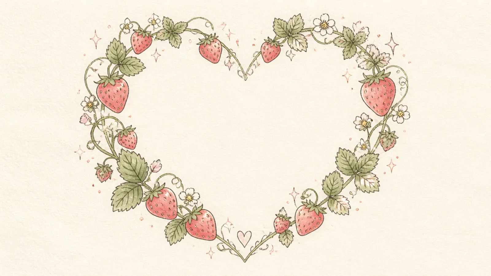
A heart outlined with tiny strawberries makes a soft frame for a quote or date. The berry border is pretty and delicate. It is perfect for a header.
Pro tipAlternate berries and leaves around the heart for a balanced border.
Step 1 lightly draw a heart guide. Step 2 space small strawberries and leaves around the outline. Step 3 erase the guide and leave the center empty for text.
AvoidDon’t crowd the frame; leave the center open for writing.
14 Chocolate-Dipped Strawberry
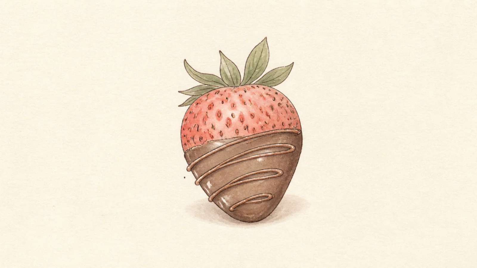
A strawberry dipped in soft brown chocolate is indulgent yet gentle. The muted brown keeps it aesthetic. It is a sweet, treat-like accent.
Pro tipKeep the chocolate a muted cocoa brown so it stays soft, not harsh.
Step 1 draw a strawberry. Step 2 add a wavy chocolate line across the lower half and fill it soft brown. Step 3 add a thin drizzle zigzag on top.
AvoidDon’t make the drizzle heavy; a thin zigzag looks delicate.
15 Strawberry Quote Corner
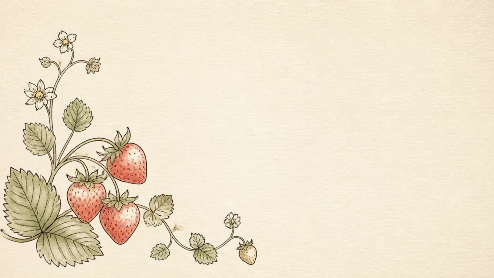
A strawberry tucked in one corner leaves a clean space for a favorite line. The layout feels intentional and calm. It is a lovely page starter.
Step 1 draw a small strawberry cluster in one corner. Step 2 add a few trailing leaves. Step 3 leave the rest of the space open for handwriting.
Anchor the drawing to one corner so the writing space stays clean.
Don’t spread the drawing across the page; keep it to the corner.
16 Strawberry Lace Border
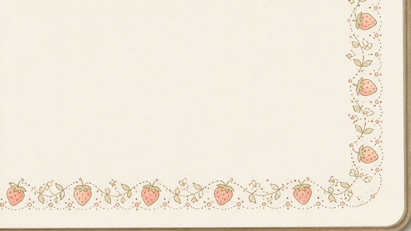
A repeating strawberry-and-dot border looks like delicate lace along a page edge. The gentle repetition is soothing. It frames a page beautifully.
Step 1 draw a light guideline along the edge. Step 2 repeat a tiny strawberry and a few dots in a pattern. Step 3 keep the spacing even and the color pale.
Repeat the same little unit evenly so the border reads as lace.
Don’t vary the pattern; even repetition is what makes it look like lace.
17 Strawberry Moon Phases
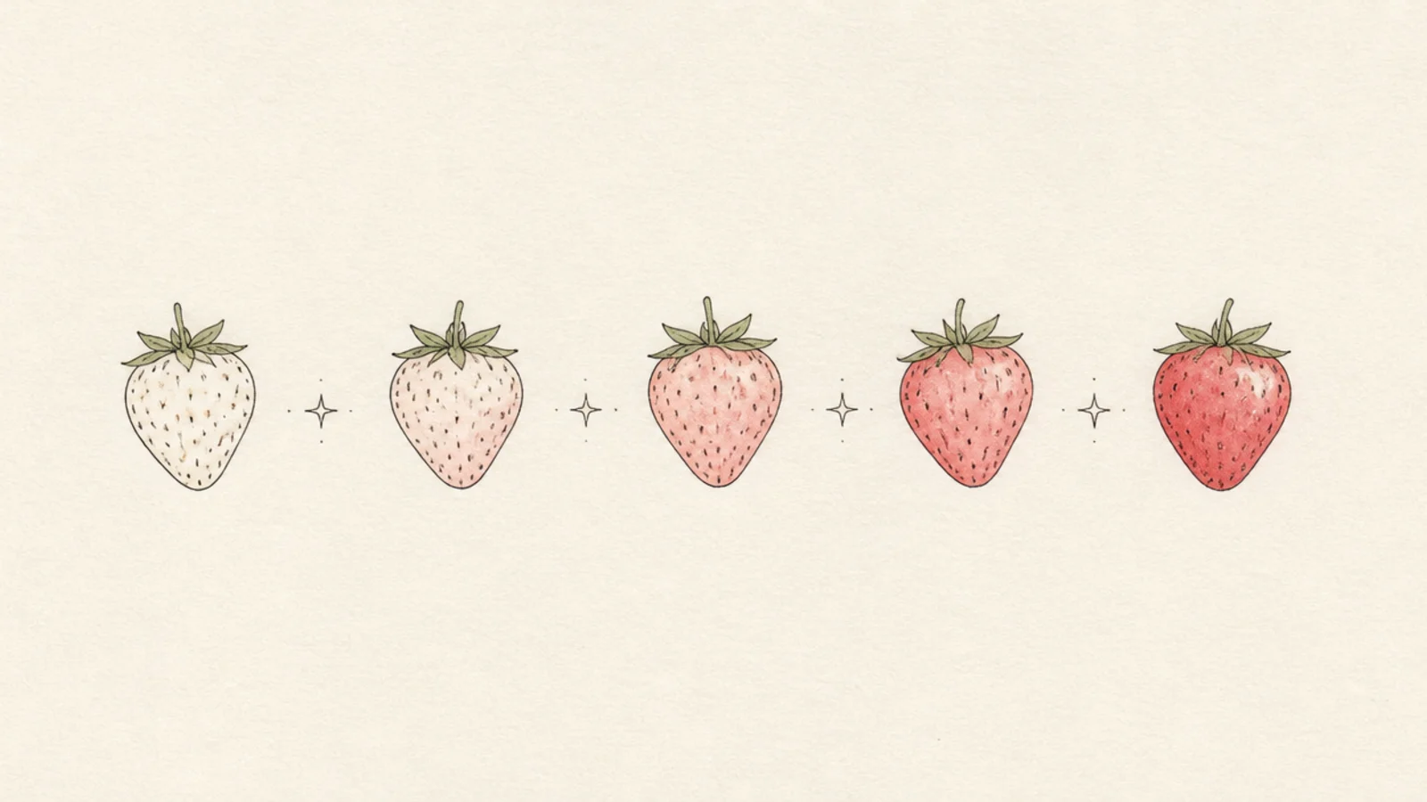
Drawing strawberries as a row of moon phases is a clever, dreamy motif. The gradual change is satisfying. It is an original aesthetic idea.
Step 1 draw four or five strawberries in a row. Step 2 shade them from fully light to fully colored like waxing phases. Step 3 add tiny stars between them.
Increase the shading gradually across the row for a smooth phase effect.
Don’t jump the shading; a gradual change reads as phases.
18 Strawberry on a Windowsill
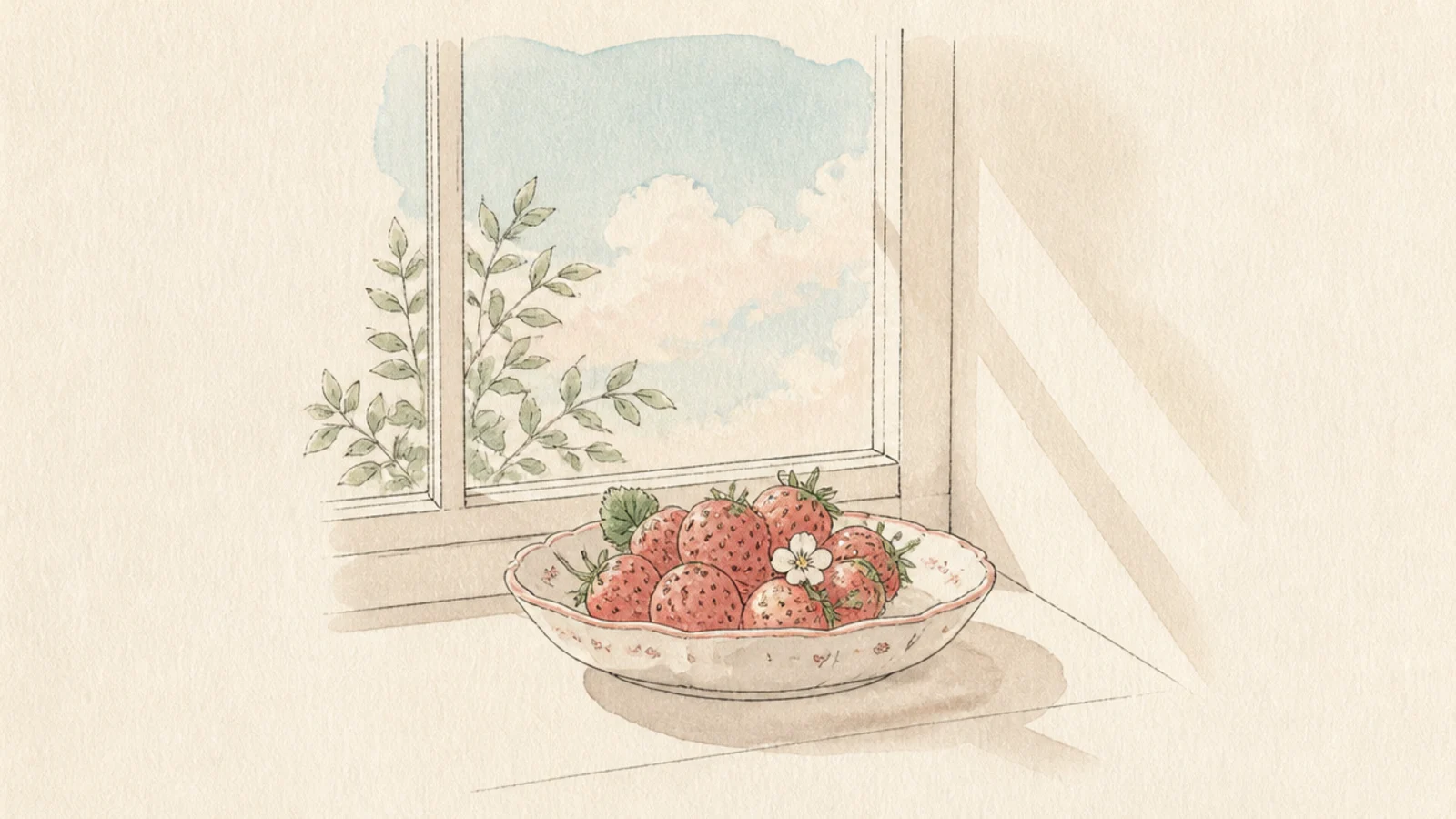
Strawberries on a sunny windowsill make a cozy, slow-morning scene. The soft light and frame feel very aesthetic. It is warm and homey.
Step 1 draw a simple window frame. Step 2 place a small dish of strawberries on the sill. Step 3 add soft light rays and a muted sky beyond.
Suggest sunlight with a few pale diagonal rays across the sill.
Don’t detail the view outside; a soft wash keeps the focus inside.
19 Soft Strawberry Sticker Set
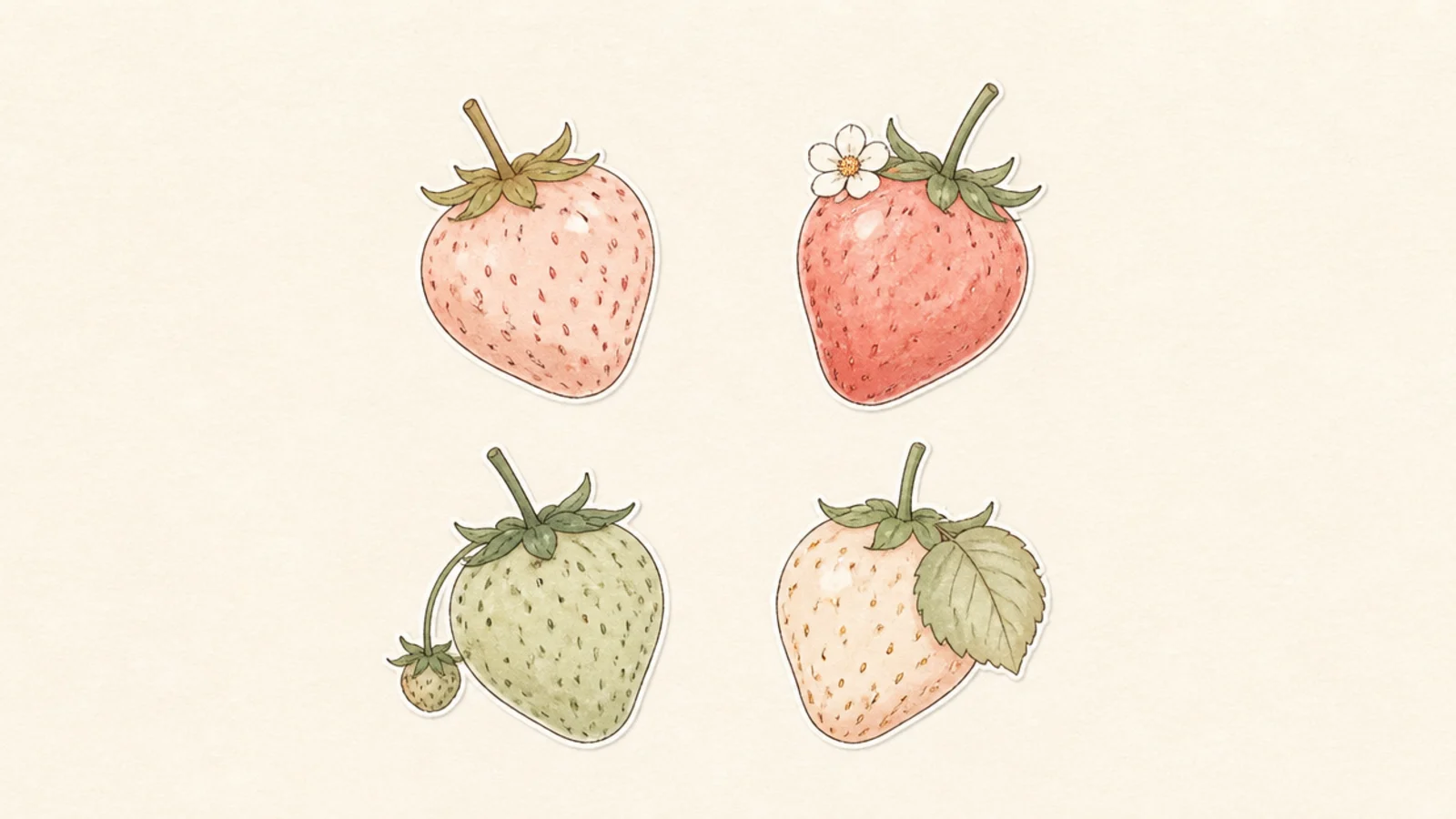
A few matching pastel strawberries make a soft sticker set for your journal. The muted palette ties them together. It is satisfying to draw a gentle collection.
Pro tipKeep all four in the same muted palette so they feel like a set.
Step 1 draw four small strawberries in a loose grid. Step 2 give each a different soft color and tiny detail. Step 3 add a thin white outline around each.
AvoidDon’t use bright colors; soft tones keep the set cohesive.
20 Soft Strawberry Vignette
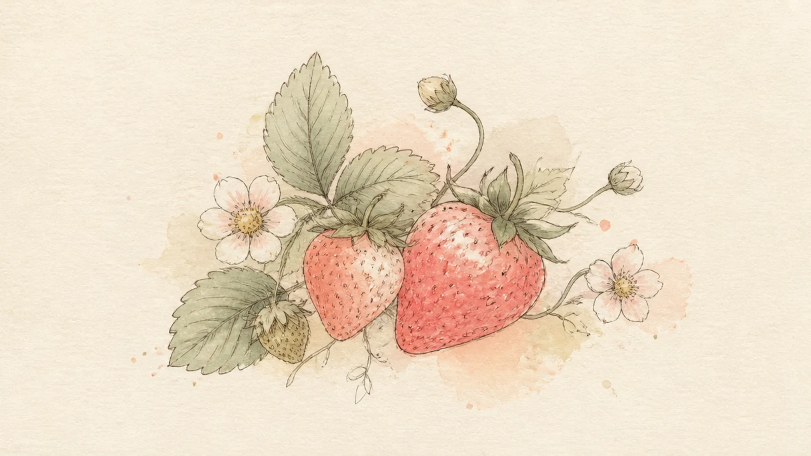
A gentle vignette of berries, leaves, and little flowers is a beautiful closer. The soft arrangement feels curated and calm. It ties the whole aesthetic together.
Pro tipCluster the elements loosely and let the edges dissolve into white.
Step 1 loosely arrange two or three strawberries with leaves and small blossoms. Step 2 keep the linework thin and the color muted. Step 3 fade the edges of the group into the page.
AvoidDon’t outline the whole group; letting it fade keeps it soft.