1. Neon Coral Hibiscus with Ink Outline and Soft Wash
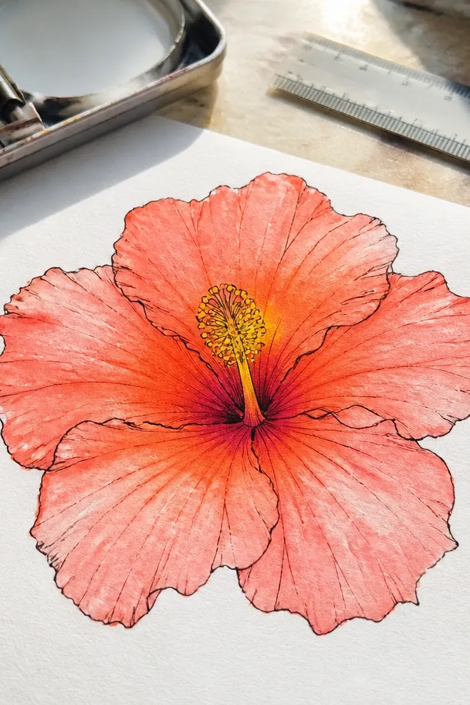
This one looks like a finished botanical illustration without needing fancy watercolor skills. The ink outline gives crisp edges, while the wash stays light so the petals look airy instead of heavy. Use neon coral (or a close substitute) to make the flower pop against the white page. The center stays bright yellow with tiny red accents so it reads as hibiscus instantly. It’s a strong choice for a sketchbook page, a card front, or any page you want to look bold in photos.
Start by drawing a small oval for the ovary and a cluster of stamens that fan outward, keeping them slightly curved. Then sketch five main petals using overlapping arcs, with the top petal slightly smaller and angled. Ink over your lines with a fine liner, then drop a diluted coral wash into each petal, leaving the highlight side lighter. Finally, add a warm yellow wash in the center and dot small red marks along the inner petal folds.
Pro tipLet the wash dry fully before you add the center dots, or they’ll bleed into the petals.
AvoidDon’t color every petal at the same intensity — one darker fold makes the flower look real.
2. Monochrome Hibiscus in Pen Hatching with Dark Center Pop
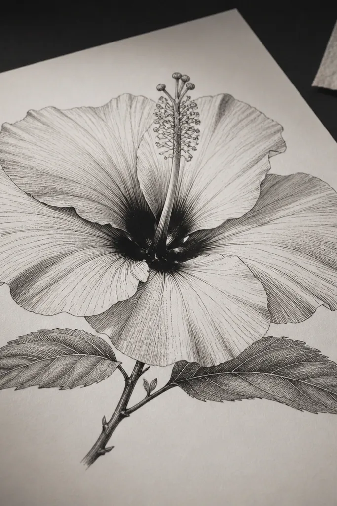
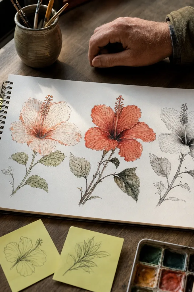
If you want an aesthetic that looks sharp and graphic, this monochrome approach does it. Pen hatching lets you control values precisely, so the petals gain shape without watercolor smears. A dark center pop makes the flower feel dimensional even with limited color. Keep the petals mostly light with targeted hatching under folds and near the base. This style is great for prints, stickers, or anyone who likes clean linework with a dramatic center.
Begin with a light pencil sketch of the center oval and stamens, then add five petal outlines with clear overlap. Ink the outlines first, then hatch under each petal fold using short lines that follow the petal curve. Leave one side of each petal mostly white to create highlight space. Next, shade the center heavily with denser hatching, then reinforce a few inner fold lines so the flower reads from a distance.
Pro tipUse a 0.3 or 0.5 liner for petals and a 0.1 for the center details for clean contrast.
AvoidDon’t hatch randomly across the whole petal — keep hatching clustered where the fold turns.
3. Watercolor Hibiscus on Wet Paper with Bleed-Control Splashes
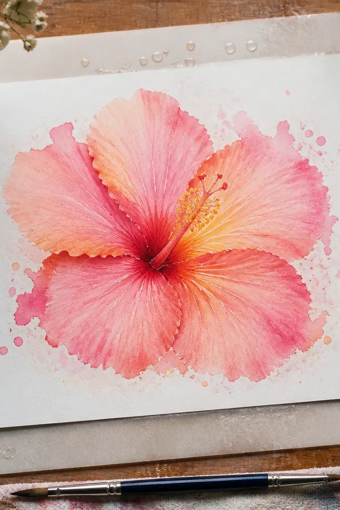
This is the “soft, dreamy” hibiscus look, but controlled enough to stay pretty. Wet-on-wet watercolor makes petal edges blur naturally, and the bleed gives you that organic hibiscus texture. The trick is to keep only the petal edges wet, not the whole flower, so it doesn’t turn into one big blob. Add small splashes around the petals for movement, and keep the center more defined so it still looks like a hibiscus. Great for loose sketchbook spreads and art prints where you want motion.
Wet just the petal area with clean water using a flat brush, then load diluted pigment at the petal base and let it bloom toward the edges. Paint five petals around a lightly sketched center, keeping the highlight side pale by not flooding it. After the petals set, add a stronger yellow-green wash for the center and draw stamens with a darker pigment once the paper is mostly dry. Finish with tiny splatters using a toothbrush flick, but keep them sparse so they don’t compete with the flower.
Tilt the paper while painting so gravity pulls blooms toward the petal folds instead of spreading everywhere.
Don’t overwork the wet petals — repeated brush strokes turn them grainy and muddy.
4. Hibiscus Flower Mandala Frame with Single-Focus Bloom
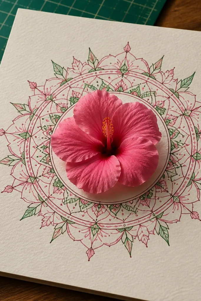
This design gives you instant “aesthetic page” energy: the hibiscus is the hero, and the mandala frame makes it feel intentional. The best part is the contrast between organic petals and crisp geometric pattern. Use a limited palette like pink and green, or keep it ink-only with a few color accents. The frame also helps with composition, so your hibiscus doesn’t float awkwardly on the page. It’s perfect for sketchbook covers, planner stickers, and wall art that needs structure.
Draw a hibiscus center and five petals in the middle first, then add a simple circle guide around it. Create a mandala frame by drawing repeating shapes in rings — dots, short leaflets, or teardrop petals — keeping each ring evenly spaced. Add thin connecting lines between rings for a clean look, then color only the hibiscus petals and leave the frame mostly white or lightly washed. Finish by darkening a few hibiscus fold lines and adding tiny pattern dots on the inner petal edges.
Use a ruler for the outer ring guide, then freehand everything inside it.
Don’t make the frame too dark — it should frame the hibiscus, not compete with it.
5. Pencil-Only Hibiscus with Soft Burnished Highlights
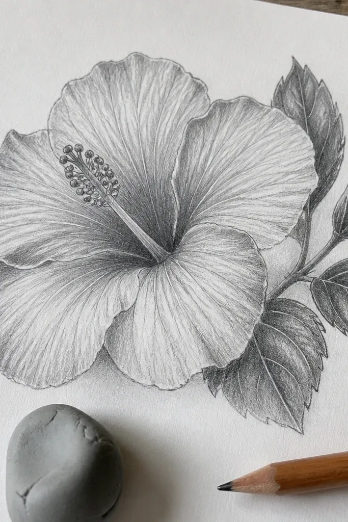
This one is clean, realistic-looking, and surprisingly photogenic even in grayscale. Pencil-only works because hibiscus petals have lots of gentle value changes, not sharp color boundaries. The “burnished highlight” trick keeps the petals from looking flat by preserving bright areas while you shade around them. It’s a good choice if you want something quiet and refined for a minimal sketchbook page. Also, it’s cheap and easy: you only need graphite, a blending tool, and patience.
Sketch the hibiscus in light HB lines, starting with the center oval and stamens, then placing petal overlap anchors. Shade each petal by building values gradually: use 2B for midtones and 4B for fold shadows. Blend lightly with a tortillon, but stop before the highlights disappear. Burnish the highlights by rubbing a clean paper stump or kneaded eraser to sharpen the bright edges, then add a few darker line accents along inner folds.
Pro tipKeep your eraser for “light sculpting” — lift tiny highlights instead of erasing big shapes.
AvoidDon’t press hard from the start; heavy graphite early makes it hard to keep crisp highlights.
6. Hibiscus Flower Silhouette with Color-Blocked Layers
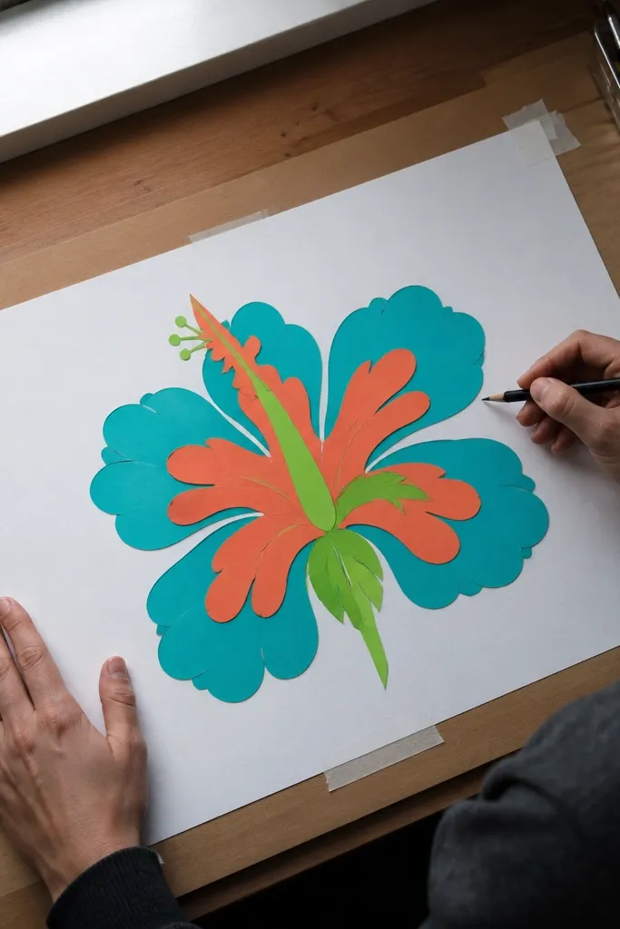
Color-blocking makes hibiscus look modern and graphic. You’re not trying to paint every vein; you’re building bold layers that read instantly. The trick is to keep each petal layer separated with clean edges so the flower looks crisp in photos. Choose two or three strong colors: one for outer petals, one for inner folds, and one for the center. This style is great for posters, craft paper cutouts, and simple wall decor where you want bold shapes.
Draw a simple hibiscus silhouette first, then duplicate the petal shapes into separate layers on tracing paper or with a light grid. Color the outer petals with your main color, then add a second color to the inner fold areas and around the center. Use a fine marker to trace edges cleanly after coloring so the separation looks sharp. Finish by filling the center with a contrasting yellow/orange and adding small dash marks for the stamen tips.
Pro tipIf your edges get messy, outline each layer with a black gel pen after the fill dries.
AvoidDon’t add too many colors; three petal tones plus a center color is enough.
7. Ink-and-White Hibiscus on Dark Paper
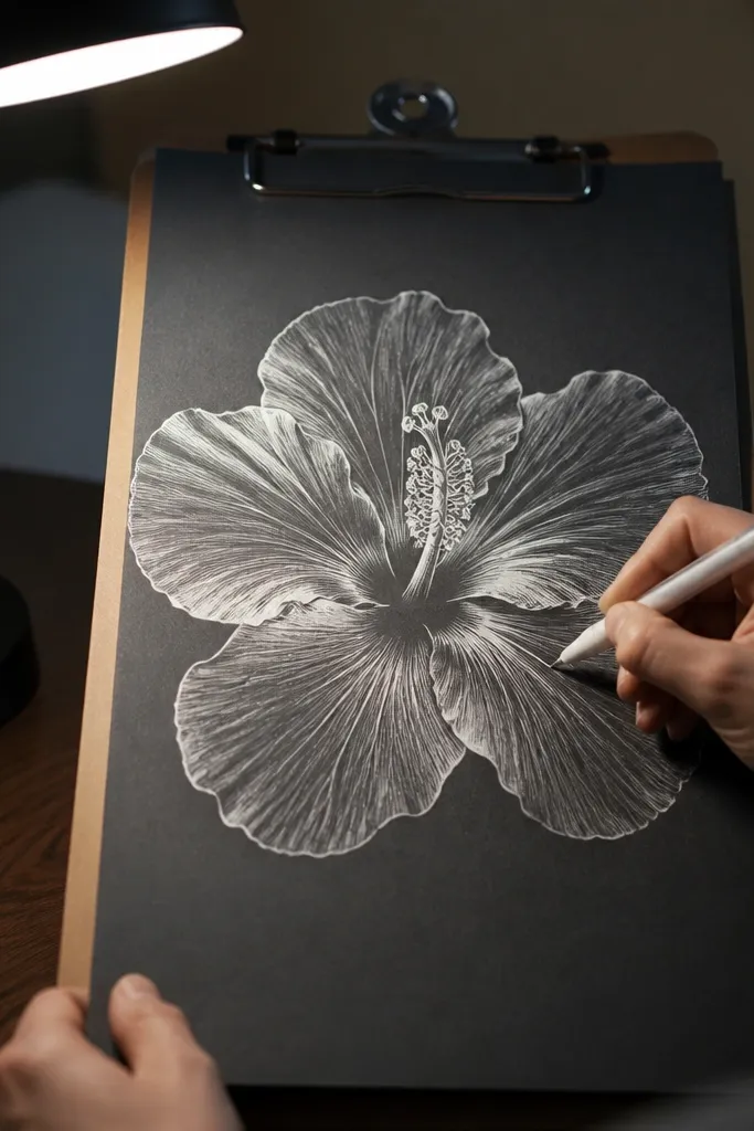
Drawing hibiscus on dark paper flips the whole look: highlights become the main color. White ink or gel pen makes petals glow, and you can keep shadows minimal while still getting depth. This style is extremely photogenic because the contrast is instant. Keep the center bright and crisp so the stamens read clearly. It’s also a great way to make hibiscus look dramatic without heavy coloring.
Start by lightly sketching the hibiscus outline with a soft pencil so you can erase before inking. Then draw petals and center using white gel pen or opaque white ink, working from outlines to inner folds. Add a few thin shadow lines with a darker pencil or a watered-down gray wash if you want extra dimension. Finally, dot the center with small white and pale yellow marks to create the “spark” look.
Pro tipUse a thicker gel pen for petals and a finer one for stamen tips so the center stays readable.
AvoidDon’t rely on pencil shading on dark paper; it usually turns dull instead of dimensional.
8. Hibiscus Botanicals with Realistic Petal Veins (Simplified)
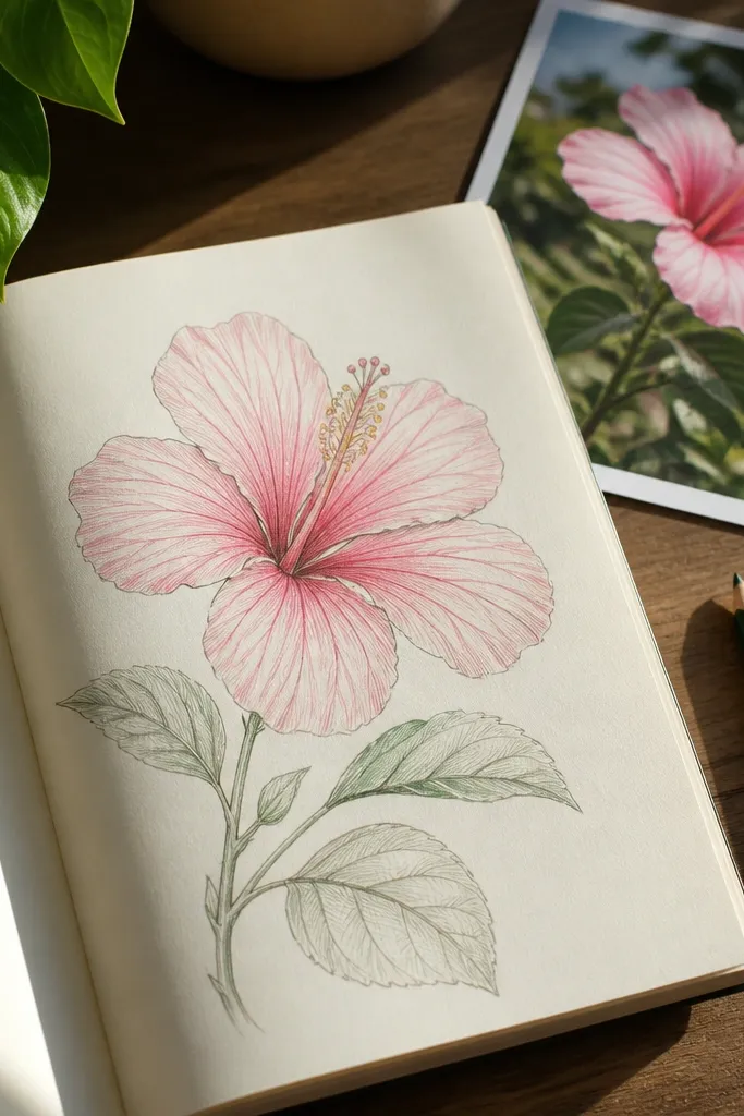
Most beginners either skip veins entirely or draw every tiny line until it looks busy. This version simplifies veins into clear, believable strokes that still look botanical. The result is a hibiscus drawing that feels detailed but not cluttered. You get a strong “illustration” look that works for bookmarks, prints, and reference pages. It also trains your eye for how petal veins radiate from the base.
Sketch the center first, then outline five petals with overlap and a slightly ruffled edge at the top petal. Ink the petal contours with a fineliner, then add vein lines: draw 3-5 main veins per petal from the base outward, curving them with the petal shape. Add small cross-hatch marks only where the fold darkens. Color lightly at the inner fold areas and keep the vein lines crisp with minimal wash.
Pro tipIf veins get messy, draw them in pencil first, then ink only the cleanest ones.
AvoidDon’t add veins to the entire petal evenly; keep them denser near the fold and base.
9. Line-Art Hibiscus for Tattoo Planning with Clean Stamen Detail
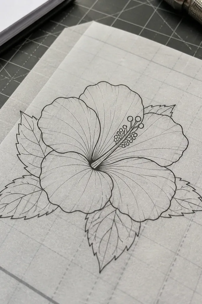
This style is made for clean, readable linework. Simplifying petals into confident arcs while keeping stamen detail gives you a tattoo-planning look without overcomplication. It also makes the drawing easier to redraw on skin or transfer to stencil paper. The hibiscus silhouette stays recognizable from a distance — that’s the point. Use this when you want a design that looks professional and graphic, not painterly.
Draw a center oval, then build 12-18 stamen lines that curve outward like a fan. Add five petals with thick outer contours and thinner inner fold lines so the flower has hierarchy. Use a 0.3 or 0.5 liner for petals and a 0.1 for stamen tips and inner details. Finally, reinforce a few outer edges with a thicker pen so the silhouette stays bold after copying or printing.
Pro tipKeep line thickness changes intentional — thick for outer boundary, thin for inner petals and stamens.
AvoidDon’t shade with gray if you plan to transfer; line-only designs reproduce better.
10. Hibiscus in Profile with Asymmetrical Petals
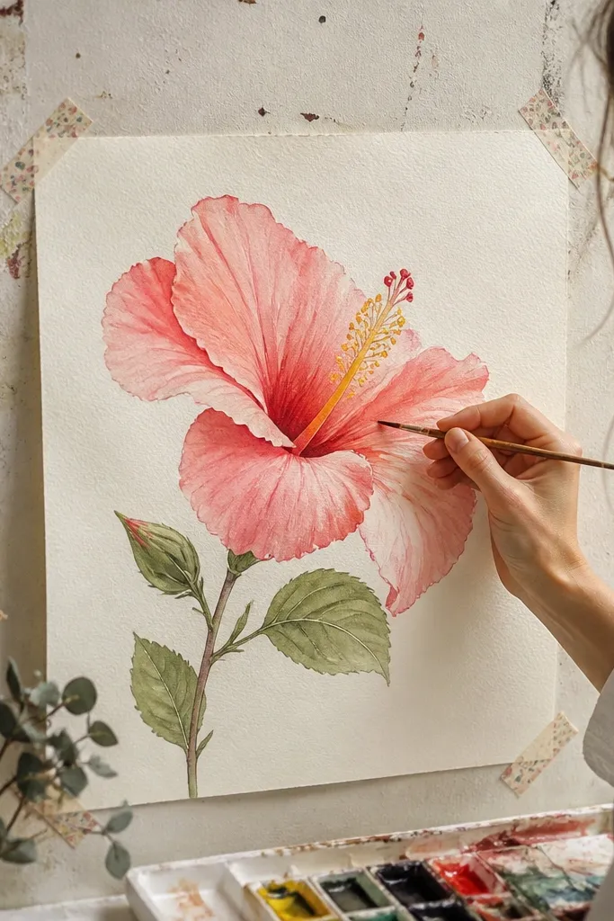
Most hibiscus drawings go front-facing, so this profile version stands out. Asymmetry makes it look more natural and less like a template. One petal turns forward, another folds slightly back, and the center stays visible — that’s what gives it personality. It’s also a great exercise in depth because you can show overlap with fewer lines. Works beautifully as a single hero drawing on the page.
Sketch a center oval shifted slightly to one side, then draw stamens as a curved fan that points toward the viewer. Outline five petals but make only two fully visible; the rest should be partially hidden behind overlaps. Ink the visible petal edges, then add a small highlight gap where the forward petal catches light. Color the forward petal more intensely and keep the back petals lighter or uncolored for depth.
Pro tipUse a darker wash under the forward petal fold — it sells the 3D look fast.
AvoidDon’t force symmetry just to “fix” the composition; asymmetry is the whole charm.
11. Hibiscus Flower with Pastel Chalk Texture (Dry Brush Look)
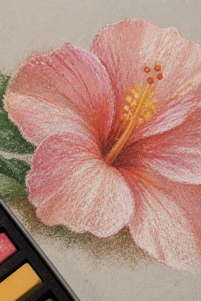
This gives you a soft, aesthetic texture that looks great on textured paper. The dry brush effect creates a slightly speckled surface, which mimics chalk and makes petals feel delicate. Pastels keep it light and pretty, and the center can be a warm yellow-orange for contrast. This style is perfect for scrapbooking and for pages where you want a gentle, airy vibe. It also hides tiny drawing imperfections because the texture smooths them visually.
Use textured paper or rough watercolor paper so the pigment catches. Sketch the flower lightly, then apply pastel or watered-down gouache with a dry brush: load pigment lightly, brush off excess on a scrap, then sweep color across petals. Keep edges uneven for realism, but reinforce the outer petal outline with a thin pencil or light ink. Finally, add a warm center wash and tiny stamen tips using a fine brush or pen.
Pro tipTest your dry brush pressure on a scrap first; too much pressure turns it smooth and dull.
AvoidDon’t use heavy water with dry-brush texture — it destroys the speckle.
12. Hibiscus with Watercolor Gradient Petals and White Gel Highlights
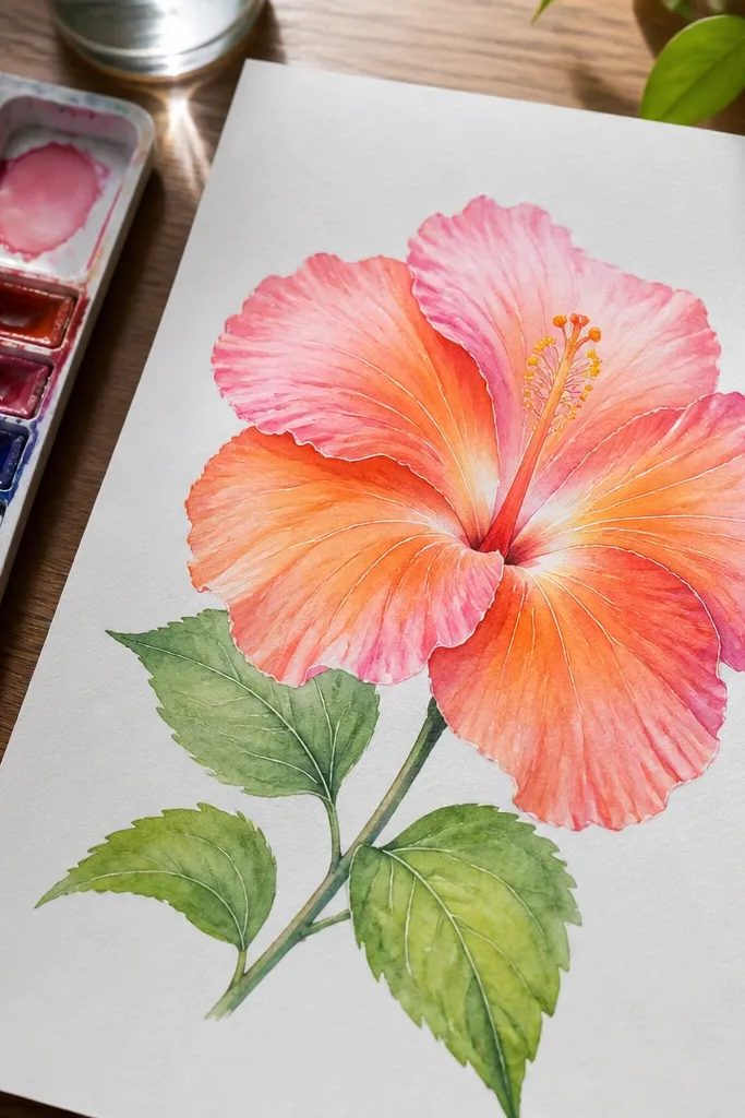
Smooth gradients plus crisp white highlights look polished fast. You get that “petals are translucent” feel without complicated realism. The white gel pen trick adds sharp specular highlights that watercolor alone can’t hold. This style is especially pretty for pinks and oranges because the gradient makes the flower glow. It’s a great choice for a centerpiece drawing on a page.
Sketch the center oval and petals with light pencil, then outline petals lightly with a fineliner if your pencil marks smudge. Wet one petal at a time, then paint a gradient from darker base to lighter tip using diluted pigment. Leave a clean highlight strip unpainted while the petal is wet. When everything is dry, add white gel pen highlights along the petal folds and a few stamen tip dots for sparkle.
Pro tipUse two pigment strengths: one for the base and one diluted version for the fade, so gradients look intentional.
AvoidDon’t paint the white highlights on wet watercolor; they won’t stay bright.
13. Hibiscus Flower Corner Doodle with Patterned Background Wash
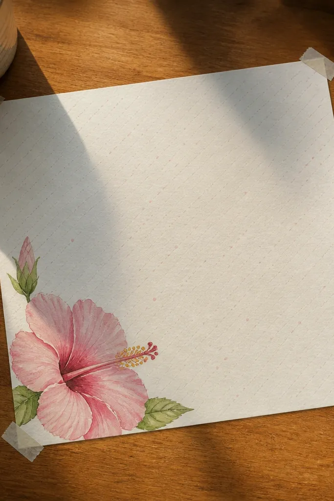
Corner placement looks aesthetic because it frames your page without taking over. This idea keeps the hibiscus bigger than the background pattern, so the flower stays readable. The patterned wash — like faint dots or tiny lines — gives a soft backdrop that makes the hibiscus look intentional. Use a limited palette so the corner doesn’t feel busy. It’s perfect for planner pages, journal covers, and any layout where you need a decorative accent.
Place the hibiscus in a corner and draw a simple boundary guide so it doesn’t creep into the margins. Outline the petals with a fine pen, then add light watercolor or colored pencil in the petals and center. Create the background by adding a light wash behind the flower area and then stamping dots or drawing tiny dashes with a small brush. Keep the pattern faint — you should barely notice it until you look closely.
Use a lighter background pattern color than your petal color so the flower stays the focus.
Don’t fill the whole page with pattern; corner doodles look best when the center stays calm.
14. Hibiscus with Embossed Look Using Eraser Resist
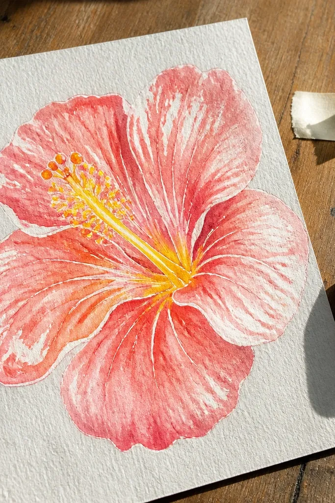
Eraser resist gives you that embossed, lifted highlight effect that looks more advanced than it is. You draw your hibiscus highlights first, protect them, then paint over everything. When you remove the resist, the highlights appear crisp and bright, which makes petals look dimensional. This style is great for bold pink hibiscus and for adding a premium look to simple line art. It’s also a nice way to practice leaving highlights without relying only on white paper.
Sketch the hibiscus in pencil, then use a white colored pencil or masking technique to mark highlight areas on petal folds and along the inner center. Paint the petals with watercolor over the entire area, using deeper pigment at the base. Let it dry completely, then gently rub the resist with a clean eraser to reveal bright highlights. Outline the center stamens with a fine pen once the paint is dry so they stay sharp.
Keep the resist marks small and targeted; big resist areas look like glare instead of petal shine.
Don’t scrub hard while removing resist; you can tear watercolor paper and ruin edges.
15. Hibiscus Flower in Vintage Botanical Style with Sepia Wash
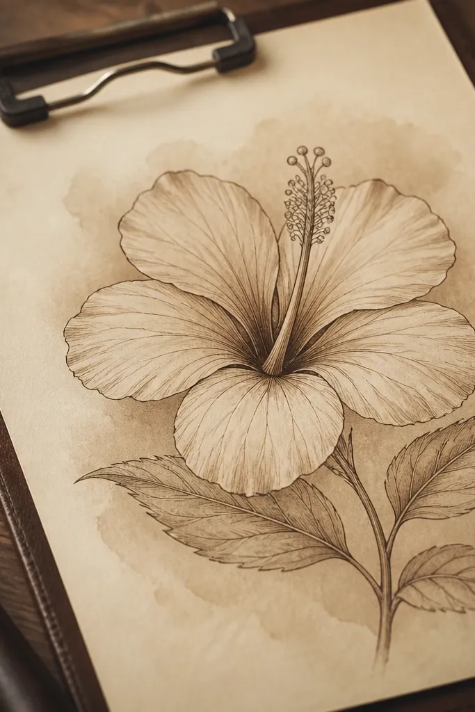
Vintage botanical style looks good because it has clear linework and controlled sepia tone. The sepia wash makes the flower feel old-paper pretty without needing complicated shading. Fine lines for veins and stamens keep it readable. Add a subtle vignette around the flower to frame it like a specimen sketch. This one works for slow, detailed drawings and looks especially nice in a sketchbook page meant to feel “collected.”
Sketch the hibiscus with light pencil, then ink the outline and add vein lines with a fineliner. Apply a diluted sepia wash to petals, focusing on the inner folds and shaded underside areas. Add a darker sepia tone for the center and reinforce a few inner petal lines so the structure shows through. Finish by adding faint speckled texture around the edges of the page with a dry brush and diluted sepia.
Pro tipUse a small brush for washes; larger brushes make sepia pool and look uneven.
AvoidDon’t go too dark overall; too much sepia makes the drawing look like it’s been over-aged.
16. Hibiscus Flower with Lime Green Leaves and Minimal Veins
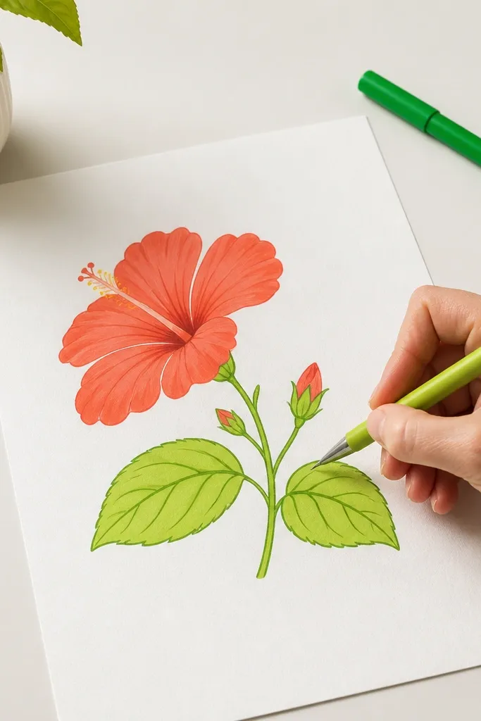
Adding leaves changes the whole drawing — it gives the hibiscus a place to live. The aesthetic here is clean and modern: bold hibiscus petals, lime green leaves, and minimal vein detail so it doesn’t get cluttered. This works especially well if you want a composition that looks good even when the hibiscus is slightly smaller on the page. Keep the leaves lighter than the flower so the hibiscus stays the hero. Great for card designs and small wall prints.
Draw a main hibiscus first, then add two leaves behind it at different angles so you get depth. Outline leaves with a smooth contour line, then add only 2-3 vein strokes per leaf. Color the leaves lime green with a lighter wash near the top edge and a darker wash under the leaf fold. Finish by coloring the hibiscus petals more intensely and adding a simple center dot cluster for stamens.
Place leaves to cover part of the hibiscus outline; overlap makes the drawing look layered and intentional.
Don’t add lots of leaf veins — it competes with the hibiscus center.
17. Hibiscus Flower with Patterned Petal Tips and Solid Center
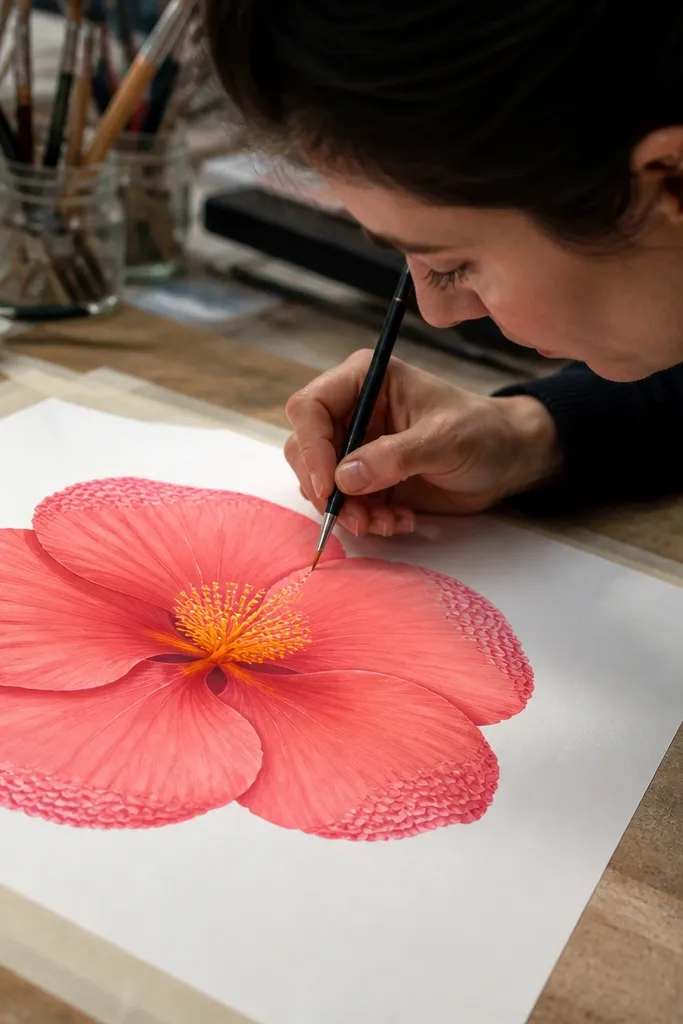
This design is fun because the petals have a repeating pattern only at the tips, not across the whole flower. That keeps it decorative without turning into doodle mess. A solid center with clear stamen dots makes it still read as hibiscus. Use one pattern type — tiny dots, short stripes, or micro scallops — and repeat it consistently across the petal edges. It’s a great choice for stationery and for pages where you want a playful but structured look.
Sketch the hibiscus outline and center, then ink the main shapes with a fine pen. Color the petals with a flat light base, leaving the outer tip area slightly uncolored. Add the pattern to the petal tips using a darker pigment or pen: dots or stripes following the petal curve. Finally, fill the center solidly and add stamen dots and a few inner fold lines to give structure.
Pro tipUse a ruler edge or the side of a pen tip to keep stripes evenly spaced across all petals.
AvoidDon’t add pattern to the petal base where shadows live; it flattens the depth.
18. Hibiscus Flower with Sumi Ink Splatter Background and Clean Foreground
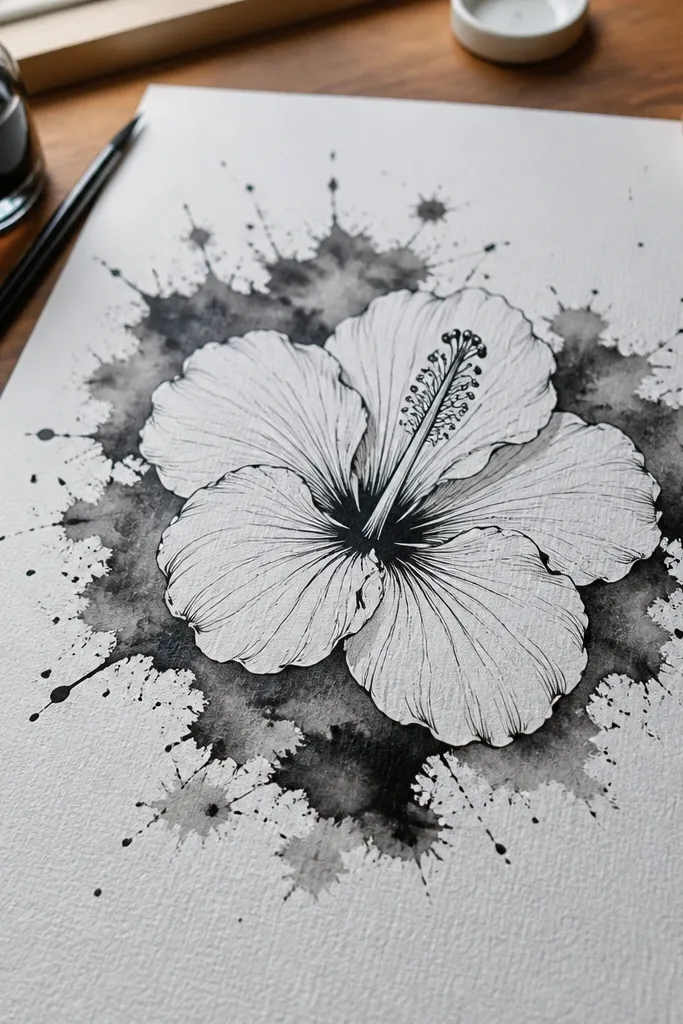
This is dramatic without being messy. The hibiscus stays clean and crisp, while the background splatter adds energy and movement. It’s one of the easiest ways to make a simple flower drawing feel gallery-ready. Keep the splatter behind the flower only, so it doesn’t confuse the shape. This style is great for black-and-white art or for color accents like red hibiscus petals on a dark background.
Draw the hibiscus in pencil, then ink the outline and center details first so the flower stays crisp. Mask the flower area with scrap paper so splatter doesn’t land on your petals. Mix sumi ink with water for a medium splatter strength and flick it behind the flower using a toothbrush. Remove the mask after the background dries, then add color to petals or keep it ink-only with a dark center for contrast.
Pro tipPractice one flick on scrap paper so you don’t end up with overpowering blobs.
AvoidDon’t splatter over the hibiscus outline; it makes lines look uneven and smudged.
19. Hibiscus Flower in a Glassy Look with Glossy Gel Medium Highlights
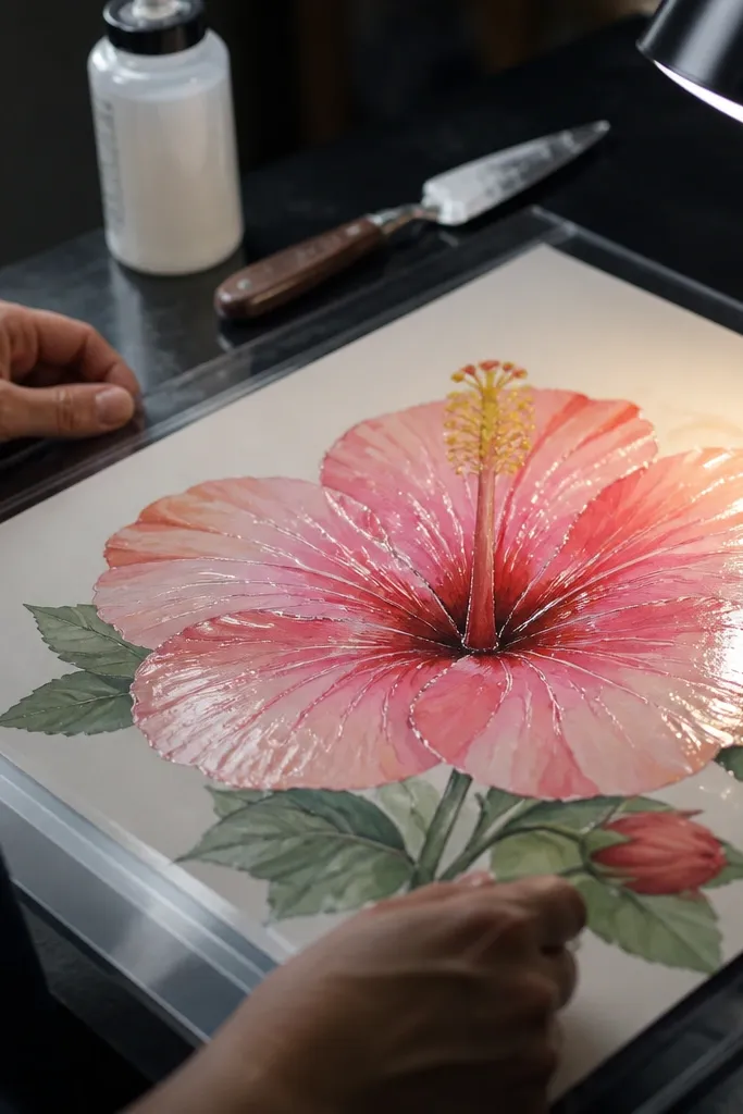
Glassy highlights make hibiscus look like it’s been painted with a shiny finish. You get that reflective feel by painting normally, then adding glossy gel medium on select highlight lines and center accents. It’s surprisingly photogenic because the shine catches light in photos, not just in real life. Keep the rest of the petals more matte so the glossy areas look intentional. This style is best for decorative art pieces and for people who like “finished” results.
Paint or color the hibiscus petals with watercolor or colored pencil, keeping highlights slightly lighter but not pure white. Let everything dry fully, then apply a thin layer of clear glossy gel medium along petal fold highlights and a few stamen tips. Use a small brush and keep the gel lines narrow so they look like reflections, not puddles. Finish by re-adding a couple of outline lines with pen if the gel slightly dulls them.
Apply gel medium after the paper dries for at least an hour so it doesn’t haze your colors.
Don’t cover the whole petal in gel; it looks like wet paint instead of glassy highlights.
20. Hibiscus "Sunburst" Stems with Metallic Center and Cut-Glass Petal Edges
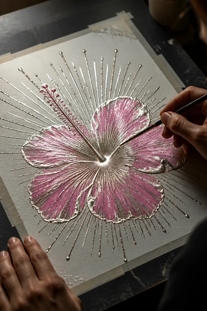
This one is all about that hibiscus glow — not by repainting petals the same way every time, but by building a crisp sunburst structure that makes the flower look lit from behind. The petals get a glassy edge effect using a resist layer, so the highlights look sharp instead of fuzzy. You start with a simple hibiscus sketch, then add a metallic center that catches light even in a flat photo. It’s a medium-skill project that takes about 45 to 70 minutes, and it looks amazing on a sketchbook page, a handmade card, or a small wall print. If your drawings usually look flat, this fixes that by giving you strong directional light and high-contrast edges.
1) Lightly sketch a hibiscus front view with five main petals and a slightly off-center throat, keeping the petals about 2.5 to 3 times wider than they are tall. Trace the hibiscus outline with a 0.3 or 0.5 black fineliner, then draw 10 to 14 thin rays that start at the base of the stem and fan outward behind the petals, all pointing to the center throat. 2) Mix a resist highlight: paint a thin coat of white acrylic or gel medium only along the petal edges and a few inner “fold” lines. Let it dry 10 to 15 minutes, then paint the petals with watercolor or diluted gouache in your chosen hibiscus tone (coral, magenta, or deep red). While the paint is still slightly damp, add a second darker wash near the throat and fade it outward so the rays feel like backlight. 3) For the metallic center, rub gold or copper metallic paint/marker into the throat area and stamen base, then add a tiny dot of opaque white gel highlight on the top of each stamen. Finish by lifting any resist edges with a clean kneaded eraser tip, then seal with a light fixative or matte spray so the metallic doesn’t smear.
Use a kneaded eraser like a pencil eraser — press, lift, and rotate. It removes resist edges cleanly without scuffing the watercolor wash.
Don’t flood the sunburst rays with paint — keep them thin and mostly unpainted so the light effect stays crisp.