
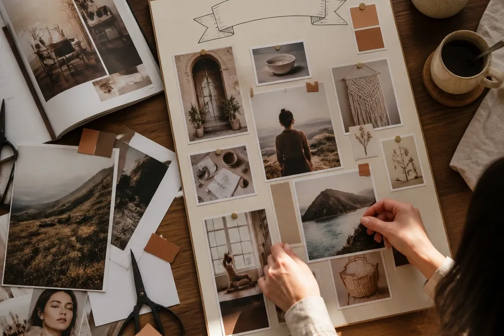
1. Cream Fabric + Polaroid Corners Cozy Grid
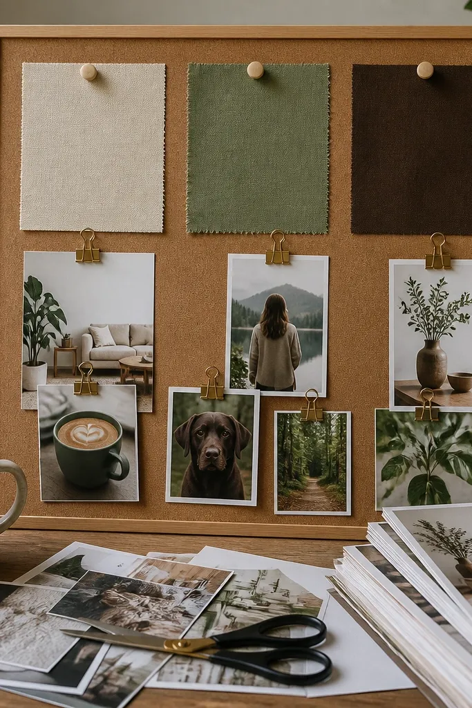
This theme looks soft because the background is fabric, not plain paper. The trick is to treat each photo like a “mini card” with visible corners, so the board has that lived-in, cozy feel without looking chaotic. Use Polaroid-style prints or just add a white border around your photos. It’s great for beginners because you can place items in an orderly grid and stop when the spacing looks right. Expect a calm, warm board that reads clean from a distance.
First, stretch a piece of cotton fabric over a foam board (about 18x24 inches) and staple or tape the edges on the back. Then arrange 10 to 14 printed photos in a grid, leaving 1 to 2 inches between each one, and secure corners with corner tape or double-sided tape at the edges only. Finally, add short labels on small strips of thick paper, and place them under the photos like caption cards.
Pro tipUse fabric in a light weave (muslin, cotton sheeting) so it doesn’t look shiny under indoor lighting.
AvoidAvoid full-coverage glue on photos — it warps paper and makes edges lift.
2. Terracotta Sticky-Note Steps Layout
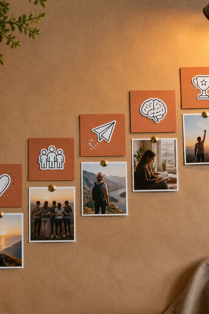
If your vision boards turn into a scrapbook mess, this one forces a clear story. The “steps” layout makes your goals look like a gentle path, not a random pile. Terracotta sticky notes give the warm cozy vibe, and small icon cutouts keep it photogenic. This theme is perfect when you’re learning something specific or building a habit. You’ll end up with a board that feels actionable and calm.
Start with a cork sheet or smooth cardstock base sized 16x20 inches. Then draw a simple staircase path in pencil (five to seven steps), and fill each step with one sticky note color block plus one printed image or icon. Finally, add one short action phrase per step using a thin black marker, and seal the whole thing with a light spray of matte fixative only on paper areas.
Stick icons in the top-left corner of each note so the board looks consistent and tidy.
Don’t use too many font styles — one handwriting-like marker style keeps it cozy.
3. Thrifted Frame Cluster With Linen Backing
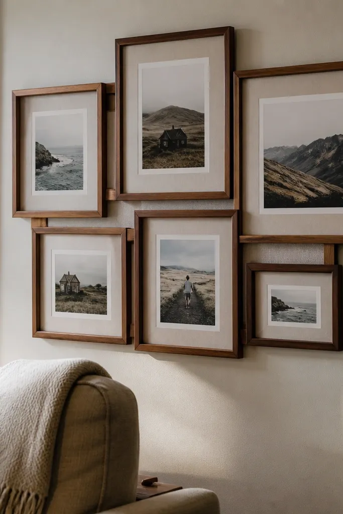
This theme makes your board look like wall decor, not a craft project. Frame clusters hide the messy parts because each piece has its own boundary, and linen backing adds that cozy texture. It’s especially good if you want your vision board to look good even when the photos aren’t “perfect.” Choose frames with similar tones (black, dark walnut, or brass) so it feels intentional. Beginners like this because you can build it without measuring every inch.
First, pick three frames (for example 8x10, 5x7, and 4x6) and remove glass if it’s easy. Then cut or pin linen fabric behind each frame so the background shows through around your photos. Finally, add a small cluster of 3 to 6 prints per frame, and secure using photo corners or removable tape so you can swap images later.
Pro tipKeep frame heights within 2 inches of each other for a cleaner look from across the room.
AvoidAvoid mixing silver and gold hardware — it makes the cluster look accidental.
4. Window Screen Dream Board With Fabric Banners
This one looks airy and cozy because the background is open mesh, not solid. Fabric banners add softness, and clothespins give you a satisfying, practical way to swap images. It’s a great choice if you like changing your board as you go. The screen texture also makes the board feel “designed” without needing fancy typography. Beginners can do this with minimal cutting — it’s mostly clipping and layering.
First, source a small window screen or wire panel and mount it on a frame or directly on a wall with sturdy hooks. Then attach fabric banner strips (like 1.5 to 2 inches wide) across the top and sides using tape or zip ties, and clip photos with mini clothespins. Finally, add a few printed labels directly on cardstock and clip them too, so the text looks like part of the display.
Pro tipUse clothespins in a single finish (natural wood or black) so the board looks cohesive.
AvoidDon’t overcrowd the screen — leave 30 to 40 percent empty space for that cozy breathing room.
5. Oatmeal Paper + Dried Flower Corner Theme
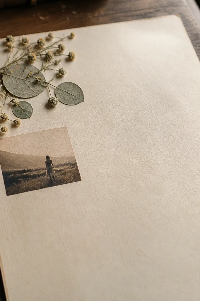
Dried flowers make a board feel instantly warm, but you need restraint to keep it tasteful. This layout puts the floral element in one corner so it doesn’t look like decoration overload. Oatmeal paper underneath makes everything look softer and older in a good way. This theme suits slow goals — home comfort, creative hobbies, self-care routines. It’s beginner-friendly because you’re building one focal corner and letting negative space do the rest.
Start with a board base covered in oatmeal or kraft paper (about 18x24 inches). Then press or glue a small cluster of dried flowers onto a corner using archival glue or a thin layer of white glue under parchment. After that, arrange 6 to 10 photos around the corner like rays, and add short handwritten labels on narrow strips of paper.
Pro tipSeal the dried flowers lightly with matte spray to reduce shedding, and keep the board away from direct moisture.
AvoidAvoid putting dried flowers under wet mediums like Mod Podge — petals discolor.
6. Brown Boots Moodboard With Monochrome Outfits
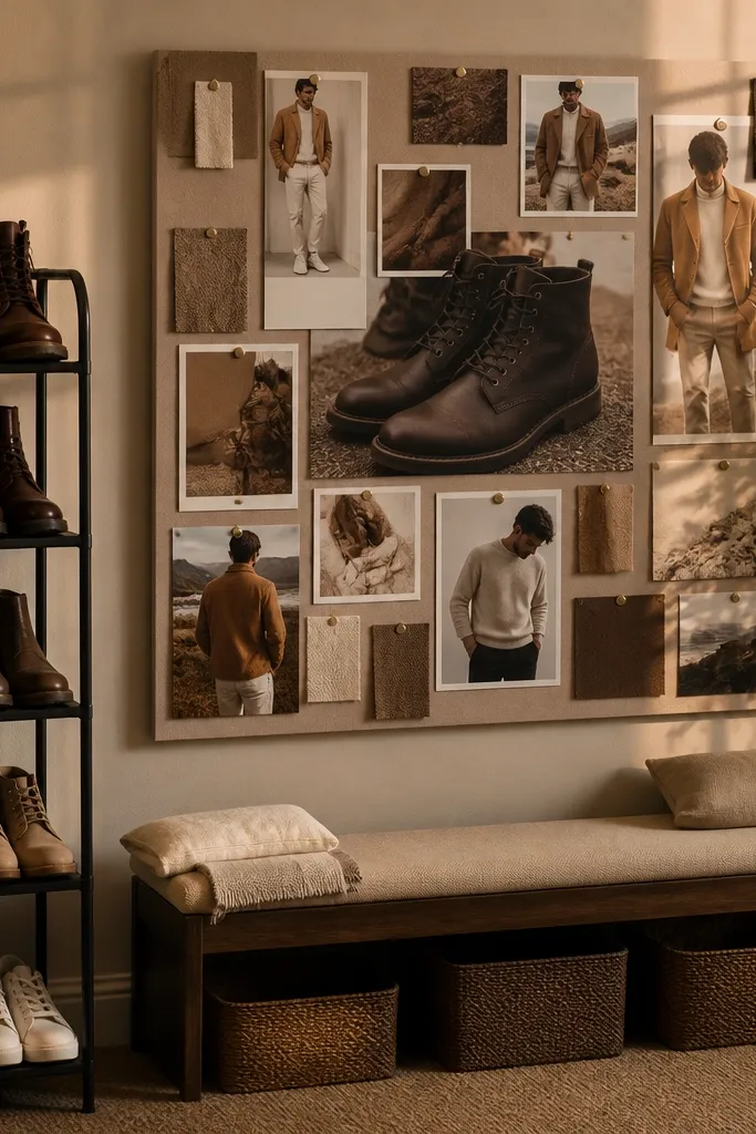
This is a cozy theme built on one color family. When all your visuals share similar tones (espresso, tan, oatmeal, chocolate), the board looks styled instead of random. It’s perfect for wardrobe goals, personal style, or confidence goals because it turns “dream” into a visual identity. Use one anchor image with a strong silhouette and build around it with smaller outfit photos. Beginners can nail this quickly because you’re not inventing complex layouts — you’re repeating the same palette.
First, choose a monochrome brown palette and print 8 to 14 images with similar tones. Then create a dark border on your base (charcoal or deep brown) using colored paper strips, leaving a 1-inch margin. Finally, place the hero outfit image in the top third, and arrange the rest in two columns below, each with a small label card beside it.
Use a white label strip with black marker so text stays readable against dark photos.
Don’t add bright accents like neon — it breaks the cozy monochrome.
7. Soft Olive + Gold Leaf Quote Lines
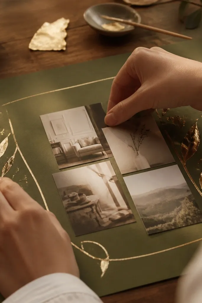
This theme makes your board feel like stationery. The olive background keeps it calm, and gold leaf accents add warmth without turning it flashy. It’s ideal if your goals are more mindset-based: calm mornings, creative output, stress control. You’ll get a clean, photogenic look because the composition is simple — quote lines run across the board and photos sit at the edges. Beginners do well here because you’re using typography as structure.
Start by covering a board with soft olive paper or felt (about 18x24 inches). Then write one or two short quote lines across the center using a pencil guide, and apply gold leaf only to the words (use craft adhesive where needed). Finally, add 5 to 8 small photo cutouts in the corners and tape them with thin strips for a neat finish.
Keep quote text to 6 to 10 words per line so it stays visually strong.
Avoid gold leaf on the whole board — it makes the texture look messy.
8. Seamless Jute Rope Border + Photo Columns
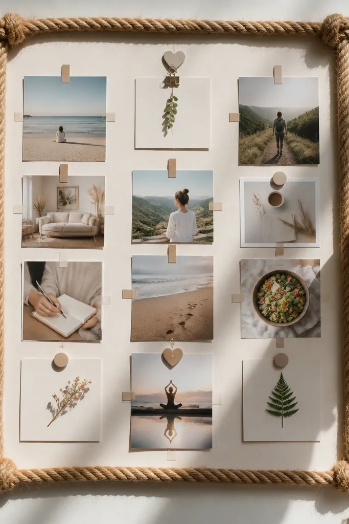
This theme gives you instant “cozy frame” energy. The rope border makes the board look finished and adds tactile texture to photos and printouts. Photo columns keep the layout organized, so you don’t need perfect handwriting or fancy design skills. This works well for home goals, travel planning, and hobby boards where you want categories. Beginners like columns because each column has a job: one for visuals, one for notes, one for reminders.
First, cover a board with neutral paper (cream or beige) and glue jute rope around the edges using a hot glue gun or fabric glue. Then draw three vertical columns lightly in pencil and place 3 to 5 photos per column. Finally, add small note cards under photos using double-sided tape, and seal the paper edges with a tiny dab of glue so they don’t lift.
Cut rope ends at a slight angle so corners don’t leave gaps.
Don’t make the rope too thick — if it’s bulky, it warps the board edges.
9. Cork Tile Patchwork With Color Blocks
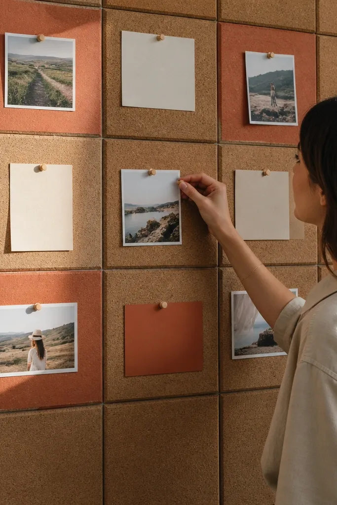
Patchwork cork looks like cozy wall organization. The tiles give you built-in sections, so each goal has a neat boundary. Color blocks keep it aesthetically pleasing because you’re not relying on random photo sizes to carry the look. This theme is great for beginners because you can pin and move items until the spacing feels right. It also suits people who want to update their vision board monthly.
First, arrange cork tiles into a simple grid on a backing board, leaving 1/4 inch gaps for glue. Then add color blocks using cardstock behind or around each tile section (use 2 to 3 pastel tones max). Finally, pin photos with thumbtacks and add tiny label tags using cardstock strips, keeping each tag the same size.
Pro tipUse one tack color (brass or black) so the board looks intentional, not mixed hardware.
AvoidAvoid pinning everything at full spread — use the negative space between tiles.
10. Calendar Page Cutout Collage With Clean Margins

Calendar pages give you instant structure because the grid is already there. Tear out specific dates or months and use them as texture and timing cues. The key to keeping it cozy is clean margins and limited use of busy text. This theme is perfect for goals with deadlines or routines. Beginners will find it forgiving because torn edges hide small placement mistakes.
Start with a cream base board and cover parts of it with torn calendar pages, leaving a 2-inch breathing area around the edges. Then cut out a few bigger photo pieces and place them on top, aligning them to the calendar grid lines you can see. Finally, add one short label strip per section, and finish by pressing everything under a flat book for an hour to reduce curl.
Pro tipUse only one calendar print style (same year or same font) so the collage doesn’t feel noisy.
AvoidDon’t cover the whole board in calendar text — it kills readability.
11. Linen Pocket Organizer Board
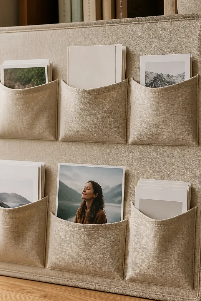
Pocket boards look cozy because they feel practical and lived-in. You can store extra cards behind the fabric so the front stays clean and photogenic. This theme is great for beginners who hate clutter but still want lots of ideas. It also works well for learning goals because you can swap cards without re-gluing everything. The look is soft, structured, and tidy — the exact opposite of messy craft chaos.
First, sew or pin linen pockets onto a backing fabric or foam board (aim for 4 to 8 pockets total). Use simple rectangle pockets around 5x7 inches for photos and 3x5 inches for notes. Then insert printed images and cards, and label pocket categories with small fabric tags or paper strips. Finally, mount the board or place it on a shelf using adhesive hooks on the back.
Pro tipAdd one clear pocket for “weekly focus” so you use the board daily.
AvoidAvoid pockets that are too shallow — cards slide out and the board looks messy.
12. Blue-Gray + White Waves Theme
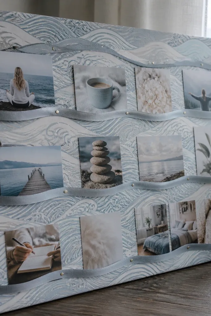
This theme is cozy because it looks like calm weather. The wave paper background gives movement, and the ribbon-style photo placement keeps everything coherent. It’s ideal for rest, mental health goals, and slow creative projects. Beginners can do this without drawing perfect waves by using pre-printed patterned paper or scrapbook paper. The end result feels soothing and photogenic because the motion guides the eye.
First, cover a board with blue-gray patterned paper or fabric that has a wave motif. Then cut 2 to 3 “ribbon” strips of white paper and place them diagonally across the board as paths. Finally, tuck photo printouts onto each ribbon path and add one label card at the start of each path so each ribbon has a theme.
Keep ribbon strips the same width (about 2 inches) for a cleaner look.
Avoid mixing too many patterns — two patterns max keeps it cozy, not busy.
13. Monochrome Black + Cream Minimal Cozy
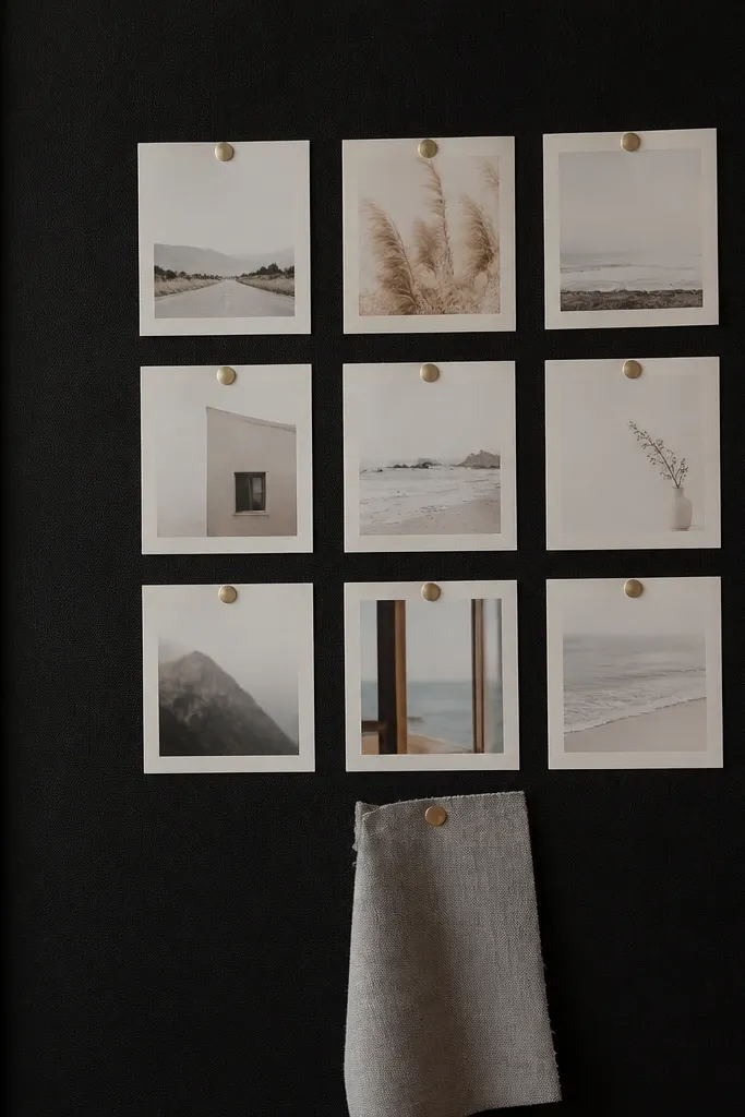
Minimal boards look cozy when the empty space is intentional. This theme uses only black, cream, and one soft gray, so your photos stand out and your goals don’t blend into the background. It’s perfect if you get overwhelmed by clutter or you’re starting from scratch. Beginners can build this quickly because it’s basically a layout exercise: place a few hero images and a small set of labels. It also photographs beautifully because there’s no visual noise.
Start with a cream base and add a thin black border using matte paper strips. Then print 5 to 8 hero images and place them in a simple 2x4 grid, leaving 1 inch between each. Finally, add a small grid of 10 to 14 short labels using black marker on cream cardstock, and keep all text the same size.
Pro tipUse a ruler for label spacing so your board looks designed, not improvised.
AvoidAvoid adding more than 12 labels — minimal only works when the board stays quiet.
14. Rusty Metal Pegboard With Photo Clips
Pegboards look cozy because they’re functional and slightly industrial, in a warm way. The photo clips create a clean, modular layout that looks good in photos. This theme is ideal for people who like to reorganize and adjust their focus. You can build it with a small pegboard and still get a full-board look by grouping items by category. Beginners can handle it because the pegboard grid does the spacing math for you.
First, mount a pegboard panel (about 12x18 inches) on a backing board or directly to the wall. Then use clothespin or binder clips on the holes to attach 10 to 14 photos, grouping them into two or three clusters. Finally, hang short note cards with clip hooks and write one-line goals in thick marker for readability.
Pick one clip style and color — mixed clips look messy fast.
Avoid placing clips randomly across the whole board; cluster by category.
15. Thrifted Book Page Background With Sepia Photo Corner
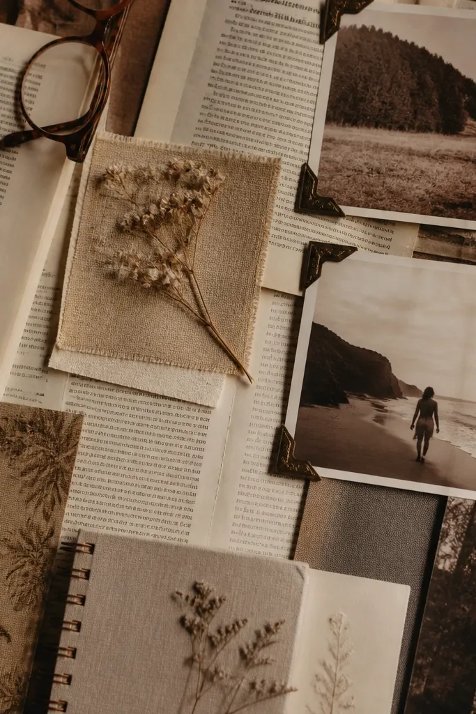
Book pages create cozy texture instantly, especially when you keep the photos sepia or muted. This theme is for goals that feel reflective: reading plans, creative routines, personal growth. It looks photogenic because the background has print texture, and the photo corner gives you a focal point. Beginners can make it without art skills: tear, place, and glue in simple sections. The result feels like a curated journal page.
Start by covering the board with torn book pages, overlapping lightly and sealing edges with matte glue. Then add a sepia photo cluster in one corner using photo corners or tape only at edges. Finally, write 3 to 5 short bullet labels on small cardstock tabs and glue them near the photos so the board reads like a mini page.
Pro tipUse one font style for labels by printing labels from your computer in a serif font, then gluing them.
AvoidAvoid using glossy sprays on the book pages — shine makes the board look cheap.
16. Patchwork Quilt Squares With Fabric-Backed Photos
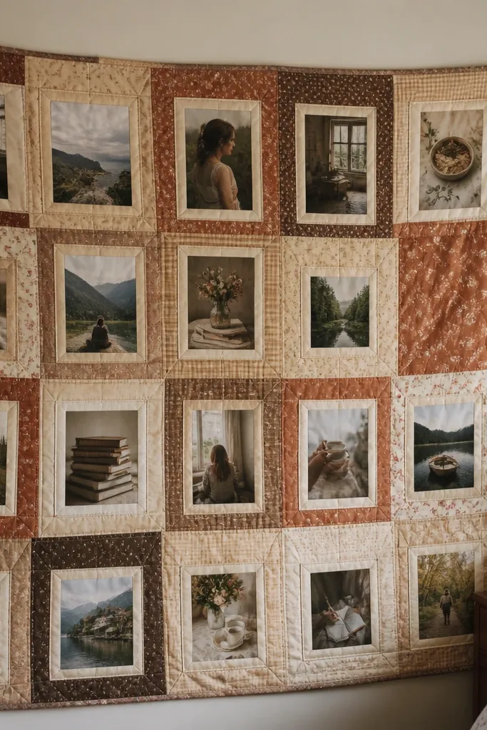
This is the cozy-est look on the list because it reads like a handmade quilt. Quilt-square patchwork gives you natural boundaries and makes the board feel warm even if you use only a few photos. It’s great for beginners who have fabric scraps and want a board that looks like it belongs in a bedroom. The photo backing keeps everything unified, so you don’t get the “random printed paper” look. This theme also makes swapping images simple because each square acts like a pocket.
First, cut 10 to 14 fabric squares in coordinated tones (cream, mustard, rust, soft green) and glue them onto a foam board like a patchwork. Then place your photos on fabric-backed mats (cut 1/2 inch wider than the photo) and glue or tape each photo mat into a specific square. Finally, add a thin strip border around the edges using matching fabric tape or bias tape.
Pro tipUse fabric glue for the squares and keep photos removable by securing only the corners.
AvoidAvoid mismatched fabric textures that look shiny next to matte — it breaks the cozy uniformity.
17. Candlelight Amber Lights String + Minimal Photos
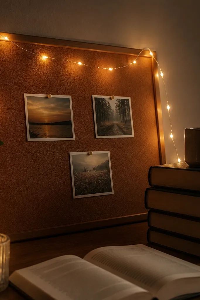
This theme adds coziness through light. Amber string lights make the board look like it belongs in a late-night reading corner, and minimal photos keep it clean. It’s excellent if you want your vision board to feel atmospheric rather than scrapbooky. Beginners can do this safely with battery lights and a simple layout: wrap lights around the border and place photos in the center. The result is photogenic in a way paper-only boards can’t match.
First, use a battery-powered warm amber LED string and secure it around the edges of a board using hot glue small dots or fabric tape. Then place 6 to 10 photos in the center area only, with one label card per photo. Finally, tie the layout together with a single background color block behind the photos so the lights don’t highlight clutter.
Pro tipUse battery lights with a low-heat rating and keep the battery pack accessible for quick changes.
AvoidAvoid plugging in mains lights directly to craft boards — battery power is the beginner-safe move.
18. Sage Felt Background With Stitched Path Lines
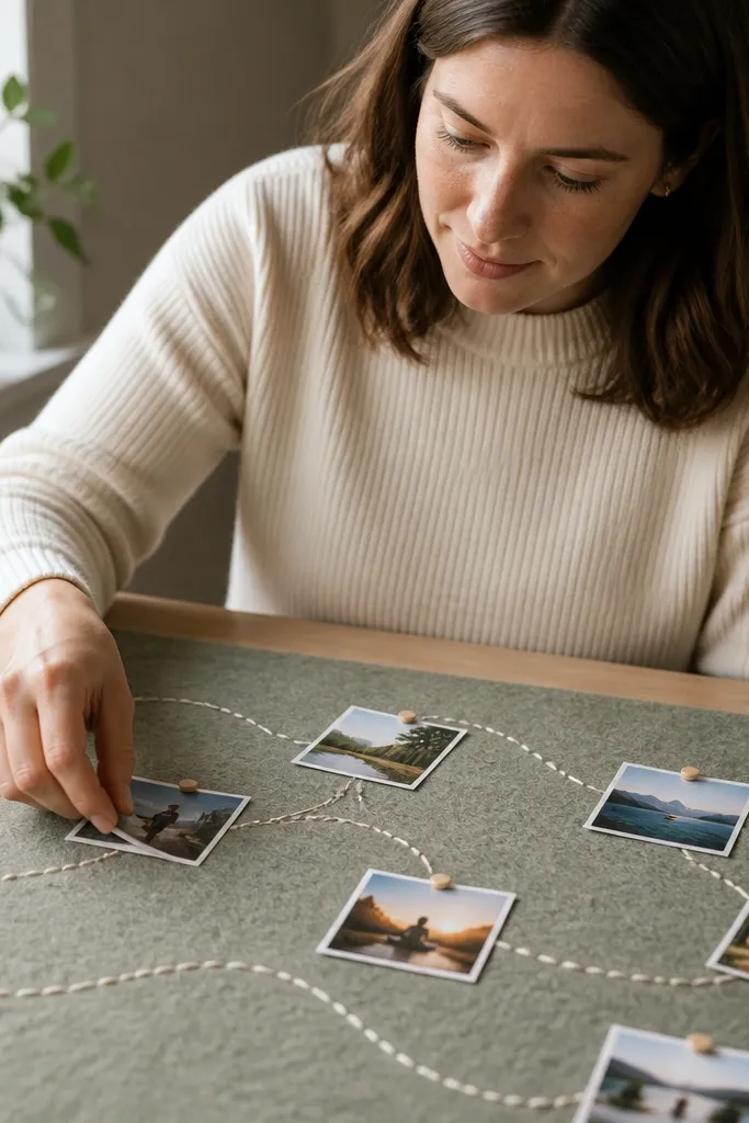
Felt makes everything feel cozy because it softens edges and hides small imperfections. Stitched path lines create structure, so your photos follow a journey instead of floating randomly. This theme is great for habit-building goals and creative routines where you want a “route” your eye travels. Beginners can copy it without sewing by using fabric glue and faux stitching lines made with twine. It photographs well because felt absorbs glare.
First, cover a board with sage felt and trim edges clean. Then draw one path line across the board and glue thin twine along the line in a gentle curve. Finally, place 8 to 12 photos along the twine path and add tiny label tags under each photo using cardstock and glue.
Pro tipKeep the path line thickness consistent by using one twine strand, not multiple.
AvoidAvoid placing felt photos directly on raw felt with no backing — paper can curl over time.
19. Brown Kraft Paper + Twine Pinboard Shapes
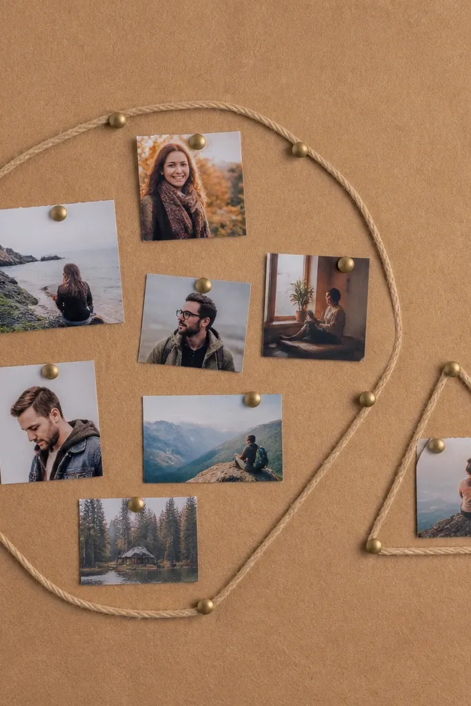
Kraft paper is the easiest way to get a warm, cozy base that hides mistakes. Twine shapes give your board a graphic structure, and pinned photos inside the shapes look intentional. This theme is perfect for beginners because it’s forgiving: you can rearrange until the shapes feel balanced. It also works for goal categories like career, health, and home because each shape can represent one category. The board ends up looking like handmade wall art.
First, cover a board with kraft paper and lightly mark three or four large shapes (circles, rectangles, or rounded triangles). Then glue twine along the shape outlines and pin or tape photos inside each shape using thumbtacks or corner tape. Finally, add one small handwritten label per shape on a strip of cream cardstock.
Pro tipUse thicker twine (jute or cotton rope) so the outline reads clearly in photos.
AvoidAvoid thin sewing thread outlines — they disappear visually and make the board look unfinished.
20. Soft Pink + White Ribbon Banner Headline
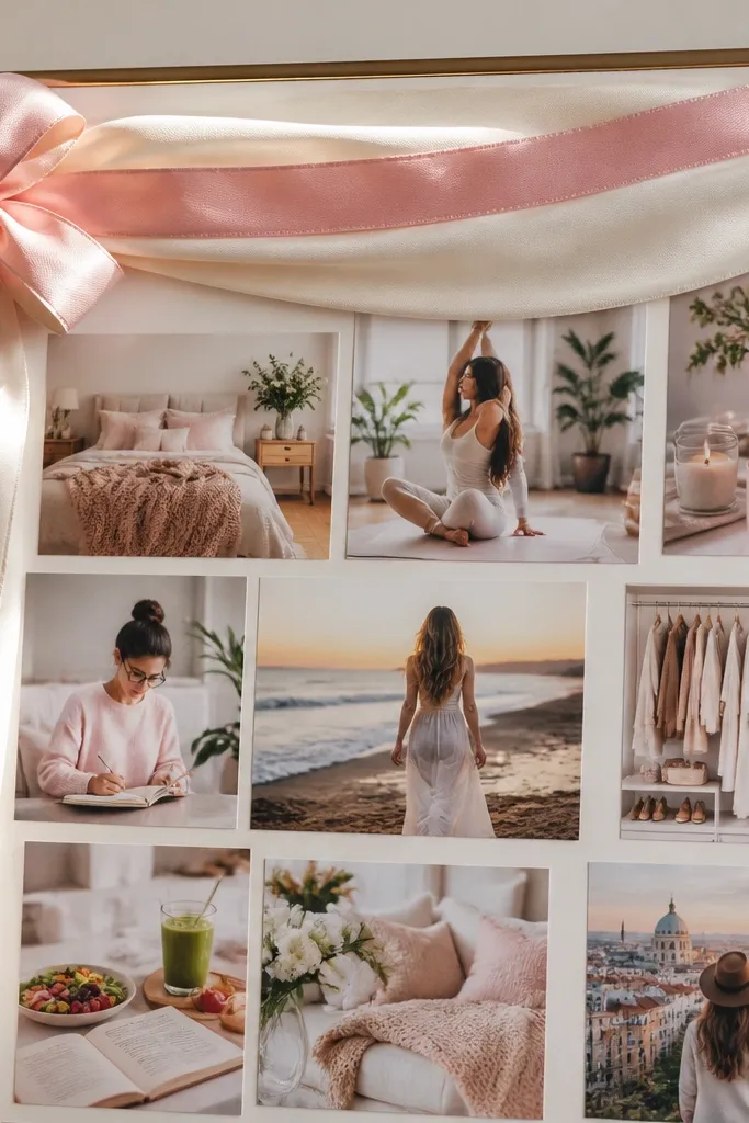
A banner headline makes your vision board feel like a cozy poster. The ribbon draws the eye to the top, and the clean photo layout below keeps it readable. This theme is great for beginners who want their board to look “put together” fast. Use soft pink and white for a gentle, warm mood. It also works well for seasonal goals like spring habits or holiday recovery — just swap the banner text and images.
First, cover a board with white or pale cream paper and cut two ribbon pieces (about 2 inches wide) for the top banner. Then attach the ribbons across the top and write a short headline on one ribbon using a black marker or printed label. Finally, place 9 to 12 photos below in three neat rows and add small white label cards beside each row.
Keep ribbon tails short and even so the top looks symmetrical.
Avoid glossy ribbon — it reflects light and makes photos look washed out.
21. Chocolate Brown Chalkboard Labels With Color Pop Photos
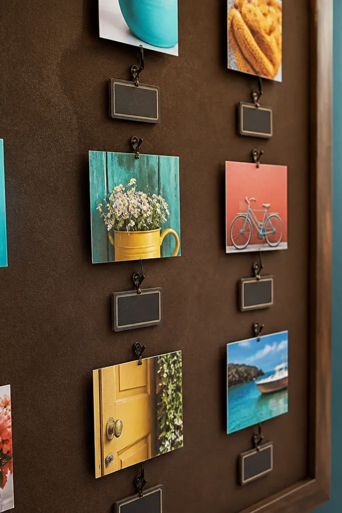
Chalkboard-style labels add cozy personality without needing fancy design. Pair them with color pop photos — think teal, mustard, or coral — so your board feels lively but still warm. The brown label cards create a consistent visual rhythm and keep text readable. This theme works well if you want your goals to feel playful but organized. Beginners like it because chalk labels are forgiving and you can wipe or redo text before you glue.
First, cut 10 to 16 label cards from brown cardstock or paint chip paper. Then write your short goal phrases with chalk marker and let them dry fully. Finally, arrange 8 to 12 photos in a grid and tape each photo to a label card so the label becomes the caption beneath it.
Pro tipUse one font vibe for all labels by sticking to all-lowercase or all-title-case — consistency matters.
AvoidAvoid wet glue directly on chalk ink — it smears.
22. Warm Marble Paper Background With Minimal Typography
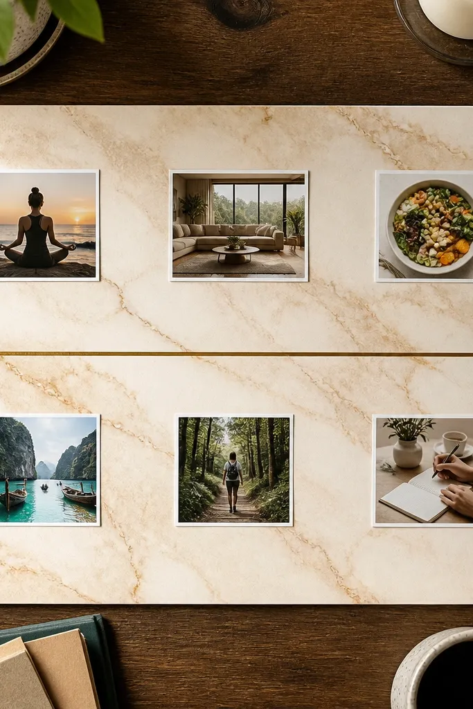
Marble paper looks fancy but it’s actually easy to build around. The trick is to keep typography minimal and use small photo tiles so everything stays balanced. This theme is cozy because warm marble (cream with tan swirls) feels soft, not cold like gray marble. It’s excellent for desk boards and shelf displays where you want a clean, stylish look. Beginners can succeed quickly because the background already does most of the visual work.
First, cover a board with warm marble contact paper or printed marble paper. Then cut your photos into consistent tiles (for example 2.5x3.5 inches) and place 8 to 10 tiles in two columns. Finally, add 6 to 8 typed labels on small cream cardstock and tape them under the tiles with straight edges.
Pro tipPrint labels with a simple serif font at 14 to 16 pt so they look like design, not handwriting.
AvoidAvoid mixing marble with busy patterned scrapbook paper — keep the background as the only pattern.
23. Cedar Wood Slat Board With Photo Clothespins
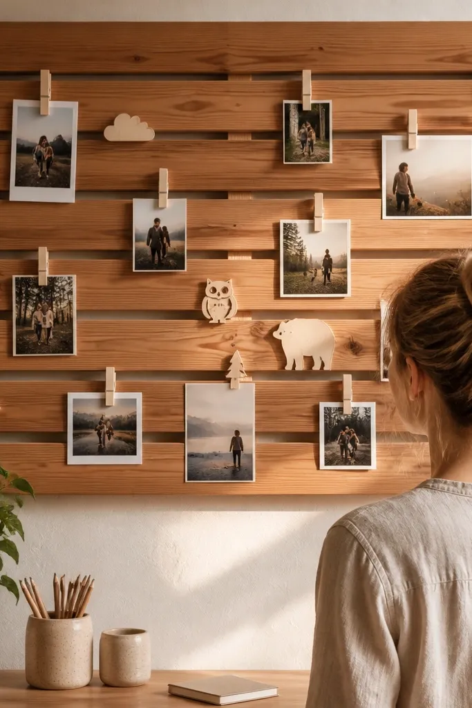
A wood slat board looks cozy because it brings warm material texture into the design. The slats create built-in spacing, so you can arrange photos without measuring every gap. This theme is great for home goals and creative practice goals since it feels like a studio wall. Beginners can keep it simple by using fewer photos, each clipped to a different slat. It also photographs well because the wood grain adds depth.
First, mount wooden slats on a backing panel (or buy a small slatted organizer board) and space them 1 to 1.5 inches apart. Then clip 10 to 14 photos using small clothespins onto different slats, grouping by theme color. Finally, pin or tape 3 to 6 handwritten note cards between photos for short reminders, and wipe the board with a dry cloth to remove dust before displaying.
Use matching clothespin finishes so the board looks like one system.
Avoid too many tiny photos — slats need breathing space to look cozy.
24. Smoked Glass Jar Photo Wall With Twine Trays
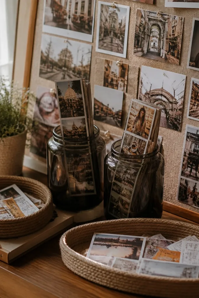
This theme turns your photos into a cozy little still life instead of a flat collage. Smoked glass jars mute bright colors and make everything feel warm and calm, even with mixed pictures. The twine trays give you a place for small notes, ticket stubs, and mini printouts, so the board looks styled instead of crowded. It is beginner-friendly because you are mostly mounting frames or hardware and hanging jars — no advanced crafting. Expect about 2-3 hours total if you already have photos printed, and it looks great in a hallway, bedroom, or reading nook where you want “soft focus” vibes.
1) Cut a backing board from 1/2-inch plywood or MDF to 16 x 20 inches, then sand the edges and wipe it clean. Paint it matte warm gray or oat white, let it dry, and seal with a matte clear coat so twine and jar dust wipes off easily. 2) Mark three horizontal twine “trays” across the board: space them 6 inches apart, and leave 2 inches of clearance on both sides. Screw in small eye hooks or cup hooks at each end of each tray line, then stretch jute twine tight and tie it into a shallow U-shape. 3) Mount 6-8 smoked glass jars using jar-lid hardware: either glue-and-screw jar lids to the board with wood screws or use metal jar brackets if your jars have compatible lids; place taller jars on the ends and shorter ones in the center. Finish by threading warm white string lights behind the twine and between jars, then tuck your photos into the jars with kraft paper strips so they look intentional.
Pro tipUse a matte clear coat before you mount anything — it stops twine fibers from catching on paint and makes dust removal easy. If your jars are heavy, drill pilot holes for every screw so the board does not split.
AvoidSkipping pilot holes and forcing screws into MDF is the quickest way to crack your backing.
25. Felted Wool Color Blocks With Photo Window Cutouts
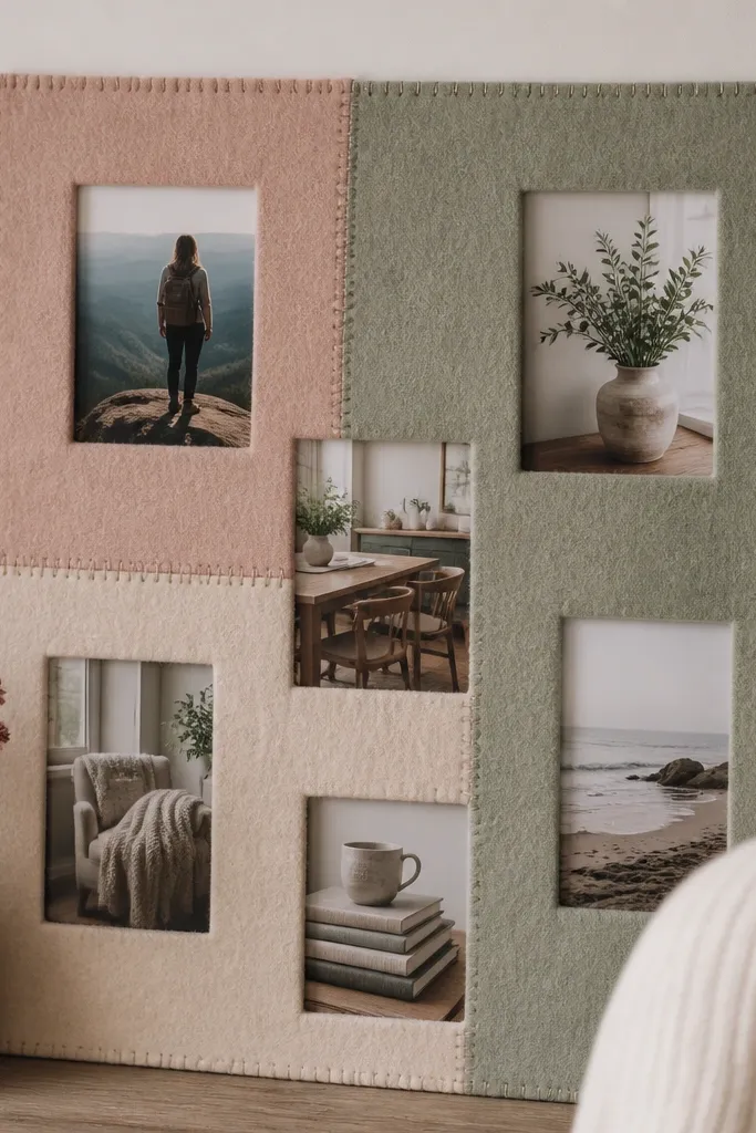
This is the cozy vision board look that feels soft even from across the room. Felted wool blocks create texture that reads warm in photos, and the photo window cutouts keep your layout clean instead of messy. You get a built-in “grid” without using tape everywhere, which makes it beginner-friendly and forgiving. It also fixes the usual problem with vision boards — loose corners and peeling paper — because the photos sit in stitched openings. It takes about 3-4 hours for a 18 x 24 inch board, and it suits bedrooms, craft rooms, and anyone who wants a calm, tactile aesthetic.
1) Cut felt panels into a simple layout: for an 18 x 24 inch board, cut one 12 x 18 inch base piece and three accent rectangles around it (each about 4 x 12 inches) in colors like cream, dusty rose, and sage. Lay them on top of the base to test spacing, then pin and stitch or glue them down with fabric glue. 2) For the photo windows, cut openings in the felt using a craft knife and small scissors — aim for 3 x 4 inch windows and leave at least 1 inch of felt border around each one. Fold the felt edges inward and stitch a simple blanket stitch around each window so the cut edges do not fray. 3) Insert printed photos behind the windows by sliding them into the felt “pocket” area: glue one side of the photo to kraft paper backing, then slide the kraft-backed photo into place and secure the kraft paper to the felt edge with a few stitches at the corners. Finish with a thin ribbon or fabric strip hanger on the back so the board sits flat.
Use a sharp rotary cutter or new craft knife blade for the felt windows — dull blades stretch and distort the edges. Blanket-stitch slowly and keep tension even so the border looks neat in close-up photos.
Cutting windows too close to the edge makes the felt border collapse and look sloppy.



