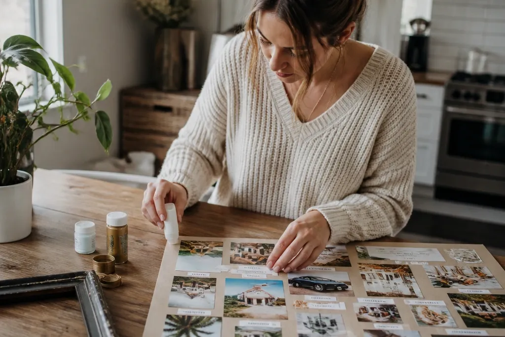

1. Kraft Paper + Black Tape Title Strip Board
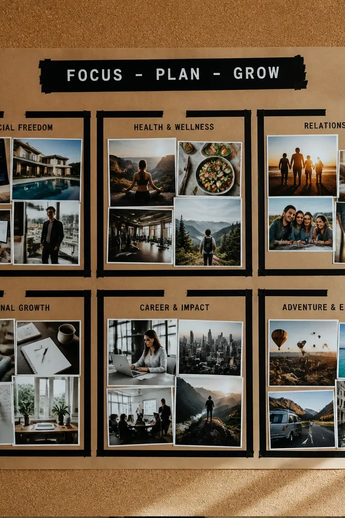
This look is clean, bold, and camera-friendly because kraft paper gives you a warm neutral base and black tape creates strong lines that read instantly. You’ll build it with magazine photos and printed goal words, then frame each cluster using tape borders instead of bulky frames. The contrast is the whole point: dark tape against light paper makes the images pop without spending on expensive materials. It’s great for a wall board or a board photographed on a desk because the matte surface avoids glare.
Start with a piece of cardboard or foam board cut to your preferred size (like 18x24 inches). Cover it with kraft paper using a thin glue stick or tape along the edges only. Add a straight black tape strip across the top for your category title, then build two to four photo clusters under it using photo corners or small tabs. Finish by writing one short goal line in a black fine-liner at the bottom of each cluster.
Use a metal ruler and press the tape down with a plastic card so the edges stay crisp in photos.
Don’t cover the whole board in glue — kraft paper buckles fast and makes your photos look warped.
2. Old Frame Backing Collage Grid
This idea looks expensive because old frame backing already has a rigid, finished edge. You cut your photos into consistent squares, then place them in a grid so the board reads organized even when the content is varied. The photos look more intentional when each one has the same margin size. It’s a strong choice if you want your vision board to feel like wall art, not a craft project, and it photographs well from straight-on angles.
Find a thrifted frame backing or cut a backing from thick cardboard and keep the frame edge visible. Mark a grid with light pencil lines (for example, a 3x3 layout) so spacing stays even. Cut photos into matching square sizes like 4x4 inches and mount them with small tape tabs. Add a title label on the top edge using a strip of paper and glue stick, then seal nothing — let the matte textures stay natural.
If you have glass from the frame, skip glue and use removable tape so you can swap photos later.
Don’t use random photo sizes — the grid only looks good when every piece matches.
3. Fabric Scrap Ribbon Lines Board
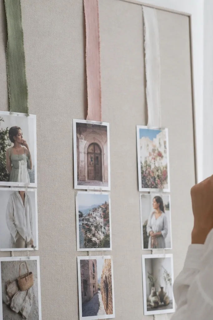
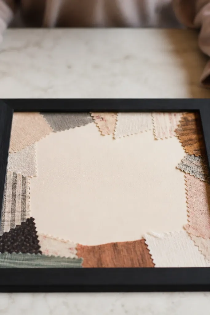
Fabric scraps add real texture that reads on camera, especially when you use them as separators instead of full backgrounds. The look is airy and artsy, but still organized because the fabric ribbons create vertical structure. You’ll pair each ribbon with one photo cluster so your categories feel like lanes. This suits bedroom walls, dorms, and desks because it feels soft and intentional without needing paint or expensive supplies.
Cut fabric scraps into strips about 1 inch wide and vary lengths so they create a rhythm across the board. Glue strips only where they meet the backing (cardboard or foam board) so the fabric lays flat. Mount photos in sections between ribbons and keep the photo edges aligned to the fabric for a clean look. Finish with a narrow paper label under each cluster written in black fine-liner.
Pro tipIron the fabric scraps first — wrinkles photograph as shadows and make the layout look sloppy.
AvoidDon’t pick fabrics that clash in color temperature (warm orange with cool gray) unless you’re intentionally going for a patchwork vibe.
4. Receipt and Ticket Micro-Goal Board
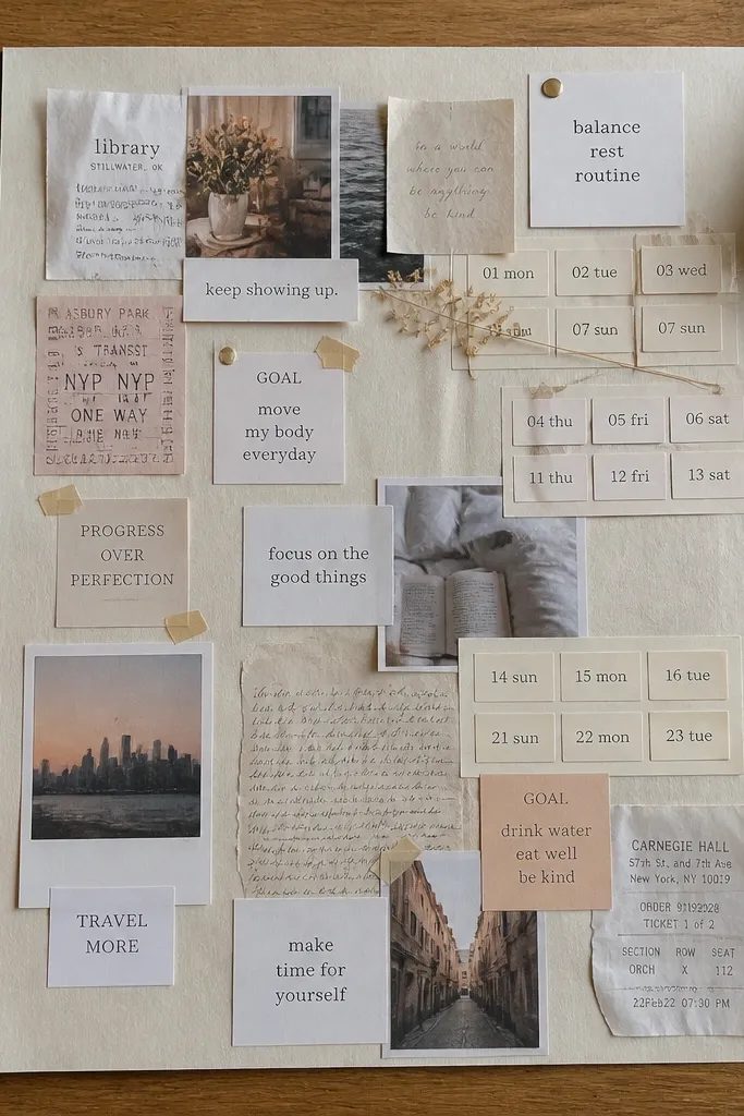
This one is visually satisfying because it mixes small paper ephemera with crisp typography. It’s also practical: you can track mini goals by date or theme without turning the board into a cluttered planner. The board looks cohesive when you keep the text style consistent and use a single background color like cream or white. It’s perfect for people who want their vision board to feel real and grounded, but still photo-ready.
Use a single sheet of thick paper or backing and cut it to your size (like 18x24). Create a border with masking tape, then place small ephemera pieces (receipts, old tickets, bus passes) in a neat grid. Add a tiny handwritten label under each item using a black gel pen. Mount each piece with glue stick so nothing lifts at the edges.
Pro tipLimit the handwriting to one font style — use block letters or cursive consistently so it looks designed.
AvoidDon’t cover the whole board with tiny scraps — leave breathing room or the page looks chaotic.
5. Magazine Cutout Color Blocks Board
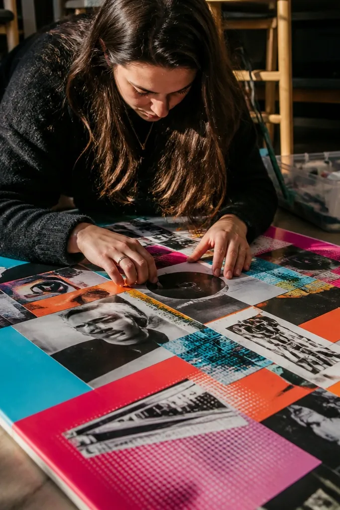
Magazine color blocks look striking because you’re using the magazine’s real printing and halftone texture as design. You build big color areas first, then place cutout words or images on top. This makes the board look like graphic design instead of a craft collage. It’s great for aesthetics-driven goals like fashion, home style, or lifestyle changes because the color energy does the selling.
Pick one base paper color like off-white and cut it to 18x24 inches. Tear magazine pages into large rectangles and glue them down in a simple layout (three big blocks is enough). Add cutout letters or keywords from the same magazine and place them centered on each block. Finish by outlining one block title with a thin black marker for sharp contrast.
Pro tipTear edges, don’t cut — torn edges create a softer transition that photographs better than perfect straight cuts.
AvoidDon’t mix too many magazines — different print tones can fight and make the board look uneven.
6. Photo Corners + Minimal Black Labels Board
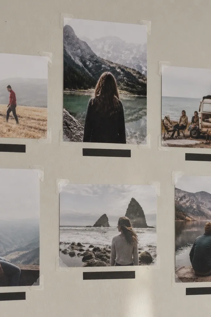
This look is clean and modern because it uses the same mounting method for every photo. Photo corners keep edges crisp, and black label strips create a readable structure. It’s one of the easiest ways to make your vision board look “professional” without spending on fancy materials. If you like simple aesthetics and want your board to photograph without glare, this is the move.
Use a plain board backing like matte white foam board or thick cardstock. Print or cut photos to a consistent size such as 4x6 inches and add photo corners at the four corners. Place a black label strip under each photo with a short word like “Fitness” or “Home.” Write labels with a fine-tip marker so the text stays sharp in photos.
Keep label text to 1-2 words and align all labels to the same baseline.
Avoid glossy printouts — they reflect light and make the board look harsh in pictures.
7. Thrifted Sheet Music Background Board
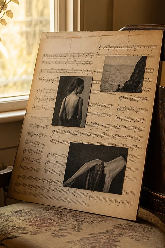
Sheet music gives you movement and pattern without needing paint, and it photographs with a vintage, artsy vibe. You keep it gorgeous by using the sheet music as a full background and then placing a few dark, high-contrast photo cutouts on top. The board stays readable because you don’t over-layer everything. This suits goals around creativity, music, writing, or any theme where you want the board to feel poetic but not messy.
Cover your backing with thrifted sheet music using a thin layer of glue stick. Tear or cut the paper edges so they don’t look too perfect, then let it fully dry flat under a book. Choose three to five hero photos and mount them with tape tabs so the edges lift slightly for dimension. Add a title label using kraft paper and glue stick for contrast.
Lightly trim the sheet music so the background stays flat and doesn’t wrinkle around photo corners.
Don’t cover sheet music with heavy glue — it soaks in and warps the paper.
8. DIY Contact Sheet Binder Pages
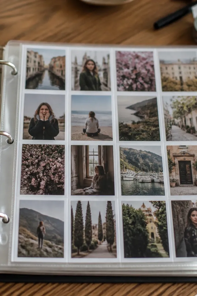
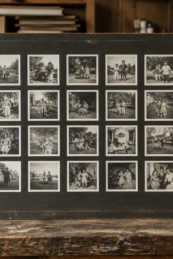
A binder format makes your vision board easy to update and easy to photograph because each page is flat inside a sleeve. The “contact sheet” layout looks tidy: photos line up in rows with consistent margins. This is the best option when you want 20 ideas but don’t want one massive poster that’s hard to store. It also lets you separate themes like style, travel, and habits into different sections.
Print or cut photos into a consistent size like 2.5x3.5 inches. Arrange them in a grid on plain paper, then glue nothing — use photo corners or place them inside clear page protectors. Put a handwritten label strip at the top of each page with a single theme word. Add one small quote or goal line at the bottom in black pen.
Use a black binder or black page protector edges so the background stays uniform in your photos.
Don’t use thick scrapbook paper under sleeves — it creates uneven thickness and can warp pages.
9. Paint Swatch + Photo Overlay Board
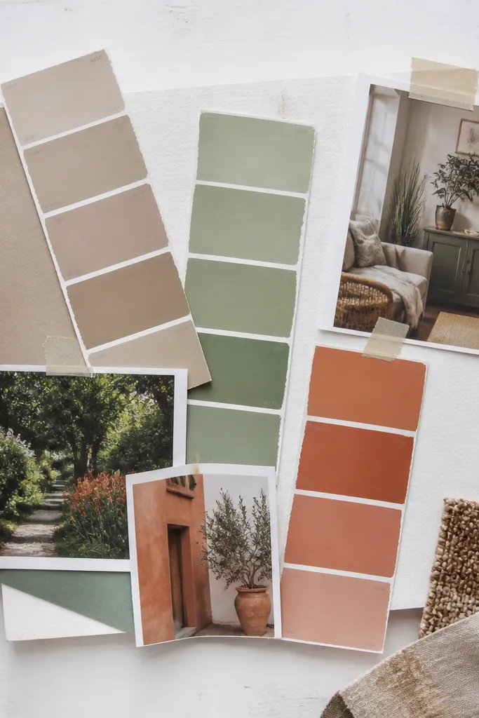
Paint swatches are made for looking good together, and they give you an instant color system. Overlaying photos on top keeps it personal while the swatches keep it cohesive. This is a smart aesthetic move for home goals, color palettes, and mood-based inspiration. It photographs cleanly because the swatches are flat, uniform shapes that read like design elements.
Grab paint swatches from leftover sample cards or cut sections from old paint sample boards. Arrange swatches in a row or two-column grid on your backing and glue them down. Add photos on top using thin tape borders so you can remove and swap later. Label each swatch with the color name or a short note like “warm white” or “terracotta.”
Choose swatches that all share the same undertone (warm or cool) so the board feels intentional.
Don’t mix neon colors with muted tones unless you plan to make neon the hero.
10. Old Maps with Compass Rose Corner Frames
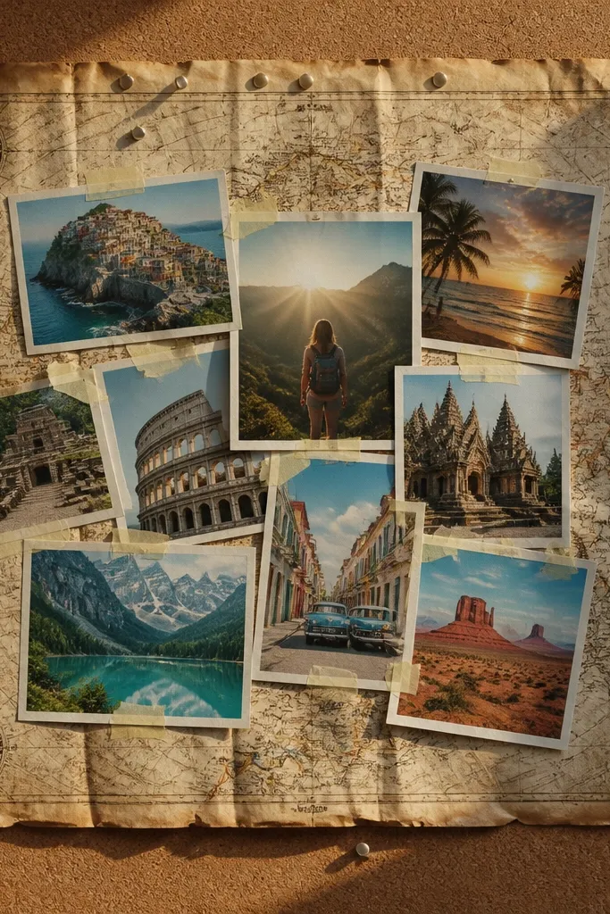
Maps add instant story and texture, and you can make the layout look styled by using compass rose motifs or simple corner frames. Put the map as your background, then mount photos in the center with corner decorations. This works especially well for travel goals, new beginnings, or any theme where you want movement and direction. The board stays photogenic because the map pattern gives depth behind your images.
Cover your backing with old map pages or printouts, smoothing them flat with a glue stick and drying under a book. Cut a few compass rose shapes from scrap paper or use printed motifs. Place the compass rose in two opposite corners while keeping the center open for a photo cluster. Add a title at the top and one handwritten directional note like “North Star” or “Next Trip.”
Use a dark pen for titles so the text stands out against map lines.
Don’t place photos directly on the most dense map areas — the pattern competes with your images.
11. Tea-Stained Paper + Sepia Photo Mood Board
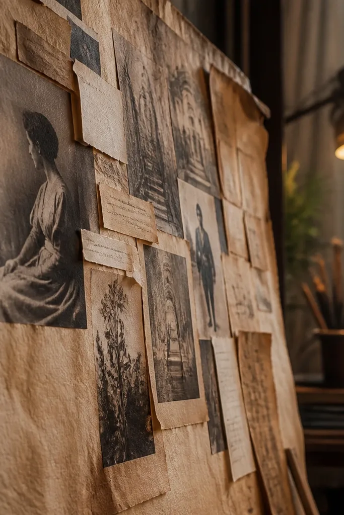
Tea-stained paper gives you that warm, antique look without buying special paper. When you pair it with sepia-toned photos or black-and-white cutouts, the whole board looks cohesive and cinematic. This style is great for a cozy aesthetic, journaling goals, or a “slow living” vibe. It also photographs beautifully because the stain creates a natural gradient that looks intentional.
Brew black tea, let it cool, then lightly brush or sponge the paper until it shows an even tint. Dry it completely, then press it under books so it stays flat. Cut photos into consistent shapes and mount them with glue stick or tape tabs. Add labels with a dark marker and keep the text minimal so the stained background stays the star.
Use a hairdryer on low speed to speed up drying, then press flat for 30 minutes.
Don’t soak the paper — puddles create blotches that show up in photos.
12. Foil Tape + Monochrome Photos Board
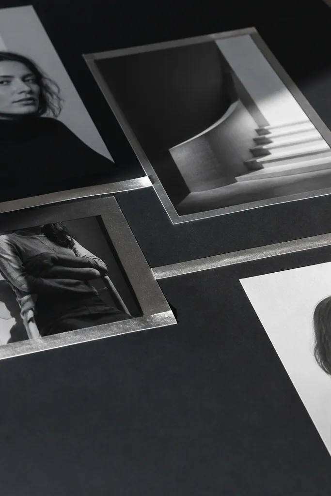
Foil tape is the easiest way to add “expensive” shine to a budget board, but only if you use it sparingly. This look uses monochrome photos so the foil becomes the accent, not a distraction. The result is sharp, modern, and very photogenic because the shine catches light in a controlled way. Great for goals tied to style, confidence, and clean design aesthetics.
Choose 6-10 monochrome photos and print or cut them to consistent sizes like 4x4 or 4x6. Mount them on matte black or dark gray paper so contrast is strong. Apply thin foil tape lines between photo blocks to create borders or diagonal accents. Write small black or white labels on paper strips and glue them under each image.
Pro tipTest foil tape placement on scrap first — too many lines make it look like a craft fail.
AvoidAvoid covering large areas with foil — it looks cheap and can ruin photo readability.
13. Linen Scrap Frame Mat Board
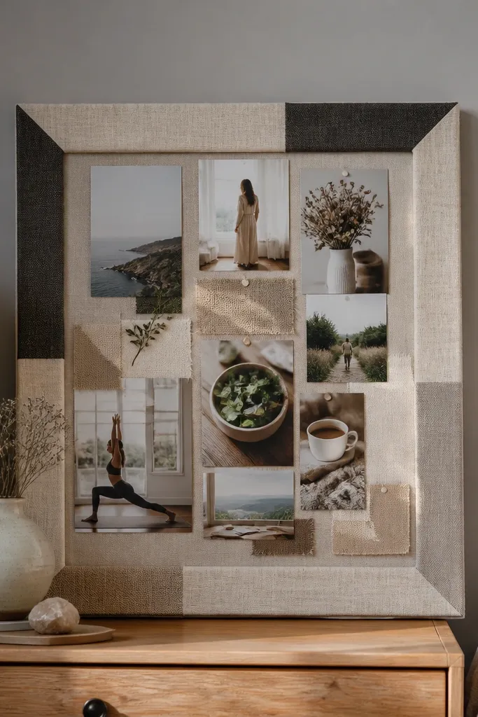
A linen scrap mat makes your vision board feel like framed art even when you build it from leftovers. You create a border with fabric strips, then mount a central collage for the main focus. The texture gives softness, while the border creates a clean edge that reads in photos. This suits bedroom aesthetics, calm goals, and anyone who likes neutral colors and tactile detail.
Cut your backing to size and lay fabric strips around the edges like a picture frame. Use spray adhesive on the back of the fabric or a thin glue line along the backing so the fabric stays flat. Leave a clear center area for your photo collage, then mount photos in a tight grid. Add a small title label on the bottom fabric strip using fabric-safe glue stick.
Use fabric that’s already hemmed or cut edges that won’t fray — fraying looks messy on camera.
Don’t use thick, stretchy fabric — it warps and creates bubbles that show up under lighting.
14. Threaded String Map Lines Board
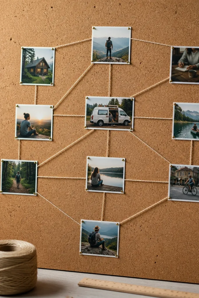
This board looks like a modern pinboard because string lines guide your eye from photo to photo. You use small push pins or tack dots to anchor thread, then connect the images into a path. It’s visually striking and also makes the board interactive — you can re-route the “plan” as your goals change. This is a great fit for planning goals, study goals, or anything you want to show as a journey.
Start with a cork sheet or a thick foam board covered in fabric. Pin or tape your photos in a rough line or cluster. Use colored embroidery thread to connect them — stretch the thread between pins and keep it tight. Tie off the thread at the last pin and trim ends close, then add a short handwritten title near the top.
Use one thread color for the whole board so it reads as intentional, not random.
Avoid loose thread — sagging lines look messy and won’t photograph cleanly.
15. Shadow Box Layered Paper Board
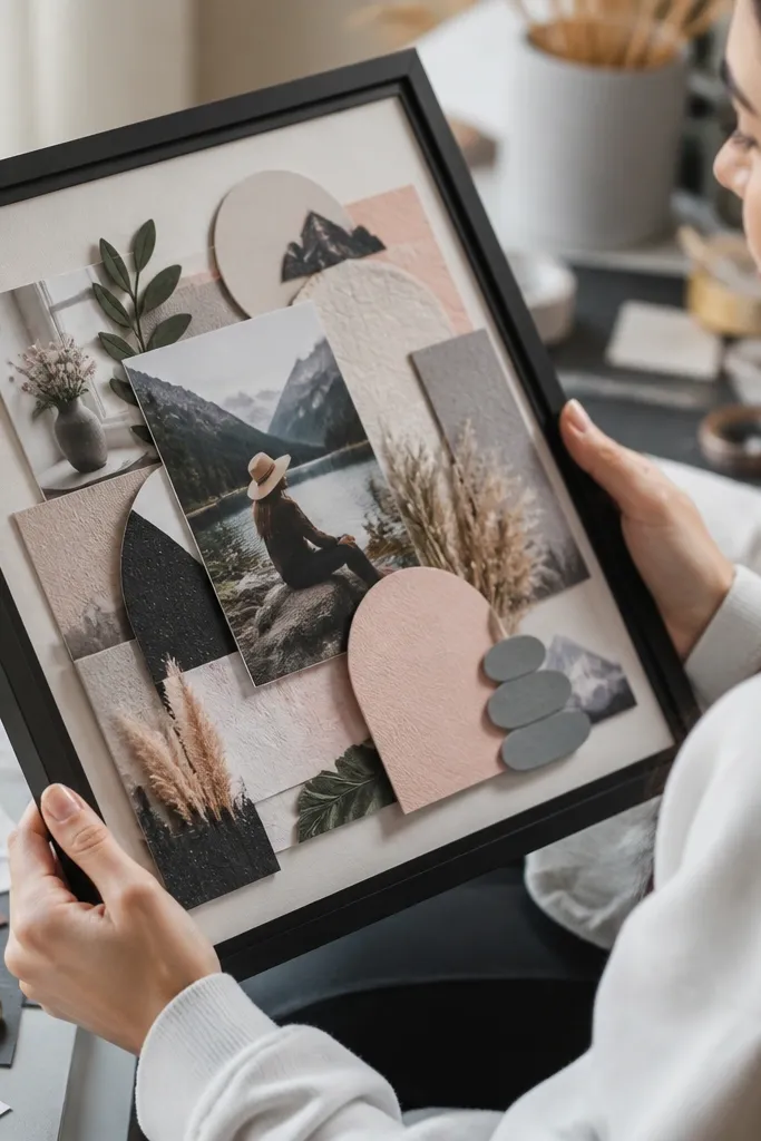
A shadow box look is gorgeous because it creates dimension without needing a real shadow box. You build depth by layering paper cutouts and using foam tape for the top elements. The result is that your board has a “3D” feel in photos, even when everything is paper and tape. It’s ideal for fashion, home styling, or any theme where you want the images to feel layered and dimensional.
Cut your backing from thick cardboard and cover it with a matte background paper like kraft or cream. Build a base layer of photos and magazine shapes, then add raised cutouts using foam tape strips. Keep the raised elements to two layers max so the board doesn’t look lumpy. Finish with a title at the top and small handwritten notes tucked under the raised pieces.
Pro tipUse 1/4-inch foam tape for a controlled raise; thicker makes edges look chunky.
AvoidDon’t stack five layers of paper — it becomes too high and casts ugly shadows.
16. Thrifted Postcards + Corner Tacks Board
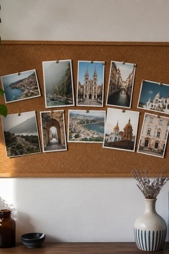
Postcards look instantly curated because they’re already graphic and sized for display. When you mount them with corner tacks or small tape tabs, the board looks like a real wall collage. This is a strong choice if you want travel, art, or lifestyle inspiration that looks cohesive without lots of cutting. The board is also easy to rearrange, which helps when you refine your goals.
Use a corkboard or a fabric-covered board as your base. Pin postcards at consistent angles or keep them all straight for a cleaner look. Add one thin border of tape around the outside edge to make it feel finished. Write one short theme label near the center and use small stickers or cut paper tabs for sub-labels.
Pro tipChoose postcards with a shared color theme like sepia, cream and black, or blues to keep it cohesive.
AvoidDon’t pin every postcard edge flat — stagger slightly so the collage feels intentional, not like a storage dump.
17. Monochrome Newspaper Tear + White Ink Titles
Newspaper tears give you texture and movement, and the monochrome palette looks bold in photos. You’ll make it aesthetic by using only a few hero images and then adding white ink titles on dark paper pieces. This creates a graphic, high-contrast look that reads from far away. It’s a good choice for goals around clarity, focus, learning, and building routines.
Tear newspaper into irregular rectangles and glue them down as a background layer. Add one or two larger photo cutouts in the center and keep the rest minimal. For titles, glue a small dark paper square and write the title with a white gel pen. Seal nothing; let the matte paper absorb light for a softer look.
Use a stencil for letter shapes if your handwriting is uneven — crisp text makes the whole board look better.
Avoid gluing wet paper — it warps and creates bubbles that show up under camera flash.
18. Color-Coded Habit Tracker Grid Vision Board
A habit tracker grid is photogenic because it’s structured, and structure reads as “design.” You combine small icons or mini photos with a clean grid, then color-code the categories so the board looks organized at a glance. This is ideal when your vision board needs to be practical, not just inspirational. It also gives you a way to show progress visually without turning the board into a spreadsheet.
Draw or print a grid on thick paper with consistent rows and columns (like 4 columns by 5 rows). In each section, paste a tiny photo cutout or an icon and add a short habit label. Use three marker colors max to color-code categories, and keep the rest black for readability. Add a key in the corner with a small legend and keep it aligned.
Use ruler lines and keep marker strokes light — thick marker can bleed and look messy in photos.
Don’t overload each grid cell — one photo or one icon per cell keeps it clean.
19. Scrapbook Paper Frames Around Thumbnails Board
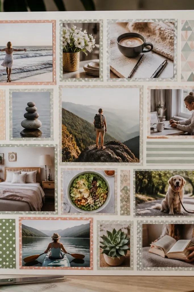
Patterned scrapbook paper frames make the board look styled because each photo has a designed border. The trick is to keep the number of patterns low and repeat one or two papers across the board. You end up with a cohesive set of thumbnail images that looks like a magazine layout. This works best for themes like style inspo, room goals, or a “gallery wall” vibe on a budget.
Pick 2-3 scrapbook paper designs and cut them into frame pieces sized to fit your thumbnails (like 3x4 inch frames). Mount a thumbnail in the center of each frame using photo corners. Arrange frames in a grid on your backing and glue only the frame edges so the photo stays flat. Add a simple title strip at the top with a contrasting paper color.
Pro tipRepeat the same frame paper for all photos — repetition makes it look intentional, not random.
AvoidAvoid using five different patterns — it reads busy and kills the aesthetic.
20. Pressed Flower Corner Accent Vision Board
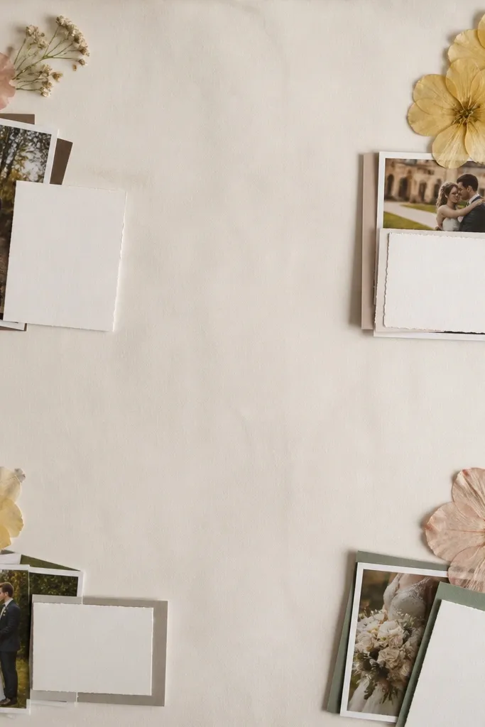
Pressed flowers add a delicate, high-end feel, but only when you keep them minimal. Use them as corner accents or tiny details near titles, not as full background coverage. This look is romantic and photogenic because the textures catch light softly and add a natural color pop. It’s great for wellness goals, creative projects, or any theme that needs gentle energy.
Press flowers between heavy books for at least 1-2 weeks, then cut a small corner area where you’ll place them. Seal the flower by placing it under a thin layer of matte tape or a clear adhesive sheet so it doesn’t crumble. Mount your main photo clusters normally, then add the pressed flower in one corner with a small title nearby. Write your main goal in black marker so it stays readable against the delicate detail.
Pro tipKeep flowers to one color family so the accents don’t fight your photo palette.
AvoidDon’t place flowers directly under glossy glue — it can turn them translucent and spotty.