
1. Polaroid Grid Board (12-photo storyboard)
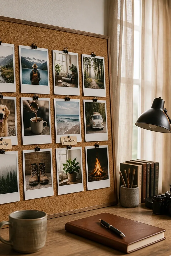
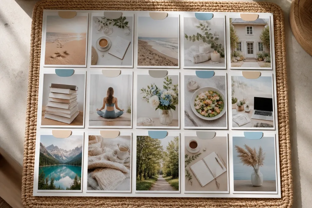
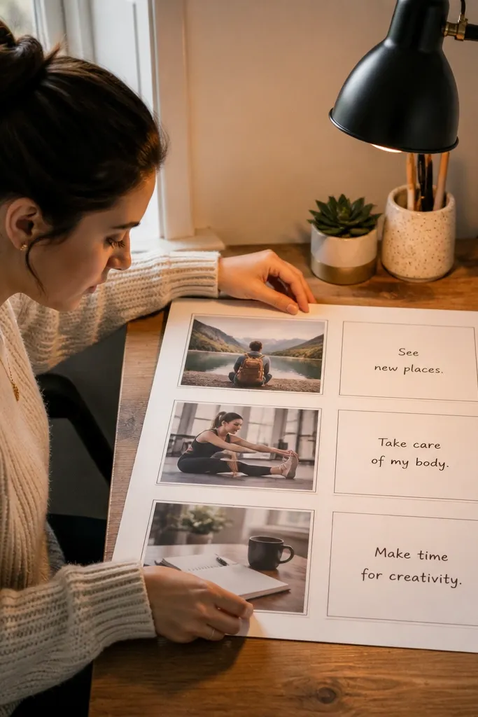
This template is the fastest way to get a good-looking board without overthinking. It turns your ideas into a storyboard: each “photo tile” becomes one clear target or theme, so your board reads like a plan instead of a pile of images. Use it if you want a clean, Instagram-friendly look that still works with magazine cutouts. The rounded tiles hide small cutting mistakes and make everything feel cohesive. It’s beginner-friendly because you only repeat one shape, and the layout stays consistent across all 12 squares.
Cut a piece of matte craft cardstock to your preferred size, then draw a grid for 12 tiles. Make each tile 3.5 x 4.5 inches with 0.5-inch gaps, and leave a 1.25-inch title strip at the top. Round the corners by tracing a quarter-circle corner template or using a corner punch, then trace and cut your photo mounts to match. Arrange the tiles first without glue, then add your title text on the strip using a thick marker or paint pen. Seal everything with a light matte spray or a thin matte Mod Podge coat on top of the collage.
Pro tipUse a paper cutter for the mounts; uneven tile edges are what make this look “crafty” instead of designed.
AvoidDon’t mix glossy magazine pages with matte paper on the same tile — the glare will make the board look uneven.
2. Two-Column Goal vs. Proof Layout
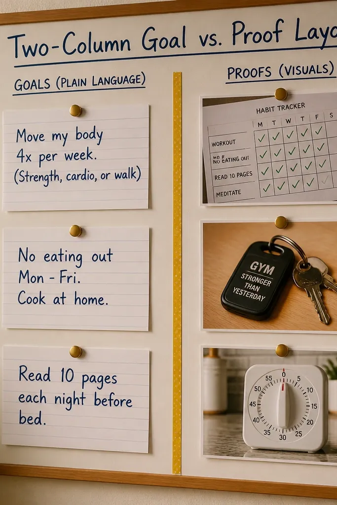
This template is for when your vision board feels vague. The left side forces you to write what you want in plain language, and the right side gives you “proof visuals” like habits, tools, places, or outfits that represent progress. It looks sharp because the columns create a built-in structure, and the contrast between text blocks and image circles makes it visually interesting. Beginners like this because it stops the board from becoming only pictures. It’s also great for goal-setting rooms, like a desk board or a small hallway wall piece.
Start with a base sheet of matte cardstock and mark a vertical center line. Create a left column for text blocks sized about 3.5 x 2 inches each, and a right column for circle photo frames about 3.25 inches wide. Write 4-6 goals on the left using short phrases, then fill the right with corresponding images in circles. Glue text blocks first, then add circle frames, leaving a consistent 0.75-inch margin between elements. Finish by sealing the full surface with a matte coat so edges don’t lift.
Pro tipUse one font style for every goal (all caps or all lowercase) to make the left column look intentional.
AvoidDon’t put long paragraphs on the left — keep each goal under 5 words so the layout stays readable.
3. Color-Block Mood Board with Fabric Swatches
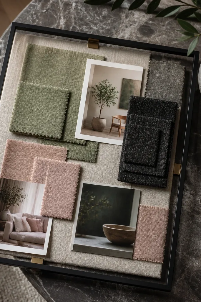
If you want your vision board to look like home decor, this is the template. It treats your goals like a color story, then backs it with real texture using fabric swatches. The result looks layered and expensive even when you’re using scraps. This is best for beginners who struggle to find the right words, because you can express your direction through color, pattern, and texture. It also photographs cleanly because the blocks create large visual areas with clear edges.
Pick 5 to 7 mood colors and cut rectangular paper blocks sized roughly 3 x 4 inches each. Arrange them in a grid with intentional spacing, then label each block with a tiny tag like “weekend calm” or “creative energy.” Add fabric swatches by gluing fabric onto thin cardstock first, trimming flush, and then attaching the swatches over the matching color blocks. Layer small cutout icons or magazine fragments on top of two blocks max so it doesn’t get busy. Seal the finished board with matte medium, keeping the coat thin so fabric texture stays visible.
Choose fabrics with a clear weave (cotton, linen, denim scraps) for the best texture read on camera.
Don’t overfill the board with tiny cutouts; this template looks best with big blocks and a little restraint.
4. Monthly Check-In Calendar Vision Board
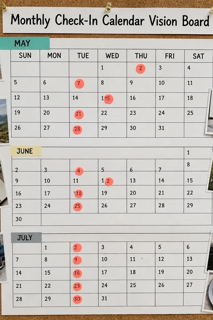
This template is for people who need momentum. Instead of one big theme, it gives you a month-by-month structure, so your board feels active and current. The look is tidy and graphic, with clean lines and highlighted dates that pop. It’s beginner-friendly because you’re repeating a calendar grid pattern and adding only small icon choices. Use it for a fridge or a corkboard because the check-in dates make it feel practical, not decorative.
Draw a 4-week grid on matte paper, using 1.5-inch squares with 0.25-inch gaps. Add a header bar at the top with the month name and a short intention line. In each weekly row, add one icon or word label in the top corner of the week box, like “prep,” “practice,” or “apply.” Highlight 3-5 dates with a colored marker, then glue tiny paper callouts next to them. Seal with matte medium only after all glue is dry so lines don’t smear.
Pro tipUse one highlight color for dates and one accent color for labels; too many colors turns it into clutter fast.
AvoidDon’t write tiny text inside every square — keep the calendar boxes for icons and date highlights.
5. Manifestation Map with Arrows and Path
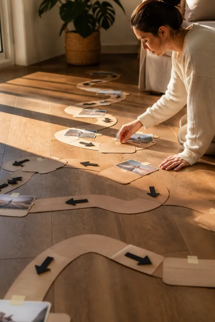
This template makes progress feel like a route. You lay out a path of milestones, and each stop gets images and a short phrase, so your board tells a story in one glance. It looks dynamic because arrows create motion, and the milestone labels give it a designed, infographic vibe. Beginners like it because the structure tells you what to place where. It’s especially good for career shifts, fitness goals, or any “step-by-step” plan where you need direction, not just inspiration.
Choose a vertical base sheet and draw a path line from bottom to top using a thick marker. Add three milestone boxes along the path, each about 4 x 2 inches, spaced evenly. Put a small image cluster next to each milestone (2-3 cutouts max) and write one short line inside each box. Add arrowheads between milestones, then connect them with a thin line so the path looks intentional. Finish by sealing the collage and leaving the arrow line crisp with light coats.
Pro tipPrint or cut your milestone labels with a consistent paper color (like off-white) so the map feels unified.
AvoidDon’t add more than three milestones — the board stops reading as a path once you overload it.
6. Scrapbook Layered Frames Template
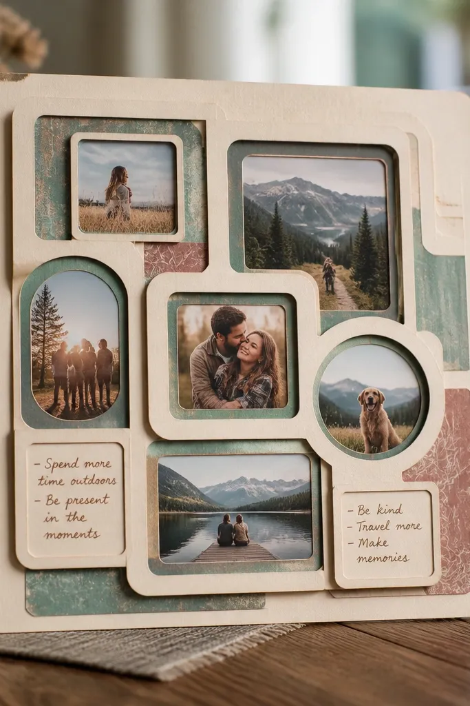
This is the template for people who have a box of random scraps. It turns mismatched cutouts into a cohesive look by putting everything inside layered frames. The “frame within a frame” style makes it forgiving if your photos vary in size, because you’re hiding differences under mats and overlaps. It looks aesthetic because torn edges and paper mats create depth. Beginners can pull it off quickly since you only repeat the framing technique. It suits desks, bedrooms, and any space where you want a cozy, handmade feel.
Start with a kraft or matte neutral base and cut three to five photo frames from cardstock, each slightly larger than the last. Create mats by cutting a second inner opening for each frame, leaving about a 0.5-inch border. Layer frames on the base, then glue cutouts inside the openings. Add a torn-paper accent strip behind one frame to create texture, then glue it down first so it anchors the layers. Seal the whole piece with matte medium, focusing on the edges where paper tends to lift.
Pro tipUse the same border color for every mat even if the photos change; it’s the easiest way to keep it cohesive.
AvoidDon’t glue everything flat — add one or two layers with thin foam tape so the board has visual depth.
7. Travel Dream Board with Ticket Stubs
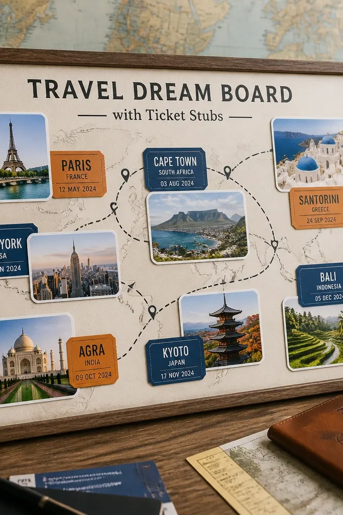
This template makes destinations feel specific instead of generic. You build a board around route lines and “ticket stub” labels that name places, dates, or experiences you want. It’s visually satisfying because the ticket shapes repeat and create a pattern, even if your photos vary. It’s beginner-friendly because you only need to collect a few destination images and then match them to stub labels. Great for a bedroom wall or a travel corner where you want motivation that looks like memorabilia.
Cut a base from matte cardstock and draw a simple route line across it. Create 5 to 8 ticket stub labels from cardstock, about 2.5 x 4 inches, with rounded ends using scissors. Glue destination photos behind or beside each stub so the stub label sits on top. Add small route lines with a thin marker connecting the stubs, then write one short experience under each destination like “food market” or “museum day.” Seal with matte spray, keeping the route line dark by going light on coats.
Pro tipUse a single ink color for all stub text (black or dark brown) so the board stays crisp.
AvoidDon’t use too many tiny destinations — this template looks best with 5 to 8.
8. Before You Start Checklist Board (Habit + Reward)
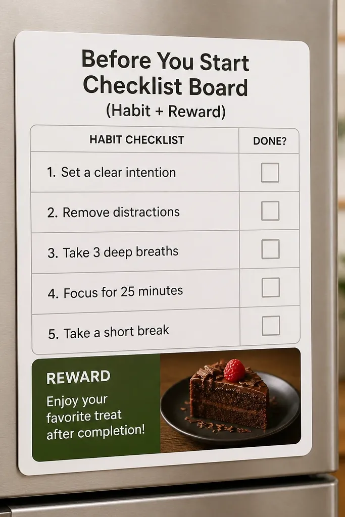
This template turns inspiration into repeatable action. It has a checklist for the habit you want and a reward box that makes the habit feel doable. The look stays clean because checkboxes create a grid, and the reward box adds one focal point. Beginners like it because it’s straightforward: pick one habit, list 3 steps, then attach 1 visual reward. It works well for kitchens, bathrooms, and anywhere you need a prompt you’ll actually see.
Use matte cardstock and draw a left-side checklist area with 3 checkboxes sized 1.5 x 1.5 inches. Write one habit name at the top and keep the checklist items short, like “set timer,” “start for 10 minutes,” “put it away.” On the right, create a reward box sized 3 x 3 inches and glue one image that represents the reward. Add a small line under the reward box for “after I finish, I will...” so the prompt feels complete. Seal once everything is glued, using a thin matte coat over the paper edges.
Pro tipWrite checklist items in thick marker so they stay readable when you mount the board.
AvoidDon’t include more than 3 checklist steps — extra steps make it harder to follow.
9. Gold Foil Frame Collage with One Accent Color
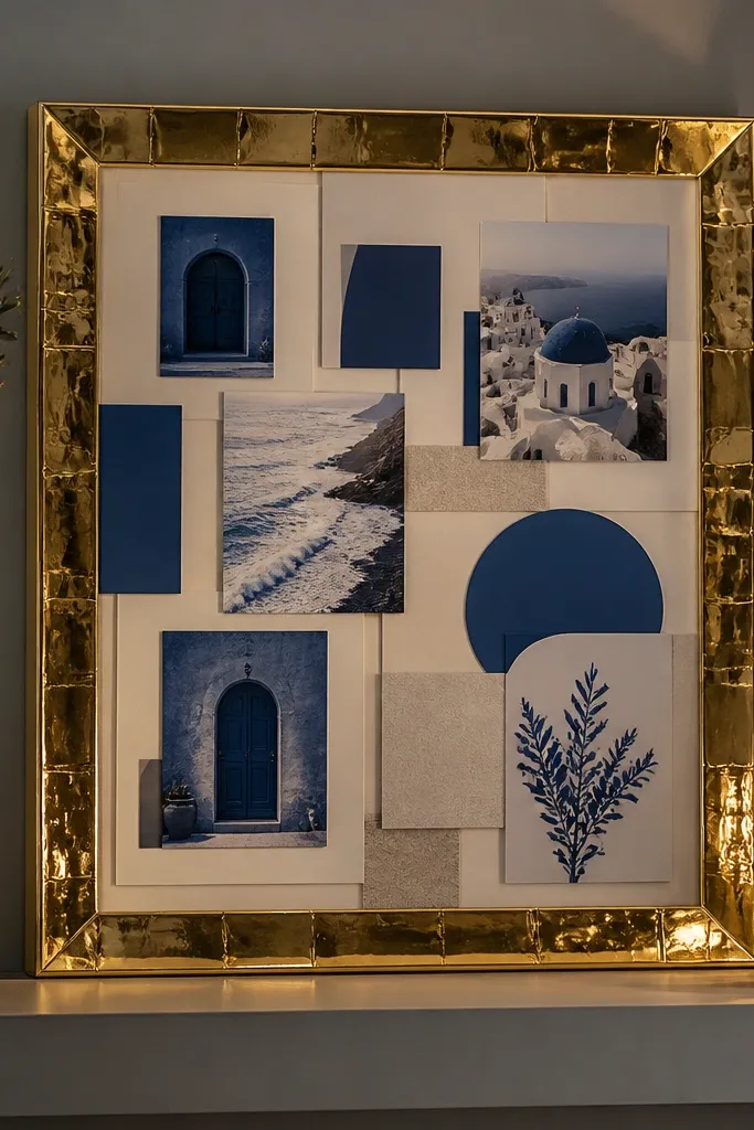
If your boards usually look messy, this template forces a polished finish. You build a strong border using gold foil paper or gold tape, then limit the rest to one accent color plus neutrals. The result looks styled and intentional because your eye lands on the images inside the frame. Beginners can use magazine cutouts, printouts, or fabric textures; the frame does the heavy lifting visually. It’s a great pick for anyone who wants a “luxury” look without buying expensive kits.
Create a base on matte cardstock. Cut a frame border strip from gold foil paper or apply gold tape in a rectangle, leaving a 1-inch inner margin. Inside the frame, place 6 to 10 image cutouts, keeping them mostly monochrome or in neutral tones. Add text labels only in your one accent color, and keep the labels short and aligned to the same edge. Seal with matte medium so the foil stays bright but doesn’t smear.
Pro tipChoose one font weight for labels and keep them all the same size; it makes the frame look designed.
AvoidDon’t add multiple accent colors; it kills the clean, framed look.
10. Vision Board in a Repurposed Jewelry Tray Layout
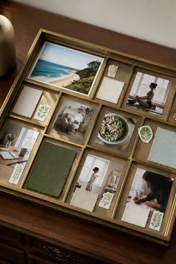
This template is for people who want a vision board that’s functional and pretty on a dresser. A shallow jewelry tray creates natural sections, so your images and notes stay organized. It looks aesthetic because the tray edges frame the collage, and you can mix small cards, stickers, and fabric scraps without chaos. It’s beginner-friendly because you’re working within a limited boundary, so placement is easier. Great for “soft goals” like self-care, outfit goals, or creative routines where you want a daily glance.
Find a shallow jewelry tray and clean it thoroughly. Line the tray bottom with matte craft paper, trimming to fit and using spray adhesive or thin Mod Podge. Create small photo cards sized 2 x 3 inches and write one-word labels on the back or on a corner tag. Arrange cards in rows, then anchor fabric scraps or sticker accents in the empty spaces. Seal the paper lining lightly so it resists dust, then store the tray away from direct water splashes.
Pro tipUse a tray with straight sides for the cleanest look; curved trays can warp paper edges.
AvoidDon’t skip lining; bare tray surfaces can make paper peel and curl.
11. Dreamboard with Magazine Collage Waves
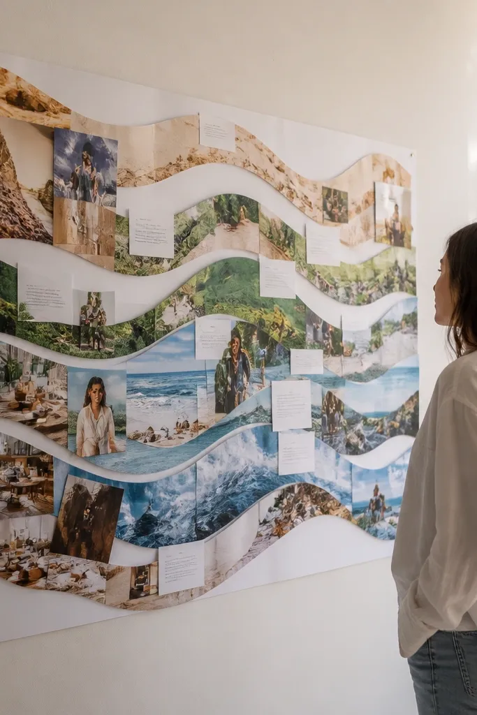
This template looks artsy without being chaotic. Instead of scattering images, you arrange them into wave bands, which creates strong movement and a clear structure. It’s photogenic because the waves guide the eye across the board, and the curved edges make the collage feel intentional. Beginners can use whatever scraps they have, as long as you place them into the wave bands. It suits creative goals, art spaces, and anyone whose vision board needs more energy than a grid.
Draw three horizontal wave lines across a matte base, leaving space for a centered title at the top. Cut or tear your images into pieces that fit the wave width and glue them along the wave lines so the bands look layered. Keep each wave band mostly in one color family for cohesion, like warm tones in wave one and cool tones in wave two. Add small text labels under the waves, aligned to the left edge of each band. Seal with matte medium, applying carefully so torn edges stay crisp.
Pro tipTear the top edges of pieces slightly — it makes the wave bands look smoother than straight-cut collage blocks.
AvoidDon’t overstuff the waves; leave some negative space between bands so it reads clearly.
12. Checklist + Quote Panel Board (3 panels)
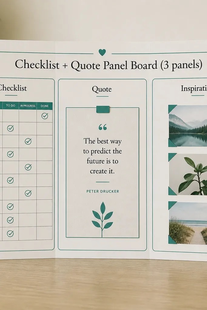
This is the template for when you want a board that looks like something you’d buy, not something you cobbled together. It uses three vertical panels with different roles: action checklist, a short quote or mantra, and an image cluster. The panel structure gives you hierarchy and keeps the board from feeling flat. Beginners like it because each panel has one job, and you don’t have to invent a complex layout. It’s a great fit for study spaces and bedrooms where you need both motivation and a plan.
Cut a base and divide it into three vertical panels, each about 4 inches wide if your board is 12 inches across. In the left panel, draw 4 checkboxes with a short habit label above them. In the middle panel, add a quote in 2-3 lines using a marker or printed text, then surround it with a thin paper border. In the right panel, glue a small collage cluster of 6-8 images, keeping them within the panel edges. Seal the entire board with matte medium, and let it dry flat under weight.
Pro tipUse the same border color around all panels to make the board look designed even with mixed materials.
AvoidDon’t pick a long quote; keep it under 12 words so the panel stays balanced.
13. Goal Categories Board with Sticky-Note Windows
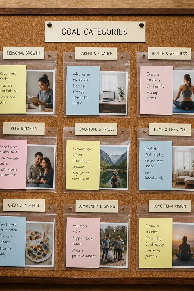
This template is for people who hate making a new board every week. You build category sections, then use “windows” for notes and small printouts you can swap later. The look stays clean because everything sits inside the same pocket shape, and labels keep it organized. Beginners can do it with simple sheet protectors or clear pocket sleeves cut to size. It’s especially good for desks, planners, and anyone who wants their vision board to change without looking messy.
Choose a base and create 4 category headers at the top, like Health, Work, Relationships, and Money. Under each header, measure a pocket window area about 4 x 3 inches and cut clear sleeves to fit. Glue or tape the pocket edges to the base, then slide in small photo printouts or handwritten notes. Add one small icon next to each category header to make scanning easy. Seal around the pocket edges only if your adhesive needs extra hold; keep the clear window surfaces clean.
Label headers with a thick marker first, then add the pocket so the text stays crisp and centered.
Don’t use cheap glossy sleeves; glare makes photos look washed out.
14. Upcycled Book Page Vision Board with Cutout Window
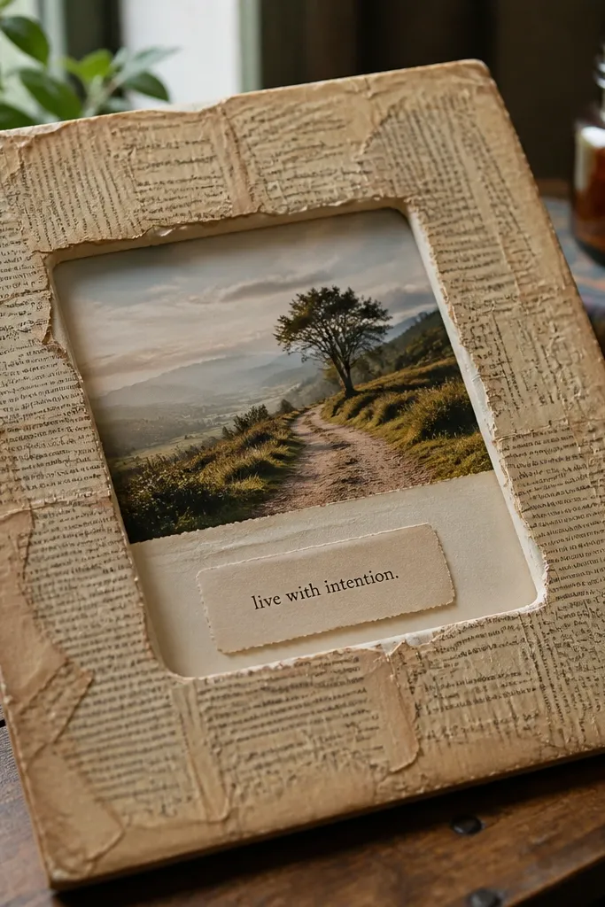
This template is for a specific look: vintage paper texture plus one clean focal window. You cover the base with upcycled book pages for instant character, then create a cutout window in the center where your best photo and one short goal line live. The window makes the board feel intentional, not busy, because everything else acts like a muted background. Beginners can handle this since it’s mostly layering and trimming, not fine art skills. It’s great for a cozy corner, a reading nook, or any space that needs warmth.
Tear or cut book pages to cover a matte base sheet, overlapping slightly to avoid bare spots. Brush a thin layer of Mod Podge over the pages and smooth wrinkles flat so it dries flat. Cut a central rectangle window about 4 x 6 inches and back it with a photo print or collage. Add one short goal line under the window using a dark marker, then glue small paper scraps around the window corners for framing. Seal over the entire base with matte medium, keeping the window area protected from excess glue.
Use smaller tears for the edges near the window — it blends the background better than large chunks.
Don’t saturate the book pages; too much medium makes them warp and curl.
15. Fabric-Covered Clipboard Vision Board
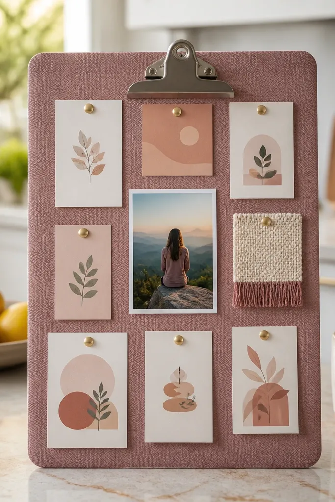
This template looks like a styled organizer, not a craft project. A clipboard gives you a ready-made frame, and fabric covering adds texture that photographs well. You pin or adhere cards for goals, habits, and reminders, so your board stays practical and easy to update. Beginners like it because the clipboard hardware handles the “mounting” for you. It fits a home office, kitchen, or entryway where you need a daily glance.
Cover a clipboard board with fabric by wrapping it tightly around the back and gluing the edges to the underside. Trim the fabric cleanly at the corners and add a thin coat of matte medium over the fabric surface if you want extra durability. Create three priority cards sized about 3 x 4 inches and write one sentence on each, like “Send the application” or “Pack gym bag.” Pin the cards using binder clips or small push pins, and tuck small photo cutouts behind the pinned cards. Seal only around the card edges if you’re using adhesive, and keep the fabric from getting soaked.
Match fabric to your palette first, then choose card colors that contrast (cream cards on dark fabric look best).
Don’t cover the clipboard with stretchy fabric; it puckers at corners.



