
1. Cream Paper + Black Index Grid Board
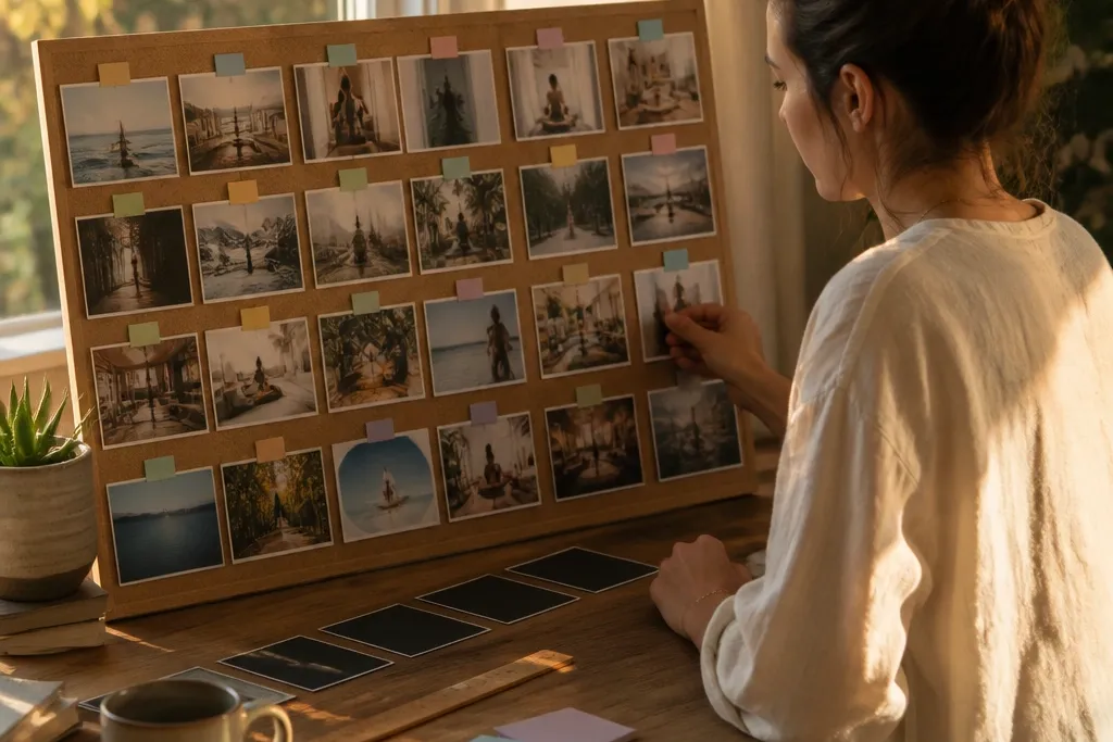
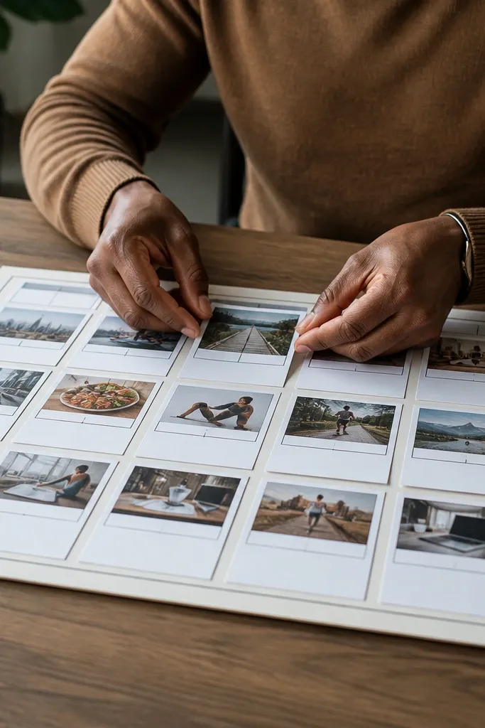
This is the vision board look that feels calm but still directs your attention. The trick is an index-style grid — think library labels — with strict alignment, so your brain reads it as a system instead of a scrapbook. Use only two fonts or two text styles on the whole board: one for the weekly goal and one for subjects. The board boosts focus because the grid forces comparison: you can instantly see which subject block is winning this week and which one needs a swap. It’s also photogenic — cream background and black accents photograph cleanly and don’t look messy even with a few images.
Start with a foam board or thick poster board painted matte cream (spray paint works; let it cure fully). Draw a light grid with a ruler and pencil, then add black paper tabs along the top row for each subject. Print or cut small photos (one per subject) and glue them into their grid cells, keeping the same photo size each time. Add a weekly goal box at the center using black cardstock and white gel pen, then finish with a few tiny label stickers so it looks “indexed,” not random.
Use a white gel pen only for short words on dark labels; it keeps the board readable in photos and in real life.
Don’t mix bright backgrounds with black text — it makes the whole board visually loud.
2. Fabric Swatch Study Board With Velcro Swapping
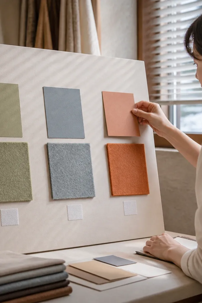
This board looks soft and intentional, but it’s built for action. Fabric swatches kill the “flat collage” vibe and give you a tactile focus cue. Each swatch holds one study category, and the matching notes attach with Velcro, so you can swap weekly targets without tearing paper. The focus boost comes from repetition: the same categories live in the same spots, and your brain learns where to look. It’s also super photogenic because fabric textures show up on camera even when the board is simple.
Pro tipChoose one fabric family (all cotton or all canvas) so the textures match; mixed materials look chaotic fast.
Cover a corkboard or a thin wood panel with neutral fabric (canvas or cotton) and staple the edges on the back. Cut small fabric squares and stitch or glue them onto the front in a grid, leaving a consistent margin between blocks. Place hook-and-loop Velcro squares on each swatch and on the back of your printed cards. Write one weekly target per card, attach them, then add tiny binder clips for extra visual structure if you want it to look styled.
AvoidDon’t use glossy fabric or satin — it reflects light and ruins readability.
3. Wall Frame Gallery With One Word Per Frame
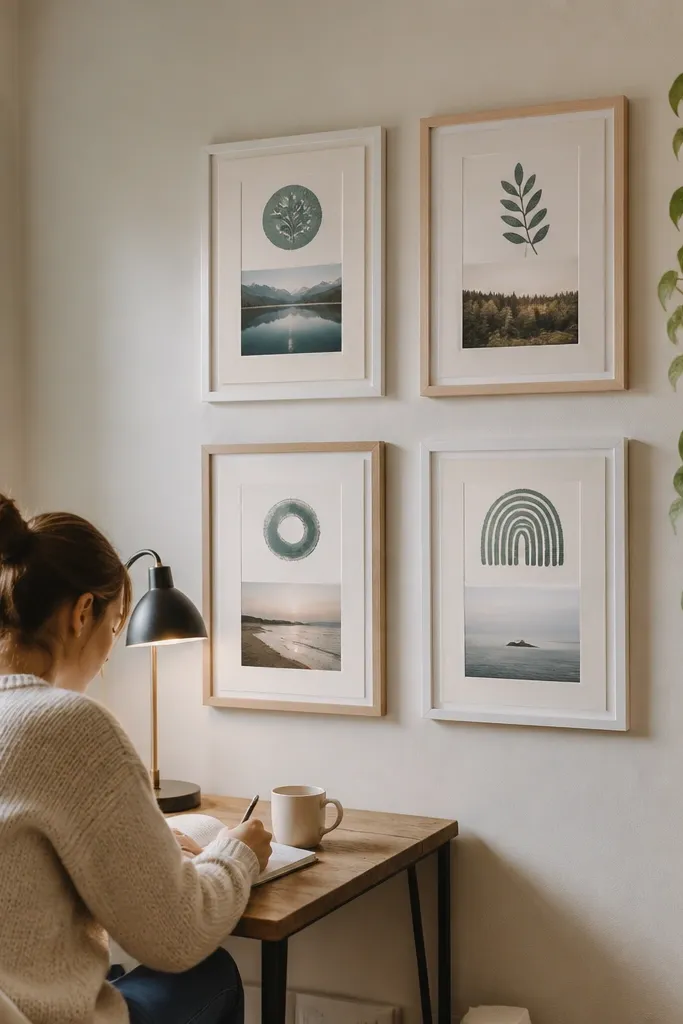
If your current board feels overwhelming, this one solves it by going strict. Multiple frames look like a gallery wall, which instantly upgrades the aesthetic. Each frame holds one word that represents a study mode: Focus, Practice, Recall, or Review. Pair each word with one small photo and one short line of text, so it stays bold and readable. The focus boost is psychological: fewer decisions, faster start. You’re not scanning a collage; you’re choosing a mode in one glance.
Pro tipKeep the words under 8 letters and use the same font weight across all frames for a cohesive look.
Pick three to five matching frames in the same finish (matte black, brushed wood, or white). Remove the glass if it’s heavy and cover the backboard with matte paper or fabric. Print your one-word prompts in a consistent size, then glue them to the center and add a tiny photo at the bottom corner. Hang the frames in a tight vertical line above your desk or stagger them as a clean grid on a wall. Use spacers or double-sided mounting tape so the gaps stay even.
AvoidDon’t add extra quotes inside frames — it turns the gallery into clutter.
4. Book Spine Subject Ladder (Upcycled Racks)
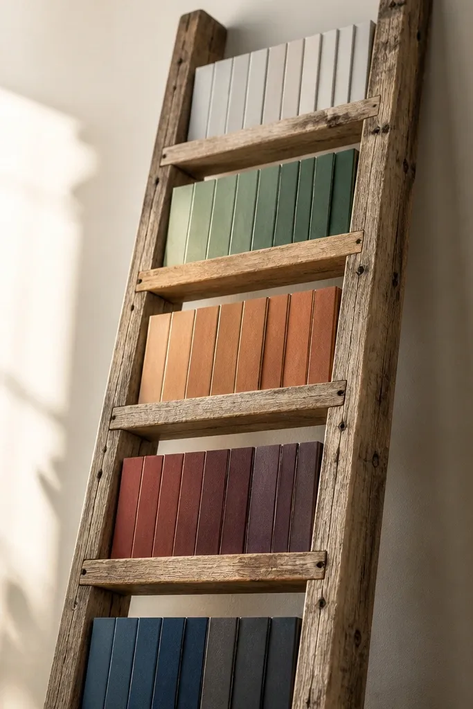
This idea makes “study progress” visible without charts. An upcycled ladder (or ladder-like rack) gives you natural steps, and you stack your subjects by difficulty or sequence. Each rung holds cards styled like book spines, so the board looks curated instead of random. The focus boost is because it turns studying into climbing: you move from rung to rung in order. It also photographs well because vertical lines and consistent card widths create a clean, styled pattern.
Pro tipUse the same paper color for all spines, then vary only the ink color by subject for contrast.
Find a small wooden ladder or make one by mounting two rails and adding 4-6 dowels as rungs. Sand and stain or paint it matte (chalk paint works). Cut cardstock strips the width of each rung, then write subject names in large letters like spines. Attach strips using small binder clips or thumbtacks, and place tiny progress markers at the bottom of each strip. Finish by adding one central card at the top rung for your weekly target.
AvoidDon’t crowd every rung with multiple cards — one card per rung reads best.
5. Dry-Erase Quote + Color-Coded Sticky Tabs Board
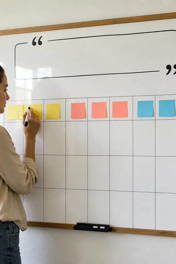
This board is for people who want their vision board to change daily without losing the aesthetic. A dry-erase surface gives you a clean look, and sticky tabs add the color system your eyes use to sort tasks. Write one short quote or rule at the top (like “Start small, finish strong”), then use color-coded tabs for subjects. The focus boost comes from the board being updated in under a minute: you don’t wait for a weekly remake. It looks sharp because white + color blocks reads crisp on camera and in your workspace.
Pro tipWrite the date in the same spot every day so your board becomes a visual routine.
Buy a small framed dry-erase board or make one by mounting a sheet of thin whiteboard material on foam board. Clean it thoroughly, then add a border with washi tape or painter’s tape in one color. Create sticky tabs by cutting tape-backed cardstock into rectangles and labeling them with a fine marker. Place tabs along one side as a legend, then write today’s target in big dry-erase letters at the center. Use a color for each subject and keep your writing consistent in size.
AvoidDon’t use too many colors. Two to three subject colors keeps it readable.
6. Matte Black Clip-Board Board With Photo Strips
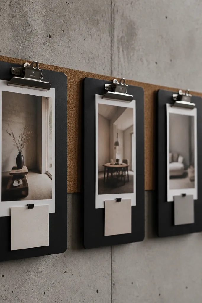
This is the “editorial” board look: crisp, minimal, and slightly industrial. A matte black clipboard or mini clipboards mounted together creates a clean structure where photos and notes sit in rows. Clip systems look good because metal and paper lines catch light without looking messy. The focus boost is simple: you see your current plan instantly, and the clipped layout prevents the board from turning into a paper pile. It works best for desk setups where you want the board in your workflow, not across the room.
Pro tipUse photo strips with lots of negative space so the labels don’t fight the images.
Paint or buy clipboards in the same matte finish and mount them to a wall or keep one standing on your desk. Print your study images as narrow photo strips (same width each time) and cut them to a consistent height. Add a small handwritten label at the top of each strip using white gel pen. Clip one strip per subject, then pin a separate “today” note at the center clip. Use binder clips if you don’t have enough clips — keep the metal color consistent.
AvoidDon’t mix glossy photos with matte backgrounds — it creates visual glare.
7. Upcycled Cereal Box Tiered Study Organizer Board
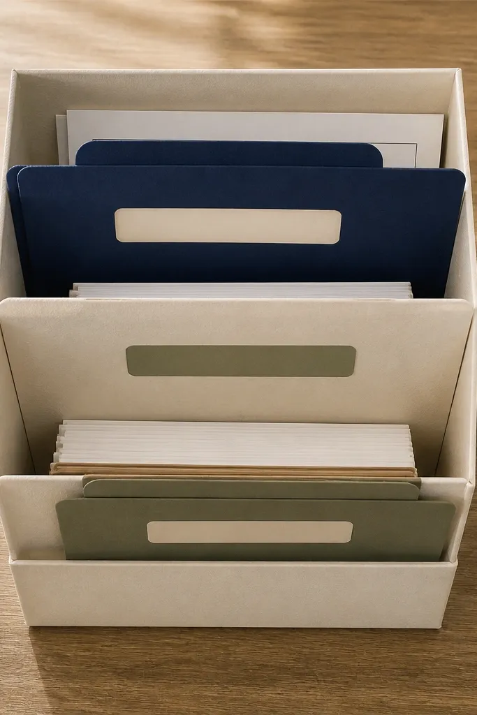
This repurpose turns packaging into a structured vision board, which is exactly what focus needs. Tiered compartments create a visual hierarchy: top is the weekly target, middle is active tasks, bottom is reference or backlog. The look is clean if you cover the boxes with matte paper and keep the labels consistent. The focus boost comes from physical sorting — your brain stops mixing “study” with “someday.” It’s also budget-friendly and photogenic because you can make every compartment match in color and typography.
Pro tipPress the covered paper with a brayer or a clean acrylic block so edges stay crisp.
Cut cereal boxes into three shallow tiers by trimming flaps and folding them into boxes with hot glue or strong craft glue. Cover each tier with matte wrapping paper or bookbinding paper, then seal with a thin layer of matte Mod Podge. Label the tiers with big block letters and a small color dot for each subject. Attach the tiers to a flat base board so they look like a little shelf system. Add printed cards inside each compartment and close the loop with a small “weekly target” card on the top tier.
AvoidDon’t leave raw box edges exposed — it makes the board look DIY messy.
8. Photo Polaroid Wall With Theme Color Border
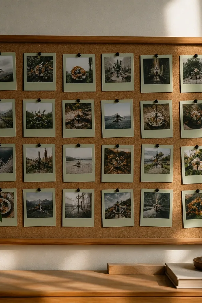
This board uses a classic photo look but makes it study-focused with one consistent border color. The border is your anchor: every photo sits inside the same frame style, so your eye compares quickly. Choose one theme color that matches your desk setup (muted sage, dusty blue, or terracotta) and use it everywhere — border, stickers, and small labels. The focus boost is because you’re not hunting for the right image; the border tells you where the study cues live. It’s photogenic because the polaroid edges create a uniform pattern.
Pro tipKeep the caption area the same height on every card for a clean, gallery-like grid.
Cut white cardstock into polaroid-style rectangles with a bottom caption area. Add a border by applying a thin strip of colored washi tape around each card or by drawing a border with a fine marker and a ruler. Print study-related images in a consistent crop and glue them in the center. Write one caption line per card in the bottom area: subject + what you’re practicing. Arrange the cards in a grid and mount them with photo corners or removable tape so you can swap weekly.
AvoidDon’t mix different photo aspect ratios — it breaks the uniform look.
9. Notebook Cover Vision Board (Wrap-Around Focus)

If your focus problem is that you don’t look at the wall, this fixes it. A vision board on a notebook cover follows you everywhere you study, so it’s impossible to ignore. Make the design simple: one central goal card, then small subject icons around the edges. The aesthetic is clean because notebook covers are naturally framed and the layout is contained. The focus boost comes from “start cue” behavior — open the notebook and your brain sees the same goal instantly. It also makes a great photo because the cover looks like purposeful design, not clutter.
Choose a notebook with a sturdy cover or a plain binder cover. Cover the front with matte contact paper or bookbinding cloth for a smooth surface. Add a central printed card with your weekly target and a short subline using a ruler and glue stick. Surround it with 4-6 small stickers or cutouts, one per subject, each in the same size. Seal the whole cover with a matte clear spray or a thin Mod Podge layer to protect it from handling.
Use contact paper first, then glue paper on top. It prevents bubbles and keeps edges flat.
Don’t use thick layers under the cover edges — it makes the notebook look warped.
10. Corkboard With Tension Wire Timeline
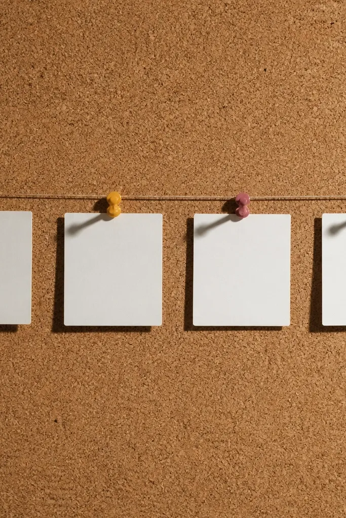
This board is built for people who lose focus because their plan feels vague. A tension wire timeline gives you a clear sequence from week 1 to week 4, and you pin cards at the right points. The look is crisp: wire lines create structure, cork gives texture, and color-coded pins add personality. The focus boost is that you always know what comes next without re-reading your whole plan. It’s photogenic because the wire creates strong lines and the pins add small pops of color.
Pro tipUse three pin colors only: one for active study, one for practice, one for review.
Start with a corkboard and mark three to five evenly spaced points along a vertical line. Drill or screw small eye hooks at the top and bottom, then thread a tension wire through and tighten it. Cut small card tabs for each week and punch a hole at the top so you can pin them to the wire with thumbtacks. Add one weekly goal card per tab and attach a tiny subject icon in the corner. Keep all cards the same dimensions so the timeline looks intentional.
AvoidDon’t cram the timeline. Leave at least 1 inch between week tabs.
11. Minimal Chalkboard With Cut-Paper Subject Labels
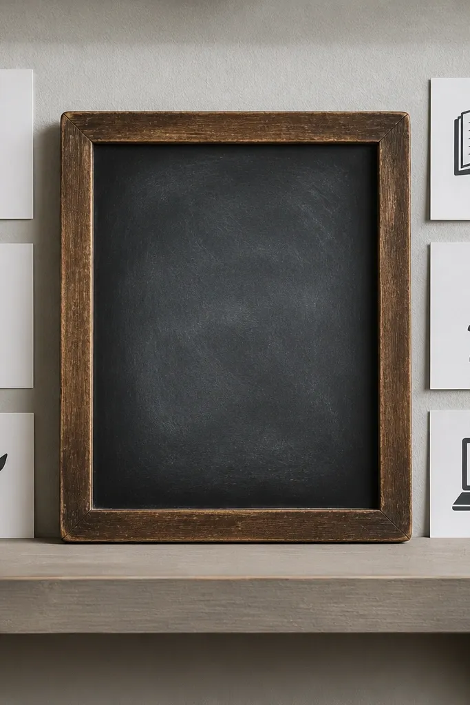
This is the “clean but serious” vision board for students who hate clutter. A small chalkboard keeps the center message always readable. Cut-paper labels act like a typographic system: each subject gets a label with the same font style and the same placement. The focus boost comes from refresh — you can rewrite the center goal daily in chalk while keeping the labels fixed. It looks good because chalk has a soft texture and cut-paper labels add crisp edges.
Mount a small chalkboard panel on a wall or inside a frame. Cut subject labels from matte cardstock and use a craft knife to shape clean rectangles with rounded corners if you want it softer. Attach labels with removable adhesive or tiny magnets so you can update them. Write one short daily focus statement in the center using white chalk or a light-colored chalk marker. Add a small weekly date strip along the bottom using the same chalk color each week.
Use white chalk marker for the big line so it stays readable on camera and from your desk.
Don’t write paragraphs. One line max in the center.
12. Magazine-Only Vision Board With One Dominant Layout
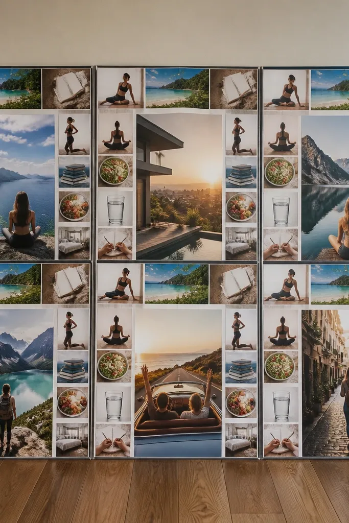
This board looks like a designer collage because it follows one strict layout rule. Use magazine clippings only, then repeat the same arrangement: center goal image, top subject strip, side habit icons. The focus boost comes from limitation. When you only pull from magazines and keep the layout identical, you stop adding random ideas that dilute your priorities. It’s photogenic because magazine paper has color depth and texture, and the repeated layout reads as intentional rather than chaotic.
Pro tipUse a paper cutter for straight edges. Crooked cuts kill the “designed” look fast.
Pick one magazine set with a consistent color tone (fashion, architecture, or fitness works). Cut clippings and sort them by subject before you touch the board. Lay out a template on your base board: center rectangle for the weekly goal, a narrow top strip for the main subject, and two smaller side blocks. Glue everything down with matte glue stick, then add a single handwritten label style in black ink. Finish with a matte spray to reduce glare and keep colors steady.
AvoidDon’t use too many different paper sources. Different magazine finishes look mismatched.
13. Corner Pocket Board for Daily Check-In
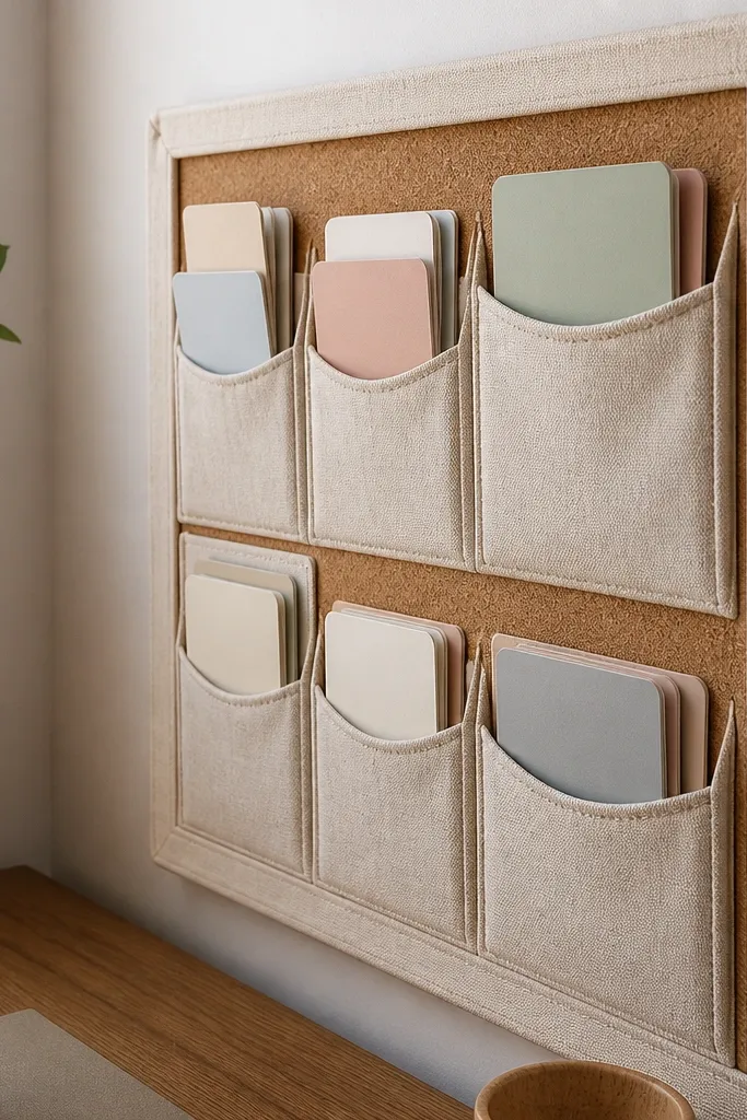
This idea is practical and pretty, which is rare. Corner pockets keep your daily check-in cards in one obvious location, so you don’t lose track of what you planned. The look works because pockets have shape — they create a frame within the frame — and fabric pockets add texture that photographs well. The focus boost is that you physically touch the card every day. You open the pocket, grab the card, and your brain switches modes immediately. Keep the rest of the board minimal so the pockets stay the hero.
Pro tipUse Velcro on the pocket flap if you want the cards to look neatly “closed” in photos.
Cover a base board with neutral fabric or matte paper. Sew or glue 2-4 fabric pockets into one corner, using the same fabric for a clean look. Make daily cards on thick cardstock and punch a small notch or hole so they slide in easily. Add a central goal card at eye level with your weekly target and a tiny “today” checkbox box. Use removable adhesive or thumbtacks so you can swap cards without wrecking the board.
AvoidDon’t make pockets too deep — cards look messy when they bunch.
14. Translucent Tape Borders Over Photo Squares
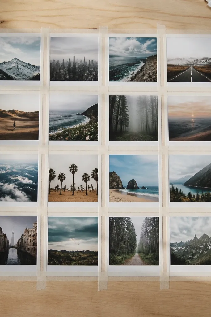
This board turns simple photo squares into a styled design without heavy crafting. You build a border system using translucent tape strips so each photo has a clean frame. The look is modern and airy, and it photographs with a soft light effect. The focus boost is that your photos align into a grid, so comparison is instant: you see which subject images are new this week and which ones you’re repeating. It’s also easy to update because tape borders don’t require re-gluing the whole layout.
Pro tipUse a ruler and press tape down firmly so edges look crisp, not wavy.
Print or cut photos into equal-size squares, like 3x3 inches or 4x4 inches for a tighter grid. Mount them on a matte base board with glue stick. Add translucent tape strips across each photo as a border, keeping the tape thickness and spacing consistent. Type or hand-write short labels and place them in the same corner of each square. Finish by adding one central “weekly target” label with a heavier paper weight so it looks like the main headline.
AvoidDon’t use multiple tape colors. One translucent tone keeps it clean.
15. Pegboard With Paint-Color Pins and Subject Cards
Pegboard makes your vision board look like a real study station. It’s structured, modular, and naturally grid-based, which is exactly what comparison needs. Paint-color pins add personality while keeping the layout consistent. Each row can represent a subject, and each pin holds a card for your current tasks or weekly goals. The focus boost is that the board is easy to rearrange without losing the grid. It also photographs well because pegboard lines create a tidy background and the pins add small color accents.
Pro tipUse the same font size on every card. Pegboard layouts look messy when text sizes vary.
Buy a small pegboard panel and paint it matte white or light gray. Mark rows and columns with pencil so each card sits in the same alignment. Cut thick cardstock cards and punch holes at the top to hang on peg pins, or use mini binder clips on the pegs. Insert color-coded pins for each subject so your key is visible at a glance. Add a larger card at the top center for your weekly focus and keep the rest in consistent sizes.
AvoidDon’t add too many card sizes. Stick to one small, one medium, one header size.



