
1. Hot Tea Comfort Grid with One Hero Mug
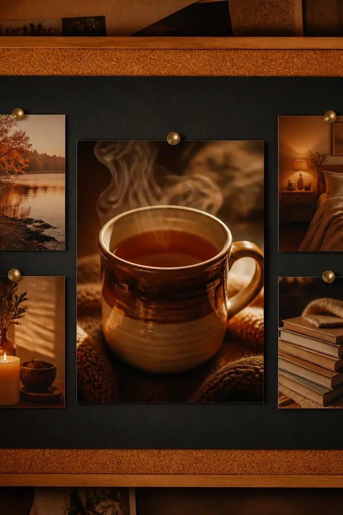
This idea makes your self-care feel physical. A grid gives structure, but the one hero mug photo creates that cozy focal point your eyes can land on when you’re tired. Use warm, steamy visuals and keep the rest of the images smaller so the board doesn’t turn into visual noise. The look is clean enough for your wall, but still soft because the palette stays in creams, honey tones, and light browns. It works best for people who need a routine cue more than a big motivational poster.
Start with a warm neutral base paper or a printed template on 11x14. Place one large mug image in the center-right, then build a 3x3 grid of smaller comfort photos around it. Add four short phrases in the margins using one handwritten-style font and keep each phrase under 4 words, like “slow sip” or “breathe in.” Finish by adding tiny steam accents using light gray or pale gold ink dots, then seal with a matte sheet protector if you’re putting it on a desk.
Pro tipPrint your mug image slightly larger than the frame and trim only after it’s glued, so the steam edges stay soft.
AvoidAvoid a template that forces every photo to be the same size — it kills the cozy focal point.
2. Linen Morning Routine Board with Checklist Bands
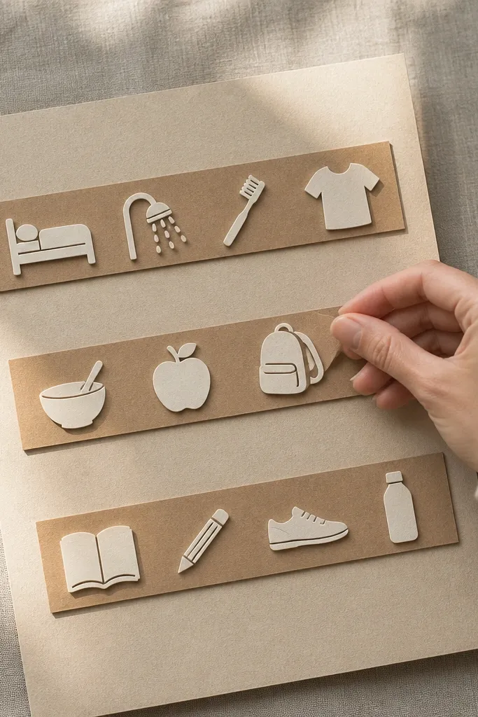
A routine board should feel calming, not like admin work. Linen-colored bands give you “zones” — wake, move, reset — so you don’t have to read paragraphs when your brain is foggy. This layout looks good because the bands create horizontal rhythm, and the icons stay small and consistent. It also fixes a common self-care issue: you’re trying to remember too much at once. With three bands and short check items, the board becomes a visual nudge you can follow without thinking.
Pick a template with horizontal strips or create them by drawing three bands across the page using a light oat marker. Add one photo per band: sunrise window light for wake, a stretching image for move, and a calm skincare or towel shot for reset. Write checklist lines directly on the bands using a simple sans-serif font, keeping each line to 3-6 words. Finally, add tiny checkbox squares in the same color each time, then protect with clear matte tape along the edges.
Use one icon set only, like simple line icons in muted brown, so your board doesn’t look like it came from five different apps.
Avoid cramming 10+ tasks into the bands — it stops feeling cozy and starts feeling like pressure.
3. Boundary Lines with Soft Scissor-Cut Frames
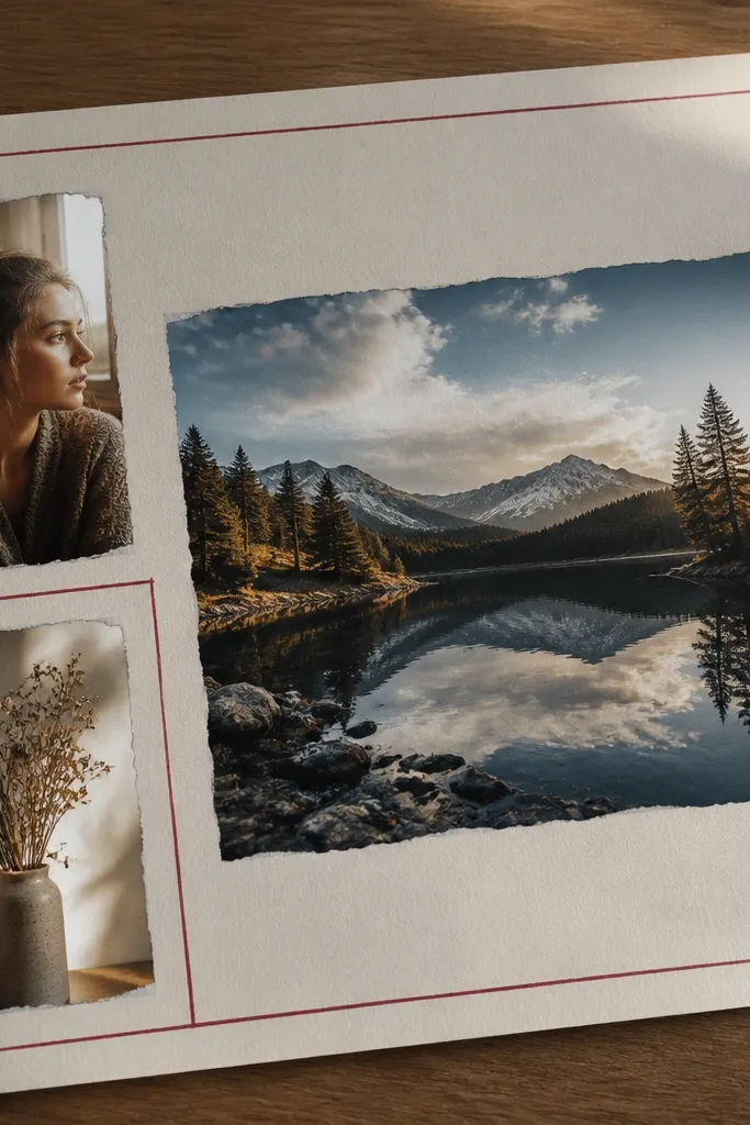
Boundaries are self-care, and this board makes them visual without turning harsh. Soft scissor-cut frames add a handmade feel, and the muted red boundary line gives a clear visual signal. Keep only two or three core images so the page doesn’t become cluttered. This is especially good for people who have trouble saying no because they need a reminder they can see instantly. The board feels gentle, but the message is firm.
Cut two irregular frames from off-white cardstock using small scissors, then lightly distress the edges with a sanding sponge for a soft look. Place one frame around a calming background photo, like a quiet room corner, and use the second frame for a “no” visual like a closed door or a turned-away face silhouette (no text). Add boundary phrases in muted ink on the blank space between frames, using one short line per phrase. Draw thin boundary lines with a fine-tip marker in muted red, stopping short of the edges so it stays airy.
Test your marker color on scrap paper first — muted red looks cozy, bright red looks aggressive.
Avoid covering the whole page with frames — too many cutouts make boundaries feel like walls.
4. Candlelight Recovery Board with Gradient Glow
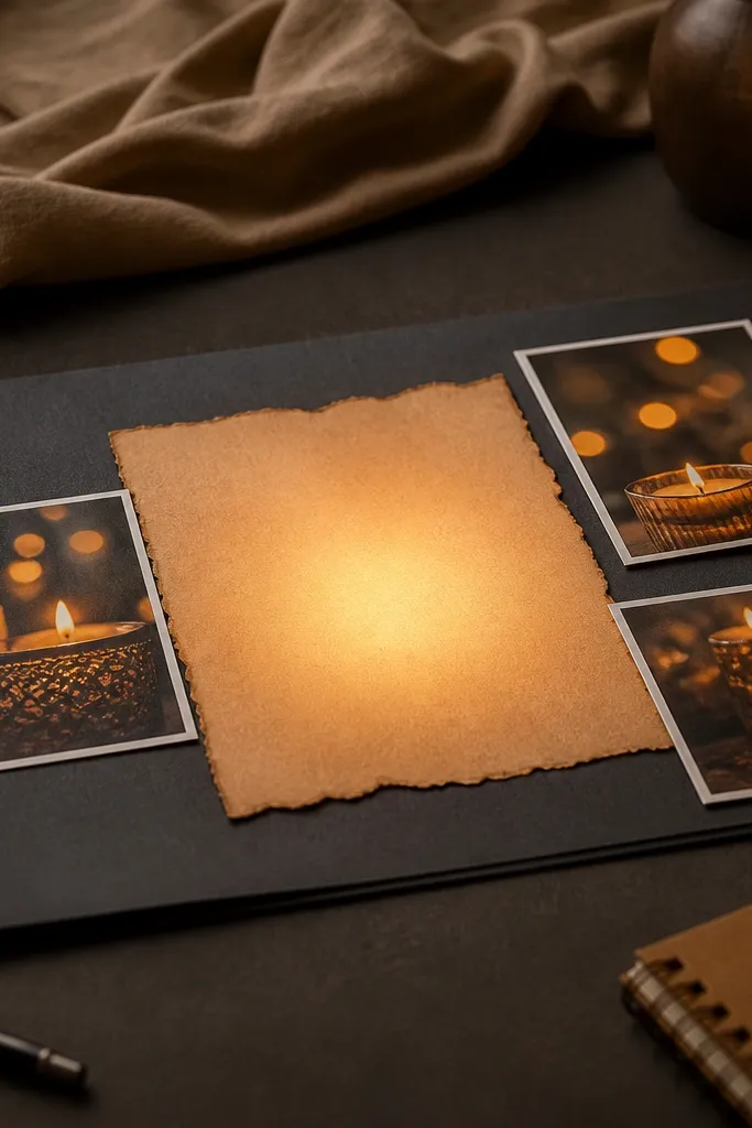
If you want cozy days, you want light that feels slow. This board uses a dark base so candle photos pop, then adds a soft amber gradient behind the text to mimic glow. The contrast is what makes it photogenic: your eyes read the central quote first, then scan the candle images. It’s a great option for burnout recovery because it gives your brain permission to go dim and rest. Keep it small and intentional so it doesn’t feel dramatic.
Start with a charcoal or deep espresso paper base in 11x14. Place one candle photo in the center and two smaller photos on either side, all angled slightly the same direction for a cohesive look. Create the glow by using a makeup sponge to dab a light amber ink or watercolor behind the text area, then blend outward with fewer taps. Add one recovery phrase in the middle, keeping the font large and clean, then seal with a matte spray or a clear sleeve.
Glow looks best when the gradient starts behind the text and fades before it hits the photos.
Avoid using bright neon ink on a dark base — it makes the board feel harsh instead of cozy.
5. Bath Day Self-Care Board with Watercolor Splashes
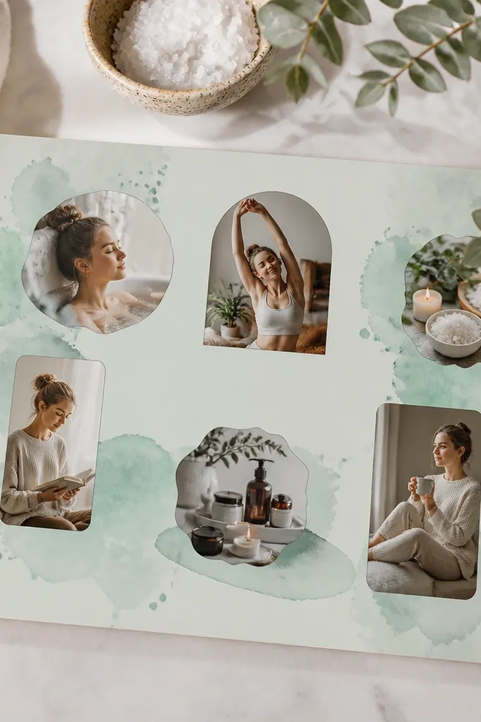
This one is for days when your nervous system needs a reset. Watercolor splashes look airy and calming, and the mint-cream palette keeps the board feeling clean rather than cluttered. The key is restraint: splashes should frame the photos, not cover them. This layout is photogenic because the color pooling catches light and makes your images look softer. It also gives you a clear theme cue — bath day — so you’re not hunting for what your self-care “means.”
Choose a mint cardstock or print background, then place three bath-related photos in a loose triangle layout. Use watered-down watercolor or diluted ink to paint small splash shapes around the triangle, staying mostly in the corners. Add one short phrase near the bottom using a simple serif or handwritten-style font, keeping it under 6 words. Let everything dry fully, then apply a thin layer of matte medium or use a sleeve so the watercolor doesn’t smudge.
Use two splash sizes only — small droplets and one larger puddle — so the board doesn’t look chaotic.
Avoid a template that forces you to add text everywhere — bath boards need negative space.
6. Cozy Reading Nook Board with Page-Edge Collage
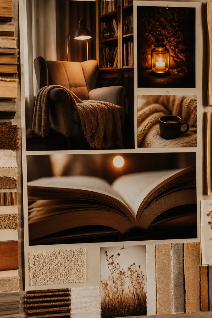
This board looks like a real cozy corner because it uses book textures, not just book photos. Page-edge collage makes the board tactile on camera, and it gives you a “reading time” identity instantly. Use warm paper tones and cut book spines into narrow strips so the board has depth without clutter. This idea works for people who recharge through quiet time and want that feeling anchored visually. It’s also great if you want your board to look good even from across the room.
Cut narrow strips from old book pages or printed page textures, then glue them vertically as a backdrop on one side of an 11x14 board. Place two larger reading-nook photos on the other side, slightly overlapping, and keep the page-edge strips behind them so they look layered. Add a single quote line on a small cream label, using one font style throughout. Finish by adding a thin border line in espresso ink around the collage area and protect with a matte sleeve.
Pro tipIf you’re using printed textures, print at 300 dpi so the page fibers don’t look blurry.
AvoidAvoid mixing too many paper textures at once — three textures max is what keeps it cozy.
7. Soft Movement Board with Scarf Arcs
Movement doesn’t have to look sporty. Scarf arcs create a gentle curve direction, so the board feels like it’s guiding you instead of demanding action. This layout is photogenic because fabric-like cutouts catch light and add motion even on a flat page. It’s a good choice for people who want self-care that includes stretching, walking, or mobility without the pressure of “workouts.” Keep the number of images small so the curve stays readable.
Cut two or three semi-circular scarf shapes from fabric scraps or printed fabric paper in muted colors like oat, dusty rose, and light gray. Glue the arcs across the page in a sweeping curve from top left to bottom right. Place one movement photo at the start of the arc and two smaller photos along the curve. Add short prompts near each photo, like “neck rolls” and “slow walk,” then outline the arc edges lightly with a pencil so they pop without getting harsh.
Use fabric scraps if you can — even thin jersey looks warmer than paper when photographed.
Avoid a grid layout for movement — strict rows make the board feel rigid.
8. Skin Care Glow Board with Sticker Labels and Color Dots
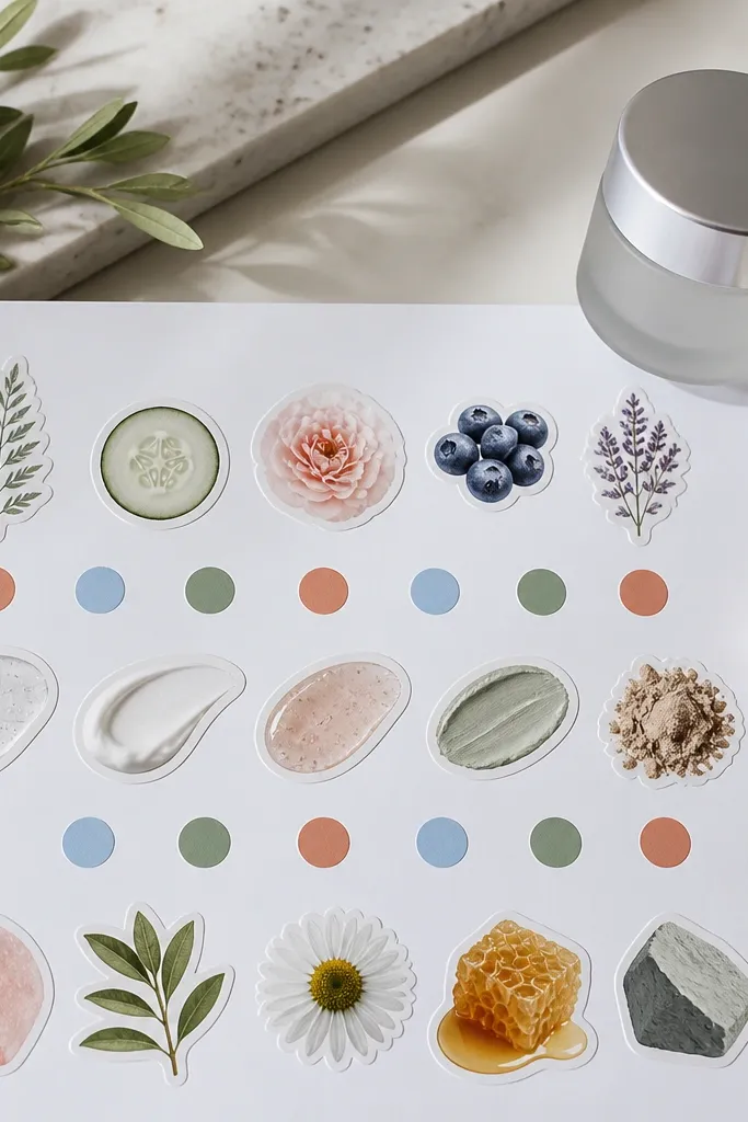
This idea turns skincare into a visual cue you can follow in seconds. Sticker-style labels make the board look tidy and intentional, while color dots act like a system for AM vs PM or cleanse vs moisturize. It’s photogenic because the labels create crisp edges and the dots give soft pops of color. This board is best for people who forget steps or second-guess themselves when they’re tired. It also keeps self-care grounded in daily actions, not big promises.
Start with a cream base and place three skincare photos in a 2x2 arrangement with one empty corner for labels. Add circular dots in two colors only, like warm terracotta for AM and muted plum for PM. Use sticker labels or label paper cut into rectangles, then write one step per label with a fine-tip pen. Finally, draw tiny arrows between labels if you want a clear order, then laminate or sleeve the board so it wipes clean.
Make your label text bigger than you think — readability matters more than cuteness when you’re half-asleep.
Avoid using 6+ accent colors — the board turns into a random sticker sheet.
9. Rainy Day Cozy Board with Faux Film Frames
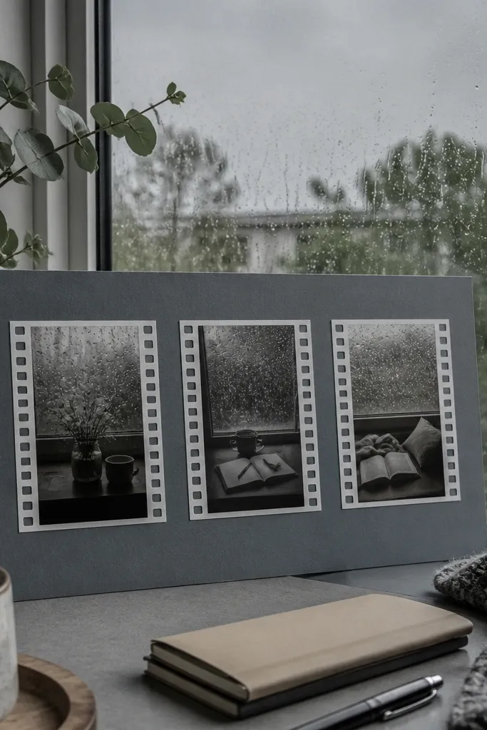
Rainy days need a calmer visual rhythm. Faux film frames give you a nostalgic look without needing actual negatives, and the repeating frame edges make the page feel cohesive. Use muted gray-blue as your base, then add three rainy-window photos so the theme stays obvious. The film frame style is photogenic because it creates consistent borders that look good in photos and in person. It’s a strong choice for people who want their self-care to feel like an atmosphere.
Choose a gray-blue background paper and draw three film frames using a ruler for even spacing. Place one rainy photo inside each frame, then add small “film holes” along the side with a fine black pen or pre-made hole stickers. Add one line of text on a label strip at the bottom, keeping it short and centered. Finish by adding a subtle speckle effect using a toothbrush and diluted white paint on the empty gray areas.
Pro tipKeep the film frames aligned — one crooked frame makes the whole board feel rushed.
AvoidAvoid full-page watercolor washes under film frames — it muddies the borders.
10. Gratitude, But Cozy Board with Corner Notes
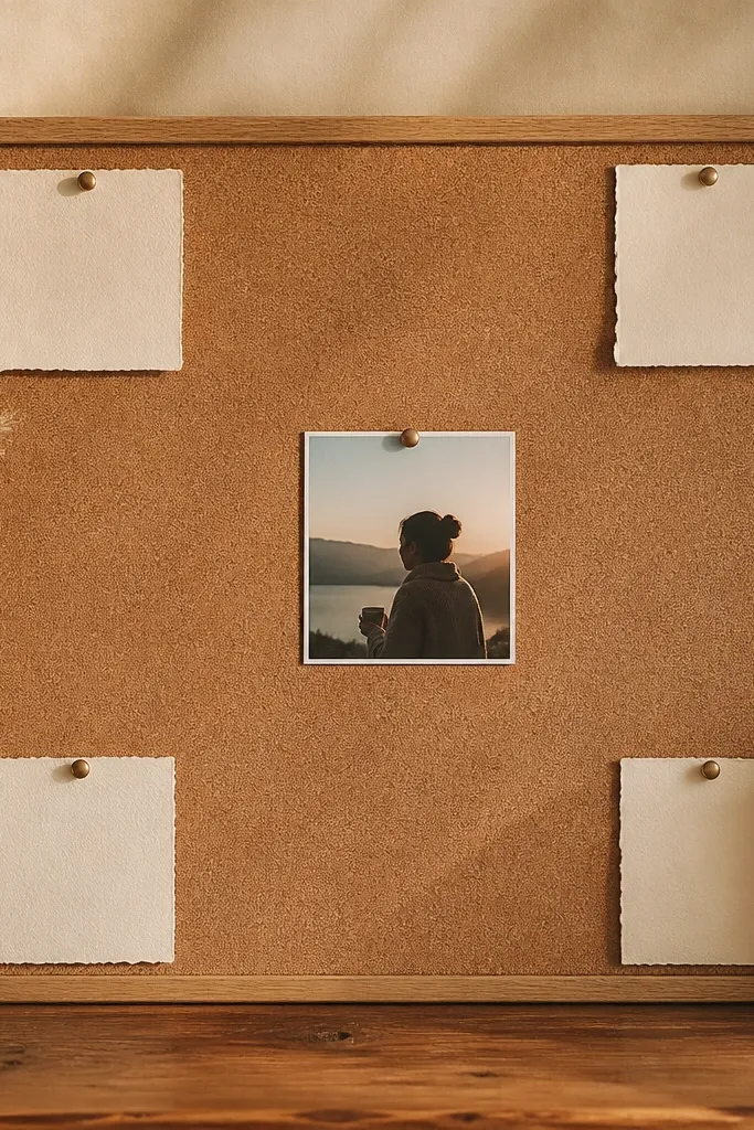
Gratitude boards often get cluttered fast. This one keeps gratitude soft by placing it in the corners, leaving the center for calm imagery. Corner note cards look charming and organized, and they let you add new lines without redesigning the whole template. The look is clean, photogenic, and easy to update, which matters if your self-care theme changes week to week. It’s best for people who want the board to feel supportive, not like a journal page.
Pick one central photo that matches the cozy theme, like a window plant or a blanket on a chair. Create four small note cards from light cream paper and place them in each corner. Write one short gratitude line on each card in a consistent handwritten-style font, keeping them under 8 words. Add a thin border around the entire page in a neutral brown, then use removable tape for the note cards if you want easy swaps.
Pro tipUse removable tape on the corners so you can refresh only the notes, not the photos.
AvoidAvoid long paragraphs — corner notes should be readable at a glance.
11. Affirmation Arch Board with Curved Word Path
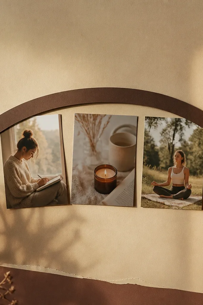
This is for people who like affirmations but hate when they look like posters. A curved word path is visually soothing and gives your eyes a guided arc, which feels gentler than a straight block of text. Put three small self-care photos under the arch so the words feel grounded in real imagery. Keep the palette warm and the ink muted so the board feels cozy, not loud. It’s also a great fix for template mistakes where the text looks pasted on top of everything.
Draw an arch curve across the top third of the page using a pencil and a flexible curve tool or a string. Add your affirmation words along the curve, one or two words per line, so the spacing stays even. Place three small photos in a row under the arch, centered and aligned. Use a muted ink color like espresso or dusty rose, then trace over the pencil lightly only where needed and protect with a matte sleeve.
Print your affirmation words on label paper first, then cut along the letters for cleaner edges.
Avoid using a template with fixed text boxes that don’t match the arch — mismatch makes it look slapped together.
12. Blanket Fort Calm Board with Layered Paper Corners
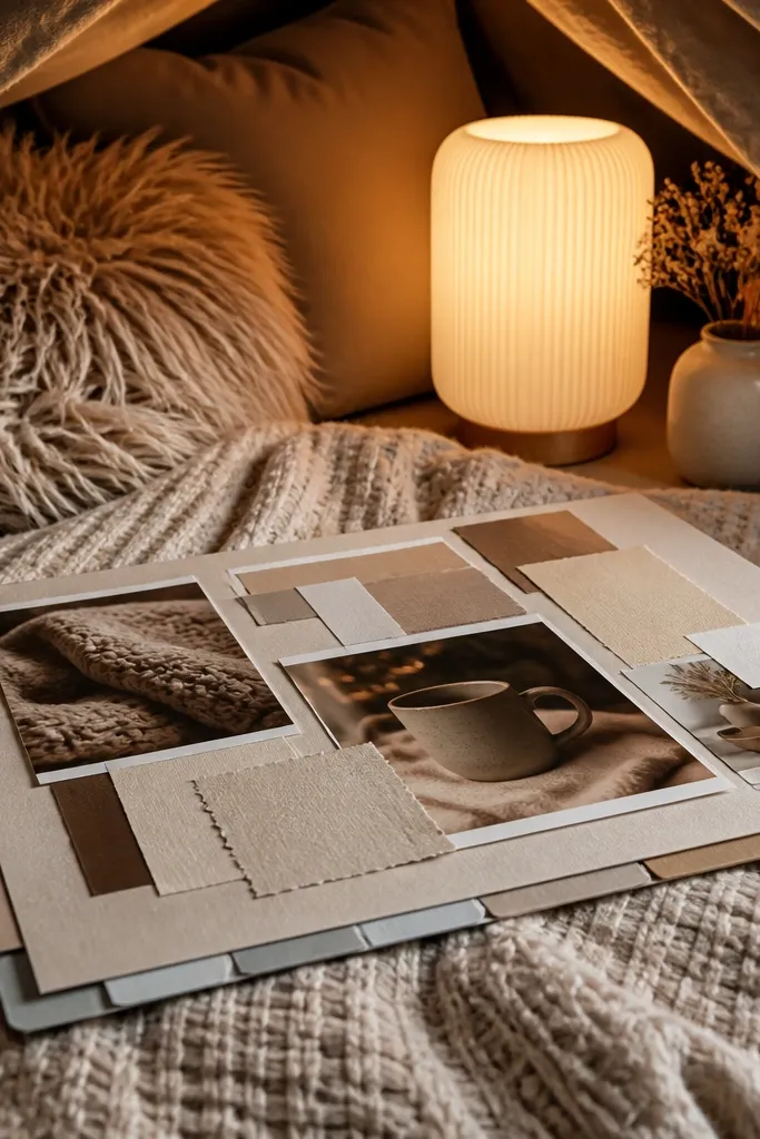
Layered paper corners create depth, and depth makes a vision board feel more “real” and less flat. This blanket fort theme is cozy because it visually suggests softness and hiding out. Use two blanket photos as anchors, then build around them with layered corner tabs so your eye has something to explore without reading walls of text. It’s photogenic because the corner layers cast tiny shadows and add texture. This layout fits people who want comfort and rest as the main self-care message.
Start with a cream base in 11x14. Place one blanket photo slightly left of center and another photo smaller on the right, leaving a gap for layering. Cut four corner tabs from coordinating cardstock and glue them so they peek from the edges of your photos like frames. Add one short caption under the larger photo and finish by lightly dry-brushing a pale gray shadow behind the tabs for extra separation.
Pro tipUse a craft knife with a ruler for the tabs so the corners look crisp, not ragged.
AvoidAvoid overcrowding the center — the layered corners work because the middle stays calm.
13. Slow Sunday Meal Board with Recipe Card Layout
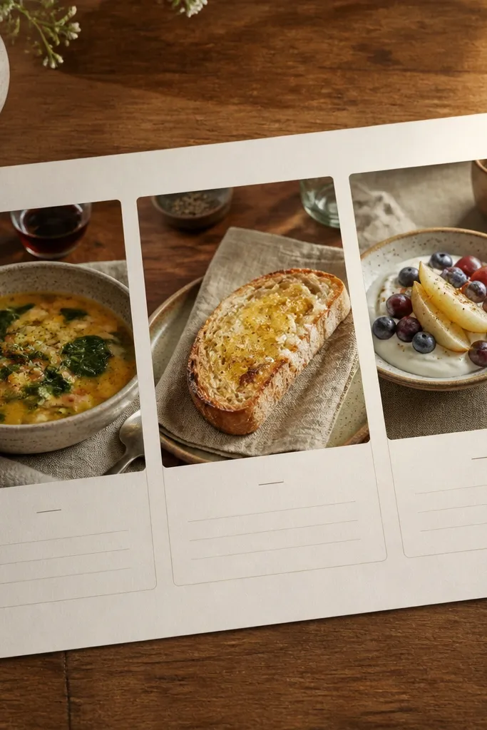
Self-care isn’t only emotional — it’s also sensory. A recipe card layout makes your board feel practical and cozy, and it looks great when photographed because cards create neat structure. Choose three slow Sunday meal images like soup bowls, toast, or fruit with yogurt, then pair each with one tiny “ritual” line. This board works for people who wind down best through food routines and want a visual plan that doesn’t feel like dieting. Keep it warm and simple.
Use a warm neutral background and place three food photos on the left side in a vertical stack. Create two recipe-style cards on the right with thick paper, each card having a title line and a short ritual note. Add small line drawings of herbs or spoons in muted green or brown between the cards. Finally, draw a thin border around the whole layout and laminate if you want it to survive kitchen humidity.
Write the ritual in pencil first, then go over it with a fine-tip pen once you like the spacing.
Avoid a template with lots of tiny boxes — recipe cards need readable space.
14. Desk Reset Board with Tape-Made Sections
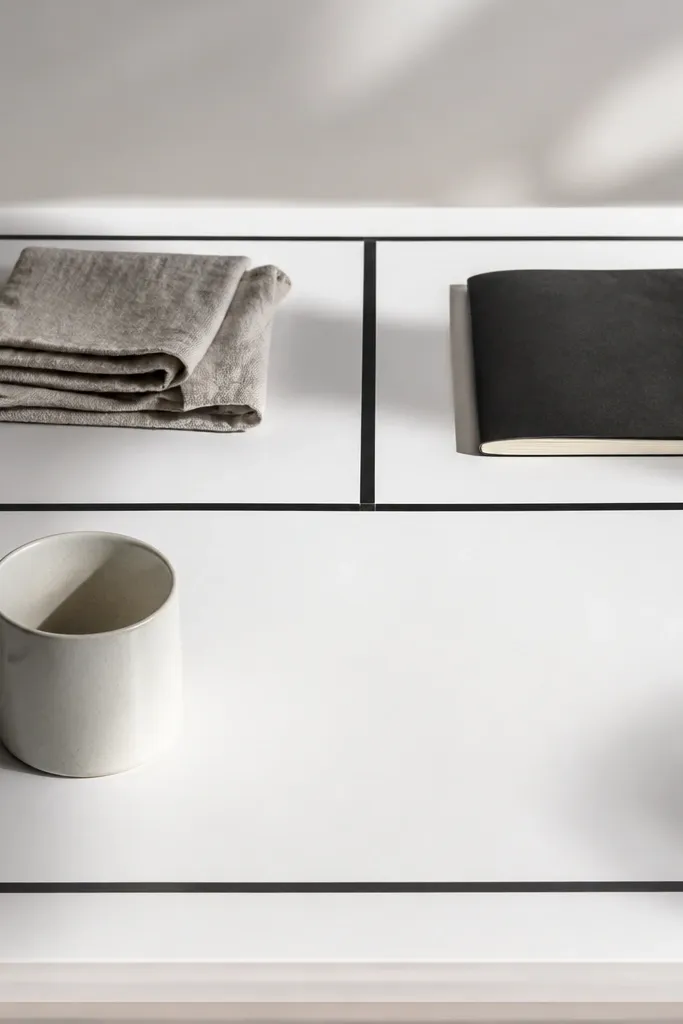
If your self-care collapses when your environment gets messy, this board fixes that visually. Tape-made sections give you instant order, and the clean white space keeps it photogenic and modern. Add small desk reset photos like a tidy notebook, a clean mug, or a folded towel, then anchor everything with one bold reset phrase in the center. This layout works for cozy days because it turns “I need a reset” into a visible plan. It’s also one of the easiest boards to update without reprinting a template.
Start with a white or off-white board in 8.5x11 or 11x14. Lay painter’s tape or washi tape to create 3-4 sections, then lightly outline each section with a pen so the boundaries look intentional. Place one photo per section, keeping them small and aligned to the tape edges. Add one centered phrase on a small label strip, then remove the tape carefully after everything is glued and dry.
Pro tipPress tape edges firmly with a credit card so no glue bleeds under and makes fuzzy lines.
AvoidAvoid templates that already have sections printed — the tape effect looks best when it’s handmade.
15. Cozy Night Sleep Board with Stars and Minimal Icons
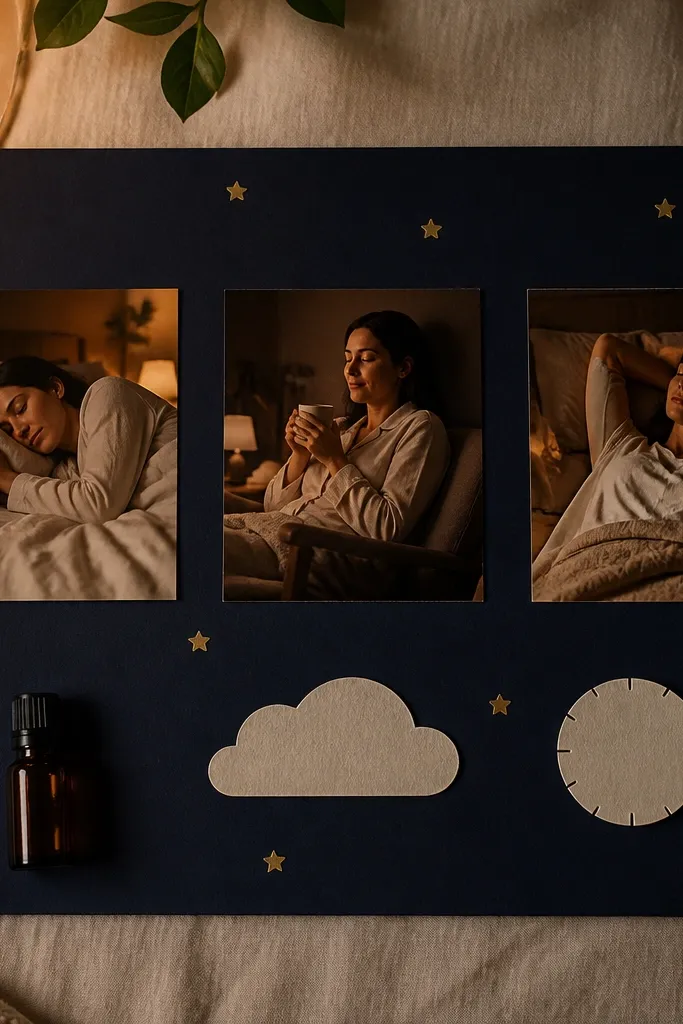
This is the night version of self-care. Deep navy makes everything feel quieter, and tiny gold star dots give a gentle sense of calm without being childish. Keep the icons minimal — moon, small bottle, one clock — so the board stays clean. Two sleep photos are enough, plus one short phrase you can read when you’re winding down. It’s photogenic because the contrast between navy and gold makes the page pop even under warm indoor lighting.
Choose deep navy cardstock and add two sleep photos in the center, slightly overlapping. Draw a simple crescent moon icon near the top and a tiny clock icon near the bottom using muted gold or pale cream ink. Add gold star dots with a fine brush or a star-shaped hole punch stencil, keeping them small and uneven like real dust. Write one bedtime phrase in a clean font across the middle, then protect the board with a clear sleeve.
Use a light touch with star dots — too many makes it look busy, not cozy.
Avoid bright white text blocks across the whole page — they feel like alarms at night.



