
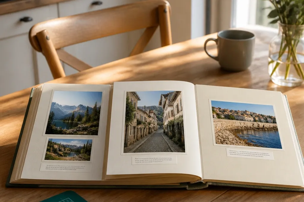
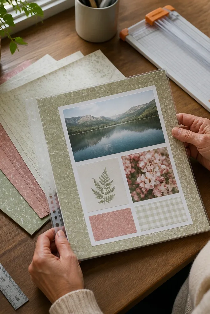
1. Hinged Photo Windows on Rigid Mat Pages
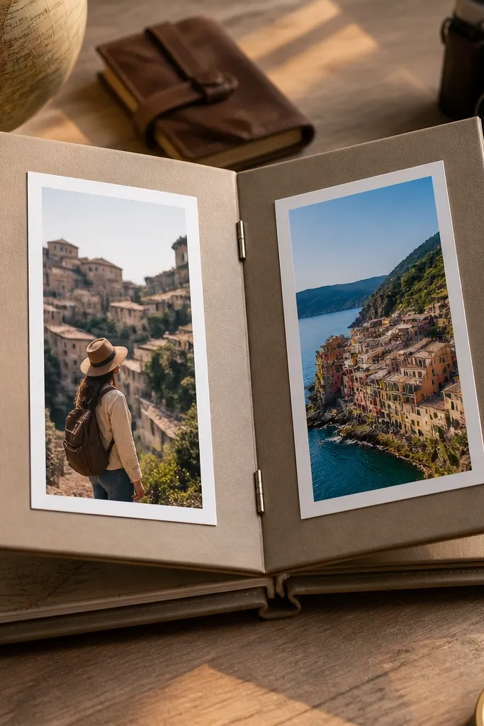
This layout looks expensive because the photo sits inside a clean window and the page has movement. The hinge makes the image feel like a reveal, not a flat sticker. Use rigid cardstock so the window stays crisp and doesn’t curl at the edges. It’s great for travel days, weddings, or any album where you have a clear “before and after” moment you want to show. Skill level is beginner-friendly, and it takes about an hour per spread once you cut everything.
Start with a 12x12 page base in 110 lb cardstock. Cut two window openings using a craft knife and steel ruler — each window should be about 1/2 inch smaller than your photo on all sides. Score a hinge strip on the back of the window area using a bone folder, then attach the window frame with photo-safe tape only along the hinge edge. Mount photos to the window using adhesive squares, then close the window so the frame edges line up. Finish by adding a thin journaling strip under the windows with a pen that won’t bleed.
Pro tipCut window openings on a sacrificial cutting mat and test the fit with one scrap photo first.
AvoidAvoid wet glue on the window edges — it warps cardstock and makes the frame look uneven.
2. Polaroid-Stack Frames with One Color Border
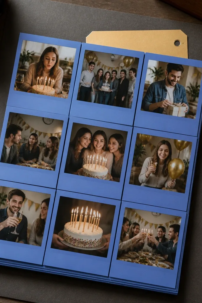
This is the easiest way to get that “collected” look without messy layering. The trick is strict spacing: each photo gets the same border thickness and the same gap between layers. Use one border color for the whole spread so your photos don’t fight each other. It works best for sets of similar moments like a birthday day, concert night, or family weekend. It’s fast, photogenic, and looks cohesive even when the photos have different lighting.
Choose one photo size and print everything the same width, like 4x6 cropped to 4x6 or 3x4 cropped to 3x4. Cut three “polaroid” frames from 80-110 lb cardstock — keep the border consistent, for example 3/4 inch on the sides and 1 inch at the bottom for the caption area. Adhere the bottom photo first, then center the middle and top using pencil tick marks on the page. Add a caption with a 1/2 inch tall strip of matching color paper behind the journaling. Seal the page with a clear matte photo protector sheet if you’re using an album sleeve system.
Pro tipUse a corner rounder punch on the top corners only — it keeps the stack cute without looking childish.
AvoidAvoid random thicknesses between layers — uneven gaps make the stack look sloppy.
3. Fabric Scrap Photo Panels with Visible Thread Lines
Fabric panels photograph beautifully because they add texture and color without cluttering the photo. The visible thread lines create a built-in grid that guides the eye. This idea is ideal when your photos are muted and you want one strong tactile element. It also hides minor photo imperfections because the fabric edge frames everything. Expect about 2-3 hours for your first one, mostly from cutting and pressing fabric flat.
Cut a fabric rectangle slightly larger than your photo panel, like 1/2 inch extra on each side. Back the fabric with thin fusible interfacing so it stays flat, then press it to a cardstock base. Position your photo on the fabric and mark the corners, then stitch a simple straight-line border around the photo using a sewing machine or hand whip stitch. Mount the photo with double-sided tape squares so it sits flush under the thread. Finish with a thin strip of paper journaling along the bottom edge, then trim any fabric overhang cleanly.
Pro tipPre-wash fabric and iron it to remove shrink — otherwise the panel warps later.
AvoidAvoid frayed edges that you don’t control — uncontrolled fraying makes the page look messy in photos.
4. Shadowbox Layering with Foam Tape and Deep Depth
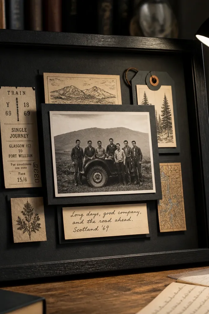
Shadowbox-style scrap pages look dimensional and “gallery” clean when you control depth. Foam tape creates a real separation between photo, mat, and embellishments, so nothing blends into the background. This is perfect for albums where you want to include ticket stubs, small printed ephemera, or layered captions. It’s also the solution for pages that feel flat because you keep adding stickers. With one foam-tape layer system, your page has structure.
Use a 12x12 page base in black, charcoal, or deep navy cardstock for strong contrast. Cut a mat for your photo leaving a 1/2 inch border, then adhere the mat flat. Add a second layer behind the photo using 1/8 inch foam tape strips — keep the tape in a rectangle so the photo sits level. Arrange ephemera on the same raised plane, then tape them down with foam squares so the height matches. Finish by adding a thin caption strip in a single font style, like all caps, and keep the rest of the page clean.
Pro tipChoose foam tape thickness and commit — mix 1/8 inch and 1/4 inch on the same page and depth looks chaotic.
AvoidAvoid stacking too many raised elements — it makes photos look crowded and reduces readability.
5. Corner Photo Mounts with Clean White Margins

Minimal corner mounting makes photos feel intentional and gives your album breathing room. This look works because the white margin becomes part of the composition, not empty space you forgot to fill. Use it when you have strong photos that don’t need a lot of decoration. It’s also a great fix for older albums where pages look too busy. Time is quick, about 30-45 minutes per page, because there’s less cutting and fewer layers.
Start with a 12x12 white or cream cardstock page base. Choose one photo orientation and trim it so it fits a consistent corner frame, like 4x6 anchored with 1 inch from the top and side edges. Use a straight edge and pencil to mark placement, then apply adhesive squares only to the photo corners so it lies flat. Add a small journaling label next to the photo, like a 2x3 inch paper tag, with the date under it. Optional: draw a thin line border using a fine-tip pen to frame the page without adding clutter.
Pro tipKeep journaling to 1-2 lines. Short captions read better and look cleaner in photos.
AvoidAvoid filling every corner with stickers — minimal pages lose the clean look fast.
6. Guide-Grid Collage with Consistent Photo Heights
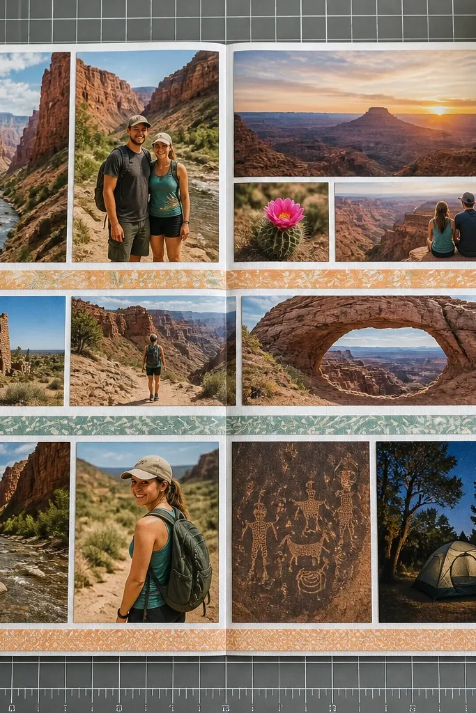
This is a “system” layout that makes multiple photos look designed even when they’re from different moments. The key is a grid with consistent photo heights so the eye can scan left to right. Use thin divider strips to separate images without heavy borders. It’s best for events with lots of photos like vacations, graduations, or group days where you want to tell a sequence. The look is crisp on camera because edges align and spacing is controlled.
Pick a grid format first, like 3 rows x 2 columns on a 12x12 page. Use pencil to draw the grid lines lightly, then cut divider strips from solid cardstock about 1/8 to 1/4 inch wide. Trim each photo so its height matches the grid cell height, even if widths vary slightly. Mount photos with tape runner, then place dividers between them so the lines are straight. Add journaling on one side using a vertical strip so it doesn’t break the grid symmetry.
Pro tipUse the grid as your alignment guide for stickers too — keep them inside the cell boundaries.
AvoidAvoid mixing photo heights. Uneven heights are the fastest way to make collages look accidental.
7. Tape-Resist Borders with Washi and Inked Edges
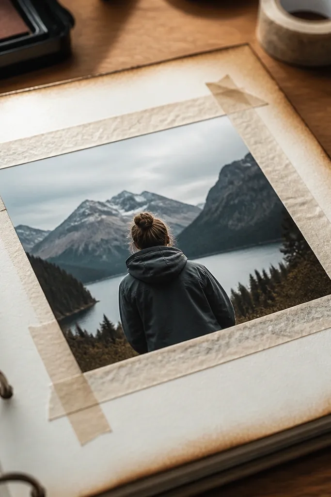
This one looks artsy but still controlled. Washi tape creates a resist, and inked edges add a soft, hand-made frame around your photo. It makes photos pop without turning the page into a sticker bomb. Use it when your album feels too clean and you want texture. It takes about 45-60 minutes because you need to let ink dry, and it looks best with matte photos or slightly muted prints.
Cut your photo mat, then place washi tape along the mat edges in a rectangle — keep the tape width consistent. Lightly ink the exposed cardstock edge with a sponge dauber using archival ink or distress ink, using one direction strokes. Remove the tape while the ink is still set enough not to smear, then let it dry fully. Mount the photo with adhesive squares and add a simple caption strip. Seal with a matte spray only if your ink is dry and compatible with paper.
Press washi tape down with a bone folder so ink doesn’t seep under it.
Avoid cheap ink that bleeds — it can soak into the paper and blur your photo edges.
8. Sticker-Only Caption Blocks with Photo Centering
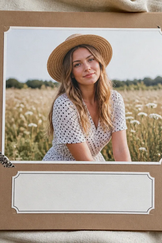
This is a clean way to use stickers without wrecking readability. Your photo stays centered and large, while the caption becomes a single graphic block. The look is modern and camera-friendly because the sticker edges form a border. It works for short messages like place names, first names, or event dates. If you’ve got photos that are already strong, this layout keeps attention where it belongs.
Choose a dominant photo and trim it so it’s the largest element on the page, like 5x7 on a 12x12 layout with margins. Mat it with a solid color cardstock frame, then center it with pencil marks. Create a caption block underneath using one sticker sheet color family — keep it to a rectangle, like 3.5x1.5 inches. Add journaling with a fine black marker over the sticker surface or place a small label sticker for the date. Finish by adding one tiny decorative icon in the bottom corner so the page doesn’t look empty.
Use only one sticker style for the caption block — mix too many and it stops looking like a planned design.
Avoid scattering small stickers around the photo. That’s how you get visual noise.
9. Bookbinding Style Page Protectors for Flat Lay Photos
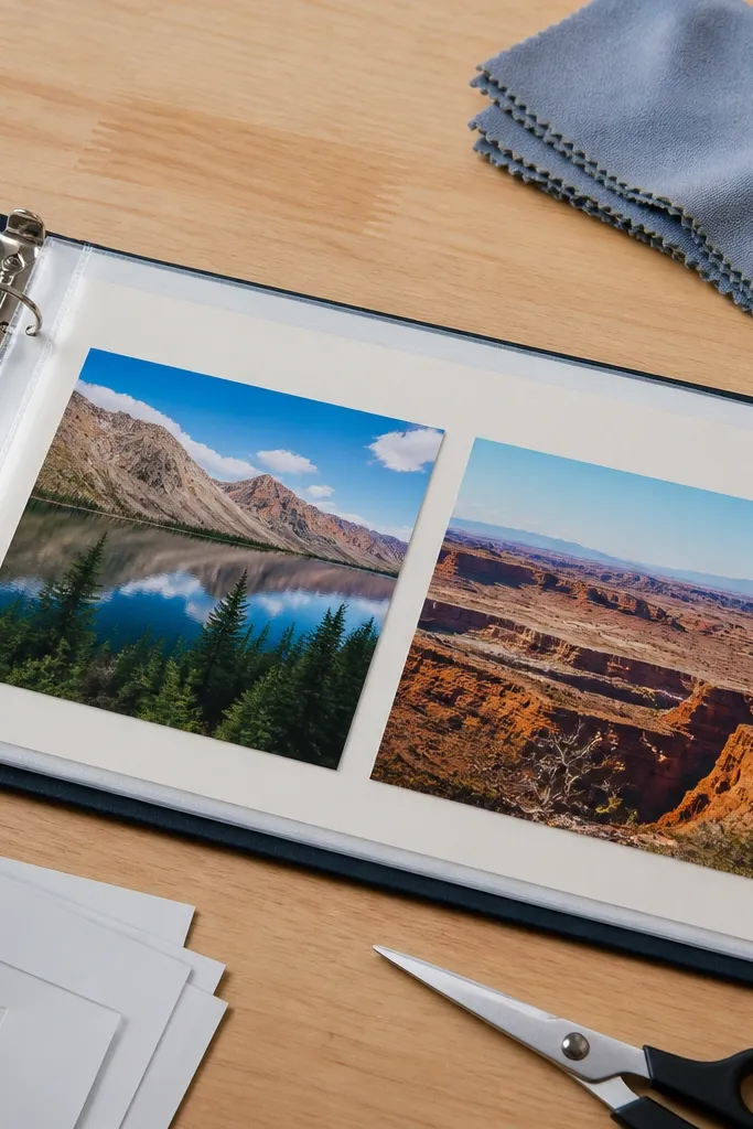
If your album pages curl or get scuffed, this layout fixes the physical problem and improves how photos look. Page protectors keep everything flat for camera, and the binder format gives you that neat, structured look. It’s also the safest approach for photos you want to keep long-term. Use it for albums you’ll flip often, like family years or recipe travel trips. Time is about 1-2 hours per section because you’re building page inserts, not just gluing.
Start with a binder that uses clear page sleeves sized for your pages, like 12x12 or 8.5x11 based on your print sizes. Cut your page base from 110 lb cardstock, then mount photos using tape runner so edges stay flat. Create a journaling strip on the cardstock base, not on loose paper, so it doesn’t shift inside the sleeve. Place your finished insert into a sleeve and check flatness under bright light — adjust if you see bowing. Add corner reinforcement with photo-safe tape on the back side if the sleeve catches at the corners.
Pro tipUse matte cardstock inserts under glossy photos to reduce glare in photos.
AvoidAvoid over-thick embellishments in page sleeves — they make sleeves bulge and ruin the flat look.
10. Two-Page Roadmap Spread with Arrows and Date Bands
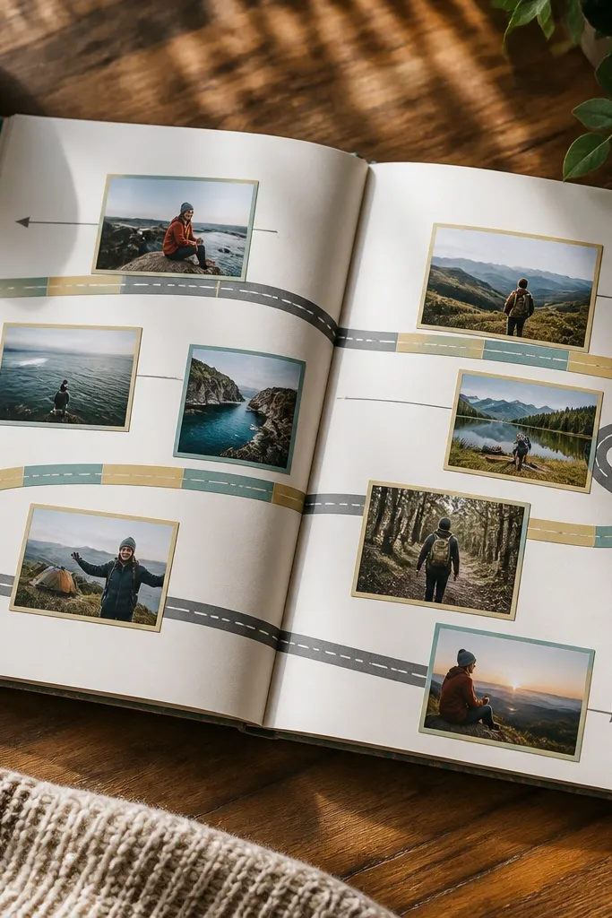
Roadmap spreads look great because they turn photos into a story path. The arrow guides the eye, while date bands create a repeating pattern across both pages. This is perfect for trips, moves, or any album where you want to show sequence without writing paragraphs. The design works on camera because the line and bands create strong geometry. You’ll spend more time planning than building, but once it’s laid out, assembly is straightforward.
Decide your arrow direction and draw a long pencil line across both pages, leaving 1 inch margins. Cut photo strips sized to sit along the arrow path, like 3x4 or 2.5x3.5, and keep them equal width for alignment. Create date bands from cardstock rectangles, like 1 inch tall, and place them between photos. Use a ruler to keep arrowheads centered and cut the arrow shape from solid cardstock. Mount photos first, then glue date bands on top so the bands overlap cleanly at the arrow line.
Pro tipMake your arrow from one color cardstock and add a single accent color for date bands only.
AvoidAvoid handwritten dates directly on busy sticker backgrounds. It turns captions into unreadable texture.
11. Pressed Flower Photo Corners with Clear Tape Edges
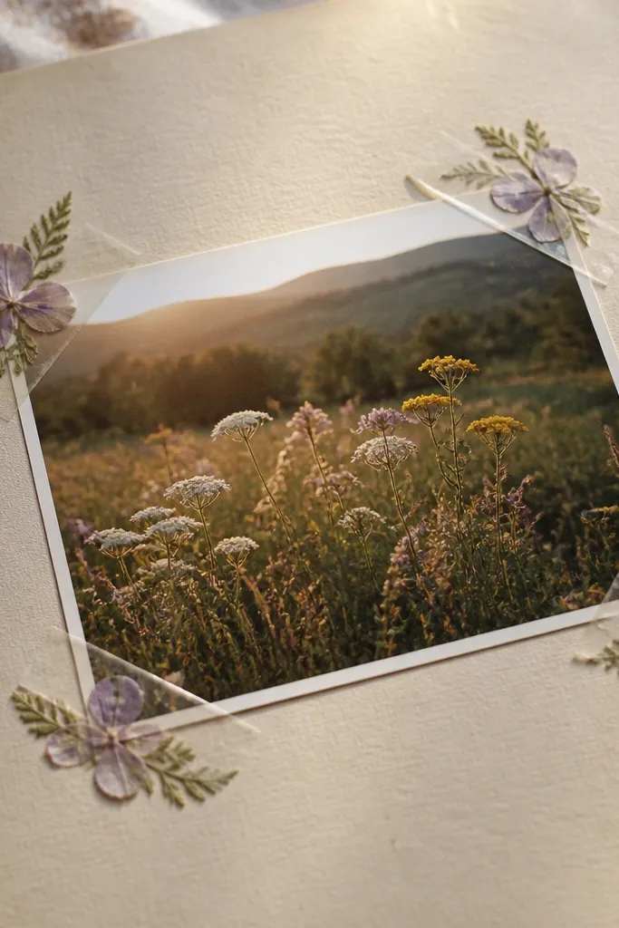
Pressed flower corners add softness and detail without covering the photo. The trick is to keep the flowers at the corners and let the photo stay the hero. Clear tape edges keep the pressed pieces from lifting and create a tidy, sealed look on camera. This idea suits spring events, baby albums, or any page that needs a delicate frame. It’s a slow-ish build because pressing flowers takes time, but the scrapbook assembly itself is quick — about 20-30 minutes per page.
Use already pressed, flat flowers or small leaf fragments. Trim your photo mat and place it centered on off-white cardstock. Apply small strips of clear double-sided tape or archival tape to the mat corners, then tuck flower pieces onto the tape so they sit just inside the photo border. Cover with a final thin clear tape strip to hold them flat, then mount the photo over the mat using tape runner. Add a tiny handwritten caption in pencil first, then go over with a fine pen once you like the spacing.
Pro tipSort flowers by size and keep one “main” cluster per page — too many pieces look cluttered fast.
AvoidAvoid gluing flowers directly with thick glue — it soaks paper and makes the corners look lumpy.
12. Monochrome Photo Frames with One Metallic Accent
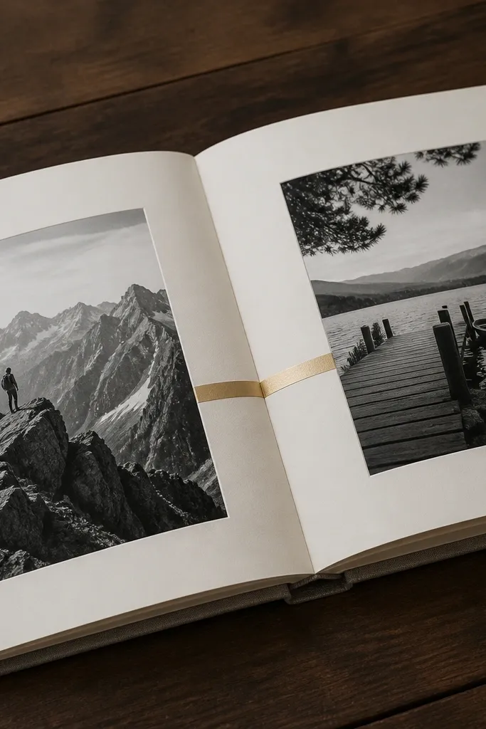
Monochrome frames make the album look designed because everything shares one visual language. Add one metallic accent strip for a clean pop that reads well in photos without turning the page into glitter. This layout works when your photos have mixed colors or when you want a calmer, editorial look. It’s also easy to repeat across an entire album so it feels like one set. Build time is about 45-75 minutes per spread depending on how many photos you use.
Pick a monochrome palette: black, charcoal, and gray cardstock. Trim your photos to matching sizes and matte them with gray cardstock frames leaving a 1/4 to 1/2 inch border. Cut a metallic strip from gold or silver cardstock or thin foil tape — about 1/4 to 1/2 inch tall — and place it as a header line across the top or as a divider between two photos. Mount photos with tape runner so edges stay flat. Add journaling in a single color pen, like white gel pen on dark gray or black pen on light gray, and keep it short.
Use metallic only once per page. A single strip keeps the look crisp.
Avoid using metallic foil on multiple surfaces. It reflects light and can blur your journaling in photos.
13. Ticket Stub and Map Strip Collage with Edge Trimming
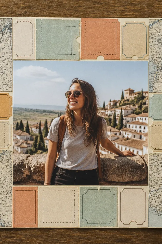
This layout looks great because it mixes real-world paper textures with a clean photo center. Ticket stubs and map strips bring color and story, but trimming them properly keeps the design sharp instead of messy. The photo stays centered, while the ephemera forms a border-like frame. It’s perfect for trips where you have receipts, boarding passes, or printed maps. Time is around 1 hour because you’re trimming and layering for straight edges.
Cut your map and ticket pieces into strips that match a consistent height, like 1.5-2 inches, and trim each edge with a ruler for clean lines. Center your photo on the page and mount it with tape runner. Layer the map strips around the photo in a partial frame, leaving 1/8 inch gaps so the paper doesn’t look glued together. Add one ticket stub diagonally as the accent and secure it with adhesive squares. Finish with a small date label at the bottom using cardstock, not loose paper.
If your ticket stubs are thin, back them with a thin cardstock strip so they don’t curl.
Avoid torn edges everywhere. Mixed raw edges make the page look uneven in photos.
14. Layered Lettering Tags on a Single Journaling Lane
A single journaling lane makes pages look organized even when you have lots to say. The layered tags create the visual interest, while the lane keeps everything aligned. This is ideal for albums where you want more than one caption per photo set, like milestone years or wedding planning. It also fixes the common problem of captions that look like random notes. The result reads clean in photos because the typography sits in one predictable area.
Pick one side for the journaling lane, like right edge, and mark a vertical column with pencil. Cut a series of tag shapes from cardstock, keeping the same width, like 2.5 inches wide, and varying only the height. Mount your photo with a flat mat, then place tags along the lane using adhesive squares so each tag overlaps slightly. Write dates and short phrases on each tag, and use one pen thickness for consistency. Add one small decorative element at the top of the lane so the stack has a visual start point.
Pro tipUse a ruler under your paper when writing on tags. It keeps letters straight across multiple lines.
AvoidAvoid journaling across the whole page. That destroys the clean lane look.
15. Mat-and-Mirror Frame with Photo Flip Flaps
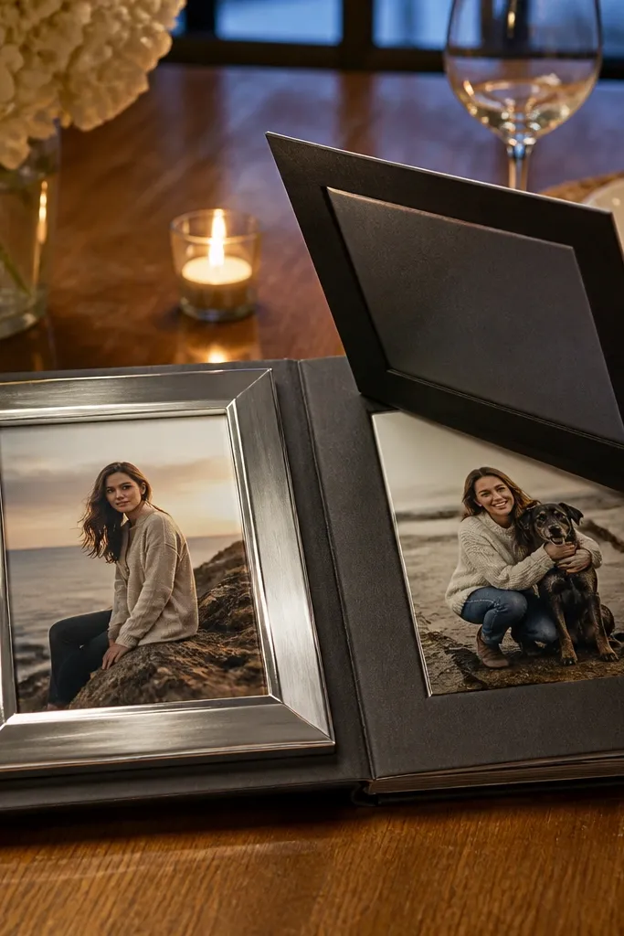
Flip flaps create a “double take” effect that looks fun on camera and keeps pages from feeling static. The mirror frame concept means you show one photo on the front, then reveal another with a controlled flap. It’s great for pairs like close-up and full shot, or day and night versions of the same place. This layout also helps when your album has duplicate angles and you want both without adding a second full frame. Expect about 60 minutes to build your first one, then it gets faster.
Cut a photo mat with a central opening for the front photo. On the back of the mat, attach a second photo using a hinge strip — use 1/2 inch binder board or cardstock hinge. Build a flap by cutting a matching piece of cardstock that covers the hinge and swings open; score the hinge so it folds flat. Mount the front photo on the mat front using tape runner, then attach the second photo to the flap with adhesive squares. Test the flap opening before you glue down the final border so you don’t trap the hinge.
Use a darker mat color under the flap so the reveal looks intentional instead of washed out.
Avoid thick bulky paper hinges — they prevent the flap from lying flat and make the page look warped.



